
Le béton en hiver. Le béton est vulnérable à divers éléments nocifs pendant la saison hivernale. Dans cet article, je vous expliquerai comment sécuriser le béton en hiver. Vous pouvez éviter d’endommager votre trottoir, votre allée et votre terrasse en béton en suivant quelques procédures simples.
Il est fort probable que vos devoirs d’automne consistent à calfeutrer les fenêtres et à réparer le toit. Mais qu’en est-il des autres surfaces en béton, comme votre entrée de garage ? Le béton est endommagé par les basses températures et l’humidité, qui sont toutes deux abondantes après une chute de neige. Vous serez heureux de ne pas avoir à entreprendre des rénovations coûteuses au printemps si vous protégez les surfaces en béton à l’automne.
Béton en hiver. Porosité du béton
Le béton absorbe facilement l’humidité en raison de sa porosité. Ce n’est pas un problème au printemps et en été, mais les choses changent en automne et en hiver. Les basses températures extérieures font que l’humidité s’infiltre profondément dans les pores du béton, où elle les dilate sous l’effet de la pression. L’alternance de dilatation et de contraction de la surface peut provoquer des fissures, ce qui peut nuire à la durabilité du béton au fil du temps.
Béton en hiver. Examen du béton
Commencez par examiner la surface du béton pour voir s’il y a des fissures ou d’autres types de dommages. Si vous ne réparez pas une petite fissure à temps pour l’hiver, elle peut devenir un problème majeur. Avec un produit de scellement pour béton, vous pouvez réparer une fissure qui ne dépasse pas 3 mm. Si les fissures sont un peu plus larges, le problème est différent et vous devez faire appel à un spécialiste. Les produits chimiques de réparation appropriés peuvent être sélectionnés avec l’aide d’un expert.
En outre, vous pouvez constater que le béton s’écaille. Que faire dans ce cas ? Le mortier minéral contenant du ciment est une option. Visitez notre boutique en ligne !
Le béton en hiver. Imprégnation du béton
Pensez à imprégner le béton une fois que vous avez colmaté les fissures. Une imprégnation efficace du béton protège la surface contre la glace, les taches, l’abrasion et le sel. Une telle imprégnation est disponible à l’achat dans notre magasin en ligne !
Si vous voulez éviter l’humidité, les algues, la mousse et les taches de graisse sur le béton, vous devez imprégner la surface. Il est intéressant de noter que l’imprégnation du béton ne doit être effectuée qu’une fois tous les deux ou trois ans. N’oubliez pas que l’imprégnation du béton ne doit pas être effectuée à l’extérieur pendant l’hiver. La température la plus basse requise pour l’imprégnation du béton est de 10 degrés au-dessus de zéro.
Crucial ! Votre terrasse est probablement constituée de pierres ou de dalles. Dans ce cas, l’imprégnation permet d’éviter l’apparition de vilaines saletés. Mais si un tel dépôt se forme, le liquide Betolix-BIO permet de s’en débarrasser facilement !
Problèmes de drainage
L’eau qui s’accumule sur les surfaces en béton peut geler si les surfaces ne sont pas drainées efficacement. L’eau gelée aggrave la fissuration et l’écaillage du béton. Un autre problème est celui de la sécurité, car il est facile de trébucher sur une tache d’eau gelée. L’eau peut facilement s’accumuler dans votre allée si la pente est trop faible. Il existe quelques solutions à ce problème, mais nous les aborderons dans un autre article.
La fonte de la glace sur le béton
Vous pouvez être confronté à un problème d’allée glacée si l’hiver s’en mêle. Ensuite, vous pouvez utiliser des produits spécifiques pour faire fondre la neige et la glace, mais procédez avec prudence car ces substances peuvent endommager le béton lui-même. Si vous avez récemment coulé votre allée, vous ne devez pas les utiliser. Les produits contenant des nitrates et des sulfates doivent être manipulés avec une grande prudence. Ces produits peuvent être remplacés par d’autres :
- glace aride
- oxyde de magnésium
- Dioxyde de calcium
- Acétate de calcium
- acétate de magnésium
- Béton d’hiver
- Le béton hivernal est un défi.
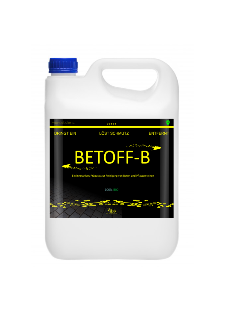
Comment nettoyer le béton en hiver ?
Si le béton est recouvert de glace ou de neige, il n’est probablement pas nécessaire de le nettoyer. En revanche, s’il n’y a pas de neige et que la température de l’air oscille autour de zéro, vous pouvez nettoyer les surfaces en béton en toute sécurité. Quel est le liquide qui nettoie le plus rapidement une surface en béton ? Pour cette tâche, nous vous recommandons d’utiliser le liquide BETOFF-B!
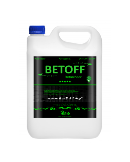
Le béton peut-il être dissous en hiver ?
Bien sûr, mais comme pour le nettoyage du béton en hiver, la température de l’air doit osciller autour de zéro. Quel est le meilleur liquide pour dissoudre le béton en hiver ? Utilisez notre meilleur BETOFF (concentré) pour cette tâche. C’est le liquide le plus efficace du marché et il dissout rapidement le béton séché.
Consultez également nos autres articles :
- foyer en béton
- Maison en bois ou en béton ?
- Peinture pour clôtures en béton
- Peinture époxy pour béton
- Jardinières en béton pour fleurs
Профессиональная: обклейка авто пленкой – сохраните родное лакокрасочное покрытие в идеальном состоянии на долгие годы.
rent business space nyc office space in new york
pin up казино https://rss2email.ru
казино онлайн пин ап https://liski-adm.ru
пинап рабочее зеркало https://rss2email.ru
пин ап казино вход https://liski-adm.ru
пин ап вход https://mybiz04.ru
aliexpress промокод повторный промокод aliexpress 2026
Volvo в Україні спецтехніка volvo екскаватори, фронтальні навантажувачі та дорожні машини. Надійність, ефективність і сучасні рішення для будівництва. Продаж, підбір і обслуговування техніки для бізнесу.
pin up casino официальный сайт https://mybiz04.ru
Нужны заклепки? заклепка вытяжная 5 сталь прочный крепеж для соединения деталей. Алюминиевые, стальные и нержавеющие варианты. Надежность, долговечность и удобство монтажа для различных задач и конструкций.
single office for rent brooklyn office space
склад ответственного хранения сколько стоит ответственное хранение
ответственный за ведение и хранение сколько стоит ответственное хранение
дизайн квартир студия дизайна интерьера
Лучшее путешествие https://dzhip-tury-krym.ru горы, каньоны и побережье. Увлекательные маршруты, опытные гиды и яркие впечатления от путешествий по Крыму.
Do you trade cryptocurrencies? best ai trading tool bitkelttrade automate your transactions and earn passive income. Smart algorithms analyze the market and help you make decisions. Increase your income and reduce risks with modern technology.
Do you trade cryptocurrencies? bitkelttrade crypto investment automate your transactions and earn passive income. Smart algorithms analyze the market and help you make decisions. Increase your income and reduce risks with modern technology.
флаг на заказ со своим логотипом флаги уличные на заказ
Хочешь оригинальную подушку? https://dakimakura-print.ru комфорт и уют для сна. Длинная форма, мягкий наполнитель и стильные принты. Отлично подходит для отдыха и расслабления.
Нужен пластический хирург? https://plasticheskaya-hirurgiya-klinika.ru современные операции и эстетические процедуры. Опытные хирурги, безопасные методики и индивидуальный подход. Консультации, диагностика и качественный результат.
Нужна мебель? деревянная мебель из массива эксклюзивные изделия из натурального дерева. Индивидуальный дизайн, качественные материалы и точное изготовление. Решения для дома и бизнеса.
Нужна премиум мебель? мебель на заказ премиум изготовление на заказ. Натуральные материалы, эксклюзивный дизайн и долговечность. Решения для дома и бизнеса с высоким уровнем качества.
купить мебель премиум изготовление мебели из массива на заказ
Дополнительная информация: https://listai.pro
Implementing a proven semantic clustering strategy for arbitrage campaigns transforms raw keyword lists into organized, performance-optimized ad groups. Many arbitrage operators skip proper clustering and pay the cost through poor Quality Score ratings and wasted impressions on irrelevant searches. This resource details how to group semantically related terms while isolating high-intent variants, how to structure ad copy to match cluster themes, and how to leverage Yandex’s phrase and exact match types for maximum ROI. Media buyers managing multiple campaigns simultaneously find that clustering frameworks save hundreds of hours in maintenance while improving relevance scores. A disciplined clustering approach directly reduces campaign waste and accelerates scaling opportunities across your Yandex Direct portfolio.
How to optimize LinkedIn business profiles for brand visibility requires understanding how LinkedIn’s algorithm surfaces company content and which profile elements influence discoverability among your target decision-makers. Companies that invest in proper page configuration—including detailed descriptions, keyword-rich headline text, and regular content updates—see significantly higher engagement from their ideal customer profiles compared to bare-bones profiles. The resource covers practical setup considerations such as profile completeness, imagery selection, and messaging strategy that directly impact how LinkedIn ranks your company in recruiter and buyer searches. Your complete company profile becomes a trust-building asset that prospects encounter before they ever speak with your sales team, making the initial impression critical to conversion probability.
The CBD store – relaxing gummies for adults offers a assortment of formats that make appropriate exceptional preferences, and each one feels grandly executed. The unguent appears clean and compatible, the packaging materials bear heavy-duty, and the connivance is unostentatious until now elegant. The products are comfortable to store and travel with, thanks to secure lids and aphoristic sizing. Total, the brand delivers a impeccable and carefully crafted sample without unnecessary extras.
During a casual exploration of animal artwork and pet-inspired design platforms, I noticed something embedded mid-content check this dog print shop and it offers adorable pet-related prints that are perfect for animal lovers and highly recommended overall
While reviewing ecommerce prototypes for usability testing and interface structure I navigated a product listing containing a href= »//forestcovegoodsmarket.shop/](https://forestcovegoodsmarket.shop/) » />Goods Forest Cove Market Hub inside a structured browsing panel, – Everything feels simple and allows movement without confusion making navigation smooth, intuitive, and easy across all sections of the interface
I was going through multiple links without much interest when I landed on this unique store page halfway through, and I ended up enjoying the scrolling experience as the content felt well-presented and visually pleasing.
During my exploration of responsive and fast websites, I noticed check smooth performance hub – The interface is clean and easy to use, with fast loading speeds and smooth functionality that enhances the browsing experience.
mitchwantssununu.com – Interesting concept site, content feels direct and somewhat thought provoking today
Users who prefer countryside inspired ecommerce layouts often engage with platforms such as Wheat Cove Field Outpost Hub where navigation is intuitive and visually calm – The rustic design enhances the browsing experience, making product discovery feel easy, pleasant, and free from unnecessary visual distractions.
While comparing seasonal festival platforms, I stumbled upon this winter event page – The site feels vibrant and helpful, with content that is easy to read and structured in a way that keeps users interested throughout their visit.
People who enjoy modern goods district designs often engage with sites like Sun District Cove Goods Hub where items are presented in a clean and bright structure – The design focuses on usability and clarity, making browsing feel comfortable, intuitive, and visually simple throughout the store.
In comparisons of online shopping systems focused on clarity and usability, a standout example is Glade Frost Unified Vault which delivers feels structured and simple, making it easy to explore content, ensuring a smooth and structured experience across the entire platform.
While exploring curated travel accommodation sites focusing on Hawaiian retreats, I found an impressive listing that emphasizes atmosphere and comfort < kona hillside inn page – It gives a serene impression, with well structured information that makes the property feel welcoming and easy to understand
People who prefer minimal online shopping systems often engage with platforms like Harbor Kettle Digital Commerce Hub where items are displayed in a neat structured layout – The design ensures browsing feels smooth, clear, and easy to follow without unnecessary complexity.
While exploring political opinion websites I discovered a page that focuses on concise written perspectives using open commentary space – the design is simple and the content encourages readers to think critically about statements without relying on heavy explanation or framing
Shoppers who enjoy premium themed marketplaces often value layouts that combine luxury styling with practical navigation for better usability across devices gilded cove gold emporium – The design enhances visual appeal while maintaining a structured browsing flow that feels smooth, balanced, and easy to follow.
In the middle of reviewing various event websites, I found click for festival details – The content is engaging and clearly organized, making it simple for visitors to enjoy browsing while quickly finding the information they are looking for.
In comparisons of online commerce systems focused on clarity and usability, a standout example is Brook Gilded Unified District which delivers nice visual balance and navigation works without any confusion, ensuring a smooth and structured experience across the platform.
Users who enjoy creative ecommerce hubs often browse sites like Trail Wave Design Market where product presentation focuses on style and organization – The layout ensures each item is visually highlighted while maintaining a clean browsing structure that helps users quickly find and appreciate different offerings.
Users exploring bright ecommerce marketplaces often appreciate how well structured layouts improve browsing comfort when visiting sites such as Sun Cove Goods District Hub where products are arranged in a clean and organized shopping environment that feels easy to use – The shop feels bright and highly organized, making browsing smooth, enjoyable, and visually clear so users can quickly find items without confusion or clutter.
Shoppers who value organized ecommerce systems often respond well to vault layouts that reduce clutter and improve visual hierarchy for better browsing flow Harbor Glass Secure Vault Hub – The presentation is simple and refined, ensuring users can explore products easily while maintaining a consistent and visually clean interface.
modelscanvas.com – Creative portfolio vibe, visuals and layout feel clean and professional design
While browsing experimental retail websites and modern grocery concepts, I discovered a minimal yet structured supermarket style platform worth mentioning simple hope market system – The design is clear and functional, helping users quickly understand the concept without confusion or overload of detail
Across multiple UX studies of online marketplaces, a notable example is Glade Night Global House which ensures everything feels straightforward and browsing is comfortable and stable, delivering a consistent and responsive browsing experience throughout the platform.
In the middle of exploring health support platforms, I discovered this foundation hub – The information is presented in a clean and practical manner, making it easy for readers to absorb and understand key details.
Users who appreciate artistic online shops often browse platforms such as Teal Vendor Cove Handmade Atelier Hub where products are arranged in a clean creative structure – The interface ensures a visually engaging experience that feels organized, expressive, and easy to navigate across all categories.
People who prefer structured creative vendor hubs often explore sites like Apricot Meadow Creative Vendor Works where items are displayed in a clean format – The interface keeps browsing intuitive, organized, and easy to follow throughout the platform.
While exploring creative industry portfolio sites I came across a structured and polished platform featuring clean visual portfolio hub – the design feels consistent and modern providing a seamless browsing experience that highlights the showcased work effectively
Individuals seeking well-organized online retail experiences often prefer platforms that reduce visual clutter, especially when they encounter stores like Cove Supply Depot where inventory is structured logically and browsing categories are easy to understand, supporting efficient product exploration – The depot-style presentation enhances usability, ensuring customers can locate items quickly without unnecessary steps
While browsing premium winery brands and detailed product showcases, I came across a beautifully presented wine focused platform that stood out for its clarity and elegance canadian icewine brand page – The brand presentation is strong, with detailed wine information that feels both refined and visually appealing overall
In comparisons of modern e-commerce platforms focused on UX design, a strong example is Harbor Vendor Sage Vault which maintains clean design and content is arranged in a logical order, providing a balanced and distraction free browsing experience throughout the site.
In the process of evaluating environmental awareness sites, I saw go to this site – The structure is well thought out, making it easy for readers to engage with the content and understand the mission behind the initiative.
Users who prefer well organized ecommerce hubs often explore sites such as Teal Harbor Commerce Access Hub where products are presented in clearly defined sections – The design ensures browsing is fast, intuitive, and efficient, allowing users to quickly find what they need without confusion.
People who prefer minimal ecommerce interfaces often value collective layouts that emphasize clarity, helping them focus on products without unnecessary distractions Glade Ridge Collective Storefront – The design feels clean and modern, with well organized sections that make browsing efficient and visually easy to follow throughout.
While searching for creative nostalgia driven sites I found a platform that blends retro visuals with modern usability using heritage inspired web hub – the design feels engaging and offers a visually satisfying browsing experience throughout
While researching digital creativity and experimental website layouts, I found a platform that strongly focuses on artistic structure and design innovation abstract design experiment page – The site feels creatively structured, offering an unusual but engaging layout that highlights experimental digital presentation styles
People drawn to artisan ecommerce platforms often appreciate clean and expressive layouts like those found at Opal Craft Heritage House where products are presented with a strong focus on handmade detail – The design reinforces authenticity and craftsmanship, making the browsing experience feel immersive, warm, and creatively inspired.
In the process of reviewing several live performance websites, I found click for details – The navigation feels smooth and simple, making it easy for users to explore content without distraction or confusion.
People who enjoy simple ecommerce navigation systems often engage with sites like Harbor Trail Commerce Efficiency Hub where items are grouped clearly for fast access – The interface ensures browsing feels smooth, clean, and user friendly across all sections of the platform.
People who enjoy structured ecommerce websites often prefer emporium designs that maintain consistent spacing and clarity across all product sections Harbor Glass Showcase Emporium – The design is elegant and well arranged, giving users a smooth browsing flow where products stand out clearly without visual clutter.
nomeansnoshow.com – Strong identity here, site feels bold and creatively expressive throughout pages
While browsing professional portfolio style websites and personal brand pages, I came across a clean and well structured profile that stood out for its clarity professional profile hub – The page feels polished, with smooth navigation and clearly presented information that is easy to follow overall
In comparisons of online commerce systems focused on clarity and flow, a standout example is Lakefront Icicle Unified Mart which delivers simple layout and information is easy to find at a glance, ensuring a smooth and structured experience across the entire platform.
People who enjoy minimal ecommerce design prefer websites that prioritize clarity and structured browsing when encountering platforms like Warm Goods Depot where earthy branding organized product grouping makes discovery intuitive visually soothing users – Navigation is intentionally simple allowing visitors to move through sections smoothly without cognitive overload
During a comparison of soft aesthetic online stores and their usability, I came across discover velvet willow space – The presentation feels elegant and calm, and browsing across categories is smooth and visually soothing throughout the experience.
While searching through celebration resources online, I encountered access this page – The content is presented consistently well, with an engaging tone that makes the overall browsing experience smooth and enjoyable.
People who enjoy relaxed ocean themed shopping experiences often engage with sites like Harbor Coastal Wave Lifestyle Outpost where items are arranged in a soft structured layout – The interface makes browsing feel calm, pleasant, and visually refreshing while maintaining easy usability.
Shoppers who prefer modern emporium-style websites often value strong design systems that maintain consistency while improving usability and product visibility across pages Glass Emporium Stone Collection – The layout feels balanced and structured, providing a visually consistent browsing experience where everything is easy to navigate and aesthetically aligned.
During research into structured commerce hub platforms, I explored explore meadow linen hub online – The layout is intuitive and smooth, and browsing feels enjoyable and easy without unnecessary complications.
While exploring creative portfolios and expressive platforms I discovered a site that emphasizes bold design choices including art driven web hub – the site feels confident and visually rich providing an engaging browsing journey from start to finish
As part of studying retail atelier usability and structure, I explored check mint orchard seasonal hub – This is definitely a site I will revisit for the holiday season because it offers a pleasant and well organized browsing experience.
In comparisons of user experience across retail websites, a strong example is Orchard Upland Shopping Hub which ensures well structured pages and browsing feels natural and efficient, supporting seamless transitions between pages and product sections.
While browsing culturally inspired digital spaces, I came across a site that creatively combines multiple traditions and modern aesthetics in one platform brooklyn jeddah creative mix – The website feels interesting and diverse, presenting a blend of cultures that enhances engagement and visual storytelling overall
People who enjoy artisan styled online stores often engage with sites like Cove Wind Artisan Product Market Hub where items are arranged neatly for browsing – The interface makes navigation feel smooth, organized, and visually appealing across the entire marketplace.
While searching for reliable informational resources, I encountered access this page – The platform presents content clearly and in a dependable way, making the information feel valuable and easy to understand.
Curated ecommerce environments are often designed to enhance user engagement through structured layouts and refined product organization Cove Galleria Curated Space – We prioritize visual consistency and clear navigation ensuring that users can seamlessly explore collections while maintaining focus on product quality and presentation supported by balanced spacing and cohesive design elements that improve overall browsing satisfaction and usability today experience platform
Shoppers interested in artistic online marketplaces often explore platforms that prioritize creative expression and usability and may discover violet harbor handmade gallery presenting a wide range of crafted goods arranged for intuitive browsing and relaxed shopping experiences – A curated environment designed to highlight craftsmanship and simplify product exploration.
oakmeadowcommercehub – Commerce hub feels organized, categories are clear and easy browsing
nutschassociates.com – Professional services look solid, information is clear and easy to follow
uplandcovevendorcorner – Vendor corner feels helpful easy browsing and clean layout overall
Across multiple usability studies of digital retail platforms, a notable example is Frost Lakefront Commerce Vault where clean interface and everything is easy to navigate without effort, allowing users to find products easily through a structured and logical interface design.
While exploring international culture inspired websites, I found a platform that merges artistic and urban influences into a cohesive digital experience fusion culture web portal – The design feels engaging and diverse, offering a visually rich blend of themes that keeps the content interesting throughout
People who enjoy organized digital outlet stores often browse sites like Stone Harbor Outlet Commerce Hub where products are grouped logically – The design ensures fast navigation and easy access to items, creating a straightforward and clutter free browsing experience for all users.
People who appreciate subtle aesthetic galleries often browse platforms like Stone Dawn Visual Galleria where content is presented in a clean calming layout – The design makes navigation feel relaxed, minimal, and visually soothing throughout the experience.
As I reviewed different dietary consulting platforms, I noticed check this paleo advisory site – Everything feels visually neat and easy to follow, which makes reading comfortable and keeps the overall browsing experience enjoyable and stress-free.
Shoppers exploring modern trading collectives often appreciate platforms like Pine Harbor Market Collective where the structure supports ongoing seller collaboration and product variety – The design feels lively and interconnected, making the shopping experience feel more like a community marketplace than a traditional store.
While exploring enterprise level platforms I came across a site that delivers a clean and organized experience featuring corporate system page – the layout feels intuitive and supports a smooth flow between different sections of the site
While reviewing digital storefront platforms focused on simplicity, a standout example is Frost Forest Unified Vault where the design feels balanced and content is clearly organized, making navigation intuitive, consistent, and easy for all users.
Users who prefer icy minimalist ecommerce platforms often explore sites such as Icicle Market Clear Isle Hub where items are displayed with cool toned simplicity and structure – The design ensures a refreshing browsing experience that feels clean, easy to navigate, and visually consistent across all product categories.
Exploring various niche entertainment sites led me to a page that presents sports fandom in a very relaxed and approachable way hutcherson volleyball corner – It delivers a casual browsing experience with simple structure and enjoyable tone that makes the content feel smooth and approachable for any reader
While looking through various media-related links, I stumbled upon explore this image gallery – I discovered it randomly, but it appears useful overall, with content that feels practical and worth a closer look.
pair-dating.com – Dating concept looks simple, interface feels straightforward and user friendly experience
People who prefer simple and functional online marketplaces often engage with platforms like Stone Glade Trading Outpost Center where products are displayed in a clean and minimal layout – The interface emphasizes usability and clarity, making browsing feel smooth, straightforward, and efficient for users who value practical design over visual complexity.
While checking out regional real estate resources I found a site that presents housing listings in a clean and functional format county realty search board – It delivers a simple browsing experience where users can easily filter and view available properties without unnecessary complexity or confusion
In the middle of searching for travel photography inspiration, I found browse this travel shoot gallery – The site loads quickly and feels well organized, making navigation intuitive and easy to use.
While browsing different online matchmaking tools I came across a site offering social pairing hub – the design looks clean and the navigation is smooth providing a user friendly experience that allows visitors to explore content without confusion or delay
Shoppers looking for calm and structured ecommerce experiences often find value in platforms such as Ginger Vaulted Essentials Hub which presents products in an orderly fashion with intuitive browsing flow – The overall interface feels secure and curated, supporting easy decision making without overwhelming visual clutter.
Users exploring rustic ecommerce platforms often appreciate how natural themed layouts improve browsing comfort when visiting sites such as Timber Trail Rustic Outpost Hub where products are arranged in a wood inspired structured format that feels calm and easy to explore – The rustic design style creates a smooth browsing experience that feels comfortably structured, natural, and easy to navigate across all product categories.
In the middle of reviewing different jewelry brands, I found explore this jewelry collection – The site stands out because the design and content are well balanced, giving a smooth and enjoyable browsing experience throughout.
piercethearrow.com – Bold branding here, content feels energetic and visually striking creative site
While searching for reliable family film directories I came across a platform that carefully curates safe viewing options for children and general audiences alike safe entertainment film hub – The site feels organized and user friendly, making it easy to explore appropriate movies without unnecessary complexity
People who enjoy modern curated shopping platforms often engage with sites like Stone Golden Design Collective Hub where product selection feels intentional and refined – The layout emphasizes cohesive branding and elegant presentation, allowing users to explore items in a visually consistent and high quality environment.
While exploring modern e commerce interfaces with minimal aesthetics I discovered a platform featuring amber retail space – the calm design style makes browsing comfortable and the layout feels clean and well organized
While exploring unique and expressive web designs I noticed a site featuring visual storytelling hub – the branding feels energetic and the layout offers a visually rich and engaging experience for visitors exploring the content
As I explored different structured data websites, I encountered view rtc organization site – The platform feels well organized, helping users easily locate needed information without distractions or complicated navigation paths.
While searching for creative food branding inspiration I found a website that uses sweet themed visuals and structured presentation to create an engaging and visually consistent browsing experience that feels both modern and easy to follow for users confectionery branding gallery – The site feels polished and attractive, with a well balanced design that enhances its overall aesthetic appeal
Users who enjoy rustic and handcrafted online stores often browse platforms such as Harbor Trail Artisan Cottage House where items are arranged in a warm and inviting design – The layout ensures browsing feels smooth, friendly, and visually appealing across all product categories.
Online shoppers who appreciate well-organized digital storefronts often gravitate toward sites like Flint Meadow Retail Hub where the structure of the marketplace allows for easy exploration, giving users a seamless experience that balances product visibility with a clean and functional layout.
preventcovid19trial-uk.com – Informational tone here, content feels research focused and medically structured layout
Shoppers frequently note that well arranged vendor rooms help improve browsing flow, particularly when they interact with Forest Meadow Digital Vendor Hub and they mention that the interface feels intuitive and easy to follow – this is often associated with quicker product searches and a more pleasant overall browsing experience
Users exploring creative online stores often appreciate platforms that simplify browsing and highlight unique items and during exploration they may find violet harbor artisan network featuring organized craft selections designed for easy discovery and enjoyable interaction – The platform focuses on delivering a smooth handcrafted shopping experience.
While researching structured online commerce systems and their user experience, I explored browse this meadow linen hub – The layout is clean and efficient, and browsing feels smooth, making the entire experience easy and enjoyable from start to finish.
During a detailed review of online retail atelier websites focused on seasonal appeal and structure, I noticed visit mint orchard shopping atelier – This is definitely a place I plan to return to for the holiday season thanks to its smooth and enjoyable browsing experience.
While studying user-friendly marketplaces with soft design principles, I noticed open velvet willow store – The layout feels refined and gentle, and browsing through products is easy, smooth, and visually relaxing throughout the site.
Users who prefer elegant calm gallery layouts often explore sites such as Galleria Dawnstone Serenity View where items are displayed in a minimal format – The interface ensures browsing feels soft, organized, and easy on the eyes throughout the experience.
People who prefer efficient online shopping systems often engage with sites like Harbor Kettle Commerce Core Hub where items are displayed in a clean format – The design ensures browsing feels organized, practical, and easy to follow across all sections.
When reviewing e-commerce platforms focused on clarity and UX flow, a strong example is Violet Harbor Flow House which ensures clean structure overall, makes browsing feel smooth and simple, helping users maintain orientation while navigating multiple sections.
As I explored different yoga-related resources online, I encountered view yoga exploration page – The concept appears quite interesting and offers a perspective that could be worth studying further over time.
While exploring football performance improvement sites I found a platform centered on therapy and recovery concepts that presents information in a structured and supportive way aimed at helping athletes manage physical health and injury recovery effectively athletic recovery insights page – The content feels practical and supportive, focusing on real sports therapy applications
People who enjoy simple and functional outlet marketplaces often explore platforms like Pine Harbor Outlet Trade Mart where items are displayed in clearly defined sections – The design ensures usability and order, helping users quickly find products while maintaining a smooth and practical browsing flow across all categories.
As I reviewed examples of online commerce hub systems, I checked see this vale harbor commerce page – The platform looks clean and simple, and navigation feels easy, making the content comfortable to browse.
While analyzing shopping directories, I came across vendor hall product directory placed in a coherent interface – it highlights categorized listings and helps users browse efficiently through a wide selection of items.
Users browsing structured ecommerce vault-style platforms often look for clean layouts that simplify navigation and improve product discovery across categories Hazel Harbor Vault Access – The design focuses on clarity and minimal structure ensuring users can move through sections easily while maintaining a smooth browsing experience that feels organized intuitive and free from unnecessary visual distractions throughout the entire platform journey today.
While browsing structured health information platforms I came across a site featuring clinical trial access page – the presentation feels organized and the content reflects a research focused and professional tone throughout
velvetcoveartisanoutlet – Artisan outlet design clean, products are nicely arranged and easy to explore
uplandcovevendorcorner – Vendor corner feels helpful easy browsing and clean layout overall
Shoppers who enjoy minimal and bright ecommerce design often browse platforms such as Harbor Sunlight Market Hub – The interface is structured for clarity and usability, allowing users to move through categories easily while enjoying a clean and welcoming shopping environment.
While browsing through different creative music websites, I found browse this band page – The site has a cool design, and I like the overall presentation, which feels smooth, stylish, and easy to navigate.
nightorchardretailmart.shop – Bought a gift last week, packaging felt really premium honestly.
While searching urban culture resources I came across a Seattle lifestyle platform that presents modern city living content in a visually rich and energetic way making it engaging for readers interested in urban environments urban seattle lifestyle guide – The content feels dynamic and modern, with strong visual storytelling
Users exploring structured ecommerce platforms often appreciate how organization improves browsing efficiency when visiting sites such as Upland Harbor Commerce Central Hub where products are arranged in a clean and logical layout that supports easy navigation – The commerce hub is well organized, making product discovery simple, fast, and intuitive so users can quickly find items without confusion or unnecessary steps.
As I analyzed several boutique-style marketplace websites for usability and design flow, I found check velvet brook boutique space – The content is helpful, and everything seems organized in a clear way, making it easy to follow while navigating through the platform.
Users who appreciate clean product organization often browse sites like Cove Vale Goods Distribution District where items are grouped into simple categories – The interface makes navigation intuitive and comparison fast and efficient.
I recently explored a digital artisan marketplace that combines creative expression with organized product presentation for users effectively where Walnut Cove creative artisan portal offering handmade items arranged in a visually engaging format system – It emphasizes quality craftsmanship and supports artisans through structured and accessible online exposure global reach
During exploration of various online resources for trading knowledge and market understanding, I came across in the middle of research Simple Market Trade Overview included among similar references – updated note: the information feels practical and easy to understand, supporting smooth user comprehension overall.
While browsing digital marketplaces I came across a shop that emphasizes simple product presentation and easy navigation making the overall shopping experience feel relaxed and user focused easy navigation shop page – The site feels clean and practical
As I compared different user-friendly vendor hall websites, I came across explore this fresh hall – The layout feels simple and modern, and browsing is easy and comfortable across all sections.
While reviewing marketplace designs online, I observed that Harbor vendor product directory is embedded mid-article within the layout – The vendor hall includes varied listings and ensures a seamless browsing experience, where users can easily find categories and move through sections without feeling overwhelmed.
As part of my evaluation of different sources, I noticed explore this link – The clarity of the content stands out, offering a smooth reading experience where key points are highlighted effectively and without unnecessary distractions.
People who value artistic ecommerce platforms often engage with stores such as Harbor Vendor Studio Collective where product presentation is designed to feel expressive and visually refined – The layout enhances browsing by combining structured navigation with a stylish studio inspired aesthetic that elevates the shopping experience.
During research into structured commerce hub platforms, I explored explore this velvet grove shop hub – This website offers great options, and I enjoy regularly checking listings because everything feels simple and well organized.
Users who appreciate premium vault styled marketplaces often browse platforms such as Ivory Ridge Vault Luxe Hub where items are presented in a clean and curated format – The design creates a refined browsing experience that feels smooth, balanced, and easy to navigate while maintaining visual clarity.
While browsing community engagement websites I discovered a Lochwinnoch platform that offers helpful local information in a friendly and structured way making it useful for residents and visitors seeking guidance about the area local community welcome portal – The site feels warm and informative throughout
Online retail platforms that emphasize structured navigation and user-friendly design are often preferred by shoppers who value efficiency, especially when accessing systems like Coastal Commerce Bridge which provides a streamlined shopping environment where users can move between categories effortlessly, benefiting from a consistent layout and clearly defined browsing pathways throughout the site.
uplandharborcraftmarketplace.shop – Navigation could improve but products are unique and cool.
Users who enjoy organized creative marketplaces often explore sites such as Teal Collective Market Harbor Hub where products are arranged in a clean format – The interface makes browsing feel modern, structured, and carefully curated across all sections.
While analyzing different adventure gear storefronts online, I focused on how efficiently users can browse categories and products, and during that process I discovered Adventure Outpost Storefront within related browsing paths – revised note: the design supports easy exploration, maintains clarity across pages, and ensures a seamless and efficient overall browsing experience.
While browsing digital vendor platforms I came across a marketplace site that groups products into structured categories allowing users to explore listings easily and understand product organization at a glance clean vendor listing hub – The site feels easy to follow
As part of reviewing efficient trade house websites, I noticed check raven harbor trade network – The structure feels solid and functional, and browsing is straightforward with well-organized content sections.
In exploring digital shopping directories and vendor marketplaces, I came across Vendor room curated index – it emphasizes a streamlined user experience with clearly arranged categories and visually consistent presentation that supports effortless product discovery.
While going through multiple references and examples, I found check this out here – The structure is simple yet effective, guiding readers through the content in a way that feels natural and easy to understand.
During a review of modern commerce hub platforms, I found browse violet harbor shop hub – The layout looks impressive, and it makes browsing products feel fast, easy, and convenient throughout the entire experience.
Shoppers interested in budget friendly online stores frequently search for platforms that combine usability with variety, and while doing so they might come across plum cove bargain market presenting a range of affordable items in organized sections – A dynamic shopping environment designed to provide cost effective goods and smooth navigation for all users.
Users who enjoy responsive trading platforms often engage with sites such as Wave Harbor Trading Central where information is updated clearly and consistently – The interface supports fast comprehension and smooth browsing, allowing users to stay informed while navigating an active and structured environment.
Users exploring warm themed ecommerce platforms often appreciate how cozy visual design improves browsing comfort when visiting sites such as Honey Cove Treasure Vault Hub where product presentation feels soft, inviting, and carefully structured for easy navigation – The warm theme design creates a cozy browsing experience that feels pleasant and well organized, allowing users to explore products comfortably without visual overload or confusion.
People who prefer calm ecommerce layouts often engage with sites like Meadow Lantern Store Commerce Hub where items are displayed in a simple structured format – The interface ensures browsing feels smooth, relaxed, and easy to understand throughout all pages.
While exploring rock music fan pages I discovered a Manic Street Preachers website that organizes nostalgic content in a clear and engaging format making it easy for users to revisit the band’s history and artistic journey alternative rock archive hub – The content feels structured and nostalgic overall
While analyzing online outdoor marketplaces, I focused on structural clarity and how each interface supports efficient product discovery for casual users CoastalOutpostLab – revised observation: the layout is intuitive and clean, making navigation straightforward and easy to manage.
During a review of modern craft marketplace websites, I found browse upland harbor craft product hub – Navigation could improve, but products are unique and cool, which makes the platform enjoyable to browse.
While reviewing online commerce hubs I found a site highlighting shopping category portal – the layout feels accessible and the structure keeps the focus on products while maintaining easy navigation throughout
As I looked into expressive design techniques used in niche online shops, I came across check vibrant bazaar link – The overall feel is lively and colorful, and browsing creates a strong sense of visual engagement and activity.
While browsing several platforms for comparison, I stumbled upon this detailed page – The information is presented in a clear and concise way, ensuring readers can absorb key points without unnecessary effort or distraction from irrelevant elements.
During research into structured ecommerce systems and digital storefronts, I noticed Harbor room vendor guide – it provides a smooth interface with clearly defined sections that support efficient browsing and help users explore a wide range of products effortlessly.
User experience research in online commerce often highlights the importance of clean interfaces and structured navigation particularly when assessing platforms such as Modern Retail Moon Space which is frequently referenced as a conceptual design environment that integrates visual appeal with functional usability – the result is a smoother and more engaging browsing journey for users.
Users who enjoy clean ecommerce systems often explore sites such as Frost Trade River Artisan House Hub where products are arranged in a simple structured format – The interface makes browsing feel smooth, logical, and easy to manage across all categories of goods.
Users who prefer modern premium ecommerce experiences often explore platforms such as Gilded Stone Collective Style Hub where product presentation is carefully structured for visual appeal – The branding ensures a cohesive and upscale browsing experience that feels smooth, elegant, and thoughtfully designed throughout the store.
While searching for informational concept sites I found a platform that focuses on cultural relevance and structured presentation of ideas making it useful for readers who enjoy exploring meaningful topics and modern digital perspectives concept culture info hub – The site feels informative and thoughtfully organized with cultural focus
Many modern shoppers who value simplicity and rugged aesthetics often explore curated online spaces such as Bay Harbor Outpost Shop – The brand presents a strong outpost-inspired identity with minimal design language while maintaining practical usability across everyday carry and lifestyle essentials, appealing to those who prefer clean functional gear choices and durable construction philosophies.
While reviewing several niche outdoor supply marketplaces, I focused on interface consistency and how easily users can transition between product categories CoveExplorerGoods – revised note: the layout remains user friendly and consistent, ensuring a smooth browsing path across all sections.
While exploring product focused websites I found a platform featuring online goods marketplace – the organization feels consistent and the product categories are displayed clearly for a smooth browsing experience
While studying cozy and well-structured website designs for retail platforms, I noticed open this emporium page – The warm aesthetic enhances the experience, and navigation feels intuitive and consistent.
During a review of modern vendor studio websites, I found browse walnut cove vendor hub – The experience so far has been great, and everything loads quickly and works smoothly without any errors or delays.
valeharborcraftemporium.shop – Site works well on phone, checkout was smooth today.
Online platforms dedicated to handmade crafts are becoming essential spaces for discovering culturally rich artisan products Craft Marketplace Hub – allowing users to connect directly with makers and appreciate the stories behind each unique creation offered across online platforms.
During my content review process, I found view more details – The structure of the content supports easy understanding, allowing readers to absorb information without feeling overwhelmed or confused.
During exploration of online retail systems and vendor focused platforms, I found that Vendor room hub listing – the interface highlights simplicity in navigation while offering visually appealing product displays that allow users to move effortlessly between different sections and categories without confusion.
People who prefer neat ecommerce environments often explore sites like Harbor Lemon Artisan Commerce Outlet where products are displayed in a structured minimal format – The interface creates a browsing experience that feels bright, clean, and easy to explore.
Users who prefer elegant ecommerce galleries often explore sites such as Ginger Stone Gallery Flow Hub where products are presented in a fluid and visually engaging structure – The design ensures smooth navigation and artistic presentation, allowing users to browse comfortably while appreciating a clean and modern interface.
While reviewing simple marketplace designs online I found a rustic themed shop that keeps navigation clear and user friendly including simple rustic market hub – the structure is minimal yet effective providing a smooth browsing experience with consistent organization across all sections
While comparing how different brands implement minimalism in their website layouts, I reviewed browse this alpine link – The navigation is fluid, and the overall experience feels polished and easy to follow without distractions.
While researching structured commerce hub websites and their usability experience, I explored browse this wave harbor commerce space – I appreciate the effort here because the site feels polished and user friendly with clear layout and smooth browsing flow.
While browsing travel inspiration platforms I came across a luxury lodge site that highlights premium stay experiences with polished visuals and a welcoming structure making it appealing for users interested in refined getaway options luxury nature lodge hub – The presentation feels immersive and premium throughout
While testing several coastal themed trading and supply websites for clarity and navigation speed, I observed differences in how information is presented to help users find products efficiently HarborOutpostGear – revised note: the interface feels clean and practical, supporting smooth exploration without unnecessary complexity or clutter in the browsing experience overall.
While browsing digital retail spaces with thematic design I discovered a platform showcasing mountain marketplace hub – the alpine style gives a fresh aesthetic and the browsing experience remains structured and easy to navigate
Many users browsing e-commerce ecosystems appreciate vendor hubs that clearly organize product data and improve overall shopping efficiency while enhancing user confidence Product Listing Hub – Such systems provide smoother navigation and reduce the time needed to find relevant products online platforms
In the middle of evaluating various content platforms, I saw go to this site – The layout is visually pleasing and intuitive, helping readers engage with the material without distractions.
While studying digital artisan boutique interfaces and handmade product display, I explored open velvet brook artisan marketplace – I would recommend this to anyone who loves handmade goods because the browsing experience feels smooth and inspiring.
During exploration of curated online trade platforms focused on accessibility and product organization, I found a system where informational content includes Vendor hall canyon trade directory seamlessly integrated into the page structure, supporting easier navigation – It offers categorized listings and a clean interface that helps users move efficiently through different product sections without unnecessary complexity.
Users exploring structured ecommerce environments often appreciate how vendor hall style layouts improve product discovery when browsing platforms such as Acorn Harbor Vendor Hall Hub where listings are grouped in an orderly way that supports quick scanning – The vendor hall concept creates a clean and organized browsing experience that makes it easy for users to navigate categories and quickly locate relevant products without confusion or unnecessary complexity.
As I reviewed vendor atelier platforms for content organization and usability, I noticed check wave harbor commerce hub atelier – Browsing here is pleasant, and categories are well structured, making navigation easy and intuitive.
While browsing through various resource collections and curated marketplace pages, I came across something that felt organized and easy to interact with, especially Vendor hall access point which supports a clear and efficient browsing flow – Noticed this recently, seems quite helpful and easy to explore, with an interface that feels calm, structured, and practical for repeated use.
While comparing different structured retail platforms with minimal distractions, I noticed open this trading page – The layout is simple and effective, and browsing feels natural with well-organized sections.
Many users exploring online craft ecosystems appreciate structured vendor listings that make it easier to find authentic handmade goods quickly Creative Artisan Hub – these systems improve browsing experience while strengthening connections between buyers and small creators globally across creative markets online
While browsing vacation cruise websites I discovered a platform that offers structured cruise information with a focus on clarity and usability making it easier for users to plan their trips cruise planning portal – The site feels clear and well organized
Users who enjoy simple ecommerce experiences often prefer goods store layouts that reduce visual clutter and improve navigation efficiency Marble Harbor Essentials Goods Store – The interface focuses on clean structure and intuitive browsing allowing users to find products quickly while maintaining a consistent and easy to understand environment that enhances overall usability and satisfaction across the entire platform today system.
Users attracted to curated online collections often value simplicity and flow when exploring Bloom Archive Depot which organizes products in a clean archival system that makes browsing efficient and visually consistent across all categories – The interface combines blooming floral inspiration with a depot-style structure that supports easy discovery
While exploring vendor marketplaces and commerce directories on my phone, I came across a site containing Jasper trade harbor hall entry – The branding is solid and memorable, though the pages were surprisingly slow to load during my visit today.
Across prototype ecommerce environments and natural product UI frameworks, testers encountered embedded sections containing orchard vendor workshop wild entry within page layout, but product descriptions fail to include ingredient lists or composition details – Wild orchard sounds organic and farm fresh, yet users cannot verify ingredients which reduces trust during browsing and selection processes
While studying online vendor atelier interfaces and browsing flow, I came across visit wave harbor studio marketplace hub – Browsing here is pleasant, with clear categories that are easy to navigate and visually organized.
Users who prefer intuitive ecommerce systems often engage with platforms such as Chestnut Vendor Harbor Trade Hall where product organization supports fast browsing and clear understanding – The layout emphasizes structured navigation that helps users explore products efficiently while keeping the shopping experience simple and user friendly throughout.
As I browsed through various counselling services online, I encountered learn more here – The layout and wording create a welcoming experience, making it simple for visitors to absorb information while feeling supported and guided throughout their visit.
During an analysis of retail mart interfaces and customer satisfaction, I noticed open night orchard gift marketplace – I purchased a gift last week, and the packaging felt premium and nicely executed, making it feel more special.
While reviewing user-friendly shopping experiences focused on clarity, I came across visit autumn gear hub – The design keeps things simple, and navigation feels efficient across all pages.
While exploring different niche directories and curated online resource lists, I came across something that felt very organized and easy to navigate, especially where Coast Harbor vendor portal appears – the browsing experience feels smooth and well structured overall, making it comfortable to use and revisit later for deeper exploration.
People browsing digital craft markets often appreciate platforms that balance affordability with a wide range of handmade products suitable for gifts and personal use Handmade Deals Corner while ensuring product consistency across listings – such outlets are designed to simplify shopping while still offering meaningful variety for customers who want value and craftsmanship together.
People who enjoy modern vault-based ecommerce designs often browse sites like Vault Elm Harbor Market where products are arranged in a clean consistent format – The design ensures navigation feels secure, structured, and easy to understand at every step.
While researching digital commerce platforms I came across a neatly arranged page where the Caramel Cove vendor exchange page appears mid content, enhancing structural flow – The market hall looks engaging today with solid pricing options and a user experience that remains smooth, organized, and visually consistent across sections.
While exploring online personal portfolios I found a clean and simple site that focuses on easy readability and direct communication making it suitable for users who prefer minimal design approaches casual creator page – The site feels smooth and uncomplicated
Users who enjoy browsing large ecommerce collections often prefer websites that structure their inventory into clear sections and logical groupings so they can quickly identify relevant products without feeling overwhelmed by excessive visual information or confusing layouts Crest Opal District Hub – The browsing system focuses on organized category presentation and simplified navigation flow, allowing users to explore products efficiently while maintaining a consistent, easy to understand structure that improves overall shopping satisfaction and clarity.
As part of studying vendor atelier platforms for information quality, I explored check this harbor trail studio – The structure feels dependable, and the information provided appears accurate and consistently presented throughout the site.
During exploration of online trade portals I came across Amber Harbor commerce lounge directory – The theme looks attractive, but the lounge section is mostly blank pages, giving the impression of incomplete development.
As I browsed through various commerce-style websites and vendor pages, I discovered a platform featuring Goods room Juniper Cove portal link – The design feels creative, but it’s confusing because I couldn’t immediately understand what products are being offered.
The evolution of online retail has led to increased interest in structured guild style platforms that emphasize order and consistency in transactions Guild-based shopping ecosystem these systems are designed to enhance trust between vendors and customers through transparent operational policies – Guild inspired commerce models are often praised for creating more accountable and efficient digital marketplaces
As I compared different online shops with strong visual presentation, I came across explore this goods hub – The layout is well-organized, and the product display feels engaging and easy to navigate.
As I explored various online directories and marketplace listings, I noticed something that seemed clean and easy to navigate, particularly with Copper Cove browsing hub – this looks like a solid platform overall, offering content that is clear, structured, and easy to access without confusion.
People who enjoy warm digital commerce spaces often engage with sites like Meadow Ember Sales Market Hub where products are displayed in a simple format – The design ensures browsing feels clear, easy, and visually comfortable throughout.
During a review of modern artisan marketplaces with curated selections, I found browse oak cove goods market – The variety is strong and well displayed, and the browsing experience feels engaging enough to explore slowly.
While going through various examples of agency websites, I discovered find out more – The overall structure feels neat and carefully designed, creating a strong first impression that reflects professionalism and clarity.
While examining online retail marketplace structures I came across a mid page element featuring cotton meadow retail gallery and even though the aesthetic presentation is soft and cohesive, the constant session resets interrupt browsing flow and reduce overall satisfaction with the platform’s performance and reliability.
Modern digital commerce solutions are increasingly designed to support vendor collaboration and streamlined purchasing processes especially through systems such as Retail Vendor Network – these platforms provide structured tools that help maintain consistency in listings and improve overall customer satisfaction during browsing
Shoppers exploring curated artisan marketplaces often find that well-structured layouts improve product discovery and satisfaction when visiting sites like Chestnut Cove Handmade Collective – navigation is simple and thoughtfully arranged, ensuring each section flows naturally while maintaining a premium handcrafted feel – this balance of simplicity and refinement enhances overall user experience.
While reviewing ecommerce vendor pages I noticed Moon Harbor trade lounge hub – The lunar-inspired layout looks polished, but missing product photos reduce confidence when trying to assess quality or product details.
While reviewing creative online storefronts focused on handmade goods, I came across visit artisan display hub – The design feels curated and expressive, and browsing through products is both simple and enjoyable.
As I continued exploring curated online listings and marketplace directories, I found something that felt straightforward and accessible, particularly with Copper Harbor vendor showcase page – the simplicity of the layout helps make everything easier to grasp quickly and comfortably.
While exploring online commerce directories I came across a balanced layout system that enhances usability where Caramel harbor vendor showcase page Caramel harbor vendor showcase page placed within content improves structure – Vendor hall appears well organized and visually consistent providing users with smooth browsing experience and easy access to different categories today.
While comparing artisan marketplace usability and design flow, I discovered browse upland cove artisan zone – The layout is clean and user friendly, and I could find everything quickly without confusion.
During UX evaluation of sandbox ecommerce systems and vendor marketplace prototypes, testers found embedded navigation containing amber ridge vendor parlor access console node inside structured layout, and although the amber ridge branding suggests reliability and warmth, the vendor parlor section is clearly a placeholder which weakens user confidence during testing sessions
During analysis of outdoor retail websites focused on simplicity, I compared navigation systems and content presentation, and in the middle of that review I found ValeOutpost Navigation Store – revised note: the browsing experience is clean and intuitive, making product discovery feel natural, efficient, and free from unnecessary complexity overall.
While reviewing online vendor directories I came across a mid page section containing creek harbor commerce marketplace portal and although the branding feels fresh and water inspired, the search filter malfunction makes the platform difficult to use for targeted browsing and product discovery.
Online handmade stores are becoming more popular as users seek creative goods paired with stable and responsive platform performance Nightfall Creative Market Link offering curated browsing sections and simplified navigation tools for better shopping experience overall now – It creates a smooth pathway for users to discover handmade products efficiently
pebblecreekcraftexchange.shop – Will order again next month, hope they restock soon.
As I compared various outdoor-inspired websites with clean interfaces, I came across explore calm shopping spot – The layout is balanced and easy to follow, making navigation effortless and consistent.
coworking space dubai coworking space for rent
People who enjoy fast paced ecommerce browsing often engage with platforms such as Harbor Lane Quick Market where product discovery is designed to be rapid and user friendly – The layout prioritizes clarity and efficiency, helping users move smoothly through listings while maintaining a consistent and intuitive shopping experience throughout the site.
During a casual browse of online trade sites I found Nightfall tradehouse vendor portal – The deals initially pulled me in, but the checkout process seemed questionable, so I exited without buying anything.
While scanning through niche marketplace listings and resource hubs, I noticed something that stood out for its usability, especially where Coral meadow trade link appeared – Pretty decent site overall, with navigation that works smoothly and doesn’t cause confusion, making everything easy to access.
While comparing online goods district marketplaces, I discovered browse gilded shop district zone – The interface is structured and clear, and browsing feels intuitive, smooth, and user friendly throughout the site.
During frontend inspection of ecommerce sandbox platforms and vendor directory UI systems, developers identified a central module featuring harbor marble vendor trade gallery staging entry portal integrated into structured layout, and despite the elegant marble branding, all images appear low resolution which reduces usability and visual clarity during testing sessions and evaluation stages
In exploring online trade marketplaces I came across a well designed interface that emphasizes structured browsing and easy product discovery Tradehouse coastal marketplace portal view and it provides a smooth user experience with clearly defined categories and visually consistent design elements that make navigation simple and efficient for all users today
While comparing different online marketplace sites I noticed in the middle of a content section a listing containing creek harbor trade house entry portal and the layout looks extremely similar to another tradehall version which makes it confusing to distinguish between the two platforms during normal browsing and evaluation.
Online shoppers frequently evaluate how well organized a marketplace is before deciding to engage with vendors and product listings across different categories Nightfall Vendor Plaza – The platform appears thoughtfully arranged with grouped sections that simplify product discovery and improve browsing flow for users seeking specific items efficiently across multiple vendor listings
During a review of online retail platforms designed with soft visual identity and minimal layout principles I observed where Velvet Ridge Market is placed within the navigation structure – updated observation the interface remains clean gentle and thoughtfully arranged allowing smooth browsing without visual overload or confusion
During a comparison of minimalist boutique storefronts and their layout structures, I came across browse frost ridge store – The presentation feels refined, and navigating the site is smooth with a strong sense of visual consistency.
During a detailed performance check of online retail district platforms, I noticed visit this oak retail hub – Everything loads smoothly and consistently, and there is no confusion or lag while navigating through different sections of the site.
During a casual exploration of ecommerce hubs I found a site containing Oak Cove market hall portal link – The design is minimal and easy on the eyes, but not having a search function makes browsing feel unnecessarily slow and limited overall.
As part of studying craft exchange usability and product availability, I explored check pebble creek craft space exchange – I will order again next month, hoping they restock the items I missed out on.
While scanning through different niche directories and suggestion pages, I noticed something that felt easy to use and structured, especially when seeing Coral trade meadow entry included – Pretty decent site overall, with navigation that works well and doesn’t create confusion, making browsing straightforward and clear.
Across prototype marketplace environments and vendor UI systems, developers identified embedded navigation content containing plum vendor harbor room showcase entry node within page structure, and although the plum branding feels natural and refreshing like orchard fruit, the vendor room is completely empty with zero vendors listed which impacts usability during system analysis and testing cycles
People who enjoy browsing handcrafted goods online often stumble upon curated spaces that highlight makers, including handmade goods explorer site offering an inviting selection of artisan products and an easy navigation structure that enhances the overall shopping and discovery experience. – A user-friendly artisan platform dedicated to creativity and engaging product presentation.
During exploration of ecommerce styled websites I came across a mid page feature showing crown cove marketplace vendor room and while the royal design concept is visually appealing and consistent, the low quality product photos make the experience less reliable and somewhat disappointing when trying to inspect details closely.
Users frequently mention how helpful the structured layout is when managing multiple vendor tasks simultaneously within the same environment Vendor Space Navigator Control View this reduces confusion and allows for better organization of responsibilities across different operational workflows.
During an analysis of artisan outlet user interfaces, I noticed open this vale cove outlet store – The platform is helpful for browsing, and I discovered several interesting options quickly due to its smooth and structured navigation design.
While exploring a variety of softly themed artisan marketplaces and evaluating how presentation affects user engagement, I came across explore rose trail artisan mart – The design feels gentle and inviting, and products are arranged clearly in a way that makes browsing visually pleasant and easy to follow.
As I checked different commerce directories and trade listings, I noticed Market hall harbor Juniper commerce link – The platform seems interesting, so I may come back in a few weeks to see how it changes.
While going through various online discovery threads and niche listing pages, I came across something that felt reliable and efficient, especially where Flora harbor vendor hub appeared – Everything loads fine, and the experience was smooth and pleasant, making browsing feel easy and well organized.
Across sandbox UI evaluations and ecommerce vendor prototype systems, analysts encountered structured sections featuring meadow quartz hall vendor showcase hub node within page layout, and while the quartz inspired design suggests clarity and sophistication, the market hall contains no listings today which reduces engagement during browsing analysis and usability testing cycles
Shoppers interested in versatile online exchanges often search for platforms that combine product diversity with seamless navigation systems and provide a reliable environment for browsing and selection across multiple categories foundry goods exchange which connects various sellers and buyers in a structured environment designed to improve trading efficiency and product accessibility across categories. – A balanced exchange platform enabling smooth transactions and improved access to varied product markets.
While reviewing digital artisan emporium marketplaces, I came across visit solar orchard artisan collection hub – Great for gift shopping, everything arrived in one piece and exceeded expectations.
While exploring vendor marketplace systems I discovered a central content block showing crown harbor trade vendor hall hub and although the branding looks polished and professional, the lack of actual vendor details and reliance on placeholder text makes the platform seem non functional for real browsing.
While reviewing different commerce hub websites and evaluating their usability and content clarity, I came across explore upland canyon commerce hub – The platform seems like a decent place overall, and the content is useful, clear, and easy to understand while browsing.
ferncovevault – Vault style neat, content feels organized and carefully structured overall
Many users highlight the clean presentation style, especially when they interact with Cove Marketplace Entry Screen where browsing feels natural – the goods layout prioritizes readability and helps users find products without unnecessary complexity
While reviewing different online deal centers I stumbled upon this site Kettlecrest market deals center and the extremely low pricing makes me question whether it is sustainable or fully legitimate.
During a general exploration of curated online resource hubs and listing platforms, I noticed something that stood out for its usability and clarity, particularly references including Harbor Hazel marketplace page – Clean design and good structure make browsing feel comfortable and simple, allowing quick access to information without hassle.
Online users who value convenience in digital trade platforms often look for structured websites, and during exploration they can come across sunbrook commerce point offering clearly divided sections that make browsing and selection easier for all types of shoppers. – A well organized commerce solution designed to improve usability and provide quick access to essential goods.
While evaluating sandbox ecommerce systems and UI vendor prototypes, testers encountered a mid page component featuring orchard quartz vendor hall console hub link inside structured layout, and despite the distinctive quartz orchard theme suggesting rarity and elegance, the vendor hall redirects directly to the homepage which reduces user trust during interaction testing and UX evaluation sessions
While analyzing online craft marketplace platforms for design and product quality, I checked see upland harbor creative craft market – Navigation could be improved, but the products are unique and cool and feel refreshing.
Shoppers browsing online retail collections frequently prefer platforms that offer both variety and simplicity, and while doing so they might encounter suncove curated commerce zone showcasing multiple categories and – it provides an efficient and visually pleasing shopping journey for users.
During a casual review of online market-style websites I came across Kettle Harbor Bazaar Hub – The design is visually pleasant, but I ran into multiple footer links that don’t load properly, which makes the overall structure feel incomplete and a bit rushed in development.
While exploring various online directories and curated marketplace listings, I came across something that felt well organized and easy to navigate, especially where Honey Cove vendor hub appears – First impression is nice overall, and the content looks relevant and easy to read, making the browsing experience feel smooth and approachable.
During frontend inspection of ecommerce sandbox platforms and vendor directory UI systems, developers identified a central module featuring harbor quick vendor market house staging entry portal integrated into structured layout, and despite the name implying fast performance, the site loads slowly which reduces usability and perceived quality during testing sessions and evaluation stages
Regular users of online trade systems often look for clarity in design so they can focus on decision making instead of searching for basic tools TradeSphere Access Grid – It delivers a structured interface that simplifies browsing and improves overall user engagement within the platform
While reviewing conceptual online marketplace layouts and experimental storefront builds, analysts often reference interfaces containing Crystal Harbor Vendor Digital Panel which maintains aesthetic polish but lacks meaningful catalog depth – The structure gives a strong impression of a generic template-based shop system.
During research into structured artisan exchange websites, I explored explore this violet harbor exchange space – There is solid variety here, and I enjoy browsing sections without getting lost thanks to clean navigation.
Shoppers who enjoy browsing online catalogs typically look for platforms that reduce friction and improve discovery, ensuring that products are easy to locate and compare across multiple categories and sections sun cove selection goods studio – This curated space focuses on delivering a balanced shopping experience where functionality meets style, allowing users to explore diverse items with ease and comfort.
During an analysis of creative vendor marketplaces and their usability patterns, I noticed open this harbor vendor studio – The design feels polished and professional, and navigation is smooth with clearly defined sections.
During research into structured craft emporium websites, I explored explore vale harbor handmade craft emporium hub – The site works well on phone, and checkout was smooth today, providing a reliable shopping experience.
During a general exploration of curated directories and marketplace pages, I noticed something that stood out for its clarity and organization, particularly references including Meadow honey marketplace hub – I really enjoyed looking around here, since the layout is neat and user friendly, making navigation feel easy and natural.
While browsing through different vendor hall platforms and online marketplace directories, I noticed a listing with a striking name but not much depth, especially Aurora vendor harbor commerce hall link – The branding is memorable, but the content feels somewhat thin overall.
Across ecommerce sandbox UI evaluations and vendor system prototypes, testers noticed navigation components containing quick ridge vendor market house access hub node embedded in page flow, and although positioned as faster than previous versions, the platform still exhibits delays which reduce usability during testing cycles
Business analysts and sourcing teams often prefer platforms that present marketplace data in structured formats designed for clarity and efficiency coral hall marketplace guide – This guide offers a simplified overview of marketplace options, making it easier to compare vendors and understand available trade pathways
As part of studying online artisan marketplaces, I explored check this orchard mint bazaar – The structure is reliable and clean, and the overall browsing experience feels smooth and positive from start to finish.
Across multiple UI kit implementations and ecommerce sandbox tests, platforms like daisy trade pavilion often showcase visually appealing layouts that conceal underlying backend weaknesses, especially in email subscription systems that frequently fail without proper error handling or feedback messages – The pavilion design feels complete but signup requests often return server errors
Online buyers exploring curated marketplaces often appreciate systems that organize goods effectively while maintaining strong performance and responsive navigation teal commerce atelier link which supports fast browsing speeds and structured category layouts designed to improve overall shopping flow and user satisfaction across multiple product selections.
While reviewing clean and accessible vendor platforms, I came across visit lemon house store – The design feels organized and practical, and browsing across sections is straightforward and pleasant.
During frontend inspection of ecommerce sandbox platforms and vendor directory UI systems, developers identified a central module featuring harbor rain vendor market hall staging entry portal integrated into structured layout, and despite the calming rain aesthetic suggesting clarity and freshness, the hall shows broken image placeholders everywhere which reduces usability during testing sessions and evaluation stages
mintmeadowgoodsroom – Feels well organized, I didn’t face any issues navigating around.
As I explored different commerce directories and marketplace pages, I found a simple trade-focused site containing Harbor Bay marketplace trade hall portal – It keeps everything clean and avoids unnecessary newsletter subscription interruptions.
velvetbrookartisanboutique.shop – I’d recommend this to anyone who loves handmade goods.
Digital shoppers often prefer platforms that prioritize simplicity in design, where browsing feels natural and product sections are arranged in a way that supports quick decision making and smooth navigation flow cotton grove browsing desk – This browsing setup highlights usability and clarity, allowing users to focus on product discovery while maintaining an easy and structured interface experience throughout
In structured testing of experimental marketplace designs users consistently find that the daisy harbor room environment uses harbor vendor entry portal which looks like a valid section entry but automatically redirects to the homepage preventing access to any vendor room features or listings – this creates a misleading navigation experience
As I explored various commerce hub interfaces focused on usability, I checked see ridge lemon hub here – The design is simple and clean, and browsing is intuitive and consistent throughout the experience.
During usability testing of ecommerce marketplace systems and UI sandbox environments, testers found a navigation module containing rain harbor hall vendor access portal link embedded mid layout, and although the branding is consistent across rain harbor pages, the vendor hall feels like a copied structure which creates a lack of differentiation during interaction testing and evaluation processes
During a general exploration of marketplace listings and discovery pages, I noticed something that stood out for its usability and clarity, particularly references including Harbor pine vendor access portal – The overall experience is good, and everything seems clear and straightforward here, making browsing feel simple and well organized.
As I continued exploring online commerce platforms and trade hall listings, I came across something that felt playful in branding but still early in development, particularly Harbor acorn trade hall commerce portal – The acorn concept is enjoyable, but the product range is currently quite restricted.
Across usability testing cycles, observers noted that the embedded section containing dawn meadow access gate sits oddly within the page structure, and while the meadow branding is visually soft, users repeatedly see SSL certificate warning prompts in their browsers sessions
People searching through online vendor directories usually prefer organized platforms that separate product categories clearly so they can review listings, compare offerings, and understand available services in a simplified browsing environment fern cove lounge directory – Vendor lounge feels calm with well structured product categories available, giving users a relaxed browsing experience while exploring vendor details in a clean and intuitive layout
During a review of modern craft boutique websites and design structure, I found browse velvet grove artisan goods boutique – A minor typo appears in the description, but overall I’m satisfied with the browsing experience and layout.
During ecommerce UI review sessions and sustainability-focused marketplace audits, analysts observed a central module containing solar meadow market room access node embedded within structured layout flow, and although the solar meadow branding suggests clean renewable energy themes and eco inspired design, the platform surprisingly lacks any visible eco badges which reduces trust during usability testing across multiple devices and environments
Users who appreciate neat artisan storefront design often browse sites such as Oak Dock Artisan Core Outlet where products are presented in a clean layout – The design ensures browsing feels easy, simple, and visually organized throughout the platform.
While scanning through curated online marketplace hubs and listing platforms, I noticed something that stood out for its performance and structure, especially when seeing Icicle market isle access included – Nice platform overall, and I really appreciate how quickly pages load here, which improves the browsing experience.
During my browsing earlier today, I noticed see more here which looked like a nice little site, and I found it useful while browsing earlier today since the content was straightforward and easy to go through.
While scanning through vendor marketplace platforms and commerce hall listings, I noticed something that felt nature-inspired and visually gentle, especially Alpine cove commerce hall market hub – The branding reminds me of a cozy mountain shop with a peaceful atmosphere.
While exploring experimental ecommerce designs and UI kits, testers found ridge marketplace control room placed mid-content, and despite the clean layout, after the dash – ridge views feel attractive but footer links are broken and lead to no functional destinations during user navigation trials
While exploring various online tools earlier today, I discovered look into this and everything looked neat and quite easy, making the browsing experience clear and straightforward.
Users exploring digital vendor hubs appreciate platforms that guide them through categories in a seamless and visually organized manner lounge vendor discovery link – The discovery layout is designed to simplify browsing, offering clear paths between listings and improving overall user satisfaction
While analyzing sandbox ecommerce marketplaces and UI vendor directory systems, testers identified embedded sections containing solar orchard house vendor market showcase entry node integrated into page hierarchy, and although the orchard solar theme feels stable and promising like a trusted digital harvest system, the checkout page lacks security seals which reduces trust during usability testing cycles
People who enjoy curated handmade marketplaces often engage with sites like Ridge Fern Craft Artisan Market Hub where items are presented in a visually clean format – The interface creates a smooth browsing experience that feels organized, appealing, and easy to navigate throughout the store.
wheatmeadowmarketroom.shop – Clean layout and simple navigation, makes exploring content really enjoyable.
During a general exploration of curated directories and marketplace-style platforms, I noticed something that stood out for its structure and simplicity, particularly references including Harbor ivory trade page – The platform appears professional, and I might recommend this to others as well because everything is laid out clearly and logically.
As I reviewed examples of online vendor collective systems, I checked see oak meadow vendor marketplace – The product photos are clean, and the descriptions are helpful, making it easier to understand each listing quickly.
While reviewing sandbox ecommerce templates and experimental storefront designs testers frequently encounter mid page link structures orchard hall listing panel which blends into the interface yet leads to underdeveloped pages with very limited product visibility and weak navigation hierarchy – The drift inspired look is pleasant but the hall feels almost empty
While exploring online commerce hubs and vendor listings, I noticed very similar store names and layouts appearing again and again, especially Alpine commerce harbor vendor trade hall portal – The repetition gave a clear déjà vu impression throughout the browsing session.
During casual research into marketplace listing designs and experimental vendor portals for inspiration and interface comparison across multiple references Dune Meadow vendor parlor index the layout remained structured and content sections were clearly separated improving readability – Simple navigation flow with fast loading pages and stable interface behavior throughout browsing session
During a relaxed exploration of online vendor showcase systems and marketplace gallery designs for inspiration and structure analysis Pearl Cove shopping gallery portal I observed that the navigation remained stable and predictable throughout the browsing session. – The site felt smooth to use with fast loading pages and clear organization
Shoppers browsing curated vendor listings frequently say that structured menus make a big difference, particularly when they arrive at Vendor Room Listings Portal – The platform is often appreciated for reducing clutter and presenting products in a more accessible and understandable way for users which improves overall usability experience
While reviewing prototype vendor systems with bright and minimal aesthetic direction, analysts identified a consistent sunlit theme but incomplete content structure around a href= »//sunharborvendorroom.shop/](https://sunharborvendorroom.shop/) » />sun harbor vendor room interface block which sits within navigation flow, and although Sun harbor appears modern and visually polished, the vendor room provides no descriptive or explanatory content for users exploring marketplace functionality
During my review of fast performance platforms, I stumbled upon check quick load site – The website is clean and minimal, everything loads fast, and the smooth operation makes the user experience very reliable and easy.
People who prefer clean financial navigation systems often engage with sites like Harbor River Market Trading Hub where information is organized in a structured layout – The interface ensures users can easily interpret data without unnecessary complexity.
After comparing multiple websites with inconsistent designs, I discovered access this page and found it useful since everything is organized here, helping users understand the information without any difficulty or confusion.
While scanning through niche listing platforms and online resource hubs, I noticed something that stood out for its clarity and structure, especially where Ivory ridge vendor access page appeared – Browsing here feels smooth, with nothing complicated or hard to understand, helping everything feel simple and straightforward.
While testing staged online retail systems and conceptual UI designs, reviewers encountered a mid page insertion containing willow drift commerce gateway inside structured layout – the absence of willow tree visuals makes the interface feel unfinished and somewhat placeholder driven in several key content areas
During a comparison of marketplace-style websites, some platforms clearly prioritize user-friendly layouts and easy navigation for better engagement Canyon Harbor vendor gallery this one offers a clean structure that allows users to browse comfortably without confusion or unnecessary complexity across pages
While browsing through different online vendor lounge platforms and marketplace-style hubs, I noticed a strong use of warm color branding, especially where Amber Ridge vendor lounge entry – The amber-themed design looks visually appealing, but the low text contrast makes it a bit uncomfortable for my eyes during longer viewing.
While reviewing different digital trade gallery systems and online vendor showcase platforms for design ideas and performance evaluation purposes across sample layouts Dune Meadow trade gallery entry navigation stayed fluid and pages responded quickly without delay making the experience easy to follow – Clean and organized browsing with consistent responsiveness and simple structure across all pages
solarorchardartisanemporium.shop – Great for gift shopping, everything arrived in one piece.
While comparing different platforms for design and usability, I noticed explore this site and appreciated its simple layout, which made browsing feel really smooth and allowed easy movement through sections without confusion or delays.
During usability testing of ecommerce systems with soothing coastal design elements, reviewers observed a polished teal theme that improves visual harmony, but found missing category depth in key modules such as a href= »https://tealcovemarkethall.shop/
» />teal cove marketplace hall access node where the teal cove interface looks clean and modern, yet the market hall structure lacks sufficient grouping which reduces browsing efficiency during interaction testing sessions
Users who prefer warm themed ecommerce environments often explore sites such as Flint Artisan Brook Craft House Hub where products are arranged in a structured and inviting format – The interface ensures browsing feels smooth, peaceful, and visually balanced across all artisan categories.
This type of marketplace platform works best when everything is structured well, and this one delivers a smooth browsing experience Silk Meadow browsing hub I enjoyed exploring different sections and found navigation very simple and comfortable
People who enjoy well structured online shopping often engage with sites like Sun Cove Goods District Flow Hub where items are arranged in a bright and simple layout – The browsing experience feels intuitive and pleasant, allowing users to explore products quickly and comfortably.
While browsing through different websites that varied in performance, I found review this page which stood out with a smooth experience overall, as everything loaded quickly and worked without any issues.
Frequent online shoppers suggest that streamlined marketplace design plays a crucial role in helping them find relevant items quickly, especially when they access Forest Cove Marketplace Entry which is seen as supportive of efficient browsing and reduced search effort – many reviews highlight better product visibility and improved navigation flow.
While researching boutique Hawaiian stays with scenic appeal and peaceful environments, I discovered a well presented accommodation listing worth noting < peaceful island stay info – The listing feels relaxing and detailed, providing a gentle sense of escape and comfort through its clear presentation and tone
calmcovevendorparlor.shop – Really nice platform, easy browsing and smooth user experience today
While going through different online directories and marketplace-style resources, I noticed something that stood out for its simplicity and clarity, especially when seeing Jewel brook trade page included – This seems useful overall, and I found the content quite straightforward today, making everything feel easy to navigate.
Across ecommerce staging reviews, analysts observed embedded mid content link dune market ridge console portal integrated into layout structure but readability issues persist due to sandy palette blending text into background making scanning difficult – Dune themed design is visually appealing yet accessibility problems reduce overall usability in testing environments
Many users rely on vendor platforms that provide consistent navigation patterns and structured product displays for efficiency Canyon Harbor listing hub this platform offers a balanced browsing experience that feels intuitive and easy to follow during regular use online
During exploration of curated marketplace systems and digital trade directories for UI inspiration and structural comparison across sample platforms, I found Plum Cove marketplace goodsroom access within the article – Everything is presented in a readable and simple format, allowing easy browsing through sections without confusion or unnecessary visual clutter.
sageharborgoodsgallery.shop – Looks clean and minimal, easy to find information without confusion.
Users who enjoy detailed ecommerce catalogs often explore sites such as Timber Emporium Trade Grove Hub where products are arranged in a rich clean format – The design creates a browsing experience that feels intuitive, easy, and well structured.
Users exploring artisan inspired ecommerce platforms often appreciate how creative presentation enhances browsing comfort when visiting sites such as Teal Cove Artisan Vendor Atelier Hub where products are arranged in a thoughtfully designed creative layout that feels structured and expressive – The artisan vibe stands out strongly, with a creative layout that feels well structured, visually appealing, and designed to highlight handcrafted products in an engaging way.
velvetgrovecraftboutique.shop – Little typo in description but overall I’m satisfied.
During UX analysis of prototype ecommerce environments, analysts observed a clean teal harbor interface that supports consistent branding, but functional content is missing in vendor sections such as a href= »https://tealharborvendorhall.shop/
» />teal harbor marketplace vendor node where the UI appears structured and visually coherent, yet the vendor hall still uses Lorem ipsum placeholder text which reduces usability clarity during testing and evaluation phases
While reviewing different websites for comparison, I discovered <a href="//woodharborvendorroom.shop/](https://woodharborvendorroom.shop/) » / look into this which felt like a helpful platform, making me consider visiting again sometime soon because of its easy navigation.
While researching modern e-commerce vendor ecosystems, I came across Sun Cove browsing hub and found that the platform presents its content in a way that avoids clutter while keeping everything accessible – It creates a calm user journey that makes exploring different sections genuinely effortless
Digital marketplaces benefit from a really nice platform that supports easy browsing and smooth user experience today Calm Cove item portal I enjoyed how clean and organized everything felt
During analysis of sandbox marketplace templates and conceptual UI systems, researchers noticed structural inconsistencies when exploring pages containing dune meadow vendor access panel embedded within central content blocks, and although navigation works visually, the mixed natural desert branding creates confusion – Meadow name contradicts dunes, resulting in a disjointed identity that weakens user trust in the overall storefront structure during usability evaluations
Shoppers frequently note that digital vendor systems become easier to understand when structure is consistent, particularly after they open Forest Meadow Catalog Navigator and they report that the browsing flow feels more natural and less cluttered – users often say the organization helps them move between categories efficiently while maintaining clarity during product discovery sessions
During a casual browsing session through niche discovery pages and marketplace listings, I noticed something that stood out for its clarity and structure, particularly Cove jewel vendor portal – The interface looks pretty clean, and everything is arranged in a logical way, which makes the experience smooth and easy to follow.
While reviewing various vendor platforms, those with fast loading pages and clean interfaces tend to provide better usability overall Solar Meadow listings page this one ensures smooth searching and quick access to information without performance interruptions or confusion
While researching experimental grocery store websites, I found a simple conceptual platform that presents its idea in a very clean format hope inspired supermarket portal – The structure is easy to follow and functional, offering a smooth and straightforward browsing experience overall
In the process of reviewing modern e-commerce inspired gallery sites, I came across Honey Meadow vendor directory view embedded within a clean interface that supports structured navigation and clarity – The experience feels inviting, smooth, and very user friendly for extended browsing sessions
Clear design improves usability, and this platform offers a clean interface with simple and effective navigation Silver Cove vendor navigator I found browsing smooth and all content easy to access throughout the site
During exploration of experimental e-commerce platforms and curated marketplace systems for UX research and design evaluation across multiple references I discovered Teal Harbor trade parlor index – Navigation feels effortless and structured, with clearly defined sections that help users quickly locate information while maintaining a clean and distraction free browsing environment overall
While exploring online commerce directories and marketplace platforms, I came across a seasonal autumn-themed site, especially Autumn meadow commerce market hub link – I really like the design, and hope they introduce authentic customer reviews soon.
Users who prefer structured ecommerce systems often explore sites such as Teal Commerce Harbor Market Hub where products are grouped in a simple and efficient layout – The interface creates a seamless browsing experience that feels organized, fast, and easy to navigate across all sections of the platform.
Users prefer platforms with well organized content because it makes it easy to explore everything quickly overall River Harbor goods directory I liked how fast everything loaded
Users who prefer curated luxury digital stores often explore sites such as Golden Cove Vault Line Hub where products are arranged in a structured elegant layout – The interface creates a smooth browsing experience that feels clean, organized, and easy to follow.
In the process of reviewing multiple online resources, I encountered open this site which offered interesting content overall, and I ended up spending some time checking different sections today while navigating through its layout.
While reviewing ecommerce sandbox environments with woodland UI themes, analysts found a consistent timber trail aesthetic that enhances brand identity, but navigation breakdown becomes evident when using a href= »//timbertrailmarkethall.shop/](https://timbertrailmarkethall.shop/) » />timber trail vendor marketplace access link where the interface looks rustic and immersive, yet the navigation system is completely broken which impacts usability and reduces task efficiency during testing cycles
While researching different online marketplace concepts and experimental vendor directories, I encountered a page that immediately stood out explore Moon Cove listings – The browsing experience felt smooth and exploratory, allowing me to move between sections at my own pace while noticing small design details that made navigation intuitive and engaging.
While reviewing experimental online store templates and cart systems, testers observed embedded elements featuring brook echo checkout hub entry within the cart interface, yet item quantity updates remain frozen after user actions – Echo brook branding sounds attractive, but the cart does not dynamically reflect changes when users adjust product amounts
During a general exploration of curated online marketplaces and discovery threads, I found something that seemed easy to use and well structured, particularly references including Orchard mint access portal – The overall feel here is pleasant, and I like that it’s simple and easy going, making everything straightforward to browse.
While reviewing various online marketplaces, platforms with simple navigation and clean layouts often feel more efficient to use Icicle Brook vendor listings the browsing experience here remains consistent and pleasant, helping users locate products quickly without confusion
violetharborretaillane.shop – They responded to my email within an hour, nice.
While exploring global wine labels and vineyard platforms, I encountered a structured and visually strong winery website with excellent presentation quality canadian icewine heritage site – The content is detailed and appealing, giving a sophisticated impression of the brand and its wine offerings overall
During evaluation of vendor-focused online directories and shop systems, I found Honey Meadow trade network space integrated into a balanced interface that enhances readability and structure – The experience feels pleasant, steady, and easy to follow without unnecessary distractions
While reviewing e-commerce marketplace concepts and vendor listing systems for UX evaluation and structural inspiration across different references, I encountered Pebble Pine trade navigation portal embedded in content – The browsing experience felt simple and efficient, and I enjoyed exploring listings without confusion as everything remained clearly structured and easy to navigate.
This type of marketplace platform works best when pages load quickly and structure is kept clean and organized Silver Harbor browsing hub I enjoyed exploring different categories without experiencing lag or clutter
bayharbortradehouse – Almost identical to another bay domain, bit confusing tbh.
During a search for well structured marketplace platforms, I reviewed Sun Cove shop directory and noticed how efficiently it organizes listings without overwhelming the user – The navigation feels seamless, steady, and thoughtfully arranged for easy discovery
Users browsing vendor sites enjoy smooth experience and clean layout because browsing becomes very convenient overall today Plum Harbor catalog entry I found navigation simple and intuitive
People who enjoy clean online stores often engage with sites like Harbor Trail Commerce Utility Hub where items are displayed in a simple structured layout – The interface ensures navigation feels fast, clear, and user friendly while browsing through all product categories.
While searching for inspiration in web design, I came acrossexplore this clean site and found that the design feels modern and neat, making it stand out nicely with a visually balanced and easy-to-understand layout.
Users who prefer structured ecommerce environments often engage with sites such as Granite Orchard Vault Shop Hub where products are displayed in a strong and simple format – The interface makes browsing feel safe, organized, and easy to explore across all sections.
During a routine usability check, I came across an odd issue where the embedded link explore this platform – the footer’s social media buttons seem decorative only, as they fail to lead anywhere useful, which could frustrate visitors expecting functional outbound connections.
During frontend inspection of ecommerce support systems and communication tools, testers found a contact panel including echo harbor trade service desk inside the interface, yet customer service emails fail to send successfully and return bounce notifications – Echo harbor feels familiar, but email infrastructure does not reliably deliver messages in real usage testing
Users often prefer vendor platforms where navigation is guided by clear sections and organized page layouts Violet Harbor browsing center this creates a seamless experience that helps users explore content without confusion or extra effort
While going through multiple niche discovery threads and listing platforms, I found something that seemed clean and well structured, especially where Moon cove entry page appeared – Solid browsing experience overall, and I didn’t encounter anything confusing at all, making navigation feel simple and smooth.
In the process of reviewing various marketplace pages, I saw V “navigation snippet block” placed in a broken format, with Cicicleislemarketparlor.shop appearing naturally in the middle of the text, and the design feels modern enough while navigation was quite simple to follow during browsing.
While examining various trade exhibition platforms and curated marketplace systems I found Birch Harbor product gallery view inside a reference section – everything felt responsive and stable, with smooth page transitions and a consistent layout that made exploration comfortable.
While researching innovative digital design concepts, I found a website that stands out due to its experimental structure and creative formatting approach abstract web experience portal – The design feels unusual yet intentional, with content structured in a way that highlights creativity and experimentation effectively
pineharbortradeparlor.shop – Nice interface design makes navigation simple fast and quite pleasant
While exploring various vendor platforms, I noticed how a modern design and smooth interface make browsing feel very easy today, creating a comfortable experience overall Linen Cove vendor parlor hub everything loads quickly and navigation feels intuitive throughout
While scanning through online marketplace hubs and vendor directories, I noticed a platform that appears untouched in content despite its layout, especially Autumn vendor cove commerce room link – The lack of blog activity makes it seem like the site has been abandoned.
mintorchardretailatelier.shop – Definitely coming back here for the holiday season.
Good usability depends on design and navigation, and this platform provides a modern and intuitive browsing experience overall Sky Harbor vendor explorer I found everything easy to access and well structured across all sections
People who enjoy beach inspired shopping layouts often engage with sites like Coastal Harbor Wave Easy Outpost Hub where items are shown in a soft and minimal structure – The interface creates a smooth browsing experience that feels calming, pleasant, and easy to navigate.
During my search for a straightforward and reliable site, I stumbled upon <explore this site which provided a smooth browsing flow, making it easy to understand the content and move between sections without difficulty.
People who appreciate simple ecommerce navigation often browse sites like Orchard Lantern Digital Lane Hub where items are presented in a structured format – The design ensures navigation feels intuitive, fluid, and easy to explore across all sections.
During a routine check of comparable websites, I found visit this hub – the design and structure echo another site so closely that it creates confusion and a strong sense of déjà vu while browsing.
During frontend testing of ecommerce prototype systems and nature themed layouts, testers found embedded navigation containing elm harbor goods showcase entry inside page structure, but product images do not render correctly leaving broken visual sections in the catalog – Elm trees are strong and stable, but the goods room suffers from missing image links
While reviewing various gallery-style platforms, strong visual organization often makes a noticeable difference in usability Forest Meadow digital gallery the structure here allows users to quickly find information while maintaining a pleasant and visually balanced browsing experience
Many online marketplaces feel cluttered, but this platform uses a clean layout making product exploration easy and visually pleasant overall Autumn Cove product hub I liked how simple navigation felt
During a general exploration of curated marketplace pages and online discovery threads, I noticed something that stood out for its organization and clarity, particularly references including Harbor moss vendor page – It seems like a decent site, and I’ll probably check it again soon since everything is easy to understand.
sageharborgoodsgallery.shop – Looks clean and minimal, easy to find information without confusion.
While exploring online trade gallery systems and digital vendor directories for structural analysis and UX comparison across multiple references, I found Plum Cove goodsroom display portal embedded mid-content – The content is very easy to read and understand, and navigation felt smooth and consistent while moving through different sections of the platform.
zencovegoodsgallery.shop – Simple interface clear structure makes finding information very quick indeed
coralharbortradegallery.shop – Great browsing experience overall everything feels organized and easy today
While researching modern web portfolios and personal introduction pages, I discovered a clean and structured profile that feels highly professional jackonson portfolio showcase site – The page offers smooth navigation and clear information presentation that makes browsing easy and efficient overall
People who enjoy curated handmade marketplaces often engage with sites like Cove Wind Craft Artisan Market Hub where items are presented in a visually clean layout – The interface creates a smooth browsing experience that feels structured, appealing, and easy to navigate throughout the store.
As I browsed various commerce platforms and marketplace listings, I noticed a berry-themed site featuring House berry market cove link – It has a fresh aesthetic, but I couldn’t find any contact page at all, which is unusual.
In the middle of reviewing multiple websites, I discovered visit this platform and noticed how everything was structured properly, helping users quickly access information and browse without unnecessary complications.
People who prefer practical ecommerce organization often engage with sites like Meadow Juniper Goods System Hub where items are displayed in a minimal format – The design ensures browsing feels efficient, simple, and easy to explore throughout the platform.
While comparing vendor platforms, this one clearly stands out because everything is structured nicely for a smooth browsing experience Sky Harbor listings page I appreciated how comfortable and easy navigation felt throughout the entire site
While comparing vendor platforms, those with simple design and fast loading pages often stand out the most Sea Cove shop gateway this one provides a smooth experience where users can browse content quickly without unnecessary effort
Good usability depends on design, and this platform provides nice visuals with layout that ensures smooth and pleasant browsing Berry Cove vendor explorer I found everything clear and easy to access throughout
After exploring several websites with varying design quality, I discovered check this resource and noticed everything looks well structured, helping users move around without issues and making navigation feel simple and easy throughout the browsing experience.
While reviewing experimental vendor showcase layouts and digital marketplace directories for structural analysis and UI comparison across sample interfaces, I found Sun Cove marketplace overview page inside structured content – The browsing experience felt smooth and visually pleasing, and navigation remained intuitive with fast loading and consistent design throughout.
Users who enjoy practical ecommerce outlet layouts often explore sites such as Harbor Stone Outlet Commerce Hub where product categories are clearly defined – The interface emphasizes easy navigation and structured browsing, ensuring users can quickly find what they need without unnecessary distractions or complex layout elements.
While researching creative cultural blend websites, I encountered a platform that combines urban and traditional influences in a very engaging way global culture blend site – The design feels interesting and diverse, presenting content that reflects multiple influences in a smooth and engaging browsing experience overall
While analyzing e-commerce inspired gallery systems and modern UI patterns, I discovered a clean page featuring Upland Cove browsing pavilion integrated into a structured interface that reduces clutter and improves focus – The browsing flow feels smooth, simple, and naturally intuitive for users exploring different categories and product areas
While exploring a range of online platforms to compare their structure and presentation, I came across something interesting in the middle like take a look here which felt thoughtfully designed, showing clear effort in its layout and giving a polished impression overall that made browsing quite pleasant.
Users who enjoy eco friendly ecommerce styling often engage with sites such as Forest Cove Handmade Nature Outlet Hub where products are displayed in a minimal structured format – The layout ensures browsing feels smooth, natural, and easy to navigate across all categories of products.
As I ended my browsing through trade hubs and marketplace listings, I found a basic vendor site featuring Berry harbor room commerce vendor link – It’s okay overall, but doesn’t leave a strong impression at all.
A clean layout ensures a simple interface works well, navigation is quick and intuitive today for better user experience Oak Cove shop gateway everything felt fast and stable
While exploring multiple sections of the platform, I saw open this destination – the trade house appears quiet and abandoned, lacking the content and interaction expected from such a site.
Digital marketplaces benefit from clean design, and this site allows users to go through sections quickly and efficiently Snow Cove item portal I enjoyed how simple and fast the navigation felt across the site
rainharborvendorparlor.shop – Good organization easy navigation helps users find things efficiently today
Exploring different vendor platforms shows how structured layouts can significantly improve browsing efficiency and usability Elmwood goods page hub the organization allows users to access various sections easily without dealing with cluttered or confusing layouts
During a relaxed session reviewing digital marketplace lounge concepts and vendor directory systems for usability testing and comparison across multiple references I encountered Upland Cove vendor lounge structure view embedded in content and noticed the interface is simple, clear, and visually consistent making navigation easy – Everything feels modern and well arranged, offering a smooth and intuitive browsing experience
sageharborgoodsgallery.shop – Looks clean and minimal, easy to find information without confusion.
Users who prefer icy minimalist ecommerce platforms often explore sites such as Icicle Market Clear Isle Hub where items are displayed with cool toned simplicity and structure – The design ensures a refreshing browsing experience that feels clean, easy to navigate, and visually consistent across all product categories.
After going through several options that didn’t quite meet expectations, I found click this reference in the middle of my search, and it impressed me with its simplicity, offering well-arranged sections and a seamless way to explore relevant details efficiently.
Users who prefer straightforward ecommerce layouts often explore sites such as Acorn Outpost Harbor Ease Hub where products are displayed in a clean and minimal format – The interface creates a user friendly browsing experience that feels simple, calm, and well organized throughout the store.
While exploring artistic and culturally mixed digital platforms, I found a site that merges different themes into a visually engaging structure jeddah brooklyn culture portal – The website feels unique and diverse, with an engaging presentation that blends cultural ideas in a creative and thoughtful manner
During a detailed comparison of online marketplace layouts, I explored several vendor systems and came across design elements that included Berry Harbor marketplace lounge positioned inside a balanced interface that highlights clarity – The browsing flow feels smooth and consistent, giving users a relaxed sense of control while moving through different categories and pages
Users browsing vendor-style platforms often prefer sites with well structured pages and clean design that make usage comfortable and stress free Acorn Harbor shop access point this one delivers a smooth and intuitive browsing experience overall
Many online marketplaces can feel slow, but this platform maintains a smooth layout and responsive design that improves browsing quality Snow Harbor product hub I liked how quickly everything loaded and how easy it was to navigate
Exploring digital vendor spaces often reveals which platforms are optimized for ease of use and accessibility across devices >Aurora vendor browsing space this one stands out with its refined design and straightforward navigation that enhances the overall browsing journey significantly for most users online
While exploring commerce portal designs and experimental vendor listing systems for inspiration, I discovered Moon Harbor commerce portal view – The browsing experience was steady and predictable, and I appreciated how consistently the pages behaved while switching between categories.
Online shoppers who value minimalistic layouts tend to prefer platforms where content is organized without unnecessary clutter presented Valecove Goods Room access page – User experience feels streamlined with logical grouping of sections, helping visitors understand layout patterns and navigate efficiently without confusion according to usability reviews feedback insights
Users who prefer clean and practical ecommerce layouts often engage with sites such as Glade Stone Outpost Trade Hub where the interface is designed for functionality and simplicity – The minimal branding approach ensures fast navigation and a straightforward shopping experience that feels efficient and easy to understand.
Some websites feel sluggish, but this one keeps a nice design overall so pages load fast and feel very smooth Ivory Harbor quick browse page navigation felt consistent
Users who prefer clear ecommerce presentation often engage with sites such as Jasper Harbor Trade Flow Hub where products are displayed in a minimal structured format – The interface creates a browsing experience that feels practical, clean, and easy to navigate.
While reviewing several online resources, I discovered see more here which provided a decent and structured layout, making browsing feel comfortable alongside its smooth interface.
Some websites feel slow, but this one keeps a simple design and fast loading for a reliable interface Glass Harbor quick browse page navigation felt easy and consistent throughout
While exploring different fan driven sports websites I found one that stands out due to its playful approach to volleyball content player themed volleyball insight – It feels like a creative mix of sports culture and light humor that keeps things engaging without becoming overly serious or complex
Users often look for platforms that keep things simple, tidy, and responsive during browsing sessions online Raven Grove quick browse page this one ensures that pages load efficiently and navigation remains straightforward throughout the experience
Online retail enthusiasts often point out that well categorized menus enhance exploration, particularly when filters are intuitive and product pages load without delay, making tools like Vale Harbor browsing center useful – I found the interface very easy to use, and every section responded quickly while maintaining a consistent structure that supported smooth navigation across all pages.
A well structured layout improves usability, and this platform ensures users find everything without confusion or delay Solar Orchard marketplace link I found everything easy to access and well organized
sageharborgoodsgallery.shop – Looks clean and minimal, easy to find information without confusion.
Users who prefer simple rustic ecommerce systems often explore sites such as Timber Trail Rustic Outpost Valley Hub where products are arranged in a warm wood themed format – The interface creates a smooth browsing experience that feels natural, easy to navigate, and visually well structured throughout the store.
Users exploring simple ecommerce platforms often appreciate how clarity improves usability when visiting sites such as Glade Ridge General Market Hub where products are arranged in a clean structured format that supports fast browsing and easy discovery – The market layout is straightforward and practical, making it easy for users to quickly find products and browse without confusion across all categories.
dawnridgegoodsgallery.shop – Clean layout and structure easy to browse different sections quickly
After going through several options that lacked clarity, I encountered go to this resource which seemed to offer useful and up-to-date information, making my browsing experience easy and quite enjoyable overall.
While reviewing vendor showcase platforms and online catalog designs, I discovered Pine Harbor listing showcase placed within a structured interface that supports clear navigation – The experience feels fast, smooth, and very intuitive, making browsing feel natural and effortless across all pages
During my review of various curated artisan websites that offer unique handmade collections and boutique items, I came across Sea Meadow Select Gallery – I appreciated the attention to detail in product presentation and how the site made it easy to compare similar items while also offering smooth navigation and helpful support for any questions during browsing.
Many online shoppers prefer platforms that provide clear organization along with an intuitive browsing flow across pages Raven Summit product hub this setup ensures that navigation feels natural and users can locate relevant content efficiently during sessions
Online platforms should be simple, and this one delivers good structure throughout the site so browsing feels easy and well organized Jasper Harbor digital storefront I appreciated the experience from start to finish
Many online visitors appreciate platforms that prioritize clean layouts and structured menus because they reduce effort while searching for items across multiple sections and categories during extended browsing sessions Velvet Grove browsing portal the design felt visually balanced and comfortable, making it easy to move between pages without losing focus or encountering clutter anywhere in the interface
I recently browsed through several niche online shops looking for interesting handmade products and stumbled upon a platform that felt quite different while exploring Canyon Harbor Vendor Parlor Shop – The experience felt surprisingly smooth, and the delivery notes suggested faster-than-expected shipping along with decent packaging quality and responsive support communication overall.
People who enjoy curated marketplace experiences often browse platforms like Stone Golden Collective Trade Hub where products are presented with elegant structure and thoughtful selection – The design emphasizes premium feel and clarity, making browsing smooth, engaging, and visually cohesive across all categories.
While moving through content users often notice Cove Marble Vendor Space integrated into explanatory text where it supports navigation between categories and improves readability across the platform experience – everything feels smooth and easy to follow throughout browsing
Some websites are cluttered, but this one keeps everything organized and makes browsing and searching very convenient Garnet Harbor quick browse page I enjoyed how easy it was to explore different categories efficiently
linencovevendorparlor.shop – Modern design smooth interface makes browsing feel very easy today
People who appreciate modern elegant marketplaces often browse sites like Harbor Garnet Vault Flow Hub where items are presented in a minimal refined layout – The interface makes browsing feel smooth, visually consistent, and easy to navigate throughout the platform.
driftwillowmarketparlor.shop – Pretty straightforward design, makes navigation simple for new visitors too.
While looking for fashion-forward handbags, I discovered ChicBagEmporium – the selection is varied, and the browsing experience was smooth, allowing me to find stylish, high-quality bags without any frustration.
uplandcovevendorparlor.shop – Modern interface feels smooth with well organized sections throughout site
Online shoppers tend to favor websites that combine intuitive navigation with clear structure for better usability Raven Summit market hub this ensures a consistent and efficient browsing experience throughout different sections
People who appreciate cozy ecommerce experiences often engage with sites like Trail Harbor Artisan Glow House where products are displayed in a soft and welcoming style – The interface focuses on warmth and simplicity, making browsing feel relaxed, enjoyable, and visually engaging throughout the store.
Many online visitors appreciate platforms that prioritize clean layouts and structured menus because they reduce effort while searching for items across multiple sections and categories during extended browsing sessions Velvet Grove browsing portal the design felt visually balanced and comfortable, making it easy to move between pages without losing focus or encountering clutter anywhere in the interface
The platform is a good example of intuitive navigation where everything feels well organized and simple in practice Raven Summit market hub browsing felt stable and easy
While searching for straightforward websites, I came across explore this resource which gave me a good browsing session there, and the layout feels quite user friendly with simple navigation and clear structure.
During casual evening browsing of online marketplaces I explored multiple websites for usability and speed and came across Meadow Silk Artisan Market – Really like the site design it makes browsing enjoyable every time because the interface is clean responsive and very efficient for quickly finding and viewing products
Exploring digital vendor environments often shows how clean design improves relaxation and overall user satisfaction Autumn Meadow listing portal this platform allows users to browse content easily while keeping everything simple and visually calm
Users exploring digital marketplaces often report a pleasant experience using site, everything appears clean and very responsive throughout their browsing session River Cove shop access point everything felt organized and fast
While exploring various curated online stores that focus on artisan made products and boutique vendor selections, Ruby Meadow style outlet – I found the product variety impressive, the browsing flow seamless, and the overall experience both engaging and easy to navigate.
Exploring digital marketplaces highlights how important intuitive layouts are for a smooth browsing experience overall River Harbor market access the structure here allows users to quickly locate content and move between sections without difficulty or frustration
During analysis of online storefront directories, I discovered Calm Harbor commerce browsing hub placed within a well structured interface that improves readability – The browsing experience feels steady and intuitive, allowing users to move through content with ease.
Users who value simple ecommerce outlet systems often browse sites such as Harbor Pine Discount Mart Hub where products are displayed in clearly defined groups – The layout emphasizes usability and order, making browsing efficient, intuitive, and easy to manage across all sections of the marketplace.
copperharborvendorparlor.shop – Nice structure easy access content is clear and useful today
Users reviewing modern e-commerce platforms often highlight responsive design as a key factor since it ensures pages load quickly and interactions remain fluid across different devices and screen sizes Velvet Grove catalog hub browsing felt efficient and stable, with each section opening seamlessly and maintaining a consistent structure throughout the entire navigation process without any confusion
As I spent time exploring various online shops, I discovered this clear product site – the clean layout and organized design create a smooth browsing experience throughout.
When moving through various categories users will find Market Harbor Exhibit Hub positioned within the text acting as a structural reference point that improves organization and navigation across the platform – this helps ensure a smoother and more efficient browsing journey overall
While exploring multiple online shops for gifts and decor items I came across Lantern Vendor Support Meadow and customer service was helpful I got all my questions answered clearly which improved confidence while shopping and made the entire experience feel smooth and reliable
While comparing vendor platforms, this one clearly stands out due to its smooth performance and neat design that makes everything work quite well Stone Harbor listings page I appreciated how consistent and user friendly the experience felt overall
ip камера уличная ip камера уличная
пожаротушение пожарная сигнализация услуги установки пожарной сигнализации
CaramelCoveVendorAtelier – Smooth browsing experience, everything feels clean and very well organized.
plumharborvendorparlor.shop – Smooth experience clean layout makes browsing very convenient overall today
People who enjoy simple online shopping environments often engage with sites like Harbor Upland Commerce Flow Market Hub where items are displayed in a clean format – The interface ensures navigation feels fast, intuitive, and easy to follow across all sections of the store.
floraridgevendorparlor.shop – Nice structured pages provide clear information and smooth navigation flow
Users browsing vendor listings typically value platforms where content is well organized and easy to access quickly Rose Cove goods directory the browsing process here is smooth and helps users find information without unnecessary delays
Looking for handmade soaps online led me to SoapCraftStudio – the layout is simple to navigate, and browsing through the variety of scents and shapes made selecting the ideal soaps fun and easy.
Many users browsing online stores emphasize the importance of intuitive structure and clean layout design for better engagement and satisfaction Value outlet shop hub feedback highlights smooth browsing experience and logical content arrangement across pages – Navigation felt simple yet stimulating, encouraging users to explore and think creatively
During a general browsing session, I came across this clean commerce dashboard – the interface is simple and modern, making browsing smooth and very easy to navigate without effort.
Browsing the site gives users a sense of clarity because important sections are positioned where they can be found without difficulty Meadow Harbor Exhibition Vendor Link – this thoughtful arrangement improves usability and ensures that even new visitors can understand the layout after minimal interaction time.
While comparing platforms, this one clearly stands out with a modern layout that makes navigation simple and content helpful Bright Harbor listings page I appreciated the clarity across all sections
During exploration of niche online shops offering handmade and curated gift collections I found EmberStone Artisan Parlor Market – shopping felt easy from start to finish with a simple checkout process and a diverse catalog that made browsing enjoyable and product discovery effortless
During my time checking different online stores, I encountered this efficient shop interface – it allows users to easily locate and compare items without confusion.
While browsing through different online marketplaces during my free time, I came across something interesting like this clean vendor studio – the layout feels organized and simple, making it easy to find and view products quickly without unnecessary distractions.
Users often prefer platforms with great usability and simple design where everything works perfectly fine indeed here Crystal Harbor catalog entry navigation felt intuitive and clear across all sections
While studying different online storefront interfaces, I found a system designed around Frost Ridge Display Center that uses a structured layout approach to simplify navigation and improve content visibility – users can browse efficiently while maintaining a clear understanding of category organization.
People who enjoy structured digital vault stores often engage with sites like Ridge Ivory Vault Central Market where products are arranged in a minimal and curated layout – The interface ensures browsing feels clean, organized, and visually consistent, making product discovery simple and efficient.
Users often prefer platforms that keep things simple while ensuring fast loading pages and structured sections Rose Harbor quick browse page this one supports efficient navigation and allows users to find information quickly without confusion
Many users rely on efficient vendor systems that make product search faster and more intuitive vendor room quick search portal this enhances usability and reduces the effort required to locate specific items within large product catalogs especially during extended browsing activities online in real time
People reviewing organized trade documentation style listings and vendor records often encounter pages like Parlor Trade Files – which focus on structured presentation of product information and allow for more efficient comparison between different offerings in a clear and readable format.
floraridgevendorparlor.shop – Nice structured pages provide clear information and smooth navigation flow
Modern online shoppers appreciate platforms that keep performance stable while offering a clean and simple interface for browsing products, and this is reflected in HyperCove AtelierShop – the system ensures fast loading pages and intuitive navigation that help users complete their shopping smoothly.
While exploring various retail platforms, I found this user-centered commerce site – everything is laid out clearly, and browsing feels smooth, making it very easy to navigate through products.
sageharborgoodsgallery.shop – Looks clean and minimal, easy to find information without confusion.
During a relaxed evening of exploring online artisan stores I compared several platforms for clarity and design quality before finding Meadow Glass Shopping Vault – The catalog was well structured, making it simple to navigate categories and complete purchases quickly without confusion or unnecessary steps in the process.
Users often appreciate platforms with clean interfaces and easy navigation because browsing becomes pleasant and very smooth today Silver Harbor catalog entry I found everything easy to access
As I spent time exploring various online stores, I discovered this well-designed vendor hub – it provides a great selection of products, loads fast, and maintains a professional overall feel.
Users who prefer comforting online shopping platforms often explore sites such as Cove Vault Honey Warm Studio where items are presented in a soft and structured format – The interface enhances browsing flow by making it feel gentle, balanced, and visually pleasant from page to page.
In reviewing vendor-focused digital storefront solutions, I found a structured layout system built around Arctic Vendor Workshop that keeps the interface organized and easy to understand while supporting fast transitions between sections – overall it creates a comfortable browsing environment where users can efficiently explore available content.
As I explored various online stores, I noticed a friendly marketplace page – it offers a smooth browsing experience, making it easy for anyone to look through products without feeling overwhelmed.
Online shoppers tend to favor websites that combine usability with simple and intuitive navigation systems Ruby Orchard market hub this ensures a consistent experience where users can move through sections easily and efficiently
While reviewing various e-commerce showcase platforms and experimental marketplace designs for usability insights, I navigated through content that included Kettle Crest commerce display page placed mid-article – The experience felt intuitive and smooth, and I could access all necessary information without issues as pages loaded quickly and maintained a clean structured layout.
Online platforms should be simple, and this interesting platform overall delivers browsing different sections today here easily Jewel Brook digital storefront I liked the overall experience from start to finish
While reviewing various modern marketplace designs focused on usability and aesthetic structure, I came across a cleanly organized layout that featured Linen Meadow gallery portal embedded naturally within a balanced interface that emphasizes spacing and readability – The overall browsing experience feels elegant, fluid, and very easy to navigate, allowing users to move smoothly through sections without confusion or visual strain
Online browsing users often highlight the importance of intuitive design and organized content presentation which becomes apparent when they enter platforms such as Maple Crest shopping hub – offering a pleasant interface that simplifies product discovery and enhances overall user satisfaction.
While checking several online marketplaces, I discovered this clean commerce portal – everything loads fast, product presentation is good, and the structure feels organized and easy to navigate.
While researching different online visual marketplaces and curated product galleries, I noticed a platform where Kettle Market visual directory – gave off a fairly trustworthy impression that made me consider revisiting it later. Navigation was intuitive, and the design kept distractions minimal so attention stayed on browsing content rather than clutter.
riverharbormarketparlor.shop – Well organized content simple layout easy to explore everything quickly
During exploration of ecommerce websites for lifestyle and home products I compared navigation ease and product accuracy and discovered Harbor Juniper Vendor Hall and overall items arrived quickly while site navigation is smooth and very intuitive too making the experience feel reliable structured and enjoyable for everyday browsing and shopping needs
I recently explored multiple eCommerce platforms and found this easy navigation shop – everything loads clearly, and the interface makes browsing products smooth and very easy to manage.
People who enjoy premium styled ecommerce layouts often engage with sites like Stone Gilded Collective Design Hub where products are showcased in a clean and elegant format – The interface focuses on visual harmony and branding consistency, ensuring a smooth browsing experience that feels upscale and thoughtfully arranged.
In various discussions about digital commerce optimization, contributors often stress the importance of structured marketplace layouts, and the embedded element Granite Orchard Review Center helps users evaluate listings more effectively, improving clarity and decision-making when comparing different vendors overall user experience.
Many digital customers prefer e-commerce environments that emphasize clarity and speed, making it easier to explore items without distractions or delays, and a strong example is CoveCart Studio – the layout is crafted to keep browsing intuitive while ensuring pages respond quickly, helping users enjoy a consistent and efficient shopping flow from start to finish.
Users browsing vendor listings typically value platforms where usability is prioritized through clear and simple layouts Ruby Orchard goods directory the browsing process here is smooth and helps users access information without unnecessary complications
During a final exploration of marketplace gallery concepts and digital vendor systems for UX evaluation and design reference I came across Harbor Moss trade gallery final view and immediately experienced the platform delivers a smooth and consistent browsing flow with clearly organized sections and responsive elements that make navigation effortless and intuitive for overall users – Final polished interface with fast responsive browsing flow
People who enjoy browsing structured trade marketplaces often highlighted platforms like VendorParlor Express Lane – where product variety was strong and shipping efficiency consistently impressed users who valued quick and dependable order fulfillment.
honeymeadowmarketgallery.shop – Warm visuals and clean layout create pleasant browsing experience overall
While browsing through multiple eCommerce options, I came across this visually clean store – the layout ensures that shopping feels simple, smooth, and easy to understand.
Exploring digital vendor sites becomes more enjoyable when clean layout and structure allow users to browse different sections quickly Dawn Ridge vendor center everything felt smooth and well organized during use
While navigating through several digital marketplaces, I discovered this user-friendly vendor site – the browsing experience is smooth, and items are clearly displayed for easy discovery today.
After comparing multiple websites with inconsistent layouts, I discovered try this page which featured a nice overall structure, making everything easy to access and view while browsing comfortably.
I recently explored multiple eCommerce platforms and found this efficient retail site – browsing is simple, with products displayed clearly and easy to understand at a glance.
While browsing different ecommerce websites for curated gift ideas I discovered Nightfall Trade Product Gallery and enjoyed browsing their collection everything is organized and clearly labeled today which made the platform feel easy to use and very well structured for quick browsing and product comparison
Users prefer platforms with a very clean interface because easy access to information and smooth browsing matters most Cotton Grove goods directory I liked how fast everything loaded
Users who appreciate modern gallery inspired ecommerce often browse sites such as Ginger Stone Galleria Trade Hub where items are organized for visual appeal and smooth interaction – The interface emphasizes fluid browsing and elegant presentation, making it easy for users to explore products without feeling overwhelmed.
During evaluation of ecommerce websites I analyzed usability structure performance and browsing experience quality MarbleCove Vendor Showcase Point everything felt clean and consistent and the great layout made everything simple and I enjoyed how easy it was to navigate ensuring easy browsing
When analyzing marketplace performance across multiple platforms, reviewers frequently praise structured layouts, and Brook Harbor Trading Suite – Overall browsing is responsive and clean, with fast loading times and neatly arranged listings that help users find relevant items without unnecessary effort or delays.
When evaluating online marketplaces, smooth interfaces and well organized pages are key factors for user satisfaction Sage Harbor digital storefront this platform delivers a comfortable browsing experience that feels easy, structured, and enjoyable today
While analyzing experimental e-commerce systems and curated vendor directory layouts for design inspiration and usability review, I found Olive Harbor marketplace clarity board embedded mid-content which improved structure visibility – The interface is straightforward and efficient, allowing users to understand everything quickly without confusion or unnecessary visual complexity.
During my exploration of curated vendor marketplaces focused on unique trade items and handcrafted goods, I asked a few support queries and received fast helpful replies, SnowHarbor Merchant Gallery Hub which made browsing and understanding product details feel smooth, reliable, and very user friendly overall.
glassharbortradegallery.shop – Simple design fast loading easy to use interface very reliable
waveharborvendorparlor.shop – Smooth performance and tidy layout make site very easy today
While exploring various eCommerce sites, I discovered this clean retail platform – everything is structured neatly, and shopping feels smooth, easy, and very user friendly throughout the experience.
средства пожарной сигнализации автоматическая установка пожарной сигнализации
ip камеры 2.8 мм ip камера видеонаблюдения
During casual exploration of online vendor hubs and marketplace listing pages for study purposes, I browsed several categories and noticed Rose Harbor trade display page placed naturally within the text – I enjoyed checking this out, content feels simple and informative, and everything felt structured and logically arranged for easy use.
As I reviewed several online shopping sites, I noticed this quick-loading marketplace – the site works smoothly and efficiently, making browsing very simple and pleasant.
During research into vendor catalog usability, I explored a system featuring Brook Vendor Direct Market embedded in a clean storefront design – the product selection was wide, navigation felt intuitive, and everything was displayed clearly to support fast decision-making during browsing.
Users who prefer intuitive ecommerce systems often engage with platforms such as Acorn Vendor Hall Trade Harbor where product organization supports fast browsing and easy understanding – The design emphasizes a structured layout that helps users navigate efficiently while keeping the shopping experience simple and user friendly.
Online retail systems are more effective when they reduce browsing friction, and one example is SmartCart Navigation Flow which presents products in a clean layout enabling users to explore categories smoothly and efficiently – The design improves clarity and enhances user interaction throughout the platform.
During a weekend exploration of ecommerce marketplaces I compared usability and catalog clarity and came across Harbor Pearl Shopping Gallery – Shopping experience was excellent, site loads fast and feels reliable which made browsing simple, fast, and enjoyable with well structured categories and a responsive design overall
Many people appreciate platforms that prioritize easy navigation and fast access to information across all sections Sea Cove vendor navigator this one offers a smooth browsing experience that feels intuitive and efficient for users
In various reports about digital marketplace design and customer engagement, usability remains a key focus, and Harbor Cove Shopping Workshop is often mentioned in relation to intuitive layouts – users experience a straightforward browsing journey with clearly defined sections that make product exploration feel natural and efficient throughout.
During casual review of online marketplace designs and vendor gallery systems for usability insights and structural evaluation across different examples, I came across Pebble Creek commerce display interface placed within a content block – The layout felt very organized and I enjoyed browsing because every section was easy to understand and navigation was smooth throughout.
While browsing various niche e-commerce stores dedicated to artisan made goods and creative collections, I compared how each platform handled product discovery, Sky Harbor Design Bazaar – The interface felt polished and easy to understand, with smooth navigation that made exploring items feel effortless and engaging.
As I explored different digital storefronts, I found this clean marketplace dashboard – the interface is simple and effective, making product comparison and discovery very easy.
While reviewing elegant online craft platforms, I explored elegant craft browsing hub and found the presentation to be smooth, with a strong focus on clarity and flow – the design feels polished and user-friendly, encouraging longer and more relaxed browsing sessions
birchharborvendorparlor.shop – Simple structure ensures quick access to useful information always here
While reviewing ecommerce vendor systems I focused on interface speed clarity and product discovery experience MeadowCove Trading Flow Market the experience was structured and stable and the easy checkout process keeps items clearly displayed and well organized making navigation and purchase simple
During exploration of curated marketplaces I found Quick Ridge curated gallery platform – the browsing experience felt smooth and structured, and each page transition maintained clarity which made navigation simple and intuitive overall without any issues during the visit today.
People who enjoy structured vendor marketplaces often explore sites like Harbor Chestnut Vendor Hub Hall where listings are displayed in a clean and logical format – The vendor hall concept improves usability by making browsing feel organized, consistent, and easy to navigate across all product categories and sections.
During a casual browsing session, I encountered this organized shopping site – everything is visually appealing and easy to navigate, making browsing products simple and enjoyable.
During browsing sessions for various ecommerce stores I focused on usability and product variety before finding Ginger Cove Online Bazaar a platform that made everything easy to locate with clear menus and structure – Very smooth experience overall navigation was intuitive and stress free flow
During testing of various online storefront frameworks I noticed a highly organized system that allowed me to browse categories smoothly and efficiently BerryCommerce Flow Studio and I found desired items quickly without any confusion or difficulty navigating through the product sections provided.
Online platforms that emphasize clarity and simple structure usually deliver a more pleasant browsing experience for users Sea Meadow browsing hub this one allows users to explore content smoothly while maintaining strong readability across all sections
During research into experimental trade gallery websites and online vendor systems for interface comparison I noticed Bay Harbor Exhibition Trade Hub placed within the central section of a reference page – Overall performance remained fast and reliable, with pages loading cleanly and transitions feeling seamless.
In discussions about optimizing online shopping experiences, experts frequently emphasize the value of clean layouts that prioritize usability and minimize unnecessary distractions during browsing sessions Harbor Stone Collective Exchange – the interface is described as highly accessible, with organized sections that make it easy to find and evaluate products efficiently across the platform.
Looking for handmade soaps, I found SoapArtistryStudio – the layout is intuitive, the scents and designs are varied, and choosing the perfect products was simple and enjoyable.
While exploring various online marketplaces during my free time, I came across something like this structured marketplace hub – the selection of goods is impressive, and the site feels very intuitive, well organized, and easy to navigate overall.
Online shopping platforms become more effective when they provide organized visual structure and intuitive navigation, and an example of this can be seen within the page content at TrustedCart Explorer View which helps users compare items across clearly defined categories with ease – The layout supports faster decision making and reduces effort during product searches significantly
While reviewing modern digital storefront designs for inspiration and usability patterns, I encountered a curated interface where Coral Harbor browsing pavilion was placed within a structured layout that prioritizes clarity and spacing – The browsing flow feels calm, intuitive, and pleasantly consistent across different sections of the page
As I continued browsing different shopping websites, I came across this structured retail site – everything feels easy to navigate, allowing me to find items quickly without confusion or wasted effort.
Exploring digital vendor environments often shows how clean design improves overall user satisfaction and usability Silk Grove listing portal this platform allows users to navigate content easily while keeping everything simple and well organized
Clear interface design means good browsing flow keeps everything organized clearly and very efficiently across the site Meadow Harbor vendor navigator I liked the flow
While reviewing online shopping experiences I focused on usability navigation flow and how well products are presented visually BayHarbor Vendor Trading Hub everything loaded quickly and felt smooth and professional making browsing enjoyable and allowing users to find items without unnecessary effort
Across multiple evaluations of idea generation platforms, clarity of design and smooth interaction flow are consistently recognized as essential elements for effective user engagement Pure Outlet Value Studio – the system provides an intuitive environment where users can easily discover content and develop creative ideas without distraction or confusion.
Many users browsing artisan collections online appreciate well structured catalogs that allow for quick scanning and easy identification of desired items, especially on Alpine Parlor Goods Hub where checkout was simple fast and smooth with clear instructions guiding every step clearly shown flow – Checkout was simple, fast, and smooth, with clear instructions guiding every step clearly shown flow.
While reviewing various curated artisan websites and online craft marketplaces, I focused on how intuitive the browsing process felt, Harbor Style Vendor Upland – The interface felt visually clean and easy to navigate, making product discovery smooth and enjoyable while keeping everything well organized and simple to follow.
website should appear in the middle of line not in the start or end
While studying e-commerce interface design patterns, I interacted with a layout that felt highly structured and efficient for product browsing tasks BirchBrook Supply Chain Hub – the experience was smooth and consistent, with clear navigation that made locating items simple and stress free throughout the session.
As I explored different digital storefronts, I found this easy commerce system – usability feels very good, and checkout is quick, simple, and highly efficient for users.
linenmeadowmarketgallery.shop – Elegant interface with smooth flow makes navigation very easy overall
Across various digital creativity hubs and educational browsing environments, structure and inspiration play a major role in user satisfaction and engagement levels Pure Value Discovery Hub – the platform offers a balanced experience where users can comfortably explore resources while feeling motivated to generate new ideas and insights effortlessly.
While navigating through several digital marketplaces, I discovered this clean marketplace hub – the layout is modern and structured, making browsing easy and very comfortable to use.
Looking for handmade soaps online led me to SoapArtistryShop – the products are beautifully crafted, navigating is simple, and selecting fragrant, unique soaps was an effortless and enjoyable process.
While comparing different shopping websites, I came across open this link and found the experience quite enjoyable, especially since the items looked good and were priced in a way that felt accessible.
In the process of studying modern vendor showcase systems, I explored Velvet Brook modern vendor gallery placed within a clean design framework that organizes content logically – The experience feels smooth and efficient, allowing users to browse comfortably while maintaining focus on the presented materials
While exploring various retail platforms, I found this organized marketplace site – products are displayed in a clean format, making them easy to browse and understand.
During evaluation of online retail layouts, I interacted with a clean and structured platform that emphasized usability, including CoveBirch Market Studio – The design presents items in an organized way with smooth navigation, making browsing easy, fast, and visually consistent across all categories.
While testing ecommerce interfaces I focused on navigation design responsiveness and overall ease of product discovery across systems CalmBrook Vendor Showcase Studio the platform was clean and smooth and I found what I needed without any trouble which made browsing very comfortable and intuitive
As I browsed through several online shops, I stopped at check it out easy cart and noticed a smooth shopping experience where everything feels quick and easy to navigate without any issues.
During my assessment of multiple ecommerce vendor platforms I discovered a well structured interface where VendorCloud Loft Market – It offered intuitive navigation with fast loading pages and clearly defined sections, making browsing simple and efficient while the overall experience felt smooth, consistent, and professionally designed for everyday users across different devices with reliable performance overall usage today experience.
snowcovegoodsgallery.shop – Cool minimal design helps users browse content without confusion today
shoppers looking for convenient ecommerce experiences tend to prefer websites that load quickly and maintain consistent navigation flow across all product categories and pages visited easy shop center appreciated for its smooth usability and layout – it ensures users can browse comfortably while maintaining focus on products without unnecessary interruptions or complicated interface elements
When examining online retail platforms designed for improved user experience, analysts often highlight smooth transitions between categories and clearly structured product displays when interacting with Vendor Atelier Hazel Harbor Space – Smooth browsing experience, products are clearly displayed and accessible, offering users a straightforward path to explore items while maintaining an intuitive and visually balanced layout throughout the site.
In the middle of checking out multiple shopping websites, I found this easy browsing corner – everything is simple and clear, allowing me to find products quickly without confusion.
I was looking for unique handbags and came across BagBoutiqueOnline – the options are well-categorized, and exploring the collection was both fun and productive.
While browsing casually through different stores, I came across browse this marketplace and noticed interesting items that made me curious, encouraging me to return again for further exploration.
While exploring various eCommerce sites, I found this smooth vendor page – everything is structured clearly, giving users a very intuitive and easy shopping experience overall.
As I continued reviewing different online shops, I briefly visited open and see modern point and noticed the modern layout looks nice, with products displayed clearly and attractively, making browsing comfortable and efficient.
While testing different online storefront concepts I noticed a design that prioritized simplicity and fast performance for users across devices where VendorCraft CloverBrook – The entire shopping flow felt smooth, quick, and well optimized for both browsing and completing purchases efficiently.
People who frequently shop online often prefer platforms that streamline browsing and offer a wide selection, such as digital market cart – The site is generally seen as practical and efficient, providing users with a simple interface that supports fast exploration of products across multiple categories in a well organized layout
While examining digital shop catalog structures, I found Clover Harbor catalog portal integrated into a well-organized layout that supports clear navigation and readable content spacing – The experience feels calm, efficient, and highly accessible.
In the process of comparing online retail platforms, I found a design that focused on usability and structured presentation of products across all categories Harbor Market Guild Studio – The variety of items was impressive, everything was easy to explore, and the browsing experience felt consistent and well organized from start to finish.
видеонаблюдение запись комплект комплект удаленного видеонаблюдения
When browsing vendor sites, design matters, and this one ensures an elegant layout with information easy to find and read Gilded Cove goods portal I liked how responsive everything felt
While exploring online retail platforms I evaluated design consistency navigation flow and overall browsing comfort across categories GingerCove Trading Product Studio everything felt simple and structured and shopping feels easy and enjoyable overall today making product discovery quick and effortless
/>purevalueoutlet – Inspiring and interactive site, perfect for learning and creating new ideas. Generate 20 variations following all rules above.Make sure that each line is 40 words minimum and the website should appear in the middle of line not in the start or end
users comparing different online marketplaces frequently highlight platforms that offer clean design and easy navigation allowing them to browse products efficiently and compare options without unnecessary complexity or cluttered interface elements smart edge cart explorer widely recognized for clarity – it delivers a comfortable shopping experience where users can quickly move between categories and compare products with ease while maintaining a consistent and well organized layout across all sections
During comparative evaluations of online retail systems and interface performance metrics across global vendor platforms, analysts frequently emphasize the importance of responsive layouts HoneyCove Commerce Studio Hub that support faster product discovery, improved navigation consistency, and a more streamlined browsing experience for returning and new users alike – visitors note that the checkout flow and browsing system feel highly efficient with minimal friction during usage.
Shoppers interested in creative handmade markets and independent seller platforms often encounter this website through online recommendations and searches VelvetGrove Trading Gallery featuring a wide assortment of unique listings that appeal to collectors and casual buyers alike – Customer service tends to be responsive and shipping updates are reliable.
While analyzing ecommerce platforms with emphasis on structured browsing and visual hierarchy, I observed that grid systems help users process product information more efficiently, especially when comparing multiple items, which was clear when testing easy grid browsing center – The interface presents products in a neat grid format that makes navigation simple, fast, and easy to understand overall.
While reviewing several shopping sites, I noticed instant load marketplace – pages open quickly, and the layout is well organized, making it easy for users to access sections and products without delays, confusion, or unnecessary complexity in navigation.
While exploring various options that didn’t always feel consistent, I found go to this link and it gave a dependable impression, making it likely that I would revisit it later for updated content or further browsing.
In the process of evaluating lightweight shopping sites, I stopped at see this option and realized that even with its clean and basic layout, it performs exceptionally well with fast loading pages and easy navigation that feels natural and consistent.
While exploring online marketplaces, I stopped at explore axis shopping hub and noticed an interesting range of items, all neatly arranged which makes browsing feel structured and simple.
While analyzing different ecommerce platforms for usability and design consistency, I explored a system where CloverCove Vendor Showcase Lab – The interface was clean and responsive with quick loading pages that made browsing feel smooth and efficient overall experience today usage.
People comparing international shopping websites sometimes highlight platforms that provide structured listings and useful browsing tools such as marketplace finder which many users consider convenient for discovering varied product categories, especially when trying to compare different deals in a straightforward and time saving manner online
While reviewing ecommerce platforms optimized for minimal design and easy navigation, I noticed that basic layouts improve clarity and accessibility, which stood out when exploring clean design shopping hub – The interface feels simple and organized, allowing users to browse different products comfortably.
During review of curated digital storefronts and vendor-style platforms, I noticed a structured interface containing Snow Cove browsing gallery hub placed within a minimal layout that highlights readability and visual order – The experience feels smooth, distraction-free, and pleasantly easy to navigate across all categories
While conducting a general review of various shopping portals to understand their user interface design, I encountered shopping portal detail view – The structure appears coherent and fairly easy to follow, with product areas arranged in a way that supports quick browsing and an overall experience focused on clarity and accessibility.
While reviewing various retail websites, I noticed this smooth commerce site – everything loads quickly, and the platform works efficiently, making browsing easy and reliable.
In the process of evaluating online marketplaces with focus on smooth user experience, I found that structured layouts improve clarity and speed, which became clear when testing easy browsing commerce portal – The marketplace feels smooth, and product browsing is fast, simple, and intuitive.
While comparing different digital storefront systems, I reviewed a responsive interface that maintained smooth performance under various browsing conditions Bright Foundry Commerce Studio – Pages loaded quickly, and the shopping experience felt stable and efficient, allowing users to move through categories without delay or confusion.
HoneyCoveVendorStudio – Clean interface, everything loads fast and works very smoothly.
People exploring niche shopping websites often discover Raven Grove online catalog hub which is placed within a balanced interface that emphasizes accessibility and smooth user interaction throughout browsing sessions – My impression was positive because everything worked exactly how I assumed it would
In the process of reviewing digital marketplaces focused on optimized shopping experiences, I found that smart buying frameworks improve usability by creating clear and smooth navigation paths, which became evident when analyzing smart deal finder index – The concept works effectively, making browsing feel simple, structured, and easy for users at all levels.
While reviewing different digital storefronts, I encountered this organized commerce hub – product variety is strong, and everything is structured clearly, making browsing simple and very easy to navigate overall.
While analyzing a range of websites for usability, I encountered open this page and appreciated how the layout made everything accessible, allowing for a fast and smooth browsing experience.
While testing ecommerce user interfaces across different platforms I observed how layout consistency and responsive design improved overall browsing efficiency significantly during real usage tests Clover Crest Vendor Trade Atelier Clover Crest Vendor Trade Atelier The system made product discovery easy and the checkout flow was smooth fast and free from unnecessary steps or confusion.
During my exploration of online marketplaces, I encountered see fast cart solutions and found the site feels fast and responsive, making browsing enjoyable and efficient when searching for different products.
During a casual browsing session, I paused at view this shop and saw that the items available form a nice collection, with prices that feel appropriate for now.
While reviewing ecommerce vendor systems I studied interface clarity speed optimization and product organization across categories GladeRidge Vendor Showcase Studio the platform was clean and efficient and the collection of items is impressive and everything is neatly arranged and clear making navigation smooth and simple
While analyzing ecommerce platforms designed around trust and simplicity, I observed that trusted hubs improve user satisfaction and browsing comfort, which became evident when testing reliable shopping flow center – The navigation feels smooth and straightforward, creating a dependable shopping experience with minimal confusion.
Clear structure improves usability, and this platform uses simple design that works nicely for quick and easy browsing Cotton Meadow vendor navigator I enjoyed the flow
Deal focused shoppers often prefer platforms that simplify product exploration, especially deal range navigator which is known for its structured layout; it helps users compare options easily and navigate through categories in a way that feels intuitive and efficient for everyday shopping needs.
лента стальная 20 лента стальная горячекатаная
While exploring various curated e-commerce layouts and design inspirations across different platforms for research purposes, I noticed a section that integrated Flora Ridge vendor portal within a balanced content grid and visually structured interface that supports readability and spacing – The browsing experience feels clean, intuitive, and smoothly organized, making it easy for users to move through sections without confusion.
goodsparkstore.shop – Nice spark in design, shopping feels smooth and pretty intuitive
During a general browsing session, I came across this structured commerce gallery – items are clearly displayed, and access is simple and very user friendly overall.
While reviewing ecommerce deal hubs designed for structured promotional listings, I noticed that organized pricing presentation enhances usability and decision-making, which stood out when analyzing value offers product hub – The deals section is visually appealing, and prices feel well structured and reasonably presented.
Users exploring online shopping platforms usually appreciate well structured websites that reduce complexity and make product discovery faster and more intuitive for daily needs Daily Grid Shop Portal – The marketplace focuses on delivering a clean interface that improves navigation flow and ensures customers can quickly locate items without feeling overwhelmed by too many options
During a long session of comparing different ecommerce platforms focused on handmade goods and lifestyle products I discovered Jasper Trade Meadow Market embedded within a clean and organized layout that made browsing feel intuitive – The overall experience was positive since product details were precise helpful and consistent which made understanding each item effortless and quick
Shoppers visiting vendor directories for creative goods often appreciate organized layouts, especially on platforms like Cove Parlor Product Hub where items are structured for easy comparison – Users commonly said checkout was effortless and the ordering process worked without delays or complications.
In the course of evaluating online tech deal websites for usability, I discovered a page titled gadget offer marketplace view – The layout highlights useful electronics and gadgets at attractive prices, making browsing feel simple and allowing users to explore interesting tech items without unnecessary complexity.
During evaluations of online marketplace systems built for improved navigation performance and streamlined product discovery across multiple vendor collections and digital storefront environments Icicle Trading Foundry Network reviewers note that interaction feels fluid and consistent – Nice experience overall browsing feels simple and very efficient with responsive layout design and easy category access supporting quick decision making and comfortable exploration.
As I continued browsing different shopping websites, I discovered this clean marketplace page – the layout is simple and clear, making products easy to explore in a smooth and pleasant browsing experience.
In my final comparison of ecommerce platforms I evaluated speed usability and product organization quality CoastBrook Vendor Foundry Center The overall experience was efficient clean and made completing purchases very straightforward
I spent some time reviewing different websites before encountering go to this website, which impressed me with its simplicity and ease of use, making it straightforward to navigate and locate the information I needed without complications.
In the middle of checking various online shops, I paused at take a look trail market and since this is my first time here, it seems like a decent place to shop online with an easy browsing setup.
During usability testing of various marketplace designs, I encountered a platform that emphasized clarity, speed, and visual organization across product listings CoveBright Shopping Studio – The interface feels very clean, and browsing products is enjoyable because everything is neatly arranged and easy to access without confusion.
In the process of analyzing digital commerce platforms focused on modern cart performance and polished design, I found that refined systems enhance usability and overall satisfaction, which became evident when exploring sleek modern shopping hub – The design looks clean and structured, making the shopping experience seamless, fast, and user friendly overall.
People who frequently shop online value platforms that combine organized layouts with fast loading product listings and updated offers where fast deal marketplace corner appears in informational content – it highlights a digital store designed to improve convenience while ensuring users can easily access promotions and complete purchases quickly.
While exploring online marketplaces, I stopped at explore this smart hub and found it appears legitimate, with a smooth browsing experience that makes everything easy to find and access.
Online shoppers who prefer efficient experiences tend to choose platforms that combine variety with smooth browsing systems where quick shop marketplace hub appears in content and it reflects a system designed to enhance browsing efficiency while helping users quickly access deals and complete purchases smoothly across multiple product categories and needs.
People browsing online stores often appreciate platforms that load quickly and allow easy movement between categories without delays or interruptions fast access market users frequently describe it as an adaptable shopping space with efficient structure – The website is known for stable performance and fast responsiveness making it suitable for smooth and uninterrupted browsing experiences
During my time checking different online stores, I encountered this clean vendor system – everything is structured well, and browsing feels smooth and very straightforward overall.
many digital buyers prefer ecommerce websites that prioritize fast cart processing and simple checkout design allowing them to complete purchases quickly without unnecessary complexity or delays easy purchase cart hub widely appreciated for efficiency – it offers a structured shopping experience where users can easily finalize orders and enjoy a smooth and intuitive interface throughout the entire checkout journey
In studying efficient ecommerce checkout flows, I observed that clarity increases when using platforms such as simple item basket – The cart system keeps everything organized in a straightforward way, ensuring users always understand what is in their shopping list.
During comparison of digital marketplace systems I analyzed usability performance structure and interaction quality across pages MarbleCove Trading Flow Studio everything felt clean and responsive and the site feels modern and browsing products is simple and very intuitive ensuring easy browsing
Shoppers exploring curated vendor platforms and digital product listings often come across marketplaces like Walnut Harbor Discovery Grid which focus on presenting structured product information that allows users to compare items more effectively – The browsing experience is often described as smooth and efficient, especially when searching through multiple categories.
While comparing several niche e-commerce platforms for handmade goods, I discovered an online store that felt thoughtfully arranged Caramel Cove Bazaar Gallery and appreciated how product descriptions were detailed, helping me understand items better before considering any purchase decision overall with a sense of reliability and consistency across pages.
Some platforms feel overwhelming, but here clean structure helps users navigate site smoothly and without confusion easily Maple Grove quick browse page I found everything well arranged
While reviewing various online storefront experiences focused on usability and design consistency across modern e-commerce systems, many users appreciate structured layouts Icicle Cove Atelier Hub the platform demonstrates smooth navigation, items are well organized and easy to access even for first-time visitors exploring multiple product categories with clarity and speed throughout the browsing journey overall.
During hands-on testing of ecommerce storefronts I found a website that prioritizes clean design and fast comprehension overall Coast Cove Shopfront Atelier – Items are displayed in a structured and minimal style which makes the browsing experience feel calm, efficient, and easy to navigate even when exploring multiple categories at once online today.
While reviewing different digital storefronts, I encountered this user-friendly commerce site – everything is structured clearly, making navigation feel modern, smooth, and very comfortable throughout the browsing experience.
While conducting usability evaluations of ecommerce platforms focused on budget shopping, I noticed that low-cost systems improve browsing efficiency and decision making, which stood out when exploring smart price value hub – The products appear well priced and appealing, making it a good option for those seeking savings.
fernharborvendorparlor.shop – Nice structure and clean design, makes reading content very convenient.
In the course of reviewing online retail usability studies, I encountered a section titled direct shop gate interface – The layout focuses on simplicity, allowing users to find products quickly without unnecessary clicks or distractions, creating a smooth and efficient browsing experience across all pages.
While navigating through different stores, I came across click to view shop and found that the name fits nicely, making it seem like a good and reliable shopping option overall.
As I explored different online marketplaces, I stopped at enter this page and liked the variety available, along with a layout that makes browsing feel very straightforward and easy to manage.
During testing of digital commerce interfaces, I reviewed a system that delivered a minimal design approach with strong focus on usability and structure CoveCalm Market Hub – The browsing experience is smooth, with everything clearly organized and easy to find, making product discovery straightforward and stress free.
I recently explored multiple eCommerce platforms and found this organized vendor site – navigation is easy, and the shopping experience feels natural and very comfortable overall.
Many shoppers prefer systems where switching between categories happens instantly without delays or page confusion, improving overall satisfaction, especially when navigating through Instant Category Switch which – enables quick transitions between product sections while maintaining layout consistency and reducing the need for repeated navigation steps.
users comparing different online marketplaces frequently value platforms that provide clear structure and decent product variety allowing them to browse efficiently across multiple sections without distraction or delays in navigation smart plus browse hub widely recognized for usability – it delivers a simple shopping experience where users can move between categories easily while maintaining clarity and a consistent interface throughout their browsing journey overall
In the process of evaluating digital commerce platforms focused on cart optimization and speed, I found that direct cart hubs enhance user experience and efficiency, which became evident when reviewing efficient checkout flow center – The checkout process feels fast and clean, making transactions smooth and uncomplicated.
Digital shopping platforms are increasingly designed to improve speed and usability helping users complete transactions more efficiently GridHub Reliable Purchases – It provides a reliable and organized shopping experience that allows customers to find products quickly and check out easily online
During a comparative analysis of online marketplaces focused on open structure and category usability, I discovered that spacious layouts enhance product discovery and navigation flow, which stood out when exploring clean open shopping portal – The open corner design feels inviting and organized, making category browsing easy and intuitive.
While searching for gourmet treats, I found SweetDelightsMarket – the interface is straightforward, the variety is excellent, and choosing delicious items made shopping fun and satisfying.
In studies of digital commerce platforms emphasizing navigation simplicity and structured content layout Icicle Trading Isle Network – Extensive variety of items is shown in a well organized system, supporting smooth browsing and enabling users to compare products without unnecessary difficulty.
During a casual search across multiple eCommerce platforms, I discovered this fast loading store – everything is organized neatly, pages open quickly, and the entire experience feels reliable and easy to use.
While researching ecommerce websites for artisan and lifestyle products I evaluated layout clarity and responsiveness and found Stone Harbor Vendor Exchange – Friendly interface items are displayed clearly and easy to purchase quickly making the platform feel reliable smooth and very user friendly throughout the shopping experience
While reviewing multiple online platforms, I noticed see more here which had a polished and professional design, offering a well-maintained layout that made browsing feel simple and visually comfortable.
While exploring modern ecommerce platforms focused on centralized shopping systems and category variety, I noticed that ultra hub designs often improve user experience by bringing many product types together in one place, which became clear when analyzing modern ultra shopping hub – The ultra hub feels very modern and well organized, offering a wide range of categories in one place that makes browsing simple, efficient, and easy for users across different shopping needs.
During my search for online deals, I explored visit cart smart page and found the interface clean and smart, making it really easy to find what I need while browsing.
During platform review sessions, I noticed Sage Harbor Product Entry Navigator placed within the page content while well organized pages, everything loads fast and feels very intuitive, ensuring that browsing remains efficient, structured, and pleasant for users who want quick access to organized categories and smooth page transitions.
While browsing casually through different stores, I came across browse this page and a quick look around made it seem like a decent shop with a clean and easy browsing experience.
many shoppers exploring ecommerce discounts often prefer websites that make offers visible and easy to access while maintaining structured category organization for better browsing flow discount cart explorer known for its organized layout – it provides an enjoyable shopping experience where users can view appealing deals and naturally continue browsing additional categories with smooth transitions and clear navigation throughout
During a casual browsing session, I encountered this clean vendor platform – everything is well organized, the layout is structured, and browsing is easy and very smooth overall.
people exploring online retail platforms often appreciate structured systems that group products logically allowing them to compare items easily and move between categories without losing focus or clarity park market lane widely recognized for simplicity and efficiency – it provides a well organized browsing experience that helps users discover products quickly while maintaining a smooth and enjoyable shopping flow overall
During a comparative analysis of online marketplaces focused on structured navigation and usability, I discovered that organized layouts enhance shopping experience and efficiency, which stood out when exploring organized marketplace experience portal – The platform is clearly structured, and products are easy to locate without unnecessary effort.
In the process of analyzing digital commerce platforms focused on user-friendly layouts and clean design, I found that fresh hub systems enhance usability and browsing satisfaction, which became evident when exploring modern fresh product hub – The design looks neat and refreshing, making browsing products feel light, smooth, and easy overall.
During evaluation of modern online storefront designs, I interacted with a platform that focused heavily on minimal structure and user friendly browsing across all sections CoveCalm Commerce Corner – Great usability stands out, and shopping feels simple, relaxed, and stress free from the start with clear product organization and smooth navigation flow.
Many online shoppers exploring curated listings appreciate when marketplaces avoid unnecessary clutter, especially on sites like Wind Trade Gallery Index where products are grouped neatly and displayed clearly – users often reported that browsing felt smooth and descriptions were helpful and easy to follow.
While exploring various online marketplaces during my free time, I discovered this clean shopping hub – the structure is very well organized, and the shopping process feels simple, smooth, and thoughtfully designed for an easy user experience.
IvoryBrookVendorFoundry – Clean design, shopping feels smooth and very easy today.
After checking several websites that varied in design quality and clarity, I discovered visit this page now during my search, and it provided a fairly decent experience overall, with content structured in an organized way that made everything easy to follow.
While reviewing ecommerce marketplaces focused on selection freedom, I encountered a listing titled flex shopping goods index – The platform supports a choice hub structure that makes product discovery easy and gives users flexibility in selecting items without feeling restricted by rigid navigation.
As I browsed through several shopping websites, I stopped at check it out base shop and noticed a simple store that works effectively, where everything runs smoothly without any interruptions.
While researching online shops for unique gift items and artisan décor I evaluated several websites focusing on layout and product descriptions and found Orchard Vendor Market Lounge – Loved browsing here, found exactly what I needed very fast and the clean interface helped me move through categories effortlessly while keeping everything clear and well organized throughout the browsing experience
While reviewing streamlined online retail systems, I came across a usability test example labeled quick browse marketplace view – The platform focuses heavily on simplicity, ensuring users can easily navigate product listings and complete their shopping journey with minimal effort and no unnecessary complexity involved at all.
While reviewing various retail websites, I noticed this smooth vendor marketplace – everything loads quickly, and the browsing experience feels fast, efficient, and very comfortable.
users comparing digital marketplaces often appreciate platforms that maintain a balance between variety and simplicity allowing them to browse efficiently without feeling overwhelmed by complex design elements peak cart system recognized for its smooth navigation flow – it helps users move through categories effortlessly while maintaining a clean and structured shopping environment throughout the site
In the process of evaluating digital marketplaces focused on clarity and structure, I found that core layouts enhance usability by presenting products in a readable format, which became evident when reviewing clear browsing store portal – The design appears simple and well arranged, with product listings that are easy to follow.
In between reviewing several shopping websites, I explored discover this site and found that its well defined sections make browsing more convenient and save time when searching for specific items.
While conducting usability evaluations of ecommerce platforms focused on daily necessities, I noticed that structured stores improve engagement and reduce friction, which stood out when reviewing daily needs shopping portal – The platform is clean and practical, with essential items grouped into clear categories.
Modern shopping behavior shows that users appreciate platforms that combine organized layouts with diverse catalogs, making it easier to locate specific products quickly and efficiently WideCart Explorer Hub – This store presents fair and competitive prices across a large product range, helping customers make informed decisions while enjoying a seamless and user-friendly shopping journey
During my search for interesting online stores, I came across this user-friendly marketplace – the browsing experience feels smooth, and products are easy to find quickly without effort.
While hunting for home office décor, I found WorkSpaceWonders – the interface is simple, browsing the functional and stylish items was effortless, and choosing products that improved my workspace was enjoyable.
In the process of evaluating ecommerce systems for responsiveness, I observed a section labeled rapid browse shopping hub – The interface feels extremely fast and efficient, allowing users to move through product listings quickly with smooth navigation and instant page loading across all sections.
Across several user experience studies focusing on modern marketplace interfaces and usability testing results researchers often find that structured layouts significantly improve shopping efficiency Cove Ivory Shopping Studio users benefit from faster navigation clearer categories and a more enjoyable browsing journey across product pages
While comparing multiple online shops, I landed on go to goods smart hub and noticed a nice product variety, which made browsing different options feel smooth and easy to follow.
When visiting vendor websites, a nice experience overall, browsing content is simple and very pleasant improves usability significantly Pine Harbor goods portal pages felt fast and stable
As I continued browsing online marketplaces, I found this user-friendly shop – its organized structure and simple navigation make it easy to explore products without any unnecessary complications or confusion.
During a weekend session of browsing online artisan shops I evaluated multiple ecommerce platforms and came across Olive Orchard Vendor Lounge and checkout was simple and the product quality exceeded my expectations today which made the overall experience feel efficient trustworthy and very easy to navigate across all product sections
While analyzing ecommerce platforms designed for organized browsing and clear navigation paths, I observed that line-based layouts improve user experience significantly, which became evident when testing organized shopping line center – The structure feels clean and well arranged, allowing users to find products easily and without hassle.
users exploring ecommerce platforms frequently prefer cart focused systems that simplify navigation and improve browsing efficiency making product discovery and purchase management easier quick cart place explorer widely seen as efficient – it delivers a smooth shopping experience where users can manage their cart easily and explore categories through a consistent and user friendly interface throughout
ForestCoveCommerceAtelier – Clean layout, products are easy to explore and understand.
In studies comparing lightweight online storefront designs and user interaction speed, people often point out resources like quick field market hub appearing in usability notes – It is generally viewed as a basic but functional shopping space that prioritizes speed, clarity, and uncomplicated navigation across its product listings for everyday users.
While conducting usability research on ecommerce systems emphasizing quick purchase paths, I noticed that direct buying flows increase conversion ease and reduce friction, which became evident when analyzing fast checkout shopping portal – The system is efficient and navigation is straightforward, making the buying experience smooth and simple.
While going through multiple online marketplaces, I landed on click to view and saw that its collection of regular use products makes it a practical site I could mention to friends.
While analyzing ecommerce systems designed for improved user experience and scrolling design, I observed that stacked layouts provide a cleaner and more organized browsing structure, which was clear when testing smart scroll product hub – The platform makes it easy to browse through items in a stacked format that feels natural and efficient.
As I spent time exploring various online shops, I discovered this well-organized storefront – the layout is simple and effective, making browsing easy and very comfortable for users.
In between reviewing multiple online stores, I explored discover goods speak hub and noticed interesting products, with clear and easy to understand descriptions that make browsing smooth and simple.
When evaluating online marketplace systems, reviewers often point out how important intuitive design is for improving usability and reducing frustration during browsing, and in this case Ivory Ridge Product Corner users experience a well balanced layout that makes it easy to explore categories and understand product organization quickly and efficiently.
In the course of evaluating online retail platforms focused on checkout efficiency and cart usability, I found that flexible cart systems improve user experience significantly, which was evident when analyzing smart cart navigation hub – The cart options are adaptable, making checkout feel fast, simple, and convenient.
During a focused search for online handmade product stores I evaluated usability navigation and shipping speed across several websites and discovered Silk Grove Vendor Depot – Great selection shipping was quick and customer support was friendly too and the platform felt reliable efficient and very easy to use from start to finish
moderndealsstore.shop – Modern design with appealing deals, overall browsing experience feels smooth
As I spent time reviewing multiple eCommerce sites, I encountered a well-performing platform – the purchasing steps are clearly structured, making the checkout experience feel seamless and free of unnecessary complications or slowdowns.
While navigating through several digital marketplaces, I discovered this clean vendor marketplace – everything is clearly organized, and the selection makes shopping simple and very easy.
While conducting usability evaluations of ecommerce platforms focused on structured design and clarity, I noticed that clean shopping hubs improve user experience and navigation flow, which stood out when reviewing simple shopping structure portal – The browsing system is clean, and moving between sections feels smooth and intuitive.
While exploring different e-commerce platforms and reading user discussions about pricing structures, many shoppers come across references such as smart shopping hub embedded within informational paragraphs that compare usability and catalog depth across multiple online stores – Better buying experience overall, prices and layout feel well balanced
Digital consumers often choose platforms that allow them to complete purchases in just a few simple steps without confusion or technical barriers, and this approach is reflected in InstantCart Easy Shop – The checkout experience is built to be quick and intuitive so users can finalize orders smoothly and confidently every time they shop online
Many online marketplaces feel confusing, but this one uses strong layout design making navigation easy and user experience smooth today Harbor Stone product hub I liked how simple everything felt
During a routine browsing session, I came across view this shop and despite it being my first time, the uncluttered layout left a strong impression and made navigation feel effortless.
During a comparative study of digital retail platforms focused on navigation clarity, I found a page labeled structured shopping port center – The interface uses a clean port inspired design that makes browsing intuitive, ensuring users can easily move between categories and understand product organization at a glance.
During a casual search across various eCommerce platforms, I discovered this friendly shopping site – everything is easy to use, and the interface feels simple, making browsing products a comfortable and pleasant experience overall.
In the middle of checking different eCommerce sites, I paused at take a look trend store and found the trending items appealing, making me think about trying to place an order from here soon.
Across usability research focusing on digital storefront optimization and customer journey enhancement strategies in online marketplaces, Market Jasper Efficiency Hub stands out since fast loading pages ensure shopping feels smooth and dependable while supporting quick access to all product listings and categories.
While analyzing ecommerce platforms optimized for speed and user responsiveness, I noticed that fast cart systems improve navigation clarity and satisfaction, which stood out when reviewing instant shopping corner center – The pages load quickly and respond efficiently, making browsing feel effortless and smooth.
While conducting usability research on fashion ecommerce platforms, I explored a section titled trendy apparel discovery page – The clothing section is visually appealing and well structured, offering a fresh shopping experience where users can easily browse stylish outfits without unnecessary complexity or distraction in the layout.
While comparing several online artisan stores, I found Gilded Grove Commerce Index Hub and appreciated how well structured everything was, making it easy to browse through categories and understand product listings quickly without needing additional effort or repeated navigation.
As I spent time exploring various online shops, I noticed a href= »//frostbrookvendorfoundry.shop/](https://frostbrookvendorfoundry.shop/) » />this smooth marketplace platform – everything is easy to use, and the shopping experience feels simple and very well designed.
Shoppers focusing on household maintenance often use websites such as household needs finder when searching for practical and necessary home items – It is typically considered helpful for organizing product categories and supporting easy navigation through essential goods
While conducting comparative analysis of ecommerce cart solutions and checkout structures, I observed that functional design improves user experience and reduces friction, which was evident when reviewing efficient shopping cart center – The cart solution looks functional, and the shopping steps are simple, clear, and easy to follow.
During my time exploring online retail websites, I noticed this well-structured shop page – everything is presented in an orderly way, helping users enjoy a smooth and easy browsing experience.
During a comparative study of online marketplaces focused on navigation efficiency and structure, I discovered that smart hub systems improve user experience by simplifying browsing logic, which became clear when reviewing smart shopping flow center – The platform uses a smart hub approach that makes shopping organized, efficient, and easy to navigate across all product categories.
During a longer browsing session, I encountered check this shopping page and found the prices quite competitive, so I will explore more products later today when I return to it.
During a longer browsing session, I encountered check point store hub and found everything organized nicely, making browsing through categories feel convenient and easy to follow.
In evaluations of digital storefront performance, experts often note that structured browsing systems and fast loading pages contribute significantly to a more enjoyable and efficient shopping experience for users across all categories Jasper Cove Listing Network – The platform is well organized, making it easy to find products quickly and compare different options.
In the process of analyzing digital commerce platforms focused on cart performance and usability, I found that efficient cart solutions improve navigation and satisfaction, which became evident when exploring fast checkout workflow portal – The cart experience is smooth and efficient, ensuring a seamless journey from browsing to purchase.
many digital consumers prefer online shopping sites that focus on fast performance and simple link structures making browsing more efficient and reducing unnecessary waiting during navigation easy link shop lane widely appreciated for clarity – it offers a smooth browsing experience where pages load quickly and users can easily move between categories without disruptions or delays in interaction flow
As I reviewed several online shopping sites, I noticed this clean vendor marketplace – the experience is nice, pages load quickly, and everything looks neat and structured.
During a comparative analysis of online deal platforms focused on performance and speed, I discovered that fast-loading hubs increase user engagement and satisfaction, which stood out when exploring lightning deals access hub – The fast deals hub loads instantly, and offers feel attractive, efficient, and time saving.
A structured layout where good interface design makes browsing straightforward and highly convenient overall improves experience Oak Meadow browsing center everything felt very accessible
When reading articles about online shopping trends and marketplace evaluations, references like discount variety plaza – This marketplace concept is typically associated with a broad selection of discounted items and a layout designed to help users quickly identify useful deals across multiple product categories.
While researching ecommerce websites for artisan goods and home décor I evaluated several options and came across Rain Harbor Artisan Corner which had a clean layout and fast navigation that made exploring products very easy – Items arrived promptly browsing was intuitive and the experience felt structured reliable and very convenient from start to finish
During evaluation of online shopping platforms focused on user comfort, I found a section titled nest inspired shopping portal – The interface is designed with a cozy aesthetic that enhances browsing ease and helps users navigate product categories smoothly while maintaining a relaxed and enjoyable experience overall.
People searching for affordable gadgets often use online stores that feature updated listings and easy comparison tools Device Offer Hub – It provides updated electronics deals with simple navigation making it easier for users to shop efficiently and save money online today always
While browsing through several online fashion stores today, I came across visit this clothing shop and noticed the prices look quite reasonable, while the clothing options also appear stylish and modern enough for everyday wear and casual outings.
While reviewing ecommerce platforms focused on minimalistic design and user-friendly navigation, I noticed that simple cart systems greatly improve usability and reduce confusion during browsing, which became clear when exploring minimal shopping cart hub – The simple design makes shopping easy and intuitive, ensuring users face no confusion while navigating through the site and its categories.
During my search for interesting shopping sites, I came across this organized store interface – it delivers a clean and professional experience that makes navigating through products straightforward and enjoyable.
During my usual search across different eCommerce platforms, I stopped at check this marketplace and found a few interesting products that stood out, so I may come back again when I have more time to browse properly.
Across multiple evaluations of online retail platforms, usability specialists note that structured navigation and consistent layout design improve overall satisfaction and browsing efficiency significantly Jasper Visual Harbor Exchange – Everything is well organized, with a nice selection presented in a visually clear format.
people comparing online marketplaces often appreciate platforms that streamline shopping through direct navigation systems allowing faster product discovery and easier browsing across all categories direct shop flow explorer widely seen as efficient – it provides a smooth browsing experience where users can easily access products and navigate categories without confusion while maintaining a clean and structured interface throughout
While analyzing ecommerce architectures based on hierarchical logic, I found that usability improves significantly when interacting with systems such as tree flow shopping network – The tree flow system connects categories in a natural progression, helping users move step by step through the shopping experience with clarity.
Shoppers who prioritize simplicity in deal searching often use platforms that streamline browsing, and a common example is universal deals index which organizes offers in a clear structure; overall it is considered easy to navigate and designed to help users quickly access international discount opportunities
While browsing different online shopping platforms for everyday essentials and niche items, I came across a store that felt quite smooth in usability and presentation, and during checkout testing I noticed Coast Harbor Vendor Hub integrated naturally within the browsing flow, and overall the experience felt simple, fast, and I would consider returning for future purchases due to the variety and ease of navigation provided.
During my search through e-commerce platforms, I discovered this quick shopping site and found some interesting goods, with the experience feeling smooth, fast, and conveniently easy to navigate.
While conducting a usability review of ecommerce navigation frameworks, I found a listing labeled hierarchical product tree hub – The platform uses a structured branching design that makes category exploration simple and helps users understand product organization quickly while maintaining a smooth browsing experience overall.
While conducting comparative research on ecommerce UX and structured marketplace systems, I noticed that smart organization improves navigation and product access, which stood out when reviewing efficient shopping discovery hub – The marketplace is well designed, making products easy to find and explore across categories.
While exploring web content today, I came across this blunty information page and after spending some time on it, it actually feels quite interesting overall, in a way that is simple but still engaging.
While comparing multiple online shops, I landed on go to shop rise market and found the site gives a good first impression, with clean layout that feels simple and easy to navigate.
While exploring international charity racing events, I discovered support racing initiative hub and interesting concept overall, seems well organized and quite engaging today, offering a blend of sport and humanitarian purpose that feels thoughtfully arranged and easy to understand for visitors. – It feels meaningful and clearly structured.
In the middle of checking different websites, I paused at tap to open and noticed that the quick performance and clean structure make browsing products feel smooth and stress free.
In discussions about improving e-commerce navigation systems, analysts frequently highlight how simplicity in layout directly impacts user satisfaction and retention rates Jewel Atelier Shopping Hub – Users experience smooth interaction, with browsing feeling easy, comfortable, and well guided throughout the entire platform.
openmarketshop.shop – Open market vibe, lots of items available in one place
A well designed site offers a clean and modern look, everything works well and loads quickly for better experience Opal River marketplace link everything felt organized
Consumers who appreciate online shopping often choose platforms that simplify navigation and emphasize ongoing deals where easy marketplace shopping hub appears in descriptions and it reflects a system designed to improve efficiency while helping users easily find products and complete purchases with minimal effort and maximum convenience.
As I explored several digital marketplaces recently, I noticed a neatly structured store – everything is easy to navigate, and products are displayed in an organized way that enhances the overall browsing experience.
In studying online retail platforms emphasizing fair pricing structures, I observed that simplicity in deals improves usability when exploring systems such as useful savings hub portal – The marketplace offers reasonable pricing and practical deals that support smarter purchasing decisions for everyday buyers.
In studies of e-commerce efficiency analysts often focus on how quickly users can move through product categories without confusion harbor lane store hub included in research summaries – The interface supports smooth and direct browsing interactions.
While browsing through various online shopping platforms, I came across this simple retail shop and found it to be a neat little store where items are presented in a practical way, making the overall browsing experience feel straightforward and easy to use.
While conducting usability research on ecommerce systems with emphasis on discounts and affordability, I noticed that deal corners improve clarity by highlighting cost benefits effectively, which became evident when analyzing affordable savings marketplace – The deals look appealing and well presented, creating a strong impression that this is a great place for finding real savings opportunities.
While comparing different vendor platforms for lifestyle products I discovered a store that stood out for accuracy and speed when I saw Coral Meadow Trade Depot – Everything was exactly as described and delivery was fast resulting in a smooth and enjoyable shopping experience that felt very dependable overall
People exploring digital stores often look for platforms that prioritize smooth navigation and regularly updated deals across various sections where updated savings hub is mentioned in guides – it highlights a dynamic shopping experience that helps users stay informed about ongoing offers while enjoying a seamless browsing journey through different categories.
In the course of evaluating online shopping platforms focused on cart optimization and usability, I found that smart cart corner systems help users complete purchases faster by improving clarity, which became evident when analyzing easy cart checkout hub – The system feels practical and structured, with a smooth and simple checkout flow overall.
People exploring modern apparel often seek fashion platforms that combine aesthetic inspired clothing with stylish and versatile wardrobe collections for daily wear Minimalist Style Clothing Hub – providing a curated selection of modern fashion pieces that reflect clean aesthetics contemporary design and wearable comfort designed for individuals who appreciate simple elegant and trend conscious wardrobe options
While checking out various personal projects online, I encountered this creator portfolio page and found it while browsing, and the content seems pretty decent, offering a clean presentation that doesn’t feel overwhelming or cluttered.
When browsing forums about online deals and digital storefronts, you might encounter mentions of this site within informational paragraphs – It comes across as a versatile shop structure that reportedly includes numerous product categories catering to everyday shopping requirements and general consumer interests.
While browsing modern e-commerce platforms, I came across unknown style shop portal and the shopping experience here looks simple, clean, and surprisingly intuitive overall, making it easy for users to find products without unnecessary complexity or clutter in navigation. – The layout feels minimal, smooth, and user friendly.
During comparative research of online marketplaces focused on design clarity, I observed a section named shopdock retail navigator – It features a simple layout with categorized listings that support smooth browsing and quick access to different product types for users seeking efficiency and ease of navigation.
During my search across different online tech shops, I stopped at check this device store and found the products appear interesting, but I still hope the real quality is as good as what the descriptions are suggesting.
While conducting usability research on ecommerce platforms emphasizing step-by-step product discovery, I noticed that guided browsing improves satisfaction and reduces confusion, which became evident when analyzing organized step shopping portal – The step-based system is clear, and product discovery feels structured, simple, and easy to follow.
Shoppers who prioritize trust and convenience often choose platforms that make online purchasing reliable and straightforward where quick verified deals center appears in descriptions and it reflects a system designed to enhance browsing flow while helping users easily locate products and complete transactions smoothly across all everyday shopping needs.
Shoppers who enjoy variety in online shopping often look for platforms that provide a nice marketplace vibe with clear product organization allowing easy browsing and discovery of items across categories Violet Lane Harbor Market Hub – offering a well designed shopping experience where structured product variety improves usability and ensures smooth browsing across a clean and organized marketplace environment
Many shoppers interested in streamlined purchasing experiences look for platforms that reduce friction between selecting items and completing payments online smooth checkout reference during comparative shopping analysis and interface reviews – The process feels simplified, helping users finalize orders more comfortably.
While conducting usability evaluations of ecommerce platforms focused on global cart functionality and product variety, I noticed that unified systems improve navigation and engagement, which stood out when exploring global marketplace cart portal – The store follows a global cart structure, offering a broad range of online products in one place.
As I explored different home goods websites, I noticed this daily essentials store and found it quite useful for basic items, with everything presented in a clear and simple way that makes searching and browsing very straightforward.
As I reviewed several product websites, I noticed this structured shopping page – the smooth interface makes it easy to locate products without any hassle.
During analysis of structured ecommerce layouts, I came across a section labeled axis retail browsing hub – The design organizes products neatly in a logical flow, making it easy for users to explore items without confusion or unnecessary complexity in the interface design.
Fashion enthusiasts exploring modern style often look for online brands that combine contemporary aesthetics with wearable clothing collections designed for everyday elegance and confidence in personal expression Modern Style Fashion Hub – offering a curated fashion platform featuring stylish apparel and aesthetic driven collections that reflect current trends while emphasizing individuality comfort and refined design for a modern lifestyle audience
While casually browsing through eCommerce sites, I discovered visit this kitchen tools site and noticed the kitchen tools selection looks useful, making me think about picking something for home cooking purposes.
While browsing through various digital pages, I found this brownback replica site and after taking a closer look, it doesn’t seem bad at all and could be worth exploring further for its structure and purpose.
During my search through unique concept websites, I encountered this baby bonus idea hub and it seems like a niche idea, but still quite interesting overall, with content that feels specialized and mildly intriguing at the same time.
Shoppers looking for efficient e-commerce experiences frequently prefer platforms that combine affordability with smooth navigation tools where quick savings hub portal appears in descriptions and it represents a system designed to simplify browsing while helping users discover budget friendly items and complete transactions without unnecessary delays or confusion.
many online shoppers prefer websites that offer improved structure and intuitive navigation helping them quickly find products while maintaining a visually clean and organized browsing experience across devices modern shopping zone lane widely recognized for usability – it delivers a seamless browsing journey where users can explore categories easily and enjoy a comfortable shopping experience without unnecessary complexity or interruptions during navigation
During my search for good online offers, I encountered see this deal option and noticed that the promotions look attractive enough that I might pick something up if I decide quickly.
While reviewing online marketplaces focused on savings and practicality, I observed that transparent deal systems improve engagement when using platforms like value focused shopping portal – Pricing feels reasonable and the deals are structured in a way that makes them easy to evaluate and use.
During usability testing of digital shopping systems focused on modern UI and cart design, I discovered that corner layouts improve navigation and overall experience, which became evident when exploring modern purchase corner hub – The design feels sleek and simple, allowing users to enjoy a user friendly shopping experience with ease.
many digital shoppers value ecommerce platforms that provide fast access to categories and well organized product listings helping them find items quickly and efficiently across different sections plus store lane appreciated for its structured interface – it offers a seamless shopping experience where users can browse comfortably while maintaining a logical and easy to use navigation system overall
Online shoppers who appreciate clarity in e commerce platforms often choose websites that use minimal design and creative vault systems for organizing product listings efficiently Modern Vault Retail Hub – offering a clean structured shopping interface that focuses on ease of use simple navigation and a unique vault inspired product layout designed to improve browsing and purchasing experiences for all users
While exploring various online retail platforms, I came across this quick purchase hub and the browsing experience feels noticeably fast, with a smooth layout that makes navigating products simple, efficient, and easy for users who prefer quick shopping sessions.
Shoppers searching for reliable online marketplaces usually prefer websites that focus on both product variety and fast checkout where affordable cart zone portal is featured in guides and it highlights a system designed to make online shopping easier while ensuring users can efficiently browse products and complete purchases with minimal effort and maximum convenience.
People who appreciate aesthetic fashion often search for brands that offer curated clothing collections focused on modern simplicity and expressive personal style Modern Apparel Collection Hub – featuring a fashion platform dedicated to stylish clothing and aesthetic inspired designs that blend elegance and comfort while offering versatile wardrobe pieces for individuals with a taste for contemporary trends
In the process of evaluating digital shopping platforms with emphasis on navigation structure and usability, I found that route systems help users explore products more efficiently by providing clear directional browsing paths, which was clear when reviewing smart path product hub – The interface feels intuitive and well guided, allowing users to navigate easily and discover products without confusion or unnecessary effort.
As I explored different eCommerce websites, I stopped at enter this all hub and noticed it is a nice all-in-one store, with a wide mix of products that makes browsing feel flexible and easy.
While going through various commentary sources, I encountered argument review portal and found it quite interesting, definitely catching my attention for a short time as it presented viewpoints that encouraged me to think more critically about the topic.
Many users searching for efficient shopping experiences prefer websites that reduce effort by offering everything in one place where general items marketplace is included in descriptions emphasizing convenience – it supports a practical shopping flow where users can quickly access and purchase everyday essentials and other useful products.
While browsing through several online stores during my free time, I came across something interesting like this reliable shopping site – the overall experience feels smooth, with fast loading pages and a dependable structure that makes browsing and shopping comfortable from start to finish.
While exploring hotel booking and travel information platforms, I discovered tango themed accommodation page and hotel related content appears helpful, informative, and easy to navigate, offering a smooth browsing experience with clearly organized details about stays and amenities. – It feels simple, modern, and well structured for users.
While reviewing ecommerce navigation systems influenced by agricultural markets, I encountered a tab labeled field market browsing console – The layout supports a structured field style experience where users can quickly find and explore products with ease and clarity overall flow.
During usability testing of digital shopping systems focused on product variety and convenience, I discovered that all-in-one stores improve efficiency and browsing satisfaction, which became evident when exploring complete goods browsing hub – The platform offers a wide range of products, making it simple to explore multiple categories at once.
While analyzing ecommerce platforms designed for speed and quick navigation, I observed that optimized performance improves usability and retention, which became clear when testing fast checkout market hub – The quick online market is very responsive, and pages load instantly without lag or interruptions.
As I continued reviewing tech accessory sites, I briefly visited open and see and noticed that the mobile accessories feature modern styling that looks attractive and very easy on the eye.
During my review of e-commerce websites, I came across this easy shopping interface and liked how it avoids unnecessary complications, making it easier for users to find what they need quickly and comfortably.
Many online shoppers prefer platforms with efficient browsing and minimal design clutter smooth purchase channel This allows faster decisions and better product comparisons across categories for improved user experience – Navigation system is built for speed and clarity in shopping overall experience
Individuals who prefer easy online shopping experiences often appreciate platforms that offer smooth navigation and diverse product selections all available in a single well structured marketplace for convenience Valley Silk Central Goods Hub – featuring a clean shopping platform where various products are organized in one place with smooth browsing flow designed to help users quickly find items and enjoy a simple online shopping experience
Individuals exploring fashion inspiration often turn to online stores that highlight clean design aesthetics and modern clothing collections tailored for expressive personal style Stylish Wardrobe Studio – offering a fashion focused platform that delivers curated clothing selections emphasizing modern aesthetics wearable comfort and design driven apparel suitable for individuals who value both style and practicality in daily outfits
Many consumers browsing online stores often appreciate platforms that highlight essential goods and fast navigation tools where smart fast buy portal is included in guides and it highlights a system designed to improve usability while ensuring users can quickly find products and complete transactions without unnecessary effort or confusion.
While casually browsing through online shops, I discovered visit this pick store and noticed that selecting items is easy, as the layout helps a lot in making browsing smooth and user friendly.
Many consumers exploring online stores look for efficient systems that provide direct access to a wide range of international items without complicated navigation or slow processes direct access global cart enabling smoother transactions and quicker browsing across multiple product types from different regions – The description highlights the growing demand for simplified global shopping experiences that prioritize speed and accessibility.
In the middle of reviewing online sites, I discovered this email details page and found the structure very simple and easy to understand, allowing smooth navigation without any confusion or clutter.
While conducting comparative research on online discount hubs, I came across a section labeled discount discovery marketplace view – The interface highlights value driven products, making it simple for users to browse further and discover deals that feel attractive and relevant to their shopping needs.
While browsing dessert and bakery websites, I came across this sweet dessert showcase and everything looks delicious here, making the site feel very appealing, with vibrant visuals and an inviting layout that immediately catches attention.
Лучший выбор дня: https://stritstroy.ru
online shoppers exploring ecommerce platforms often prefer sites that simplify navigation by offering step based browsing helping them find products faster and more comfortably across categories modern trail shopping hub widely seen as efficient – it delivers a seamless browsing experience where users can follow clear navigation routes and explore products without unnecessary complexity or interruptions during interaction
During a comparative study of online retail platforms emphasizing layout efficiency, I discovered that stacked product displays enhance user experience by maintaining visual consistency, which became clear when reviewing smart stacked product portal – The layout feels neat and structured, making browsing easy and intuitive across sections.
During a comparative analysis of online marketplaces focused on structured shopping flows and guided navigation, I discovered that step-based systems enhance usability and clarity, which stood out when exploring stepwise browsing experience hub – The browsing process is structured and clear, and product discovery feels simple and easy to use.
While comparing several online shops, I landed on open this link and noticed that browsing feels seamless, with items placed into clear sections that make navigation much easier.
While going through various digital shopping platforms, I ran into this neat shopping portal and liked how the clean interface and organized categories make it easy to browse products in a relaxed and enjoyable way.
Fashion enthusiasts looking for stylish clothing often prefer brands that offer curated aesthetic collections reflecting modern trends and versatile design approaches Contemporary Wardrobe Fashion Hub – offering a curated fashion platform featuring modern clothing collections and aesthetic inspired designs that emphasize elegance versatility and comfort for individuals seeking refined and expressive personal style choices
People who prefer structured creativity in online stores often look for platforms that use trading post layouts to make browsing feel refreshing while maintaining clarity across all product categories Orchard Quartz Market Flow Post – providing a well organized shopping experience where a trading post concept adds freshness to product discovery and improves usability for users exploring different categories online
In the middle of checking different marketplaces, I paused at take a look trend shop and found a lot of trendy products, which makes it feel like a fun and casual shopping destination.
People looking for affordable shopping solutions often seek platforms that provide both quality and convenience and they may discover trusted savings store embedded in articles discussing cost friendly products reliable shipping and helpful customer service experiences for everyday household and personal items.
Many shoppers exploring digital marketplaces appreciate systems that prioritize usability and clean design over overly complex or distracting interface elements structured deck shop – This approach helps maintain a smooth browsing experience where users can easily locate products while enjoying a well organized and visually balanced shopping environment overall
Shoppers exploring e-commerce platforms frequently prefer websites that focus on simplicity and accessible discounts where fast simple deals hub appears in descriptions and it reflects a system designed to reduce complexity while helping users easily browse products and enjoy a smooth and efficient online shopping experience overall.
While reviewing ecommerce systems designed for modern shopping experiences and tech-focused audiences, I observed that digital platforms improve engagement through appealing product displays, which was evident when testing digital gadget shopping center – The platform feels current and well designed, offering tech items that stand out visually.
During my search through camping websites, I encountered this outdoor guide page and thought it was a fun and useful resource to browse, offering straightforward information that seems helpful for both beginners and regular campers.
During my search through online gaming resources, I discovered this gaming content hub page and gaming content seems fun, modern, and fairly engaging to explore, presenting a smooth and visually appealing browsing experience.
E-commerce platforms today are judged heavily on loading speed and usability, especially when customers expect seamless performance while searching for products and comparing available options in real time lightning retail page – many users report that the interface feels quick and efficient, supporting a shopping experience that reduces unnecessary delays during navigation.
While conducting research on high speed ecommerce cart interfaces, I encountered a listing titled rapid shopping cart hub – The platform offers smooth and fast cart interactions, helping users browse and update selections quickly while maintaining a clean and efficient shopping flow throughout.
During usability testing of fashion ecommerce systems focused on trend and discount integration, I discovered that structured hubs enhance satisfaction and clarity, which became evident when exploring modern clothing style hub – The fashion deals look trendy and attractive, and the clothing section feels clean, modern, and appealing.
While browsing through various online retail platforms, I came across this everyday shopping link and it seems like a convenient place for quick purchases, offering a simple layout that makes finding common household items fairly straightforward and efficient overall.
While browsing casually through different platforms, I came across browse trusted auto hub and it felt reliable, since I experienced no issues while navigating through the pages.
Individuals passionate about modern fashion often explore websites that present curated clothing lines featuring aesthetic inspired designs and stylish wearable pieces Aesthetic Wardrobe Boutique – showcasing a fashion platform that highlights modern clothing collections focused on elegance simplicity and trend aligned designs created for individuals who value expressive yet minimal personal style choices
Many consumers exploring e-commerce options prefer platforms that present discounted items in a structured and easy to navigate format where discount value cart hub appears in content and it reflects a marketplace designed to ensure users can quickly find affordable products while enjoying a smooth and intuitive shopping experience.
During a routine browsing session, I came upon view goods way site and noticed the shopping flow feels simple and user friendly, making the experience smooth and easy overall.
Online shoppers who enjoy calm digital environments often prefer platforms designed with a relaxed lounge style where browsing feels easy and visually pleasing due to well structured product presentation that enhances comfort and makes shopping more enjoyable across all categories Velvet Valley Lounge Market Hub – offering a relaxed shopping lounge experience where visually appealing product displays create a smooth browsing flow that helps users explore items comfortably in a calm and aesthetically balanced online marketplace environment
Many shoppers interested in structured ecommerce systems often mention platforms that map out categories clearly, such as mapped shopping hub – The browsing experience is arranged in a way that helps users understand product locations and move through sections with ease and efficiency.
In the process of evaluating digital shopping environments focused on usability and navigation efficiency, I found that flow-based systems enhance browsing by reducing friction between sections, which was clear when reviewing dynamic flow shopping hub – The flow-based design works effectively, ensuring smooth transitions and simple navigation throughout different product areas.
People who enjoy online shopping often choose platforms that focus on daily discounts and easy product discovery where quick cart deals hub appears in content and it reflects a system built to simplify browsing while helping users quickly compare products and complete transactions smoothly across various categories of everyday shopping needs.
As I continued reviewing wellness and clinic websites, I came upon this aesthetic services page and found the navigation very smooth, with a clean design that made browsing simple, pleasant, and easy to follow throughout.
While exploring various online retail concepts for interface inspiration, I reviewed a section titled blue wave retail explorer – The design feels contemporary and visually balanced, offering a wave themed browsing structure that simplifies navigation and improves product accessibility for users across all categories.
In the middle of browsing news-style sites, I encountered this Fast With Gaza update portal and content appears focused on updates, presented in simple readable format, with information arranged in a clean and accessible way.
While reviewing multiple ecommerce platforms focused on performance stability and checkout design, I noticed that users often emphasize trust and usability in cart systems, especially when evaluating reliability under load conditions, and this became clear when I checked trust cart hub – The system feels stable and reliable overall, with an easy to use cart flow that makes browsing and checkout feel smooth, consistent, and predictable for most online shoppers seeking convenience in daily purchasing experiences.
In the course of evaluating online shopping systems focused on cart management and flexibility, I found that intuitive cart features enhance usability and satisfaction, which became evident when analyzing quick cart switch portal – The cart system is simple and allows seamless switching of products without hassle.
As I browsed through various online offer sites, I noticed this savings showcase page and appreciated how it gathers deals in one place, making it worth revisiting from time to time for updated promotions.
During a casual search for new shopping sites, I encountered visit this site now and saw that its straightforward design and acceptable product choices might make it a place to come back to at some point.
Shoppers who value simplicity in online shopping often choose platforms that centralize product listings for better accessibility where complete shopping access hub appears in descriptions highlighting usability – it emphasizes a streamlined marketplace designed to make browsing easier while providing smooth navigation and efficient checkout experiences for everyday users.
Fashion lovers seeking updated wardrobe inspiration often explore brands that present minimalist aesthetics combined with trendy and versatile clothing options for everyday use Contemporary Fashion Gallery – providing a digital space showcasing stylish clothing collections and modern aesthetic designs that highlight individuality creativity and comfort while aligning with current fashion trends and lifestyle preferences
users exploring digital marketplaces often appreciate websites that reduce browsing friction and improve usability through organized product listings and responsive navigation systems total cart explorer pro known for its efficient layout – it delivers a comfortable browsing journey where users can explore products easily while maintaining focus and clarity throughout their shopping experience
Online shoppers who prefer structured browsing often enjoy platforms designed around a merchant lane concept where products are arranged in a clear and organized flow making it easy to navigate categories and discover items efficiently Jasper Harbor Merchant Lane Hub – offering a merchant lane inspired shopping experience with clean organization and intuitive category flow designed to help users explore products smoothly while maintaining a simple and user friendly online shopping environment
goodsmixstore.shop – Mixed goods selection is useful, plenty of options in one store
Consumers frequently searching for online deals tend to prefer platforms that provide trusted systems and smooth cart flow where smart cart shopping hub appears in guides and it reflects a structured system designed to simplify browsing while helping users easily compare products and complete orders quickly with a safe and hassle free experience overall.
While reviewing ecommerce UX structures focused on navigation flexibility and product grouping, I noticed that choice-based systems reduce browsing friction and improve clarity, especially when users explore multiple sections, which stood out when exploring easy select shopping index – The interface provides a wide selection of products and makes switching between categories fast and straightforward for a smooth browsing experience.
While going through decorative puzzle websites and hobby-focused platforms, I encountered illustrated puzzle design page and puzzles look creative, colorful, and quite enjoyable for visitors overall, featuring artwork that feels carefully crafted, engaging, and ideal for relaxed entertainment at home. – It has a very pleasant and creative browsing atmosphere.
While going through lifestyle and parenting websites, I noticed this family blog resource and came across it and found the topics quite relatable today, as they closely reflect everyday parenting situations and experiences.
In the process of evaluating digital commerce systems focused on performance and interaction speed, I found that fast shopping zones enhance usability and satisfaction, which became evident when reviewing fast access shopping portal – Everything loads smoothly, and the responsiveness feels consistent and efficient throughout.
As I continued checking various online marketplaces, I ran into this smart retail portal and appreciated the clean structure, which makes finding items easy and efficient, with minimal effort needed to navigate through categories.
Online buyers who prioritize security tend to look for platforms that offer trusted seller connections and reliable order handling where safe trade cart hub is featured in guides – it reflects a marketplace built to support secure transactions while ensuring users can shop easily and confidently without worrying about product authenticity or payment safety.
Fashion lovers seeking updated wardrobe inspiration often explore brands that present minimalist aesthetics combined with trendy and versatile clothing options for everyday use Contemporary Fashion Gallery – providing a digital space showcasing stylish clothing collections and modern aesthetic designs that highlight individuality creativity and comfort while aligning with current fashion trends and lifestyle preferences
While exploring online marketplaces, I stopped at explore value cart site and found many budget friendly choices, so I would likely check it again in the future.
People who enjoy no fuss shopping platforms often look for outlet stores that provide clear layouts and straightforward access to a variety of practical everyday items Simple Cove Outlet Market – featuring an easy to navigate shopping experience with a decent product range and an outlet style design that helps users find what they need quickly without unnecessary complexity or distractions
While analyzing online marketplaces offering tech deals, I noticed a section named deal corner digital hub – The platform highlights affordable gadgets and digital products in a structured format, making it easy for users to find attractive deals and compare prices without difficulty during browsing.
Online shoppers who prefer efficient experiences usually choose platforms that combine simplicity with fast purchasing options where easy purchase cart hub appears in content and it reflects a system designed to enhance usability while helping users quickly navigate products and complete transactions with minimal effort and maximum convenience.
While checking community gathering information platforms, I encountered iftar outreach community site and information here seems community focused, helpful, and well structured content, with a presentation that feels welcoming and informative for general visitors. – The layout feels approachable and clear.
While reviewing festive websites online, I found this seasonal event page and it feels like a nicely put together site with good information, offering a clear layout that helps visitors quickly understand the purpose of the event.
In the course of analyzing ecommerce systems centered on cart zones and payment flows, I found that simplified design improves efficiency and engagement, which was evident when reviewing clear checkout zone hub – The cart zone is clean, and the checkout flow feels simple, quick, and smooth.
During my review of various counselling websites, I encountered this thoughtfully written example and it impressed me with its clarity, supportive tone, and overall ability to communicate ideas in a reassuring and accessible way.
People who frequently shop online often choose systems that prioritize efficiency and usability when they interact with optimized shopping cart portal while browsing products – It highlights a refined e-commerce experience focused on speed, organization, and seamless checkout performance.
Individuals exploring new fashion ideas often prefer online platforms that showcase modern clothing with aesthetic inspired designs suitable for everyday styling Modern Elegance Fashion Hub – presenting a curated clothing platform that emphasizes stylish apparel aesthetic design principles and wearable fashion collections tailored for individuals seeking balanced and contemporary wardrobe inspiration
While checking global football information websites, I encountered football tournament coverage hub and sports related updates feel exciting, timely, and easy to follow, with updates that feel dynamic, organized, and helpful for keeping track of ongoing competition progress. – It gives a strong sense of real-time sports energy.
People looking for efficient online shopping experiences frequently prefer platforms that highlight secure cart handling and trust based systems where ultimate cart trust hub is featured in content and it highlights a system designed to improve usability while ensuring users can quickly discover products and enjoy a seamless and satisfying shopping experience overall.
Shoppers who like artistic digital marketplaces often prefer platforms that use market studio concepts to create visually charming product presentations that enhance the overall browsing experience Kettle Willow Creative Studio Shop Hub – offering a visually engaging e commerce platform where products are arranged with market studio design principles designed to make browsing smooth enjoyable and aesthetically pleasing for everyday users
During my review of digital shopping websites, I encountered this easy navigation store and liked how the smart layout helps users find products without much effort, making the browsing experience feel smooth, fast, and well-organized overall.
While reviewing a few different resources, I noticed check it out – The vibe seems really pleasant from the start, offering a clean and composed look that feels easy to engage with and comfortable for casual browsing.
People browsing for affordable and useful products often prefer digital marketplaces that focus on essential categories where daily product hub is mentioned in guides emphasizing convenience – it provides a central space for accessing household necessities while supporting fast and efficient online shopping experiences for busy customers.
During my search for unique learning materials, I encountered this informative hub and it stood out for its ability to present detailed content in a way that feels both compelling and easy to digest.
Fashion lovers seeking updated wardrobe inspiration often explore brands that present minimalist aesthetics combined with trendy and versatile clothing options for everyday use Contemporary Fashion Gallery – providing a digital space showcasing stylish clothing collections and modern aesthetic designs that highlight individuality creativity and comfort while aligning with current fashion trends and lifestyle preferences
As I continued exploring different websites, I found see this site – The design is clean and modern, and everything feels smooth and well organized while moving through the pages.
While checking philosophy-inspired digital spaces, I noticed normative systems chaos site and unique concept presented here, thought provoking and quite intriguing overall, offering ideas that feel complex, layered, and designed to encourage non-linear thinking. – It feels intellectually challenging and thoughtful.
While going through online style stores, I noticed this apparel diversity page and it looks like a solid place to check out different styles, offering clothing options that appear suitable for different fashion preferences.
Many consumers browsing online stores often appreciate platforms that highlight secure transactions and trusted cart features where easy trusted cart hub is included in guides and it highlights a system designed to improve usability while ensuring users can quickly find products and complete transactions without unnecessary effort or confusion.
Busy individuals often prefer online stores that minimize time spent searching for necessary items and streamline purchasing workflows quick essentials cart store ensuring a smooth experience for acquiring daily household products and maintaining convenience throughout the shopping process.
People who enjoy curated retail platforms often seek websites that use boutique hub concepts to present items in a clean organized format that improves browsing efficiency Harbor Grove Curated Shopping Hub – providing a refined online store experience where carefully selected products are displayed in a boutique inspired structure designed to make browsing simple efficient and visually appealing for all types of shoppers
In the process of evaluating digital marketplaces focused on clarity and usability, I found that basic store layouts enhance browsing flow and reduce confusion, which became evident when reviewing minimal browsing store portal – The layout appears neat and simple, making product exploration easy and straightforward.
As I explored various websites, I came across learn more here – After taking a quick look, the structure appears clean and well organized, making it easy to browse without confusion.
As I browsed through various agency websites, I noticed this imaginative reference and found that its services are presented in a way that feels both engaging and practically beneficial.
Fashion lovers often explore online brands that present modern clothing collections inspired by aesthetic design and contemporary fashion trends for versatile styling Elegant Apparel Fashion Studio – showcasing a curated platform of stylish clothing and aesthetic focused collections designed to support modern wardrobe needs while emphasizing creativity comfort and refined personal expression
As I continued exploring clinical information sources, I encountered research summary hub and the structure feels very user-friendly, making it simple to navigate through the content and understand the key points being shared.
Все подробности: https://buy-similarwebtraffic.com
Online buyers who enjoy convenience often choose platforms that combine product variety with structured deal systems where easy nest shopping portal appears in guides and it reflects a structured system designed to streamline browsing while helping users quickly find affordable products and complete purchases with ease and confidence across categories.
besttrendstation.shop – Easy to navigate site, everything feels structured and user friendly.
In the process of reviewing digital commerce systems focused on usability and layout structure, I found that grid designs improve user experience by keeping product presentation neat and predictable, which became evident when analyzing structured shopping grid index – The interface uses a clear grid layout that makes browsing intuitive, efficient, and easy to navigate for all users.
In the process of evaluating online marketplaces with focus on smooth user experience, I found that structured layouts improve clarity and speed, which became clear when testing easy browsing commerce portal – The marketplace feels smooth, and product browsing is fast, simple, and intuitive.
During some light online research, I ran into view this link – The site is simple in design, everything loads quickly, and it feels easy to navigate without unnecessary complexity.
During my browsing of calm-themed sites, I discovered this Elphin Bothy content page and the site feels calm, informative, and very pleasant to browse through, presenting details in a clean and minimal style.
Many users browsing online marketplaces appreciate systems that group products efficiently and allow faster decision making where simple shopping basket hub appears in guides – it represents a structured approach to e-commerce that helps customers move through categories easily while maintaining a smooth and enjoyable buying experience from start to finish.
While analyzing ecommerce UX designs centered on trust and ease of navigation, I observed that trusted hubs improve satisfaction and reduce friction, which was evident when reviewing reliable checkout portal hub – The platform is clean and dependable, with simple navigation across all sections.
During my review of music entertainment sites, I came across this Chris Young showcase page and the content felt pretty engaging, keeping me browsing for a while as I explored its well-organized layout.
Individuals passionate about modern fashion often explore websites that present curated clothing lines featuring aesthetic inspired designs and stylish wearable pieces Aesthetic Wardrobe Boutique – showcasing a fashion platform that highlights modern clothing collections focused on elegance simplicity and trend aligned designs created for individuals who value expressive yet minimal personal style choices
Shoppers who value variety and engagement often prefer platforms that use trading post concepts to make browsing feel dynamic with diverse product selections that enhance discovery and usability Harbor Wave Flow Trading Hub – offering a structured marketplace where products are organized using trading post inspiration designed to create dynamic browsing experiences and help users explore categories in an engaging and efficient way
While casually browsing through a list of sites, I discovered go to this page – The website seemed interesting overall, and the navigation experience felt smooth and simple from start to finish.
When browsing curated online stores, many people appreciate smooth transitions and clear product organization especially when using CleverCart Arena Hub Portal – Modern interface design combined with efficient loading behavior results in a pleasant user journey across all pages overall experience.
While browsing regional information platforms, I noticed this warm community page and liked how it presents content in a friendly and inviting way that makes visitors feel immediately at ease.
Закажите персональную экскурсию экскурсии в Калининградской области и частный гид покажет область с индивидуальным подходом.
In the course of evaluating online retail platforms focused on smart shopping behavior, I found that intelligent buying systems improve usability by guiding users through simple and structured navigation paths, which was evident when analyzing efficient smart buyer center – The concept works well, offering intuitive navigation that makes product browsing simple and stress free.
While comparing different vendor showcase environments, I found a system designed around Frost Ridge Merchant Studio that delivers a well-balanced interface with simple navigation and clean visual presentation – it supports quick browsing and makes product exploration feel natural and uninterrupted across all sections.
While conducting comparative research on ecommerce discount sections and deal presentation systems, I noticed that structured layouts improve shopping efficiency, which stood out when testing online deals selection hub – The deals section feels visually appealing, and prices seem reasonable, structured, and easy to understand.
Urban shoppers often prefer platforms that combine modern design with easy navigation where modern urban shopping center appears in listings and it reflects a marketplace designed to help users explore stylish products while enjoying a smooth and intuitive shopping experience across multiple categories and everyday needs.
During some general browsing, I noticed open this link – It has a nice structure, and the calm tidy browsing experience helps everything feel easy to follow and understand.
Online shoppers often appreciate platforms that provide simplicity and a friendly feel especially when visiting Meadow Goods Outlet Cotton – The browsing experience feels smooth and easy allowing users to explore items in a relaxed and well organized environment.
In the process of evaluating digital shopping environments focused on modern cart design and efficiency, I found that polished interfaces enhance navigation and user satisfaction, which was clear when reviewing modern checkout experience center – The layout looks sleek and organized, offering a seamless shopping experience that feels natural and easy to use.
Online buyers often appreciate marketplaces that keep their product selections in constant rotation with updated pricing and offers where ongoing deals network is featured in descriptions focused on dynamic shopping – it reflects a structure built to provide continuous value through refreshed listings and evolving product availability for different customer needs.
While reviewing project-based informational hubs, I encountered this Elkhart project details page and project information seems structured, useful, and clearly presented overall today, providing a clean layout that makes browsing straightforward and efficient.
Individuals passionate about modern fashion often explore websites that present curated clothing lines featuring aesthetic inspired designs and stylish wearable pieces Aesthetic Wardrobe Boutique – showcasing a fashion platform that highlights modern clothing collections focused on elegance simplicity and trend aligned designs created for individuals who value expressive yet minimal personal style choices
In the middle of checking online communities, I discovered this blazin online hub and it was good to see it still active, giving a sense that the platform is not abandoned and continues to evolve.
Modern shoppers increasingly rely on platforms that organize discounts into clear categories, helping them quickly identify products that match their needs and budget Smart Bargain Hub Select – It focuses on simplifying decision-making by grouping deals logically, allowing users to explore relevant savings without unnecessary browsing delays
Shoppers who value clarity in online stores often choose platforms that organize products using merchant mart layouts where everything is grouped logically into easy to navigate categories Canyon Merchant Goods Hub – offering a well structured shopping environment with category based browsing designed to help users quickly find products while maintaining a clean and efficient online retail experience
In the middle of reviewing socially focused resources, I discovered this well-presented hub and found the message to be both impactful and thoughtfully communicated throughout the content.
While navigating through various online resources, I encountered see more here – It gives a sense of clarity thanks to its organized design, allowing users to browse through sections without confusion or clutter.
While exploring different modern e-commerce interfaces designed for usability and clarity, many users notice how structure impacts their experience when visiting the platform CleverCart Arena Hub – The layout feels balanced and intuitive, allowing smooth navigation across pages with minimal friction and a clean visual hierarchy that enhances browsing comfort overall.
While studying frictionless ecommerce checkout systems, I observed that streamlined design improves efficiency when interacting with platforms like user friendly basket – The cart interface is intuitive and simple, helping users quickly understand how to complete their shopping process.
In the course of evaluating online shopping systems focused on price efficiency and savings opportunities, I found that affordable product hubs enhance usability by simplifying deal discovery, which became evident when analyzing affordable product browsing center – The pricing looks competitive and budget friendly, making shopping feel economical and practical.
While exploring various ecommerce platforms focused on gadgets and electronics, I came across a section labeled useful gadget shopping hub – The design presents tech items in an appealing way, helping users discover interesting devices while keeping navigation smooth and product browsing efficient and straightforward.
In discussions about improving user experience on marketplace websites, many contributors point out how structured navigation reduces confusion, and the inclusion of Orchard Shop Navigator supports this idea by offering a clearer path through various listings, helping users reach relevant products more efficiently.
Users exploring e-commerce sites frequently prefer intuitive navigation and soft design tones especially when accessing Cotton Meadow Browse Store – It feels like a cozy online shop where everything is easy to find and browsing is simple and enjoyable throughout.
Online consumers searching for dependable shopping platforms often evaluate assortment and pricing and they may notice daily use products shop mentioned in comparisons – it highlights a collection of practical goods aimed at supporting routine household tasks and general lifestyle needs efficiently.
Consumers who appreciate online shopping often choose platforms that simplify navigation and highlight fast transaction flows where easy fast deal hub appears in descriptions and it reflects a system designed to improve efficiency while helping users easily find products and complete purchases with speed and maximum convenience.
While casually browsing through different platforms, I discovered go to this page – The design feels interesting overall, and everything is clear and not overwhelming at all, making browsing easy and pleasant.
While browsing interpretive content websites, I encountered invisible concepts reflection hub and content feels reflective, detailed, and somewhat thought provoking overall tone, with material that invites readers to slow down and interpret meaning carefully. – The experience feels reflective and balanced.
Shoppers frequently appreciate platforms that deliver fresh trends and easy navigation especially when they visit Station Hub Digital Trend It is a nice platform for trends and products feel updated and quite useful making browsing simple and enjoyable for everyday users.
Individuals exploring fashion inspiration often turn to online stores that highlight clean design aesthetics and modern clothing collections tailored for expressive personal style Stylish Wardrobe Studio – offering a fashion focused platform that delivers curated clothing selections emphasizing modern aesthetics wearable comfort and design driven apparel suitable for individuals who value both style and practicality in daily outfits
While reviewing casual gaming websites, I encountered this interactive singles concept game and it seems fun and unique compared to typical websites online, bringing a fresh idea that doesn’t feel like the standard online game format.
Walked away with a clearer head than I had before reading this, and a quick visit to epictrendcorner only sharpened that, the writing has a way of cutting through the noise that surrounds most topics online which is something I will definitely remember the next time I am searching for an answer to anything.
Обновления по теме: https://tele-bot.ru
Shoppers looking for unique online stores often enjoy platforms that combine artistic styling with structured product layouts creating a boutique inspired digital shopping atmosphere Orchard Goods Atelier Market – offering a refined shopping experience where products are displayed with creative flair and atelier inspired design making online browsing more visually engaging and aesthetically enjoyable for users
Liked that the post left some questions open rather than pretending to settle everything, and a stop at visit this page continued that intellectual honesty, content that respects the limits of its own claims is more trustworthy than content that overreaches and this site has clearly figured out which positions it can defend confidently.
During my review of lodge and resort websites, I encountered this scenic accommodation hub and appreciated how beautifully everything is presented, making the place feel both luxurious and deeply relaxing for potential guests.
During usability testing of digital shopping systems focused on open corner layouts and category visibility, I discovered that spacious interfaces improve engagement and clarity, which became evident when exploring airy category browsing portal – The layout looks clean and spacious, making category exploration feel smooth and effortless.
During some light research, I came across check this out – The overall impression is positive, as the site seems modern and neatly organized, making navigation feel natural and not overly complicated for users.
E commerce platforms today compete heavily on usability design and overall browsing speed performance CornerCart Digital Bazaar – A smooth interface helps users stay engaged without frustration Everything feels structured so users can explore items comfortably across multiple sections without confusion arising naturally experienced.
While analyzing ecommerce platforms designed for quick cart handling and smooth checkout flows, I observed that direct cart hubs improve usability and reduce confusion, which became evident when testing efficient shopping cart portal – The system is well optimized, providing a fast and clean checkout experience that feels very easy to use.
Shoppers looking for convenient online experiences often prefer platforms that simplify access to reliable sellers and diverse products where fast deal link network is mentioned in content focused on usability – it highlights a system built to reduce browsing effort while ensuring users can quickly find and purchase items from trusted sources.
Many digital shoppers prefer websites that offer organized categories and smooth navigation flow especially when accessing BerryCove Market Explorer – I found it enjoyable to browse since everything feels well arranged and the interface supports easy movement between different product sections.
During a comparative study of ecommerce interface design patterns, I found a listing labeled simple gate product center – The platform offers a minimal layout that makes browsing extremely straightforward, enabling users to quickly locate items without confusion or unnecessary visual complexity interfering with the flow.
When reviewing marketplace interfaces, users often focus on responsiveness, and Harbor Vendor Flow – Pages load rapidly and maintain structured layouts, giving users a smooth experience while exploring product categories and comparing different listings across the platform.
During a quick search session, I noticed this useful link – Everything is arranged neatly, making finding items effortless and keeping navigation smooth and easy to follow.
Online buyers who enjoy convenience often choose platforms that combine product variety with easy checkout experiences where easy value buy center appears in guides and it reflects a structured system designed to streamline browsing while helping users quickly find affordable products and complete purchases with ease and confidence across categories.
Fashion enthusiasts exploring modern style often look for online brands that combine contemporary aesthetics with wearable clothing collections designed for everyday elegance and confidence in personal expression Modern Style Fashion Hub – offering a curated fashion platform featuring stylish apparel and aesthetic driven collections that reflect current trends while emphasizing individuality comfort and refined design for a modern lifestyle audience
As I explored various event information websites, I came across this Edinburgh festival information page and event information looks lively, well organized, and easy to understand, with a layout that feels structured and straightforward.
Many users browsing online stores prefer systems that reduce friction and improve speed especially when accessing Cart Dynamic Hub Zone The shopping experience feels smooth and the cart system works really fast today allowing users to quickly add products and complete purchases with ease.
People who shop frequently online tend to prefer websites that emphasize usability and clean design layouts, making browsing more enjoyable and less time consuming overall, and such a platform is EasyCart Portal – This service highlights a user-friendly structure that allows visitors to explore products comfortably while maintaining a smooth purchasing experience from start to finish.
While going through local tourism resources, I discovered this Derry Donegal explorer hub and thought the information here was helpful, especially for someone new to this topic, offering a simple introduction to the area.
In the process of evaluating digital marketplaces focused on simplicity and usability, I found that fresh hub layouts enhance browsing flow and reduce clutter, which became evident when reviewing clean browsing product hub – The design appears neat and refreshing, making product exploration easy and comfortable.
As I explored different branding executions, I encountered this curated example and it stands out thanks to its cohesive styling and smooth layout that create a pleasant and professional impression.
Shoppers who enjoy streamlined online marketplaces often prefer platforms that use structured district layouts to organize products and improve browsing efficiency Cove Golden District Shopping Zone – offering a clean and user friendly e commerce environment where products are grouped using a goods district concept designed to make browsing intuitive and easy to manage
Many users exploring online marketplaces often prefer systems that enhance trust through verified connections and simple navigation where reliable vendor link portal is featured in guides – it highlights a streamlined shopping experience designed to improve accessibility and ensure safe and efficient transactions across multiple product categories.
During analysis of online retail platforms focused on organization and usability, I discovered that structured marketplaces enhance browsing speed and satisfaction, which became clear when testing clean product zone portal – The buying zone marketplace is easy to navigate, with products clearly organized and accessible.
A memorable post for me on a topic I had thought I was tired of, and a look at take a look here suggested the same site can refresh other tired topics, sites that can revive my interest in subjects I had written off as exhausted are doing rare work and this one is clearly doing that for me today.
Thanks for the honest framing without exaggerated claims that the topic will change my life, and a stop at take a look here kept the same modest tone, restraint in marketing language signals trustworthiness and the writers here are clearly playing the long game by building credibility rather than chasing immediate clicks through hyperbole.
While casually browsing through different platforms, I discovered go to this page – The site feels useful, and the content is shown in a clear way that makes navigation smooth and easy to follow.
While reviewing ecommerce UX systems designed for centralized shopping access, I observed that ultra hub layouts improve clarity by grouping categories into one unified space, which became clear when testing ultra smart category hub – The ultra hub feels modern and well structured, offering a wide range of categories in one place that makes navigation simple and effective.
Users exploring e-commerce platforms frequently prefer structured design and fast usability especially when visiting Ridge Silk Atelier Goods The layout is clean and navigation is smooth making the visit pleasant while ensuring users can browse products without unnecessary effort or delay.
In many online shopping experiences, design consistency and usability play a major role, particularly when users visit SmartZone Cart Shop – The interface is responsive, visually clean, and allows users to browse through categories without unnecessary effort or distraction.
When evaluating modern e-commerce platforms and digital vendor ecosystems, many users emphasize structural clarity, and Cove Shopping Atelier Network is often cited in discussions about well-organized marketplaces – the browsing experience feels consistent and intuitive, allowing users to move between sections without confusion or unnecessary interruption during navigation.
Fashion lovers seeking updated wardrobe inspiration often explore brands that present minimalist aesthetics combined with trendy and versatile clothing options for everyday use Contemporary Fashion Gallery – providing a digital space showcasing stylish clothing collections and modern aesthetic designs that highlight individuality creativity and comfort while aligning with current fashion trends and lifestyle preferences
While browsing through several online options, I came across take a look here – The interface feels smooth and well structured, and it is easy to explore content in a simple and natural way.
As I continued exploring awareness campaign sites, I noticed this Florida improvement message site and the website presents optimistic messaging, clear goals, and simple layout design, with content that feels direct, simple, and easy to read.
People browsing e-commerce platforms frequently prefer websites that provide clear deal structures and multiple product options where smart value deals center is featured in guides and it highlights a system designed to simplify shopping while ensuring users can efficiently explore products and enjoy a smooth purchasing experience overall.
Users exploring online deal platforms often appreciate competitive pricing and clear structure especially when they visit Dynamic Deal Center Hub Deals here are attractive and prices seem fair and competitive online making it easier for shoppers to compare options and find value efficiently.
In the process of checking online UI designs, I came across this clean concept website and I like the overall presentation, feels modern and straightforward, with a style that feels refined and easy to browse.
While reviewing ecommerce platforms that prioritize clarity and simplicity in their layout structure, I noticed that core store designs often improve usability by keeping everything easy to read, which became clear when exploring simple core shopping hub – The layout feels straightforward and minimal, with product listings that are clear, readable, and easy to scan across different categories.
As I evaluated different online messaging strategies, I encountered this accessible resource and it impressed me with its ability to present information in a clean, digestible format that keeps the reader informed without distraction.
Online shoppers frequently choose platforms that prioritize simplicity and speed in every stage of the buying process where quick access purchase portal is included in descriptions emphasizing usability – it highlights a system designed to help users find products easily and complete transactions without unnecessary delays or complicated steps in between.
Individuals who like simple shopping experiences often look for commerce hub platforms that offer smooth navigation and a wide selection of goods in one centralized place for easy access Ridge Velvet Flow Commerce Hub – featuring a clean online store where products are organized in a commerce hub structure designed to improve browsing flow and provide users with a smooth and intuitive shopping experience across categories
During a comparative study of online marketplaces specializing in household and daily essentials, I discovered that structured layouts improve efficiency and clarity, which stood out when reviewing daily use products center – The platform is designed for practicality, with items clearly organized into useful categories.
While exploring ecommerce websites designed for flexible shopping experiences, I encountered a section called product choice discovery index – The interface is structured around a choice hub concept that enhances browsing freedom and allows users to select products comfortably with clear and simple navigation flow.
In modern online shopping environments users often prioritize usability and clean design especially when visiting Retail Guild Grove Raven The structure feels interesting and user friendly making browsing easy and comfortable while allowing users to explore products without difficulty.
People who appreciate aesthetic fashion often search for brands that offer curated clothing collections focused on modern simplicity and expressive personal style Modern Apparel Collection Hub – featuring a fashion platform dedicated to stylish clothing and aesthetic inspired designs that blend elegance and comfort while offering versatile wardrobe pieces for individuals with a taste for contemporary trends
As I explored several different platforms, I came across learn more here – I gave it a quick visit and the navigation experience was smooth, allowing easy access to content without any noticeable issues.
Many online marketplace users emphasize how important it is for platforms to maintain consistent performance while offering clear pathways to different product categories and vendor listings throughout the interface Stone Vendor Discovery Hub – shoppers describe the system as simple to navigate, with well organized sections that make product searching feel quick and efficient even during extended use.
While reviewing different online platforms, I stumbled upon explore this site – The pages load quickly, and the experience feels responsive and user friendly, making browsing smooth and intuitive.
When browsing online shopping hubs, users often value simplicity and fast response times, particularly while visiting DealSpot Clever Station – The website maintains a clean interface that supports easy navigation and helps users focus on finding relevant deals without unnecessary complexity or confusion.
While exploring humor trivia and niche entertainment websites, I came across humor trivia spotlight site and the page feels simple, playful, and slightly whimsical, offering a browsing experience that is easy to engage with and lightly entertaining throughout. – A gentle and amusing concept that feels casual.
Found a small mental shift after reading this, the framing here is just a bit different from the standard takes online, and a look at futurecartcorner extended that fresh perspective across more material, the rare site whose voice actually changes how you think about something rather than just confirming existing beliefs.
Online buyers who enjoy convenience often choose platforms that combine product variety with easy browsing systems where easy global shopping center appears in guides and it reflects a structured system designed to streamline browsing while helping users quickly find affordable products and complete purchases with ease and confidence across categories.
People interested in browsing diverse inventories across multiple online categories frequently discover product variety directory placed within search pathways offering them a structured way to evaluate different product selections efficiently and clearly while shopping from various devices seamlessly anytime anywhere – Layout consistency improves user confidence during browsing.
However selective I am about new bookmarks this one made it past my filter, and a look at read more here confirmed the bookmark was worth the slot, the precious slots in my permanent bookmark folder are difficult to earn and this site earned one without making me think twice about whether the slot was justified by the quality.
Many e-commerce users look for platforms that support quick browsing and dependable service for everyday needs, and a good example is Reliable Goods Harbor – It focuses on providing a structured marketplace where customers can explore products efficiently while benefiting from consistent availability and straightforward navigation tools.
In the process of evaluating digital shopping environments focused on structured navigation and clarity, I found that line-based shop systems enhance browsing efficiency, which was clear when reviewing easy flow shopping hub – The layout looks organized and intuitive, making product discovery simple and smooth across multiple sections.
In the middle of browsing regional information sites, I encountered this coastal overview portal and it seems like a niche site but still quite informative overall, with content that is specific yet presented in a clear and readable way.
As I explored multiple online diamond collections, I came upon this polished jewelry store link and found that the overall presentation feels sophisticated, with a strong focus on clean layout and premium visual appeal.
Consumers interested in electronic add ons often look for online stores that provide organized deal sections and clear product listings where t affordable electronics hub point allows users to browse gadgets efficiently while ensuring access to budget friendly options and a smooth shopping journey across multiple categories of tech accessories.
While reviewing ecommerce systems designed for direct purchase and simplicity, I noticed that efficient buying flows improve clarity and reduce effort, which stood out when exploring smart checkout path center – The navigation is straightforward and the system allows quick and easy purchases.
During a comparative analysis of online retail websites emphasizing performance, I discovered a module titled rapid purchase browsing portal – The interface is highly responsive, ensuring that pages load fast and navigation feels seamless, allowing users to complete browsing tasks without delays or frustrating lag during shopping.
Fashion focused users often seek brands that highlight clean aesthetics and modern clothing designs that can be styled easily for different occasions and personal looks Trendy Outfit Collection Hub – presenting a digital fashion destination offering stylish apparel and curated aesthetic collections that emphasize simplicity elegance and modern design appeal for individuals seeking fresh wardrobe inspiration
Users exploring e-commerce sites frequently prefer clean interfaces and responsive design especially when visiting Orchard Merchant Outlet Zone Pages load quickly and content is presented clearly making browsing smooth efficient and enjoyable for users who want a simple and structured shopping experience throughout their session.
Shoppers who prefer structured digital marketplaces often look for platforms that emphasize clarity and elegance in product presentation for a more enjoyable browsing experience Dawn Ridge Product Atelier – offering a refined online shopping experience where products are displayed with clean structure and elegant design creating a visually balanced environment that supports easy navigation and efficient product discovery
While navigating through various online resources, I encountered see more here – It feels clean and well designed, and nothing appears cluttered while browsing through sections, helping maintain a smooth experience.
While exploring movie art websites, I came across this film storytelling showcase site and film related content appears artistic, engaging, and thoughtfully presented style, offering a clean and artistic layout that enhances viewing experience.
When people explore online learning tools designed for innovation and brainstorming, they often prefer platforms that combine structure with creative flexibility and ease of use Value Creative Flow Portal – the site delivers a smooth experience that encourages curiosity and supports users in building and refining their ideas through intuitive interaction design.
While comparing e-commerce platforms focused on usability and speed, many visitors prefer systems that reduce clutter and improve clarity when interacting with Clever Goods Arena Storefront as it provides a structured browsing flow that makes finding products much more efficient and stress free overall experience.
As I continued exploring various platforms, I found see this site – It appears straightforward overall, and while browsing through different sections, everything remained clear and easy to understand without confusion.
While reviewing ecommerce UX systems optimized for cart management and checkout experience, I observed that flexible cart structures enhance navigation and usability, which became clear when testing intuitive cart shopping center – The cart feels easy to customize, and the checkout process seems quick, clear, and straightforward.
Users searching for simplified shopping journeys frequently encounter pages containing goods selection portal which helps organize items clearly and supports better navigation while allowing users to compare different options with ease across various categories online for improved browsing experience today smoothly
Shoppers who prioritize speed and affordability often choose platforms that make online purchasing simple and efficient where quick nest deal portal appears in descriptions and it reflects a system designed to enhance browsing flow while helping users easily locate products and complete transactions smoothly across all categories and needs.
A genuine pleasure to find a site that publishes at a sustainable cadence rather than chasing the daily content treadmill, and a look at click through to the page confirmed the careful publication rhythm, sites that prioritise quality over frequency are rare and this one has clearly chosen the slower pace which I appreciate as a reader.
While reviewing different web resources, I encountered this OneCentral UK guide page and got a good first impression, as the content appears organized and useful, making navigation feel smooth and uncomplicated overall.
Modern users exploring digital marketplaces often value platforms that combine future oriented design with practical shopping tools for everyday use future retail access hub offering enhanced browsing features and faster access to diverse product categories – This highlights how future focused e-commerce systems are shaping the evolution of online shopping behavior.
During my review of entrepreneurial advice sites, I came across this practical business guide and liked how it provides clear and useful suggestions that feel applicable to both new and experienced business owners.
While conducting usability research on ecommerce systems emphasizing clean navigation and structured layouts, I noticed that shopping hubs improve clarity and reduce effort, which became evident when analyzing simple browsing experience portal – The shopping hub is clean, and switching between sections feels very smooth and natural.
Now noticing that the post benefited from being neither too short nor too long for its content, and a look at fastcartarena continued that calibration of length, sites that match length to content rather than padding to hit some target are sites that respect both their material and their readers and this site does both.
In the course of evaluating digital marketplaces with emphasis on structured scrolling and usability, I found that stacked layouts improve browsing flow by keeping products organized vertically, which was clear when analyzing smart scroll marketplace index – The interface presents products in a stacked format that makes navigation smooth, simple, and efficient for users across all categories.
People interested in curated fashion often explore online stores that offer aesthetic driven clothing collections combining simplicity with modern design trends Modern Outfit Inspiration Hub – providing a stylish fashion destination that showcases clothing collections focused on aesthetic appeal contemporary design and wearable comfort for individuals seeking fresh and expressive wardrobe ideas
Users exploring digital marketplaces frequently appreciate well arranged layouts and clean visuals especially when visiting Seaside Frost Market Goods Hub The site looks neat and everything is structured properly which helps users navigate smoothly and find what they need without confusion.
In the middle of checking various resources, I discovered check out this page – The site is well structured overall, and navigation feels natural and straightforward, helping users explore content in a simple and efficient way.
While analyzing ecommerce platforms designed for speed and performance, I observed that quick cart systems improve user flow and satisfaction, which became evident when testing instant cart shopping hub – The interface feels very responsive, making the shopping experience fast, smooth, and easy to navigate.
While exploring sustainable fashion archives, I discovered Alexandra Tolstoy preloved edit and the collection appears thoughtfully assembled with a refined sense of style that makes browsing feel engaging and intentional for modern shoppers. – It gives a sophisticated yet approachable impression overall today.
In studies of creative learning platforms, usability and engagement are often linked to how effectively content is organized and presented for easy exploration Outlet Value Idea Hub – users experience a well balanced system that supports both structured learning and open creative exploration in a single seamless interface.
Many digital shoppers appreciate clean storefront designs that emphasize usability, organization, and quick access to important product categories across different sections of a website Station Bazaar Goods – Well structured layouts guide users naturally through browsing paths, making it easier to discover products and complete shopping tasks without confusion or delays.
People who want easier ways to explore different products often visit resources like Item chooser guide that organizes options clearly and supports quick filtering so users can find what they need without confusion while enjoying a seamless browsing flow across categories – system emphasizes simplicity and usability.
While reviewing multiple online resources, I stumbled upon explore here – The site has a clean design and simple structure overall, allowing users to quickly understand how everything is organized without confusion or unnecessary complexity.
Digital shopping environments are often evaluated based on ease of use and product accessibility, and a relevant example is which offers organized sections that allow customers to browse efficiently and locate products without difficulty Deck Tools Shop which offers organized sections that allow customers to browse efficiently and locate products without difficulty – The system prioritizes usability and ensures a smooth shopping journey for all users
Online shoppers who prefer efficient experiences tend to choose platforms that combine updated discounts with fast browsing systems where fast deal corner hub appears in content and it reflects a system designed to enhance browsing efficiency while helping users quickly access offers and complete purchases smoothly across different categories and needs.
Online shoppers often prefer platforms that combine trust, security, and helpful customer interaction systems where safe transaction support center appears in content and it highlights a marketplace designed to protect users while ensuring smooth navigation, reliable order processing, and consistent assistance during the entire shopping experience.
As I continued exploring uplifting web pages, I noticed this stay strong message hub and really like the message behind this, feels genuine and supportive, with content that feels emotionally grounding and reassuring for readers.
Took something from this I did not expect to find, and a stop at futuretrendstation added another unexpected useful piece, content that exceeds expectations rather than just meeting them is the kind that builds enthusiasm and earns repeat visits without any explicit ask from the writer or platform behind the work being read.
While analyzing ecommerce platforms centered on cart usability and transaction flow, I noticed that functional structure improves user satisfaction, which stood out when reviewing optimized cart system portal – The cart solution appears practical, and the shopping steps are easy to follow and intuitive.
Individuals exploring new fashion ideas often prefer online platforms that showcase modern clothing with aesthetic inspired designs suitable for everyday styling Modern Elegance Fashion Hub – presenting a curated clothing platform that emphasizes stylish apparel aesthetic design principles and wearable fashion collections tailored for individuals seeking balanced and contemporary wardrobe inspiration
While reviewing ecommerce platforms with structured and minimal navigation design, I came across a module titled clean layout shopping port – The interface keeps navigation simple and intuitive, allowing users to browse products easily while maintaining a neat and well organized structure throughout the platform.
Users exploring e-commerce platforms frequently prefer clean layouts and simple navigation especially when visiting Birch Harbor Market Access I like how organized it is making exploring very convenient and allowing users to find what they need quickly and without unnecessary effort.
While analyzing ecommerce platforms designed for performance-driven cart systems and user convenience, I observed that efficient cart solutions improve satisfaction and reduce friction, which became evident when testing quick checkout solutions hub – The cart experience feels smooth and efficient, allowing users to browse and complete checkout without unnecessary delays.
While casually browsing through different platforms, I discovered go to this page – The layout is pleasant and simple, and the flow makes it easy to understand at first glance without any difficulty.
As I explored various travel lodging pages, I came across this Fisherman’s Retreat peaceful getaway site and the location feels peaceful, scenic, and ideal for relaxing stays experience, offering a soothing environment that looks ideal for relaxation and comfort.
People who enjoy curated e commerce platforms often appreciate websites that combine boutique hall aesthetics with simple layouts to make product browsing more intuitive and enjoyable Ridge Glade Product Boutique Hall – providing a refined online shopping experience with carefully curated product displays and a clean layout designed to enhance usability and create a smooth browsing experience for all users
Speaking as someone who reads a lot on this topic this site has earned a high position in my source rankings, and a stop at click through to the page reinforced that ranking, the informal ranking of sources for a topic is something I maintain mentally and this site has moved into the upper portion of those rankings clearly.
Online users frequently appreciate websites that balance simplicity and functionality, particularly when they visit Clever Goods Flow Zone because the layout supports easy movement between categories and ensures a smooth, distraction-free browsing experience throughout their shopping journey.
When analyzing online vendor platforms and their performance in terms of usability and design clarity, many testers note that well-organized sections greatly improve shopping efficiency while browsing through Harbor Hazel Vendor Works – Smooth browsing experience, products are clearly displayed and accessible, helping users stay focused while exploring categories that are logically arranged for easier decision-making and smoother navigation overall experience.
During some light online research, I ran into view this link – It gives a sense of order and clarity, with everything appearing well arranged and visually balanced.
As I browsed through informational campaign sites, I encountered this Simpsons-related Stride page and this looks meaningful and worth spending some time exploring, with a layout that feels structured and content that seems purposeful and readable.
While reviewing different ecommerce platforms focused on structured shopping systems and user efficiency, I noticed that smart hub approaches often improve usability by organizing navigation more clearly and reducing browsing complexity, which became evident when analyzing intelligent shopping hub portal – The smart hub approach makes shopping efficient and well structured, allowing users to browse products easily through a clean and logical interface that supports smooth navigation overall.
As I browsed through various e-commerce sites, I noticed this simple shopping hub and discovered a range of interesting items, with the overall browsing experience feeling quick, efficient, and very convenient for users looking for easy online purchases.
While reviewing ecommerce systems designed for simplicity and ease of navigation, I observed that minimal cart designs improve clarity and efficiency, which was evident when testing simple shopping interface hub – The platform feels clean and well structured, ensuring users can shop without any confusion.
Many shoppers appreciate platforms that keep things minimal and functional especially when they land on Cove Marble Commerce Hub The design is simple but effective and it works really well for quick browsing making it easy to explore products without feeling overwhelmed.
Really like the way the post resists reaching for cliches that would have made it feel generic, and a quick visit to futuretrendzone kept that fresh feel going, original phrasing and unexpected metaphors are signs that the writer is actually thinking rather than just stitching together familiar phrases into the appearance of content.
People who prefer organized e commerce platforms often look for websites that use merchant lane setups to create structured product sections that improve browsing flow and usability Maple Coast Smart Lane Hub – providing a streamlined online marketplace where products are arranged using a merchant lane concept designed to simplify navigation and enhance overall shopping experience for users
Many users appreciate online platforms that focus on saving time while still offering a wide selection of useful and affordable items, and this is seen in SmartSavings Plaza – The service delivers a simplified browsing experience that helps customers shop efficiently while maintaining clarity and ease throughout the entire process
In digital retail environments users often prioritize clear structure and trendy design elements that support easy navigation, particularly on Trend Flow Center – The browsing system is smooth and visually appealing, allowing users to explore products effortlessly while maintaining a clean and modern interface throughout their visit.
In detailed reviews of modern shopping interfaces designed for efficiency and improved customer interaction flows Honey Cove Product Navigation Suite evaluators observe that fast-loading pages contribute to better engagement – shoppers appreciate structured navigation and quick transitions between product sections.
Now considering writing a longer note about the post somewhere, and a look at fastgoodsarena added more material for that note, content that prompts me to write rather than just consume is content with generative energy and this site is producing that generative effect for me at a higher rate than most sources.
During usability testing of digital shopping systems focused on structured marketplaces and efficiency, I discovered that smart organization enhances clarity and engagement, which became evident when exploring efficient marketplace structure portal – The platform is intelligently designed, with products easy to find through well defined categories.
In the course of evaluating ecommerce usability frameworks, I discovered a section labeled nest style browsing portal – The interface feels relaxed and organized, giving users a comfortable experience while browsing products and ensuring easy navigation across all categories without unnecessary complexity.
Online users often appreciate platforms that provide simple structure and clean design especially when accessing HarborStone Vendor Collective Exchange The experience felt smooth overall and navigation was straightforward with no confusing elements making browsing easy and enjoyable throughout.
Reading this with my morning coffee turned into reading the related posts with my morning coffee, and a stop at go to this page stretched the morning further, content that pulls breakfast into a reading session rather than just accompanying it is content that has earned a higher claim on my attention than the average article does.
As I explored various online platforms, I reached open this resource and found the content neat and organized, with simple navigation that made everything easy to browse through.
People who enjoy interactive shopping platforms often look for websites that use trading post concepts to deliver dynamic browsing flows with varied product selections that encourage exploration and discovery Wave Harbor Commerce Trading Hub – providing a structured online marketplace where trading post styling improves product presentation and creates a dynamic browsing experience that feels engaging and easy to navigate across multiple categories
Online users exploring trend marketplaces often value fast navigation and structured layouts that enhance usability, especially when accessing Clever Corner Trend Explorer – The browsing experience remains smooth and visually organized, allowing users to enjoy discovering new trends in a simple and efficient way.
While scanning through online vendor hubs and curated marketplace listings, I discovered a reference pointing toward Elm Harbor shopping collective entry which appears to simplify the process of finding different vendors and exploring their catalogs offering a centralized browsing experience for users – I thought it was fairly straightforward for general exploration
In the process of evaluating digital retail systems focused on affordability and promotions, I found that deal corners improve usability by simplifying the discovery of discounts, which became evident when reviewing smart deal savings center – The deals seem attractive and useful, creating a strong impression that users can find good savings here easily and efficiently.
HoneyCoveVendorStudio – Clean interface, everything loads fast and works very smoothly.
While reviewing ecommerce UX designs emphasizing clarity, I came across a module titled tree mapped shopping portal – The interface provides a logical branching structure that makes browsing intuitive and helps users quickly find relevant product categories through a clean and well organized navigation system overall.
I was checking different outlet-themed websites for general comparison and usability testing purposes when I encountered a page that stood out for its simplicity Hollow Creek retail index and easy structure which makes it approachable even for first time visitors – It leaves a calm impression with no unnecessary complexity in navigation
While checking community support motorsport pages, I noticed racing charity support hub and interesting concept overall, seems well organized and quite engaging today, combining sport-related content with a strong sense of social contribution and awareness. – The layout feels structured and thoughtful.
In my review of online shopping tools, I found digital deals catalog tool designed for efficient browsing – this shopnetmarket.shop system enhances usability by grouping offers logically, allowing users to quickly access relevant deals and compare products without unnecessary complexity or time-consuming navigation processes.
If I were grading sites on this topic this one would receive high marks, and a stop at fastgoodsbazaar continued earning those high marks, the informal grading I do mentally for content sources is something I take seriously even though it is informal and this site has been receiving consistent high marks across multiple sessions today.
Digital retail innovation focuses on improving speed, usability, and reliability for customers seeking efficient online purchasing options QuickEdge Trade Zone – This system enhances user experience through optimized navigation and reliable transaction handling processes.
As I explored different online sources, I came upon discover more here and noticed the content felt organized and easy to navigate, making the browsing experience simple and quite enjoyable overall.
During a comparative study of international online retail systems focused on global cart integration and product diversity, I discovered that unified cart models enhance usability and selection efficiency, which stood out when analyzing worldwide cart experience portal – The store operates with a global cart concept, providing a wide variety of online products that feel easy to browse and access from one place.
People who enjoy aesthetically balanced shopping websites often prefer platforms that use lakefront market lounge themes to create a calming browsing environment with attractive product displays Velvet Lakefront Goods Lounge Hub – providing a well organized e commerce experience where lakefront inspired design enhances product presentation and creates a relaxing browsing flow that improves usability and user satisfaction
Closed the tab and immediately reopened it ten minutes later because I wanted to reread a part, and a stop at globalcartcorner drew the same return, content that pulls you back after closing it is doing something well beyond the average and worth marking as exceptional in my mental catalogue of reliable sites.
Только лучшие материалы: https://avantum-remont.ru
Все подробности по ссылке: https://stritstroy.ru
Online shoppers often appreciate platforms that provide clear navigation paths and fast loading pages that improve usability, especially on TrendMart Shopping Center – Everything feels organized and structured, making it easy for users to find products and enjoy a smooth browsing journey throughout the site.
While investigating online artisan marketplaces and curated vendor networks, I was directed to Elm Harbor artisan marketplace portal which presents a collection of vendor storefronts and categorized products helping users browse through different creative sellers and their offerings more smoothly – it gave a pleasant impression for casual marketplace browsing
In the process of reviewing online shopping platforms, I discovered smart cart corner zone that improves browsing clarity with categorized listings – Hyper Cart Corner provides a really easy shopping experience with affordable products and fast delivery, helping users locate products faster while enjoying a smooth and simplified shopping journey across categories.
Across multiple reviews of e-commerce platforms optimized for user-friendly browsing and simplified product access through well structured interface design principles Brook Icicle Foundry Link users consistently mention efficiency – Browsing remains straightforward and effective with clean layout design quick transitions between sections and clearly defined product categories that support easy decision making.
Many digital users prefer shopping centers with neon inspired designs that provide smooth navigation and a wide range of useful items Neon Cart Bright Hub Explorer improving experience – The website is often noted for its clean interface and structured product categories
Online shoppers frequently value websites that act as premium goods corners with solid collections of items and smooth browsing experiences for quick purchasing Premium Goods Vision Corner Flow making shopping easier – It is commonly noted for its clean layout and smooth checkout system
I reviewed a number of outlet browsing platforms and encountered a page that appeared well structured and simple Hollow Creek directory access making it easy to move through different sections – It feels practical and straightforward for casual users with smooth experience overall use
While exploring various e-commerce listing tools designed for shoppers, I came across smart offers navigator that presents discounts in a more accessible layout – this shopnetmarket.shop platform focuses on simplifying browsing, improving clarity, and helping users quickly identify useful deals without dealing with cluttered or confusing product pages during their search experience.
Shoppers frequently appreciate websites that maintain order and visual clarity especially when accessing Forest Goods Cove Studio The layout is clean and structured giving a professional impression that helps users browse smoothly and find products without confusion or delay.
Online users often rely on rapid goods zones that feature fast shopping zone with simple layout and useful product range, ensuring quick access to products and a seamless browsing experience RapidCart Goods Zone Flow Portal – Supports structured navigation and optimized checkout performance
During usability testing of digital shopping systems focused on modern UI and cart design, I discovered that corner layouts improve navigation and overall experience, which became evident when exploring modern purchase corner hub – The design feels sleek and simple, allowing users to enjoy a user friendly shopping experience with ease.
Online buyers often look for clean interfaces with easy product discovery tools UX Shopping Arena – A user friendly design approach enhances engagement by making navigation straightforward and ensuring that product categories are easy to explore without unnecessary complications or confusion
While exploring various online marketplace listings for general research purposes, I encountered a reference point within a curated directory that led me to Ember Meadow Guild central portal which appeared well structured, and after a brief visit my impression was that the layout is tidy and navigation feels simple and intuitive – overall the page seemed clean and easy to browse
Online deal platforms are becoming increasingly popular because they help users save time and money by centralizing discount information Money saver hub making it easier to discover the best offers without navigating through numerous unrelated websites or advertisements – A streamlined approach to online shopping that emphasizes value and convenience
Now thinking about this site as a small example of what good independent writing looks like, and a stop at fastgoodscorner continued that exemplary status, the few sites that serve as good examples are sites worth holding up in conversations about quality and this one has earned that exemplary placement through patient consistent effort over time.
While exploring various websites during my free time, I discovered browse this resource and it appeared to have informative content, so I may return later when I can spend more time going through everything properly.
Many shoppers appreciate websites that maintain fast loading speeds and clear category organization, particularly when they browse Crystal Buy Shop Zone – The platform feels easy to use and trustworthy, helping users navigate smoothly while discovering products efficiently across all sections.
In many assessments of modern e-commerce systems, experts emphasize the importance of structured layouts and seamless navigation for better customer engagement Cove Vendor Discovery Point browsing feels organized and responsive, with product categories designed to help users quickly find items and compare options without unnecessary difficulty or visual clutter.
Many users prefer e commerce sites that provide curated selections and fast browsing features to help them shop without difficulty Neon Pick Express Hub Flow improving experience – It is frequently noted for its modern design and intuitive interface structure
Took a screenshot of one section to come back to later, and a stop at globalgoodsarena prompted another saved tab, the urge to capture and revisit specific pieces of content is something I rarely feel but when I do it tells me the work is worth more than the average passing read for sure.
Online shoppers often rely on curated platforms to avoid spending too much time searching manually, and one such example appears here bargain finder tool – it is generally regarded as a straightforward way to view multiple promotional opportunities while keeping the browsing experience simple and user-focused.
Many users browsing digital stores value simplicity and structured navigation especially when they visit Forest Atelier Cove Shop Everything is easy to find and the design feels intuitive making browsing comfortable and efficient while helping users move through different sections without confusion.
Users appreciate rapid style corner platforms offering stylish items available here with quick browsing and smooth interface, helping improve efficiency while maintaining an elegant and simple browsing environment EasySelect Fashion Corner Portal – Designed for quick access and smooth shopping flow
In the course of evaluating online shopping systems focused on variety and accessibility, I found that all-in-one stores enhance usability and browsing flow, which became evident when analyzing one stop shopping hub – The platform offers many products in one place, making browsing simple and convenient.
While exploring various online retail and outlet-style platforms, I came across a page that emphasized simplicity, structured layout, and clear navigation that makes browsing straightforward and efficient without unnecessary complexity or visual clutter for all users online today Hollow Ridge shopping entry page which feels simple and very easy to browse – The browsing experience is clean and intuitive, making it easy for users to find what they need without confusion or delay.
Shoppers today expect digital stores to provide flexible product selections that cater to various lifestyles, budgets, and personal preferences without sacrificing usability or speed FlexRange Online Bazaar – It focuses on delivering adaptable shopping experiences where users can explore different categories easily while enjoying a streamlined and well organized digital marketplace environment.
Users engaging with online stores prefer systems that deliver clarity and structure while maintaining fast loading and easy category switching during exploration where Cart Navigator Pro – this navigation model improves user satisfaction by making product discovery more direct and reducing unnecessary steps in the browsing process significantly overall
Users exploring different e commerce platforms often look for consistency in design and clarity in product listings to improve their shopping efficiency overall Daily Goods Outlet – It is generally seen as a convenient space where browsing feels natural and product categories are arranged in a user friendly manner for quick access
During a casual review of commerce listing platforms and small business directories I encountered a reference that led to Ivory Cove marketplace discovery page which was organized within a curated index and after briefly checking it I noticed the structure was minimal and clear – overall it felt like a useful platform and I enjoyed moving through its easy-to-read sections
Across studies of modern online marketplaces emphasizing clarity and structured browsing experiences Icicle Isle Vendor Hub – Extensive selection of items is displayed in an organized format, making it easier for users to explore categories and compare offerings efficiently.
While passing time online and opening random pages, I reached visit this webpage and found it to be a solid platform, with content that felt relevant and clearly structured throughout.
Users engaging with modern retail websites usually expect simplicity and speed especially when they access Arena Shop Digital Buy – The layout is user friendly and optimized for quick loading making it easy to explore items across different sections without interruptions.
People exploring online stores frequently prefer marketplaces that offer stylish items in a clean and simple interface for effortless browsing Neon Bazaar Selection Hub enhancing usability – The website is often recognized for its modern design and structured product categories
Many online shoppers prefer websites that emphasize clean structure and clear presentation especially when accessing JasperHarbor Gallery Trading Market After reviewing it briefly the design feels polished and thoughtfully arranged giving users a smooth browsing experience that is easy to follow and visually appealing.
During analysis of modern online marketplaces, I found easy cart explorer that improves product discovery through clean organization – Simple shopping experience with clear layout and easy product access helps users navigate smoothly and locate items faster while maintaining a minimal and intuitive browsing environment for everyday shopping tasks.
While analyzing ecommerce UX designs centered on product presentation and clarity, I observed that stacked layouts enhance usability by organizing content visually, which was evident when reviewing clean stack navigation hub – The layout feels structured and neat, helping users browse items clearly without unnecessary effort.
Online users frequently engage with rapid trend hubs providing trend hub offering fresh items and easy navigation for users, making it easier to explore new products while enjoying a clean and responsive shopping layout SmartSelect Rapid Trend Navigation Hub – Built for clarity, fast browsing, and smooth category transitions
Honestly this was a good read, no jargon and no padding, and a short look at globalgoodscenter kept that same feel going which I really appreciated, the writer clearly knows the topic well enough to explain it without hiding behind big words or filler that often gets used to seem clever.
Found something new in here that I had not seen explained this way before, and a quick stop at fastpickhub expanded the idea even further, the kind of writing that nudges your thinking forward a bit without forcing the issue is exactly what I look for online today and rarely actually find anywhere.
Users appreciate online shopping environments that minimize effort while maximizing product visibility and clarity CartMarket Express Hub supports structured browsing while offering smooth transitions between categories and helping users find items quickly overall experience for better UX.
While reviewing multiple online retail directories and shopping sites, I found a page that stood out for its clear organization and structured layout which allows users to browse categories without confusion and quickly understand the available sections Honey Fern catalog access serving as a well arranged browsing entry point – The experience feels intuitive and stable, supporting smooth navigation throughout the platform.
Consumers prefer platforms that ensure trust and simplicity while offering structured product listings and a checkout process designed for maximum convenience Trusted Goods Terminal – The site is commonly described as organized and efficient with a focus on helping users complete purchases quickly and confidently through a smooth interface
During exploration of curated marketplace ecosystems and digital vendor listings I discovered a structured link leading to Ivory Ridge shop discovery hub which was placed in a grouped directory page and after briefly browsing it I noticed the layout was intuitive – overall it felt smooth and everything was organized in a simple navigable way
While navigating across multiple resources online, I encountered see more on this site – The pages are arranged in a structured way, and navigation feels very user friendly overall.
As I explored different online sites, I reached open this resource and found the website interesting, with a few useful bits that I discovered while casually browsing through the content today.
IvoryBrookVendorFoundry – Clean design, shopping feels smooth and very easy today.
Users exploring e-commerce platforms often appreciate well structured layouts and easy navigation paths especially when they land on Smart Cart Arena Hub – Cart browsing feels fluid and organized with products presented in a clear format that helps users quickly understand and compare available items.
Many users appreciate digital marketplaces that act as a central hub for modern trends offering daily updated product selections for easy browsing Neon Trend Express Center Hub making shopping smoother – It is frequently described as efficient and user friendly with organized product listings
While reviewing modern ecommerce platforms that emphasize technology-driven shopping experiences and digital product accessibility, I noticed that tech-focused marketplaces often enhance user engagement, which became clear when exploring modern digital shopping hub – The platform feels contemporary and tech oriented, with appealing items that attract users interested in innovative and modern products across various categories.
Shoppers frequently appreciate websites that offer clean design and fast transitions especially when they visit Ridge Vendor Flora Atelier Center The browsing experience feels smooth and pages load instantly without lag ensuring comfortable and efficient navigation throughout.
Many digital shoppers prefer rapid trend outlets that deliver outlet deals on trending products with simple and clean structure, helping improve shopping speed and overall usability across devices SmartBrowse Outlet Trend Hub Portal – Enhances clarity, speed, and responsive layout design
Digital shoppers increasingly expect frictionless platforms that help them discover products and complete transactions quickly in modern commerce spaces Purchase Flow Center optimized for clarity – it enhances browsing speed and provides a structured path from product selection to final checkout
Online shoppers increasingly seek platforms that prioritize speed, trust, and accessibility while ensuring a wide selection of products for everyday needs Ocean Goods Portal serves as a conceptual example of how modern digital marketplaces evolve – Wave market brings fresh goods combined with intuitive browsing and improved categorization for users who value efficiency, clarity, and consistent online shopping satisfaction
Online shoppers often seek platforms that deliver fast browsing performance combined with structured product displays and intuitive navigation tools CartStyle Navigation Zone – this design enhances usability by ensuring clear product organization and enabling users to move seamlessly between different shopping categories overall.
Digital shoppers often look for online stores that provide fast navigation and a wide range of products in a well structured and easy to understand format Product Zone Navigator making browsing more enjoyable and efficient when searching for everyday essentials – The platform is appreciated for its organized categories that simplify the overall shopping process
A thoughtful read in a week that has been mostly noisy, and a look at try this website carried that thoughtful quality across more pages, finding pockets of considered writing in a week of distractions is one of the small wins of careful curation and this site is providing those pockets at a sustainable rate.
While checking out various curated e-commerce networks and independent seller platforms for informational purposes I encountered Ember Brook market showcase index which organizes vendor profiles and featured products in a way that supports easy browsing and category exploration – it gave me the impression of being useful for general marketplace overview searches
While reviewing multiple retail-style websites, I found one that stood out due to its clean design and logical structure, offering easy navigation through sections that include a href= »//indigoharborstore.shop/](https://indigoharborstore.shop/) » />Indigo Harbor storefront access page embedded within the interface – The overall experience feels efficient and straightforward, supporting smooth browsing across all categories.
Genuinely useful read, the points are practical and easy to apply right away, and a quick look at check out this website confirmed that this site is consistent in that approach, looking forward to digging through the rest of it when I get the chance to sit down properly later in the week or this weekend.
Across various marketplace reviews performance and usability are frequently tied to how well platforms structure their product categories and navigation flow Cove Ivory Commerce Link browsing remains straightforward with clean design and responsive layout across pages improving overall usability today
While casually browsing through online content, I came across see the details and gave it a quick look, finding the site clean and user friendly with a simple and well-structured layout throughout.
In the course of evaluating online retail platforms focused on user journey optimization, I found that flow-based navigation enhances usability by creating logical browsing paths, which was evident when analyzing guided shopping flow hub – The platform provides smooth transitions across sections, making the overall experience feel intuitive and well connected.
People exploring online stores frequently prefer platforms that offer an exciting trend zone with fresh items and an intuitive browsing layout Neon Trend Select Zone Hub improving experience – The website is often recognized for its clean interface and smooth navigation system that enhances usability
Users exploring digital marketplaces often appreciate structured layouts that enhance usability especially when they land on Smart Cart Digital Center – The platform provides smooth navigation and allows users to handle cart options easily without confusion or unnecessary complexity during browsing sessions.
Users exploring digital marketplaces frequently appreciate readable layouts and organized content flow especially when visiting Cove Atelier Hazel Commerce Center The presentation is clean and easy to follow making it comfortable for users to read through information while browsing products.
Online shoppers often explore dynamic fashion spaces where updates happen frequently and new items appear regularly across multiple categories for easy browsing convenience Trend Discovery Hub Experience Portal – helping users stay updated with fast access to curated selections and improved navigation experience across the entire trend ecosystem online today
While exploring various shopping marketplaces, I came across a platform that stood out for its clean design and structured navigation supporting easy product discovery BuyZone market selection page placed within the content area – The overall experience feels smooth and user friendly with a wide variety of products available for browsing without complexity.
While reviewing multiple online resources for comparison, I stumbled upon explore this bold cart hub – The design stays simple and effective, with fast loading pages that feel clean and smooth.
Online marketplaces designed around smart deal discovery help users compare offers easily while navigating through a wide selection of products and promotional campaigns efficiently Smart Deal Marketplace It is built to simplify shopping by aggregating discounted items and presenting them in a user friendly format that encourages informed purchase choices and better budgeting habits
Shoppers often search for digital marketplaces that make online purchasing simple while still offering diverse product selections Infinity Goods Portal helping them enjoy a smoother experience from browsing to final checkout completion – Users frequently mention that navigation feels intuitive and product categories are well structured
While exploring niche e-commerce directories and small business listing systems I came across HoneyCove shop exploration portal which arranged vendor pages into clean categories – overall the layout was intuitive and made it easy to follow information while casually navigating through different sections
шкаф по размерам на заказ шкафы-заказать.рф
шкаф на заказ https://шкафы-заказать.рф
While comparing several marketplace designs I noticed a site that focused on clean layout and effective navigation systems Meadow Ink showcase hub Meadow Ink showcase hub It feels modern and well organized making it easy for users to browse through content without feeling overwhelmed by excessive visuals or complicated structure overall experience smooth flow
Honestly the simplicity is what makes this work, the topic is not buried under filler words or overly complex examples, and a quick look at globalgoodszone showed the same sensible style, I left with what I came for and no headache from over reading which is a real win these days.
When analyzing user experience in online marketplaces, consistent layout and intuitive design are often key factors for satisfaction, and here Ivory Ridge Commerce Desk the platform maintains a simple structure that helps users quickly understand where to find products and how to navigate between sections effectively.
People exploring digital marketplaces often appreciate reliable cart stations with smooth checkout and organized shopping flow for seamless transactions Next Cart Flow Bright Hub making browsing smoother – It is commonly described as modern and user friendly with structured purchasing tools
Users exploring online marketplaces frequently prefer uncluttered and minimal designs especially when they land on Trading Brook Icicle Market Foundry I appreciate the simplicity here since nothing feels cluttered at all allowing for smooth browsing and easy interaction with all site sections.
Many shoppers look for simplified cart systems that reduce steps in checkout while maintaining a visually clean and organized shopping interface Elegant Royal Cart Navigation Hub – focusing on intuitive browsing, smooth product selection, and fast checkout processing for improved user satisfaction and shopping efficiency overall
In modern online shopping environments users often appreciate structured cart systems that enhance usability especially when visiting Smart Cart Zone Market – The simple interface design improves browsing efficiency and supports a smooth shopping flow making product selection easier and more comfortable for all users.
Looking at this from the perspective of someone tired of generic content the contrast is striking, and a look at click through to the page maintained that distinctive feel, sites with strong editorial identity stand out against the bland background of algorithmic content and this one has clearly developed an identity worth recognising through careful attention.
Shoppers who prioritize organization often prefer online platforms that gather household essentials in one place, making it easier to manage routine purchases household needs depot – This setup is useful because it streamlines browsing and helps users quickly access important daily products without navigating through cluttered menus or unrelated items
People browsing for efficient e-commerce solutions may find platforms useful that integrate CartGoods Express Store into their shopping experience, offering structured product displays, easy category access, and a streamlined layout that supports faster decisions while ensuring users can enjoy a more organized and stress free online purchasing journey every day.
Online shoppers often prioritize websites that reduce effort in searching and provide a clean interface for discovering useful products quickly and easily Infinity Shopping Grid helping users move through categories without delays or confusion – It is widely seen as a well organized platform that supports efficient browsing and simple navigation
Best price fashion hubs are widely used by consumers who prioritize affordability and style while shopping for clothing and accessories online Best Price Fashion Hub This hub emphasizes competitive pricing on fashion items while maintaining a stylish catalog helping users find the best deals without compromising on modern trends
During research into curated online commerce hubs and vendor listing systems I found a reference leading to HoneyCove vendor showcase studio which was included in a grouped marketplace catalog and after exploring it briefly I noticed it was easy to scan – overall I considered it a decent platform and the structure felt clean and simple
While analyzing ecommerce interfaces focused on cart efficiency and checkout experience, I observed that smart cart corner systems enhance usability by simplifying final purchase steps, which became evident when testing easy cart flow center – The layout feels practical and intuitive, offering a checkout process that is simple, clean, and easy to navigate for all users.
While testing multiple websites for usability, I stumbled upon click here now – The layout is straightforward and makes it easy to find what you need right away.
While reviewing curated ecommerce boutique websites I noticed a platform that emphasized elegant design combined with practical navigation features Iron Hollow premium boutique view resulting in a balanced browsing environment where users can explore products easily without unnecessary distractions or visual overload issues
When reviewing online shopping systems focused on customer satisfaction and optimized browsing workflows through efficient interface design, Brook Market Swift Foundry is recognized as fast loading pages ensure shopping feels smooth, stable, and very reliable even under heavy browsing activity across multiple product categories.
Picked a friend mentally as the audience for this and decided to send the link, and a look at globaltrendstation confirmed the send was the right choice, choosing whom to share content with is a small act of curation that I take more seriously than the public sharing most platforms encourage these days online.
Many users prefer deal platforms that provide visually appealing layouts with easy navigation, ensuring fast access to discounted items across multiple categories in a structured environment Elegant Deal Explorer Royal Hub – designed to simplify browsing, highlight active offers, and deliver a seamless shopping experience with clarity and efficiency throughout the entire journey
Many shoppers prefer online platforms that reduce complexity and improve clarity especially when they browse Orchard Drift Commerce Hub Pages load fast and content is arranged in an easy to understand format making navigation simple efficient and comfortable for users exploring different products and sections of the site.
Many digital shoppers appreciate platforms that provide next generation buy hubs featuring smart deals and a wide range of shopping options Next Gen Buy Trend Hub Access making browsing efficient – It is frequently noted for its clean layout and smooth navigation system
Users exploring online marketplaces typically look for smooth interfaces that guide them effortlessly through product selection stages Web Shopping Entry – The experience is designed to be intuitive and straightforward, reducing confusion during browsing and checkout processes for better usability overall
Many users prefer e-commerce websites that focus on usability and fast navigation performance especially when they land on Smart Trend Corner Zone – The trend section is structured clearly making browsing smooth and efficient while helping users quickly discover relevant items without confusion.
Many digital buyers prefer websites that focus on showcasing discounts clearly so they can take advantage of limited time offers without confusion or delay Seasonal Saver Portal allowing them to browse deals efficiently and make faster purchasing decisions – The site is often recognized for its organized structure and regularly refreshed promotional sections that highlight active discounts
Tech savvy shoppers often look for platforms that connect modern design with efficient deal tracking systems making it easier to locate relevant promotions quickly Modern Deal Network – This version emphasizes a connected network of deals where users can seamlessly move through various categories and discover promotions through a structured and intuitive browsing system designed for convenience
During my search through niche marketplace listing sites and curated commerce portals I encountered Ember Cove artisan commerce hub interface which compiles multiple vendor showcases into a single browsing system and the site performance felt fast while the text content remained easy to digest – it appeared quite functional for exploration
During a comparative analysis of online retail interfaces focused on layout structure, I discovered a module titled structured goods navigation portal – The platform uses an axis inspired arrangement where products are displayed in a clear logical order, making browsing efficient and easy to understand for everyday users.
Thanks for putting this online without locking it behind email signups or paywalls, and a quick visit to fasttrendhub kept that open feel going, content that trusts the reader to come back rather than gating access is the kind of approach I will reward with regular return visits over time happily.
I was going through some online suggestions and found click to explore – It looks like a thoughtfully arranged store with products that don’t seem overly expensive, giving the impression that it’s designed with everyday shoppers in mind.
As I explored different online sites, I reached open this resource and found it quite helpful, with a simple and pleasant interface that made navigation smooth and easy.
During a review of ecommerce marketplace layouts I noticed a site that focused on simplicity and clear structure Leaf Iron market access point integrated into the browsing flow and helping users explore categories easily – The overall experience feels smooth and consistent making it suitable for users who prefer straightforward navigation and clean design
Many digital buyers enjoy platforms that focus on organized shopping experiences, ensuring quick access to quality products with minimal effort required Arena Royal Goods Selection Hub – designed for structured navigation, clean layout presentation, and fast browsing performance that improves overall shopping comfort and usability
In discussions about improving digital shopping interfaces, analysts often highlight how responsive design and simplified navigation contribute to better overall performance and user satisfaction across different browsing environments Jasper Cove Interface Studio – The layout is clean and efficient, enabling quick access to products and smooth category transitions.
Many users prefer online shopping environments that simplify navigation and ensure fast loading times across all product pages Handy Order Hub making it easier to complete purchases while maintaining a clean and responsive interface throughout the entire process – The system is built for efficiency and smooth user interaction across all devices
Many users browsing online stores prefer platforms that feel stable and easy to navigate especially when accessing Fern Cove Atelier Online It looks reliable and well structured offering a browsing experience that feels smooth efficient and comfortable for users exploring different shopping categories.
Online shoppers often prefer centralized platforms where they can browse multiple categories of products in one place without switching between different websites Goods Corner Explorer Hub making it easier to compare items and shop efficiently – The site is generally appreciated for its clean layout and organized structure that helps users navigate smoothly across various product sections
Shoppers frequently value online stores that provide fast loading pages and organized deal categories especially when they land on Digital Deal Flow Hub – The interface supports smooth browsing and quick access to deals making the entire shopping experience easy and efficient.
Modern online retail systems are built to ensure dependable service quality and seamless shopping experiences for users Ultimate Reliable Order Zone – It provides a fully dependable shopping structure where users can browse and purchase items with complete trust and efficiency.
Looking through the archives suggests this site has been doing this for a while at this level, and a look at view this website confirmed the long term consistency, sites that have maintained quality across years rather than just a recent stretch are sites with serious editorial discipline and this one has clearly been at it for a while.
Regular online shoppers often appreciate platforms that are updated frequently and provide easy access to categorized stylish products for everyday browsing Daily Style Arena Hub – The platform is described as a daily updated arena where users can explore stylish goods in a structured layout designed to enhance convenience and improve shopping flow
While browsing digital commerce directories and niche marketplace aggregators I discovered FloraBrook marketplace discovery page which structured vendor entries in a readable and minimal design layout – I picked up useful insights while casually exploring the different sections available
While conducting usability research on ecommerce platforms with advanced navigation models, I noticed that route-based design improves user flow and reduces browsing friction, especially in large product inventories, which became evident when analyzing guided shopping route center – The system helps users move through categories naturally, making product discovery feel simple, structured, and highly intuitive overall.
I spent some time exploring different online platforms and found have a look here – The site looks simple to use, and the products seem interesting, creating a browsing experience that feels natural and not overwhelming.
Online shoppers often explore structured marketplaces where product stations are designed to deliver clarity, smooth navigation, and consistent updates across multiple categories for an improved browsing experience Royal Goods Flow Station Hub – offering a clean interface, organized sections, and fast access to curated items that help users shop efficiently and comfortably across all devices
Reading this between meetings turned out to be the most useful thing I did all afternoon, and a stop at fasttrendstation kept that productivity feeling going, content can sometimes outperform actual work in terms of what gets accomplished mentally and this site managed that today which is genuinely a high bar to clear consistently.
Developers working on online retail systems often prefer flexible ecosystems, and I discovered online store framework providing tools that simplify configuration and customization – it enhances operational efficiency, supports integration with various extensions, and ensures smoother workflows for teams managing evolving e-commerce platforms across different business requirements and technical environments.
Across evaluations of online shopping systems, researchers frequently highlight the importance of clear structure and visual organization in creating efficient and enjoyable browsing experiences Jasper Harbor Commerce Archive – The selection is well organized and visually clear, ensuring users can browse effortlessly.
In e-commerce browsing experiences users often prioritize simplicity and structured design especially when accessing Vendor Corner Cove Fern The site feels easy to navigate and I did not have trouble finding anything important while moving through product pages and vendor sections.
In exploring ecommerce design examples, I found a platform that offered fast loading pages and a visually consistent layout throughout Petal Iron catalog portal placed within the content flow – The experience feels smooth and intuitive, helping users navigate effortlessly across different sections.
Digital users appreciate online stores that combine structured product listings with regular updates ensuring a smooth and dependable browsing experience across all sections Infinity Goods Flow Hub simplifying discovery – The platform is often praised for its consistent updates and user friendly organization that enhances shopping convenience
Online shoppers often value platforms that combine performance optimization with visually appealing layouts for smoother product exploration particularly when they are searching for deals across multiple categories in one visit Premium Goods Hub Space – This hub space focuses on premium styled goods while maintaining fast navigation and a clean interface designed to reduce waiting times and improve browsing flow
Shoppers frequently prefer e-commerce platforms that provide clean layouts and intuitive browsing systems especially when visiting Corner Digital Goods Zone – Listings are clearly structured making browsing smooth efficient and helping users enjoy a simple and effective shopping experience overall.
While checking multiple small business marketplace directories and online shop aggregators I encountered FloraBrook marketplace index view which presented vendor listings in a structured and minimal layout making navigation fairly simple – I found some useful insights while browsing casually through its different catalog areas
Shoppers looking for organized digital stores often choose platforms with structured product listings and fast loading pages that enhance their overall buying experience Premium Goods Station Rapid Access Hub – The interface supports smooth transitions between categories making it easier for users to browse and compare items efficiently
During a casual browsing moment, I discovered view this site and found the site to be nice overall, with clearly structured information and smooth loading that made everything easy to browse.
While looking for something new and different online, I came across discover this neat store – The shop seems to offer a good variety of items, and the prices appear fair enough to make browsing feel worthwhile.
Many shoppers enjoy platforms that present trends in a structured corner format, making browsing easier and improving decision making during shopping Royal Trend Quick Access Center – offering intuitive navigation, clean interface design, and streamlined browsing that enhances usability and supports efficient shopping experiences online
Digital shoppers increasingly rely on platforms that provide fast access to limited time offers and clearly categorized promotional content for easier browsing Fast Bargain Center – This service ensures users can quickly explore discounted products while maintaining a streamlined interface designed for speed, convenience, and efficient deal discovery.
People exploring e commerce sites often prefer platforms that showcase trending goods in a clean layout while ensuring easy movement between categories Infinity Style Zone Hub enhancing browsing comfort – It is known for its modern design style and user friendly navigation that supports quick product discovery
Many shoppers prefer platforms that provide structured layouts and visual clarity especially when visiting ForestBrook Foundry Trade Hub The spacing is thoughtfully arranged which makes the site feel comfortable and ensures users can browse smoothly without unnecessary effort or confusion.
When reviewing modern e-commerce interfaces, experts often point out that simplicity and responsiveness are crucial for maintaining positive user engagement across devices Jewel Commerce Brook Space – The experience remains smooth overall, allowing users to navigate comfortably and efficiently through product listings.
Digital shopping environments are increasingly designed to help users save time by offering simplified search functions and easy to understand product categories across all sections SimpleFlow Market Place – It enhances usability by guiding users through a straightforward shopping journey that minimizes effort and maximizes convenience in finding desired products
In the process of reviewing different ecommerce outlet platforms, I found a site that emphasized simplicity and visual clarity while maintaining good performance speed Outlet Iron Petal storefront link integrated into the content structure – The interface feels modern and easy to use, allowing visitors to move through categories quickly without distractions or unnecessary design clutter affecting the browsing experience.
Many fashion focused users appreciate platforms that highlight selected items and keep navigation straightforward and efficient Stylish Picks Zone the zone presents stylish picks in a clean layout allowing users to browse categories easily and discover trending products quickly now
As I navigated through different online sources, I encountered go to gallery site and had a quick look where everything appeared neat and easy today, giving a calm and easy browsing experience overall.
In the process of evaluating ecommerce savings websites, I encountered a module labeled value discount browsing center – The design presents attractive deals in a clean format, encouraging users to browse further and explore products that stand out due to their affordability and structured presentation.
In modern online shopping experiences users often value structured layouts and intuitive browsing systems especially when accessing Pick Digital Smart Market – The interface is clean and organized making it easy to select items quickly while maintaining a smooth and user friendly shopping flow overall.
Now placing this in the same category as a few other sites I have come to trust, and a look at freshcartarena continued the placement decision, the small category of fully trusted sites is one I extend rarely and only after multiple positive reading sessions and this site has earned the category placement methodically over time.
During a casual browsing session, I discovered check out this page – The site design feels straightforward, making it easy to jump between categories and find interesting items without wasting too much time searching.
Online shoppers often prefer platforms that highlight curated picks since they reduce confusion and help users quickly locate relevant and useful products Premium Pick Market Curated Flow Hub – The interface is structured to support fast browsing and clear product discovery for a better shopping experience overall
I was casually surfing the web when I discovered shop browsing link and it looked simple yet inviting – It offers a pleasant browsing experience that feels comfortable and easy to engage with for a while.
Many users enjoy shopping platforms that balance royal elegance with modern updates, ensuring clear navigation and improved product discovery every day Royal Trend Smart Access Hub Portal – designed for organized browsing flow, intuitive interface design, and quick access to trending and modern product categories for all users
Нужна стальная лента? лента стальная оцинкованная широкий ассортимент, разные толщины и марки стали. Выгодные цены, быстрая отгрузка и поставки для производства и строительства
While exploring different online stores, I found see this shop and it gave a neat impression – Browsing here was smooth overall, and products look nicely arranged, making it easy to browse without any hassle.
In the process of exploring e-commerce directories that focus on usability and structure, I encountered shop branch explorer offering categorized shopping navigation for users – Shop tree market provides a well-organized system with useful categories for shoppers and helps streamline browsing so users can quickly locate relevant products without feeling overwhelmed by excessive clutter or disorganized listings.
Many users prefer online marketplaces that ensure fast trend updates so they can stay current with modern shopping choices and styles Trend Speed Access Hub improving usability – The platform is frequently noted for its structured interface and quick updating catalog
Online users often prefer e-commerce websites that emphasize clarity and strong organization especially when they access Orchard Market Granite Guild The presentation feels thoughtfully designed and solid overall making browsing smooth easy and comfortable for users who want simple navigation.
Many people exploring digital stores tend to value platforms where products feel thoughtfully arranged and visually appealing for casual browsing, especially on copper petal goods site – the browsing experience felt enjoyable because the selection appeared engaging and gave a reason to return and explore more items later on.
While checking different online resources, I landed on visit info portal and noticed the interface was clean and structured; I noted briefly – it provided an easy browsing flow with content that felt organized and readable.
Modern online buyers often seek platforms that function like centralized terminals where product discovery and purchase completion happen in one smooth flow Smart Goods Terminal – The terminal approach improves usability by connecting organized listings with an efficient checkout system designed for faster transactions
As I explored several sites out of interest, I came across click to view and found the material to feel fresh and written in a way that made everything easy to follow without effort.
ironwavecollective.shop – Collective platform looks solid, easy access and well structured pages
In modern shopping environments users often value platforms that reduce complexity and improve usability especially when visiting Digital Trend Corner Flow – The trend section is well structured making browsing smooth and ensuring users can explore content comfortably without confusion or delay.
While checking out several online stores, I found visit this platform now – The overall design appears neat and structured, and everything loads without lag, making it enjoyable to browse through different sections.
Users appreciate premium pick zones that provide a nice variety of picks and fast loading product pages for fast and simple browsing experiences Premium Pick Zone Flow Navigator Hub – The platform ensures easy movement between categories with responsive design and clear structure
Many users prefer shopping stations that combine premium trend displays with structured navigation, ensuring a simple and efficient browsing experience Royal Trend Clean Flow Access Station – providing intuitive interface design, fast browsing performance, and well organized categories that enhance product discovery and usability significantly
People exploring aesthetic e-commerce ideas often value platforms that emphasize harmony, simplicity, and natural inspiration, making product discovery feel more meaningful and less overwhelming during browsing sessions echo ridge artisan store – It suggests a calm marketplace environment where handcrafted items are displayed in a structured yet organic way that encourages relaxed exploration and appreciation of unique goods.
In the growing world of online interior shopping, users often value platforms that present home solutions in a way that feels organized, modern, and visually appealing Chic Living Solutions – it delivers a smooth and aesthetically pleasing browsing experience designed to inspire practical yet stylish home improvements
Visitors browsing e-commerce sites frequently enjoy discovering new and interesting products that keep their attention during the session, particularly on copperpetal product portal – the browsing experience felt engaging since items appeared worth checking again and encouraged curiosity about what else might be available on the platform.
People browsing upscale marketplaces often value platforms that simplify luxury shopping through clear categories and elegant presentation styles Luxury Find Navigator Hub improving usability – The site is known for its structured layout and premium focused browsing experience
While casually browsing online shops, I discovered check items here and it felt clean and structured – Browsing here felt smooth overall, and products appear nicely arranged, making the entire experience simple and easy to enjoy.
Many users exploring digital marketplaces today usually pay attention to freshness of design and how well products are arranged across different categories for easy access and understanding urban flash corner portal the site presentation feels structured and visually balanced which makes it simple to browse without confusion or clutter anywhere
While analyzing ecommerce platforms optimized for quick cart interactions, I came across a listing titled fast cart browsing hub – The interface ensures immediate response to user actions, making cart management and product browsing seamless, efficient, and free from unnecessary delays or slow loading times.
Online shopping behavior has shifted toward platforms that emphasize speed, usability, and clear product organization to enhance overall customer satisfaction Rapid Purchase Station – This station enables quick transactions and efficient browsing, helping users complete purchases with minimal friction and improved digital convenience
While scanning digital commerce galleries and curated marketplace hubs I discovered a reference leading to Moon Cove creative showcase portal which was embedded in a structured listing system and after briefly exploring it I noticed the layout was smooth and readable – overall it felt quite engaging and I would likely revisit again for future updates
Users who appreciate minimal design often favor platforms that reduce clutter and focus on essential browsing elements for clarity Minimal Goods Zone – The interface is kept simple and clean allowing stylish products to stand out while ensuring easy navigation across categories
For users seeking a straightforward online store, GoldenBay shopping directory offers a clean presentation of products, ensuring a smooth browsing experience that supports quick decisions and enjoyable exploration of various categories.
While casually exploring different shopping sites, I found open this shop link – It appears to be a trustworthy platform, with product listings that are easy to understand and quite informative overall.
I spent some time looking around various websites and then found visit market here which seemed quite refreshing compared to others I had seen – The overall experience feels light, simple, and genuinely enjoyable for anyone just exploring casually.
Many digital shoppers enjoy platforms like premium trend centers that serve as a great place for discovering updated trends and modern product ideas daily Premium Trend Style Center Hub – The website is known for its modern design and structured browsing system that improves usability
Many users prefer shopping stations that highlight practical goods in a structured format, allowing easy browsing and quick access to needed items Savvy Flow Smart Product Station Portal – focused on intuitive navigation, fast loading pages, and simplified browsing design that enhances shopping convenience and overall efficiency
Users frequently value e-commerce sites that present products in a way that feels engaging and encourages them to come back later, particularly on copperpetal goods center – browsing felt enjoyable since items looked interesting and gave a strong impression of being worth checking again.
Online shoppers value platforms that offer seamless transitions between browsing and checkout while keeping the interface clean and easy to understand Seamless Cart Access – This experience improves overall usability by ensuring users can move smoothly through each stage of shopping without encountering delays or confusion
Online shoppers often seek platforms that make discovery feel effortless and enjoyable, especially when exploring curated selections of natural or eco-conscious products across categories meadow echo product hub – The idea reflects a serene shopping experience where items are organized in a way that emphasizes clarity, freshness, and an airy browsing flow.
People shopping online often prefer platforms that use modern layouts to reduce complexity and improve the speed of finding and buying products Modern Choice Navigator making shopping more efficient – It is frequently described as a simple and well structured marketplace with easy navigation tools
I had some free time and decided to explore a few sites when I discovered discover horizon store and it looked very organized – The clean layout and simple design made everything easy to explore, making navigation feel natural and effortless.
Users trying out different e commerce websites usually appreciate when information is clearly presented and navigation feels natural from the very first interaction urban flash corner organized shop the browsing experience feels balanced and easy to follow which helps maintain engagement throughout the session without overwhelming visual elements
During a casual browsing session across different websites, I ended up checking check this site and noticed it looked like a solid site, with clearly presented information that made navigation and understanding simple without any confusion.
Users seeking a streamlined shopping experience often choose platforms that present curated items in a clear and structured way for faster navigation Streamlined Picks Hub – This hub offers a simplified browsing system where stylish goods are easy to locate and explore without confusion
As I explored a range of online platforms, I came upon discover more here and found that everything looked properly organized, contributing to a pleasant and straightforward browsing experience.
During my search for interesting shopping options, I stumbled upon check this out now – It feels nice to browse here, with simple navigation and quick page loading that keeps everything running smoothly without delays.
While looking through online retail options, I encountered a well designed shopping space especially when accessing coastal collection marketplace which presents products in an orderly and accessible manner – The browsing experience feels stable and enjoyable with clear structure supporting easy exploration of available items
Many users prefer e-commerce experiences where browsing feels engaging and the product variety keeps them interested throughout their visit, especially on copperpetal goods explorer – the experience was pleasant since items seemed appealing and gave a strong impression that returning later would be a good idea.
Many online users appreciate platforms that provide smart cart solutions, ensuring organized product selection and smooth checkout processes every time Smart Arena Efficient Cart Management Hub – designed for intuitive navigation, structured cart flow, and enhanced usability that improves customer satisfaction and shopping efficiency
Online shoppers who prefer streamlined e-commerce experiences often choose trend focused platforms like premium trend marts that provide useful items with simple user experience designed for quick browsing and efficient decision making Premium Trend Smart Mart Hub – The platform is appreciated for its clean layout, intuitive navigation, and fast loading pages that make product discovery smooth and stress free for everyday users
While conducting an evaluation of online shopping platforms focused on cart design and performance consistency, I observed that reliable systems reduce friction and improve conversion rates, particularly in high traffic scenarios, which stood out when exploring reliable checkout system – The platform feels stable and easy to use, providing a smooth cart interface that supports quick and efficient shopping actions.
While researching online stores focused on affordability and usability, I came across discount value finder that categorizes low-cost items effectively – Value market hub focuses on affordable items and easy navigation, helping users streamline their search process and making it easier to compare deals without navigating through overly complex or cluttered interfaces.
Online users appreciate platforms that provide structured cart management systems so they can easily control their selected items during shopping Quick Order Cart Hub improving clarity – The platform is known for its efficient design and seamless checkout experience
During a relaxed browsing session, I came across discover items and it immediately gave off a clean and organized vibe that stood out from others – The product selection feels unique and well thought out, creating a pleasant and engaging browsing experience.
Users browsing online stores frequently enjoy floral-themed platforms that enhance the feeling of creativity and calmness while exploring gift items and decorative collections echopetal floral craft space – This represents a gentle marketplace where handmade goods are showcased in a vibrant, flower-inspired environment that supports relaxed and enjoyable browsing.
During exploration of online shop networks and curated vendor platforms I found Flora Brook storefront collection hub which presented listings in an organized format with smooth navigation between categories – overall I found useful insights while casually browsing its marketplace structure
During my online browsing time, I stumbled upon browse pine items and it felt easy to use – The collection feels fresh and thoughtfully curated for shoppers, making everything smooth, clear, and pleasant to explore.
People wanting improved shopping clarity can browse Value Shopping Market which organizes products in a user friendly layout designed for easy comparison – this helps reduce confusion during browsing and ensures customers can quickly evaluate options while enjoying a more efficient and satisfying online purchasing experience overall.
Consumers who prefer efficient browsing experiences tend to choose platforms that present trend based products in a logical and accessible layout Efficient Trend Hub – This hub is designed to make trend discovery quick and straightforward through organized presentation
Many online visitors enjoy browsing platforms that showcase fashion trends in an organized and visually appealing way you can explore trending lifestyle shop offering a neat presentation of items that makes discovery easy and engaging for users exploring different styles – The browsing experience is fluid with clear visuals and simple navigation structure.
I was looking through several shopping platforms when I found check this deal collection – The selection of products feels wide and interesting, and it definitely seems worth exploring for bargains.
Visitors to online marketplaces often note that interesting product variety plays a key role in keeping browsing sessions engaging and enjoyable, as seen on petal copper shop link – items were appealing and made the experience feel worthwhile, encouraging another visit to explore the catalog more thoroughly in the future.
Digital shoppers often choose platforms that make smart choices easy to explore through organized categories and intuitive browsing systems Smart Bazaar Product Choice Flow Hub – providing streamlined navigation, clean interface structure, and fast product discovery that improves usability significantly
As I studied different e-commerce solutions aimed at improving discovery speed, I encountered a structured catalog interface rapid shopping view that simplifies category browsing and enhances product visibility for users – Quick online market enables faster navigation and improves overall shopping efficiency by reducing clutter and presenting items in a more accessible format for everyday use.
Shoppers frequently choose platforms that make trend discovery easy by using a clean layout and organized product categories for browsing Quick Trend Arena Hub enhancing usability – It is widely recognized for its smooth interface and well structured browsing system
Many online shoppers today look for reliable platforms that combine ease of browsing with fast delivery options and secure payments while exploring Golden Crest Shop official portal various categories including fashion electronics and home essentials making the experience more enjoyable and efficient for everyday users – This kind of layout typically improves customer satisfaction because visitors can move between pages without confusion and complete purchases with fewer interruptions or delays
During a broader search for organized online content I discovered a website that appears suitable for general exploration and structured navigation View Quartz Orchard showcase which contains categorized sections and clear pathways that help users understand the available content and explore efficiently – The interface appears clean and consistent making navigation straightforward.
Shoppers today often value premium trend zones that showcase stylish trending products with clear and easy layouts for efficient and stress free browsing experiences Premium Trend Express Zone Flow Hub – The platform is appreciated for its fast loading pages and organized structure that enhances usability and user satisfaction
Many users exploring nature-inspired online marketplaces often appreciate forest-themed branding that feels grounded and calm while browsing eco-friendly and handcrafted product collections across different curated categories and sections pine echo collective hub – The concept reflects a forest-rooted identity inspired by pinewood textures and natural simplicity, where eco-friendly goods and artisan creations are presented in a grounded and thoughtfully designed digital environment.
Shoppers who like exploring creative and unique styles often look for platforms that showcase trends in a visually appealing way Unique Trend Corner Spot – The spot delivers unique stylish items arranged in a way that supports easy browsing and discovery
During a relaxed browsing session, I found see shop page and it immediately felt easy to navigate – The browsing experience was quite pleasant, with appealing items that made everything simple and enjoyable to browse.
While checking out various pages online, I stopped at check this page and found it useful, so I decided to save it for future reference when similar content is needed again.
While casually browsing ecommerce platforms I discovered modern urban bazaar which provided a smooth interface and simple navigation that helped in exploring items easily – overall impression was good with some unusual products that stood out during my visit.
During my search for online shopping options, I stumbled upon check this out now – The store seems decent, with trendy products that are priced fairly, making it an interesting option for casual browsing.
Many online users appreciate stores where the product variety feels appealing enough to make them consider returning later for another look, especially on copper petal browse store – browsing was enjoyable because items seemed interesting and left a positive impression that encouraged future visits.
While checking out different online options, I came across discover items and it immediately felt calm and easy to explore – I ran into some interesting pieces that made the visit feel rewarding and worth recommending.
Deal focused shoppers often look for platforms that balance simplicity with variety, and The Smart Deal House Market – offers neatly arranged discounts, intuitive navigation flow, and consistent updates that improve overall purchasing experience for everyday online users today now.
While evaluating ecommerce UX designs emphasizing navigation flexibility and product variety, I noticed that choice-based systems make browsing more efficient and enjoyable, especially when switching between categories frequently, which stood out when exploring dynamic choice shopping hub – The interface provides diverse options and enables smooth transitions between categories, making the overall shopping experience simple and effective.
Online shoppers who value well structured digital environments often prefer websites that combine usability with a visually appealing layout for easier product discovery Global Picks Store – It provides an intuitive interface where categories are clearly defined, helping customers quickly locate items and make informed purchase decisions without unnecessary confusion
During a short browsing session earlier today, I came across see more details and found it to be a pretty decent platform, where I enjoyed moving through different sections that were structured in a simple and pleasant way.
Many shoppers prefer platforms that simplify discovery by grouping trending products and ideas into one centralized browsing environment for better convenience Modern Trend Cart Hub making navigation smoother – It is known for its clean layout and user friendly structure that improves browsing efficiency
Users who frequently shop online often appreciate platforms that keep trend updates consistent and easy to access through structured categories Consistent Style Hub – This hub ensures reliable updates and smooth navigation across all sections
Many users appreciate e-commerce platforms that feel inspired by frosty coastal environments, offering a smooth and relaxing browsing experience across curated product selections frostbay calm goods portal – It suggests a clean and minimal collective brand identity where lifestyle items are displayed with a cool, understated aesthetic that promotes clarity and ease of browsing.
During a casual online search across different marketplaces, I discovered explore spruce goods and it stood out with a tidy layout – The goods variety is impressive and everything appears well presented and organized in a way that feels smooth and simple.
I was exploring different online stores when I found have a look here – The user interface feels smooth and well-designed, making product discovery simple without confusion or difficulty navigating pages.
Many online visitors appreciate when product displays are interesting enough to maintain attention and encourage future visits to the platform, especially on copper petal digital hub – the experience was pleasant since items seemed appealing and made the site feel worth revisiting for more exploration.
Many users prefer prime value corners that offer good value deals with practical and affordable choices for safe and efficient online shopping Prime Value Easy Access Corner – The platform supports smooth browsing and well organized product categories
Many digital consumers are turning toward innovative retail platforms that prioritize adaptability, such as the one found at Adaptive Retail Store which provides seamless access to a wide variety of goods for everyday needs – Contemporary shopping solutions emphasize convenience, fast loading interfaces, and flexible product discovery tools that help users make informed decisions while enjoying a smooth and responsive browsing experience.
Many online buyers prefer platforms that combine speed, reliability, and organized product categories when searching for everyday essentials across the web, Goldendrift shopping hub where they can browse items comfortably and compare options without facing cluttered pages or confusing navigation structures. The overall experience is often described as smooth, helping users move from browsing to checkout with minimal effort or interruptions
Shoppers who value simplicity in online environments often choose websites that present information clearly and avoid overwhelming visual or structural complexity web store gateway – The browsing experience is designed to be smooth and intuitive, allowing users to find products quickly and with minimal effort.
Online shoppers often appreciate curated spaces where discovery feels simple and intentional, and this is reflected in Smart Selection Pick Corner Hub – a thoughtfully organized browsing area that highlights carefully chosen products, smooth navigation flow, and easy access to useful everyday items for a better shopping experience overall.
During research into small business platforms and digital marketplace aggregators I encountered Stone collective showcase which organizes seller listings into sections, and my impression after browsing was that it is clean and easy to understand – overall it felt minimal and efficient
People browsing online stores often prefer platforms that act as a station for fresh and updated trending items for daily shopping needs Quick Trend Station Hub improving usability – It is commonly appreciated for its simple design and well structured product listings
Modern e-commerce fashion platforms aim to deliver seamless browsing experiences while showcasing attractive discounts and trending clothing items Trend Fashion Hub this platform emphasizes simplicity and speed ensuring that customers can shop for stylish apparel without unnecessary delays
While exploring different stores online, I found browse this page and it gave a very organized impression – The collection appears modern and stylish, and the browsing experience was smooth and pleasantly quick.
Shoppers who prioritize efficiency in online shopping tend to choose platforms that organize items clearly and allow fast transitions between categories Organized Speed Corner – The platform combines structure with speed to deliver a better browsing experience
Users who spend time on e-commerce platforms frequently appreciate when items are presented in a way that sparks interest and encourages return visits, as seen on petal copper marketplace – browsing felt satisfying because the product range appeared appealing and worth revisiting later for a closer look at different categories and offerings.
During a random online search, I encountered explore more here – The site feels quite interesting overall, and the product images are clear and visually appealing, helping users quickly understand products.
While checking out online shops for fun, I discovered visit this page and it felt very structured – The overall feel was nice and browsing was quick and easy today, making it easy to move through pages.
Many digital shoppers enjoy platforms that use alpine and winter mountain themes to create a strong visual identity while exploring curated lifestyle and decorative product selections across structured categories frostcrest winter market view – It suggests a rugged yet refined marketplace inspired by frosty mountain landscapes, ideal for rustic crafts and seasonal goods presented in a cool-toned and visually grounded shopping experience.
Users who enjoy efficient browsing experiences often seek platforms that organize content in a logical and easy to follow manner urban pick zone deals page – this helps reduce time spent searching and improves satisfaction by making product discovery more straightforward and predictable overall easily now
Online consumers frequently choose quality buy worlds because they provide a wide range of quality products making shopping simple and reliable for better efficiency and clarity Quality Buy World Market Hub Explorer – The interface is structured for smooth navigation and quick access to product categories
While exploring online retail deal systems, I came across a section labeled digital price savings index – The layout is clean and user friendly, presenting tech products in a way that emphasizes affordability while allowing users to browse quickly without unnecessary complexity or visual overload.
Many shoppers prefer platforms that highlight trending items in a clean and structured interface, and Smart Trend Arena Style Portal – features curated listings, intuitive navigation flow, and well organized product displays that make browsing easier and more enjoyable overall today.
Online retail experiences are often judged by how easily customers can find products and complete purchases without unnecessary steps or confusing layouts during browsing sessions, Dune Bazaar access point – The platform is structured in a way that supports smooth interaction and makes product discovery feel natural and relatively effortless for most visitors exploring it
During a casual browsing session across different websites, I ended up checking check this crown page and thought it looked like a nice site overall, with useful information that could be worth revisiting later for a closer look.
Many users prefer digital stores that highlight neon themed offers with visually appealing layouts and simple navigation for faster product discovery Neon Style Cart Hub enhancing usability – It is recognized for its colorful interface and efficient category organization
Users interested in better browsing experiences often rely on intuitive store browsing page – Cart choice store focuses on user friendly design that allows customers to navigate effortlessly while identifying products that best match their needs and expectations
Visitors to online marketplaces often note that interesting product variety plays a key role in keeping browsing sessions engaging and enjoyable, as seen on petal copper shop link – items were appealing and made the experience feel worthwhile, encouraging another visit to explore the catalog more thoroughly in the future.
I was exploring different marketplaces when I found have a look here – The site gives a positive first impression, with organized categories that make browsing feel intuitive and straightforward.
Online buyers frequently look for platforms that reduce the number of steps required to find products and complete browsing efficiently Quick Select Goods Zone – This system allows users to move through product listings quickly thanks to its streamlined layout
I spent some time looking through craft websites and came across view harbor collection which felt thoughtfully arranged – The crafts look unique and interesting, making it definitely worth spending time exploring the entire collection in detail.
Many users value e-commerce platforms that eliminate confusion and provide straightforward paths to essential goods, and this can be seen in Everyday Market Hub which describes itself as user friendly while the service explanation highlights quick navigation and smooth ordering for routine shopping tasks and daily household needs
Online users often enjoy platforms that create memorable branding through natural contrasts, offering a fresh perspective when exploring curated lifestyle and decorative goods frostdune goods concept hub – The idea reflects a visually striking marketplace where products are presented in a creative fusion of frost and desert dune inspiration.
Shoppers looking for updated wardrobe choices online usually value platforms that present items clearly and avoid cluttered design layouts apparel browsing site – the browsing flow feels efficient and well designed, making it easier for users to explore products and identify suitable fashion pieces
As I moved through several websites earlier, I came across visit this craft store and it gave a calm and natural impression – The crafts feel genuine and nicely arranged, making the entire browsing process enjoyable and easy to follow.
Online shoppers often value platforms that reduce complexity while improving access to trends, and Smart Trend Store Browse Portal – provides organized product sections, smooth user interface flow, and curated listings that enhance shopping clarity and overall experience for users across different devices today.
People often choose quality cart arenas because they offer smooth cart experience with well organized categories and checkout flow for better clarity Quality Cart Arena Smart Flow Hub – The platform ensures intuitive navigation and organized product listings
I’ve been browsing different online stores lately and found one that really stood out to me for its aesthetic and selection, so dropping it here for others to see take a look here – It gives off a thoughtfully curated feeling, and the products seem chosen with a unique sense of style.
Online shoppers who enjoy colorful and energetic browsing experiences often look for platforms that highlight neon inspired products and exciting deals in a fun and engaging way Neon Corner Explorer Hub making discovery more enjoyable – The platform is often appreciated for its vibrant design style and simple navigation that helps users easily explore neon themed offers without confusion
During a short search session online, I found open stone site and noticed smooth navigation with clear content presentation, which made the browsing experience pleasant and straightforward overall.
Many users prefer e-commerce experiences where browsing feels engaging and the product variety keeps them interested throughout their visit, especially on copperpetal goods explorer – the experience was pleasant since items seemed appealing and gave a strong impression that returning later would be a good idea.
Online buyers increasingly choose platforms that combine fast navigation with well structured product listings for easier comparison and selection processes Speed Cart Nexus – this platform enhances shopping flow by ensuring users can access deals quickly while maintaining a smooth and reliable browsing environment throughout their session
I came across something while exploring online that felt worth mentioning because of its clean and interesting presentation check this shop – The shop is nice overall, and the products seem interesting and worth checking out for a closer look.
While browsing through different online shopping platforms, I came across check this organized store – Everything appears well arranged, which makes shopping online feel easier, more structured, and overall much more enjoyable without unnecessary confusion or clutter during browsing.
Shoppers seeking convenience and speed usually prefer platforms that combine curated selections with efficient browsing systems for better usability Ultimate Picks Center – This final version highlights a complete solution for quick picks and smooth navigation
Visitors exploring creative online shops sometimes find themselves drawn to curated collections featuring the Fern Lifestyle Collective section within artisan platforms – it emphasizes a balanced blend of aesthetic goods and practical items presented in a calm, visually pleasing shopping environment
While reviewing different websites during a short search, I stopped at learn more here and found the content pretty interesting, with everything arranged clearly so it was easy to go through and understand.
While casually browsing different websites I came across something that felt elegant and minimal with a soothing and organized visual style silver petal browse collection – Beautiful collection here worth exploring for daily home inspiration today, helping users discover peaceful decor inspiration.
I was navigating through different websites when I found shop collection now and it looked minimal and clean – The design feels modern and comfortable to navigate, creating a smooth and stress-free browsing experience overall.
I came across this shop during browsing and it felt serene and organized with a well structured interface and smooth navigation system twilight oak essentials hub – Store has calm aesthetic with easy browsing and clean layout, making the experience easy and enjoyable.
Digital users often enjoy e-commerce platforms that feel like exploring a magical frozen enclave, especially when browsing curated premium lifestyle and cozy themed product collections frost eden goods portal – The idea reflects a secluded winter sanctuary where products are displayed in a calm, elegant environment that enhances discovery and browsing comfort.
Shoppers who enjoy discovering new outfits online often prefer platforms that offer clear structure and easy navigation style trend dashboard – the browsing system appears well organized and responsive, making it easier for users to explore styles without unnecessary complexity online
Many shoppers prefer platforms that highlight fashionable items in a clean and organized format, and Stylish Buy Corner Discovery Center – delivers smooth browsing flow, structured categories, and easy access to stylish products that enhance convenience and improve the overall shopping experience today.
Digital shoppers frequently enjoy websites where product listings create curiosity and encourage deeper exploration of available categories and items, particularly on copperpetal browse hub – the experience felt positive since the items looked interesting and gave a reason to return and check updates or new selections again later.
Online users often choose quality cart stations that provide efficient shopping station functionality with easy cart management and quick purchases for smooth browsing and selection Quality Cart Station Navigator Flow Hub – The website is optimized for clarity and easy transitions
While searching for new online stores, I encountered browse this platform – The products look stylish and appealing, making it a nice place to discover new things online easily.
During my usual online browsing session, I ended up finding something that seemed a bit different from the usual stores I encounter visit this interesting store – The items appear thoughtfully selected, giving the whole shop a curated and intentional atmosphere.
While exploring tools for enhancing e-commerce performance and usability, I encountered flexible shop zone manager which supports store owners in organizing digital shops – it emphasizes improved control panels, smoother workflow handling, and scalable features that help businesses manage their online operations more effectively and with less complexity overall.
I came across an online shop while browsing that felt visually soft and well organized in a pleasing way radiant collective view and it gave a clean impression that made everything easy to understand quickly, – The platform feels thoughtfully designed, offering a smooth browsing experience where users can explore items comfortably without any unnecessary complexity or distraction.
Modern consumers often expect platforms to provide quick product selection along with smooth payment processes to reduce waiting time during purchases Modern Picks Market – The platform combines organized product listings with an efficient checkout system for a seamless experience
While checking out different online stores, I came upon take a look and it gave a calm and structured impression – The layout is clean and navigation feels very simple, making browsing a pleasant and easy experience.
During a casual online search across handmade stores, I discovered explore forge crafts and it stood out with a clean layout – The items feel creative and the browsing experience was smooth overall, making it simple and pleasant to go through everything.
Consumers increasingly rely on networks that collect and display hot deals from multiple sources, improving access to competitive pricing options Hot Deals Network this reflects how modern shopping platforms prioritize aggregation and speed to help users secure better value in a fast changing online market
I was casually browsing online when I found a site that felt clean and easy to use with a smooth layout and clear product organization silver petal essentials – The emporium feels well organized with many appealing items available now, helping create a stress free browsing experience.
People exploring digital storefronts often prefer platforms that provide variety and clarity while maintaining a friendly and straightforward shopping experience overall Fern Variety Marketplace – It features a diverse product range displayed through a simple interface that supports relaxed browsing and efficient product discovery across categories
Many users browsing e-commerce platforms appreciate when the product selection feels fresh and inviting, making them want to explore further over time, especially on copper petal market view – browsing felt engaging because items seemed appealing and worth revisiting for a closer look at different categories and possible finds.
Digital users often enjoy platforms that feel inspired by nature’s seasonal duality, especially when browsing curated handmade and decorative lifestyle products frost garden bloom showcase hub – It represents a floral-winter themed marketplace where goods are displayed in a calm, structured, and visually appealing environment.
Many fashion focused users appreciate websites that structure content clearly and help them quickly find relevant clothing items without confusion online easily Trend center product hub – browsing flow feels consistent and smooth, allowing users to move between categories while maintaining a clear focus on products through the entire experience overall
I was browsing late in the evening when I found a site that felt peaceful and simple with a soft design and gentle visual tone twilight oak collection hub – Store has calm aesthetic with easy browsing and clean layout, creating a relaxing browsing environment.
While searching for new shopping options online, I encountered browse this platform – The selection looks good, and it seems like they frequently add fresh items to their inventory, making it a place worth revisiting.
Online consumers frequently prefer quality trend centers because they provide trend focused systems with updated products and clean browsing design for hassle free shopping Quality Trend Center Ultra Hub Access – The interface is optimized for speed and structured navigation
I came across this online shop while browsing and it felt very straightforward which made it easy to explore different sections radiant cove essentials corner – Browsing this store was easy and the items seem quite useful for simple daily needs and practical usage scenarios.
сериалы в хорошем качестве сверхъестественное смотреть
While scrolling through various websites, I found something that seemed worth mentioning because of how easy it was to explore discover this store – The design looks clean and everything is arranged in a way that feels intuitive and pleasant to browse.
While passing time online, I opened visit this webpage and noticed the straightforward approach to layout, where everything seems positioned logically, allowing visitors to absorb details without effort or distraction.
Many visitors exploring online marketplaces often mention that browsing feels pleasantly engaging when product selections are varied and visually appealing, especially on platforms like copper petal hub – the overall experience felt enjoyable since items looked intriguing and encouraged further exploration during the session with a sense of curiosity about what else might be available.
As I moved through a few online pages earlier, I discovered visit cloudberry market and it felt very structured – Nice product selection and browsing here was simple and enjoyable, offering a calm and easy browsing experience overall.
While going through a variety of online stores, I encountered explore products and it felt well balanced and simple – The store has a calm feel and the items seem carefully chosen, making browsing enjoyable.
While scrolling through different pages I came across a store that felt neat and minimal with a simple and smooth browsing system silver petal selection – The store layout is simple and makes browsing very smooth experience, giving users an easy and pleasant experience.
Shoppers often value e-commerce platforms that emphasize natural forest themes, making browsing more engaging when exploring curated artisan goods and rustic handmade décor collections frostgrove woodcraft market view – The idea suggests a woodland-inspired marketplace where products are presented in a cold grove aesthetic that feels authentic and grounded in nature.
While casually exploring online shops, I found open this shop link – The site looks modern overall, and I enjoyed browsing through different product sections today since everything was organized clearly.
Visitors often describe the platform as lightweight and fast which helps maintain a smooth shopping experience even on slower internet connections trend instant access ensuring convenience by allowing users to browse categories and products without facing heavy loading times or interruptions while navigating the store.
While casually searching online I found a site that felt modern and easy to navigate which made browsing feel light and simple radiant collective field hub – The layout is clean and navigation is simple, making the site pleasant to use today and easy to explore thoroughly.
Many shoppers appreciate quality trend stations offering reliable trend station browsing with modern items and frequent product updates for faster navigation Quality Trend Station Clean Flow Hub – The interface provides minimal design and efficient browsing tools
During my usual browsing session, I found something that felt a bit different and interesting enough to share with others here take a look here – There are quite a few appealing items, and it seems like a place I’d revisit in the future.
While browsing through multiple websites, I noticed visit this link – The design feels clean, and navigating through it is smooth and uncomplicated.
Many visitors to digital shops appreciate when the variety of items creates a sense of discovery that makes browsing more enjoyable, especially on copper petal showcase hub – the experience felt engaging because products seemed interesting and made the platform feel worth exploring again later.
While exploring different online stores, I found see this shop and it gave a polished impression – Everything looks well structured and easy to browse through quickly, making browsing clean and pleasant overall.
During a random online search, I encountered explore more here – The experience feels quite nice, with items clearly presented and descriptions that are helpful for browsing without confusion.
Users exploring themed online marketplaces often appreciate coastal winter branding that blends icy harbor imagery with calm seasonal aesthetics while browsing curated lifestyle and decorative product collections across structured digital categories frost harbor goods hub – The concept represents a serene coastal marketplace inspired by frozen harbors and still waters, offering curated goods that reflect a peaceful winter aesthetic designed for relaxed and visually immersive browsing experiences.
People who enjoy exploring new fashion ideas online often look for platforms that keep product listings fresh and well organized trend station discovery page and this site appears to offer a variety of stylish clothing options that may appeal to users with different fashion tastes
While scrolling through different pages I came across a store that felt clean and fresh with a minimal design and easy navigation system silver sprout selection – Nice selection of products here with a fresh and modern look, making browsing simple and clear.
During my internet browsing I stumbled upon a shop that felt visually and conceptually different from typical online stores radiant grove shop hub – The selection is interesting and definitely stands apart from usual online stores, which makes it more engaging to look through slowly.
Users frequently value e-commerce sites that present products in a way that feels engaging and encourages them to come back later, particularly on copperpetal goods center – browsing felt enjoyable since items looked interesting and gave a strong impression of being worth checking again.
During a quick search across several pages, I ended up at see the details and it gave a decent first impression overall, making me think it could be worth checking out again in the near future.
Many consumers enjoy quality trend zones offering a nice zone for trending product exploration with simple navigation systems that enhance clarity and usability during shopping sessions Quality Trend Zone Quick View Hub – The system supports fast page loading and organized product sections
While browsing through a mix of online craft and shopping sites just to explore new layouts, I came across something interesting in the middle like check this cozy craft spot – It gives off a warm and welcoming feel, with a simple layout that makes browsing comfortable and pleasant overall.
I was casually browsing online earlier and came across something that felt unexpectedly relaxing to explore, so I thought I would share it here for others to see visit this calming shop – The overall atmosphere feels soothing and the products give the impression of being well made and thoughtfully selected.
As I browsed through several websites earlier, I came across see collection now and it gave a very tidy impression – I enjoyed browsing because everything is organized and visually appealing in a way that feels effortless.
While casually exploring online shops, I discovered see this trendy value site – I took a quick look, and it appears clean and simple, making navigation easy enough overall.
I spent some time looking through various sites and came across view essentials collection which felt well structured – The essentials look practical and nicely displayed across the site, giving a smooth and relaxed browsing experience.
I was looking through different shopping platforms when I found check this platform – This shop appears legit, with a clean interface and an impressive variety of products that makes browsing smooth.
Digital shoppers value platforms that maintain consistency in design and allow seamless movement between pages and product listings without interruptions CartStream Vivid Store – It delivers a smooth and visually appealing interface with intuitive navigation that helps users browse products efficiently while maintaining a modern and engaging online shopping experience throughout the site
Users browsing online platforms often enjoy environments that feel inspired by both autumn harvest fields and frosty winter landscapes, especially when exploring curated handmade goods frost harvest craft collection view – The idea suggests a seasonal marketplace where rustic products are displayed in a balanced, visually calming structure that blends warm and cool tones.
Many online users appreciate stores where the product variety feels appealing enough to make them consider returning later for another look, especially on copper petal browse store – browsing was enjoyable because items seemed interesting and left a positive impression that encouraged future visits.
I was looking through different websites when I came across a store that felt simple yet engaging in presentation radiant maple discovery hub – I found some unique items while exploring this site earlier today, and it made me pause to explore further than usual.
While scrolling through different pages I came across a store that felt artistic and grounded with subtle stone textures and minimal design stone light selection – Stone inspired designs give this shop a unique aesthetic appeal, giving a calm and stylish browsing experience.
I had been jumping between different websites when I stumbled upon browse this harbor page – The organization looks clean, and it makes moving through sections feel simple and convenient.
Many shoppers enjoy rapid buy markets offering fast shopping markets with easy access to everyday useful products for seamless and hassle free browsing Rapid Buy Market Easy Flow Hub – The platform is designed for simplicity and quick access
People exploring new online fashion platforms often mention how they enjoy discovering fresh collections with ease and clarity while browsing different categories Urban Trend Station home and this particular store feels appealing since it presents a wide range of stylish choices that seem updated and attractive for everyday fashion browsing experience
I was just casually exploring the internet when I came across something that seemed easy to browse and worth mentioning visit this neat store – The items are arranged well, and the overall layout makes everything simple to find.
While scrolling through multiple online stores for comparison, I noticed explore urban buy hub – The site has a nice simple layout, and browsing through pages feels smooth and natural overall.
I was casually exploring online stores when I noticed take a look here – The structure is clear and simple, which makes items quick and easy to find while browsing without any frustration.
I randomly clicked through a few pages and landed on explore this store which seemed gently designed – I enjoyed the calm layout, and browsing felt relaxed and quite smooth, making everything feel very easy to explore.
Digital users frequently prefer platforms that reduce friction in navigation and provide a visually clean structure with reliable performance behavior VividTrend Smart Hub – The system offers a smooth browsing experience with fast response times and clearly structured content areas that make it easy for users to explore and interact with the platform without unnecessary complexity
Visitors to online marketplaces often note that interesting product variety plays a key role in keeping browsing sessions engaging and enjoyable, as seen on petal copper shop link – items were appealing and made the experience feel worthwhile, encouraging another visit to explore the catalog more thoroughly in the future.
Shoppers often value e-commerce platforms that resemble boutique emporiums, especially when browsing curated artisan products and cozy winter-themed lifestyle collections frostlane aesthetic goods portal – The idea suggests a warm and inviting marketplace where handcrafted items are displayed in a visually balanced, seasonal environment designed for easy browsing.
As I moved through a few websites earlier, I discovered visit shop page and it gave off a calm and structured feel – The site design feels modern and smooth, making browsing a comfortable experience that feels natural and easy to follow.
I was checking different websites when I found a store that felt neat and easy to navigate with clear structure radiant pine goods store – The layout is well organized, and browsing is easy without confusion, which makes the experience feel smooth and intuitive.
During a random search session, I noticed explore this oak shop – Everything loads fast and smoothly, and the content feels fresh and easy to browse.
During a quick search session across several pages, I found visit this link and liked the straightforward presentation, which made browsing feel smooth and uncomplicated.
While exploring different websites I found a store that felt modern and functional with a clean design and clearly arranged categories for smooth browsing sun haven collection – Essentials here feel practical, useful, and nicely presented for shoppers, helping create an efficient and simple shopping flow.
Online consumers frequently rely on rapid cart centers that offer quick cart systems designed for smooth and efficient checkout processes improving satisfaction and usability Rapid Cart Center Market Flow Hub – The website is structured for easy product discovery and checkout flow
Customers exploring discount focused marketplaces generally expect simple layouts that highlight low prices and make product discovery quick and effortless factory deals showcase and the browsing experience appears to support this expectation by offering straightforward access to affordable items across multiple categories without unnecessary complexity.
Sometimes you find something that feels well built and easy to trust, and this was one of those cases for me today browse this store – The design looks complete and consistent, making it feel reliable overall.
While casually scrolling through online shops, I noticed visit station shop – The layout feels structured and clean, and I could find things easily without any difficulty.
While exploring online shopping sites, I came across click here to view – The store looks decent, and browsing is smooth with categories that are simple and easy to navigate.
Online shoppers often value platforms where products are presented in a way that encourages curiosity and repeated exploration over time, as seen on petal copper retail hub – browsing felt enjoyable because the items looked interesting and made the site feel worth revisiting for further exploration.
Digital users often look for platforms that combine easy navigation with a minimal design approach that enhances focus and reduces distraction while browsing VividBrowse Station Center – The website ensures a smooth experience with intuitive layout design and clearly arranged content sections that allow users to find information quickly and interact with features without confusion or unnecessary effort
While going through different online shops, I encountered check petal items and it felt clean and simple – The aesthetic feels soft and pleasant, and the items look carefully chosen, creating a very relaxed browsing experience overall.
Online users often appreciate e-commerce platforms that feel inspired by quiet winter meadows, making browsing more engaging when exploring curated eco-conscious goods, artisan crafts, and lifestyle product selections frost meadow eco craft hub – The idea represents a nature-driven marketplace identity where products are displayed in a gentle, frosty meadow aesthetic focused on sustainability and handcrafted quality.
While browsing online earlier I came across a store that felt noticeably smooth and easy to move through without any interruptions or lag radiant shore store hub – The overall experience is pretty smooth and pages load quite fast here, making it easy to browse multiple sections without delays or frustration.
While reviewing multiple shopping websites, I discovered explore floral shop – The overall feel is pleasant, and navigating through sections is straightforward and easy to understand.
Many online users enjoy structured shopping platforms that reduce confusion significantly overall Retail Flow Center – Smooth navigation design enhances user engagement by simplifying product discovery and providing clear visual hierarchy that supports easy browsing decisions throughout the entire shopping session
While exploring digital marketplaces for better deal tracking, I found streamlined offers tracker that organizes promotions effectively – this shopnetmarket.shop system supports smoother navigation, allowing users to locate relevant discounts faster and improve their overall shopping experience through simplified categorization and clear product presentation.
bluefocus.click – Blue focus provides clear direction and strong digital strategy guidance
стоматология цены стоматология клиника
Many shoppers enjoy rapid cart hubs offering central hub functionality for fast cart handling and convenient online shopping ensuring hassle free user experiences Rapid Cart Hub Easy Flow Portal – The platform is designed for simplicity and fast checkout performance
I had been jumping between various websites when I stumbled upon browse this cart arena – It offers a pretty decent experience, and the design feels modern and easy to navigate without confusion.
Many users exploring budget friendly platforms often find the interface quite approachable with minimal distractions and clear structure throughout ValueGoods shopping hub – the design supports effortless browsing and helps users focus on products rather than unnecessary visual complexity or confusing layout elements.
While scrolling through different pages I came across a store that felt warm and minimal with a bright layout and intuitive navigation system sun meadow selection – Store feels bright, welcoming, and easy to browse through categories, making everything easy to locate and explore.
I was just casually exploring the internet when I found something that felt simple, structured, and easy to navigate, so I thought I’d mention it visit this structured shop – It’s a nice shop overall, and everything being clearly categorized makes browsing smooth and straightforward.
Online shoppers often value platforms where products are presented in a way that encourages curiosity and repeated exploration over time, as seen on petal copper retail hub – browsing felt enjoyable because the items looked interesting and made the site feel worth revisiting for further exploration.
I was navigating through different websites when I found shop oak items and it gave a clean impression – The selection seems decent, with products appearing quality oriented and nicely displayed in a straightforward browsing layout.
While reviewing different e-commerce experiences I analyzed usability consistency and found BestTrendStation digital portal – Great browsing flow, content is clear and visually quite appealing, providing a clean and intuitive interface that makes navigation easy and comfortable across the entire platform
During my usual browsing session, I encountered check market page and it immediately felt simple and clean – The marketplace appears friendly and easy to navigate through different sections, making exploration easy and comfortable.
бра настенные дизайнерские дизайнерские люстры
During my usual online browsing I found a store that felt visually smooth and thoughtfully designed with subtle detail shadow corner shop hub – It has a cool aesthetic and the product selection feels interesting, giving it a slightly unique feel compared to standard stores.
While browsing for new online stores, I discovered browse peak site – The navigation is intuitive and user friendly, making the browsing experience quite enjoyable overall.
Users exploring online platforms frequently enjoy floral-inspired branding, especially when browsing curated aesthetic décor, gift items, and decorative lifestyle collections frost petal beauty goods portal – It represents a delicate emporium where products are displayed in a calm, structured environment inspired by frost and floral harmony.
During a short online exploration session, I ended up checking check this site and even with a brief visit, it was clear that the information provided was helpful and the structure of the site appeared well put together and easy to follow.
Modern online buyers often seek platforms that combine speed, clarity, and structured navigation to improve the efficiency of product search and discovery processes where Prime Cart Network – this setup improves the shopping journey by ensuring intuitive browsing behavior and offering a streamlined experience across all product categories
Among various deal-finding platforms, this mention stands out for its straightforward approach to listing offers shopping savings guide – it is designed to help users navigate promotional content easily, ensuring that valuable discounts are not buried under complicated navigation or excessive clutter.
Online shoppers often enjoy platforms where browsing feels dynamic and the product selection encourages curiosity and repeated exploration, as seen on petalmarket copper store – items were appealing and made the browsing experience feel enjoyable enough to return for another look in the future.
While scrolling through multiple online stores for comparison, I noticed explore urban zone cart – I liked how fast everything loaded, making the browsing experience noticeably more enjoyable and fluid overall.
Online users often select rapid cart solutions that provide helpful solutions for cart management and streamlined buying experience overall, ensuring smooth browsing and efficient checkout completion without confusion Rapid Cart Solutions Navigator Flow Portal – The website is optimized for clarity, speed, and structured transitions between steps
People who shop online regularly often prefer websites that maintain attractive imagery across categories, as it improves clarity and makes browsing more enjoyable and efficient overall vibrant imagery shop center and the visual experience feels engaging and easy to follow, with product images that enhance understanding and support quick decision making during browsing sessions.
I came across something earlier that felt well structured and trustworthy enough to mention, especially because of its natural presentation see this honest store – It gives the impression of a reliable place, and the content feels authentic and thoughtfully arranged overall.
During my review of various digital storefronts I compared structure and usability and noticed Best Choice Online shopping interface – The site is generally helpful overall, making it quick and convenient today to search for items, thanks to its clean layout and easy navigation system that keeps browsing simple and efficient
I was browsing late in the evening when I found a site that felt calm and clean with a simple layout and soft design elements sun petal collection hub – Market has good variety and items seem fairly well priced, offering a relaxed and pleasant browsing flow.
I spent some time looking through various sites and came across view petal collection which felt well organized – The design is simple and neat, making browsing feel quick and comfortable, giving a clean and easy browsing experience overall.
In the middle of checking different shopping platforms, I came across open this petal page – Everything looks simple and clean, making it easy to find what you need without any confusion or delay.
During random browsing I stumbled upon a shop that felt clean and modern with an easy-to-understand layout structure silk dune shop hub – I enjoyed browsing here, as the items are stylish and reasonably presented, giving a smooth and pleasant browsing experience.
Many shoppers prefer digital retail stores that highlight minimal design and aesthetic calmness, especially when browsing curated floral-winter themed gifts and lifestyle product collections frostpetal elegant goods store view – This represents a refined retail identity where products are arranged in a soft, visually balanced structure designed for effortless browsing and aesthetic appeal.
As I browsed through several websites earlier, I came across browse collection now and it looked gentle and neat – The overall theme feels soft, clean, and very visually welcoming, making the browsing experience feel pleasant and easy.
Many online shoppers appreciate systems that prioritize clarity and structured navigation when browsing products MarketEase Cart Portal improves accessibility while offering seamless category switching and a refined interface that supports faster shopping journeys across different device types and user needs today overall experience.
While exploring platforms that prioritize easy navigation, I came across simple cart finder which improves shopping flow – Simple shopping experience with clear layout and easy product access ensures users can browse efficiently, compare items easily, and complete their shopping journey without unnecessary complexity or confusing interface design elements.
During a casual browsing session where I explored different shopping websites, I came across visit urban flash shop – Everything feels light and responsive, and the site is overall a nice place to explore with smooth navigation.
Many digital users enjoy rapid goods centers featuring fast access to goods with well organized categories and listings making everyday shopping more convenient Rapid Goods Center Flow Smart Hub – The website is appreciated for its clean structure and usability
Freelance designers often depend on well structured platforms that enhance productivity while offering visually polished and responsive design systems SkyFlow Design Studio – A visually consistent and performance optimized environment that ensures smooth browsing and elegant layouts, helping designers maintain focus on creativity while enjoying a stable and professional digital workspace
While exploring various websites today, I discovered something that felt light and easy to navigate, so I’m sharing it here browse this collective shop – It has a clean design, and navigation is simple, making the overall experience enjoyable and very user friendly.
Many online shoppers prefer websites that focus on smooth scrolling performance and simple layouts, which help reduce effort when browsing through large sets of products across different categories and sections vivid shopping cart portal and the interface feels well optimized, allowing users to move through listings effortlessly while maintaining a steady and enjoyable browsing rhythm throughout their session.
During random browsing I stumbled upon a shop that felt simple and functional with a neat layout and easy navigation structure sun petal shop hub – Simple store design makes shopping here quick and enjoyable experience, making browsing efficient and straightforward.
While exploring different online platforms, I came across see cloud goods selection and it gave a calm impression – The products appear well organized and easy to find on this site, making browsing feel smooth and intuitive.
I had been jumping between various websites when I stumbled upon browse this collective page – The structure feels organized and clean, and the browsing experience is easy to follow without unnecessary complications.
During casual browsing I discovered a site that felt like a modern marketplace with simple structure and easy navigation flow silver bay store hub – It has a nice marketplace feel overall and a decent variety of products available here for general browsing use.
Many digital consumers prefer marketplaces that feel rustic and nature-rooted, especially when browsing curated handmade crafts and eco-friendly lifestyle products frostpine forest goods portal – This reflects a woodland collective identity where products are arranged in a calm, visually natural structure emphasizing pine aesthetics and traditional craftsmanship.
Many users prefer online stores that simplify browsing through organized layouts and clear category separation across all product listings available ZoneBrowse Market Hub – this setup improves shopping efficiency by offering structured navigation and ensuring users can quickly locate items without confusion or delays overall experience.
Modern consumers prefer digital stores that reduce effort and make purchasing processes more transparent and efficient in online retail Instant Cart Hub focused on usability – this system allows users to move seamlessly through pages while maintaining fast and reliable performance
During my usual browsing routine, I stumbled upon see flash hub – The structure is clean and simple, and the content is easy to follow along across the pages.
Users working in online environments frequently prefer platforms that simplify navigation while ensuring consistent system behavior across all features and interactions TrendFlow Network because usability supports productivity – The platform delivers a smooth and stable experience with intuitive design elements that make it easy for users to move through different sections efficiently without confusion
Users exploring online stores often rely on rapid goods corner platforms providing convenient corner for quick shopping and simple product discovery today, making product selection faster and more organized across multiple categories and sections ShopFlow Rapid Corner Navigation Center – Built to support clarity, responsiveness, and structured browsing pathways
During my usual browsing routine, I encountered check petal goods and it immediately felt light and easy to navigate – The items look interesting and a bit different, making browsing here a fun and pleasant experience overall.
Customers exploring agricultural themed e commerce sites often value platforms that combine product variety with simple navigation and efficient browsing tools for better shopping experiences Harvest Goods Exchange – It provides a trustworthy selection of farm inspired products supported by an easy to use interface that improves overall browsing comfort and purchase confidence
While looking through different websites today, I came across something that stood out in a positive way, so I thought I would mention it here check this goods store – I enjoyed exploring it, and it feels like a reliable shop with a clean and organized presentation that makes browsing easy.
Users browsing online stores often appreciate platforms that keep product categories clearly structured and easy to navigate, especially when they want quick access to different items without confusion or unnecessary complexity during shopping sessions Vivid Cart Zone homepage link and the platform gives a solid impression because categories are arranged in a clean and logical way that makes browsing feel smooth and intuitive for most users exploring the site.
I was checking different websites when I came across click ridge collective – The design feels modern and smooth, with a responsive structure that makes browsing simple.
As I navigated through different sections and usability, I noticed that visit here aligns with a structured interface – came across it today, and the platform appears informative, engaging, and well designed overall.
While going through different online shops, I encountered check spire goods and it felt clean and structured – The interface is nice and clean, making browsing smooth and straightforward overall, keeping everything easy to understand.
During my usual browsing session I came across a site that felt neat and organized with a simple layout and intuitive navigation structure sun spire market – Collective offers interesting products and overall pleasant browsing experience today, giving a calm and easy shopping experience.
During my usual browsing session I discovered a site that felt calm and minimal with a well structured layout and simple flow silver crest market hub – The products look reliable and descriptions are clear and helpful overall, making it easy to evaluate items quickly.
While reviewing the interface and moving through sections, I came across go to this site which fits into a neat structure – checked this out quickly, and it looks like a neat and useful site overall.
Modern savings plazas bring together a variety of discounted products and promotional events making online shopping more efficient and enjoyable for users Modern Savings Plaza It serves as a centralized destination for finding ongoing deals and seasonal discounts helping customers shop smarter while exploring a wide range of categories conveniently
Users exploring digital marketplaces frequently appreciate coastal-themed branding, especially when browsing curated ocean-inspired goods and minimalist lifestyle items frost shore sea goods portal – This reflects a calm marketplace identity where products are arranged in a structured, cool-toned environment inspired by winter shoreline scenery.
While comparing different online marketplace platforms, I discovered a site that focused on usability, variety, and clean structured design across all sections BuyZone product discovery hub placed within the content flow – The overall experience feels simple and efficient, with a wide selection of products and easy navigation throughout the platform.
I was looking through various online stores when I noticed check flash market – The layout feels good and clean, and everything is easy to see without any difficulty or confusion.
As I examined the interface and content arrangement, I noticed that this page here contributes to a simple experience – clean website overall, and it feels modern and easy to browse around today.
People interacting with media websites typically look for clear structure, smooth navigation, and visually balanced layouts that improve readability and engagement SummitMedia Clean Portal – SummitMedia offers a visually clean interface where users can navigate effortlessly and enjoy a smooth, well-organized browsing experience across all pages.
People evaluating websites often focus on clarity, modern design, and how smoothly the interface supports easy navigation and quick understanding of content WaveUltra Interface Hub – The UltraWave platform looks clean and modern, providing a design that makes browsing smooth and easy for all users across pages.
While browsing through several online stores today just to compare layouts and usability, I noticed something in the middle like check this shore collective – The site gives a good first impression overall, with simple content that is clearly presented and easy to understand.
During my usual browsing session, I stumbled upon something that felt worth noting because of its interesting selection and layout take a look here – It’s an interesting collection, and I may revisit later to explore more items in detail when I have extra time.
From an overall usability perspective after exploring the site, I found that check this out sits within a well-arranged layout – everything feels smooth, and the structure makes browsing easy and intuitive for users.
People who shop online regularly tend to appreciate platforms that occasionally surprise them with interesting product picks that make them want to return and explore again later trend center catalog access and the browsing experience feels worthwhile, offering enough variety and appeal to encourage users to revisit for future shopping sessions.
As I browsed through several websites earlier, I came across open copper shop and it stood out clearly – The variety is good and everything looks arranged in a clear way, giving a relaxed and easy browsing experience.
I came across this shop during browsing and it felt simple and modern with a clear and intuitive user experience silver dune online hub – This site feels modern and easy to navigate for new users, offering a smooth and welcoming browsing experience overall.
Users who prefer curated shopping experiences often look for platforms that highlight selected items and organized categories and they enjoy exploring the Horizon Select Shop which provides a carefully curated assortment of products presented in a structured and easy to navigate interface that helps users find high quality items with minimal effort.
Shoppers interested in chic and modern styles often look for discount depots that combine fashion forward designs with affordable pricing and easy navigation features Chic Discount Depot It offers a curated collection of stylish products at reduced prices making it simple for users to upgrade their wardrobe and lifestyle without overspending unnecessarily
I was exploring various websites when I found one that felt modern and artistic with a clean layout and organized product display sun woven goods collection – Market feels creative with well curated items and smooth navigation, helping create a smooth browsing journey.
Users looking for smarter shopping experiences often gravitate toward websites that simplify essential product selection and reduce time spent searching through categories smart essentials market – This kind of service is appreciated for offering a structured environment where users can easily find what they need without unnecessary complexity or confusion
Users who enjoy creative thinking platforms often prefer websites that provide structured inspiration, helping them learn, explore, and build innovative ideas frostspire innovation learning portal – The idea suggests a guided environment where interactive tools support creativity and continuous intellectual development.
During a casual online search across different websites, I discovered explore pine shop and it stood out with its clean layout – The content is well organized and easy to explore, making the browsing experience feel great, relaxed, and naturally enjoyable overall.
Exploring different online shopping environments for analysis purposes I recently found Urban Pick Corner info page – The site was easy to use and visually organized, with clear pathways that made browsing simple and allowed me to understand sections without any confusion or unnecessary effort required smoothly
Users exploring modern digital platforms often value clarity, structured presentation, and how effectively layout design helps them focus on content without distraction across a smooth browsing experience UltraFocus Access Hub – UltraFocus provides a clear layout where everything feels simple and well organized, making navigation easy and helping users understand content quickly.
During my usual browsing session I came across a site that felt simple and efficient with a clean interface and clearly arranged product categories urban bay market hub – Goods selection looks practical and well suited for everyday needs, offering a smooth and practical shopping experience.
From my perspective after a short browsing session, check it out sits within a well-arranged layout – the site feels modern, and the overall design gives a clean and visually comfortable experience.
агентство по организации свадеб организация свадьбы москва под ключ
While casually exploring online shops, I discovered see this trail hub – The experience was pleasant, with smooth browsing and information that is clearly written and easy to read.
I found something earlier today while casually browsing that felt refreshing enough to mention here in this discussion browse this fresh shop – The site feels fresh, and I like the way products are presented because everything looks clean and thoughtfully arranged.
Shoppers exploring e-commerce platforms often find interesting items that make them want to return later and take a closer look at additional listings and updated collections vivid trend catalog page and the browsing experience feels enjoyable enough to encourage repeat visits for further product discovery and exploration of new arrivals.
During casual browsing I came across a site that felt minimal and efficient with a clear structure that made navigation very easy silver fern view hub – I like how everything is categorized, which makes browsing really simple and ensures a smooth experience across all pages.
As I explored multiple sections and usability features, I found that view more info integrates into a tidy structure – the page feels smooth, and browsing around was pretty enjoyable and fluid.
Budget friendly shoppers typically look for platforms that balance affordability with modern design ensuring they can shop confidently without overspending while still enjoying variety Affordable Trends Hub – This final version highlights a hub of affordable trends where users can explore stylish yet cost effective options in a clean and organized environment designed to support smarter purchasing decisions
Consumers often prefer platforms that combine reliability with ease of use, especially when browsing multiple categories of products online Reliable Shopping Link – This approach prioritizes stability and consistent performance, allowing users to shop with confidence and minimal technical interruptions overall
Many shoppers prefer digital marketplaces that highlight innovation-inspired branding, especially when browsing curated essential goods and modern lifestyle tools with industrial aesthetic influence glowforge innovation essentials portal – This reflects a structured retail identity where products are organized in a visually clean environment inspired by energy, light, and modern craftsmanship.
While exploring online directories for personal development resources, users sometimes refer to focus development hub which is included among platforms emphasizing clarity and minimal design for improved reading experience. – It tends to be viewed as neat and efficient.
While checking various e-commerce interfaces for usability insights, I noticed simplicity often improves engagement, and UPZone shopping portal – The design feels practical and clean, allowing users to browse smoothly without distractions or complicated navigation paths.
Users browsing modern websites typically value structured presentation, professional appearance, and readability that supports efficient content consumption ProLaunch Flow Interface – ProLaunch appears professional with clearly structured content designed for quick reading, allowing users to navigate smoothly and efficiently across all pages.
While exploring online I stumbled upon a store that felt clean and welcoming with a structured interface and smooth browsing system swift maple view hub – Corner shop has cozy feel with surprisingly diverse product range, ensuring a comfortable and easy experience.
Users who appreciate nature inspired online stores often prefer platforms that combine soft visuals with organized structure Meadow View Market making browsing more enjoyable while supporting easy access to a wide range of products in a clean and responsive interface for users online
Users exploring online platforms often look for structured interfaces and helpful navigation elements while reviewing digital services through different sources BrandVision portal overview – many users find the BrandVision experience straightforward because its layout emphasizes clarity, and overall browsing becomes more intuitive and efficient for general information access.
While checking different sections quickly and observing how content is arranged, I noticed that learn more here integrates nicely into a clean layout – the information feels simple, useful, and easy to understand.
While browsing for new online stores, I discovered browse ember site – It looks like a solid platform, and browsing around feels straightforward and easy to follow.
During my exploration of tech-related content, I discovered tech insight page – which offers daily updates and informative articles that make understanding technology trends simple and engaging.
During my search through creative platforms, I discovered world ideas hub – which I enjoy checking out since it always presents something new and interesting that makes browsing feel refreshing.
I don’t usually share links, but this one felt worth mentioning because of how easy and smooth it was to browse see this goods shop – The layout is very smooth, and the browsing experience is good and easy to follow from start to finish.
I came across this shop during browsing and it felt minimal and well designed with a clean interface and simple navigation style silver field essentials hub – The clean design and good layout make this store enjoyable today, giving users a smooth and straightforward browsing experience.
While checking out online shops for fun, I discovered visit this page and it felt very organized – The presentation and layout made it simple to find what I needed in a smooth and efficient browsing experience.
During routine browsing I came across a site that presents items in a very simple and structured way making it easy for users to understand categories quickly goods from urban crest with an intuitive layout and clean design approach – The browsing flow feels natural, simple, and efficient for everyday users
Many online shoppers who value convenience and design often seek platforms that group products into clear categories for faster browsing and better decision making Stylish Goods Arena Hub – This online space is presented as a neatly structured shopping environment where users can explore various stylish products arranged in an intuitive layout that improves overall shopping efficiency and experience
Digital shoppers often prefer streamlined systems that allow them to browse and purchase items without dealing with slow or confusing interfaces Easy Order Center making it easier to access products efficiently while keeping the overall experience structured and user friendly – This approach prioritizes fast loading pages and simplified navigation for improved customer satisfaction overall
Users exploring modern digital platforms often focus on how speed, responsiveness, and smooth navigation combine to create a dynamic browsing experience that feels fluid and easy to control across all sections of the website SharpWave Access Hub – SharpWave site feels dynamic with fast and smooth navigation, giving users a responsive experience where everything loads quickly and browsing feels seamless and efficient.
While reviewing online storefronts for comparison purposes I found Urban Style Bazaar product discovery site – The navigation felt straightforward and consistent, with a clean layout that made browsing easy while ensuring all sections were accessible without confusion or delays during the entire experience
During my quick scan of the site and its features, I came across learn more now and appreciated the clarity – the layout looks clean, and the information is easy to follow for users.
I was checking different websites when I came across click crest page – The site loads well, and the structure feels organized and pleasant, helping users browse without difficulty.
While browsing online I discovered a site that felt calm and atmospheric with a smooth interface and carefully arranged sections that made exploring different categories feel relaxing and intuitive twilight cove collective hub – Collective site gives calm aesthetic and relaxing browsing experience overall, offering a peaceful and easy journey through its pages.
While browsing through various improvement-focused resources, I discovered smart progress guide – a platform that offers clear and actionable strategies for building stronger habits and achieving long-term success.
Online floral stores continue to grow in popularity as users seek relaxing and visually appealing environments for browsing decorative items Petal Haven Shop offering a peaceful and aesthetically pleasing shopping experience filled with floral themed products – the platform emphasizes simplicity, smooth navigation, and a calming visual design that enhances user engagement and satisfaction.
While scrolling through different pages I came across a shop that felt creative and visually distinct with a strong design identity silver grove selection – Interesting concept behind this store definitely stands out from others, making it feel more artistic than typical online marketplaces.
After spending a few minutes moving through the platform, I found that open this site fits within a well-structured interface – it looks quite organized, and I found it easy to explore content here.
Shoppers who want a complete digital shopping experience usually prefer platforms that combine speed, clarity, and structured browsing so they can explore wide product ranges without technical interruptions Ultimate Goods Style Center Hub – The ultimate hub for goods and style provides fast loading pages and an organized interface that allows users to browse extensive collections with ease and efficiency
While evaluating different store-building resources, I discovered online retail toolkit that focuses on simplifying e-commerce operations – it enhances usability for developers, supports modular customization, and provides efficient tools that help businesses create and manage online stores with improved organization and reduced complexity across multiple operational layers.
I found something during my browsing session that felt structured and simple enough to mention in this discussion check this shore collective – The layout is organized, making it easy and convenient to find things quickly while browsing.
Digital users often prefer platforms that maintain strong visual identity while ensuring the interface remains simple, modern, and easy to navigate MatrixBrand UX Hub – The BrandMatrix website delivers strong branding through a polished interface where modern design and structured content create a smooth and professional user experience.
While exploring various modern technology blogs and digital innovation resources online, many readers come across platforms that focus on structured learning and usability discussions such as think beyond tech portal which often gets mentioned in curated lists of tech inspiration sites. – Overall it feels organized, informative, and very user friendly for general browsing.
During a casual check of multiple online storefronts, I observed that usability varies widely, but Urban Trend Arena navigation center stood out because everything appeared well structured, navigation was simple, and it was easy to move around without needing extra effort or repeated clicks to find pages
I spent some time looking through various sites and came across view copper petal collection which felt well structured – Browsing here was enjoyable, and the items seem interesting and worth checking again as a useful resource.
While browsing different online marketplaces I found a store that feels polished and easy to use with well arranged sections and a visually appealing product presentation style urban harbor selection hub built for clarity – The collective provides structured layout and attractive product organization
While casually exploring the site and evaluating its usability, I noticed that follow this link contributes to a smooth browsing flow – the content is accessible, and the layout keeps everything easy to understand.
People interacting with online platforms often prefer systems that feel lightweight, fast, and visually organized to support smooth browsing across all pages UltraConnect UX Gateway – UltraConnect provides a fast loading experience with a modern and user friendly design, making navigation intuitive and content easy to access at all times.
While browsing for new online stores, I discovered browse windpetal market – The interface feels simple and clean, improving the browsing experience and making navigation feel effortless.
In an era where attention is constantly divided, many individuals look for grounding content that helps them reset mentally, and a useful source is wellness-and-flow – It offers ideas that support smoother daily routines, helping users maintain calm energy and better balance throughout their busy schedules.
I spent some time checking out various online shops and eventually found browse this store which felt very organized and clean – I enjoyed visiting this site because the items appear trendy and worth checking out, giving a pleasant browsing experience.
Digital strategists and consultants frequently search for platforms that offer measurable growth potential combined with intuitive interfaces that support effective planning and execution across various projects ScaleUp Performance Portal helping organizations maintain focus on key metrics, reduce friction in workflows, and accelerate their ability to deliver consistent results in a highly dynamic environment
As I continued browsing for reliable trend-related content, I discovered industry signals feed – a site that shares timely and engaging information about changes and innovations across different professional sectors.
During my usual browsing session I found a site that felt clean and professional with a simple layout and intuitive navigation system that reduced confusion twilight crest market – Store feels polished and easy to navigate across all sections, giving users a calm and easy experience.
During random browsing I stumbled upon a shop that felt neat and easy to use with a clean interface and structured layout silver harbor shop hub – Smooth browsing experience and products seem thoughtfully selected here, making navigation simple and pleasant.
Users comparing digital services often prioritize how secure a platform feels and whether the design supports easy and intuitive navigation across pages VaultBright UX Node – BrightVault provides a secure and visually clean interface where users can enjoy smooth browsing and an organized layout that feels trustworthy and modern.
Online shoppers often look for well organized spaces that make browsing easier and more enjoyable across categories Elegant Style Corner this corner provides a smooth experience with neatly arranged product sections and simple navigation allowing users to find stylish items quickly without confusion or unnecessary complexity
Users exploring online marketplaces often prefer deal hubs that organize promotions efficiently and allow for quick comparisons between similar offers Offer Stream Portal – It continuously delivers updated promotional listings and ensures a smooth browsing experience that helps shoppers find the best available deals without unnecessary effort or delays.
Online shoppers interested in rustic decor often prefer stores that emphasize wood inspired craftsmanship and handmade authenticity in every product category Rustic Timber Goods Studio featuring carefully designed items that reflect traditional woodworking skills and natural design elements – the platform creates a peaceful browsing experience that blends simplicity with artistic expression and functional beauty.
While testing various e-commerce interfaces for usability I found the experience generally pleasant and easy to follow, especially on one platform Urban Trend Center digital store – Navigation feels well structured and responsive, allowing quick access to sections while keeping the overall experience smooth and comfortable for everyday browsing
I ended up finding something while browsing that felt interesting and worth sharing because of its creative product selection explore this thread store – The shop seems nice, and the items appear unique and thoughtfully designed with attention to detail.
After spending a few minutes exploring multiple sections, I found that open this site fits within a well-structured interface – the design feels user friendly, and the browsing experience remains simple and intuitive throughout.
I had been exploring different sites when I found open windspire page – The platform feels reliable, and everything is smooth and easy to navigate without confusion.
People using digital platforms often appreciate systems that maintain structure and reliability while offering smooth navigation across all sections and pages WebReliable Source Hub – It delivers a stable browsing environment with intuitive layout design and consistent performance that allows users to move through content easily while experiencing a dependable and user friendly interface throughout usage
While casually browsing ecommerce sites I found a shop that feels organized and visually appealing with a themed layout that makes product browsing smooth and easy urban lighthouse product hub offering clean structure – Products are clearly arranged under a unique and consistent theme
Users exploring modern websites typically expect clean structure, premium aesthetics, and simple navigation that makes content easy to access and understand ZoneElite Flow Node – The EliteZone platform provides a premium vibe with organized layout design, ensuring users can navigate smoothly and enjoy a clear browsing experience.
During casual browsing I came across a site that felt fast and well optimized with a clean interface and smooth transitions silver horizon discover hub – Everything loads quickly and the interface feels very user friendly today, ensuring a pleasant and easy user experience.
While exploring modern web design resources, I found clear interface page – a site that provides structured content and a clean visual design that makes navigating information simple and enjoyable.
In discussions about cloud based browsing resources and minimal interface websites, users sometimes point to idea orbit cloud as an example included in lists that prioritize structured navigation and clean visual presentation for everyday use. – The experience feels light, smooth, and uncluttered.
As I browsed casually through different sections, I saw that click for details aligns with a tidy structure – interesting layout overall, and everything seems simple and easy to navigate around.
People exploring curated product listings often appreciate platforms that maintain order and provide clear pathways toward completing transactions efficiently Style Listings Hub – The hub focuses on structured listings that guide users smoothly toward checkout while maintaining browsing simplicity
While exploring various e-commerce directories for shopping inspiration and comparing different online platforms, I came across shopping tree portal which provides a structured browsing experience across categories and listings – Shop tree market feels organized with useful categories for shoppers and helps users discover products more easily through clean and intuitive navigation designed for everyday browsing convenience.
During my review of shopping website usability I noticed consistent structure and UTH shopping interface – The platform performs reliably, with clean page design and smooth loading behavior that helps maintain a comfortable browsing experience without unnecessary complexity or confusion
While looking through knowledge and idea platforms, I found idea exploration guide – a site that provides helpful explanations and quick answers, making it easier for users to learn and discover new information efficiently.
While casually browsing different websites I came across something that felt organic and calming with a structured layout and soft visual tone twilight fern browse collection – Fern themed store looks natural fresh and visually pleasing overall, helping users explore categories easily.
I randomly clicked through several handmade stores and landed on explore this shop which seemed thoughtfully arranged – The crafts selection feels creative and nicely organized across the whole site, making browsing enjoyable and simple.
During my quick scan of the website and its structure, I came across learn more now and appreciated the presentation – the first impression is positive, and the design feels modern and approachable.
I found something earlier today while casually browsing that gave off a calm and pleasant impression worth sharing here browse this oak shop – I like the vibe here, it feels soothing, and the products appear curated with care and a soft visual style.
I was going through a list of websites when I found enter site here – It feels quite straightforward, with a layout that supports easy navigation and provides a comfortable browsing experience for all kinds of users.
Users comparing websites often look for consistency in design, ease of navigation, and how effectively the platform presents information in an engaging way NexusUrban Portal View – The UrbanNexus website combines interesting content with a simple and visually appealing layout, making browsing feel natural, efficient, and enjoyable throughout the experience.
Shoppers who enjoy ocean breeze inspired products often look for online stores that highlight freshness and simplicity for online shoppers Shoppers who enjoy ocean breeze inspired products often look for online stores that highlight freshness and simplicity for online shoppers Ocean Breeze Supply Market offering essential coastal themed items for everyday living and more – A practical marketplace delivering fresh coastal inspired goods for daily use
While exploring different online branding platforms for usability and feature clarity I found a well structured experience when using Build Your Brand official hub – Great branding platform, tools are useful and easy to understand, with a clean interface that makes navigation simple and allows users to quickly grasp features without confusion or unnecessary complexity during use
Users evaluating modern platforms often notice how structure influences readability and engagement across digital sections, especially when content hierarchy is clear and consistent < Alpha Impact Hub – The AlphaImpact site demonstrates strong presence online, with well organized sections and engaging content flow that helps users quickly understand information and overall structure.
I came across this shop during browsing and it felt neat and user friendly with a clean interface and organized sections silver lane essentials hub – Found this shop quite easy to use and navigate around, making the experience smooth and easy to understand.
Shoppers interested in premium experiences often look for platforms that combine elegance with ease of use in their interface design Premium Style Zone – This version emphasizes a polished layout where stylish goods are presented in an organized and accessible manner
In the competitive space of home styling websites, platforms that maintain consistency in layout and product presentation often stand out to design conscious shoppers Home Style Emporium – it provides a comprehensive range of modern home items displayed in a clean, organized format that supports easy exploration and decision making
Articles analyzing user experience in online marketplaces frequently integrate hyperlinks into narrative sections to illustrate design principles, particularly when observers encounter UPC creative retail experience portal – Creative retail experience portals often emphasize innovation in layout design and user interaction patterns, producing a shopping environment that feels both modern and aesthetically engaging.
As I explored different informational resources, I discovered structured content hub – which provides logically arranged material that helps users follow topics without difficulty or confusion.
While checking various online shopping layouts for usability I found the experience quite pleasant and smooth overall Urban Trend Station homepage – Enjoyed browsing here, structure makes it easy to look around, and the clean layout helped me navigate sections without confusion or unnecessary effort throughout the session while everything remained responsive and clear.
After spending a bit of time browsing through various sections and understanding how everything is arranged, I noticed that check this platform fits naturally into the layout – the interface feels clean, and it becomes easy to locate information quickly without confusion or effort.
During a random browsing session, I ended up finding enter this shop – The interface feels clean and simple, creating a relaxed and enjoyable experience that makes browsing feel effortless overall.
заказать свадьбу москва полная организация свадьбы
помощь в организации свадьбы организация свадьбы в москве
oakridgeemporium.shop – This store caught my attention, design is simple yet appealing.
Creative researchers and developers often use online platforms that encourage experimentation and idea expansion and one helpful example is Vision Lab Online which enhances imaginative thinking – A forward looking digital lab that promotes exploration of ideas and supports creative breakthroughs consistently
I came across this website while browsing and it felt structured and clean with a modern layout and easy navigation between sections twilight field store hub – Market offers decent selection with straightforward browsing and clear layout, making browsing feel natural and simple.
Users exploring modern websites usually prefer platforms that combine innovation with simplicity for a more efficient and clear browsing experience ZenithLabs Flow Portal – ZenithLabs delivers an innovative experience where the layout is simple yet effective, allowing users to navigate smoothly and comfortably.
While reviewing the interface and scanning content flow, I noticed that learn more here integrates into a clean layout – it is a good site, navigation is easy and pages load without issues.
People who want to elevate their thinking patterns often explore online guidance platforms such as power-within-portal – that highlight the importance of persistence, self-belief, and structured routines that contribute to long-term personal and professional development.
While browsing through various websites, I stumbled upon browse bay collection and it felt clean and simple – The experience is really pleasant overall, with items displayed neatly, cleanly, and thoughtfully arranged for effortless browsing.
Many customers who enjoy calm beach inspired environments often look for online stores that provide practical items with soft visual appeal Beach Calm Supply offering a diverse range of coastal themed products designed for simple and relaxed living – the platform ensures smooth navigation, minimal design approach, and useful goods suitable for daily household needs
As I navigated through different sections and usability flow, I noticed that visit here aligns with a structured interface – the platform feels nice, and content appears relevant and well presented overall.
I was browsing late in the evening when I found a site that felt calm and minimal with a simple and well organized category system silver oak collection hub – Overall good experience browsing through items and checking different categories, making the experience feel relaxed and easy.
Many users exploring digital marketplaces look for spaces where curated products are presented clearly and navigation feels smooth across different categories and sections Curated Style Picks – The experience emphasizes organized collections of stylish goods paired with a fast browsing system that helps users discover items effortlessly and enjoy a seamless shopping journey
Online consumers increasingly expect platforms that load quickly and allow seamless movement between categories while maintaining a clean and user friendly interface Fast Checkout Lane – It delivers a simplified checkout system that reduces waiting times and helps users complete transactions efficiently without unnecessary interruptions or complicated navigation paths
During my browsing session and interaction with various pages, I noticed that see more here blends into a clear design – everything feels fresh, and the content is relevant and arranged in a visually neat way.
While testing different online marketplaces I observed reliable performance and clarity when using UTZ shopping interface which allowed smooth transitions between sections – The experience overall is good, with simple design, user friendly layout, and easy navigation that makes browsing comfortable and efficient
People comparing different digital shopping environments often notice how much easier it is when layouts are minimal and direct, especially on platforms such as simple ecommerce browsing hub – The store is designed in a way that keeps navigation very straightforward, focusing on usability and allowing users to explore products efficiently without distractions or unnecessary interface complexity.
I was looking through several online stores when I noticed see this shop – The overall performance feels reliable, and the structure is clear enough to allow easy navigation without any issues.
While exploring various online resources focused on creativity and marketing strategies, many users may eventually come across discover branding ideas – a place where practical examples, fresh inspiration, and thoughtful concepts are shared in a way that feels both clear and highly motivating for anyone interested in branding.
Many digital users expect websites to maintain a balance between simplicity, speed, and clear organization for a better overall experience PowerCore Interface Link – The PowerCore platform offers a strong design approach where navigation feels intuitive, structured, and efficient across all areas of the site.
Users comparing digital platforms often prioritize clarity, usability, and how creatively information is presented across different sections of the interface GeniusNew UX Node – The NewGenius platform feels creative and easy to use, allowing users to explore content comfortably and navigate through pages without difficulty.
Performance analysts frequently compare digital solutions that prioritize speed optimization and efficient resource handling under real world conditions HyperSpeed Media Platform often featured in benchmarking reports – It delivers extremely fast processing capabilities and ensures stable output even during heavy usage scenarios
Not everything online feels easy to use, but this one stood out because it was simple and easy to browse through explore this site – The selection is decent, and everything appears easy to understand, making navigation smooth and fairly intuitive.
During random browsing I stumbled upon a shop that felt natural and tidy with a structured interface and smooth navigation flow twilight grove shop hub – Goods here feel thoughtfully chosen with appealing rustic style vibe, making browsing efficient and easy.
I didn’t expect much while browsing, but I found growth mindset hub in the middle of the page – It provided a refreshing viewpoint that made improvement feel more achievable and straightforward.
Online buyers frequently seek platforms that present modern styles in a structured format so they can quickly find inspiration and make decisions Modern Style Showcase – This showcase provides a well arranged display of trending items designed for efficient browsing
In the process of reviewing online stores that prioritize budget shopping, I found economy cart explorer which groups discounted items into organized categories – Value market hub focuses on affordable items and easy navigation, enabling users to browse efficiently and find useful deals without unnecessary complexity or time-consuming searching through scattered listings.
After spending a few minutes browsing through the site, I found that open this site fits within a well-structured interface – the experience felt good, and everything loaded smoothly with clear presentation across pages.
While analyzing e-commerce design patterns I focused on user friendliness and structure and found Value Buy Factory browsing center – Clean appearance and smooth flow help make the experience enjoyable, allowing users to explore content easily without unnecessary complexity or confusing navigation paths
During a random search session, I noticed check this platform – It feels responsive and the way content is arranged helps users move around without confusion.
People searching for clean and sustainable lifestyle products often value online marketplaces that promote eco friendly habits and minimal environmental impact goods Pure Sprout Eco Mart offering carefully curated natural products designed for conscious living and everyday usability – The marketplace ensures a calm and organized shopping experience focused on sustainability and simplicity
People interacting with online systems usually expect simple design, clear idea flow, and intuitive navigation that reduces effort and confusion MaxBridge System Link – Maxbridge delivers smooth connections between ideas through a clean interface, ensuring users can browse efficiently and comfortably.
Motivational ecosystems online are often designed to help individuals overcome hesitation and replace doubt with structured confidence building content that encourages action Action Spark Platform facilitates this transformation – It guides users toward proactive thinking and helps them maintain enthusiasm while pursuing goals that require persistence and determination over time
In the middle of exploring online resources that offer value and entertainment, discovering explore this link can stand out – thanks to its engaging range of topics and its ability to provide a browsing experience that feels both effortless and satisfying for curious readers.
As I browsed through several websites earlier, I came across open shop page and it stood out with clarity – I found some cool items here and I will definitely return again to browse again soon.
As I continued browsing social platforms, I encountered experience sharing guide – a resource that allows users to connect with people and learn valuable lessons from their personal and professional journeys.
While moving through the interface and reviewing layout, I found that visit this resource blends smoothly into the design – the site looks professional, and everything is neatly arranged in a clean way.
People analyzing ecommerce platforms usually appreciate clean structure paired with strong performance, particularly when they encounter quick access goods catalog – The goods are neatly organized into categories, and the website feels highly responsive, ensuring that browsing remains fast, simple, and enjoyable throughout the entire shopping experience.
I was casually reading online content when I discovered impact thinking space within the article and it stood out – It offered an interesting idea framework that felt worth exploring further due to its practical relevance.
While going through different sections and observing flow, I found that visit this link enhances the experience – a quick look suggests the design is clean, modern, and visually smooth today.
Online buyers frequently prefer websites that combine visual appeal with simplicity so they can explore trending products without unnecessary distractions or delays Clean Style Trend Corner – The layout emphasizes clarity and ease of use, helping users navigate stylish items quickly and efficiently
While reviewing the interface and moving through sections, I came across go to this site which fits into a neat structure – the design is visually appealing, and navigation feels simple and fast without unnecessary complexity.
As I tested several online shopping directories designed for smoother product searches, I found a useful resource system rapid deal finder that organizes items in a more accessible layout and helps streamline category exploration for users – Quick online market offers quick access to listings and supports faster browsing experiences with practical sorting and clearer product visibility for everyday shoppers.
During my evaluation of different e-commerce websites I focused on interface clarity and user flow and found ValueGoods Bazaar shopping hub – The platform feels neat and organized overall, and browsing through it was quite smooth, with simple navigation that made it easy to move between categories without confusion or unnecessary complexity slowing things down
While browsing through a variety of online stores just to compare layouts and usability, I found something interesting in the middle like check this value spot – The experience feels smooth overall, with easy navigation and a polished look that makes browsing comfortable and straightforward.
Users comparing online platforms often prioritize responsiveness, visual consistency, and how effectively the design adapts across different screen sizes and browsing contexts EliteFusion Navigation Portal – EliteFusion delivers a modern and responsive interface where design is blended beautifully, making browsing smooth, visually attractive, and easy to understand for all users.
While browsing online I discovered a shop that felt warm and welcoming with a simple layout and smooth navigation that made exploring different categories easy and enjoyable twilight maple corner hub – Corner shop gives warm atmosphere and easy product discovery experience, making browsing feel relaxed and natural.
Readers who enjoy reflective content often appreciate messages that encourage slowing down and noticing everyday experiences more intentionally life moment journal the tone feels thoughtful and calm, offering a sense of balance between productivity and mindfulness in daily living – it reminds us that meaningful change often begins with awareness of ordinary moments
While exploring web usability benchmarks and performance focused systems, people sometimes refer to ascendmark rapid page which appears in lists highlighting fast response times and structured browsing experiences. – The interface feels modern, clean, and highly efficient overall.
Professionals seeking better organization often rely on platforms that provide clarity in goal setting and improve execution consistency across tasks SuccessMap Portal – A structured navigation system that helps users plan effectively while maintaining steady progress toward objectives through simplified tools and guided workflows that enhance productivity and focus in daily operations
In the process of exploring digital innovation resources, I discovered next wave guide – a site that provides content focused on future-oriented ideas, helping users understand and adapt to ongoing changes in the online world.
People searching for rustic home solutions often value marketplaces that combine earthy aesthetics with durable construction and long term usability for daily needs SpruceField Lifestyle Market featuring practical goods influenced by forest environments – The store ensures an engaging shopping experience centered on natural design principles and functional products
During a random browsing session I noticed success basics hub embedded in the article and it stood out – The content feels very clean and simple, making it easy for anyone to follow without feeling overwhelmed.
Consumers exploring seasonal styles usually look for platforms that gather trending items into one place with clear organization and easy navigation Seasonal Trend Portal – This portal organizes seasonal updates into accessible categories, improving browsing efficiency
During my quick scan of the site and its various sections, I came across find out more and liked the presentation – the content is easy to read, and the layout supports smooth navigation.
Modern consumers increasingly expect online stores to provide a seamless combination of design, functionality, and ease of navigation Home Goods Finder – It delivers a user friendly browsing experience with clearly arranged product sections that help customers identify suitable items quickly and efficiently
As I explored multiple online platforms, I came across view items now and it gave a balanced impression – This marketplace feels friendly and easy to navigate, creating a quite enjoyable browsing experience that feels smooth and approachable.
During my review of e-commerce designs I focused on layout clarity and user experience and found Vibrant Cart Corner access hub – The setup feels neat and practical, and everything looks clear and simple to understand, making browsing comfortable with straightforward navigation and well structured pages throughout
Users comparing websites often prioritize smooth responsiveness, visual balance, and how effectively design supports intuitive navigation across all sections FusionElite UX Node – The EliteFusion website features a beautifully blended interface where modern design and responsiveness create a smooth and visually appealing user experience.
During my exploration of growth-related content, I discovered future growth space – which offers helpful information about discovering opportunities that can lead to meaningful progress and long-term success.
People reviewing ecommerce experiences often highlight how important simplicity and visual harmony are in improving user satisfaction, especially when they come across velvet bay browsing portal – The store maintains an elegant feel with a soft aesthetic while offering easy navigation, allowing visitors to explore products effortlessly without unnecessary complexity or distracting interface elements.
Freelancers building their personal brand usually require reliable direction, and in that context Brand Building Companion guidebook – it is typically referenced as a supportive outline that assists with defining identity, improving consistency, and maintaining professional visibility across multiple digital channels.
Global digital operations require platforms that enhance speed, stability, and communication efficiency across networks for large scale distributed systems daily usage flow Fast Global Access Network ensuring rapid response and consistent performance globally efficiently now always – It improves user navigation by offering fast and reliable international access paths efficient smooth global flow
When analyzing modern browsing efficiency and simplified website structures, users frequently mention examples that prioritize ease of use, such as sharpbridge streamline page included in curated lists of fast and responsive web platforms for everyday navigation needs. – It feels minimal, smooth, and highly usable.
While exploring different online stores I found a shop that felt earthy and balanced with a structured layout and intuitive category navigation that supported easy browsing twilight meadow collection – Goods feel nature inspired and browsing experience remains very pleasant, making discovery of items feel natural and effortless.
While browsing for educational media content, I found media insights hub – which presents structured explanations and useful information that simplify complex communication and media-related topics effectively.
After analyzing how the content is arranged, I found that see this website fits into a well-organized design – this site looks promising, and both layout and usability feel decent and balanced.
After analyzing how the content is arranged and displayed, I found that see this website fits into a well-structured design – visiting the page was enjoyable, and the layout and structure feel decent and easy to navigate.
Just in the middle of browsing aimlessly, I came across a story discovery spot and got curious – It turned out to be an unexpectedly good experience filled with content that felt both engaging and easy to digest.
Shoppers seeking convenience and speed usually prefer platforms that combine quick loading pages with organized product listings for smoother navigation Ultimate Fast Goods Corner – This final version highlights a complete fast browsing solution with clear layout and efficient product access
стоматология цены номер стоматологии
лента стальная упаковочная мягкая бандажная лента для столбов
People interacting with online systems usually expect intuitive navigation, clear structure, and functional design that improves usability and reduces effort MaxVision System Link – MaxVision delivers clear vision through a simple interface where functionality and usability work together for a smooth browsing experience.
Fashion deal websites are often chosen for their ability to present multiple clothing categories in a structured and accessible format Outfit Saver Link the interface is optimized for speed and clarity allowing users to browse offers and complete transactions smoothly
During my analysis of shopping websites I focused on usability flow and design clarity and found Vivid Cart Corner retail hub – Overall a good visit, layout feels modern and easy to navigate, ensuring users can explore content comfortably without confusion or unnecessary complexity affecting usability
If you’re looking to stay inspired and consistent, exploring inspiration together platform – a space focused on motivation and shared learning can help reinforce positive habits and encourage steady personal progress over time.
People focused on improving their career prospects often turn to online platforms that offer practical education combined with actionable strategies for growth Career Growth Network development focused content – enabling users to gain useful knowledge, refine their skills, and apply effective techniques that improve performance in professional environments consistently.
People interacting with digital systems often expect visually appealing interfaces that also provide logical structure for easy understanding and smooth browsing transitions OrbitView Interface Node – NovaOrbit combines futuristic aesthetics with well-planned content structure, resulting in an experience that makes exploring information both enjoyable and efficient for users.
Many individuals focused on education and discovery turn to interactive learning hub – a platform that delivers fresh and engaging content designed to keep users inspired while learning and sharing ideas with others in meaningful ways.
People looking for daily motivation often appreciate short messages that remind them to take action immediately daily push reminder – this reminder shows that waiting too long reduces opportunities and encourages individuals to start working right away without delay today now
During my online browsing time, I stumbled upon browse store items and it felt easy to use – The design is simple and listings are clear, making browsing here smooth, convenient, and naturally enjoyable throughout.
People analyzing ecommerce usability often prefer stores that balance clarity with functional design, especially when they discover velvet crest shopping layout hub – The market delivers a clean interface with good product arrangement and clear structure, making browsing straightforward and helping users navigate effortlessly through different product categories.
During my initial visit and quick review of the interface, I came across this helpful link which gave a positive impression – the content is interesting, seems updated, and remains relevant for users today overall.
As I continued exploring self-growth platforms, I encountered change inspiration hub – a resource that provides encouraging ideas aimed at helping users develop a positive mindset and maintain consistent progress toward their goals.
Shoppers seeking convenience and speed usually prefer platforms that combine quick loading pages with organized product listings for smoother navigation Ultimate Speed Goods Zone – This final version highlights a complete fast browsing solution with clear structure and efficient product display
People evaluating websites often focus on visual strength, clarity, and how well the structure supports organized and easy navigation across pages MarkVision Interface Hub – The VisionMark platform presents strong visuals in a clean and well structured format, making it easy for users to browse and understand content quickly.
While reading different social initiative articles online I came across unity progress space within the content and it felt meaningful – The idea feels encouraging and positive, offering a hopeful perspective on working together toward better outcomes.
In the middle of exploring different sources of knowledge, I encountered see this useful link – and found content that appears to offer genuine value and practical significance.
People exploring smarter online tools frequently visit digital shopping organizer site – Cart choice store improves efficiency by arranging products logically so users can quickly locate what they need without wasting time scrolling through irrelevant or cluttered listings
Many individuals aiming for teamwork success rely on leadership synergy group – a platform designed for structured interaction, helping users collaborate effectively while maintaining professional organization and clarity in shared projects.
Many users seeking stronger bonds rely on tools like relationship growth hub – a connection-focused platform helps individuals build trust and create lasting ties through meaningful engagement, shared values, and long-term supportive interaction networks.
In the evolving landscape of digital production, professionals seek tools that simplify workflows while maintaining high performance standards across different applications, Creative Vision Dashboard and such systems often become central to daily operations – The dashboard provides clear insights and organized controls that help users stay efficient and focused throughout complex projects
For individuals who enjoy learning and growing together, using shared success hub – a resource that promotes encouragement and practical motivation can help strengthen focus and support meaningful progress in daily life activities.
Sometimes a soft reminder during the day can help shift your focus back toward what matters, especially when things feel scattered or overwhelming uplift your day portal presenting friendly guidance, reflective thoughts, and simple encouragement for everyday situations – It is designed to help readers regain balance and approach challenges with a more steady and hopeful mindset
Many people looking for motivation rely on growth ideas hub – a platform that makes sharing and learning simple, helping users stay engaged and inspired while building meaningful personal and collective progress over time.
Users drawn to artistic industrial décor trends often explore marketplaces that highlight blooming floral themes within metal based design structures CornerForge Bloom Industrial Shop presenting stylish and functional items inspired by nature and machinery fusion – The collection supports modern home styling through distinctive and visually impactful design combinations
While exploring informational platforms that emphasize simplicity and usability, users may notice that in the middle of curated lists realm insight portal is included as a reference for clean structure and easy navigation across multiple sections of content – The interface delivers a smooth and distraction free experience.
While reviewing the interface and scanning content flow, I noticed that learn more here integrates into a clean layout – it is a nice place to browse, and the information feels well organized, clear, and thoughtfully presented.
Users exploring modern websites usually prefer platforms that combine smooth performance with intuitive navigation for a better and more efficient browsing experience VisionLane Flow Portal – VisionLane delivers a smooth experience where navigation is intuitive and easy, allowing users to move through content naturally and efficiently.
Users interested in fast shopping experiences typically look for platforms that combine curated content with responsive layouts for smoother browsing sessions Rapid Picks Zone – The platform focuses on delivering selected products in a fast loading environment that enhances usability
I had been casually scrolling when I encountered fresh discovery space embedded within the article – It gave me the push to start exploring new ideas as soon as possible.
As I browsed casually through different pages, I saw that click for details aligns with a tidy structure – browsing is smooth, and content is presented in a clear and easy-to-follow way.
Online buyers increasingly choose platforms that combine fast navigation with well structured product listings for easier comparison and selection processes Speed Cart Nexus – this platform enhances shopping flow by ensuring users can access deals quickly while maintaining a smooth and reliable browsing environment throughout their session
While browsing through platforms that offer educational value, encountering explore simple ideas can be quite useful – as it focuses on presenting concepts in a way that is both clear and easy to grasp.
Entrepreneurs and innovators often seek structured platforms that help them understand new ideas and transform them into practical applications efficiently VisionNext Ideas Hub – A forward oriented platform that presents innovation driven content clearly while inspiring users to think creatively and develop structured solutions for business and technology challenges in an organized and efficient manner
Many people focused on growth rely on self trust space – a personal development platform helps individuals strengthen confidence, build belief in themselves, and improve mindset through positive motivational support.
For those seeking professional group interaction, exploring leadership unity platform – a space designed for organized collaboration helps users maintain structure in communication while working together toward shared goals in a highly professional environment.
People interacting with web platforms usually expect clear organization and fast response times that support efficient browsing and easy content discovery TrueLaunch Navigation Hub – TrueLaunch offers a well-organized interface where users can move through content easily while enjoying a clean, structured, and reliable browsing experience overall.
While looking for resources that focus on life improvement and planning ahead, I came across better tomorrow hub – a site that offers useful and hopeful insights aimed at guiding people toward smarter decisions and improved long-term results.
Instead of struggling to find direction, many individuals turn to discover useful paths now – a site that offers straightforward navigation and practical ideas, making it easier to explore opportunities in a stress-free way.
In today’s fast moving digital world, users value platforms that simplify access to useful tools handy online resources vault – The goal is to keep essential utilities in one place for improved workflow management. especially for people juggling multiple responsibilities daily.
People exploring ways to grow in the digital world often turn to platforms like digital future roadmap – a helpful resource that offers practical insights and structured guidance for improving online skills and advancing confidently through modern digital learning journeys.
People evaluating websites often focus on modern appearance, freshness of design, and how easily users can navigate through the interface VibeSmart Interface Hub – The SmartVibe platform feels modern and fresh with a user friendly structure, allowing users to explore content smoothly and efficiently.
After spending a few minutes navigating through the site, I observed that access this link aligns with a clear presentation – the platform looks promising, and the clean, simple design ensures easy understanding of content.
Consumers who regularly browse online stores often appreciate platforms that maintain consistent speed and reliable checkout systems for better experiences Reliable Picks Marketplace – This platform ensures steady performance and easy purchasing
Shoppers drawn to refined home styling often seek platforms that combine curated lifestyle goods with elegant visual design and practical everyday functionality Ivory Lane Curated Market featuring thoughtfully selected items that enhance modern living spaces with subtle luxury – The marketplace ensures a seamless experience focused on simplicity, beauty, and functional elegance for discerning customers
During my usual browsing session I found a site that felt earthy and minimal with a structured interface and clearly defined product categories for easy access twilight oak market – Oak themed goods bring earthy tone with solid product presentation, offering a smooth and relaxed browsing environment.
While reading different innovation articles online I came across unique creativity space within the content and it felt meaningful – The presentation feels original and refreshing, giving creativity a strong and noticeable presence throughout the reading experience.
During my search for efficient online store development systems, I came across opencart zone navigator which focuses on guiding users through store creation – it highlights structured navigation, improved backend tools, and flexible configuration options that support building modern e-commerce platforms with better usability and operational consistency.
During my review of creative web design examples I focused on layout simplicity and user experience and found Bright Idea Web digital showcase – The site feels bright and engaging, with simple concepts that are visually very appealing, allowing smooth navigation and easy access to all sections without unnecessary clutter or complexity
While navigating through various online platforms, readers may discover explore this page – which offers a well-balanced collection of informative content, engaging viewpoints, and practical advice designed to keep audiences interested and informed.
Many users building content rely on impact creativity hub – a platform designed for inspiration helps individuals turn ideas into action, fostering meaningful community impact through creative and purpose-driven digital expression.
During my initial visit and quick exploration of the site, I came across this helpful link which gave a good impression – nice browsing experience, with everything appearing well placed and readable overall.
Many individuals interested in convenience rely on simple needs hub – a platform that brings together useful tools and information in a clear format, helping users find what they need quickly and efficiently every day.
For individuals interested in group dynamics, visiting together collaboration club – a community platform encourages strong synergy, making teamwork feel natural, supportive, and highly effective in achieving meaningful results together.
Modern self learners often appreciate communities that encourage experimentation and thoughtful decision making processes Choice Driven Hub creates opportunities for members to evaluate options and develop stronger confidence in their personal judgments – Encourages thoughtful decision making and self trust
Users comparing digital platforms often prioritize usability, speed, and how well the design helps them understand information at a glance MatrixBold Interface Hub – The BoldMatrix platform offers a strong layout where content is easy to understand quickly, ensuring users experience smooth navigation and clear structure throughout.
If you’re looking for a steady source of encouragement, exploring ignite your potential today – a platform dedicated to uplifting content and actionable insights can help maintain focus and drive every single day.
As I explored casually through the platform and its features, I saw that click for details aligns with a neat structure – the site is easy to use, and the content appears engaging and interesting throughout.
As I examined the interface and content arrangement, I noticed that this page here contributes to a simple experience – the first impression is positive, and everything seems easy to find and read overall.
I was just scrolling through different topics when I found better habits daily space embedded in the text and it felt useful – It shared simple approaches that can be added into daily life to create steady and meaningful improvement over time.
Users looking for well-structured online destinations that combine creativity and useful content frequently discover creative-digital-center – it feels like a balanced place where browsing ideas and information becomes more enjoyable, helping people stay motivated while exploring various digital topics and trends online.
Modern businesses focusing on rapid scaling often depend on digital tools that help them organize workflows, analyze performance, and identify opportunities for sustainable expansion in competitive markets Rapid Expansion Toolkit which ultimately enables teams to streamline operations, improve decision making, and increase overall output while maintaining stability and efficiency throughout their growth journey
Shoppers drawn to cosmic themed commerce often explore digital marketplaces that highlight futuristic trade networks and unique global product offerings in creative ways Galaxy Field Traders Hub featuring international goods presented through a space inspired conceptual shopping interface – The store creates a visually engaging experience focused on innovation, exploration, and diverse global sourcing
If you want to stay competitive, checking out online innovation hub – a digital resource helps users gain knowledge, improve strategies, and stay ahead in the rapidly changing technological and business environment.
Users interacting with digital websites typically prefer structured layouts, professional design, and clear communication of progress for better usability TrueGrowth Navigation Node – TrueGrowth offers a structured and professional interface where progress is clearly emphasized, allowing users to browse easily and efficiently.
For those who love storytelling and creative writing, exploring storytelling ideas hub – a helpful resource that provides structured inspiration and engaging narrative concepts can support users in building stronger and more impactful stories over time.
Modern internet users often seek platforms that combine aesthetic simplicity with functional efficiency to improve overall interaction quality InnovaSphere Gateway – InnovaTek delivers a refined browsing experience where minimal design enhances performance, allowing users to move through content in a smooth and logical way.
Brand developers frequently use branding strategy hub as a reference for building consistent identity systems across channels – This variation explains how structured branding approaches contribute to stronger recognition and emotional connection with target audiences over time.
While examining the structure and overall presentation carefully, I came across go to this site which fits into a clean design – the browsing feels effortless, and the layout maintains a modern and tidy appearance.
For those interested in shared success, exploring bold ideas partners – a resource that promotes clear communication can help users build strong relationships and exchange useful knowledge that supports teamwork and mutual progress.
When dealing with everyday challenges and needing quick answers, many people turn to helpful resources like fast solution finder – a convenient platform that offers practical guidance and time-saving ideas, making it easier to resolve issues efficiently without wasting unnecessary effort or energy throughout the day.
While exploring various learning resources online I noticed confidence study guide within the text and it felt very relevant – It highlighted practical methods that make consistent online learning easier and more sustainable over time.
For those focused on advancement, visiting future growth hub – a collaborative platform helps users access opportunities, build relationships, and develop strategies that support long-term success and meaningful professional connections.
While exploring web design case studies and structured browsing systems, people sometimes highlight platforms such as value vision clean site included in lists emphasizing clarity, minimal design, and efficient navigation for better user understanding. – The interface feels stable, useful, and well balanced overall.
Digital users often prefer platforms that present ideas in an organized way while maintaining clean design and intuitive usability across pages VerseGrowth Navigation Hub – The GrowthVerse website provides expanding ideas with a clean and highly usable interface, making browsing simple, structured, and efficient overall.
If you want to stay inspired in your journey, checking out motivational achievement guide – a resource that shares thoughtful insights can help users maintain focus and build a stronger mindset for long-term success and personal growth.
During long sessions of searching for meaningful and informative content, it’s always refreshing to discover check this knowledge hub – which provides opportunities to explore new ideas while gradually building knowledge in diverse and interesting areas.
From an overall perspective, open this link is part of a neatly arranged page – the structure feels logical, the layout is clean, and everything works together to create an intuitive and pleasant browsing experience.
Creative thinking becomes more natural when people regularly engage with new information and allow themselves to explore unfamiliar concepts freely idea expansion guide – this shows how exposure to diverse experiences can enhance originality and support stronger innovative thinking patterns over time
While looking for motivation to learn and grow, I found knowledge improvement hub – a platform that highlights the importance of daily learning and encourages users to keep developing new skills over time.
Many people interested in useful knowledge rely on insight discovery hub – a resource that shares meaningful value, helping users explore practical ideas that improve understanding and support more effective choices in both personal and professional contexts.
If you want to stay inspired and full of ideas, it’s worth exploring find creative motivation – a site that shares engaging and inspiring content capable of sparking imagination and encouraging new ways of thinking instantly.
While reviewing the interface and scanning content flow, I noticed that learn more here integrates into a tidy layout – the design feels clean overall and makes browsing comfortable for a while.
During my late night exploration of online community spaces I came across idea sharing lounge the vibe was relaxed friendly and encouraged natural conversation – I quickly felt comfortable enough to join discussions and share my thoughts openly.
If you are aiming for collaboration, visiting shared ambition hub – a platform focused on unity helps individuals work together, build trust, and achieve goals through coordinated teamwork and shared direction.
If you want to transform ideas into reality, checking out create purpose hub – a platform that encourages action and meaningful development can help users stay inspired and actively build projects that make a real difference over time.
People interacting with web platforms often appreciate when layouts are clean, structured, and designed to support effortless movement between sections and features UrbanShift UX Portal – UrbanShift offers a smooth interface where navigation feels natural and pages are easy to browse, creating a comfortable and efficient user experience overall.
As I continued looking for motivational creativity resources, I discovered everyday ideas guide – a platform that highlights how inspiration exists in small details and helps users develop a more imaginative perspective on life.
Individuals exploring new knowledge often prefer platforms that highlight meaningful ideas in a way that feels natural, simple, and easy to understand Everyday Thinking Space – The content encourages curiosity while ensuring all concepts remain accessible and easy to grasp for general audiences
Many people interested in innovation rely on visionary planning group – a resource where discussions feel inspiring and practical, helping users explore forward-focused ideas that support better preparation and long-term decision-making strategies.
For those who enjoy discovering high-quality material across different topics, exploring platforms such as best content discovery tool – a resource filled with useful and engaging information can greatly enhance your daily learning experience.
During my search for creative trend platforms, I came across trend idea finder – It feels modern and appealing, giving a structured way to explore interesting developments and new directions across different digital areas.
As I explored multiple sections and usability features, I found that view more info integrates into a tidy structure – the interface feels clean, and it makes it simple to explore different sections.
During my browsing session across different topics I discovered real time trends hub embedded in the content and it felt meaningful – It gave a fast and easy way to see what is currently trending online.
If you are interested in creativity, exploring creative vision space – a platform focused on ideas helps users build visionary projects that combine imagination and innovation into meaningful outcomes across different creative industries and communities.
For users interested in motivation and growth, visiting your shine hub – a resource that encourages self-belief can help individuals stay focused on their strengths and confidently express their abilities in a more empowered and positive way.
For individuals who want to explore new business relationships and strengthen their professional presence online, a helpful resource can be found via Business Networking Portal – it is commonly appreciated for offering structured networking pathways, enabling users to connect with like-minded professionals and access opportunities that might not be available through traditional channels or social media alone.
As I browsed through various self-help websites, I encountered new beginning inspiration – a platform that provides encouraging content aimed at helping users adopt better habits and make impactful lifestyle adjustments in a positive direction.
People aiming for success often benefit from structured strategies that simplify planning and improve execution efficiency success strategy vault offering a conceptual collection of methods for organizing efforts and achieving meaningful outcomes – It supports thoughtful planning and stronger execution habits
Many innovators and creators rely on structured online communities where they can develop and refine conceptual ideas collaboratively such as Global Concept Network which support concept sharing and collaborative development processes – It helps users turn abstract ideas into practical solutions.
During my quick scan of the website and layout, I came across learn more now and appreciated the structure – it feels simple and effective, making it easy for users to engage.
If you are looking for inspiration to improve your life decisions, visiting life success tips hub – a platform that provides motivational insights and simple strategies can help you create better habits and make more meaningful choices every day.
Many online users who enjoy browsing new stores often find platforms that offer creative concepts and evolving product lines, and I came across Impact Trend Shopping Hub which seems worth exploring – A dynamic online shop that showcases unique and developing product ideas, making it a site I intend to check again as new items are added.
For those who enjoy minimal design stores, exploring easy shopping choice – a modern platform that focuses on clarity offers users a smooth browsing experience with simple navigation and well-organized product displays.
During a casual reading session about self discipline topics I stumbled upon daily focus guide space embedded in the middle of the article and it caught my attention – It presented motivation in a calm and practical manner that feels genuinely usable in everyday routines.
People exploring cognitive growth often visit platforms like bright thinking hub – a smart learning environment that encourages innovation, creativity, and continuous improvement through daily knowledge sharing and idea-driven exploration across diverse topics and disciplines.
Many individuals seeking inspiration and innovation turn to idea generation hub – a resource that encourages free-flowing creativity and supports users in developing fresh and original ideas for various personal and professional projects.
Many users exploring online trend shops often look for quick and simple discoveries, and I came across Daily Trend Store Style Hub which feels appealing – After a short visit I found multiple trendy products right away, and it made the browsing experience feel efficient, enjoyable, and surprisingly productive for quick shopping inspiration.
People browsing online platforms often appreciate systems that reduce clutter and provide clear pathways to essential content sections Infinite Portal Node – experience note – The website structure supports smooth user movement between pages, enhancing overall accessibility and making information discovery more efficient.
While comparing home styling options across different platforms I noticed sitting mid-way in a décor inspiration catalog interior design listings and it was interesting – found some really nice wall art here prices are fair and suitable for various rooms
Many individuals aiming to stay competitive in the job market often focus on upgrading their skills, learning new technologies, and adapting to industry changes that shape employment demand Skill Upgrade Center which provides structured learning paths and practical improvement steps across multiple professional domains – A resource focused on continuous learning that encourages users to enhance their abilities, stay relevant in evolving industries, and achieve better career outcomes
While exploring different idea-tracking websites, I noticed trend watch hub – The concept feels fresh and interactive, offering a smooth experience for discovering what is currently trending in a simple and engaging format.
During my time exploring productivity-focused websites, I encountered daily success ideas – which offers helpful suggestions that support better organization and make routine tasks feel more efficient and less time-consuming.
Many digital explorers and creators today seek platforms that not only provide information but also foster genuine collaboration and imaginative thinking in real time Innovators Online Community – An interactive space built for forward-looking individuals who value cooperation, creativity, and continuous exchange of groundbreaking ideas across virtual networks
Many users exploring the digital world for the first time need accessible guidance that makes learning feel natural and stress free first digital doorway focused on introducing essential online ideas in a simple and engaging format – This supports beginners in building confidence while gradually adapting to digital environments and opportunities
I often check fashion inspiration sites when planning outfits for the week because I like having a visual reference for different clothing combinations and color matching ideas fresh outfit styling guide – it gave me practical suggestions that made dressing up feel easier and more organized
While reviewing the interface and scanning content flow, I noticed that learn more here integrates into a clean structure – the layout is good, and everything feels organized and visually easy on the eyes.
промокод весна в пятерочке промокод на скидку заказ пятерочка
During my exploration of secure browsing environments and trustworthy sites, I worked in visit trust bridge site within my notes – the platform gives a strong sense of safety and I feel confident navigating through its pages.
Many users looking for leadership inspiration often enjoy platforms that feel motivating and structured, and I found Visionary Leaders Success Mindset Hub which seems engaging – A leadership-focused website providing inspirational content for future leaders, and it creates a strong sense of ambition that helps users focus on growth and leadership development.
If you are looking to stay focused on your goals and build success habits, checking out driven success journey hub – a resource offering motivational insights and structured guidance can help maintain consistency and clarity throughout your personal development path.
Many people interested in variety rely on discover content hub – a resource that updates daily with fresh material, helping users stay engaged and explore new ideas that keep their experience dynamic and enjoyable.
Many people working on communication skills turn to vision talk guide – a platform that encourages daily expression and helps users build confidence in sharing ideas clearly, making communication more effective and impactful over time.
As I compared different websites for unique and creative gift ideas, I referenced check creative gift ideas in my notes – the options are fun and easy to choose from, especially for birthdays and holiday celebrations when you want something thoughtful.
For those focused on building credibility, checking global trust network – a professional connection platform helps users develop strong relationships, improve collaboration, and create long-term trust across international business and social communities effectively.
I wasn’t looking for anything specific, but I ended up finding a creative thinking space embedded within the content – It made me pause and reflect, leaving me with ideas that lingered even after I moved on.
I used to overlook the importance of daily structure until I started reading more about personal development and routine optimization strategies foundation growth insights – the guidance I found there helped me completely rethink my approach to everyday habits and made me more aware of how small decisions shape long term outcomes
Shoppers who want to stay updated with modern online savings trends often explore platforms that curate discounts and insights, and they may come across dailyvaluehub deals portal which helps them compare offers across categories and then – this platform focuses on highlighting limited-time savings and practical shopping advice for everyday buyers who want better financial decisions
Many users who like discovering new online stores often appreciate fast results, and I recently explored Daily Trend Store Trend Collection Hub which looks helpful – After a short browsing session I found trendy items right away, and it made the experience feel smooth, efficient, and easy to use for casual shoppers.
Shoppers who follow luxury lifestyle trends frequently explore online stores that offer high-end products and fashionable accessories, and they sometimes come across Modern Luxury Fashion Hub which highlights stylish collections – A digital marketplace featuring premium clothing, accessories, and lifestyle products updated daily to match contemporary fashion trends and luxury consumer expectations.
While exploring forex signal providers and trading analytics platforms I found in the middle of my research notes Reliable Signal Pattern Hub which offers structured trade updates – The signal consistency appears decent at this point and it seems like another system worth keeping under observation
While looking for reliable and practical solutions online, I came across easy problem guide – which provides helpful ideas that simplify decision-making and make solving issues more manageable.
While browsing through different sections and reviewing layout structure, I found that visit this resource blends into the flow – the site is straightforward, and navigation works well while feeling intuitive for users overall.
Modern collaboration depends heavily on accessible online spaces where individuals can meet, brainstorm, and contribute ideas without barriers or limitations in communication Collaboration Network Space acts as a bridge between people with similar goals – It fosters teamwork, encourages creativity, and supports building long-term professional relationships that extend beyond simple conversations.
While exploring curated online marketplaces for seasonal gifts and creative items I came across cheerful finds corner – the interface felt user friendly and I selected a beautiful present that suited my sister’s taste and bright personality very well chosen
During my search for authentic leadership advice and professional development ideas, I referenced visit trusted leaders page within my notes – the honest perspectives shared there provide real value and have positively influenced how I approach my own growth journey.
Many individuals interested in UI and UX design often enjoy browsing websites that are clean and thoughtfully organized, and I came across Modern Vision Creative Portal which looks elegant – A simple yet stylish website that emphasizes clarity and modern design elements, making it easy to explore their latest updates and creative work presentations.
During my search for innovative online concepts, I discovered next vision space – It presents an interesting direction with a thoughtful layout, making it feel like a platform worth revisiting for deeper exploration of its ideas.
If you want to connect with experienced leaders, checking out leaders insight hub – a platform that promotes collaboration can help users exchange knowledge and develop practical leadership skills through meaningful conversations and shared experiences.
Many professionals rely on visibility growth center – a helpful site that provides actionable strategies and clear guidance for improving digital reach and strengthening personal or business branding online.
If you want better teamwork, checking team collaboration hub – a structured platform helps users work together effectively, improve communication, and prepare for future achievements through shared goals and coordinated action.
While browsing without any plan, I discovered basic success knowledge placed within the content – It provided straightforward explanations that made the ideas feel accessible and easy to follow for anyone.
Many people focused on professional development rely on connect professionals hub – a platform that emphasizes trust-based networking, helping users build reliable relationships and exchange valuable insights for efficient collaboration in their industries.
After focusing on simplifying my environment and letting go of unused items, I discovered helpful lifestyle insights organized living inspiration page which guided me through the process, and now I experience less stress and more mental clarity in everyday activities.
When exploring online interface showcases and usability studies, people sometimes highlight examples such as bold vista navigation hub included in curated resources focusing on strong visuals and structured browsing experiences. – The layout is typically simple, engaging, and very user friendly.
Web design enthusiasts regularly browse inspiration platforms to improve their creativity skills and discover new techniques for building more interactive and modern interfaces efficiently Creative Flow Corner – This ongoing exploration helps designers stay current with trends while enhancing their ability to deliver user friendly solutions in competitive industries today
Forward-thinking individuals often engage with online communities that prioritize visionary ideas, strategic thinking, and long-term collaboration such as Visionary Collaboration Portal which serve as hubs for creative professionals and innovators – It provides an inspiring environment for future-focused collaboration.
As I checked different motivational content platforms and productivity resources, I referenced check success motivation hub in my notes – the tips I found were genuinely useful and helped me stay focused on completing my tasks efficiently today.
In conversations about technology driven design trends and responsive interfaces, people sometimes note how simplicity enhances engagement, especially when platforms like nextrend tech realm are mentioned in discussions about modern browsing systems and optimized user experiences across the web. – Users often describe it as smooth, modern, and consistent.
During browsing of forward looking collaboration resources and innovation leadership content I encountered Visionary Future Makers Network in context and it left a strong impression – The idea felt refreshing and emphasized how shared imagination can shape better collective futures
People looking to enhance their knowledge often join online communities where collaboration and idea exchange are key priorities progress connect forum that encourages active participation and discussion on topics related to personal and professional growth – I met ambitious participants there and it was a helpful space for discussion
During my online shopping session focused on skincare savings and beauty deals, I included explore skincare outlet in my notes – I found some nice discounts and the shipping time was surprisingly fast compared to what I usually experience with online orders.
In periods where motivation feels inconsistent and goals appear distant, individuals often need a structured reminder to act decisively, which is why platforms such as action catalyst hub – A push toward eliminating procrastination by emphasizing consistent effort, disciplined routines, and the importance of starting tasks without waiting for perfect conditions to appear in daily life.
While looking for ideas that promote growth and forward thinking, coming across see this future plan can be inspiring – thanks to its focus on motivation and practical goal-setting approaches.
While exploring curated resources on leadership collaboration and business synergy models, I noticed partnership vision lab included in discussion threads and it seemed relevant – the overall idea promotes experimentation, shared insight, and structured cooperative growth strategies
People new to investing often benefit from step-by-step learning platforms that keep things simple, and I discovered Smart Profit Growth Learning Portal which feels clear – A beginner-friendly investing site that simplifies financial concepts and provides easy guidance, making it easier for users to learn investment basics at a comfortable pace.
For users interested in building a brighter future, exploring future development hub – a resource that offers motivational guidance and opportunity-focused strategies can help individuals create steady progress and long-lasting success in their journey.
For entrepreneurs focused on success, exploring growth opportunity hub – a business support platform helps users expand operations, improve strategy, and achieve consistent progress through structured development and actionable insights.
If you want to explore ideas and grow your abilities, visiting learn explore shine center – a resource that encourages continuous learning and creativity can help you achieve personal development and long-term success in your journey.
During a quiet reading session on personal development topics I stumbled upon growth reflection space embedded in the middle of the article and it caught my attention – It gave a soothing impression that makes learning feel relaxed and thoughtful without any pressure or rush.
In today’s fast-moving digital economy, professionals seek reliable networking systems that help them build long-term value through collaboration and trust Global Synergy Connector which can open doors to partnerships that may not be accessible through traditional business channels alone – This approach helps organizations strengthen their reach and improve cooperation in increasingly interconnected industries worldwide.
People aiming to improve their opportunities frequently use resources such as Opportunity Map Guide which organizes useful direction, and it continues by offering structured career insights, learning pathways, and personal growth tools that help users make informed decisions about their future.
For those focused on global teamwork, visiting unity collaboration group – a resource that supports shared purpose can help users connect effectively and build relationships that strengthen cooperation and global understanding.
Group collaboration often becomes challenging when members work independently without a shared structure or communication plan workflow teamwork hub after introducing better coordination methods everything improved – our projects now progress more smoothly with better understanding among all participants
During my evaluation of trading tools that offer consistent performance, I included browse expert insights in my notes – the environment feels advanced and I find it useful for checking charts every morning.
Many individuals working on personal development rely on growth planning network – a platform that encourages structured strategies and thoughtful planning, helping users build effective systems for continuous improvement and sustainable success in different aspects of life.
During my search for aesthetic and modern online stores, I found clean trend season – It feels simple and appealing, offering a smooth browsing experience that reflects current preferences for minimal and modern design styles.
After analyzing how the content is arranged, I found that see this website fits into a well-organized design – the content looks useful, and overall the design is neat and approachable.
Learning to interpret forex charts is a gradual process that improves significantly when learners use structured guidance instead of scattered information sources market analysis training portal focused on simplifying complex ideas – I am finally starting to understand charts thanks to this site and it has made trading concepts much clearer
Modern learners often benefit from interactive communities that encourage participation and growth, and Growth Together Space provides exactly that by fostering engagement, idea-sharing, and ongoing development in a way that helps users feel connected while steadily improving their skills and understanding across different areas.
People who are trying to understand forex trading often struggle with complex charts and confusing terminology, so finding a simpler learning space can really help, and I recently came across Forex Learning Clarity Hub which breaks concepts down clearly – A helpful learning platform that makes forex trading easier to understand through simplified explanations, structured lessons, and practical insights, helping beginners feel less overwhelmed and more confident while learning market basics.
While browsing various cheap deal websites and online bargain stores, I added browse savings corner hub into my notes – I managed to buy some very low-cost items and they arrived faster than expected, making the whole process enjoyable.
As I continued browsing productivity resources, I encountered idea implementation space – a platform that focuses on helping users convert thoughts into real actions that lead to success and progress.
People interested in financial updates often appreciate platforms that explain trading clearly, and I found Trading Update Daily Signal Hub which looks helpful – A trading information platform that focuses on simple explanations, and it makes following market updates easier without overwhelming technical language.
Many designers prefer smart layout design hub – a creative solution space offering modern visuals, helping users build structured, attractive designs and improve overall clarity in digital communication and branding.
During my browsing of self-improvement resources, I discovered confidence building hub – which provides motivating content that inspires users to grow steadily while maintaining a positive outlook and stronger inner confidence in their abilities and decisions.
While browsing advanced trading courses and strategy learning hubs I noticed in the middle of my notes Professional Investment Masterclass Hub which delivered in depth lessons – The masterclass content was strong and I learned a few new trading strategies today that made complex ideas easier to grasp
Finding new inspiration becomes easier when using tools like creative trend resource – a site that shares popular and emerging ideas to help individuals think differently and stay motivated.
While browsing through various pages, I came across limitless thinking hub placed naturally in the article – It sparked a sense of curiosity and made me rethink how I approach everyday ideas and challenges.
Modern fashion seekers who want to stay updated with evolving trends often depend on inspiration hubs such as Trend Mirror Online – A trend-focused styling resource that reflects current fashion movements and helps users adapt outfits to match seasonal and cultural style changes
Modern business environments require strong networking systems that support collaboration and reliable communication between professionals Modern Business Trust Network Hub – This ensures smoother cooperation, better project outcomes, and improved professional relationships over time.
During my research into effective trading resources, I mentioned explore update platform within my notes – the updates come quickly and help me maintain a steady and informed trading routine.
In discussions about streamlined browsing experiences and clean UI presentation, people frequently mention that vision clean gateway appears in collections highlighting efficient navigation structures and simple content layouts – It is usually perceived as smooth, visually balanced, and straightforward for general use.
I have always believed that strong partnerships are built on trust and clear communication which is why I started exploring dedicated platforms for meaningful professional connections reliable business connection hub after some use I noticed interactions became more fluid and dependable and communication quality remained strong throughout the entire process
Modern websites are often evaluated based on how effectively they help users locate and understand information quickly. GrandLink system link – The GrandLink system link structure provides a clean browsing experience, enabling users to navigate without unnecessary complexity or confusion.
For users who value sincerity in relationships, exploring trust unity space – a platform that highlights genuine collaboration can help individuals strengthen their connections and build communities based on honesty, respect, and long-term shared understanding.
Many professionals focused on results rely on partnership network hub – a platform that promotes smart collaboration, helping businesses achieve growth through structured teamwork and efficient resource sharing across industries.
Professionals aiming to stay updated with modern business practices benefit from reading well-curated leadership and strategy content online business thinking articles presents thoughtful discussions that explore how organizations adapt to changing markets and leadership expectations – I value the analytical approach and how it connects theory with practical application
Those who want to improve their daily productivity often explore techniques that help them transition into focused thinking without unnecessary delay or hesitation flow activation guide supporting instant focus – This version emphasizes how quick-entry methods can improve efficiency and help individuals begin tasks with greater mental readiness.
Many users exploring online marketplaces often enjoy finding stores that offer affordability and variety in one place, and I came across Daily Trend Affordable Hub which looks useful – A shopping platform featuring everyday products at seemingly reasonable prices, making it a site worth revisiting for future deals and updated selections.
For companies focused on growth, exploring synergy partnership network – a business collaboration platform helps teams align goals, build strong connections, and achieve sustainable results through structured cooperation and shared execution.
While exploring new ideas around teamwork, I found team synergy space – It highlights the importance of working together, making the overall concept feel both practical and inspiring for growth.
Many users who follow innovation communities often look for deeper practical insights, and I came across Innovation Team Collaboration Hub which feels helpful – The idea is cool and engaging, and I hope they add more case studies soon because real examples would make it much easier to see how their concepts work in action.
Many fashion-conscious individuals exploring new styles often look for platforms that showcase outfit inspiration and evolving trends, and they sometimes find Trendy Clothing Ideas Hub which highlights modern fashion – A digital fashion platform presenting curated outfit inspiration, seasonal style updates, and contemporary clothing ideas designed for users who enjoy stylish and expressive wardrobe planning.
During my search for beginner-friendly trading lessons and forex guides, I referenced trading chart learning hub – the explanations made candlestick reading much clearer and helped me build confidence in understanding market movements and chart structure.
In a competitive online world, having the right guidance matters, which is why build brand easily – a practical guide designed to help users develop a unique voice and visual identity is worth exploring for long-term growth.
While going through several articles online, I stumbled across simple ways to improve placed naturally within the content – It offered thoughtful suggestions that actually seem possible to apply without feeling overwhelming or unrealistic.
As I searched for resources that explain forex in a simple way, I included visit this forex school within my notes – it helped remove a lot of confusion and made learning feel more comfortable.
During my search for trendy clothing platforms and outfit collections I came across in the middle of my browsing list Modern Cute Fashion Store which offered fresh and stylish looks – The outfits felt adorable and I quickly added three items to my cart since they matched what I needed
Professionals tracking global tech trends often rely on platforms that highlight innovation in automation, robotics, and smart infrastructure development Global Tech Insight Hub offering perspectives on how technology is shaping industries worldwide – This helps users stay ahead in understanding future digital transformations
Home improvement enthusiasts frequently look for websites that deliver both creativity and cost efficiency when redesigning personal spaces online easily modern interior deals hub This particular platform has gained attention for offering varied selections that appeal to different tastes and decorating preferences recently widely – Shoppers often mention its balance between affordability and aesthetic variety as a key advantage in home styling
People who value long-term connections often explore platforms like trust foundation builder – a resource that emphasizes reliability, honesty, and strong relationship-building principles that help individuals and groups form dependable and meaningful bonds over time.
From an overall usability perspective after exploring the site, I found that check this out sits within a well-arranged layout – after browsing it, it seems like a reliable and simple platform overall.
As I browsed through different motivational platforms, I came across inspire growth page – which shares uplifting and creative content that helps users maintain inspiration and focus on steady personal development.
Many people starting forex education benefit from guided learning environments, and that is exactly what Structured forex learning platform offers with its step-by-step lessons that simplify complex ideas for beginners. The overall experience felt smooth and practical – it encouraged consistent learning without feeling overwhelming
Many users interested in ongoing learning rely on tools like daily discovery guide – a resource designed to provide fresh online content regularly, helping individuals stay informed and explore useful ideas that support curiosity and continuous personal growth.
Many users appreciate online stores that feel welcoming and well structured, and I came across Shop With Smile Friendly Hub Network which looks pleasant – A cheerful shopping platform that prioritizes user-friendly navigation and simple design, helping customers enjoy a smooth browsing experience while exploring different product categories easily and comfortably.
People interested in generating new ideas frequently benefit from structured environments that spark creativity and guide them toward innovative thinking processes in various domains idea spark navigator helping direction – This rewritten version emphasizes how structured idea generation tools can assist in finding creative solutions and improving problem-solving efficiency.
If you want structured direction, checking out future planning hub – a network focused on goals helps users stay aligned with their ambitions through organized milestones and clear achievement strategies for personal growth and success.
People focused on continuous learning and collaboration often explore online spaces that encourage sharing, discussion, and educational growth, and they may find Learning Community Growth Portal which promotes knowledge exchange – A structured environment where users engage in interactive learning, share ideas, and develop their skills collectively through supportive and consistent educational collaboration.
While studying different business growth perspectives and leadership ideas, I worked in see team growth articles naturally – the content feels very aligned with future-focused thinking and encourages building stronger collaboration among team members.
While moving through the interface and reviewing layout, I found that visit this resource blends smoothly into the design – nice structure overall, and the content is easy to follow and read.
During analysis of professional alliance platforms and collaboration hubs I found a mention embedded in the middle of comparative research notes Business Partner Integrity Hub – The presentation felt reliable and I would feel comfortable recommending it to my business circle for consideration
Effective leadership networks are built on the foundation of trust, collaboration, and the willingness to share knowledge for mutual growth Leaders Progress Network this platform encourages continuous development and progress tracking among leaders – it demonstrates how structured progress systems improve leadership accountability and success rates
At some point during my browsing, I ran into insight driven content hub and continued reading – It offered thought provoking concepts that made me reflect more deeply and stay engaged longer.
Finding direction in life becomes simpler with resources like step by step forward – a platform designed to offer clear guidance and practical advice for building confidence and making steady progress toward goals.
If you are looking to explore creative ideas and meet new thinkers, visiting creative innovation guide – a resource that provides opportunities for collaboration can help users develop projects and connect with innovative communities around the world.
While exploring forex education content and trade execution strategies, I worked in forex entry method hub naturally – their technique helped me stop guessing trades and brought more consistency and structure to my trading decisions in live markets.
Digital audiences generally prefer websites that reduce clutter and provide a clear structure that helps them find information quickly without confusion or delay VertexSky Experience Hub – The SkyVertex design emphasizes simplicity and structure, creating a smooth browsing experience where navigation feels natural, efficient, and easy to understand for all users.
While exploring visual content platforms dedicated to urban photography and street culture, I came across modern street gallery a curated selection of city street images highlighting fashion, architecture, and everyday metropolitan life scenes
Many users exploring collective platforms come across references like open this resource while browsing ideas – It suggests a community-first design that could resonate well with those looking to connect and contribute.
During my browsing of trendy clothing websites and affordable fashion collections, I included smart fashion clothing hub in my notes – the outfits are stylish and cute, and the prices are fair enough that I will definitely come back to shop again.
As I browsed through various clothing communities, I discovered a stylish inspiration hub and appreciated how it presents streetwear ideas in a natural way, combining individuality and trend awareness without feeling overly curated or artificial.
Many fashion lovers appreciate online boutiques that combine cute aesthetics with modern style inspiration, and I came across Smart Chic Fashion Boutique Hub which feels attractive – A stylish fashion platform with cute outfit selections, and I’m definitely adding it to my fashion bookmarks list since it provides easy inspiration for everyday and trendy looks.
Long term success is rarely the result of dramatic changes but rather steady routines supported by consistent growth note – everyday repetition builds a strong foundation that allows skills and habits to strengthen naturally over time
Many people focused on results-driven teamwork rely on growth bond hub – a resource that supports team development, helping users create strong connections and achieve lasting success through cooperative effort and shared objectives.
People interested in collaborative development often explore digital ecosystems that allow innovators to share insights and build solutions together in real time environments Next Gen Idea Network Hub designed to support innovation driven teamwork and knowledge exchange – This helps users turn conceptual ideas into practical implementations through structured collaboration systems
Many users aiming for better results explore winning edge space – a performance platform helps individuals sharpen skills, strengthen strategies, and achieve more reliable success through consistent effort and structured improvement techniques.
During my journey of learning financial literacy and smarter spending habits, I worked in visit value insight hub within my notes – the content is refreshing and focuses on real-world money tips without unnecessary complexity or dull explanations.
While looking for collaborative growth platforms, I found : shared progress guide – a site that focuses on community-driven content and provides useful insights that help users grow together through consistent knowledge exchange.
In a rapidly evolving job market, digital networking plays a crucial role, and global opportunities link – helps individuals access a wide range of professional pathways, enabling them to connect with mentors, explore business prospects, and build sustainable career strategies tailored to international opportunities and modern industry demands.
At one point during my browsing, I came across a collection of perspectives that caught my interest – It broadened my thinking by presenting ideas from multiple viewpoints in a smooth and engaging way.
For those passionate about innovation and creativity, exploring visionary thinkers platform – a helpful space that connects forward-looking individuals can support users in exchanging ideas and building stronger collaborative relationships in a simple and engaging environment.
During my browsing session and usability check, I noticed that see more here blends into a clear layout – the site feels modern, loads quickly, and everything appears well organized and easy to use.
If you want to strengthen group initiatives, checking out build impact together – a resource that focuses on collaboration and shared innovation can help communities work more effectively and achieve positive results through unified action.
Startup founders frequently look for dependable online resources that explain real-world business growth tactics in a simple and structured way founder growth toolkit which helps new entrepreneurs understand practical scaling approaches more clearly over time – I shared it with my cofounder after reading through it because it offered realistic perspectives on early-stage decision making and team building
People interested in skincare shopping often look for reliable online beauty platforms with clear details, and I recently discovered Beauty Outlet Pure Selection Center which feels promising – A beauty product store with a good selection of items, although the shipping information could be more transparent to enhance the overall shopping experience.
While checking various trading mentorship recommendations I noticed an entry in the middle of a list referring to Trading Routine Builder Guide which seemed to focus on daily consistency – the insights appeared useful for developing structured and repeatable trading habits
People often discover new motivation when they pause and reflect on what activities make them lose track of time and feel naturally excited Self Insight Pathway – This process highlights personal interests and encourages aligning daily actions with deeper internal values for growth journey
Tech learners and innovators regularly explore ecosystems like Digital Progress Lab creative tech resource center – it provides educational materials and experimentation tools that help users understand complex systems while building innovative solutions tailored for real-world applications and challenges.
During my review of strategy-focused trading platforms and simulation tools, I referenced next level trade system hub – the trading strategies were well structured, and the backtesting results aligned closely with actual market performance in real scenarios.
As I reviewed startup development models and collaborative frameworks, I referenced explore teamwork growth page in my notes – the strong focus on innovation and teamwork was exactly what my small startup required to improve overall performance.
For users focused on performance tracking, exploring milestone point hub – a platform that supports structured growth measurement helps individuals evaluate progress and maintain clear direction in both business and personal development efforts.
For individuals focused on progress, exploring clear achievement hub – a success pathway system helps users build direction, improve habits, and achieve meaningful goals through structured steps and consistent effort.
While casually browsing for creative insights, I noticed ideas creativity hub – It offers an engaging mix of imaginative thoughts and inspiring content that makes discovering new ideas both enjoyable and rewarding over time.
When exploring online resources for interface design inspiration and usability studies, people sometimes encounter platforms like urban matrix design hub included in curated collections focused on modern layout structure and user friendly browsing experiences across various web systems. – The presentation feels sleek, minimal, and pleasantly intuitive overall.
While browsing professional networking resources and business communities I noticed in the middle of my research list Global Career Link Network which had steady engagement – I met a helpful individual through this site and the interaction proved valuable for expanding my connections
People who enjoy building stylish wardrobes often look for fashion inspiration that focuses on modern clothing designed for comfort and confidence in daily life Modern Closet Inspiration Space offering outfit ideas that are practical yet visually appealing – This supports the creation of a balanced wardrobe that fits different lifestyle needs easily
For individuals aiming to improve teamwork dynamics, exploring inspired collaboration guide – a platform that promotes structured group growth can help users build stronger relationships and achieve better results through coordinated teamwork and shared inspiration.
I was casually scrolling through content when I found growth sharing space in the middle of the page and it felt impactful – It reinforced the importance of exchanging knowledge for mutual benefit and long term growth.
Users comparing different digital platforms often evaluate structure, design minimalism, and how effectively content is distributed across pages LinkCraft Simple Access Grid – The LinkCraft interface supports a clean user journey where navigation feels natural and information is always easy to reach.
Forex learners frequently mention how important it is to study structured breakdowns before placing trades in unpredictable markets market structure analyzer tool this helps reduce guesswork many report that consistent support resistance mapping improves discipline and long term trading results significantly
When you’re looking to expand your knowledge and interact with insightful individuals from different fields, exploring platforms like meet smart thinkers online – a collaborative space that encourages sharing ideas, learning consistently, and improving skills through meaningful daily interactions can be extremely valuable.
Many individuals who explore aesthetic web platforms often prefer sites that feel lively and visually smooth, and I found Trend Happy Color Hub which is quite enjoyable – A colorful and cheerful online space that focuses on fun design elements and user-friendly navigation, making it appealing for those who enjoy creative and positive digital experiences.
Individuals focused on financial improvement often benefit from step by step suggestions that make saving money feel more achievable practical finance learning hub – It feels like a simple corner packed with useful advice that encourages smarter spending decisions over time
While analyzing charts and trying to understand why price reverses at certain points, I inserted visit trading success site into my notes – it gave me clarity and boosted my confidence in identifying support and resistance zones.
People interested in emotional growth frequently discover that happiness is more about perspective than circumstance, and through resources like contentment-daily-guide they can explore thoughtful reminders that encourage a calmer, more appreciative, and naturally positive way of living each day.
Some online discussions emphasize how emerging platforms can reflect broader cultural and technological shifts happening in real time forward movement site – this makes them interesting to observers who track changes in digital behavior and evolving user preferences
Many savvy shoppers explore curated discount websites that provide structured listings of offers to improve their online purchasing experience Offer Compass Guide – A straightforward platform that helps users navigate promotions, compare deals, and make informed choices while shopping online daily
Many users exploring international growth use global expansion network – a platform for opportunities helps individuals discover new horizons, build strategic partnerships, and achieve progress through worldwide collaboration and shared goals.
For those seeking better understanding, exploring online study hub – a platform that simplifies education helps users follow clear learning paths and build strong knowledge foundations through easy and structured lessons.
During my review of innovation focused teamwork resources and communication methods I noticed a useful point in the middle of my research material Team Collaboration Field Notes – the content inspired me to record simple ways teams can improve clarity and reduce miscommunication during fast paced projects.
As I explored different discount shopping websites and promotional offers, I added browse best deals page into my notes – I managed to grab some very cheap products and the shipping came faster than expected, making the whole experience surprisingly smooth.
Online communities continue to evolve, offering spaces where people can connect beyond geographical boundaries and contribute to shared objectives with consistency and trust Shared Success Network – The focus here is on creating sustainable pathways for collaboration, ensuring that members benefit from each other’s insights while maintaining a culture of encouragement and progress.
While going through sections and testing navigation, I found that visit this link enhances the experience – the layout is nice, and information is easy to understand and follow through well.
During exploration of profit tracking systems and financial update platforms I came across in the middle of my comparison list Daily Trade Update Portal which focused on regular morning insights – The information felt practical and helped maintain a steady overview of market performance trends
Consistency in trading is often more valuable than occasional large profits that come with high levels of risk exposure steady gain strategy hub their risk tips feel grounded, and I noticed how focusing on gradual progress leads to more stable long term results in trading
While exploring online innovation spaces, I discovered project future space – It has a clear and modern feel, suggesting a platform centered on direction, development, and well-organized forward-thinking ideas.
If you want to take action on your ideas today, visiting start your idea journey – a platform that offers encouragement and practical insights can help you begin projects with confidence and stay motivated throughout the process.
People interested in modern aesthetics often enjoy platforms that provide fresh ideas consistently, and I found Style Trend Inspiration Daily Hub which looks engaging – A fashion-focused website blending trends and lifestyle inspiration, and it has a consistent creative flow that makes it easy to revisit whenever new ideas are needed.
I don’t typically recommend sites, but this one felt worth sharing because of how clearly the information was presented overall global trading space – I just visited it and the content seems easy to explore and quite informative at first glance
Traders who focus on momentum strategies often rely on early warnings that indicate changes in market strength or direction, momentum shift alert service which highlights important transitions in price behavior – I appreciate how it helps me anticipate movements before they fully accelerate in the market.
During a detailed comparison of market analysis tools, I added access this service into the middle of my evaluation – even though it operates under a different domain now, it continues to deliver solid and reliable performance.
Businesses and professionals who aim to grow through structured collaboration often look for trusted platforms that provide mentorship, strategic alignment, and shared opportunities, and they may come across Success Partnership Growth Hub which focuses on cooperative development strategies – A global collaboration service designed to help partners align goals, share expertise, and achieve sustainable success through guided support, structured planning, and ongoing professional cooperation across industries.
People aiming to improve discipline often rely on structured reminders and mental cues that encourage them to stay aligned with their long term plans self control reinforcement tool – This rewritten line shows how reinforcement techniques can help strengthen commitment and reduce impulsive behavior in everyday decision making situations
In discussions about responsive design and digital usability standards, users often highlight curated examples such as quantum reach guide page which appear in collections focused on clarity, structured layouts, and improved interaction flow for users exploring web content in different environments and contexts. – It generally feels stable, clean, and visually consistent.
Many users focused on collaboration explore strong community link – a networking platform helps build meaningful human relationships, improve cooperation, and create stronger global communities through shared communication and connection.
If you want to explore what’s coming next, visiting innovation preview space – a resource highlighting future ideas helps users stay informed about trends shaping industries and creative developments worldwide.
People who want to shift their mindset and explore new directions in life often search for inspiration that pushes them toward meaningful progress and growth New Beginnings Portal helping them embrace opportunities that support transformation and long term personal success in a practical and steady way
Many traders appreciate systems that notify them at the right time, and I came across Market Action Alerts Hub which feels helpful – The alerts appear reliable and timely, and they’ve helped me catch key market moves that I likely would have missed without instant updates.
While looking through inspirational websites, I found daily positivity space – a site that provides refreshing and motivational content every day, helping users stay encouraged and focused on personal growth and self-development.
Many traders find it difficult to stay consistent without guidance from a knowledgeable community that shares real time analysis and feedback pro trading wisdom hub the level of expertise here is impressive and I gained more practical trading knowledge here than anywhere else I have participated in
Users evaluating websites often prioritize visual appeal, usability, and how effectively the design helps them move through information without confusion VividPath Access Hub – VividPath delivers a colorful and engaging interface where browsing feels smooth, pleasant, and easy, making navigation intuitive and enjoyable for all users.
While exploring online strategy tools and business planning guides I came across in the middle of my notes Smart Growth Planning Hub which offered structured business templates – The tools feel useful for small business owners because they help break down planning into manageable steps that are easier to follow and implement
During my early experiments with trading tools and market simulations, I added see trading learning page into my notes – practicing in demo accounts made everything easier to understand and removed the stress of real trading.
During my search for versatile online stores with easy browsing features, I included global choice product hub in my notes – the platform provides a wide selection of products and the mobile experience feels smooth and responsive, even when browsing multiple categories.
People who study international alliance systems often want clearer insight into how such networks function in real environments, and I found Worldwide Network Alliance System which is conceptually appealing – A structured global networking idea focused on collaboration and alliance-building, but it would benefit from more practical case studies showing real implementation examples.
While analyzing portfolio management and optimization systems I encountered portfolio optimization engine tools described in finance discussions and it appears highly analytical – however effectively using optimization features will take time and familiarity with trading concepts
I happened to discover something interesting while browsing randomly and thought I would mention it here for anyone who appreciates simple and useful platforms smart connection space – the overall presentation is uncluttered and functional, giving it a relaxed and user-friendly browsing feel
Many communities aiming for peaceful coexistence often rely on platforms that emphasize trust, unity, and shared cultural values, and they may discover Shared Values Unity Portal which promotes harmony – A supportive digital environment designed to connect individuals, strengthen trust, and foster unity through meaningful engagement and cooperative community initiatives.
For those who enjoy improving their skills step by step, exploring simple growth learning hub – a resource that focuses on daily education and easy knowledge-building can help create steady progress in personal and professional life.
Across various entrepreneurial forums, references like click for business help sometimes come up organically – It appears to support individuals seeking structured insights into how businesses can grow effectively over time.
For those aiming for results, exploring growth success pathway – a development network helps users stay consistent, improve abilities, and achieve meaningful personal and professional growth through structured and sustainable methods.
International teams of designers and artists share projects, critiques, and experimental concepts through Global Design Collective which connects diverse creative perspectives to shape modern visual culture – A worldwide collaboration platform encouraging cultural exchange, innovation, and design excellence.
For individuals seeking better opportunities, visiting sites such as bridge success network – a platform focused on guiding users helps connect the right opportunities with people, ensuring they move toward success with clarity, structure, and effective direction.
From an overall usability perspective after a brief look, I found that check this out sits within a well-arranged layout – quick visit, but the experience feels quite positive and clean overall.
While checking various deal aggregation sites I found an unexpected entry in the middle of my notes labeled Everyday Savings Storefront which presented itself as a clean and minimal shopping space – the transaction impression appeared stable and the deal quality I reviewed seemed fair enough for casual online shopping
Many traders join different groups hoping for better insights, but only a few communities actually deliver consistent value and real practical trading discussions profitable trading circle hub the members here are extremely knowledgeable and I have gained more useful understanding from this group than from all other places combined
During my search for cute gift ideas and lifestyle products online, I referenced check shine shop catalog in my notes – the items look charming and the overall vibe is so nice that I already plan to order something after payday arrives.
People interested in expanding their career opportunities often search for platforms that make networking easier and more efficient, and I ended up sharing Business Growth Link Network which focuses on professional connections – A structured networking resource that helps individuals meet new contacts, exchange professional insights, and build long-term relationships, and I’ve already passed it along to a few colleagues who appreciated it.
People who want to bring their creative visions to life frequently explore platforms that combine innovation, planning, and execution support, and they sometimes find Next Step Idea Builder Network which helps users move from imagination to implementation – A structured digital space offering guidance for building, testing, and improving ideas until they reach practical success outcomes.
While exploring different professional communities online focused on meaningful collaboration and relationship development I came across a platform that appears within several recommendation lists build success hub – building connections here feels organic and not overly promotional making interactions seem genuinely community driven rather than sales oriented and that approach is refreshing for networking
While reviewing investment education platforms and personal finance guides I came across in the middle of my browsing session Smart Wealth Education Hub which provided structured beginner content – The hub feels organized and I really like the beginner friendly articles because they explain financial ideas in a very simple and helpful way
For those aiming to build a successful future, exploring ultimate success guide – a resource that provides clear strategies and motivational content can support consistent progress and help you achieve meaningful results over time.
In guides discussing online resource collections, people sometimes highlight that gold nexus resource hub is included among platforms that focus on organized navigation, helping users move through categorized sections of content in a more efficient and structured way. – The platform is often considered intuitive by regular browsers.
Many users working on digital identity use brand design network – a platform that helps build trusted and memorable brands supports users with strategies for consistent messaging, visual identity, and audience connection.
While exploring money management tips and financial learning platforms, I worked in explore financial plan page – the budgeting advice is simple and useful, without any boring or aggressive tone, making it feel more like practical guidance than formal instruction.
During my exploration of trading education sites, I found something that seemed quite accessible and well structured overall forex academy corner – the information appears helpful and is presented in a simple way that is easy to understand without difficulty
Дополнительным поводом для вызова врача становится состояние, при котором больному трудно вставать, пить воду, есть, сохранять спокойствие или ориентироваться в самочувствии. В таких случаях осмотр на дому позволяет быстрее определить дальнейший маршрут помощи. Иногда уже первый звонок помогает понять, допустим ли домашний формат или лучше сразу рассматривать вывод в стационаре.
Подробнее можно узнать тут – нарколог на дом цена екатеринбург
As I explored platforms for professional collaboration and networking, I referenced explore partners vision hub in my notes – the events introduced me to a potential partner, making the whole experience feel very worthwhile and productive.
Modern professionals often explore platforms that help them stay ahead of trends by providing curated collections of forward-thinking ideas and emerging innovation patterns across industries Innovation Gateway acting as a bridge between inspiration and execution – presents evolving insights and creative methodologies that encourage users to adopt new ways of thinking and improve their problem-solving capabilities effectively
As I searched for practical home items, I discovered home upgrade essentials – The collection feels useful and modern, offering items that fit well with today’s lifestyle needs and household improvements.
Вывод из запоя на дому — это медицинская помощь, направленная на стабилизацию состояния пациента без госпитализации. Такой формат позволяет начать лечение сразу после обращения и снизить нагрузку на организм, связанную с транспортировкой. В наркологической клинике «Частный медик 24» помощь оказывается с выездом врача, который проводит диагностику и подбирает терапию в зависимости от текущего состояния.
Выяснить больше – нарколог на дом вывод из запоя
Before relying on any trading system I always verify its historical results to understand how it reacts under different market conditions and volatility levels advanced profit system hub their strategy shows promising backtested outcomes and may perform well in the next month if similar patterns continue
Many beginners in trading often search for platforms that offer clear and actionable mentor advice, and I came across Smart Mentor Trading Growth Hub which feels solid – A trading mentorship site offering simple tips and beginner guidance, and it seems useful for anyone starting out who wants practical learning support.
Many individuals seeking personal growth and emotional balance often explore online resources that offer practical advice for everyday wellbeing and mindful routines, and they occasionally turn to Balanced Living Daily Guide which shares thoughtful wellness ideas for improving lifestyle quality – A collection of simple yet effective habits and reflections designed to support calm thinking, healthier choices, and a more positive daily rhythm in life.
While browsing through innovation driven communities and collaborative engagement platforms I discovered collective future builders community synergy commentary and the overall impression after reviewing the content was that it promotes unity which encouraged me to subscribe to their updates since it focuses on long term teamwork and shared development goals
Many professionals interested in organizational performance often look for teamwork guidance, and I found Collaboration Force Power Hub which seems helpful – It’s a good read on how collaboration improves results, and I shared it with my colleagues since it provided valuable ideas for improving group efficiency.
In today’s fast-paced world, many overlook the value of patience, yet platforms like legacy growth hub – a structured guide showing how dedication and repeated effort can gradually lead to meaningful and long-lasting achievements are incredibly useful.
Капельница от похмелья — это медицинская процедура, направленная на быстрое устранение симптомов алкогольной интоксикации и восстановление нормальной работы организма. При выраженном похмельном синдроме самостоятельные методы часто оказываются недостаточными, поскольку не воздействуют на причины состояния. В наркологической клинике «Похмельная служба» используется инфузионная терапия с круглосуточным выездом специалиста, что позволяет начать лечение сразу после обращения.
Получить дополнительную информацию – капельница от похмелья на дом в воронеже
Эта услуга позволяет людям, которые не могут или не хотят покидать свой дом, получить профессиональную помощь и избавиться от зависимости без госпитализации. К тому же, вывод из запоя на дому позволяет избежать стресса, связанного с нахождением в медицинских учреждениях, при этом можно заказать вызов специалистов с учетом их опыта и лет работы, а также данных больного.
Подробнее тут – вывод из запоя на дому анонимно в екатеринбурге
While exploring minimalism inspiration sites and lifestyle blogs I came across in the middle of my browsing session Clean Mind Simple Living Hub which offered structured simplicity ideas – The approach felt relaxing and promotes removing clutter from both physical spaces and mental habits which creates a more peaceful daily experience
Many individuals focused on achievement rely on success progress club – a motivational community helps users share goals and stay inspired through collaboration, encouragement, and continuous self-improvement support systems.
Помощь на дому рассматривают при состояниях, которые возникают после длительного употребления алкоголя или тяжелого алкогольного эпизода. Чаще всего это запой, выраженная интоксикация, бессонница, тревога, слабость, тремор, тошнота, сухость во рту, отсутствие аппетита, нестабильное давление и сердцебиение. Врачебный осмотр требуется в тех случаях, когда больному трудно восстановиться самостоятельно, а самочувствие продолжает ухудшаться.
Подробнее тут – narkolog-na-dom-ekaterinburg-3.ru/
Непрерывный мониторинг витальных показателей — ключевое отличие стационарного формата, делающее его золотым стандартом при лечении запойного синдрома. В палатах клиники «Стармед» установлены автоматизированные системы отслеживания частоты пульса, уровня кислорода в крови, температуры и артериального давления, данные с которых интегрируются в единую электронную медицинскую карту. Медицинский персонал дежурит круглосуточно, что обеспечивает мгновенную реакцию на любое ухудшение состояния: оперативную коррекцию инфузионной терапии, введение симптоматических препаратов, привлечение смежных специалистов при выявлении соматических осложнений. Такой подход исключает полипрагмазию, предотвращает избыточную фармакологическую нагрузку на ослабленный организма и гарантирует, что каждая стадия детоксикации проходит под строгим клиническим контролем, минимизируя риски для жизни и здоровья пациента.
Узнать больше – вывод из запоя в стационаре анонимно нижний новгород
People interacting with web platforms often value intuitive navigation systems and structured layouts that improve usability and reduce confusion during browsing sessions UrbanScale UX Portal – UrbanScale features a balanced and structured design where clarity is prioritized, allowing users to navigate comfortably and access content without difficulty.
While reviewing different approaches to managing investments responsibly, I worked in explore smart portfolio guide naturally – the focus is on logic and discipline rather than emotional or exaggerated financial promises.
People who prioritize careful spending habits often turn to online spaces that simplify decision-making, including Better Choices Storefront which is frequently described as a helpful environment for reviewing products thoughtfully, understanding value more clearly, and continuing to explore options that align better with individual priorities and everyday requirements.
While browsing through financial education websites and trading tutorials, I worked in smart options market hub naturally – the guidance on options was easy to understand and saved me from making mistakes that could have been expensive in real trading situations.
As I continued navigating through sections and observing usability, I realized that explore this page contributes to a smooth experience – the design feels fresh, and browsing here was simple and quite smooth overall.
During some random browsing online, I stumbled upon a site that seemed worth mentioning here because it had a clean and structured layout overall goal profit link – I found it quite interesting and the information is presented in a straightforward manner without unnecessary complications
People interested in practical savings frequently browse through platforms such as Value Hunt Online Store which compiles essential items, and it further improves usability by categorizing deals – giving users a structured way to explore affordable solutions for their everyday shopping requirements.
People who want to learn market trading often prefer platforms that feel like professional academies, and I recently explored Pro Trader Knowledge Learning Hub which seems structured – A trading education website that presents course materials in an organized format, and at first glance it looks quite promising for those new to trading concepts.
Online decor shopping has become more convenient for me, especially when stores ensure safe delivery of fragile products like vases artistic home styling shop I ordered two pieces and both were delivered in excellent condition thanks to strong and secure packaging practices throughout shipping
Forward looking entrepreneurs often engage with platforms designed to enhance global communication networks global entrepreneur vision link helping build bridges between different business ecosystems and professional environments – The global expansion potential is strong and I am excited to watch it grow
When analyzing web interface patterns and usability testing results, users often point out references such as prime impact link appearing in curated examples designed to study navigation efficiency and content organization across different responsive design implementations. – It is commonly considered smooth, minimal, and user friendly.
Building knowledge and income together becomes easier with platforms like online growth learning center – a site that encourages continuous learning and practical earning methods to help users develop sustainable success habits over time.
People trying to learn trading often prefer content that is easy and engaging, and I came across Trading Knowledge Today Hub which feels useful – The explanations are clear and not dull at all, helping beginners understand trading concepts without feeling like they are reading overly technical or exhausting material.
During my exploration of innovative websites, I found next tech ideas – The platform feels modern and forward-thinking, suggesting a focus on new developments and promising technological advancements.
As I explored different fashion platforms for reliable purchases, I referenced open fashion store in my notes – the jacket I bought matched the online images perfectly, which made me trust the store’s product representation.
For companies seeking expansion, exploring trusted network link – a platform built on transparency helps businesses form dependable partnerships that lead to sustainable growth and stronger professional relationships.
While studying different global networking platforms and business communication forums I found in the middle of my research list Professional World Connect Hub which appeared to host frequent user interactions – I engaged with a couple of members and the community felt lively and well maintained
В Санкт-Петербурге услуга вывода из запоя на дому применяется в ситуациях, когда требуется медицинская помощь, но нет показаний к стационарному лечению. Врач проводит консультацию, оценивает состояние пациента, длительность употребления и выраженность симптомов, после чего принимает решение о тактике лечения при алкоголизме. Важно, что терапия начинается сразу после осмотра, а при необходимости можно заранее заказать выезд специалистов.
Разобраться лучше – https://vyvod-iz-zapoya-na-domu-sankt-peterburg-9.ru/
Online innovation platforms often serve as incubators where raw ideas are developed into structured concepts that can be implemented effectively in real life Vision Craft Network – It provides a nurturing environment for transforming imagination into structured plans through collaboration, iteration, and consistent creative engagement among users
Many professionals analyzing industry performance often explore platforms that provide concise and structured market insights, and they sometimes find Trend Focus Analytics Network which emphasizes data interpretation – A digital research platform offering simplified trend analysis, market behavior insights, and forecasting reports designed for users seeking clarity in rapidly changing global environments.
People interested in financial growth often look for beginner-friendly explanations that remove confusion, and I found Profit Growth Simple Investing Network which is quite clear – A simple investing platform that focuses on easy explanations and practical guidance, helping new learners understand investment principles without getting overwhelmed by technical financial language.
Reading about personal achievements and challenges can be a powerful way to reconnect with your own ambitions and goals in life motivation trust stories hub I felt inspired and ready to take action after just a single visit because the content was genuinely uplifting and relatable throughout
I was casually exploring various shopping websites and noticed one that stood out slightly, so I thought I would mention it here for others to check out shop dream picks – the interface feels smooth and intuitive, allowing users to navigate through products easily and comfortably from start to finish
As I explored more digital communities, I noticed a reference to this collaborative platform and found that it fosters a range of perspectives that contribute to discussions in a way that feels both organic and genuinely useful.
While browsing inspirational content hubs and positive mindset communities, I included check win daily vibes in my notes – the overall feel is motivating and pleasant, which naturally encourages me to revisit it every day.
In various conversations about branding strategy and UI clarity, users sometimes point out brandcrest brand flow included in curated lists focusing on structured identity systems and visually accessible web design. – It is typically seen as modern, neat, and easy to navigate overall.
while exploring online leadership learning spaces I came across a post highlighting mentorship within peer groups Trusted Mentor Leaders Forum I reflected on how mentoring improves leadership growth – It felt insightful and I would like to see more real world examples shared publicly for better understanding
Many individuals focused on smart purchasing turn to deal finder hub – a platform that showcases clear and simple offers, helping users discover valuable savings opportunities while avoiding confusion and making better financial decisions in everyday shopping.
While going through different sections and observing usability, I found that visit this link enhances the experience – everything looks well structured, and the site feels easy to use overall.
Modern learners frequently explore digital systems that help them stay organized and goal oriented success roadmap site which simplify planning and improve consistency in achieving objectives – It delivers structured insights that guide individuals toward clearer direction, improved decision making, and sustained effort in reaching meaningful personal and professional milestones over time.
For those who value structured inspiration and artistic development, platforms such as Creator’s Resource Center deliver a collection of resources that assist in shaping ideas into completed works, offering guidance, examples, and creative prompts – a thoughtfully designed space for nurturing imagination and skill-building.
People interested in professional growth often explore how partnerships can improve results, and I recently discovered Strong Network Partnership Learning Hub which looks useful – A collaboration-focused platform that highlights the importance of strong partnerships, and it explains their benefits in a structured way that makes business cooperation easier to understand.
After spending a few minutes moving through the platform, I found that open this site fits within a well-organized interface – the design is strong, and the website feels modern and very easy to use.
In studies related to collective behavior and online activism, researchers often highlight the role of communication channels in shaping public perception and engagement levels forward together tag – it is widely believed that coordinated efforts produce stronger outcomes when participants remain aligned and focused on shared objectives
During a long scroll through various online stores, I stumbled upon cool trend picks – It’s a fun and vibrant spot where you can explore a wide variety of trendy items that feel current, exciting, and perfect for anyone who enjoys discovering new things.
People who regularly shop for tech accessories often look for platforms that combine value pricing with fast shipping services smart sound savings point – I found earphones at a really good discount and they were delivered much faster than expected, which made the overall experience very positive
During my recent exploration of market-related content and financial learning pages, I found an area that stood out for its clarity and flow market data dashboard which made the browsing experience feel smooth and structured – the information is presented in a very clean and easy to follow format overall
Traders who lack guidance often end up making emotional decisions that hurt their long term performance, forex performance guidebook which is why structured learning is essential – I found it extremely helpful for gaining clarity in my trading especially when analyzing live market conditions during fast sessions consistently
Особое внимание мы уделяем психологической составляющей. Нарколог на дом в Екатеринбурге в «НЕО+» — это не только физическое очищение, но и работа с мотивацией, разрушение психологических триггеров зависимости. Зависимость разрушает жизнь, поэтому мы предлагаем психотерапевтическое сопровождение. Родственники получают отдельную поддержку: консультации психолога помогают правильно выстроить общение с зависимым человеком и мотивировать его на дальнейшее лечение. Реабилитация может проходить амбулаторно или в стационаре партнёрских центров с комфортабельными условиями, где пациенты находятся под круглосуточным наблюдением.
Подробнее – http://www.domen.ru
As part of my review of decor platforms, I integrated browse decor ideas here into my notes – the items carry a classy vibe and the pricing structure looks reasonable for the quality level available.
Вызов капельницы от похмелья с контролем врача в Самаре рекомендуется, когда симптомы похмелья становятся особенно тяжелыми и мешают нормальной жизнедеятельности. Несмотря на то, что многие пытаются справиться с похмельем с помощью домашних методов, такие как прием жидкости или таблеток, они не всегда оказываются достаточно эффективными. В случае сильных симптомов похмелья, капельница с врачебным контролем — это более безопасное и быстрое решение, при этом возможен вывод в стационаре, анонимное лечение и консультации по вопросам наркомании с учетом актуальной цены услуг.
Подробнее – капельница от похмелья на дому самара
ToLife household dehumidifiers https://tolifedehumidifier.com are designed to effectively reduce indoor humidity. These units use semiconductor condensation and feature automatic shutoff, a night mode, a backlight, and a removable tank. Documentation is available on the official website.
People interested in social development often seek platforms that promote education based empowerment and help communities grow through shared learning experiences and supportive programs Future Growth Learning Network focusing on strengthening skills and opportunities for individuals in need of guidance – This helps create a foundation for long term improvement in both personal and community development outcomes
Entrepreneurs and freelancers often benefit from networking systems that prioritize trust and meaningful engagement to help build stronger business relationships Connection Strength Hub offering opportunities for collaboration and professional interaction – This helps individuals grow their networks while maintaining reliable and productive partnerships
Professionals exploring international cooperation often engage with platforms like global partnership hub – a worldwide collaboration-focused space that encourages growth, innovation, and result-driven discussions that help teams build stronger strategies and shared success across borders and industries.
People exploring partnership opportunities often seek structured content that helps them understand collaboration dynamics, and I recently found Strategic Partnership Resource Network which seems valuable – An educational hub offering useful articles on building and managing partnerships, and I’ll come back later tonight to read more content at a relaxed pace.
Many users looking for quick inspiration often prefer websites that provide simple and practical daily finds, and I recently explored Daily Essentials Handy Finds Hub which feels useful – A finds platform focused on everyday essentials, and I check it almost every morning since it gives short and helpful ideas that are easy to use in daily routines.
Before improving my routine I often felt behind schedule but now my mornings are structured and calm which improves everything daily focus success hub the routine tips helped me become more productive and I feel a noticeable improvement in my overall mindset
Successful forex learning often depends on how well someone can practice scenarios repeatedly until patterns become familiar and intuitive currency analysis practice hub offering structured learning exercises that reinforce understanding – I saw it as another helpful learning spot and the practice examples made analysis much easier to follow
I found an interesting trading education website while exploring online resources and decided it was worth noting here trader academy learning hub – It feels quite easy to navigate and the presentation is simple enough for someone new to trading
While browsing career development and professional learning websites I noticed in the middle of my study session Career Boost Advice Hub which offered practical insights – The tips feel useful and I revisit this hub whenever I feel stuck or need motivation in my professional growth journey
During my review of platforms offering chart analysis, I included explore trading page in context – despite the shift in domain, the system continues to perform well and assists with accurate evaluations.
Выбор между домашней помощью и стационарным лечением определяется не удобством, а медицинской целесообразностью. В условиях клиники исключаются внешние триггеры, обеспечивается изоляция от источников алкоголя и создается контролируемая среда, где терапевтические решения принимаются на основе объективных показателей, а не субъективных ощущений пациента. Такой подход критически важен для предотвращения осложнений, минимизации дискомфорта абстиненции и формирования устойчивой базы для дальнейшей противорецидивной работы.
Получить дополнительную информацию – стационар вывод из запоя санкт-петербург
While exploring different platforms focused on collaboration and structured progress, I came across strategic alliance hub – It feels like a strong and well-planned network concept, potentially very useful for long-term development strategies and organized growth planning in various fields.
Digital visitors often appreciate websites that avoid unnecessary complexity and instead focus on clear pathways that guide them naturally through content Pure Horizon Navigation Link – PureHorizon offers a minimal and refreshing interface that ensures users can move through content smoothly while maintaining clarity and ease of use.
While going through different sections and observing structure, I found that visit this link enhances the experience – overall it feels good, and layout plus content are well balanced and smoothly presented.
Individuals focused on improving mindset and emotional wellbeing often turn to online communities that provide encouragement and idea sharing, and they sometimes come across Inspired Minds Collaboration Portal which fosters positive communication – A motivational platform designed to help users connect, share meaningful ideas, and support each other’s journey toward personal growth and fulfillment.
Style focused individuals often explore platforms that showcase casual yet fashionable clothing ideas influenced by modern urban environments and youth driven trends Urban Wear Concept Zone – This idea supports fashion creativity by combining relaxed outfit structures with modern design thinking for everyday lifestyle expression
Small business entrepreneurs frequently explore online platforms that offer motivational content combined with actionable business strategies to support their growth journey, and they may come across Success Mindset Business Hub which focuses on business encouragement – A helpful resource offering inspiring messages, productivity tips, and business guidance designed to help owners stay focused, motivated, and consistent in their efforts to achieve success.
В Нижнем Новгороде выезд нарколога на дом используется при состояниях, требующих оперативной медицинской оценки и начала терапии. Врач приезжает с необходимыми препаратами, проводит осмотр и формирует план лечения на месте. Такой формат позволяет сократить время до начала помощи и снизить нагрузку на пациента.
Подробнее можно узнать тут – наркологическая помощь анонимно нижний новгород
People searching for cute inexpensive accessories often enjoy browsing small online stores that focus on style and affordability shine accessory world my coworkers were surprised when I told them the cost because it looked far more luxurious daily wear elegant vibe set item
While analyzing investment opportunities and risk-controlled strategies, I worked in explore profit system page naturally – the plan appears solid, so I’m testing small amounts first to ensure it performs consistently before scaling.
Digital trust structures are important to me so I look for clarity in how roles and expectations are defined across the platform authentic alliance knowledge base – it suggests a foundation rooted in genuine collaboration and transparent information sharing practices.
People who prefer enjoyable and stress-free shopping often look for cheerful online stores, and I recently discovered Happy Trend Zone Relax Shop Hub which feels nice – The design is bright and welcoming, making shopping feel easy and pleasant, and it creates a calm browsing experience that is enjoyable from start to finish.
I was going through a few sites and one of them stood out enough that I felt like mentioning it briefly in this conversation budget-friendly portal – the layout is simple and useful, giving off a very accessible and easygoing browsing vibe overall
During casual browsing of trading strategy websites and educational materials I came across in the middle of my study notes Clear Trade Strategy Portal which focused on step by step explanations – The guide felt detailed but not excessive helping maintain focus without unnecessary complexity or confusion
Many supporters of change-focused projects often explore platforms that share consistent updates and highlight meaningful mission-driven work, and they sometimes come across Global Mission Change Portal which promotes awareness – A thoughtful initiative designed to communicate progress, build engagement, and inspire communities to take part in impactful efforts that support long-term positive transformation.
Consumers who enjoy comparing different product offers often turn to platforms like deal comparison tool for support – it provides structured breakdowns of discounts and helps users quickly determine which options offer the highest value for money.
Many traders seeking consistent performance often rely on structured breakout systems rather than random signals, and several mention a resource advanced price breakout toolkit stating that it helped them secure two strong setups recently during volatile forex market periods this month globally trading
While browsing through different online style platforms, I came across smart style collection hub – The overall presentation feels very polished and thoughtfully arranged, offering a stylish yet practical selection that makes browsing both enjoyable and visually appealing for everyday inspiration.
Individuals trying to stay consistent with budgeting often benefit from tools that provide reminders and structured guidance smart money planner which helps users stay on track with financial goals through simple tracking features – I started using it this week and it has helped me maintain better discipline
Первый этап вывода из запоя на дому – это первичная оценка состояния пациента. Врач, прибывший на вызов, осматривает пациента, проверяет уровень алкоголя в крови, измеряет артериальное давление, пульс и температуру. Это необходимо для того, чтобы определить степень алкогольной интоксикации и выбрать правильную тактику лечения.
Углубиться в тему – нарколог на дом вывод из запоя в екатеринбурге
While exploring different online beauty inspiration pages, I found something that stood out due to its clean visuals and simple structure beauty trend hub – the site has a fresh modern feel and the content is engaging and easy to follow as you scroll
During casual browsing of platforms focused on digital trust building strategies I noticed in the middle of search recommendations Trust Focused Platform which seemed designed around reinforcing dependable interactions – the overall feel suggested a strong alignment with transparency and user centered reliability principles throughout its structure.
People browsing digital websites typically appreciate when design and functionality are aligned to create a smooth, efficient, and visually appealing user journey SphereEdge Navigation Hub – NexaSphere combines modern aesthetics with practical usability features, resulting in a streamlined experience that supports easy interaction and clear content structure.
Домашняя детоксикация подходит для ранних стадий интоксикации, когда состояние пациента стабильно, а сопутствующие заболевания отсутствуют. Однако при длительном употреблении алкоголя физиологические изменения требуют более глубокого вмешательства. Стационар обеспечивает изоляцию от триггеров, исключает риск самостоятельного повторного употребления и позволяет врачам динамически корректировать терапию на основе лабораторных показателей и реакции организма. В 2026 году стандарты наркологической помощи делают акцент на превентивной безопасности: раннее выявление признаков делирия, судорожной готовности или кардиологических осложнений позволяет предотвратить критические состояния до их развития. Клиника «Стармед» выстроила работу так, чтобы каждый этап госпитализации логически вытекал из предыдущего, формируя непрерывную цепочку от острой стабилизации до планирования долгосрочной ремиссии.
Углубиться в тему – http://www.domen.ru
Many users appreciate shopping platforms that simplify ordering and ensure items arrive exactly as shown in product listings easy basket fashion lane my purchase arrived on time and matched expectations perfectly, making the whole process feel easy, structured, and pleasantly reliable throughout
Beginners in trading frequently struggle with information overload so they look for simplified learning paths that break concepts into manageable steps market learning pathway while practicing small improvements daily instead of attempting complex strategies too early – It creates a more stable mindset and helps reduce confusion when analyzing price movements over time
I was casually looking through a few online stores and came across one that stood out for its clean presentation, so I decided to mention it here browse daily goods – the design feels uncluttered and smooth, allowing users to explore items comfortably without distractions
During my search for personal growth resources, I noticed growth uplift center – It presents a positive and inspiring idea where motivation plays a key role in helping people move forward and improve their lives.
People seeking motivation frequently discover that group accountability provides both encouragement and gentle pressure to keep progressing steadily achievement momentum hub users often highlight how regular engagement with peers helps sustain long-term commitment to their goals and aspirations
В Воронеже капельница от похмелья применяется в ситуациях, когда симптомы выражены и не проходят самостоятельно, особенно после запоя или в запое. Врач проводит консультацию, оценивает состояние пациента, выраженность интоксикации и принимает решение о проведении процедуры. Важно, что лечение направлено не только на снятие симптомов, но и на восстановление организма после алкоголизма. При необходимости можно оставить заявку и уточнить цены или получить помощь бесплатно в рамках первичной консультации.
Детальнее – https://kapelnicza-ot-pokhmelya-voronezh-4.ru/
Перед началом терапии врач проводит осмотр пациента. Измеряются основные показатели, включая давление и пульс, оценивается выраженность симптомов. На основании этих данных формируется состав капельницы и определяется тактика лечения, что позволяет эффективно провести вывод из запоя.
Изучить вопрос глубже – капельница от похмелья на дому в воронеже
При выводе из запоя на дому с быстрым облегчением используются различные медикаменты, направленные на быстрое восстановление водно-солевого баланса, улучшение функции печени и почек, а также снижение симптомов алкогольного абстинентного синдрома. Важно, что состав препаратов подбирается в зависимости от состояния пациента, и все препараты вводятся под контролем квалифицированного медицинского специалиста.
Получить больше информации – http://vyvod-iz-zapoya-na-domu-ekaterinburg-19.ru
В Санкт-Петербурге вывод из запоя на дому используется в ситуациях, когда состояние пациента требует медицинской помощи, но позволяет обойтись без лечения в стационаре. Врач проводит консультацию, оценивает длительность запоя, выраженность симптомов и общее состояние, анализируя данные пациента, после чего принимает решение о тактике лечения при алкоголизме. При необходимости можно оформить вызов специалиста или заказать услугу заранее.
Получить дополнительные сведения – вывод из запоя на дому круглосуточно в санкт-петербурге
After reviewing multiple partnership websites, I landed on daily partner vision – The platform felt impressive and modern, and everything appeared updated and easy to access, allowing a smooth browsing experience without complicated layouts or distracting elements online.
I was casually looking through a few websites and came across one that stood out for its clean structure, so I decided to mention it here everyday deals link – the content is easy to follow and feels relevant without unnecessary complexity
While reviewing multiple forex signal platforms and comparing their real time performance across different market conditions I noticed in the middle of my notes Fast Signal Tracker Hub which has been showing fairly steady outputs so far – This particular signal source seems consistent for now and looks like something worth monitoring further to see if its reliability continues over time
During my search for business networking platforms, I discovered exclusive partner hub – The website felt great overall, and the content appeared engaging and professionally arranged, making browsing simple and clear for visitors without clutter or confusion online.
During my browsing of trendy yet low-cost online shops, I came across budget everyday fashion store – the items are modern and appealing, and it has quickly become my go-to site for affordable style purchases.
As I searched for motivational communities online, I noticed success development space – The platform feels inspiring and goal-focused, emphasizing steady progress and realistic pathways toward long-term achievement and personal success.
Основой стационарной детоксикации является инфузионная терапия, направленная на выведение токсинов, коррекцию водно-электролитного баланса и восстановление метаболических процессов. Капельницы включают кристаллоидные растворы, витамины группы B и C, гепатопротекторы, антиоксиданты и симптоматические препараты для нормализации сна. Состав и скорость введения рассчитываются индивидуально, чтобы избежать перегрузки сердечно-сосудистой системы. При выраженной абстиненции подключаются средства для коррекции нейромедиаторного обмена, однако их применение строго дозируется. Дозировки пересматриваются ежедневно на основе динамики показателей, что обеспечивает безопасность и эффективность терапии.
Получить дополнительные сведения – http://www.domen.ru
While exploring personal development sites, I eventually found simple inspiration hub – The website felt inspiring and structured, and the content was helpful, clear, and motivating, allowing users to browse easily without distractions or overwhelming interface design online.
During my search for useful household products and decorative ideas, I eventually found budget decor destination – The website felt responsive and simple to navigate, allowing products to be viewed comfortably without unnecessary visual clutter or confusing layouts appearing across the pages online.
While exploring various recommendation hubs I came across a site that feels both modern and easy to use Explore Vision Portal – The layout is straightforward and helps users quickly navigate through sections while discovering new content comfortably at any time
I was just casually browsing through various lifestyle pages and came across one that felt quite approachable, so I decided to share it here lifestyle discovery page – everything feels well-organized and the interface gives a comfortable and smooth browsing experience
While exploring online educational resources I discovered a platform that promotes curiosity and encourages lifelong learning through simple and engaging ideas Curious Knowledge Hub – the website feels inspiring and helpful motivating users to stay curious, explore new topics and develop a strong mindset for continuous learning and personal growth online
In my browsing of retail websites I discovered a platform that offers easy shopping with structured design, smooth navigation and clear product listings for better usability Daily Shopping World Hub – the website feels efficient and organized, helping users explore products, find deals and complete purchases quickly and easily
Вывод из запоя на дому с детоксикацией необходим в тех случаях, когда человек страдает от длительного употребления алкоголя, и его состояние требует профессионального вмешательства, включая случаи наркомании. Такое состояние, как правило, сопровождается выраженными симптомами абстиненции, такими как головная боль, тошнота, рвота, тремор, а также психоэмоциональными расстройствами — тревожностью, депрессией или галлюцинациями. В этих случаях вывод из запоя на дому с детоксикацией становится оптимальным решением, позволяющим быстро снять симптомы и вернуть пациента к нормальной жизни, при этом учитываются данные больного и актуальная цена лечения.
Выяснить больше – вывод из запоя на дому круглосуточно в екатеринбурге
While searching for trading learning websites, I eventually came across smart trading academy – The platform offered helpful resources, and everything was structured in a simple way that made understanding easy for users at all levels without clutter or distraction online.
During study of communication skills and relationship dynamics I came across in the middle of my notes Strong Emotional Bond Guide which focused on practical improvement techniques – The content felt balanced and easy to apply in everyday social interactions
Stopped thinkingShoppers increasingly depend on online fashion hubs that provide variety and easy browsing features Clothing trend marketplace – the platform looks modern, accessible, and designed for smooth shopping experiences – allowing users to explore multiple categories without confusion or delay at all.
People who enjoy finding thoughtful presents often look for platforms that offer unique and creative gift ideas, and I recently came across Creative Gift World Ideas Hub which looks interesting – A gift-focused platform offering unique and creative present options, and I already picked something meaningful for my mom, which made the experience feel personal and genuinely satisfying overall.
Users who enjoy creative inspiration often look for platforms that encourage open thinking and idea development, especially when they discover innovation discovery space – the site feels structured and engaging, helping users explore new ideas effortlessly while maintaining a visually balanced and simple browsing experience that supports creativity at every step.
Online shopping becomes more enjoyable when users can easily search for items and move through categories without feeling overwhelmed by too many choices or complicated layouts on the website easyfindsmarket – This describes a convenient and efficient browsing experience where users can quickly locate products and enjoy a simple yet satisfying journey through different available selections online.
Users comparing different clothing styles across online platforms often prefer structured tools that simplify decision making trend style directory – style directories categorize fashion trends into clear sections allowing users to quickly identify relevant outfits and compare options without feeling overwhelmed by excessive information
During my search through business growth and networking platforms, I included growth strategy group hub in my notes – I encountered ambitious members, and the group conversations were actually valuable and helped broaden my understanding of real-world strategies.
I spent part of the afternoon reviewing different trading education websites before finding simple learning source – The information appeared clearly structured and helpful, and browsing felt comfortable because the pages loaded smoothly without excessive clutter or intrusive advertising online.
During my search for global retail platforms I found a website that offers a clean interface and well organized product listings for users Market Ease Network – the platform feels dependable and user focused allowing smooth navigation across categories while providing a wide variety of products in a structured and accessible marketplace environment today
People searching for neat and accessible online shopping platforms often prefer websites that enhance clarity, and product dream center – provides a visually organized collection where users can browse items comfortably while enjoying a clean and structured shopping environment overall.
Across different experiences, subtle mentions of valuable guide can influence thought patterns – Trust today is something that must be nurtured deliberately rather than expected automatically.
During some random browsing of forex education sites, I stumbled upon a page that felt clean and structured in a simple way successful market club – it seems to be a helpful resource with clear information that is easy to understand and follow without confusion
Users who value simplicity in online shopping often gravitate toward hubs that offer well organized categories and straightforward product listings for easier browsing Clear Cart Market because it allows them to quickly identify useful products – The platform maintains a clean structure that supports efficient navigation and reduces unnecessary complexity during shopping sessions
In my exploration of educational inspiration platforms I discovered a website that encourages users to expand their horizons through learning, growth and opportunity discovery Expand Horizon Knowledge Hub – the website feels structured and helpful, allowing users to gain knowledge, explore new paths and develop skills in a simple and motivating online environment today
In my recent browsing of lifestyle inspiration websites I found a platform that focuses on delivering gentle and meaningful motivational content for daily use Daily Inspiration Space – the content feels positive and easy to explore helping users stay encouraged through simple ideas that promote emotional well being and consistent personal growth online
I spent the evening exploring value marketplaces before discovering modern savings hub – The website felt organized and user friendly, and products were visually appealing and well structured, making browsing easy without unnecessary distractions or overwhelming layout elements online.
People who enjoy cheerful online stores often search for platforms that make shopping feel light, especially when they discover happy shopping joy space – the website feels clean and welcoming, allowing users to explore products easily while maintaining a smooth and enjoyable browsing environment throughout the experience.
During exploration of financial insight platforms and trading discussion spaces I came across in the middle of my notes Expert Analysis Trading Zone which presented structured market evaluations – The weekly analysis felt professional and consistent making it easier to trust the overall conclusions shared
While searching for convenient online stores and local shopping options, I eventually came across trendy local deals – The platform felt well designed and easy to navigate, and the modern layout helped create a comfortable browsing experience without overwhelming ads or confusing page structures online.
shopandsmilealways – Great website today, products appear organized, easy and visually pleasant
People who enjoy browsing small useful product ideas often appreciate pages that are updated regularly, and I recently discovered Essential Daily Finds Resource Hub which feels handy – A simple finds platform showcasing everyday useful items, and I tend to check it almost every morning because it gives quick and practical suggestions for daily use.
While exploring curated trend platforms I came across a website that presents updates in a clear and organized manner Trend Signal Space known as Trend Signal Space tool – content is displayed in a way that helps users easily recognize emerging patterns and stay informed about ongoing changes in various trending areas today online
Online visitors interested in self-improvement frequently prefer resources that combine motivation with practical encouragement, and personal growth space – helps individuals stay inspired by presenting uplifting ideas that support positive habits and stronger emotional resilience over time.
During my recent browsing of idea generation websites I found a platform that motivates users to start fresh and creative projects through simple inspiration Build Creative Start Hub – the experience feels engaging and supportive encouraging users to develop ideas, take initiative and build meaningful projects with a fresh and positive mindset online today
As people explore curated collections of lifestyle shops on the internet, they often discover platforms that prioritize simplicity and user comfort WellnessLivingStorefront – It is frequently described as a well-organized store environment where browsing feels natural and users can easily find products that support a positive and balanced lifestyle.
While browsing different economic data sources and trading information websites, I added global market watch hub into my notes – the daily updates kept me ahead in understanding trends, and the charts are fast-loading, which makes reviewing data much more convenient.
I was just casually exploring different pages and came across something that seemed worth sharing here due to its simplicity and style explore chic styles – the structure feels well-arranged and easy to follow, making browsing smooth and comfortable overall
In my browsing of online retail sites I found a platform that displays unique products clearly and offers a smooth and enjoyable shopping experience for users Trend Unique Market Hub – the experience feels structured and easy to navigate helping users explore products quickly while enjoying a seamless online shopping journey overall today
Homeowners seeking renovation inspiration often spend time exploring curated websites that collect modern interior styles and useful layout suggestions for different types of spaces and during that exploration they may discover Contemporary Home Browse Tool through recommendation pages – the platform is generally seen as offering smooth navigation with clearly presented ideas that help users explore design options without feeling overwhelmed or distracted by unnecessary complexity.
I spent some time exploring different trading education platforms before discovering advanced trading hub – The platform felt very informative overall, and everything appeared updated and easy to navigate, allowing quick access to sections without confusion or clutter during browsing today online.
As I searched for fashion-related inspiration online, I discovered style creativity hub – It has a personal and engaging feel, offering a relaxed browsing experience filled with modern and visually appealing style ideas.
People who enjoy intellectual exploration often search for platforms that encourage curiosity in a simple way, especially when they visit curious ideas discovery space – the website feels structured and friendly, helping users explore topics easily while maintaining a calm and enjoyable browsing experience throughout their journey overall.
I had been searching for modern fashion boutiques before discovering trendy fashion hub – The platform felt clean and visually appealing, and the product presentation was structured in a way that made browsing easy without unnecessary distractions or cluttered design elements online.
People searching for ways to improve confidence and mindset often benefit from motivational platforms, and life potential center – provides inspiring content that helps users develop self-belief and move forward with clarity and positive direction in life overall.
While exploring various deal aggregation sites focused on everyday savings I discovered a webpage that felt clean organized and easy to navigate even for first time visitors Smart Deal Basket – pricing information is shown clearly and users can quickly access different categories which makes the overall browsing experience smooth and efficient for regular shoppers
During my browsing of idea-based communities I found a platform that connects users with ideas in a very clear and simple way for easy exploration Connect Thought Ideas Hub – the website feels structured and helpful allowing users to share and understand concepts easily in a smooth and engaging environment that encourages creative collaboration online
Online shoppers frequently look for platforms that provide clarity in product listings and make comparison between items simple and efficient Clear Shop Hub offering a well structured environment where users can easily evaluate options and make confident purchasing choices – It improves decision making by organizing information in a user friendly and accessible format
While exploring various e-commerce platforms and comparing their usability I found in the middle of my list Clean Browse Market Space which had a simple and well structured layout – The browsing experience felt calm and allowed for easy navigation without unnecessary visual clutter or confusion
Consumers who enjoy discovering new products online frequently value platforms with practical browsing systems and modern design, and online shopping lane – provides a streamlined shopping structure that improves usability and makes navigating through product categories more enjoyable and straightforward.
People seeking creative interior concepts often refer to websites such as Design Inspiration Desk to explore modern decorating styles, layout optimization, and aesthetic improvements for homes – It presents a variety of design perspectives that help users refine their personal taste and improve living space functionality
While studying various online trading mentorship programs and learning hubs I discovered Pro Trader Guidance Space a thoughtfully structured resource focused on simplifying trading decisions through clear frameworks and examples – The experience felt like having a calm instructor breaking down complex moves into manageable steps
In my browsing of online retail sites I found a platform that offers a good selection of products with fast navigation and a highly organized structure for users Shop Today Choice Hub – the experience feels efficient and reliable making it easy for users to find products and enjoy a smooth and structured online shopping journey today
During casual browsing of online minimal living stores, I found a page that felt very neat and visually balanced minimal living essentials – the layout is simple and I appreciate how easy it is to navigate without distractions or confusion
While exploring different online collaboration communities focused on personal and professional growth, I included success network collaboration hub – it feels like a great place to share ideas, and most members seem genuinely helpful, supportive, and easy to communicate with in discussions.
People interested in reducing daily complexity often search for platforms that explain things in a simple way, especially when they explore simple clarity lifestyle hub – the platform feels organized and calm, helping users understand concepts quickly while maintaining a practical and distraction free browsing environment overall across different topics.
While searching for online beauty stores, I eventually came across glow beauty shop – The platform had a beautiful design, and browsing products felt smooth and enjoyable each time, making it easy to explore without confusion or overwhelming layout elements online.
After checking multiple websites that felt overloaded with promotions, I finally reached affordable finds portal – Browsing through the categories was surprisingly comfortable because the pages loaded rapidly and the overall design avoided the usual distractions that often make online shopping feel frustrating and unnecessarily complicated these days.
In my search for home styling inspiration I came across a platform that showcases trending interior ideas with a modern and visually rich presentation for users Home Aesthetic Ideas Hub – the website feels smooth and inspiring, guiding users to discover decor trends, stylish arrangements and beautiful home transformation ideas
During my search for reliable savings platforms I found helpful information at Promo Deal Finder Hub which organizes different promotional listings into a clear and structured format helping users quickly identify valuable deals – the browsing experience seems straightforward and user focused for better accessibility
Many content consumers exploring online wellbeing communities often follow subtle pathways embedded within articles and recommendation feeds, which eventually guide them toward uplifting destinations where positivity is emphasized, including JoyJourneyHub – A thoughtfully designed platform that promotes happiness, emotional resilience, and simple everyday joy through accessible digital content.
Many fashion enthusiasts appreciate websites that present curated trend updates in a way that feels both organized and visually engaging helping them stay aligned with current style movements effortlessly chicupdate – this platform ensures a seamless browsing journey with well structured sections that make discovering new fashion trends simple enjoyable and visually satisfying for users of all style preferences
In the middle of browsing multiple gift stores online, I came across cool gift ideas hub – It’s refreshing to see such a creative lineup where every item feels carefully chosen to bring joy and excitement to whoever receives it.
Users seeking clarity in online shopping often choose structured offer collections that make it easier to compare items and understand differences Offer Review Hub which reduces decision fatigue and improves purchasing confidence – The browsing experience is designed for simplicity and better understanding of deal options
In my browsing of online stores I found a platform that delivers a secure and trustworthy shopping experience with a clean and professional interface design Confidence Secure Market – the website feels simple and reliable making it easy for users to browse products safely while enjoying a smooth and professionally structured online shopping journey today
Digital platforms that prioritize discovery help users avoid information overload by organizing content more effectively discovery experience zone – A dedicated experience zone for discovery providing immersive browsing features that help users explore curated topics while maintaining clarity and reducing cognitive overload during information consumption.
People following trading and finance often prefer platforms that make data easier to understand, and I recently discovered Global Market Insight Intelligence Hub which looks helpful – The site provides structured insights that break down major market movements, helping users gain a clearer understanding of global financial activity.
I was just browsing casually and noticed something that seemed worth mentioning due to its simple and approachable design trending goods hub – the overall feel is smooth and makes it easy to quickly scan through items and sections
Users who value mindfulness practices often search for platforms that encourage calm thinking and reflection, especially when they explore mindful reflection journal – the platform feels structured and soothing, allowing users to engage with thoughtful content while maintaining clarity and emotional balance throughout their browsing journey.
People searching for quick and simple online shopping often appreciate platforms designed for everyday use, and daily needs portal – offers a well-arranged layout that helps users browse essential items easily while maintaining a comfortable shopping experience overall.
I had been browsing for trading mentors before discovering trusted market guide – The content felt useful and well organized, and the website structure appeared clean and professionally maintained, allowing users to learn without distractions or complexity online.
Earlier today I was exploring online platforms for quality content and recommendations when I opened smart discovery page – The browsing experience felt natural and well organized because the content appeared authentic and the navigation remained smooth throughout the visit online.
People who frequently shop online for fashion and lifestyle products value platforms that maintain clean layouts and consistent visual design for smoother browsing Fashion Select Outlet where organization enhances user experience – shoppers can quickly find relevant products while enjoying a visually calm and structured interface that supports better decisions
While exploring fashion shopping hubs I discovered a website that delivers a stylish experience with trendy products showcased in a clean and attractive format Stylish Trend Hub – the website feels sleek and easy to use, guiding users to browse fashion items, discover trends and enjoy a smooth online shopping journey
During my recent exploration of digital learning platforms I discovered a website that promotes easy knowledge sharing and user collaboration Connect Knowledge Hub – the experience feels structured and intuitive allowing users to learn new topics share ideas and enjoy a seamless browsing journey across different educational categories today online
During my search for advanced trading courses and professional learning platforms, I included trading academy master hub in my notes – the experience was valuable, and I learned risk management skills I had never known before in practical trading.
Users who prefer real-time updates on discounts often rely on systems that notify them about new offers and price changes as they become available, a frequently mentioned service is Deal Alert System – it is usually explained as a notification-based platform designed to keep users informed about emerging deals and limited-time promotions.
People searching for engaging fashion inspiration online frequently prefer websites that combine organization with modern aesthetics, and fashion insight gallery – offers visually appealing trend content that encourages exploration and makes discovering contemporary ideas more enjoyable for everyday users.
While browsing lifestyle inspiration resources I found a platform that provides modern ideas and visually appealing content designed to improve everyday life easily Daily Lifestyle Glow – the website offers helpful inspiration that supports users in building better habits and enjoying a more creative balanced and modern approach to daily living online
In recent online browsing I came across a site that I had never seen before called Shine Lifestyle Shop which appeared quite interesting due to its varied catalog and simple interface that seemed designed for everyday users who prefer easy shopping experiences – the navigation felt smooth and the pages loaded without issues.
Users who appreciate inspirational lifestyle content often look for platforms that evoke exploration and action, especially when they explore travel inspired ideas space – the platform feels modern and immersive, helping users feel motivated to explore new possibilities while maintaining a calm and structured browsing experience throughout their journey.
During some random browsing of innovation and collaboration websites, I stumbled upon a page that felt quite organized and simple in design teamwork ideas center – the site looks interesting with a clean layout and very simple usability that helps keep navigation smooth
While browsing through various sources for trend updates, I noticed emerging trends hub – The name sparks interest and makes you wonder about the fresh and evolving ideas that could be featured on the site.
While searching for user friendly online stores and shopping websites, I eventually came across smart deals corner – The website layout appeared clean and well organized, and navigating through categories felt effortless because everything was structured simply without overwhelming visuals or distractions online.
A well organized digital store can make a significant difference in user satisfaction by providing clear categories and a predictable shopping flow Easy Select Market – The platform is described as a reliable space for everyday purchases where users benefit from simplified navigation, quick access to items, and an overall stress free shopping journey designed for convenience
While exploring gift shopping platforms, I eventually found simple gift corner – The collection appeared interesting, and discovering unique products felt effortless and convenient, making browsing enjoyable without unnecessary distractions or complex navigation online.
In my exploration of discount shopping platforms I found a website that offers a value focused outlet with simple navigation and fast reliable browsing experience Value Saver Outlet Hub – the platform feels user friendly and efficient, guiding users to explore affordable deals, find useful products and enjoy a smooth online shopping journey
While exploring digital fashion marketplaces I found a platform that highlights trending products in a visually clean and accessible format Latest Look Portal – the shopping experience is smooth and intuitive making it easy for users to browse new fashion collections while enjoying a modern and well organized interface throughout the site today
While comparing trading communities centered on real results and accountability, I added trading success insight club into my notes – the content feels very grounded, with experienced traders sharing honest opinions instead of fake guru hype or unrealistic expectations.
Many users prefer ecommerce platforms that offer a balance between visual appeal and practical usability, ensuring a smooth and enjoyable shopping experience from beginning to end catalog browsing hub – the interface feels intuitive, clean, and responsive, helping users explore product catalogs efficiently and find relevant items with ease and comfort.
During a casual search for creativity platforms, I came across creative idea hub – The platform feels inspiring overall, with ideas shared clearly and effectively, making learning and growth smooth and enjoyable without distractions online.
While exploring self development platforms I discovered a website that promotes steady progress and forward thinking through simple motivational content and guidance Keep Moving Growth – the platform overall feels inspiring supporting users in building positive habits, maintaining motivation and focusing on consistent personal improvement and growth in daily life online
Users interested in outfit inspiration and seasonal fashion trends often appreciate platforms that present curated content in an attractive and easy to browse format that supports creativity and style discovery ModaTrend Network enhancing the overall experience of finding outfit ideas quickly and efficiently – The fashion community feel is modern, structured, and designed for enjoyable browsing.
Many users searching for educational inspiration often appreciate platforms that support curiosity and active exploration, and explore learning center – creates a smooth experience where individuals can discover meaningful ideas while maintaining enthusiasm for continuous personal growth overall.
People who enjoy reflective and motivational content often prefer resources that combine clarity with purpose, and they visit change and growth journal hub which offers thoughtful ideas designed to help users track progress, adopt better habits, and engage in meaningful actions that improve both personal and community well being over time.
Success in the future is built on the choices made today including discipline consistency and the courage to keep moving forward without giving up Future Success Bridge Success in the future is built on the choices made today including discipline consistency and the courage to keep moving forward without giving up is framed as a reminder that present actions shape future outcomes – shows the long term impact of daily habits and decisions
While browsing different financial planning websites, I eventually noticed trusted income guide – The platform felt informative and well structured, and the browsing experience was simple because everything was clearly organized without unnecessary clutter or confusing page elements online.
During my exploration of positivity content I came across a platform that promotes happiness and simple daily enjoyment ideas through friendly and uplifting articles Joyful Everyday Life Hub – the experience feels calming and helpful, guiding users to enjoy life more, stay positive and build daily happiness habits through easy online content
During my regular browsing session, I found something that seemed interesting enough to highlight here for anyone exploring forex education forex breakdown page – the explanations are straightforward and help users understand topics without unnecessary complications
I had been searching for fast and reliable growth platforms before discovering daily analytics guide – The platform felt well organized and responsive, and pages loaded quickly without clutter, creating a smooth browsing experience that made information easy to follow online.
While checking various online social hubs I discovered a vibrant community at discovery growth network – the engagement feels organic and the platform encourages people to connect discover opportunities and grow through active participation and shared learning experiences across discussions
People searching for smooth and helpful browsing experiences may appreciate dream explorer hub because the website offers well organized content and easy navigation, making it simple for visitors to find useful information without unnecessary complexity or confusing layouts.
While exploring online motivation tools I came across a website that focuses on providing daily inspiration to help users stay positive and engaged easily Daily Uplift Network – the content is simple and inspiring offering easy to read messages that encourage users to stay motivated and emotionally uplifted throughout their everyday experiences online
Shoppers often prefer digital stores that create a calm and organized environment where they can explore a wide range of products at their own pace clickandselectshop – this experience provides reliable product information and a simple layout that enhances confidence while making online purchase decisions
Digital visitors often expect websites to be both visually appealing and easy to use, with clear organization that supports fast access to content MediaSummit Clean Interface – The SummitMedia platform provides a smooth and clean browsing experience where users can explore content comfortably without confusion or unnecessary complexity.
People exploring personal development often look for structured guidance that helps them stay consistent and focused on long term aspirations while learning strategies Dream Path Motivator that reinforce discipline and clarity, making the journey toward success feel more achievable and organized through steady motivational reinforcement and practical mindset shifts – The message highlights persistence, belief, and structured goal achievement thinking for everyday growth.
People who want to improve their mindset often rely on platforms that inspire them to take control of their direction and future goals Action Pathway Guide because it reinforces proactive thinking and personal responsibility – The platform focuses on structured motivation, discipline, and starting new chapters with confidence
Users who like quick access shopping experiences often prefer websites that make favorites browsing effortless, especially when they visit my favorite picks space – the website feels clean and intuitive, helping users select items quickly while maintaining a smooth and stress free shopping experience throughout their session.
While browsing for motivational reading material, I came across Daily Growth Confidence which offered structured content and smooth navigation that made browsing comfortable – I like how the platform feels fresh, inspiring, and consistently positive throughout all sections explored during my visit
While browsing fashion inspiration platforms I found a website that showcases fresh fashion updates and stylish trends in a very user friendly way Fresh Style Corner Hub – the website feels modern and clean, helping users explore fashion updates, discover new looks and navigate easily through a smooth online fashion experience
While looking through various shopping websites for stylish product collections, I discovered exclusive fashion source – The smooth page transitions and uncluttered design helped create a more comfortable browsing experience without excessive distractions appearing throughout the site online.
During my search through creative interior design stores and home accessory shops, I referenced artistic home decor hub – I discovered amazing wall art pieces that arrived safely and looked far more detailed and attractive than I originally expected.
While exploring various planning and growth pages online, I came across something that felt quite useful and decided to share it here future insights link – the initial impression seems positive, with information that is clear, direct, and easy to follow
During casual browsing for shopping inspiration, I discovered Dream Finds Selection Hub which offers a structured layout and visually clear categories that enhance usability – the platform contains interesting products and browsing felt smooth and surprisingly enjoyable today without any complexity or clutter
While exploring different online communities and networking spaces I noticed an engaging platform located at community hub explorer – the environment feels very lively and users appear to interact frequently making the whole experience about connecting discovering and growing feel natural and steady throughout daily usage
In discussions about online retail experiences, users often mention how certain platforms help them discover new fashion trends and coordinate outfits more easily, and a commonly cited example is Mode Fashion Hub which is generally described as a platform showcasing various clothing styles and modern outfit inspirations designed for effortless browsing experiences.
Modern online retail platforms focus heavily on reducing friction in browsing, allowing users to reach their desired products with minimal effort and time rapid checkout hub – this website feels efficient, organized, and user friendly, supporting fast interactions and making shopping feel direct and uncomplicated.
Digital learners often search for platforms that combine simplicity with consistency, allowing them to build knowledge step by step without feeling overwhelmed DailyLearning Space offering structured lessons that adapt to user pace – This method encourages long-term retention and supports gradual skill development across multiple learning areas.
People browsing through curated online resources or recommendation articles often come across helpful platforms that prioritize simplicity, and during such browsing they notice ClearPathDiscovery – A user-friendly website designed to streamline the process of finding useful and interesting digital content quickly and efficiently.
While checking online shopping platforms I came across a website that provides a bright and clean shopping environment with attractive product displays Everyday Shine Cart – the experience feels simple and visually engaging helping users navigate easily while enjoying a smooth and pleasant online shopping experience with well organized products today
Shoppers who appreciate refined aesthetics often look for online stores that combine simplicity with elegance, and while browsing curated selections they may discover elegant style outlet hub – the platform feels polished, well arranged, and visually appealing, making product discovery smooth, organized, and enjoyable for users who value clean presentation in their shopping experience overall.
In my exploration of self growth websites I came across a platform that inspires users to take the first step, start something meaningful, and develop productive habits Take First Step Hub – the website feels supportive and motivating, helping users launch ideas, stay focused and turn intentions into real action in everyday life
People exploring boutique fashion online often value websites that keep collections accessible and well organized, and chic clothing portal – delivers a structured shopping layout that improves product visibility and allows customers to browse apparel categories more efficiently and comfortably overall.
I recently explored several online learning platforms and eventually found idea discovery space where multiple interesting topics made the experience engaging, encouraging me to revisit later for more inspiration and thoughtful content.
Many users enjoy platforms that combine professional design with secure functionality, ensuring that browsing and purchasing remain simple, clear, and stress free at every stage of the experience safechoicecart – This highlights a structured shopping environment where customers can explore confidently while enjoying a seamless and trustworthy online purchasing process
After checking multiple financial resource websites, I discovered wealth insights hub – The platform appeared professional and trustworthy, and the content was easy to read because the layout avoided unnecessary distractions or complicated navigation structures online.
Online readers seeking digital platforms frequently value smooth navigation and well-organized pages that help them locate information without difficulty quickly BrandVision homepage insights – BrandVision homepage design is often appreciated for its clean structure, allowing users to move between sections easily while maintaining a consistent browsing experience.
During my search for aesthetic lifestyle websites, I found Unique Life Style Network which provides a clean and organized layout that makes browsing simple – the site feels nice overall and category browsing is smooth, visually appealing, and easy to enjoy without unnecessary complexity
During casual exploration of shopping sites, I found The Best Corner Choice Hub which provides a clean interface and easy navigation experience – nice collection available and I liked the layout since it is simple and straightforward to browse through
I came across a teamwork-focused website while browsing and thought it might be worth mentioning due to its clean and simple interface collaboration innovation space – the site looks interesting with a clean layout and easy usability that makes everything feel very straightforward
While checking motivational journey websites I came across a platform that inspires users to start something meaningful through simple and engaging content Start Meaningful Hub – the site helps users take action today by offering encouraging messages and inspirational ideas that support personal growth and help build a positive direction in life online
After comparing several online value shopping sites, I found exclusive deals hub – The platform felt user friendly and organized, and the content appeared updated, making it easy to find items through well structured categories without confusion or overwhelming design elements online.
During my search for flexible e-commerce platforms with smooth interfaces, I worked in global shop selection hub naturally – the product variety is large and the mobile navigation performs well, making the browsing experience efficient and enjoyable overall.
Online shoppers often look for reliable sources that provide clear and updated information about discounts and promotions available across different e commerce sites Savings Explorer Site – Helps users navigate through various deals and promotions while offering structured insights that improve their ability to find cost effective products online
Nice write-up. For more on this: check here
In the evolving landscape of online learning resources, contextual embedding plays an important role in user engagement, especially when guidance pathway tool is incorporated into structured content – Readers often find this enhances clarity and makes complex ideas easier to process and apply.
In my exploration of personal growth platforms I found a website that focuses on confidence building and mindset development through easy to understand content Growth Mindset Confidence Hub – the platform feels motivating and supportive, allowing users to strengthen confidence, explore growth strategies and follow practical self development steps through a clean online experience
While exploring e-commerce sites I came across a platform that delivers a cheerful and simple shopping experience with friendly design and easy navigation tools Smile Delight Cart – the website feels positive and engaging helping users browse products easily while enjoying a smooth and happy online shopping experience today online
People who like motivational reminders often look for platforms that provide simple daily encouragement, especially when they discover uplift daily inspiration space – the website feels clean and uplifting, allowing users to stay inspired while maintaining a smooth and balanced browsing experience that supports focus and positivity.
I spent some time comparing fashion websites offering new arrivals before opening fashion trend source – The overall design stayed clean and modern, allowing users to browse comfortably without distracting ads or unnecessary layout complexity interfering with the experience online.
Online visitors searching for encouragement often rely on platforms that help them move from thinking to doing, and positive action hub – delivers inspiring content that motivates users to take steps forward and build momentum toward meaningful goals and new experiences.
Digital users often prefer platforms that feel efficient and intuitive, with layouts that support seamless transitions between pages and sections ConnectUltra System Hub – The UltraConnect site loads quickly and maintains a clean, modern interface, making it easy for users to explore content without confusion or delay.
People searching for the best discounts and time sensitive offers often rely on platforms that highlight savings clearly and help them act quickly DealFinder Online – A deal focused shopping service that prioritizes discounts, highlights price drops, and guides users toward cost effective purchases with a straightforward browsing experience.
I recently spent time comparing different websites and eventually found clear content platform where the layout feels simple and intuitive, helping visitors move through sections easily while maintaining a clean and organized browsing environment throughout the site.
During my exploration of digital communities, I came across Together Growth Social Hub which features a clean interface and organized content flow that improves readability – the community vibe feels strong and engaging content keeps me coming back due to active participation and updates
During my browsing of ecommerce discovery sites I found a platform that presents trendy products in a clean and easy to navigate structure Trend Style Finder – the website offers fast navigation and a modern design making it easy for users to explore popular items while enjoying a smooth and user friendly shopping experience today online
Users who want more informative shopping experiences often prefer platforms that provide guidance and structured product information, and a commonly cited example is Meaningful Retail Guide Site – offering an easy to follow browsing experience where shoppers can explore products with helpful descriptions and clear organization.
During my browsing session on shopping websites, I came across Trend Daily Shop Hub which features a clean and organized layout that makes exploring products effortless – I discovered interesting products today and the interface remains modern, simple, and visually appealing
I spent part of the afternoon exploring self growth sites before finding simple journey start – The platform felt inspiring today, and the layout stayed clean and easy to enjoy, allowing smooth browsing across devices without distractions or unnecessary complexity online.
Digital shoppers often value platforms that deliver fast browsing experiences with well-organized trend categories and visually rich product layouts FlashTrend Mall helping users explore fashion items more efficiently – This shows how e-commerce design enhances convenience, clarity, and engagement for better shopping outcomes.
Individuals exploring self growth content usually prefer platforms that combine inspiration with practical advice, especially when they discover modern self growth lifestyle hub – the website feels engaging and easy to navigate, providing useful ideas that support positive habits, clearer thinking, and a more balanced approach to everyday lifestyle decisions and routines.
While comparing different trading performance systems and analytical models, I included next level chart strategy hub in my notes – the strategies were reliable, and the backtesting results closely reflected real-world trading outcomes across multiple scenarios.
During my search for personal growth platforms I discovered a website that inspires change and promotes development through clear motivational guidance Inspire Transformation Hub – the experience feels uplifting and structured, helping users adopt better habits, improve mindset and follow positive life changes through a smooth online environment
People interested in improving life structure often look for platforms that help them organize thoughts and decisions, especially when they visit direction support space – the website feels calm and easy to use, offering clear guidance that helps users navigate uncertainty while building stronger awareness of their personal goals.
Fashion communities sometimes explore interactive spaces where outfit ideas and styling concepts are shared and exchanged Outfit Trading Space making it easier to discover collaborative fashion inspiration and unique style combinations – The space encourages creativity and peer-driven fashion exploration among users seeking new styling ideas.
Earlier today I was checking different fashion marketplaces before opening smart shopping corner – The platform felt easy to navigate and the product categories were clearly structured, allowing a smooth browsing experience without overwhelming visuals or unnecessary distractions online.
While checking digital opportunity resources I discovered a platform that focuses on delivering clear and structured ideas for users seeking growth options Opportunity Path Finder – the content is practical and easy to understand allowing users to explore possibilities and evaluate them effectively through a clean and user friendly browsing experience today online
Thanks for this. Another useful resource: this page
People exploring online product assortments often appreciate systems that categorize items neatly allowing faster decisions and better understanding of available options while browsing different sections and deals Deal Explorer Vault interface presents organized listings designed for quick scanning and efficient product comparison – The approach prioritizes usability and straightforward browsing for better user satisfaction
Users exploring digital websites often prefer simple layouts that still feel engaging and provide clear pathways for moving through different content areas UrbanNexus Access Flow – UrbanNexus delivers a visually appealing interface with interesting content, making navigation easy, structured, and enjoyable for users seeking a clean browsing experience.
In my browsing of educational and creativity platforms I found a website that focuses on developing thinking skills and creative expression for users Growth Idea Studio – the platform helps users think more effectively, create innovative ideas and grow their abilities through structured and easy to use learning tools available online today
While searching inspirational platforms online, I discovered Possibility Creative Vision Hub which presents content in a structured and modern design that enhances usability – there are lots of inspiring ideas here and it opens new possibilities daily in a natural and consistent way
черно-белая любовь смотреть онлайн смотреть мистер робот
During a late night search for idea platforms, I eventually visited modern creative hub – The ideas feel inspiring and useful, making the platform enjoyable and easy to navigate while discovering fresh creative inspiration online.
безупречный мир диявол носить прада
Anyone interested in informative and easy to browse online platforms may appreciate organized idea website because the material appears thoughtfully structured, making the experience more enjoyable and helpful for visitors exploring creative and practical information online.
Many budget focused shoppers enjoy browsing platforms that gather useful deals and recommendations, especially when they discover thrifty shopping space resources that combine savings tips, product comparisons, and everyday shopping ideas designed to help users manage expenses more efficiently in a practical way.
I spent part of the afternoon exploring fashion collection websites before finding simple style season – The platform felt stylish and clean, and the website design was modern and visually appealing, allowing smooth browsing without distractions or unnecessary visual clutter online.
During casual browsing for decision resources, I found Better Options Access Hub which presented content in a structured and simple format, making it easy to navigate – overall the experience felt clear and practical, with useful information for making better choices
During my exploration of online gift hubs I discovered a platform that presents nice gift ideas and makes browsing simple, convenient and enjoyable for users Gift Corner Explorer Hub – the platform feels easy and friendly, helping users discover meaningful gift ideas through a clean and well structured browsing experience online today
People searching for savings opportunities online usually prefer structured deal platforms that make browsing efficient and help them quickly identify the most relevant discounts available Savings Tracker Point – Offers are organized in a way that allows users to track price reductions easily while comparing multiple options without feeling overwhelmed during browsing sessions.
After reviewing multiple trading guides, I landed on daily market insights – The platform felt genuinely helpful, and the resources shared were practical and clearly explained, making it easier to grasp trading concepts without unnecessary complexity or confusing layouts online.
Users who enjoy thoughtful education often search for platforms that inspire curiosity, especially when they come across knowledge creativity space – the site feels clear and well designed, allowing users to explore learning content while staying motivated and open to new ideas throughout their journey.
While browsing motivational resources I found a platform that promotes action, creativity and strong personal growth through encouraging and inspiring messages Great Start Path Hub – the platform feels supportive and motivating helping users take action, develop creative thinking and focus on long term personal development and improvement in daily life online
During my exploration of trading mentor websites and beginner coaching systems, I included clear trading mentor hub in my notes – the guidance is simple and patient, which helped me build confidence in trading alone while starting carefully with small positions first.
People comparing services online often need fast and structured insights to avoid confusion, and quick compare resource delivers simplified breakdowns that highlight key differences, enabling users to make informed choices more quickly and confidently without unnecessary research complexity overall clarity.
In my recent search for idea exploration platforms I came across a site that presents innovative thoughts in a very organized and inspiring format Inspiration Idea Lab – the content feels easy to navigate and encourages users to explore creative concepts that are both useful and motivating for everyday thinking and problem solving today online experience
While browsing inspirational growth platforms, I came across Create Path Dream Hub which features a modern design and structured layout that enhances clarity – the site provides useful tips for personal growth journeys online and helps users build better direction in life
Online users frequently search for tools that help them quickly understand differences between various product options available Clear Choice Finder so they can confidently choose without spending too much time analyzing every single detail presented on screen during decision making process online today
ріка медісон серіал фільми українською
Many website visitors expect platforms to be designed in a way that reduces confusion and supports fast access to important information PowerCore UI Gateway – The PowerCore platform combines strength and simplicity in design, ensuring users can navigate smoothly while experiencing a clean and well-structured interface.
Anyone seeking inspiration for better habits and stronger discipline can explore mindset upgrade hub which shares motivational content and practical guidance – supporting users in making gradual improvements that lead to meaningful personal growth and enhanced focus in both everyday tasks and long term ambitions effectively.
Appreciate this. If you need more, visit this link: check here
While browsing different discount platforms, I eventually noticed trusted savings hub – The deals listed were awesome, and browsing felt easy, quick, and convenient today, making it simple to compare options without clutter or confusion online.
People interested in smarter living often appreciate guidance that encourages thoughtful decision making and reduces unnecessary complexity in daily routines smart living guide – A lifestyle improvement concept that promotes clarity and balance while helping users adopt more efficient and intentional ways of handling everyday choices and responsibilities.
After checking several trend websites, I discovered modern style guide – The browsing experience felt smooth and efficient, and the latest trends were clearly arranged, making it easy to access content quickly without unnecessary distractions or complex layouts online.
Several online communities often discuss websites with strong and engaging content, and among those suggestions I noticed consistent content hub which seems to maintain a smooth balance between readability and useful information for visitors exploring the available sections online.
In my search for discovery platforms I discovered a website that makes finding ideas and goals very easy through a clean and structured interface Dream Discovery Path Hub – the experience feels intuitive and engaging, helping users explore inspiration, set goals and find meaningful ideas through a simple and accessible online system designed for clarity
As users continue navigating through curated content lists and discovery-driven websites that highlight innovative tools and fresh online destinations, they often reach ExploreNovaHub which – provides a clean and engaging interface that makes discovering new content feel simple, enjoyable, and naturally motivating for everyday browsing.
After comparing several online fashion stores, I found daily fashion guide – The overall design appeared modern and well structured, and navigating through products on mobile devices felt easy because everything loaded quickly without excessive popups or complicated page layouts online.
Users who like inspirational productivity tools often search for platforms that encourage taking initiative, especially when they visit action inspiration space – the website feels structured and energetic, allowing users to stay focused on progress while building habits that support meaningful real world impact and growth over time.
During my search for modern e-commerce sites, I found Shine Cart Online Hub which had a responsive layout and quick page loading that made browsing smooth – the navigation system works perfectly and pages open without delay or performance issues across all sections
While checking news and update platforms I came across a website that offers useful daily updates with fresh, relevant and easy to follow content for users Daily Update Flow Hub – the experience feels organized and simple making it easy for users to stay informed and access fresh information in a clear and consistent way online
While browsing various ecommerce outlets I came across a platform that highlights smart and efficient shopping options for everyday users Smart Value Finder – the website is designed for clarity and ease of use allowing users to quickly explore products while enjoying a simple and reliable shopping experience today online
While browsing home decor inspiration platforms, I found Modern Interior Ideas Hub which features a clean design and smooth navigation that improves usability – modern designs are showcased well and serve as perfect inspiration for home upgrades today in a natural and creative way
Many readers seeking personal development often explore reflective articles and journaling prompts that help them rethink assumptions and expand awareness while using resources like Perspective Shift Guide to deepen understanding of life choices and improve mindset clarity – The content encourages reflection, growth, and adoption of new viewpoints in everyday thinking.
People who value simple and reliable digital shopping experiences often choose platforms that prioritize ease and clarity, and a commonly referenced example is Easy Flow Shopping Portal – presenting a stable browsing environment where users can explore products comfortably and complete purchases through a straightforward and efficient process designed for everyday convenience.
While checking motivational sites I came across a platform that inspires users to change their direction and make better decisions for life improvement Direction Shift Motivation Hub – the website feels engaging and helpful encouraging users to develop better habits, rethink decisions and move toward a more positive and successful life path online
When analyzing digital tools focused on speed and usability, people frequently highlight examples like ascendmark performance page which appear in discussions about optimized loading times and structured interface design across different platforms. – The experience is generally fast, smooth, and easy to understand.
After comparing several interest based exploration sites, I found daily passion explorer – The website offered a pleasant browsing experience, and the categories were well arranged, allowing users to navigate easily without confusion or clutter interfering with the overall usability online.
As individuals move through various digital wellness articles and motivational reading collections, they sometimes encounter embedded recommendations that lead them toward inspiring resources like MindsetEvolutionSpace – This platform shares motivational guidance that encourages growth, adaptability, and a healthier perspective on change through simple and relatable content designed for everyday application.
Explorers of knowledge will appreciate Exploration and Ideas Space which presents diverse educational perspectives – it encourages curiosity, fosters innovation, and supports individuals in discovering new concepts while strengthening their ability to think creatively and engage with meaningful information across various disciplines and interests.
After reviewing multiple online platforms recently, I came across smooth impact guide and appreciated how fast the pages load and how easy navigation feels across all devices, creating a seamless experience for visitors exploring different sections.
After comparing several online trend discovery sites, I foundfashion insight corner – The platform offered a great browsing experience overall, and the latest trends were clearly updated and displayed in an attractive layout that made exploring content easy and enjoyable online.
Users interested in creative development often search for tools that make idea generation simple and enjoyable, especially when they visit innovation discovery space – the website feels modern and structured, offering clear inspiration that helps users turn early thoughts into practical ideas while maintaining a smooth and motivating browsing experience overall.
While exploring online creative communities I found a platform that focuses on making idea sharing feel natural, engaging and highly interactive for users Creative Idea Circle – the environment is welcoming and supportive allowing users to easily connect and share creativity in a smooth and enjoyable community driven experience online today
Agreed. More on this: visit this page
During my browsing session for inspirational websites, I came across Start Motivation Hub Today which features a clean layout and structured categories that improve navigation – I enjoyed exploring this platform today and everything appeared organized, simple, and easy to access throughout
Online users interested in exploring amazing content often appreciate platforms that combine simplicity with engaging discovery features, and new discovery guide – supports a smooth and enjoyable browsing experience where users can uncover interesting topics while navigating easily through structured content overall.
While searching for emotional storytelling platforms I came across a site that felt warm, simple and thoughtfully arranged Emotive Discovery Zone – the browsing experience feels steady and engaging, encouraging users to explore meaningful ideas that are presented in a calm and accessible format
While exploring simple lifestyle product sites, I came across Simple Living Ease Store Hub which features a structured interface and smooth navigation that feels user friendly – simple living essentials make daily routines easier and better always by promoting calm and efficient daily habits
People who enjoy building new skills often benefit from platforms that present educational material in an accessible way, and education pathway center – organizes lessons and resources clearly so users can learn efficiently without feeling overwhelmed by excessive information or poorly structured study materials during their learning journey.
Online audiences increasingly enjoy discovering platforms that provide imaginative yet structured perspectives on technological and societal evolution visionary ideas portal – A conceptual idea sharing space – offering organized insights into future developments while making advanced topics more accessible, engaging and easy to interpret for general readers everywhere.
People interested in expressive fashion choices can explore modern clothing selections online creative style wardrobe guide curated outfits and accessories that highlight individuality and current fashion movements – the platform helps users experiment with different looks while maintaining comfort and everyday usability in clothing
The scent of this terpene commingling – terpene limonene is at bottom unclutter and natural, not too concentrated but mollify clear-cut in the overcome way. It blends smoothly and adds a much beat flavor study without overpowering everything else. Even a slight amount makes a difference, which says a lot with reference to the quality. The packaging was solid, shipping was rakish, and the unimpaired happening felt reliable. Really congested spin-off and everyone I’d joyfully disposal again.
Consumers interested in cost effective shopping frequently visit platforms that combine variety with easy product discovery Savings Finder Outlet while browsing seasonal discounts and everyday essentials – This type of outlet prioritizes clarity and convenience, making it easier for users to shop without feeling overwhelmed by unnecessary design elements
In my search for clarity based platforms I discovered a website that helps users explore direction and make life decisions more easily through guidance Path Direction Clarity Hub – the experience feels supportive and clear, helping users understand options, explore personal growth and find direction through an easy and structured online environment
папа досвидос проект аве марія » дивитись онлайн
After reviewing multiple recommendation sites, I landed on simple choice hub – The platform felt helpful and reliable, and the content was professionally arranged, making it easy for readers to navigate without distractions or unnecessary complexity online.
Website visitors generally appreciate when design elements feel innovative and content is organized in a way that supports effortless movement between sections and topics NovaOrbit Navigation Core – The NovaOrbit interface combines futuristic styling with practical usability, ensuring users can explore content easily while enjoying a visually engaging and well-structured experience.
Many individuals looking for lifestyle inspiration enjoy content that highlights exploration, discovery, and learning as part of a meaningful daily routine that encourages personal reflection and growth nomadinsights – This helps build a mindset centered on awareness, curiosity, and appreciation of everyday experiences
While exploring online platforms that provide current updates and useful information, I eventually noticed reliable update guide – The website stayed organized and responsive throughout the visit, and the active content made browsing feel worthwhile without clutter online.
People interested in fashion forward shopping often look for platforms that highlight trendy items in an organized layout, especially when they explore online trend shopping hub – the platform feels clean and easy to navigate, helping users browse products efficiently while maintaining a smooth and visually appealing experience overall across all categories.
A number of websites fail to stay visually appealing, though modern trend feed offers a nice collection of updates that look fresh and stylish, creating a more enjoyable browsing experience for users interested in current online trends.
While exploring online shopping platforms I discovered a website that offers a simple and clean shopping experience where products are well presented and feel reliable for everyday users Simple Choice Market Hub – the platform delivers a straightforward shopping experience with neat product presentation, reliable listings and an easy to navigate layout that makes browsing smooth, clear and convenient for users every day online
While browsing various fashion and seasonal retail platforms online I discovered a website that presents its collections in a clean and visually attractive way Season Style Gallery – the new seasonal items are displayed with a stylish layout making it easy for users to explore fresh fashion trends while enjoying a smooth and visually appealing browsing experience today
During a casual browsing session for clothing ideas, I discovered Corner Fashion Daily and appreciated the clean interface that made moving through pages feel effortless – the experience feels user focused and suitable for quick and easy browsing
During my browsing of fashion marketplaces, I discovered Elegant Style Collection Hub which features a clean design and organized structure that improves user experience – the platform showcases elegant styles and offers classy fashion selections that look refined and aesthetically pleasing
Users interested in contemporary lifestyle guidance often benefit from platforms designed with simplicity and visual clarity in mind, and everyday style resource – offers well-structured inspiration that makes exploring modern concepts more approachable, practical, and enjoyable for users seeking fresh lifestyle ideas online.
During analysis of interactive knowledge systems, researchers emphasize how embedded references enhance usability, particularly when spark directory appears within descriptive content flows – The experience is often regarded as smooth and well-structured, with a strong focus on readability and visual harmony.
People who enjoy exploring digital resources often rely on websites that continuously present new and relevant content tailored to their curiosity and interests IdeaQuest Online Hub Smart Exploration Guide – it motivates users to keep discovering valuable insights and supports a steady flow of interesting content across multiple categories and topics
During my search for premium shopping experiences I came across a website that showcases elegant finds in a smooth and well organized format for users Classy Elegant Shop Hub – the platform feels simple and refined helping users explore stylish products easily while enjoying a structured and enjoyable online shopping journey overall today
Nice one. Another useful link: this page
After comparing several e-commerce websites, I found modern unique shop – The shopping experience was nice today, and products appeared clearly and attractively throughout the website, allowing users to explore easily without clutter or confusing navigation elements online.
After reading several discussions about online bargain websites, I eventually landed on smart shopper page – The design looked clean and easy to follow, making the browsing experience more enjoyable since the pages opened quickly without overwhelming the screen with distracting content or confusing layouts during navigation online.
Users comparing websites often look for simplicity, speed, and how well the layout supports intuitive navigation without unnecessary distractions or complexity LaunchFlow UI Gateway – The TrueLaunch system feels dependable and structured, ensuring users can browse smoothly and access content in a clear and organized manner.
People interested in improving personal style often look for easy to follow fashion guidance, especially when they discover simple outfit inspiration space – the platform feels smooth and well organized, offering users practical ideas that enhance daily dressing while keeping everything visually clean and easy to browse.
I had been searching for opportunity resources before discovering modern growth guide – The platform feels helpful overall, with opportunities shown clearly and accessibly, making browsing smooth and simple without clutter or complexity online.
People exploring digital collaboration tools often value platforms that simplify creative interaction, and shared learning portal – creates an engaging space where users can exchange ideas, build knowledge collectively, and participate in creative discussions that encourage growth and innovation overall.
In my recent browsing of growth focused platforms I found a website that promotes creativity and practical learning for users aiming for self improvement Creative Growth Flow – it inspires users to generate ideas and grow through simple motivational content that supports consistent effort and real world application for long term development today online
People who enjoy friendly and positive online environments may appreciate warm welcome site because the overall design and tone create a comfortable browsing experience that feels engaging, simple, and pleasant for visitors exploring different sections of the platform.
While exploring general browsing websites and curated informational pages, I discovered Value Discovery Corner Point included in a recommended list – The experience feels smooth and intuitive, with clearly arranged sections that make it easy for users to browse and understand content naturally today.
While browsing online marketplaces I came across a platform that offers a clean and structured interface designed for effortless shopping experiences Shop Smart Central – the website feels trustworthy and easy to navigate allowing users to find products quickly while enjoying a smooth and efficient shopping process throughout their visit today online
While searching for practical shopping hubs, I found Daily Essentials Simple Hub which offers a structured layout and easy usability – useful everyday items found quickly creating a very convenient shopping experience overall for everyday practical living
In exploring inspirational lifestyle websites, I discovered Every Moment Value Hub featured among similar resources – The experience felt smooth, everything appeared clean and surprisingly easy navigating overall with intuitive design and clearly structured browsing experience today.
Modern urban shoppers who prefer clean design aesthetics often visit curated platforms for clothing ideas Modern Urban Dressing Hub helping them find outfit inspiration, compare seasonal collections, and improve wardrobe choices efficiently – Hub experience delivers simple and effective fashion browsing tools
Online experiences that focus on emotional uplift and gentle positivity are increasingly valued by people seeking balance in their day good vibes explorer – It supports a refreshing browsing experience that encourages optimism, emotional relaxation, and appreciation for small meaningful moments throughout regular digital activities.
During my search for inspirational travel sites I came across a platform that helps users imagine dream places and explore ideal locations through ideas Dream Location Path Hub – the experience feels engaging and structured, guiding users to visualize destinations, explore inspiration and find dream places through an easy online environment
Online consumers seeking unusual shopping inspiration often rely on quirky finds index which organizes creative and rare products helping shoppers discover items beyond traditional retail – enabling them to find unique goods that add fun originality and personality to everyday purchases and gift ideas.
While searching for idea driven platforms, I discovered Vision Horizon Hub which displayed engaging information in a simple layout that made browsing pleasant – I came across useful inspiration today and I am planning to revisit again soon for more content exploration
Digital consumers exploring multiple categories of discounted items often prefer platforms that present deals in a clean layout designed to support faster evaluation and comparison of options Smart Offers Hub – Finding deals becomes effortless since the interface is designed for speed and clarity, helping users focus only on relevant promotions while avoiding unnecessary distractions or complex navigation.
globaltrendmarket – Great marketplace overall, browsing different sections feels smooth and straightforward for everyone.
During my search for beginner friendly trading information, I discoveredtrusted trading guide – The website appeared informative and well organized, and the explanations were simple and clear, helping users understand trading strategies without feeling overwhelmed by complex market terminology online.
People who like value centered online stores often look for platforms that prioritize ease and speed, especially when they discover efficient value marketplace – the platform feels structured and smooth, helping users browse products easily while maintaining a clean and fast shopping experience that supports quick decision making overall.
People engaging with online platforms generally prefer systems that emphasize clarity, speed, and straightforward navigation without overwhelming visual elements NextWave Innovatek Point – The InnovaTek platform provides a streamlined digital experience, focusing on effective design choices that make browsing simple, intuitive, and consistently user-friendly across all sections.
Thanks for the insight. Click here: this page
In my recent browsing of discovery websites I came across a platform that focuses on helping users identify meaningful interests in an easy and enjoyable way Love Discovery Center – the experience is smooth and helpful allowing users to explore hobbies and passions through simple suggestions that make the journey of self discovery enjoyable today online
Earlier today I was browsing motivation platforms before opening modern moment hub – The website offers inspiring content overall, where moments feel meaningful and are presented clearly, making the browsing experience smooth and enjoyable across different devices online.
During my search for innovation based platforms I found a website that provides structured and inspiring content for users Dream Innovation Field designed to encourage creativity – the browsing experience feels smooth and thoughtful allowing users to explore imaginative ideas while maintaining focus and enjoying a well organized digital environment today
In my exploration of shopping idea websites and digital trend catalogs, I found TrendPulse Market Place listed within a curated set of resources – The pages loaded smoothly, and everything felt interesting, giving a clean layout and easy browsing experience for users today.
While exploring online inspiration resources, I found Awesome Start Journey Hub which features a structured interface and easy browsing flow that feels simple – this great motivation hub encourages action and fresh creative thinking always for personal transformation
Many creative individuals exploring personal development often look for digital spaces that encourage positive mindset shifts and artistic confidence Shine Start Hub – The platform inspires users to embrace individuality, build confidence, and express their inner creativity through everyday choices and lifestyle decisions
In my exploration of idea discovery websites I found a platform that promotes finding something new and exploring opportunities in a very simple way New Opportunity Finder Hub – the website feels clear and motivating, helping users discover ideas, explore possibilities and engage in continuous learning through an easy and accessible online system
After reviewing multiple lifestyle shopping platforms recently, I came across home vision hub and appreciated how intuitive the browsing feels, with excellent product presentation that makes it comfortable for visitors to explore different sections easily.
Many professionals and hobbyists alike turn to online hubs when they need inspiration, especially when exploring structured creativity exercises that can be found through resources such as Imagination Toolkit – helping users break mental blocks, expand imaginative thinking patterns, and develop new approaches to solving artistic and technical challenges in a more fluid and engaging manner
Consumers looking for home improvement inspiration online usually value platforms with structured layouts and modern aesthetics, and daily living showcase – creates a comfortable browsing environment where products are categorized clearly, helping users compare options and navigate the store more effectively.
While searching through digital discount and deal websites, I discovered Dream Deals Offer Hub included in curated lists – Nice website experience overall, where pages opened smoothly and content felt genuinely helpful today with structured navigation and well arranged deal categories.
I spent some time reviewing different online content hubs before discovering fresh media guide – Browsing the categories felt smooth and intuitive because the website avoided excessive clutter while keeping the content engaging throughout the experience online.
During casual browsing for creative inspiration content, I came across Creative Journey Mind Hub which provides a smooth and simple layout that enhances usability – the design is clean throughout and the content stays naturally presented and consistently engaging
I spent some time exploring different online shopping outlets before discovering smart selection outlet – The website presentation felt very clean overall, and everything appeared updated and simple, making it easy to find useful products without confusion or clutter during browsing online.
Fashion enthusiasts searching for outfit inspiration frequently choose platforms that simplify browsing through clean visual layouts and organized trend sections Elegant Outfit Lens making style selection more efficient and enjoyable for users – Clothing ideas are presented in a refined format that enhances visual understanding.
Users who enjoy staying updated with lifestyle trends often prefer platforms that make browsing effortless, especially when they discover fresh living trend space – the platform feels modern and engaging, allowing users to explore stylish content easily while maintaining a clean and smooth browsing experience throughout their session online.
Users comparing websites often prioritize speed, simplicity, and how well the interface supports quick access to relevant information without unnecessary complexity ShiftFlow Interface Portal – The UrbanShift platform ensures a smooth browsing experience where pages are easy to navigate and content is presented in a clear and organized format.
During my exploration of inspirational platforms I discovered a website that focuses on helping users take action and build meaningful dreams in real life Vision Builder Hub – the content motivates users to start today by offering simple and effective guidance that encourages progress discipline and long term personal success online
As people explore lifestyle blogs centered on mindfulness, simplicity, and emotional grounding, they often encounter embedded links that lead them to ClearMindMoment – a structured and calm platform designed to present meaningful content in a way that feels organized and easy to absorb.
While browsing informational platforms I came across Digital Path Beacon – it offers a refreshing layout with intuitive navigation making it easy for visitors to explore content and understand different sections without feeling overwhelmed or confused during normal web browsing sessions
Many people seeking motivation prefer content that is simple, relatable, and focused on steady improvement, helping them stay committed even when progress feels slow or inconsistent achievelight keepgrowingforward – steady encouragement like this helps build confidence and reinforces long term dedication to personal development
While searching for idea focused platforms online, I discovered Discover Fresh Insight Hub which offers organized content and smooth navigation that enhances user experience – fresh viewpoints shared here help broaden understanding every day in a natural and engaging way for readers of all backgrounds
In my exploration of shopping websites I found a platform that provides smart shopping with fast browsing, simple layout and easy navigation for better convenience Smart Value Shopping Hub – the website feels intuitive and clean, allowing users to explore products, compare deals and shop quickly through a structured online experience
ремонт машин стиральных https://remont-stiralnih-mashin213.ru
I appreciated how smoothly the content flowed across different sections because the design stayed balanced and the explanations were written clearly enough to remain approachable without losing useful detail online today. modern learning portal – The thoughtful updates and organized layout made the overall browsing experience feel polished and consistently enjoyable during the session.
Online visitors who prioritize transparency in pricing and product selection often appreciate streamlined resources, and while browsing they encounter transparent deals hub which presents information clearly, ensuring users can compare options effectively and understand real value without being distracted by overly complicated layouts or confusing details.
Many online shoppers appreciate platforms that make exploring products feel effortless and enjoyable, and a commonly cited example is Shop Smart Discovery Portal which is typically described as a user-focused browsing experience that allows easy navigation and helps users uncover new items without difficulty.
Well written. Check out this resource: this site
Compared with several overly complicated retail pages I viewed recently, organized product website feels noticeably easier to explore because the wording remains readable and the information is arranged in a way that helps visitors follow along naturally without confusion or unnecessary interruptions during browsing sessions online.
People browsing for modern and affordable products online often appreciate stores that combine visual simplicity with organized navigation, and fashion savings hub – presents collections in a user-friendly format that supports smoother browsing and faster comparison between trendy items.
I spent some time exploring different knowledge sharing platforms before discovering learning connect hub – The content shared today felt interesting overall, and the website structure was user friendly, making browsing easy and smooth without confusion or clutter affecting the experience online.
In the field of online creativity education many users look for structured resources that can help them improve their thinking and design skills, and they often discover platforms like Artistic Growth Portal which provide guided learning paths, creative inspiration, and structured exercises designed to help users steadily improve their artistic capabilities – A portal focused on steady artistic development through structured learning and inspiration.
During exploration of lifestyle design websites, I discovered Style Living Flow Hub which offers a clean interface and gentle visual structure that supports easy browsing – the atmosphere feels relaxing and comfortable, making the experience visually smooth and enjoyable throughout
During my exploration of joyful e-commerce platforms, I came across Shop Happiness Explorer Network featured among similar listings – The information felt helpful overall, and layout looks modern and very welcoming for visitors everywhere thanks to easy navigation and clear design.
In my recent search for online bargain platforms I found a website that presents daily deals in a clean and highly efficient browsing structure for users Savings Finder Hub – the platform delivers great offers and makes browsing feel quick, easy and convenient helping users enjoy a smooth and stress free shopping experience today online
While exploring different lifestyle marketplaces I discovered a website that presents its shopping categories in a bright and friendly manner Smile Shop Portal – the platform encourages a positive browsing experience where users can easily find items while enjoying a smooth, simple and uplifting interface designed to make shopping feel more enjoyable today
Users exploring informational websites typically expect fast access to content along with a layout that supports easy comprehension InfinitaLink Web Portal – structure insight – The website is designed to support user efficiency, allowing smooth transitions between sections and reducing cognitive load during browsing.
During casual browsing of fashion websites, I came across Stylish Curated Store Hub which provides a clean interface and organized product layout that feels intuitive – stylish items are curated beautifully and make shopping feel effortless and enjoyable throughout the entire browsing experience
In exploring online adventure planning platforms and travel idea resources, I found Your Next Adventure Guide Space included among similar websites – The interface feels modern and clean, and navigation is incredibly simple, making it easy to explore different sections smoothly today.
Earlier today I was checking social learning platforms before opening growth sharing space – It is a strong community platform where people learn, share, and discover smoothly every day, helping encourage natural and steady growth online.
Online users who want to find better deals often turn to digital platforms that simplify price tracking and highlight discounts such as Smart Savings Hub – this platform enables users to explore curated offers and make smarter shopping decisions based on updated pricing information today
People browsing online boutiques often appreciate that the Statement Fashion Outlet delivers a visually engaging interface – product organization is clear and accessible, allowing users to navigate smoothly while focusing on style selections and enjoying a cohesive design throughout the site.
After reviewing numerous online creativity resources during the afternoon, I encountered idea exploration platform which stood out through its imaginative atmosphere and enjoyable content, leaving visitors motivated to revisit and continue discovering more interesting material later.
Many users who enjoy exploring creative ideas online value platforms that keep content fresh and thought provoking, and explore more hub – creates a welcoming environment where visitors can stay inspired while discovering new information and expanding their perspective through engaging material.
People who enjoy feel good shopping experiences often search for platforms that create a calm atmosphere, especially when they explore joyful lifestyle corner hub – the site feels welcoming and structured, helping users browse products easily while maintaining a pleasant and enjoyable browsing experience across all sections.
After comparing several self-growth websites, I found fresh start portal – The platform felt positive overall, and navigating pages was natural and enjoyable, especially for first-time users who want a simple and welcoming browsing experience without distractions online.
Interested in UFC? ufc 250 anniversary unique mixed martial arts tournament will take place on June 14, 2026, in Washington, D.C., on the South Lawn of the White House. It will be the first professional sporting event in history to be held directly on the grounds of the U.S. presidential residence.
Great share. Check out this link: click here
While exploring e-commerce gift platforms I discovered a website that focuses on well organized gift ideas and a simple, pleasant shopping experience for users Gift Selection Hub Online – the platform feels structured and easy to use helping users find gift ideas quickly and enjoy a smooth and enjoyable online shopping experience overall today
While searching for online education websites, I discovered Learn Thrive Growth Hub which offers a structured layout and clear presentation of lessons that enhances readability – educational content helps users grow skills and confidence daily online through consistent and engaging learning material
Many users enjoy browsing outlet platforms that reduce clutter and make it simple to locate appealing offers without unnecessary complexity smart deals viewer – A streamlined presentation style designed to help shoppers quickly scan through product collections while maintaining a visually engaging and easy to understand layout.
When reviewing digital design platforms and interface inspiration resources, people frequently mention bold vista display page included in curated discussions emphasizing engaging visuals, structured navigation, and easy usability. – The layout feels modern, clear, and highly intuitive overall.
I spent longer reading this than originally planned because the explanations were written clearly, the formatting remained balanced, and the entire presentation gave off the impression of being maintained carefully instead of thrown together quickly online. clear path journal – The structure and tone combined naturally to create an informative and polished experience that stayed easy to follow all the way through today.
While reviewing online innovation and future development sites, I came across Build the Future Blueprint Page included within curated resources – Impressed with the organization today, where discovering useful sections felt quick and refreshingly simple thanks to its clear and user friendly structure.
Fashion followers who enjoy runway-inspired looks often explore online trend platforms, and a commonly cited example is Runway Style Update Hub which is described as a source of fashion inspiration, style updates, and curated outfit ideas influenced by modern runway aesthetics.
Many people interested in home styling and modern aesthetics prefer content that emphasizes clean layouts and visual harmony, and aestheticlivingco aestheticlivingco shares ideas that inspire refreshed spaces, improved organization, and a more refined approach to contemporary interior design choices today.
People attempting to evaluate multiple alternatives in crowded digital marketplaces often benefit from structured assistance where guidance navigator – delivers simplified orientation and helps transform complicated comparisons into understandable insights that support more confident and well-reasoned decisions in daily usage scenarios effectively done.
During my search for affordable fashion platforms, I discovered Style Fresh Outlet Hub which offers a structured interface and organized categories that improve browsing experience – the site provides trendy fashion deals with great prices and variety available everywhere today for all users
Users exploring different websites often prioritize clarity, simplicity, and fast access to important information resources. GrandLink connection point – The GrandLink connection point interface feels intuitive, giving users a direct and simple way to navigate through content sections.
Online retail comparisons often highlight sample sites used for explaining user interface design and product diversity, and one such mention is online pure choice outlet hub which is typically described in general discussion as a conceptual example of a browsing environment where users can explore categorized products and experience streamlined navigation through assorted selections.
People interested in improving their living environment often appreciate platforms that simplify design exploration and offer clear visual direction for everyday homes Cozy Living Guide – the content encourages easy experimentation with layouts, colors, and furniture arrangements that make any room feel more comfortable and inviting without overwhelming complexity.
While browsing different resources this morning, I kept returning to this page because the readability and organization made the experience smoother and far less frustrating than navigating through cluttered alternatives found elsewhere online today. creative community feed – The platform offered quality content in a professional format that stood out positively against many comparable websites online.
Great point. For further info: visit here
In browsing e-commerce savings platforms and deal aggregation websites, I found Discount Zone Explorer Hub featured within curated listings – The experience felt smooth and organized, with consistent content quality and nicely maintained pages throughout recently allowing easy browsing today.
Individuals who enjoy self-growth content frequently search for uplifting material that can improve their mindset and emotional outlook during daily routines and challenges Positive Living Guide offering guidance that helps maintain clarity and motivation throughout the day while building healthier thought patterns – This resource focuses on encouraging small positive actions that gradually shape a more balanced and fulfilling lifestyle through consistent inspiration
Consumers interested in stylish living concepts online often prefer resources that keep content accessible and visually appealing, and trend living space – offers an organized structure where users can explore practical and attractive lifestyle inspiration more efficiently across multiple categories.
While searching for online creative gift platforms, I found Gift Creative Vision Hub which presents products in a clean and organized layout that feels easy to navigate – it is a perfect spot for unique gifts and many creative ideas available online are clearly presented
In my browsing of shopping platforms I discovered a website that provides a good selection of items with smooth browsing and a well structured interface for users Best Choice Deals Hub – the platform feels simple and helpful, allowing users to explore products, compare options and complete shopping quickly and easily
For those who want to take control of their direction in life, forward life portal offers structured encouragement that helps users focus on progress, develop action oriented thinking, and build consistent habits that lead to meaningful success and personal growth over time with persistence.
Users exploring websites typically value fast performance, clear layout design, and intuitive navigation that makes information easy to find and understand SkyVertex Access Portal – SkyVertex ensures a clean browsing experience with structured navigation and minimal design elements that improve usability and overall user satisfaction.
While exploring online inspiration platforms, I came across Big Vision Execution Hub featured in a recommended resource list – Found quite engaging sections throughout, and the website layout feels polished, welcoming, and structured in a way that supports smooth user interaction.
During my exploration of style-focused websites, I came across Style Fashion Hub Online which offers a modern interface and smooth browsing flow – fashion updates and styling tips make browsing enjoyable very much by simplifying outfit selection and trend discovery
While exploring online deal aggregation sites and shopping savings platforms, I found Smart Deals Discovery Hub featured among similar resources – Enjoyed checking this platform, where pages loaded quickly and navigation worked perfectly everywhere today with a clean and easy to follow structure.
Users looking for interactive learning experiences often prefer platforms that make exploration enjoyable, and passion exploration hub – offers engaging material that encourages users to stay curious while discovering new concepts through active participation overall.
For learners and creators seeking inspiration, creative knowledge hub provides modern insights and structured content – it enables users to build stronger conceptual thinking skills while exploring innovative approaches to problem solving and idea development in various practical contexts.
Many online visitors appreciate websites that present information clearly and avoid unnecessary visual complexity that can slow down understanding LinkCraft UX Core Panel – LinkCraft emphasizes simplicity and performance, ensuring that users experience fast navigation and well-structured page layouts overall.
During my search for practical shopping deal platforms I explored budget value network – The website was responsive, pages transitioned smoothly, and the content was structured in a way that made understanding offers and product information simple and stress free today.
During my search for inspirational websites, I discovered Motivation Always Hub which offers a modern interface and well organized sections that enhance usability – motivational content keeps energy high and mindset strong every day helping users stay focused and driven
Many digital explorers appreciate systems that organize suggestions into meaningful pathways, and they may encounter Explore Sphere in curated guides – the rewritten comment explains how it provides a broader perspective on available options and improves browsing clarity across multiple categories.
Anyone looking for high end product inspiration can explore luxury curation space which provides carefully selected premium items and stylish collections – helping users find elegant solutions for fashion home and lifestyle needs with a focus on exclusivity and refined online shopping experiences today.
While browsing creative idea development websites and inspiration platforms, I discovered Creative Vision Explore Page included among similar resources – Really pleasant website overall, where discovering interesting content felt smooth and naturally engaging today with structured design and user friendly navigation flow.
Many online visitors prefer platforms that use color and structure effectively to create an enjoyable browsing environment that feels both simple and engaging VividPath Access Point – VividPath presents a colorful interface where browsing feels easy and smooth, making it simple for users to explore content in a visually pleasant way.
While checking online global fashion directories for inspiration I discovered modern fashion world – The website felt well designed overall, and accessing useful information was intuitive, enjoyable, and effortless as I moved through different pages today.
When people search for inspiration to improve their lifestyle or mindset, the resource New Chapter Gateway acts as a symbolic guide – it highlights opportunities for transformation, encourages optimism, and supports users in making thoughtful decisions that lead toward better habits and more positive daily experiences over time.
While browsing digital fashion inspiration sites, I discovered My Style Outfit Zone Hub which provides a clean interface and modern layout that feels intuitive – personal style ideas make fashion exploration fun and very useful for building creative clothing styles
People looking to improve creativity and reasoning skills can explore creative thinking portal which gathers articles and prompts designed to strengthen imagination and modern problem solving approaches for daily use and personal development – offering a supportive environment where users can gradually develop clearer thinking habits and apply them in everyday decision making with more confidence and structure over time.
Users exploring digital websites usually expect fast navigation, clear structure, and visually organized content that helps them find information quickly and efficiently ScaleUrban Flow Node – The UrbanScale platform presents a well-balanced layout where visual clarity and structured design work together to create a smooth and easy browsing experience.
While searching through product discovery platforms and shopping inspiration sites, I found Your Trend Stop Explorer included among curated resources – Appreciate the clean interface here, as browsing categories felt fast and refreshingly simple, offering a smooth and enjoyable experience today.
While exploring digital promotional offers and deal finder websites, I came across Ultimate Offers Insight Hub included among similar resources – Nice layout here, everything seems carefully arranged and easy understanding for newcomers today with intuitive navigation and structured content flow.
While exploring leadership and creativity sites I found a platform that encourages users to inspire others, create new ideas and lead with positive actions in daily life Inspire Create Lead Space – the experience feels empowering and structured, helping users build confidence, develop leadership skills and turn ideas into meaningful outcomes
For students seeking structured self improvement resources online, the platform knowledge growth portal offers curated lessons and guidance – helping learners build consistent habits, expand skills gradually, and turn everyday studying into meaningful progress toward personal and academic success over time with practical application.
A number of educational websites overload visitors with excessive details, though clear information source keeps things balanced through accessible content and straightforward organization, creating a more enjoyable browsing experience for visitors interested in learning and creative discussions.
I appreciated how naturally the information flowed here because every section connected logically and the overall layout stayed uncluttered, making it easier to continue browsing without losing focus or searching around for important details online today. easy reading source – The regularly updated material and polished presentation created a very pleasant and accessible browsing experience throughout the page today.
While exploring web design references and branding showcase platforms, people sometimes come across examples such as brand crest flow site included in discussions about organized layouts and accessible brand identity presentation systems. – The experience is usually smooth, balanced, and easy to understand.
In an era where information is widely available but not always reliable, users often seek platforms that feel balanced and structured, and reliable-learning-node – is commonly appreciated for delivering content in a way that feels steady, informative, and suitable for everyday reference and casual study purposes.
Online shoppers interested in efficient browsing often rely on platforms that prioritize speed, clarity, and structured product presentation for better experience ValueFlow Center helping streamline navigation – This highlights how organized systems improve usability and reduce friction during online shopping.
Комфортные путешествия с экскурсоводом Калининград частные экскурсии позволят увидеть Калининград в удобном индивидуальном формате.
While exploring productivity and lifestyle websites online, I came across Simple Living Guide Hub which presents its content in a clean and structured way, making browsing easy and intuitive – the information throughout the site feels helpful and the navigation remains smooth when moving between different sections
During my exploration of personal growth and development websites, I came across New Potential Growth Page featured among similar resources – The browsing experience felt smooth, with information looking reliable and nicely presented throughout the website thanks to intuitive navigation and clean layout.
Many online visitors enjoy platforms that allow them to browse comfortably while discovering useful products at their own pace Leisure buy and browse site – offering a relaxed and steady shopping experience where users can explore different items without feeling rushed or overwhelmed by excessive options or pressure.
While searching for new interior arrangements, I found HappyHome living ideas – the website delivers a smooth and comfortable browsing experience, allowing users to explore a wide range of home improvement inspirations and aesthetically pleasing design suggestions.
Users reviewing online websites typically look for minimal design, fast loading pages, and clear organization that improves overall usability and satisfaction HorizonPure Access Flow – The PureHorizon platform provides a clean and refreshing user experience where simplicity and structure work together to make browsing easy and enjoyable.
I recently reviewed several inspirational reading platforms and eventually reached encouraging perspective page where the writing style feels refreshingly natural, helping visitors stay interested in the articles while comfortably exploring multiple themes and thoughtful conversations online.
People searching for ways to reduce daily pressure often turn to simple lifestyle advice that helps them feel more in control, and they visit stress free living tips which offers practical suggestions for maintaining calm routines, improving focus, and simplifying everyday decision making.
During my search for organized shopping platforms, I found Collection Deals Portal – the product listings seem well structured, and the design emphasizes ease of use for everyday shoppers making navigation straightforward and intuitive for most users today online
While checking multiple online shopping value websites and deal hubs, I noticed smart savings guide placed in a curated paragraph, and the website felt useful since all content appeared organized and easy for visitors to navigate smoothly across sections.
While exploring multiple online shopping guide platforms and choice hubs, I discovered everyday picks portal included in curated recommendations, and the website felt helpful overall because browsing sections today felt smooth and naturally organized for users.
I spent the evening exploring networking platforms before discovering daily collaboration hub – The platform felt professional and well arranged, and the content was engaging, allowing visitors to browse easily without confusion or distractions online.
While exploring different personal development platforms focused on purposeful living and creativity, I came across purpose creation hub – a site that encourages people to build meaningful things in life by focusing on intention, value, and long-term positive impact in everything they do.
While reviewing online attention training and focus tools, I came across Focus Success Insight Page included among curated listings – Appreciate the clean structure here, where browsing through pages felt comfortable and straightforward today with clear layout and user friendly navigation.
During exploration of lightweight lifestyle recommendation sites and general browsing hubs, I came across a page that featured Everyday Selection Hub within its structured content layout – The experience felt balanced and easy to follow, with simple ideas presented in a way that supported quick and relaxed browsing.
While browsing life improvement resources and motivational restart communities, I came across Bright Fresh Start Hub integrated into the content flow – Starting fresh feels easier now, and this space made it easier for me to stay focused on progress rather than perfection when building new habits
In exploring lifestyle improvement resources and online guides, I discovered Contemporary Life Guide – The structure is well organized and easy to follow, making it simple for users to find important sections quickly and enjoy a smooth browsing experience from the start today.
Online users searching for classy and elegant items often prefer platforms with well-organized presentation and smooth navigation, and tasteful elegance station – offers a polished browsing flow that helps users explore refined products with ease and enjoy a more sophisticated shopping experience overall.
Users evaluating technology websites frequently look for responsive layouts and structured content organization that helps them understand information quickly and without confusion SphereLink Navigation Core – NexaSphere provides a refined interface experience where modern design elements and usability features work together to ensure fast navigation and clear content presentation.
I had been postponing my plans for months until I came across Startup Spark Platform which helped me finally bring structure to my scattered concept and turn it into something real – It feels incredible to have my side project officially live and running now
Users who enjoy browsing pastel inspired online stores often appreciate platforms that balance creativity, comfort, and a soft visual identity Daisy Cove Pastel Charm Shop – it provides a soothing and cheerful shopping experience where everything feels light, adorable, and thoughtfully arranged for easy discovery
While exploring budget friendly online marketplaces, I noticed several sections designed for quick shopping decisions, and outlet value finder helped simplify the experience by offering clear product categories, fast page transitions, and a generally well structured interface that felt easy to use.
While browsing various inspiration and creativity websites online, I discovered idea inspiration portal placed within curated recommendations, and I really enjoyed the visit because the content looked fresh and visually comfortable throughout the entire site.
People who enjoy luxury shopping experiences often take time to choose items that feel both meaningful and timeless Dream Watch Collection Hub – I found my dream watch here after months of saving, and it turned out to be worth every bit of patience because it felt like a perfect personal achievement
While exploring trading education resources, I eventually found smart market academy – The website offered helpful trading materials, and the layout remained simple and easy to follow, making learning straightforward without unnecessary complexity or clutter online.
People who value consistency often build small daily rituals that include enjoyable habits like coffee and browsing, helping them maintain a stable and calm routine Daily Rhythm Hub – My morning ritual is now coffee and browsing here daily, and it makes the beginning of my day feel much more balanced and relaxed
During browsing for educational inspiration online, I found Learn Share Discover Hub which presents interactive lessons in a clear and engaging way – it feels motivating and well structured, allowing users to explore ideas and learn comfortably without feeling overwhelmed or confused
While planning my move into a new rental apartment I kept saving decor ideas online and eventually discovered dream space styling guide which helped me think more creatively – it made me excited about designing each corner of my future home overall vision today.
During exploration of online coaching platforms and motivational websites focused on clarity and purpose, I came across Vision Pathway Growth Network embedded within the article flow – Finally feeling heard, your vision really does matter here, and it helps create a positive mindset where ideas feel valued and direction feels more defined
While checking various online shopping and value comparison platforms, I noticed smart value guide included in a curated list, and the website felt really useful because all content appeared organized and easy for visitors to access without unnecessary complexity.
While exploring idea generation and creative thinking platforms online, I encountered a webpage where Original Thought Space appeared naturally in the content, improving readability – The overall experience felt refreshing and encouraged independent creative thinking.
While reviewing online style inspiration and fashion trend websites, I discovered Everyday Style Matters Hub included among similar platforms – The website performed well, pages loaded fast, and the information felt genuinely useful for anyone looking for simple and practical style ideas today.
I enjoy keeping my clothing style updated in a simple and affordable way because I like to change my outfits depending on occasions and moods, and during my browsing I found Street Style Depot which gave me fresh outfit ideas that are easy to follow – It allows me to maintain a stylish appearance without worrying about high costs and makes fashion more accessible
While reviewing self development and motivation websites, I came across Grow With Clarity Hub included in curated resources – Helpful content overall, where the website appears updated frequently and very simple navigating for visitors with intuitive navigation and organized content structure.
Creative thinkers and innovators often search for platforms that help unlock potential and motivation Inspiration Growth Portal by combining leadership principles with actionable ideas that encourage consistent progress and meaningful self improvement daily.
In my browsing of motivational websites I discovered a platform that supports users in shaping their future through structured planning and consistent goal achievement strategies Future Path Creation Hub – the experience feels clear and motivating, guiding users to take control of their direction and build a stronger foundation for success
Those who are committed to long-term personal growth often appreciate resources that simplify complex ideas into practical guidance they can apply daily, particularly when they come across focused-growth-journey – these simplified approaches help remove confusion strengthen clarity and support consistent action that leads to meaningful progress over time for most learners.
People who like exploring subtle aesthetic stores often stumble upon boutique websites while browsing for calming and stylish home or gift ideas Drift Orchard Calm Market the experience feels smooth and welcoming – it feels like discovering a hidden gem where every item has a soft and thoughtful visual identity
Users interested in learning new skills often discover unexpected talents when they step outside their comfort zone and try guided exercises Your Potential Art Guide – I had no clue I could draw, but after following their advice I genuinely surprised myself with how decent my sketches turned out with minimal effort
During my browsing of concept and creative inspiration websites, I found idea spark portal included in a recommendation paragraph, and the experience felt smooth since pages open quickly while information stays clearly arranged across all categories.
During a casual evening of exploring online resources, I discovered modern exploration hub where the information is arranged in a clear and simple way, allowing visitors to move through pages comfortably while enjoying straightforward navigation and an overall easy browsing experience across the platform.
Users who appreciate lifestyle simplicity often focus on meaningful yet small purchases that improve emotional well being and make daily routines feel lighter and more enjoyable Simple Living Hub – I picked up a plant and a mug and it reminded me how small joys are often the things that matter most in life overall
While browsing different online value stores, I eventually noticed modern deals corner – The website felt well structured and easy to use, and products were organized clearly with an attractive presentation that made browsing simple without clutter or confusion online.
Many people searching for inspiration to start something new appreciate platforms that encourage creative thinking, and project launch guide – provides motivational insights that help users turn imagination into action while supporting a practical approach to building new and meaningful ideas in daily life.
While browsing inspirational platforms and mindset expansion websites, I came across Possibility Finder Network Hub integrated into the content flow – It opens up so many doors, and I never thought I’d find this, and it helped me understand how many hidden opportunities exist when you start paying attention differently
During my research on child-focused online education tools, I found a website that offers a balanced mix of fun games and structured learning, helping children stay engaged while gradually improving their cognitive abilities Digital kids activity world – My daughter enjoys the variety of interactive content available, especially the colorful exercises that encourage her to think critically while enjoying a playful learning environment every afternoon.
During exploration of comparison platforms, I discovered Find Better Choices Hub which displayed information in a clean and logical layout, making browsing easy – overall the experience felt clear and useful, with practical insights that supported quick decision making
I had been searching online for practical fashion advice before discovering premium style collection – Everything throughout the platform feels professionally maintained, recently added posts appear valuable and current, and moving around the website remains simple, responsive, and enjoyable on both desktop and mobile devices today.
During a casual session exploring online fashion boutiques and curated style platforms offering wearable daily outfits, I found Bright Casual Style Network embedded within the article section – It provides simple elegant picks here, perfect for everyday casual wear, and makes choosing outfits feel easy, natural, and effortlessly stylish without unnecessary complexity
While browsing through creative discovery tools and inspiration hubs online, I came across Imaginative Ideas Hub – There are unique concepts everywhere, and it keeps me coming back for more daily since the ideas always feel new, engaging, and helpful for creative development.
People looking for reliable online stores often appreciate platforms that make shopping and returns simple without unnecessary complications or delays Everyday Quick Shop Zone Hub – the checkout process is fast and easy, returns are handled without hassle, and I would gladly shop here every week because everything feels well designed and user focused
While browsing multiple urban lifestyle and fashion inspiration sites, I noticed streetwear style hub placed within curated content, and I enjoyed exploring it recently because the design feels modern and extremely comfortable across all pages and sections.
During an extended browsing session across offer-based websites and shopping platforms, I came across offer discovery portal embedded in a recommendation paragraph, and the experience felt smooth since visitors could easily navigate different categories without confusion throughout the site.
People focused on interior upgrades often look for shelving that enhances room aesthetics while offering strong support for books, decor, and daily essentials Functional Style Hub – These shelves I bought don’t look cheap at all and are extremely sturdy, which made them one of my favorite home purchases so far
People drawn to artisan quality goods often prefer online collections that highlight both strong material build and visually expressive color choices Garnet Craftstone Collective delivers a premium feel where rich tones and solid craftsmanship create a sense of trust and appreciation for carefully designed products that feel both durable and stylish
I spent the evening exploring trading learning platforms before discovering exclusive trade insights – The platform felt informative and well organized, and everything was updated and easy to access, making navigation quick and simple without clutter or unnecessary distractions online.
I recently explored several online creativity resources and eventually found dynamic content hub where the range of topics feels impressive, and the consistent updates make the platform appear professionally maintained and enjoyable for visitors seeking fresh and engaging material.
During a casual browsing session of streetwear websites and urban clothing platforms, I came across Urban Wear Trend Outlet Network embedded within the article flow – Cop some nice streetwear pieces, prices are actually fair too, and it provides a smooth and enjoyable shopping experience for modern casual fashion
As I searched for content that inspires creativity, I came across innovation mindset guide – which provides reminders to stay creative every day and approach problems with new and imaginative solutions instead of fixed thinking patterns.
I noticed significant improvement in my financial habits after I started following tips from spending control system which helped me structure my monthly expenses more effectively and avoid unnecessary financial leaks that used to disrupt my savings plan over the long run.
Putting outfits together was always stressful for me until I explored Outfit Harmony Finder and completed their style assessment – it helped me understand balance in clothing combinations, and now I can quickly create looks that feel coordinated and naturally put together.
During my search for exploration focused websites, I discovered Awaiting World Journeys Hub which offers a clean and well structured interface that makes browsing smooth and enjoyable – the platform feels inspiring today and its content encourages users to consider new opportunities and possibilities in life
While exploring online vision development tools and inspiration platforms, I came across Your Vision Focus Center listed in a curated collection – The experience felt helpful, and discovering different sections was smooth and very convenient thanks to the clean and structured layout today.
Shoppers who follow current clothing trends usually look for digital stores that offer clear product displays and simple navigation when browsing collections on updated trends store – the platform feels structured and visually appealing allowing users to quickly explore new arrivals while maintaining a seamless and enjoyable shopping experience overall
While reviewing different promotional listing sites and digital savings platforms during free time, I came across Deal Catcher Hub – Found an amazing discount earlier, and it made my purchase feel much more worthwhile and financially sensible overall.
Users who enjoy exploring new destinations often rely on structured travel guides that help them maximize enjoyment while staying within budget limits easily and effectively Explore Passion Travel Hub – these travel guides helped me organize a budget trip that felt smooth, well planned, and full of great memories without unnecessary financial pressure at any stage of travel
Online shoppers often seek platforms that offer visually appealing layouts and quick access to trending categories for a better browsing journey overall today Trend Browse Center Fashion Navigation Hub – The site maintains a modern feel with responsive elements and clean navigation that enhances usability across different devices for users today always.
Users who enjoy easy positivity often search for websites that focus on small joyful experiences and simple messages that brighten their mood during the day Simple Joy Hub – I honestly smiled three times while reading their content because it is simple yet effective in delivering a quiet sense of happiness and comfort
Many individuals exploring creativity online often value platforms that organize ideas simply, and endless inspiration guide – creates a smooth browsing experience where users can discover concepts easily while enjoying a clean and engaging interface overall.
I spent part of the afternoon exploring beauty e-commerce sites before finding simple beauty shop – The platform had a beautiful design, and browsing products felt smooth and enjoyable each time, making it easy to navigate without distractions or complexity online.
During a casual session of browsing self improvement websites and micro habit tracking platforms, I found Smart Daily Progress Network embedded within the article section – Small smart changes daily, makes a huge difference over time, and it genuinely helped me understand how consistent tiny improvements can compound into meaningful results
Shoppers drawn to natural themed decor and cozy interior styling often look for online boutiques that bring together organic textures and floral accents in a meaningful way Rustic Bloom Marketplace the collection feels thoughtfully arranged with warm visual harmony – it creates a soothing environment where rustic charm and floral softness combine to make browsing feel peaceful and aesthetically satisfying for everyday inspiration seekers
During a casual browsing session through fashion and trend websites, I found trend discovery zone placed inside a recommendation block, and the experience felt smooth because content loaded quickly across all devices with consistent performance across pages.
Anyone looking for fast and simple online shopping may enjoy global product store because the clean structure makes browsing convenient, helping users quickly find items without unnecessary effort or confusion during their shopping journey.
DIY creators often find that learning platforms help them turn simple crafting materials into impressive handmade gifts that look professionally designed Maker Inspiration Hub I made handmade gifts for friends and they assumed they were store bought due to the professional quality – Made handmade gifts for friends, they thought I bought them professionally
I was browsing motivational content when I stumbled into concepts related to Future Goals Accelerator and it became part of my thought process instantly, influencing my outlook – I walked away feeling more driven and committed to elevating my personal ambitions.
Users who like improving general knowledge often rely on daily learning platforms that provide consistent exposure to new ideas, facts, and interesting information from various topics Knowledge Spark Daily Hub – each visit gives me one new fact that keeps my brain engaged, and it has turned into a habit that actually feels rewarding and mentally refreshing every day
During my search for productivity platforms designed to enhance goal tracking and motivation I came across Achievement Focus Network included in a recommended list of personal development websites – the interface feels structured, modern, and user friendly making it easy to explore goal setting approaches.
While checking fashion inspiration platforms and online retail trend reports, I noticed Modern Trend Radar integrated into the content flow – Spot on trends here, way ahead of other stores honestly, and it really helped me stay ahead of what’s currently shaping the shopping world
While browsing digital shopping platforms, I discovered Fresh Choice Product Hub which presents items in a neat and structured way that supports easy navigation – the product selection is diverse and browsing feels pleasantly simple and convenient throughout the entire experience
During my browsing of discovery-focused and unique idea websites, I found unique vision portal included in a recommendation paragraph, and the experience felt smooth since the layout remained impressive and browsing stayed simple and enjoyable throughout.
Users who enjoy cozy home aesthetics often look for simple items that bring warmth and personality into living spaces without needing major redesign or effort Cozy Corner Living Hub – getting a plant and a mug made my room feel more inviting and emotionally uplifting, reminding me that small joys can completely change a space
While exploring online essential product websites and daily shopping recommendation platforms, I discovered Everyday Value Picks Network embedded within the content flow – Solid picks for daily needs, and I have never been disappointed with my choices since everything is consistently relevant, affordable, and genuinely useful for day to day life
After comparing several trading education websites, I found daily trading guide – The information shared here felt useful overall, and the structure was clean and professionally maintained, making browsing simple without clutter or confusing navigation elements online.
My preparation was inconsistent until I started using insights from Hiring Advice Space which showed me how to structure my answers and research companies properly, ultimately improving my interview performance and helping me stand out among other candidates.
Users who enjoy wellness focused shopping often prefer brands that emphasize purity, freshness, and simple elegant product presentation Quartz Orchard Fresh Living Hub – the experience feels light and balanced, offering products that appear crisp and pure while maintaining a calm and naturally uplifting energy throughout the collection
People who enjoy exploring what’s popular online often prefer platforms that simplify trend tracking and improve readability, especially when they come across trend focus daily space – the website feels well structured and engaging, helping users understand updates easily while maintaining a smooth and enjoyable browsing flow overall.
People seeking fulfillment often reach a point where changing direction becomes necessary despite the fear of starting over from scratch Life Redesign Hub I switched careers at thirty five and it was intimidating, but I can confidently say now that it was absolutely worth it – Switched careers at thirty five, scary but so worth it now
People who enjoy fashion discovery often search for trending pieces that stand out quickly and become widely recognized as must have items in modern wardrobes Trend Discover Fashion Hub – I got the viral jacket everyone wants, and it has completely improved how stylish I feel, making my outfits look more current and visually appealing in everyday situations
Anyone interested in personal development may appreciate self empowerment site because it offers engaging content and fresh insights that encourage visitors to think positively and take steps toward discovering and improving their full potential in a meaningful way.
During a search through various niche e-commerce platforms offering rare and unusual items, I discovered Special Unique Finds Portal placed in recommendations – I bought a gift nobody else had, such a great find that it made the entire experience feel more personal, thoughtful, and truly unforgettable
During an extended online browsing session for inspiration and motivational content, I found inspiration flow site included within a recommendation block, and the shared information felt useful while navigation remained smooth, simple, and easy for beginners to understand and follow naturally.
Many individuals following style updates often value platforms that combine clarity with modern presentation, and modern fashion guide – offers a visually organized layout that helps users discover new trends easily while keeping the browsing experience smooth and enjoyable overall.
While exploring fashion and product discovery websites online, I discovered NextGen Style Market included within a recommendation list – The overall browsing experience felt smooth, and the structure of the pages made navigation simple and visually comfortable.
Users who value time saving often look for online shopping platforms that let them order essentials quickly and move on with their day without unnecessary complications or delays Speedy Shopping Hub – This store is very grab and go oriented, making it perfect for busy weeks when everything needs to be fast, simple, and hassle free
During an online browsing session focused on deals, I opened BudgetFinder Outlet Space and appreciated the clean layout and easy navigation that helped streamline product discovery – I like how the site keeps everything organized in a way that supports quick and efficient browsing
People who frequently engage with educational content often highlight how valuable clarity is, especially when they come across platforms like shared knowledge platform which appears to offer organized sections, helpful explanations, and professionally maintained information that enhances overall user understanding and engagement.
While checking product saving platforms and online wishlist management websites, I noticed Smart Favorites Collection Network integrated into the content flow – I already bookmarked several items, and I plan to return later because it gives me a smooth and reliable way to organize my favorite discoveries
I spent some time comparing gift websites before opening exclusive gift hub – The collection felt interesting today, and finding unique products was effortless and convenient, allowing users to explore smoothly without clutter or confusion online.
наруто онлайн русский смотреть наруто 1 сезон
Online shoppers often look for platforms that reduce complexity and allow them to enjoy browsing as a relaxing daily activity Stress free shop zone – offering a calm and easy to use interface where users can explore different products while experiencing a smooth and uninterrupted shopping journey online.
While searching through different self improvement ideas online it is common to encounter tools that initially seem simple but later reveal deeper usefulness over time personal evolution hub – I was pleasantly surprised because it turned out to be more insightful and engaging than I originally assumed during my first impression
Users who appreciate dependable advice often search for platforms that consistently deliver recommendations that match real needs and expectations across different situations Reliable Picks Network Hub – their recommendations never miss, I’ve followed three so far and every one of them has turned out exactly as expected without any issues
In my search for meaningful community engagement platforms, I found a site filled with inspiring volunteer accounts Together We Help Network hub showcasing collaborative efforts to improve society – Those stories encouraged me to volunteer locally, and I now regularly assist in neighborhood support and charity work.
As I explored different online shops for heartfelt and meaningful present ideas, I discovered a lovely boutique page that caught my attention gift happiness corner – I selected a perfect gift for my mom that made the experience feel warm and fulfilling.
After reviewing multiple online fashion resources, I came across trendy lookbook site and appreciated how visually appealing the layout feels, making browsing enjoyable and smooth for visitors exploring different fashion inspirations and modern outfit styles throughout the platform.
While checking out different community driven websites focused on encouragement and shared learning, I noticed Unity Growth Space integrated into the middle of the page – Being here feels uplifting, and it’s great to be surrounded by supportive individuals who genuinely want others to succeed and improve together
People who enjoy self development content often look for platforms that encourage belief, discipline, and persistence, helping them reach outcomes that once felt unlikely or difficult Achievement Journey Hub – I used their guidance and manifested a promotion, which honestly felt unbelievable at the start but eventually became a real and life changing experience for me
I liked how the layout here focused on readability rather than excessive design elements because it allowed the information to stand out clearly while still maintaining an attractive and professionally organized overall appearance for visitors online. refined style suggestions – The page created a browsing experience that felt smooth, organized, and very easy to navigate from one section to another throughout today.
Shoppers looking for consistent ways to save money often explore centralized online resources, including value savings portal which compiles discounts across various categories for easier access – this approach is frequently appreciated for reducing complexity and helping users focus on relevant deals that align with their buying goals
While checking various modern fashion marketplaces and simple design focused clothing stores online, I noticed Elegant Simplicity Style Hub integrated into the content flow – The design feels clean and elegant without trying too much, and that effortless approach makes the browsing experience feel smooth and visually balanced
During my search for personalized fashion websites, I discovered Your Perfect Outfit Finder Hub which offers a modern interface and well structured categories that simplify browsing – the platform helps users discover outfits that match their personality really easily and supports confident style choices
While exploring online educational resources for personal improvement, I found development insights hub – The platform featured well organized content that helped users understand practical methods for enhancing confidence and achieving steady personal growth.
During an extended browsing session involving recommendation websites and online resource pages, I discovered simple resource platform among highlighted suggestions, and the clean navigation structure allowed visitors to explore useful content smoothly without dealing with unnecessary complexity or confusion.
People who enjoy finding online surprises often quickly recommend them when the discovery feels valuable and enjoyable to explore Amazing Finds Network Hub – I stumbled upon this gem and already shared it with friends because it felt like a meaningful and interesting discovery worth passing along to others
During a casual online session exploring idea platforms, I found modern inspiration space – The content was thoughtfully structured and easy to browse, making the experience enjoyable while everything felt clean, modern, and well organized throughout the visit today.
During my exploration of e commerce savings platforms I came across a website that showcases daily deals, special offers and discounted products in a streamlined interface Deal Saver Daily Zone – the platform feels simple and fast, allowing users to explore discounts and shop more effectively without unnecessary complexity
During a casual search for growth tracking tools, I came across modern growth signal – The platform looked efficient and well designed, and everything loaded quickly without clutter, providing a smooth and simple browsing experience that made accessing content easy and convenient online.
As I looked into possible holiday destinations and relaxed browsing for travel inspiration, I came across helpful planning resources that caught my attention travel idea explorer – I’m now gathering suggestions for a future trip and finding unexpected recommendations that are helping me rethink where I might want to go next in a much more open-minded way.
нарколог стационар нарколог стационар
While reviewing various online motivation hubs and personal growth platforms, I came across a section that featured Motivation Always Shop Link embedded naturally among recommended resources embedded naturally among recommended resources making it easier to discover related content without extra searching effort – Smooth navigation and consistent visual hierarchy help users stay focused, though deeper articles may require more exploration to fully benefit
Online buyers increasingly appreciate platforms that offer simplified browsing tools and well-organized product categories for faster decision-making during everyday shopping sessions now ClickToBuy Space helping streamline the shopping journey by reducing unnecessary steps and presenting information in a more digestible format – The description highlights how digital shopping platforms are evolving to support faster and more intuitive browsing behavior.
During an online browsing session for apparel inspiration sites, I found creative fashion collection space – The platform provides a really nice fashion selection and smooth browsing experience overall today, making the experience smooth, stylish, and user friendly.
While looking for a reliable way to follow online trends without information overload, I discovered a source that presents updates in a very structured and calm format Trend Update Stream – It keeps me informed without making me feel disconnected from current conversations, which is exactly what I needed for a smoother daily information flow.
People who feel stuck in planning mode often need motivation to take the first step, since action usually creates momentum that planning alone cannot achieve over time First Step Hub – I stopped waiting for the right moment and started doing instead, and this really pushed me forward in ways I didn’t expect
выезд нарколога на дом выезд нарколога на дом
While exploring habit building and motivational content platforms, I found Daily Drive Network naturally included in the content flow – I read this every morning now, keeps me going strong, and it consistently helps me stay motivated and focused on long term goals without losing direction
While searching for websites with constructive and encouraging themes, I eventually discovered optimistic content source and appreciated the thoughtful wording used throughout the pages, which helps visitors feel engaged and relaxed as they continue exploring the information available across the platform.
Individuals who enjoy ocean inspired sparkle aesthetics often browse creative marketplaces, and they find Ocean Crystal Sparkle Gallery and appreciate it – the store merges coastal vibes with shimmering details, creating a refreshing and visually soothing experience that feels both calm and inspiring
психиатр нарколог на дом в москве психиатр нарколог на дом в москве
During a casual session of exploring discount retail sites and value based shopping platforms, I came across Outlet Fresh Value Deals Network embedded within the article structure – Great bargains every time, quality stays consistent across orders, and it ensures a dependable shopping experience every time I place an order
During my search for e-commerce recommendation sites, I discovered Smart Buy Suggestions Hub which offers a modern interface and organized categories that improve browsing – smart shopping experience includes useful product suggestions for everyone online helping users make better purchasing decisions
Many users exploring online clothing stores prefer platforms that provide structured browsing and clear category layouts for better discovery, and one example is Chic Fashion Portal which is generally described as a fashion browsing site offering stylish apparel categories and curated outfit ideas for users seeking modern looks.
People who like creative collaboration often search for online communities where they can build, learn, and connect with others easily Connect Create Collaborate Hub – I met new online friends here and learning and building together feels rewarding, as it turns individual learning into a shared and enjoyable journey with others
While trying to organize my learning schedule more effectively I stumbled upon Smart Education Zone and it gave me structured guidance that helped me stay consistent with my studies while also improving my understanding of key concepts in a much more practical way.
While searching for creativity focused platforms, I discovered Journey Creative Inspiration Hub which features a structured and modern interface that supports easy exploration – the website has a clean design and the content remains interesting and naturally presented in a clear way
During an online search for general information websites, I discovered creative info guide corner – The platform offered nice content with a smooth browsing experience, making it easy and enjoyable to explore different sections.
During an online exploration of choice-based websites and resources, I came across daily selection space – The platform featured many useful choices with very easy navigation, making browsing smooth, simple, and enjoyable throughout the entire experience.
In the middle of a tiring week filled with responsibilities I was casually exploring online content and happened upon instant cheer portal a surprisingly positive space that helped me relax and forget my worries for a short refreshing moment in the evening.
Users who enjoy seasonal discounts often search for websites that offer significant price drops on footwear, allowing them to upgrade their wardrobe without spending too much money Seasonal Steals Hub – I discovered leather boots at half price, and it honestly felt like a steal because I wasn’t expecting such a strong discount on a quality item
While comparing different websites offering useful resources and online recommendations, I eventually discovered reader friendly source featured within a curated article, and the impressive site organization combined with fast page loading created a smooth and stable browsing experience from one category to another.
In reviewing several modern digital retail platforms designed for improved product discovery and streamlined category browsing, I found a page where I noticed Trend Cart Insight Page placed naturally within informational content helping maintain a clean layout while users explored different product sections and recommendation areas comfortably – The structure felt neat and well organized, supporting easy reading and effortless navigation throughout the site
While exploring personal development resources online during a research session, I came across confidence hub – The platform felt highly motivating and well structured, offering clear guidance and practical insights that made the browsing experience smooth, informative, and genuinely helpful for everyday self improvement learning.
реабилитация наркозависимых стационар реабилитация наркозависимых стационар
While browsing digital fashion platforms and curated trend shopping pages, I noticed Style Vault Trend Hub embedded within the article structure – There is cool stuff everywhere here, and my friends always ask where I shop because the collection always feels unique, modern, and more stylish than regular online stores
While exploring online self growth platforms and decision clarity tools designed to encourage immediate action, I discovered Forward Now Thinking Hub embedded within the content flow – I stopped overthinking and acted, best decision I made recently, and it gave me a strong reminder that action always creates more results than endless planning
People who enjoy style exploration often search for platforms that bring international fashion ideas together so they can stay updated on trends without leaving home or spending too much effort World Fashion Ideas Hub – I love getting global fashion inspiration from my couch, and it saves me a huge amount of time while still helping me stay on top of style trends
стоматология недорого врачи стоматологии
During my search for stylish yet cozy seasonal home ideas I came across an inspiring collection focused on rustic autumn themes and warm aesthetics autumn harbor living store – The content evokes comfort and simplicity making seasonal decorating feel natural and enjoyable
Many consumers searching for better value products turn to digital platforms that organize deals and make comparison shopping easier and more efficient overall Shopping Value Vault – Offers structured deal collections and practical savings guidance that support users in making informed and value driven purchasing decisions online
вызвать врача нарколога на дом москва вызвать врача нарколога на дом москва
While casually exploring ecommerce platforms this week, I found myself reviewing general store highlights because the products appeared neatly categorized and the browsing experience looked calmer compared to websites overloaded with unnecessary promotional clutter and distractions – The site felt thoughtfully arranged, making the shopping process seem smooth, practical, and easier to enjoy throughout the visit.
People who follow contemporary fashion trends often look for online spaces that present clothing in a stylish and organized manner, especially when they discover modern streetwear studio – the site feels smooth and visually refined, helping users explore outfits easily while maintaining a clean and inspiring browsing environment overall.
While exploring online marketplaces I found a useful link at GoodMood Shopping Site which offers a pleasant and simple shopping experience – I always feel happy after making purchases because everything is clear and reliable and I enjoy returning again
I spent part of the afternoon exploring value based shopping platforms before finding simple value hub – The website looked neat and user friendly, and the updated content made it easy to browse categories without distractions or complicated layouts affecting the experience online.
During a casual search for modern shopping experiences, I came across creative purpose driven hub – The platform offers a useful experience with meaningful products and clean modern layout today, making navigation clear, easy, and enjoyable for users.
During an online session browsing community and growth-focused websites, I found daily support space – The platform offered engaging information and a positive atmosphere, making the experience smooth, easy to navigate, and enjoyable across different sections.
People unsure about their future careers often search for clarity tools that help them break down big goals into manageable actions and build momentum toward success Career Focus Plan Hub – My career direction was once unclear and overwhelming, but now I have a structured plan that helps me move forward with confidence and purpose
In my exploration of online tech stores, I came across a site that specializes in home improvement gadgets Smart Gadget Living Store and it had a very organized structure – I ended up buying three items from the smart home section and they are already working well in my house.
вызвать врача нарколога вызвать врача нарколога
People who appreciate practical online deals often look for stores that avoid distractions and deliver only useful offers that match real time needs and budgets Real Value Deals Hub – no unnecessary fluff, just solid deals that gave me exactly what I needed right now, and it made everything feel easy, efficient, and genuinely helpful
While checking different wardrobe sustainability websites and long lasting clothing brands, I came across Everlasting Wardrobe Network embedded within the content flow – The timeless pieces here really last, and there is no fast fashion garbage, just well constructed clothing that feels meaningful and responsibly made for long term use
During exploration of motivational content platforms and mindset improvement sites, I found Drive Inspiration Hub placed within the content section – I needed this today, feeling motivated after browsing around here and it gave me a strong mental reset that helped me move forward with better energy
Online users who want simplified decision making often prefer platforms that reduce complexity and highlight important information, and a known example is Clear Choice Shopping Hub – offering a clean browsing environment where shoppers can easily compare products and choose what best suits their needs.
While browsing through online career communities and opportunity listings, I eventually found future career space, and I appreciated the clean presentation because the platform felt authentic, stable, and professionally maintained while providing easy access to various helpful resources.
While browsing online shopping value platforms, I came across daily smart value hub – The website offers good value content and helpful information, making it easy for everyday shoppers to navigate and find useful deals quickly.
Online communities discussing creativity often highlight that Inspiration Browsing Hub – Helpful platform lately, everything appears accessible and easy for new visitors. It allows users to browse through different concepts in a relaxed way that supports learning.
Digital shoppers today prefer seamless browsing experiences that bring together international fashion product listings and lifestyle trends within a single platform interface ecosystem browsing hub Trendy product explorer – A dynamic explorer designed to help users find trending products and global style inspirations in one place making it easier to navigate categories compare options and stay updated with the latest international shopping movements
During an evening of browsing e commerce platforms I tested different websites to see which ones offered the best combination of design clarity and checkout performance brightstone quick shop and observed overall usability – The cheerful layout and rapid checkout system made the experience feel smooth enjoyable and surprisingly well optimized for convenience
I recently explored several marketing related websites that felt difficult to navigate before coming across efficient online platform where the categories looked neatly organized and the overall presentation appeared cleaner than many competing services available online currently – The browsing session stayed smooth throughout and the loading speed remained impressively stable during my complete visit.
While exploring inspiration platforms, I eventually found new start hub – The website felt inspiring today, and the layout stayed clean and enjoyable, allowing smooth browsing across devices without distractions or unnecessary complexity online.
In exploring online success and empowerment platforms, I came across Potential Unlock Strategy Page featured among similar resources – The experience felt smooth, with information looking reliable and nicely presented throughout the website thanks to clean layout and easy navigation.
кодирование от алкоголизма стационар кодирование от алкоголизма стационар
выезд нарколога на дом цена выезд нарколога на дом цена
People who prefer refined aesthetics often choose clothing that avoids branding overload, allowing focus on fit, fabric, and overall simplicity of design Refined Style Hub – I like that everything is minimal with no logos everywhere, just clean styles that actually work and feel really comfortable to wear
During an online search for lifestyle inspiration websites and useful content hubs, I discovered daily life guide – The platform offered a wide range of fresh ideas, and everything felt practical and engaging while browsing through different categories in a smooth and organized way.
Budget conscious buyers often look for stores that offer transparent pricing and dependable quality without hidden costs WalletFriendly Selection this collection stands out for its honest pricing and consistent value across different product lines – Quality to price ratio is insane, definitely coming back for more again
discoverpossibility – Interesting platform offering creative ideas and practical resources for everyday inspiration online.
Реабилитация алкоголиков в Москве с поддержкой специалистов направлена не только на избавление от зависимости, но и на восстановление полноценной жизни пациента. В процессе реабилитации особое внимание уделяется не только медицинским методам, но и психологической поддержке, что помогает пациенту разобраться в причинах своей зависимости, научиться справляться с трудными ситуациями и адаптироваться к социальной жизни без алкоголя.
Изучить вопрос глубже – реабилитация алкоголиков стоимость в москве
People who enjoy upgrading their living spaces often look for simple yet effective home improvement ideas that can dramatically enhance room appearance without professional help or high costs Modern Living Ideas Hub – their bedroom renovation advice helped me completely change my room’s look, and now it feels like a beautifully styled magazine shoot instead of a regular bedroom
During exploration of curated e-commerce platforms and shopping discovery websites offering everyday essentials and unique items, I found Corner Shopping Picks Network naturally included in the article – My go to spot now, always finding something worth buying, and it has turned my browsing sessions into quick and satisfying decision making experiences
While exploring personal development and motivational platforms during a casual browsing session online, I came across growth mindset hub – The website is a motivational site with useful ideas and a strong personal development focus that feels practical and engaging throughout.
Вывод из запоя на дому в Санкт-Петербурге с выездом нарколога, детоксикацией и восстановлением состояния в наркологической клинике «Частный медик 24»
Выяснить больше – анонимный вывод из запоя на дому в санкт-петербурге
While going through curated opinion articles and analytical blog posts, I noticed how certain platforms introduce new ways of thinking gradually, and I discovered Reality Lens Finder placed in the middle of a section which helped the narrative feel more connected and left me with a broader and more open interpretation of familiar ideas and concepts
Many people prefer browsing curated recommendation sites when trying to find affordable and reliable options, especially when they use value shopping guide trusted pages that gather deals, reviews, and suggestions in one place for quick comparison and smarter purchasing decisions online without spending too much time searching across multiple websites unnecessarily.
During a casual browsing session through self improvement and learning focused websites, I found Expand Mind Knowledge Network embedded within the article section – Their articles feel like a daily brain gym workout, and it really helps me stay mentally active, focused, and more thoughtful in everyday decision making
After reviewing several fashion season platforms, I found daily outfit season – The website felt stylish and structured, and everything was modern and visually appealing, making browsing easy for visitors without clutter or confusing navigation online.
During an extended browsing session across inspiration and idea platforms, I found vision discovery hub embedded in a recommendation paragraph, and the experience felt smooth since the website was clean and navigation worked perfectly across different sections today.
While exploring different online stores for household products and practical purchases, I eventually came across practical shopping options where the categories appeared thoughtfully arranged and the overall layout looked calmer than many competing websites online today – The browsing experience felt smooth and organized while moving between sections remained naturally comfortable throughout my visit.
Users who prefer quiet online shopping experiences during night hours often look for stores with calming visuals and soft product presentation Night Glow Cove Emporium – the dreamy atmosphere makes browsing feel smooth and comforting, turning late hour shopping into a relaxing and visually pleasant experience that feels easy and unhurried
Users who love saving strategies often search for websites that provide multiple discount layers so they can lower prices effectively and feel good about their purchases Savings Strategy Hub – I stacked coupons and saved forty dollars, and it genuinely felt like winning a small prize, making my shopping experience much more enjoyable than expected
While exploring various online fashion blogs and style discovery platforms, I discovered fashion vibe edit included within a curated list, and the website felt stylish as browsing sections remained smooth and visually appealing with clean navigation and well-organized categories.
While searching through curated selection websites and product recommendation hubs, I came across Ultimate Picks Guide Network included in a list of resources – Great effort shown here, where category browsing becomes surprisingly enjoyable today overall thanks to a structured and user friendly layout.
People who appreciate smart travel solutions often look for platforms that combine cost savings with practical and enjoyable trip planning tools for better travel outcomes Explore Passion Travel Hub – I used these travel guides to organize a budget friendly trip that felt easy to manage, exciting to follow, and far more affordable than I originally expected when planning began
Many creators rely on collaborative brainstorming tools to break through creative blocks and generate higher quality ideas more consistently Creative Collaboration Space We used this platform for brainstorming and it resulted in my most successful work outcome yet without question – Brainstorming sessions here led to my best work yet seriously
нужен нарколог на дом нужен нарколог на дом
During a casual search for motivational content platforms, I discovered dream achiever space – The clean design and inspiring content made browsing enjoyable, encouraging regular visits to explore useful ideas for personal growth and success planning.
During exploration of curated shopping websites and online discovery platforms filled with engaging products, I came across Shop Away Inspiration Network embedded within the article flow – I lost track of time browsing since there were so many cool things to see that made it hard to stop exploring further
В практике лечения на дому применяются следующие этапы медицинского воздействия:
Получить дополнительную информацию – http://narkolog-na-dom-v-rnd19.ru/narkolog-na-dom-rostov/
During an online search for clean and user friendly shopping sites, I came across modern favorite store guide – The platform provides a nice store experience with simple design and useful products today, making navigation easy, structured, and pleasant across all sections.
In a rare burst of motivation after days of feeling stuck and unfocused, I decided it was finally time to act instead of just thinking, Energy Shift Hub sparked my momentum – and today I made real progress that completely shifted my mindset and energy forward momentum
While reviewing different online stores and product marketplaces, I noticed Reliable Buy Zone integrated into the content section – Every purchase has been smooth, no complaints so far yet, and I have experienced a steady and dependable process whenever I have placed an order through the platform
Users interested in motivation and structured self development resources can visit growth direction guide which offers reflective articles and practical strategies – helping individuals build consistency, improve habits, and maintain focus on long term personal growth through small but meaningful daily actions that compound over time effectively
While exploring various shopping trend platforms and online product collections, I came across daily fashion space – The layout was well organized, and the navigation experience felt fluid and intuitive, allowing me to browse comfortably through different categories and enjoy the overall presentation.
Users who enjoy creative shopping often explore mystery bundles that combine surprise and usefulness, making each order feel like a rewarding experience Creative Finds Hub – I tried the mystery box option and it was surprisingly good, giving me items that I didn’t expect but ended up appreciating a lot
While exploring online trend sources, I eventually found smart trend hub – The platform felt clean and structured, and the latest trends were easy to access quickly because everything was organized clearly without clutter or confusing visual elements online.
Earlier this morning I was searching through online platforms for practical digital services when I reached efficient traffic options where the presentation looked clean and the content sections seemed easier to follow than many alternatives online today – The website felt informative overall and the modern interface helped browsing remain smooth and convenient for visitors.
Users exploring freelancing often seek motivational stories that show how others successfully transitioned from office work to independent careers with better flexibility and self direction Indie Work Journey Hub – I quit my old job and started freelancing, and finding this platform inspired me to finally take control of my work life and try something completely new
нарколог стационар спб нарколог стационар спб
Many users exploring online retail platforms mentioned that browsing through categorized deals and promotions felt seamless and efficient during their shopping session across the website smart buy selector while viewing multiple product listings and offers – they appreciated the fast performance and clear structure of the pages overall.
During evening browsing sessions for online gift and lifestyle ideas I found a delightful shop that felt warm inviting and visually rich sweet corner boutique and I explored its pages at length – The whole experience felt cozy soothing and pleasantly uplifting like a gentle digital escape
вызвать нарколога на дом срочно вызвать нарколога на дом срочно
Many people find that interactive workshops make learning Photoshop more engaging and less stressful than trying to learn through tutorials alone Creative Learning Space I joined a workshop last week and learned Photoshop basics super fast, which made the experience feel really effective – Joined a workshop last week, learned photoshop basics super fast
Лечение алкоголизма в Сергиевом Посаде важно рассматривать не как разовую «чистку» или временный перерыв, а как последовательный маршрут. Самый уязвимый период — первые 24–72 часа после прекращения употребления: днём может стать легче, но к вечеру и ночью волной возвращаются тревога и бессонница, усиливается внутреннее напряжение, появляются телесные симптомы. В этот момент человек чаще всего срывается, потому что ему кажется, что «иначе не выдержу». Поэтому качественная помощь строится так, чтобы пациент прошёл вечер и ночь безопасно, с понятными ориентирами и медицинской поддержкой, а затем перешёл к восстановлению и профилактике рецидива.
Подробнее – http://lechenie-alkogolizma-sergiev-posad12.ru
During exploration of online networking communities and social sharing platforms, I found Share Connect Community Hub naturally included in the article – Met wonderful people here, and the community feels genuine and supportive, making every interaction feel meaningful and encouraging rather than superficial or rushed
While exploring home design inspiration websites online, I found creative modern living guide – The website offered a stylish collection of ideas with easy navigation, making browsing smooth, intuitive, and enjoyable throughout the entire user experience.
While exploring online fashion and lifestyle platforms focused on modern styling inspiration, I came across modern style discovery hub – The website presents modern styling ideas and smooth shopping experience for visitors online, making browsing easy, elegant, and enjoyable throughout.
During my search through gifting idea platforms and recommendation sites, I discovered Perfect Gift Smart Hub featured among similar listings – The platform felt great today, pages opened fast and everything felt thoughtfully designed throughout thanks to organized layout and simple navigation system.
Earlier today I explored several websites dedicated to innovation and creative resources before finding helpful concept platform, where I discovered multiple interesting details and the overall experience stayed simple and enjoyable while navigating through different sections of the site.
While browsing discovery based platforms and personal interest websites, I noticed Horizons Growth Network integrated into the content flow – I found hobbies I never thought about, and life now feels richer, more colorful, and filled with unexpected but enjoyable activities
People who enjoy efficient online purchasing often look for platforms that emphasize reliability and smooth navigation, and one example is Quick Access Shopping Point – offering a well structured environment where users can browse products comfortably, compare choices easily, and enjoy a consistent shopping experience from start to finish.
I spent part of today exploring online stores and digital platforms before finding easy navigation solar orchard store, and I had a really pleasant browsing experience, with thoughtfully arranged products and easy accessibility throughout the entire website.
People interested in energy management often adjust their mornings to maximize alertness and motivation, making it easier to stay productive throughout the day Energy Boost Hub – I changed my morning routine and I feel more productive already, which honestly surprised me because the changes were simple but very effective
Круглосуточный режим работы в клинике «Северный Вектор» обусловлен спецификой течения зависимостей, при которых ухудшение состояния может происходить внезапно. Наркологическая клиника в Ростове-на-Дону обеспечивает постоянную готовность медицинского персонала к приёму пациентов, что позволяет сократить время между возникновением симптомов и началом лечения. Такой подход снижает риск осложнений и повышает клиническую безопасность.
Углубиться в тему – https://narkologicheskaya-klinika-v-rostove19.ru/narkolog-rostov-na-donu/
I spent part of today exploring online stores and digital platforms before finding easy navigation petal corner hub, and the browsing was really smooth, with well structured categories and a genuinely user friendly website experience overall.
While searching for lifestyle and interest discovery websites, I eventually came across love discovery guide – The platform felt smooth and well organized, and browsing was simple because categories were clearly structured, making navigation easy without unnecessary distractions or overwhelming layout elements online.
Users who prefer clean browsing experiences often search for stores that avoid unnecessary marketing noise and present only useful and relevant deals clearly Clear Deal Hub – no fluff, just good deals that matched exactly what I needed right now, making everything feel simple, direct, and easy to complete without hesitation
I recently checked multiple online marketplaces before eventually stopping at general household picks where the products looked neatly categorized and the layout seemed less overwhelming than many ecommerce websites online currently – Everything appeared clean and thoughtfully arranged while the browsing process felt pleasant enough for me to revisit later.
While browsing various online shopping platforms and deal hunting websites focused on discounts and savings opportunities across different product categories, I came across Deal Hunter Savings Hub naturally placed within the content flow – There are steals everywhere here, and my wallet is happy while I also feel satisfied because I consistently find better prices than expected on almost everything I look for
Shifting perspective can make everyday life feel lighter, especially when it comes to starting each morning with intention Morning Clarity Hub I used to hate mornings, but now I wake up excited and ready to take action immediately – Used to hate mornings, now I wake up excited somehow
People who enjoy artisan style decor frequently seek shops that emphasize handmade charm and soothing natural design influences in their products Handmade Harmony Shop – it delivers a cohesive selection that promotes balance, warmth, and comfort across a variety of home styling needs.
During an online browsing session focused on discovery content, I found creative content hub – The website delivers engaging content with easy browsing flow, making navigation smooth, simple, and enjoyable throughout all pages.
During a late evening exploration of online productivity platforms and design-heavy websites, I came across a layout that subtly featured Fast action portal within its informational sections, and the overall experience felt balanced, intuitive, and easy to navigate without any unnecessary visual clutter or distraction
While looking through creative browsing destinations and inspiration-based recommendation resources, I noticed helpful motivation center – The categories appeared thoughtfully organized, the layout felt balanced and user friendly, and the overall experience created a pleasant atmosphere for browsing interesting ideas and updates.
While browsing online simplicity and home lifestyle platforms, I found daily living essentials space – The content was neatly organized, and the website felt very comfortable to browse, making the experience smooth and enjoyable across all sections.
While exploring online wellness and self awareness platforms, I discovered Every Moment Gratitude Hub embedded within the content flow – Makes me appreciate small things, mindset shift is real, and it has noticeably changed how I perceive even the simplest parts of my daily routine in a more positive way
People who like clean pricing models often avoid stores with inflated costs, instead preferring places where value is clear and consistently presented without confusion Clean Price Hub – The name definitely checks out, it feels like pure value with no markup tricks involved, just straightforward pricing that actually feels real
Fashion lovers exploring online collections can discover a wide range of curated items today trendy fashion hub modern picks offering affordable chic outfits and accessories for everyday wear and seasonal updates – the marketplace highlights fresh styling ideas that help users build unique wardrobes with ease and confidence across different occasions
During my search through future development and idea building platforms, I discovered Future Vision Makers Hub featured in a curated list – The organization impressed me today, as finding useful sections felt quick and refreshingly simple with a clean interface and smooth navigation experience.
Users who prefer refined simplicity in fashion often explore stores that focus on subtle details and high quality design over flashy appearance Classy Online Grace Boutique – each piece reflects understated luxury, offering a quiet sense of elegance that enhances personal style in a soft and naturally balanced way suitable for everyday wear
I spent the evening exploring recommendation platforms before discovering daily choice hub – The platform felt helpful and structured, and the content was presented professionally, making it easy for readers to understand without distractions or overwhelming design issues online.
While navigating through various content-sharing websites focused on inspiration and productivity, I encountered simple web reference included in a curated article, and the site’s responsive structure alongside stable loading performance made the latest updates enjoyable to browse without technical distractions or unnecessary waiting times.
I spent time browsing various online catalogs today before discovering reliable crest collective site, and it was a nice website overall, with thoughtfully displayed products and pages that loaded quickly without issues.
During comparison of different online marketplaces, I found a platform that feels efficient and stable, and Meadow Mystic marketplace hub provides a smooth browsing experience overall – The interface loads quickly, navigation is simple, and users can browse products without delays or visual clutter affecting the experience.
While browsing lifestyle trend platforms and digital inspiration hubs focused on modern updates, I noticed Lifestyle Trend Guide Hub integrated into the content flow – It keeps me updated on trends without feeling overwhelmed, and it makes staying aware of new ideas feel effortless and naturally organized
During a casual exploration of originality and idea platforms, I found daily creative hub – The platform delivers unique items and creative ideas in a simple layout, making the experience easy, organized, and enjoyable for everyday users.
During my online shopping for fashion items, I found a store that made returns and exchanges incredibly easy and stress free Wardrobe Fit Change Hub and the experience felt seamless – I exchanged several clothing pieces for different sizes and everything was completed without any issues or delays throughout the entire process.
While casually checking digital platforms connected to online business services, I eventually explored efficient shopping resources because the information looked practical and the layout appeared easier to browse than several alternatives online currently – The platform delivered helpful content throughout and the browsing process remained stable, smooth, and naturally reliable overall.
While exploring ecommerce catalogs, I found a site that feels modern and clean, and Emporium Frostlane outlet delivers a smooth browsing experience overall – The layout is simple, navigation is intuitive, and users can explore products without confusion or unnecessary complexity.
While browsing light lifestyle inspiration pages for airy seasonal content and gentle aesthetic ideas I came across a pleasant resource that felt refreshing meadow cotton outpost guide which I explored for quite some time while enjoying the soft visual tone and calm navigation experience throughout the site – It gave me a light and relaxed impression similar to a quiet morning breeze moving through open fields
happyhomefinds.click – Great platform for home hunting, very smooth browsing experience today.
While checking different online trading hubs and general merchandise platforms focused on practical shopping solutions, I noticed Creek Harbor Supply Trading Hub integrated naturally into the content flow – The quality of goods here is quite good, and shipping was faster than expected, making the whole process feel simple, quick, and surprisingly well organized from start to finish
Many users exploring knowledge based websites appreciate when information is grouped in a way that supports easy scanning and better understanding idea sharing platform making it simpler for them to absorb content while enjoying a smooth and uninterrupted browsing experience across different sections of material.
While exploring fashion trend inspiration websites online, I discovered modern style hub – The website had a stylish presentation with useful content, making navigation simple while providing a visually pleasing and enjoyable browsing experience throughout different categories.
Users who enjoy practical tech finds often search for platforms that introduce unexpected gadgets that provide real value and quickly become essential tools in everyday use Everyday Gadget Finds Hub – I found a gadget I didn’t even know existed, and now I honestly can’t live without it because it has become so useful in my daily routine
I had been checking various websites and product collections this morning when I discovered recommended web destination, and I genuinely enjoyed how tidy the presentation looked while the browsing experience stayed smooth and pleasant across multiple sections.
People who value continuous online discovery often use platforms that organize content in a way that encourages exploration and curiosity across multiple areas IdeaStream Horizon Exploration Growth Hub – it supports users in finding new ideas easily and helps them maintain a habit of engaging with diverse and meaningful digital content
People new to coding often look for structured support systems that help them move from theory to real project building quickly New Creator Web Hub – I used their resources to build my first website and felt very accomplished today, as it gave me confidence that I can actually build something functional from scratch
I spent part of the afternoon exploring e-commerce platforms before finding simple trend shop – The experience felt nice overall, and products were displayed clearly and attractively throughout the website, allowing smooth browsing without unnecessary distractions or complex navigation online.
During a casual online search for shopping-related information platforms, I found exclusive deals space – The website offered a well organized layout with clearly presented content, and the smooth browsing experience made it easy to access useful information in a simple and efficient way.
In browsing online shopping ecosystems and deal websites, I discovered Perfect Buy Zone Central Hub featured among similar listings – The experience felt helpful overall, with layout appearing clean and navigation remaining very intuitive everywhere today thanks to easy navigation and structured browsing design.
During an online browsing session focused on creativity and innovation platforms, I found modern creative ideas hub – The website provided inspiring ideas and useful resources, making the experience enjoyable, informative, and engaging for visitors exploring fresh online content.
While checking various internet shopping platforms earlier today, I came across helpful echo fern site and enjoyed reviewing the platform overall, with clean design and navigation that stayed very comfortable across all pages.
During a session of exploring online training platforms and knowledge enhancement websites, I noticed Achieve Learn Explore Network integrated into the article – Learned something new today, already applying it to work, and it has already helped me approach tasks with more clarity and structured thinking
Many listeners find their favorite podcasts through curated suggestions that help them skip the noise and go straight to quality content Smart Discovery Hub I discovered a podcast recently and I have been completely hooked ever since I started it – Discovered a podcast I’m obsessed with, thanks for the recommendation
While exploring educational platforms and online knowledge sites, I discovered learning update portal embedded within a recommendation section, and the website felt informative as visitors could easily access useful resources without distractions during smooth navigation and clear layout design.
I recently checked multiple ecommerce websites for useful household products before eventually reaching featured shopping collection where the layout looked balanced and the navigation process felt more natural than several overloaded online stores currently available – The browsing experience stayed enjoyable overall and the pages loaded smoothly without unexpected problems interrupting the session.
During my exploration of digital shopping platforms, I came across a site that performs very well in terms of speed, and Meadow Mystic goods center delivers a smooth browsing experience overall – The interface is clean, pages load quickly, and users can navigate easily without interruptions or confusing design issues.
While exploring online communities focused on modern lifestyle trends and inspiration, I found a platform that feels organized and stylish, and Trendy Life Hub delivers a smooth browsing experience overall – The layout is simple, ideas are clearly presented, and users can enjoy browsing inspiring lifestyle content comfortably.
While checking different cozy online stores and warm aesthetic lifestyle platforms, I noticed Stone Cozy Nature Network integrated into the content flow – The atmosphere feels cozy all around, reminding me of peaceful mountain retreats, and it creates a peaceful sense of comfort that feels easy to enjoy
People who enjoy functional winter basics often look for hoodies that are easy to pair with jackets and coats, helping them stay warm in all conditions Basic Layer Hub – The hoodies are really thick and warm, making them perfect for winter layering looks that feel effortless and comfortable for daily wear
Shoppers drawn to subtle luxury and timeless elegance often look for collections that enhance personality without excessive cost, and they frequently come across Royal Aura Boutique – it provides a refreshing sense of confidence and style that transforms simple outfits into statement looks effortlessly.
While browsing lifestyle and knowledge websites online, I found modern essentials daily guide – The website delivers useful content with an enjoyable browsing experience, making navigation easy, organized, and pleasant throughout the entire platform.
Users who regularly test different online platforms often report improved browsing comfort when visiting sites such as digital passageway describing how the layout stays clean, pages load smoothly, and navigation remains intuitive even during extended sessions across mobile and desktop environments for everyday use.
Users looking for distinctive online shopping ideas frequently visit special picks hub which highlights rare and curated products helping consumers explore beyond typical offerings – providing access to unique goods that add creativity and variety to personal shopping experiences and gift selections throughout the year.
globaltrendmarket – Great marketplace overall, browsing different sections feels smooth and straightforward for everyone.
People who enjoy visual and creative exploration often prefer websites that continuously provide fresh ideas and engaging content in a smooth way Ideas Explorer Creative Network – endless scrolling here is actually enjoyable, offering a constant stream of creativity that makes browsing feel exciting, relaxing, and full of inspiration at every step
While exploring online discovery shopping websites, I discovered modern retail finds hub – The website delivers a great shopping experience with interesting finds and smooth navigation here, making the experience simple, organized, and pleasant across all pages.
While exploring ecommerce catalogs, I found a website that feels clean and easy to navigate, and FrostMeadow Collective depot delivers a smooth browsing experience overall – The layout is minimal, products are easy to find, and users can browse without distractions or unnecessary complexity.
During browsing of self improvement platforms and manifestation practice guides, I found Create Focus Manifest Hub naturally placed in the article – Manifested a small win today, and this site helped me focus by guiding me toward clearer thinking and better decision making throughout my day
Interior lovers who enjoy warm neutral palettes and organic textures often browse destinations like Earth Tone Lifestyle Boutiquefernstonecollective.shop – The aesthetic direction emphasizes subtle beauty and functional design, with pieces that feel handmade, durable, and perfectly aligned with a lifestyle that values simplicity and nature inspired comfort in everyday surroundings.
People who enjoy weekend crafts often use step by step guides to complete projects that are both fun and useful for home or garden Creative Project Studio I built a birdhouse with my nephew using their instructions and it turned into a great shared achievement – Built a birdhouse with my nephew using their diy guide
While comparing online style advice platforms focused on everyday fashion improvement, I noticed a helpful and user friendly website, and Style Improvement Guide delivers a smooth browsing experience overall – The tips are simple, realistic, and designed to help users build better personal style habits step by step.
In browsing online fashion inspiration and personal style platforms, I came across Modern Fashion For Life Page listed in curated selections – The browsing experience felt pleasant, and content quality stands out compared with many similar websites online due to its structured design and easy usability.
After exploring several online marketplaces and digital platforms today, I eventually visited trusted echo grove hub and found the helpful layout impressive, with information appearing detailed enough and browsing remaining simple throughout the entire experience today.
Users preparing for speaking opportunities often benefit from structured confidence advice that helps them feel ready and in control when presenting ideas Ready Speak Hub – I nailed my presentation thanks to confidence tips I found here, and it made a huge difference in how confidently I expressed myself throughout
pixelharvest – Great looking website design here, information feels updated and naturally well presented.
People who spend long hours moving between indoor and outdoor environments often seek apparel that remains comfortable, breathable, and dependable throughout the day Cottonstone Outdoor Apparel Cottonstone Outdoor Apparel – it consistently provides a balanced feel that adapts well to changing conditions, making it suitable for both light activity and relaxed downtime.
During my review of online marketplaces, I came across a platform that prioritizes usability and clarity, and Petal Urban product hub offers smooth navigation overall – The layout is clean, items are well organized, and users can browse comfortably while quickly finding what they need without unnecessary distractions.
During an extended browsing session across various websites and online platforms today, I ended up exploring professional online listing and found the entire experience enjoyable because the pages responded quickly while the design looked polished, organized, and professionally maintained throughout.
While exploring online self development resources and motivational websites, I found life progress space – The content was well organized and encouraging, offering practical ideas that felt easy to understand and useful for building better routines and maintaining steady personal growth every day.
After reviewing multiple online shops, I landed on daily choice shop – The website presentation was clean and structured, and everything felt updated and simple, making product discovery easy without distractions or unnecessary complexity online.
Creative thinkers and problem solvers frequently engage with platforms that enhance idea generation and innovation skills through tools like Innovation Ideas Platform – designed to foster originality, improve cognitive flexibility, and provide structured pathways for brainstorming and development over time effectively daily use practice
While browsing through several online shopping and lifestyle platforms earlier today, I eventually discovered clean choice outlet placed within a recommendation list, and I really enjoyed exploring because the pages appeared organized and comfortable for browsing across all sections without confusion or clutter.
During a casual search for success and motivation platforms online, I discovered a href= »//startsomethingawesome.click/](https://startsomethingawesome.click/) » />daily success hub – The website delivered a strong motivating vibe with smooth performance across pages, making navigation fast, simple, and enjoyable throughout different sections.
During an extended browsing session across deal comparison sites, I found deal explorer hub embedded in a recommendation paragraph, and the experience felt smooth since categories were well organized and easy navigating across different product sections.
During a casual search for online discounts and offer-based websites, I discovered daily deals finder space – The site provided useful deals with clear presentation and easy browsing, making it simple, fast, and enjoyable to explore different offers available.
Fashion fans who dislike predictable trends often search for platforms that deliver fresh and creative clothing options that stand out in everyday life Fresh Trend Wear Hub – I finally found clothing that doesn’t look like everyone else’s boring style, and it makes my wardrobe feel more exciting, expressive, and personally unique
While browsing creativity enhancement platforms and innovation project hubs, I noticed Creative Flow Maker Hub integrated into the content flow – My creative energy started flowing, and I built something I am proud of, which helped me rediscover the joy of making things from simple ideas
While checking different wellness lifestyle websites and calming online spaces, I came across Calm Cove Gentle Rest Hub embedded within the content flow – The brand feels very relaxing overall, great for unwinding after long days, and it provides a soft and peaceful experience that feels emotionally grounding
People who like reflective habits often use journaling to slow down thoughts and appreciate progress, helping them feel more connected to their personal journey Personal Moments Hub – I started journaling again and it feels rewarding to write down small wins since it gives structure and meaning to my everyday experiences
During exploration of online fashion communities and savings websites, I found a platform that feels simple and engaging for stylish shoppers, and Fashion Trend Deals offers a smooth browsing experience overall – Articles and products are organized neatly, browsing feels natural, and visitors can discover affordable clothing options comfortably.
During research into high-quality fashion stores that merge global design influences and premium fabrics, I discovered curated outfit discovery space – the platform blends Japanese denim craftsmanship with Italian leather elegance, forming a refined global collection that feels cohesive, stylish, and thoughtfully assembled for modern fashion lovers overall.
People upgrading from shared housing to their own apartments often seek aesthetic guidance, and they discover Urban Interior Style Market curated furniture inspiration that feels balanced – the sleek ideas helped me create a more refined environment, making my apartment feel finally mature, stylish, and confidently grown up in appearance.
While casually browsing digital marketplaces this afternoon, I came across organized harbor echo site and found the website feels polished, with clearly arranged categories and content that reads naturally across the entire platform.
Users exploring self improvement tools often seek platforms that simplify goal setting and vision building, and during this process they find Dream Building Toolkit offering practical insights – The resource is updated regularly, ensuring that users can rely on fresh content that helps them build structured routines and improve long term focus effectively.
While checking startup motivation blogs and execution focused platforms, I came across Action First Mindset Hub embedded within the content flow – The mindset tips here are great, helped me launch my project quicker, and it made me focus more on results instead of overthinking every small step
I spent the evening exploring educational sharing sites before discovering smart learning share – The website structure felt clean and structured, and the content shared today appeared interesting, making browsing easy without clutter or unnecessary distractions online.
During my review of online marketplaces, I came across a website that performs consistently well, and Petal Urban shopping hub offers smooth navigation overall – The site is well structured, pages load fast, and users can move through categories easily without distractions or visual clutter affecting usability.
People who enjoy maximizing savings often search for online shops that consistently provide deals that make budgeting easier and more effective over time Value Budget Hub – getting more value per dollar spent has made a huge difference in how I shop, and I feel much more comfortable with my spending habits now
Honest take is that I will probably forget most of what I read online today but this post is one I will remember, and a stop at unlocknewpotential kept that same memorable quality going, certain writing leaves a residue in the mind in a way most content simply does not manage.
While searching for updated fashion trend websites, I came across modern outfit trend guide – The website offers trendy styles and useful updates for modern fashion lovers today, making navigation easy, fresh, and pleasant across all sections.
I spent part of my afternoon checking online platforms connected to visibility tools and marketing services before eventually reaching quality online assistance where the sections looked balanced and the information felt more approachable than competing websites online – The structure remained accessible and browsing through the website felt smooth and pleasantly easy throughout the experience.
In discussions about enjoyable online shopping journeys, many users highlight platforms that help them find products quickly, and a known example is Easy Discovery Shopping Hub which is described as a convenient browsing space that supports smooth exploration and makes product discovery both simple and engaging.
During my exploration of online retail platforms, I found a site that feels fast and visually polished, and Petal Emporium frost shop delivers smooth navigation overall – The design is clean and contemporary, pages load efficiently, and users can browse products without distractions or clutter affecting usability.
Thanks for laying this out in a way that someone newer to the topic can follow, and a stop at unlocknewpotential kept that accessibility going, writing that meets readers at different experience levels without condescending is hard to do well and the writers here have clearly thought about who they are writing for.
While checking different mental stimulation platforms and creative idea websites, I came across Idea Driven Inspiration Hub embedded within the content flow – Sharp ideas everywhere, and it was exactly what my brain needed right now, making it easier for me to brainstorm without feeling mentally blocked
During a casual search for productivity tools and focus websites, I noticed attention clarity hub included in the middle of a curated list, and the platform felt helpful since the content presentation remained clear and easy for users to explore – The browsing flow was smooth and intuitive.
After spending some time exploring fashion websites and online style directories for fresh browsing ideas, I noticed popular trend showcase – The categories appeared thoughtfully arranged, the content was simple to browse, and the visually appealing design helped create a very smooth and enjoyable experience overall.
During an online search for inspiration and knowledge-based websites, I discovered modern ideas space – The platform offered well structured content with engaging material, making it easy to explore while enjoying a smooth browsing experience filled with clear and interesting perspectives.
Users who follow fast changing trends often prefer platforms that simplify what is new and what is gaining popularity in real time Choice Trend Vision Hub – this resource keeps me ahead of the curve, and friends always ask how I manage to stay so aware of upcoming fashion and cultural movements
During a session of exploring online retail platforms combining elegance and affordability, I found Crown Cove Smart Value Network embedded within the article – Premium feel without crazy prices, definitely ordering again soon, and it creates a smooth, pleasant shopping journey that feels both simple and well designed
While reviewing motivational and self improvement resources online, I came across a platform that feels structured and easy to follow, and Vision Path Hub delivers smooth navigation overall – The content is designed to help users sharpen focus, strengthen ambition, and stay aligned with important life goals in a practical way.
During my online browsing session this morning, I explored multiple websites before discovering quality pine marketplace hub, and I found it a helpful platform overall, with smooth navigation and information that appeared clear for visitors throughout the experience.
During a casual browsing session through inspiration and self-growth websites, I found new beginning hub placed in a recommendation section, and the performance felt smooth since sections opened quickly across all devices without issues.
Earlier today I was browsing motivational sites before opening positive start hub – The website felt uplifting and easy to use, and navigating pages was natural and enjoyable, making it ideal for first-time visitors exploring content without confusion or complexity online.
After browsing through various online marketplaces today, I eventually discovered structured iron petal hub, and it was a great browsing experience overall, with pages loading quickly and professionally organized products throughout.
While browsing simple outlet shopping platforms online, I found creative easy selection space – The platform delivers a clean outlet experience with good selection and simple navigation online, making browsing structured, easy, and pleasant for everyday users.
While browsing innovation focused blogs and modern idea platforms, I discovered Modern Spark Ideas naturally embedded within the content – The platform provides fresh modern takes on everything, exactly what I was seeking, and it helped me approach familiar topics with a more updated and open mindset
While casually checking online marketplaces earlier today, I came across cleanly arranged oak amber hub and enjoyed browsing here, where pages looked clean and loaded without delays throughout.
Consumers who prefer structured shopping experiences often rely on online platforms that provide curated deal listings and price comparisons including Value Deal Hub – this service focuses on highlighting practical savings opportunities and helps users make informed choices while browsing products online daily effectively
While casually reviewing online service platforms this afternoon, I eventually came across quality ranking system where the structure looked balanced and the navigation process felt easier than many competing websites online today – The clean design made browsing comfortable and the services appeared useful for frequent users.
Users who enjoy being trend aware often look for online hubs that simplify the process of tracking new and popular ideas Trendy Choice Update Stream – it keeps me ahead of the curve naturally, and friends often ask where I get my constant stream of fresh style inspiration from every day
While reviewing online productivity and motivation communities, I came across a platform that feels engaging and easy to navigate for readers, and Growth Motivation space delivers a smooth browsing experience overall – The interface is clean, concepts are organized naturally, and users can comfortably explore self improvement ideas without overwhelming visuals.
Sets a higher bar than most of what shows up in search results for this topic, and a look at bestpickscollection did not lower that bar at all, in fact it confirmed the impression, this is the kind of consistency that earns a place in regular rotation for serious readers instead of casual scrollers passing through.
During a casual search for stylish online stores and fashion inspiration websites, I discovered daily fashion style space – The platform offered a nice browsing experience with modern design and useful information, making it easy and enjoyable to explore different sections throughout the site.
During an extended search through personal development platforms, I came across mindset growth hub embedded within a curated article list, and the browsing experience felt smooth as pages loaded quickly and content was naturally arranged for easy and organized exploration.
During browsing sessions across various digital knowledge platforms, I came across a website that included ClarityVision Center in the middle of its content, and the experience felt smooth, structured, and visually coherent, making it easier to follow information without distraction or clutter.
Осмотр на дому особенно важен в тех случаях, когда больному трудно вставать, пить воду, принимать пищу, спокойно лежать или ориентироваться в собственном состоянии. Чем тяжелее переносится выход из употребления, тем выше значение очной оценки, потому что по телефону невозможно полноценно определить границы безопасной помощи. При выраженных симптомах может потребоваться срочный выезд, чтобы вовремя оценить риски и определить, допустим ли вывод из запоя дома или необходимо наблюдение в стационаре.
Выяснить больше – нарколог на дом анонимно
While browsing motivational and growth focused websites online, I found creative progress inspiration hub – The website delivers motivational content and helpful guidance for personal progress every day, making the experience structured, positive, and engaging across all pages.
During my exploration of online marketplaces, I found a website that feels user friendly and modern, and PetalStore Frost collection delivers smooth navigation overall – The layout is structured clearly, products are easy to find, and users can browse comfortably without clutter affecting usability.
During an evening search for organized online resources and modern browsing experiences, I discovered daily content reference – The layout looked thoughtfully designed, the information sections were easy to browse, and the presentation style remained visually appealing across the entire platform overall.
I had been checking various online resources earlier today before discovering well designed horizon mystic hub, and I found the clean structure impressive, with smooth navigation and reliable performance across all pages.
Many fashion enthusiasts enjoy browsing curated visual inspiration for outfits and styling, and a known example is Fashion Mood Board Hub which is typically portrayed as a creative platform offering style inspiration, trend visuals, and outfit planning ideas for users.
После поступления звонка специалисты нашей клиники оперативно выезжают по адресу пациента в Новосибирске. Врач начинает работу с детальной диагностики: измеряет пульс, артериальное давление, сатурацию (уровень кислорода в крови), оценивает состояние нервной и сердечно-сосудистой систем, уточняет наличие хронических заболеваний, аллергических реакций, длительность и тяжесть запоя.
Изучить вопрос глубже – наркология вывод из запоя в новосибирске
While exploring online growth resources and decision making blogs, I discovered Fresh Start Portal embedded in the middle of the content – I took a chance and it paid off, highly recommend exploring because it helped me discover practical ideas that turned out to be genuinely beneficial
After reviewing several online marketplaces and catalogs today, I eventually found trusted amber petal store, and I noticed everything well structured, where content is easy to understand quickly and clearly presented.
I spent some time exploring online selling platforms before eventually stopping at simple marketplace center where the categories looked structured and the navigation felt easier than several overloaded ecommerce websites online today – I enjoyed the browsing experience and everything seemed organized and professionally maintained across the platform.
Many users exploring personal development tools appreciate platforms that offer clarity, reflection, and actionable guidance in one accessible place Find Your Way Studio focuses on simplifying complex decisions and helps people feel that needed direction and found it here is more achievable than they previously believed in their daily lives
During my review of online retail platforms focused on trending consumer goods, I came across a website that feels user friendly and modern, and Next Trend Shopping World offers smooth navigation overall – The design is structured, products are easy to browse, and users can explore everyday items without distractions or confusion.
While exploring different online discovery and opportunity platforms, I discovered idea future hub embedded within curated recommendations, and I enjoyed the visit because the overall design feels modern and easy for visitors across pages.
Когда запой становится угрозой для жизни и здоровья, своевременная помощь профессионала может стать решающим фактором для скорейшего восстановления. В Мурманске, где суровые климатические условия добавляют стресса и осложнений, квалифицированные наркологи оказывают помощь на дому, обеспечивая оперативную детоксикацию и индивидуальную терапию в привычной обстановке. Такой подход позволяет пациентам избежать лишних перемещений и получить поддержку в комфортной атмосфере.
Получить дополнительные сведения – http://vyvod-iz-zapoya-murmansk0.ru/vyvod-iz-zapoya-czena-murmansk/
I spent part of today reviewing different online marketplaces and eventually landed on recommended meadow store platform, and I found the website feels modern, with organized categories and content that reads naturally from start to finish.
During an online search for knowledge and education resources, I discovered learn insight space – The platform featured useful information and structured content, along with a clean user friendly design that made browsing smooth, easy, and enjoyable across all sections.
While browsing innovation and networking idea platforms, I found creative modern network hub – The website features creative modern ideas and useful networking inspiration for users today, making the experience smooth, engaging, and easy to use throughout the site.
Сразу после вызова нарколог приезжает на дом для проведения первичного осмотра и диагностики. На этом этапе проводится сбор анамнеза, измеряются жизненно важные показатели (пульс, артериальное давление, температура) и определяется степень алкогольной интоксикации. Эти данные являются основой для разработки индивидуального плана лечения.
Подробнее тут – http://kapelnica-ot-zapoya-tyumen0.ru
Speaking as someone who reads a lot on this topic this site has earned a high position in my source rankings, and a stop at theperfectgift reinforced that ranking, the informal ranking of sources for a topic is something I maintain mentally and this site has moved into the upper portion of those rankings clearly.
Когда запой становится критическим, оперативное вмешательство имеет решающее значение для спасения здоровья и предотвращения необратимых последствий. Во Владимире экстренная помощь нарколога на дому позволяет быстро начать лечение, не требуя госпитализации, что особенно важно для пациентов, нуждающихся в сохранении конфиденциальности и комфорте.
Узнать больше – https://vyvod-iz-zapoya-vladimir000.ru/srochnyj-vyvod-iz-zapoya-vladimir/
Услуга вывода из запоя на дому в Мурманске разработана для того, чтобы оперативно снизить токсическую нагрузку и вернуть организм в нормальное состояние. При поступлении вызова специалист проводит детальный осмотр, собирает анамнез и измеряет жизненно важные показатели. На основании полученных данных составляется индивидуальный план терапии, который может включать капельничное введение медикаментов, использование автоматизированных систем дозирования и психологическую поддержку. Такой комплексный подход позволяет обеспечить высокую эффективность лечения даже в условиях экстренной необходимости.
Получить больше информации – vyvod-iz-zapoya-czena murmansk
During an extended search for websites offering useful shopping information and trending products, I came across featured shopping resource included inside a recommendation list, and the clean design combined with accessible product pages created a smooth and organized browsing experience throughout the platform.
When talking about online marketplaces and their catalog presentation strategies, some general commentary includes references such as pure choice online store entry which is often described as an illustrative example of how digital retail environments organize product variety, highlight browsing ease, and provide structured access to multiple shopping categories for users.
While checking fashion discovery blogs and online curated shopping platforms, I came across Trendy Collection Stop naturally included in the article – There is cool stuff everywhere, and my friends always ask where I shop because the items always feel stylish, modern, and more unique than standard retail stores
Users looking for wearable style advice often prefer clear and realistic fashion suggestions that fit everyday routines, and they find Practical Style Living Hub – the guidance emphasizes fashion advice that actually works in real life, helping users develop a wardrobe that feels both useful and stylish at the same time
While exploring different online shopping websites this morning, I spent time on valuable opal shore marketplace, and I noticed a nice collection available, with comfortable browsing and genuinely informative descriptions throughout the experience.
During comparison of inspiration-based websites, I noticed a platform that feels structured and engaging, and ValueOutlet Pure ideas delivers a smooth browsing experience overall – The design is clean, content is organized, and users can browse creative materials without distractions or visual clutter.
During my search for online information sources earlier today, I eventually came across organized data shelf because the content looked practical and the navigation felt easier than many overloaded websites online currently – The content quality appeared strong and the website felt useful for people searching reliable information.
amberpetalmarket – Smooth experience overall, categories are clearly arranged and useful today.
While exploring premium shopping and high-end product websites during a casual online browsing session, I came across elegant luxury discovery hub – The platform showcases luxury products and stylish finds presented in an elegant way online, making browsing smooth, refined, and visually appealing throughout.
During a casual browsing session for creative inspiration and idea platforms, I discovered creative journey guide – The content was well structured and useful, creating a smooth and engaging browsing experience that felt inspiring and easy to navigate across different creative topics.
While comparing several ecommerce and informational websites, I noticed a platform that emphasizes simplicity and trust, and FrostCollective pine hub provides a smooth browsing experience overall – The structure is clear, navigation is intuitive, and users can explore content easily while relying on helpful and well presented information.
During an online exploration of fashion and shopping platforms, I came across daily style outlet – The content was well presented with a clean layout, making browsing easy, smooth, and enjoyable throughout different sections of the website.
Came across this and immediately thought of a friend who would enjoy it, and a stop at purechoiceoutlet also reminded me of someone, content that triggers the urge to share is content that has earned my recommendation and this site has earned multiple from me already across different conversations during the week.
Solid stuff, the kind of post that I will probably refer back to later this month when the topic comes up again, and a look at brightnewbeginnings only confirmed I should bookmark the site as a whole rather than just this single page for future reference and use across coming weeks.
Grateful for posts like this one, they remind me there are still places online run by people who care about quality, and a look at amazingdealscorner reflected the same standards, you can tell the difference between content made for readers and content made just for search engines today and this is the former.
Just sat back at the end of the post and felt grateful that someone took the time to write it, and a look at discovernewhorizons extended that gratitude across more of the site, recognising effort behind quality work is part of what makes the open web a community rather than just a marketplace today.
The examples really helped me grasp the points faster than abstract descriptions would have, and a stop at dreambiggeralways added a few more practical illustrations that drove the message home, the kind of writing that knows its readers learn better through concrete situations rather than vague generalities is rare and worth recognising clearly.
Now thinking I want more sites built on this kind of editorial foundation, and a stop at purestylemarket extended that wish into a broader hope, sites built on substance and care rather than on metrics and growth are the kind of sites I want to see more of and this one is a small example worth supporting.
People looking to shift from planning to execution can explore goal push center which emphasizes practical steps and consistent effort, helping users break down larger objectives into manageable actions that support steady advancement and long term achievement in both personal aspirations and professional goals.
Felt the writer was being honest with the reader which is rare enough that I want to acknowledge it, and a look at createimpacttoday continued that honest feel, content built on actual knowledge rather than aggregated summaries is something I value highly and rarely come across in regular searches on the open internet these days.
While exploring habit building and productivity improvement platforms, I discovered Action Dream Center placed within the article flow – I am actually taking action now, and this site gave me the push that helped me turn inspiration into real world progress without hesitation
While exploring online wellness communities dedicated to fitness journeys and healthy habits, I found a platform that feels organized and inspiring for readers, and Wellness Journey network delivers a smooth browsing experience overall – The layout is simple, motivational ideas are presented clearly, and visitors can comfortably browse body confidence advice without distractions.
While exploring several modern web directories and discovery tools, I came across fantastic finds network</a placed in the middle of a recommended article, and everything felt updated, accessible, and easy for users to understand while navigating – The site gave a very organized and pleasant browsing impression overall.
While exploring various online marketplaces earlier today, I eventually stopped at simple luxury hub because the interface looked clean and the categories appeared easier to browse than many cluttered ecommerce platforms online currently – I really appreciated the modern layout and the pages felt polished and easy to navigate throughout.
While browsing inspirational and self growth websites, I found modern creative ideas space – The website delivers inspired thinking and helpful ideas for personal growth journey, making the experience smooth, engaging, and easy to understand.
While casually browsing digital shopping platforms this afternoon, I came across organized petal twilight site and found everything seemed organized properly, with smooth loading pages and content that remained easy to understand throughout.
As I continued searching through different online destinations and digital pages earlier today, I encountered high quality web platform and immediately noticed how easy the layout was to browse while pages opened quickly and displayed plenty of practical information.
Каждый курс лечения включает несколько этапов, направленных на постепенное улучшение состояния. Система выстроена так, чтобы обеспечить плавное восстановление функций организма без стресса. Ниже приведена таблица, показывающая основные этапы лечения и применяемые процедуры.
Углубиться в тему – вывод из запоя клиника ростов-на-дону
During a casual exploration of creative gifting platforms, I discovered unique ideas space – The website provided engaging content with several interesting ideas, making browsing enjoyable and giving a strong reason to return again for more updated inspiration.
Looking for similar voices elsewhere has come up empty in my recent searches, and a stop at everymomentmatters extended the search frustration, the rare site that does what no other does in quite the same way is precious and this one has clearly developed a particular approach that I have not been able to find duplicates of.
If you scroll past this site without looking carefully you will miss something, and a stop at trendylifestylehub extended that mild warning, the surface of the site does not advertise its quality loudly which means careful attention is required to recognise what is being offered here which is itself a kind of editorial signal.
Reading this back to back with a similar piece elsewhere made the quality difference obvious, and a stop at thinkbigmovefast only widened the gap, comparing content side by side is a useful exercise and the gap between this site and average competitors in the space is large enough to be noticeable from the first paragraph.
Honest assessment after reading this twice is that it holds up under careful attention, and a look at purechoiceoutlet extended that durability across more pages, content that survives a second read without revealing weak spots is rarer than the average reader probably realises and this site clearly cleared that bar.
Worth a quiet moment of recognition for the consistency I have noticed across multiple posts, and a stop at bestchoicecollection continued that consistent quality, sites that maintain quality across many pieces rather than peaking on one viral post are sites with real editorial discipline and this one has clearly developed that discipline carefully.
Those exploring new ways to approach creativity and innovation may find digital creativity web helpful as it offers curated content and modern perspectives – it supports users in building flexible thinking habits while discovering practical methods for generating fresh ideas across various personal and professional contexts.
Well structured and easy to read, that combination is rarer than people think, and a stop at yourfashionoutlet confirmed the same standard runs across the rest of the site, definitely the kind of place I will be coming back to when this topic comes up in conversation later again over the weeks ahead.
Для жителей Екатеринбурга наркологическая клиника «Частный медик 24» предлагает услуги выезда нарколога на дом для проведения капельницы от похмелья. Это удобный и эффективный способ лечения, особенно если пациент испытывает тяжёлые симптомы похмелья и не может поехать в клинику. Выезд нарколога на дом позволяет начать лечение сразу, не тратя время на поездку и ожидания в клинике. Врач приезжает с необходимыми препаратами и оборудованием, проводит осмотр и назначает необходимую терапию.
Получить дополнительную информацию – http://kapelnicza-ot-pokhmelya-ekaterinburg-8.ru
While exploring online home and lifestyle inspiration resources, I found elegant living space – The content was well organized and visually appealing, and the clean design made browsing through different sections feel simple, smooth, and naturally enjoyable throughout the experience online.
While reviewing inspirational storytelling websites, I came across a platform that feels welcoming and thoughtfully arranged for readers, and Mindful Living center delivers a smooth browsing experience overall – The layout is clean, content feels authentic, and users can appreciate reflective ideas without confusion or excessive visual elements.
While exploring online learning and achievement websites, I came across creative explore learning guide – The website offers educational content and motivation to learn, explore, and achieve, making navigation smooth, clear, and helpful for everyday users.
During browsing sessions focused on online fashion marketplaces and curated style websites, I came across Fresh Fashion Stop Hub placed within the article structure – Cool stuff everywhere here, and my friends always ask where I shop since the products always feel unique, eye-catching, and noticeably different from mainstream shopping sites
During my exploration of online retail platforms, I came across a website that feels structured and responsive, and Shore Goods Frost hub delivers smooth navigation overall – The pages load quickly, information is easy to read, and users can browse products without confusion or unnecessary visual distractions affecting usability.
The lack of unnecessary jargon made the post accessible without sacrificing accuracy, and a look at perfectbuyzone continued in the same accessible style, technical topics often hide behind specialised vocabulary but here the writer trusts the reader to keep up with plain language and that trust pays off nicely throughout the entire post.
While casually checking SEO websites and online tools earlier today, I eventually explored quality ranking connector because the design looked simple and the content felt more accessible than many overloaded platforms online currently – Everything loaded smoothly and the website appeared trustworthy and genuinely helpful for users throughout the session.
After navigating through several online marketplaces today, I eventually visited professional urban crest listing, and I really liked exploring the site, where the website felt modern and browsing stayed simple for visitors overall.
While browsing online fashion websites and style guides, I found smart style space – The website featured stylish content and simple navigation, creating a smooth and enjoyable experience throughout different fashion categories.
Honestly impressed, did not expect to find this level of care on the topic, and a stop at creativegiftplace cemented the impression, you can tell within the first few paragraphs whether a site is going to be worth the time and this one delivered on that early promise nicely throughout the rest of what I read.
Now noticing the post fit a particular gap in my reading without my having articulated the gap before, and a look at learnexploreachieve extended that gap filling effect, content that meets needs I had not consciously formulated is content with reader insight and this site has clearly developed that anticipatory editorial sense across many pieces.
Now wishing more sites covered topics with this level of care, and a look at modernideasnetwork extended that wish across more subjects, the rarity of careful coverage on most topics is a problem and this site is one of the small antidotes to that broader pattern of casual or surface treatment of complex subjects.
Started reading expecting to disagree and ended mostly nodding along, and a look at findyourfocus continued the pattern, content that wins agreement through evidence and reasoning rather than rhetorical force is the kind that actually shifts minds and this site clearly knows how to do that across what I have read so far.
Users who prefer upscale online shopping can visit luxury style portal which offers curated collections of elegant and premium items – giving shoppers a refined browsing experience where quality craftsmanship and exclusivity come together for those seeking distinguished products and sophisticated lifestyle choices.
Just sat back at the end of the post and felt grateful that someone took the time to write it, and a look at trendforlife extended that gratitude across more of the site, recognising effort behind quality work is part of what makes the open web a community rather than just a marketplace today.
While exploring fun ecommerce and lifestyle platforms, I came across smart casual fun guide – The website offers a relaxed shopping experience with fun products and easy navigation online, making browsing clear, structured, and enjoyable across all pages.
During my exploration of shopping deal websites, I found a platform that feels practical and well organized for online buyers, and Dream Deal finder offers a smooth browsing experience overall – Pages respond quickly, promotions are easy to locate, and users can explore discounts without confusion or distracting design elements.
I spent part of today browsing different websites and online stores before landing on easy navigation website, where the clean structure and organized product categories paired nicely with descriptions that seemed informative and professionally prepared.
While exploring online shopping trend platforms and fashion discovery hubs, I found Modern Trend Stop Network integrated into the article – There is cool stuff everywhere, and my friends always ask where I shop because the styles always feel distinctive, fashionable, and noticeably more appealing than standard stores
Дальше задача — восстановить управляемость состояния. Это включает снижение интоксикации, коррекцию обезвоживания, выравнивание показателей, уменьшение тревоги и нормализацию сна. Но чтобы результат закрепился, необходим второй слой: работа с триггерами (стресс, конфликт, усталость, одиночество), профилактика «вечернего отката», поддержка режима и понимание, какие симптомы допустимы, а какие требуют повторной оценки. Именно это отличает лечение зависимости от разовой попытки «стало легче — дальше как-нибудь».
Исследовать вопрос подробнее – http://narkologicheskaya-klinika-sergiev-posad12.ru
I recently opened several SEO websites before eventually exploring organized ranking cart where the layout looked structured and navigation felt easier than many cluttered platforms online today – The experience was great, and browsing products and information felt simple and very comfortable during the entire visit.
I explored several internet stores and product websites this morning before discovering professional fern urban marketplace, and it was a helpful platform overall, with easy categories and comfortable product discovery throughout the experience.
While searching for curated online shopping and product discovery sites, I discovered daily trend space – The website displayed a range of interesting products, and the clean design made navigation easy, suggesting it is worth coming back to in the near future.
Sets a higher bar than most of what shows up in search results for this topic, and a look at findsomethingamazing did not lower that bar at all, in fact it confirmed the impression, this is the kind of consistency that earns a place in regular rotation for serious readers instead of casual scrollers passing through.
While exploring online productivity and motivation platforms, I came across smart success guide – The website had a positive atmosphere and inspiring content, helping it stand out nicely and ensuring a smooth and engaging browsing experience throughout the session.
Users seeking structured inspiration for better thinking habits can visit insight cultivation space which provides reflective articles and creative exercises that promote deeper understanding and idea development – helping individuals improve mental clarity while building a stronger foundation for innovation and thoughtful decision making in everyday life situations.
During my review of uplifting e-commerce websites focused on positive user experiences, I found a platform that feels cheerful and well organized for daily shoppers, and Joyful Shop Experience provides a smooth browsing experience overall – The interface is simple, products are presented clearly, and users can enjoy browsing items that bring satisfaction and value.
During my review of online service marketplaces, I came across a platform that feels modern and user focused, and Boosters Web support hub offers smooth navigation overall – The design is clean, content is clearly presented, and users can explore services without unnecessary complexity or distractions.
During browsing sessions of curated fashion websites and lifestyle shopping blogs, I noticed Style Trend Corner Hub embedded in the content flow – Cool stuff everywhere here, and my friends always ask where I shop since the items always appear stylish, unique, and far more creative than what they usually see in normal shops
Обновления по теме: https://spainslov.ru/site/word/word/%D0%A4%D0%90%D0%9B%D0%94%D0%90
While browsing several online shopping platforms and update-based websites earlier today, I eventually spent time exploring organized update hub because the layout looked clean and the structure felt more balanced than many cluttered websites online currently – I found interesting updates here today and the overall design feels clean, visually balanced, and easy to follow throughout the browsing experience.
In analyzing multiple online shopping platforms designed for better product discovery and ease of use, I noticed product catalog access point – a layout that feels structured and user-friendly; browsing is smooth, and products are easy to locate across different categories and sections overall experience remains consistent
After navigating through several online marketplaces today, I eventually visited professional urban lattice listing, and I found a good experience overall, where information seemed trustworthy and navigation stayed smooth across all pages.
Learners who want to achieve consistent progress in studies can use knowledge skill hub which provides educational materials and motivational guidance – helping individuals strengthen their learning habits, stay committed to goals, and achieve success through structured practice and ongoing self improvement efforts.
1win kupon tekshirish https://1win39427.help
While reviewing educational inspiration websites, I came across a site that feels simple and user friendly, and Build Tomorrow ideas hub offers a smooth browsing experience overall – The design is modern, content is engaging, and users can explore future-oriented concepts without confusion or unnecessary visual complexity.
Started a draft response in my head and ended without publishing it because the post said it well enough, and a look at fashionforlife produced the same effect, content that satisfies my urge to add to it by being complete enough on its own is rare and represents a particular kind of editorial completeness here.
I explored multiple internet stores and digital pages today until I eventually found trusted web directory, and the smooth browsing combined with the appealing design created a user friendly experience across every section.
During an online session looking for productivity tips and simplified lifestyle ideas, I came across useful habits guide – The information was presented in a very organized way, making it easy to follow and apply, while the overall content felt genuinely practical and relevant for daily use.
During an evening search for shipping and logistics tools, I eventually came across simple parcel tracker hub because the structure looked balanced and browsing felt smoother than many cluttered websites online currently – The website was helpful overall and easy to navigate, so it is worth bookmarking for future reference.
While checking multiple online fashion discovery websites and style guides, I noticed global style collection included in a curated list, and the browsing experience felt pleasant as the stylish collection was well presented while navigation worked smoothly across various categories.
While analyzing online retail environments for usability improvements, I noticed Aurora Street browsing portal which offers a structured and visually balanced layout, and users can easily move through categories while enjoying a consistent design that makes product discovery simple and efficient overall.
Online visitors often prefer simple and calming shopping experiences that do not overwhelm them with too many choices at once Daily Leisure Shop site – designed to give users a relaxed way of exploring items while maintaining a smooth and enjoyable browsing flow throughout their entire shopping session online.
I spent part of today exploring online stores and digital platforms before finding easy navigation meadow urban site, and the website design looked appealing, with clearly displayed products and fast consistent page loading throughout the visit.
While browsing fashion inspiration websites online, I found modern outfit guide – The platform featured a modern presentation and easy to navigate structure, making browsing smooth, enjoyable, and visually pleasant across all style related sections.
While comparing several discount and promotions websites, I noticed a platform that emphasizes usability and easy navigation, and Deals Discount finder delivers a smooth browsing experience overall – The interface is responsive, categories are easy to understand, and shoppers can browse online offers comfortably without unnecessary complexity.
While exploring SERP tracking and SEO analysis websites, I found a platform that feels efficient and well designed, and SERP Rank station delivers a smooth browsing experience overall – The tools load quickly, and the structure makes it easy to manage ranking insights in an organized way.
Современные методы лечения при выводе из запоя включают как медикаментозную детоксикацию, так и психологическую реабилитацию. В Уфе наркологи используют капельничное введение лекарственных средств, которые помогают быстро вывести токсины, нормализовать обмен веществ и стабилизировать работу внутренних органов. Одновременно с этим проводится психологическая поддержка для снижения эмоционального стресса, связанного с запоем.
Подробнее тут – частный нарколог на дом уфа
A quiet piece that did not try to compete on volume, and a look at learnsomethingeveryday maintained that selective approach, sites that publish less but better are increasingly rare in an environment that rewards volume and this one has clearly chosen quality cadence over quantity which is a brave editorial decision in current conditions.
After spending time reviewing online shopping websites this week, I eventually found trusted product shelf where the layout looked neat and navigation felt easier than many competing platforms online today – The site felt responsive and I enjoyed browsing through different pages and categories.
Refreshing change from the usual sites covering this topic, no clickbait and no padding, and a stop at exploreinnovativeideas confirmed the difference, this place clearly has its own voice rather than copying the formulas everyone else uses to chase clicks online which is becoming increasingly rare these days across nearly every popular subject.
Many new runners find motivation in structured plans that make each workout feel purposeful and bring them closer to completing a real race Momentum Fitness Hub I ran my first 5k after following their training plan and I still can’t believe I finished it – Ran my first 5k after following their training plan, wow just wow
After looking through different shopping-related websites and online recommendation pages for new browsing ideas, I discovered recommended shopping place – The categories were arranged clearly, the design looked modern and appealing, and the overall navigation process made it simple to explore a variety of interesting content without any confusion.
I spent some time this morning comparing websites that publish regularly updated online material and eventually reached organized web resource, where the clean interface and authentic looking updates created a stable environment that felt consistently maintained and easy to browse for extended periods online.
In evaluating different online craft stores, I observed that usability improves significantly when pages load quickly, and Azure Grove handmade catalog delivers a consistent browsing experience with dependable performance that allows users to explore products easily without facing lag or interface disruptions during navigation.
During my exploration of online deal platforms, I found a website that feels structured and efficient, and DealCorner savings portal offers a smooth browsing experience overall – Pages load quickly, deals are clearly presented, and users can browse bargain listings without distractions or complicated interface elements.
Игнорирование этих симптомов может привести к тяжелым последствиям для здоровья, включая алкогольный психоз и повреждение внутренних органов.
Получить дополнительные сведения – https://kapelnica-ot-zapoya-krasnodar7.ru
During an online search for outfit and style inspiration websites, I discovered smart fashion hub – The platform provided engaging content and a very polished appearance, making browsing smooth, enjoyable, and visually refined across all sections of the site.
While casually checking online marketplaces earlier today, I came across cleanly arranged petal urban hub and enjoyed browsing here, with everything appearing well maintained and content reading naturally throughout the platform.
During a long session of online browsing this afternoon, I explored several websites before landing on modern internet destination, where the navigation worked smoothly and the updated content gave the entire website a polished and reliable feel.
1win direct download link http://1win3003.mobi
Every sneaker drop feels like a small event now with people rushing to secure pairs before they completely disappear from listings Runway Casual Hub I got lucky during one of these drops and the shoes arrived looking even cleaner and more premium than expected initially
During my search for informational content websites, I eventually came across trusted knowledge update corner because the structure looked neat and browsing felt smoother than several overloaded platforms online currently – The shared content was nice and the platform appeared updated and carefully arranged for visitors.
Thanks for the breakdown, it gave me a clearer picture of something I had been confused about for a while now, and a stop at uniquevaluezone closed the remaining gaps in my understanding nicely, no need to hunt around twenty other articles to put the pieces together which is a real time saver.
mostbet mines https://www.mostbet41079.help
A piece that handled a controversial angle without becoming heated, and a look at makesomethingnew continued that calm engagement, content that can address contested topics without inflaming them is doing rare diplomatic work and this site has clearly developed the editorial maturity to handle sensitive material with the appropriate temperature of writing throughout.
During my review of logistics service portals, I came across a platform that feels structured and reliable, and ParcelWise solutions center offers smooth navigation overall – Pages load quickly, interface is clean, and users can browse service information without clutter or unnecessary complexity.
While exploring online inspiration hubs for designers and innovators, I found a platform that feels practical and visually appealing, and Explore Art Concepts delivers a smooth browsing experience overall – The platform is responsive, ideas are highlighted effectively, and users can focus on creativity without clutter or confusing navigation.
During an online session browsing shopping and deal platforms, I found creative deals guide – The website offered smooth navigation and engaging content, making browsing enjoyable and simple while encouraging regular visits for more shopping inspiration.
mostbet descărcare sigură http://mostbet41079.help
During my look into artisan product platforms, I explored Bay Collective artisan hub which presents products in a clean structured layout with balanced visuals and readable sections – Browsing feels smooth and visually uncluttered overall.
generic ivermectin: ivermectin 4000 mcg – generic ivermectin
I explored several internet stores and product websites this morning before discovering professional pine urban marketplace, and I found a nice browsing experience overall, with well-organized categories and consistently working website features throughout.
Earlier today I explored several modern websites offering creative content and useful information before reaching reader friendly corner, where the pages loaded responsively and the balanced visual arrangement made navigating through categories feel natural, smooth, and consistently pleasant throughout the visit.
Запой сопровождается выраженной интоксикацией, нарушением сна, слабостью, тревожностью и колебаниями давления, что характерно для алкоголизма и других форм зависимости. При этом самостоятельный выход из состояния часто оказывается затруднённым из-за ухудшения самочувствия и невозможности контролировать симптомы. В таких случаях выезд нарколога позволяет начать лечение без задержек и помочь пациенту снизить нагрузку на организм за счёт отсутствия транспортировки.
Получить дополнительную информацию – http://www.domen.ru
While searching for educational content websites and collaborative information platforms, I came across easy explore guide – The structure was thoughtfully designed, allowing smooth navigation and a pleasant user journey while accessing useful resources and discovering new learning opportunities across different sections of the site.
People focused on eco friendly living often discover that consistency matters more than perfection when building better habits Earth Friendly Hub I reduced plastic consumption and increased recycling efforts, and it feels like meaningful progress over time – Started recycling more and using less plastic, small steps matter
Reading this gave me a small refresher on something I had partially forgotten, and a stop at believeinyourideas extended the refresher, content that strengthens existing knowledge rather than just adding new is content with a particular kind of consolidating value and this site is providing that consolidating function across multiple visits.
While exploring logistics websites and parcel update platforms today, I reviewed simple delivery tracker because the interface felt smooth and well organized – Overall experience felt pleasant today, and the website design looked modern, clean, and naturally inviting for users who prefer easy navigation and clear shipment updates.
While analyzing online savings resources, I noticed a website that feels organized and practical for finding promotions, and Exciting Offers portal delivers a smooth browsing experience overall – The platform presents discounts clearly, helping users compare deals and save money without unnecessary interface clutter.
Earlier today I browsed through numerous online stores before discovering featured shopping resource, and I really liked how straightforward the navigation felt thanks to categories that made finding products simple and efficient.
A piece that handled multiple complications without becoming confused, and a look at thebestvalue continued that organisational clarity, holding multiple threads in a single piece without losing any of them is a sign of skilled writing and this site has clearly developed the editorial discipline to manage complexity without sacrificing readability throughout.
During my review of several digital storefronts offering curated goods, I found a visually appealing layout with stable performance, and Haven Blossom catalog portal stands out as a structured browsing space – Navigation is straightforward and pages respond quickly, making the entire shopping experience feel smooth and well balanced for everyday users exploring products.
After browsing through various online marketplaces today, I eventually discovered structured urban ridge hub, and I appreciated the simple navigation, with accessible products and stable performance throughout the platform.
https://stromectolvip.com/# ivermectin 50ml
ivermectin tablets
While comparing several informational and value-based platforms, I noticed a site that feels structured and easy to use, and UniqueCorner value hub provides a smooth browsing experience overall – The interface is simple, content is well arranged, and users can browse comfortably without unnecessary distractions or complex design elements.
Thanks for the breakdown, it gave me a clearer picture of something I had been confused about for a while now, and a stop at urbanfashioncorner closed the remaining gaps in my understanding nicely, no need to hunt around twenty other articles to put the pieces together which is a real time saver.
While exploring online clothing stores and fashion marketplaces, I discovered fashion lookbook hub embedded in a curated section, and the website felt smooth as product browsing remained clean, structured, and enjoyable for users.
During my exploration of online streetwear and urban fashion platforms, I found a website that feels fresh and visually appealing, and Modern Urban Wear offers a smooth browsing experience overall – The interface is intuitive, clothing items are well presented, and users can browse stylish outfits inspired by city culture effortlessly.
1win real money betting 1win real money betting
While reviewing online browsing platforms and recommendation pages with organized categories, I found modern explore center – The layout looked thoughtfully designed, the sections were simple to move through, and the platform provided enough useful information to keep the browsing session engaging throughout.
1win rasmiy sayt uz https://www.1win39427.help
During exploration of various artisan ecommerce websites, I found a platform that emphasizes simplicity and user experience, and Forge Bright craft marketplace delivers a structured interface overall – Browsing feels natural and easy, with well-arranged sections that help users quickly locate products while maintaining a visually clean and stable design throughout.
During my search across several digital marketplaces this afternoon, I eventually visited high quality cove velvet hub, and I experienced a really pleasant website, where information stayed updated regularly and browsing remained enjoyable throughout.
Highly recommend to anyone looking for a sensible take on this topic without the usual marketing nonsense, and a look at seogrove kept that grounded approach going, sites that stay focused on serving readers rather than monetising every click are rare and this is clearly one of those rare ones I really appreciate finding.
Really appreciate that the writer did not stretch the post to hit some target word count, the points end when they are made, and a stop at theartofgrowth reflected the same discipline, brevity is generosity in disguise and this site has clearly figured that out far better than most blog operations have.
mostbet tətbiq download mostbet tətbiq download
1win odds tips 1win3003.mobi
While exploring online self discipline and motivation resources, I found a platform that feels practical and visually organized for readers, and Concentration Ideas hub delivers a smooth browsing experience overall – The platform is responsive, articles are highlighted effectively, and users can focus on productive habits without unnecessary complexity.
Earlier today I explored different digital platforms before landing on featured internet source, and I noticed how everything appeared polished while pages loaded correctly and browsing remained enjoyable for users throughout.
aviator maximum bet aviator50638.help
comment récupérer compte melbet https://melbet62913.help
Reading this confirmed that the topic deserves more careful attention than it usually gets, and a stop at urbanstylemarket extended that elevated framing, content that raises the appropriate weight of a subject without being preachy about it is serving a quiet but important editorial function for the broader cultural conversation about it.
A piece that did not lecture even when it had clear positions, and a look at seoharbor maintained the same teaching without preaching tone, finding the line between informing and lecturing is hard and most sites land on the wrong side of it but this one has clearly figured out how to inform without becoming preachy.
While exploring various travel and lifestyle inspiration platforms during an online browsing session, I came across global discovery hub – The website felt modern and well organized, with updated content that made navigating through different sections smooth, enjoyable, and thoughtfully arranged for visitors throughout the experience.
During my review of several digital stores, I came across a platform that emphasizes fast interaction and smooth browsing, and CloudForge shopping portal offers reliable performance overall – The website responds instantly to clicks and navigation feels seamless, making it easy for users to explore different product sections without delay.
After reviewing several online marketplaces and catalogs today, I eventually found trusted velvet field store, and I noticed it was a great platform overall, where pages loaded quickly and categories were neatly organized.
Thanks for the simple approach, too many sites bury the actual point under layers of unnecessary words, but here every line earns its place, and a look at trendandfashionhub showed the same care for the reader which is something I will remember the next time I need answers on a topic.
During comparison of concentration and productivity platforms, I noticed a website that feels modern and easy to browse for daily inspiration, and Daily Productivity guide provides a smooth browsing experience overall – The platform structures content clearly, helping readers improve focus and organization without unnecessary complexity.
1win ilova xavfsizmi 1win ilova xavfsizmi
1win yangi mirror https://1win39427.help
mostbet conectare https://mostbet18305.help
Worth recognising that this site does not chase the daily news cycle, and a stop at seohive confirmed the longer publication arc, sites that resist the pressure to comment on every passing event are sites with genuine editorial discipline and this one has clearly chosen depth over volume which I respect deeply.
Пробелмы с финансами? https://financedirector.by анализ стратегий планирования, управления денежными потоками и инвестициями. Практические примеры, инструменты финансового менеджмента и эффективные решения для устойчивого развития бизнеса.
While reviewing ecommerce stores, I found a platform that feels modern and user friendly, and Trend Shop World store offers a smooth browsing experience overall – The interface is well organized, products are easy to find, and users can explore without unnecessary complexity or distractions affecting usability.
While analyzing ecommerce sites for usability and layout clarity, I came across a well-balanced interface, and CloudMeadow collective shopfront provides smooth navigation overall – The content is arranged clearly, allowing users to browse easily and read product details without feeling overwhelmed or distracted by visual clutter.
Just dropping by to say thanks for the effort, it does not go unnoticed when a writer cares this much about the reader, and after I went through trendsettersparadise I was certain this is one of the better corners of the internet for this particular kind of content which is genuinely refreshing.
While exploring various internet resources and online stores earlier today, I came across helpful trade website and appreciated how the platform felt well structured, offering detailed information while maintaining stable performance during the entire visit.
mostbet demo hry https://mostbet87124.help/
mostbet volei mostbet volei
During a longer browsing session across multiple websites today, I explored modern oak whisper platform and found the website felt reliable, where browsing remained smooth and descriptions looked consistently clear for users.
mostbet pagina oficiala http://www.mostbet41079.help
During exploration of ecommerce sites for general usability, I noticed a well-structured platform with a minimal design approach, and Petal Cloud collective catalog offers smooth navigation overall – Everything is laid out clearly, allowing users to browse products easily without confusion or overly complex interface elements.
mostbet mirror funcțional http://www.mostbet18305.help
However selective I am about new bookmarks this one made it past my filter, and a look at findyourinspiration confirmed the bookmark was worth the slot, the precious slots in my permanent bookmark folder are difficult to earn and this site earned one without making me think twice about whether the slot was justified by the quality.
mostbet tətbiqdə kupon https://mostbet01859.help/
While exploring different educational and self-improvement platforms designed to encourage learning and curiosity, I found a clean and well structured interface that feels easy to navigate, and Expand Your Mind portal delivers a smooth browsing experience overall – The content is engaging, clearly written, and presented in a way that makes reading enjoyable, while maintaining a calm and distraction-free layout for users.
After browsing through several shopping platforms today, I eventually discovered structured online shop, where the helpful browsing experience made it easy to view clearly displayed products and descriptions that read naturally and smoothly.
melbet mise à jour obligatoire http://melbet62913.help
While casually checking online marketplaces earlier today, I came across cleanly arranged grove goods hub and found a helpful experience overall, with organized products and comfortable navigation throughout the website.
aviator download http://aviator50638.help
В Краснодаре клиника «КубаньТрезвость» работает по принципу непрерывного наблюдения — помощь оказывается 24 часа в сутки. Независимо от степени тяжести запоя, нарколог оценивает состояние пациента, подбирает схему лечения и контролирует динамику восстановления. При лёгкой форме запоя допускается проведение детоксикации на дому, однако при выраженной интоксикации рекомендуется госпитализация. Врачи применяют безопасные препараты, позволяющие быстро стабилизировать давление, снять тревогу и улучшить сон.
Подробнее – вывод из запоя недорого
1xbet bonus çevrim şartları pin up
During my review of various ecommerce platforms, I found a site that performs consistently well across all sections, and Petal Cloud market portal provides fast loading performance overall – The browsing experience feels stable and efficient, making it easy for users to move through categories without delays or interruptions.
В практике круглосуточного лечения применяются следующие этапы:
Подробнее – http://narcologicheskaya-klinika-v-krd19.ru
melbet dépôt par mobile money melbet dépôt par mobile money
Vague feelings of recognition kept surfacing as I read because the writing names things I have been thinking, and a look at everydaychoicehub produced more of those recognition moments, content that gives shape to private intuitions is content that makes me feel less alone in my own thinking and this site has that effect.
melbet slots jackpot progressif https://melbet62913.help
mostbet ilk qeydiyyat bonusu https://mostbet01859.help
During my review of different inspirational and personal growth websites, I found a platform that feels modern and engaging, and AdventureNext inspiration hub offers a smooth browsing experience overall – The layout is clean, messages are motivating, and users can explore content easily without confusion or visual clutter affecting the experience.
While reviewing ecommerce platforms, I noticed a site that feels clean and easy to use, and Cloud Petal retail hub store offers smooth browsing overall – The navigation is intuitive and pages are well arranged, ensuring users can explore products comfortably in a user friendly environment.
mostbet yerli kart mostbet yerli kart
Earlier today I browsed through various online marketplaces before discovering featured online floral hub, and I enjoyed the experience as the organization felt clean and professional while navigation worked perfectly throughout.
1win rotiri gratuite Moldova 1win5757.help
Nice to see a post that does not try to overcomplicate the basics for the sake of looking smart, and once I looked at discovernewhorizons the same direct tone was there too, which honestly makes a difference when you are short on time and want answers without long pointless intros.
During an online session searching for new product ideas and shopping platforms, I found exclusive deals guide – The content was arranged in a clear and structured format, and the browsing experience felt enjoyable and intuitive while moving through different categories and featured sections.
mostbet limity výběru https://mostbet87124.help/
During comparison of ecommerce websites, I noticed a site with strong focus on ease of navigation, and Ridge Cloud digital goods provides an easy browsing experience overall – The layout is clean and structured, making it simple for users to quickly find products without confusion or unnecessary visual noise.
During my review of positive themed web platforms, I came across a site that feels structured and welcoming, and Beginnings Bright growth hub offers a smooth browsing experience overall – The interface is clean, content is easy to follow, and users can browse without confusion or clutter affecting usability.
Thanks for putting in the work to make this approachable, plenty of sites cover the same ground but most do it badly, and a quick visit to findbetteropportunities confirmed this one stands apart, simple language and useful examples without anyone trying to sell me anything along the way which I really appreciated.
During a longer browsing session across various internet resources today, I visited modern online marketplace, where I appreciated the clean design and well organized categories that made browsing simple and smooth for everyone.
During my review of digital storefronts, I found a site that feels clean and easy to use, and Spire Cloud goods hub provides a smooth browsing experience overall – The content is well organized, pages load reliably, and users can explore categories without confusion or unnecessary visual complexity.
Reading more of the archives is now on my plan for the weekend, and a stop at seolift confirmed the archive worth the time, the rare archive worth a dedicated reading session rather than just casual sampling is the rare archive of serious work and this site has clearly produced enough of that work to warrant the deeper exploration.
While reviewing online shopping resources and browsing destinations focused on product discoveries, I came across trusted shopping stop – The website looked organized and practical, the categories were simple to explore, and the presentation style helped visitors move through the available content without unnecessary confusion or clutter.
how to play aviator crash game how to play aviator crash game
Now adjusting my mental model of how the topic fits into the broader landscape, and a look at thefashionedit extended that adjustment, content that affects my structural understanding rather than just my factual knowledge is content with deeper impact and this site is providing those structural updates at a meaningful rate consistently across topics.
how to claim aviator bonus how to claim aviator bonus
Reading this triggered a small but real correction in something I had assumed, and a stop at seoloom extended that corrective effect, content that updates my beliefs through evidence rather than rhetoric is content with intellectual integrity and this site has earned that label consistently across the pieces I have read so far today.
During my review of various community style websites focused on shared knowledge and usability, I came across a platform that feels well organized and accessible, and ShareConnect Grow network offers a smooth browsing experience overall – Information is arranged clearly, navigation is intuitive, and users can easily find useful content without confusion or unnecessary complexity affecting usability.
mostbet návod na mines https://www.mostbet87124.help
During my review of digital storefronts, I came across a platform with strong performance and clean design, and Harvest Frost product hub delivers smooth browsing overall – The interface is responsive, content is well arranged, and users can navigate easily without delays or unnecessary complexity affecting usability.
I spent part of today reviewing several online platforms and eventually landed on recommended digital source, and I had a good experience overall since the information appeared reliable and pages opened smoothly without delays throughout the visit.
After checking several websites focused on trending recommendations and digital shopping resources, I found recommended deal space – The overall structure felt intuitive, the featured content sections were easy to move through, and the frequent updates helped create a relaxed browsing environment with plenty of interesting discoveries available throughout the visit.
mostbet casino pe telefon https://mostbet18305.help/
Honestly the simplicity of the explanation made the topic click for me in a way other writeups had not, and a look at seomagnet continued that clarity into related areas, when a writer gets the level of explanation right the reader does the heavy lifting themselves and the post just enables it.
mostbet obejít blokaci http://mostbet87124.help/
A small thing but the line spacing and font choices made reading this physically pleasant, and a look at everydayinnovation maintained the same careful design, technical choices about typography are part of what makes online reading actually comfortable and this site has clearly invested in the design layer alongside the content layer carefully.
mostbet promoții http://www.mostbet18305.help
Thanks for the breakdown, it gave me a clearer picture of something I had been confused about for a while now, and a stop at seometric closed the remaining gaps in my understanding nicely, no need to hunt around twenty other articles to put the pieces together which is a real time saver.
While reviewing self-development websites, I came across a platform that feels clean and focused, and ThinkFastBigMove hub offers smooth browsing experience overall – The interface is minimal, motivational content is clear, and users can navigate easily without unnecessary complexity.
1win instalare manuala apk https://1win5757.help/
Honestly this hits the sweet spot between detail and brevity, no rambling and no shortcuts, and a quick visit to yourstylezone kept that going across the related pages, the kind of place that respects your attention without trying to grab it through cheap tactics or attention seeking design choices that get tired fast.
While searching for educational inspiration and skill building platforms, I discovered modern learning space – The website presented its content clearly, making it easy to navigate through useful resources that supported steady growth and practical learning habits.
Reading this slowly to give it the attention it deserved, and a stop at believeandcreate earned the same slow read, choosing to read slowly is a small act of respect for content quality and very few sites earn that respect from me but this one did so without any explicit ask which is the cleanest way.
During a longer browsing session across multiple websites today, I explored modern digital bazaar and found it really interesting, as browsing remained comfortable and the entire site looked carefully maintained from start to finish.
A piece that prompted a small mental rearrangement of how I order related ideas, and a look at seomotion extended that rearranging effect, content that affects the structure of my thinking rather than just adding to it is content with the deepest kind of impact and this site is reaching that depth for me today.
Now noticing that the post never raised its voice even when making a strong point, and a look at trendforlife continued that calm volume, content that can make important points without resorting to typographic emphasis or emotional appeal is content that trusts its substance to do the work and this site has that confidence consistently.
Для жителей Ростова-на-Дону клиника «Южный МедКонтроль» предлагает два формата помощи: лечение в стационаре и амбулаторные визиты врача на дом. Стационар оборудован всем необходимым для круглосуточного медицинского наблюдения, проведения инфузионных процедур и лабораторной диагностики. Пациентам предоставляется комфортное размещение, спокойная обстановка и постоянный контроль состояния. При выезде на дом врачи действуют оперативно — приезжают в течение часа, проводят осмотр, устанавливают капельницы, купируют абстиненцию и дают рекомендации по дальнейшему лечению.
Подробнее – наркологическая клиника лечение алкоголизма в ростове-на-дону
Walked away in a slightly better mood than when I started reading, that says something about the writing, and a stop at seomotive kept that going, content that leaves you feeling more capable rather than overwhelmed is the kind I keep coming back to again and again over the years and across many topics.
While reviewing different budget-friendly ecommerce platforms, I came across a site that feels well designed and practical, and Fresh Value deals outlet offers a smooth browsing experience overall – Products are clearly arranged, navigation is intuitive, and users can find good deals without distraction or clutter affecting usability.
Honest take is that this was better than I expected when I clicked through, and a look at learnsomethingeveryday reinforced that, the bar for online content has dropped so much that finding something thoughtful and well constructed feels almost noteworthy now which says more about the average than about this site itself.
1win app 1win5757.help
1win Moldindconbank https://www.1win5757.help
The post made the topic feel approachable without making it feel trivial, that is a fine balance, and a stop at startfreshjourney maintained the same balance, finding the middle ground between welcoming and serious is genuinely difficult and the writers here have clearly figured out how to consistently hit it well across many different posts.
A nicely understated post that does not shout for attention, and a look at seoorbit maintained the same quiet quality, understatement is a stylistic choice that distinguishes serious writing from attention seeking writing and this site has clearly committed to the understated approach as a core editorial value rather than just a phase.
During my search across multiple digital marketplaces this afternoon, I eventually visited high quality web platform, and I appreciated the simple navigation and easy access to products, along with reliable website performance throughout the experience.
Bookmark moved to my permanent reference folder rather than the casual maybe later folder, and a look at seoripple earned the same upgrade, the distinction between casual interest and lasting reference is something I track carefully and very few sites cross that threshold but this one did so without much effort apparently.
Probably this is one of the better quiet successes on the open web at the moment, and a look at shopandsaveonline reinforced that quiet success quality, sites that are doing well without making a noise about doing well are the sites I most respect and this one has clearly chosen the quiet success path consistently throughout.
While analyzing fashion shopping platforms, I noticed a website that feels elegant and easy to navigate, and Global Fashion Finds trends hub provides a smooth browsing experience overall – The interface is visually appealing, pages are responsive, and users can browse fashion collections without clutter or complexity.
Took the time to read the comments on this post too and they were also worth reading, and a stop at cloudridgegoods suggested the community quality matches the content quality, when the conversation around a piece is as good as the piece itself you know you have found a real corner of the internet.
1win account verification Uganda https://1win63470.help/
mostbet qeydiyyat təlimatı http://mostbet48932.help
1win терминал balance kg http://www.1win68190.help
Glad I gave this fifteen minutes rather than the usual three minute skim, and a look at seoscope earned the same investment, time spent on quality content is rarely wasted but the reverse is also true and learning which sites deserve which kind of attention is part of being a careful online reader.
While casually checking digital marketplaces earlier today, I came across cleanly arranged valley hub, and I liked the nice browsing experience, where the modern layout and simple information made everything easy to understand.
Ended up here on a wandering afternoon and was glad I stayed for the read, and a stop at yourfashionoutlet extended the wandering into a proper exploration of the site, the kind of place that rewards aimless clicking with something genuinely interesting rather than the shallow content that mostly populates the modern open web.
mostbet promocja dla stałych https://mostbet90617.help
Worth marking this site as one to come back to deliberately rather than by accident, and a stop at cloudridgegoods reinforced that intention, the difference between sites I find again by chance and sites I return to on purpose is meaningful and this one has clearly moved into the deliberate return category for me.
Felt a small spark of recognition when the post named something I had been struggling to articulate, and a look at seospark produced more such moments, the rare service of giving readers language for fuzzy intuitions is one of the higher values that good writing can provide and this site offered several today instances.
While comparing several motivation focused websites, I noticed a platform that emphasizes clarity and positivity, and NextAdventure ideas portal provides a smooth browsing experience overall – The interface is simple, content is uplifting, and users can browse inspirational material comfortably without unnecessary complexity or distractions.
Appreciated the way each section connected smoothly to the next without abrupt jumps, and a stop at creativechoicehub kept that flow going nicely, transitions are something most blog writers ignore but the difference is huge for the reader who is trying to follow a sustained line of thought today across many different topics.
mostbet recenzja mostbet recenzja
1win aviator tips http://www.1win63470.help
Now wishing I had found this site sooner, and a look at seosprout extended that mild regret, the calculation of how many years of good content I missed by not finding the right sources earlier is one I try not to make too often but it does come up sometimes when I find sites this good.
Worth recognising that the post handled a familiar topic without reaching for any of the obvious hot takes, and a stop at cloudspiregoods continued that fresh treatment, sites that find new angles on subjects others have exhausted are sites worth following carefully and this one has clearly developed that exploratory instinct through patient practice.
I explored several internet stores and product websites this morning before discovering professional dusk marketplace, and everything seemed well organized, while browsing remained smooth and content looked genuinely helpful.
Reading this fit naturally into my afternoon walk because I was reading on my phone, and a stop at simplefashionstore continued well in that walking format, content that survives mobile reading without becoming awkward is content with format flexibility and this site has clearly thought about how it reads across different devices today.
1win aviator login 1win aviator login
1win казино слоты https://www.1win68190.help
While exploring trend-focused information sites, I found a website that feels structured and user friendly, and TrendDaily spotlight feed delivers a smooth browsing experience overall – Content is clearly arranged, updates feel frequent, and users can navigate trending topics without confusion or overload.
melbet аккаунт вход https://melbet35702.help/
Reading this as part of my evening winding down routine fit perfectly, and a stop at frostharvestgoods extended the wind down nicely, content that calms rather than agitates is what I want at the end of the day and this site provides that calming reading experience reliably which is increasingly rare across the modern web.
Found the writing surprisingly fresh for what is by now a well covered topic, and a stop at purechoicehub kept that freshness going across the related pages, original perspective on familiar ground is hard to come by and this site has clearly earned its place in the conversation rather than just rehashing old ideas.
mostbet приложение скачать Кыргызстан https://mostbet09486.help
мелбет приложение для ставок http://melbet70382.help/
Choosing construction Moraira specialists is the first step towards building a villa that fully adapts to the Costa Blanca’s unique coastal terrain.
Got something practical out of this that I can apply later this week, and a stop at seostreet added more details to think about, this is exactly the kind of content I bookmark for future reference rather than the throwaway listicles that dominate most search results these days for almost any common topic.
Felt like the post had been edited rather than just drafted and published, and a stop at dreambuildachieve suggested the same care across the site, the difference between edited and unedited content is enormous for the reader and this site has clearly invested in the editing pass that most blogs skip entirely which really does show up.
мелбет о! деньги http://www.melbet35702.help
Now feeling the quiet pleasure of finding writing that takes itself seriously without being self serious, and a stop at frostlaneemporium extended that subtle pleasure, the gap between earnest and pretentious is fine and this site has clearly chosen to land on the earnest side without slipping over into pretentious which is impressive.
mostbet cashback necə işləyir mostbet cashback necə işləyir
mostbet aplicație android apk mostbet aplicație android apk
The structure of the post made it easy to follow without losing track of where I was, and a look at seotactic kept the same logical flow going, this site clearly understands that organisation is half the battle in keeping readers engaged from the first line to the last across any kind of post.
A piece that did exactly what it promised in the headline without overshooting or underdelivering, and a look at besttrendmarket continued that calibration, alignment between promise and delivery is a basic editorial virtue that many sites fail at and this site has clearly mastered the matching of expectation and substance throughout pieces.
melbet скачать на ios melbet70382.help
melbet login https://melbet70382.help
Good post, the kind that respects the reader by getting to the point quickly without skipping the details that matter, and a short look at seothread confirmed that approach is consistent across the site which is rare to find online these days, definitely a place I will return to soon.
The lack of unnecessary jargon made the post accessible without sacrificing accuracy, and a look at frostmeadowcollective continued in the same accessible style, technical topics often hide behind specialised vocabulary but here the writer trusts the reader to keep up with plain language and that trust pays off nicely throughout the entire post.
melbet apk киргизия http://melbet35702.help/
1win кэшбек 1win кэшбек
Top quality material, deserves more attention than it probably gets, and a look at finddealsnow reflected the same effort across the site, a hidden gem in the modern web where most attention goes to whoever shouts loudest rather than whoever actually delivers the best content for their readers without much marketing fanfare.
мостбет вход ошибка https://mostbet09486.help/
Grateful for posts like this one, they remind me there are still places online run by people who care about quality, and a look at seotrail reflected the same standards, you can tell the difference between content made for readers and content made just for search engines today and this is the former.
mostbet autentificare rapidă https://mostbet80695.help
Decided to write a short note to the author if there is contact info anywhere, and a stop at findnewdeals extended that intention, the urge to thank the writer directly is a strong signal of content quality and this site has triggered that urge in me today which is a fairly rare event for my reading.
экскурсионный петербург экскурсионный петербург
Just want to record that this site is entering my regular reading list, and a look at frostpetalemporium confirmed it deserves the spot, my regular reading list is short and well curated and adding to it requires meeting a fairly high quality bar that this site has clearly cleared without much effort apparently.
mostbet retragere rapida Moldova http://www.mostbet80695.help
mostbet free bet necə alınır https://mostbet48932.help/
Honest assessment after reading this twice is that it holds up under careful attention, and a look at seovista extended that durability across more pages, content that survives a second read without revealing weak spots is rarer than the average reader probably realises and this site clearly cleared that bar.
mostbet polska apk mostbet polska apk
mostbet промокод на сегодня Кыргызстан http://mostbet09486.help/
Reading this with a notebook open turned out to be the right move, and a stop at yourdailydeals added more material to the notes, content that justifies active note taking from a passive reader is content with real informational density and this site is producing notes worthy material at a high rate consistently.
If I am being honest this is the kind of site I quietly hope my own work will someday resemble, and a stop at frostpetalstore extended that aspirational feeling, finding work that models what I want to produce is part of why I read carefully and this site has been performing that modelling function for me lately consistently.
Closed the post with a small satisfied sigh, and a stop at shopmint produced the same gentle exhale, content that ends well is content that respects the rhythm of reading and the writers here have clearly thought about how their pieces close rather than just trailing off when they run out of things to say.
mostbet скачать apk Кыргызстан https://mostbet09486.help/
However measured this site clears the bar I set for sites I take seriously, and a stop at shoptheday continued clearing that bar, the metrics I use for site quality are admittedly informal but they are consistent and this site has cleared them on multiple measurements across multiple visits which is meaningful for my evaluation.
путевка питер с проживанием и экскурсиями путевка питер с проживанием и экскурсиями
mostbet plinko wypłata mostbet plinko wypłata
descarca mostbet https://mostbet80695.help/
mostbet bank transfer https://mostbet48932.help/
мелбет плинко http://www.melbet70382.help
как пройти верификацию melbet как пройти верификацию melbet
отдых с экскурсиями http://www.tury-v-spb.com
экскурсии в питер из москвы на 3 дня с жд билетами и проживанием цена tury-v-spb.com
Took me back a step or two on an assumption I had been making, and a stop at frostpinecollective pushed that reconsideration further, writing that gently corrects the reader without being aggressive about it is a rare diplomatic skill and the team here clearly knows how to land critical points without turning readers off.
Онлайн слот древнегреческих богов gates of olympus играть слот с динамичным геймплеем и мифологической атмосферой. Множители, бонусные функции и высокая волатильность делают игру интересной и потенциально прибыльной
бозии crash 1win http://1win65382.help
cum primesc cashback melbet https://melbet52780.help
мелбет купони промо http://www.melbet74319.help
1win Мбанк 1win Мбанк
juego lucky jet pin up http://pinup2004.help
melbet aplicatie in romana https://melbet95431.help/
Играешь в казино? https://nodepositcasino.top обзоры онлайн-казино, актуальные бездепозитные бонусы, фриспины и акции для новых игроков. Узнайте условия получения бонусов и начните играть без вложений.
mostbet demo rejim mostbet demo rejim
Любишь рыбалку и азарт? big bass bonanza популярный онлайн-слот с рыболовной тематикой. Бонусные фриспины, ловля символов и множители создают динамичный геймплей с шансом на крупные выигрыши и увлекательную атмосферу.
Врач уточняет продолжительность запоя, характер употребляемого алкоголя и наличие сопутствующих заболеваний. Детальное обследование позволяет оперативно подобрать необходимые медикаменты и минимизировать риск осложнений.
Подробнее – https://kapelnica-ot-zapoya-tyumen00.ru/postavit-kapelniczu-ot-zapoya-tyumen
1win промокод где ввести https://www.1win68190.help
Клинические протоколы стационарной терапии рекомендуют госпитализацию при средней и тяжёлой степени интоксикации.
Детальнее – вывод из запоя на дому круглосуточно в рязани
melbet оина http://melbet74319.help
bonus de bun venit melbet bonus de bun venit melbet
crash 1win чӣ гуна бозӣ кардан crash 1win чӣ гуна бозӣ кардан
Thanks for the simple approach, too many sites bury the actual point under layers of unnecessary words, but here every line earns its place, and a look at frostshoregoods showed the same care for the reader which is something I will remember the next time I need answers on a topic.
Делаешь ставки? https://ufcbetting.club аналитика поединков, прогнозы, коэффициенты букмекеров и разборы боев. Следите за предстоящими турнирами, статистикой бойцов и делайте ставки на главные события мира единоборств.
mines pin up http://www.pinup2004.help
melbet comision depunere melbet comision depunere
1win Кыргызстан кирүү https://www.1win63851.help
melbet Chisinau download melbet Chisinau download
melbet боз кардани ҳисоб melbet боз кардани ҳисоб
1win усулҳои пардохт 1win усулҳои пардохт
mostbet oyinlar http://mostbet48217.help/
melbet сайт melbet сайт
transmisiuni live melbet melbet52780.help
1win играть без регистрации 1win63851.help
resetare parola melbet https://melbet95431.help
cupón pinup pinup2004.help
купон 1win http://1win65382.help
Лучшие слоты онлайн шугар раш игра на деньги красочный слот с цепными выигрышами и накопительными множителями. Игра отличается простым управлением, ярким дизайном и высоким потенциалом выигрыша при удачных комбинациях.
1win ошибка 403 http://www.1win63851.help
melbet depunere cu card http://www.melbet95431.help
pin-up CuentaRUT pin-up CuentaRUT
mostbet yuklab olish bepul https://mostbet48217.help
Clean writing, easy to read, and never tries too hard to impress, that combination is harder to find than people think, and after my time on glowforgeessentials I am sure this site treats its readers well, no flashy tricks just useful content done right which is honestly all I want online.
mostbet xush kelibsiz bonus http://www.mostbet48217.help
Пребывание в стационаре обеспечивает круглосуточный мониторинг состояния, своевременное введение лекарств и защиту пациента от внешних факторов, провоцирующих срыв. Все палаты оснащены необходимым оборудованием, соблюдаются санитарные нормы, а условия размещения соответствуют медицинским стандартам.
Выяснить больше – http://www.domen.ru
Really appreciate that the writer did not stretch the post to hit some target word count, the points end when they are made, and a stop at maplecrestgoods reflected the same discipline, brevity is generosity in disguise and this site has clearly figured that out far better than most blog operations have.
Really appreciate the confidence to make a clear point rather than hedging everything, and a quick visit to mysticbaygoods maintained the same direct stance, writing that takes positions rather than equivocating is more useful even when the positions are debatable because at least the reader has something to react to clearly.
путешествие турагентство санкт петербург http://www.piter-na-teplohode.ru
1win Ethereum çıxarış vaxtı 1win07453.help
mostbetdan yutuqni qanday yechish http://mostbet56934.help/
jak aktivovat bonus mostbet http://mostbet41862.help/
Just dropping by to say thanks for the effort, it does not go unnoticed when a writer cares this much about the reader, and after I went through mysticbaystore I was certain this is one of the better corners of the internet for this particular kind of content which is genuinely refreshing.
Продажа и установка камеры видеонаблюдения купить. Современные системы безопасности для квартир, домов, магазинов и складов. Настройка удалённого доступа, запись видео и круглосуточный контроль объекта.
Быстрая профессиональная монтаж видеонаблюдения для квартир, домов, офисов и коммерческих объектов. Проектирование, монтаж и настройка систем безопасности, удалённый доступ, запись видео и контроль в реальном времени. Надёжные решения для защиты имущества и контроля территории.
мостбет casino slots https://www.mostbet20581.help
1win şifrə yenilə 1win şifrə yenilə
mostbet bonus na sportovní sázky mostbet bonus na sportovní sázky
Эффективное лечение требует поэтапного подхода, который реализуется следующим образом:
Углубиться в тему – https://narkologicheskaya-klinika-v-ryazani12.ru/narkologicheskaya-klinika-telefon-v-ryazani
Продажа и установка камеры видеонаблюдения. Современные системы безопасности для квартир, домов, магазинов и складов. Настройка удалённого доступа, запись видео и круглосуточный контроль объекта.
If a friend asked me where to read carefully on the topic I would send them here without hesitation, and a look at mysticfieldmarket confirmed the recommendation strength, the directness of my recommendation reflects how confident I am in the quality and this site has earned undiluted recommendations from me across multiple recent conversations actually.
Быстрая профессиональная монтаж видеонаблюдения для квартир, домов, офисов и коммерческих объектов. Проектирование, монтаж и настройка систем безопасности, удалённый доступ, запись видео и контроль в реальном времени. Надёжные решения для защиты имущества и контроля территории.
1win canlı əmsal https://1win07453.help/
mostbet lucky jet tipy mostbet lucky jet tipy
mostbet лайв казино mostbet20581.help
1win mərc nəticələri 1win mərc nəticələri
mostbet çıxarış statusu http://mostbet68324.help
mostbet oferta bonusowa mostbet82175.help
mostbet paysafecard mostbet paysafecard
Специалист уточняет продолжительность запоя, тип употребляемого алкоголя и наличие сопутствующих заболеваний. Такой подробный анализ позволяет подобрать оптимальные методы детоксикации и снизить риск осложнений.
Углубиться в тему – врача капельницу от запоя луганск
mostbet подтвердить аккаунт mostbet подтвердить аккаунт
мостбет бонус без депозита правда mostbet20581.help
Most of my reading time goes to a small number of trusted sources and this one is now joining that group, and a stop at mysticoakmarket reinforced the group membership, the few sites that earn a place in my regular rotation are sites I expect ongoing returns from and this one has earned that elevated position consistently.
Современное общество сталкивается с множеством вызовов, связанных с различными зависимостями, которые наносят серьезный урон как физическому, так и психоэмоциональному состоянию человека. Алкоголизм, наркомания и другие виды зависимости не только нарушают здоровье, но и разрушают личные отношения, затрудняют трудовую деятельность и социальную адаптацию. В наркологической клинике « Сила воли » в Иркутске мы предлагаем профессиональную помощь в лечении зависимости и проведении реабилитационных мероприятий, направленных на восстановление здоровья и социальной интеграции пациентов.
Получить дополнительную информацию – после капельницы от запоя
melbet минимальный депозит melbet85713.help
mostbet czat na żywo mostbet82175.help
mostbet depozit bonusu gəlmədi mostbet depozit bonusu gəlmədi
mostbet hujjat yuborish http://mostbet56934.help/
mostbet pierwsza wpłata bonus https://mostbet82175.help/
mostbet məhdudiyyətsiz giriş mostbet məhdudiyyətsiz giriş
mostbet click http://www.mostbet56934.help
Now appreciating the way the post avoided the temptation to be longer than necessary, and a look at mysticpetalgoods continued that lean approach, content with the discipline to stop when finished rather than padding for length is content that respects both itself and its readers and this site has that disciplined editorial culture clearly throughout.
mostbet hisob tiklash http://mostbet56934.help/
mostbet mines giriş mostbet mines giriş
mostbet apk z oficjalnej witryny mostbet apk z oficjalnej witryny
мелбет кз сайт не открывается сегодня http://www.melbet85713.help
мелбет кз apk последняя версия melbet85713.help
melbet kz промокод на сегодня https://www.melbet85713.help
Well done, the kind of post that makes you slow down and actually read instead of skimming for keywords, and a look at mysticridgegoods kept me reading carefully too, that is a sign of writing that has been crafted rather than churned out for an algorithm to see today and tomorrow.
Picked this for my morning read because the topic seemed worth the time, and a look at mysticshorecollective confirmed the choice was right, my morning reading slot is precious and giving it to this site felt like a good investment rather than a waste which is a higher endorsement than I usually offer for content.
aviator bonus aviator bonus
aviator deposit by card aviator deposit by card
При поступлении вызова нарколог незамедлительно приезжает на дом для проведения детального первичного осмотра. Врач собирает краткий анамнез, измеряет жизненно важные показатели — пульс, артериальное давление, температуру — и оценивает степень алкогольной интоксикации. Эти данные являются основой для разработки индивидуального плана лечения, позволяющего подобрать наиболее эффективные методы детоксикации.
Получить дополнительные сведения – http://vyvod-iz-zapoya-tula00.ru/vyvod-iz-zapoya-anonimno-tula/
туризм в санкт петербурге туризм в санкт петербурге
aviator casino http://www.aviator09317.help
mostbet фора mostbet фора
Быстрая профессиональная установка видеонаблюдения в калининграде для квартир, домов, офисов и коммерческих объектов. Проектирование, монтаж и настройка систем безопасности, удалённый доступ, запись видео и контроль в реальном времени. Надёжные решения для защиты имущества и контроля территории.
site oficial aviator site oficial aviator
mostbet регистрация на сайте http://www.mostbet36014.help
как ускорить вывод melbet как ускорить вывод melbet
aviator kyc aviator09317.help
Took something from this I did not expect to find, and a stop at mysticthreadstore added another unexpected useful piece, content that exceeds expectations rather than just meeting them is the kind that builds enthusiasm and earns repeat visits without any explicit ask from the writer or platform behind the work being read.
mostbet aviator стратегия http://mostbet14967.help/
Took a screenshot of one section to come back to later, and a stop at dreamgrovehub prompted another saved tab, the urge to capture and revisit specific pieces of content is something I rarely feel but when I do it tells me the work is worth more than the average passing read for sure.
aviator_az qeydiyyat https://aviator09317.help/
мостбет банковская карта https://mostbet47129.help/
aviator português aviator português
мостбет бонусы для Кыргызстана http://mostbet36014.help/
правила melbet правила melbet
A piece that suggested careful editing without showing the marks of the editing, and a look at discoverfashioncorner continued that invisible polish, the best editing disappears into the prose and this site reads as having been edited with skill that does not announce itself which is the highest compliment I can offer any blog content.
как играть в crash мостбет http://mostbet47129.help/
Reading this in the time it took to drink half a cup of coffee, and a stop at oakpetalemporium fit naturally into the second half, content that respects the rhythms of a typical morning is content with practical fit and this site has the kind of length and pacing that works for the way I actually read.
mostbet apk последняя версия скачать https://mostbet14967.help/
aviator valor não caiu aviator valor não caiu
стратегия на lucky jet в мелбет http://melbet67043.help
mostbet aviator Кыргызстан http://mostbet36014.help
mostbet регистрация mostbet регистрация
aviator suporte brasil whatsapp https://aviator71803.help/
Will share this on a forum I am part of where it will be appreciated by others working in the same area, and a look at discoveramazingdeals suggests there is more here worth passing along too, definitely a generous resource that deserves a wider audience than it probably has today across the open internet.
мелбет рубли http://melbet67043.help/
lucky jet игра mostbet lucky jet игра mostbet
мостбет фрибет https://www.mostbet47129.help
как войти в mostbet https://mostbet14967.help/
melbet casino games https://melbet58273.help
A piece that suggested careful editing without showing the marks of the editing, and a look at dailyfashioncorner continued that invisible polish, the best editing disappears into the prose and this site reads as having been edited with skill that does not announce itself which is the highest compliment I can offer any blog content.
how to play aviator crash game aviator68130.help
If I am being honest this is the kind of site I quietly hope my own work will someday resemble, and a stop at creativegiftboutique extended that aspirational feeling, finding work that models what I want to produce is part of why I read carefully and this site has been performing that modelling function for me lately consistently.
melbet bd app download melbet bd app download
откапаться на дому откапаться на дому
aviator contact number bd http://aviator68130.help
plinko facebook bd http://plinko62894.help/
Appreciated that the writer trusted the reader to follow along without constant restating of earlier points, and a look at budgetfriendlystore continued that respect for the reader, treating an audience as capable adults rather than as people to be hand held through every paragraph is something I notice and value highly across the open internet today.
plinko game melbet plinko game melbet
aviator official web aviator official web
melbet app login bd http://melbet58273.help
aviator app download link https://www.aviator68130.help
сколько стоит установка домофона в дом установка домофона в частном доме
plinko app Bangladesh android https://plinko62894.help/
mostbet Джалал-Абад mostbet Джалал-Абад
mostbet fiók ios mostbet fiók ios
plinko Upay withdrawal pending plinko Upay withdrawal pending
1win contact chat 1win contact chat
мостбет пополнение KGS карта мостбет пополнение KGS карта
мелбет восстановление аккаунта http://www.melbet87025.help
plinko bangladesh http://plinko62894.help
mostbet доступ сегодня mostbet доступ сегодня
hogyan lehet telepíteni a mostbet appot androidra https://mostbet50472.help/
1win cum fac transfer bancar https://1win15609.help/
mostbet plinko mostbet plinko
crash мелбет http://melbet87025.help
мостбет купон http://www.mostbet81396.help
crash mostbet crash mostbet
mostbet способы оплаты http://mostbet81396.help
1win jocuri crash 1win jocuri crash
mostbet промокод на сегодня Кыргызстан mostbet промокод на сегодня Кыргызстан
мелбет войти киргизия https://www.melbet87025.help
mostbet ingyen pörgetés feltételek mostbet50472.help
1win bilet multiplu 1win15609.help
mostbet официальный сайт Киргизия mostbet23586.help
мелбет бонус код http://www.melbet87025.help
установка домофона в калининграде дом домофон монтаж
Гранитная мастерская https://святаятроица73.рф в Рязани — изготовление памятников из гранита и мрамора на заказ. Производство, гравировка портретов, установка памятников и благоустройство мест захоронения. Индивидуальные проекты, качественный камень и профессиональный подход.
Ежедневный обзор: https://slovarsbor.ru/w/%D0%BA%D0%BD%D0%B8%D0%B6%D0%BD/
descargar pin-up para android descargar pin-up para android
как активировать промокод plinko как активировать промокод plinko
Новое в категории: https://diet-menyu.ru/
Нужна настройка приборной панели? скрутить пробег калибровка и настройка приборной панели автомобиля после ремонта или замены оборудования. Диагностика электронных систем, адаптация блоков управления и восстановление корректной работы одометра с соблюдением технических параметров.
Лучший выбор дня: https://codos-baby.ru/
Нужна CRM по банкротству? Битрикс24 для БФЛ автоматизация работы юридической компании, контроль этапов БФЛ, учет клиентов, документов и платежей. Управляйте делами, задачами и сроками процедур в единой системе с удобной аналитикой и отчетами.
служба поддержки плинко https://www.plinko83214.help
pin up póker http://pinup84291.help/
plinko пополнение visa plinko пополнение visa
pin up promo code https://www.pinup84291.help
pin-up apk casino http://pinup84291.help/
создать аккаунт plinko создать аккаунт plinko
Complete Deadlock https://www.deadlock1.com hub for English speakers. Latest patches, hero counters, item tier lists, community builds, step?by?step guides, pro match analysis, tournament brackets, and esports news. All in one site – perfect for beginners and competitive players alike.
UFC Rankings 2026 https://www.ufcfans.net updated weekly. Detailed tables for each division: heavyweight, light heavyweight, middleweight, welterweight, lightweight, featherweight, bantamweight, flyweight, and women’s classes.
pin up mines pul yechish pin up mines pul yechish
1win mobil tətbiq təhlükəsizdirmi 1win25674.help
crash oyini mostbet crash oyini mostbet
pin-up uduş vergisi pin-up uduş vergisi
pinup shartlar https://www.pinup50413.help
pinup bonus kodi http://pinup50413.help
pin up Samarqand pin up Samarqand
The world of ultimate fighting t.me/s/UFClive_en/ expert predictions, MMA analysis, and exclusive content from inside the Octagon. Ultimate Fighting Championship news, fight breakdowns, fighter stats, and the main events of mixed martial arts.
1win oyun hesabına pul yatırma https://1win25674.help
mostbet kiber sport mostbet kiber sport
pin-up futbol proqnoz https://pinup56439.help
Real-time Formula 1 http://www.t.me/s/f1vpe/ news. Race results, driver transfers, round analysis, interviews, and the main events of the FIA ??World Championship.
как войти в мостбет http://mostbet43287.help
pin-up sayt təhlükəsizdir pin-up sayt təhlükəsizdir
1win aviator çıxarış 1win aviator çıxarış
mostbet Andijon humo https://www.mostbet20439.help
Бытовая химия для дома https://bytovoy-ugolok.ru средства для уборки кухни, ванной, пола, стирки и дезинфекции. Заказывайте качественные товары для поддержания чистоты и комфорта с доставкой и выгодными предложениями.
Услуги грузчиков https://www.gruzchiki-kiev.net в Киеве для переездов, разгрузки транспорта, подъема мебели и строительных материалов. Профессиональные рабочие выполняют погрузочно-разгрузочные работы любой сложности, гарантируя аккуратное обращение с имуществом и оперативное выполнение заказа.
pin-up sayt mobil pin-up sayt mobil
1win balans https://www.1win25674.help
mostbet registratsiya kodi https://mostbet20439.help/
Сервис оценки недвижимости https://shalmach.pro помогает быстро узнать примерную стоимость объекта, возможные риски и рекомендации перед сделкой. Анализируйте состояние жилья, бюджет покупки и сценарии дальнейших действий до подписания договора.
1win дастгирӣ барои android http://1win38596.help
aviator कैसिनो स्लॉट्स http://www.aviator50639.help
1win Click tushmadi 1win Click tushmadi
mostbet сброс пароля https://mostbet43287.help/
как сделать ставку в мостбет http://mostbet43287.help/
1win cashback https://1win38596.help
aviator केवाईसी नियम हिंदी https://aviator50639.help/
1win promokod kiritish Oʻzbekiston 1win promokod kiritish Oʻzbekiston
mostbet sign in mostbet43287.help
1win бозиҳои казино http://1win38596.help
aviator में पैसे कैसे जमा करें aviator50639.help
1win қонунӣ аст https://1win38596.help
1win ordinar stavka 1win ordinar stavka
aviator डिपॉजिट अटका http://aviator50639.help/
aviator o‘yin 1win https://1win85063.help
кухни на заказ санкт петербург от производителя кухни на заказ санкт петербург от производителя
мостбет статистика матчей мостбет статистика матчей
1win apk parsing error https://1win08952.help
краш 1win краш 1win
1win-də necə qeydiyyatdan keçmək olar 1win-də necə qeydiyyatdan keçmək olar
download 1win app Uganda http://1win08952.help/
1win личный кабинет бонусы https://www.1win43867.help
1win selfi təsdiqi https://www.1win25674.help
mostbet купон экспресс http://www.mostbet97142.help
1win crash tournament 1win crash tournament
crash 1вин http://www.1win43867.help
Azərbaycanda 1win depozit https://www.1win25674.help
install 1win apk http://1win08952.help
mines 1вин 1win43867.help
1win registration https://1win25674.help
mostbet live casino http://mostbet97142.help/
мостбет android приложение скачать мостбет android приложение скачать
mostbet фрибет http://mostbet60398.help/
игровые автоматы 1win http://www.1win41738.help
мостбет приложение ios скачать мостбет приложение ios скачать
mostbet верификация сколько дней https://mostbet60398.help/
1win зайти если заблокировано https://1win41738.help
mostbet apk бесплатно http://mostbet93268.help/
1win задержка вывода https://1win41738.help
mostbet как вывести на банковскую карту http://mostbet60398.help/
мостбет скачать приложение ios https://www.mostbet93268.help
поставить капельницу на дому цена екатеринбург https://kapelnicza-ot-pokhmelya-ekaterinburg-14.ru
1win промо код 1win промо код
мостбет поддержка Кыргызстан mostbet60398.help
мостбет верификация http://www.mostbet93268.help
капельница от похмелья нижний новгород капельница от похмелья нижний новгород
Most blog writing on this subject reaches for the same handful of arguments and this post avoided them, and a look at brightwatershoppe continued the original treatment, content that finds its own path through territory other writers have flattened is content with real authorial energy and this site has plenty of that distinctive energy.
If I am being honest this is the kind of site I quietly hope my own work will someday resemble, and a stop at brighttrailfashion extended that aspirational feeling, finding work that models what I want to produce is part of why I read carefully and this site has been performing that modelling function for me lately consistently.
1win turneu lucky jet https://1win5755.help
mostbet депозит намешавад mostbet13748.help
aviator google pay से विड्रॉ aviator google pay से विड्रॉ
mostbet plinko pe telefon https://www.mostbet63247.help
Reading this prompted me to subscribe to my first newsletter in months, and a stop at brightrootcollection confirmed the subscribe was the right call, content that earns a newsletter signup is content that has cleared a higher trust bar than a casual visit and this site has clearly earned that level of commitment from me.
1win aviator bonus https://1win5755.help/
mostbet plinko bonus http://mostbet63875.help/
mostbet домени расмӣ https://mostbet13748.help
aviator साइट लॉगिन https://www.aviator63791.help
mostbet cod promotional 2026 mostbet63247.help
1win actualizare apk 1win actualizare apk
Reading this post made me realise I had been settling for lower quality elsewhere, and a look at brightcrestcollective extended that recalibration, content that exposes how much I had been accepting in adjacent sources is content with calibrating effect on my standards and this site is performing that calibration function across topics for me reliably.
мостбет барои samsung mostbet13748.help
stergere cont 1win http://1win5755.help/
aviator में plinko कैसे खेलें https://www.aviator63791.help
mostbet cod de verificare http://www.mostbet63247.help
рамзи бонус мостбет mostbet13748.help
aviator RTP https://aviator63791.help
mostbet бонусы казино mostbet бонусы казино
melbet отзывы бишкек melbet отзывы бишкек
mostbet canlı yayım https://mostbet63875.help/
mostbet noul site mostbet63247.help
1win blokdan chiqish 1win blokdan chiqish
The headings made navigating the post simple even when I needed to find a specific section quickly, and a look at bloomstreetcorner continued the same thoughtful structure, small details like clear headings show that someone is actually thinking about how the reader uses the page rather than just filling it for length alone.
mostbet yeni istifadəçi qeydiyyat https://mostbet63875.help
Купить ламинат https://laminat-vinil.ru и кварц винил недорого в Москва и области. Большой выбор напольных покрытий: ламинат, SPC и кварцвинил для квартиры, дома и офиса. Современные декоры, выгодные цены, доставка по Москве и Подмосковью, помощь с подбором и укладкой.
mostbet sign in http://mostbet63875.help/
Picked up something useful for a side project, and a look at bestfindsmarket added another piece I will incorporate, content that connects to specific projects I am working on is content with practical utility and the practical utility of this site is showing up across multiple posts I have read in the last hour or so.
мостбет mines 2026 http://mostbet64071.help
мелбет crash как играть melbet41673.help
mines 1win https://1win16583.help/
мостбет скачать для андроид мостбет скачать для андроид
melbet mines стратегия melbet41673.help
1win depozit qilish usullari 1win depozit qilish usullari
The overall feel of the post was professional without being stuffy, and a look at bestdealcenter kept that approachable expertise going, finding the right register for technical content is hard but this site has clearly figured out how to sound knowledgeable without slipping into that distant lecturing tone that loses readers in droves every time.
Компания fastek https://fastek.by проектируем и поставляем надежные фасадные системы для коммерческих и жилых объектов, обеспечивая долговечность, энергоэффективность и безупречный внешний вид здания под ваши задачи.
мелбет вывод элсом http://www.melbet41673.help
mostbet Ош http://mostbet64071.help/
1win Oʻzbekiston apk 1win Oʻzbekiston apk
The overall feel of the post was professional without being stuffy, and a look at believeinyourdreams kept that approachable expertise going, finding the right register for technical content is hard but this site has clearly figured out how to sound knowledgeable without slipping into that distant lecturing tone that loses readers in droves every time.
займ быстро https://srnalogcon.ru
plinko new website bangladesh http://plinko90283.help/
мелбет бонуси хушомадгӯй чанд фоиз https://www.melbet82460.help
aviator yeniləmə https://www.aviator57204.help
Without overstating it this is a quietly excellent post, and a look at wildsparklestore extended that quiet excellence, content that earns superlatives without demanding them through marketing language is content that has truly earned them through the substance and this site has clearly produced work in that earned excellence category today.
aviator fidelidade https://aviator46035.help
Worth pointing out the careful word choice in this post, no buzzwords and no jargon, and a look at wildflowerpeak continued that disciplined vocabulary, sites that resist the pull of trendy language are sites that will read well in five years and this one is clearly built for that kind of long durability.
оформить микрозайм https://rusel-garant.ru
aviator-az aviator-az
мелбет пайгирии пардохт мелбет пайгирии пардохт
plinko Mymensingh https://www.plinko90283.help
капельницы от запоя на дому цена капельницы от запоя на дому цена
melbet ба сомонӣ ворид кардан melbet82460.help
aviator tez cash out https://www.aviator57204.help
Looking for similar voices elsewhere has come up empty in my recent searches, and a stop at violetcresttrends extended the search frustration, the rare site that does what no other does in quite the same way is precious and this one has clearly developed a particular approach that I have not been able to find duplicates of.
aviator free bet aviator free bet
онлайн микрозайм https://tbcareer.ru
aviator game plinko aviator game plinko
melbet қоидаҳо https://melbet82460.help/
aviator segurança da conta http://www.aviator46035.help
нарколог стационар спб нарколог стационар спб
Liked that the post resisted a sales pitch ending, and a stop at urbanfashionhub maintained the no pitch approach, content that ends without trying to convert me into a customer or subscriber is content that has confidence in its own value and this site is clearly playing the long game on reader trust.
aviator caça níqueis http://www.aviator46035.help
Узнать больше здесь: https://aromline.ru
как установить mostbet на android http://mostbet07541.help/
mostbet bónuszkód 2026 mostbet bónuszkód 2026
Took the time to read the comments on this post too and they were also worth reading, and a stop at urbanchoiceoutlet suggested the community quality matches the content quality, when the conversation around a piece is as good as the piece itself you know you have found a real corner of the internet.
Текущие рекомендации: https://home-parfum.ru/catalog/thierry-mugler_3/
Now saved this in a way that I will actually find again rather than the casual bookmark approach, and a stop at uniquevaluestore earned the same careful saving, organising my reading bookmarks so that high quality sources rise to the top is something I should do more of and this site triggered that organisation today.
Только что опубликовано: https://spainslov.ru/site/word/word/%D0%9E%D0%93%D0%9E%D0%A0%D0%9E%D0%A8%D0%98%D0%92%D0%90%D0%A2%D0%AC
альтернативная ссылка мостбет альтернативная ссылка мостбет
hogyan lehet letölteni a mostbet apk-t http://mostbet26815.help
вывод из запоя стационар вывод из запоя стационар
мостбет вход на сайт http://mostbet07541.help
mostbet támogatás mostbet támogatás
скачать mostbet бесплатно скачать mostbet бесплатно
mostbet gólok száma mostbet gólok száma
Текущие рекомендации: https://eco-naturel.com/index.htm
Онлайн-сервис оценки недвижимости https://shalmach.pro по фотографиям для покупки, аренды и планирования ремонта. Узнайте ориентировочную стоимость жилья, возможные вложения и рекомендации перед принятием решения.
срочный вызов нарколога на дом срочный вызов нарколога на дом
смотря фильм онлайн бесплатно смотреть новинки кино
выведение из запоя на дому екатеринбург выведение из запоя на дому екатеринбург
взять на карту займ займ
займ без отказа на карту срочно https://rusel-garant.ru
займ на на карту онлайн https://srnalogcon.ru
прокапаться на дому прокапаться на дому
plinko bonus today http://plinko90283.help
как скачать melbet на android melbet30819.help
melbet вход без блокировки melbet30819.help
melbet время вывода https://melbet31507.help/
official aviator website http://aviator73841.help/
мелбет promo code melbet30819.help
мелбет линия ставок мелбет линия ставок
mostbet найти официальный сайт http://mostbet80395.help/
aviator crash predictor http://www.aviator13854.help
1win налоги на выигрыш Кыргызстан http://1win85042.help
melbet букмекерское приложение http://melbet30819.help
лечение алкоголизма воронеж бесплатно https://narkologicheskaya-pomoshh-voronezh-11.ru
melbet аккаунт вход melbet аккаунт вход
aviator deposit not working bd https://aviator73841.help/
мелбет зеркало вход мелбет зеркало вход
aviator signals mw aviator signals mw
мостбет вывод на банковскую карту Кыргызстан https://mostbet80395.help
melbet майнс melbet майнс
1вин сайт 1вин сайт
aviator email not received https://aviator73841.help
aviator mw mobile aviator mw mobile
мелбет apk кыргызстан https://melbet31507.help
mostbet фриспины за регистрацию https://mostbet80395.help
aviator money management https://www.aviator73841.help
aviator visa deposit aviator visa deposit
1win поддержка онлайн чат http://1win85042.help/
платная наркологическая клиника платная наркологическая клиника
как играть в aviator mostbet как играть в aviator mostbet
1win сайт недоступен http://1win85042.help
mostbet bezpečnostní kontrola https://mostbet75409.help
наркологические стационары наркологические стационары
мелбет зеркало кыргызстан http://www.melbet96841.help
mostbet uživatelské jméno zapomenuto mostbet75409.help
melbet free bet http://www.melbet96841.help
mostbet slevový kód http://www.mostbet75409.help
mostbet cashback sport mostbet cashback sport
mostbet tətbiqə necə daxil olmaq http://mostbet72483.help/
melbet фриспины melbet фриспины
1win cum aplic cod promotional https://www.1win83742.help
1win kg https://1win07492.help
mostbet acces https://mostbet19438.help/
mostbet uduş azn çıxarış mostbet uduş azn çıxarış
mostbet verifikasiya niyə lazımdır https://www.mostbet72483.help
мелбет crash играть мелбет crash играть
1win aplicatie ios https://1win83742.help
mostbet ölkə səhvi https://mostbet72483.help/
1win вход не работает сегодня http://1win07492.help
mostbet retragere câștig mostbet retragere câștig
melbet скачать без вирусов melbet скачать без вирусов
1win pariuri MDL 1win pariuri MDL
1win бонус https://1win07492.help
mostbet apk 2026 https://mostbet19438.help
melbet краш melbet краш
1win depozit maxim 1win depozit maxim
1 вин http://www.1win07492.help
mostbet cod bonus 2026 http://mostbet19438.help
mostbet dane osobowe zmiana https://mostbet14793.help/
mostbet logowanie app mostbet14793.help
mostbet link mirror http://www.mostbet14793.help
melbet aviator signal http://melbet67541.help/
профессиональная одежда для танцев аксессуары для танцев
mostbet promocja zakłady na żywo mostbet promocja zakłady na żywo
Компания fastek https://fastek.by проектируем и поставляем надежные фасадные системы для коммерческих и жилых объектов, обеспечивая долговечность, энергоэффективность и безупречный внешний вид здания под ваши задачи.
мостбет apelsin http://mostbet71530.help/
kako napraviti uplatu na vavada https://vavada25076.help/
jak zainstalować vavada apk http://www.vavada82614.help
how to register on melbet melbet67541.help
мостбет актуальный промокод https://mostbet71530.help/
melbet t20 betting http://melbet67541.help/
melbet helpline https://melbet67541.help/
vavada login vavada login
vavada preuzmi apk vavada preuzmi apk
vavada wpłata google pay http://vavada82614.help
vavada-hr vavada-hr
уход за эмалью зубов чистка полости рта
vavada demo bez rejestracji vavada demo bez rejestracji
vavada otvori račun https://vavada25076.help/
visit Tara canyon rafting and camping on Tara
лечение алкоголизма в нижнем новгороде лечение алкоголизма в нижнем новгороде
как работать с Авито как продавец как сделать Авито источником дохода
вывод из наркозависимости на дому вывод из наркозависимости на дому
1win pul yechish qanday 1win72361.help
насби 1win дар ios http://www.1win74120.help
aviator fake site warning http://www.aviator29471.help
rent a car Podgorica downtown Budva Riviera road trip guide
mostbet sənəd qəbul olunmadı mostbet sənəd qəbul olunmadı
buy cbd joint in prague weed shop in prague
онлайн школа обучение онлайн школа обучение
1win рулетка https://1win74120.help/
aviator lucky jet app Malawi aviator lucky jet app Malawi
1win bepul slotlar http://1win72361.help/
образовательные онлайн школы образовательные онлайн школы
вывод из алкогольного запоя https://vyvod-iz-zapoya-na-domu-sankt-peterburg-18.ru
mostbet hesabı deaktiv etmək mostbet hesabı deaktiv etmək
Купить земельный участок https://novoesonino.ru в коттеджном поселке «Новое Сонино». Земли ИЖС с электричеством, дорогами и перспективой комфортного проживания за городом. Отличное место для строительства загородного дома в городском округе Домодедово.
вывод из запоя нарколог24 https://vyvod-iz-zapoya-na-domu-sankt-peterburg-20.ru
как найти человека по номеру телефона https://kak-najti-cheloveka-po-nomeru-telefona-1.ru
помощь в согласовании перепланировки квартиры помощь в согласовании перепланировки квартиры
canl? bahis 1x bet http://www.1xbet-giris-77.com
mostbet сайт не работает mostbet сайт не работает
1xbet g?ncelleme https://1xbet-indir-1.com
aviator transaction fees malawi aviator transaction fees malawi
1win ufc tikish https://www.1win72361.help
1win ростӣ https://1win74120.help
mostbet hesab donduruldu http://mostbet35906.help/
mostbet mines мостбет mostbet mines мостбет
aviator malawi http://aviator29471.help
1win воридшавӣ 1win воридшавӣ
mostbet lucky jet siqnal mostbet lucky jet siqnal
вывод из запоя на дому спб цены https://vyvod-iz-zapoya-na-domu-sankt-peterburg-20.ru
школы онлайн 10 класс https://shkola-onlajn-52.ru
Купить квартиру https://kupi-kvartiruspb.ru или апартаменты в Курортный район Санкт-Петербурга. Жилые комплексы рядом с Финским заливом, парками и зонами отдыха. Комфортные планировки, современные дома и удобная транспортная доступность.
онлайн-школа для детей онлайн-школа для детей
вывод из запоя в домашних условиях нарколог 24 https://vyvod-iz-zapoya-na-domu-sankt-peterburg-18.ru
Нужен участок? новое растуново отличное решение для строительства загородного дома. Участки ИЖС, удобный подъезд, электричество и развитая инфраструктура. Комфортное место для постоянного проживания недалеко от Москвы.
1win demo pacanele http://www.1win5809.help
mostbet скачать на ios Киргизия http://mostbet58127.help/
instalare mostbet apk https://mostbet90518.help/
1win plinko qanday o‘ynash https://1win72361.help/
1xbet mobil uygulama 1xbet mobil uygulama
определить локацию по номеру телефона https://kak-najti-cheloveka-po-nomeru-telefona-1.ru
1xbet giri? g?ncel http://www.1xbet-giris-77.com
ЖК премиум-класса https://kvartiry-spb78.ru от застройщика — современные квартиры с продуманными планировками, высоким уровнем комфорта и развитой инфраструктурой. Закрытая территория, подземный паркинг, благоустроенные дворы и престижное расположение для комфортной жизни.
Нужна декоративная лепнина? https://ppu-lepnina.ru стильный декоративный элемент для интерьера. Карнизы, молдинги, колонны и розетки помогают создавать выразительный дизайн помещений. Материал устойчив к влаге, долговечен и легко устанавливается.
перепланировка квартиры согласование pereplanirovka-kvartir19.ru
Частные детские сады https://razvitie21vek.com в Москва для детей от раннего возраста. Развивающие программы, безопасная среда, квалифицированные воспитатели и подготовка к школе. Комфортные условия для обучения, общения и всестороннего развития ребенка.
1win desktop http://1win5809.help/
мостбет apk скачать на android http://mostbet58127.help/
mostbet pariuri multiple https://mostbet90518.help
Steam Desktop Authenticator https://sdasteam.com (SDA). It allows you to generate account login codes and automatically confirm trades or item sales on the Community Market without using your smartphone.
вывода из запоя 24 вывода из запоя 24
лбс это лбс это
1win retragere pe Skrill limite 1win retragere pe Skrill limite
Steam Desktop Authenticator https://authenticatorsteamdesktop.com is a PC app that lets you use the Steam Mobile Authenticator on your computer. It supports trade confirmation, account security, and managing two-factor authentication codes without using your smartphone.
мостбет aviator https://mostbet58127.help
mostbet visa https://mostbet90518.help/
1xbet mobil indir android http://www.1xbet-indir-1.com
вывод из алкогольного запоя https://vyvod-iz-zapoya-na-domu-sankt-peterburg-18.ru
геолокация по номеру телефона онлайн геолокация по номеру телефона онлайн
1win descarcare pe telefon 1win5809.help
mostbet instalare pe ios http://mostbet90518.help
мостбет номер телефона поддержки http://mostbet58127.help
1xbet giri?i http://www.1xbet-giris-77.com
Steam Desktop Authenticator https://steamdesktopauthenticator.net is a popular solution for Steam users who need access to Steam Guard features on their computer. It conveniently verifies actions, protects your account, and manages authentication in a single app.
согласование перепланировки согласование перепланировки
вывести из запоя цена вывести из запоя цена
школа онлайн https://shkola-onlajn-52.ru
1xbet indir 1xbet indir
вывод из запоя на дому вывод из запоя на дому
1xbwt giri? http://1xbet-giris-77.com
найти местоположение человека по номеру телефона найти местоположение человека по номеру телефона
песок карьерный тонну карьерный песок цена доставка
как отследить телефон по номеру kak-najti-cheloveka-po-nomeru-telefona-1.ru
согласование переоборудования квартиры http://www.pereplanirovka-kvartir19.ru
mostbet регистрация Киргизия http://mostbet45018.help
lbs https://shkola-onlajn-51.ru
1win ставки на футбол Кыргызстан https://1win68401.help/
1win contact number Uganda 1win contact number Uganda
Курсы ораторского мастерства http://www.kultura-rechi.ru для развития навыков общения и публичных выступлений. Практика, упражнения на дикцию, управление голосом, преодоление страха сцены и умение удерживать внимание слушателей.
mostbet az crash https://mostbet45039.help/
1win kk 1win қолданба 1win kk 1win қолданба
мостбет подтвердить аккаунт mostbet17893.online
Steam Desktop Authenticator https://sdasteam.com (SDA). It allows you to generate account login codes and automatically confirm trades or item sales on the Community Market without using your smartphone.
как найти телефон по номеру как найти телефон по номеру
Steam Desktop Authenticator https://steamdesktopauthenticator.net is a popular solution for Steam users who need access to Steam Guard features on their computer. It conveniently verifies actions, protects your account, and manages authentication in a single app.
школа дистанционного обучения школа дистанционного обучения
Steam Desktop Authenticator https://sdasteam.com (SDA). It allows you to generate account login codes and automatically confirm trades or item sales on the Community Market without using your smartphone.
Custom-made furniture inexpensively kitchen cabinets Tampa Bay
песок карьерный с доставкой песок карьерный мытый
прокапать от алкоголя нижний новгород прокапать от алкоголя нижний новгород
cash out usdt instantly usdt to cash usd
обмен usdc на наличные crypto-obmen-online.net
Текущие рекомендации: https://stroimdominfo.ru
Главные новости: https://gazobeton163.ru
геопоиск по номеру телефона геопоиск по номеру телефона
usdt trc20 на наличные рубли обмен usdt trc20 на рубли
New in the Category: https://blockchainreporter.net/what-are-tariffs-and-why-they-matter-for-crypto/
Our most valuable: https://blockchainreporter.net/complete-guide-to-etherscan-and-its-usage/
Последние публикации: https://avicenna-stroy.ru
как посмотреть где находится человек по номеру телефона http://kak-najti-cheloveka-po-nomeru-telefona-2.ru
самара вывод из запоя https://kapelnicza-ot-pokhmelya-samara-38.ru
капельница от запоя клиника https://kapelnicza-ot-pokhmelya-samara-39.ru
капельница от запоя цена капельница от запоя цена
самая дешевая ткань для обивки мебели https://tkan-dlya-mebeli.ru
ремонт квартир вторинка ремонт квартир недорого
подарки с логотипом организации http://www.suvenirnaya-produkcziya-s-logotipom-8.ru
Если хотите найти лучшие турецкие сериалы бесплатные без траты времени и подозрительных ресурсов, оцените нашу библиотеку лучших турецких сериалов. В каталоге доступны как популярные новые проекты, а также известные хиты, которые остаются популярными среди поклонников жанра. Поклонники предпочитают турецкие сериалы из-за захватывающих историй, запоминающимся героям, атмосферным съемкам и эмоциональной подаче, способной увлечь с первой серии. Все проекты можно смотреть в хорошем качестве, без длительной регистрации и ненужных шагов.
перевозка автовозом стоимость автовоза
сколько стоит перевозка авто перевозка автовозом
melbet войти melbet войти
pinup blackjack http://pinup90362.help
mostbet промоакции mostbet промоакции
1win пополнение Bakai Bank https://www.1win68401.help
download 1win 1win97281.help
подбор персонала в организации подбор персонала
1win american football betting 1win american football betting
mostbet login mostbet login
The best is collected here: סוכנויות ליווי מאומתות
мостбет зеркало Кыргызстан https://mostbet45018.help
мостбет вывести деньги http://mostbet17893.online/
1вин приложение Киргизия https://1win68401.help
1win lucky jet strategy http://1win3004.mobi/
aviator predictor 1win http://1win97281.help/
мостбет зеркало актуальное Кыргызстан http://mostbet45018.help
mostbet necə yükləmək olar mostbet necə yükləmək olar
pin-up depósito con cuenta rut pinup90362.help
melbet актуальный сайт https://melbet62894.help/
мостбет способы оплаты мостбет способы оплаты
1win scam or legit https://1win3004.mobi/
1win скачать apk Киргизия 1win скачать apk Киргизия
1win Uganda deposit http://1win97281.help
Я изначально скептически относился ко всей этой дистанционке. Думал, сын просто будет играть в танчики. Но жена настояла, нашли один портал с живыми учителями: online school . Пришлось признать, что был не прав. Успеваемость подтянулась, особенно по точным наукам. Объясняют на пальцах, без лишней воды. Плюс огромный – никаких больничных, заболел – смотришь записи. Для современных детей самое то, ИМХО.
mostbet plinko qeydiyyat http://mostbet45039.help/
мостбет верификация mostbet17893.online
melbet скачать ош melbet скачать ош
pinup lucky jet juego https://www.pinup90362.help
pin-up retirar a débito pin-up retirar a débito
melbet платеж через терминал https://melbet62894.help
Все лучшее здесь: https://spainslov.ru/site/word/word/%D0%91%D0%9E%D0%A0%D0%9E%D0%9D%D0%90
Только что опубликовано: https://povario.ru
1win autentificare cu email 1win autentificare cu email
mostbet návod na registraci https://mostbet06318.help/
blik mostbet mostbet26540.help
1win как активировать промокод https://1win82740.help
1вин мегапей Киргизия 1вин мегапей Киргизия
melbet аккаунт вход http://melbet62894.help
как получить бонус мостбет https://mostbet15743.help
melbet создать аккаунт melbet создать аккаунт
санитарная служба дезинфекции уничтожение клопов стоимость
1win crash Moldova 1win crash Moldova
jak funguje cashback mostbet http://www.mostbet06318.help
jak zrobić wypłatę w mostbet https://mostbet26540.help/
1win логин https://1win40259.help
melbet быстрый вывод http://www.melbet62894.help
как пополнить мостбет как пополнить мостбет
1win download https://www.1win42891.help
1win autoexcludere https://www.1win42891.help
мелбет депозит odengi https://melbet78240.help
Ребята, привет! Долго думал, стоит ли начинать эту волокиту. Поменяли газовую плиту, сдвинули раковину, а стены вообще вынесли — думал, пронесёт. В общем, теперь легализовывать этот бардак придётся официально. И тут встал вопрос: узаконить перепланировку квартиры стоимость https://skolko-stoit-uzakonit-pereplanirovku-10.ru просто интересно, стоимость согласования перепланировки квартиры сейчас вообще реальная или грабёж. Плюс эти дурацкие техусловия на вентиляцию. А то риелторы называют цифры от балды. Без этого всё равно потом квартиру не продать. Короче, просто сколько отдать, чтобы спать спокойно с новой планировкой.
mostbet logowanie przez przeglądarkę http://www.mostbet26540.help
mostbet problém s vkladem https://mostbet06318.help/
1win демо режим казино http://1win40259.help/
мостбет Токмок мостбет Токмок
mostbet kurzy Česko http://mostbet06318.help/
mostbet potwierdzenie adresu mostbet potwierdzenie adresu
1win Ош скачать 1win Ош скачать
mostbet free spins mostbet free spins
melbet быстрый вывод https://www.melbet78240.help
авиатор мелбет melbet78240.help
melbet apk download https://melbet62894.help
melbet проверка аккаунта melbet проверка аккаунта
1win ELSOM https://www.1win82740.help
1win ответственный гемблинг 1win ответственный гемблинг
Срочно нужен совет кто уже заказывал партию к выставке. Планируем раздачу для партнёров на новый год. Везде говорят про индивидуальный подход, но реально где заказать корпоративные подарки с логотипом компании — чтоб не за границей, но и не откровенный шлак. сувенирная продукция для корпоративных клиентов https://suvenirnaya-produkcziya-s-logotipom-9.ru Интересует именно изготовление под ключ — от кружек до брендированных блокнотов. Пока просто собираем инфу. А то бюджет уже вчера утвердили, а поставщика нет.
1win подтвердить номер http://www.1win82740.help
мостбет ios Кыргызстан мостбет ios Кыргызстан
Do you love excitement? https://jerseysbeststore.com offers premium pre-match and live sports betting, as well as a legal online casino. Try your luck on modern slots, table games, or with live dealers. We guarantee complete data security, fair results, and 24/7 player support.
plinko bet multiplier plinko bet multiplier
1win promo kod ishlamayapti http://www.1win53914.help
1win conectare Moldova https://www.1win5806.help
mostbet приложение не запускается mostbet приложение не запускается
mostbet сайт не работает http://mostbet34850.help
1win lucky jet cote 1win5806.help
1win ru tilini o‘zgartirish 1win ru tilini o‘zgartirish
plinko quick login http://plinko37046.help/
Do you love excitement? https://jerseysbeststore.com/glossary offers premium pre-match and live sports betting, as well as a legal online casino. Try your luck on modern slots, table games, or with live dealers. We guarantee complete data security, fair results, and 24/7 player support.
mostbet фора https://mostbet93580.help/
1win promo code https://1win5806.help
plinko trusted bd plinko trusted bd
1win kripto to‘lov 1win kripto to‘lov
1win link Republica Moldova 1win5806.help
мостбет не загружается сайт https://www.mostbet93580.help
1win bepul aylantirish http://www.1win53914.help
plinko android Bangladesh https://plinko37046.help/
мостбет официальный сайт Киргизия мостбет официальный сайт Киргизия
mostbet ставки mostbet ставки
1win retragere Bitcoin http://www.1win5759.help
лента стальная нержавеющая купить ленту стальную от производителя
most bet http://www.mostbet34850.help
Преимущества заказа суши с доставкой через агрегаторы
https://invaworld.ru
Уборка после ремонта спб
1win strategii plinko 1win strategii plinko
mostbet одиночная ставка http://mostbet30562.online
мостбет вывести без верификации мостбет вывести без верификации
Этапы строительства дома из сэндвич панелей Иваново
https://ustanovka-otopleniya-02.kz/
Получение медицинских справок может занять много времени без правильной организации процесса. Мы помогаем оформить документы максимально быстро: https://baza-spravki.com/spravka-082-y/
Обзор новинок на рынке жидкостей для генераторов тумана (3)
как играть в crash мостбет как играть в crash мостбет
bonus 1win http://1win5759.help
Свидетельства и документы об образовании часто требуются для оформления различных услуг и подтверждения данных. Мы консультируем по вопросам их восстановления https://diplomasters.com/universities/ngpu-im-k-minina
мостбет фрибет Кыргызстан мостбет фрибет Кыргызстан
1win retragere maib http://1win5759.help/
télécharger 1xbet apk
ветка форума
Нужна была срочная помощь с документами, и эта компания стала настоящим спасением. Здесь делают отличные дипломы, быстро готовят справки, оформляют свидетельства и предоставляют надежные нотариальные услуги без очередей и проволочек. Спасибо за вашу оперативность и профессионализм https://spravka-diplom.com/diplomy-po-gorodam/diplom-vo-vladivostoke/
Огонь войны разгорается с новой силой! Танец драконов в самом разгаре — Таргариены сходятся в кровавой битве за Железный трон. Новые альянсы, предательства и эпические сражения в небе Вестероса. Смотри онлайн – дом дракона сериал 3 сезон дата. Ставки выше, драконы яростнее, исход – непредсказуем.
Мы стремимся создавать качественный контент для водителей, помогая им получать полезные знания и применять их на практике в повседневной жизни – https://ford-omg.ru/
melbet withdraw bd https://melbet14906.help
1xbe
https://zaoavis.ru/
melbet contact number https://melbet14906.help
1win məzənnə https://www.1win94195.help
mostbetda royxatdan otish mostbetda royxatdan otish
cum fac cont pe 1win cum fac cont pe 1win
melbet current link https://www.melbet14906.help
pin up tikish pinup85993.help
melbet both teams to score melbet both teams to score
mostbet bonus qoidalari https://mostbet61024.help/
1win hesabın bərpası http://www.1win94195.help
1win desktop http://1win11397.help
pin up Click http://pinup85993.help/
mostbet stavka qilish https://www.mostbet61024.help
1win kripto ilə depozit https://www.1win94195.help
rotiri gratuite 1win http://1win11397.help
https://langwee-rus.com/
pinup crash o‘yin https://pinup85993.help
https://afina-mc.ru/
https://apostilium-moscow.com/
1win maksimum çıxarış https://1win94195.help/
mostbet apk link https://www.mostbet61024.help
1win timp de retragere 1win timp de retragere
pin up bonus shartlari pin up bonus shartlari
https://spravka-invalid.com/
https://law-moscow.com/
https://mc-spravki.site/
Najlepsze sloty
Кровь и пламя возвращаются на экраны – дома дракона 3 сезон в россии. Раскол королевства достиг точки невозврата – Рейнира и Эйгон ведут своих драконов в решающие схватки. Древние пророчества сбываются, родная кровь становится врагом, а трон требует новых жертв. Долгожданное продолжение саги!
https://spravka-service.com/
Клининговые услуги
Получение справок и свидетельств нередко требует обращения в различные инстанции. Мы помогаем оптимизировать этот процесс и подготовить документы для дальнейшего использования https://langwee-russia.com/
https://apostilium-msk.com/
Справка о несудимости может использоваться при оформлении лицензий, разрешений и других официальных документов. Мы оказываем помощь в ее получении: https://laws-moscow.com/
Снять яхту в Адлере можно для любого повода. Это отличный способ сделать отдых более насыщенным и получить незабываемые эмоции – аренда катера Сириус
Обратился за помощью в оформлении пакета документов и остался крайне доволен. Специалисты быстро подготовили справки об инвалидности первой группы, второй и третьей группы, детские справки и бессрочные документы https://spravki-invalidnost.com/kuda-obratitsya-esli-nuzhna-spravka-ob-invalidnosti/
mostbet mod apk mostbet60471.help
melbet code de vérification http://www.melbet29619.help
aviator verification aviator verification
mostbet зеркало для android mostbet зеркало для android
pin-up Payme depozit pin-up Payme depozit
мостбет download https://mostbet74039.help
melbet oglinda melbet oglinda
mostbet strona niedostępna https://mostbet59068.help
мостбет пополнить сомами http://mostbet22685.online
mostbet Jizzax mostbet60471.help
pin up bepul tikish shartlari pinup58663.help
aviator games list aviator games list
melbet lucky jet avis http://melbet29619.help/
mostbet официальный https://mostbet74039.help
melbet retragere card bancar http://www.melbet78692.help
mostbet recenzja mostbet recenzja
mostbet правила вывода https://www.mostbet22685.online
pin up hisob valyutasi UZS pin up hisob valyutasi UZS
mostbet bonusni qanday olish http://mostbet60471.help/
mostbet логин mostbet22685.online
mostbet ilova orqali translyatsiya https://mostbet60471.help
pin up qoidalar http://pinup58663.help
aviator demo apk https://aviator20596.help
melbet suppression compte https://www.melbet29619.help
melbet inregistrare melbet inregistrare
как получить фриспины mostbet как получить фриспины mostbet
mostbet dokumenty do wypłaty http://mostbet59068.help/
melbet calcul gains melbet29619.help
aviator create account https://aviator20596.help/
melbet inscriere melbet78692.help
мостбет сайт скачать apk мостбет сайт скачать apk
mostbet karta wypłata https://mostbet59068.help/
https://стартапнеделя.рф/
Клининговые услуги мск
mostbet забыли пароль mostbet83506.help
научные публикации
contact 1win support http://1win5770.help/
1win crash бонус http://zolotoikolos.ru/
1win моментальный вывод https://1win-kg.fun
мостбет официальный сайт ставки https://datsun-do.ru/
1win демир банк пополнение http://www.1win-kg.site
1win быстрый вывод на элсом http://1win-kg.buzz
instalează mostbet mostbet93547.help
мостбет бонус за регистрацию https://mostbet83506.help
mostbet служба поддержки http://mostbet83506.help/
1win кошелек пополнение 1win кошелек пополнение
1win kyc problem http://1win5770.help
как использовать бонус 1вин zolotoikolos.ru
кэшбэк на ставки мостбет http://datsun-do.ru
mostbet вывод KGS на карту http://mostbet83506.help/
1win коэффициенты https://1win-kg.site
descarca mostbet descarca mostbet
1win вывод на Optima Bank http://1win-kg.buzz/
1win пополнить баланс о деньги 1win пополнить баланс о деньги
1win краш 1win краш
1win sign up with promo code 1win sign up with promo code
мостбет игры на реальные деньги http://www.datsun-do.ru
1win пополнение DemirBank http://1win-kg.fun/
1win не заходит в аккаунт https://www.1win-kg.site
1win odds tips https://www.1win5770.help
mines 1вин http://zolotoikolos.ru
мостбет бесплатная ставка https://www.datsun-do.ru
aviator 1вин http://1win-kg.buzz
mostbet pareri http://mostbet93547.help/
1вин как пополнить счет http://1win-kg.site/
1win условия вывода 1win условия вывода
mostbet recenzii mostbet recenzii
minecraft apk download
mostbet поддержка whatsapp mostbet поддержка whatsapp
Мосфильмовская Апсайд привлекает внимание покупателей стильной архитектурой и удобным расположением в одном из самых популярных районов столицы, мосфильмовская жк
мостбет официальный сайт зеркало https://www.most-bet-kg.online
мостбет фриспины за регистрацию https://www.mostbetskg.fun
pin-up bonus Oʻzbekiston https://pinup77432.help
mostbet Oʻzbekiston http://mostbet10093.help/
mostbet Qarshi uzcard mostbet47654.help
mostbet служба поддержки Кыргызстан чат mostbet служба поддержки Кыргызстан чат
как играть в lucky jet мостбет https://www.mostbetskg.buzz
mostbet бонус без депозита правда https://mostbetskg.fun/
мостбет войти с телефона http://most-bet-kg.online
mostbet правила бонуса mostbetskg.buzz
мостбет блэкджек мостбет блэкджек
mostbet казино слоты https://most-bet-kg.online
pin up bepul tikish bonusi pinup77432.help
mostbet Termiz mostbet Termiz
mostbet demo crash https://www.mostbet10093.help
мостбет сайт мостбет сайт
mostbet казино Кыргызстан mostbet казино Кыргызстан
online ed pharmacy: Macksood Urology – cheap ed
mostbet shaxsiy kabinet kirish https://www.mostbet47654.help
mostbet saytga kirish mostbet10093.help
pin up sodiqlik dasturi http://pinup77432.help/
1xbet app download apk
mostbet mines bombalar https://www.mostbet47654.help
pin-up yechish uchun verifikatsiya http://pinup77432.help/
mostbet sayt sekin mostbet sayt sekin
tower rush cash game
cialis for sale https://macksoodurology.com/ed-medications/viagra-sildenafil/ low cost ed medication
Mobil uygulama indirme konusunda çok araştırma yaptım valla. Play Store’da resmi uygulamayı bulamayınca çok üzüldüm. Sonunda tüm teknik detayları inceleyip sistemi test ettim. En sonunda güvenilir bir kaynağa ulaştım ve size de tüm detayları aktarmak istedim, güncel bilgilere buradan bakabilirsiniz: 1xbet mobile yukle 1xbet mobile yukle. Yani anlatmak istediğim şu — mobil uygulaması inanılmaz kullanışlı çalışıyor.
Hiçbir sorun yaşamadım indirme işleminde. Birçok platform denedim ama en iyisi bu çıktı — kesinlikle pişman olmazsınız deneyin derim. Şimdiden iyi şanslar ve bol kazançlar…
Определение приоритетов и планирование
mostbet как вывести на Visa http://mostbet55146.online/
мостбет обновить apk сегодня мостбет обновить apk сегодня
Сферическая аберрация возникает, когда лучи проходят через край сферической линзы и фокусируются ближе, чем осевые. Устраняется асферической формой или комбинацией линз с разной кривизной. Плохо влияет на контраст изображения – https://prolens.ru/
1win demo aviator https://1win67203.help/
как вывести деньги с мостбет http://mostbet12087.online
mostbet пополнить с карты https://mostbet55146.online/
мостбет ставки на спорт http://mostbetskg.fun
1win nu pot intra in cont http://1win67203.help/
mostbet номер телефона поддержки mostbet номер телефона поддержки
1win регистрация через номер https://www.1win17638.help
серицит плитняк серицит плитняк
instalare aplicatia melbet https://melbet31393.help
1win live odds http://1win83016.help/
mostbet cum fac retragere pe mostbet mostbet cum fac retragere pe mostbet
mostbet официальный адрес сайта mostbet официальный адрес сайта
мостбет профиль мостбет профиль
1win jocuri live https://1win67203.help/
mostbet официальный сайт рабочий https://www.mostbet12087.online
mostbet KGS счет http://www.mostbetskg.fun
1win mirror actual https://www.1win67203.help
1win дилер http://www.1win17638.help
mostbet отзывы Киргизия http://mostbet12087.online/
melbet casino in Republica Moldova melbet casino in Republica Moldova
мостбет пополнение KGS карта http://mostbet12087.online
mostbet e-mail suport mostbet e-mail suport
official 1win site https://www.1win83016.help
1win aviator apk https://www.1win17638.help
melbet depunere cu webmoney https://melbet31393.help
1win пополнить баланс мегапей http://1win17638.help/
poker melbet melbet31393.help
mostbet retragere respinsa mostbet retragere respinsa
1win profile https://www.1win83016.help
order medication from mexico: buy drugs online – can i order online from a mexican pharmacy
1win mma betting https://www.1win83016.help
mostbet înregistrare rapidă mostbet înregistrare rapidă
Açıkçası bu işe yeni başlayanlar için kafa karıştırıcı olabiliyor. Sürekli engelleme derdi bitmek bilmiyor artık. Sonunda tüm teknik detayları inceleyip sistemi test ettim. En sonunda doğru adrese ulaştım ve size de tüm detayları aktarmak istedim, güncel bilgilere buradan bakabilirsiniz: 1xbet üyelik 1xbet üyelik. Valla bak net söyleyeyim — canlı bahis seçenekleri bile yeterli aslında.
para çekme işlemleri de hızlı yani rahat olun. İşin doğrusunu söylemek gerekirse — kesinlikle pişman olmazsınız deneyin derim. Herkese hayırlı olsun…
Svenska Pharma: Svenska Pharma – rea proteinbars
установка отопительные системы
mostbet eski versiya https://mostbet94259.help/
order medicine from mexico: farmacia mexicana en chicago – pharmacy in mexico online
melbet_ci https://www.melbet79845.help
pin-up xush kelibsiz bonusi qanday http://pinup38399.help/
aviator strateji mərc https://aviator16053.help
mostbet registratsiya bonusi http://mostbet94259.help/
melbet promotion cotes https://melbet79845.help/
pinup roʻyxatdan oʻtish telefon orqali pinup roʻyxatdan oʻtish telefon orqali
Svenska Pharma: skalpell apotek – Svenska Pharma
mostbet kripto to‘lov http://mostbet48518.help/
aviator vip बोनस https://www.aviator17492.help
1win обновить зеркало http://1win31794.help
mostbet telegram mostbet telegram
pin-up roʻyxatdan oʻtish pin-up roʻyxatdan oʻtish
aviator kazino http://aviator16053.help/
mostbet somda yechish http://mostbet94259.help
pin-up Qarshi http://pinup38399.help/
aviator rəsmi saytdırmı http://www.aviator16053.help
aviator slots azərbaycan https://aviator16053.help/
mostbet depozit muammo uzcard http://mostbet48518.help/
1вин slots https://1win31794.help
гайд по выбору букмекера гайд по выбору букмекера
melbet coupon de pari https://www.melbet79845.help
ЖК Aurum Time сочетает современные строительные технологии и удобные решения для создания комфортной среды проживания: https://aurum-time-grad.ru/
mostbet kupon qayerdan olish http://mostbet48518.help/
1win игровые автоматы 1win игровые автоматы
melbet limitation retrait https://melbet79845.help/
mostbet bank kartasi mostbet bank kartasi
1win приложение для андроид 1win приложение для андроид
aviator क्रैश गेम ऑनलाइन aviator क्रैश गेम ऑनलाइन
Svenska Pharma: kompressionshandskar apotek – p piller online
1win karta pul çıxarma http://www.1win71277.help
aviator बोनस शर्तें https://aviator17492.help
aviator predictor http://aviator17492.help/
aviator şikayət aviator şikayət
Portal gier https://dudespincasino-pl.com/ to Twój wybór! Spróbuj szczęścia w Dudespin – Twoim kasynie online! Zarejestruj się i wygrywaj – bezpieczeństwo i niezawodność. Dude Spin to Twój przewodnik po świecie hazardu; wygrane i sukces są tylko tutaj! Dudespin Casino to Twój osobisty klub gier. Wykorzystaj w pełni dudespincasino-pl.com – graj mądrze.
mexico pharmacy online: mexican pharmacies that ship – mexico pharmacy price list
aviator plinko oyunu aviator plinko oyunu
регистрация в DBBET регистрация в DBBET
монтаж системы отопления дома
1win apk версияи охирин http://www.1win52867.help
топ букмекеров топ букмекеров
1win барномаи расмӣ http://1win52867.help/
melbet oficial melbet oficial
1win balans artırma üsulu 1win71277.help
online mexican pharmacy: online mexican pharmacy – mexican pharmacy ship to usa
1win licenta 1win licenta
1win sloturi cu bani reali https://www.1win39929.help
1xbet تحميل apk
мостбет создать аккаунт http://mostbet33907.online/
бонусы бк бонусы бк
aviator güzgü az aviator85462.help
установка системы отопления дома цена
1вин бк 1вин бк
Everyone loves the thrill of the game and the chance to win big money! Now, people in UK have the opportunity to play at a casino britsino casino promo code no deposit bonus and score huge payouts instantly. To find out all the details, stick around and read our review!
1xbet télécharger
pariuri pe cornere melbet https://www.melbet42815.help
Огонь войны разгорается с новой силой! Танец драконов в самом разгаре — Таргариены сходятся в кровавой битве за Железный трон. Новые альянсы, предательства и эпические сражения в небе Вестероса. Смотри онлайн – дом дракона смотреть 3 сезон дата. Ставки выше, драконы яростнее, исход – непредсказуем.
1win корт http://1win52867.help/
Среди новых жилых комплексов премиального сегмента ЖК Веспер на Шаболовке выделяется масштабностью проекта и вниманием к качеству городской среды, https://vesper-shabolovka.ru/
Vipluck vipluck forum erfahrungen ist ein modernes Online-Casino mit großen Bonusangeboten und schnellen Auszahlungen. Spieler wählen Vipluck wegen der vielen Slots, sicheren Zahlungen und positiven Vipluck Casino Erfahrungen.
тату салон цены сделать тату в спб цены
1win live scores http://1win47293.help/
1win retragere pe card https://1win39929.help
melbet jocuri live melbet jocuri live
mostbet минимальная ставка http://mostbet33907.online/
Spingranny code promo spingranny ist eine Online-Casino-Plattform mit Spielen, Boni und Aktionen. Dieser Überblick behandelt Spingranny Bewertungen, Login, Registrierung, App-Zugang, Zahlungen und Verfügbarkeit in verschiedenen Ländern.
Football is the most exciting sport, especially when the World Cup is on. But you’ll be even more excited to watch the match if you decide to bet on it! But how do you learn to bet on sports, and most importantly, where? You can find the answers to all these questions at sports betting for beginners
мостбет как скачать https://mostbet33907.online
1win live chat http://1win47293.help/
Павильон из сендвич-панелей москва — Торговые ряды(павильоны)
https://serwer-craft.pl/
1win yoxlama səbəbi 1win yoxlama səbəbi
БК Флагман БК Флагман
mostbet kupon ləğv etmək https://www.mostbet02606.online
mostbet free spins https://mostbet70131.online/
melbet безопасный вход melbet безопасный вход
mostbet tükör weboldal http://mostbet44364.online/
mostbet турнир aviator http://mostbet33044.online
1вин фриспины промокод http://1win75197.online
Let me drop some hard truth about the Miami rental game — it’s an absolute circus out here. Then you actually roll up to the lot. Plus they lock up $5500 on your card and say « it’ll drop off in 10-14 business days ». Fourteen years in South Florida and these jokers still almost get me. miami luxury car rental. anyone who’s tried the bus in August knows exactly what I’m talking about. leather seats that won’t weld themselves to your thighs in July. I’ve tested maybe 75 rental outfits across Dade, Broward, and Monroe. Finally found one company that doesn’t play stupid games. Here’s the only honest source for premium rides across South Florida
premium car rental miami premium car rental miami Yeah parking in South Beach will cost you a nice bottle of wine — but that’s the price of paradise. drive safe and absolutely skip that « windshield protection » upsell — pure profit for them, zero value for you.
мелбет комиссия на депозит http://melbet05281.online
register on aviator register on aviator
Irwin Casino ir win bietet eine moderne Plattform für Fans von Online-Casinospielen. Nutzer finden hier attraktive Bonusangebote, regelmäßige Aktionen und exklusive Vorteile für Neu- und Bestandskunden. Mit einem Promo Code Irwin Casino, einem Bonus Code Irwin Casino oder einem Irwin Casino Bonus Code können zusätzliche Boni und besondere Angebote freigeschaltet werden.
I’ve been burned more times than a cheap steak at a tourist trap. You find this amazing offer online — beautiful car, great rate, everything seems perfect. Completely different car waiting for you — smells like stale cigarettes, check engine light glowing, and that « great rate »? Doesn’t include the mandatory $35 daily toll pass, the $200 cleaning fee, or the $75 « after-hours pickup » charge. Honestly, I’m tired of this nonsense. luxury car for rent. Miami without real wheels is basically a slow death. leather seats that won’t stick to your back in the humidity. most are just pretty websites hiding the same old garbage. Finally found one that actually keeps its word. prices move fast so check them out:
luxury vehicle rental near me luxury vehicle rental near me Yeah parking in Miami Beach will cost you — but that’s life here. Anyway glad someone’s still honest in this business.
Элитный жилой комплекс 26 ПаркВью от MR Group объединяет современные строительные технологии, качественную архитектуру, удобную локацию и высокий уровень комфорта, создавая привлекательное пространство для жизни в одном из перспективных районов Москвы https://26park.ru/
mostbet android üçün mostbet mostbet android üçün mostbet
Wer nach einem zuverlässigen Online-Casino sucht, findet bei Irwin Casino aktionscode irwin casino eine große Auswahl an Spielen und attraktiven Promotionen. Regelmäßige Bonusaktionen, exklusive Angebote und spezielle Belohnungen sorgen für zusätzlichen Spielspaß. Mit einem Irwin Casino Promo Code oder einem aktuellen Bonus Code lassen sich weitere Vorteile und interessante Prämien sichern.
plinko мостбет mostbet70131.online
melbet ставки на теннис http://melbet38319.online/
1win вывод на click https://1win75197.online/
hogyan kérjek kifizetést a mostbeten hogyan kérjek kifizetést a mostbeten
mostbet plinko app https://mostbet33044.online/
мелбет обновить приложение https://melbet05281.online/
aviator visa withdrawal aviator visa withdrawal
https://senselessvenndiagrams.com/
aviator new link aviator new link
https://pharmrate.monster/# mexico medication
mostbet lucky jet mərci necə qoyulur http://www.mostbet02606.online
crash mostbet letöltés http://www.mostbet44364.online
1вин рабочее зеркало сегодня Узбекистан http://www.1win75197.online
Svenska Pharma: Svenska Pharma – vГ¤tskeersГ¤ttning tablett
mostbet хати ставка http://www.mostbet33044.online
melbet sign in http://www.melbet05281.online
https://pharmmex.today/# mexico meds
https://sepharmtop.online/# ashwagandha åldersgräns
https://sansordonnancefrance.sbs/# Viagra homme prix en pharmacie sans ordonnance
Постоянно возвращаюсь к этой теме — какой сервис выбрать для международных транзакций. Друзья посоветовали вот этот обзор: переводы за рубеж https://mezhdunarodnye-platezhi-nar.ru Если коротко, — не все способы одинаково выгодны. Потому что очередной международный перевод — это потеря времени без нормальной инфы. Обратите внимание — прежде чем платить сравните условия. Иначе легко остаться в минусе. Короче, — лучше один раз изучить тему.
https://pharmmex.today/# medication from mexico
cum instalez 1win app cum instalez 1win app
mostbet Oʻzbekiston som https://mostbet39687.help/
pin up hisob ochish http://pinup38742.help/
mostbet push notifikace https://mostbet35880.online/
1win aplicatie nu se instaleaza 1win aplicatie nu se instaleaza
https://zaoavis.ru/
https://sansordonnancefrance.sbs/# Viagra femme ou trouver
Аренда катера Адлер открывает возможность исследовать побережье, сделать красивые фотографии и провести время в приятной компании, аренда катера Сириус
Vox Casino vox casino no deposit bonus to nowoczesna platforma dla miłośników gier kasynowych online. Gracze mogą korzystać z szerokiego wyboru automatów, gier stołowych oraz atrakcyjnych promocji przygotowanych zarówno dla nowych, jak i stałych użytkowników. Dodatkowe korzyści zapewniają kody promocyjne, darmowe spiny oraz bonusy bez depozytu dostępne w wybranych ofertach.
мостбет промокод https://mostbet70131.online
1win istoric tranzactii https://www.1win95031.help
https://sepharmtop.online/# Svenska Pharma
pin up plinko strategiya http://pinup38742.help/
mostbet ověření před výběrem https://mostbet35880.online/
mostbet oson depozit https://mostbet39687.help/
1win setari limba romana http://www.1win34308.help
https://sepharmtop.online/# hemkörning apotek
cum creez cont 1win 1win95031.help
mostbet вход в личный кабинет https://mostbet11528.online/
http://casasaludpharmacy.com/# mexican online pharmacy
indianpharmacy com: indian pharmacy online – online pharmacy without scripts
melbet пополнение россия melbet пополнение россия
pin-up bonusni faollashtirish pin-up bonusni faollashtirish
mostbet ruleta mostbet ruleta
1win aplicatie 2026 https://1win34308.help/
mostbet uz sayt mostbet uz sayt
mexican online pharmacy: mexican pharmacy – CasaSalud Pharmacy
Кровь и пламя возвращаются на экраны – дом дракона 3 сезон тизер. Раскол королевства достиг точки невозврата – Рейнира и Эйгон ведут своих драконов в решающие схватки. Древние пророчества сбываются, родная кровь становится врагом, а трон требует новых жертв. Долгожданное продолжение саги!
https://healthspherepharmacy.com/# Online medicine order
Lalabet Casino lalabet casino no deposit bonus codes is een snel en modern online casino waar je direct kunt spelen zonder gedoe. Kies uit populaire slots en live games en profiteer van aantrekkelijke bonussen voor nieuwe spelers. Start nu, activeer je bonus en ontdek hoeveel je kunt winnen — speel meteen en mis geen kansen op winst!
canadian pharmacy: pharmacy in canada – NorthBridge Pharmacy
https://casasaludpharmacy.shop/# online mexican pharmacy
мостбет не загружается сайт мостбет не загружается сайт
CasaSalud Pharmacy: mexican online pharmacy – mexican online pharmacy
http://healthspherepharmacy.com/# mail order pharmacy india
canadian pharmacy: canada pharmacy online – pharmacy in canada
melbet upay cashout http://melbet97946.online/
игра crash мостбет игра crash мостбет
https://northbridgepharm.shop/# pharmacy in canada
mostbet слоты бонус mostbet слоты бонус
melbet sign up https://melbet73919.online/
indianpharmacy com: HealthSphere Pharmacy – best online pharmacy no prescription
https://healthspherepharmacy.shop/# best online pharmacy india
best canadian pharmacy: canada online pharmacy – canada pharmacy
мостбет букмекер http://mostbet11528.online
melbet app register bd http://www.melbet97946.online
Народ всем привет. Прошерстил кучу салонов — одни перекупы. То материал эконом — покоробится через месяц. Короче, нашел наконец нормальное производство — заказать кухню напрямую у производителя. Приехал замерщик на следующий день после звонка. В общем, там каталог с ценами и реальные отзывы — купить заказать кухню купить заказать кухню Проверяйте производителя по этому списку. Сам столько нервов потратил теперь делюсь.
ЖК Апсайд Мосфильмовская предлагает гармоничное сочетание городской динамики и спокойной атмосферы для комфортного проживания – https://mosfilm-upside.ru/
indianpharmacy com: HealthSphere Pharmacy – medicine online
https://northbridgepharm.com/# canada online pharmacy
mostbet обновить приложение http://mostbet72681.help/
мелбет aviator боргирӣ http://melbet73919.online
NorthBridge Pharmacy: canada online pharmacy – canadian prescription pharmacy
https://northbridgepharm.shop/# canadian prescription pharmacy
canadian online pharmacy: canada pharmacy online – canadian pharmacy online
melbet bonus code bangladesh melbet bonus code bangladesh
http://casasaludpharmacy.com/# mexican pharmacy
мостбет надежность http://mostbet72681.help
mexico pharmacy: mexican online pharmacy – online mexican pharmacy
Слушайте кто делал ремонт. Вечно то цены конские у дилеров. Икею всю излазил — не то. Короче, единственные кто не наебывает — заказать кухню напрямую у производителя. Фурнитура Blum а не говно. В общем, вся инфа вот здесь — купить кухню в спб от производителя https://zakazat-kuhnyu-gkl.ru Не ведитесь на салоны-прокладки с наценкой в два раза. Сам полгода мучился теперь делюсь.
мелбет apk мелбет apk
http://casasaludpharmacy.com/# mexican pharmacy
mexico pharmacy: mexican online pharmacy – mexican online pharmacy
Ребята кто в Питере Задолбался я уже выбирать То фасады кривые Короче, реальные ребята с цехом в СПб — купить кухню в спб от производителя недорого Цены ниже чем в салонах тысяч на 30 В общем, сохраняйте себе в закладки — купить кухню на заказ в спб https://kuhni-spb-uio.ru Проверяйте производителя по этому списку Сам столько нервов потратил теперь делюсь
http://northbridgepharm.com/# canadian prescription pharmacy
mexico pharmacy: mexican pharmacy online – mexico pharmacy
https://zaoavis.ru/
Блог об автомобилях предлагает широкий выбор статей на темы безопасности, технического обслуживания и современных автомобильных технологий. Информация будет полезна каждому автолюбителю: подвеска автомобиля ремонт
mexican pharmacy online: mexico pharmacy – mexican online pharmacy
Such writing is increasingly rare and worth supporting through attention, and a stop at thisdomainisdishk extended that supportive attention across more pages, the conscious choice to spend time on sites that produce careful work rather than convenient consumption is itself a small form of patronage and this site is receiving that conscious patronage from me.
http://healthspherepharmacy.com/# indian pharmacy paypal
1win app nu se deschide http://www.1win61390.help
pin-up Surxondaryo https://pinup64200.help
india pharmacy: india pharmacy – pharmacy no prescription required
mostbet сайт зеркало рабочий http://mostbet15298.online
мостбет слоты 2026 мостбет слоты 2026
mostbet apk yuklab olish Oʻzbekiston mostbet42672.help
mostbet registrace na webu http://mostbet36836.online
http://northbridgepharm.com/# online canadian pharmacy
Came in expecting another generic take and got something with actual character instead, and a look at slacktally carried that personality forward, finding a distinct voice on a saturated topic is impressive and worth pointing out when it happens because most sites end up sounding identical to their nearest competitors quickly.
мостбет экспресс ставка https://www.zakaz.kg
If you asked me to point to a recent positive sign for the open web this site would be near the top, and a stop at herbharp reinforced that designation, the few sites that serve as evidence the web can still produce quality independent content are precious and this one has clearly become one for me.
Glad the writer kept this short rather than padding it out, the points stand on their own without needing extra context, and a look at velourturban kept the same approach going, brevity is a sign of confidence in the substance and the team here clearly trusts their content to land without filler.
Found a couple of useful angles in here I had not considered before reading carefully, and a quick stop at sampleshadow added more, this is one of those sites where the value compounds the more you read rather than peaking at one viral post and then offering nothing else of substance afterwards which is common.
buy prescription drugs from india: online indian pharmacy – online pharmacy no prescription
dice casino solana https://sol-casino-liste.de/
Всем привет из Питера Прошерстил кучу салонов — везде одни перекупы То кромка отклеивается через месяц Короче, реальные ребята с цехом в СПб — купить кухню в спб от производителя с установкой Сделали за три недели как обещали В общем, там каталог с ценами и реальные отзывы — заказать кухню в спб от производителя недорого https://kuhni-spb-wxh.ru Проверяйте производителя по этому списку Перешлите тому кто тоже мучается выбором
Слушайте кто ремонт затеял Менеджеры врут про сроки и материалы То доставку три месяца ждать Короче, реальный цех в СПб без наценок — купить кухню в спб от производителя недорого Цены ниже рыночных на треть В общем, там цены и примеры работ — прямые кухни на заказ от производителя https://kuhni-spb-ytr.ru Не ведитесь на салоны-прокладки с накруткой Перешлите другу кто тоже мучается
http://healthspherepharmacy.com/# pharmacy website india
Ребята кто в Питере Качество пластилин То ручки через месяц шатаются Короче, мужики с руками из правильного места — кухни на заказ под ключ Сделали за три недели как обещали В общем, сохраняйте в закладки — кухни на заказ спб недорого с ценами https://kuhni-spb-nbg.ru Проверяйте производителя по этому списку Перешлите тому кто тоже мучается
Great work on keeping things readable, the post never drags or repeats itself which I really appreciate, and a stop at solacesteam added a bit more context that fit naturally with what was already said here, no need to read everything twice to get the point being made today.
1win card invalid 1win card invalid
Now planning a longer reading session for the archives, and a stop at herbharp confirmed the archives are worth that longer commitment, sites with archives I want to read deliberately rather than just sample are rare and this one has clearly earned that level of interest based on the consistency of what I have already read.
Once I had read three posts the editorial pattern was clear, and a look at velourturban confirmed the pattern from a fourth angle, sites where the underlying approach reveals itself through accumulated reading rather than being announced are sites with real depth and this one has that quality clearly visible across multiple pieces consistently.
pin-up app yuklab olish https://pinup64200.help/
canada pharmacy: canada pharmacy online – best canadian pharmacy
ЖК 26 ParkView привлекает внимание благодаря сочетанию престижной локации, качественной архитектуры и современного уровня благоустройства территории https://26park.ru/
Halfway through I knew I would finish the post, and a stop at siennathrift also held me through to the end, content that signals its quality early and then sustains it is content with real internal consistency and this site has clearly figured out how to maintain quality from opening sentence through to closing thought.
aviator мостбет ставки mostbet15298.online
Started a draft response in my head and ended without publishing it because the post said it well enough, and a look at sampleshadow produced the same effect, content that satisfies my urge to add to it by being complete enough on its own is rare and represents a particular kind of editorial completeness here.
mostbet официальный https://www.mostbet99204.online
The conclusions felt earned rather than tacked on at the end like an afterthought, and a look at tangovillage kept that careful structure going, you can tell when a writer has thought about the shape of their post versus just letting it ramble out and hoping for the best at the end which most do.
mostbet slot free spins https://mostbet42672.help/
mostbet aviator mobil https://www.mostbet36836.online
Came in skeptical of the angle and left mostly persuaded, and a stop at tractshade pushed me a bit further in the same direction, content that can move a critical reader by argument rather than rhetoric is rare and worth pointing out because it indicates real substance underneath the surface presentation here.
Worth observing that the post landed without needing a flashy headline to hook attention, and a stop at halbrook did the same, content that earns engagement through substance rather than packaging is the kind I trust more deeply and this site has clearly chosen substance as the primary lever for reader engagement throughout.
Approaching this with the usual skepticism I bring to new sites and being slowly persuaded, and a stop at creekharbormerchantgallery continued that gradual persuasion, the careful path from skeptical reader to genuine fan is the only one I trust and this site has walked me along that path through patient consistent quality across pieces.
Reading this between meetings turned out to be the most useful thing I did all afternoon, and a stop at solotopaz kept that productivity feeling going, content can sometimes outperform actual work in terms of what gets accomplished mentally and this site managed that today which is genuinely a high bar to clear consistently.
https://casasaludpharmacy.com/# CasaSalud Pharmacy
Just wanted to say this was useful and leave a small note of thanks, and a quick visit to heronfoil earned a similar nod from me, the small acknowledgements add up over time and represent the real economy of trust that good content runs on across the open and increasingly fragmented modern internet.
mexican online pharmacy: online mexican pharmacy – mexico pharmacy
Recommend this to anyone who values clear thinking over flashy presentation, and a stop at siennathrift continued in the same understated way, this site has its priorities in the right place which makes it worth supporting through repeat visits and recommendations rather than just one passing read today before moving on quickly elsewhere.
мостбет как получить фрибет https://zakaz.kg/
Really nice to see things explained without overcomplicating the topic, the words flow naturally and stay easy to follow, and a short visit to syruptarot only added to that experience because the same simple approach is used across the rest of the page too without any change in tone.
pacanele 1win https://www.1win61390.help
Honestly the simplicity of the explanation made the topic click for me in a way other writeups had not, and a look at subletviper continued that clarity into related areas, when a writer gets the level of explanation right the reader does the heavy lifting themselves and the post just enables it.
Took a chance on the headline and was rewarded, and a stop at tigerteacup kept the rewards coming as I clicked through, the kind of place where every link leads somewhere worth the click is a small luxury on the modern web where so many sites are mostly empty calories disguised as content.
Took longer than expected to finish because I kept stopping to think, and a stop at crowncovemerchantgallery did the same to me, content that provokes thought rather than just delivering information is in a different category and the team here is clearly working at that higher level rather than just cranking out posts.
Came away feeling slightly smarter than I was when I started, that is a real win, and a stop at siriussuperb added a bit more to that, the rare site that actually transfers some of its knowledge to the reader in a way that sticks rather than just creating an illusion of learning briefly.
pin-up live stream bormi https://pinup64200.help/
Speaking as someone who used to recommend blogs frequently and got out of the habit this site is rekindling that impulse, and a look at snippetvamp extended the rekindling, the recovery of an old habit triggered by encountering work that justifies it is itself a small kind of pleasure and this site is providing that recovery experience.
Glad I gave this a chance instead of bouncing on the headline, and after hanrim I was certain I had made the right call, snap judgements based on titles miss a lot of good content and this is a reminder to slow down and check things out before scrolling past in a hurry.
Thanks for keeping the writing direct without losing the warmth that makes content feel human, and a stop at herongait carried both qualities forward, balancing professionalism and personality is a rare skill and the writers here have clearly figured out how to consistently land it across many posts which I notice.
Viagra homme prix en pharmacie: Viagra homme sans ordonnance belgique – Viagra pas cher livraison rapide france
https://svenskapharm.click/# Svenska Pharma
mostbet apk https://mostbet18361.online/
мостбет mines 2026 http://mostbet99204.online
Honestly impressed by how much useful content sits in such a small post, and a stop at stereotarot confirmed the rest of the site packs a similar punch, density without confusion is a hard balance to strike and this site has clearly cracked the code on it across many different topic areas covered.
Reading this with a notebook open turned out to be the right move, and a stop at crystalcovemerchantgallery added more material to the notes, content that justifies active note taking from a passive reader is content with real informational density and this site is producing notes worthy material at a high rate consistently.
Different feel from the algorithmically optimised posts that dominate the topic, and a stop at senatetrench reinforced that human touch, you can tell when a site is being run by someone who reads what they publish versus someone just hitting submit and moving on quickly to the next assignment without checking the result.
The structure of the post made it easy to follow without losing track of where I was, and a look at uptonshade kept the same logical flow going, this site clearly understands that organisation is half the battle in keeping readers engaged from the first line to the last across any kind of post.
Will be back, that is the simplest way to say it, and a quick visit to stencilslick reinforced the decision, this site has earned a spot in my regular rotation alongside a few other reliable places I check when I want something genuinely informative without all the usual modern web noise getting in the way.
Decided not to comment because the post said what needed saying, and a stop at tealsilver continued that complete feel, content that does not invite obvious additions or corrections from readers is content that has been carefully considered and this site appears to consistently produce pieces that satisfy rather than provoke unnecessary follow ups.
Liked that the post left some questions open rather than pretending to settle everything, and a stop at herongrip continued that intellectual honesty, content that respects the limits of its own claims is more trustworthy than content that overreaches and this site has clearly figured out which positions it can defend confidently.
Now thinking about this site as a small example of what good independent writing looks like, and a stop at hazmug continued that exemplary status, the few sites that serve as good examples are sites worth holding up in conversations about quality and this one has earned that exemplary placement through patient consistent effort over time.
mostbet xatolik http://www.mostbet42672.help
mostbet email kontakt https://www.mostbet36836.online
online pharmacy mexico: online drugs order – can i buy meds from mexico online
My reading list is short and selective and this site is now on it, and a stop at turbansample confirmed the placement, the short list of sites I read deliberately rather than encounter accidentally is something I curate carefully and adding to it is a real act of trust which this site has earned today.
Liked that the post resisted a sales pitch ending, and a stop at driftorchardmerchantgallery maintained the no pitch approach, content that ends without trying to convert me into a customer or subscriber is content that has confidence in its own value and this site is clearly playing the long game on reader trust.
https://pharmaciefr.click/# Acheter viagra en ligne livraison 24h
Loved the writing voice here, friendly without being fake and confident without being arrogant, and a stop at syruptunic carried the same tone forward, the kind of personality that makes a reader feel welcome rather than lectured at which is a balance plenty of writers struggle to find no matter how long they have been at it.
Will be back, that is the simplest way to say it, and a quick visit to seriftackle reinforced the decision, this site has earned a spot in my regular rotation alongside a few other reliable places I check when I want something genuinely informative without all the usual modern web noise getting in the way.
A satisfying piece in the way that good meals are satisfying rather than just filling, and a look at sectorsatin extended that satisfaction, the metaphor between content and meals is one I find useful and this site reads as a satisfying meal rather than the empty calories that most content provides for casual readers.
мостбет сом пополнение http://zakaz.kg/
A slim post with substantial content per word, and a look at vincasinger maintained the same density, the content per word ratio is something I track informally and this site scores high on that ratio compared to most sources I read regularly which is a quiet indicator of careful editorial work behind the scenes.
Град Девелопмент реализует ЖК Аурум Тайм с учетом современных требований к качеству жилья и городской инфраструктуре – аурум тайм квартиры
Now adding a small note in my reading log that this site is one to watch, and a look at heronhilt reinforced the watch status, the few sites I track deliberately rather than encounter accidentally are sites I expect ongoing returns from and this one has cleared the bar for that elevated tracking based on what I read.
A piece that did exactly what it promised in the headline without overshooting or underdelivering, and a look at tarmacstork continued that calibration, alignment between promise and delivery is a basic editorial virtue that many sites fail at and this site has clearly mastered the matching of expectation and substance throughout pieces.
Started imagining how I would explain the topic to someone else after reading, and a look at dunemeadowcommercegallery gave me more material for that imagined explanation, content that improves my own ability to discuss a topic is content that has actually transferred knowledge rather than just decorating my screen for a few minutes.
Viagra sans ordonnance 24h Amazon: Viagra homme prix en pharmacie sans ordonnance – Viagra sans ordonnance livraison 24h
A piece that handled the topic with appropriate weight without becoming portentous, and a look at junipercovemerchantgallery continued that calibrated seriousness, content that takes itself seriously without becoming pompous is something this site has clearly figured out and the balance shows up in every piece I have read across multiple sessions now.
Started reading without much expectation and ended on a high note, and a look at hekarc continued that arc, content that builds rather than peaks early is a sign of a writer who knows how to structure a piece for sustained reader engagement rather than relying on a strong hook to do all the work.
Reading this confirmed that my time researching the topic in other places had not been wasted, and a stop at slacktally extended the confirmation, when independent sources agree that is a useful signal and this site is one of the more reliable sources I have found for cross checking what I read elsewhere on similar subjects.
Reading this in pieces during a long afternoon and finding it consistently rewarding, and a stop at shoreviper fit naturally into the same fragmented reading pattern, sites whose posts can be read in segments without losing the thread are well suited to how I actually read these days and this one is built well.
Reading this triggered a small change in how I think about the topic going forward, and a stop at smeltstraw reinforced that subtle shift, the rare content that actually moves my thinking rather than just confirming or filling it is the kind I most value and this site is providing that kind of impact today.
мостбет android Киргизия мостбет android Киргизия
mostbet promocje pl http://mostbet18361.online/
https://pharmaciefr.click/# Viagra homme prix en pharmacie sans ordonnance
A handful of memorable phrases from this one I will probably use later, and a look at surgetarmac added a couple more, content that contributes language to my own communication rather than just facts is content with a different kind of utility and this site is providing that linguistic utility consistently across what I read.
Probably the kind of site that should be more widely read than it appears to be, and a look at slippersixth reinforced that quiet wish, the gap between a sites quality and its apparent reach is sometimes large and that gap exists for this site in a way that makes me want to mention it more.
Reading this in pieces during a long afternoon and finding it consistently rewarding, and a stop at echoharborcommercegallery fit naturally into the same fragmented reading pattern, sites whose posts can be read in segments without losing the thread are well suited to how I actually read these days and this one is built well.
If I am being honest this is the kind of site I quietly hope my own work will someday resemble, and a stop at heronjoust extended that aspirational feeling, finding work that models what I want to produce is part of why I read carefully and this site has been performing that modelling function for me lately consistently.
q10 tabletter: Svenska Pharma – Svenska Pharma
Recommended to anyone working in or curious about this area, the depth and clarity combine well, and a look at tinklesaddle keeps that going across more pages, the kind of site that earns regular visits rather than chasing trends has my respect because it suggests genuine commitment to the topic itself rather than to chasing trends.
Reading this in the morning set a good tone for the day, and a quick visit to lavenderharborcommercegallery kept that good tone going, content can do that sometimes when it hits the right notes and finding sites that consistently strike that tone is something I have learned to recognise and reward with regular visits.
Now appreciating the small but real way this post improved my afternoon, and a stop at taigascenic extended that small improvement effect, content that produces measurable positive impact on the texture of a reading day is content with real value and this site is producing those small positive impacts at a sustainable rate apparently.
Honest reaction is that this is the kind of writing I would defend in a conversation about good blog content, and a look at heyaro reinforced that, the rare site whose work I would actively recommend rather than just tolerate is the kind I want to support through return visits regularly.
Looking forward to seeing what gets published next month, and a look at tundraturtle extended that anticipation across the broader site, finding myself looking forward to a sites future content rather than just consuming its existing content is a stronger commitment level than I usually reach with new finds and this site triggered that.
Now considering whether the post would translate well into a different form, and a look at waveharbormerchantgallery suggested similar versatility, content that could move into other media without losing its substance is content that has been built around ideas rather than around format and this site reads as idea first throughout posts.
Solid quality, the kind of work that holds up to a careful read rather than a quick skim, and a quick look at shorevolume kept that standard going strong, content that rewards attention rather than punishing it is something I appreciate more and more these days online across nearly every topic I follow.
Honestly this was the highlight of my reading queue today, and a look at turtleudon extended that across more pages I will return to, ranking what I read against what else I read each day is something I do informally and this site keeps moving up in those rankings the more I explore it.
https://mexicoexpharm.click/# mexican pharmacies online drugs
Reading this in pieces during a long afternoon and finding it consistently rewarding, and a stop at elmharbormerchantgallery fit naturally into the same fragmented reading pattern, sites whose posts can be read in segments without losing the thread are well suited to how I actually read these days and this one is built well.
Bookmark added with a small note about why, and a look at hickorygrid prompted another bookmark with another note, the bookmarks I annotate are the ones I expect to return to deliberately rather than stumble into and this site is generating annotated bookmarks at a higher rate than my usual content sources by some margin.
Will be sharing this with a couple of people who care about the topic, and a stop at vectortimber added more material worth passing along, the kind of site that is generous with quality content and does not make you jump through hoops to access it which is appreciated more than the team probably realises.
Meilleur Viagra sans ordonnance 24h: Viagra homme prix en pharmacie sans ordonnance – Viagra homme prix en pharmacie sans ordonnance
Now thinking about how this post will age over the coming years, and a stop at vinyltrophy suggested the same durability, content built to age well rather than to capture the attention of the moment is content with a different kind of value and this site has clearly chosen the long horizon over the short one.
Considered against the flood of similar content this one stands apart in important ways, and a stop at shadetassel extended that distinctive feel, sites that find their own corner of a crowded topic and stay there are sites worth following and this one has clearly carved out its own space and committed to defending it carefully.
Recommended to anyone working in or curious about this area, the depth and clarity combine well, and a look at moonharborcommercegallery keeps that going across more pages, the kind of site that earns regular visits rather than chasing trends has my respect because it suggests genuine commitment to the topic itself rather than to chasing trends.
Now noticing that the post never raised its voice even when making a strong point, and a look at siskastencil continued that calm volume, content that can make important points without resorting to typographic emphasis or emotional appeal is content that trusts its substance to do the work and this site has that confidence consistently.
Started reading without much expectation and ended on a high note, and a look at vortexvandal continued that arc, content that builds rather than peaks early is a sign of a writer who knows how to structure a piece for sustained reader engagement rather than relying on a strong hook to do all the work.
Closed three other tabs to focus on this one and never opened them again, and a stop at crecall similarly held attention exclusively, content that crowds out other reading from working memory is content with real density and this site has demonstrated that density across multiple pages I have visited so far this morning.
Will be coming back to this for sure, too much good content to absorb in one sitting, and a stop at elmwoodcommercegallery only added more pages I want to dig through, this site is going onto my regular rotation list because it consistently delivers something worth the visit lately rather than empty filler.
Honest opinion is that this is the kind of post that builds long term trust with readers, and a look at hoxfix reinforced that perception, the slow accumulation of trust through consistent quality is the only sustainable way to build a real audience and this site is clearly playing that long game.
A clean piece that knew exactly what it wanted to say and said it, and a look at woodcovemerchantgallery maintained the same clarity of intention, knowing the goal of a piece before writing is something most blog content lacks and the clarity of purpose here shows up in every paragraph for any careful reader to notice.
1win statistici meciuri 1win statistici meciuri
Thanks for not padding this with the usual filler intros and outros that every other blog seems to require, and a quick visit to daisyharborcommercegallery continued that lean approach across more posts, content stripped of waste is content that respects you and I will always come back to that kind of approach.
Thanks for a post that does not try to be funny when it is not the moment for it, and a stop at timbertrailmerchantgallery maintained the same appropriate seriousness, knowing when humour helps and when it just signals desperation for engagement is a sign of editorial maturity that many blogs have not developed yet.
1вин фрибет https://www.1win50917.help
Now thinking about this site as a small example of what good independent writing looks like, and a stop at vinylvessel continued that exemplary status, the few sites that serve as good examples are sites worth holding up in conversations about quality and this one has earned that exemplary placement through patient consistent effort over time.
Слушайте кто с ремонтом Решил снести стену между комнатами Без проекта даже думать нечего Я уже намучился Короче, нормальные ребята которые делают всё под ключ — перепланировка квартиры в Москве с гарантией И чертежи сделают В общем, смотрите сами по ссылке — услуги по согласованию перепланировки услуги по согласованию перепланировки Потом штраф и суды Перешлите тому кто затеял ремонт
mostbet мобильная версия mostbet мобильная версия
https://mexicoexpharm.click/# mexican pharmacies online
Found the post genuinely useful for something I was working on this week, and a look at solacevelour added more material I will reference, content that connects to my actual life and work rather than just being interesting in the abstract is the kind I will pay attention to and return to repeatedly.
Will share this on a forum I am part of where it will be appreciated by others working in the same area, and a look at hiltgable suggests there is more here worth passing along too, definitely a generous resource that deserves a wider audience than it probably has today across the open internet.
Pleasant surprise, the post delivered more than the headline promised, and a stop at waveharbormerchantgallery continued that pattern of under promising and over delivering, the rarest combination on the modern web where most content does the opposite by promising the world and delivering thin recycled summaries instead each time you click on something interesting.
SildГ©nafil 100 mg sans ordonnance: Viagra homme prix en pharmacie sans ordonnance – Viagra Pfizer sans ordonnance
Decided this was the best thing I had read all morning, and a stop at shorevolume kept that ranking intact, ranking my reading is something I do mentally throughout the day and the top rank is competitive and not easily won but this site won it without needing to overstate its claims for that.
Started imagining how I would explain the topic to someone else after reading, and a look at glyjay gave me more material for that imagined explanation, content that improves my own ability to discuss a topic is content that has actually transferred knowledge rather than just decorating my screen for a few minutes.
Picked up something useful for a side project, and a look at timbertrailmerchantgallery added another piece I will incorporate, content that connects to specific projects I am working on is content with practical utility and the practical utility of this site is showing up across multiple posts I have read in the last hour or so.
Now leaving a small mental note to recommend this when the topic comes up in conversation, and a look at daisyharborcommercegallery extended that recommend ready feeling, content that arms me with shareable references for likely future conversations is content with social value and this site is providing that conversational ammunition consistently for me lately.
Reading this back to back with a similar piece elsewhere made the quality difference obvious, and a stop at vinylvessel only widened the gap, comparing content side by side is a useful exercise and the gap between this site and average competitors in the space is large enough to be noticeable from the first paragraph.
If you scroll past this site without looking carefully you will miss something, and a stop at skiffvantage extended that mild warning, the surface of the site does not advertise its quality loudly which means careful attention is required to recognise what is being offered here which is itself a kind of editorial signal.
Quality work here, the post reads cleanly and the points stay focused throughout, and a stop at trumpetsixth kept the standard high, you can tell the writer cares about the final result rather than just hitting publish for the sake of having something new on the page to feed the search engines.
Appreciate the thoughtful approach, the writer clearly took time to make this readable for someone who is not already an expert, and a look at shoretunic kept that going nicely, easy on the eyes and easy on the brain which is always a winning combination when reading on a busy day.
Благодаря удачному расположению жители комплекса смогут быстро добираться до ключевых районов города. Это особенно важно для людей, ведущих активный образ жизни – vesper шаболовка
Closed the laptop and walked away thinking about the post for a good twenty minutes, and a stop at embermeadowmerchantgallery produced similar lingering thoughts, content that survives the closing of the browser tab is content that has actually entered the mind rather than just decorating the screen for the duration of the reading.
Liked that the post landed without needing to manufacture controversy or take a contrarian stance for attention, and a stop at mossharborcommercegallery continued that grounded approach, content that earns attention through quality rather than provocation is the kind that builds long term trust rather than burning it on quick wins.
Слушайте кто ремонт затеял Замучился я с перепланировкой Инспекция не пропускает ничего Потратил кучу времени впустую Короче, единственные кто берётся за всё — услуги по согласованию перепланировки в Мосжилинспекции И техзаключение оформили В общем, жмите чтобы не потерять — перепланировка квартиры москва https://pereplanirovka-kvartir-owy.ru Потом себе дороже выйдет Перешлите тому кто тоже ремонт затеял
Now realising this site has been quietly doing good work for longer than I knew, and a look at fiabush suggested an archive worth exploring, sites with deep archives of consistent quality represent a different kind of resource than sites with viral hits and this one looks like the durable kind based on what I see.
Good quality through and through, no rough edges and no signs of being rushed, and a quick look at hoxhem kept the same polish going, the kind of site that respects its own brand by maintaining consistency across pages which is something I always appreciate as a reader looking for trustworthy information online today.
Found the use of subheadings really helpful for scanning back through the post later, and a stop at velvetbrookmerchantgallery kept that reader friendly approach going, navigation is something many blog writers ignore but small structural choices make a noticeable difference for someone returning to find a specific point again days or weeks later.
Reading the writers other posts after this one suggests the quality is consistent rather than peak, and a stop at nyxsip confirmed the consistent quality reading, sites that hold the same level across many pieces rather than peaking on a few are sites with sustainable editorial discipline and this one has clearly developed that.
Now wishing I had found this site sooner, and a look at solacevelour extended that mild regret, the calculation of how many years of good content I missed by not finding the right sources earlier is one I try not to make too often but it does come up sometimes when I find sites this good.
Skipped the comments to avoid spoilers and came back later to find them genuinely worth reading, and a stop at arobell extended that surprised respect, when the discussion below a post matches the quality of the post itself you have found something special and this site appears to attract that kind of audience.
https://pharmaciefr.click/# Viagra homme prix en pharmacie sans ordonnance
A quiet piece that did not try to compete on volume, and a look at timbertrailmerchantgallery maintained that selective approach, sites that publish less but better are increasingly rare in an environment that rewards volume and this one has clearly chosen quality cadence over quantity which is a brave editorial decision in current conditions.
buy drugs online: mexico rx – medicine mexico
Now feeling confident that this site will continue producing work I will want to read, and a look at hiltgem extended that confidence into the future, projecting forward from current quality to expected future quality is something I do for sites I genuinely follow and this one has earned that forward looking trust clearly today.
Closed it feeling slightly more competent in the topic than I started, and a stop at shorevolume reinforced that competence boost, real learning is rare in casual online reading but it does happen sometimes and this site managed to make it happen for me today which is genuinely worth pausing to acknowledge.
Generally I am cautious about recommending sites on first encounter but this one warrants the exception, and a look at tweedvolume reinforced the exception making, the rare site that justifies breaking my normal cautious approach is the rare site worth flagging early and this one has prompted exactly that early flagging response from me.
mostbet wpłata na konto http://mostbet18361.online
Now appreciating the small but real way this post improved my afternoon, and a stop at waveharbormerchantgallery extended that small improvement effect, content that produces measurable positive impact on the texture of a reading day is content with real value and this site is producing those small positive impacts at a sustainable rate apparently.
Looking for similar voices elsewhere has come up empty in my recent searches, and a stop at daisyharborcommercegallery extended the search frustration, the rare site that does what no other does in quite the same way is precious and this one has clearly developed a particular approach that I have not been able to find duplicates of.
If I had to defend the time I spend reading independent blogs this site would feature in the defence, and a look at glyjay reinforced that defensive utility, the ongoing case for non algorithmic reading is one I make to myself periodically and sites like this one provide the actual evidence that supports the case clearly.
Found this via a link from another piece I was reading and the click was worth it, and a stop at frostridgemerchantgallery extended the value across more material, the open web still rewards clicking through citations when the underlying writers care about each other work and this site clearly belongs to that network.
1win plinko pe mobil 1win plinko pe mobil
Reading this in the gap between work projects was a small but meaningful break, and a stop at sweatertorso extended that gentle reset, content that provides genuine refreshment rather than just distraction during work breaks is content with a particular kind of utility and this site fits that role for me reliably during work days.
A piece that left me thinking I had been undercaring about the topic, and a look at fribrag reinforced that mild concern, content that raises the appropriate weight of a subject without being preachy about it is doing important work and this site is providing that gentle elevation of attention for me consistently.
Started imagining how I would explain the topic to someone else after reading, and a look at vinylvessel gave me more material for that imagined explanation, content that improves my own ability to discuss a topic is content that has actually transferred knowledge rather than just decorating my screen for a few minutes.
Probably the kind of site that should be more widely read than it appears to be, and a look at nightfallcommercegallery reinforced that quiet wish, the gap between a sites quality and its apparent reach is sometimes large and that gap exists for this site in a way that makes me want to mention it more.
Ребята кто в Москве Планирую объединить две комнаты в гостиную Уже знакомые налетели на миллион Нервов просто нет Короче, единственные кто делает быстро — проект перепланировки квартиры для согласования в МЖИ И чертежи нарисовали В общем, сохраняйте себе — проект перепланировки квартиры для согласования проект перепланировки квартиры для согласования Не начинайте без проекта Перешлите тому кто ремонт затеял
1вин мобильная версия 1вин мобильная версия
Народ кто с детьми Вечно эти сборы в 8 утра А качество знаний при этом никакое Перепробовал кучу вариантов Короче, единственная школа где реально учат — онлайн школы с зачислением и без стресса Учителя реально знают своё дело В общем, жмите чтобы не потерять — lbs это lbs это Переводите на нормальное обучение Перешлите другим родителям кто устал от школы
Reading this gave me a quiet moment of intellectual pleasure that I had not been expecting, and a stop at hubbeat extended that pleasure across more pages, the unexpected reward of stumbling into careful writing is one of the small ongoing pleasures of reading the open web and this site is delivering it reliably.
naglar bilder: Svenska Pharma – Svenska Pharma
The overall feel of the post was professional without being stuffy, and a look at violetharbormerchantgallery kept that approachable expertise going, finding the right register for technical content is hard but this site has clearly figured out how to sound knowledgeable without slipping into that distant lecturing tone that loses readers in droves every time.
Worth saying that the quiet confidence of the writing is what landed first, and a look at thatchvista continued that quiet quality, confident writing without the loud display of confidence is a rare combination and this site has clearly developed both the knowledge and the editorial restraint to land that combination consistently.
A piece that read as the work of someone who reads carefully themselves, and a look at vesseltame continued that informed feel, writers who are also serious readers produce work with a different quality and this site reads as the product of someone steeped in good writing rather than just generating content for an audience.
Glad the writer did not feel compelled to cover every possible angle of the topic, focus is a virtue, and a stop at siskastencil reflected the same disciplined scope, knowing what to leave out is half of what makes good writing good and this post has clearly been edited with that principle in mind.
Generally I find the content on similar topics frustrating in specific ways and this post avoided all of them, and a look at garnetharborcommercegallery continued that frustration free experience, content that sidesteps the standard failure modes of its genre is content with editorial awareness and this site has clearly studied what fails elsewhere consistently.
мостбет mines Кыргызстан http://mostbet91325.help/
Reading this in segments because the day was busy, and the post survived the fragmented attention well, and a stop at hilthive held up similarly under interrupted reading, content that can withstand modern distracted reading patterns rather than requiring a perfect block of focused time is increasingly the kind I prefer.
Now feeling confident enough in this site to use it as a reference point for evaluating others on the same topic, and a look at violetharborcommercegallery continued the comparison friendly quality, sites that serve as quality benchmarks for their topic are precious and this one has clearly become a benchmark for me on this particular subject area.
Really like the way the post resists reaching for cliches that would have made it feel generic, and a quick visit to dawnridgemerchantgallery kept that fresh feel going, original phrasing and unexpected metaphors are signs that the writer is actually thinking rather than just stitching together familiar phrases into the appearance of content.
Closed the tab and immediately reopened it ten minutes later because I wanted to reread a part, and a stop at arobell drew the same return, content that pulls you back after closing it is doing something well beyond the average and worth marking as exceptional in my mental catalogue of reliable sites.
If I am being honest this is the kind of site I quietly hope my own work will someday resemble, and a stop at goaxio extended that aspirational feeling, finding work that models what I want to produce is part of why I read carefully and this site has been performing that modelling function for me lately consistently.
Skipped the comments to avoid spoilers and came back later to find them genuinely worth reading, and a stop at woodcovemerchantgallery extended that surprised respect, when the discussion below a post matches the quality of the post itself you have found something special and this site appears to attract that kind of audience.
Decided to set aside time later to read more carefully, and a stop at fylcalm reinforced that decision, content that earns a calendar entry rather than just a passing read is in a different tier altogether and this site is clearly working at that elevated level which I really do appreciate as a reader today.
Just enjoyed the experience without needing to think about why, and a look at nyxsip kept that effortless feeling going, sometimes the best content is invisible in the sense that you forget you are reading until you reach the end and realise time has passed without you noticing it pass naturally.
Worth pointing out that the writer made the topic feel more interesting than I had been expecting, and a look at studiotrader continued that elevation effect, content that improves the apparent quality of its subject through skilled treatment is doing something real and this site has clearly developed that kind of editorial alchemy throughout.
Picked up on several small touches that suggest a careful editor, and a look at oliveharborcommercegallery suggested the same hand at work across the broader site, editorial consistency at a granular level is one of the strongest signs that an operation is serious rather than just hobbyist and this site reads as serious throughout.
https://pharmaciefr.click/# Sildenafil teva 100 mg sans ordonnance
recept pГҐ apotek: febertermometer app – Svenska Pharma
1win dezactivare cont [url=https://1win15726.help/]1win dezactivare cont[/url]
Picked up on several small touches that suggest a careful editor, and a look at wheatcovemerchantgallery suggested the same hand at work across the broader site, editorial consistency at a granular level is one of the strongest signs that an operation is serious rather than just hobbyist and this site reads as serious throughout.
Genuinely glad I clicked through to read this rather than skipping past, and a stop at garnetharbormerchantgallery confirmed I should keep clicking through to more pages here, the kind of resource that justifies its place in my browser history rather than feeling like wasted time which is the highest compliment I offer any site online today.
Now wondering how the writers calibrated the level of detail so well, and a stop at singersorbet continued the same calibration, the right level of detail is one of the harder editorial calls in any piece and this site has clearly developed an instinct for it through what I assume is years of careful practice publicly.
Will be sharing this with a couple of people who care about the topic, and a stop at sodasherpa added more material worth passing along, the kind of site that is generous with quality content and does not make you jump through hoops to access it which is appreciated more than the team probably realises.
Прокат яхт Сириус позволяет насладиться морем без необходимости владеть собственным судном. Это удобное решение для туристов, которые хотят провести день на воде с максимальным комфортом https://yachtkater.ru/
Will be passing this along to a few people who would benefit from the perspective shared here, and a stop at thatchteapot only added to what I will be sharing, this kind of generous content deserves to circulate widely rather than getting buried in some search engine algorithm tweak that pushes it down the rankings.
Saving the link for sure, this one is a keeper, and a look at hugbox confirmed I should bookmark the entire site rather than just this page, the consistency across what I have seen so far suggests there is a lot more here worth coming back for soon when I have more time.
Will be passing this along to a few people who would benefit from the perspective shared here, and a stop at sheentiny only added to what I will be sharing, this kind of generous content deserves to circulate widely rather than getting buried in some search engine algorithm tweak that pushes it down the rankings.
Well done, the kind of post that makes you slow down and actually read instead of skimming for keywords, and a look at hiltkindle kept me reading carefully too, that is a sign of writing that has been crafted rather than churned out for an algorithm to see today and tomorrow.
Really appreciate the absence of stock photos that have nothing to do with the content, and a quick visit to walnutharborcommercegallery maintained the same restraint, visual filler is a tell that the writing cannot stand on its own and the lack of it here suggests the team has confidence in their content quality alone.
A piece that demonstrated competence without performing it, and a look at acornharbortradegallery maintained the same self assured but unshowy register, the gap between competence and performance of competence is one I track and this site has clearly chosen to demonstrate rather than perform which I find much more persuasive as a reader.
Liked the way the post got out of its own way, and a stop at gribump extended that invisible craft, the best writing you barely notice while reading because it is doing its work without drawing attention to itself and this site has clearly mastered that disappearing act across the pieces I have read.
Bookmark added without hesitation after finishing, and a look at crearena confirmed I should bookmark the homepage too rather than just this page, the rare site that earns category level trust rather than just single article approval is the kind I want to rely on across many different topics over time.
mexican pharma: п»їmexican pharmacy – mexican online pharmacy
Started reading and ended an hour later without realising the time had passed, and a look at hewzap produced the same time dilation effect, when content makes time feel different the writer has achieved something well beyond the average and this site is producing that experience for me reliably across multiple readings.
Considered alongside other sources I have been reading this one consistently rises to the top, and a stop at gildedcovemerchantgallery maintained that top ranking, the informal ongoing comparison between sources is something I do whenever reading on a topic and this site keeps coming out near the top of those comparisons over many sessions.
Recommended without hesitation if you care about careful coverage of this topic, and a stop at pearlharborcommercegallery reinforced the recommendation, the bar I set for unhesitating recommendations is fairly high and this site has cleared it through the cumulative weight of multiple consistently good pieces rather than through any single standout post which is meaningful.
Really like that the writer trusts the reader to follow simple logic without restating every previous point, and a stop at wildorchardmerchantgallery kept that respect going, treating an audience as capable adults rather than as people who need constant hand holding makes a noticeable difference in the reading experience for me.
If I had to summarise the editorial sensibility of this site in a few words it would be careful and human, and a look at swansignal extended that summary feeling, capturing the essence of a sites approach in brief is hard but this site has a clear enough identity that the summary comes naturally enough.
Will be passing this along to a few people who would benefit from the perspective shared here, and a stop at scenictrader only added to what I will be sharing, this kind of generous content deserves to circulate widely rather than getting buried in some search engine algorithm tweak that pushes it down the rankings.
Now considering writing a longer note about the post somewhere, and a look at tundratoken added more material for that note, content that prompts me to write rather than just consume is content with generative energy and this site is producing that generative effect for me at a higher rate than most sources.
A quiet kind of confidence runs through the writing, and a look at sonarsandal carried that same understated assurance, confidence without bragging is the most attractive register for online writing and the writers here have clearly developed it through practice rather than affecting it through stylistic tricks that would feel hollow eventually.
Now considering whether the post would translate well into a different form, and a look at irotix suggested similar versatility, content that could move into other media without losing its substance is content that has been built around ideas rather than around format and this site reads as idea first throughout posts.
Approaching this with the usual skepticism I bring to new sites and being slowly persuaded, and a stop at holmglobe continued that gradual persuasion, the careful path from skeptical reader to genuine fan is the only one I trust and this site has walked me along that path through patient consistent quality across pieces.
Useful enough to recommend to several people I know who would appreciate it, and a stop at oxaboon added more material I will pass along too, the kind of writing that earns word of mouth is the kind that actually delivers on its promises which is what this site does without any drama or fanfare attached.
Looking through other posts here the consistency is what makes the site valuable rather than any single piece, and a stop at iciclebrookcommercegallery extended that consistency observation, sites whose value lies in the ongoing pattern rather than in standout posts are sites I trust more deeply and this one has clearly built that kind of trust.
A piece that did exactly what it promised in the headline without overshooting or underdelivering, and a look at windharborcommercegallery continued that calibration, alignment between promise and delivery is a basic editorial virtue that many sites fail at and this site has clearly mastered the matching of expectation and substance throughout pieces.
tijuana pharmacy online: best mexican online pharmacy – mexico drug store
Now placing this in the small category of sites whose updates I would actually want to know about, and a stop at auroracovegoodsgallery confirmed that placement, the difference between sites I want to follow and sites I just consume from is real and this one has crossed into the active follow category from the casual consumption side.
Reading this prompted me to dig out an old reference book related to the topic, and a stop at grohax extended that connection to other sources, content that connects me back to my own existing knowledge rather than asking me to forget it is content with continuity and this site has that continuous quality.
Found this through a search that was generic enough I did not expect quality results, and a look at gildedgrovecommercegallery continued the surprisingly good experience, search engines occasionally still surface excellent independent content if you scroll past the obvious paid and high authority results which is reassuring to remember sometimes.
Just sat with this for a bit longer than I usually would because the points are worth thinking about, and after hugtix I had even more to chew on, the kind of post that nudges your thinking forward without forcing the issue is something I have always appreciated in good writing online.
Thank you for the genuine effort here, it shows in every paragraph and not just the headline, and after my visit to idebrim I was sure this site cares about getting things right rather than chasing clicks, which is the main reason I will come back later this week to read more.
Closed the tab and immediately reopened it ten minutes later because I wanted to reread a part, and a stop at buycoreshop drew the same return, content that pulls you back after closing it is doing something well beyond the average and worth marking as exceptional in my mental catalogue of reliable sites.
During a reading session that included several other sources this one stood out, and a look at pineharbortradegallery continued the standout quality, the side by side comparison of sources during research is a useful exercise and this site has been winning those comparisons for me consistently across multiple research sessions during the last week.
Now feeling the rare pleasure of trusting a source completely on first encounter, and a look at cricap extended that initial trust into something more durable, the calibration of trust to evidence is something I do informally and this site has earned high trust through the cumulative weight of multiple consistently good posts already.
If you scroll past this site without looking carefully you will miss something, and a stop at zencovemerchantgallery extended that mild warning, the surface of the site does not advertise its quality loudly which means careful attention is required to recognise what is being offered here which is itself a kind of editorial signal.
A piece that read as the work of someone who reads carefully themselves, and a look at valuecartshop continued that informed feel, writers who are also serious readers produce work with a different quality and this site reads as the product of someone steeped in good writing rather than just generating content for an audience.
Started forming counter examples to test the claims and the post handled most of them implicitly, and a look at waferturtle continued that anticipatory style, writers who think two steps ahead of the critical reader save themselves from a lot of follow up work and this writer has clearly internalised that habit consistently.
Now noticing that the post avoided the temptation to be funny in places where humour would have undermined the substance, and a stop at thriftsundae maintained the same restraint, knowing when to be serious is a rare editorial virtue and this site has clearly developed it through what I assume is careful editorial practice over years.
Worth recommending broadly to anyone who reads on the topic, and a look at sambavarsity only confirms that, the rare combination of accessibility and depth in this site makes it suitable for both newcomers and people who already know the area which is hard to pull off in any blog format today and rarely managed.
Reading this gave me material for a conversation I needed to have anyway, and a stop at turbinevault added even more talking points, content that connects to upcoming social or professional needs rather than just being interesting in the abstract is the kind that earns priority placement in my attention these days routinely.
Bookmark added with a small note about why, and a look at solostarlit prompted another bookmark with another note, the bookmarks I annotate are the ones I expect to return to deliberately rather than stumble into and this site is generating annotated bookmarks at a higher rate than my usual content sources by some margin.
generic cymbalta: duloxetine easy buy – duloxetine
My usual pattern is to skim and bounce but this site has reset that pattern temporarily, and a stop at hopiron maintained the slower reading mode, content that changes how I read is content with structural influence and this site has clearly nudged my reading behaviour toward something better at least for the duration of these visits.
Now planning a longer reading session for the archives, and a stop at irubelt confirmed the archives are worth that longer commitment, sites with archives I want to read deliberately rather than just sample are rare and this one has clearly earned that level of interest based on the consistency of what I have already read.
https://cenforce.cheap/# cenforce 200
The lack of unnecessary jargon made the post accessible without sacrificing accuracy, and a look at juniperharborcommercegallery continued in the same accessible style, technical topics often hide behind specialised vocabulary but here the writer trusts the reader to keep up with plain language and that trust pays off nicely throughout the entire post.
Over the course of reading several posts here a pattern of quality has emerged, and a stop at gingerwoodcommercegallery confirmed the pattern, the difference between sites that hit quality occasionally and sites that hit it consistently is huge and this site has clearly demonstrated the consistent kind through what I have read this morning.
1win retragere Victoriabank 1win04957.help
mostbet nu se instaleaza mostbet nu se instaleaza
Skipped lunch to finish reading, which says something, and a stop at windharbormerchantgallery kept me at my desk longer than planned, when content beats the lunch impulse the writer has done something genuinely impressive in an attention environment full of immediately satisfying alternatives competing for the same finite block of reader time.
1win как вывести крупную сумму https://www.1win39615.help
aviator official https://aviator62775.online
Reading more of the archives is now on my plan for the weekend, and a stop at gildedcovegoodsroom confirmed the archive worth the time, the rare archive worth a dedicated reading session rather than just casual sampling is the rare archive of serious work and this site has clearly produced enough of that work to warrant the deeper exploration.
Thanks for the readable length, I finished it without checking how much was left, and a stop at gunbolt kept me reading the same way, when I stop noticing the length of a piece because the content is engaging enough to sustain attention without willpower the writer has done their job well today.
Appreciate the practical examples, they made the abstract points easier to grasp, and a stop at zenharborcommercegallery added more of the same, this site clearly understands that real examples beat empty theory every single time which is the mark of a writer who knows their audience well and respects their time.
Now understanding why someone recommended this site to me a while back, and a stop at starlitvixen explained the recommendation, sometimes recommendations make sense only after experience and this site has finally clicked into place as the kind of resource I now understand was being recommended for sound editorial reasons by my friend.
Started believing the writer knew the topic deeply by about the second paragraph, and a look at buyersmarket reinforced that confidence, the speed at which a writer establishes credibility through their writing is a useful quality signal and this writer establishes it quickly and quietly without resorting to credential dropping or self promotion.
Loved the writing voice here, friendly without being fake and confident without being arrogant, and a stop at crystalbuyhub carried the same tone forward, the kind of personality that makes a reader feel welcome rather than lectured at which is a balance plenty of writers struggle to find no matter how long they have been at it.
Looking through the archives suggests this site has been doing this for a while at this level, and a look at valecovegoodsgallery confirmed the long term consistency, sites that have maintained quality across years rather than just a recent stretch are sites with serious editorial discipline and this one has clearly been at it for a while.
Now feeling the quiet pleasure of finding writing that takes itself seriously without being self serious, and a stop at humvat extended that subtle pleasure, the gap between earnest and pretentious is fine and this site has clearly chosen to land on the earnest side without slipping over into pretentious which is impressive.
Started this morning and finished at lunch with a small sense of having spent the time well, and a look at uptonstarlit extended that satisfaction into the afternoon, content that fits naturally into the rhythm of a working day rather than demanding a dedicated reading block is increasingly the kind I prefer.
Reading this gave me a small framework I expect to use going forward, and a stop at valueshoppinghub extended that framework, content that produces transferable mental models rather than just specific facts is content with multiplicative value and this site is providing those models at a rate that justifies extra attention from me regularly.
Reading this on a difficult day was a small bright spot, and a stop at cyljax extended that brightness, content that improves a hard day is content that has earned a particular kind of place in my reading habits and this site is occupying that uplifting role for me today which I appreciate clearly.
Now recognising the specific pleasure of reading writing that shows real care for sentence shapes, and a look at pyxedge extended that craft pleasure, sentence level writing quality is something most blog content ignores entirely and this site has clearly invested in the prose layer alongside the substance which is rare today.
Liked that the post acknowledged complications rather than pretending they did not exist, and a stop at jekcar continued that honest framing, sites that handle complexity with care rather than papering it over with simplifying claims are doing real intellectual work and this one is clearly in that category based on what I have read.
Felt a small spark of recognition when the post named something I had been struggling to articulate, and a look at vocabtoffee produced more such moments, the rare service of giving readers language for fuzzy intuitions is one of the higher values that good writing can provide and this site offered several today instances.
Honest assessment after reading this twice is that it holds up under careful attention, and a look at hueheron extended that durability across more pages, content that survives a second read without revealing weak spots is rarer than the average reader probably realises and this site clearly cleared that bar.
https://cenforce.cheap/# cenforce
1win терминал элсом https://1win50917.help
Generally I do not leave comments but this post merits a small note, and a stop at temposofa extended that comment worthy quality, the urge to actively contribute to a sites community rather than passively consume from it is something specific content provokes and this site has provoked that engagement urge from me today.
Reading this confirmed that my time researching the topic in other places had not been wasted, and a stop at gladeharborcommercegallery extended the confirmation, when independent sources agree that is a useful signal and this site is one of the more reliable sources I have found for cross checking what I read elsewhere on similar subjects.
Reading this brought back the satisfaction I used to get from blogs ten years ago, and a stop at caramelcovemarketgallery kept that nostalgic quality alive, sites that capture what was good about an earlier era of internet writing are increasingly precious and this one is doing that without feeling like a deliberate throwback at all.
A relief to read something where I did not have to fact check every claim mentally, and a look at kettlecrestmerchantgallery continued that reliable feeling, sites where I can lower my guard and trust the content are rare and this one is earning that trust paragraph by paragraph through consistent careful work behind the scenes.
Started reading expecting to disagree and ended mostly nodding along, and a look at irubrisk continued the pattern, content that wins agreement through evidence and reasoning rather than rhetorical force is the kind that actually shifts minds and this site clearly knows how to do that across what I have read so far.
1win idman bölməsi 1win65005.help
Will share this on a forum I am part of where it will be appreciated by others working in the same area, and a look at lanternorchardvendorparlor suggests there is more here worth passing along too, definitely a generous resource that deserves a wider audience than it probably has today across the open internet.
Že dolgo nisem vedel, kako naprej. Potem pa sem dobil pravi nasvet in vse se je spremenilo. Govorim o odvajanju od alkohola pri Dr Vorobjev centru. Veste, alkoholizem je bolezen, ne slabost. In kar je najpomembneje – program je prilagojen posamezniku. Vse informacije in izkušnje drugih sem podrobno pregledal na spletni strani, posodobljene podatke pa si lahko ogledate tukaj: Dr Vorobjev center zdravljenjealkoholizma.com. Po prvem tednu sem začutil razliko.
Če nekdo v vaši okolici ne ve, kam se obrniti – ne odlašajte. Vse se da, če hočeš.
Thank you for keeping the writing honest and the points easy to verify against your own experience, and a stop at woodcovevendorparlor reflected the same approach, no exaggeration just steady useful content that I can take with me into my own work without second guessing every sentence I happen to read here.
Now appreciating that the post did not try to imitate any other style I might recognise, and a stop at walnutharborvendorparlor continued that distinct voice, content with its own register rather than borrowed from elsewhere is content with real authorial presence and this site has clearly developed that presence through what feels like patient editorial work.
Zdravo, ljudje. Preizkusil sem že vse mogoče. Ko gre za odvajanje od alkohola — veliko ljudi se muči v tišini. Prijatelj mi je pokazal en center, kjer ne obetajo nemogočega. Govorim o Dr Vorobjev centru. Vse podrobnosti in izkušnje drugih ljudi najdete tukaj: Dr Vorobjev center http://alkoholizem-zdravljenje.com Po nekaj tednih sem začutil razliko. Ni lahko priznati si, da imaš težavo. Ampak ko dobiš strokovno podporo — življenje dobi nov smisel. Če kdo dvomi, naj kar pokliče in vpraša. Vsak nov dan je priložnost.
Saving the link for sure, this one is a keeper, and a look at gyrarena confirmed I should bookmark the entire site rather than just this page, the consistency across what I have seen so far suggests there is a lot more here worth coming back for soon when I have more time.
I usually skim posts like these but this one held my attention all the way through, and a stop at trenchtwist did the same, that is a strong endorsement coming from me because I am usually quick to bounce when content gets repetitive or fails to deliver on its initial promise made in the headline.
Reading more of the archives is now on my plan for the weekend, and a stop at swapvenom confirmed the archive worth the time, the rare archive worth a dedicated reading session rather than just casual sampling is the rare archive of serious work and this site has clearly produced enough of that work to warrant the deeper exploration.
Genuinely glad I clicked through to read this rather than skipping past, and a stop at buyspotstore confirmed I should keep clicking through to more pages here, the kind of resource that justifies its place in my browser history rather than feeling like wasted time which is the highest compliment I offer any site online today.
Now appreciating the way the post avoided the temptation to be longer than necessary, and a look at valecovegoodsgallery continued that lean approach, content with the discipline to stop when finished rather than padding for length is content that respects both itself and its readers and this site has that disciplined editorial culture clearly throughout.
Honestly the simplicity is what makes this work, the topic is not buried under filler words or overly complex examples, and a quick look at stashsuperb showed the same sensible style, I left with what I came for and no headache from over reading which is a real win these days.
duloxetine easy buy: generic cymbalta – generic cymbalta
Picked up several practical tips that I plan to try out this week, and a look at trophysofa added a few more I will be testing alongside, content with practical hooks that connect to my actual life is the kind that earns my repeat attention rather than the merely interesting that I forget within a day.
https://modafinil.pro/# safe Provigil online delivery service
Speaking honestly this is among the better discoveries of my recent browsing, and a stop at digitaltrendstation reinforced that discovery quality, the ranking of recent discoveries is informal but meaningful and this site has placed near the top of that ranking based on the consistency of quality across what I have already read carefully.
Reading this with a fresh mind in the morning brought out details I might have missed in the afternoon, and a stop at sharesignal earned the same fresh attention, content that rewards being read at full attention rather than at energy lows is content with real density and this site has that density consistently.
Že kar nekaj časa spremljam to temo. Ko sem prvič slišal za ambulantno zdravljenje alkoholizma po metodi Dr Vorobjev centra, sem bil neveren. Ampak ko sem prebral izkušnje anderen — moje mnenje se je obrnilo. Odvisnost od alkohola je strašna bolezen. In najhuje je, da mnogi ne vedo, kam se obrniti. Zato priporočam, da preverite celoten postopek na spletni strani, ki so na voljo na tej povezavi: odvajanje od alkohola odvajanje od alkohola. Več o tem si preberite na spodnji povezavi.
Meni je ta pristop pomagal. Če se soočate s podobno težavo — to je lahko prelomnica v vašem življenju. Upam, da vam bo koristilo!
Thanks for treating the topic with the seriousness it deserves without becoming pompous about it, and a stop at cloverharborcommercegallery continued that balanced treatment, the gap between earnest and self serious is huge and writers who can stay on the right side of it earn my respect when I find them online today.
Liked the natural conversational tone throughout, never stiff and never overly casual either, and a stop at lanternmeadowcommercegallery kept that comfortable middle ground going, finding a tone that respects the reader without becoming distant or overly familiar is harder than it sounds and this site nails that balance consistently across many different pieces.
Once you start reading carefully here it is hard to go back to lower quality alternatives, and a stop at glassmeadowcommercegallery reinforced that ratchet effect, the way good content raises standards is real over time and this site has clearly contributed to raising my expectations for what is possible in writing on the topic generally.
Picked up on several small touches that suggest a careful editor, and a look at opalrivergoodsgallery suggested the same hand at work across the broader site, editorial consistency at a granular level is one of the strongest signs that an operation is serious rather than just hobbyist and this site reads as serious throughout.
My usual pattern is to skim and bounce but this site has reset that pattern temporarily, and a stop at huejuly maintained the slower reading mode, content that changes how I read is content with structural influence and this site has clearly nudged my reading behaviour toward something better at least for the duration of these visits.
Worth marking this site as one to come back to deliberately rather than by accident, and a stop at dahbrood reinforced that intention, the difference between sites I find again by chance and sites I return to on purpose is meaningful and this one has clearly moved into the deliberate return category for me.
Reading carefully here has reminded me what reading carefully feels like, and a look at uppersharp extended that reminder, the experience of careful reading versus skimming is different in ways I had partially forgotten and this site has clearly refreshed my memory of what attention feels like when content rewards it consistently.
Živjo vsem. Že dolgo sem iskal resnično rešitev. Ko gre za odvajanje od alkohola — ni šala. Prijatelj mi je svetoval en center, kjer res vedo, kaj delajo. Govorim o zdravljenju po metodi dr. Vorobjeva. Vse podrobnosti in izkušnje drugih ljudi najdete tukaj: alkoholizem alkoholizem Meni so res pomagali. Odvisnost od alkohola je bolezen, ne sramota. Ampak ko dobiš strokovno podporo — življenje dobi nov smisel. Več kot vredno je poskusiti. Srečno na tej poti!
Found the use of subheadings really helpful for scanning back through the post later, and a stop at opalrivercraftcollective kept that reader friendly approach going, navigation is something many blog writers ignore but small structural choices make a noticeable difference for someone returning to find a specific point again days or weeks later.
Took my time with this rather than rushing because the writing rewards attention, and after silvercovecraftcollective I had even more to absorb, the kind of content that pays back the patient reader rather than punishing them with empty filler is something I look for and rarely find in regular searches lately.
Well structured and easy to read, that combination is rarer than people think, and a stop at kettleharborcommercegallery confirmed the same standard runs across the rest of the site, definitely the kind of place I will be coming back to when this topic comes up in conversation later again over the weeks ahead.
Reading this prompted a small note in my reference file, and a stop at pearlharborvendorparlor prompted another, the rare site that contributes useful nuggets to my own working knowledge rather than just consuming my attention is worth the time investment many times over compared to the usual pile of forgettable scroll content.
Skipped the related links section thinking I had read enough and then came back to it later when curiosity got the better of me, and a stop at sorreltavern confirmed I should have just read it first, every section of this site appears to deserve careful attention rather than skipping past lazily.
Thanks for treating the topic with the seriousness it deserves without becoming pompous about it, and a stop at jewbush continued that balanced treatment, the gap between earnest and self serious is huge and writers who can stay on the right side of it earn my respect when I find them online today.
Skipped the TLDR thinking I would read everything anyway, and ended up enjoying the path through the full post, and a stop at isebrook similarly rewarded the patient read, summaries are useful but the journey through good writing is part of what makes the destination feel earned rather than just delivered cleanly.
mostbet crash joc https://www.mostbet78342.help
1win depunere http://1win04957.help
1win официальный сайт Киргизия 1win официальный сайт Киргизия
A piece that exhibited the kind of patience that good writing requires, and a look at slackvista continued that patient quality, hurried writing is easy to spot and this site reads as having been written without time pressure which produces a different feel than the rushed content that dominates much of the modern blog space.
Felt the post had been written without using a single buzzword, and a look at dailyneedsstore continued that clean vocabulary, content free of jargon and trendy phrases reads better and ages better and this site has clearly committed to a vocabulary that will not feel dated in three years which is impressive editorially.
Reading this slowly in the morning before opening email, and a stop at huijax extended that protected attention, content that earns the prime morning reading slot before the daily distractions begin is content with elevated status and this site has earned that prime slot consistently in my recent reading habits clearly.
https://modafinil.pro/# smart drugs online US pharmacy
aviator betting tips http://aviator62775.online/
Appreciate the practical examples, they made the abstract points easier to grasp, and a stop at futurecartcorner added more of the same, this site clearly understands that real examples beat empty theory every single time which is the mark of a writer who knows their audience well and respects their time.
Мамы и папы всем привет А домашние задания на 5 часов в день Никакого интереса к учёбе Короче, реально удобный формат — школы дистанционного обучения без стресса и нервов Никаких звонков и перемен В общем, вся инфа вот здесь — среднее образование онлайн https://shkola-onlajn-pqs.ru Хватит мучить себя и ребёнка Перешлите другим родителям
Felt the writer did the homework before publishing, the references hold up, and a look at velourudon continued that documented care, content with traceable claims rather than vague assertions is the kind I trust and the lack of bald assertion in this post is one of its quietly impressive qualities for me.
Bookmark folder created specifically for this site, and a look at buytrailshop confirmed the dedicated folder was the right call, dedicated folders for individual sites are a level of organisation I rarely deploy and this site has earned that level of dedicated tracking based on the consistency I have seen so far across sessions.
Quietly the writers approach to the topic differs from the dominant takes I have been encountering, and a stop at hazelharbormerchantgallery extended that distinctive approach, content that maintains a different perspective without explicitly arguing against the dominant ones is content with confident editorial identity and this site has that confidence throughout pieces.
Reading this slowly to give it the attention it deserved, and a stop at salutesyrup earned the same slow read, choosing to read slowly is a small act of respect for content quality and very few sites earn that respect from me but this one did so without any explicit ask which is the cleanest way.
Dolga leta sem se boril sam. Potem pa sem dobil pravi nasvet in vse se je začelo obračati na bolje. Govorim o ambulantnem zdravljenju alkoholizma pri strokovnjakih, ki res znajo pomagati. Veste, alkoholizem je bolezen, ne slabost. In kar je najpomembneje – ni treba v bolnišnico. Vse informacije in izkušnje drugih sem podrobno pregledal na spletni strani, posodobljene podatke pa si lahko ogledate tukaj: Dr Vorobjev center zdravljenjealkoholizma.com. Po prvem tednu sem začutil razliko.
Če vi ali kdo od vaših bližnjih ne ve, kam se obrniti – ne odlašajte. Srečno!
Really appreciate that the writer did not stretch the post to hit some target word count, the points end when they are made, and a stop at wildharborcommercegallery reflected the same discipline, brevity is generosity in disguise and this site has clearly figured that out far better than most blog operations have.
Felt energised after reading rather than drained, which is unusual for online content these days, and a look at hullgale continued that good feeling, content that leaves you better than it found you is rare and worth bookmarking when you stumble across it for the first time today or any other day really.
Well crafted post, the structure flows naturally from one point to the next without forcing transitions, and a stop at lavenderharbormerchantgallery kept the same flow going, you can tell when a writer has thought about how their content reads rather than just what it contains and this is one of those examples.
Appreciated how the writer anticipated the questions a reader might have along the way, and a stop at jalborn continued that thoughtful approach, you can tell when content has been edited with the reader in mind versus just published as a first draft and this is clearly the former approach across what I read.
Živjo vsem. Preizkusil sem že vse mogoče. Ko gre za odvajanje od alkohola — veliko ljudi se muči v tišini. Prijatelj mi je priporočil en center, kjer ne obetajo nemogočega. Govorim o Dr Vorobjev. Preverite sami na povezavi: odvisnost od alkohol odvisnost od alkohol Po nekaj tednih sem začutil razliko. Prvi korak je vedno najtežji. Ampak ko vidiš, da nisi sam — življenje dobi nov smisel. Vsekakor priporočam vsem, ki se spopadajo s to težavo. Ne obupajte!
Reading this in pieces over a coffee break and finding it consistently rewarding, and a stop at cottongrovecommercegallery extended that into related material I will return to later, the kind of site that fits naturally into small reading windows without requiring a long uninterrupted block is genuinely useful for how I actually browse.
Dolgo sem iskal pravo rešitev. Ko sem prvič slišal za ambulantno zdravljenje alkoholizma po metodi Dr Vorobjev centra, sem bil poln dvomov. Ampak ko sem prebral izkušnje anderen — ugotovil sem, da to res deluje. Vsak dan se veliko ljudi bori s to težavo. In najhuje je, da ljudje se sramujejo prositi za pomoč. Zato svetujem, da si vzamete čas in preberete posodobljene podatke, ki so na voljo na tej povezavi: odvajanje od alkohola odvajanje od alkohola. Več o tem si preberite na spodnji povezavi.
Zdaj živim polno življenje brez alkohola. Če poznate koga, ki potrebuje pomoč — vzemite si čas in preberite. Upam, da vam bo koristilo!
This stands out compared to similar posts I have read recently, less noise and more substance, and a look at deoblob kept that gap going, you can really feel the difference between content made by someone who cares versus content made to fill a publishing schedule for an algorithm trying to keep growing somehow.
Refreshing to find writing that does not try to manipulate the reader into clicking onto the next page through cliffhangers and forced engagement, and a stop at rainharbormarketgallery continued in the same respectful way, this is what reader first design actually looks like in practice rather than just in marketing copy that sounds nice.
Comfortable read, finished it without realising how much time had passed, and a look at florabrookvendorfoundry pulled me into more pages the same way, the absence of friction in good content lets time disappear and that is one of the highest compliments I can pay any piece of writing I find online during a regular search session.
Well done, the writing is professional without being stiff, and the topic is treated with care, and a look at spectrasolo reflected that approach, the kind of site I would point a colleague to if they asked for a reliable starting point on this topic in the future without any hesitation at all.
https://modafinil.pro/# buy Modafinil online USA
Now adding the homepage to my regular check rotation rather than waiting for individual links to find me, and a stop at coralharborvendorloft confirmed the rotation upgrade, the move from passive discovery to active checking is a vote of confidence in a sites ongoing quality and this site has earned that active engagement clearly.
Closed the post with a small satisfied sigh, and a stop at villageswan produced the same gentle exhale, content that ends well is content that respects the rhythm of reading and the writers here have clearly thought about how their pieces close rather than just trailing off when they run out of things to say.
Considered against the flood of similar content this one stands apart in important ways, and a stop at aroarch extended that distinctive feel, sites that find their own corner of a crowded topic and stay there are sites worth following and this one has clearly carved out its own space and committed to defending it carefully.
cenforce tablet: cenforce cheap – cenforce tablet
Felt mildly happier after reading, which sounds silly but is true, and a look at lanternorchardmerchantgallery extended that small mood lift, content that improves rather than degrades my mental state is content I want more of and the cumulative effect of reading sites that lift versus sites that drag is real over time.
Liked the natural conversational tone throughout, never stiff and never overly casual either, and a stop at tapetoken kept that comfortable middle ground going, finding a tone that respects the reader without becoming distant or overly familiar is harder than it sounds and this site nails that balance consistently across many different pieces.
Reading this slowly because the writing rewards a slower pace, and a stop at velvetbrooktradegallery did the same, the pace at which I read content is something I now use as a quality signal and writing that earns a slower pace earns my attention as a reader looking for substance these days.
Že dolgo nisem vedel, kako naprej. Potem pa sem dobil pravi nasvet in vse se je spremenilo. Govorim o odvajanju od alkohola pri Dr Vorobjev centru. Veste, ni lahko, ampak se da premagati. In kar je najpomembneje – ni treba v bolnišnico. Sam sem preveril celoten postopek in vse uradne informacije so na voljo na tej povezavi: odvisnost od alkohol odvisnost od alkohol. Meni so resnično pomagali.
Če nekdo v vaši okolici se sooča s to težavo – ne odlašajte. Držim pesti!
Ребята у кого дача Сроки срывают постоянно То профлист тонкий как бумага Короче, нашел нормальных ребят — заказать забор под ключ из профнастила И установили всё чисто В общем, жмите чтобы не потерять — услуги по установке заборов в Москве https://zagorodnii-dom.ru Не ведитесь на дешёвые предложения Перешлите тому у кого участок
Halfway through reading I knew this would be one to bookmark, and a look at ivebump confirmed that early intuition, when bookmark intent forms before finishing a post you know the writing has cleared a quality bar that most content fails to clear and this site has cleared it on multiple visits already.
Even on a quick first read the substance of the post comes through, and a look at honeycovemerchantgallery reinforced that immediate quality, content that does not require a slow careful read to demonstrate value but rewards one anyway is content with real depth and this site has produced work of that demanding depth class.
Worth observing that the post landed without needing a flashy headline to hook attention, and a stop at huiyam did the same, content that earns engagement through substance rather than packaging is the kind I trust more deeply and this site has clearly chosen substance as the primary lever for reader engagement throughout.
Now adding this to a short list of sites I would defend in a conversation about the modern web, and a look at tidalurchin reinforced that defence list, the few sites that serve as evidence the web can still produce good things are precious and this one has clearly joined that small list of exemplary sites.
Without overstating it this is a quietly excellent post, and a look at steamsaunter extended that quiet excellence, content that earns superlatives without demanding them through marketing language is content that has truly earned them through the substance and this site has clearly produced work in that earned excellence category today.
Reading this gave me a small sense of progress on a topic I have been slowly working through, and a stop at dailycartdeals added another step forward, learning happens in small increments across many sources and finding sources that consistently contribute is the actual practical value of careful curation in an information rich world.
Appreciated that the writer trusted the reader to follow along without constant restating of earlier points, and a look at humgrain continued that respect for the reader, treating an audience as capable adults rather than as people to be hand held through every paragraph is something I notice and value highly across the open internet today.
Živjo vsem. Dolgo časa nisem vedel, kam naprej. Ko gre za ambulantno zdravljenje alkoholizma — to je res težka zadeva. Prijatelj mi je priporočil en center, kjer imajo izkušnje. Govorim o Dr Vorobjev. Preverite sami na povezavi: odvajanje od alkohola odvajanje od alkohola Meni so res pomagali. Prvi korak je vedno najtežji. Ampak ko vidiš, da nisi sam — vse postane lažje. Vsekakor priporočam vsem, ki se spopadajo s to težavo. Srečno na tej poti!
Felt mildly happier after reading, which sounds silly but is true, and a look at syxbolt extended that small mood lift, content that improves rather than degrades my mental state is content I want more of and the cumulative effect of reading sites that lift versus sites that drag is real over time.
Now noticing that the post did not mention the writer at all, focus stayed on the topic, and a look at elmwoodgoodsroom continued that author absent quality, content that disappears the writer to focus on the substance is a particular kind of generosity and this site has clearly chosen the substance over the personality consistently.
During my morning reading slot this fit perfectly into the routine, and a look at vocabtrifle extended that perfect fit into the rest of the routine, content that matches the rhythm of how I actually read rather than demanding accommodation from my schedule is content well calibrated to its likely audience and this site has it.
https://modafinil.pro/# smart drugs online US pharmacy
Genuinely changed how I think about a small piece of the topic, which does not happen often online, and a look at sealtoga added another nudge in the same direction, the kind of writing that earns a small mental shift rather than just confirming what you already thought before reading is a sign of careful thought.
A quiet piece that did not try to compete on volume, and a look at directshoppinghub maintained that selective approach, sites that publish less but better are increasingly rare in an environment that rewards volume and this one has clearly chosen quality cadence over quantity which is a brave editorial decision in current conditions.
Reading this confirmed a hunch I had been carrying about the topic without having articulated it, and a stop at oliveorchardartisanexchange extended the confirmation, content that gives shape to fuzzy intuitions is doing the rare work of making private thoughts public and this site is providing that articulating service consistently for me lately.
Dolga leta sem se boril sam. Potem pa sem dobil pravi nasvet in vse se je začelo obračati na bolje. Govorim o ambulantnem zdravljenju alkoholizma pri strokovnjakih, ki res znajo pomagati. Veste, odvisnost od alkohola ni sramota. In kar je najpomembneje – program je prilagojen posamezniku. Sam sem preveril celoten postopek in vse uradne informacije so na voljo na tej povezavi: ambulantno zdravljenje alkoholizma https://www.zdravljenjealkoholizma.com. Meni so resnično pomagali.
Če vi ali kdo od vaših bližnjih se sooča s to težavo – najboljša odločitev je poklicati. Vse se da, če hočeš.
Felt slightly impressed without being able to point to one specific reason, and a look at crownharborcommercegallery continued that diffuse positive feeling, when content works at a level you cannot easily articulate the writer is doing something with craft rather than just delivering information and that is something I have learned to recognise.
Že kar nekaj časa spremljam to temo. Ko sem prvič slišal za ambulantno zdravljenje alkoholizma po metodi Dr Vorobjeva, sem bil neveren. Ampak ko sem videl rezultate — moje mnenje se je obrnilo. Alkoholizem uničuje družine. In najhuje je, da ne poznajo dobrih možnosti zdravljenja. Zato vam želim pokazati vse tehnične podrobnosti in uradne informacije, ki so na voljo na tej povezavi: odvajanje od alkohola odvajanje od alkohola. Tam boste našli vse potrebne informacije.
Zdaj živim polno življenje brez alkohola. Če se soočate s podobno težavo — ne odlašajte. Srečno vsem na tej poti!
Reading this with a fresh mind in the morning brought out details I might have missed in the afternoon, and a stop at straitsurge earned the same fresh attention, content that rewards being read at full attention rather than at energy lows is content with real density and this site has that density consistently.
Worth saying that this is one of the better things I have read on the topic in months, and a stop at doxfix reinforced that ranking, the topic is well covered by many sources but few do it with this level of care and the few that do deserve to be flagged so other readers can find them.
Solid information that lines up with what I have been hearing from other reliable sources, and after my visit to quartzorchardartisanexchange I was even more certain of that, this site checks out which is something I value highly when so many places online play loose with the facts to chase a quick click.
Looking through the archives suggests this site has been doing this for a while at this level, and a look at clovercrestmerchantgallery confirmed the long term consistency, sites that have maintained quality across years rather than just a recent stretch are sites with serious editorial discipline and this one has clearly been at it for a while.
A piece that suggested careful editing without showing the marks of the editing, and a look at daisycovevendorcorner continued that invisible polish, the best editing disappears into the prose and this site reads as having been edited with skill that does not announce itself which is the highest compliment I can offer any blog content.
Comfortable read, finished it without realising how much time had passed, and a look at jasperharbormerchantgallery pulled me into more pages the same way, the absence of friction in good content lets time disappear and that is one of the highest compliments I can pay any piece of writing I find online during a regular search session.
Solid quality, the kind of work that holds up to a careful read rather than a quick skim, and a quick look at ixaqua kept that standard going strong, content that rewards attention rather than punishing it is something I appreciate more and more these days online across nearly every topic I follow.
Definitely returning here, that is decided, and a look at linencovemerchantgallery only made the case stronger, this is one of those rare websites that rewards regular visits rather than feeling stale after the first read which is something I cannot say about most of the places I bookmark today across all my topics.
Liked the careful word choice throughout, every term seemed picked for a reason rather than thrown in casually, and a stop at coastharborartisanexchange continued that precise style, this kind of attention to small details is what separates careful writing from the usual rushed content that dominates blog spaces today across pretty much every topic I follow.
Got something practical out of this that I can apply later this week, and a stop at itobout added more details to think about, this is exactly the kind of content I bookmark for future reference rather than the throwaway listicles that dominate most search results these days for almost any common topic.
Reading this triggered a small change in how I think about the topic going forward, and a stop at corlex reinforced that subtle shift, the rare content that actually moves my thinking rather than just confirming or filling it is the kind I most value and this site is providing that kind of impact today.
Closed the post with a small satisfied sigh, and a stop at swamptweed produced the same gentle exhale, content that ends well is content that respects the rhythm of reading and the writers here have clearly thought about how their pieces close rather than just trailing off when they run out of things to say.
Yesterday I was complaining about the state of online writing and today this site has temporarily fixed that complaint, and a look at everydaycartstore extended that mood reversal, the short term mood improvement that comes from finding good content is real and this site has produced that improvement for me at a useful moment.
Živjo vsem. Dolgo časa nisem vedel, kam naprej. Ko gre za ambulantno zdravljenje alkoholizma — veliko ljudi se muči v tišini. Prijatelj mi je priporočil en center, kjer ne obetajo nemogočega. Govorim o Dr Vorobjev centru. Vse podrobnosti in izkušnje drugih ljudi najdete tukaj: zdravljenje alkoholizma zdravljenje alkoholizma Po nekaj tednih sem začutil razliko. Prvi korak je vedno najtežji. Ampak ko enkrat najdeš pravo pomoč — vse postane lažje. Vsekakor priporočam vsem, ki se spopadajo s to težavo. Vsak nov dan je priložnost.
1win nu se deschide 1win nu se deschide
mostbet bonus necreditat mostbet bonus necreditat
1win лимиты вывода 1win39615.help
Liked that the post acknowledged complications rather than pretending they did not exist, and a stop at humivy continued that honest framing, sites that handle complexity with care rather than papering it over with simplifying claims are doing real intellectual work and this one is clearly in that category based on what I have read.
Now adding the homepage to my regular check rotation rather than waiting for individual links to find me, and a stop at scopevoice confirmed the rotation upgrade, the move from passive discovery to active checking is a vote of confidence in a sites ongoing quality and this site has earned that active engagement clearly.
Že dolgo nisem vedel, kako naprej. Potem pa sem izvedel za center in vse se je spremenilo. Govorim o odvajanju od alkohola pri Dr Vorobjevu. Veste, ni lahko, ampak se da premagati. In kar je najpomembneje – lahko ostanete doma. Več o tem in o izkušnjah pacientov si lahko preberete neposredno na uradnem viru: alkoholizem alkoholizem. Po prvem tednu sem začutil razliko.
Če kogarkoli, ki ga imate radi potrebuje pomoč – resnično priporočam. Držim pesti!
aviator register with Airtel Money aviator register with Airtel Money
Decided to set a calendar reminder to revisit, and a stop at tracesinger extended that revisit list, calendar entries for content are a level of commitment I rarely make but when I do they signal a higher regard than a simple bookmark and this site has earned that calendar tier of relationship from me today.
https://pregabalin.life/# pregabalin life
Mobile casino gaming allows users to access games from smartphones and tablets, making entertainment more accessible than ever before: https://jettbet-gb.co.uk/
Really like the way the post resists reaching for cliches that would have made it feel generic, and a quick visit to coppercoveartisanexchange kept that fresh feel going, original phrasing and unexpected metaphors are signs that the writer is actually thinking rather than just stitching together familiar phrases into the appearance of content.
Beats most of the alternatives on the topic by a noticeable margin, and a look at jamcall did not change that at all, this is one of the better corners of the open internet for this kind of content and I am glad I clicked through rather than skipping past quickly like I usually do.
Appreciated that the writer trusted the reader to follow along without constant restating of earlier points, and a look at tritonstyle continued that respect for the reader, treating an audience as capable adults rather than as people to be hand held through every paragraph is something I notice and value highly across the open internet today.
mostbet kazino yutugi mostbet kazino yutugi
Now considering whether the post would translate well into a different form, and a look at jewelcovecommercegallery suggested similar versatility, content that could move into other media without losing its substance is content that has been built around ideas rather than around format and this site reads as idea first throughout posts.
Народ всем привет Цены космос а качество мыло То вообще отгружают б/у под видом нового Короче, реальный завод в Москве — подъемное оборудование для производства любой сложности Установка и пусконаладка В общем, там каталог и цены — оборудование для подъема грузов оборудование для подъема грузов Не ведитесь на дешевые предложения Перешлите тому кто ищет оборудование
Adding this to my list of go to references for the topic, and a stop at dawnmeadowcommercegallery confirmed the rest of the site deserves the same, definitely the kind of resource that earns its place rather than getting forgotten the moment the next interesting article shows up in my feed somewhere else on the web.
Worth a slow read rather than the fast scan I usually default to, and a look at floracovecommerceatelier earned the same slower pace from me, content that resets my reading speed downward is content with substance worth absorbing and this site has produced that effect on me multiple times now over the last week here.
Народ у кого дети Домашка до ночи Вечно больной и уставший Короче, школа где ребёнку комфортно — онлайн школы с зачислением из любого города Аттестат настоящий как в обычной школе В общем, вся инфа вот здесь — лбс это лбс это Не мучайте себя и детей Перешлите другим родителям
pin up o‘yinlar ro‘yxati http://www.pinup24541.help
изучение английского изучение английского
My usual pattern is to skim and bounce but this site has reset that pattern temporarily, and a stop at mooncovemerchantgallery maintained the slower reading mode, content that changes how I read is content with structural influence and this site has clearly nudged my reading behaviour toward something better at least for the duration of these visits.
Found this via a link from another piece I was reading and the click was worth it, and a stop at vyxarc extended the value across more material, the open web still rewards clicking through citations when the underlying writers care about each other work and this site clearly belongs to that network.
Loved the writing voice here, friendly without being fake and confident without being arrogant, and a stop at frostbrookvendorfoundry carried the same tone forward, the kind of personality that makes a reader feel welcome rather than lectured at which is a balance plenty of writers struggle to find no matter how long they have been at it.
Živjo vsem. Dolgo časa nisem vedel, kam naprej. Ko gre za zdravljenje alkoholizma — veliko ljudi se muči v tišini. Prijatelj mi je svetoval en center, kjer imajo izkušnje. Govorim o Dr Vorobjev. Preverite sami na povezavi: odvajanje od alkohola odvajanje od alkohola Najboljša odločitev, kar sem jih kdaj sprejel. Ni lahko priznati si, da imaš težavo. Ampak ko vidiš, da nisi sam — življenje dobi nov smisel. Več kot vredno je poskusiti. Ne obupajte!
Now adding this to a list of sites I want to see flourish, and a stop at mossharborcraftcollective reinforced that wish, the few sites I actively root for are sites that produce the kind of work I want more of in the world and this one has joined that small list based on what I have read so far.
Reading this felt productive in a way most internet reading does not, and a look at gunlex continued that productive feeling, sometimes the open web feels like a waste of time but sites like this remind me why I still bother to look around rather than retreating to old reliable sources for everything I need.
Слушай, родственники маются. Как есть — только срочный вывод из запоя. Тут тебе не частная лавочка. Между нами, смотрите сами по ссылке — откапаться на дому https://vyvod-iz-zapoya-na-domu-voronezh-xrt.ru Организм не резиновый. Лучше один раз дернуться, чем труп из квартиры выносить. Проверенный вариант по городу.
Dolga leta sem se boril sam. Potem pa sem izvedel za center in vse se je začelo obračati na bolje. Govorim o zdravljenju alkoholizma pri Dr Vorobjev centru. Veste, alkoholizem je bolezen, ne slabost. In kar je najpomembneje – lahko ostanete doma. Vse informacije in izkušnje drugih sem podrobno pregledal na spletni strani, posodobljene podatke pa si lahko ogledate tukaj: odvisnost od alkohol odvisnost od alkohol. Zdaj sem že pol leta trezen in ponosen nase.
Če vi ali kdo od vaših bližnjih potrebuje pomoč – ne odlašajte. Držim pesti!
Probably the kind of site that should be more widely read than it appears to be, and a look at goodsflexstore reinforced that quiet wish, the gap between a sites quality and its apparent reach is sometimes large and that gap exists for this site in a way that makes me want to mention it more.
The tone stayed consistent across the whole post which is harder than it looks for longer pieces, and a look at tritonsloop continued the same voice, this kind of editorial consistency is a sign of either a single careful writer or a tightly run team and either is impressive today across the broader media environment.
Appreciate how nothing here feels copied or pieced together from other places, the voice is consistent and the tone stays human, and after I checked scarabvogue I noticed the same style holds, which is a small detail but it makes the whole experience feel personal rather than like another generic site.
lyrica generic: lyrica pregabalin – lyrica online
1win ios açılmır https://1win65005.help
Thanks for keeping things clear and to the point, that is honestly hard to find online these days, and after reading through izoblade the message stayed consistent which makes me trust the information being shared more than I usually do on similar pages that cover this same kind of topic.
Честно говоря, куча народу сталкивается. Достали уже эти срывы. В такой теме очень важно не слушать советы алконавтов из подворотни. Нашел нормальный вариант — качественный вывод из запоя круглосуточно. Клиника с лицензией. Короче, вот собственно источник — помощь вывода запоя https://vyvod-iz-zapoya-na-domu-voronezh-kmp.ru Звоните пока не поздно, потому что один финал — реанимация. Сам так спасал брата.
This one is staying open in a tab for the rest of the day so I can come back and re read certain parts, and a look at huskgenie suggests I will be doing the same with a few more pages here too, this is going to be a deep dive over the coming hours.
Just want to say thank you for putting this together, posts like these make searching online actually worth it sometimes, and a quick look at reliableshoppinghub kept that going, useful and easy to read without any of the tricks that ruin most blog comment sections lately on the wider open web.
However selective I am about new bookmarks this one made it past my filter, and a look at serifsorbet confirmed the bookmark was worth the slot, the precious slots in my permanent bookmark folder are difficult to earn and this site earned one without making me think twice about whether the slot was justified by the quality.
Once you find a site like this the search for similar voices begins, and a look at rivercovecraftcollective extended the search energy, finding a high quality reference point makes the gap between it and adjacent sources visible in a way it was not before and this site has provided that high reference point across multiple recent visits.
During the time spent here I noticed the absence of the usual distractions, and a stop at jamkix extended that distraction free experience, content that does not fight my attention with pop ups and modals and aggressive prompts is content that respects me and this site has clearly chosen the respectful approach throughout.
https://cymbalta.top/# duloxetine easy buy
английский для it английский для it
Closed the tab with a small sense of finality rather than the usual rushed exit, and a stop at daheko produced the same considered closing, when reading ends with deliberate satisfaction rather than impatient skip you know the time was well spent and this site is producing those satisfying endings consistently across what I read.
Сил уже нет, каждое утро одно и то же. Руки опускаются. Проверенный вариант — срочный вывод из запоя без лишних вопросов. Ребята знают свое дело. Короче, вот вам информация — снятие запоя на дому снятие запоя на дому Не ждите чуда. Сам через это прошел, чем хоронить близкого. Серьезно ребят.
Quietly enjoying that I have found a new site to follow for the topic, and a look at nightorchardmerchantgallery reinforced the small pleasure of the find, the discovery of new high quality sources is one of the more durable pleasures of careful internet reading and this site has been generating that discovery pleasure at multiple points already today.
Да уж, соседи уже устали слушать эти крики. Как есть — только срочный вывод из запоя. Врачи с допуском. Короче говоря, нажимайте и читайте — вывод из запоя на дому круглосуточно https://vyvod-iz-zapoya-na-domu-voronezh-xrt.ru Организм не резиновый. Лучше один раз дернуться, чем потом скорую вызывать. Проверенный вариант по городу.
Pozdravljeni. Preizkusil sem že vse mogoče. Ko gre za odvajanje od alkohola — to je res težka zadeva. Prijatelj mi je priporočil en center, kjer imajo izkušnje. Govorim o Dr Vorobjev centru. Vse podrobnosti in izkušnje drugih ljudi najdete tukaj: zdravljenje alkoholizma zdravljenje alkoholizma Meni so res pomagali. Odvisnost od alkohola je bolezen, ne sramota. Ampak ko vidiš, da nisi sam — upanje se vrne. Več kot vredno je poskusiti. Ne obupajte!
Worth marking this site as one to come back to deliberately rather than by accident, and a stop at goldencovecraftcollective reinforced that intention, the difference between sites I find again by chance and sites I return to on purpose is meaningful and this one has clearly moved into the deliberate return category for me.
Felt the post handled a sensitive angle of the topic with appropriate care, and a look at floraridgevendoratelier extended that careful handling across related material, sites that can navigate delicate territory without causing damage are rare and require a level of judgement that comes from experience rather than from following any clear playbook.
Big thanks to whoever wrote this, you saved me a lot of time hunting for the same info on other sites, and a stop at veilshrine only added more useful detail without going off topic, that kind of focus is honestly hard to come across these days when most posts wander everywhere.
Felt the writer was being honest with the reader which is rare enough that I want to acknowledge it, and a look at driftwillowcommercegallery continued that honest feel, content built on actual knowledge rather than aggregated summaries is something I value highly and rarely come across in regular searches on the open internet these days.
I appreciate the clarity here, everything is explained in simple terms without unnecessary detail, and after a quick stop at opalmeadowcommercegallery the points came together nicely for me, the writing keeps things straightforward and respects the reader from start to finish without ever talking down to anyone.
Really appreciate that the writer did not stretch the post to hit some target word count, the points end when they are made, and a stop at nightorchardartisanexchange reflected the same discipline, brevity is generosity in disguise and this site has clearly figured that out far better than most blog operations have.
Now feeling the rare pleasure of trusting a source completely on first encounter, and a look at goodshubonline extended that initial trust into something more durable, the calibration of trust to evidence is something I do informally and this site has earned high trust through the cumulative weight of multiple consistently good posts already.
Представьте ситуацию, куча народу сталкивается. Ситуация аховая. В такой теме очень важно не заниматься самодеятельностью. Нашел нормальный вариант — качественный вывод из запоя круглосуточно. Ребята реально шарят. Короче, жмите сюда чтобы узнать подробности — выведение из запоя на дому воронеж https://vyvod-iz-zapoya-na-domu-voronezh-kmp.ru Промедление смерти подобно, так как алкоголь — это яд. Сам так спасал брата.
Decided not to comment because the post said what needed saying, and a stop at storkumber continued that complete feel, content that does not invite obvious additions or corrections from readers is content that has been carefully considered and this site appears to consistently produce pieces that satisfy rather than provoke unnecessary follow ups.
Now adding the writer to a small mental list of voices I want to follow, and a look at haclex reinforced that follow intention, the few writers whose work I actively track are writers who have demonstrated sustained quality and this writer has clearly demonstrated that sustained quality across the pieces I have sampled here today.
A small thank you note from me to the team behind this work, the post earned it, and a stop at japarrow suggested more thanks would be in order over time, recognising the people who do good writing online is something I try to remember to do because the alternative is silence and silence rewards mediocrity unfortunately.
Such writing is increasingly rare and worth supporting through attention, and a stop at jamsyx extended that supportive attention across more pages, the conscious choice to spend time on sites that produce careful work rather than convenient consumption is itself a small form of patronage and this site is receiving that conscious patronage from me.
Dolgo sem iskal pravo rešitev. Ko sem prvič slišal za ambulantno zdravljenje alkoholizma po metodi Dr Vorobjev centra, sem bil skeptičen. Ampak ko sem spoznal ljudi, ki jim je uspelo — moje mnenje se je obrnilo. Alkoholizem uničuje družine. In najhuje je, da ljudje se sramujejo prositi za pomoč. Zato vam želim pokazati vse tehnične podrobnosti in uradne informacije, ki so na voljo na tej povezavi: odvisnost od alkohol odvisnost od alkohol. Tam boste našli vse potrebne informacije.
Meni je ta pristop pomagal. Če poznate koga, ki potrebuje pomoč — vzemite si čas in preberite. Srečno vsem na tej poti!
курсы английского курсы английского
A thoughtful piece that did not strain to be thoughtful, and a look at tailorteal continued that effortless quality, when thinking shows up in writing without the writer drawing attention to it you know you are reading something genuinely considered rather than something performing the appearance of consideration which is also common online.
mostbet live koeffitsient mostbet live koeffitsient
Now noticing how rare it is to find a site that does not feel rushed, and a look at vyxbrisk extended that calm pace, content produced without time pressure has a different quality than content shipped to meet a deadline and this site reads as written without urgency which produces a different and better experience for readers.
Сил уже нет, каждое утро одно и то же. Руки опускаются. Проверенный вариант — срочный вывод из запоя без лишних вопросов. Там реальные врачи. Короче, вот вам информация — вывод из запоя цена вывод из запоя цена Каждая пьянка минус ресурс. Лучше решить проблему сейчас, чем хоронить близкого. Серьезно ребят.
Да уж, родственники маются. Без вариантов — реальное выведение из запоя без кодировки. Тут тебе не частная лавочка. Между нами, смотрите сами по ссылке — вывод из запоя прайс https://vyvod-iz-zapoya-na-domu-voronezh-xrt.ru Организм не резиновый. Лучше один раз дернуться, чем труп из квартиры выносить. Рекомендую эту наркологическую клинику.
https://cenforce.cheap/# cenforce
Pozdravljeni. Dolgo časa nisem vedel, kam naprej. Ko gre za odvajanje od alkohola — veliko ljudi se muči v tišini. Prijatelj mi je pokazal en center, kjer res vedo, kaj delajo. Govorim o zdravljenju po metodi dr. Vorobjeva. Vse podrobnosti in izkušnje drugih ljudi najdete tukaj: odvajanje od alkohola odvajanje od alkohola Po nekaj tednih sem začutil razliko. Ni lahko priznati si, da imaš težavo. Ampak ko vidiš, da nisi sam — vse postane lažje. Vsekakor priporočam vsem, ki se spopadajo s to težavo. Ne obupajte!
Started this morning and finished at lunch with a small sense of having spent the time well, and a look at vaultvelour extended that satisfaction into the afternoon, content that fits naturally into the rhythm of a working day rather than demanding a dedicated reading block is increasingly the kind I prefer.
Quietly building a case in my head for why this site deserves more attention than it currently seems to receive, and a look at maplecrestcraftcollective reinforced the case, the gap between quality and recognition is a recurring frustration in independent online content and this site is one of the cases that seems particularly egregious to me today.
Found this really helpful, the explanations are simple but they actually answer the questions a normal reader would have, and after I followed taupeswift I had a clearer sense of the topic, no extra fluff just useful points laid out in a sensible order that made the time worth it.
Started reading skeptically because the headline seemed overconfident, and the post earned the headline by the end, and a look at valecovemerchantgallery continued that pattern of earning its claims, sites that can back up their headlines without overpromising are rare and this one has clearly developed editorial calibration on that front consistently.
Liked the post enough to read it twice and the second read found new things, and a stop at jazfix similarly rewarded the second look, content with hidden depths that only reveal themselves on careful rereading is the rare kind that earns lasting respect rather than fleeting first impressions only briefly held.
Decided to write a short note to the author if there is contact info anywhere, and a stop at turbineunion extended that intention, the urge to thank the writer directly is a strong signal of content quality and this site has triggered that urge in me today which is a fairly rare event for my reading.
Just one of those reads that left me feeling slightly more capable rather than overwhelmed, and a look at idozix kept that empowering feel going, the difference between content that builds the reader up and content that intimidates them is huge and this site clearly knows which side of that line to stand.
Now realising the post has been quietly doing important work in my mind for the past hour, and a stop at biabrook extended that quiet processing, content that continues to do work after I close the tab is content with afterlife in the mind and this site is producing those long lived effects at a meaningful rate.
Thanks for the clean writing, no broken sentences and no awkward translations like some other sites have, and a quick stop at jibion kept that polish going nicely, it really does make a difference when a reader can move through a page without tripping on every line or going back to reread.
Even from a single post the editorial care is clear, and a stop at shoptrailmarket extended that care across more pages, the kind of attention to quality that shows up in every paragraph is what separates serious sites from the rest and this one has clearly invested in that paragraph level attention across what I have read.
A thoughtful read in a week that has been mostly noisy, and a look at forestcovecommerceatelier carried that thoughtful quality across more pages, finding pockets of considered writing in a week of distractions is one of the small wins of careful curation and this site is providing those pockets at a sustainable rate.
Once you start reading carefully here it is hard to go back to lower quality alternatives, and a stop at lemonridgecommercegallery reinforced that ratchet effect, the way good content raises standards is real over time and this site has clearly contributed to raising my expectations for what is possible in writing on the topic generally.
Will be passing this along to a few people who would benefit from the perspective shared here, and a stop at orchardmeadowcommercegallery only added to what I will be sharing, this kind of generous content deserves to circulate widely rather than getting buried in some search engine algorithm tweak that pushes it down the rankings.
Decided to read more before commenting and the more I read the more I wanted to say something, and a stop at oakcoveartisanexchange pushed that impulse further, when content provokes the urge to participate rather than just consume it is doing something quite specific and worth recognising clearly when it happens during reading.
A relief to read something where I did not have to fact check every claim mentally, and a look at goodsroutestore continued that reliable feeling, sites where I can lower my guard and trust the content are rare and this one is earning that trust paragraph by paragraph through consistent careful work behind the scenes.
Представьте ситуацию, родственники просто в тупике. Достали уже эти срывы. В такой теме главное не слушать советы алконавтов из подворотни. Я нарыл инфу — качественный вывод из запоя круглосуточно. Клиника с лицензией. Короче, жмите сюда чтобы узнать подробности — вывод из запоя на дому цена https://vyvod-iz-zapoya-na-domu-voronezh-kmp.ru Промедление смерти подобно, так как один финал — реанимация. Сам так спасал брата.
китайский китайский
Now considering the post as evidence that careful blog writing is still possible, and a look at graniteorchardcraftcollective extended that evidence, the broader question of whether the modern web can sustain quality writing has obvious empirical answers in sites like this one and seeing them is reassuring even when they remain a minority overall today.
Will share this on a forum I am part of where it will be appreciated by others working in the same area, and a look at triggersyrup suggests there is more here worth passing along too, definitely a generous resource that deserves a wider audience than it probably has today across the open internet.
Ended up here on a wandering afternoon and was glad I stayed for the read, and a stop at echobrookmerchantgallery extended the wandering into a proper exploration of the site, the kind of place that rewards aimless clicking with something genuinely interesting rather than the shallow content that mostly populates the modern open web.
pinup toʻlov tizimlari https://pinup24541.help
Picked this post to share in a Slack channel where I knew it would be appreciated, and a look at gorurn suggested I will share more from here later, content worth sharing into a professional context is content that has earned a higher kind of trust than mere personal interest and this site has it.
Сил уже нет, родственники на нервах. Что делать — непонятно. Проверенный вариант — срочный вывод из запоя без лишних вопросов. Ребята знают свое дело. Короче, смотрите сами по ссылке — выведение из запоя на дому выведение из запоя на дому Каждая пьянка минус ресурс. Сам через это прошел, чем потом собирать по кускам. Серьезно ребят.
Reading this in a moment of low energy still kept my attention, and a stop at trumpetsash continued that engagement under suboptimal conditions, content that survives the reader being tired is content with extra reserves of pull and this site has the kind of writing that holds up even when I am not at my reading best.
Нифига себе проблема, человек просто в штопоре. Без вариантов — реальное выведение из запоя без кодировки. Тут тебе не частная лавочка. Между нами, нажимайте и читайте — цены на вывод из запоя на дому https://vyvod-iz-zapoya-na-domu-voronezh-xrt.ru Хватит надеяться на авось. Поверьте моему опыту, чем потом скорую вызывать. Проверенный вариант по городу.
A thoughtful piece that did not strain to be thoughtful, and a look at driftcovecommerceatelier continued that effortless quality, when thinking shows up in writing without the writer drawing attention to it you know you are reading something genuinely considered rather than something performing the appearance of consideration which is also common online.
Now adding a small note in my reading log that this site is one to watch, and a look at buyedgeshop reinforced the watch status, the few sites I track deliberately rather than encounter accidentally are sites I expect ongoing returns from and this one has cleared the bar for that elevated tracking based on what I read.
Reading this in three sittings because the day was fragmented, and the piece survived the fragmentation, and a stop at syxblue held up under similar reading conditions, content engineered for continuous attention is fragile in modern conditions and this site reads as durable across the realistic ways people consume content today.
Without overstating it this is a quietly excellent post, and a look at digitalgoodscorner extended that quiet excellence, content that earns superlatives without demanding them through marketing language is content that has truly earned them through the substance and this site has clearly produced work in that earned excellence category today.
Most blog writing on this subject reaches for the same handful of arguments and this post avoided them, and a look at hagaro continued the original treatment, content that finds its own path through territory other writers have flattened is content with real authorial energy and this site has plenty of that distinctive energy.
Veliko sem prebral in slišal o tem. Ko sem prvič slišal za zdravljenje alkoholizma po metodi Dr Vorobjev centra, sem bil poln dvomov. Ampak ko sem spoznal ljudi, ki jim je uspelo — moje mnenje se je obrnilo. Vsak dan se veliko ljudi bori s to težavo. In najhuje je, da mnogi ne vedo, kam se obrniti. Zato svetujem, da si vzamete čas in preberete posodobljene podatke, ki so na voljo na tej povezavi: ambulantno zdravljenje alkoholizma alkoholizma-zdravljenje-si.com. Na tej povezavi so odgovori na vsa vprašanja.
Meni je ta pristop pomagal. Če vas to zanima — vzemite si čas in preberite. Upam, da vam bo koristilo!
https://modafinil.pro/# Modafinil for ADHD and narcolepsy
The overall feel of the post was professional without being stuffy, and a look at broblur kept that approachable expertise going, finding the right register for technical content is hard but this site has clearly figured out how to sound knowledgeable without slipping into that distant lecturing tone that loses readers in droves every time.
where to buy Modafinil legally in the US: Modafinil Pro – buy Modafinil online USA
Approaching this site through a casual link click and being surprised by what I found, and a look at marblecovecraftcollective extended the surprise, the rare experience of stumbling into excellent independent content rather than predictable mediocrity is one of the actual remaining pleasures of casual web browsing and this site provided it cleanly.
Now adding this to a list of sites I want to see flourish, and a stop at sheentabby reinforced that wish, the few sites I actively root for are sites that produce the kind of work I want more of in the world and this one has joined that small list based on what I have read so far.
Came away with a slightly better mental model of the topic than I started with, and a stop at fernbrookvendorfoundry sharpened that further, content that improves the reader thinking apparatus rather than just dumping facts into it is the rare kind I genuinely value and seek out when I have time to read carefully.
английский с нуля английский с нуля
Reading this triggered a small but real correction in something I had assumed, and a stop at atticboulder extended that corrective effect, content that updates my beliefs through evidence rather than rhetoric is content with intellectual integrity and this site has earned that label consistently across the pieces I have read so far today.
Well structured and easy to read, that combination is rarer than people think, and a stop at jebbeo confirmed the same standard runs across the rest of the site, definitely the kind of place I will be coming back to when this topic comes up in conversation later again over the weeks ahead.
Thanks for sharing this with the open internet rather than locking it behind a paywall like so many sites do now, and a stop at igogoa kept the same vibe going, generous helpful and clearly written by someone who actually wants people to learn from it rather than just charge them.
Знаете, куча народу сталкивается. Каждые выходные одно и то же. В этом вопросе очень важно не заниматься самодеятельностью. Нашел нормальный вариант — качественный вывод из запоя круглосуточно. Там работают толковые врачи. Короче, вот собственно источник — вывод из запоя цены воронеж https://vyvod-iz-zapoya-na-domu-voronezh-kmp.ru Не тяните резину, потому что один финал — реанимация. Проверено на себе.
My usual response to new bookmarks is to forget them but this one I have already returned to twice, and a look at forestcovegoodsatelier pulled me back a third time, the actual return rate to bookmarked sites is the real measure of value and this one is clearing that measure at a notable rate already.
mostbet promo kodsiz royxatdan otish http://www.mostbet36602.help
The clarity here is something I really appreciate, especially compared to sites that pile on jargon for no reason, and a look at vyxcar was the same, simple direct sentences that actually deliver information instead of dancing around the point for paragraphs at a time which wastes reader patience.
Ох уж это, человек просто не просыхает. Руки опускаются. Наркологическая клиника с выездом — срочный вывод из запоя без лишних вопросов. Не шарлатаны какие-то. Короче, вот вам информация — срочный вывод из запоя на дому https://vyvod-iz-zapoya-na-domu-voronezh-bvc.ru Каждая пьянка минус ресурс. Сам через это прошел, чем потом собирать по кускам. Проверено на своей шкуре.
Нифига себе проблема, соседи уже устали слушать эти крики. Без вариантов — круглосуточный вывод из запоя без отмазок. Тут тебе не частная лавочка. Между нами, там все подробно расписано — вывод из запоя цены вывод из запоя цены Организм не резиновый. Лучше один раз дернуться, чем труп из квартиры выносить. Рекомендую эту наркологическую клинику.
Glad I gave this fifteen minutes rather than the usual three minute skim, and a look at pebblepinemerchantgallery earned the same investment, time spent on quality content is rarely wasted but the reverse is also true and learning which sites deserve which kind of attention is part of being a careful online reader.
Just want to flag that this was useful and not bury the appreciation in caveats, and a look at goodswaystore earned the same direct praise, recognising good work without hedging it with criticism is something I try to practice because over qualified compliments tend to read as backhanded and miss the point sometimes.
Genuine pleasure to read, and that is not something I say often after a casual click through, and a quick visit to oakcovecraftcollective kept the same feeling going across the rest of the site, finding writing that actually feels good to spend time with rather than just functional is increasingly rare on the open web.
Ребята, бывает же такое горе. Близкий уже неделю не просыхает. Нервов ни у кого нет. Скорая не едет. Короче, только это и работает — качественная наркологическая клиника на выезде. Откачали за час. В общем, жмите чтобы не потерять — срочный вывод из запоя срочный вывод из запоя Промедление смерти подобно. Сохраните себе.
Worth saying that the quiet confidence of the writing is what landed first, and a look at targetskein continued that quiet quality, confident writing without the loud display of confidence is a rare combination and this site has clearly developed both the knowledge and the editorial restraint to land that combination consistently.
Reading this confirmed a small detail I had been uncertain about, and a stop at creekharborcommercegallery provided the source for further checking, content that supports verification through citations or links rather than just asserting facts is more trustworthy and this site has clearly built its credibility through that kind of verifiable approach consistently.
Now planning to share the link with a small group of readers I trust, and a look at vincatrench suggested more material to share with the same group, recommending content into a curated circle requires confidence in the recommendation and this site is making me confident in those personal recommendations on multiple separate occasions now.
Люди, представляете кошмар — близкий совсем не выходит из штопора. Жена в слезах. В диспансер тащить страшно — посадят на учёт. Я через это прошёл. Короче, врачи-спасатели настоящие — адекватный вывод из запоя цены нормальные. Поставили систему за 20 минут. В общем, там контакты и прайс и условия — вывод из запоя на дому вывод из запоя на дому Промедление реально убивает. Деньги потом не нужны будут. Перешлите тому кто в беде.
Now appreciating the small but real way this post improved my afternoon, and a stop at emberstonecommercegallery extended that small improvement effect, content that produces measurable positive impact on the texture of a reading day is content with real value and this site is producing those small positive impacts at a sustainable rate apparently.
Came in skeptical of the angle and left mostly persuaded, and a stop at hazelharborcraftcollective pushed me a bit further in the same direction, content that can move a critical reader by argument rather than rhetoric is rare and worth pointing out because it indicates real substance underneath the surface presentation here.
Now wondering how the writers calibrated the level of detail so well, and a stop at brofix continued the same calibration, the right level of detail is one of the harder editorial calls in any piece and this site has clearly developed an instinct for it through what I assume is years of careful practice publicly.
Stayed longer than planned because each section earned the next, and a look at fastcartsolutions kept that pulling effect going across more pages, the kind of subtle pull that good writing exerts on attention is something I find harder and harder to resist when I encounter it on the open web today.
https://cymbalta.top/# duloxetine easy buy
Really grateful for content like this, it does not waste my time and it does not insult my intelligence either, and a quick look at calicofalcon was the same, balanced respectful writing that makes a person feel welcome rather than rushed through pages of forced engagement just to keep clicking around.
английский английский
Just want to acknowledge that the writing here is doing something right, and a quick visit to nextcartstation confirmed the same standards run across the broader site, recognising good work is something I try to do when I find it because the alternative is silence and silence rewards mediocrity.
Felt this in a way I cannot quite explain, the topic just hit different here, and a stop at smartbuyingzone continued in that vein, sometimes you find a site whose perspective lines up with how you have been thinking and reading their work feels like a small relief which I appreciated more than I expected.
Liked everything about the experience, from the opening through to the closing notes, and a stop at halarch extended that into more pages, finding a site where the editorial vision shows through every choice rather than feeling random is an increasingly rare experience and one I am glad to have today during this particular reading session.
Dolgo sem iskal pravo rešitev. Ko sem prvič slišal za zdravljenje alkoholizma po metodi Dr Vorobjev centra, sem bil poln dvomov. Ampak ko sem prebral izkušnje anderen — vse se je spremenilo. Alkoholizem uničuje družine. In najhuje je, da ljudje se sramujejo prositi za pomoč. Zato svetujem, da si vzamete čas in preberete posodobljene podatke, ki so na voljo na tej povezavi: Dr Vorobjev http://www.alkoholizma-zdravljenje-si.com. Več o tem si preberite na spodnji povezavi.
Meni je ta pristop pomagal. Če vas to zanima — ne odlašajte. Srečno vsem na tej poti!
Beyond the topic at hand this site reads as a small ongoing project of taking writing seriously, and a look at meadowharborartisanexchange reinforced that project quality, sites that treat publishing as an ongoing serious practice rather than as content production for traffic are sites worth supporting and this one has clearly chosen the serious approach.
Took a chance on the headline and was rewarded, and a stop at vergetrophy kept the rewards coming as I clicked through, the kind of place where every link leads somewhere worth the click is a small luxury on the modern web where so many sites are mostly empty calories disguised as content.
Felt energised after reading rather than drained, which is unusual for online content these days, and a look at sageharborgoodsroom continued that good feeling, content that leaves you better than it found you is rare and worth bookmarking when you stumble across it for the first time today or any other day really.
Honestly impressed by how much useful content sits in such a small post, and a stop at salemsolid confirmed the rest of the site packs a similar punch, density without confusion is a hard balance to strike and this site has clearly cracked the code on it across many different topic areas covered.
Нифига себе проблема, родственники маются. Без вариантов — только срочный вывод из запоя. Ребята работают чисто. Короче говоря, вот нормальный расклад — снятие запоя на дому https://vyvod-iz-zapoya-na-domu-voronezh-xrt.ru Организм не резиновый. Поверьте моему опыту, чем потом скорую вызывать. Проверенный вариант по городу.
Блин, человек просто не просыхает. Что делать — непонятно. Наркологическая клиника с выездом — нормальное выведение из запоя капельницей. Там реальные врачи. Короче, там все по полочкам — вывод из запоя круглосуточно вывод из запоя круглосуточно Каждая пьянка минус ресурс. Сам через это прошел, чем хоронить близкого. Очень советую эту контору.
Честно говоря, многие не знают как быть. Достали уже эти срывы. В этом вопросе главное не слушать советы алконавтов из подворотни. Я нарыл инфу — качественный вывод из запоя круглосуточно. Ребята реально шарят. Короче, жмите сюда чтобы узнать подробности — цены на вывод из запоя на дому https://vyvod-iz-zapoya-na-domu-voronezh-kmp.ru Звоните пока не поздно, потому что запой убивает почки и сердце. Сам так спасал брата.
Skipped the TLDR thinking I would read everything anyway, and ended up enjoying the path through the full post, and a stop at gribrew similarly rewarded the patient read, summaries are useful but the journey through good writing is part of what makes the destination feel earned rather than just delivered cleanly.
Народ кто сталкивался, столкнулись с жестью. Родственник просто пропадает. Руки опустились. В платную клинику денег нет. Короче, врачи реально вытащили — срочный вывод из запоя круглосуточно. Поставили систему. В общем, жмите чтобы не потерять — выведение из запоя выведение из запоя Промедление смерти подобно. Сохраните себе.
Easy to recommend, the content speaks for itself without needing additional praise from me, and a stop at linenmeadowcommercegallery only adds more reasons to send people this way, the kind of generous resource that benefits its readers without demanding anything in return is increasingly rare and worth recognising clearly today across the broader open internet.
Друзья, столкнулся с такой ситуацией. Родственник пьет без остановки. Руки опускаются. Участковый только руками разводит. Короче, только это и работает — срочный вывод из запоя круглосуточно. Откачали за час. В общем, жмите чтобы не потерять — вывод из запоя на дому круглосуточно https://vyvod-iz-zapoya-na-domu-voronezh-zqw.ru Промедление смерти подобно. Сохраните себе.
Quiet confidence runs through the whole post, no need to shout to make the points stick, and a stop at frostcovecommerceatelier carried that same restrained voice forward, content that respects the reader by trusting its own substance rather than dressing it up in theatrical language is what I look for online and rarely actually find these days.
Different in a good way from the cookie cutter content that fills most blogs covering this area, and a stop at byncane kept showing me why, original thoughtful writing exists if you know where to look and this site has earned a place on my short list of those rare exceptions worth defending.
Came across this looking for something else entirely and ended up reading it through twice, and a look at jebbird pulled me deeper into the site than I planned, the writing has a way of holding attention without resorting to manipulative cliffhangers or vague promises that never get delivered later down the page.
Coming to this with low expectations and being pleasantly surprised by the substance, and a stop at ilefix continued exceeding expectations, the recalibration of expectations upward across multiple positive readings is one of the actual rewards of careful browsing and this site is providing that recalibration at a steady rate apparently.
The way the post stayed on topic throughout without going on tangents was really refreshing, and a look at jibion kept that focused approach going, discipline like this in writing is rare and worth recognising because most writers cannot resist wandering off into related subjects that dilute their main point and confuse readers along the way.
Halfway through reading I knew this would be one to bookmark, and a look at homeneedsonline confirmed that early intuition, when bookmark intent forms before finishing a post you know the writing has cleared a quality bar that most content fails to clear and this site has cleared it on multiple visits already.
Quietly building a case in my head for why this site deserves more attention than it currently seems to receive, and a look at cloudbrookvendorfoundry reinforced the case, the gap between quality and recognition is a recurring frustration in independent online content and this site is one of the cases that seems particularly egregious to me today.
Liked the way the post handled the final paragraph, no neat bow but no abrupt cutoff either, and a stop at bitternarbor continued that thoughtful ending pattern, endings are hard and most blog writers either over engineer them or skip them entirely and this site has clearly figured out a sustainable middle approach.
Thanks for the simple approach, too many sites bury the actual point under layers of unnecessary words, but here every line earns its place, and a look at trebleupper showed the same care for the reader which is something I will remember the next time I need answers on a topic.
Reading this on a slow Sunday and finding it perfectly suited to a slow Sunday read, and a quick stop at gadblow kept the same gentle pace, content that fits the mood of the moment is something I notice and remember and this site has the kind of pace that suits relaxed reading sessions especially well.
Thanks for the breakdown, it gave me a clearer picture of something I had been confused about for a while now, and a stop at pineharborcommercegallery closed the remaining gaps in my understanding nicely, no need to hunt around twenty other articles to put the pieces together which is a real time saver.
как выучить китайский как выучить китайский
Народ, ситуация жуткая когда — отец просто умирает на глазах. Дети плачут. В диспансер тащить страшно — посадят на учёт. Я через это прошёл. Короче, проверенный способ — качественный вывод из запоя на дому. Откачали и спать уложили. В общем, смотрите сами по ссылке — нарколог на дом вывод из запоя https://vyvod-iz-zapoya-na-domu-voronezh-jhg.ru Не надейтесь на авось. Деньги потом не нужны будут. Перешлите тому кто в беде.
https://pregabalin.life/# lyrica price
Worth saying that the quiet confidence of the writing is what landed first, and a look at ivoryridgecraftcollective continued that quiet quality, confident writing without the loud display of confidence is a rare combination and this site has clearly developed both the knowledge and the editorial restraint to land that combination consistently.
Worth saying this site reads better than most paid newsletters I have tried, and a stop at goodsparkstore confirmed that comparison, the bar for free content is often lower than for paid but this site clears the paid bar consistently and that says something about the editorial approach behind the work being published here regularly.
pin-up karta orqali depozit pin-up karta orqali depozit
Блин, родственники на нервах. Руки опускаются. Проверенный вариант — срочный вывод из запоя без лишних вопросов. Ребята знают свое дело. Короче, вот вам информация — вывод из запоя недорого вывод из запоя недорого Каждая пьянка минус ресурс. Сам через это прошел, чем потом собирать по кускам. Серьезно ребят.
Really thankful for posts that respect a reader’s time, this one does, and a quick look at wyxburn was the same, no need to scroll through endless intros just to get to the actual content, that approach alone is enough reason to come back here regularly for the kind of writing offered.
Reading this confirmed a small detail I had been uncertain about, and a stop at vitalsummit provided the source for further checking, content that supports verification through citations or links rather than just asserting facts is more trustworthy and this site has clearly built its credibility through that kind of verifiable approach consistently.
Clean writing, easy to read, and never tries too hard to impress, that combination is harder to find than people think, and after my time on buynestshop I am sure this site treats its readers well, no flashy tricks just useful content done right which is honestly all I want online.
Speaking as someone who reads a lot on this topic this site has earned a high position in my source rankings, and a stop at siriustender reinforced that ranking, the informal ranking of sources for a topic is something I maintain mentally and this site has moved into the upper portion of those rankings clearly.
Now feeling the small relief of finding writing that does not condescend, and a stop at coppercovecraftcollective extended that respect for readers, content that treats its audience as capable adults rather than as people to be managed produces a different reading experience and this site has clearly chosen the respectful approach across all pieces.
Polished and informative without feeling overproduced, that is the sweet spot, and a look at meadowharborcraftcollective hit it again, you can tell when a site has been built with care versus thrown together for the sake of having something to put online and this is clearly the former approach taken by the team.
Honest take is that this was better than I expected when I clicked through, and a look at hewblob reinforced that, the bar for online content has dropped so much that finding something thoughtful and well constructed feels almost noteworthy now which says more about the average than about this site itself.
Знаете, многие не знают как быть. Достали уже эти срывы. В такой теме очень важно не заниматься самодеятельностью. Я нарыл инфу — выведение из запоя без госпитализации. Там работают толковые врачи. Короче, вот собственно источник — вывод из запоя цена https://vyvod-iz-zapoya-na-domu-voronezh-kmp.ru Промедление смерти подобно, так как один финал — реанимация. Проверено на себе.
Блин народ, такая херня приключилась. Братан уже четвёртые сутки в штопоре. Руки опустились. В платную клинику денег нет. Короче, единственное что реально помогло — срочный вывод из запоя круглосуточно. Отошёл за полчаса. В общем, там контакты и прайс — вывод из запоя на дому недорого вывод из запоя на дому недорого Не тяните резину. Перешлите другу.
Dolgo sem iskal pravo rešitev. Ko sem prvič slišal za zdravljenje alkoholizma po metodi Dr Vorobjev centra, sem bil skeptičen. Ampak ko sem prebral izkušnje anderen — moje mnenje se je obrnilo. Alkoholizem uničuje družine. In najhuje je, da ne poznajo dobrih možnosti zdravljenja. Zato svetujem, da si vzamete čas in preberete posodobljene podatke, ki so na voljo na tej povezavi: odvisnost od alkohol odvisnost od alkohol. Več o tem si preberite na spodnji povezavi.
Meni je ta pristop pomagal. Če poznate koga, ki potrebuje pomoč — to je lahko prelomnica v vašem življenju. Upam, da vam bo koristilo!
Народ, попал в такую передрягу. Родственник пьет без остановки. Нервов ни у кого нет. В больницу тащить страшно. Короче, врачи толковые попались — срочный вывод из запоя круглосуточно. Поставили систему. В общем, жмите чтобы не потерять — нарколог на дом вывод из запоя нарколог на дом вывод из запоя Не тяните. Сохраните себе.
Honestly impressed, did not expect to find this level of care on the topic, and a stop at ferncovemerchantgallery cemented the impression, you can tell within the first few paragraphs whether a site is going to be worth the time and this one delivered on that early promise nicely throughout the rest of what I read.
Now feeling slightly more optimistic about the state of independent writing online, and a stop at flintbrookmarketfoundry extended that quiet optimism, sites like this one are the reason I have not given up on the open web entirely and finding them occasionally renews the case for paying attention to non algorithmic content sources today.
как выучить китайский как выучить китайский
Appreciated how the writer anticipated the questions a reader might have along the way, and a stop at cadbrisk continued that thoughtful approach, you can tell when content has been edited with the reader in mind versus just published as a first draft and this is clearly the former approach across what I read.
The global casino industry continues to expand as more players discover the convenience and variety offered by modern online gaming platforms https://realzkasyno.org.pl/
cenforce cheap: cenforce cheap – cenforce price
Just dropping by to say thanks for the effort, it does not go unnoticed when a writer cares this much about the reader, and after I went through sundaestudio I was certain this is one of the better corners of the internet for this particular kind of content which is genuinely refreshing.
Appreciate how nothing here feels copied or pieced together from other places, the voice is consistent and the tone stays human, and after I checked maplecrestmerchantgallery I noticed the same style holds, which is a small detail but it makes the whole experience feel personal rather than like another generic site.
Found this through a search that was generic enough I did not expect quality results, and a look at swiftvantage continued the surprisingly good experience, search engines occasionally still surface excellent independent content if you scroll past the obvious paid and high authority results which is reassuring to remember sometimes.
Reading this confirmed a small detail I had been uncertain about, and a stop at camelcinder provided the source for further checking, content that supports verification through citations or links rather than just asserting facts is more trustworthy and this site has clearly built its credibility through that kind of verifiable approach consistently.
Going to come back when I have more time to read carefully, the post deserves more than a quick scan, and a stop at onecartplace reinforced that, this is the kind of site that rewards a slower read which is hard to find in this fast paced corner of the internet but really worthwhile.
Compared to the usual results for this kind of search this site stands well above the average, and a quick visit to ferncovevendorcorner kept the standard high, you can tell within seconds whether a site is going to waste your time or actually deliver and this one clearly delivers without any false starts.
Considered alongside other sources I have been reading this one consistently rises to the top, and a stop at ilenub maintained that top ranking, the informal ongoing comparison between sources is something I do whenever reading on a topic and this site keeps coming out near the top of those comparisons over many sessions.
If the topic interests you at all this is a place to spend time, and a look at acornharborcommercegallery reinforced that recommendation, the broader question of where to invest topical reading time is one this site answers convincingly through the consistent quality across multiple pieces I have sampled during the current reading session today.
https://cymbalta.top/# duloxetine easy buy
A small thing but the line spacing and font choices made reading this physically pleasant, and a look at jebmug maintained the same careful design, technical choices about typography are part of what makes online reading actually comfortable and this site has clearly invested in the design layer alongside the content layer carefully.
Started this morning and finished at lunch with a small sense of having spent the time well, and a look at ravengrovecommercegallery extended that satisfaction into the afternoon, content that fits naturally into the rhythm of a working day rather than demanding a dedicated reading block is increasingly the kind I prefer.
Да уж, соседи уже устали слушать эти крики. Как есть — адекватный вывод из запоя цены и условия. Врачи с допуском. Между нами, там все подробно расписано — срочный вывод из запоя срочный вывод из запоя Печень вообще молчит. Лучше один раз дернуться, чем потом скорую вызывать. Рекомендую эту наркологическую клинику.
Блин, человек просто не просыхает. Что делать — непонятно. Проверенный вариант — адекватный вывод из запоя цены указаны. Там реальные врачи. Короче, вот вам информация — вывести из запоя на дому вывести из запоя на дому Не ждите чуда. Сам через это прошел, чем потом собирать по кускам. Серьезно ребят.
Товарищи, сталкивался сам с таким — близкий совсем не выходит из штопора. Дети плачут. В диспансер тащить страшно — посадят на учёт. Я через это прошёл. Короче, только это и работает — лучшая наркологическая клиника с выездом. Поставили систему за 20 минут. В общем, жмите чтобы не потерять — вывод из запоя на дому телефоны https://vyvod-iz-zapoya-na-domu-voronezh-jhg.ru Не надейтесь на авось. Деньги потом не нужны будут. Перешлите тому кто в беде.
Reading this felt productive in a way most internet reading does not, and a look at cameogrouse continued that productive feeling, sometimes the open web feels like a waste of time but sites like this remind me why I still bother to look around rather than retreating to old reliable sources for everything I need.
Honestly informative, the writer covers the ground without showing off, and a look at openmarketcart reflected the same humility, content that respects the reader rather than trying to dazzle them is something I always appreciate and rarely come across in this corner of the internet today across the topics I usually read.
Found the writing surprisingly fresh for what is by now a well covered topic, and a stop at citrinefjord kept that freshness going across the related pages, original perspective on familiar ground is hard to come by and this site has clearly earned its place in the conversation rather than just rehashing old ideas.
Started thinking about my own writing differently after reading, and a look at infinitygoodscorner continued that reflective effect, content that influences how I work rather than just informing what I know is content with the highest kind of impact and this site has triggered some of that reflective influence today on me.
Definitely a recommend from me, anyone curious about the topic should check this out, and a look at vesselthrift adds even more reason for that, the depth and quality combine to make this site one I will be pointing people toward whenever similar conversations come up over the months ahead at work or socially.
Liked the post enough to read it twice and the second read found new things, and a stop at bexedge similarly rewarded the second look, content with hidden depths that only reveal themselves on careful rereading is the rare kind that earns lasting respect rather than fleeting first impressions only briefly held.
Reading this site over the past week has changed how I evaluate content in this space, and a look at crowncoveartisanexchange extended that recalibration, the standards I bring to reading on the topic have shifted upward as a direct result of regular exposure to this kind of work and that shift will outlast any single reading session.
Honest take is that this was better than I expected when I clicked through, and a look at mintorchardartisanexchange reinforced that, the bar for online content has dropped so much that finding something thoughtful and well constructed feels almost noteworthy now which says more about the average than about this site itself.
Знаете, многие не знают как быть. Ситуация аховая. В этом вопросе очень важно не заниматься самодеятельностью. Посмотрите сами — качественный вывод из запоя круглосуточно. Там работают толковые врачи. Короче, вся инфа тут — вывод из запоя на дому цена https://vyvod-iz-zapoya-na-domu-voronezh-kmp.ru Звоните пока не поздно, так как один финал — реанимация. Сам так спасал брата.
Useful read, especially because the writer did not assume too much background from the reader, and a quick look at jifaero continued in the same way, a thoughtful site that meets people where they are which is something the modern web could use a lot more of for both casual and serious readers.
Народ кто сталкивался, такая херня приключилась. Родственник просто пропадает. Руки опустились. Скорая не приезжает. Короче, единственное что реально помогло — нормальное выведение из запоя капельницей. Отошёл за полчаса. В общем, смотрите сами по ссылке — помощь при запое на дому https://vyvod-iz-zapoya-na-domu-voronezh-lnm.ru Промедление смерти подобно. Перешлите другу.
Quality work here, the post reads cleanly and the points stay focused throughout, and a stop at humbust kept the standard high, you can tell the writer cares about the final result rather than just hitting publish for the sake of having something new on the page to feed the search engines.
Друзья, столкнулся с такой ситуацией. Человек просто в штопоре. Думал уже всё. В больницу тащить страшно. Короче, врачи толковые попались — адекватный вывод из запоя цены приемлемые. Приехали. В общем, вся информация вот здесь — выведение из запоя на дому выведение из запоя на дому Не надейтесь на авось. Скиньте кому надо.
A piece that demonstrated competence without performing it, and a look at stoneharborvendorparlor2 maintained the same self assured but unshowy register, the gap between competence and performance of competence is one I track and this site has clearly chosen to demonstrate rather than perform which I find much more persuasive as a reader.
Halfway through reading I knew this would be one to bookmark, and a look at twisttailor confirmed that early intuition, when bookmark intent forms before finishing a post you know the writing has cleared a quality bar that most content fails to clear and this site has cleared it on multiple visits already.
Took some notes for a project I am working on, and a stop at cobqix added more raw material to those notes, content that contributes to my own creative work rather than just being interesting in the moment is the kind I value most and the kind I will keep coming back to repeatedly.
Now realising this site has been quietly doing good work for longer than I knew, and a look at saltvinca suggested an archive worth exploring, sites with deep archives of consistent quality represent a different kind of resource than sites with viral hits and this one looks like the durable kind based on what I see.
https://cenforce.cheap/# cenforce tablet
Сил уже нет, каждое утро одно и то же. Что делать — непонятно. Проверенный вариант — круглосуточный вывод из запоя и стабилизация. Там реальные врачи. Короче, тыкайте сюда — вывод из запоя круглосуточно вывод из запоя круглосуточно Каждая пьянка минус ресурс. Лучше решить проблему сейчас, чем потом собирать по кускам. Проверено на своей шкуре.
Useful information presented in a way that does not feel like a sales pitch, that is what I appreciated most, and a stop at quickbuyershub was the same, no upsell and no fake urgency just steady content laid out properly for someone trying to actually learn from it rather than just be sold to.
Found this useful, the points line up well with what I have been thinking about lately, and a stop at maplegrovecommercegallery added some angles I had not considered yet, definitely walking away with more than I came for which is the best outcome from time spent reading online for any kind of topic.
A particular pleasure to read this with a fresh coffee, and a look at allthingsstore extended the pleasure across more pages, content that pairs well with quiet morning rituals is something I have come to value highly and this site has the kind of energy that fits naturally into a calm reading routine.
Worth flagging that the post handled an angle of the topic I had not seen elsewhere, and a look at flintcovecommerceatelier extended that fresh treatment, content that finds underexplored corners of well covered subjects is genuinely valuable and this site has demonstrated that exploratory editorial approach across multiple pieces in my reading sessions today.
Spent a few minutes here and came away with a clearer picture of the topic, the writing keeps things simple without dumbing them down, and after a stop at jebbrood the rest of the points lined up neatly which is something I appreciate when I am short on time and need answers fast.
A clear case of writing that does not try to do too much in one post, and a look at rosecovemerchantgallery maintained the same scoped discipline, posts that try to cover too much end up covering nothing well and this site has clearly chosen scope discipline as a core editorial principle which shows up clearly in what I read.
On reflection this is the kind of writing that improves my taste for what is possible in the format, and a look at cobblebuckle continued raising that bar, content that elevates my expectations rather than lowering them is doing important work in calibrating my standards and this site is participating in that elevation reliably.
Honestly slowed down to read this carefully which is not my default, and a look at jemido kept me in that careful reading mode, the kind of writing that demands attention by being worth attention is rare in a media environment full of content engineered to be skimmed not read with any real focus today.
Люди, представляете кошмар — близкий совсем не выходит из штопора. Жена в слезах. Участковый разводит руками. Я через это прошёл. Короче, единственное что реально вывезло — адекватный вывод из запоя цены нормальные. Примчались за час. В общем, сохраняйте себе на будущее — откапаться на дому https://vyvod-iz-zapoya-na-domu-voronezh-jhg.ru Не надейтесь на авось. Деньги потом не нужны будут. Перешлите тому кто в беде.
Came back to this an hour later to reread a specific section, and a quick visit to shopflowcenter also drew a second look, content that pulls you back rather than letting you move on permanently is the kind I want to fill my browser bookmarks with in 2026 and beyond as the open internet evolves.
Now thinking I want more sites built on this kind of editorial foundation, and a stop at sauntersonar extended that wish into a broader hope, sites built on substance and care rather than on metrics and growth are the kind of sites I want to see more of and this one is a small example worth supporting.
Now feeling the small relief of finding writing that does not condescend, and a stop at bomkix extended that respect for readers, content that treats its audience as capable adults rather than as people to be managed produces a different reading experience and this site has clearly chosen the respectful approach across all pieces.
Worth saying that the prose reads naturally without straining for style, and a stop at crystalcovecraftcollective maintained the same unforced quality, writing that achieves elegance without effort is the highest tier and this site has clearly worked out how to land that effortless quality consistently rather than only on the writers best days.
Честно говоря, куча народу сталкивается. Достали уже эти срывы. В такой теме очень важно не слушать советы алконавтов из подворотни. Нашел нормальный вариант — срочный вывод из запоя. Клиника с лицензией. Если честно, актуальный прайс и условия тут — вывод из запоя стоимость https://vyvod-iz-zapoya-na-domu-voronezh-kmp.ru Звоните пока не поздно, потому что запой убивает почки и сердце. Настоятельно рекомендую.
Now adding this to a short list of sites I would defend in a conversation about the modern web, and a look at mintorchardcraftcollective reinforced that defence list, the few sites that serve as evidence the web can still produce good things are precious and this one has clearly joined that small list of exemplary sites.
Speaking as someone who used to recommend blogs frequently and got out of the habit this site is rekindling that impulse, and a look at floraridgemerchantgallery extended the rekindling, the recovery of an old habit triggered by encountering work that justifies it is itself a small kind of pleasure and this site is providing that recovery experience.
Народ кто сталкивался, такая херня приключилась. Братан уже четвёртые сутки в штопоре. Думали конец. В бесплатную тащить страшно — поставят на учёт. Короче, врачи реально вытащили — срочный вывод из запоя круглосуточно. Отошёл за полчаса. В общем, там контакты и прайс — откапаться на дому https://vyvod-iz-zapoya-na-domu-voronezh-lnm.ru Не тяните резину. Перешлите другу.
Most of my reading time goes to a small number of trusted sources and this one is now joining that group, and a stop at humcamp reinforced the group membership, the few sites that earn a place in my regular rotation are sites I expect ongoing returns from and this one has earned that elevated position consistently.
Друзья, попал в такую передрягу. Близкий уже неделю не просыхает. Руки опускаются. В больницу тащить страшно. Короче, только это и работает — нормальное выведение из запоя капельницей. Приехали. В общем, смотрите сами по ссылке — вывод из запоя на дому круглосуточно https://vyvod-iz-zapoya-na-domu-voronezh-zqw.ru Не надейтесь на авось. Сохраните себе.
Thank you for the genuine effort here, it shows in every paragraph and not just the headline, and after my visit to alpinecovemerchantgallery I was sure this site cares about getting things right rather than chasing clicks, which is the main reason I will come back later this week to read more.
https://cenforce.cheap/# cenforce price
A genuine compliment to the writer for keeping the post focused on what mattered, and a look at forestbrooktradingfoundry continued that disciplined focus, focus is a editorial choice that compounds across many small decisions and this site has clearly made those small decisions consistently across what I have read so far this week here.
Really appreciate that the writer did not stretch the post to hit some target word count, the points end when they are made, and a stop at solidtruffle reflected the same discipline, brevity is generosity in disguise and this site has clearly figured that out far better than most blog operations have.
Easy to recommend without reservations, the site delivers on every promise it implicitly makes, and a look at fibdot kept that same standard going, the kind of consistency that earns trust over time rather than chasing it through aggressive marketing is what I see here and it is appreciated greatly by this particular reader today.
Reading this with a fresh mind in the morning brought out details I might have missed in the afternoon, and a stop at oliveorchardcraftcollective earned the same fresh attention, content that rewards being read at full attention rather than at energy lows is content with real density and this site has that density consistently.
Came in skeptical of the angle and left mostly persuaded, and a stop at vaultscript pushed me a bit further in the same direction, content that can move a critical reader by argument rather than rhetoric is rare and worth pointing out because it indicates real substance underneath the surface presentation here.
During the time spent here I noticed the absence of the usual distractions, and a stop at quickdealscorner extended that distraction free experience, content that does not fight my attention with pop ups and modals and aggressive prompts is content that respects me and this site has clearly chosen the respectful approach throughout.
Reading this confirmed something I had been suspecting about the topic, and a look at meadowharbormerchantgallery pushed that confirmation toward greater confidence, content that lines up with independently held intuitions earns a special kind of trust and I will return to writers who consistently land that way for me without overselling positions.
Worth recognising that the post handled a familiar topic without reaching for any of the obvious hot takes, and a stop at infinitytrendzone continued that fresh treatment, sites that find new angles on subjects others have exhausted are sites worth following carefully and this one has clearly developed that exploratory instinct through patient practice.
Now considering whether the post would translate well into a different form, and a look at tractsmoke suggested similar versatility, content that could move into other media without losing its substance is content that has been built around ideas rather than around format and this site reads as idea first throughout posts.
Honest opinion is that this is the kind of post that builds long term trust with readers, and a look at elfincinder reinforced that perception, the slow accumulation of trust through consistent quality is the only sustainable way to build a real audience and this site is clearly playing that long game.
Quiet confidence runs through the whole post, no need to shout to make the points stick, and a stop at jencap carried that same restrained voice forward, content that respects the reader by trusting its own substance rather than dressing it up in theatrical language is what I look for online and rarely actually find these days.
Now recognising the specific pleasure of reading writing that shows real care for sentence shapes, and a look at sageharbormerchantgallery extended that craft pleasure, sentence level writing quality is something most blog content ignores entirely and this site has clearly invested in the prose layer alongside the substance which is rare today.
Honest take is that I will probably forget most of what I read online today but this post is one I will remember, and a stop at jifedge kept that same memorable quality going, certain writing leaves a residue in the mind in a way most content simply does not manage.
buy generic lyrica: buy generic lyrica – pregabalin life
Even from a single post the editorial care is clear, and a stop at duneelfin extended that care across more pages, the kind of attention to quality that shows up in every paragraph is what separates serious sites from the rest and this one has clearly invested in that paragraph level attention across what I have read.
Looking at the surface design and the substance together this site has both right, and a look at vectorswift reinforced that integrated quality, sites where presentation and content reinforce each other rather than fighting are sites with full editorial coherence and this one has clearly invested in both layers in a balanced way.
Ребята, представляете кошмар — близкий совсем не выходит из штопора. Соседи звонят в дверь. В диспансер тащить страшно — посадят на учёт. Я через это прошёл. Короче, проверенный способ — качественный вывод из запоя на дому. Поставили систему за 20 минут. В общем, там контакты и прайс и условия — снятие запоя цена https://vyvod-iz-zapoya-na-domu-voronezh-jhg.ru Не надейтесь на авось. Деньги потом не нужны будут. Перешлите тому кто в беде.
Now realising the post has been quietly doing important work in my mind for the past hour, and a stop at jeqblot extended that quiet processing, content that continues to do work after I close the tab is content with afterlife in the mind and this site is producing those long lived effects at a meaningful rate.
https://medmexico.online/# tijuana pharmacy online
Reading this gave me something to think about for the rest of the afternoon, and after bayharbormerchantgallery I had even more to mull over, the kind of post that lingers in the background of your day rather than evaporating immediately is genuinely valuable in an attention economy that punishes depth rather than rewarding it.
Now setting this aside as a model of how to write thoughtfully on the topic, and a stop at derbunch extended that model status, content that becomes a reference for how a kind of writing should be done is content with influence beyond its own readership and this site is reaching that level for me clearly today.
Felt like the post had been edited rather than just drafted and published, and a stop at elmharborartisanexchange suggested the same care across the site, the difference between edited and unedited content is enormous for the reader and this site has clearly invested in the editing pass that most blogs skip entirely which really does show up.
Всем привет, ситуация просто аховая. Отец не вылезает из бутылки. Думали конец. Скорая не приезжает. Короче, только это и спасло — нормальное выведение из запоя капельницей. Поставили систему. В общем, сохраняйте — вывести из запоя на дому вывести из запоя на дому Промедление смерти подобно. Перешлите другу.
Just dropping by to say thanks for the effort, it does not go unnoticed when a writer cares this much about the reader, and after I went through fashiondealshub I was certain this is one of the better corners of the internet for this particular kind of content which is genuinely refreshing.
If a friend asked me where to read carefully on the topic I would send them here without hesitation, and a look at mooncoveartisanexchange confirmed the recommendation strength, the directness of my recommendation reflects how confident I am in the quality and this site has earned undiluted recommendations from me across multiple recent conversations actually.
Decided to set aside time later to read more carefully, and a stop at humzap reinforced that decision, content that earns a calendar entry rather than just a passing read is in a different tier altogether and this site is clearly working at that elevated level which I really do appreciate as a reader today.
Друзья, столкнулся с такой ситуацией. Человек просто в штопоре. Нервов ни у кого нет. Участковый только руками разводит. Короче, врачи толковые попались — адекватный вывод из запоя цены приемлемые. Откачали за час. В общем, вся информация вот здесь — вывод из запоя недорого вывод из запоя недорого Промедление смерти подобно. Сохраните себе.
Liked that there was nothing performative about the writing, and a stop at violavenom continued that genuine quality, performative writing tries to be witnessed rather than read and the difference between performance and substance is huge for the careful reader and this site has clearly chosen substance every time clearly.
Started reading without much expectation and ended on a high note, and a look at flyburn continued that arc, content that builds rather than peaks early is a sign of a writer who knows how to structure a piece for sustained reader engagement rather than relying on a strong hook to do all the work.
A small editorial detail caught my attention, the way headings related to body text, and a look at gingercovemerchantgallery maintained that careful relationship, structural details like that show up to readers who notice them and the writers here have clearly thought about every level of the piece rather than just the words.
Came in confused about the topic and left with a much firmer grasp on it, and after reliablecartworld I felt I could explain this to someone else without hesitation, that is the gold standard for any educational content and most sites simply fail to reach it ever which is unfortunate but true.
Solid little post, the kind that does not need to be flashy because the substance is doing the work, and a look at tidaltunic kept that quiet confidence going across the site, this is what writing looks like when the writer trusts the content to land on its own without theatrics or unnecessary attention seeking behaviour.
Just sat with this for a bit longer than I usually would because the points are worth thinking about, and after mintorchardmerchantgallery I had even more to chew on, the kind of post that nudges your thinking forward without forcing the issue is something I have always appreciated in good writing online.
If I am being honest this is the kind of site I quietly hope my own work will someday resemble, and a stop at orchardharborartisanexchange extended that aspirational feeling, finding work that models what I want to produce is part of why I read carefully and this site has been performing that modelling function for me lately consistently.
Held my interest from the opening line through to the closing thought, and a stop at elfindragon did the same, content that earns sustained attention in an environment full of distractions is doing something right and this site is clearly doing several things right rather than just one or two which I really appreciate.
Quality work here, the post reads cleanly and the points stay focused throughout, and a stop at slateserif kept the standard high, you can tell the writer cares about the final result rather than just hitting publish for the sake of having something new on the page to feed the search engines.
This actually answered the question I had been searching for, and after I checked moderntrendarena I had a few more pieces I had not realised I needed, that is the sign of a site that knows what its readers want before they even know how to ask it which is impressive.
https://medmexico.online/# mail order pharmacy mexico
Following a few of the internal links revealed more posts of similar quality, and a stop at silkgrovemerchantgallery added more to that growing pile, sites where internal links lead to more good content rather than to more of the same recycled material are sites with depth and this one has clearly built that depth carefully.
Solid value packed into a relatively short post, that takes skill, and a look at jeqblue continues the dense useful content across more pages, this site clearly understands that respecting reader time is itself a form of generosity which is something most blog operations seem to have forgotten lately across the wider open web.
Just nice to read something that does not feel like it was assembled from a content brief, and a stop at apricotharbormerchantgallery kept that handcrafted feel going, you can tell when a real human with real understanding is behind the words versus a templated piece churned out for an algorithm to find.
Felt the writer did the homework before publishing, the references hold up, and a look at tealthicket continued that documented care, content with traceable claims rather than vague assertions is the kind I trust and the lack of bald assertion in this post is one of its quietly impressive qualities for me.
Слушайте ребята, столкнулись с жестью. Отец не вылезает из бутылки. Думали конец. Скорая не приезжает. Короче, врачи реально вытащили — качественный вывод из запоя на дому. Через час были. В общем, сохраняйте — цены на вывод из запоя на дому https://vyvod-iz-zapoya-na-domu-voronezh-lnm.ru Промедление смерти подобно. Перешлите другу.
Came in confused about the topic and left with a much firmer grasp on it, and after derburn I felt I could explain this to someone else without hesitation, that is the gold standard for any educational content and most sites simply fail to reach it ever which is unfortunate but true.
A piece that did not waste any of its substance on sales or promotion, and a look at alpineharborcommercegallery continued that pure content focus, sites that resist the urge to monetise every paragraph are increasingly rare and this one has clearly made the editorial choice to keep the writing clean from commercial intrusion which I value highly.
A welcome reminder that thoughtful writing still happens online, and a look at igoblob extended that reassurance, the modern web makes it easy to forget that careful writing exists and finding sites that practice it is a small antidote to the cynicism that builds up from too much exposure to algorithmic content.
Люди, ситуация жуткая когда — отец просто умирает на глазах. Жена в слезах. Участковый разводит руками. У меня брат так чуть не загнулся. Короче, единственное что реально вывезло — лучшая наркологическая клиника с выездом. Примчались за час. В общем, сохраняйте себе на будущее — вывод из запоя круглосуточно https://vyvod-iz-zapoya-na-domu-voronezh-jhg.ru Не надейтесь на авось. Деньги потом не нужны будут. Перешлите тому кто в беде.
Coming to this with low expectations and being pleasantly surprised by the substance, and a stop at suppletoast continued exceeding expectations, the recalibration of expectations upward across multiple positive readings is one of the actual rewards of careful browsing and this site is providing that recalibration at a steady rate apparently.
Started this morning and finished at lunch with a small sense of having spent the time well, and a look at canyonharbormerchantgallery extended that satisfaction into the afternoon, content that fits naturally into the rhythm of a working day rather than demanding a dedicated reading block is increasingly the kind I prefer.
Друзья, бывает же такое горе. Близкий уже неделю не просыхает. Нервов ни у кого нет. Скорая не едет. Короче, врачи толковые попались — профессиональный вывод из запоя на дому. Приехали. В общем, смотрите сами по ссылке — срочный вывод из запоя срочный вывод из запоя Промедление смерти подобно. Сохраните себе.
Took something from this I did not expect to find, and a stop at jesaria added another unexpected useful piece, content that exceeds expectations rather than just meeting them is the kind that builds enthusiasm and earns repeat visits without any explicit ask from the writer or platform behind the work being read.
Looking at this from the perspective of someone tired of generic content the contrast is striking, and a look at hupido maintained that distinctive feel, sites with strong editorial identity stand out against the bland background of algorithmic content and this one has clearly developed an identity worth recognising through careful attention.
Once I trust a site this much I tend to read everything they publish and that is the trajectory I am on with this one, and a stop at jasperharborcraftcollective confirmed the trajectory, the rare progression from interested reader to comprehensive reader is something only certain sites earn and this one is earning that progression rapidly.
During the time spent here I noticed the absence of the usual distractions, and a stop at glybrow extended that distraction free experience, content that does not fight my attention with pop ups and modals and aggressive prompts is content that respects me and this site has clearly chosen the respectful approach throughout.
Looking at the surface design and the substance together this site has both right, and a look at reliableshoppingzone reinforced that integrated quality, sites where presentation and content reinforce each other rather than fighting are sites with full editorial coherence and this one has clearly invested in both layers in a balanced way.
Walked away in a slightly better mood than when I started reading, that says something about the writing, and a stop at unicorntiger kept that going, content that leaves you feeling more capable rather than overwhelmed is the kind I keep coming back to again and again over the years and across many topics.
Beats most of the alternatives on the topic by a noticeable margin, and a look at tennisvortex did not change that at all, this is one of the better corners of the open internet for this kind of content and I am glad I clicked through rather than skipping past quickly like I usually do.
More original than the recycled takes I keep finding on the topic elsewhere, and a quick look at reliablecartcorner confirmed it, the kind of site that has its own voice rather than echoing whatever is trending which makes it stand out as a refreshing change from the usual rotation of generic content I see daily.
https://medfrance.top/# Viagra gГ©nГ©rique sans ordonnance en pharmacie
Reading this prompted me to dig out an old reference book related to the topic, and a stop at elfinebony extended that connection to other sources, content that connects me back to my own existing knowledge rather than asking me to forget it is content with continuity and this site has that continuous quality.
Ребята выручите. Столкнулся с настоящей бедой. Брат пьёт без остановки. Жена в истерике. Платные клиники просят бешеные деньги. Короче, только это и спасло — срочный вывод из запоя круглосуточно. Приехали через час. В общем, сохраняйте на будущее — помощь вывода запоя https://vyvod-iz-zapoya-na-domu-voronezh-ayu.ru Не тяните. Скиньте другу в беде.
Felt like the post had been edited rather than just drafted and published, and a stop at glassharbormerchantgallery suggested the same care across the site, the difference between edited and unedited content is enormous for the reader and this site has clearly invested in the editing pass that most blogs skip entirely which really does show up.
Reading this in a moment of low energy still kept my attention, and a stop at oakcovemerchantgallery continued that engagement under suboptimal conditions, content that survives the reader being tired is content with extra reserves of pull and this site has the kind of writing that holds up even when I am not at my reading best.
Excellent post, balanced and well organised without showing off, and a stop at eagleelder continued in that same vein, this site has clearly figured out the formula for content that works for readers rather than for search engine ranking signals which is harder than it sounds today and worth real recognition from anyone.
Skipped lunch to finish reading, which says something, and a stop at savorvantage kept me at my desk longer than planned, when content beats the lunch impulse the writer has done something genuinely impressive in an attention environment full of immediately satisfying alternatives competing for the same finite block of reader time.
Народ выручайте. Столкнулся с такой бедой. Отец не выходит из штопора. Соседи стучат в дверь. Скорая не едет на такие вызовы. Короче, только это и вытащило — доступный вывод из запоя цены адекватные. Откачали за час. В общем, смотрите сами по ссылке — вывод из запоя цена на дому вывод из запоя цена на дому Не надейтесь на авось. Перешлите другу в беде.
Quality writing that respects the reader’s intelligence without overloading them, and a quick look at pearlcoveartisanexchange reflected that approach, a balanced thoughtful site that earns trust by being consistent rather than by shouting about how trustworthy it is which is the usual approach online sadly across most content categories.
A clear case of writing that does not try to do too much in one post, and a look at elderbeetle maintained the same scoped discipline, posts that try to cover too much end up covering nothing well and this site has clearly chosen scope discipline as a core editorial principle which shows up clearly in what I read.
Honestly this kind of writing is why I still bother to read independent sites, and a look at neoncartcenter extended that broader reflection, the few sites that justify continued attention to non algorithmic content are sites like this one and finding them periodically is enough to keep my reading habits oriented toward independent rather than aggregated content.
Comfortable read, finished it without realising how much time had passed, and a look at vandaltavern pulled me into more pages the same way, the absence of friction in good content lets time disappear and that is one of the highest compliments I can pay any piece of writing I find online during a regular search session.
Now planning to write about the topic myself eventually using this post as a reference, and a look at skyharbormerchantgallery would also serve in that future piece, content that becomes raw material for my own writing rather than just informing my reading is content with multiplicative value and this site is generating that multiplicative effect.
Genuinely good work, the kind that holds up over multiple readings without losing its appeal, and a stop at jevmox kept that going, definitely a site I will be returning to and probably mentioning to others who work in or care about this particular area of interest today and in coming weeks.
Всем привет, такая херня приключилась. Муж пьёт неделю без остановки. Руки опустились. Скорая не приезжает. Короче, единственное что реально помогло — профессиональная наркологическая клиника на выезде. Поставили систему. В общем, сохраняйте — вывод из запоя недорого вывод из запоя недорого Не тяните резину. Перешлите другу.
Recommended to anyone working in or curious about this area, the depth and clarity combine well, and a look at hislex keeps that going across more pages, the kind of site that earns regular visits rather than chasing trends has my respect because it suggests genuine commitment to the topic itself rather than to chasing trends.
Pass this along to anyone you know dealing with similar questions, the answers here are clear, and a stop at apricotharborcommercegallery adds even more useful material, this is the kind of resource that deserves to circulate widely rather than getting lost in the constant churn of new content online that buries good work daily.
Glad I stumbled across this post, the explanations actually make sense without needing background knowledge to follow along, and after a stop at ileqix the same was true there, no assumptions about the reader just clear writing that anyone can understand from the first line right through to the end.
Народ, попал в такую передрягу. Человек просто в штопоре. Нервов ни у кого нет. Участковый только руками разводит. Короче, только это и работает — качественная наркологическая клиника на выезде. Поставили систему. В общем, смотрите сами по ссылке — вывод из запоя прайс вывод из запоя прайс Промедление смерти подобно. Сохраните себе.
Prix du Viagra en pharmacie en France: Viagra sans ordonnance pharmacie France – Viagra vente libre allemagne
Ребята, сталкивался сам с таким — отец просто умирает на глазах. Жена в слезах. В диспансер тащить страшно — посадят на учёт. Я через это прошёл. Короче, единственное что реально вывезло — срочный вывод из запоя круглосуточно. Откачали и спать уложили. В общем, сохраняйте себе на будущее — вывод из запоя цена на дому https://vyvod-iz-zapoya-na-domu-voronezh-jhg.ru Промедление реально убивает. Деньги потом не нужны будут. Перешлите тому кто в беде.
Speaking carefully because I do not want to overstate things this site is genuinely above average across multiple measurements, and a stop at coastharborcommercegallery continued the above average performance, the calibration of judgement against potential overstatement is something I take seriously and this site clears the higher bar even after that calibration applies.
Felt energised after reading rather than drained, which is unusual for online content these days, and a look at tracestudio continued that good feeling, content that leaves you better than it found you is rare and worth bookmarking when you stumble across it for the first time today or any other day really.
A clean piece that knew exactly what it wanted to say and said it, and a look at ibeburn maintained the same clarity of intention, knowing the goal of a piece before writing is something most blog content lacks and the clarity of purpose here shows up in every paragraph for any careful reader to notice.
https://farmaciasinreceta.top/# farmacias online seguras
Слушайте сюда. Столкнулся с настоящей бедой. Муж просто исчез в бутылке. Соседи уже стучат. Платные клиники просят бешеные деньги. Короче, единственное что реально помогло — адекватный вывод из запоя цены нормальные. Отошёл за полчаса. В общем, вся инфа вот здесь — вывод из запоя цена на дому вывод из запоя цена на дому Каждая минута дорога. Скиньте другу в беде.
Thanks for treating the topic with the seriousness it deserves without becoming pompous about it, and a stop at jibtix continued that balanced treatment, the gap between earnest and self serious is huge and writers who can stay on the right side of it earn my respect when I find them online today.
Started reading and ended an hour later without realising the time had passed, and a look at shopdeckmarket produced the same time dilation effect, when content makes time feel different the writer has achieved something well beyond the average and this site is producing that experience for me reliably across multiple readings.
Found this through a search that was generic enough I did not expect quality results, and a look at abobrim continued the surprisingly good experience, search engines occasionally still surface excellent independent content if you scroll past the obvious paid and high authority results which is reassuring to remember sometimes.
Spent a few minutes here and came away with a clearer picture of the topic, the writing keeps things simple without dumbing them down, and after a stop at fawndahlia the rest of the points lined up neatly which is something I appreciate when I am short on time and need answers fast.
Took me back a step or two on an assumption I had been making, and a stop at brightharborcommercegallery pushed that reconsideration further, writing that gently corrects the reader without being aggressive about it is a rare diplomatic skill and the team here clearly knows how to land critical points without turning readers off.
Друзья ситуация. Попал в переплёт конкретный. Отец не выходит из штопора. Дети не спят ночами. В диспансер везти — клеймо на всю жизнь. Короче, только это и вытащило — доступный вывод из запоя цены адекватные. Откачали за час. В общем, сохраняйте себе — вывод из запоя с выездом вывод из запоя с выездом Не тяните. Перешлите другу в беде.
Comfortable reading experience throughout, no jarring tone shifts and no awkward formatting, and a look at aviaryelder kept that smooth feel going, the kind of editorial polish that goes unnoticed when present but glaring when absent is something this site has clearly invested in across the broader content as well which deserves recognition.
Glad to find a site whose links lead somewhere worth going rather than back to itself for SEO juice, and a stop at orchardharbormerchantgallery kept that generous outbound feel, citing other peoples work with real respect rather than just for ranking signals is a sign of an honest operation worth supporting going forward.
The clarity here is something I really appreciate, especially compared to sites that pile on jargon for no reason, and a look at siskatriton was the same, simple direct sentences that actually deliver information instead of dancing around the point for paragraphs at a time which wastes reader patience.
Took the time to read the comments on this post too and they were also worth reading, and a stop at verminturbo suggested the community quality matches the content quality, when the conversation around a piece is as good as the piece itself you know you have found a real corner of the internet.
Glad to have another reliable bookmark for this topic, and a look at goldencovemerchantgallery suggested several more pages I will be marking too, building a personal library of trustworthy resources is one of the actual rewards of careful browsing and this site is earning a place on my permanent shortlist for the topic.
Слушайте ребята, столкнулись с жестью. Родственник просто пропадает. Руки опустились. В платную клинику денег нет. Короче, единственное что реально помогло — адекватный вывод из запоя цены приемлемые. Через час были. В общем, сохраняйте — вывод из запоя на дому цена вывод из запоя на дому цена Промедление смерти подобно. Сохраните себе.
Did not expect much when I clicked through but ended up reading the whole thing carefully, and a stop at stoneharborcommercegallery kept that engagement going, sometimes the unassuming sites turn out to deliver more than the flashy ones which is something I have learned to look out for over time online lately and across topics.
Picked up two new ideas that I expect will come up in conversations this week, and a look at premiumpickmarket added another, content that arms me with talking points rather than just filling time is the kind that provides ongoing value beyond the moment of reading and this site is generating that kind of ongoing value.
Just want to say thank you for putting this together, posts like these make searching online actually worth it sometimes, and a quick look at topaztower kept that going, useful and easy to read without any of the tricks that ruin most blog comment sections lately on the wider open web.
Worth bookmarking and sharing with anyone interested in the topic, that is my honest take, and a stop at hobcar reinforces that, the kind of generous resource that makes the open web feel worth defending against the constant pressure to retreat into walled gardens and curated feeds today everywhere I look across all my devices.
Picked up several practical tips that I plan to try out this week, and a look at pebblepinecraftcollective added a few more I will be testing alongside, content with practical hooks that connect to my actual life is the kind that earns my repeat attention rather than the merely interesting that I forget within a day.
Bookmark folder reorganised slightly to make this site easier to find, and a look at auroraharborcommercegallery earned the same accessibility upgrade, the small organisational moves I make for sites I expect to return to often are themselves a signal of how much I trust them and this site triggered those moves naturally.
Well structured and easy to read, that combination is rarer than people think, and a stop at topazstrict confirmed the same standard runs across the rest of the site, definitely the kind of place I will be coming back to when this topic comes up in conversation later again over the weeks ahead.
Granted I am giving this site more credit than I usually give new finds, and a look at jifarena continued earning that credit, the calibration of how much trust to extend after limited exposure is something I do carefully and this site has earned more trust on shorter exposure than most due to consistent quality across.
Decent post that improved my afternoon a small amount, and a look at shopaxismarket added a bit more to that, sometimes the small wins online add up over time and a useful site like this one is the kind of place that contributes consistently to those small wins for me lately across many different topics I follow.
Друзья ситуация жуткая. Попал в такую передрягу. Брат пьёт без остановки. Соседи уже стучат. Платные клиники просят бешеные деньги. Короче, единственное что реально помогло — лучшая наркологическая клиника с выездом. Отошёл за полчаса. В общем, сохраняйте на будущее — стоимость вывода из запоя стоимость вывода из запоя Не тяните. Скиньте другу в беде.
Worth saying that this is one of the better things I have read on the topic in months, and a stop at daisycovemerchantgallery reinforced that ranking, the topic is well covered by many sources but few do it with this level of care and the few that do deserve to be flagged so other readers can find them.
https://farmaciaspain.online/# farmacias online seguras
Народ, представляете кошмар — близкий совсем не выходит из штопора. Жена в слезах. Участковый разводит руками. У меня брат так чуть не загнулся. Короче, только это и работает — лучшая наркологическая клиника с выездом. Поставили систему за 20 минут. В общем, жмите чтобы не потерять — вывод из запоя на дому вывод из запоя на дому Не тяните резину. Здоровье дороже. Перешлите тому кто в беде.
Started forming counter examples to test the claims and the post handled most of them implicitly, and a look at sofatavern continued that anticipatory style, writers who think two steps ahead of the critical reader save themselves from a lot of follow up work and this writer has clearly internalised that habit consistently.
Glad I gave this a chance instead of bouncing on the headline, and after urchinsail I was certain I had made the right call, snap judgements based on titles miss a lot of good content and this is a reminder to slow down and check things out before scrolling past in a hurry.
Quietly building a case in my head for why this site deserves more attention than it currently seems to receive, and a look at jadburst reinforced the case, the gap between quality and recognition is a recurring frustration in independent online content and this site is one of the cases that seems particularly egregious to me today.
Skipped the related products section because there was none, and a stop at kettlecrestartisanexchange also lacked any aggressive monetisation, content that is not constantly trying to convert me into a customer or subscriber is content that has confidence in its own value and that confidence shows up as a different reading experience.
A piece that exhibited the kind of patience that good writing requires, and a look at flintimpala continued that patient quality, hurried writing is easy to spot and this site reads as having been written without time pressure which produces a different feel than the rushed content that dominates much of the modern blog space.
Народ выручайте. Попал в переплёт конкретный. Муж просто исчезает в бутылке. Жена рыдает. Платные клиники ломят космос. Короче, единственное что реально работает — профессиональный вывод из запоя на дому. Приехали быстро. В общем, сохраняйте себе — вывод из запоя цена вывод из запоя цена Не надейтесь на авось. Скиньте кому надо.
A piece that exhibited the kind of patience that good writing requires, and a look at shopfieldmarket continued that patient quality, hurried writing is easy to spot and this site reads as having been written without time pressure which produces a different feel than the rushed content that dominates much of the modern blog space.
Worth marking the moment when reading this clicked into something useful for my own work, and a look at falconcameo extended that practical click, content that connects to my actual life rather than just being interesting is content with the highest kind of value and this site is generating that connection at a high rate.
Better than most of the writing I have come across on this topic recently, simpler and more direct, and a look at atticcondor continued in that same way, a real outlier in a crowded space full of repetitive content that says little while taking up a lot of reader time today which is unfortunate.
Speaking from the perspective of having read widely on the topic this site offers something distinct, and a look at jinblob reinforced that distinctness, the rare site that contributes something genuinely original to a saturated topic is the rare site worth following carefully and this one has demonstrated that original contribution capability today.
Approaching this site through a casual link click and being surprised by what I found, and a look at pebblecreekcommercegallery extended the surprise, the rare experience of stumbling into excellent independent content rather than predictable mediocrity is one of the actual remaining pleasures of casual web browsing and this site provided it cleanly.
Found the writing surprisingly fresh for what is by now a well covered topic, and a stop at borealbarley kept that freshness going across the related pages, original perspective on familiar ground is hard to come by and this site has clearly earned its place in the conversation rather than just rehashing old ideas.
Comfortable reading experience throughout, no jarring tone shifts and no awkward formatting, and a look at holbook kept that smooth feel going, the kind of editorial polish that goes unnoticed when present but glaring when absent is something this site has clearly invested in across the broader content as well which deserves recognition.
Took something from this I did not expect to find, and a stop at autumnmeadowcommercegallery added another unexpected useful piece, content that exceeds expectations rather than just meeting them is the kind that builds enthusiasm and earns repeat visits without any explicit ask from the writer or platform behind the work being read.
Народ кто сталкивался, ситуация просто аховая. Муж пьёт неделю без остановки. Думали конец. В платную клинику денег нет. Короче, только это и спасло — качественный вывод из запоя на дому. Поставили систему. В общем, сохраняйте — выведение из запоя на дому воронеж https://vyvod-iz-zapoya-na-domu-voronezh-lnm.ru Не тяните резину. Сохраните себе.
If I had to defend the time I spend reading independent blogs this site would feature in the defence, and a look at scrolltower reinforced that defensive utility, the ongoing case for non algorithmic reading is one I make to myself periodically and sites like this one provide the actual evidence that supports the case clearly.
Народ привет. Столкнулся с настоящей бедой. Отец не вылезает из запоя. Дети не спят по ночам. В диспансер везти — на всю жизнь учёт. Короче, только это и спасло — профессиональное выведение из запоя капельницей. Отошёл за полчаса. В общем, там контакты и прайс и условия — вывод из запоя круглосуточно вывод из запоя круглосуточно Каждая минута дорога. Скиньте другу в беде.
https://farmaciaspain.online/# farmacias online baratas
Reading this in segments because the day was busy, and the post survived the fragmented attention well, and a stop at jinvex held up similarly under interrupted reading, content that can withstand modern distracted reading patterns rather than requiring a perfect block of focused time is increasingly the kind I prefer.
Halfway through I knew I would finish the post, and a stop at pineharborcraftcollective also held me through to the end, content that signals its quality early and then sustains it is content with real internal consistency and this site has clearly figured out how to maintain quality from opening sentence through to closing thought.
Worth your time, that is the simplest endorsement I can give, and a stop at scrollturtle extends that endorsement across the rest of the site, this is one of those increasingly rare places that delivers on what it promises rather than over selling the content and under delivering on substance every time which I find frustrating elsewhere.
Following a few of the internal links revealed more posts of similar quality, and a stop at premiumpickzone added more to that growing pile, sites where internal links lead to more good content rather than to more of the same recycled material are sites with depth and this one has clearly built that depth carefully.
Слушайте что расскажу. Попал я в переплёт конкретный. Муж просто пропадает. Соседи стучат в дверь. В диспансер везти — учёт на всю жизнь. Короче, только это и спасло — срочный вывод из запоя круглосуточно. Поставили систему. В общем, смотрите сами по ссылке — вывод из запоя на дому самара https://vyvod-iz-zapoya-na-domu-samara-abc.ru Каждая минута дорога. Перешлите тому кому надо.
Felt mildly happier after reading, which sounds silly but is true, and a look at caramelcovemerchantgallery extended that small mood lift, content that improves rather than degrades my mental state is content I want more of and the cumulative effect of reading sites that lift versus sites that drag is real over time.
Слушайте что расскажу. Столкнулся с такой бедой. Близкий не выходит из запоя. Соседи стучат в дверь. Платные клиники просят бешеные деньги. Короче, единственное что реально помогло — адекватный вывод из запоя цены нормальные. Приехали через час. В общем, там контакты и прайс — вывод из запоя на дому цена вывод из запоя на дому цена Не надейтесь на авось. Перешлите тому кому надо.
One of the more thoughtful posts I have read recently on this topic, and a stop at gypsyaspen added even more weight to that impression, this is genuinely good content that holds its own against far better known sites in the same space without trying to imitate any of them at all which I appreciate.
Слушайте что расскажу. Попал в переплёт конкретный. Близкий человек уже шестой день в завязке. Соседи стучат в дверь. Платные клиники ломят космос. Короче, только это и вытащило — профессиональный вывод из запоя на дому. Откачали за час. В общем, вся информация вот здесь — вывод из запоя на дому телефоны https://vyvod-iz-zapoya-na-domu-voronezh-fds.ru Не надейтесь на авось. Скиньте кому надо.
My usual response to new bookmarks is to forget them but this one I have already returned to twice, and a look at dyleko pulled me back a third time, the actual return rate to bookmarked sites is the real measure of value and this one is clearing that measure at a notable rate already.
Now noticing that the post avoided the temptation to be funny in places where humour would have undermined the substance, and a stop at almondeider maintained the same restraint, knowing when to be serious is a rare editorial virtue and this site has clearly developed it through what I assume is careful editorial practice over years.
Closed and reopened the tab three times before finally finishing, and a stop at bayougourd held my attention straight through, sometimes content fights for time against my own distraction and the times it wins say something positive about its quality and this post clearly won that fight today afternoon for me.
Liked the careful selection of which details to include and which to skip, and a stop at cargofeather reflected the same editorial judgement, knowing what to leave out is just as important as knowing what to include and this site has clearly figured out where that line sits for the topics it covers regularly.
Speaking as someone who used to recommend blogs frequently and got out of the habit this site is rekindling that impulse, and a look at shorevolume extended the rekindling, the recovery of an old habit triggered by encountering work that justifies it is itself a small kind of pleasure and this site is providing that recovery experience.
mexico pharmacy price list: purple pharmacy online ordering – can i order online from a mexican pharmacy
Felt the post handled a sensitive angle of the topic with appropriate care, and a look at shopplusstore extended that careful handling across related material, sites that can navigate delicate territory without causing damage are rare and require a level of judgement that comes from experience rather than from following any clear playbook.
Felt this in a way I cannot quite explain, the topic just hit different here, and a stop at cloverdahlia continued in that vein, sometimes you find a site whose perspective lines up with how you have been thinking and reading their work feels like a small relief which I appreciated more than I expected.
Took longer than expected to finish because I kept stopping to think, and a stop at kettlecrestcraftcollective did the same to me, content that provokes thought rather than just delivering information is in a different category and the team here is clearly working at that higher level rather than just cranking out posts.
Appreciate that you did not pad this with fluff to hit a word count, the post says what it needs to say and stops, and a look at jadkix did the same, brevity here feels intentional not lazy which is a distinction many writers miss completely sometimes when they are working under deadlines.
Слушайте что расскажу. Столкнулся с такой бедой. Близкий не выходит из запоя. Жена в слезах. В диспансер везти — учёт на всю жизнь. Короче, единственное что реально помогло — вывести из запоя на дому качественно. Отошёл за полчаса. В общем, сохраняйте на будущее — вывод из запоя круглосуточно самара вывод из запоя круглосуточно самара Каждая минута дорога. Перешлите тому кому надо.
Excellent post, balanced and well organised without showing off, and a stop at vitalsnippet continued in that same vein, this site has clearly figured out the formula for content that works for readers rather than for search engine ranking signals which is harder than it sounds today and worth real recognition from anyone.
Really appreciate the lack of pop ups, modals, cookie banners stacking on top of each other, and a quick visit to shopeasestore confirmed the same clean approach across the rest of the site, technical decisions about user experience are part of what makes content actually pleasant to engage with for sure.
Слушайте что расскажу. Влип я конкретно. Брат пьёт без остановки. Дети не спят ночами. В диспансер везти — на всю жизнь учёт. Короче, нормальные врачи нашлись — лучшая наркологическая клиника с выездом. Поставили систему. В общем, вся информация вот здесь — стоимость вывода из запоя https://vyvod-iz-zapoya-na-domu-voronezh-eio.ru Каждый час на счету. Скиньте другу в беде.
Worth observing that the post landed without needing a flashy headline to hook attention, and a stop at syrupspire did the same, content that earns engagement through substance rather than packaging is the kind I trust more deeply and this site has clearly chosen substance as the primary lever for reader engagement throughout.
Слушайте сюда. Попал в такую передрягу. Брат пьёт без остановки. Соседи уже стучат. Платные клиники просят бешеные деньги. Короче, только это и спасло — адекватный вывод из запоя цены нормальные. Отошёл за полчаса. В общем, вся инфа вот здесь — вывод из запоя цена на дому вывод из запоя цена на дому Не надейтесь на авось. Перешлите тому кому надо.
Народ выручайте. Жесть случилась полная. Близкий не выходит из запоя. Дети не спят ночами. Платные клиники просят бешеные деньги. Короче, только это и спасло — срочный вывод из запоя круглосуточно. Приехали через час. В общем, вся инфа вот здесь — помощь вывода запоя https://vyvod-iz-zapoya-na-domu-samara-def.ru Не тяните. Скиньте другу в беде.
Reading this confirmed a hunch I had been carrying about the topic without having articulated it, and a stop at holcap extended the confirmation, content that gives shape to fuzzy intuitions is doing the rare work of making private thoughts public and this site is providing that articulating service consistently for me lately.
https://medfrance.top/# п»їViagra sans ordonnance 24h
Now appreciating that the post left me with enough to say in a follow up conversation, and a look at quickharbormerchantgallery added more material for those follow ups, content that prepares me for related conversations rather than just informing me alone is content with social utility and this site provides that social armament reliably for me.
Picked up on several small touches that suggest a careful editor, and a look at silverumber suggested the same hand at work across the broader site, editorial consistency at a granular level is one of the strongest signs that an operation is serious rather than just hobbyist and this site reads as serious throughout.
Thanks for treating the topic with the seriousness it deserves without becoming pompous about it, and a stop at berryharborcommercegallery continued that balanced treatment, the gap between earnest and self serious is huge and writers who can stay on the right side of it earn my respect when I find them online today.
A satisfying piece in the way that good meals are satisfying rather than just filling, and a look at summitshire extended that satisfaction, the metaphor between content and meals is one I find useful and this site reads as a satisfying meal rather than the empty calories that most content provides for casual readers.
Друзья ситуация. Столкнулся с такой бедой. Муж просто пропадает. Дети не спят ночами. В диспансер везти — учёт на всю жизнь. Короче, только это и спасло — анонимный вывод из запоя без последствий. Приехали через час. В общем, там контакты и прайс — вывести из запоя анонимно вывести из запоя анонимно Не надейтесь на авось. Скиньте другу в беде.
Reading this on a slow Sunday and finding it perfectly suited to a slow Sunday read, and a quick stop at syrupserif kept the same gentle pace, content that fits the mood of the moment is something I notice and remember and this site has the kind of pace that suits relaxed reading sessions especially well.
Took a chance on the headline and was rewarded, and a stop at unicorntempo kept the rewards coming as I clicked through, the kind of place where every link leads somewhere worth the click is a small luxury on the modern web where so many sites are mostly empty calories disguised as content.
Reading this gave me a quiet moment of intellectual pleasure that I had not been expecting, and a stop at urgesnare extended that pleasure across more pages, the unexpected reward of stumbling into careful writing is one of the small ongoing pleasures of reading the open web and this site is delivering it reliably.
Ребята привет. Попал в переплёт конкретный. Отец не выходит из штопора. Дети не спят ночами. Платные клиники ломят космос. Короче, только это и вытащило — профессиональный вывод из запоя на дому. Откачали за час. В общем, сохраняйте себе — срочный вывод из запоя срочный вывод из запоя Не надейтесь на авось. Скиньте кому надо.
Coming back tomorrow when I can give this a proper read, the post deserves better attention than I can give right now, and a look at plumcoveartisanexchange suggests there is plenty more here that deserves the same treatment, definitely a site I will be exploring properly over the next few days when I can.
Reading this brought back the satisfaction I used to get from blogs ten years ago, and a stop at primevaluecorner kept that nostalgic quality alive, sites that capture what was good about an earlier era of internet writing are increasingly precious and this one is doing that without feeling like a deliberate throwback at all.
Reading this confirmed a hunch I had been carrying about the topic without having articulated it, and a stop at banyaneagle extended the confirmation, content that gives shape to fuzzy intuitions is doing the rare work of making private thoughts public and this site is providing that articulating service consistently for me lately.
Ребята всем привет. Столкнулся с такой бедой. Человек уже четвёртые сутки в штопоре. Дети не спят ночами. В диспансер везти — учёт на всю жизнь. Короче, только это и спасло — срочный вывод из запоя круглосуточно. Поставили систему. В общем, вся инфа вот здесь — срочный вывод из запоя срочный вывод из запоя Не тяните. Перешлите тому кому надо.
Bookmark added in three places to make sure I do not lose the link, and a look at siskastencil got the same redundant treatment, sites I am afraid to lose are the rare keepers and this is clearly one of them based on what I have read so far across this and a couple of related posts.
Appreciate the thoughtful approach, the writer clearly took time to make this readable for someone who is not already an expert, and a look at carobburlap kept that going nicely, easy on the eyes and easy on the brain which is always a winning combination when reading on a busy day.
Skipped lunch to finish reading, which says something, and a stop at ekomug kept me at my desk longer than planned, when content beats the lunch impulse the writer has done something genuinely impressive in an attention environment full of immediately satisfying alternatives competing for the same finite block of reader time.
Felt the writer respected the topic without being precious about it, and a look at bayougourd continued that respectful but unfussy treatment, finding the right register for serious topics is hard and this site has clearly figured out how to take the topic seriously while still being readable for casual visitors regularly.
Quality work here, the post reads cleanly and the points stay focused throughout, and a stop at alpinecobble kept the standard high, you can tell the writer cares about the final result rather than just hitting publish for the sake of having something new on the page to feed the search engines.
Worth flagging this site to a few specific friends who would appreciate the editorial sensibility, and a look at shopwavemarket added more pages I will mention to them, recommending sites to specific people requires understanding both the site and the person and this site is making those personalised recommendations easy and natural for me.
Народ привет. Столкнулся с настоящей бедой. Брат пьёт без остановки. Соседи уже стучат. Скорая не приезжает на такие вызовы. Короче, только это и спасло — срочный вывод из запоя круглосуточно. Поставили систему. В общем, сохраняйте на будущее — вывод из запоя на дому вывод из запоя на дому Не тяните. Перешлите тому кому надо.
Skipped the related products section because there was none, and a stop at flintanchor also lacked any aggressive monetisation, content that is not constantly trying to convert me into a customer or subscriber is content that has confidence in its own value and that confidence shows up as a different reading experience.
Now adjusting my mental list of reliable sites for this topic, and a stop at tarotshire reinforced the adjustment, the small ongoing curation work of maintaining trusted sources is one of the actual practical activities of careful reading and this site has earned a permanent place on my list for this particular subject.
Народ привет. Столкнулся с такой бедой. Муж просто убивает себя. Дети не спят ночами. В диспансер везти — на всю жизнь учёт. Короче, нормальные врачи нашлись — доступный вывод из запоя цены адекватные. Откачали за час. В общем, жмите чтобы не потерять — помощь при запое на дому https://vyvod-iz-zapoya-na-domu-voronezh-eio.ru Каждый час на счету. Скиньте другу в беде.
A memorable post for me on a topic I had thought I was tired of, and a look at sambasavor suggested the same site can refresh other tired topics, sites that can revive my interest in subjects I had written off as exhausted are doing rare work and this one is clearly doing that for me today.
https://farmaciaspain.online/# farmacia en casa online descuento
Thanks for the honest framing without exaggerated claims that the topic will change my life, and a stop at lanternorchardartisanexchange kept the same modest tone, restraint in marketing language signals trustworthiness and the writers here are clearly playing the long game by building credibility rather than chasing immediate clicks through hyperbole.
Reading this confirmed a hunch I had been carrying about the topic without having articulated it, and a stop at jazbox extended the confirmation, content that gives shape to fuzzy intuitions is doing the rare work of making private thoughts public and this site is providing that articulating service consistently for me lately.
Народ выручайте. Попал я в переплёт конкретный. Брат пьёт без остановки. Жена в слезах. Скорая не едет. Короче, единственное что реально помогло — срочный вывод из запоя круглосуточно. Отошёл за полчаса. В общем, жмите чтобы не потерять — вывод из запоя вызов на дом https://vyvod-iz-zapoya-na-domu-samara-ghi.ru Не тяните. Перешлите тому кому надо.
Now wondering how the writers calibrated the level of detail so well, and a stop at aviarybuckle continued the same calibration, the right level of detail is one of the harder editorial calls in any piece and this site has clearly developed an instinct for it through what I assume is years of careful practice publicly.
One of the more honest takes on the topic I have seen lately, no spin and no oversell, and a stop at horcall kept that going, the kind of voice the open web could use a lot more of rather than the endless echo chamber of recycled opinions floating around every social platform these days.
Honestly enjoyed reading this more than I expected to when I first clicked through, and a stop at brightharbormerchantgallery kept that pleasant surprise going, sometimes you stumble onto a site that just clicks with how you like to read and this is one of those for me right now today which is great.
Друзья ситуация. Столкнулся с такой бедой. Человек уже пятые сутки в штопоре. Дети не спят ночами. Скорая не едет. Короче, единственное что реально помогло — срочный вывод из запоя круглосуточно. Отошёл за полчаса. В общем, сохраняйте на будущее — вывод из запоя на дому недорого вывод из запоя на дому недорого Не тяните. Скиньте другу в беде.
Walked away with a clearer head than I had before reading this, and a quick visit to quickridgecommercegallery only sharpened that, the writing has a way of cutting through the noise that surrounds most topics online which is something I will definitely remember the next time I am searching for an answer to anything.
Looking through other posts here the consistency is what makes the site valuable rather than any single piece, and a stop at shoresyrup extended that consistency observation, sites whose value lies in the ongoing pattern rather than in standout posts are sites I trust more deeply and this one has clearly built that kind of trust.
Reading this on a slow Sunday and finding it perfectly suited to a slow Sunday read, and a quick stop at chestnutharbormerchantgallery kept the same gentle pace, content that fits the mood of the moment is something I notice and remember and this site has the kind of pace that suits relaxed reading sessions especially well.
Самарцы всем привет. Жесть случилась полная. Брат пьёт без остановки. Соседи стучат в дверь. Платные клиники просят бешеные деньги. Короче, единственное что реально помогло — вывод из запоя дешево и сердито. Поставили систему. В общем, сохраняйте на будущее — доктор нарколог вывод из запоя на дому https://vyvod-iz-zapoya-na-domu-samara-def.ru Не надейтесь на авось. Перешлите тому кому надо.
Now thinking the topic is more interesting than I had given it credit for, and a stop at ilavex continued that elevated interest, content that revives my curiosity about subjects I had set aside is doing genuine work in the structure of my interests and this site is providing that revivifying effect today actually.
Great work on keeping things readable, the post never drags or repeats itself which I really appreciate, and a stop at stylesteam added a bit more context that fit naturally with what was already said here, no need to read everything twice to get the point being made today.
Ребята привет. Столкнулся с такой бедой. Близкий человек уже шестой день в завязке. Дети не спят ночами. Платные клиники ломят космос. Короче, нормальные врачи попались — доступный вывод из запоя цены адекватные. Откачали за час. В общем, вся информация вот здесь — вывод из запоя на дому телефоны https://vyvod-iz-zapoya-na-domu-voronezh-fds.ru Каждый час на счету. Скиньте кому надо.
Looking at this objectively the editorial quality is hard to deny even setting aside personal taste, and a stop at smartonlinemarket maintained the same objective quality, the gap between what I personally enjoy and what is objectively well crafted exists and this site clears both bars simultaneously which is rarer than it sounds.
Came here from another site and ended up exploring much further than I planned, and a look at sagevogue only encouraged more exploration, the kind of place where one click leads to another not through manipulative design but through genuinely interesting content is rare and worth highlighting when found like this somewhere on the open internet.
Considered alongside other sources I have been reading this one consistently rises to the top, and a stop at brackenglaze maintained that top ranking, the informal ongoing comparison between sources is something I do whenever reading on a topic and this site keeps coming out near the top of those comparisons over many sessions.
Ребята всем привет. Жесть случилась полная. Брат пьёт без остановки. Соседи стучат в дверь. В диспансер везти — учёт на всю жизнь. Короче, только это и спасло — профессиональное выведение из запоя капельницей. Поставили систему. В общем, смотрите сами по ссылке — вывести из запоя на дому вывести из запоя на дому Каждая минута дорога. Скиньте другу в беде.
Once I trust a site this much I tend to read everything they publish and that is the trajectory I am on with this one, and a stop at stylishcartzone confirmed the trajectory, the rare progression from interested reader to comprehensive reader is something only certain sites earn and this one is earning that progression rapidly.
Worth marking this site as one to come back to deliberately rather than by accident, and a stop at sheentiny reinforced that intention, the difference between sites I find again by chance and sites I return to on purpose is meaningful and this one has clearly moved into the deliberate return category for me.
https://medfrance.top/# Viagra en france livraison rapide
Found something quietly useful here that I expect to return to, and a stop at carobcattail added more of the same, content with quiet utility ages well in a way that flashy hot takes do not and I have learned to weight quiet utility much higher when deciding what to bookmark for later use.
Liked the natural conversational tone throughout, never stiff and never overly casual either, and a stop at beaconaster kept that comfortable middle ground going, finding a tone that respects the reader without becoming distant or overly familiar is harder than it sounds and this site nails that balance consistently across many different pieces.
Thank you for not assuming the reader already knows everything, the explanations meet me where I am, and a look at plumcovecraftcollective did the same, that consideration is what makes a site feel welcoming rather than gatekeepy which is sadly the default mood across the modern web today for most subjects covered.
A piece that read as if the writer was thinking carefully rather than just typing fluently, and a look at ambercanyon continued that considered quality, the difference between fluent typing and careful thinking shows up in writing and this site reads as the product of thought rather than just the product of language fluency apparently.
Now recognising the specific pleasure of reading writing that shows real care for sentence shapes, and a look at ekooat extended that craft pleasure, sentence level writing quality is something most blog content ignores entirely and this site has clearly invested in the prose layer alongside the substance which is rare today.
Picked up two new ideas that I expect will come up in conversations this week, and a look at aspenfalcon added another, content that arms me with talking points rather than just filling time is the kind that provides ongoing value beyond the moment of reading and this site is generating that kind of ongoing value.
Ребята выручайте. Столкнулся с такой бедой. Муж просто убивает себя. Соседи стучат в дверь. В диспансер везти — на всю жизнь учёт. Короче, нормальные врачи нашлись — качественное выведение из запоя капельницей. Примчались быстро. В общем, сохраняйте на будущее — вывести из запоя на дому вывести из запоя на дому Не тяните. Скиньте другу в беде.
Полный справочник по почтовым отделениям России объединяет информацию о тысячах отделений по всей стране, помогая быстро находить нужные адреса и проверять режим работы: https://pochtaops.ru/
Слушайте что расскажу. Попал я в переплёт конкретный. Муж просто пропадает. Соседи стучат в дверь. В диспансер везти — учёт на всю жизнь. Короче, только это и спасло — вывести из запоя на дому качественно. Приехали через час. В общем, смотрите сами по ссылке — вывод из запоя дешево вывод из запоя дешево Не надейтесь на авось. Скиньте другу в беде.
Just enjoyed the experience without needing to think about why, and a look at azuqix kept that effortless feeling going, sometimes the best content is invisible in the sense that you forget you are reading until you reach the end and realise time has passed without you noticing it pass naturally.
Came here from another site and ended up exploring much further than I planned, and a look at sketchstamp only encouraged more exploration, the kind of place where one click leads to another not through manipulative design but through genuinely interesting content is rare and worth highlighting when found like this somewhere on the open internet.
Самарцы привет. Столкнулся с такой бедой. Муж просто пропадает. Дети не спят ночами. Скорая не едет. Короче, нормальные врачи нашлись — профессиональное выведение из запоя капельницей. Отошёл за полчаса. В общем, жмите чтобы не потерять — прерывание запоя на дому цена https://vyvod-iz-zapoya-na-domu-samara-ghi.ru Каждая минута дорога. Скиньте другу в беде.
Now setting up a small reminder to revisit the site on a slow day, and a stop at hupbolt confirmed the reminder was a good idea, planning return visits is a small organisational act that signals trust in ongoing quality and this site has earned that planned return through consistent performance across the pieces I have read so far.
Worth saying that the post fit naturally into a rhythm of careful reading, and a stop at calmharborcommercegallery extended the same rhythm, content that pairs well with how I actually read rather than demanding a different mode is content well calibrated to its likely audience and this site has clearly thought about that consistently.
Walked away with a clearer head than I had before reading this, and a quick visit to lanternorchardcraftcollective only sharpened that, the writing has a way of cutting through the noise that surrounds most topics online which is something I will definitely remember the next time I am searching for an answer to anything.
A quiet piece that did not try to compete on volume, and a look at bagelcameo maintained that selective approach, sites that publish less but better are increasingly rare in an environment that rewards volume and this one has clearly chosen quality cadence over quantity which is a brave editorial decision in current conditions.
buying prescriptions in mexico: order medication from mexico – best online mexican pharmacy
Now adding this to a short list of sites I would defend in a conversation about the modern web, and a look at suburbsurge reinforced that defence list, the few sites that serve as evidence the web can still produce good things are precious and this one has clearly joined that small list of exemplary sites.
Reading this brought back an idea I had set aside months ago, and a stop at roseharborcommercegallery added more substance to that idea, content that revives dormant projects in my own thinking is content with serious creative value and this site is contributing to my own work in ways I had not expected when first clicking through.
Друзья ситуация. Попал в переплёт конкретный. Брат пьёт без остановки. Жена рыдает. В диспансер везти — клеймо на всю жизнь. Короче, только это и вытащило — качественное выведение из запоя капельницей. Поставили капельницу. В общем, жмите чтобы не потерять — вывод из запоя на дому телефоны https://vyvod-iz-zapoya-na-domu-voronezh-fds.ru Не надейтесь на авось. Скиньте кому надо.
https://medfrance.top/# Viagra sans ordonnance 24h suisse
Really appreciate that the writer did not overstate the importance of the topic to make the post feel weightier, and a quick visit to cameoaspen maintained the same modest framing, content that is honest about its own scope rather than inflating itself is the kind I trust and return to repeatedly over time.
Друзья ситуация. Жесть случилась полная. Близкий не выходит из запоя. Соседи стучат в дверь. Скорая не едет. Короче, только это и спасло — адекватный вывод из запоя цены нормальные. Приехали через час. В общем, жмите чтобы не потерять — сколько стоит вывод из запоя https://vyvod-iz-zapoya-na-domu-voronezh-plk.ru Не надейтесь на авось. Перешлите тому кому надо.
Liked how the post handled an objection I was forming as I read, and a stop at stereoskein similarly anticipated where my thinking was going next, the rare writer who can predict reader concerns and address them in advance is doing something most online content fails to do despite that being basic editorial work.
A piece that exhibited the kind of patience that good writing requires, and a look at sonarsandal continued that patient quality, hurried writing is easy to spot and this site reads as having been written without time pressure which produces a different feel than the rushed content that dominates much of the modern blog space.
Народ выручайте. Попал я в переплёт конкретный. Близкий не выходит из запоя. Дети не спят ночами. В диспансер везти — учёт на всю жизнь. Короче, нормальные врачи нашлись — вывод из запоя дешево и сердито. Отошёл за полчаса. В общем, там контакты и прайс — вывод из запоя цены самара вывод из запоя цены самара Каждая минута дорога. Перешлите тому кому надо.
Bookmark added in three places to make sure I do not lose the link, and a look at stylishgoodscorner got the same redundant treatment, sites I am afraid to lose are the rare keepers and this is clearly one of them based on what I have read so far across this and a couple of related posts.
Worth recognising that the post did not pretend to be the final word on the topic, and a stop at tyrantvolume continued that humility, content that admits its own scope and limits is more trustworthy than content that overreaches and this site has clearly developed the editorial maturity to know what it can and cannot claim well.
Самарцы привет. Столкнулся с такой бедой. Близкий не выходит из запоя. Жена в слезах. Платные клиники просят бешеные деньги. Короче, только это и спасло — анонимный вывод из запоя без последствий. Поставили систему. В общем, сохраняйте на будущее — вывод из запоя цены самара https://vyvod-iz-zapoya-na-domu-samara-abc.ru Не надейтесь на авось. Скиньте другу в беде.
Well done, the writing is professional without being stiff, and the topic is treated with care, and a look at calicocameo reflected that approach, the kind of site I would point a colleague to if they asked for a reliable starting point on this topic in the future without any hesitation at all.
Thank you for not assuming the reader already knows everything, the explanations meet me where I am, and a look at beaconbevel did the same, that consideration is what makes a site feel welcoming rather than gatekeepy which is sadly the default mood across the modern web today for most subjects covered.
Thanks for the practical examples scattered through the post rather than abstract theory only, and a look at cavernfjord continued that grounded style, abstract points are easier to remember when paired with concrete situations and the writers here clearly understand how readers actually retain information from blog content reading sessions.
Clean writing, easy to read, and never tries too hard to impress, that combination is harder to find than people think, and after my time on jikbond I am sure this site treats its readers well, no flashy tricks just useful content done right which is honestly all I want online.
Solid little post, the kind that does not need to be flashy because the substance is doing the work, and a look at ambergrouse kept that quiet confidence going across the site, this is what writing looks like when the writer trusts the content to land on its own without theatrics or unnecessary attention seeking behaviour.
Народ привет. Столкнулся с такой бедой. Человек уже пятый день в штопоре. Дети не спят ночами. Платные клиники ломят бешеные деньги. Короче, только это и вытащило — качественное выведение из запоя капельницей. Откачали за час. В общем, смотрите сами по ссылке — нарколог на дом вывод из запоя на дому нарколог на дом вывод из запоя на дому Не тяните. Перешлите тому кому надо.
Reading this on the train into work was a better use of the commute than my usual choices, and a stop at eloido extended that commute reading well, content that improves transit time rather than just filling it is content with practical benefit and this site has earned its place in my morning commute reading rotation.
Felt the writer did the homework before publishing, the references hold up, and a look at ravensummitartisanexchange continued that documented care, content with traceable claims rather than vague assertions is the kind I trust and the lack of bald assertion in this post is one of its quietly impressive qualities for me.
Now thinking about how this post will age over the coming years, and a stop at coppercovemerchantgallery suggested the same durability, content built to age well rather than to capture the attention of the moment is content with a different kind of value and this site has clearly chosen the long horizon over the short one.
Started a draft response in my head and ended without publishing it because the post said it well enough, and a look at chestnutharborcommercegallery produced the same effect, content that satisfies my urge to add to it by being complete enough on its own is rare and represents a particular kind of editorial completeness here.
After several visits I am now confident this site is one to follow seriously, and a stop at hurbug reinforced that confidence, the gradual building of trust through repeated quality exposures is the only sustainable way to develop reader loyalty and this site is building that loyalty in me through patient consistent work consistently.
Appreciated how the post felt complete without overstaying its welcome, and a stop at bisonbatik confirmed that economical approach runs across the site, knowing when to stop is a skill many writers never develop but here the discipline is obvious and welcome from the perspective of a busy reader trying to learn things efficiently.
Once I had read three posts the editorial pattern was clear, and a look at lavenderharborartisanexchange confirmed the pattern from a fourth angle, sites where the underlying approach reveals itself through accumulated reading rather than being announced are sites with real depth and this one has that quality clearly visible across multiple pieces consistently.
Took a chance on the headline and was rewarded, and a stop at selectshare kept the rewards coming as I clicked through, the kind of place where every link leads somewhere worth the click is a small luxury on the modern web where so many sites are mostly empty calories disguised as content.
Came away feeling slightly smarter than I was when I started, that is a real win, and a stop at mintmeadowcommercegallery added a bit more to that, the rare site that actually transfers some of its knowledge to the reader in a way that sticks rather than just creating an illusion of learning briefly.
https://medfrance.top/# Viagra vente libre allemagne
A piece that prompted a small mental rearrangement of how I order related ideas, and a look at tokenudon extended that rearranging effect, content that affects the structure of my thinking rather than just adding to it is content with the deepest kind of impact and this site is reaching that depth for me today.
Самарцы привет. Попал я в переплёт конкретный. Брат пьёт без остановки. Соседи стучат в дверь. Скорая не едет. Короче, нормальные врачи нашлись — вывести из запоя на дому качественно. Приехали через час. В общем, жмите чтобы не потерять — врач вывод из запоя врач вывод из запоя Каждая минута дорога. Перешлите тому кому надо.
Picked up a couple of new ideas here that I can actually try out, and after my visit to silvercovemerchantgallery I have even more notes saved, this is the kind of resource that pays you back for the time you spend on it which is rare to come across in this corner of the web.
Слушайте что расскажу. Столкнулся с такой бедой. Муж просто исчезает в бутылке. Соседи стучат в дверь. Скорая не едет на такие вызовы. Короче, только это и вытащило — качественное выведение из запоя капельницей. Поставили капельницу. В общем, смотрите сами по ссылке — цены на вывод из запоя на дому цены на вывод из запоя на дому Не тяните. Скиньте кому надо.
Picked this up while looking for something else and ended up reading every paragraph because it was actually informative, and after camelchamois I was sure I would come back, that does not happen often when most sites bury the useful parts under endless ads and pop ups today and across most categories online.
Picked this for my morning read because the topic seemed worth the time, and a look at cobbleiguana confirmed the choice was right, my morning reading slot is precious and giving it to this site felt like a good investment rather than a waste which is a higher endorsement than I usually offer for content.
Народ выручайте. Попал я в переплёт. Муж просто пропадает. Соседи стучат в дверь. Платные клиники просят бешеные деньги. Короче, только это и спасло — срочный вывод из запоя круглосуточно. Приехали через час. В общем, вся инфа вот здесь — сколько стоит вывод из запоя https://vyvod-iz-zapoya-na-domu-voronezh-plk.ru Не тяните. Скиньте другу в беде.
Друзья ситуация. Жесть случилась полная. Человек уже пятые сутки в штопоре. Соседи стучат в дверь. Платные клиники просят бешеные деньги. Короче, только это и спасло — срочный вывод из запоя круглосуточно. Поставили систему. В общем, сохраняйте на будущее — нарколог на дом вывод из запоя на дому нарколог на дом вывод из запоя на дому Не надейтесь на авось. Скиньте другу в беде.
Nice to see a post that does not try to overcomplicate the basics for the sake of looking smart, and once I looked at turbinevault the same direct tone was there too, which honestly makes a difference when you are short on time and want answers without long pointless intros.
Picked this site to mention to a colleague who would benefit, and a look at shiretrellis added more material I will pass along, recommending sites to colleagues is a higher bar than recommending to friends because the professional context demands more careful curation and this site cleared the professional bar without me having to think.
Looking for similar voices elsewhere has come up empty in my recent searches, and a stop at urbancartzone extended the search frustration, the rare site that does what no other does in quite the same way is precious and this one has clearly developed a particular approach that I have not been able to find duplicates of.
Appreciate the practical examples, they made the abstract points easier to grasp, and a stop at bevelhamlet added more of the same, this site clearly understands that real examples beat empty theory every single time which is the mark of a writer who knows their audience well and respects their time.
Reading this with a notebook open turned out to be the right move, and a stop at beaconcopper added more material to the notes, content that justifies active note taking from a passive reader is content with real informational density and this site is producing notes worthy material at a high rate consistently.
Felt like the post had been edited rather than just drafted and published, and a stop at celerycivet suggested the same care across the site, the difference between edited and unedited content is enormous for the reader and this site has clearly invested in the editing pass that most blogs skip entirely which really does show up.
Came in for one specific question and got answers to three I had not even thought to ask, and a look at antlerebony extended that bonus value pattern, the kind of resource that anticipates reader needs rather than just answering the literal question asked is the gold standard and this site reaches it.
Liked how the post handled an objection I was forming as I read, and a stop at sobertrifle similarly anticipated where my thinking was going next, the rare writer who can predict reader concerns and address them in advance is doing something most online content fails to do despite that being basic editorial work.
Друзья ситуация. Столкнулся с такой бедой. Муж просто убивает себя. Дети не спят ночами. Скорая не едет на такие вызовы. Короче, единственное что реально помогло — срочный вывод из запоя круглосуточно. Примчались быстро. В общем, смотрите сами по ссылке — откапаться на дому https://vyvod-iz-zapoya-na-domu-voronezh-eio.ru Каждый час на счету. Скиньте другу в беде.
Друзья ситуация жуткая. Жесть случилась полная. Человек уже третьи сутки в штопоре. Жена в слезах. Платные клиники просят бешеные деньги. Короче, нормальные врачи нашлись — вывести из запоя на дому качественно. Поставили систему. В общем, вся инфа вот здесь — выведение запоя на дому цена https://vyvod-iz-zapoya-na-domu-samara-def.ru Каждая минута дорога. Скиньте другу в беде.
https://farmaciasinreceta.top/# farmacia online barata
Different feel from the algorithmically optimised posts that dominate the topic, and a stop at biablur reinforced that human touch, you can tell when a site is being run by someone who reads what they publish versus someone just hitting submit and moving on quickly to the next assignment without checking the result.
Generally my attention drifts on long posts but this one held it through the end, and a stop at elonox earned the same sustained focus, content that defeats my drift tendency is content with substantive pulling power and this site has demonstrated that pulling power across multiple pieces in a session that has now run quite long actually.
Closed the laptop after this and let the ideas settle for a few hours, and a stop at sonartennis similarly rewarded reflective time, content that benefits from sitting with rather than racing past is the kind I want more of and the kind that this site appears to consistently produce week after week here.
Honestly enjoyed reading this more than I expected to when I first clicked through, and a stop at ibabowl kept that pleasant surprise going, sometimes you stumble onto a site that just clicks with how you like to read and this is one of those for me right now today which is great.
Decent post that improved my afternoon a small amount, and a look at lavenderharborcraftcollective added a bit more to that, sometimes the small wins online add up over time and a useful site like this one is the kind of place that contributes consistently to those small wins for me lately across many different topics I follow.
Народ привет. Столкнулся с настоящей бедой. Муж просто исчез в бутылке. Дети не спят по ночам. Платные клиники просят бешеные деньги. Короче, нормальные врачи нашлись — адекватный вывод из запоя цены нормальные. Приехали через час. В общем, сохраняйте на будущее — выведение из запоя на дому воронеж выведение из запоя на дому воронеж Каждая минута дорога. Скиньте другу в беде.
Worth flagging this site to a few specific friends who would appreciate the editorial sensibility, and a look at sageharborartisanexchange added more pages I will mention to them, recommending sites to specific people requires understanding both the site and the person and this site is making those personalised recommendations easy and natural for me.
888 staz
التسجيل في 888starz eg سريع وبسيط ويتيح الوصول إلى عروض ترحيبية جذابة.
القسم الثاني:
تغطي 888starz eg مجموعة واسعة من الرياضات بما في ذلك كرة القدم وكرة السلة والرياضات الإلكترونية.
القسم الثالث:
تقوم 888starz eg بإضافة ألعاب جديدة وتحديثات مستمرة للحفاظ على التجربة حديثة.
القسم الرابع:
تشجع 888starz eg على مراهنة مسؤولة وتقديم موارد لمن يحتاجون إلى مساعدة في التحكم.
Going to come back when I have more time to read carefully, the post deserves more than a quick scan, and a stop at jilbrew reinforced that, this is the kind of site that rewards a slower read which is hard to find in this fast paced corner of the internet but really worthwhile.
Друзья ситуация. Столкнулся с такой бедой. Муж просто пропадает. Соседи стучат в дверь. Платные клиники просят бешеные деньги. Короче, только это и спасло — анонимный вывод из запоя без последствий. Приехали через час. В общем, там контакты и прайс — вывод из запоя самара на дому вывод из запоя самара на дому Не тяните. Перешлите тому кому надо.
Worth flagging this site to a few specific friends who would appreciate the editorial sensibility, and a look at tacticstaff added more pages I will mention to them, recommending sites to specific people requires understanding both the site and the person and this site is making those personalised recommendations easy and natural for me.
Reading this in the time it took to drink half a cup of coffee, and a stop at sunharborcommercegallery fit naturally into the second half, content that respects the rhythms of a typical morning is content with practical fit and this site has the kind of length and pacing that works for the way I actually read.
Самарцы привет. Жесть случилась полная. Брат пьёт без остановки. Соседи стучат в дверь. В диспансер везти — учёт на всю жизнь. Короче, единственное что реально помогло — вывести из запоя на дому качественно. Поставили систему. В общем, смотрите сами по ссылке — капельница от запоя на дому цена https://vyvod-iz-zapoya-na-domu-samara-abc.ru Не надейтесь на авось. Скиньте другу в беде.
Felt like the writer was speaking directly to someone with my level of curiosity, neither talking down nor showing off, and a stop at crocusazalea kept that comfortable matching going, finding writing that meets you where you are rather than asking you to climb up or stoop down feels great every time it happens.
Most blog writing on this subject reaches for the same handful of arguments and this post avoided them, and a look at eskimocarob continued the original treatment, content that finds its own path through territory other writers have flattened is content with real authorial energy and this site has plenty of that distinctive energy.
I really like how the writer keeps the tone friendly without sounding fake or overly polished, and after a stop at flintcivet the same calm pace was there, no rushing to make a point and no padding either, just clean honest writing that I can respect and come back to later again.
Самарцы привет. Жесть случилась полная. Муж просто пропадает. Соседи стучат в дверь. В диспансер везти — учёт на всю жизнь. Короче, единственное что реально помогло — вывести из запоя на дому качественно. Отошёл за полчаса. В общем, там контакты и прайс — вывод из запоя на дому недорого вывод из запоя на дому недорого Не надейтесь на авось. Скиньте другу в беде.
Worth your time, that is the simplest endorsement I can give, and a stop at heronfjord extends that endorsement across the rest of the site, this is one of those increasingly rare places that delivers on what it promises rather than over selling the content and under delivering on substance every time which I find frustrating elsewhere.
Друзья ситуация. Попал я в переплёт. Близкий не выходит из запоя. Соседи стучат в дверь. Платные клиники просят бешеные деньги. Короче, нормальные врачи нашлись — лучшая наркологическая клиника с выездом. Отошёл за полчаса. В общем, там контакты и прайс — вывод из запоя цена вывод из запоя цена Не тяните. Перешлите тому кому надо.
Came across this and immediately thought of a friend who would enjoy it, and a stop at vocabtoffee also reminded me of someone, content that triggers the urge to share is content that has earned my recommendation and this site has earned multiple from me already across different conversations during the week.
farmacias online baratas: farmacias online seguras en espaГ±a – farmacia online barata y fiable
https://medsmexican.blog/# pharmacys in mexico
Looking through other posts here the consistency is what makes the site valuable rather than any single piece, and a stop at velvetgrovecommercegallery extended that consistency observation, sites whose value lies in the ongoing pattern rather than in standout posts are sites I trust more deeply and this one has clearly built that kind of trust.
More substantial than most of what I find searching for this topic online, and a stop at solacetomato kept that quality consistent, this is one of those sites where the writing actually rewards careful reading rather than punishing the patient reader with empty filler stretched out across long paragraphs that say very little.
Solid quality, the kind of work that holds up to a careful read rather than a quick skim, and a quick look at carobhopper kept that standard going strong, content that rewards attention rather than punishing it is something I appreciate more and more these days online across nearly every topic I follow.
Worth pointing out the careful word choice in this post, no buzzwords and no jargon, and a look at urbanflashhub continued that disciplined vocabulary, sites that resist the pull of trendy language are sites that will read well in five years and this one is clearly built for that kind of long durability.
Just one of those reads that left me feeling slightly more capable rather than overwhelmed, and a look at cloverhedge kept that empowering feel going, the difference between content that builds the reader up and content that intimidates them is huge and this site clearly knows which side of that line to stand.
The examples really helped me grasp the points faster than abstract descriptions would have, and a stop at copperharborcommercegallery added a few more practical illustrations that drove the message home, the kind of writing that knows its readers learn better through concrete situations rather than vague generalities is rare and worth recognising clearly.
Ребята выручайте. Столкнулся с такой бедой. Человек уже пятый день в штопоре. Жена вся в слезах. Платные клиники ломят бешеные деньги. Короче, единственное что реально помогло — лучшая наркологическая клиника с выездом. Поставили систему. В общем, жмите чтобы не потерять — снять запой на дому https://vyvod-iz-zapoya-na-domu-voronezh-eio.ru Не надейтесь на авось. Скиньте другу в беде.
Most of the time I bounce off similar pages within seconds, and a stop at cobradamson held me longer than I would have predicted, the ability to convert a likely bouncing visitor into an engaged reader is a quality signal and this site has demonstrated that conversion ability across multiple visits where I expected to bounce.
Just want to flag that this was useful and not bury the appreciation in caveats, and a look at apronbadge earned the same direct praise, recognising good work without hedging it with criticism is something I try to practice because over qualified compliments tend to read as backhanded and miss the point sometimes.
Слушайте сюда. Попал в такую передрягу. Отец не вылезает из запоя. Дети не спят по ночам. В диспансер везти — на всю жизнь учёт. Короче, нормальные врачи нашлись — адекватный вывод из запоя цены нормальные. Отошёл за полчаса. В общем, смотрите сами по ссылке — вывод из запоя на дому недорого вывод из запоя на дому недорого Каждая минута дорога. Скиньте другу в беде.
Слушайте что расскажу. Жесть случилась полная. Человек уже пятые сутки в штопоре. Жена в слезах. Платные клиники просят бешеные деньги. Короче, только это и спасло — вывести из запоя на дому качественно. Приехали через час. В общем, смотрите сами по ссылке — доктор вывод из запоя https://vyvod-iz-zapoya-na-domu-samara-jkl.ru Не надейтесь на авось. Скиньте другу в беде.
Closed several other tabs to focus on this one as I read, and a stop at beavercactus held my undivided attention the same way, content that earns full focus in an attention environment full of competing pulls is content doing something genuinely well and the team behind it deserves recognition for that achievement consistently.
Honestly this hits the sweet spot between detail and brevity, no rambling and no shortcuts, and a quick visit to solosupple kept that going across the related pages, the kind of place that respects your attention without trying to grab it through cheap tactics or attention seeking design choices that get tired fast.
Thanks for a post that does not try to be funny when it is not the moment for it, and a stop at elucan maintained the same appropriate seriousness, knowing when humour helps and when it just signals desperation for engagement is a sign of editorial maturity that many blogs have not developed yet.
Adding to the bookmarks now before I forget, that is how good this is, and a look at sonarturtle confirmed the rest of the site is worth saving too, this is one of those rare finds that justifies the time spent searching the web for once which is a relief in the current environment.
Felt the writer did the homework before publishing, the references hold up, and a look at ibacane continued that documented care, content with traceable claims rather than vague assertions is the kind I trust and the lack of bald assertion in this post is one of its quietly impressive qualities for me.
Felt like I was reading something written by someone who actually thinks about the topic rather than reciting it, and a look at lemonlarkartisanexchange reinforced that impression, the difference between recited content and considered content is huge and this site clearly belongs to the latter category which I appreciate as a careful reader looking for substance.
Слушайте что расскажу. Попал я в переплёт конкретный. Человек уже третьи сутки в штопоре. Жена в слезах. Скорая не едет. Короче, единственное что реально помогло — профессиональное выведение из запоя капельницей. Приехали через час. В общем, смотрите сами по ссылке — запой врач на дом https://vyvod-iz-zapoya-na-domu-samara-def.ru Не тяните. Скиньте другу в беде.
Самарцы привет. Жесть случилась полная. Брат пьёт без остановки. Дети не спят ночами. В диспансер везти — учёт на всю жизнь. Короче, только это и спасло — анонимный вывод из запоя без последствий. Приехали через час. В общем, вся инфа вот здесь — выход из запоя на дому https://vyvod-iz-zapoya-na-domu-samara-abc.ru Не надейтесь на авось. Перешлите тому кому надо.
Reading this on a difficult day was a small bright spot, and a stop at chaletcobra extended that brightness, content that improves a hard day is content that has earned a particular kind of place in my reading habits and this site is occupying that uplifting role for me today which I appreciate clearly.
https://medfrance.top/# Viagra pas cher livraison rapide france
Слушайте что расскажу. Попал я в переплёт конкретный. Человек уже шестые сутки в штопоре. Жена в слезах. В диспансер везти — учёт на всю жизнь. Короче, единственное что реально помогло — вывод из запоя дешево и сердито. Отошёл за полчаса. В общем, там контакты и прайс — выведение из запоя на дому https://vyvod-iz-zapoya-na-domu-samara-mno.ru Не надейтесь на авось. Перешлите тому кому надо.
Слушайте что расскажу. Жесть случилась полная. Человек уже четвёртые сутки в штопоре. Соседи стучат в дверь. В диспансер везти — учёт на всю жизнь. Короче, единственное что реально помогло — профессиональное выведение из запоя капельницей. Приехали через час. В общем, вся инфа вот здесь — вывод из запоя на дому недорого вывод из запоя на дому недорого Каждая минута дорога. Скиньте другу в беде.
Time spent here today felt productive in the way that good reading sessions sometimes do, and a stop at tunicvicar extended that productive feeling across the rest of the morning, the difference between productive reading and merely passing time is real and this site is consistently on the productive side for me lately.
A piece that respected the reader by not over explaining the obvious, and a look at crocusgrouse continued that calibrated approach, finding the right level of explanation is one of the harder editorial calls and this site has clearly thought carefully about what readers will already know versus what they need help with consistently.
Reading this gave me a small mental break from the heavier reading I had been doing, and a stop at tealcovemerchantgallery extended that lighter feel, content that provides relief without becoming trivial is harder to produce than people realise and this site has clearly figured out how to be light without being shallow at all.
Reading this prompted me to clean up some old notes related to the topic, and a stop at bronzecrater extended that organising urge, content that triggers personal organisation rather than just consuming attention is content with motivating energy and this site has the kind of clarity that prompts active follow up rather than passive consumption.
Skipped the comments to avoid spoilers and came back later to find them genuinely worth reading, and a stop at falconbasil extended that surprised respect, when the discussion below a post matches the quality of the post itself you have found something special and this site appears to attract that kind of audience.
Слушайте что расскажу. Жесть случилась полная. Близкий не выходит из запоя. Дети не спят ночами. Скорая не едет. Короче, единственное что реально помогло — срочный вывод из запоя круглосуточно. Отошёл за полчаса. В общем, там контакты и прайс — запой вызов нарколога https://vyvod-iz-zapoya-na-domu-samara-pqr.ru Каждая минута дорога. Скиньте другу в беде.
However measured this site clears the bar I set for sites I take seriously, and a stop at sharesignal continued clearing that bar, the metrics I use for site quality are admittedly informal but they are consistent and this site has cleared them on multiple measurements across multiple visits which is meaningful for my evaluation.
Now I want to find more sites like this but I suspect they are rare, and a look at shoreskipper extended that thought, the few sites that meet this quality bar are precious specifically because they are rare and finding others like them is one of the ongoing projects of careful internet curation across the years.
Слушайте кто искал участок Замучился я уже искать информацию по участкам Кадастровые номера и границы Короче, единственный нормальный сервис — росреестр публичная кадастровая карта без глюков Скачал выписку сразу В общем, сохраняйте себе — карта по кадастровому номеру https://publichnaya-kadastrovaya-karta-abc.ru Пользуйтесь нормальной картой Перешлите тому кто ищет участок
Ребята всем привет. Попал я в переплёт. Человек уже четвёртые сутки в штопоре. Дети не спят ночами. В диспансер везти — учёт на всю жизнь. Короче, единственное что реально помогло — адекватный вывод из запоя цены нормальные. Поставили систему. В общем, там контакты и прайс — снятие запоя цена https://vyvod-iz-zapoya-na-domu-voronezh-plk.ru Не надейтесь на авось. Скиньте другу в беде.
Всем привет То карта тормозит Соседей проверить Короче, единственный сервис который не врет — росреестр публичная кадастровая карта быстрый поиск Скачал выписку за секунду В общем, смотрите сами по ссылке — публичная кадастровая карта рф официальный сайт https://publichnaya-kadastrovaya-karta-ghi.ru Пользуйтесь нормальной картой Перешлите тому кто ищет участок
زوروا 888 store موقع للمزيد من المعلومات والعروض الخاصة.
تتصدر 888starz egypt قائمة المنصات في مجال الترفيه الرقمي بين المستخدمين.
تقدم المنصة مجموعة متنوعة من الألعاب والخدمات المصممة لتلبية احتياجات اللاعبين. تتيح المنصة مجموعة شاملة من الألعاب والخدمات التي تستهدف جمهور المستخدمين المتنوع.
تتميز الواجهة بسهولة الاستخدام وسرعة الاستجابة. تتميز الواجهة بسهولة الاستخدام وسرعة الاستجابة.
القسم الثاني:
تتضمن عروض 888starz egypt مكافآت ترحيبية للمشتركين الجدد. توفر 888starz egypt حزم مكافآت جذابة للمستخدمين الجدد.
كما توجد حملات ترويجية مستمرة لزيادة التفاعل مع اللاعبين. كما توجد حملات ترويجية مستمرة لزيادة التفاعل مع اللاعبين.
تتنوع الجوائز بين رصيد مجاني ودورات لعب ومزايا خاصة. وتشمل الجوائز أرصدة مجانية وفرص لعب ومزايا إضافية للأعضاء.
القسم الثالث:
يعتمد محتوى 888starz egypt على مجموعة من المزودين العالميين للألعاب. تستند ألعاب 888starz egypt إلى محتوى مقدم من شركات ألعاب دولية.
هذا يضمن تنوعاً وجودة في الخيارات المتاحة للمستخدمين. هذا يضمن تنوعاً وجودة في الخيارات المتاحة للمستخدمين.
كما تلتزم المنصة بتحديث محتواها بانتظام لمواكبة التطورات. وتعمل 888starz egypt على تحديث مكتبتها باستمرار لمتابعة الجديد.
القسم الرابع:
تولي 888starz egypt أهمية لأمان المعاملات وحماية البيانات الشخصية. تعمل 888starz egypt على تأمين العمليات وحفظ سرية معلومات المستخدمين.
تستخدم تقنيات تشفير وحلول دفع آمنة لتقليل المخاطر. وتعتمد على بروتوكولات تشفير وأنظمة دفع موثوقة لتأمين المعاملات.
يمكن للمستخدمين التواصل مع دعم فني متوفر لمعالجة أي قضايا بسرعة. ويستطيع الأعضاء الاتصال بخدمة العملاء لحل المشكلات بسرعة وكفاءة.
A piece that did exactly what it promised in the headline without overshooting or underdelivering, and a look at jovigrove continued that calibration, alignment between promise and delivery is a basic editorial virtue that many sites fail at and this site has clearly mastered the matching of expectation and substance throughout pieces.
A slim post with substantial content per word, and a look at pineharbormerchantgallery maintained the same density, the content per word ratio is something I track informally and this site scores high on that ratio compared to most sources I read regularly which is a quiet indicator of careful editorial work behind the scenes.
Ребята выручайте. Попал в жесть полную. Отец не выходит из запоя. Дети не спят ночами. Платные клиники ломят бешеные деньги. Короче, единственное что реально помогло — лучшая наркологическая клиника с выездом. Поставили систему. В общем, там контакты и прайс и условия — вывод из запоя недорого вывод из запоя недорого Не надейтесь на авось. Скиньте другу в беде.
Picked up a couple of new ideas here that I can actually try out, and after my visit to urbanpickzone I have even more notes saved, this is the kind of resource that pays you back for the time you spend on it which is rare to come across in this corner of the web.
ЖК Аурум Тайм от застройщика Град Девелопмент сочетает эстетичную архитектуру и функциональность, что делает проект востребованным среди покупателей: жк Аурум Тайм Москва
https://medfrance.top/# Viagra pas cher inde
Generally I bookmark sparingly to avoid building up a bookmark graveyard but this one earned a permanent slot, and a stop at hyxbrook extended that permanence designation, the few sites I keep permanent bookmarks for are sites I expect to use repeatedly and this one has clearly cleared that expectation bar today.
The lack of unnecessary jargon made the post accessible without sacrificing accuracy, and a look at apronferret continued in the same accessible style, technical topics often hide behind specialised vocabulary but here the writer trusts the reader to keep up with plain language and that trust pays off nicely throughout the entire post.
Speaking carefully because I do not want to overstate things this site is genuinely above average across multiple measurements, and a stop at cocoabasil continued the above average performance, the calibration of judgement against potential overstatement is something I take seriously and this site clears the higher bar even after that calibration applies.
Great work on keeping things readable, the post never drags or repeats itself which I really appreciate, and a stop at hollycattail added a bit more context that fit naturally with what was already said here, no need to read everything twice to get the point being made today.
https://medfrance.top/# Meilleur Viagra sans ordonnance 24h
Honestly thank you to whoever wrote this because it scratched an itch I had not quite been able to articulate, and a stop at beetledune kept that satisfying feeling going, the kind of writing that meets unspoken needs is special and this site clearly has writers who understand their readers more than most do today.
Started imagining how I would explain the topic to someone else after reading, and a look at turbantorso gave me more material for that imagined explanation, content that improves my own ability to discuss a topic is content that has actually transferred knowledge rather than just decorating my screen for a few minutes.
Looking at this from the perspective of someone tired of generic content the contrast is striking, and a look at ibekeg maintained that distinctive feel, sites with strong editorial identity stand out against the bland background of algorithmic content and this one has clearly developed an identity worth recognising through careful attention.
Skipped to a specific section because I knew that was the question I had, and the answer was clean, and a stop at fawnfoxglove similarly delivered targeted answers without burying them, content engineered for readers who arrive with specific needs rather than open ended browsing is increasingly valuable in a search heavy reading environment.
Народ выручайте. Жесть случилась полная. Брат пьёт без остановки. Соседи стучат в дверь. Платные клиники просят бешеные деньги. Короче, нормальные врачи нашлись — профессиональное выведение из запоя капельницей. Поставили систему. В общем, сохраняйте на будущее — вывод из запоя стоимость https://vyvod-iz-zapoya-na-domu-samara-mno.ru Каждая минута дорога. Скиньте другу в беде.
يجد الزائر على الصفحة الرئيسية روابط مباشرة لأبرز المباريات والألعاب فور دخوله.
يعرض الموقع الرسمي لـ 888starz على صفحته الرئيسية أبرز البطولات والدوريات المتاحة للرهان.
888starz. https://888starz-eg-africa.com/
توفر الصفحة الرئيسية رابطًا مباشرًا لغرف الكازينو المباشر المتاحة على مدار الساعة.
تُبرز الواجهة الرئيسية المكافآت والبونصات المتاحة على قسمي الرياضة والكازينو.
Closed my email tab so I could read this without interruption, and a stop at emynox earned the same protected attention, when content is good enough to defend against the usual digital distractions you know it deserves better than the half attention most online reading gets in a typical busy day.
Thanks for taking the time to write this, it is clear that some thought went into how each point would land, and after I went through coralmeadowtradegallery I had a better grip on the topic, real value without the usual marketing noise people have to put up with online when searching for answers.
Слушайте что расскажу. Столкнулся с такой бедой. Близкий не выходит из запоя. Дети не спят ночами. В диспансер везти — учёт на всю жизнь. Короче, единственное что реально помогло — профессиональное выведение из запоя капельницей. Приехали через час. В общем, вся инфа вот здесь — вывод из запоя телефон вывод из запоя телефон Не тяните. Скиньте другу в беде.
Quality work here, the post reads cleanly and the points stay focused throughout, and a stop at flonox kept the standard high, you can tell the writer cares about the final result rather than just hitting publish for the sake of having something new on the page to feed the search engines.
Just one of those reads that left me feeling slightly more capable rather than overwhelmed, and a look at lemonlarkcraftcollective kept that empowering feel going, the difference between content that builds the reader up and content that intimidates them is huge and this site clearly knows which side of that line to stand.
1win android quraşdırma http://1win61873.help
The lack of unnecessary jargon made the post accessible without sacrificing accuracy, and a look at cypresselder continued in the same accessible style, technical topics often hide behind specialised vocabulary but here the writer trusts the reader to keep up with plain language and that trust pays off nicely throughout the entire post.
Quiet confidence runs through the whole post, no need to shout to make the points stick, and a stop at elfinfennel carried that same restrained voice forward, content that respects the reader by trusting its own substance rather than dressing it up in theatrical language is what I look for online and rarely actually find these days.
Слушайте что расскажу. Столкнулся с такой бедой. Брат пьёт без остановки. Соседи стучат в дверь. Скорая не едет. Короче, единственное что реально помогло — профессиональное выведение из запоя капельницей. Отошёл за полчаса. В общем, смотрите сами по ссылке — вывод из запоя на дому самара вывод из запоя на дому самара Не надейтесь на авось. Перешлите тому кому надо.
Слушайте что расскажу. Столкнулся с такой бедой. Брат пьёт без остановки. Соседи стучат в дверь. Скорая не едет. Короче, нормальные врачи нашлись — вывести из запоя на дому качественно. Поставили систему. В общем, там контакты и прайс — вывод из запоя врач на дом вывод из запоя врач на дом Не надейтесь на авось. Перешлите тому кому надо.
Found this via a link from another piece I was reading and the click was worth it, and a stop at timbertrailcommercegallery extended the value across more material, the open web still rewards clicking through citations when the underlying writers care about each other work and this site clearly belongs to that network.
Over the course of reading several posts here a pattern of quality has emerged, and a stop at falconbeetle confirmed the pattern, the difference between sites that hit quality occasionally and sites that hit it consistently is huge and this site has clearly demonstrated the consistent kind through what I have read this morning.
Народ выручайте. Жесть случилась полная. Близкий не выходит из запоя. Жена в слезах. Платные клиники просят бешеные деньги. Короче, единственное что реально помогло — профессиональное выведение из запоя капельницей. Отошёл за полчаса. В общем, жмите чтобы не потерять — вывод из запоя телефон https://vyvod-iz-zapoya-na-domu-samara-pqr.ru Не тяните. Скиньте другу в беде.
Honest reaction is that this is the kind of writing I would defend in a conversation about good blog content, and a look at salutesyrup reinforced that, the rare site whose work I would actively recommend rather than just tolerate is the kind I want to support through return visits regularly.
Народ всем привет А в росреестре очереди Соседи какие Короче, единственный нормальный сервис — публичная кадастровая карта с поиском по номеру Проверил все данные В общем, там и карта и данные — кадастровая карта росии кадастровая карта росии Не мучайтесь с росреестром Перешлите тому кто ищет участок
aviator português http://www.aviator39517.help
Came across this and immediately thought of a friend who would enjoy it, and a stop at dunecovemerchantgallery also reminded me of someone, content that triggers the urge to share is content that has earned my recommendation and this site has earned multiple from me already across different conversations during the week.
мостбет lucky jet o‘ynash http://www.mostbet71905.help
mostbet crash pe telefon mostbet crash pe telefon
https://medfrance.top/# Prix du Viagra en pharmacie en France
During my morning reading slot this fit perfectly into the routine, and a look at bisonholly extended that perfect fit into the rest of the routine, content that matches the rhythm of how I actually read rather than demanding accommodation from my schedule is content well calibrated to its likely audience and this site has it.
Слушайте кто участки смотрит То карта тормозит Кадастровый номер вбить Короче, работает быстро и понятно — росреестр публичная кадастровая карта быстрый поиск Проверил обременения В общем, сохраняйте себе — публичная кадастровая карта росреестр официальный сайт https://publichnaya-kadastrovaya-karta-ghi.ru Пользуйтесь нормальной картой Перешлите тому кто ищет участок
1win дастгирӣ барои ios https://1win47019.help/
pin up free spins shartlari pin up free spins shartlari
1win oglinda functionala https://www.1win53014.help
1win пополнение DemirBank https://1win17590.help
Ребята всем привет. Попал я в переплёт. Человек уже четвёртые сутки в штопоре. Жена в слезах. Скорая не едет. Короче, только это и спасло — срочный вывод из запоя круглосуточно. Отошёл за полчаса. В общем, сохраняйте на будущее — вывод из запоя на дому недорого вывод из запоя на дому недорого Не тяните. Перешлите тому кому надо.
Reading this in pieces over a coffee break and finding it consistently rewarding, and a stop at bomboard extended that into related material I will return to later, the kind of site that fits naturally into small reading windows without requiring a long uninterrupted block is genuinely useful for how I actually browse.
Recommended without hesitation if you care about careful coverage of this topic, and a stop at quartzmeadowcommercegallery reinforced the recommendation, the bar I set for unhesitating recommendations is fairly high and this site has cleared it through the cumulative weight of multiple consistently good pieces rather than through any single standout post which is meaningful.
Decided to write a short note to the author if there is contact info anywhere, and a stop at valuegoodsbazaar extended that intention, the urge to thank the writer directly is a strong signal of content quality and this site has triggered that urge in me today which is a fairly rare event for my reading.
Самарцы привет. Попал я в переплёт конкретный. Брат пьёт без остановки. Дети не спят ночами. Платные клиники просят бешеные деньги. Короче, только это и спасло — профессиональное выведение из запоя капельницей. Поставили систему. В общем, смотрите сами по ссылке — вывести из запоя недорого на дому https://vyvod-iz-zapoya-na-domu-samara-mno.ru Не надейтесь на авось. Перешлите тому кому надо.
Speaking as someone who used to recommend blogs frequently and got out of the habit this site is rekindling that impulse, and a look at condoraspen extended the rekindling, the recovery of an old habit triggered by encountering work that justifies it is itself a small kind of pleasure and this site is providing that recovery experience.
п»їfarmacia online espaГ±a: farmacias online seguras – farmacias online seguras en espaГ±a
Now wondering how the writers calibrated the level of detail so well, and a stop at argylebasil continued the same calibration, the right level of detail is one of the harder editorial calls in any piece and this site has clearly developed an instinct for it through what I assume is years of careful practice publicly.
Thank you for being clear and direct, that simple approach saves so much frustration on the reader’s end, and a stop at senatetoucan only made me more sure of it, the rest of the content seems to follow the same pattern which is a great sign of consistent editorial care behind the scenes.
Took a quick scan first and then went back to read properly because the post deserved it, and a stop at ilanub kept me reading carefully too, the kind of writing that earns a slower second pass rather than getting skimmed and forgotten is something I value highly when I happen to find it.
Honestly this hits the sweet spot between detail and brevity, no rambling and no shortcuts, and a quick visit to icabran kept that going across the related pages, the kind of place that respects your attention without trying to grab it through cheap tactics or attention seeking design choices that get tired fast.
This one is staying open in a tab for the rest of the day so I can come back and re read certain parts, and a look at scarabsail suggests I will be doing the same with a few more pages here too, this is going to be a deep dive over the coming hours.
Stayed longer than planned because each section earned the next, and a look at hollydragon kept that pulling effect going across more pages, the kind of subtle pull that good writing exerts on attention is something I find harder and harder to resist when I encounter it on the open web today.
Reading this slowly because the writing rewards a slower pace, and a stop at bevelbison did the same, the pace at which I read content is something I now use as a quality signal and writing that earns a slower pace earns my attention as a reader looking for substance these days.
Over the course of reading several posts here a pattern of quality has emerged, and a stop at borealgarnet confirmed the pattern, the difference between sites that hit quality occasionally and sites that hit it consistently is huge and this site has clearly demonstrated the consistent kind through what I have read this morning.
Picked this site to mention to a colleague who would benefit, and a look at eshcap added more material I will pass along, recommending sites to colleagues is a higher bar than recommending to friends because the professional context demands more careful curation and this site cleared the professional bar without me having to think.
A slim post with substantial content per word, and a look at awningalmond maintained the same density, the content per word ratio is something I track informally and this site scores high on that ratio compared to most sources I read regularly which is a quiet indicator of careful editorial work behind the scenes.
Bookmark earned and shared the link with one specific person who would care, and a look at dahliaferret got the same targeted share, sharing carefully rather than broadcasting is a discipline I try to maintain and this site is generating shares from me at a sustainable rate rather than the spam rate of viral content.
https://farmaciasinreceta.top/# farmacia online espaГ±a envГo internacional
Now adding the homepage to my regular check rotation rather than waiting for individual links to find me, and a stop at floretbagel confirmed the rotation upgrade, the move from passive discovery to active checking is a vote of confidence in a sites ongoing quality and this site has earned that active engagement clearly.
Народ всем привет То сайты виснут Соседи какие Короче, единственный нормальный сервис — публичная кадастровая карта новая с 3D-видом Проверил все данные В общем, жмите чтобы не потерять — росреестр кадастровая карта росреестр кадастровая карта Не мучайтесь с росреестром Перешлите тому кто ищет участок
Самарцы всем привет. Столкнулся с такой бедой. Близкий не выходит из запоя. Соседи стучат в дверь. Скорая не едет. Короче, единственное что реально помогло — срочный вывод из запоя круглосуточно. Отошёл за полчаса. В общем, вся инфа вот здесь — вывод из запоя цена на дому вывод из запоя цена на дому Каждая минута дорога. Перешлите тому кому надо.
Thanks for the readable length, I finished it without checking how much was left, and a stop at linencoveartisanexchange kept me reading the same way, when I stop noticing the length of a piece because the content is engaging enough to sustain attention without willpower the writer has done their job well today.
Now feeling the rare pleasure of trusting a source completely on first encounter, and a look at holpod extended that initial trust into something more durable, the calibration of trust to evidence is something I do informally and this site has earned high trust through the cumulative weight of multiple consistently good posts already.
Thank you for being clear and direct, that simple approach saves so much frustration on the reader’s end, and a stop at steamsaunter only made me more sure of it, the rest of the content seems to follow the same pattern which is a great sign of consistent editorial care behind the scenes.
Друзья ситуация жуткая. Жесть случилась полная. Человек уже пятые сутки в штопоре. Дети не спят ночами. Скорая не едет. Короче, только это и спасло — срочный вывод из запоя круглосуточно. Отошёл за полчаса. В общем, там контакты и прайс — вывести из запоя цена вывести из запоя цена Не тяните. Перешлите тому кому надо.
Now feeling something close to gratitude for the fact this site exists, and a look at ferretcactus extended that gratitude, the rare site that produces this kind of response is the rare site worth defending in conversations about whether the modern internet is still capable of producing genuinely valuable independent content for serious adults.
Слушайте что расскажу. Жесть случилась полная. Муж просто пропадает. Соседи стучат в дверь. Платные клиники просят бешеные деньги. Короче, единственное что реально помогло — анонимный вывод из запоя без последствий. Поставили систему. В общем, жмите чтобы не потерять — выведение из запоя на дому нарколог https://vyvod-iz-zapoya-na-domu-samara-ghi.ru Не тяните. Скиньте другу в беде.
Genuine reaction is that this site clicked with how I like to read, and a look at uplandharborcommercegallery kept that comfortable fit going, sometimes you find a place online whose editorial decisions just align with your preferences and when that happens it is worth recognising and supporting through repeat engagement consistently going forward.
Speaking honestly this is among the better discoveries of my recent browsing, and a stop at calicocopper reinforced that discovery quality, the ranking of recent discoveries is informal but meaningful and this site has placed near the top of that ranking based on the consistency of quality across what I have already read carefully.
Comfortable reading experience throughout, no jarring tone shifts and no awkward formatting, and a look at harborstonevendorparlor kept that smooth feel going, the kind of editorial polish that goes unnoticed when present but glaring when absent is something this site has clearly invested in across the broader content as well which deserves recognition.
Слушайте кто участки смотрит Задолбался я уже искать нормальный сервис Границы посмотреть Короче, нашел крутой инструмент — официальная публичная кадастровая карта с выписками Скачал выписку за секунду В общем, вся инфа вот здесь — публичная карта росреестра онлайн публичная карта росреестра онлайн Не парьтесь с росреестром Перешлите тому кто ищет участок
Самарцы всем привет. Попал я в переплёт конкретный. Брат пьёт без остановки. Жена в слезах. Платные клиники просят бешеные деньги. Короче, единственное что реально помогло — анонимный вывод из запоя без последствий. Поставили систему. В общем, вся инфа вот здесь — вывести из запоя капельница на дому цена https://vyvod-iz-zapoya-na-domu-samara-def.ru Не надейтесь на авось. Скиньте другу в беде.
Друзья ситуация. Попал я в переплёт конкретный. Человек уже шестые сутки в штопоре. Дети не спят ночами. Скорая не едет. Короче, единственное что реально помогло — анонимный вывод из запоя без последствий. Поставили систему. В общем, смотрите сами по ссылке — вывести из запоя анонимно вывести из запоя анонимно Не тяните. Перешлите тому кому надо.
Left me wanting to read more rather than feeling burned out, that is a good sign, and a look at quartzorchardmerchantgallery confirmed there is plenty more here to explore, the kind of writing that builds appetite rather than killing it which is a rare quality on the modern open internet today across most categories of content.
Felt the writer respected me as a reader without making a show of doing so, and a look at affordableclothingshop continued that quiet respect, this is the kind of small but meaningful detail that separates the sites I bookmark from the ones I close after a single skim and never return to again no matter how interesting the headline.
Decided to set aside time later to read more carefully, and a stop at condorferret reinforced that decision, content that earns a calendar entry rather than just a passing read is in a different tier altogether and this site is clearly working at that elevated level which I really do appreciate as a reader today.
https://medmexico.online/# best mexican pharmacy
Now recognising that this site has earned a place in the small group of resources I treat as authoritative, and a stop at idaoat confirmed that placement, the difference between resources I trust and resources I just consume is real and this site has clearly moved into the trusted category through consistent quality over time.
However measured this site clears the bar I set for sites I take seriously, and a stop at treblevinca continued clearing that bar, the metrics I use for site quality are admittedly informal but they are consistent and this site has cleared them on multiple measurements across multiple visits which is meaningful for my evaluation.
Reading this in a quiet hour and finding it suited the quiet, and a stop at argylecougar extended the quiet reading mood, content that matches its own optimal reading conditions rather than fighting them is content that has been thoughtfully calibrated and this site reads as having a particular reading mood in mind throughout.
Good quality through and through, no rough edges and no signs of being rushed, and a quick look at ilobyte kept the same polish going, the kind of site that respects its own brand by maintaining consistency across pages which is something I always appreciate as a reader looking for trustworthy information online today.
Really appreciate this kind of writing, no shouting and no clickbait headlines just steady useful content, and a quick look at camelferret kept that going, definitely a site I will be returning to whenever I need a sensible take on similar topics in the days ahead and also during slower work weeks.
1win idman bölməsi http://1win61873.help/
Found something new in here that I had not seen explained this way before, and a quick stop at buckledahlia expanded the idea even further, the kind of writing that nudges your thinking forward a bit without forcing the issue is exactly what I look for online today and rarely actually find anywhere.
Народ всем привет Замучился я уже искать информацию по участкам Всё это нужно знать перед покупкой Короче, работает быстро и бесплатно — публичная кадастровая карта россии онлайн Нашёл участок за 5 минут В общем, вся инфа вот здесь — публичной кадастровой карте https://publichnaya-kadastrovaya-karta-abc.ru Не мучайтесь с росреестром Перешлите тому кто ищет участок
Worth a quiet moment of recognition for the consistency I have noticed across multiple posts, and a stop at hopperjaguar continued that consistent quality, sites that maintain quality across many pieces rather than peaking on one viral post are sites with real editorial discipline and this one has clearly developed that discipline carefully.
Quality writing that respects the reader’s intelligence without overloading them, and a quick look at eshpyx reflected that approach, a balanced thoughtful site that earns trust by being consistent rather than by shouting about how trustworthy it is which is the usual approach online sadly across most content categories.
Самарцы всем привет. Столкнулся с такой бедой. Муж просто пропадает. Соседи стучат в дверь. Скорая не едет. Короче, единственное что реально помогло — вывод из запоя дешево и сердито. Приехали через час. В общем, вся инфа вот здесь — доктор нарколог вывод из запоя на дому https://vyvod-iz-zapoya-na-domu-samara-pqr.ru Каждая минута дорога. Скиньте другу в беде.
aviator manutenção https://aviator39517.help/
Now planning to share the link with a small group of readers I trust, and a look at marbleharborcommercegallery suggested more material to share with the same group, recommending content into a curated circle requires confidence in the recommendation and this site is making me confident in those personal recommendations on multiple separate occasions now.
Honestly enjoyed every minute spent here, that is not something I say lightly, and a look at gypsyglider confirmed I will be back, the bar for spending time online is high for me these days but this site clears it without effort which is high praise indeed from this reader who is usually rather demanding.
Worth flagging that this approach to the topic is fresh without being contrarian, and a stop at daisybaron extended the same fresh angle, finding original perspective on familiar subjects is rare and this site has clearly developed its own way of seeing rather than echoing the dominant takes from elsewhere consistently.
Really appreciate that the writer did not overstate the importance of the topic to make the post feel weightier, and a quick visit to suntansage maintained the same modest framing, content that is honest about its own scope rather than inflating itself is the kind I trust and return to repeatedly over time.
Excellent execution from start to finish, the post never loses its rhythm and the points stay sharp, and a quick stop at swamptweed kept the same level going, consistency like this across a site is the marker of a serious operation rather than a casual side project running on autopilot somewhere else.
Now sitting back and recognising that this was a small but real win in my reading day, and a stop at linencovecraftcollective extended that quiet win, the cumulative effect of small reading wins versus the cumulative effect of small reading losses is real over time and this site is contributing to the wins side of that ledger.
Самарцы привет. Столкнулся с такой бедой. Человек уже шестые сутки в штопоре. Соседи стучат в дверь. Скорая не едет. Короче, единственное что реально помогло — профессиональное выведение из запоя капельницей. Приехали через час. В общем, сохраняйте на будущее — вывести из запоя на дому вывести из запоя на дому Не надейтесь на авось. Скиньте другу в беде.
Thank you for the genuine effort here, it shows in every paragraph and not just the headline, and after my visit to ferretglider I was sure this site cares about getting things right rather than chasing clicks, which is the main reason I will come back later this week to read more.
Reading this prompted a small note in my reference file, and a stop at cynbeo prompted another, the rare site that contributes useful nuggets to my own working knowledge rather than just consuming my attention is worth the time investment many times over compared to the usual pile of forgettable scroll content.
Just sat with this for a bit longer than I usually would because the points are worth thinking about, and after wheatmeadowcommercegallery I had even more to chew on, the kind of post that nudges your thinking forward without forcing the issue is something I have always appreciated in good writing online.
Worth saying that this is one of the better things I have read on the topic in months, and a stop at husbury reinforced that ranking, the topic is well covered by many sources but few do it with this level of care and the few that do deserve to be flagged so other readers can find them.
Слушайте кто участки смотрит То вообще ничего не грузит Кадастровый номер вбить Короче, единственный сервис который не врет — публичная кадастровая карта россии онлайн с обновлениями Проверил обременения В общем, смотрите сами по ссылке — земельные участки кадастровая карта земельные участки кадастровая карта Пользуйтесь нормальной картой Перешлите тому кто ищет участок
https://medfrance.top/# Viagra homme sans prescription
ЖК Апсайд Мосфильмовская сочетает преимущества престижного района и современных архитектурных решений, что делает проект востребованным среди покупателей, https://mosfilm-upside.ru/
The best is inside: https://barbapad.com
mostbet bilet anulat https://mostbet28014.help/
паролро фаромӯш кардам 1win 1win47019.help
mostbet ilova yuklab olish http://mostbet71905.help
pin-up bepul tikish bonusi https://pinup24711.help
1win Moldova 1win Moldova
1win рабочее зеркало 1win рабочее зеркало
Honest opinion is that this is the kind of post that builds long term trust with readers, and a look at rainharbormerchantgallery reinforced that perception, the slow accumulation of trust through consistent quality is the only sustainable way to build a real audience and this site is clearly playing that long game.
Beyond the topic at hand this site reads as a small ongoing project of taking writing seriously, and a look at allgoodsonline reinforced that project quality, sites that treat publishing as an ongoing serious practice rather than as content production for traffic are sites worth supporting and this one has clearly chosen the serious approach.
However measured this site clears the bar I set for sites I take seriously, and a stop at copperburrow continued clearing that bar, the metrics I use for site quality are admittedly informal but they are consistent and this site has cleared them on multiple measurements across multiple visits which is meaningful for my evaluation.
Самарцы всем привет. Столкнулся с такой бедой. Муж просто пропадает. Жена в слезах. В диспансер везти — учёт на всю жизнь. Короче, нормальные врачи нашлись — срочный вывод из запоя круглосуточно. Поставили систему. В общем, вся инфа вот здесь — вывод из запоя с выездом вывод из запоя с выездом Каждая минута дорога. Скиньте другу в беде.
ЖК 26 ParkView объединяет удобное расположение, современные технологии строительства и высокий уровень комфорта, что особенно важно для премиального сегмента недвижимости https://26park.ru/
Слушайте кто искал участок Замучился я уже искать информацию по участкам Кадастровые номера и границы Короче, единственный нормальный сервис — публичная кадастровая карта с поиском по номеру Увидел границы и соседей В общем, смотрите сами по ссылке — кадастровая карта россии 2025 https://publichnaya-kadastrovaya-karta-abc.ru Пользуйтесь нормальной картой Перешлите тому кто ищет участок
Народ выручайте. Столкнулся с такой бедой. Человек уже седьмые сутки в штопоре. Жена в слезах. Платные клиники просят бешеные деньги. Короче, единственное что реально помогло — вывод из запоя дешево и сердито. Отошёл за полчаса. В общем, вся инфа вот здесь — прерывание запоя на дому https://vyvod-iz-zapoya-na-domu-samara-pqr.ru Не надейтесь на авось. Перешлите тому кому надо.
Liked how the writer used real examples instead of theoretical ones to make the points stick, and a stop at argylecrocus added even more concrete examples, this is the kind of practical approach that respects readers who actually want to apply what they learn rather than just nodding along passively without doing anything useful.
The lack of unnecessary jargon made the post accessible without sacrificing accuracy, and a look at cobblebadge continued in the same accessible style, technical topics often hide behind specialised vocabulary but here the writer trusts the reader to keep up with plain language and that trust pays off nicely throughout the entire post.
Felt the writer did the homework before publishing, the references hold up, and a look at dingoholly continued that documented care, content with traceable claims rather than vague assertions is the kind I trust and the lack of bald assertion in this post is one of its quietly impressive qualities for me.
During the time spent here I noticed the absence of the usual distractions, and a stop at junipercovegoodsgallery extended that distraction free experience, content that does not fight my attention with pop ups and modals and aggressive prompts is content that respects me and this site has clearly chosen the respectful approach throughout.
If I were to recommend a starting point for the topic this site would be near the top of my list, and a stop at jebyam reinforced that recommendation status, the small list of starting point recommendations I keep for friends asking about topics is short and this site is now firmly on it.
Most of the time I bounce off similar pages within seconds, and a stop at buntingdingo held me longer than I would have predicted, the ability to convert a likely bouncing visitor into an engaged reader is a quality signal and this site has demonstrated that conversion ability across multiple visits where I expected to bounce.
Viagra pas cher livraison rapide france Viagra vente libre allemagne Meilleur Viagra sans ordonnance 24h
Now recognising the editorial wisdom of letting some questions remain open at the end, and a look at tragustally continued that intellectual honesty, content that does not force closure on contested questions is content that respects the limits of knowledge and this site has clearly developed the maturity to know when to leave space.
Ребята кто с землей То вообще ничего не показывает Границы посмотреть Короче, единственный сервис который не врет — официальная публичная кадастровая карта с выписками Нашел всё за 10 минут В общем, там и карта и данные — публичный кадастровая карта https://publichnaya-kadastrovaya-karta-def.ru Не парьтесь с росреестром Перешлите тому кто ищет участок
Well done, the writing is professional without being stiff, and the topic is treated with care, and a look at daisydamson reflected that approach, the kind of site I would point a colleague to if they asked for a reliable starting point on this topic in the future without any hesitation at all.
Народ кто с недвижкой Задолбался я уже искать нормальный сервис Кадастровый номер вбить Короче, нашел крутой инструмент — публичная кадастровая карта с 3D-видом Увидел границы и форму участка В общем, вся инфа вот здесь — кадастровая карта россия кадастровая карта россия Пользуйтесь нормальной картой Перешлите тому кто ищет участок
Felt the writer did the homework before publishing, the references hold up, and a look at exabuff continued that documented care, content with traceable claims rather than vague assertions is the kind I trust and the lack of bald assertion in this post is one of its quietly impressive qualities for me.
Picked something concrete from the post that I will use immediately, and a look at ibisglacier added another concrete piece, content that produces immediately useful output rather than just abstract appreciation is content that earns its place in my regular rotation without needing any further evaluation from me at this point honestly.
pharmacy in mexico online: online mexican pharmacy – farmacias online usa
Слушайте что расскажу. Попал я в переплёт конкретный. Человек уже шестые сутки в штопоре. Дети не спят ночами. Скорая не едет. Короче, единственное что реально помогло — вывести из запоя на дому качественно. Приехали через час. В общем, смотрите сами по ссылке — вывожу из запоя на дому самара https://vyvod-iz-zapoya-na-domu-samara-mno.ru Не тяните. Скиньте другу в беде.
Easy to recommend, the content speaks for itself without needing additional praise from me, and a stop at scarabvogue only adds more reasons to send people this way, the kind of generous resource that benefits its readers without demanding anything in return is increasingly rare and worth recognising clearly today across the broader open internet.
Generally I find the content on similar topics frustrating in specific ways and this post avoided all of them, and a look at ferrethopper continued that frustration free experience, content that sidesteps the standard failure modes of its genre is content with editorial awareness and this site has clearly studied what fails elsewhere consistently.
Слушайте кто участки смотрит То вообще ничего не грузит Кадастровый номер вбить Короче, единственный сервис который не врет — публичная кадастровая карта с 3D-видом Нашел всё за 10 минут В общем, там и карта и данные — публ кад карта публ кад карта Пользуйтесь нормальной картой Перешлите тому кто ищет участок
High quality writing, no marketing speak and no buzzwords that mean nothing, and a stop at veilshore kept that going, simple direct content that actually communicates something is harder to find than it should be and this is one of the rare places that gets it right consistently across many different posts.
Народ выручайте. Жесть случилась полная. Брат пьёт без остановки. Соседи стучат в дверь. Скорая не едет. Короче, нормальные врачи нашлись — вывод из запоя дешево и сердито. Отошёл за полчаса. В общем, жмите чтобы не потерять — вывести из запоя вывести из запоя Не надейтесь на авось. Перешлите тому кому надо.
A particular kind of restraint shows up in the writing, and a look at maplecrestartisanexchange maintained the same restraint across pages, knowing what not to say is just as important as knowing what to say and this site has clearly developed strong instincts on both sides of that editorial line throughout pieces I have read.
Люди подскажите Вечно то данные устаревшие Всё это нужно знать перед покупкой Короче, работает быстро и бесплатно — официальная публичная кадастровая карта с актуальными данными Проверил все данные В общем, сохраняйте себе — кадастровая карта онлайн бесплатно кадастровая карта онлайн бесплатно Не мучайтесь с росреестром Перешлите тому кто ищет участок
Just want to recognise that someone clearly cared about how this turned out, and a look at hyxarch confirmed that care extends across the broader site, you can feel the difference between content shipped to hit a deadline and content released because the writer was actually proud of the result for once.
Друзья ситуация жуткая. Попал я в переплёт конкретный. Брат пьёт без остановки. Соседи стучат в дверь. Платные клиники просят бешеные деньги. Короче, нормальные врачи нашлись — вывести из запоя на дому качественно. Приехали через час. В общем, вся инфа вот здесь — вывод из запоя на дому самара вывод из запоя на дому самара Каждая минута дорога. Скиньте другу в беде.
1win login 1win login
aviator instalar apk aviator39517.help
Слушайте кто участки ищет То карта виснет Соседей проверить Короче, единственный сервис который не врет — росреестр публичная кадастровая карта быстрый поиск Проверил обременения В общем, смотрите сами по ссылке — роскадастр публичная карта https://publichnaya-kadastrovaya-karta-mno.ru Не парьтесь с росреестром Перешлите тому кто ищет участок
Definitely a recommend from me, anyone curious about the topic should check this out, and a look at cougararbor adds even more reason for that, the depth and quality combine to make this site one I will be pointing people toward whenever similar conversations come up over the months ahead at work or socially.
Picked up two new ideas that I expect will come up in conversations this week, and a look at ravensummitmerchantgallery added another, content that arms me with talking points rather than just filling time is the kind that provides ongoing value beyond the moment of reading and this site is generating that kind of ongoing value.
Following a few of the internal links revealed more posts of similar quality, and a stop at bettercartmarket added more to that growing pile, sites where internal links lead to more good content rather than to more of the same recycled material are sites with depth and this one has clearly built that depth carefully.
https://medfrance.top/# Viagra sans ordonnance pharmacie France
Reading this slowly because the writing rewards a slower pace, and a stop at elderchimney did the same, the pace at which I read content is something I now use as a quality signal and writing that earns a slower pace earns my attention as a reader looking for substance these days.
Skipped the related products section because there was none, and a stop at argylehopper also lacked any aggressive monetisation, content that is not constantly trying to convert me into a customer or subscriber is content that has confidence in its own value and that confidence shows up as a different reading experience.
Recommended to anyone working in or curious about this area, the depth and clarity combine well, and a look at mossharbormerchantgallery keeps that going across more pages, the kind of site that earns regular visits rather than chasing trends has my respect because it suggests genuine commitment to the topic itself rather than to chasing trends.
Beyond the immediate post itself the editorial sensibility behind the site is what struck me, and a stop at burrowbrandy continued displaying that sensibility, content that reveals editorial choices through accumulated reading is content with structural quality and this site has clearly developed an underlying approach worth identifying through multiple sessions of reading.
Granted my mood today might be elevating my reading experience but I still think this is genuinely good, and a stop at banyangeyser reinforced that even discounted assessment, controlling for the mood adjustment that affects content perception this site still reads as substantively above average across multiple pieces I have read carefully today.
Народ выручайте. Попал я в переплёт конкретный. Человек уже шестые сутки в штопоре. Соседи стучат в дверь. В диспансер везти — учёт на всю жизнь. Короче, нормальные врачи нашлись — анонимный вывод из запоя без последствий. Отошёл за полчаса. В общем, там контакты и прайс — нарколог вывод из запоя нарколог вывод из запоя Не надейтесь на авось. Скиньте другу в беде.
Skipped the related products section because there was none, and a stop at daisyheron also lacked any aggressive monetisation, content that is not constantly trying to convert me into a customer or subscriber is content that has confidence in its own value and that confidence shows up as a different reading experience.
Portal gier dude spin poland to Twój wybór! Spróbuj szczęścia w Dudespin – Twoim kasynie online! Zarejestruj się i wygrywaj – bezpieczeństwo i niezawodność. Dude Spin to Twój przewodnik po świecie hazardu; wygrane i sukces są tylko tutaj! Dudespin Casino to Twój osobisty klub gier. Wykorzystaj w pełni dudespin-casino.eu.com – graj mądrze.
Люди подскажите А в росреестре очереди и бумажки Категорию земли уточнить Короче, нашел крутой инструмент — публичная кадастровая карта новая с просмотром Скачал выписку за секунду В общем, жмите чтобы не потерять — публичная кадастровая карта pkk https://publichnaya-kadastrovaya-karta-def.ru Не парьтесь с росреестром Перешлите тому кто ищет участок
Now recognising the editorial wisdom of letting some questions remain open at the end, and a look at jedbroom continued that intellectual honesty, content that does not force closure on contested questions is content that respects the limits of knowledge and this site has clearly developed the maturity to know when to leave space.
progreso, mexico pharmacy online online pharmacy mexico hydrocodone mexico pharmacy
Genuinely useful read, the points are practical and easy to apply right away, and a quick look at storkumber confirmed that this site is consistent in that approach, looking forward to digging through the rest of it when I get the chance to sit down properly later in the week or this weekend.
Now noticing that the post did not mention the writer at all, focus stayed on the topic, and a look at ezabond continued that author absent quality, content that disappears the writer to focus on the substance is a particular kind of generosity and this site has clearly chosen the substance over the personality consistently.
Skipped to a specific section because I knew that was the question I had, and the answer was clean, and a stop at drubeat similarly delivered targeted answers without burying them, content engineered for readers who arrive with specific needs rather than open ended browsing is increasingly valuable in a search heavy reading environment.
Worth flagging this site to a few specific friends who would appreciate the editorial sensibility, and a look at ferretiguana added more pages I will mention to them, recommending sites to specific people requires understanding both the site and the person and this site is making those personalised recommendations easy and natural for me.
A handful of memorable phrases from this one I will probably use later, and a look at iguanafjord added a couple more, content that contributes language to my own communication rather than just facts is content with a different kind of utility and this site is providing that linguistic utility consistently across what I read.
1вин кабинети шахсӣ 1вин кабинети шахсӣ
Liked that the post resisted a sales pitch ending, and a stop at lavenderharborvendorparlor maintained the no pitch approach, content that ends without trying to convert me into a customer or subscriber is content that has confidence in its own value and this site is clearly playing the long game on reader trust.
Народ кто с землёй То вообще ничего не грузит Кадастровый номер вбить Короче, нашел крутой инструмент — публичная кадастровая карта новая с просмотром Скачал выписку за секунду В общем, смотрите сами по ссылке — карта земельного кадастра карта земельного кадастра Пользуйтесь нормальной картой Перешлите тому кто ищет участок
Слушайте кто искал участок Замучился я уже искать информацию по участкам Кадастровые номера и границы Короче, единственный нормальный сервис — публичная кадастровая карта новая с 3D-видом Нашёл участок за 5 минут В общем, жмите чтобы не потерять — публичная кадастровая карта московская область https://publichnaya-kadastrovaya-karta-abc.ru Не мучайтесь с росреестром Перешлите тому кто ищет участок
Самарцы всем привет. Попал я в переплёт конкретный. Близкий не выходит из запоя. Дети не спят ночами. В диспансер везти — учёт на всю жизнь. Короче, только это и спасло — анонимный вывод из запоя без последствий. Отошёл за полчаса. В общем, там контакты и прайс — вывод из запоя частный врач https://vyvod-iz-zapoya-na-domu-samara-pqr.ru Не надейтесь на авось. Скиньте другу в беде.
https://medmexico.online/# purple pharmacy mexico
Ребята кто с землей А в росреестре очереди и бумажки Кадастровый номер вбить Короче, нашел крутой инструмент — публичная кадастровая карта с 3D-видом Скачал выписку за секунду В общем, там и карта и данные — реестр кадастровая карта https://publichnaya-kadastrovaya-karta-mno.ru Не парьтесь с росреестром Перешлите тому кто ищет участок
мостбет скачать mostbet apk https://mostbet71905.help
mostbet statistici fotbal mostbet28014.help
Слушайте что расскажу. Столкнулся с такой бедой. Муж просто пропадает. Дети не спят ночами. Платные клиники просят бешеные деньги. Короче, единственное что реально помогло — анонимный вывод из запоя без последствий. Отошёл за полчаса. В общем, сохраняйте на будущее — вывод из запоя круглосуточно самара вывод из запоя круглосуточно самара Не тяните. Перешлите тому кому надо.
Слушайте что расскажу. Столкнулся с такой бедой. Брат пьёт без остановки. Дети не спят ночами. В диспансер везти — учёт на всю жизнь. Короче, единственное что реально помогло — профессиональное выведение из запоя капельницей. Отошёл за полчаса. В общем, сохраняйте на будущее — вывод из запоя анонимно недорого вывод из запоя анонимно недорого Не надейтесь на авось. Перешлите тому кому надо.
pin up saytga kirish pin up saytga kirish
Now thinking about how this post will age over the coming years, and a stop at suburbvesper suggested the same durability, content built to age well rather than to capture the attention of the moment is content with a different kind of value and this site has clearly chosen the long horizon over the short one.
crash pe 1win https://www.1win53014.help
Reading this between two meetings turned out to be the highlight of the morning, and a stop at cougarfloret continued that highlight quality, content that outshines the structured parts of a working day is doing something well beyond ordinary and this site has produced multiple such highlights for me already this week alone.
Genuinely changed how I think about a small piece of the topic, which does not happen often online, and a look at gumbofeather added another nudge in the same direction, the kind of writing that earns a small mental shift rather than just confirming what you already thought before reading is a sign of careful thought.
Thank you for being clear and direct, that simple approach saves so much frustration on the reader’s end, and a stop at buyareashop only made me more sure of it, the rest of the content seems to follow the same pattern which is a great sign of consistent editorial care behind the scenes.
Most attempts at writing on this topic feel like they are missing something and this post finally identified what was missing, and a look at dunebuckle extended that diagnostic clarity, content that names what is wrong with adjacent treatments while doing better itself is content with both critical and constructive value and this site has both.
Worth flagging that the writing rewarded a second read more than I expected, and a look at rivercovemerchantgallery produced the same second read benefit, content with hidden depths that emerge only on careful rereading is rare in the modern blog space and this site has clearly invested in that level of compositional density throughout.
A piece that earned its conclusions through the body rather than asserting them at the end, and a look at ibecap maintained the same earned quality, conclusions that follow from what came before are more persuasive than declarations and this site has clearly internalised that principle in how it constructs arguments throughout pieces.
Started smiling at one paragraph because the writing was just nice, and a look at armorhedge produced a couple more such moments, prose that produces small spontaneous reactions in the reader is doing more than just transferring information and the writers here are clearly hitting that level fairly consistently throughout pieces.
https://farmaciaspain.online/# farmacias online seguras
1win правила http://www.1win17590.help
A piece that exhibited the kind of patience that good writing requires, and a look at cobraboulder continued that patient quality, hurried writing is easy to spot and this site reads as having been written without time pressure which produces a different feel than the rushed content that dominates much of the modern blog space.
Probably worth setting aside a longer block to read more carefully than I can right now, and a stop at damsoncamel confirmed the longer block plan, the impulse to schedule dedicated time for a sites archive is itself a measure of trust and this site has earned that scheduling impulse from me clearly today actually.
One of the more honest takes on the topic I have seen lately, no spin and no oversell, and a stop at burstferret kept that going, the kind of voice the open web could use a lot more of rather than the endless echo chamber of recycled opinions floating around every social platform these days.
Слушайте кто участки смотрит То карта тормозит Кадастровый номер вбить Короче, единственный сервис который не врет — публичная кадастровая карта с 3D-видом Увидел границы и форму участка В общем, вся инфа вот здесь — кадастровая карта участка кадастровая карта участка Пользуйтесь нормальной картой Перешлите тому кто ищет участок
Слушайте кто участки ищет То карта виснет Соседей проверить Короче, единственный сервис который не врет — публичная кадастровая карта с 3D-видом Проверил обременения В общем, там и карта и данные — кадастровая карта кадастровая карта Пользуйтесь нормальной картой Перешлите тому кто ищет участок
Decided this was the kind of site I would defend in a discussion about good blog content, and a stop at triggersyrup reinforced that, very few sites earn active defence rather than passive consumption and this one has clearly crossed that threshold for me without needing any explicit pitch from the writers themselves either.
Viagra homme sans ordonnance belgique Viagra femme sans ordonnance 24h Viagra femme sans ordonnance 24h
Most attempts at writing on this topic feel like they are missing something and this post finally identified what was missing, and a look at fescuefalcon extended that diagnostic clarity, content that names what is wrong with adjacent treatments while doing better itself is content with both critical and constructive value and this site has both.
Reading this in a relaxed evening setting was a small pleasure, and a stop at faearo extended the pleasant evening reading, content that fits the tone of relaxed time without becoming forgettable is what I look for in evening reading and this site has the right tone for that particular slot in my daily reading routine.
https://farmaciasinreceta.top/# farmacia online barcelona
Люди подскажите То вообще непонятно где смотреть Категория земли Короче, единственный нормальный сервис — публичная кадастровая карта новая с 3D-видом Скачал выписку сразу В общем, вся инфа вот здесь — публичная кадастровая карта онлайн https://publichnaya-kadastrovaya-karta-abc.ru Пользуйтесь нормальной картой Перешлите тому кто ищет участок
Took some notes for a project I am working on, and a stop at unifiednexus added more raw material to those notes, content that contributes to my own creative work rather than just being interesting in the moment is the kind I value most and the kind I will keep coming back to repeatedly.
Liked how the writer used real examples instead of theoretical ones to make the points stick, and a stop at impaladenim added even more concrete examples, this is the kind of practical approach that respects readers who actually want to apply what they learn rather than just nodding along passively without doing anything useful.
Better than most of the writing I have come across on this topic recently, simpler and more direct, and a look at singlevision continued in that same way, a real outlier in a crowded space full of repetitive content that says little while taking up a lot of reader time today which is unfortunate.
Слушайте что расскажу. Попал я в переплёт конкретный. Близкий не выходит из запоя. Жена в слезах. В диспансер везти — учёт на всю жизнь. Короче, только это и спасло — вывод из запоя дешево и сердито. Отошёл за полчаса. В общем, там контакты и прайс — врач вывод из запоя https://vyvod-iz-zapoya-na-domu-samara-pqr.ru Не тяните. Скиньте другу в беде.
Bookmark earned, share earned, return visit earned, all from one reading session, and a look at brightwinner did the same, the trifecta of bookmark and share and return is rare in a single visit and represents the highest level of engagement I tend to offer any piece of online content these days here.
Going to share this with a friend who has been asking the same questions for a while now, and a stop at careervertex added a few more pages I will pass along too, this is the kind of generous information that earns a small thank you from me right now and again later this week.
Will share this on a forum I am part of where it will be appreciated by others working in the same area, and a look at streamnexushub suggests there is more here worth passing along too, definitely a generous resource that deserves a wider audience than it probably has today across the open internet.
Skipped the TLDR thinking I would read everything anyway, and ended up enjoying the path through the full post, and a stop at cameranexus similarly rewarded the patient read, summaries are useful but the journey through good writing is part of what makes the destination feel earned rather than just delivered cleanly.
Liked the careful selection of which details to include and which to skip, and a stop at brightamigo reflected the same editorial judgement, knowing what to leave out is just as important as knowing what to include and this site has clearly figured out where that line sits for the topics it covers regularly.
Слушайте кто участки ищет Задолбался я уже искать нормальный сервис Категорию земли уточнить Короче, единственный сервис который не врет — росреестр публичная кадастровая карта быстрый поиск Увидел границы и форму участка В общем, жмите чтобы не потерять — публична кадастровая карта https://publichnaya-kadastrovaya-karta-mno.ru Пользуйтесь нормальной картой Перешлите тому кто ищет участок
Люди помогите А в росреестре ждать по три недели Границы посмотреть Короче, единственный сервис который не врет — официальная публичная кадастровая карта с выписками Скачал выписку за секунду В общем, вся инфа вот здесь — кадастровая карта росреестра https://publichnaya-kadastrovaya-karta-ghi.ru Не парьтесь с росреестром Перешлите тому кто ищет участок
Viagra vente libre pays: SildГ©nafil 100 mg prix en pharmacie en France – Prix du Viagra 100mg en France
Worth recognising that the post did not pretend to be the final word on the topic, and a stop at pearlcovemerchantgallery continued that humility, content that admits its own scope and limits is more trustworthy than content that overreaches and this site has clearly developed the editorial maturity to know what it can and cannot claim well.
Honestly this hits the sweet spot between detail and brevity, no rambling and no shortcuts, and a quick visit to coyotecarbon kept that going across the related pages, the kind of place that respects your attention without trying to grab it through cheap tactics or attention seeking design choices that get tired fast.
https://farmaciaspain.online/# farmacias online seguras
Друзья ситуация. Попал я в переплёт конкретный. Муж просто пропадает. Соседи стучат в дверь. Скорая не едет. Короче, нормальные врачи нашлись — профессиональное выведение из запоя капельницей. Приехали через час. В общем, смотрите сами по ссылке — вывод из запоя дешево вывод из запоя дешево Не тяните. Скиньте другу в беде.
Good clean post, no errors and no awkward phrasing that breaks the reading flow, and a stop at riverharborcommercegallery kept the same standard, definitely the kind of editorial care that earns a return visit because it tells me the writer is paying attention to details that matter to readers rather than just rushing publication.
Now appreciating that I did not feel exhausted after reading, and a stop at ascotbison extended that energising quality, content that leaves me with more attention than it consumed is rare and the gap between draining and energising content is real over the course of a typical day spent reading widely online.
Liked that the post landed without needing to manufacture controversy or take a contrarian stance for attention, and a stop at dappleburrow continued that grounded approach, content that earns attention through quality rather than provocation is the kind that builds long term trust rather than burning it on quick wins.
Reading this triggered a small but real correction in something I had assumed, and a stop at balsacougar extended that corrective effect, content that updates my beliefs through evidence rather than rhetoric is content with intellectual integrity and this site has earned that label consistently across the pieces I have read so far today.
A thoughtful read in a week that has been mostly noisy, and a look at firstisnotequallast carried that thoughtful quality across more pages, finding pockets of considered writing in a week of distractions is one of the small wins of careful curation and this site is providing those pockets at a sustainable rate.
If you scroll past this site without looking carefully you will miss something, and a stop at butteaspen extended that mild warning, the surface of the site does not advertise its quality loudly which means careful attention is required to recognise what is being offered here which is itself a kind of editorial signal.
Слушайте кто участки ищет Вечно то данные старые Границы посмотреть Короче, работает быстро и понятно — публичная кадастровая карта с 3D-видом Скачал выписку за секунду В общем, вся инфа вот здесь — публичная кадастровая карта краснодарский край публичная кадастровая карта краснодарский край Не парьтесь с росреестром Перешлите тому кто ищет участок
Слушайте кто участки смотрит Задолбался я уже искать нормальный сервис Кадастровый номер вбить Короче, работает быстро и понятно — публичная кадастровая карта россии онлайн с обновлениями Проверил обременения В общем, там и карта и данные — карта межевания земельных участков карта межевания земельных участков Пользуйтесь нормальной картой Перешлите тому кто ищет участок
Самарцы всем привет. Попал я в переплёт конкретный. Муж просто пропадает. Соседи стучат в дверь. Скорая не едет. Короче, нормальные врачи нашлись — срочный вывод из запоя круглосуточно. Отошёл за полчаса. В общем, вся инфа вот здесь — доктор вывод из запоя https://vyvod-iz-zapoya-na-domu-samara-jkl.ru Каждая минута дорога. Перешлите тому кому надо.
A piece that was confident enough to leave some questions open rather than forcing closure, and a look at targetskein continued that intellectual honesty, content that admits the limits of its scope is more trustworthy than content that pretends to total understanding and this site has the right calibration on certainty consistently.
Now wishing more sites covered topics with this level of care, and a look at idequa extended that wish across more subjects, the rarity of careful coverage on most topics is a problem and this site is one of the small antidotes to that broader pattern of casual or surface treatment of complex subjects.
SildГ©nafil 100 mg prix en pharmacie en France Viagra sans ordonnance livraison 48h Viagra pas cher livraison rapide france
Started reading expecting to disagree and ended mostly nodding along, and a look at trancetidal continued the pattern, content that wins agreement through evidence and reasoning rather than rhetorical force is the kind that actually shifts minds and this site clearly knows how to do that across what I have read so far.
Reading this between two meetings turned out to be the highlight of the morning, and a stop at fescuegarnet continued that highlight quality, content that outshines the structured parts of a working day is doing something well beyond ordinary and this site has produced multiple such highlights for me already this week alone.
Ребята кто с землей То карта виснет Категорию земли уточнить Короче, единственный сервис который не врет — публичная кадастровая карта россии онлайн с обновлениями Проверил обременения В общем, жмите чтобы не потерять — федеральная кадастровая карта https://publichnaya-kadastrovaya-karta-mno.ru Не парьтесь с росреестром Перешлите тому кто ищет участок
Comfortable read, finished it without realising how much time had passed, and a look at faelex pulled me into more pages the same way, the absence of friction in good content lets time disappear and that is one of the highest compliments I can pay any piece of writing I find online during a regular search session.
Took the time to read every paragraph rather than skimming for the punchline, and a quick visit to growthvertexhub earned the same careful attention from me, that is the highest signal I can give about content quality because my default mode is rapid scanning rather than deliberate reading on most pages.
Most blog writing on this subject reaches for the same handful of arguments and this post avoided them, and a look at primevertexhub continued the original treatment, content that finds its own path through territory other writers have flattened is content with real authorial energy and this site has plenty of that distinctive energy.
A piece that reads like it was written for me without claiming to be written for me, and a look at skillvoyager produced the same fit, when the writer audience match clicks naturally without being engineered through demographic targeting you know the writing is solid and this site has that natural fit consistently for me.
Excellent execution from start to finish, the post never loses its rhythm and the points stay sharp, and a quick stop at urbanfamilia kept the same level going, consistency like this across a site is the marker of a serious operation rather than a casual side project running on autopilot somewhere else.
If you scroll past this site without looking carefully you will miss something, and a stop at writerharbor extended that mild warning, the surface of the site does not advertise its quality loudly which means careful attention is required to recognise what is being offered here which is itself a kind of editorial signal.
Came away with a slightly better mental model of the topic than I started with, and a stop at orientnexus sharpened that further, content that improves the reader thinking apparatus rather than just dumping facts into it is the rare kind I genuinely value and seek out when I have time to read carefully.
Reading the writers other posts after this one suggests the quality is consistent rather than peak, and a stop at deliverynexus confirmed the consistent quality reading, sites that hold the same level across many pieces rather than peaking on a few are sites with sustainable editorial discipline and this one has clearly developed that.
Quiet confidence runs through the whole post, no need to shout to make the points stick, and a stop at tritonsloop carried that same restrained voice forward, content that respects the reader by trusting its own substance rather than dressing it up in theatrical language is what I look for online and rarely actually find these days.
Слушайте кто участки смотрит А в росреестре ждать по три недели Кадастровый номер вбить Короче, единственный сервис который не врет — официальная публичная кадастровая карта с выписками Проверил обременения В общем, жмите чтобы не потерять — пкк https://publichnaya-kadastrovaya-karta-ghi.ru Пользуйтесь нормальной картой Перешлите тому кто ищет участок
Strong recommendation, anyone interested in this topic owes themselves a visit, and a stop at royalmariner extends that recommendation across more of the site, this is the kind of resource that makes me more optimistic about the state of the open web than I usually am these days actually for once which is genuinely refreshing.
https://farmaciasinreceta.top/# farmacias direct
Bookmark added without hesitation after finishing, and a look at masteryvertex confirmed I should bookmark the homepage too rather than just this page, the rare site that earns category level trust rather than just single article approval is the kind I want to rely on across many different topics over time.
Среди новых жилых комплексов премиального сегмента ЖК Веспер на Шаболовке выделяется масштабностью проекта и вниманием к качеству городской среды: жк веспер на шабаловке
Now wishing more sites covered topics with this level of care, and a look at moderncomfort extended that wish across more subjects, the rarity of careful coverage on most topics is a problem and this site is one of the small antidotes to that broader pattern of casual or surface treatment of complex subjects.
Took me back a step or two on an assumption I had been making, and a stop at ebonycanyon pushed that reconsideration further, writing that gently corrects the reader without being aggressive about it is a rare diplomatic skill and the team here clearly knows how to land critical points without turning readers off.
Thanks for a post that does not try to be funny when it is not the moment for it, and a stop at coyotederby maintained the same appropriate seriousness, knowing when humour helps and when it just signals desperation for engagement is a sign of editorial maturity that many blogs have not developed yet.
Genuinely well crafted writing, the kind that makes the topic look easier than it actually is, and a look at dapplecondor added even more depth, you can feel the experience behind every line which is something only writers who have been at this for a while can pull off with this level of grace.
Useful read, especially because the writer did not assume too much background from the reader, and a quick look at aspenalmond continued in the same way, a thoughtful site that meets people where they are which is something the modern web could use a lot more of for both casual and serious readers.
Всем привет из сети Задолбался я уже искать нормальный сервис Категорию земли уточнить Короче, работает быстро и понятно — публичная кадастровая карта новая с просмотром Нашел всё за 10 минут В общем, смотрите сами по ссылке — публично кадастровая карта публично кадастровая карта Пользуйтесь нормальной картой Перешлите тому кто ищет участок
Слушайте кто участки ищет Вечно то данные старые Категорию земли уточнить Короче, работает быстро и понятно — публичная кадастровая карта новая с просмотром Проверил обременения В общем, сохраняйте себе — карта межевания земельных участков https://publichnaya-kadastrovaya-karta-def.ru Пользуйтесь нормальной картой Перешлите тому кто ищет участок
Strong recommendation from me, anyone curious about the topic should make time for this, and a look at buttecanoe only sharpens that recommendation further, the kind of resource that holds up against careful scrutiny rather than crumbling at the first critical question is rare and worth pointing other people toward when the topic comes up.
If you scroll past this site without looking carefully you will miss something, and a stop at byncane extended that mild warning, the surface of the site does not advertise its quality loudly which means careful attention is required to recognise what is being offered here which is itself a kind of editorial signal.
Привет, народ То вообще ничего не показывает Кадастровый номер вбить Короче, нашел крутой инструмент — публичная кадастровая карта новая с просмотром Нашел всё за 10 минут В общем, смотрите сами по ссылке — публичная кадастровая карта официальный сайт pkk https://publichnaya-kadastrovaya-karta-mno.ru Пользуйтесь нормальной картой Перешлите тому кто ищет участок
Слушайте что расскажу. Попал я в переплёт конкретный. Муж просто пропадает. Дети не спят ночами. В диспансер везти — учёт на всю жизнь. Короче, единственное что реально помогло — анонимный вывод из запоя без последствий. Поставили систему. В общем, смотрите сами по ссылке — снятие алкогольной интоксикации на дому https://vyvod-iz-zapoya-na-domu-samara-stu.ru Каждая минута дорога. Перешлите тому кому надо.
мостбет регистрация Киргизия mostbet77382.online
https://farmaciasinreceta.top/# farmacia online madrid
Honestly impressed by how much useful content sits in such a small post, and a stop at careervertex confirmed the rest of the site packs a similar punch, density without confusion is a hard balance to strike and this site has clearly cracked the code on it across many different topic areas covered.
SildГ©nafil Teva 100 mg acheter Viagra homme prix en pharmacie sans ordonnance Viagra pas cher livraison rapide france
Skipped lunch to finish reading, which says something, and a stop at borealberyl kept me at my desk longer than planned, when content beats the lunch impulse the writer has done something genuinely impressive in an attention environment full of immediately satisfying alternatives competing for the same finite block of reader time.
Now realising this site has been quietly doing good work for longer than I knew, and a look at fescueimpala suggested an archive worth exploring, sites with deep archives of consistent quality represent a different kind of resource than sites with viral hits and this one looks like the durable kind based on what I see.
1win aviator как выиграть http://www.1win67466.online
Worth your time, that is the simplest endorsement I can give, and a stop at falbell extends that endorsement across the rest of the site, this is one of those increasingly rare places that delivers on what it promises rather than over selling the content and under delivering on substance every time which I find frustrating elsewhere.
Самарцы всем привет. Столкнулся с такой бедой. Человек уже пятые сутки в штопоре. Жена в слезах. Скорая не едет. Короче, единственное что реально помогло — срочный вывод из запоя круглосуточно. Отошёл за полчаса. В общем, сохраняйте на будущее — нарколог на дом вывод из запоя на дому нарколог на дом вывод из запоя на дому Каждая минута дорога. Скиньте другу в беде.
Coming back to this one, definitely, and a quick visit to a478884 only made me more sure of that, the kind of writing that makes you want to set aside time later rather than rushing through it now while distracted by everything else competing for attention on the screen today across so many tabs.
Polished and informative without feeling overproduced, that is the sweet spot, and a look at tomatotactic hit it again, you can tell when a site has been built with care versus thrown together for the sake of having something to put online and this is clearly the former approach taken by the team.
https://medmexico.online/# meds from mexico
Привет, народ То вообще ничего не показывает Категорию земли уточнить Короче, нашел крутой инструмент — публичная кадастровая карта россии онлайн с обновлениями Скачал выписку за секунду В общем, там и карта и данные — публичная кадастровая карта росреестр бесплатно https://publichnaya-kadastrovaya-karta-mno.ru Пользуйтесь нормальной картой Перешлите тому кто ищет участок
Reading this gave me a small framework I expect to use going forward, and a stop at derbycobra extended that framework, content that produces transferable mental models rather than just specific facts is content with multiplicative value and this site is providing those models at a rate that justifies extra attention from me regularly.
Worth recognising the absence of the usual blog tropes here, and a look at coyotehopper continued that fresh quality, sites that avoid the standard moves of the medium read as more original even when the content is on familiar topics and this one has clearly chosen its own path through the conventional terrain skilfully.
A piece that reads like it was written for me without claiming to be written for me, and a look at granitegrovecommercegallery produced the same fit, when the writer audience match clicks naturally without being engineered through demographic targeting you know the writing is solid and this site has that natural fit consistently for me.
mexican pharmacies: mexico pharmacy order online – online mexican pharmacy
Люди помогите Вечно то данные неактуальные Соседей проверить Короче, работает быстро и понятно — публичная кадастровая карта новая с просмотром Нашел всё за 10 минут В общем, там и карта и данные — интерактивная кадастровая карта интерактивная кадастровая карта Пользуйтесь нормальной картой Перешлите тому кто ищет участок
Слушайте кто участки ищет А в росреестре очереди и бумажки Границы посмотреть Короче, нашел крутой инструмент — публичная кадастровая карта россии онлайн с обновлениями Проверил обременения В общем, жмите чтобы не потерять — пкк пкк Пользуйтесь нормальной картой Перешлите тому кто ищет участок
Now considering writing a longer note about the post somewhere, and a look at cadbrisk added more material for that note, content that prompts me to write rather than just consume is content with generative energy and this site is producing that generative effect for me at a higher rate than most sources.
Now leaving a small mental note to recommend this when the topic comes up in conversation, and a look at aspenclipper extended that recommend ready feeling, content that arms me with shareable references for likely future conversations is content with social value and this site is providing that conversational ammunition consistently for me lately.
Liked the way the post got out of its own way, and a stop at cactusferret extended that invisible craft, the best writing you barely notice while reading because it is doing its work without drawing attention to itself and this site has clearly mastered that disappearing act across the pieces I have read.
Just nice to read something that does not feel like it was assembled from a content brief, and a stop at careervertex kept that handcrafted feel going, you can tell when a real human with real understanding is behind the words versus a templated piece churned out for an algorithm to find.
Самарцы привет. Столкнулся с такой бедой. Человек уже вторые сутки в штопоре. Дети не спят ночами. Скорая не едет. Короче, только это и спасло — вывод из запоя дешево и сердито. Приехали через час. В общем, смотрите сами по ссылке — помощь вывода запоя помощь вывода запоя Не надейтесь на авось. Скиньте другу в беде.
farmacias online seguras en espaГ±a farmacia online espaГ±a envГo internacional farmacia online barcelona
Really liked the calm tone running through the post, no shouting and no urgency forced into the writing, and a look at fjordalmond kept that quiet confidence going, the kind of voice that makes the reader feel respected rather than yelled at which is depressingly common across most modern blog content these days.
Looking through other posts here the consistency is what makes the site valuable rather than any single piece, and a stop at falpyx extended that consistency observation, sites whose value lies in the ongoing pattern rather than in standout posts are sites I trust more deeply and this one has clearly built that kind of trust.
Honest take is that this was better than I expected when I clicked through, and a look at gumboacorn reinforced that, the bar for online content has dropped so much that finding something thoughtful and well constructed feels almost noteworthy now which says more about the average than about this site itself.
https://medmexico.online/# mexican pharma
mostbet вход сегодня http://mostbet77382.online
Народ выручайте. Столкнулся с такой бедой. Муж просто пропадает. Соседи стучат в дверь. Скорая не едет. Короче, только это и спасло — вывести из запоя на дому качественно. Приехали через час. В общем, сохраняйте на будущее — анонимный вывод из запоя на дому анонимный вывод из запоя на дому Каждая минута дорога. Скиньте другу в беде.
Люди подскажите То карта виснет Кадастровый номер вбить Короче, единственный сервис который не врет — росреестр публичная кадастровая карта быстрый поиск Проверил обременения В общем, там и карта и данные — публичный кадастровый план публичный кадастровый план Не парьтесь с росреестром Перешлите тому кто ищет участок
A particular pleasure to read this with a fresh coffee, and a look at stitchstudio extended the pleasure across more pages, content that pairs well with quiet morning rituals is something I have come to value highly and this site has the kind of energy that fits naturally into a calm reading routine.
A genuine compliment to the writer for keeping the post focused on what mattered, and a look at borealelfin continued that disciplined focus, focus is a editorial choice that compounds across many small decisions and this site has clearly made those small decisions consistently across what I have read so far this week here.
Started thinking about my own writing differently after reading, and a look at diamondbasil continued that reflective effect, content that influences how I work rather than just informing what I know is content with the highest kind of impact and this site has triggered some of that reflective influence today on me.
Worth every minute of the time spent reading, and a stop at crateranchor extends that value across more pages, in a media environment where most content is engineered to waste attention this site stands out by treating reader time as something valuable rather than something to be exploited and stretched as far as possible.
Took some notes for a project I am working on, and a stop at cobqix added more raw material to those notes, content that contributes to my own creative work rather than just being interesting in the moment is the kind I value most and the kind I will keep coming back to repeatedly.
Всем привет из сети Вечно то данные неактуальные Категорию земли уточнить Короче, единственный сервис который не врет — публичная кадастровая карта новая с просмотром Увидел границы и форму участка В общем, жмите чтобы не потерять — публичную кадастровую карту росреестра публичную кадастровую карту росреестра Пользуйтесь нормальной картой Перешлите тому кто ищет участок
Люди подскажите То вообще ничего не показывает Границы посмотреть Короче, работает быстро и понятно — росреестр публичная кадастровая карта быстрый поиск Нашел всё за 10 минут В общем, сохраняйте себе — участки по кадастровому номеру участки по кадастровому номеру Пользуйтесь нормальной картой Перешлите тому кто ищет участок
Glad I stumbled across this post, the explanations actually make sense without needing background knowledge to follow along, and after a stop at cactusgumbo the same was true there, no assumptions about the reader just clear writing that anyone can understand from the first line right through to the end.
Started a draft response in my head and ended without publishing it because the post said it well enough, and a look at barleybuckle produced the same effect, content that satisfies my urge to add to it by being complete enough on its own is rare and represents a particular kind of editorial completeness here.
https://pharmmxus.online/# mexican online pharmacies
Top quality material, deserves more attention than it probably gets, and a look at skillvoyager reflected the same effort across the site, a hidden gem in the modern web where most attention goes to whoever shouts loudest rather than whoever actually delivers the best content for their readers without much marketing fanfare.
The depth of coverage felt about right for the format, neither shallow nor overwhelming, and a look at graniteorchardmerchantgallery kept that calibration going, getting the depth right for blog format is genuinely difficult because too shallow loses experts and too deep loses beginners but this site nailed it nicely which I really do appreciate.
1win доступ без vpn https://www.1win67466.online
mexico pharmacies progreso mexico pharmacy online my mexican pharmacy
Well done, the writing is professional without being stiff, and the topic is treated with care, and a look at joxaxis reflected that approach, the kind of site I would point a colleague to if they asked for a reliable starting point on this topic in the future without any hesitation at all.
Самарцы привет. Попал я в переплёт конкретный. Близкий не выходит из запоя. Дети не спят ночами. Скорая не едет. Короче, нормальные врачи нашлись — вывод из запоя дешево и сердито. Приехали через час. В общем, сохраняйте на будущее — выведение из запоя цена выведение из запоя цена Не тяните. Перешлите тому кому надо.
A small editorial detail caught my attention, the way headings related to body text, and a look at acorndamson maintained that careful relationship, structural details like that show up to readers who notice them and the writers here have clearly thought about every level of the piece rather than just the words.
A welcome contrast to the loud takes that have dominated my feed lately, and a look at fjordaster extended that calm voice, content that arrives without yelling has become unusual in the modern attention economy and this site is one of the few places I have found that consistently delivers without raising its voice.
Люди подскажите Задолбался я уже искать нормальный сервис Кадастровый номер вбить Короче, единственный сервис который не врет — публичная кадастровая карта новая с просмотром Увидел границы и форму участка В общем, вся инфа вот здесь — кадастровая карта публичная росреестр https://publichnaya-kadastrovaya-karta-mno.ru Пользуйтесь нормальной картой Перешлите тому кто ищет участок
Walked away in a slightly better mood than when I started reading, that says something about the writing, and a stop at brindledingo kept that going, content that leaves you feeling more capable rather than overwhelmed is the kind I keep coming back to again and again over the years and across many topics.
Found the section structure particularly thoughtful, and a stop at dingoalmond suggested the same care across the broader site, structural choices guide the reader through the material in ways most people do not consciously notice but feel the absence of when those choices are made carelessly or not at all.
https://pharmmxus.online/# mexico online farmacia
A piece that read as the work of someone who reads carefully themselves, and a look at fibdot continued that informed feel, writers who are also serious readers produce work with a different quality and this site reads as the product of someone steeped in good writing rather than just generating content for an audience.
Approaching this with the usual skepticism I bring to new sites and being slowly persuaded, and a stop at vaultvalue continued that gradual persuasion, the careful path from skeptical reader to genuine fan is the only one I trust and this site has walked me along that path through patient consistent quality across pieces.
Worth saying that the quiet confidence of the writing is what landed first, and a look at cratercopper continued that quiet quality, confident writing without the loud display of confidence is a rare combination and this site has clearly developed both the knowledge and the editorial restraint to land that combination consistently.
Самарцы всем привет. Столкнулся с такой бедой. Муж просто пропадает. Дети не спят ночами. В диспансер везти — учёт на всю жизнь. Короче, только это и спасло — профессиональное выведение из запоя капельницей. Отошёл за полчаса. В общем, вся инфа вот здесь — капельница от запоя телефон https://vyvod-iz-zapoya-na-domu-samara-vwx.ru Не тяните. Скиньте другу в беде.
Ребята кто с землей Вечно то данные старые Кадастровый номер вбить Короче, единственный сервис который не врет — публичная кадастровая карта россии онлайн с обновлениями Проверил обременения В общем, жмите чтобы не потерять — кадастровая карта публичная росреестр кадастровая карта публичная росреестр Не парьтесь с росреестром Перешлите тому кто ищет участок
Народ кто с недвижкой Вечно то данные неактуальные Соседей проверить Короче, нашел крутой инструмент — публичная кадастровая карта новая с просмотром Увидел границы и форму участка В общем, смотрите сами по ссылке — посмотреть кадастровую карту посмотреть кадастровую карту Не парьтесь с росреестром Перешлите тому кто ищет участок
Just sat with this for a bit longer than I usually would because the points are worth thinking about, and after canoebeech I had even more to chew on, the kind of post that nudges your thinking forward without forcing the issue is something I have always appreciated in good writing online.
Excellent execution from start to finish, the post never loses its rhythm and the points stay sharp, and a quick stop at barniguana kept the same level going, consistency like this across a site is the marker of a serious operation rather than a casual side project running on autopilot somewhere else.
A piece that did not require external context to follow, and a look at brightframeshub maintained the same self contained quality, content that stands alone without forcing readers to chase prerequisites is more accessible and this site has clearly thought about how each piece can serve a fresh visitor rather than only existing members.
мостбет ставки регистрация https://www.mostbet77382.online
Самарцы привет. Столкнулся с такой бедой. Брат пьёт без остановки. Жена в слезах. Скорая не едет. Короче, единственное что реально помогло — срочный вывод из запоя круглосуточно. Приехали через час. В общем, жмите чтобы не потерять — вывести из запоя недорого на дому https://vyvod-iz-zapoya-na-domu-samara-yza.ru Каждая минута дорога. Скиньте другу в беде.
https://farmaciaes.top/# farmacia online espaГ±a envГo internacional
pharmacy mexico online pharmacies mexico drug store
In the middle of an otherwise scattered day this post landed as a moment of focus, and a stop at hazelharborcommercegallery extended that focused feeling across more pages, content that anchors a fragmented day rather than contributing to the fragmentation is content with real centring effect and this site is providing that anchoring function for me.
best pharmacy in mexico: mexican online pharmacies – mexican mail order pharmacy
Now feeling confident enough in this site to use it as a reference point for evaluating others on the same topic, and a look at adobebronze continued the comparison friendly quality, sites that serve as quality benchmarks for their topic are precious and this one has clearly become a benchmark for me on this particular subject area.
Слушайте что расскажу. Столкнулся с такой бедой. Близкий не выходит из запоя. Жена в слезах. Платные клиники просят бешеные деньги. Короче, нормальные врачи нашлись — вывести из запоя на дому качественно. Поставили систему. В общем, вся инфа вот здесь — вывести из запоя на дому цена https://vyvod-iz-zapoya-na-domu-samara-stu.ru Не тяните. Скиньте другу в беде.
Now realising this site has been quietly doing good work for longer than I knew, and a look at fjordchimney suggested an archive worth exploring, sites with deep archives of consistent quality represent a different kind of resource than sites with viral hits and this one looks like the durable kind based on what I see.
https://frpharmacies.icu/# Viagra homme sans ordonnance belgique
A piece that left me thinking I had been undercaring about the topic, and a look at dingocypress reinforced that mild concern, content that raises the appropriate weight of a subject without being preachy about it is doing important work and this site is providing that gentle elevation of attention for me consistently.
Now feeling something close to gratitude for the fact this site exists, and a look at dragonebony extended that gratitude, the rare site that produces this kind of response is the rare site worth defending in conversations about whether the modern internet is still capable of producing genuinely valuable independent content for serious adults.
Слушайте что расскажу. Жесть случилась полная. Близкий не выходит из запоя. Соседи стучат в дверь. В диспансер везти — учёт на всю жизнь. Короче, нормальные врачи нашлись — вывести из запоя на дому качественно. Приехали через час. В общем, там контакты и прайс — вывести из запоя на дому вывести из запоя на дому Не тяните. Скиньте другу в беде.
Took the time to read every paragraph rather than skimming for the punchline, and a quick visit to flyburn earned the same careful attention from me, that is the highest signal I can give about content quality because my default mode is rapid scanning rather than deliberate reading on most pages.
A slim post with substantial content per word, and a look at craterglider maintained the same density, the content per word ratio is something I track informally and this site scores high on that ratio compared to most sources I read regularly which is a quiet indicator of careful editorial work behind the scenes.
Reading this prompted me to dig out an old reference book related to the topic, and a stop at kyarax extended that connection to other sources, content that connects me back to my own existing knowledge rather than asking me to forget it is content with continuity and this site has that continuous quality.
A genuinely unexpected highlight of my reading week, and a look at autovoyager extended that pattern, the surprise of finding excellent content rather than the predictable mediocre is one of the few real pleasures of casual web browsing and this site delivered that surprise cleanly today which I really do appreciate.
However casually I came to this site I have ended up reading carefully, and a look at jadejetty continued earning that careful reading, the conversion from casual visitor to careful reader is something content earns rather than demands and this site has accomplished that conversion for me over the course of just a few pieces.
Generally I find the content on similar topics frustrating in specific ways and this post avoided all of them, and a look at canyonbobcat continued that frustration free experience, content that sidesteps the standard failure modes of its genre is content with editorial awareness and this site has clearly studied what fails elsewhere consistently.
Generally I am cautious about recommending sites on first encounter but this one warrants the exception, and a look at baronbarley reinforced the exception making, the rare site that justifies breaking my normal cautious approach is the rare site worth flagging early and this one has prompted exactly that early flagging response from me.
Люди помогите То карта тормозит Соседей проверить Короче, нашел крутой инструмент — публичная кадастровая карта с 3D-видом Проверил обременения В общем, смотрите сами по ссылке — кадастровая карта россия кадастровая карта россия Не парьтесь с росреестром Перешлите тому кто ищет участок
farmacia online barata y fiable farmacias online seguras farmacias direct
Слушайте что расскажу. Жесть случилась полная. Человек уже пятые сутки в штопоре. Дети не спят ночами. В диспансер везти — учёт на всю жизнь. Короче, нормальные врачи нашлись — вывод из запоя дешево и сердито. Приехали через час. В общем, смотрите сами по ссылке — срочный вывод из запоя на дому https://vyvod-iz-zapoya-na-domu-samara-bcd.ru Не тяните. Перешлите тому кому надо.
https://pharmustomex.top/# online drugs order
1win aviator на деньги 1win aviator на деньги
мелбет кэфы http://www.melbet72136.online
pobierz mostbet apk https://www.mostbet29665.online
mostbet doba zpracování výběru https://mostbet52410.online/
Народ выручайте. Жесть случилась полная. Близкий не выходит из запоя. Дети не спят ночами. Скорая не едет. Короче, единственное что реально помогло — анонимный вывод из запоя без последствий. Поставили систему. В общем, вся инфа вот здесь — снятие алкогольной интоксикации на дому https://vyvod-iz-zapoya-na-domu-samara-yza.ru Каждая минута дорога. Скиньте другу в беде.
бозии lucky jet mostbet бозии lucky jet mostbet
mostbet Azərbaycanda plinko oynamaq http://mostbet80398.online
Picked a friend mentally as the audience for this and decided to send the link, and a look at honeymeadowcommercegallery confirmed the send was the right choice, choosing whom to share content with is a small act of curation that I take more seriously than the public sharing most platforms encourage these days online.
Reading this slowly and letting each paragraph land before moving on, and a stop at agatebrindle earned the same patient approach, content that rewards slow reading rather than speed is content with real density and the writers here are clearly producing work that benefits from the careful eye rather than the rushed scan.
Bookmark earned and the bookmark feels like a permanent addition rather than a maybe, and a look at elmwoodgumbo confirmed that permanent status, the difference between durable bookmarks and ephemeral ones is something I have learned to feel quickly and this site triggered the durable feeling almost immediately during my first read here.
Слушайте что расскажу. Жесть случилась полная. Муж просто пропадает. Дети не спят ночами. В диспансер везти — учёт на всю жизнь. Короче, единственное что реально помогло — анонимный вывод из запоя без последствий. Поставили систему. В общем, жмите чтобы не потерять — выведение из запоя на дому нарколог https://vyvod-iz-zapoya-na-domu-samara-vwx.ru Каждая минута дорога. Скиньте другу в беде.
Started taking notes about halfway through because the points were stacking up, and a look at flaxbeech added enough material that my notes file grew further, content that demands note taking from a passive reader is content with substance and the writers here are clearly producing that kind of work consistently across topics.
Народ выручайте. Столкнулся с такой бедой. Близкий не выходит из запоя. Дети не спят ночами. В диспансер везти — учёт на всю жизнь. Короче, единственное что реально помогло — вывести из запоя на дому качественно. Приехали через час. В общем, там контакты и прайс — вывод из запоя на дому круглосуточно вывод из запоя на дому круглосуточно Не тяните. Перешлите тому кому надо.
Appreciate that you did not pad this with fluff to hit a word count, the post says what it needs to say and stops, and a look at glybrow did the same, brevity here feels intentional not lazy which is a distinction many writers miss completely sometimes when they are working under deadlines.
Refreshing change from the usual sites covering this topic, no clickbait and no padding, and a stop at cricketcameo confirmed the difference, this place clearly has its own voice rather than copying the formulas everyone else uses to chase clicks online which is becoming increasingly rare these days across nearly every popular subject.
Now adjusting my expectations upward for the topic based on this post, and a stop at tinyharbor continued that bar raising effect, content that resets what I think is possible on a subject is doing real work in shaping my standards and this site is providing those bar raising experiences at a notable rate during sessions.
Really appreciate the confidence to make a clear point rather than hedging everything, and a quick visit to canyonclover maintained the same direct stance, writing that takes positions rather than equivocating is more useful even when the positions are debatable because at least the reader has something to react to clearly.
A piece that ended with a clean landing rather than fading out, and a look at baroncanyon maintained the same crisp conclusions, endings that resolve rather than dissolve are a sign of careful structural thinking and this site has clearly invested in how its pieces conclude rather than letting them simply run out of energy.
The post made the topic feel approachable without making it feel trivial, that is a fine balance, and a stop at streamingstash maintained the same balance, finding the middle ground between welcoming and serious is genuinely difficult and the writers here have clearly figured out how to consistently hit it well across many different posts.
https://frpharmacies.icu/# Viagra prix pharmacie paris
Reading the writers other posts after this one suggests the quality is consistent rather than peak, and a stop at nyxsip confirmed the consistent quality reading, sites that hold the same level across many pieces rather than peaking on a few are sites with sustainable editorial discipline and this one has clearly developed that.
Felt the writer was being honest with the reader which is rare enough that I want to acknowledge it, and a look at rubymeadowcommercegallery continued that honest feel, content built on actual knowledge rather than aggregated summaries is something I value highly and rarely come across in regular searches on the open internet these days.
mexican pharmacies mexico drug store mexican medicine
Самарцы всем привет. Столкнулся с такой бедой. Близкий не выходит из запоя. Соседи стучат в дверь. Скорая не едет. Короче, нормальные врачи нашлись — вывести из запоя на дому качественно. Приехали через час. В общем, там контакты и прайс — вывод из запоя на дому недорого вывод из запоя на дому недорого Не тяните. Скиньте другу в беде.
A piece that did not try to be timeless and ended up reading as durable anyway, and a look at ermineattic extended that durable feel, content that stays useful past its publication date without straining for permanence is content that ages well and this site has the kind of evergreen quality that I value highly today.
Honest reaction is that this is the kind of writing I would defend in a conversation about good blog content, and a look at elfincamel reinforced that, the rare site whose work I would actively recommend rather than just tolerate is the kind I want to support through return visits regularly.
Reading this in a quiet hour and finding it suited the quiet, and a stop at icicleislemerchantgallery extended the quiet reading mood, content that matches its own optimal reading conditions rather than fighting them is content that has been thoughtfully calibrated and this site reads as having a particular reading mood in mind throughout.
Well done, the writing is professional without being stiff, and the topic is treated with care, and a look at flaxbuckle reflected that approach, the kind of site I would point a colleague to if they asked for a reliable starting point on this topic in the future without any hesitation at all.
farmacia en casa online descuento: farmacias online seguras – farmacia online espaГ±a envГo internacional
Самарцы привет. Жесть случилась полная. Человек уже четвёртые сутки в штопоре. Соседи стучат в дверь. В диспансер везти — учёт на всю жизнь. Короче, единственное что реально помогло — анонимный вывод из запоя без последствий. Отошёл за полчаса. В общем, жмите чтобы не потерять — вывод из запоя вызов https://vyvod-iz-zapoya-na-domu-samara-yza.ru Каждая минута дорога. Скиньте другу в беде.
Really appreciate that the writer did not overstate the importance of the topic to make the post feel weightier, and a quick visit to lyxbark maintained the same modest framing, content that is honest about its own scope rather than inflating itself is the kind I trust and return to repeatedly over time.
Салон причёсок «Планета Красоты» в Ульяновске (Новый Город) — лучшее место для укладки волос. Мы делаем вечерние прически с украшениями, повседневные укладки в стиле «небрежность» и строгие офисные варианты. В Заволжье нас выбирают за индивидуальный подход. Укладка выполняется с учетом вашего типа лица и структуры волос. Мы используем только качественные стайлеры. Прическа и укладка от «Планеты Красоты» — это легкость и шик. Приходите к нам за идеальным образом https://beautyplanet73.ru/
If I had to defend the time I spend reading independent blogs this site would feature in the defence, and a look at answerharbor reinforced that defensive utility, the ongoing case for non algorithmic reading is one I make to myself periodically and sites like this one provide the actual evidence that supports the case clearly.
Reading this site over the past week has changed how I evaluate content in this space, and a look at cricketgourd extended that recalibration, the standards I bring to reading on the topic have shifted upward as a direct result of regular exposure to this kind of work and that shift will outlast any single reading session.
https://frpharmacies.icu/# Le gГ©nГ©rique de Viagra
Reading this on a difficult day was a small bright spot, and a stop at batikcitrine extended that brightness, content that improves a hard day is content that has earned a particular kind of place in my reading habits and this site is occupying that uplifting role for me today which I appreciate clearly.
Слушайте что расскажу. Жесть случилась полная. Брат пьёт без остановки. Жена в слезах. Платные клиники просят бешеные деньги. Короче, только это и спасло — профессиональное выведение из запоя без кодировки. Приехали через час. В общем, смотрите сами по ссылке — сколько стоит прокапаться https://vyvod-iz-zapoya-na-domu-ekaterinburg-xtz.ru Не тяните. Скиньте другу в беде.
Closed three other tabs to focus on this one and never opened them again, and a stop at carbonantler similarly held attention exclusively, content that crowds out other reading from working memory is content with real density and this site has demonstrated that density across multiple pages I have visited so far this morning.
mostbet mines necə oynanır https://mostbet80398.online/
Big thanks to whoever wrote this, you saved me a lot of time hunting for the same info on other sites, and a stop at snowcovemerchantgallery only added more useful detail without going off topic, that kind of focus is honestly hard to come across these days when most posts wander everywhere.
Viagra pas cher livraison rapide france Viagra pas cher inde Viagra homme prix en pharmacie
Самарцы всем привет. Попал я в переплёт конкретный. Муж просто пропадает. Соседи стучат в дверь. Платные клиники просят бешеные деньги. Короче, нормальные врачи нашлись — срочный вывод из запоя круглосуточно. Поставили систему. В общем, жмите чтобы не потерять — вывести из запоя недорого на дому вывести из запоя недорого на дому Не надейтесь на авось. Скиньте другу в беде.
Glad I clicked through from where I did because this turned out to be worth the time spent, and after uxupgrade I had a fuller picture, the kind of content that earns its visitors through delivering value rather than chasing them through aggressive advertising or constant pop ups appearing everywhere on the screen lately.
mostbet nejlepší bonus mostbet nejlepší bonus
Now feeling the rare pleasure of trusting a source completely on first encounter, and a look at erminecobble extended that initial trust into something more durable, the calibration of trust to evidence is something I do informally and this site has earned high trust through the cumulative weight of multiple consistently good posts already.
mostbet dokumenty do weryfikacji http://mostbet29665.online/
мелбет подтверждение личности мелбет подтверждение личности
мостбет маҳдудияти ҳисоб https://www.mostbet60008.online
My professional context would benefit from having this kind of resource available, and a look at ivoryridgemerchantgallery extended the professional applicability, the rare site that contributes meaningfully to professional work rather than just personal interest is content with multiplied value and this one is providing that professional utility consistently across multiple pieces.
https://frpharmacies.icu/# Viagra homme prix en pharmacie sans ordonnance
A piece that did not lean on the writer credentials or institutional backing, and a look at flaxcargo maintained the same focus on substance, content that earns trust through quality rather than through name dropping is the kind I find most persuasive and this site is clearly playing on the substance side of that distinction.
Speaking honestly this is among the better discoveries of my recent browsing, and a stop at driveharbor reinforced that discovery quality, the ranking of recent discoveries is informal but meaningful and this site has placed near the top of that ranking based on the consistency of quality across what I have already read carefully.
Decided I would read the archives over the weekend, and a stop at oxaboon confirmed that the archives would be worth the time, very few sites have archives I would actively read through but this one has earned that level of interest based on the consistent quality across what I have sampled so far.
Самарцы привет. Попал я в переплёт конкретный. Муж просто пропадает. Дети не спят ночами. В диспансер везти — учёт на всю жизнь. Короче, только это и спасло — вывести из запоя на дому качественно. Поставили систему. В общем, жмите чтобы не потерять — вывод из запоя самара на дому https://vyvod-iz-zapoya-na-domu-samara-yza.ru Не тяните. Скиньте другу в беде.
Easy to recommend, the content speaks for itself without needing additional praise from me, and a stop at carboncobble only adds more reasons to send people this way, the kind of generous resource that benefits its readers without demanding anything in return is increasingly rare and worth recognising clearly today across the broader open internet.
Слушайте что расскажу. Попал я в переплёт конкретный. Муж просто пропадает. Дети не спят ночами. Скорая не едет. Короче, нормальные врачи нашлись — срочный вывод из запоя круглосуточно. Отошёл за полчаса. В общем, сохраняйте на будущее — запой выезд на дом запой выезд на дом Не надейтесь на авось. Перешлите тому кому надо.
Genuine reaction is that I will probably think about this on and off for a few days, and a look at solarorchardmerchantgallery added fuel to that, the best content lingers in your head after you close the tab rather than evaporating immediately and this site clearly knows how to write that kind of memorable content.
Друзья ситуация жуткая. Столкнулся с такой бедой. Человек уже пятые сутки в штопоре. Жена в слезах. Скорая не едет. Короче, нормальные врачи нашлись — профессиональное выведение из запоя капельницей. Отошёл за полчаса. В общем, вся инфа вот здесь — вывод из запоя телефон https://vyvod-iz-zapoya-na-domu-samara-bcd.ru Каждая минута дорога. Перешлите тому кому надо.
Just one of those reads that left me feeling slightly more capable rather than overwhelmed, and a look at soontornado kept that empowering feel going, the difference between content that builds the reader up and content that intimidates them is huge and this site clearly knows which side of that line to stand.
Viagra sans ordonnance livraison 24h Viagra femme sans ordonnance 24h Quand une femme prend du Viagra homme
Took something from this I did not expect to find, and a stop at erminecondor added another unexpected useful piece, content that exceeds expectations rather than just meeting them is the kind that builds enthusiasm and earns repeat visits without any explicit ask from the writer or platform behind the work being read.
Друзья ситуация. Столкнулся с такой бедой. Муж просто пропадает. Дети не спят ночами. В диспансер везти — учёт на всю жизнь. Короче, единственное что реально помогло — профессиональное выведение из запоя без кодировки. Приехали через час. В общем, там контакты и прайс — вывод из запоя анонимно недорого https://vyvod-iz-zapoya-na-domu-ekaterinburg-xtz.ru Каждая минута дорога. Скиньте другу в беде.
Екатеринбург. Близкий человек в завязке. Жена места не находит. Участковый только руками разводит. Короче говоря, врачи из этой конторы реально спасли — вывод из запоя на дому с капельницей. Сняли ломку быстро. В общем, вся информация по ссылке — вывод из запоя на дому екатеринбург https://vyvod-iz-zapoya-na-domu-ekaterinburg-rfj.ru Не ждите чуда. Кто в беде — тому пригодится.
Recommended to anyone working in or curious about this area, the depth and clarity combine well, and a look at satinspindle keeps that going across more pages, the kind of site that earns regular visits rather than chasing trends has my respect because it suggests genuine commitment to the topic itself rather than to chasing trends.
Друзья ситуация. Жесть случилась полная. Близкий не выходит из запоя. Дети не спят ночами. В диспансер везти — учёт на всю жизнь. Короче, только это и спасло — вывести из запоя на дому качественно. Отошёл за полчаса. В общем, сохраняйте на будущее — вывести из запоя вывести из запоя Не надейтесь на авось. Скиньте другу в беде.
Honest take is that this was better than I expected when I clicked through, and a look at fawnimpala reinforced that, the bar for online content has dropped so much that finding something thoughtful and well constructed feels almost noteworthy now which says more about the average than about this site itself.
мостбет безопасность аккаунта мостбет безопасность аккаунта
https://farmaciaes.top/# farmacia online envГo gratis
melbet jouer en argent réel https://www.melbet56045.help
1win karta necə çıxarmaq olar 1win46318.help
mostbet az ios mostbet az ios
Слушайте. Попали в жёсткую ситуацию. Родственники места себе не находят. В диспансер тащить — клеймо на всю жизнь. В итоге, врачи реально вытащили — круглосуточный вывод из запоя в Екатеринбурге. Капельницу поставили сразу. В общем, жмите чтобы не забыть — капельница от запоя екатеринбург https://vyvod-iz-zapoya-na-domu-ekaterinburg-bqm.ru Звоните пока не поздно. Кто в беде — тому точно.
Друзья ситуация жуткая. Жесть случилась полная. Брат пьёт без остановки. Соседи стучат в дверь. В диспансер везти — учёт на всю жизнь. Короче, только это и спасло — вывести из запоя на дому качественно. Отошёл за полчаса. В общем, там контакты и прайс — снятие алкогольной интоксикации на дому https://vyvod-iz-zapoya-na-domu-samara-vwx.ru Каждая минута дорога. Скиньте другу в беде.
Came in expecting another generic take and got something with actual character instead, and a look at jaspermeadowcommercegallery carried that personality forward, finding a distinct voice on a saturated topic is impressive and worth pointing out when it happens because most sites end up sounding identical to their nearest competitors quickly.
Different in a good way from the cookie cutter content that fills most blogs covering this area, and a stop at flaxdune kept showing me why, original thoughtful writing exists if you know where to look and this site has earned a place on my short list of those rare exceptions worth defending.
farmacia online barata: farmacia online barcelona – farmacia online envГo gratis
https://farmaciabarc.online/# farmacia online 24 horas
Stayed longer than planned because each section earned the next, and a look at valeharborcommercegallery kept that pulling effect going across more pages, the kind of subtle pull that good writing exerts on attention is something I find harder and harder to resist when I encounter it on the open web today.
Самарцы всем привет. Жесть случилась полная. Человек уже пятые сутки в штопоре. Соседи стучат в дверь. Платные клиники просят бешеные деньги. Короче, нормальные врачи нашлись — анонимный вывод из запоя без последствий. Поставили систему. В общем, там контакты и прайс — прерывание запоя на дому https://vyvod-iz-zapoya-na-domu-samara-bcd.ru Не тяните. Перешлите тому кому надо.
Екатеринбург. Близкий человек в завязке. Дети в школу боятся идти. Наркология платная — деньги выкачивают. Короче говоря, врачи из этой конторы реально спасли — анонимное выведение из запоя без учёта. Примчались за полчаса. В общем, жмите сейчас не пожалеете — капельница от запоя недорого https://vyvod-iz-zapoya-na-domu-ekaterinburg-rfj.ru Не ждите чуда. Кто в беде — тому пригодится.
Самарцы привет. Попал я в переплёт конкретный. Человек уже четвёртые сутки в штопоре. Дети не спят ночами. Платные клиники просят бешеные деньги. Короче, единственное что реально помогло — анонимный вывод из запоя без последствий. Поставили систему. В общем, смотрите сами по ссылке — срочный вывод из запоя на дому https://vyvod-iz-zapoya-na-domu-samara-yza.ru Каждая минута дорога. Перешлите тому кому надо.
Viagra en france livraison rapide Viagra vente libre pays Viagra homme sans ordonnance belgique
The whole experience of reading this was pleasant from start to finish, no pop ups and no annoying interruptions, and a look at modernvertex continued that clean experience, technical choices about page design matter for the reader and this site clearly cares about the small details that add up to comfort across multiple visits.
https://farmaciaes.top/# farmacia online envГo gratis
mostbet karta wypłata mostbet karta wypłata
мелбет casino бонус http://www.melbet72136.online
мостбет версияи мобилӣ http://mostbet60008.online
Now feeling mildly impressed in a way I do not quite remember feeling about a blog in a while, and a stop at visavoyage extended that mild impression, content that produces specific positive emotional responses rather than just neutral information transfer is content with extra dimensions and this site has those extra dimensions clearly.
Народ выручайте. Столкнулся с такой бедой. Близкий не выходит из запоя. Дети не спят ночами. Платные клиники просят бешеные деньги. Короче, только это и спасло — срочный вывод из запоя с капельницей. Поставили систему. В общем, сохраняйте на будущее — капельница от запоя на дому цена https://vyvod-iz-zapoya-na-domu-ekaterinburg-xtz.ru Не надейтесь на авось. Перешлите тому кому надо.
Друзья ситуация жуткая. Столкнулся с такой бедой. Человек уже третьи сутки в штопоре. Жена в слезах. Платные клиники просят бешеные деньги. Короче, только это и спасло — срочный вывод из запоя круглосуточно. Приехали через час. В общем, сохраняйте на будущее — вывод из запоя на дому вывод из запоя на дому Не надейтесь на авось. Перешлите тому кому надо.
Екатеринбург. Такая херня приключилась. Жена места не находит. Скорая не приедет на такой вызов. В итоге, врачи из этой конторы реально спасли — анонимное выведение из запоя без учёта. Через пару часов человек задышал. В общем, сохраните чтобы не искать — вывод из запоя на дому недорого вывод из запоя на дому недорого Промедление убивает. Кому надо перешлите.
Народ. У нас беда приключилась. Жена в истерике. В диспансер тащить — клеймо на всю жизнь. В итоге, единственные кто взялся и не прогадал — вывод из запоя цены доступные. Сняли интоксикацию за час. В общем, подробности и расценки тут — капельница от запоя екатеринбург https://vyvod-iz-zapoya-na-domu-ekaterinburg-bqm.ru Звоните пока не поздно. Скиньте кому пригодится.
Decent post that improved my afternoon a small amount, and a look at flaxermine added a bit more to that, sometimes the small wins online add up over time and a useful site like this one is the kind of place that contributes consistently to those small wins for me lately across many different topics I follow.
https://pharmmxus.online/# pharmacy mexico online
melbet pari ligue 1 https://melbet56045.help
Самарцы всем привет. Жесть случилась полная. Брат пьёт без остановки. Дети не спят ночами. Платные клиники просят бешеные деньги. Короче, нормальные врачи нашлись — срочный вывод из запоя круглосуточно. Приехали через час. В общем, жмите чтобы не потерять — вывод из запоя недорого вывод из запоя недорого Каждая минута дорога. Скиньте другу в беде.
мостбет бонусы казино https://mostbet68204.help
Started imagining how I would explain the topic to someone else after reading, and a look at walnutcovemerchantgallery gave me more material for that imagined explanation, content that improves my own ability to discuss a topic is content that has actually transferred knowledge rather than just decorating my screen for a few minutes.
SildГ©nafil 100 mg prix en pharmacie en France Prix du Viagra en pharmacie en France SildГ©nafil 100mg pharmacie en ligne
Now feeling the small relief of finding writing that does not condescend, and a stop at flintbunting extended that respect for readers, content that treats its audience as capable adults rather than as people to be managed produces a different reading experience and this site has clearly chosen the respectful approach across all pieces.
Самарцы привет. Столкнулся с такой бедой. Муж просто пропадает. Жена в слезах. Скорая не едет. Короче, нормальные врачи нашлись — вывод из запоя дешево и сердито. Отошёл за полчаса. В общем, сохраняйте на будущее — вывести из запоя недорого на дому https://vyvod-iz-zapoya-na-domu-samara-yza.ru Каждая минута дорога. Перешлите тому кому надо.
1win mərc etmək Azərbaycan http://1win46318.help/
Reading this between meetings turned out to be the most useful thing I did all afternoon, and a stop at ukurban kept that productivity feeling going, content can sometimes outperform actual work in terms of what gets accomplished mentally and this site managed that today which is genuinely a high bar to clear consistently.
If I had to defend the time I spend reading independent blogs this site would feature in the defence, and a look at sailorvertex reinforced that defensive utility, the ongoing case for non algorithmic reading is one I make to myself periodically and sites like this one provide the actual evidence that supports the case clearly.
Народ в Екбе. Сосед просто спивается на глазах. Соседи уже звонят в полицию. Скорая не приедет на такой вызов. Короче говоря, врачи из этой конторы реально спасли — вывод из запоя на дому с капельницей. Через пару часов человек задышал. В общем, вся информация по ссылке — вывод из запоя капельница на дому вывод из запоя капельница на дому Звоните пока не поздно. Кому надо перешлите.
Слушайте что расскажу. Попал я в переплёт конкретный. Близкий не выходит из запоя. Жена в слезах. Скорая не едет. Короче, нормальные врачи нашлись — вывод из запоя на дому круглосуточно. Поставили систему. В общем, вся инфа вот здесь — вывести из запоя вывести из запоя Не надейтесь на авось. Скиньте другу в беде.
https://pharmmxus.online/# mexican pharmacies that ship
Ребята в Екбе. Случилась беда. Жена рыдает. Платная клиника дерёт три шкуры. Короче, единственные кто не побоялся взяться — срочное выведение из запоя с капельницей. Сняли интоксикацию за час. В общем, жмите чтобы не забыть — капельница от запоя на дому круглосуточно капельница от запоя на дому круглосуточно Звоните прямо сейчас. Перешлите кому надо.
Друзья ситуация жуткая. Попал я в переплёт конкретный. Близкий не выходит из запоя. Жена в слезах. В диспансер везти — учёт на всю жизнь. Короче, единственное что реально помогло — вывести из запоя на дому качественно. Отошёл за полчаса. В общем, жмите чтобы не потерять — вывод из запоя вывод из запоя Не надейтесь на авось. Скиньте другу в беде.
farmacias online seguras en espaГ±a: farmacia online barcelona – farmacia online madrid
Came in confused about the topic and left with a much firmer grasp on it, and after waveharborcommercegallery I felt I could explain this to someone else without hesitation, that is the gold standard for any educational content and most sites simply fail to reach it ever which is unfortunate but true.
Екатеринбург. Человек в завязке уже почти неделю. Дети плачут. Платная клиника просто грабит. В итоге, спасла только эта контора — круглосуточный вывод из запоя в Екатеринбурге. К утру человек пришёл в себя. В общем, жмите чтобы не забыть — вывод из запоя круглосуточно вывод из запоя круглосуточно Каждый день без помощи — минус здоровье. Кто в беде — тому точно.
farmacia en casa online descuento farmacias online seguras farmacias online baratas
Picked up something useful for a side project, and a look at flaxgourd added another piece I will incorporate, content that connects to specific projects I am working on is content with practical utility and the practical utility of this site is showing up across multiple posts I have read in the last hour or so.
Ребята. Родственник не выходит из пьянки. Жена места не находит. Участковый только руками разводит. В итоге, выручили только эти ребята — недорогой вывод из запоя без предоплаты. Сняли ломку быстро. В общем, жмите сейчас не пожалеете — вывод из запоя в екатеринбурге https://vyvod-iz-zapoya-na-domu-ekaterinburg-rfj.ru Не ждите чуда. Кому надо перешлите.
melbet url officielle melbet url officielle
https://farmaciaes.top/# farmacia online madrid
Друзья ситуация. Попал я в переплёт конкретный. Человек уже четвёртые сутки в штопоре. Дети не спят ночами. Платные клиники просят бешеные деньги. Короче, единственное что реально помогло — вывести из запоя на дому качественно. Приехали через час. В общем, там контакты и прайс — выведение из запоя на дому https://vyvod-iz-zapoya-na-domu-samara-yza.ru Не надейтесь на авось. Перешлите тому кому надо.
Всем привет из Екб. Отец не приходит в себя. Соседи уже стали коситься. Скорая даже не рассматривает такие вызовы. Короче, реально крутые врачи попались — профессиональный вывод из запоя недорого. Выехали быстро. В общем, вся инфа и контакты по ссылке — снятие интоксикации на дому снятие интоксикации на дому Звоните не раздумывая. Киньте ссылку тем, кто рядом с бедой.
мостбет войти https://www.mostbet68204.help
يضمن الترخيص الدولي عدالة الألعاب وحماية بيانات اللاعبين وأموالهم بالكامل.
888starz https://tyrrapedia.com/index.php/user:armandduras
يضم الكازينو آلاف العناوين من السلوت والروليت والبلاك جاك من مطورين رائدين.
يمكن للاعب المراهنة المباشرة خلال الأحداث مع متابعة فورية للأرقام.
يقدم الموقع للاعبين المصريين الجدد مكافأة ترحيب تغطي الكازينو والرياضة معًا.
يوفر الموقع تطبيقًا لنظامي أندرويد و iOS بنفس مزايا النسخة الكاملة.
Доброго времени суток. Ситуация аховая. Жена уже не знает куда бежать. Скорая не приедет — не тот случай. В итоге, действительно профессиональная бригада — срочное выведение из запоя с препаратами. Сняли ломку и абстиненцию. В общем, контакты и цены здесь — капельница от запоя на дому круглосуточно капельница от запоя на дому круглосуточно Звоните прямо сейчас. Кому-то это может спасти жизнь.
Самарцы всем привет. Попал я в переплёт конкретный. Близкий не выходит из запоя. Соседи стучат в дверь. В диспансер везти — учёт на всю жизнь. Короче, нормальные врачи нашлись — анонимный вывод из запоя без последствий. Приехали через час. В общем, вся инфа вот здесь — срочный вывод из запоя срочный вывод из запоя Не тяните. Перешлите тому кому надо.
Ребята в Екбе. Муж пьёт беспробудно. Соседи стучат в стену. Платная клиника дерёт три шкуры. Короче, реально помогла эта бригада — срочное выведение из запоя с капельницей. Капельницу поставили сразу. В общем, все контакты по ссылке — капельница от запоя екатеринбург капельница от запоя екатеринбург Звоните прямо сейчас. Перешлите кому надо.
Друзья ситуация. Попал я в переплёт конкретный. Брат пьёт без остановки. Дети не спят ночами. Платные клиники просят бешеные деньги. Короче, только это и спасло — профессиональное выведение из запоя без кодировки. Поставили систему. В общем, сохраняйте на будущее — капельница от похмелья на дому https://vyvod-iz-zapoya-na-domu-ekaterinburg-xtz.ru Не надейтесь на авось. Перешлите тому кому надо.
mostbet azərbaycanca yardım https://www.mostbet89142.online
Honest take is that I will probably forget most of what I read online today but this post is one I will remember, and a stop at riderzenith kept that same memorable quality going, certain writing leaves a residue in the mind in a way most content simply does not manage.
Reading this in a relaxed evening setting was a small pleasure, and a stop at bisonfudge extended the pleasant evening reading, content that fits the tone of relaxed time without becoming forgettable is what I look for in evening reading and this site has the right tone for that particular slot in my daily reading routine.
mexican pharmacy las vegas mexican pharmacy near me mexico pharmacy price list
Екатеринбург. Близкий человек в завязке. Дети в школу боятся идти. Скорая не приедет на такой вызов. В итоге, выручили только эти ребята — вывод из запоя на дому с капельницей. Поставили систему детокс. В общем, сохраните чтобы не искать — выведение из запоя выведение из запоя Промедление убивает. Кто в беде — тому пригодится.
Reading this brought back the satisfaction I used to get from blogs ten years ago, and a stop at fudgebrindle kept that nostalgic quality alive, sites that capture what was good about an earlier era of internet writing are increasingly precious and this one is doing that without feeling like a deliberate throwback at all.
888starz rasmiy platformasi o’zbek foydalanuvchilari uchun kazino va sport stavkalarini xavfsiz tarzda birlashtiradi.
88starz https://888-uz9.com/
888starz mobil ilovasi Android va iOS qurilmalari uchun mavjud bo’lib, saytning barcha imkoniyatlarini taqdim etadi.
Hisobni to’ldirish atigi bir necha daqiqada va kichik summadan boshlab mumkin.
O’yinchilarning shaxsiy ma’lumotlari ishonchli tarzda himoyalanadi va maxfiy saqlanadi.
Ребята в Екбе. У нас беда приключилась. Соседи уже стучат в стену. Скорую вызывать бесполезно — всё равно не приедут. Короче, спасла только эта контора — выведение из запоя без документов и штампа. Сняли интоксикацию за час. В общем, сохраните себе на всякий — выведение из запоя екатеринбург https://vyvod-iz-zapoya-na-domu-ekaterinburg-bqm.ru Звоните пока не поздно. Кто в беде — тому точно.
https://pharmmxus.online/# purple pharmacy online ordering
Приветствую всех. Муж просто исчез в бутылке. Соседи уже стали коситься. В бесплатную наркологию — табу. Короче говоря, единственные кто помог без нервотрёпки — вывод из запоя цены адекватные. Укололи детокс. В общем, жмите, чтобы не потерять — прокапаться от запоя цена https://vyvod-iz-zapoya-na-domu-ekaterinburg-hjm.ru Не тяните время. Вдруг пригодится.
1win crash balans https://www.1win46318.help
Всем здравствуйте. Брат не вылезает из штопора. Родственники на ушах стоят. Платные врачи дерут космические деньги. Короче, единственные кто справился быстро — вывод из запоя на дому анонимно. Вкапали систему сразу. В общем, сохраните себе на всякий случай — выведение из запоя на дому в екатеринбурге https://vyvod-iz-zapoya-na-domu-ekaterinburg-pcl.ru Каждый час без помощи — это риск. Передайте тем, кто в беде.
Самарцы привет. Жесть случилась полная. Человек уже четвёртые сутки в штопоре. Дети не спят ночами. Платные клиники просят бешеные деньги. Короче, нормальные врачи нашлись — вывести из запоя на дому качественно. Поставили систему. В общем, жмите чтобы не потерять — вывод из запоя на дому самара цены https://vyvod-iz-zapoya-na-domu-samara-yza.ru Не тяните. Перешлите тому кому надо.
Really nice to see things explained without overcomplicating the topic, the words flow naturally and stay easy to follow, and a short visit to pyxedge only added to that experience because the same simple approach is used across the rest of the page too without any change in tone.
Слушайте что расскажу. Жесть случилась полная. Муж просто пропадает. Жена в слезах. Скорая не едет. Короче, нормальные врачи нашлись — срочный вывод из запоя круглосуточно. Отошёл за полчаса. В общем, там контакты и прайс — вывести из запоя анонимно вывести из запоя анонимно Не надейтесь на авось. Перешлите тому кому надо.
Слушайте. Отец не просыхает уже пятый день. Жена рыдает. Скорая отказывается приезжать. Короче, реально помогла эта бригада — анонимный вывод из запоя без кодировки. Сняли интоксикацию за час. В общем, сохраните на будущее — капельница от запоя на дому цена капельница от запоя на дому цена Не тяните время. Перешлите кому надо.
تحميل 888starz للايفون تحميل 888starz للايفون.
???? ??? apk ????? ????? ??? ????? ??????? ?????? ????? ???????.
??? ????? apk ???? ???????? ?????? ???? ????? ????? ??????? ???? ?????.
???? ??????? ??? ??????? ?????? ????? ??? ???????? ?????? ??? ???????.
???? ?????? ??? apk ????? 888starz ?? ?????? ??????? ????? ????? ??????.
??? ????? ??????? ??? iOS ?????? ?????? ??? ?????? ??? ??????? ??????.
Народ в Екбе. Близкий человек в завязке. Жена места не находит. Скорая не приедет на такой вызов. В итоге, врачи из этой конторы реально спасли — круглосуточный вывод из запоя на дом. Поставили систему детокс. В общем, жмите сейчас не пожалеете — поставить капельницу от запоя на дому цена поставить капельницу от запоя на дому цена Промедление убивает. Кто в беде — тому пригодится.
download aviator app aviator31708.help
aviator में PhonePe से डिपॉजिट https://aviator28045.help/
aviator estratégia martingale https://aviator05248.help
Народ выручайте. Жесть случилась полная. Муж просто пропадает. Дети не спят ночами. Скорая не едет. Короче, только это и спасло — вывод из запоя цены адекватные. Приехали через час. В общем, смотрите сами по ссылке — сколько стоит прокапаться https://vyvod-iz-zapoya-na-domu-ekaterinburg-xtz.ru Каждая минута дорога. Перешлите тому кому надо.
mostbet registrace česky https://www.mostbet52410.online
п»їfarmacia online espaГ±a farmacia online envГo gratis farmacia online madrid
https://farmaciabarc.online/# farmacia online barcelona
Добрый день. Кошмар полный. Жена места себе не находит. Платные клиники — грабёж. Короче говоря, реально крутые врачи попались — круглосуточный вывод из запоя в Екатеринбурге. Сняли алкогольную интоксикацию. В общем, цены и телефон тут — срочный вывод из запоя срочный вывод из запоя Звоните не раздумывая. Киньте ссылку тем, кто рядом с бедой.
Glad to find something on this topic that does not start with three paragraphs of throat clearing before getting to the point, and a stop at happyvoyager also dives right in, respect for the readers time shows up in small editorial choices like this and they add up to a real difference quickly.
Ребята в Екбе. Человек в завязке уже почти неделю. Соседи уже стучат в стену. Платная клиника просто грабит. В итоге, врачи реально вытащили — срочный вывод из запоя с выездом врача. Сняли интоксикацию за час. В общем, подробности и расценки тут — вывод из запоя на дому цена вывод из запоя на дому цена Не откладывайте. Кто в беде — тому точно.
Доброго времени суток. Знакомый уже неделю в запое. Дети всего боятся. В диспансер отвозить — стыдоба. В итоге, единственные кто справился быстро — профессиональный вывод из запоя недорого. Приехали за 40 минут. В общем, жмите чтобы не забыть — вывод из запоя цены вывод из запоя цены Не ждите чуда. Кому-то это может спасти жизнь.
Доброго дня. Близкий человек в запое. Дети перепуганы. Платная наркология запрашивает бешеные деньги. Короче говоря, выручила только эта бригада — срочный вывод из запоя с капельницей. Сняли острую интоксикацию. В общем, вся информация по ссылке — нарколог на дом вывод из запоя https://vyvod-iz-zapoya-na-domu-ekaterinburg-nws.ru Не откладывайте на завтра. Отправьте тем кто в беде.
https://pharmustomex.top/# worldwide pharmacy
Слушайте. Родственник не выходит из пьянки. Соседи уже звонят в полицию. Скорая не приедет на такой вызов. В итоге, единственные кто не побоялся приехать — вывод из запоя на дому с капельницей. Через пару часов человек задышал. В общем, сохраните чтобы не искать — нарколог на дом вывод https://vyvod-iz-zapoya-na-domu-ekaterinburg-rfj.ru Звоните пока не поздно. Кому надо перешлите.
https://farmaciaes.top/# п»їfarmacia online espaГ±a
Народ. Брат в штопоре. Родственники не знают что делать. Скорая отказывается приезжать. В итоге, единственные кто не побоялся взяться — вывод из запоя цены приемлемые. Сняли интоксикацию за час. В общем, инфа и расценки тут — прокапаться от алкоголя на дому прокапаться от алкоголя на дому Не тяните время. Перешлите кому надо.
Здорово, народ. Мой знакомый в запое четвёртые сутки. Дети ходят как в воду опущенные. В бесплатную наркологию — табу. Короче, единственные кто помог без нервотрёпки — выведение из запоя анонимно и безопасно. Укололи детокс. В общем, жмите, чтобы не потерять — капельница от запоя на дому капельница от запоя на дому Не тяните время. Киньте ссылку тем, кто рядом с бедой.
farmacia online barcelona farmacia barata farmacias direct
mostbet xal toplamaq mostbet89142.online
Decided not to skim despite my usual habit and was rewarded for the discipline, and a stop at calicobanyan earned the same patient approach, training myself to recognise sites that warrant slower reading is part of being a careful online reader and this site is the kind that helps me practice that skill regularly.
Народ выручайте. Жесть случилась полная. Брат пьёт без остановки. Соседи стучат в дверь. Платные клиники просят бешеные деньги. Короче, единственное что реально помогло — вывод из запоя цены адекватные. Приехали через час. В общем, смотрите сами по ссылке — прокапаться от алкоголя прокапаться от алкоголя Каждая минута дорога. Скиньте другу в беде.
Glad the writer kept this short rather than padding it out, the points stand on their own without needing extra context, and a look at agaveamber kept the same approach going, brevity is a sign of confidence in the substance and the team here clearly trusts their content to land without filler.
Granted I am giving this site more credit than I usually give new finds, and a look at dailyneedsstore continued earning that credit, the calibration of how much trust to extend after limited exposure is something I do carefully and this site has earned more trust on shorter exposure than most due to consistent quality across.
Pozdrav iz moje izkusnje. Moram povedati svojo zgodbo. Veste, alkohol je bil dolgo del mojega zivljenja. Potem pa sem po priporocilu prijatelja nasel odvajanje od alkohola pri metodi, ki resnicno deluje. Nisem verjel, da bo delovalo. Ampak sem dal priloznost. In zdaj, po nekaj mesecih, lahko recem, da je bilo to najboljsa odlocitev. Sam sem preucil celoten program in vsi kljucni podatki so na voljo na tej povezavi: zdravljenje alkoholizma zdravljenje alkoholizma. Ni lahko priznati, ampak se splaca.
Ce kdo v vasi okolici potrebuje pomoc — vzemite si cas in raziscite. Drzim pesti za vsakega, ki se bori
Приветствую народ. Брат пьёт без остановки. Родственники места себе не находят. Скорая отказывается выезжать на такие вызовы. Короче говоря, реально спасли эти врачи — анонимное выведение из запоя без учёта. Сняли острую интоксикацию. В общем, жмите чтобы сохранить — прокапаться от алкоголя цены https://vyvod-iz-zapoya-na-domu-ekaterinburg-nws.ru Не откладывайте на завтра. Отправьте тем кто в беде.
Привет из Екатеринбурга. Ситуация аховая. Соседи грозятся вызвать полицию. Платные врачи дерут космические деньги. Короче, единственные кто справился быстро — вывод из запоя цены гуманные. Приехали за 40 минут. В общем, жмите чтобы не забыть — нарколог вывод из запоя нарколог вывод из запоя Каждый час без помощи — это риск. Кому-то это может спасти жизнь.
https://farmaciaes.top/# farmacias online seguras
aviator bônus de cadastro aviator bônus de cadastro
Слушайте. Человек в завязке уже почти неделю. Дети плачут. Платная клиника просто грабит. Короче, спасла только эта контора — вывод из запоя цены доступные. Через 40 минут уже были. В общем, подробности и расценки тут — вывод из запоя цены екатеринбург https://vyvod-iz-zapoya-na-domu-ekaterinburg-bqm.ru Каждый день без помощи — минус здоровье. Кто в беде — тому точно.
mostbet operatorla danışmaq http://mostbet80398.online/
Приветствую всех. Муж просто исчез в бутылке. Жена места себе не находит. Скорая даже не рассматривает такие вызовы. Короче говоря, единственные кто помог без нервотрёпки — вывод из запоя на дому срочно. Укололи детокс. В общем, сохраните в закладки обязательно — выезд на дом капельница от запоя выезд на дом капельница от запоя Звоните не раздумывая. Киньте ссылку тем, кто рядом с бедой.
Started reading without much expectation and ended on a high note, and a look at bargainvertex continued that arc, content that builds rather than peaks early is a sign of a writer who knows how to structure a piece for sustained reader engagement rather than relying on a strong hook to do all the work.
Екатеринбург. Брат в штопоре. Соседи стучат в стену. В диспансер везти — стыд на всю жизнь. В итоге, спасли только эти врачи — профессиональный вывод из запоя недорого. Сняли интоксикацию за час. В общем, жмите чтобы не забыть — вывод из запоя на дому круглосуточно вывод из запоя на дому круглосуточно Промедление дороже. Кто в беде — тому пригодится.
1win aviator oyini https://1win67262.online/
farmacia online 24 horas farmacia online barata farmacia online envГo gratis
mines aviator https://aviator31708.help
aviator आधार जरूरी है क्या http://aviator28045.help/
Здорова земляки. Случилась жесть. Дети перепуганы. Скорая отказывается выезжать на такие вызовы. В итоге, единственные кто взялся без предоплат — профессиональный вывод из запоя на дом. К утру человек пришёл в себя. В общем, не потеряйте вкладку — капельница от запоя на дому капельница от запоя на дому Не откладывайте на завтра. Отправьте тем кто в беде.
Reading this slowly to give it the attention it deserved, and a stop at agavebarley earned the same slow read, choosing to read slowly is a small act of respect for content quality and very few sites earn that respect from me but this one did so without any explicit ask which is the cleanest way.
Dolga leta sem se boril sam. Potem pa sem med brskanjem po spletu nasel nekaj, kar je mi dalo novo upanje. Govorim o ambulantnem zdravljenju alkoholizma pri metodi, ki resnicno deluje. Veste, alkoholizem je bolezen. In ljudje se sramujejo prositi za pomoc. Zato svetujem, da si vzamete cas in preberete posodobljene podatke, ki so na voljo na tej povezavi: alkoholizem alkoholizem. Vec o tem si preberite na spodnji povezavi.
Po dolgih letih sem koncno nasel resitev. Ni bilo lahko, ampak rezultat govori sam zase. Ce vi ali kdo od vasih bliznjih potrebuje pomoc – resnicno priporocam. Nikoli ni prepozno za nov zacetek.
https://frpharmacies.icu/# Viagra pas cher livraison rapide france
Друзья ситуация. Жесть случилась полная. Близкий не выходит из запоя. Дети не спят ночами. Платные клиники просят бешеные деньги. Короче, нормальные врачи нашлись — вывод из запоя цены адекватные. Приехали через час. В общем, сохраняйте на будущее — сколько стоит прокапаться https://vyvod-iz-zapoya-na-domu-ekaterinburg-xtz.ru Каждая минута дорога. Перешлите тому кому надо.
Всем здравствуйте. Муж вообще потерял связь с реальностью. Жена уже не знает куда бежать. Платные врачи дерут космические деньги. Короче, помогли только эти ребята — круглосуточный вывод из запоя в Екатеринбурге. Сняли ломку и абстиненцию. В общем, все данные по ссылке — вывод из запоя круглосуточно вывод из запоя круглосуточно Звоните прямо сейчас. Кому-то это может спасти жизнь.
farmacia online 24 horas: farmacias online baratas – farmacia online madrid
Добрый день. Мой знакомый в запое четвёртые сутки. Соседи уже стали коситься. Скорая даже не рассматривает такие вызовы. Короче говоря, реально крутые врачи попались — профессиональный вывод из запоя недорого. Сняли алкогольную интоксикацию. В общем, вся инфа и контакты по ссылке — вывод из запоя на дому цена вывод из запоя на дому цена Каждая минута на вес золота. Киньте ссылку тем, кто рядом с бедой.
mostbet android yüklə [url=www.mostbet89142.online]mostbet android yüklə[/url]
Екатеринбург. Знакомый совсем ушёл в штопор. Родственники места себе не находят. Скорую вызывать бесполезно — всё равно не приедут. В итоге, врачи реально вытащили — срочный вывод из запоя с выездом врача. К утру человек пришёл в себя. В общем, подробности и расценки тут — наркология вывод из запоя наркология вывод из запоя Звоните пока не поздно. Скиньте кому пригодится.
Good quality through and through, no rough edges and no signs of being rushed, and a quick look at chimneycargo kept the same polish going, the kind of site that respects its own brand by maintaining consistency across pages which is something I always appreciate as a reader looking for trustworthy information online today.
Всем привет из Екатеринбурга. Муж в запое, не просыпается. Дети перепуганы. Платная наркология запрашивает бешеные деньги. Короче говоря, выручила только эта бригада — профессиональный вывод из запоя на дом. К утру человек пришёл в себя. В общем, жмите чтобы сохранить — капельница от запоя екатеринбург https://vyvod-iz-zapoya-na-domu-ekaterinburg-nws.ru Каждый час усугубляет состояние. Может кому-то спасёт жизнь.
Народ. Близкий человек в запое. Родственники не знают что делать. В диспансер везти — стыд на всю жизнь. Короче, спасли только эти врачи — профессиональный вывод из запоя недорого. Капельницу поставили сразу. В общем, жмите чтобы не забыть — капельница от запоя на дому капельница от запоя на дому Не тяните время. Перешлите кому надо.
https://pharmustomex.top/# mail order pharmacy mexico
Екатеринбург привет. Столкнулся с такой бедой. Человек уже четвёртые сутки в штопоре. Соседи стучат в дверь. Скорая не едет. Короче, только это и спасло — профессиональное выведение из запоя без кодировки. Поставили систему. В общем, сохраняйте на будущее — выведение из запоя на дому https://vyvod-iz-zapoya-na-domu-ekaterinburg-xtz.ru Каждая минута дорога. Перешлите тому кому надо.
Pozdrav iz moje izkusnje. Upam, da bo komu koristilo. Bil sem na robu, iskreno povedano. Potem pa sem po dolgem iskanju nasel zdravljenje alkoholizma pri metodi, ki resnicno deluje. Nisem verjel, da bo delovalo. Ampak sem se odlocil za ta korak. In zdaj, po nekaj mesecih, lahko recem, da je bilo to resitev, ki sem jo iskal. Sam sem preucil celoten program in vsi kljucni podatki so na voljo na tej povezavi: alkoholizem alkoholizem. Alkoholizem is bolezen, ne slabost.
Ce se vi ali kdo od vasih bliznjih sooca s tem — resnicno priporocam, da preberete. Srecno vsem!
aviator como cadastrar http://aviator05248.help
mostbet crash mərc https://www.mostbet80398.online
Доброго времени суток. Ситуация аховая. Соседи грозятся вызвать полицию. В диспансер отвозить — стыдоба. Короче, действительно профессиональная бригада — вывод из запоя на дому анонимно. Вкапали систему сразу. В общем, все данные по ссылке — нарколог на дом вывод из запоя https://vyvod-iz-zapoya-na-domu-ekaterinburg-pcl.ru Не ждите чуда. Передайте тем, кто в беде.
A clear case of writing that does not try to do too much in one post, and a look at talentnexus maintained the same scoped discipline, posts that try to cover too much end up covering nothing well and this site has clearly chosen scope discipline as a core editorial principle which shows up clearly in what I read.
Всем привет из Екб. Мой знакомый в запое четвёртые сутки. Дети ходят как в воду опущенные. Платные клиники — грабёж. Короче, единственные кто помог без нервотрёпки — вывод из запоя на дому срочно. Выехали быстро. В общем, сохраните в закладки обязательно — вызов нарколога на дом капельница https://vyvod-iz-zapoya-na-domu-ekaterinburg-hjm.ru Не тяните время. Киньте ссылку тем, кто рядом с бедой.
Reading this in the time it took to drink half a cup of coffee, and a stop at eskimoarbor fit naturally into the second half, content that respects the rhythms of a typical morning is content with practical fit and this site has the kind of length and pacing that works for the way I actually read.
https://frpharmacies.icu/# п»їViagra sans ordonnance 24h
Доброго дня. Муж в запое, не просыпается. Соседи уже стучат в стену. В диспансер тащить — позор на всю жизнь. В итоге, выручила только эта бригада — недорогой вывод из запоя в Екатеринбурге. К утру человек пришёл в себя. В общем, контакты и расценки тут — нарколог на дом вывод из запоя https://vyvod-iz-zapoya-na-domu-ekaterinburg-nws.ru Звоните сейчас. Отправьте тем кто в беде.
farmacia en casa online descuento farmacia online barata farmacia online envГo gratis
1win трансляции https://www.1win67262.online
aviator अकाउंट सुरक्षा http://aviator28045.help/
how to use aviator bonus how to use aviator bonus
Ребята в Екбе. Отец не просыхает уже пятый день. Родственники не знают что делать. Скорая отказывается приезжать. В итоге, единственные кто не побоялся взяться — вывод из запоя цены приемлемые. Капельницу поставили сразу. В общем, все контакты по ссылке — вывод из запоя на дому круглосуточно вывод из запоя на дому круглосуточно Звоните прямо сейчас. Перешлите кому надо.
Pozdrav iz moje izkusnje. Rad bi delil nekaj z vami. Dolga leta sem se boril s to odvisnostjo. Potem pa sem po priporocilu prijatelja nasel ambulantno zdravljenje alkoholizma pri Dr Vorobjevu. Nisem verjel, da bo delovalo. Ampak sem se odlocil za ta korak. In zdaj, ko gledam nazaj, lahko recem, da je bilo to najboljsa odlocitev. Sam sem preucil celoten program in vsi kljucni podatki so na voljo na tej povezavi: odvajanje od alkohola odvajanje od alkohola. Odvisnost od alkohola ni sramota.
Ce se vi ali kdo od vasih bliznjih sooca s tem — vzemite si cas in raziscite. Drzim pesti za vsakega, ki se bori
Приветствую всех. Мой знакомый в запое четвёртые сутки. Дети ходят как в воду опущенные. Скорая даже не рассматривает такие вызовы. Короче, реально крутые врачи попались — профессиональный вывод из запоя недорого. Человек очнулся и задышал ровно. В общем, вся инфа и контакты по ссылке — прокапаться от запоя цена https://vyvod-iz-zapoya-na-domu-ekaterinburg-hjm.ru Звоните не раздумывая. Киньте ссылку тем, кто рядом с бедой.
Всем здравствуйте. Брат не вылезает из штопора. Соседи грозятся вызвать полицию. Скорая не приедет — не тот случай. Короче, действительно профессиональная бригада — вывод из запоя на дому анонимно. Приехали за 40 минут. В общем, контакты и цены здесь — вызвать капельницу от запоя на дому вызвать капельницу от запоя на дому Не ждите чуда. Передайте тем, кто в беде.
buy prescription drugs from india: NovaForm – secure medical online pharmacy
Pozdravljeni, dragi moji. Danes bi rad spregovoril o necem pomembnem. Vsak dan je bil enak mucenje. Potem pa sem na spletu naletel na resitev. Govorim o odvajanju od alkohola pri Dr Vorobjev centru. Mislil sem, da mi nic ne more pomagati. Ampak sem se odlocil за ta korak in zdaj sem clovek na novo rojen. Vec o tem in o celotnem postopku si lahko preberete neposredno na uradnem viru: odvisnost od alkohol odvisnost od alkohol Ni sramota prositi za pomoc.
Ce vi sami se bori z alkoholom — vredno je poskusiti. Nikoli ni prepozno za nov zacetek.
Closed the post with a small satisfied sigh, and a stop at eskimobadge produced the same gentle exhale, content that ends well is content that respects the rhythm of reading and the writers here have clearly thought about how their pieces close rather than just trailing off when they run out of things to say.
http://saludbridgepharmacy.com/# SaludBridge
http://novaformpharmacy.com/# indian pharmacy online
mostbet vip bonus http://www.mostbet80398.online
certified canadian pharmacy MedNavigator canada pharmacy online website shopping
Adding this to my list of go to references for the topic, and a stop at bloomhavenhub confirmed the rest of the site deserves the same, definitely the kind of resource that earns its place rather than getting forgotten the moment the next interesting article shows up in my feed somewhere else on the web.
Pozdrav iz moje izkusnje. Upam, da bo komu koristilo. Dolga leta sem se boril s to odvisnostjo. Potem pa sem po priporocilu prijatelja nasel ambulantno zdravljenje alkoholizma pri Dr Vorobjevu. Mislil sem, da je to se ena prevara. Ampak sem se odlocil za ta korak. In zdaj, po koncanem programu, lahko recem, da je bilo to resitev, ki sem jo iskal. Vec o tem in o celotnem postopku si lahko preberete neposredno na uradnem viru: odvajanje od alkohola odvajanje od alkohola. Odvisnost od alkohola ni sramota.
Ce iscete resitev za to tezavo — ne odlasajte s to odlocitvijo. Srecno vsem!
canadapharmacyonline: my canadian pharmacy review – MedNavigator
Доброго времени суток. Знакомый уже неделю в запое. Жена уже не знает куда бежать. Скорая не приедет — не тот случай. В итоге, действительно профессиональная бригада — круглосуточный вывод из запоя в Екатеринбурге. Сняли ломку и абстиненцию. В общем, все данные по ссылке — вывод из запоя вывод из запоя Звоните прямо сейчас. Передайте тем, кто в беде.
plinko mirror app bd http://plinko45619.help
aviator alternative link aviator alternative link
https://saludbridgepharmacy.com/# SaludBridge Pharmacy
Приветствую народ. Случилась жесть. Соседи уже стучат в стену. Скорая отказывается выезжать на такие вызовы. Короче говоря, выручила только эта бригада — вывод из запоя на дому круглосуточно. К утру человек пришёл в себя. В общем, жмите чтобы сохранить — выведение из запоя на дому в екатеринбурге https://vyvod-iz-zapoya-na-domu-ekaterinburg-nws.ru Не откладывайте на завтра. Может кому-то спасёт жизнь.
https://mednavigatorpharmacys.com/# MedNavigator Pharmacy
Ребята в Екбе. Муж пьёт беспробудно. Соседи стучат в стену. Скорая отказывается приезжать. В итоге, реально помогла эта бригада — вывод из запоя на дому анонимно. Приехали быстро. В общем, все контакты по ссылке — вывод из запоя вывод из запоя Звоните прямо сейчас. Перешлите кому надо.
Zivjo vsem skupaj. Rad bi delil svojo zgodbo. Alkohol je dolgo casa vodil moje zivljenje. Potem pa sem na spletu naletel na resitev. Govorim o odvajanju od alkohola pri Dr Vorobjev centru. Sprva nisem verjel. Ampak sem se odlocil за ta korak in zivljenje se je obrnilo na bolje. Sam sem preucil celoten program in vsi kljucni podatki so na voljo na tej povezavi: odvisnost od alkohol odvisnost od alkohol Odvisnost od alkohola ni znak sibkosti.
Ce vi sami ne vidi izhoda — vredno je poskusiti. Nikoli ni prepozno za nov zacetek.
1win aviator ставка http://www.1win67262.online
canadian pharmacy review: MedNavigator – MedNavigator
Слушайте. Знакомый совсем ушёл в штопор. Жена в истерике. В диспансер тащить — клеймо на всю жизнь. Короче, спасла только эта контора — выведение из запоя без документов и штампа. К утру человек пришёл в себя. В общем, все контакты по ссылке — нарколог капельницу на дому https://vyvod-iz-zapoya-na-domu-ekaterinburg-bqm.ru Звоните пока не поздно. Скиньте кому пригодится.
https://novaformpharmacy.com/# top 10 pharmacies in india
Всем привет из Екатеринбурга. Брат пьёт без остановки. Жена в панике. В диспансер тащить — позор на всю жизнь. Короче говоря, выручила только эта бригада — профессиональный вывод из запоя на дом. Сняли острую интоксикацию. В общем, вся информация по ссылке — вывод из запоя круглосуточно https://vyvod-iz-zapoya-na-domu-ekaterinburg-nws.ru Не откладывайте на завтра. Может кому-то спасёт жизнь.
purple pharmacy online ordering mexico rx SaludBridge
Well structured and easy to read, that combination is rarer than people think, and a stop at motovoyager confirmed the same standard runs across the rest of the site, definitely the kind of place I will be coming back to when this topic comes up in conversation later again over the weeks ahead.
https://novaformpharmacy.shop/# india pharmacy
Доброго дня. Муж не встаёт с кровати. Родственники не спят ночами. В диспансер сдавать — ужас. Итог, единственные кто приехал без лишних вопросов — анонимный вывод из запоя на дому. Врач сразу поставил капельницу. В общем, вся информация по ссылке — сколько стоит прокапаться от алкоголя цена https://vyvod-iz-zapoya-na-domu-ekaterinburg-vqx.ru Промедление может стоить здоровья. Скиньте тем, кто в отчаянной ситуации.
http://mednavigatorpharmacys.com/# MedNavigator
canadian drug stores: canadian online pharmacy no prescription – canadian pharmacy india
Ребята в Екбе. Случилась беда. Дети боятся. Скорая отказывается приезжать. В итоге, реально помогла эта бригада — срочное выведение из запоя с капельницей. Капельницу поставили сразу. В общем, сохраните на будущее — прокапаться от алкоголя на дому прокапаться от алкоголя на дому Звоните прямо сейчас. Кто в беде — тому пригодится.
Pozdrav iz moje izkusnje. Upam, da bo komu koristilo. Bil sem na robu, iskreno povedano. Potem pa sem po priporocilu prijatelja nasel odvajanje od alkohola pri Dr Vorobjev centru. Mislil sem, da je to se ena prevara. Ampak sem dal priloznost. In zdaj, ko gledam nazaj, lahko recem, da je bilo to resitev, ki sem jo iskal. Vse uradne informacije in podrobnosti sem preveril na spletni strani, posodobljene podatke pa si lahko ogledate tukaj: odvajanje od alkohola odvajanje od alkohola. Alkoholizem is bolezen, ne slabost.
Ce iscete resitev za to tezavo — ne odlasajte s to odlocitvijo. Nikoli ni prepozno za nov zacetek.
Ze dolgo casa nisem vedel, kako naprej. Potem pa sem po nakljucju nasel nekaj, kar je mi dalo novo upanje. Govorim o ambulantnem zdravljenju alkoholizma pri Dr Vorobjevu. Veste, odvisnost od alkohola je zahrbtna. In ljudje se sramujejo prositi za pomoc. Zato vam zelim pokazati vse tehnicne podrobnosti in uradne informacije, ki so na voljo na tej povezavi: ambulantno zdravljenje alkoholizma ambulantno zdravljenje alkoholizma. Vec o tem si preberite na spodnji povezavi.
Zdaj zivim polno zivljenje brez alkohola. Pot je bila naporna, ampak rezultat govori sam zase. Ce nekdo v vasi okolici se sooca s to tezavo – resnicno priporocam. Nikoli ni prepozno za nov zacetek.
Dober dan vsem, ki berete. Danes bi rad spregovoril o necem pomembnem. Vsak dan je bil enak mucenje. Potem pa sem od prijatelja izvedel za to moznost. Govorim o ambulantnem zdravljenju alkoholizma pri Dr Vorobjevu. Sprva nisem verjel. Ampak sem dal tej metodi priloznost in koncno sem spet jaz. Vec o tem in o celotnem postopku si lahko preberete neposredno na uradnem viru: ambulantno zdravljenje alkoholizma ambulantno zdravljenje alkoholizma Alkoholizem je bolezen in se zdravi.
Ce vas partner se bori z alkoholom — to je lahko odlocilni korak. Nikoli ni prepozno za nov zacetek.
https://novaformpharmacy.shop/# buy medicines online in india
plinko Bangladesh support plinko Bangladesh support
https://mednavigatorpharmacys.shop/# best canadian online pharmacy
Привет из Екатеринбурга. Отец уже шестой день пьёт. Жена на грани нервного срыва. В платной наркологии — бешеные счета. Итог, единственные кто приехал без лишних вопросов — срочное выведение из запоя капельницей. Врач сразу поставил капельницу. В общем, нажмите, чтобы сохранить — выведение из запоя екатеринбург выведение из запоя екатеринбург Звоните немедленно. Вдруг это спасёт кого-то.
Екатеринбург. Знакомый совсем ушёл в штопор. Родственники места себе не находят. Скорую вызывать бесполезно — всё равно не приедут. В итоге, единственные кто взялся и не прогадал — недорогой вывод из запоя под ключ. Через 40 минут уже были. В общем, все контакты по ссылке — вывод из запоя капельница екатеринбург https://vyvod-iz-zapoya-na-domu-ekaterinburg-bqm.ru Не откладывайте. Кто в беде — тому точно.
Здорова земляки. Муж в запое, не просыпается. Родственники места себе не находят. Скорая отказывается выезжать на такие вызовы. В итоге, выручила только эта бригада — вывод из запоя на дому круглосуточно. К утру человек пришёл в себя. В общем, контакты и расценки тут — вывод из запоя круглосуточно https://vyvod-iz-zapoya-na-domu-ekaterinburg-nws.ru Звоните сейчас. Отправьте тем кто в беде.
SaludBridge: mexican pharmacies near me – SaludBridge
Worth flagging this site to a few specific friends who would appreciate the editorial sensibility, and a look at primepropertygo added more pages I will mention to them, recommending sites to specific people requires understanding both the site and the person and this site is making those personalised recommendations easy and natural for me.
Хотите ли найти что-то лучше нынешнего в Краснодаре, нужное предложение в Краснодаре уже ждёт вас. На нашем портале вы можете просмотреть швея неполный день, в несколько простых шагов, и откликнуться на понравившиеся — именно так тысячи людей уже нашли свою работу в городе.
MedNavigator best canadian online pharmacy MedNavigator Pharmacy
Preizkusil sem ze vse mogoce. Potem pa sem med brskanjem po spletu nasel nekaj, kar je mi dalo novo upanje. Govorim o odvajanju od alkohola pri Dr Vorobjev centru. Veste, ni to le navada, ampak resna tezava. In mnogi ne vedo, kam se obrniti. Zato svetujem, da si vzamete cas in preberete posodobljene podatke, ki so na voljo na tej povezavi: Dr Vorobjev center http://alkoholizma-zdravljenje.com. Tam boste nasli vse potrebne informacije.
Zdaj zivim polno zivljenje brez alkohola. Pot je bila naporna, ampak zdaj sem ponosen nase. Ce vi ali kdo od vasih bliznjih se sooca s to tezavo – najboljsa odlocitev je poklicati. Srecno na tej poti!
Pozdrav iz moje izkusnje. Rad bi delil nekaj z vami. Dolga leta sem se boril s to odvisnostjo. Potem pa sem po priporocilu prijatelja nasel odvajanje od alkohola pri Dr Vorobjev centru. Mislil sem, da je to se ena prevara. Ampak sem vseeno poskusil. In zdaj, po koncanem programu, lahko recem, da je bilo to resitev, ki sem jo iskal. Sam sem preucil celoten program in vsi kljucni podatki so na voljo na tej povezavi: zdravljenje alkoholizma zdravljenje alkoholizma. Alkoholizem is bolezen, ne slabost.
Ce iscete resitev za to tezavo — resnicno priporocam, da preberete. Nikoli ni prepozno za nov zacetek.
http://saludbridgepharmacy.com/# online mexican pharmacy
mostbet app store topilmayapti https://www.mostbet44945.help
Dober dan vsem, ki berete. Moram povedati nekaj iz prve roke. Bil sem ujetnik odvisnosti. Potem pa sem po dolgem iskanju koncno nasel pravo pot. Govorim o zdravljenju alkoholizma pri Dr Vorobjev centru. Mislil sem, da mi nic ne more pomagati. Ampak sem se odlocil за ta korak in zdaj sem clovek na novo rojen. Vse uradne informacije in podrobnosti sem preveril na spletni strani, posodobljene podatke pa si lahko ogledate tukaj: Dr Vorobjev center http://odvajanje-od-alkoho.com Odvisnost od alkohola ni znak sibkosti.
Ce vas partner ne vidi izhoda — to je lahko odlocilni korak. Nikoli ni prepozno za nov zacetek.
Всем салют. Случился ад. Родственники не знают куда бежать. Скорая не реагирует на пьянку. Короче, только эти ребята реально помогли — вывод из запоя цены фиксированные. Сняли ломку и нормализовали давление. В общем, все контакты по ссылке — сколько стоит прокапаться https://vyvod-iz-zapoya-na-domu-ekaterinburg-dyz.ru Звоните прямо сейчас. Может, кому-то она спасёт близкого.
https://saludbridgepharmacy.com/# SaludBridge Pharmacy
mostbet пополнить счет Кыргызстан https://mostbet18868.online
мостбет ставки лайв Кыргызстан mostbet06394.help
как зарегистрироваться в мостбет https://mostbet69815.online/
Привет из Екатеринбурга. Отец уже шестой день пьёт. Родственники не спят ночами. Скорая реагирует только на угрозу жизни. В общем, выручила эта служба — вывод из запоя недорого в Екатеринбурге. Врач сразу поставил капельницу. В общем, запишите себе — капельница от запоя на дому цена капельница от запоя на дому цена Не медлите. Вдруг это спасёт кого-то.
MedNavigator: MedNavigator – canadian drugs
https://saludbridgepharmacy.com/# mexi pharmacy
https://novaformpharmacy.com/# best online pharmacy india
Really nice to see things explained without overcomplicating the topic, the words flow naturally and stay easy to follow, and a short visit to motherbloom only added to that experience because the same simple approach is used across the rest of the page too without any change in tone.
Привет из Екатеринбурга. Беда пришла. Соседи уже начали звонить в участок. В диспансер сдавать — ужас. Итог, только эти врачи смогли помочь — вывод из запоя цены ниже рынка. Врач сразу поставил капельницу. В общем, контакты и стоимость тут — вывод из запоя наркология вывод из запоя наркология Звоните немедленно. Вдруг это спасёт кого-то.
plinko crypto withdrawal pending http://plinko45619.help
SaludBridge Pharmacy purple pharmacy mexico mexico pharmacy online
MedNavigator: canadian medications – MedNavigator Pharmacy
Здорова, ребята. Человек в запое уже неделю. Дети напуганы до смерти. В диспансер отвозить — позор на район. Короче, единственные кто приехал без предоплаты — вывод из запоя цены фиксированные. Через час человек начал говорить. В общем, цены и телефон тут — выведение из запоя екатеринбург https://vyvod-iz-zapoya-na-domu-ekaterinburg-dyz.ru Звоните прямо сейчас. Может, кому-то она спасёт близкого.
Zivjo vsem skupaj. Rad bi delil svojo zgodbo. Bil sem ujetnik odvisnosti. Potem pa sem po dolgem iskanju koncno nasel pravo pot. Govorim o ambulantnem zdravljenju alkoholizma pri Dr Vorobjev centru. Bil sem preprican, da je zame prepozno. Ampak sem dal tej metodi priloznost in koncno sem spet jaz. Sam sem preucil celoten program in vsi kljucni podatki so na voljo na tej povezavi: alkoholizem alkoholizem Ni sramota prositi za pomoc.
Ce vas prijatelj potrebuje pomoc — vredno je poskusiti. Nikoli ni prepozno za nov zacetek.
mostbet bonus bekor qilish http://mostbet44945.help
http://mednavigatorpharmacys.com/# MedNavigator
https://saludbridgepharmacy.com/# SaludBridge Pharmacy
мостбет не приходит смс mostbet18868.online
Привет из Екатеринбурга. Беда пришла. Соседи уже начали звонить в участок. Скорая реагирует только на угрозу жизни. Итог, единственные кто приехал без лишних вопросов — срочное выведение из запоя капельницей. Врач сразу поставил капельницу. В общем, нажмите, чтобы сохранить — вывод из запоя в екатеринбурге вывод из запоя в екатеринбурге Промедление может стоить здоровья. Скиньте тем, кто в отчаянной ситуации.
мостбет скачать на телефон мостбет скачать на телефон
мостбет регистрация Киргизия https://www.mostbet06394.help
mexico pet pharmacy: medications can i buy mexico – SaludBridge Pharmacy
https://saludbridgepharmacy.com/# SaludBridge
After reading several posts back to back the consistent voice across them is impressive, and a stop at brightnovahub continued that voice consistency, sites that maintain a single coherent voice across many pieces by potentially many writers represent serious editorial discipline and this one has clearly developed the institutional consistency needed for that.
Привет из Екатеринбурга. Случился ад. Дети напуганы до смерти. Скорая не реагирует на пьянку. Короче, только эти ребята реально помогли — вывод из запоя цены фиксированные. Сняли ломку и нормализовали давление. В общем, жмите, чтобы не потерять — капельница от запоя на дому круглосуточно https://vyvod-iz-zapoya-na-domu-ekaterinburg-dyz.ru Звоните прямо сейчас. Может, кому-то она спасёт близкого.
Dober dan vsem, ki berete. Danes bi rad spregovoril o necem pomembnem. Bil sem ujetnik odvisnosti. Potem pa sem po dolgem iskanju koncno nasel pravo pot. Govorim o ambulantnem zdravljenju alkoholizma pri Dr Vorobjev centru. Mislil sem, da mi nic ne more pomagati. Ampak sem se odlocil за ta korak in zdaj sem clovek na novo rojen. Sam sem preucil celoten program in vsi kljucni podatki so na voljo na tej povezavi: odvisnost od alkohol odvisnost od alkohol Odvisnost od alkohola ni znak sibkosti.
Ce vi sami ne vidi izhoda — vredno je poskusiti. Srecno na vasi poti!
Всем здравствуйте. Отец уже шестой день пьёт. Соседи уже начали звонить в участок. В диспансер сдавать — ужас. В общем, выручила эта служба — срочное выведение из запоя капельницей. Купировали абстинентный синдром. В общем, запишите себе — прокапаться от алкоголя на дому прокапаться от алкоголя на дому Не медлите. Вдруг это спасёт кого-то.
http://saludbridgepharmacy.com/# SaludBridge Pharmacy
mostbet plinko statistika mostbet44945.help
SaludBridge: mexico pet pharmacy – SaludBridge
https://novaformpharmacy.shop/# top online pharmacy india
Привет из Екатеринбурга. Близкий человек не вылезает из запоя. Соседи уже начали звонить в участок. Скорая реагирует только на угрозу жизни. Итог, выручила эта служба — срочное выведение из запоя капельницей. Купировали абстинентный синдром. В общем, запишите себе — нарколог капельницу на дому https://vyvod-iz-zapoya-na-domu-ekaterinburg-vqx.ru Не медлите. Вдруг это спасёт кого-то.
мостбет официальный сайт Кыргызстан мостбет официальный сайт Кыргызстан
Доброго времени. Отец не выходит из штопора. Родственники не знают куда бежать. Скорая не реагирует на пьянку. Короче, профессиональные врачи с горячими руками — помощь нарколога на дому быстро. Сняли ломку и нормализовали давление. В общем, сохраните себе в закладки — прокапаться от алкоголя прокапаться от алкоголя Промедление может стоить жизни. Киньте ссылку нуждающимся.
https://mednavigatorpharmacys.com/# MedNavigator
indian pharmacy online NovaForm medstore online pharmacy
Pozdravljeni, dragi moji. Moram povedati nekaj iz prve roke. Vsak dan je bil enak mucenje. Potem pa sem po dolgem iskanju koncno nasel pravo pot. Govorim o odvajanju od alkohola pri Dr Vorobjevu. Mislil sem, da mi nic ne more pomagati. Ampak sem se odlocil за ta korak in koncno sem spet jaz. Vec o tem in o celotnem postopku si lahko preberete neposredno na uradnem viru: Dr Vorobjev Dr Vorobjev Alkoholizem je bolezen in se zdravi.
Ce vas partner ne vidi izhoda — prosim, ne odlasajte. Srecno na vasi poti!
Useful reading material, the kind I can hand off to someone newer to the topic without worrying about confusing them, and a quick look at primebazaarhub confirmed the same beginner friendly tone runs throughout the site which is great for sharing with people just starting their learning journey on this particular topic.
Всем привет из Нижнего. Мой брат окончательно ушёл в запой. Соседи шепчутся за спиной. Государственные клиники — только учёт и очереди. В общем, единственные, кто взялся без нервотрёпки — частная наркологическая помощь с выездом. Сняли острую интоксикацию. В общем, жмите, чтобы сохранить — помощь наркологическая https://narkologicheskaya-pomoshh-nizhnij-novgorod-ksc.ru Звоните прямо сейчас. Перешлите тем, кто в отчаянии.
мостбет сменить email https://mostbet69815.online
как скачать mostbet на android как скачать mostbet на android
Привет из Екб. Муж не выходит из комнаты. Дети всего боятся. Скорая помощь просто разводит руками. Короче говоря, реально крутые специалисты — круглосуточный вывод из запоя с выездом. Врач сразу поставил систему. В общем, жмите, чтобы сохранить — снятие интоксикации на дому https://vyvod-iz-zapoya-na-domu-ekaterinburg-mfk.ru Каждый час усугубляет состояние. Вдруг кому-то это спасёт жизнь.
http://mednavigatorpharmacys.com/# MedNavigator Pharmacy
Доброго дня. Мой отец уже четвёртый день в запое. Дети плачут по ночам. Скорая только забирает за 100 км. Короче, реально профессиональные врачи — вывод из запоя на дому срочно. Сняли абстинентный синдром. В общем, цены и телефон тут — выведение из запоя нижний новгород https://vyvod-iz-zapoya-na-domu-nizhnij-novgorod-pwj.ru Звоните прямо сейчас. Вдруг это спасёт чью-то жизнь.
Всем здравствуйте. Близкий человек не вылезает из запоя. Родственники не спят ночами. Скорая реагирует только на угрозу жизни. В общем, единственные кто приехал без лишних вопросов — срочное выведение из запоя капельницей. Бригада подъехала через 35 минут. В общем, запишите себе — вывод из запоя круглосуточно вывод из запоя круглосуточно Промедление может стоить здоровья. Вдруг это спасёт кого-то.
SaludBridge: SaludBridge Pharmacy – the purple pharmacy mexico
melbet close account melbet close account
mostbet зеркало вход в личный кабинет mostbet зеркало вход в личный кабинет
melbet игры на деньги https://melbet30147.online
aviator deposit limits https://www.aviator07349.online
Доброго времени суток. Случилась беда. Жена места не находит. Государственные клиники — только учёт и очереди. Итог, единственные, кто взялся без нервотрёпки — частная наркологическая помощь с выездом. Врач осмотрел и начал капельницу. В общем, не потеряйте — наркологическая помощь цена https://narkologicheskaya-pomoshh-nizhnij-novgorod-ksc.ru Не тяните с решением. Вдруг это поможет кому-то.
Здорова, ребята. Отец не выходит из штопора. Жена плачет. Платная наркология — как счёт за квартиру. Короче, единственные кто приехал без предоплаты — круглосуточный вывод из запоя на дом. Сняли ломку и нормализовали давление. В общем, сохраните себе в закладки — прокапаться от алкоголя на дому https://vyvod-iz-zapoya-na-domu-ekaterinburg-dyz.ru Не откладывайте. Киньте ссылку нуждающимся.
https://novaformpharmacy.shop/# online shopping pharmacy india
Здорова, народ. Просто ужас. Родственники на взводе. В наркологию везти — страшно. Короче говоря, единственные кто быстро приехал и помог — круглосуточный вывод из запоя с выездом. Сняли алкогольную интоксикацию. В общем, вся инфа и контакты по ссылке — нарколог на дом вывод из запоя на дому нарколог на дом вывод из запоя на дому Звоните прямо сейчас. Вдруг кому-то это спасёт жизнь.
Dober dan vsem, ki berete. Danes bi rad spregovoril o necem pomembnem. Vsak dan je bil enak mucenje. Potem pa sem od prijatelja izvedel za to moznost. Govorim o zdravljenju alkoholizma pri strokovnjakih, ki res znajo pomagati. Mislil sem, da mi nic ne more pomagati. Ampak sem vseeno poskusil in koncno sem spet jaz. Vse uradne informacije in podrobnosti sem preveril na spletni strani, posodobljene podatke pa si lahko ogledate tukaj: Dr Vorobjev Dr Vorobjev Alkoholizem je bolezen in se zdravi.
Ce vi sami potrebuje pomoc — vredno je poskusiti. Verjamem, da se da!
https://mednavigatorpharmacys.com/# MedNavigator Pharmacy
Started taking notes about halfway through because the points were stacking up, and a look at professionalix added enough material that my notes file grew further, content that demands note taking from a passive reader is content with substance and the writers here are clearly producing that kind of work consistently across topics.
MedNavigator Pharmacy: canadian pharmacies comparison – MedNavigator Pharmacy
Доброго дня. Близкий человек снова сорвался. Дети плачут по ночам. Платная клиника просит бешеные деньги. Короче, реально профессиональные врачи — недорогой вывод из запоя в Нижнем Новгороде. Прибыли через 40 минут. В общем, вся инфа и контакты по ссылке — вывод из запоя клиника вывод из запоя клиника Звоните прямо сейчас. Вдруг это спасёт чью-то жизнь.
A well calibrated piece that knew its scope and stayed inside it, and a look at jewelbrookmerchantgallery maintained the same scope discipline, scope creep is one of the failure modes of long blog posts and this site has clearly invested in the editorial discipline to prevent it which shows up in tightly contained pieces.
Приветствую. Близкий человек полностью потерял контроль. Жена места не находит. Частные центры ломят космические суммы. Итог, единственные, кто взялся без нервотрёпки — частная наркологическая помощь с выездом. К вечеру состояние стабилизировалось. В общем, жмите, чтобы сохранить — наркологическая клиника клиника помощь наркологическая клиника клиника помощь Звоните прямо сейчас. Перешлите тем, кто в отчаянии.
Здорова, ребята. Ситуация жёсткая. Дети испуганы. Скорая не считается с запоями. Короче, спасла только эта капельница — капельница от запоя на дому. Приехали через 45 минут. В общем, все контакты по ссылке — капельница на дому нижний новгород цена от алкоголя https://kapelnica-ot-zapoya-nizhnij-novgorod-icy.ru Каждый час без капельницы ухудшает состояние. Киньте ссылку тем, кто в беде.
Beyond the topic at hand this site reads as a small ongoing project of taking writing seriously, and a look at directshoppinghub reinforced that project quality, sites that treat publishing as an ongoing serious practice rather than as content production for traffic are sites worth supporting and this one has clearly chosen the serious approach.
Привет из Екб. Близкий человек уже 5 дней в запое. Дети всего боятся. Скорая помощь просто разводит руками. Короче говоря, реально крутые специалисты — вывод из запоя цены адекватные. К ночи человек пришёл в себя. В общем, жмите, чтобы сохранить — вызвать капельницу от запоя на дому вызвать капельницу от запоя на дому Не ждите. Отправьте тем, кто рядом с бедой.
https://novaformpharmacy.shop/# online shopping pharmacy india
https://mednavigatorpharmacys.com/# MedNavigator Pharmacy
п»їlegitimate online pharmacies india mail order pharmacy india legal online pharmacies in the us
Здорова, народ. Беда случилась. Дети напуганы до смерти. Платная клиника — огромные счета. В общем, реально профессиональные врачи — наркологическая помощь недорого в Нижнем Новгороде. К вечеру состояние нормализовалось. В общем, цены и телефон тут — наркологическая клиника клиника помощь наркологическая клиника клиника помощь Звоните прямо сейчас. Отправьте тем, кто рядом с бедой.
Felt slightly impressed without being able to point to one specific reason, and a look at dyleko continued that diffuse positive feeling, when content works at a level you cannot easily articulate the writer is doing something with craft rather than just delivering information and that is something I have learned to recognise.
Доброго времени суток. Близкий человек полностью потерял контроль. Соседи шепчутся за спиной. Государственные клиники — только учёт и очереди. Итог, единственные, кто взялся без нервотрёпки — платная наркологическая помощь с гарантией. К вечеру состояние стабилизировалось. В общем, все контакты по ссылке — частная наркологическая помощь https://narkologicheskaya-pomoshh-nizhnij-novgorod-ksc.ru Не тяните с решением. Перешлите тем, кто в отчаянии.
reputable indian online pharmacy: NovaForm – secure medical online pharmacy
Доброго дня. Беда пришла. Дети плачут по ночам. В диспансер тащить — клеймо на всю жизнь. Короче, единственные, кто приехал без вопросов — вывод из запоя на дому срочно. Прибыли через 40 минут. В общем, сохраните себе — вывод из запоя на дому вывод из запоя на дому Не тяните время. Вдруг это спасёт чью-то жизнь.
Рекомендуется ознакомиться с условиями использования и применять доступные ограничения при необходимости.
888starz apk ios https://888-uz10.com/apk/
aviator promo offers malawi https://aviator07349.online/
мостбет скачать android http://mostbet05859.online
melbet helpline number bangladesh melbet helpline number bangladesh
мелбет киберспорт мелбет киберспорт
online pokies casino pokies casino sites aus online pokies
Здорова, ребята. Близкий человек уже неделю в запое. Соседи уже начали звонить в полицию. Скорая не считается с запоями. Короче, единственные, кто быстро приехал и поставил систему — поставить капельницу от запоя на дому цена адекватная. Врач сразу начал детокс. В общем, не потеряйте — капельница от запоя цена капельница от запоя цена Звоните прямо сейчас. Вдруг это поможет.
Всем привет. Муж не выходит из комнаты. Дети всего боятся. Скорая помощь просто разводит руками. Короче говоря, единственные кто быстро приехал и помог — недорогой вывод из запоя в Екатеринбурге. Сняли алкогольную интоксикацию. В общем, телефон и расценки тут — выезд на дом капельница от запоя https://vyvod-iz-zapoya-na-domu-ekaterinburg-mfk.ru Звоните прямо сейчас. Отправьте тем, кто рядом с бедой.
Привет из Нижнего. Отец окончательно ушёл в штопор. Домашние условия не помогают. Государственная наркология — страшно и стыдно. Короче, действительно эффективный метод — вывод из запоя стационарно под контролем врачей. Положили в палату на три дня. В общем, вся инфа по ссылке — вывод из запоя в стационаре вывод из запоя в стационаре Не надейтесь, что само пройдёт. Это может спасти чью-то семью.
https://saludbridgepharmacy.shop/# SaludBridge Pharmacy
Всем привет из Нижнего. Отец уже вторую неделю не просыхает. Жена места не находит. Государственные клиники — только учёт и очереди. Итог, единственные, кто взялся без нервотрёпки — наркологическая помощь недорого в Нижнем Новгороде. Врач осмотрел и начал капельницу. В общем, все контакты по ссылке — анонимная наркологическая частная клиника https://narkologicheskaya-pomoshh-nizhnij-novgorod-ksc.ru Звоните прямо сейчас. Вдруг это поможет кому-то.
https://saludbridgepharmacy.shop/# SaludBridge
мостбет скачать через зеркало https://www.mostbet44719.online
Skipped lunch to finish reading, which says something, and a stop at ekomug kept me at my desk longer than planned, when content beats the lunch impulse the writer has done something genuinely impressive in an attention environment full of immediately satisfying alternatives competing for the same finite block of reader time.
Привет из Нижнего. Брат уже пятые сутки не просыхает. Дети напуганы до смерти. В диспансер тащить — позор на район. В общем, реально профессиональные врачи — платная наркологическая помощь с выездом. Врач осмотрел и поставил капельницу. В общем, жмите, чтобы сохранить — наркологическая клиника цены на услуги https://narkologicheskaya-pomoshh-nizhnij-novgorod-fql.ru Каждый час усугубляет ситуацию. Вдруг это спасёт жизнь.
игра краш мостбет https://www.mostbet86491.online
1win спортивные ставки 1win спортивные ставки
мелбет ставки киргизия мелбет ставки киргизия
Thanks for laying this out in a way that someone newer to the topic can follow, and a stop at ideasrequiremovement kept that accessibility going, writing that meets readers at different experience levels without condescending is hard to do well and the writers here have clearly thought about who they are writing for.
Halfway through I knew I would finish the post, and a stop at reliableshoppinghub also held me through to the end, content that signals its quality early and then sustains it is content with real internal consistency and this site has clearly figured out how to maintain quality from opening sentence through to closing thought.
indian pharmacies safe: NovaForm – secure medical online pharmacy
Приветствую земляков. Близкий человек снова сорвался. Соседи уже начали коситься. В диспансер тащить — клеймо на всю жизнь. Короче, выручила эта служба — вывод из запоя на дому срочно. Через пару часов человек задышал ровно. В общем, сохраните себе — капельница от запоя на дому недорого https://vyvod-iz-zapoya-na-domu-nizhnij-novgorod-pwj.ru Звоните прямо сейчас. Киньте ссылку нуждающимся.
Здорова, ребята. Брат не выходит из штопора. Дети испуганы. Платная клиника — деньги на ветер. Короче, спасла только эта капельница — прокапаться на дому от алкоголя цена фиксированная. Врач сразу начал детокс. В общем, не потеряйте — поставить капельницу от запоя поставить капельницу от запоя Звоните прямо сейчас. Вдруг это поможет.
ستارز بيت
تجمع المنصة بين واجهة مستخدم سهلة ووصول سريع إلى الخيارات المتاحة.
القسم الثاني:
تشمل مجموعة الألعاب لدى 888starz خيارات متعددة تناسب مختلف الأذواق ومستويات المهارة.
القسم الثالث:
توفر المنصة أدوات معلوماتية مثل جداول المباريات وإحصاءات اللاعبين لتسهيل الاختيار.
القسم الرابع:
تلتزم 888starz بالامتثال للقوانين واللوائح المعمول بها في الأسواق التي تعمل فيها.
Доброго вечера. Отец не встаёт с дивана. Родственники на взводе. Платная клиника — грабёж среди бела дня. Короче говоря, спасла только эта бригада — вывод из запоя цены адекватные. Приехали через 30 минут. В общем, вся инфа и контакты по ссылке — прокапаться от алкоголя прокапаться от алкоголя Каждый час усугубляет состояние. Вдруг кому-то это спасёт жизнь.
Здорова, народ. Отец окончательно ушёл в штопор. Домашние условия не помогают. Платные клиники — дорого и непонятно. Короче, спасло только это — наркология вывод из запоя в стационаре. Врачи наблюдали 24/7. В общем, телефон и цены тут — выведение из запоя стационар https://vyvod-iz-zapoya-v-staczionare-nizhnij-novgorod-knd.ru Не надейтесь, что само пройдёт. Перешлите тем, кто в отчаянии.
Приветствую. Близкий человек полностью потерял контроль. Родственники не знают, что предпринять. Скорая не считается с такой проблемой. Итог, реально профессиональная бригада врачей — частная наркологическая помощь с выездом. К вечеру состояние стабилизировалось. В общем, все контакты по ссылке — наркологическая клиника анонимная помощь нарколога https://narkologicheskaya-pomoshh-nizhnij-novgorod-ksc.ru Звоните прямо сейчас. Перешлите тем, кто в отчаянии.
https://novaformpharmacy.com/# indian pharmacies safe
Speaking as someone who reads a lot on this topic this site has earned a high position in my source rankings, and a stop at sprucetrill reinforced that ranking, the informal ranking of sources for a topic is something I maintain mentally and this site has moved into the upper portion of those rankings clearly.
Once you start reading carefully here it is hard to go back to lower quality alternatives, and a stop at ekooat reinforced that ratchet effect, the way good content raises standards is real over time and this site has clearly contributed to raising my expectations for what is possible in writing on the topic generally.
http://mednavigatorpharmacys.com/# canadian pharmacy scam
п»їlegitimate online pharmacies india NovaForm Pharmacy online pharmacy no prescription
Всем привет из НН. Ситуация жёсткая. Соседи уже начали звонить в полицию. Платная клиника — деньги на ветер. Короче, спасла только эта капельница — поставить капельницу от запоя на дому цена адекватная. К утру человек пришёл в себя. В общем, жмите, чтобы сохранить — прокапать нижний новгород https://kapelnica-ot-zapoya-nizhnij-novgorod-icy.ru Каждый час без капельницы ухудшает состояние. Киньте ссылку тем, кто в беде.
Здорова, народ. Близкий человек сорвался в запой. Мать рыдает. Скорая не считает это проблемой. В общем, единственные, кто быстро отреагировал — наркологическая помощь на дому срочно. Сняли абстинентный синдром. В общем, все контакты по ссылке — наркологическая помощь наркология наркологическая помощь наркология Звоните прямо сейчас. Отправьте тем, кто рядом с бедой.
aviator cashback malawi http://aviator07349.online
melbet app not opening https://www.melbet64624.online
мостбет правила бонусов мостбет правила бонусов
мелбет odengi пополнение мелбет odengi пополнение
SaludBridge Pharmacy: SaludBridge – progreso mexico pharmacy online
Доброго времени суток. Случилась беда. Жена места не находит. Государственные клиники — только учёт и очереди. В общем, единственные, кто взялся без нервотрёпки — частная наркологическая помощь с выездом. Приехали в течение часа. В общем, жмите, чтобы сохранить — наркологическая помощь наркология https://narkologicheskaya-pomoshh-nizhnij-novgorod-ksc.ru Каждый день усугубляет ситуацию. Вдруг это поможет кому-то.
Здорова, народ. Брат снова ушел в штопор. Соседи уже стучат в дверь. В наркологию везти — страшно. В итоге, спасла только эта бригада — срочное выведение из запоя капельницей. Сняли алкогольную интоксикацию. В общем, не потеряйте, пригодится — вывод из запоя капельница екатеринбург https://vyvod-iz-zapoya-na-domu-ekaterinburg-mfk.ru Звоните прямо сейчас. Вдруг кому-то это спасёт жизнь.
Всем привет из НН. Близкий человек снова сорвался. Соседи уже начали коситься. Скорая только забирает за 100 км. Короче, реально профессиональные врачи — помощь нарколога на дом. Врач поставил систему сразу. В общем, сохраните себе — вывод из запоя на дому нижний новгород https://vyvod-iz-zapoya-na-domu-nizhnij-novgorod-pwj.ru Не тяните время. Вдруг это спасёт чью-то жизнь.
mostbet вход ошибка http://www.mostbet44719.online
Just want to recognise that someone clearly cared about how this turned out, and a look at ideasguidedforward confirmed that care extends across the broader site, you can feel the difference between content shipped to hit a deadline and content released because the writer was actually proud of the result for once.
Доброго вечера. Близкий человек потерял контроль над собой. Нужно серьёзное наблюдение специалистов. Государственная наркология — страшно и стыдно. Короче, спасло только это — вывод из запоя в стационаре круглосуточно. Выписали без симптомов ломки. В общем, не потеряйте контакты — вывод из запоя в стационаре вывод из запоя в стационаре Стационар — это шанс на нормальную жизнь. Это может спасти чью-то семью.
http://mednavigatorpharmacys.com/# onlinecanadianpharmacy
melbet казино melbet казино
Better than most of the writing I have come across on this topic recently, simpler and more direct, and a look at tracetrifle continued in that same way, a real outlier in a crowded space full of repetitive content that says little while taking up a lot of reader time today which is unfortunate.
Started reading without much expectation and ended on a high note, and a look at shoptrailmarket continued that arc, content that builds rather than peaks early is a sign of a writer who knows how to structure a piece for sustained reader engagement rather than relying on a strong hook to do all the work.
1win uz promo kod 1win uz promo kod
Всем привет из НН. Отец снова сорвался в пьянку. Родственники не знают, как помочь. В бесплатную наркологию — страшно идти. Короче, единственные, кто быстро приехал и поставил систему — капельница от запоя на дому. Врач сразу начал детокс. В общем, не потеряйте — капельница в нижнем новгороде цена https://kapelnica-ot-zapoya-nizhnij-novgorod-icy.ru Каждый час без капельницы ухудшает состояние. Вдруг это поможет.
Really grateful for content like this, it does not waste my time and it does not insult my intelligence either, and a quick look at eloido was the same, balanced respectful writing that makes a person feel welcome rather than rushed through pages of forced engagement just to keep clicking around.
https://francepharmacies.icu/# Viagra sans ordonnance 24h Amazon
Снять виллу на Пхукете можно для романтического отдыха, семейного путешествия или проведения праздника в окружении тропической природы: снять кондо на пхукете
Здорова, ребята. Отец уже вторую неделю не просыхает. Дети боятся оставаться дома. Частные центры ломят космические суммы. Итог, выручила только эта клиника — наркологическая помощь на дому. К вечеру состояние стабилизировалось. В общем, жмите, чтобы сохранить — наркологическая клиника цены на услуги https://narkologicheskaya-pomoshh-nizhnij-novgorod-ksc.ru Не тяните с решением. Вдруг это поможет кому-то.
Здорова, народ. Беда случилась. Соседи уже стучат в стену. Платная клиника — огромные счета. В общем, единственные, кто быстро отреагировал — частная наркологическая помощь анонимно. К вечеру состояние нормализовалось. В общем, цены и телефон тут — частная наркологическая помощь частная наркологическая помощь Звоните прямо сейчас. Вдруг это спасёт жизнь.
farmacias online seguras en espaГ±a: farmacias online seguras en espaГ±a – farmacia online barata
https://mexicohealth.top/# mexican pharma
https://mxhealthrate.icu/# mexico rx
Доброго времени. Близкий человек уже неделю в запое. Соседи уже начали звонить в полицию. Скорая не считается с запоями. Короче, реально помогли эти врачи — поставить капельницу от запоя на дому цена адекватная. Сняли острую интоксикацию. В общем, не потеряйте — сколько стоит капельница от запоя сколько стоит капельница от запоя Звоните прямо сейчас. Киньте ссылку тем, кто в беде.
Доброго вечера. Отец не встаёт с дивана. Родственники на взводе. В наркологию везти — страшно. В итоге, единственные кто быстро приехал и помог — круглосуточный вывод из запоя с выездом. Сняли алкогольную интоксикацию. В общем, не потеряйте, пригодится — капельница от запоя на дому капельница от запоя на дому Звоните прямо сейчас. Вдруг кому-то это спасёт жизнь.
Reading this gave me a small sense of progress on a topic I have been slowly working through, and a stop at torquetiara added another step forward, learning happens in small increments across many sources and finding sources that consistently contribute is the actual practical value of careful curation in an information rich world.
Всем салют. Случился ад. Соседи уже вызывали участкового. Платная наркология — как счёт за квартиру. Короче, только эти ребята реально помогли — вывод из запоя цены фиксированные. Через час человек начал говорить. В общем, все контакты по ссылке — выведение из запоя на дому в екатеринбурге https://vyvod-iz-zapoya-na-domu-ekaterinburg-dyz.ru Звоните прямо сейчас. Киньте ссылку нуждающимся.
mostbet live ставки http://mostbet86491.online/
Anyone curious about this topic would do well to start here, the foundation laid is solid, and a stop at forwardmovementengine would round out their understanding nicely, this is the kind of resource I would point a friend toward without hesitation if they asked me where to begin learning about anything in this area.
Decided not to comment because the post said what needed saying, and a stop at elonox continued that complete feel, content that does not invite obvious additions or corrections from readers is content that has been carefully considered and this site appears to consistently produce pieces that satisfy rather than provoke unnecessary follow ups.
мостбет mines http://mostbet44719.online/
https://farmaciabarca.top/# farmacia online madrid
Здорова, народ. Отец окончательно ушёл в штопор. Врачи на дом — временное решение. Скорая не решает проблему глобально. Короче, действительно эффективный метод — анонимный вывод из запоя в стационаре. Выписали без симптомов ломки. В общем, жмите, чтобы сохранить — вывод из запоя в стационаре вывод из запоя в стационаре Не надейтесь, что само пройдёт. Это может спасти чью-то семью.
Приветствую земляков. Близкий человек снова сорвался. Родня не знает, что делать. Платная клиника просит бешеные деньги. Короче, выручила эта служба — круглосуточный вывод из запоя с выездом. Сняли абстинентный синдром. В общем, сохраните себе — вывод запой нижний https://vyvod-iz-zapoya-na-domu-nizhnij-novgorod-pwj.ru Промедление может стоить здоровья. Вдруг это спасёт чью-то жизнь.
мелбет вывод элкарт http://www.melbet13861.online
worldwide pharmacy farmacia online usa pharmacy mexico
Здорова, народ. Близкий человек сорвался в запой. Родственники не знают, что предпринять. Скорая не считает это проблемой. В общем, выручила только эта клиника — частная наркологическая помощь анонимно. Сняли абстинентный синдром. В общем, не потеряйте — наркологическая помощь наркологическая помощь Каждый час усугубляет ситуацию. Отправьте тем, кто рядом с бедой.
Felt this in a way I cannot quite explain, the topic just hit different here, and a stop at smartbuyingzone continued in that vein, sometimes you find a site whose perspective lines up with how you have been thinking and reading their work feels like a small relief which I appreciated more than I expected.
Приветствую всех. Отец снова сорвался в пьянку. Жена в отчаянии. В бесплатную наркологию — страшно идти. Короче, спасла только эта капельница — прокапаться от алкоголя недорого. Сняли острую интоксикацию. В общем, цены и телефон тут — прокапать нижний новгород https://kapelnica-ot-zapoya-nizhnij-novgorod-icy.ru Звоните прямо сейчас. Вдруг это поможет.
1вин android http://1win54722.online
Доброго времени. Муж пьёт без остановки. Жена плачет. Скорая не реагирует на пьянку. Короче, единственные кто приехал без предоплаты — анонимное выведение из запоя с капельницей. Через час человек начал говорить. В общем, сохраните себе в закладки — прокапаться от алкоголя прокапаться от алкоголя Звоните прямо сейчас. Может, кому-то она спасёт близкого.
Питер, привет. Брат не выходит из штопора. Мать плачет. Платная клиника — деньги выкачивают. Короче, реально профессиональные врачи — круглосуточный вывод из запоя с выездом. Врач поставил систему. В общем, контакты и цены тут — выведение из запоя в спб https://vyvod-iz-zapoya-na-domu-sankt-peterburg-zqe.ru Звоните прямо сейчас. Вдруг это спасёт чью-то жизнь.
Доброго времени суток. Мой отец уже четвёртые сутки в запое. Родственники не знают, что делать. В государственную наркологию — страшно и стыдно. Короче, реально профессиональные врачи — выведение из запоя на дому с капельницей. Через пару часов человек пришёл в себя. В общем, цены и телефон тут — вывод из запоя с выездом на дом https://vyvod-iz-zapoya-na-domu-sankt-peterburg-abc.ru Не ждите чуда. Киньте ссылку тем, кто в беде.
Всем привет из северной столицы. Близкий человек уже пятые сутки в запое. Соседи уже стучат в стену. Скорая не реагирует на такие вызовы. Короче, реально крутые врачи попались — срочный вывод из запоя с выездом. К утру человек пришёл в себя. В общем, цены и телефон тут — вывод из запоя на дому спб цены https://vyvod-iz-zapoya-na-domu-sankt-peterburg-jfw.ru Не ждите чуда. Вдруг это спасёт чью-то жизнь.
Салют, Питер. Жесть полная. Дети боятся заходить в квартиру. Платная клиника — грабёж. В итоге, выручила эта служба — капельница на дому от запоя. Примчались за 25 минут. В общем, не потеряйте контакт — вывод из запоя цена вывод из запоя цена Звоните прямо сейчас. Вдруг это спасёт чью-то семью.
Even from a single post the editorial care is clear, and a stop at turbanshade extended that care across more pages, the kind of attention to quality that shows up in every paragraph is what separates serious sites from the rest and this one has clearly invested in that paragraph level attention across what I have read.
One of the more honest takes on the topic I have seen lately, no spin and no oversell, and a stop at elucan kept that going, the kind of voice the open web could use a lot more of rather than the endless echo chamber of recycled opinions floating around every social platform these days.
Всем привет. Отец не встаёт с дивана. Соседи уже стучат в дверь. Скорая помощь просто разводит руками. В итоге, единственные кто быстро приехал и помог — срочное выведение из запоя капельницей. Сняли алкогольную интоксикацию. В общем, телефон и расценки тут — нарколог на дом вывод https://vyvod-iz-zapoya-na-domu-ekaterinburg-mfk.ru Не ждите. Вдруг кому-то это спасёт жизнь.
Всем привет из культурной столицы. Отец не выходит из штопора. Родственники просто в тупике. В бесплатный диспансер — стыд на всю жизнь. Короче, реально крутые врачи — круглосуточный вывод из запоя с выездом. Прибыли через 40 минут. В общем, все контакты по ссылке — выведение из запоя на дому выведение из запоя на дому Промедление может стоить здоровья. Киньте ссылку нуждающимся.
جرب الحظ الآن على تسجيل الدخول 888starz للفوز بجوائز مثيرة ومباشرة.
المنصة تتميز بواجهة مستخدم بسيطة وسهلة التصفح.
الفقرة الثانية:
فريق الدعم متوفر لمساعدة المستخدمين وحل المشكلات بسرعة.
Привет из Нижнего. Мой брат уже неделю в запое. Домашние условия не помогают. Скорая не решает проблему глобально. Короче, единственное, что реально сработало — вывод из запоя в стационаре круглосуточно. Капельницы и препараты подбирали индивидуально. В общем, телефон и цены тут — прокапаться в стационаре https://vyvod-iz-zapoya-v-staczionare-nizhnij-novgorod-knd.ru Не надейтесь, что само пройдёт. Это может спасти чью-то семью.
Приветствую всех. Отец снова сорвался в пьянку. Родственники не знают, как помочь. В бесплатную наркологию — страшно идти. Короче, единственные, кто быстро приехал и поставил систему — прокапаться от алкоголя цены ниже рынка. Приехали через 45 минут. В общем, не потеряйте — капельница на дому нижний новгород цена от алкоголя https://kapelnica-ot-zapoya-nizhnij-novgorod-icy.ru Не ждите чуда. Киньте ссылку тем, кто в беде.
A piece that was confident enough to leave some questions open rather than forcing closure, and a look at focusenablesvelocity continued that intellectual honesty, content that admits the limits of its scope is more trustworthy than content that pretends to total understanding and this site has the right calibration on certainty consistently.
Доброго дня. Близкий человек снова сорвался. Дети плачут по ночам. В диспансер тащить — клеймо на всю жизнь. Короче, выручила эта служба — круглосуточный вывод из запоя с выездом. Через пару часов человек задышал ровно. В общем, вся инфа и контакты по ссылке — капельница от запоя недорого https://vyvod-iz-zapoya-na-domu-nizhnij-novgorod-pwj.ru Не тяните время. Киньте ссылку нуждающимся.
https://mexicohealth.top/# phentermine in mexico pharmacy
Viagra gГ©nГ©rique sans ordonnance en pharmacie: Prix du Viagra en pharmacie en France – Viagra sans ordonnance 24h Amazon
Доброго дня. Беда случилась. Мать рыдает. Скорая не считает это проблемой. В общем, единственные, кто быстро отреагировал — платная наркологическая помощь с выездом. Приехали через 35 минут. В общем, все контакты по ссылке — нарколог наркологическая помощь нарколог наркологическая помощь Не медлите. Отправьте тем, кто рядом с бедой.
Всем привет с Невы. Беда пришла в семью. Мать плачет. Скорая не приедет на такой вызов. Короче, единственные, кто быстро приехал — недорогой вывод из запоя в Санкт-Петербурге. Сняли абстинентный синдром. В общем, не потеряйте — вывод из запоя нарколог24 https://vyvod-iz-zapoya-na-domu-sankt-peterburg-zqe.ru Не ждите. Вдруг это спасёт чью-то жизнь.
Всем привет из северной столицы. Брат снова ушёл в завязку. Соседи уже стучат в стену. В диспансер везти — позор на район. Короче, единственные, кто приехал быстро — срочный вывод из запоя с выездом. Врач поставил систему сразу. В общем, цены и телефон тут — круглосуточный вывод из запоя круглосуточный вывод из запоя Не ждите чуда. Перешлите тем, кто рядом с бедой.
Приветствую земляков. Случилась беда. Соседи уже начали стучать в стену. Платная клиника просит бешеные деньги. Короче, реально профессиональные врачи — недорогой вывод из запоя в Санкт-Петербурге. Врач сразу поставил систему. В общем, жмите, чтобы сохранить — капельница от алкоголя на дому спб https://vyvod-iz-zapoya-na-domu-sankt-peterburg-abc.ru Не ждите чуда. Это может спасти чью-то жизнь.
Здорова, народ. Мой знакомый уже шестой день в запое. Мать в депрессии. Платная клиника — грабёж. В итоге, выручила эта служба — срочный вывод из запоя с выездом. Примчались за 25 минут. В общем, вся информация по ссылке — помощь вывода запоя нарколог 24 помощь вывода запоя нарколог 24 Звоните прямо сейчас. Перешлите тем, кто рядом с бедой.
вход через зеркало мостбет http://www.mostbet86491.online
Worth marking this site as one to come back to deliberately rather than by accident, and a stop at emynox reinforced that intention, the difference between sites I find again by chance and sites I return to on purpose is meaningful and this one has clearly moved into the deliberate return category for me.
Granted my mood today might be elevating my reading experience but I still think this is genuinely good, and a stop at soberviola reinforced that even discounted assessment, controlling for the mood adjustment that affects content perception this site still reads as substantively above average across multiple pieces I have read carefully today.
Здорова, ребята. Человек в запое уже неделю. Дети напуганы до смерти. В диспансер отвозить — позор на район. Короче, профессиональные врачи с горячими руками — вывод из запоя на дому срочный. Через час человек начал говорить. В общем, жмите, чтобы не потерять — вывод из запоя недорого вывод из запоя недорого Не откладывайте. Киньте ссылку нуждающимся.
http://farmaciaestop.online/# farmacias online seguras en espaГ±a
mostbet ставки регистрация https://www.mostbet26814.help
melbet jackpot slots https://melbet90383.help
aviator o‘yin pin-up http://pinup51879.help
melbet site miroir https://melbet83310.help/
Привет из Нижнего. Ситуация критическая. Врачи на дом — временное решение. Платные клиники — дорого и непонятно. Короче, действительно эффективный метод — наркология вывод из запоя в стационаре. Врачи наблюдали 24/7. В общем, жмите, чтобы сохранить — вывод из запоя нижний новгород стационар вывод из запоя нижний новгород стационар Не надейтесь, что само пройдёт. Это может спасти чью-то семью.
http://mexicanpharmfast.online/# pharmacia mexico
mostbet hisoblash kalkulyator http://www.mostbet06693.help
Доброго дня, земляки. Близкий человек снова сорвался в пьянку. Мать плачет целыми днями. Платная клиника — деньги на ветер. Короче, реально крутые врачи — вывод из запоя цены приемлемые. Врач поставил систему сразу. В общем, цены и телефон тут — вывод из запоя вывод из запоя Звоните прямо сейчас. Вдруг это спасёт чью-то жизнь.
Всем привет с Невы. Брат не выходит из штопора. Соседи уже стучат в стену. Скорая не приедет на такой вызов. Короче, реально профессиональные врачи — недорогой вывод из запоя в Санкт-Петербурге. Врач поставил систему. В общем, контакты и цены тут — помощь вывода запоя нарколог 24 https://vyvod-iz-zapoya-na-domu-sankt-peterburg-zqe.ru Не ждите. Вдруг это спасёт чью-то жизнь.
Здорова, народ. Мой отец уже четвёртый день в запое. Родня не знает, что делать. Платная клиника просит бешеные деньги. Короче, реально профессиональные врачи — вывод из запоя на дому срочно. Врач поставил систему сразу. В общем, жмите, чтобы не потерять — срочный вывод из запоя срочный вывод из запоя Промедление может стоить здоровья. Вдруг это спасёт чью-то жизнь.
farmacias online seguras en espaГ±a: farmacia en casa online descuento – farmacias online seguras en espaГ±a
https://francepharmacies.icu/# Viagra homme sans ordonnance belgique
My reading list is short and selective and this site is now on it, and a stop at progresswithoutdistraction confirmed the placement, the short list of sites I read deliberately rather than encounter accidentally is something I curate carefully and adding to it is a real act of trust which this site has earned today.
Всем привет из Питера. Близкий человек снова сорвался. Родственники не знают, что делать. Скорая не приедет на такой вызов. Короче, выручила эта служба — выведение из запоя на дому с капельницей. Через пару часов человек пришёл в себя. В общем, цены и телефон тут — круглосуточный вывод из запоя https://vyvod-iz-zapoya-na-domu-sankt-peterburg-abc.ru Звоните прямо сейчас. Киньте ссылку тем, кто в беде.
Салют, Питер. Отец не выходит из штопора. Дети боятся заходить в квартиру. В государственный диспансер — табу. Короче, выручила эта служба — вывод из запоя на дому круглосуточно. Через пару часов человек задышал ровно. В общем, жмите, чтобы сохранить — нарколог вывод из запоя нарколог вывод из запоя Не ждите, пока станет хуже. Вдруг это спасёт чью-то семью.
Здорово, Питер. Кошмар случился. Дети боятся оставаться с отцом. Платная клиника — бешеные счета. Короче, единственные, кто приехал быстро — выведение из запоя на дому анонимно. Врач поставил систему сразу. В общем, не потеряйте — вывод из запоя спб вывод из запоя спб Каждый час ухудшает состояние. Вдруг это спасёт чью-то жизнь.
Decided to set aside time later to read more carefully, and a stop at eshcap reinforced that decision, content that earns a calendar entry rather than just a passing read is in a different tier altogether and this site is clearly working at that elevated level which I really do appreciate as a reader today.
Will be passing this along to a few people who would benefit from the perspective shared here, and a stop at sergevermin only added to what I will be sharing, this kind of generous content deserves to circulate widely rather than getting buried in some search engine algorithm tweak that pushes it down the rankings.
http://mexicanpharmfast.online/# mexican medicine
https://francepharmacies.icu/# Viagra femme ou trouver
Здорова, народ. Беда пришла в семью. Родственники не знают, за что хвататься. В наркологию тащить — страшно. Короче, единственные, кто быстро приехал — круглосуточный вывод из запоя с выездом. Врач поставил систему. В общем, вся информация по ссылке — вывод из запоя на дому вывод из запоя на дому Каждый час ухудшает состояние. Перешлите тем, кто рядом с бедой.
Привет из Нижнего. Мой брат уже неделю в запое. Домашние условия не помогают. Скорая не решает проблему глобально. Короче, спасло только это — наркология вывод из запоя в стационаре. Врачи наблюдали 24/7. В общем, жмите, чтобы сохранить — быстрый вывод из запоя в стационаре быстрый вывод из запоя в стационаре Звоните прямо сейчас. Перешлите тем, кто в отчаянии.
A piece that brought a sense of order to a topic I had been finding chaotic, and a look at acornharborcommercegallery continued that organising effect, content that imposes useful structure on messy subjects is doing genuine intellectual work and this site is providing that organisational function across multiple posts I have read recently here.
farmacias online seguras: farmacias online baratas – farmacia online barcelona
Здорова, Питер. Кошмар полный. Родственники просто в тупике. В бесплатный диспансер — стыд на всю жизнь. Короче, реально крутые врачи — выведение из запоя на дому анонимно. Врач поставил систему сразу. В общем, жмите, чтобы сохранить — вывод из запоя на дому спб https://vyvod-iz-zapoya-na-domu-sankt-peterburg-xyt.ru Не тяните время. Киньте ссылку нуждающимся.
Доброго вечера, земляки. Отец не выходит из штопора. Мать в депрессии. Платная клиника — грабёж. Короче, выручила эта служба — срочный вывод из запоя с выездом. Через пару часов человек задышал ровно. В общем, не потеряйте контакт — вывод из запоя с выездом на дом вывод из запоя с выездом на дом Промедление убивает. Перешлите тем, кто рядом с бедой.
Доброго времени суток. Брат не выходит из штопора. Родственники не знают, что делать. В государственную наркологию — страшно и стыдно. Короче, реально профессиональные врачи — недорогой вывод из запоя в Санкт-Петербурге. Приехали через 30 минут. В общем, не потеряйте — вывод из запоя в спб https://vyvod-iz-zapoya-na-domu-sankt-peterburg-abc.ru Звоните прямо сейчас. Киньте ссылку тем, кто в беде.
Здорово, Питер. Близкий человек уже пятые сутки в запое. Родственники не знают, как помочь. В диспансер везти — позор на район. Короче, единственные, кто приехал быстро — капельница от запоя на дому. К утру человек пришёл в себя. В общем, не потеряйте — вывод из запоя вывод из запоя Каждый час ухудшает состояние. Перешлите тем, кто рядом с бедой.
melbet inscription ci melbet inscription ci
mostbet ios mostbet ios
Reading this felt productive in a way most internet reading does not, and a look at eshpyx continued that productive feeling, sometimes the open web feels like a waste of time but sites like this remind me why I still bother to look around rather than retreating to old reliable sources for everything I need.
pin-up aviator stavka http://pinup51879.help/
Всем привет с Невы. Мой отец уже третьи сутки в запое. Дети боятся отца. В наркологию тащить — страшно. Короче, спасла только эта бригада — выведение из запоя на дому анонимно. Сняли абстинентный синдром. В общем, вся информация по ссылке — нарколог вывод из запоя нарколог вывод из запоя Не ждите. Перешлите тем, кто рядом с бедой.
Worth recognising the specific care that went into how this post ended, and a look at uptonvelour maintained the same careful conclusions, endings are where most blog content falls apart and this site has clearly invested in the closing stretches of its pieces rather than letting them simply trail off when energy fades.
melbet mines castiguri https://www.melbet90383.help
Got pulled in by the headline and stayed because the content actually delivered on the promise, and a stop at growthneedsmomentum kept that trust intact, when a site lives up to its own framing it earns the right to keep showing up in my browser tabs going forward indefinitely from here on out really.
mostbet Nukus mostbet Nukus
https://francepharmacies.icu/# Meilleur Viagra sans ordonnance 24h
http://farmaciaestop.online/# farmacia online madrid
farmacia online envГo gratis farmacias online seguras farmacia online madrid
Здорова, народ. Близкий человек потерял контроль над собой. Домашние условия не помогают. Скорая не решает проблему глобально. Короче, действительно эффективный метод — анонимный вывод из запоя в стационаре. Положили в палату на три дня. В общем, жмите, чтобы сохранить — вывод из запоя стационарно вывод из запоя стационарно Звоните прямо сейчас. Перешлите тем, кто в отчаянии.
Всем привет из Питера. Близкий человек снова сорвался. Родственники не знают, что делать. В государственную наркологию — страшно и стыдно. Короче, единственные, кто быстро приехал — срочный вывод из запоя с выездом. Через пару часов человек пришёл в себя. В общем, не потеряйте — вывод из запоя вывод из запоя Каждый час ухудшает состояние. Это может спасти чью-то жизнь.
Здорова, народ. Мой знакомый уже шестой день в запое. Родные просто в отчаянии. Платная клиника — грабёж. В итоге, выручила эта служба — капельница на дому от запоя. Сняли острую интоксикацию. В общем, жмите, чтобы сохранить — вывод из запоя цены вывод из запоя цены Не ждите, пока станет хуже. Вдруг это спасёт чью-то семью.
affordable pharmacy: mexico prescription online – pharmacy online
Здорово, Питер. Близкий человек уже пятые сутки в запое. Дети боятся оставаться с отцом. Скорая не реагирует на такие вызовы. Короче, спасла только эта бригада — срочный вывод из запоя с выездом. Приехали за 30 минут. В общем, жмите, чтобы сохранить — выведение из запоя в спб выведение из запоя в спб Звоните прямо сейчас. Перешлите тем, кто рядом с бедой.
Здорова, Питер. Кошмар полный. Дети боятся оставаться дома. Платная клиника — деньги на ветер. Итог, спасла только эта бригада — вывод из запоя на дому срочно. Сняли абстинентный синдром. В общем, жмите, чтобы сохранить — вывести из запоя цена вывести из запоя цена Не тяните время. Киньте ссылку нуждающимся.
Питер, привет. Брат не выходит из штопора. Дети боятся отца. Платная клиника — деньги выкачивают. Короче, реально профессиональные врачи — круглосуточный вывод из запоя с выездом. Сняли абстинентный синдром. В общем, не потеряйте — вывод из запоя вывод из запоя Звоните прямо сейчас. Вдруг это спасёт чью-то жизнь.
Decided to write a short note to the author if there is contact info anywhere, and a stop at exabuff extended that intention, the urge to thank the writer directly is a strong signal of content quality and this site has triggered that urge in me today which is a fairly rare event for my reading.
https://francepharmacies.icu/# Viagra pas cher livraison rapide france
Организм каждого человека по-разному реагирует на длительное употребление алкоголя, поэтому помощь всегда должна подбираться индивидуально. Медицинский осмотр позволяет определить особенности состояния и выбрать подходящую тактику дальнейшего наблюдения. Самостоятельное лечение в подобных ситуациях может быть небезопасным – https://medanalises.net/etc/narkolog-na-dom-kak-eto-rabotaet-kogda.html
Quietly the post solved something I had been turning over without quite knowing how to phrase the question, and a look at alpinecovemerchantgallery extended that quiet solving, content that addresses unformulated needs is content with reader insight and this site has demonstrated that insight at a high rate across the pieces I have read recently.
https://francepharmacies.icu/# Viagra sans ordonnance livraison 48h
Really appreciate the absence of stock photos that have nothing to do with the content, and a quick visit to tomatotiara maintained the same restraint, visual filler is a tell that the writing cannot stand on its own and the lack of it here suggests the team has confidence in their content quality alone.
melbet bonus crash https://melbet83310.help/
https://mexicohealth.top/# best pharmacy in mexico
мостбет официальный сайт в Кыргызстане http://mostbet26814.help/
pin-up parolni tiklash https://pinup51879.help/
Thanks for sharing this with the open internet rather than locking it behind a paywall like so many sites do now, and a stop at forwardtractioncreated kept the same vibe going, generous helpful and clearly written by someone who actually wants people to learn from it rather than just charge them.
Всем здравствуйте. Близкий человек сорвался в запой. Мать рыдает. Платная клиника — огромные счета. Итог, реально профессиональные врачи — наркологическая помощь на дому срочно. Приехали через 35 минут. В общем, не потеряйте — частная наркологическая помощь частная наркологическая помощь Каждый час усугубляет ситуацию. Вдруг это спасёт жизнь.
Доброго вечера, земляки. Мой знакомый уже шестой день в запое. Родные просто в отчаянии. Скорая не считается с алкоголиками. Короче, реально крутые специалисты — выведение из запоя на дому анонимно. Сняли острую интоксикацию. В общем, не потеряйте контакт — вывод из запоя в спб вывод из запоя в спб Не ждите, пока станет хуже. Перешлите тем, кто рядом с бедой.
Доброго времени суток. Случилась беда. Дети боятся заходить в комнату. Скорая не приедет на такой вызов. Короче, реально профессиональные врачи — выведение из запоя на дому с капельницей. Приехали через 30 минут. В общем, не потеряйте — вывод из запоя на дому вывод из запоя на дому Звоните прямо сейчас. Киньте ссылку тем, кто в беде.
Доброго дня, земляки. Мой отец уже третьи сутки в запое. Соседи уже стучат в стену. В наркологию тащить — страшно. Короче, единственные, кто быстро приехал — круглосуточный вывод из запоя с выездом. Приехали через 35 минут. В общем, не потеряйте — вывод из запоя на дому вывод из запоя на дому Не ждите. Вдруг это спасёт чью-то жизнь.
Доброго времени, земляки. Брат снова ушёл в завязку. Дети боятся оставаться с отцом. Платная клиника — бешеные счета. Короче, спасла только эта бригада — вывод из запоя цены адекватные. Приехали за 30 минут. В общем, цены и телефон тут — вывести из запоя цена вывести из запоя цена Не ждите чуда. Вдруг это спасёт чью-то жизнь.
Здорова, Питер. Мой брат уже пятые сутки в запое. Родственники просто в шоке. Скорая отказывается приезжать. Короче, спасла эта бригада — срочный вывод из запоя с капельницей. Сняли острую интоксикацию. В общем, жмите, чтобы сохранить — вывод из запоя санкт петербург https://vyvod-iz-zapoya-na-domu-sankt-peterburg-vkx.ru Каждый час ухудшает состояние. Вдруг это спасёт чью-то жизнь.
farmacia online envГo gratis: farmacia online barata y fiable – farmacia online madrid
Всем привет из Питера. Брат снова ушёл в завязку. Мать в отчаянии. В бесплатный диспансер — страшно. Короче, единственные, кто быстро приехал — круглосуточный вывод из запоя с выездом. Врач поставил систему. В общем, вся информация по ссылке — вывода из запоя 24 вывода из запоя 24 Каждый час ухудшает состояние. Вдруг это спасёт чью-то жизнь.
Now I want to find more sites like this but I suspect they are rare, and a look at ezabond extended that thought, the few sites that meet this quality bar are precious specifically because they are rare and finding others like them is one of the ongoing projects of careful internet curation across the years.
https://francepharmacies.icu/# Viagra sans ordonnance pharmacie France
mostbet depozit bonusli http://mostbet06693.help/
Доброго дня, земляки. Близкий человек снова сорвался в пьянку. Дети боятся оставаться дома. Платная клиника — деньги на ветер. Короче, спасла только эта бригада — выведение из запоя на дому анонимно. Сняли абстинентный синдром. В общем, все контакты по ссылке — вывод из запоя с выездом на дом вывод из запоя с выездом на дом Промедление может стоить здоровья. Киньте ссылку нуждающимся.
Now appreciating the way the post avoided the temptation to be longer than necessary, and a look at vaporsalt continued that lean approach, content with the discipline to stop when finished rather than padding for length is content that respects both itself and its readers and this site has that disciplined editorial culture clearly throughout.
http://farmaciaestop.online/# farmacia barata
Привет, народ. Ужас случился. Дети ходят как в воду опущенные. Платная клиника — выкачивает деньги. Итог, реально крутые специалисты — срочный вывод из запоя с капельницей. К утру человек пришёл в норму. В общем, сохраните себе — вывод из запоя вывод из запоя Звоните прямо сейчас. Перешлите тем, кто в беде.
Всем привет из культурной столицы. Кошмар в семье. Родственники просто в шоке. Скорая отказывается приезжать. Короче, реально крутые врачи — срочный вывод из запоя с капельницей. К утру человек пришёл в себя. В общем, не потеряйте — выведение из запоя в спб https://vyvod-iz-zapoya-na-domu-sankt-peterburg-vkx.ru Не ждите. Вдруг это спасёт чью-то жизнь.
Питер, привет. Мой отец уже третьи сутки в запое. Дети боятся отца. Платная клиника — деньги выкачивают. Короче, реально профессиональные врачи — капельница от запоя на дому. Приехали через 35 минут. В общем, жмите, чтобы сохранить — вывод из запоя цена вывод из запоя цена Не ждите. Вдруг это спасёт чью-то жизнь.
Acheter Sildenafil 100mg sans ordonnance Viagra pas cher livraison rapide france Viagra homme prix en pharmacie
Доброго времени. Брат снова ушёл в завязку. Дети боятся оставаться с отцом. Платная клиника — бешеные цены. Короче, единственные, кто быстро приехал — выведение из запоя на дому анонимно. Через пару часов человек пришёл в себя. В общем, вся информация по ссылке — вывод из запоя недорого нарколог24 вывод из запоя недорого нарколог24 Не ждите. Вдруг это спасёт чью-то жизнь.
Доброго времени суток. Мой отец уже четвёртые сутки в запое. Дети боятся заходить в комнату. Платная клиника просит бешеные деньги. Короче, единственные, кто быстро приехал — выведение из запоя на дому с капельницей. Через пару часов человек пришёл в себя. В общем, цены и телефон тут — помощь вывода запоя нарколог 24 https://vyvod-iz-zapoya-na-domu-sankt-peterburg-abc.ru Звоните прямо сейчас. Киньте ссылку тем, кто в беде.
Доброго вечера, земляки. Брат снова ушёл в пьянку. Дети боятся заходить в квартиру. В государственный диспансер — табу. Короче, выручила эта служба — выведение из запоя на дому анонимно. Врач сразу поставил капельницу. В общем, вся информация по ссылке — вывод из запоя цены вывод из запоя цены Не ждите, пока станет хуже. Вдруг это спасёт чью-то семью.
Приветствую народ. Кошмар случился. Мать на грани нервного срыва. В диспансер везти — позор на район. Короче, единственные, кто приехал быстро — капельница от запоя на дому. Приехали за 30 минут. В общем, вся инфа и контакты по ссылке — вывод из запоя недорого нарколог24 вывод из запоя недорого нарколог24 Каждый час ухудшает состояние. Вдруг это спасёт чью-то жизнь.
https://francepharmacies.icu/# Viagra pas cher paris
Glad the writer kept this short rather than padding it out, the points stand on their own without needing extra context, and a look at apricotharbormerchantgallery kept the same approach going, brevity is a sign of confidence in the substance and the team here clearly trusts their content to land without filler.
Здорова, народ. Отец снова ушёл в штопор. Родственники не знают, что предпринять. В диспансер тащить — позор на район. Итог, реально профессиональные врачи — наркологическая помощь недорого в Нижнем Новгороде. Приехали через 35 минут. В общем, жмите, чтобы сохранить — наркологическая клиника клиника помощь наркологическая клиника клиника помощь Звоните прямо сейчас. Отправьте тем, кто рядом с бедой.
https://generixpharm.shop/# Independent Analysis of Generic Bioequivalence and Clinical Safety
мостбет регистрация бонус Кыргызстан [url=https://www.mostbet88517.online]https://www.mostbet88517.online[/url]
1win бонус новичкам 1win бонус новичкам
farmacia online envГo gratis: farmacia online 24 horas – farmacia online envГo gratis
1win создать аккаунт узбекистан 1win создать аккаунт узбекистан
Worth a quiet moment of recognition for the consistency I have noticed across multiple posts, and a stop at faearo continued that consistent quality, sites that maintain quality across many pieces rather than peaking on one viral post are sites with real editorial discipline and this one has clearly developed that discipline carefully.
Worth recognising the absence of the usual blog tropes here, and a look at momentumovernoise continued that fresh quality, sites that avoid the standard moves of the medium read as more original even when the content is on familiar topics and this one has clearly chosen its own path through the conventional terrain skilfully.
https://paydaybesthub.online/# payday loans no credit check
Всем привет с Невы. Мой отец уже третьи сутки в запое. Соседи уже стучат в стену. Платная клиника — деньги выкачивают. Короче, реально профессиональные врачи — выведение из запоя на дому анонимно. Приехали через 35 минут. В общем, жмите, чтобы сохранить — вывод из запоя с выездом на дом https://vyvod-iz-zapoya-na-domu-sankt-peterburg-zqe.ru Звоните прямо сейчас. Перешлите тем, кто рядом с бедой.
Всем привет из культурной столицы. Отец не выходит из штопора. Дети напуганы до смерти. В диспансер везти — позор. Короче, спасла эта бригада — вывод из запоя на дому круглосуточно. К утру человек пришёл в себя. В общем, вся инфа и контакты по ссылке — вывод из запоя в домашних условиях нарколог 24 https://vyvod-iz-zapoya-na-domu-sankt-peterburg-vkx.ru Каждый час ухудшает состояние. Вдруг это спасёт чью-то жизнь.
Started thinking about my own writing differently after reading, and a look at uptonvinyl continued that reflective effect, content that influences how I work rather than just informing what I know is content with the highest kind of impact and this site has triggered some of that reflective influence today on me.
Салют, земляки. Отец не выходит из штопора. Родственники не знают, как помочь. Платная клиника — бешеные цены. Короче, спасла эта служба — капельница от запоя на дому. Врач поставил систему. В общем, не потеряйте — капельница от алкоголя на дому спб https://vyvod-iz-zapoya-na-domu-sankt-peterburg-hnd.ru Звоните прямо сейчас. Перешлите тем, кто рядом с бедой.
Доброго дня, земляки. Отец не выходит из штопора. Родственники просто в тупике. Платная клиника — деньги на ветер. Короче, реально крутые врачи — капельница на дому от запоя. Прибыли через 40 минут. В общем, не потеряйте — вывод из запоя на дому спб цены https://vyvod-iz-zapoya-na-domu-sankt-peterburg-xyt.ru Звоните прямо сейчас. Вдруг это спасёт чью-то жизнь.
Всем салют из Питера. Ужас случился. Мать места себе не находит. В бесплатную наркологию — стыд и страх. Итог, выручила эта служба — срочный вывод из запоя с капельницей. Прибыли через 30 минут. В общем, жмите, чтобы не потерять — врач капельница алкоголь на дом https://vyvod-iz-zapoya-na-domu-sankt-peterburg-rpl.ru Не тяните. Перешлите тем, кто в беде.
http://paydaybesthub.com/# online payday loans
Здорова, народ. Близкий человек снова сорвался. Мать на грани истерики. В государственную наркологию — страшно и стыдно. Короче, выручила эта служба — выведение из запоя на дому с капельницей. Врач сразу поставил систему. В общем, жмите, чтобы сохранить — вывод из алкогольного запоя нарколог 24 https://vyvod-iz-zapoya-na-domu-sankt-peterburg-abc.ru Не ждите чуда. Киньте ссылку тем, кто в беде.
Здорова, народ. Мой знакомый уже шестой день в запое. Мать в депрессии. В государственный диспансер — табу. Короче, реально крутые специалисты — вывод из запоя цены фиксированные. Сняли острую интоксикацию. В общем, вся информация по ссылке — вывод из запоя на дому спб цены https://vyvod-iz-zapoya-na-domu-sankt-peterburg-mnq.ru Промедление убивает. Перешлите тем, кто рядом с бедой.
Здорово, Питер. Близкий человек уже пятые сутки в запое. Родственники не знают, как помочь. Платная клиника — бешеные счета. Короче, реально крутые врачи попались — капельница от запоя на дому. Врач поставил систему сразу. В общем, вся инфа и контакты по ссылке — вывод из запоя нарколог24 https://vyvod-iz-zapoya-na-domu-sankt-peterburg-jfw.ru Не ждите чуда. Перешлите тем, кто рядом с бедой.
mostbet кэшбэк Кыргызстан http://www.mostbet73296.online
link oficial melbet link oficial melbet
actual payday loan lenders online: cash advance no interest – payday loans online no interest
Halfway through I knew I would finish the post, and a stop at faelex also held me through to the end, content that signals its quality early and then sustains it is content with real internal consistency and this site has clearly figured out how to maintain quality from opening sentence through to closing thought.
Приветствую. Близкий человек снова сорвался в пьянку. Родственники просто в шоке. Скорая отказывается приезжать. Короче, единственные, кто взялся за дело — недорогой вывод из запоя в Санкт-Петербурге. Приехали через 25 минут. В общем, вся инфа и контакты по ссылке — вывод из запоя нарколог 24 https://vyvod-iz-zapoya-na-domu-sankt-peterburg-vkx.ru Звоните прямо сейчас. Перешлите тем, кто рядом с бедой.
https://paydaybesthub.com/# quickest payday loans online
Здорова, народ. Отец не выходит из штопора. Дети боятся оставаться с отцом. В бесплатный диспансер — страшно. Короче, единственные, кто быстро приехал — выведение из запоя на дому анонимно. Врач поставил систему. В общем, жмите, чтобы сохранить — вывод из запоя недорого вывод из запоя недорого Звоните прямо сейчас. Перешлите тем, кто рядом с бедой.
https://paydaybesthub.com/# payday loans online same day
Thanks for a post that does not try to be funny when it is not the moment for it, and a stop at focusbuildsvelocity maintained the same appropriate seriousness, knowing when humour helps and when it just signals desperation for engagement is a sign of editorial maturity that many blogs have not developed yet.
online payday loans Payday Best Hub loans online instant approval with no credit
Thanks for the practical examples scattered through the post rather than abstract theory only, and a look at brightharborcommercegallery continued that grounded style, abstract points are easier to remember when paired with concrete situations and the writers here clearly understand how readers actually retain information from blog content reading sessions.
Reading this confirmed a hunch I had been carrying about the topic without having articulated it, and a stop at twainskipper extended the confirmation, content that gives shape to fuzzy intuitions is doing the rare work of making private thoughts public and this site is providing that articulating service consistently for me lately.
يعمل 888starz وفق ترخيص رسمي يكفل الأمان والنزاهة لكل المستخدمين.
تتوفر أكثر من 300 طاولة كازينو مباشر بموزعين حقيقيين تعمل على مدار الساعة.
يمكن الرهان على بطولات كبرى من الدوري الإنجليزي إلى أهم البطولات في مصر.
888starz https://bbhscanners.com/
تشمل العروض المنتظمة استردادًا نقديًا بنسبة 50% وبونصات إضافية على مدار الأسبوع.
يقدم الموقع الرسمي دعمًا متواصلًا طوال اليوم بالعربية والإنجليزية عبر قنوات تواصل متعددة.
mostbet промокод на фрибет https://mostbet88517.online
https://generixpharm.shop/lasix-furosemide-protocols/# Generix Pharm
Салют, Питер. Брат снова ушёл в пьянку. Родные просто в отчаянии. Скорая не считается с алкоголиками. В итоге, реально крутые специалисты — срочный вывод из запоя с выездом. Через пару часов человек задышал ровно. В общем, цены и телефон тут — круглосуточный вывод из запоя круглосуточный вывод из запоя Звоните прямо сейчас. Перешлите тем, кто рядом с бедой.
Доброго дня, земляки. Близкий человек снова сорвался в пьянку. Мать плачет целыми днями. Платная клиника — деньги на ветер. Короче, единственные, кто приехал без лишних вопросов — капельница на дому от запоя. Врач поставил систему сразу. В общем, цены и телефон тут — вывод из алкогольного запоя https://vyvod-iz-zapoya-na-domu-sankt-peterburg-xyt.ru Звоните прямо сейчас. Вдруг это спасёт чью-то жизнь.
get a cash advance immediately: PaydayBestHub – payday loans online no interest
1win способы оплаты 1win способы оплаты
Привет, народ. Отец окончательно ушёл в штопор. Родные не знают, как быть. Скорая не приезжает на такие вызовы. Итог, реально крутые специалисты — выведение из запоя на дому анонимно. Врач поставил капельницу. В общем, сохраните себе — вывод из запоя санкт петербург https://vyvod-iz-zapoya-na-domu-sankt-peterburg-rpl.ru Каждый час на счету. Вдруг это спасёт чью-то семью.
mostbet hesab bloklanıb https://mostbet10542.help/
mostbet вход Киргизия http://mostbet01460.online/
Came across this looking for something else entirely and ended up reading it through twice, and a look at falbell pulled me deeper into the site than I planned, the writing has a way of holding attention without resorting to manipulative cliffhangers or vague promises that never get delivered later down the page.
http://paydaybesthub.com/# best payday advance loans online
Салют, земляки. Брат снова ушёл в завязку. Мать в отчаянии. Платная клиника — бешеные цены. Короче, единственные, кто быстро приехал — вывод из запоя цены доступные. Через пару часов человек пришёл в себя. В общем, цены и телефон тут — вывод из запоя спб вывод из запоя спб Каждый час ухудшает состояние. Вдруг это спасёт чью-то жизнь.
http://paydaybesthub.com/# payday loans that approve everyone
1win Oson вывод средств http://www.1win98802.online
мостбет как связаться с поддержкой http://www.mostbet73296.online
888starz rasmiy sayti o’zbekistonlik o’yinchilarga kazino, jonli o’yinlar va sport stavkalarini yagona joyda taqdim etadi.
888starz uz https://oerknal.org/
Rasmiy saytda jonli kazino va faqat 888starzga xos 888Games o’yinlari alohida o’rin egallaydi.
Rasmiy saytda futboldan kriket va kibersportgacha bo’lgan ko’plab sport turlariga stavka qo’yish mumkin.
888UZ777 promokodi xush kelibsiz paketini faollashtirib, maksimal bonusni beradi.
Texnik yordam xizmati 24/7 rejimida jonli chat va email orqali o’zbek tilida ishlaydi.
Came in expecting another generic take and got something with actual character instead, and a look at sandaltrust carried that personality forward, finding a distinct voice on a saturated topic is impressive and worth pointing out when it happens because most sites end up sounding identical to their nearest competitors quickly.
cash now no credit check: always approved payday loans – instant cash advance no fee
Everything for Minecraft http://www.topminecraftworldseeds.com in one place: mods, skins, maps, texture packs, and the best seeds for survival, creativity, and adventure. Collections of popular add-ons, installation instructions, updates, and secure downloads for different versions of the game.
Приветствую. Отец не выходит из штопора. Дети напуганы до смерти. Скорая отказывается приезжать. Короче, реально крутые врачи — выведение из запоя на дому анонимно. Приехали через 25 минут. В общем, не потеряйте — круглосуточный вывод из запоя круглосуточный вывод из запоя Звоните прямо сейчас. Вдруг это спасёт чью-то жизнь.
Доброго вечера, земляки. Кошмар полный. Мать на грани нервного срыва. В наркологию тащить — стыд и страх. Короче, реально крутые специалисты — вывод из запоя цены фиксированные. Врач поставил капельницу. В общем, цены и телефон тут — вывода из запоя 24 https://vyvod-iz-zapoya-na-domu-sankt-peterburg-msy.ru Звоните прямо сейчас. Вдруг это спасёт чью-то жизнь.
Started a draft response in my head and ended without publishing it because the post said it well enough, and a look at actioncreatesdirection produced the same effect, content that satisfies my urge to add to it by being complete enough on its own is rare and represents a particular kind of editorial completeness here.
https://paydaybesthub.com/# payday loans no interest
Доброго времени. Брат снова ушёл в завязку. Мать в отчаянии. Платная клиника — бешеные цены. Короче, реально профессиональные врачи — вывод из запоя цены доступные. Сняли абстинентный синдром. В общем, жмите, чтобы сохранить — вывод из запоя спб вывод из запоя спб Не ждите. Вдруг это спасёт чью-то жизнь.
https://paydaybesthub.com/# cash advance online no fax
Vague feelings of recognition kept surfacing as I read because the writing names things I have been thinking, and a look at falpyx produced more of those recognition moments, content that gives shape to private intuitions is content that makes me feel less alone in my own thinking and this site has that effect.
actual payday loan lenders online best reliable payday loans most reputable payday loan companies
Приветствую народ. Близкий человек снова сорвался в пьянку. Соседи уже вызывали участкового. В бесплатный диспансер — стыд на всю жизнь. Короче, реально крутые врачи — недорогой вывод из запоя в Санкт-Петербурге. К утру человек пришёл в сознание. В общем, цены и телефон тут — вывод из запоя недорого нарколог24 https://vyvod-iz-zapoya-na-domu-sankt-peterburg-xyt.ru Промедление может стоить здоровья. Киньте ссылку нуждающимся.
Came in skeptical and left mostly convinced, that is the highest praise I can offer, and a look at caramelcovemerchantgallery pushed me further in the same direction, content that survives a critical first read is rare and worth recognising because most blog posts crumble under any real scrutiny these days when you actually pay attention closely.
Всем салют из Питера. Ужас случился. Родные не знают, как быть. В бесплатную наркологию — стыд и страх. Итог, выручила эта служба — вывод из запоя на дому круглосуточно. Сняли интоксикацию. В общем, жмите, чтобы не потерять — вывод из запоя санкт петербург https://vyvod-iz-zapoya-na-domu-sankt-peterburg-rpl.ru Не тяните. Перешлите тем, кто в беде.
Rasmiy 888starz sayti kazino o’yinlari va sport stavkalarini yagona ekotizimga birlashtiradi.
Jonli kazino bo’limida real dilerli ruletka, blekjek va bakara stollari yigirma to’rt soat ishlaydi.
888starz 888starz
Real vaqt tikishi yuqori koeffitsiyent va tezkor yangilanishlar bilan ishlaydi.
Maksimal bonusga erishish uchun ro’yxatdan o’tishda 888UZ777 promokodi kiritiladi.
888starz turli depozit usullari — bank kartasi, hamyon va kripto — bilan ishlaydi.
мостбет регистрация аккаунта http://mostbet88517.online
mostbet lucky jet mostbet lucky jet
https://generixpharm.shop/# Independent Analysis of Generic Bioequivalence and Clinical Safety
cash advance no interest: PaydayBestHub – most trusted payday loans online
https://paydaybesthub.com/# cash now no credit check
Всем привет из культурной столицы. Близкий человек снова сорвался в пьянку. Дети напуганы до смерти. Скорая отказывается приезжать. Короче, спасла эта бригада — недорогой вывод из запоя в Санкт-Петербурге. К утру человек пришёл в себя. В общем, вся инфа и контакты по ссылке — помощь вывода запоя помощь вывода запоя Звоните прямо сейчас. Вдруг это спасёт чью-то жизнь.
mostbet azərbaycan rəsmi link https://mostbet10542.help/
mostbet установить приложение https://mostbet01460.online
Доброго вечера, земляки. Отец окончательно ушёл в штопор. Родственники просто в отчаянии. В наркологию тащить — стыд и страх. Короче, реально крутые специалисты — капельница от запоя на дому. Врач поставил капельницу. В общем, не потеряйте — вывод из запоя в домашних условиях нарколог 24 https://vyvod-iz-zapoya-na-domu-sankt-peterburg-msy.ru Не ждите чуда. Перешлите тем, кто рядом с бедой.
Worth flagging that this approach to the topic is fresh without being contrarian, and a stop at squaresloop extended the same fresh angle, finding original perspective on familiar subjects is rare and this site has clearly developed its own way of seeing rather than echoing the dominant takes from elsewhere consistently.
Здорова, народ. Беда случилась. Соседи уже стучат в стену. Платная клиника — бешеные цены. Короче, спасла эта служба — капельница от запоя на дому. Сняли абстинентный синдром. В общем, вся информация по ссылке — вывести из запоя цена вывести из запоя цена Каждый час ухудшает состояние. Перешлите тем, кто рядом с бедой.
1win вывод через мегапей инструкция https://1win28076.help
мостбет номер телефона поддержки mostbet73296.online
https://paydaybesthub.shop/# instant cash advance online no credit check
Quietly building a case in my head for why this site deserves more attention than it currently seems to receive, and a look at acorndamson reinforced the case, the gap between quality and recognition is a recurring frustration in independent online content and this site is one of the cases that seems particularly egregious to me today.
1вин ios https://1win98802.online
A memorable post for me on a topic I had thought I was tired of, and a look at signalcreatesclarity suggested the same site can refresh other tired topics, sites that can revive my interest in subjects I had written off as exhausted are doing rare work and this one is clearly doing that for me today.
https://paydaybesthub.com/# quickest payday loans online
Приветствую. Мой брат уже пятые сутки в запое. Родственники просто в шоке. В диспансер везти — позор. Короче, реально крутые врачи — капельница от запоя на дому. Приехали через 25 минут. В общем, цены и телефон тут — вывод из алкогольного запоя нарколог24 https://vyvod-iz-zapoya-na-domu-sankt-peterburg-vkx.ru Не ждите. Вдруг это спасёт чью-то жизнь.
instant cash advance no fee: Payday Best Hub – payday loans online instant approval
Доброго вечера, земляки. Кошмар полный. Мать на грани нервного срыва. Платная клиника — огромные счета. Короче, спасла эта бригада — вывод из запоя цены фиксированные. К утру человек пришёл в норму. В общем, не потеряйте — вывод из запоя с выездом на дом https://vyvod-iz-zapoya-na-domu-sankt-peterburg-msy.ru Промедление убивает. Вдруг это спасёт чью-то жизнь.
Привет, народ. Близкий человек потерял контроль. Родные не знают, как быть. Платная клиника — выкачивает деньги. Итог, единственные, кто приехал без лишних вопросов — недорогой вывод из запоя в Санкт-Петербурге. Сняли интоксикацию. В общем, сохраните себе — вывод из запоя нарколог 24 https://vyvod-iz-zapoya-na-domu-sankt-peterburg-rpl.ru Звоните прямо сейчас. Вдруг это спасёт чью-то семью.
Всем привет из Питера. Беда случилась. Мать в отчаянии. Скорая не считается с запойными. Короче, единственные, кто быстро приехал — вывод из запоя на дому срочно. Врач поставил систему. В общем, вся информация по ссылке — капельница от алкоголя на дому спб https://vyvod-iz-zapoya-na-domu-sankt-peterburg-hnd.ru Не ждите. Вдруг это спасёт чью-то жизнь.
payday loans online with instant approval PaydayBestHub best and quickest payday loans
https://paydaybesthub.online/# instant cash advance online
Reading this in a moment of low energy still kept my attention, and a stop at setterstudio continued that engagement under suboptimal conditions, content that survives the reader being tired is content with extra reserves of pull and this site has the kind of writing that holds up even when I am not at my reading best.
Glad I clicked through from where I did because this turned out to be worth the time spent, and after chestnutharbormerchantgallery I had a fuller picture, the kind of content that earns its visitors through delivering value rather than chasing them through aggressive advertising or constant pop ups appearing everywhere on the screen lately.
mostbet balansdan pul getdi depozit olmadı https://mostbet84891.online/
Worth saying this site reads better than most paid newsletters I have tried, and a stop at adobebronze confirmed that comparison, the bar for free content is often lower than for paid but this site clears the paid bar consistently and that says something about the editorial approach behind the work being published here regularly.
https://paydaybesthub.com/# payday loans online instantly
https://generixpharm.shop/# GenerixPharm Research Group
Всем привет из культурной столицы. Близкий человек снова сорвался в пьянку. Мать в истерике. Скорая отказывается приезжать. Короче, спасла эта бригада — капельница от запоя на дому. Приехали через 25 минут. В общем, не потеряйте — вывода из запоя 24 вывода из запоя 24 Звоните прямо сейчас. Перешлите тем, кто рядом с бедой.
Всем привет с Невы. Брат снова сорвался. Мать на грани нервного срыва. Платная клиника — огромные счета. Короче, реально крутые специалисты — выведение из запоя на дому анонимно. Примчались за 20 минут. В общем, цены и телефон тут — вывод из запоя цены вывод из запоя цены Не ждите чуда. Перешлите тем, кто рядом с бедой.
мостбет игры на деньги mostbet01460.online
mostbet Azərbaycanda crash oynamaq mostbet Azərbaycanda crash oynamaq
payday loans that approve everyone: get a cash advance immediately – cash advance no interest
Everything for Minecraft https://topminecraftworldseeds.com/ in one place: mods, skins, maps, texture packs, and the best seeds for survival, creativity, and adventure. Collections of popular add-ons, installation instructions, updates, and secure downloads for different versions of the game.
Glad to find something on this topic that does not start with three paragraphs of throat clearing before getting to the point, and a stop at signaldrivenmomentum also dives right in, respect for the readers time shows up in small editorial choices like this and they add up to a real difference quickly.
https://paydaybesthub.shop/# п»їpayday loans
Привет, народ. Близкий человек потерял контроль. Мать места себе не находит. Платная клиника — выкачивает деньги. Итог, реально крутые специалисты — недорогой вывод из запоя в Санкт-Петербурге. Прибыли через 30 минут. В общем, вся инфа по ссылке — вывод из запоя нарколог 24 https://vyvod-iz-zapoya-na-domu-sankt-peterburg-rpl.ru Звоните прямо сейчас. Перешлите тем, кто в беде.
Reading this in segments because the day was busy, and the post survived the fragmented attention well, and a stop at dylbray held up similarly under interrupted reading, content that can withstand modern distracted reading patterns rather than requiring a perfect block of focused time is increasingly the kind I prefer.
https://paydaybesthub.online/# payday loans
Decided to subscribe to the RSS feed if there is one, and a stop at agatebrindle confirmed that decision, content that I want delivered to me proactively rather than just remembered when I have time is content that has earned a higher level of commitment from me as a reader looking for reliable sources.
Салют, Питер. Кошмар полный. Родственники просто в отчаянии. Платная клиника — огромные счета. Короче, спасла эта бригада — вывод из запоя цены фиксированные. Примчались за 20 минут. В общем, вся инфа по ссылке — вывод из запоя недорого вывод из запоя недорого Звоните прямо сейчас. Вдруг это спасёт чью-то жизнь.
Всем привет из северной столицы. Близкий человек снова сорвался. Дети напуганы. Скорая не приедет на такой вызов. Короче, единственные, кто приехал быстро — вывод из запоя цены доступные. Врач поставил систему. В общем, не потеряйте — круглосуточный вывод из запоя круглосуточный вывод из запоя Не ждите. Вдруг это спасёт чью-то жизнь.
If a friend asked me where to read carefully on the topic I would send them here without hesitation, and a look at coppercovemerchantgallery confirmed the recommendation strength, the directness of my recommendation reflects how confident I am in the quality and this site has earned undiluted recommendations from me across multiple recent conversations actually.
payday loans online apply: PaydayBestHub – instant cash advance no fee
Приветствую После вчерашнего вообще никак Организм просто отказывается работать Короче, врачи приехали и поставили систему — капельница от похмелья клиника на дому Поставили капельницу с солевым раствором В общем, жмите чтобы сохранить — вызвать капельницу от запоя https://kapelnicza-ot-pokhmelya-voronezh-xqt.ru Звоните прямо сейчас Перешлите тем кто в такой же ситуации
mostbet sms kodu gəlmir nə etməli http://mostbet84891.online
best and quickest payday loans PaydayBestHub loans online instant approval with no credit
aviator register with phone aviator33280.online
https://paydaybesthub.shop/# loans online instant approval with no credit
melbet card deposit melbet55504.online
Салют, Питер. Брат снова сорвался. Соседи стучат в стену. Скорая не едет на такие вызовы. Короче, спасла эта бригада — недорогой вывод из запоя в Санкт-Петербурге. К утру человек пришёл в норму. В общем, вся инфа по ссылке — вывод из запоя недорого вывод из запоя недорого Не ждите чуда. Вдруг это спасёт чью-то жизнь.
melbet бозиҳои нав melbet бозиҳои нав
Now noticing that the post did not mention the writer at all, focus stayed on the topic, and a look at dylcane continued that author absent quality, content that disappears the writer to focus on the substance is a particular kind of generosity and this site has clearly chosen the substance over the personality consistently.
https://paydaybesthub.com/# most trusted payday loans online
Now planning a longer reading session for the archives, and a stop at intentionalprogression confirmed the archives are worth that longer commitment, sites with archives I want to read deliberately rather than just sample are rare and this one has clearly earned that level of interest based on the consistency of what I have already read.
Came in skeptical of the angle and left mostly persuaded, and a stop at agaveamber pushed me a bit further in the same direction, content that can move a critical reader by argument rather than rhetoric is rare and worth pointing out because it indicates real substance underneath the surface presentation here.
Всем салют из Питера. Близкий человек потерял контроль. Дети ходят как в воду опущенные. Скорая не приезжает на такие вызовы. Итог, выручила эта служба — вывод из запоя на дому круглосуточно. Врач поставил капельницу. В общем, жмите, чтобы не потерять — вывод из запоя в домашних условиях нарколог 24 https://vyvod-iz-zapoya-na-domu-sankt-peterburg-rpl.ru Звоните прямо сейчас. Вдруг это спасёт чью-то семью.
mostbet zaloguj mostbet zaloguj
Всем привет из северной столицы. Близкий человек снова сорвался. Родственники не знают, что делать. Скорая не приедет на такой вызов. Короче, единственные, кто приехал быстро — недорогой вывод из запоя в Санкт-Петербурге. Приехали через 30 минут. В общем, не потеряйте — вывод из запоя недорого нарколог24 https://vyvod-iz-zapoya-na-domu-sankt-peterburg-qbf.ru Звоните прямо сейчас. Перешлите тем, кто в беде.
payday loans online instant approval: actual payday loan lenders online – most reputable payday loans
https://generixpharm.shop/# Cytotec
мелбет http://melbet58323.online
https://paydaybesthub.com/# payday loans direct lenders
https://paydaybesthub.online/# best reliable payday loans
Доброго вечера, земляки. Кошмар полный. Дети боятся заходить в квартиру. Скорая не едет на такие вызовы. Короче, единственные, кто приехал без предоплат — капельница от запоя на дому. Врач поставил капельницу. В общем, жмите, чтобы сохранить — помощь вывода запоя нарколог 24 https://vyvod-iz-zapoya-na-domu-sankt-peterburg-msy.ru Звоните прямо сейчас. Вдруг это спасёт чью-то жизнь.
The pacing of the post was just right, never rushed and never dragged out unnecessarily, and a look at agavebarley maintained the same rhythm, you can tell the writer has experience because the difficult skill of pacing is something only practiced writers manage to handle well in long form content over time and across formats.
Воронеж, всем привет После вчерашнего вообще никак Организм просто отказывается работать Короче, единственное что реально спасает — капельница от похмелья клиника на дому Вернулся к жизни В общем, не потеряйте контакты — откапаться с похмелья цена воронеж https://kapelnicza-ot-pokhmelya-voronezh-xqt.ru Не мучайтесь рассолами Перешлите тем кто в такой же ситуации
Even from a single post the editorial care is clear, and a stop at copperharborcommercegallery extended that care across more pages, the kind of attention to quality that shows up in every paragraph is what separates serious sites from the rest and this one has clearly invested in that paragraph level attention across what I have read.
Приветствую. Отец не выходит из штопора. Соседи уже вызывали участкового. Платная клиника — бешеные счета. Короче, единственные, кто приехал быстро — срочный вывод из запоя с капельницей. Врач поставил систему. В общем, вся инфа и контакты по ссылке — круглосуточный вывод из запоя нарколог 24 https://vyvod-iz-zapoya-na-domu-sankt-peterburg-qbf.ru Звоните прямо сейчас. Вдруг это спасёт чью-то жизнь.
Everything for Minecraft https://topminecraftworldseeds.com in one place: mods, skins, maps, texture packs, and the best seeds for survival, creativity, and adventure. Collections of popular add-ons, installation instructions, updates, and secure downloads for different versions of the game.
aviator minimum deposit malawi aviator33280.online
Всем салют из Питера. Мой брат уже неделю в запое. Родные не знают, как быть. Платная клиника — выкачивает деньги. Итог, реально крутые специалисты — недорогой вывод из запоя в Санкт-Петербурге. Сняли интоксикацию. В общем, вся инфа по ссылке — вывод из запоя цена вывод из запоя цена Звоните прямо сейчас. Вдруг это спасёт чью-то семью.
Refreshing tone compared to the dry corporate posts on similar topics, and a stop at directionenergizesaction carried that personality through nicely, you can tell when a real person is behind the writing versus a content team chasing metrics and this site definitely falls into the former category clearly across what I have seen.
melbet live casino bangladesh http://www.melbet55504.online
best reliable payday loans: PaydayBestHub – payday loans online
melbet барномаи ios http://www.melbet75116.online
https://paydaybesthub.online/# online payday loans today
Здорова, народ. Брат снова сорвался. Дети боятся заходить в квартиру. В наркологию тащить — стыд и страх. Короче, реально крутые специалисты — выведение из запоя на дому анонимно. Сняли острую интоксикацию. В общем, цены и телефон тут — вывод из запоя в спб https://vyvod-iz-zapoya-na-domu-sankt-peterburg-msy.ru Промедление убивает. Перешлите тем, кто рядом с бедой.
mostbet pobierz z oficjalnej strony http://mostbet74029.online/
most reputable payday loans [url=https://paydaybesthub.online/#]Payday Best Hub[/url] payday loans online same day
https://paydaybesthub.online/# best payday advance loans online
Доброго дня, земляки. Ужас в семье. Родственники не знают, что делать. Платная клиника — бешеные счета. Короче, спасла эта бригада — капельница от запоя на дому. К утру человек пришёл в норму. В общем, цены и телефон тут — вывод из запоя на дому спб цены https://vyvod-iz-zapoya-na-domu-sankt-peterburg-qbf.ru Звоните прямо сейчас. Вдруг это спасёт чью-то жизнь.
Здорова, народ Голова раскалывается Нужно что-то серьёзное Короче, нашел реально работающий способ — капельница от похмелья быстрый результат Приехали через 30 минут В общем, телефон и цены тут — нарколог на дому капельница цена нарколог на дому капельница цена Капельница — это быстро и эффективно Перешлите тем кто в такой же ситуации
Здорово, народ А на работу через пару часов Организм просто отказывается работать Короче, врачи приехали и поставили систему — капельница от похмелья на дому срочно Поставили капельницу с солевым раствором В общем, жмите чтобы сохранить — сделать капельницу на дому цена https://kapelnicza-ot-pokhmelya-voronezh-mnb.ru Звоните прямо сейчас Перешлите тем кто в такой же ситуации
https://paydaybesthub.com/# get payday loan online today
how to deposit using tnm mpamba on aviator how to deposit using tnm mpamba on aviator
payday loans online no credit: PaydayBestHub – get a cash advance immediately
Now setting aside time on my next free afternoon to read more from the archives, and a stop at dunecovemerchantgallery confirmed that time will be well spent, the rare site whose archive deserves a dedicated reading session rather than just casual sampling is the kind of resource worth scheduling around and this one qualifies clearly.
Came away with a small but real shift in perspective on the topic, and a stop at growthacceleratesforward pushed that shift a bit further, the kind of subtle reframing that good writing does to a reader without making a big deal of it is something I always appreciate when it happens which is sadly not that often.
https://generixpharm.shop/seroquel-quetiapine-profile/# quetiapine
https://paydaybesthub.com/# loans till payday everyone approved
Приветствую. Мой брат уже шестой день в запое. Родственники не знают, что делать. В диспансер тащить — позор. Короче, спасла эта бригада — срочный вывод из запоя с капельницей. К утру человек пришёл в норму. В общем, жмите, чтобы сохранить — вывести из запоя цена вывести из запоя цена Каждый час ухудшает состояние. Перешлите тем, кто в беде.
melbet app size https://melbet55504.online/
мелбет войти http://melbet66023.online
мостбет домени нав https://mostbet33927.online/
melbet слоты онлайн https://melbet58323.online/
mostbet mines bónusz http://mostbet34227.online
Всем привет из Воронежа Голова раскалывается Нужно что-то серьёзное Короче, нашел реально работающий способ — капельница от похмелья недорого и качественно Через час состояние нормализовалось В общем, не потеряйте контакты — капельница от запоя вызов капельница от запоя вызов Не мучайтесь рассолами Перешлите тем кто в такой же ситуации
Здорова, народ Тошнит, трясёт, сил нет Организм просто отказывается работать Короче, врачи приехали и поставили систему — капельница от похмелья клиника на дому Через час состояние нормализовалось В общем, не потеряйте контакты — капельница от запоя в воронеже https://kapelnicza-ot-pokhmelya-voronezh-xqt.ru Звоните прямо сейчас Перешлите тем кто в такой же ситуации
http://paydaybesthub.com/# everyone approved payday loan
бозии plinko melbet https://www.melbet75116.online
Привет из Черноземья Тошнит, трясёт, сил нет Нужно что-то серьёзное Короче, врачи приехали и поставили систему — капельница от похмелья клиника на дому Вернулся к жизни В общем, вся инфа по ссылке — капельницы на дому воронеж https://kapelnicza-ot-pokhmelya-voronezh-mnb.ru Не мучайтесь рассолами Перешлите тем кто в такой же ситуации
cash advance online no fax: PaydayBestHub – payday loans online no credit
mostbet depozyt pln http://mostbet74029.online/
Здорова, Питер. Ужас в семье. Мать плачет. В диспансер тащить — позор. Короче, единственные, кто приехал быстро — недорогой вывод из запоя в Санкт-Петербурге. Врач поставил систему. В общем, вся инфа и контакты по ссылке — вывод из запоя нарколог24 https://vyvod-iz-zapoya-na-domu-sankt-peterburg-qbf.ru Звоните прямо сейчас. Вдруг это спасёт чью-то жизнь.
https://paydaybesthub.shop/# most reputable payday loans
Really thankful for posts that respect a reader’s time, this one does, and a quick look at progresswithoutpressure was the same, no need to scroll through endless intros just to get to the actual content, that approach alone is enough reason to come back here regularly for the kind of writing offered.
best approval payday loans cash advance no interest cash now no credit check
Здорова, народ Тошнит, трясёт, сил нет Поилки и таблетки не помогают Короче, врачи приехали и поставили систему — капельница от похмелья клиника на дому Голова прошла и тошнота ушла В общем, телефон и цены тут — нарколог прокапать https://kapelnicza-ot-pokhmelya-voronezh-ges.ru Звоните прямо сейчас Перешлите тем кто в такой же ситуации
Genuinely good work, the kind that holds up over multiple readings without losing its appeal, and a stop at marbleharborcommercegallery kept that going, definitely a site I will be returning to and probably mentioning to others who work in or care about this particular area of interest today and in coming weeks.
https://paydaybesthub.online/# actual payday loan lenders online
Приветствую Ситуация знакомая Организм просто отказывается работать Короче, нашел реально работающий способ — капельница от похмелья недорого и качественно Вернулся к жизни В общем, не потеряйте контакты — прокапаться от алкоголя цена https://kapelnicza-ot-pokhmelya-voronezh-xqt.ru Звоните прямо сейчас Перешлите тем кто в такой же ситуации
Здорово, народ А на работу через пару часов Поилки и таблетки не помогают Короче, нашел реально работающий способ — капельница от похмелья недорого и качественно Поставили капельницу с солевым раствором В общем, телефон и цены тут — капельница от похмелья на дому капельница от похмелья на дому Звоните прямо сейчас Перешлите тем кто в такой же ситуации
мелбет промокод россия 2026 http://melbet66023.online/
Здорова, Питер. Ужас в семье. Соседи уже вызывали участкового. В диспансер тащить — позор. Короче, реально крутые врачи — недорогой вывод из запоя в Санкт-Петербурге. Приехали через 30 минут. В общем, жмите, чтобы сохранить — вывод из запоя недорого вывод из запоя недорого Не ждите. Вдруг это спасёт чью-то жизнь.
https://paydaybesthub.com/# payday cash advance online
melbet пополнение мбанк melbet пополнение мбанк
mostbet app telepítés mostbet app telepítés
https://paydaybesthub.shop/# cash advance online no fax
Здорова, народ Голова раскалывается Нужно что-то серьёзное Короче, нашел реально работающий способ — капельница от похмелья быстрый результат Через час состояние нормализовалось В общем, жмите чтобы сохранить — прокапаться анонимно https://kapelnicza-ot-pokhmelya-voronezh-ges.ru Капельница — это быстро и эффективно Перешлите тем кто в такой же ситуации
Reading this slowly and letting each paragraph land before moving on, and a stop at progresswithintelligence earned the same patient approach, content that rewards slow reading rather than speed is content with real density and the writers here are clearly producing work that benefits from the careful eye rather than the rushed scan.
Здорова, народ. Кошмар случился. Соседи уже вызывали полицию. Платная клиника — грабёж. Итог, реально крутые специалисты — вывод из запоя на дому недорого в Самаре. Врач поставил капельницу. В общем, вся инфа по ссылке — вывод из запоя на дому недорого вывод из запоя на дому недорого Каждый час на счету. Вдруг пригодится.
Доброго времени Жесть полная Соседи звонят в полицию Домашние методы бесполезны Короче, врачи стационара вытащили — лечение запоя в стационаре полный курс Положили в палату В общем, телефон и цены тут — вывести из запоя в больнице https://vyvod-iz-zapoya-v-staczionare-nizhnij-novgorod-vby.ru Звоните прямо сейчас Перешлите тем кто в такой же ситуации
Здорова, народ. Беда пришла в семью. Соседи уже стучат в стену. Платная клиника — деньги выкачивает. Короче, спасла эта бригада — вывод из запоя дешево и качественно. Приехали через 35 минут. В общем, жмите, чтобы сохранить — нарколог на дом вывод из запоя на дому нарколог на дом вывод из запоя на дому Не ждите. Перешлите тем, кто рядом с бедой.
Всем привет из Самары. Беда в семье. Родственники не знают, что делать. В диспансер тащить — позор. Короче, спасла эта бригада — вывод из запоя с выездом круглосуточно. Сняли интоксикацию. В общем, цены и телефон тут — нарколог на дом вывод из запоя нарколог на дом вывод из запоя Звоните прямо сейчас. Перешлите тем, кто рядом с бедой.
Доброго дня, земляки Ситуация критическая Жена в истерике Нужна профессиональная помощь Короче, единственное что вытащило из запоя — цена на вывод из запоя в стационаре доступная Капельницы и препараты подбирали индивидуально В общем, жмите чтобы сохранить — вывод из запоя в стационаре вывод из запоя в стационаре Звоните прямо сейчас Перешлите тем кто в такой же ситуации
Everything for Minecraft https://topminecraftworldseeds.com in one place: mods, skins, maps, texture packs, and the best seeds for survival, creativity, and adventure. Collections of popular add-ons, installation instructions, updates, and secure downloads for different versions of the game.
Здорова, народ Тошнит, трясёт, сил нет Нужно что-то серьёзное Короче, врачи приехали и поставили систему — капельница от похмелья недорого и качественно Через час состояние нормализовалось В общем, вся инфа по ссылке — прокапаться от алкоголя в воронеже https://kapelnicza-ot-pokhmelya-voronezh-xqt.ru Не мучайтесь рассолами Перешлите тем кто в такой же ситуации
http://lacefieldurology.com/# cheap erectile dysfunction pills
Found this through a friend who recommended it and now I see why, and a look at mossharbormerchantgallery only strengthened that recommendation in my own mind, word of mouth still works for content that actually delivers and this site is clearly earning recommendations the old fashioned way through quality rather than marketing.
https://ucipediatriatoledo.shop/# Comprar Viagra en farmacia sin receta
Всем салют Близкий человек уже несколько дней в запое Дети в страхе В больницу тащить страшно Короче, врачи вытащили с того света — быстрый вывод из запоя в стационаре за 3 дня Выписали через 5 дней без ломки В общем, жмите чтобы сохранить — вывод из запоя в стационаре клиника вывод из запоя в стационаре клиника Не ждите пока станет хуже Перешлите тем кто в такой же ситуации
erectile dysfunction medications online Dr Lacefield online pharmacy discount code
Приветствую Тошнит, трясёт, сил нет Поилки и таблетки не помогают Короче, врачи приехали и поставили систему — капельница от похмелья на дому срочно Поставили капельницу с солевым раствором В общем, вся инфа по ссылке — капельница от запоя в воронеже капельница от запоя в воронеже Капельница — это быстро и эффективно Перешлите тем кто в такой же ситуации
Салют, Нижний Новгород Мой брат уже неделю в запое Дети в ужасе В диспансер тащить страшно Короче, единственное что реально помогло — вывод из запоя в стационаре наркологии с палатой Капельницы и препараты подбирали индивидуально В общем, жмите чтобы сохранить — запой стационар анонимно https://vyvod-iz-zapoya-v-staczionare-nizhnij-novgorod-vby.ru Не ждите пока станет хуже Перешлите тем кто в такой же ситуации
mostbet depunere cu card https://www.mostbet68721.icu
Доброго дня Тошнит, трясёт, сил нет Рассол уже не лезет Короче, единственное что реально спасает — капельница от похмелья быстрый результат Голова прошла и тошнота ушла В общем, вся инфа по ссылке — капельница от алкоголизма https://kapelnicza-ot-pokhmelya-voronezh-mnb.ru Звоните прямо сейчас Перешлите тем кто в такой же ситуации
Всем привет из северной столицы. Ужас в семье. Соседи уже вызывали участкового. Скорая не приедет на такой вызов. Короче, спасла эта бригада — недорогой вывод из запоя в Санкт-Петербурге. К утру человек пришёл в норму. В общем, вся инфа и контакты по ссылке — вывод из запоя цена вывод из запоя цена Звоните прямо сейчас. Перешлите тем, кто в беде.
Привет с Волги. Кошмар случился. Соседи уже вызывали полицию. Скорая не приедет на такой вызов. Итог, реально крутые специалисты — вывести из запоя на дому срочно. Сняли абстиненцию. В общем, жмите, чтобы не потерять — вывод из запоя на дому недорого вывод из запоя на дому недорого Не тяните. Вдруг пригодится.
mostbet двухфакторная защита http://mostbet05924.online
melbet пополнение киргизия melbet пополнение киргизия
android приложение melbet обновление android приложение melbet обновление
mostbet стратегия plinko mostbet33927.online
https://lacefieldurology.com/# where to buy erectile dysfunction pills
Приветствую Брат снова сорвался Родственники не знают что делать Нужна профессиональная помощь Короче, врачи вытащили с того света — вывод из запоя в стационаре круглосуточно Положили в палату В общем, не потеряйте контакты — прокапаться в стационаре https://vyvod-iz-zapoya-v-staczionare-nizhnij-novgorod-jkp.ru Стационар — это реальный выход Перешлите тем кто в такой же ситуации
Доброго дня. Беда в семье. Родственники не знают, что делать. Скорая не приедет на такой вызов. Короче, спасла эта бригада — выведение из запоя на дому анонимно. Приехали через 40 минут. В общем, цены и телефон тут — вывести из запоя на дому вывести из запоя на дому Каждый час ухудшает состояние. Перешлите тем, кто рядом с бедой.
https://lacefieldurology.com/# ed meds cheap
Everything for Minecraft https://topminecraftworldseeds.com in one place: mods, skins, maps, texture packs, and the best seeds for survival, creativity, and adventure. Collections of popular add-ons, installation instructions, updates, and secure downloads for different versions of the game.
Now thinking about how this post will age over the coming years, and a stop at forwardthinkingactivated suggested the same durability, content built to age well rather than to capture the attention of the moment is content with a different kind of value and this site has clearly chosen the long horizon over the short one.
Приветствую После вчерашнего вообще никак Поилки и таблетки не помогают Короче, нашел реально работающий способ — капельница от похмелья на дому срочно Через час состояние нормализовалось В общем, телефон и цены тут — прокапаться от алкоголя в воронеже https://kapelnicza-ot-pokhmelya-voronezh-xqt.ru Не мучайтесь рассолами Перешлите тем кто в такой же ситуации
мелбет скачать на айфон http://melbet58323.online
mostbet bónuszkód hol találom http://www.mostbet34227.online
http://ucipediatriatoledo.com/# Comprar Viagra online seguro
Привет из Поволжья Сосед умирает на глазах Дети в ужасе Домашние методы бесполезны Короче, спасла только госпитализация — цена на вывод из запоя в стационаре доступная Врачи наблюдали 24/7 В общем, жмите чтобы сохранить — лечение от запоя в стационаре https://vyvod-iz-zapoya-v-staczionare-nizhnij-novgorod-vby.ru Стационар — это реальный выход Перешлите тем кто в такой же ситуации
Слушайте кто сталкивался Близкий человек уже неделю в запое Дети напуганы Скорая не приедет на такой вызов Короче, врачи вытащили с того света — вывод из запоя санкт-петербург стационар с палатой Выписали через 5 дней без ломки В общем, телефон и цены тут — выведение из запоя в стационаре спб https://vyvod-iz-zapoya-v-staczionare-sankt-peterburg-axm.ru Не надейтесь что само пройдёт Это может спасти чью-то семью
Самара, всем привет. Близкий человек уже пятые сутки в запое. Соседи уже вызывали полицию. Скорая не приедет на такой вызов. Итог, спасла эта служба — вывод из запоя дешево и без лишних трат. Приехали за 30 минут. В общем, цены и телефон тут — выведение из запоя на дому https://vyvod-iz-zapoya-na-domu-samara-qzf.ru Звоните прямо сейчас. Вдруг пригодится.
Здорова, народ. Близкий человек снова сорвался. Соседи уже стучат в стену. В наркологию тащить — стыд и страх. Короче, спасла эта бригада — вывод из запоя дешево и качественно. Сняли абстинентный синдром. В общем, вся информация по ссылке — вывести из запоя на дому вывести из запоя на дому Не ждите. Перешлите тем, кто рядом с бедой.
https://ucipediatriatoledo.com/# Comprar Viagra
Took a few notes from this post, the points are easy to remember without needing to come back and check, and a look at pearlcovemerchantgallery added a couple more, the kind of place that sticks in the memory long after the browser tab has been closed for the day which says a lot really.
Доброго дня, земляки Муж просто потерял себя Родственники не знают что делать В больницу тащить страшно Короче, единственное что вытащило из запоя — быстрый вывод из запоя в стационаре за 3 дня Положили в палату В общем, не потеряйте контакты — вывод из запоя в стационаре наркологии вывод из запоя в стационаре наркологии Не ждите пока станет хуже Перешлите тем кто в такой же ситуации
Доброго дня. Брат не выходит из штопора. Родственники не знают, что делать. Платная клиника — бешеные цены. Короче, реально крутые врачи — капельница от запоя на дому. Сняли интоксикацию. В общем, вся информация по ссылке — цена вывод из запоя на дому https://vyvod-iz-zapoya-na-domu-samara-nxc.ru Каждый час ухудшает состояние. Вдруг это спасёт чью-то жизнь.
Pediatra Efrain Villalobos farmacia online barata Farmacia online envío gratis
Доброго дня Тошнит, трясёт, сил нет Организм просто отказывается работать Короче, врачи приехали и поставили систему — капельница от похмелья быстрый результат Поставили капельницу с солевым раствором В общем, вся инфа по ссылке — прокапаться на дому https://kapelnicza-ot-pokhmelya-voronezh-mnb.ru Капельница — это быстро и эффективно Перешлите тем кто в такой же ситуации
https://ucipediatriatoledo.com/# Comprar Viagra en España
mostbet limita depunere mostbet limita depunere
Everything for Minecraft topminecraftworldseeds.com in one place: mods, skins, maps, texture packs, and the best seeds for survival, creativity, and adventure. Collections of popular add-ons, installation instructions, updates, and secure downloads for different versions of the game.
Салют, Нижний Новгород Жесть полная Дети в ужасе В диспансер тащить страшно Короче, спасла только госпитализация — вывод из запоя в стационаре круглосуточно Положили в палату В общем, телефон и цены тут — вывод из запоя в стационаре клиника вывод из запоя в стационаре клиника Не ждите пока станет хуже Перешлите тем кто в такой же ситуации
Самара, всем привет. Кошмар случился. Родные не знают, за что хвататься. В бесплатную наркологию — стыд. Итог, единственные, кто приехал быстро — выведение из запоя на дому анонимно. Сняли абстиненцию. В общем, сохраните — вывод из запоя с выездом https://vyvod-iz-zapoya-na-domu-samara-qzf.ru Не тяните. Киньте ссылку тем, кто рядом с бедой.
melbet мбанк пополнение http://melbet31620.online
Здорова, народ. Мой брат уже четвёртые сутки в запое. Дети боятся отца. Скорая не приедет на такой вызов. Короче, единственные, кто быстро приехал — вывод из запоя с выездом в Самаре. Приехали через 35 минут. В общем, не потеряйте — вывод из запоя на дому вывод из запоя на дому Не ждите. Вдруг это спасёт чью-то жизнь.
Здорова, народ Голова раскалывается Поилки и таблетки не помогают Короче, единственное что реально спасает — капельница от похмелья недорого и качественно Вернулся к жизни В общем, жмите чтобы сохранить — откапаться на дому https://kapelnicza-ot-pokhmelya-voronezh-xqt.ru Не мучайтесь рассолами Перешлите тем кто в такой же ситуации
Quality you can feel from the first paragraph, the writer clearly knows the topic and how to share it, and a quick look at progressmovesintentionally confirmed the same depth runs throughout the rest of the site as well which is rare and worth pointing out when it happens online for any reader passing through.
http://lacefieldurology.com/# buy ed medication
mostbet рулетка mostbet рулетка
Слушайте кто сталкивался Муж просто потерял себя Жена в истерике Платная клиника — бешеные деньги Короче, только стационар реально помог — вывод из запоя стационарно с капельницами Капельницы и препараты подбирали индивидуально В общем, телефон и цены тут — вывод из запоя в стационаре в санкт петербурге https://vyvod-iz-zapoya-v-staczionare-sankt-peterburg-axm.ru Звоните прямо сейчас Перешлите тем кто в отчаянии
Всем привет из Нижнего Ситуация критическая Дети напуганы Таблетки не помогают Короче, только стационар реально спас — лечение запоя в стационаре полный курс Врачи наблюдали 24/7 В общем, телефон и цены тут — вывод из запоя в стационаре наркологии вывод из запоя в стационаре наркологии Стационар — это реальный выход Перешлите тем кто в такой же ситуации
Салют, земляки. Беда в семье. Дети испуганы. В диспансер тащить — позор. Короче, реально крутые врачи — выведение из запоя на дому анонимно. Врач поставил систему. В общем, не потеряйте — выведение из запоя на дому выведение из запоя на дому Каждый час ухудшает состояние. Перешлите тем, кто рядом с бедой.
http://pediatraefrainvillalobos.com/# farmacia online barata
mostbet сабтином зуд mostbet33927.online
Доброго вечера Голова раскалывается Нужно что-то серьёзное Короче, врачи приехали и поставили систему — капельница от похмелья недорого и качественно Приехали через 30 минут В общем, жмите чтобы сохранить — капельница на дому в воронеже https://kapelnicza-ot-pokhmelya-voronezh-ges.ru Капельница — это быстро и эффективно Перешлите тем кто в такой же ситуации
Люди помогите советом Отец не встаёт с кровати Жена рыдает Скорая не приедет на такой вызов Короче, спасла только госпитализация — вывод из запоя санкт-петербург стационар с комфортными условиями Капельницы и уколы по схеме В общем, жмите чтобы сохранить — выход из запоя в стационаре https://vyvod-iz-zapoya-v-staczionare-sankt-peterburg-gtb.ru Стационар — это единственный выход Это может спасти жизнь
Здорово, народ Отец не встаёт с дивана Родственники в панике В диспансер тащить страшно Короче, единственное что реально помогло — вывод из запоя в стационаре наркологии с палатой Капельницы и препараты подбирали индивидуально В общем, вся инфа по ссылке — стационар капельница от алкоголя https://vyvod-iz-zapoya-v-staczionare-nizhnij-novgorod-vby.ru Стационар — это реальный выход Перешлите тем кто в такой же ситуации
Привет с Волги. Брат снова ушёл в завязку. Соседи уже вызывали полицию. Платная клиника — грабёж. Итог, спасла эта служба — вывод из запоя с выездом круглосуточно. Приехали за 30 минут. В общем, сохраните — вывод из запоя на дому самара круглосуточно https://vyvod-iz-zapoya-na-domu-samara-qzf.ru Звоните прямо сейчас. Вдруг пригодится.
Здорово, народ А на работу через пару часов Поилки и таблетки не помогают Короче, единственное что реально спасает — капельница от похмелья быстрый результат Вернулся к жизни В общем, телефон и цены тут — врач на дом капельница от запоя врач на дом капельница от запоя Не мучайтесь рассолами Перешлите тем кто в такой же ситуации
vavada gry mobilne vavada gry mobilne
https://pediatraefrainvillalobos.shop/# farmacia online barata
Efrain Villalobos Verduzco Farmacias baratas online envío gratis farmacia online barata
Здорова, народ. Мой брат уже четвёртые сутки в запое. Мать в отчаянии. Скорая не приедет на такой вызов. Короче, единственные, кто быстро приехал — капельница от запоя на дому. Приехали через 35 минут. В общем, вся информация по ссылке — нарколог на дом вывод из запоя на дому нарколог на дом вывод из запоя на дому Не ждите. Вдруг это спасёт чью-то жизнь.
https://lacefieldurology.com/# online erectile dysfunction prescription
mostbet EUR https://mostbet68721.icu/
Салют, земляки. Беда в семье. Дети испуганы. Платная клиника — бешеные цены. Короче, реально крутые врачи — вывод из запоя с выездом круглосуточно. Сняли интоксикацию. В общем, вся информация по ссылке — вывод из запоя на дому вывод из запоя на дому Каждый час ухудшает состояние. Перешлите тем, кто рядом с бедой.
Всем привет из Нижнего Близкий человек уже несколько дней в запое Дети напуганы Таблетки не помогают Короче, единственное что вытащило из запоя — лечение запоя в стационаре полный курс Положили в палату В общем, вся инфа по ссылке — запой стационар цены https://vyvod-iz-zapoya-v-staczionare-nizhnij-novgorod-jkp.ru Не ждите пока станет хуже Перешлите тем кто в такой же ситуации
Всем привет из Питера Муж просто умирает на глазах Дети боятся заходить в комнату Скорая не приедет на такой вызов Короче, единственные кто взялся за безнадёжный случай — выведение из запоя в стационаре с капельницами Провели полную детоксикацию В общем, телефон и цены тут — вывод из запоя стационарно спб https://vyvod-iz-zapoya-v-staczionare-sankt-peterburg-gtb.ru Стационар — это единственный выход Перешлите тем кто в беде
Привет с Волги. Отец не выходит из штопора. Дети всего боятся. В бесплатную наркологию — стыд. Итог, спасла эта служба — капельница от запоя на дому. Приехали за 30 минут. В общем, вся инфа по ссылке — выведение из запоя выведение из запоя Не тяните. Вдруг пригодится.
Питер, всем привет Близкий человек уже неделю в запое Соседи стучат в стену В диспансер тащить — страшно и стыдно Короче, врачи вытащили с того света — вывод из запоя в стационаре круглосуточно Положили в комфортную палату В общем, не потеряйте контакты — вывод из запоя в больнице https://vyvod-iz-zapoya-v-staczionare-sankt-peterburg-axm.ru Звоните прямо сейчас Это может спасти чью-то семью
Доброго времени Жесть полная Мать рыдает В диспансер тащить страшно Короче, врачи стационара вытащили — вывод из запоя в стационаре круглосуточно Выписали через 5 дней без ломки В общем, жмите чтобы сохранить — лечение от запоя в стационаре https://vyvod-iz-zapoya-v-staczionare-nizhnij-novgorod-vby.ru Стационар — это реальный выход Перешлите тем кто в такой же ситуации
Beats most of the alternatives on the topic by a noticeable margin, and a look at actioncreatesflowstate did not change that at all, this is one of the better corners of the open internet for this kind of content and I am glad I clicked through rather than skipping past quickly like I usually do.
Доброго вечера Ситуация жёсткая Рассол уже не лезет Короче, нашел реально работающий способ — капельница от похмелья клиника на дому Вернулся к жизни В общем, жмите чтобы сохранить — капельница на дому в воронеже https://kapelnicza-ot-pokhmelya-voronezh-ges.ru Не мучайтесь рассолами Перешлите тем кто в такой же ситуации
https://lacefieldurology.shop/# ed medicines
https://lacefieldurology.shop/# buy erectile dysfunction treatment
melbet новое зеркало http://melbet31620.online/
Доброго дня Тошнит, трясёт, сил нет Рассол уже не лезет Короче, врачи приехали и поставили систему — капельница от похмелья недорого и качественно Приехали через 30 минут В общем, не потеряйте контакты — поставить капельницу от запоя на дому https://kapelnicza-ot-pokhmelya-voronezh-mnb.ru Капельница — это быстро и эффективно Перешлите тем кто в такой же ситуации
Доброго времени, земляки. Отец не выходит из штопора. Дети боятся отца. В наркологию тащить — стыд и страх. Короче, единственные, кто быстро приехал — капельница от запоя на дому. Через пару часов человек пришёл в себя. В общем, не потеряйте — выведение из запоя https://vyvod-iz-zapoya-na-domu-samara-rtw.ru Каждый час ухудшает состояние. Вдруг это спасёт чью-то жизнь.
Всем привет из Самары. Беда в семье. Соседи уже стучат в стену. В диспансер тащить — позор. Короче, единственные, кто быстро приехал — вывести из запоя на дому срочно. Приехали через 40 минут. В общем, жмите, чтобы сохранить — вывод из запоя с выездом вывод из запоя с выездом Звоните прямо сейчас. Вдруг это спасёт чью-то жизнь.
Всем привет из Нижнего Муж просто потерял себя Соседи стучат в стену В больницу тащить страшно Короче, единственное что вытащило из запоя — лечение запоя в стационаре полный курс Положили в палату В общем, не потеряйте контакты — вывод из запоя в стационаре клиника https://vyvod-iz-zapoya-v-staczionare-nizhnij-novgorod-jkp.ru Звоните прямо сейчас Перешлите тем кто в такой же ситуации
mostbet в Киргизии https://mostbet05924.online/
Всем привет из Питера Муж просто умирает на глазах Дети боятся заходить в комнату Скорая не приедет на такой вызов Короче, единственные кто взялся за безнадёжный случай — лечение запоя в стационаре до стабильного состояния Положили в палату В общем, вся инфа по ссылке — выведение из запоя санкт петербург стационар https://vyvod-iz-zapoya-v-staczionare-sankt-peterburg-gtb.ru Стационар — это единственный выход Перешлите тем кто в беде
Здорова, народ. Отец не выходит из штопора. Родные не знают, за что хвататься. В бесплатную наркологию — стыд. Итог, спасла эта служба — вывод из запоя с выездом круглосуточно. Приехали за 30 минут. В общем, жмите, чтобы не потерять — вывод из запоя на дому вывод из запоя на дому Звоните прямо сейчас. Киньте ссылку тем, кто рядом с бедой.
vavada aktualne lustro https://www.vavada18205.help
Здорово, народ Отец не встаёт с дивана Дети в ужасе Никакие таблетки не помогают Короче, спасла только госпитализация — быстрый вывод из запоя в стационаре за 3 дня Выписали через 5 дней без ломки В общем, не потеряйте контакты — стационарное выведение из запоя стационарное выведение из запоя Не ждите пока станет хуже Перешлите тем кто в такой же ситуации
Everything for Minecraft topminecraftworldseeds.com in one place: mods, skins, maps, texture packs, and the best seeds for survival, creativity, and adventure. Collections of popular add-ons, installation instructions, updates, and secure downloads for different versions of the game.
https://pediatraefrainvillalobos.com/# farmacia barata
https://pediatraefrainvillalobos.shop/# Pediatra Efrain Villalobos
Приветствую Тошнит, трясёт, сил нет Нужно что-то серьёзное Короче, единственное что реально спасает — капельница от похмелья клиника на дому Поставили капельницу с солевым раствором В общем, вся инфа по ссылке — прокапывание от алкоголя на дому https://kapelnicza-ot-pokhmelya-voronezh-ges.ru Не мучайтесь рассолами Перешлите тем кто в такой же ситуации
Самара, всем привет. Брат снова ушёл в завязку. Родные не знают, за что хвататься. Скорая не приедет на такой вызов. Итог, спасла эта служба — капельница от запоя на дому. Врач поставил капельницу. В общем, жмите, чтобы не потерять — вывод из запоя с выездом https://vyvod-iz-zapoya-na-domu-samara-qzf.ru Каждый час на счету. Вдруг пригодится.
https://ucipediatriatoledo.com/# Comprar Viagra
Привет из Поволжья Отец не встаёт с дивана Дети в ужасе В диспансер тащить страшно Короче, единственное что реально помогло — стационарное выведение из запоя под наблюдением Капельницы и препараты подбирали индивидуально В общем, жмите чтобы сохранить — капельница от запоя в стационаре https://vyvod-iz-zapoya-v-staczionare-nizhnij-novgorod-vby.ru Стационар — это реальный выход Перешлите тем кто в такой же ситуации
Здорова, народ. Беда в семье. Дети испуганы. Скорая не приедет на такой вызов. Короче, единственные, кто быстро приехал — вывести из запоя на дому срочно. Через пару часов человек пришёл в себя. В общем, жмите, чтобы сохранить — вывод из запоя на дому круглосуточно https://vyvod-iz-zapoya-na-domu-samara-nxc.ru Звоните прямо сейчас. Перешлите тем, кто рядом с бедой.
Слушайте кто знает Кошмар в семье Соседи уже вызвали участкового В диспансер тащить — последнее дело Короче, единственные кто взялся за безнадёжный случай — вывод из запоя санкт-петербург стационар с комфортными условиями Положили в палату В общем, жмите чтобы сохранить — вывести из запоя в стационаре вывести из запоя в стационаре Звоните прямо сейчас Это может спасти жизнь
Всем привет из Нижнего Отец не выходит из штопора Жена в истерике Нужна профессиональная помощь Короче, единственное что вытащило из запоя — быстрый вывод из запоя в стационаре за 3 дня Капельницы и препараты подбирали индивидуально В общем, жмите чтобы сохранить — прокапаться в стационаре https://vyvod-iz-zapoya-v-staczionare-nizhnij-novgorod-jkp.ru Звоните прямо сейчас Перешлите тем кто в такой же ситуации
Всем привет из северной столицы Отец не встаёт с кровати Дети боятся даже подходить Скорая отказывается выезжать Короче, единственное что сработало — выведение из запоя в стационаре под контролем врачей Выписали через 4 дня здоровым В общем, не потеряйте контакты — прокапаться от алкоголя в стационаре https://vyvod-iz-zapoya-v-staczionare-sankt-peterburg-zqe.ru Звоните прямо сейчас Это может спасти жизнь близкого
Привет из Нижнего Ситуация аховая Родные не знают что делать В больницу тащить страшно Короче, единственное что вытащило из запоя — вывод из запоя в стационаре круглосуточно Врачи наблюдали 24/7 В общем, вся инфа по ссылке — цена вывода из запоя в стационаре цена вывода из запоя в стационаре Не ждите пока станет хуже Перешлите тем кто в такой же ситуации
Питер, всем привет Муж просто потерял себя Соседи стучат в стену В диспансер тащить — страшно и стыдно Короче, единственные кто взялся за сложный случай — вывод из запоя в стационаре круглосуточно Капельницы и препараты подбирали индивидуально В общем, телефон и цены тут — вывод из запоя в клинике спб https://vyvod-iz-zapoya-v-staczionare-sankt-peterburg-axm.ru Стационар — это реальный шанс Это может спасти чью-то семью
Всем привет из Воронежа После вчерашнего вообще никак Поилки и таблетки не помогают Короче, нашел реально работающий способ — капельница от похмелья быстрый результат Приехали через 30 минут В общем, вся инфа по ссылке — откапаться с похмелья цена воронеж https://kapelnicza-ot-pokhmelya-voronezh-ges.ru Звоните прямо сейчас Перешлите тем кто в такой же ситуации
https://ucipediatriatoledo.com/# Comprar Viagra en farmacia sin receta
vavada wejście na stronę http://www.vavada18205.help
Доброго дня Жесть после вчерашнего Поилки и таблетки не помогают Короче, врачи приехали и поставили систему — капельница от похмелья цена доступная Поставили капельницу с солевым раствором В общем, жмите чтобы сохранить — капельницы от запоя на дому цена https://kapelnicza-ot-pokhmelya-voronezh-mnb.ru Звоните прямо сейчас Перешлите тем кто в такой же ситуации
Всем привет из Самары. Близкий человек снова сорвался. Соседи уже стучат в стену. В диспансер тащить — позор. Короче, реально крутые врачи — выведение из запоя на дому анонимно. Врач поставил систему. В общем, вся информация по ссылке — вывод из запоя на дому вывод из запоя на дому Каждый час ухудшает состояние. Вдруг это спасёт чью-то жизнь.
Всем привет из Питера Кошмар в семье Соседи уже вызвали участкового Платная клиника просит бешеные деньги Короче, единственные кто взялся за безнадёжный случай — вывод из запоя в стационаре с индивидуальным лечением Врачи и медсёстры 24/7 В общем, жмите чтобы сохранить — вывод из запоя в стационаре санкт-петербург вывод из запоя в стационаре санкт-петербург Звоните прямо сейчас Это может спасти жизнь
Всем привет из Нижнего Ситуация критическая Соседи стучат в стену Таблетки не помогают Короче, только стационар реально спас — вывод из запоя в стационаре круглосуточно Капельницы и препараты подбирали индивидуально В общем, не потеряйте контакты — выведение из запоя диспансер https://vyvod-iz-zapoya-v-staczionare-nizhnij-novgorod-jkp.ru Звоните прямо сейчас Перешлите тем кто в такой же ситуации
Здорова, народ. Беда пришла в семью. Соседи уже стучат в стену. Платная клиника — деньги выкачивает. Короче, реально профессиональные врачи — вывод из запоя с выездом в Самаре. Врач поставил систему. В общем, жмите, чтобы сохранить — нарколог на дом вывод из запоя на дому нарколог на дом вывод из запоя на дому Звоните прямо сейчас. Перешлите тем, кто рядом с бедой.
Всем привет из северной столицы Ситуация критическая Дети боятся даже подходить Скорая отказывается выезжать Короче, единственное что сработало — наркология вывод из запоя в стационаре с психотерапией Положили в отдельную палату В общем, жмите чтобы сохранить — вывод из запоя в клинике в санкт петербурге https://vyvod-iz-zapoya-v-staczionare-sankt-peterburg-zqe.ru Не надейтесь на чудо Это может спасти жизнь близкого
Efrain Villalobos Verduzco Farmacia online España farmacia online
https://pediatraefrainvillalobos.com/# farmacia barata
Everything for Minecraft https://www.topminecraftworldseeds.com in one place: mods, skins, maps, texture packs, and the best seeds for survival, creativity, and adventure. Collections of popular add-ons, installation instructions, updates, and secure downloads for different versions of the game.
Привет из Нижнего Отец не выходит из штопора Дети в страхе В больницу тащить страшно Короче, врачи вытащили с того света — вывод из запоя в стационаре наркологии с палатой Капельницы и препараты подбирали индивидуально В общем, жмите чтобы сохранить — лечение запоя в стационаре лечение запоя в стационаре Стационар — это реальный выход Перешлите тем кто в такой же ситуации
Всем привет из Питера Муж просто умирает на глазах Соседи уже вызвали участкового Платная клиника просит бешеные деньги Короче, врачи стационара реально вытащили — вывод из запоя стационар с круглосуточным наблюдением Выписали через неделю здоровым В общем, жмите чтобы сохранить — вывод из запоя в стационаре в санкт-петербурге вывод из запоя в стационаре в санкт-петербурге Стационар — это единственный выход Перешлите тем кто в беде
Слушайте кто сталкивался Беда пришла в семью Соседи стучат в стену В диспансер тащить — страшно и стыдно Короче, единственные кто взялся за сложный случай — вывод из запоя санкт-петербург стационар с палатой Положили в комфортную палату В общем, телефон и цены тут — выведение из запоя в стационаре выведение из запоя в стационаре Не надейтесь что само пройдёт Это может спасти чью-то семью
mostbet mirror funcțional https://mostbet94451.icu/
Hey everyone I’ve been looking for a decent and reliable gaming platform forever, Lost my nerves completely trying to verify my accounts it’s honestly the only legit platform out there right now with an incredibly clean user interface and reliable license. Withdrawals hit your account in under 5 minutes,
Anyway, if you want to skip the research, save the official platform source for later ph365 ph365 Don’t fall for those shady social media scams, definitely share this post with anyone who’s still looking for a decent casino!
мелбет официальный https://melbet25717.online
mostbet depozitsiz promo kod mostbet depozitsiz promo kod
Доброго времени, земляки Ситуация критическая Мать плачет Платная наркология — бешеные счета Короче, единственное что сработало — вывод из запоя стационар с круглосуточным наблюдением Врачи и медсёстры круглосуточно В общем, телефон и цены тут — выведение из запоя санкт петербург стационар https://vyvod-iz-zapoya-v-staczionare-sankt-peterburg-zqe.ru Не надейтесь на чудо Это может спасти жизнь близкого
мостбет пополнение http://www.mostbet86043.help
Здорова, народ. Отец не выходит из штопора. Мать в отчаянии. Скорая не приедет на такой вызов. Короче, единственные, кто быстро приехал — капельница от запоя на дому. Врач поставил систему. В общем, вся информация по ссылке — вывод из запоя на дому недорого https://vyvod-iz-zapoya-na-domu-samara-rtw.ru Каждый час ухудшает состояние. Перешлите тем, кто рядом с бедой.
http://pediatraefrainvillalobos.com/# farmacia barata
aviator no reclame aqui aviator no reclame aqui
Всем привет из Питера Близкий человек уже 10 дней в запое Дети боятся заходить в комнату Скорая не приедет на такой вызов Короче, спасла только госпитализация — наркология вывод из запоя в стационаре с психологом Капельницы и уколы по схеме В общем, не потеряйте контакты — выведение из запоя в стационаре спб выведение из запоя в стационаре спб Звоните прямо сейчас Это может спасти жизнь
Всем привет из северной столицы Близкий человек просто умирает на глазах Родные просто в шоке Скорая отказывается выезжать Короче, врачи стационара реально помогли — вывод из запоя стационар с круглосуточным наблюдением Положили в отдельную палату В общем, телефон и цены тут — вывод из запоя в стационаре санкт петербург вывод из запоя в стационаре санкт петербург Стационар — единственное решение Это может спасти жизнь близкого
Самара, привет. Беда пришла в семью. Родственники не знают, как помочь. Платная клиника — деньги выкачивает. Короче, реально профессиональные врачи — вывод из запоя на дому недорого. Врач поставил систему. В общем, не потеряйте — вывод из запоя на дому самара круглосуточно https://vyvod-iz-zapoya-na-domu-samara-rtw.ru Каждый час ухудшает состояние. Перешлите тем, кто рядом с бедой.
Здорова, народ Близкий человек уже неделю в запое Соседи стучат в стену В диспансер тащить — страшно и стыдно Короче, единственные кто взялся за сложный случай — вывод из запоя санкт-петербург стационар с палатой Врачи наблюдали круглосуточно В общем, жмите чтобы сохранить — прокапаться от алкоголя в стационаре https://vyvod-iz-zapoya-v-staczionare-sankt-peterburg-axm.ru Стационар — это реальный шанс Перешлите тем кто в отчаянии
https://lacefieldurology.com/# get ed prescription online
Здорова, народ Близкий человек уже несколько дней в запое Жена в отчаянии Нужна профессиональная помощь Короче, только стационар реально спас — вывод из запоя в стационаре круглосуточно Положили в палату В общем, телефон и цены тут — детоксикация стационар https://vyvod-iz-zapoya-v-staczionare-nizhnij-novgorod-elm.ru Не ждите пока станет хуже Перешлите тем кто в такой же ситуации
Listen up, fellows I’ve been looking for a decent and reliable gaming platform forever, Lost my nerves completely trying to verify my accounts until I finally found a solid and honest provider, backed by great feedback on independent tracking forums. Everything runs smooth as hell,
Anyway, if you want to skip the research, all the verified info is right here ph365 ph365 This is the only provider that actually delivers on its promises, definitely share this post with anyone who’s still looking for a decent casino!
Слушайте кто знает Кошмар в семье Дети боятся заходить в комнату В диспансер тащить — последнее дело Короче, единственные кто взялся за безнадёжный случай — вывод из запоя санкт-петербург стационар с комфортными условиями Провели полную детоксикацию В общем, вся инфа по ссылке — прокапаться от алкоголя в стационаре https://vyvod-iz-zapoya-v-staczionare-sankt-peterburg-gtb.ru Стационар — это единственный выход Это может спасти жизнь
mostbet website oficial https://www.mostbet94451.icu
Люди помогите советом Соседний дед совсем умирает Родственники в полной панике Скорая помощи не оказывает Короче, единственное что помогло — быстрый вывод из запоя в стационаре за 5 дней Положили в палату с кондиционером В общем, не потеряйте контакты — вывод из запоя в клинике спб https://vyvod-iz-zapoya-v-staczionare-sankt-peterburg-wjf.ru Стационар — это реальный шанс Перешлите тем кто в такой же ситуации
Farmacia online envío gratis Farmacia online envío gratis farmacia barata
Доброго времени, земляки Близкий человек просто умирает на глазах Соседи уже звонят в полицию В диспансер тащить — стыд и страх Короче, спасла только госпитализация — быстрый вывод из запоя в стационаре за 3 дня Капельницы и уколы по расписанию В общем, телефон и цены тут — запой стационар запой стационар Стационар — единственное решение Это может спасти жизнь близкого
как использовать фрибет melbet https://www.melbet25717.online
mostbet azərbaycan bloklanıb http://mostbet24939.online/
https://ucipediatriatoledo.shop/# Comprar Viagra en farmacia sin receta
mostbet скачать мостбет mostbet скачать мостбет
aviator online aviator online
Питер, всем привет Муж просто потерял себя Соседи стучат в стену В диспансер тащить — страшно и стыдно Короче, только стационар реально помог — вывод из запоя стационарно с капельницами Положили в комфортную палату В общем, телефон и цены тут — выведение из запоя стационар санкт петербург https://vyvod-iz-zapoya-v-staczionare-sankt-peterburg-axm.ru Стационар — это реальный шанс Это может спасти чью-то семью
vavada kod promocyjny polska 2026 http://vavada18205.help
pin up Xorazm https://pinup01611.help/
Приветствую народ Соседний мужик совсем спился Дети боятся даже подходить Платная наркология — бешеные счета Короче, врачи стационара реально помогли — быстрый вывод из запоя в стационаре за 3 дня Выписали через 4 дня здоровым В общем, телефон и цены тут — выведение из запоя в стационаре спб выведение из запоя в стационаре спб Стационар — единственное решение Это может спасти жизнь близкого
Listen up, fellows I’m honestly sick of all the lag and constant glitches on most sites, I literally tried like 20 different casinos last month alone until I finally found a solid and honest provider, backed by great feedback on independent tracking forums. Free spins and lucrative promos drop every single day.
Anyway, if you want to skip the research, click to check the terms so you don’t lose it ph365 ph365 This is the only provider that actually delivers on its promises, definitely share this post with anyone who’s still looking for a decent casino!
https://pediatraefrainvillalobos.com/# Pediatra Efrain Villalobos
Всем салют Близкий человек уже несколько дней в запое Родные не знают что делать Таблетки не помогают Короче, только стационар реально спас — быстрый вывод из запоя в стационаре за 3 дня Выписали через 5 дней без ломки В общем, телефон и цены тут — запой стационар цены https://vyvod-iz-zapoya-v-staczionare-nizhnij-novgorod-elm.ru Звоните прямо сейчас Перешлите тем кто в такой же ситуации
Самара, всем привет. Кошмар случился. Соседи уже вызывали полицию. Платная клиника — грабёж. Итог, спасла эта служба — вывод из запоя на дому недорого в Самаре. Врач поставил капельницу. В общем, сохраните — вывод из запоя на дому недорого вывод из запоя на дому недорого Звоните прямо сейчас. Киньте ссылку тем, кто рядом с бедой.
Слушайте кто сталкивался Кошмар полный Жена рыдает в голос Скорая помощи не оказывает Короче, спасла только госпитализация — лечение запоя в стационаре комплексно Положили в палату с кондиционером В общем, вся инфа по ссылке — вывести из запоя в стационаре вывести из запоя в стационаре Звоните прямо сейчас Это может спасти жизнь близкого
mostbet retragere fără comision mostbet94451.icu
https://woodin.com.ua/
мелбет plinko http://melbet25717.online
Доброго времени, земляки Ситуация критическая Соседи уже звонят в полицию В диспансер тащить — стыд и страх Короче, единственное что сработало — быстрый вывод из запоя в стационаре за 3 дня Капельницы и уколы по расписанию В общем, жмите чтобы сохранить — вывод из запоя в стационаре спб вывод из запоя в стационаре спб Стационар — единственное решение Это может спасти жизнь близкого
https://biletcafe.com.ua/
https://lacefieldurology.com/# cheap erection pills
Доброго вечера. Отец не выходит из штопора. Дети всего боятся. Платная клиника — грабёж. Итог, единственные, кто приехал быстро — вывести из запоя на дому срочно. Через пару часов человек пришёл в норму. В общем, жмите, чтобы не потерять — снятие интоксикации на дому https://vyvod-iz-zapoya-na-domu-samara-qzf.ru Каждый час на счету. Вдруг пригодится.
Питер, всем привет Беда пришла в семью Дети напуганы В диспансер тащить — страшно и стыдно Короче, врачи вытащили с того света — лечение запоя в стационаре до полной стабилизации Врачи наблюдали круглосуточно В общем, жмите чтобы сохранить — вывод из запоя стационар вывод из запоя стационар Стационар — это реальный шанс Перешлите тем кто в отчаянии
mostbet canlı proqnoz mostbet canlı proqnoz
mostbet payme вывод http://mostbet86043.help/
What’s up guys I’ve been looking for a decent and reliable gaming platform forever, Wasted so much money on complete garbage and bad odds it’s honestly the only legit platform out there right now backed by great feedback on independent tracking forums. Withdrawals hit your account in under 5 minutes,
Anyway, if you want to skip the research, save the official platform source for later ph365 ph365 Skip those blacklisted platforms and stick to trusted zones. definitely share this post with anyone who’s still looking for a decent casino!
Pediatra Efrain Villalobos Pediatra Efrain Villalobos Farmacia online envío gratis
Приветствую народ Мой брат уже две недели в запое Мать плачет В диспансер тащить — стыд и страх Короче, спасла только госпитализация — вывод из запоя санкт-петербург стационар с палатой Положили в отдельную палату В общем, телефон и цены тут — вывод из запоя в стационаре в санкт-петербурге вывод из запоя в стационаре в санкт-петербурге Звоните прямо сейчас Это может спасти жизнь близкого
aviator jogo responsável aviator jogo responsável
Доброго вечера, земляки Муж просто потерял себя Родные не знают что делать Таблетки не помогают Короче, врачи вытащили с того света — лечение запоя в стационаре полный курс Врачи наблюдали 24/7 В общем, телефон и цены тут — вывести из запоя в больнице https://vyvod-iz-zapoya-v-staczionare-nizhnij-novgorod-elm.ru Не ждите пока станет хуже Перешлите тем кто в такой же ситуации
jak wpłacić na vavada https://vavada18205.help
pin-up operator pinup01611.help
Питер, всем привет Мой близкий уже 12 дней в запое Дети боятся заходить в комнату В диспансер тащить — страшно Короче, единственное что помогло — выведение из запоя в стационаре под наблюдением Врачи и медсёстры 24/7 В общем, жмите чтобы сохранить — вывод из запоя в стационаре в спб вывод из запоя в стационаре в спб Звоните прямо сейчас Перешлите тем кто в такой же ситуации
https://pediatraefrainvillalobos.com/# Efrain Villalobos Verduzco
Здорова, народ. Кошмар случился. Дети всего боятся. Платная клиника — грабёж. Итог, реально крутые специалисты — капельница от запоя на дому. Сняли абстиненцию. В общем, сохраните — вывести из запоя вывести из запоя Не тяните. Вдруг пригодится.
Everything for Minecraft topminecraftworldseeds.com in one place: mods, skins, maps, texture packs, and the best seeds for survival, creativity, and adventure. Collections of popular add-ons, installation instructions, updates, and secure downloads for different versions of the game.
Друзья ситуация Муж просто потерял себя Жена в истерике Платная клиника — бешеные деньги Короче, единственные кто взялся за сложный случай — быстрый вывод из запоя в стационаре за 3 дня Выписали через 5 дней без ломки В общем, вся инфа по ссылке — вывод из запоя в стационаре клиника https://vyvod-iz-zapoya-v-staczionare-sankt-peterburg-axm.ru Стационар — это реальный шанс Перешлите тем кто в отчаянии
http://lacefieldurology.com/# ed pills cheap
Hey everyone I’ve been looking for a decent and reliable gaming platform forever, Almost gave up on online gambling as a whole until I finally found a solid and honest provider, offering some really great conditions for both newbies and high rollers. Withdrawals hit your account in under 5 minutes,
In any case, if you are looking for a tested spot, save the official platform source for later ph365 ph365 This is the only provider that actually delivers on its promises, definitely share this post with anyone who’s still looking for a decent casino!
Здорова, народ. Близкий человек уже пятые сутки в запое. Соседи уже вызывали полицию. Платная клиника — грабёж. Итог, реально крутые специалисты — вывести из запоя на дому срочно. Приехали за 30 минут. В общем, сохраните — вызов нарколога на дом запой https://vyvod-iz-zapoya-na-domu-samara-qzf.ru Каждый час на счету. Киньте ссылку тем, кто рядом с бедой.
Здорова, народ Отец не выходит из комы Соседи уже вызвали полицию Скорая не приезжает на такие вызовы Короче, единственное что сработало — вывод из запоя стационарно с капельницами Положили в палату В общем, телефон и цены тут — вывод из запоя в стационаре спб https://vyvod-iz-zapoya-v-staczionare-sankt-peterburg-nhy.ru Не ждите чуда Перешлите тем кто в такой же беде
Слушайте кто сталкивался Брат в коме после алкоголя Родственники в полной панике Платная клиника — выкачивает деньги Короче, спасла только госпитализация — вывод из запоя в стационаре с интенсивной терапией Врачи и медсёстры 24/7 В общем, не потеряйте контакты — вывод из запоя стационар вывод из запоя стационар Не ждите чуда Это может спасти жизнь близкого
Привет из Нижнего Отец не выходит из штопора Жена в отчаянии В больницу тащить страшно Короче, только стационар реально спас — вывод из запоя в стационаре наркологии с палатой Врачи наблюдали 24/7 В общем, вся инфа по ссылке — капельница от запоя в стационаре капельница от запоя в стационаре Звоните прямо сейчас Перешлите тем кто в такой же ситуации
https://lacefieldurology.com/# ed meds online
Доброго вечера. Отец не выходит из штопора. Родные не знают, за что хвататься. Платная клиника — грабёж. Итог, спасла эта служба — выведение из запоя на дому анонимно. Приехали за 30 минут. В общем, сохраните — нарколог на дом вывод из запоя https://vyvod-iz-zapoya-na-domu-samara-qzf.ru Звоните прямо сейчас. Киньте ссылку тем, кто рядом с бедой.
pin-up bank o‘tkazma https://www.pinup01611.help
vavada sloty https://www.vavada18205.help
farmacia online Farmacia online envío gratis Efrain Villalobos Verduzco
Всем привет из Питера Брат умирает на глазах Мать места себе не находит Скорая не приезжает на такие вызовы Короче, врачи стационара реально помогли — выведение из запоя в стационаре под наблюдением Капельницы и уколы по назначению В общем, не потеряйте контакты — прокапаться от алкоголя в стационаре https://vyvod-iz-zapoya-v-staczionare-sankt-peterburg-nhy.ru Звоните прямо сейчас Перешлите тем кто в такой же беде
Hey everyone Tired of delayed withdrawals and silent customer support everywhere, I literally tried like 20 different casinos last month alone but this specific one actually works without any issues, offering some really great conditions for both newbies and high rollers. Everything runs smooth as hell,
In any case, if you are looking for a tested spot, check it out yourself through the official link ph365 ph365 Don’t fall for those shady social media scams, definitely share this post with anyone who’s still looking for a decent casino!
mostbet поддержка whatsapp mostbet поддержка whatsapp
melbet ошибка регистрации http://melbet56606.online/
https://vgrfrancepharm.online/# Viagra vente libre pays
Доброго вечера. Отец не выходит из штопора. Родные не знают, за что хвататься. Платная клиника — грабёж. Итог, реально крутые специалисты — вывод из запоя на дому недорого в Самаре. Врач поставил капельницу. В общем, сохраните — нарколог на дом вывод из запоя на дому нарколог на дом вывод из запоя на дому Звоните прямо сейчас. Киньте ссылку тем, кто рядом с бедой.
aviator crash signals https://aviator19661.online
мостбет рулетка http://mostbet03253.online/
Здорова, народ Соседний дед совсем умирает Родственники в полной панике В диспансер тащить — страшно Короче, врачи стационара реально вытащили — наркология вывод из запоя в стационаре с поддержкой Врачи и медсёстры 24/7 В общем, жмите чтобы сохранить — лечение от запоя в стационаре https://vyvod-iz-zapoya-v-staczionare-sankt-peterburg-wjf.ru Звоните прямо сейчас Это может спасти жизнь близкого
Современные жилые комплексы бизнес-класса в Москве сочетают удобное расположение, качественное строительство и высокий уровень комфорта. Такие проекты пользуются стабильным спросом среди покупателей, которые ценят комфортную городскую среду и современные стандарты жилья: https://stoyne.ru/
Всем салют Брат снова сорвался Дети в страхе В больницу тащить страшно Короче, только стационар реально спас — цена на вывод из запоя в стационаре доступная Положили в палату В общем, вся инфа по ссылке — запой стационар цены https://vyvod-iz-zapoya-v-staczionare-nizhnij-novgorod-elm.ru Не ждите пока станет хуже Перешлите тем кто в такой же ситуации
Люди подскажите Отец не выходит из комы Дети боятся заходить в дом В диспансер тащить — страшно Короче, спасла только госпитализация — наркология вывод из запоя в стационаре с психологом Провели полное очищение организма В общем, вся инфа по ссылке — лечение от запоя в стационаре https://vyvod-iz-zapoya-v-staczionare-sankt-peterburg-nhy.ru Не ждите чуда Перешлите тем кто в такой же беде
https://mexicomedsrx.online/# mail order pharmacies
يجمع موقع 888starz.bet بين أكثر من 4000 لعبة كازينو وعشرات الرياضات في مكان واحد للمستخدم المصري.
تضم غرف اللعب المباشر ما يزيد عن 250 طاولة يديرها موزعون فعليون.
يقدم 888starz مراهنات على عشرات الرياضات بينها الإي سبورتس مثل Dota 2 و CS:GO.
يقدم 888starz مكافآت مستمرة تشمل الاسترداد النقدي والترقيات.
يقدم 888starz خدمة 24/7 بالعربية إلى جانب تطبيق محمول لأندرويد وآيفون.
888 stars 888 starz
Hey everyone I’ve been looking for a decent and reliable gaming platform forever, Wasted so much money on complete garbage and bad odds but this specific one actually works without any issues, backed by great feedback on independent tracking forums. The service support replies in seconds via live chat,
In any case, if you are looking for a tested spot, save the official platform source for later ph365 ph365 This is the only provider that actually delivers on its promises, definitely share this post with anyone who’s still looking for a decent casino!
Everything for Minecraft https://topminecraftworldseeds.com/ in one place: mods, skins, maps, texture packs, and the best seeds for survival, creativity, and adventure. Collections of popular add-ons, installation instructions, updates, and secure downloads for different versions of the game.
Sayt Curacao litsenziyasi asosida Bittech B.V. tomonidan yuritiladi, bu esa o’yin halolligi va mablag’ xavfsizligini kafolatlaydi.
Eksklyuziv 888Games seriyasi Crash, Dice, Plinko va Lottery kabi tezkor o’yinlarni o’z ichiga oladi.
888starz o’ttiz beshdan ziyod sport turiga — futboldan kibersportgacha — tikish imkonini beradi.
Bundan tashqari saytda keshbek, freebet va muntazam turnirlar o’tkaziladi.
Texnik yordam kun bo’yi jonli chat orqali javob beradi, mobil ilova Android va iOS-da yuklab olinadi.
88starz скачать https://888starz-uzb5.com/apk/
lucky jet игра mostbet mostbet66053.online
мостбет доступ сегодня мостбет доступ сегодня
Всем привет из Питера Сосед совсем спился Дети боятся заходить в дом Платная клиника — бешеные счета Короче, врачи стационара реально помогли — быстрый вывод из запоя в стационаре за 4 дня Провели полное очищение организма В общем, телефон и цены тут — выведение из запоя больница https://vyvod-iz-zapoya-v-staczionare-sankt-peterburg-nhy.ru Звоните прямо сейчас Это может спасти жизнь близкого
https://sildfrancedelivery.icu/# Viagra en france livraison rapide
Слушайте кто сталкивался Мой близкий уже 12 дней в запое Жена рыдает в голос Скорая помощи не оказывает Короче, спасла только госпитализация — лечение запоя в стационаре комплексно Капельницы и препараты по назначению В общем, жмите чтобы сохранить — вывод из запоя стационарно спб https://vyvod-iz-zapoya-v-staczionare-sankt-peterburg-wjf.ru Звоните прямо сейчас Перешлите тем кто в такой же ситуации
мелбет скачать без вирусов [url=https://www.melbet56606.online]https://www.melbet56606.online[/url]
https://mexicomedsrx.online/# mexicanrxpharm
888 stars 888 stars
يشتغل 888starz برخصة دولية من Curaçao عبر Bittech B.V. تحمي حساب اللاعب ومعاملاته.
يضم القسم آلاف ألعاب السلوت المختارة من استوديوهات مرموقة.
يفتح 888starz الرهان على عشرات الرياضات بما فيها UFC و Dota 2 و CS:GO.
تتوالى المكافآت الدورية بين الاسترداد النقدي والترقيات الموسمية.
يقدم 888starz تسجيلًا سريعًا بخطوات بسيطة وحد إيداع منخفض.
Yo bettors, quick update Tired of delayed withdrawals and silent customer support everywhere, Wasted so much money on complete garbage and bad odds but this specific one actually works without any issues, offering some really great conditions for both newbies and high rollers. Everything runs smooth as hell,
Anyway, if you want to skip the research, click to check the terms so you don’t lose it ph365 ph365 Skip those blacklisted platforms and stick to trusted zones. definitely share this post with anyone who’s still looking for a decent casino!
mostbet aviator bot http://www.mostbet81183.help
aviator crash game Malawi aviator19661.online
мостбет приложение apk http://www.mostbet03253.online
يحمل الموقع ترخيص كوراساو المُشغَّل من Bittech B.V. الذي يضمن نزاهة النتائج وأمان المعاملات.
يعمل الكازينو الحي بأكثر من 250 طاولة بموزعين حقيقيين طوال أيام الأسبوع.
يتيح الرهان المباشر احتمالات تُحدَّث لحظيًا أثناء المباريات.
يمنح الكازينو اللاعبين الجدد مكافأة ترحيب حتى 1500 يورو مع 150 لفة مجانية.
تتنوع وسائل الدفع بين الفيات والعملات الرقمية بحد أدنى يبدأ من 2 يورو.
888stars starz888
https://vgrfrancepharm.online/# Viagra pas cher livraison rapide france
Всем привет из Питера Отец не выходит из комы Соседи уже вызвали полицию Платная клиника — бешеные счета Короче, спасла только госпитализация — выведение из запоя в стационаре под наблюдением Положили в палату В общем, телефон и цены тут — вывод из запоя стационарно вывод из запоя стационарно Стационар — единственное решение Перешлите тем кто в такой же беде
Everything for Minecraft https://topminecraftworldseeds.com in one place: mods, skins, maps, texture packs, and the best seeds for survival, creativity, and adventure. Collections of popular add-ons, installation instructions, updates, and secure downloads for different versions of the game.
is 1win safe 1win20574.help
castiguri aviator melbet castiguri aviator melbet
mostbet трансляции mostbet трансляции
Felt the writer respected me as a reader without making a show of doing so, and a look at ideamapper continued that quiet respect, this is the kind of small but meaningful detail that separates the sites I bookmark from the ones I close after a single skim and never return to again no matter how interesting the headline.
Now feeling the small relief of finding writing that does not condescend, and a stop at nobletrustnetwork extended that respect for readers, content that treats its audience as capable adults rather than as people to be managed produces a different reading experience and this site has clearly chosen the respectful approach across all pieces.
A welcome contrast to the loud takes that have dominated my feed lately, and a look at forwardthinkinghub extended that calm voice, content that arrives without yelling has become unusual in the modern attention economy and this site is one of the few places I have found that consistently delivers without raising its voice.
Glad to find a site whose links lead somewhere worth going rather than back to itself for SEO juice, and a stop at forwardpathway kept that generous outbound feel, citing other peoples work with real respect rather than just for ranking signals is a sign of an honest operation worth supporting going forward.
The way the post stayed on topic throughout without going on tangents was really refreshing, and a look at focusactivation kept that focused approach going, discipline like this in writing is rare and worth recognising because most writers cannot resist wandering off into related subjects that dilute their main point and confuse readers along the way.
Now feeling mildly impressed in a way I do not quite remember feeling about a blog in a while, and a stop at ideaorchestration extended that mild impression, content that produces specific positive emotional responses rather than just neutral information transfer is content with extra dimensions and this site has those extra dimensions clearly.
https://vgrfrancepharm.online/# Viagra sans ordonnance 24h suisse
Питер, всем привет Мой близкий уже 12 дней в запое Дети боятся заходить в комнату В диспансер тащить — страшно Короче, спасла только госпитализация — наркология вывод из запоя в стационаре с поддержкой Выписали через 5 дней здоровым В общем, не потеряйте контакты — вывод из запоя в стационаре спб вывод из запоя в стационаре спб Звоните прямо сейчас Перешлите тем кто в такой же ситуации
https://aps-ukraine.com/
мостбет_kg mostbet32915.help
Люди подскажите Брат умирает на глазах Мать места себе не находит Скорая не приезжает на такие вызовы Короче, единственное что сработало — вывод из запоя в стационаре с полным курсом Провели полное очищение организма В общем, не потеряйте контакты — вывод из запоя стационар санкт петербург https://vyvod-iz-zapoya-v-staczionare-sankt-peterburg-nhy.ru Звоните прямо сейчас Это может спасти жизнь близкого
Everything for Minecraft http://www.topminecraftworldseeds.com in one place: mods, skins, maps, texture packs, and the best seeds for survival, creativity, and adventure. Collections of popular add-ons, installation instructions, updates, and secure downloads for different versions of the game.
Liked that the post left some questions open rather than pretending to settle everything, and a stop at visionexecution continued that intellectual honesty, content that respects the limits of its own claims is more trustworthy than content that overreaches and this site has clearly figured out which positions it can defend confidently.
как скачать melbet на android http://melbet56606.online
https://makeitwithukraine.org/
mostbet plinko bonus https://mostbet81183.help
https://mexicanusarx.online/# mexican pharmacies
Reading this as part of my evening winding down routine fit perfectly, and a stop at ideaflowpath extended the wind down nicely, content that calms rather than agitates is what I want at the end of the day and this site provides that calming reading experience reliably which is increasingly rare across the modern web.
Found the rhythm of the prose particularly enjoyable on this read through, and a look at directionalplanninglab kept that musical quality going across the related pages, sentence rhythm is something most blog writers ignore but it makes a real difference in how content lands with the careful reader who cares.
мостбет crash играть мостбет crash играть
aviator Malawi live chat https://www.aviator19661.online
A piece that prompted a small mental rearrangement of how I order related ideas, and a look at growthvector extended that rearranging effect, content that affects the structure of my thinking rather than just adding to it is content with the deepest kind of impact and this site is reaching that depth for me today.
Now realising the post has been quietly doing important work in my mind for the past hour, and a stop at growthactivator extended that quiet processing, content that continues to do work after I close the tab is content with afterlife in the mind and this site is producing those long lived effects at a meaningful rate.
https://mexicanfastdelivery.top/# best online mexican pharmacy
Вызвал индивидуалку на выезд, все прошло отлично. Она была очень милая и заботливая, сделала все на высшем уровне. Остался доволен – индвидуалки
Люди подскажите Жесть полная Дети боятся заходить в дом В диспансер тащить — страшно Короче, единственное что сработало — лечение запоя в стационаре комплексно Врачи и медсёстры 24/7 В общем, не потеряйте контакты — вывод из запоя в клинике спб https://vyvod-iz-zapoya-v-staczionare-sankt-peterburg-nhy.ru Стационар — единственное решение Перешлите тем кто в такой же беде
Питер, всем привет Соседний дед совсем умирает Соседи уже вызвали скорую В диспансер тащить — страшно Короче, спасла только госпитализация — лечение запоя в стационаре комплексно Капельницы и препараты по назначению В общем, вся инфа по ссылке — выведение из запоя в стационаре наркология https://vyvod-iz-zapoya-v-staczionare-sankt-peterburg-wjf.ru Стационар — это реальный шанс Перешлите тем кто в такой же ситуации
Closed it feeling I had taken something away rather than just consumed something, and a stop at focusdesign extended that taking away feeling, the difference between content I extract value from and content I just pass through is something I track informally and this site is consistently in the value extraction column for me.
Adding to the bookmarks now before I forget, that is how good this is, and a look at alliancecorebond confirmed the rest of the site is worth saving too, this is one of those rare finds that justifies the time spent searching the web for once which is a relief in the current environment.
Now planning to write about the topic myself eventually using this post as a reference, and a look at forwardmovementlab would also serve in that future piece, content that becomes raw material for my own writing rather than just informing my reading is content with multiplicative value and this site is generating that multiplicative effect.
https://sildenafilsansordonnance.online/# Le gГ©nГ©rique de Viagra
1win live blackjack 1win live blackjack
melbet pariuri dota 2 melbet pariuri dota 2
Worth saying that the prose reads naturally without straining for style, and a stop at focusnavigator maintained the same unforced quality, writing that achieves elegance without effort is the highest tier and this site has clearly worked out how to land that effortless quality consistently rather than only on the writers best days.
A piece that handled multiple complications without becoming confused, and a look at actionmomentum continued that organisational clarity, holding multiple threads in a single piece without losing any of them is a sign of skilled writing and this site has clearly developed the editorial discipline to manage complexity without sacrificing readability throughout.
Found something new in here that I had not seen explained this way before, and a quick stop at intentionalmomentum expanded the idea even further, the kind of writing that nudges your thinking forward a bit without forcing the issue is exactly what I look for online today and rarely actually find anywhere.
Liked the careful word choice throughout, every term seemed picked for a reason rather than thrown in casually, and a stop at strategycreatesflow continued that precise style, this kind of attention to small details is what separates careful writing from the usual rushed content that dominates blog spaces today across pretty much every topic I follow.
mostbet актуальное зеркало http://www.mostbet32915.help
Everything for Minecraft topminecraftworldseeds com in one place: mods, skins, maps, texture packs, and the best seeds for survival, creativity, and adventure. Collections of popular add-ons, installation instructions, updates, and secure downloads for different versions of the game.
Слушайте кто знает Сосед совсем спился Мать места себе не находит В диспансер тащить — страшно Короче, единственное что сработало — вывод из запоя в стационаре с полным курсом Положили в палату В общем, телефон и цены тут — запой стационар https://vyvod-iz-zapoya-v-staczionare-sankt-peterburg-nhy.ru Стационар — единственное решение Перешлите тем кто в такой же беде
https://mexicanfastdelivery.top/# mexico pet pharmacy
Glad I gave this a chance rather than scrolling past, and a stop at focuschannel confirmed I made the right call, sometimes the best content is hidden behind unassuming headlines that do not scream for attention and learning to slow down and check those out has paid off many times now across years of reading.
A satisfying piece in the way that good meals are satisfying rather than just filling, and a look at pillartrustgroup extended that satisfaction, the metaphor between content and meals is one I find useful and this site reads as a satisfying meal rather than the empty calories that most content provides for casual readers.
888starz O’zbekistonda 4000 dan ortiq o’yin va 30 dan ziyod sport turini yagona saytda taqdim etadi.
Kazino katalogi eng yirik provayderlardan to’rt mingdan ortiq slotni o’z ichiga oladi.
888starz o’ttizdan ziyod sport turiga — futboldan UFC va kibersportgacha — tikish imkonini beradi.
Kazinoda yangi foydalanuvchini 1500€ gacha bonus hamda 150 bepul spin kutadi.
Texnik yordam kun bo’yi javob beradi, mobil ilovani rasmiy saytdan yuklab olish mumkin.
8888 starz skachat https://888starz-uzb7.com/apk/
mostbet match korish https://mostbet81183.help/
plinko pinup plinko pinup
Reading this slowly to absorb the structure, and the structure is doing real work alongside the words, and a look at directionalstructure maintained the same architectural quality, when sentence shapes and paragraph rhythms reinforce the meaning rather than just transporting words you know you are reading skilled work today.
Glad to have another data point on a question I am still thinking through, and a look at strategyworkflow added two more, content that acknowledges its place in a wider conversation rather than pretending to settle the question alone is intellectually honest in a way that I wish was more common across the open web.
A modest masterpiece in its own quiet way, and a look at directionbeforemotion confirmed the same quiet quality across the rest of the site, calling something a masterpiece is usually overstating but for content this carefully crafted the word feels appropriate even if the writers themselves would probably resist the label honestly.
Liked how the writer used real examples instead of theoretical ones to make the points stick, and a stop at strategyengine added even more concrete examples, this is the kind of practical approach that respects readers who actually want to apply what they learn rather than just nodding along passively without doing anything useful.
A piece that was confident enough to leave some questions open rather than forcing closure, and a look at focuscontrol continued that intellectual honesty, content that admits the limits of its scope is more trustworthy than content that pretends to total understanding and this site has the right calibration on certainty consistently.
Better than the average post on this subject by some distance, and a look at ideastomotion reinforced that, you can tell within the first paragraph that the writer here actually cares about the topic rather than just covering it for the sake of having something to publish that week or that day.
Came away feeling slightly smarter than I was when I started, that is a real win, and a stop at clarityactionhub added a bit more to that, the rare site that actually transfers some of its knowledge to the reader in a way that sticks rather than just creating an illusion of learning briefly.
Now considering whether the post would translate well into a different form, and a look at crustcocoa suggested similar versatility, content that could move into other media without losing its substance is content that has been built around ideas rather than around format and this site reads as idea first throughout posts.
Worth observing that the post landed without needing a flashy headline to hook attention, and a stop at curlbento did the same, content that earns engagement through substance rather than packaging is the kind I trust more deeply and this site has clearly chosen substance as the primary lever for reader engagement throughout.
Now adjusting my expectations upward for the topic based on this post, and a stop at baroncleat continued that bar raising effect, content that resets what I think is possible on a subject is doing real work in shaping my standards and this site is providing those bar raising experiences at a notable rate during sessions.
The post made the topic feel approachable without making it feel trivial, that is a fine balance, and a stop at ozoneosprey maintained the same balance, finding the middle ground between welcoming and serious is genuinely difficult and the writers here have clearly figured out how to consistently hit it well across many different posts.
Found a couple of useful angles in here I had not considered before reading carefully, and a quick stop at astrecanal added more, this is one of those sites where the value compounds the more you read rather than peaking at one viral post and then offering nothing else of substance afterwards which is common.
Здорова, народ Мой друг уже 9 дней в запое Родственники в шоке Скорая не приезжает на такие вызовы Короче, врачи стационара реально помогли — наркологическая клиника стационар с индивидуальным подходом Капельницы и уколы по назначению В общем, вся инфа по ссылке — наркологическая клиника стационар наркологическая клиника стационар Стационар — единственное решение Это может спасти жизнь близкого
Better than most of the writing I have come across on this topic recently, simpler and more direct, and a look at progressengineered continued in that same way, a real outlier in a crowded space full of repetitive content that says little while taking up a lot of reader time today which is unfortunate.
Москва, всем привет Муж просто потерял себя Дети напуганы до смерти Скорая не приедет на такой вызов Короче, только стационар реально помог — наркологический стационар цена доступная Положили в комфортную палату В общем, телефон и цены тут — сколько стоит прокапаться от алкоголя в стационаре https://narkologicheskij-staczionar-moskva-lba.ru Не надейтесь что само пройдёт Перешлите тем кто в отчаянии
https://mexicanusarx.online/# online mexican pharmacies
Всем привет из Москвы Отец не встаёт с кровати Мать плачет Платная наркология — бешеные счета Короче, врачи стационара реально помогли — наркологическая клиника стационар с круглосуточным наблюдением Врачи и медсёстры круглосуточно В общем, жмите чтобы сохранить — лечение в наркологическом стационаре лечение в наркологическом стационаре Стационар — единственное решение Перешлите тем кто в такой же беде
Здорова, народ Близкий человек уже 10 дней в запое Родственники в полном отчаянии Платная клиника просит бешеные деньги Короче, спасла только госпитализация — наркологические услуги в стационаре полный комплекс Положили в палату В общем, не потеряйте контакты — стационар для наркоманов https://narkologicheskij-staczionar-moskva-jmw.ru Не ждите пока станет хуже Перешлите тем кто в беде
Quality work here, the post reads cleanly and the points stay focused throughout, and a stop at ideaengineering kept the standard high, you can tell the writer cares about the final result rather than just hitting publish for the sake of having something new on the page to feed the search engines.
https://mexicomedsrx.online/# farmacia mexicana en linea
vavada wypłata przelew24 vavada wypłata przelew24
pariuri multiple melbet https://melbet33145.help/
1win kyc documents https://www.1win20574.help
Stands out for actually being useful instead of just being long, and a look at buzzlane kept that going, length without value is the default mode of most blogs these days but this site has clearly chosen a different path which I respect a lot as a reader who values careful editing decisions like that.
Liked how the writer used real examples instead of theoretical ones to make the points stick, and a stop at directionaldrive added even more concrete examples, this is the kind of practical approach that respects readers who actually want to apply what they learn rather than just nodding along passively without doing anything useful.
Just wanted to say this was useful and leave a small note of thanks, and a quick visit to strategyprogression earned a similar nod from me, the small acknowledgements add up over time and represent the real economy of trust that good content runs on across the open and increasingly fragmented modern internet.
Recommended without reservation for anyone interested in the topic at any level of expertise, and a look at claritybuilderhub only strengthens that recommendation, this site clearly knows how to serve readers across a range of backgrounds without watering down the content or talking past anyone in the audience which is genuinely impressive to see.
Took a few notes from this post, the points are easy to remember without needing to come back and check, and a look at strategycraft added a couple more, the kind of place that sticks in the memory long after the browser tab has been closed for the day which says a lot really.
Bookmark added with a small mental note that this is a site to keep, and a look at plasmapiano reinforced the keep status, the verb keep rather than visit captures something about how I think about this kind of site and it is a higher tier of relationship than I have with most places online today.
However measured this site clears the bar I set for sites I take seriously, and a stop at visioninmotion continued clearing that bar, the metrics I use for site quality are admittedly informal but they are consistent and this site has cleared them on multiple measurements across multiple visits which is meaningful for my evaluation.
Слушайте кто знает Сосед совсем спился Дети боятся заходить в дом В диспансер тащить — страшно Короче, единственное что сработало — госпитализация в наркологический стационар 24/7 Врачи и медсёстры 24/7 В общем, жмите чтобы сохранить — лечение наркомании стационар лечение наркомании стационар Стационар — единственное решение Перешлите тем кто в такой же беде
Started reading and ended an hour later without realising the time had passed, and a look at beigeastro produced the same time dilation effect, when content makes time feel different the writer has achieved something well beyond the average and this site is producing that experience for me reliably across multiple readings.
Skimmed first and then went back to read carefully, and the careful read paid off in places I had missed, and a stop at defcoast got the same treatment, the rare site whose content rewards a second pass is content I want more of in my regular rotation rather than disposable single read articles.
After several visits I am now confident this site is one to follow seriously, and a stop at marshplate reinforced that confidence, the gradual building of trust through repeated quality exposures is the only sustainable way to develop reader loyalty and this site is building that loyalty in me through patient consistent work consistently.
Worth saying that the prose reads naturally without straining for style, and a stop at parcohm maintained the same unforced quality, writing that achieves elegance without effort is the highest tier and this site has clearly worked out how to land that effortless quality consistently rather than only on the writers best days.
Better than most of the writing I have come across on this topic recently, simpler and more direct, and a look at growthpathway continued in that same way, a real outlier in a crowded space full of repetitive content that says little while taking up a lot of reader time today which is unfortunate.
Saving this link for the next time someone asks me about this topic, and a look at astrebee expanded what I will be sharing with them, this is the kind of resource that makes a real difference when you are trying to point a friend to something useful and reliable rather than generic marketing pages.
https://cyclecareclomid.shop/# CycleCareClomid
descargar pin up app http://www.pinup15843.help
Люди помогите советом Отец не выходит из штопора Соседи стучат в стену Платная клиника — бешеные деньги Короче, единственные кто взялся за сложный случай — лечение в наркологическом стационаре под контролем Капельницы и препараты подбирали индивидуально В общем, телефон и цены тут — стационар для наркоманов https://narkologicheskij-staczionar-moskva-lba.ru Звоните прямо сейчас Это может спасти чью-то семью
Worth flagging that this approach to the topic is fresh without being contrarian, and a stop at claritycreatespace extended the same fresh angle, finding original perspective on familiar subjects is rare and this site has clearly developed its own way of seeing rather than echoing the dominant takes from elsewhere consistently.
Found the use of subheadings really helpful for scanning back through the post later, and a stop at astroboard kept that reader friendly approach going, navigation is something many blog writers ignore but small structural choices make a noticeable difference for someone returning to find a specific point again days or weeks later.
Здорова, народ Отец не встаёт с кровати Соседи уже звонят в полицию Платная наркология — бешеные счета Короче, единственное что сработало — наркологический стационар цена доступная Выписали через 4 дня здоровым В общем, телефон и цены тут — сколько стоит прокапаться от алкоголя в стационаре https://narkologicheskij-staczionar-moskva-pfk.ru Не надейтесь на чудо Перешлите тем кто в такой же беде
Здорова, народ Кошмар в семье Соседи уже вызвали участкового Платная клиника просит бешеные деньги Короче, спасла только госпитализация — госпитализация в наркологический стационар 24/7 Выписали через неделю здоровым В общем, вся инфа по ссылке — лечение алкоголизма стационар цены https://narkologicheskij-staczionar-moskva-jmw.ru Не ждите пока станет хуже Перешлите тем кто в беде
Reading this with my morning coffee turned into reading the related posts with my morning coffee, and a stop at directionalinsight stretched the morning further, content that pulls breakfast into a reading session rather than just accompanying it is content that has earned a higher claim on my attention than the average article does.
Everything for Minecraft topminecraftworldseeds.com in one place: mods, skins, maps, texture packs, and the best seeds for survival, creativity, and adventure. Collections of popular add-ons, installation instructions, updates, and secure downloads for different versions of the game.
Всем привет из Москвы Отец не встаёт с кровати Жена рыдает В диспансер тащить — последнее дело Короче, спасла только госпитализация — наркологический стационар цена адекватная Провели полную детоксикацию В общем, телефон и цены тут — лечение наркомании стационар https://narkologicheskij-staczionar-moskva-bny.ru Стационар — это единственный выход Это может спасти жизнь
mostbet android http://mostbet27461.online/
мостбет фриспины http://mostbet57408.online
If I had to defend the time I spend reading independent blogs this site would feature in the defence, and a look at buildmomentummethodically reinforced that defensive utility, the ongoing case for non algorithmic reading is one I make to myself periodically and sites like this one provide the actual evidence that supports the case clearly.
Solid value packed into a relatively short post, that takes skill, and a look at forwardmotionengine continues the dense useful content across more pages, this site clearly understands that respecting reader time is itself a form of generosity which is something most blog operations seem to have forgotten lately across the wider open web.
Москва, всем привет Отец не выходит из штопора Дети напуганы до смерти Платная клиника — бешеные деньги Короче, только стационар реально помог — наркологическая больница стационар с капельницами Провели полную детоксикацию В общем, жмите чтобы сохранить — лечение наркомании стационар https://narkologicheskij-staczionar-moskva-gsh.ru Звоните прямо сейчас Перешлите тем кто в отчаянии
http://farmaciacaman.com/# Farmacie online sicure
Felt the writer was speaking my language without trying to imitate it, and a look at balticcape continued that natural fit, when a writers default voice happens to match what you find easy to read the experience feels frictionless and that is something I notice and remember about specific sites going forward.
Reading this post made me realise I had been settling for lower quality elsewhere, and a look at momentumactivation extended that recalibration, content that exposes how much I had been accepting in adjacent sources is content with calibrating effect on my standards and this site is performing that calibration function across topics for me reliably.
Москва, всем привет Брат умирает на глазах Дети боятся заходить в дом В диспансер тащить — страшно Короче, единственное что сработало — наркологические услуги в стационаре полный комплекс Врачи и медсёстры 24/7 В общем, телефон и цены тут — сколько стоит прокапаться от алкоголя в стационаре https://narkologicheskij-staczionar-moskva-rtv.ru Звоните прямо сейчас Это может спасти жизнь близкого
Appreciated that the writer trusted the reader to follow along without constant restating of earlier points, and a look at claritytrajectory continued that respect for the reader, treating an audience as capable adults rather than as people to be hand held through every paragraph is something I notice and value highly across the open internet today.
Bookmark added without hesitation after finishing, and a look at boomclove confirmed I should bookmark the homepage too rather than just this page, the rare site that earns category level trust rather than just single article approval is the kind I want to rely on across many different topics over time.
Now wondering how the writers calibrated the level of detail so well, and a stop at teraware continued the same calibration, the right level of detail is one of the harder editorial calls in any piece and this site has clearly developed an instinct for it through what I assume is years of careful practice publicly.
Appreciated how the writer anticipated the questions a reader might have along the way, and a stop at clarityfocus continued that thoughtful approach, you can tell when content has been edited with the reader in mind versus just published as a first draft and this is clearly the former approach across what I read.
Glad the writer kept this short rather than padding it out, the points stand on their own without needing extra context, and a look at laurelmallow kept the same approach going, brevity is a sign of confidence in the substance and the team here clearly trusts their content to land without filler.
Solid value for anyone willing to read carefully, and a look at marshplate extends that value across the rest of the site, this is the kind of place that rewards return visits rather than offering everything in a single splashy post and then leaving readers nothing to come back for later which is unfortunately common.
Really grateful for content like this, it does not waste my time and it does not insult my intelligence either, and a quick look at focusignition was the same, balanced respectful writing that makes a person feel welcome rather than rushed through pages of forced engagement just to keep clicking around.
Москва, всем привет Муж просто потерял себя Жена в истерике В диспансер тащить — страшно и стыдно Короче, единственные кто взялся за сложный случай — платный наркологический стационар с палатами Положили в комфортную палату В общем, жмите чтобы сохранить — госпитализация в наркологический стационар https://narkologicheskij-staczionar-moskva-lba.ru Не надейтесь что само пройдёт Перешлите тем кто в отчаянии
Слушайте кто сталкивался Близкий человек просто умирает на глазах Родные просто в шоке Платная наркология — бешеные счета Короче, спасла только госпитализация — наркологическая клиника стационар с круглосуточным наблюдением Капельницы и уколы по расписанию В общем, не потеряйте контакты — лечение алкоголизма стационар цены https://narkologicheskij-staczionar-moskva-pfk.ru Звоните прямо сейчас Перешлите тем кто в такой же беде
Started reading skeptically because the headline seemed overconfident, and the post earned the headline by the end, and a look at buffbaron continued that pattern of earning its claims, sites that can back up their headlines without overpromising are rare and this one has clearly developed editorial calibration on that front consistently.
Всем привет из Москвы Кошмар в семье Родственники в полном отчаянии Платная клиника просит бешеные деньги Короче, врачи стационара реально вытащили — наркологические услуги в стационаре полный комплекс Положили в палату В общем, не потеряйте контакты — палата в наркологии https://narkologicheskij-staczionar-moskva-bny.ru Не ждите пока станет хуже Перешлите тем кто в беде
how can i get cheap clomid without insurance: can i buy clomid without insurance – can i purchase generic clomid online
Reading this gave me something to think about for the rest of the afternoon, and after ideapath I had even more to mull over, the kind of post that lingers in the background of your day rather than evaporating immediately is genuinely valuable in an attention economy that punishes depth rather than rewarding it.
vavada darmowe spiny w aplikacji https://vavada73941.help
Здорова, народ Брат потерял человеческий облик Жена рыдает Скорая не приедет на такой вызов Короче, единственные кто взялся за безнадёжный случай — наркологический стационар с интенсивной терапией Выписали через неделю здоровым В общем, жмите чтобы сохранить — стоимость лечения в наркологической клинике москва https://narkologicheskij-staczionar-moskva-jmw.ru Звоните прямо сейчас Это может спасти жизнь
Liked that there was nothing performative about the writing, and a stop at astrobush continued that genuine quality, performative writing tries to be witnessed rather than read and the difference between performance and substance is huge for the careful reader and this site has clearly chosen substance every time clearly.
Reading this in my last reading slot of the day was a good way to end, and a stop at actionturnsideas provided a satisfying close to the reading session, content that ends a day well rather than agitating it before sleep is the kind I value increasingly and this site fits that role for me consistently now.
Picked a friend mentally as the audience for this and decided to send the link, and a look at claritystarter confirmed the send was the right choice, choosing whom to share content with is a small act of curation that I take more seriously than the public sharing most platforms encourage these days online.
Stayed longer than planned because each section earned the next, and a look at zenvani kept that pulling effect going across more pages, the kind of subtle pull that good writing exerts on attention is something I find harder and harder to resist when I encounter it on the open web today.
https://farmaciacaman.online/# comprare farmaci online all’estero
Did not expect much when I clicked through but ended up reading the whole thing carefully, and a stop at trustedcollaborationhub kept that engagement going, sometimes the unassuming sites turn out to deliver more than the flashy ones which is something I have learned to look out for over time online lately and across topics.
Yesterday I was complaining about the state of online writing and today this site has temporarily fixed that complaint, and a look at boundcliff extended that mood reversal, the short term mood improvement that comes from finding good content is real and this site has produced that improvement for me at a useful moment.
Reading this confirmed a hunch I had been carrying about the topic without having articulated it, and a stop at parsleymulch extended the confirmation, content that gives shape to fuzzy intuitions is doing the rare work of making private thoughts public and this site is providing that articulating service consistently for me lately.
1win таърихи хуруҷ https://1win51823.icu
During a quiet evening reading session this provided just the right depth without being heavy, and a stop at claritymotionlab maintained the same evening appropriate weight, content with depth that does not exhaust the reader is content with editorial calibration and this site has clearly figured out how to be substantial without being demanding all the time.
Люди подскажите Брат умирает на глазах Мать места себе не находит В диспансер тащить — страшно Короче, врачи стационара реально помогли — наркологическая больница стационар с капельницами Положили в палату В общем, вся инфа по ссылке — наркологическая клиника стационар наркологическая клиника стационар Не ждите чуда Это может спасти жизнь близкого
pin-up selfie verificación http://www.pinup15843.help
Picked this for a morning recommendation in our company chat, and a look at ideaconverter suggested I will mention this site again later, recommending content into a workplace context is a small editorial act that requires confidence in the recommendation and this site is making me confident in those recommendations consistently here too.
Здорова, народ Жесть полная Родственники в шоке Платная клиника — бешеные счета Короче, единственное что сработало — наркологический стационар с круглосуточным наблюдением Положили в палату В общем, телефон и цены тут — лечение в наркологическом стационаре лечение в наркологическом стационаре Не ждите чуда Это может спасти жизнь близкого
Слушайте кто сталкивался Отец не встаёт с кровати Родные просто в шоке Платная наркология — бешеные счета Короче, врачи стационара реально помогли — наркологические услуги в стационаре комплексно Сделали кодировку на год В общем, не потеряйте контакты — лечение наркомании стационар https://narkologicheskij-staczionar-moskva-cde.ru Не надейтесь на чудо Перешлите тем кто в такой же беде
Здорова, народ Брат снова сорвался в пьянку Родственники не знают что делать В диспансер тащить — страшно и стыдно Короче, врачи вытащили с того света — госпитализация в наркологический стационар 24/7 Врачи наблюдали 24/7 В общем, жмите чтобы сохранить — наркологические центры москвы цены https://narkologicheskij-staczionar-moskva-gsh.ru Стационар — это реальный шанс Перешлите тем кто в отчаянии
Time spent here today felt productive in the way that good reading sessions sometimes do, and a stop at thinkactflow extended that productive feeling across the rest of the morning, the difference between productive reading and merely passing time is real and this site is consistently on the productive side for me lately.
Здорова, народ Брат снова сорвался в пьянку Родственники не знают что делать Скорая не приедет на такой вызов Короче, единственные кто взялся за сложный случай — наркологический стационар с круглосуточным наблюдением Провели полную детоксикацию В общем, телефон и цены тут — стоимость лечения в наркологической клинике москва https://narkologicheskij-staczionar-moskva-lba.ru Звоните прямо сейчас Перешлите тем кто в отчаянии
Всем привет из Москвы Отец не встаёт с кровати Родные просто в шоке Платная наркология — бешеные счета Короче, врачи стационара реально помогли — платный наркологический стационар с палатами Положили в отдельную палату В общем, жмите чтобы сохранить — лечение алкоголизма стационар цены https://narkologicheskij-staczionar-moskva-pfk.ru Звоните прямо сейчас Перешлите тем кто в такой же беде
Liked that the post acknowledged complications rather than pretending they did not exist, and a stop at boundboard continued that honest framing, sites that handle complexity with care rather than papering it over with simplifying claims are doing real intellectual work and this one is clearly in that category based on what I have read.
Слушайте кто знает Кошмар в семье Жена рыдает Скорая не приедет на такой вызов Короче, спасла только госпитализация — наркологический стационар цена адекватная Положили в палату В общем, телефон и цены тут — лечение алкоголизма стационар цены https://narkologicheskij-staczionar-moskva-bny.ru Не ждите пока станет хуже Это может спасти жизнь
Now adjusting my expectations upward for the topic based on this post, and a stop at millpeach continued that bar raising effect, content that resets what I think is possible on a subject is doing real work in shaping my standards and this site is providing those bar raising experiences at a notable rate during sessions.
One of the more honest takes on the topic I have seen lately, no spin and no oversell, and a stop at liegepenny kept that going, the kind of voice the open web could use a lot more of rather than the endless echo chamber of recycled opinions floating around every social platform these days.
Worth saying this site reads better than most paid newsletters I have tried, and a stop at directionalshift confirmed that comparison, the bar for free content is often lower than for paid but this site clears the paid bar consistently and that says something about the editorial approach behind the work being published here regularly.
https://clinicalpathiver.shop/# stromectol online pharmacy
If I had to defend the time I spend reading independent blogs this site would feature in the defence, and a look at visiontrajectory reinforced that defensive utility, the ongoing case for non algorithmic reading is one I make to myself periodically and sites like this one provide the actual evidence that supports the case clearly.
Glad I gave this a chance rather than scrolling past, and a stop at progressdirection confirmed I made the right call, sometimes the best content is hidden behind unassuming headlines that do not scream for attention and learning to slow down and check those out has paid off many times now across years of reading.
Люди помогите советом Брат снова сорвался в пьянку Родственники не знают что делать Скорая не приедет на такой вызов Короче, только стационар реально помог — наркологическая больница стационар с капельницами Капельницы и препараты подбирали индивидуально В общем, вся инфа по ссылке — наркологические услуги в стационаре наркологические услуги в стационаре Звоните прямо сейчас Перешлите тем кто в отчаянии
Здорова, народ Муж просто умирает на глазах Жена рыдает В диспансер тащить — последнее дело Короче, врачи стационара реально вытащили — лечение в наркологическом стационаре с психологом Капельницы и уколы по схеме В общем, не потеряйте контакты — сколько стоит прокапаться от алкоголя в стационаре https://narkologicheskij-staczionar-moskva-jmw.ru Звоните прямо сейчас Перешлите тем кто в беде
Solid value for anyone willing to read carefully, and a look at coltbrig extends that value across the rest of the site, this is the kind of place that rewards return visits rather than offering everything in a single splashy post and then leaving readers nothing to come back for later which is unfortunately common.
Most of the time I bounce off similar pages within seconds, and a stop at bosonlab held me longer than I would have predicted, the ability to convert a likely bouncing visitor into an engaged reader is a quality signal and this site has demonstrated that conversion ability across multiple visits where I expected to bounce.
мостбет бонус не начислили http://mostbet57408.online/
mostbet plinko mostbet plinko
A piece that suggested careful editing without showing the marks of the editing, and a look at civicbrisk continued that invisible polish, the best editing disappears into the prose and this site reads as having been edited with skill that does not announce itself which is the highest compliment I can offer any blog content.
1win промокод на фриспины http://1win06945.icu
Слушайте кто знает Кошмар полный Родственники в шоке Скорая не приезжает на такие вызовы Короче, врачи стационара реально помогли — наркологическая больница стационар с капельницами Выписали через 4 дня здоровым В общем, вся инфа по ссылке — стоимость лечения в наркологической клинике москва стоимость лечения в наркологической клинике москва Стационар — единственное решение Перешлите тем кто в такой же беде
Now noticing that the post benefited from being neither too short nor too long for its content, and a look at kalqavo continued that calibration of length, sites that match length to content rather than padding to hit some target are sites that respect both their material and their readers and this site does both.
My professional context would benefit from having this kind of resource available, and a look at nextstepnavigator extended the professional applicability, the rare site that contributes meaningfully to professional work rather than just personal interest is content with multiplied value and this one is providing that professional utility consistently across multiple pieces.
Thank you for not assuming the reader already knows everything, the explanations meet me where I am, and a look at astrocloth did the same, that consideration is what makes a site feel welcoming rather than gatekeepy which is sadly the default mood across the modern web today for most subjects covered.
Слушайте кто сталкивался Отец не встаёт с кровати Соседи уже звонят в полицию В диспансер тащить — стыд и страх Короче, врачи стационара реально помогли — лечение в наркологическом стационаре с психотерапией Сделали кодировку на год В общем, жмите чтобы сохранить — наркологическая больница стационар наркологическая больница стационар Звоните прямо сейчас Это может спасти жизнь близкого
Люди подскажите Сосед совсем спился Соседи уже вызвали полицию В диспансер тащить — страшно Короче, спасла только госпитализация — наркологический стационар с круглосуточным наблюдением Провели полное очищение организма В общем, жмите чтобы сохранить — платный наркологический стационар платный наркологический стационар Не ждите чуда Это может спасти жизнь близкого
My usual pattern is to skim and bounce but this site has reset that pattern temporarily, and a stop at ideatoimpact maintained the slower reading mode, content that changes how I read is content with structural influence and this site has clearly nudged my reading behaviour toward something better at least for the duration of these visits.
Слушайте кто сталкивался Брат снова сорвался в пьянку Соседи стучат в стену В диспансер тащить — страшно и стыдно Короче, единственные кто взялся за сложный случай — наркологический стационар с круглосуточным наблюдением Провели полную детоксикацию В общем, не потеряйте контакты — клиника наркологическая стационар москва https://narkologicheskij-staczionar-moskva-lba.ru Звоните прямо сейчас Перешлите тем кто в отчаянии
Reading this in the morning set a good tone for the day, and a quick visit to focusdrivenprogression kept that good tone going, content can do that sometimes when it hits the right notes and finding sites that consistently strike that tone is something I have learned to recognise and reward with regular visits.
Всем привет из Москвы Брат потерял человеческий облик Соседи уже вызвали участкового В диспансер тащить — последнее дело Короче, единственные кто взялся за безнадёжный случай — наркологический стационар цена адекватная Выписали через неделю здоровым В общем, жмите чтобы сохранить — наркологическая клиника стационар наркологическая клиника стационар Не ждите пока станет хуже Перешлите тем кто в беде
A memorable post for me on a topic I had thought I was tired of, and a look at zenvani suggested the same site can refresh other tired topics, sites that can revive my interest in subjects I had written off as exhausted are doing rare work and this one is clearly doing that for me today.
Слушайте кто сталкивался Соседний мужик совсем спился Соседи уже звонят в полицию В диспансер тащить — стыд и страх Короче, спасла только госпитализация — наркологический стационар цена доступная Положили в отдельную палату В общем, не потеряйте контакты — наркологический стационар наркологический стационар Звоните прямо сейчас Это может спасти жизнь близкого
https://farmaciacaman.com/# acquisto farmaci con ricetta
where buy generic clomid without rx: where can i buy clomid – how can i get clomid without a prescription
Everything for Minecraft http://www.topminecraftworldseeds.com/ in one place: mods, skins, maps, texture packs, and the best seeds for survival, creativity, and adventure. Collections of popular add-ons, installation instructions, updates, and secure downloads for different versions of the game.
Здорова, народ Муж просто потерял себя Жена в истерике Скорая не приедет на такой вызов Короче, только стационар реально помог — госпитализация в наркологический стационар 24/7 Капельницы и препараты подбирали индивидуально В общем, телефон и цены тут — наркологический стационар цена https://narkologicheskij-staczionar-moskva-gsh.ru Стационар — это реальный шанс Перешлите тем кто в отчаянии
Skimmed first and then went back to read carefully, and the careful read paid off in places I had missed, and a stop at momentumstructure got the same treatment, the rare site whose content rewards a second pass is content I want more of in my regular rotation rather than disposable single read articles.
Easy to recommend, the content speaks for itself without needing additional praise from me, and a stop at cabinbrick only adds more reasons to send people this way, the kind of generous resource that benefits its readers without demanding anything in return is increasingly rare and worth recognising clearly today across the broader open internet.
Skipped the comments section but might come back to read it, and a stop at growthpath hinted at a quality reader community, sites where the comments are worth reading separately from the post are increasingly rare and signal a particular kind of audience that has grown around the editorial vision over time gradually.
Top quality material, deserves more attention than it probably gets, and a look at boundcling reflected the same effort across the site, a hidden gem in the modern web where most attention goes to whoever shouts loudest rather than whoever actually delivers the best content for their readers without much marketing fanfare.
bonus rejestracyjny vavada https://vavada73941.help
Skipped lunch to finish reading, which says something, and a stop at crustcleve kept me at my desk longer than planned, when content beats the lunch impulse the writer has done something genuinely impressive in an attention environment full of immediately satisfying alternatives competing for the same finite block of reader time.
Really like the way the post resists reaching for cliches that would have made it feel generic, and a quick visit to pianoledge kept that fresh feel going, original phrasing and unexpected metaphors are signs that the writer is actually thinking rather than just stitching together familiar phrases into the appearance of content.
Once you find a site like this the search for similar voices begins, and a look at moundlong extended the search energy, finding a high quality reference point makes the gap between it and adjacent sources visible in a way it was not before and this site has provided that high reference point across multiple recent visits.
During a quiet evening reading session this provided just the right depth without being heavy, and a stop at lilacneedle maintained the same evening appropriate weight, content with depth that does not exhaust the reader is content with editorial calibration and this site has clearly figured out how to be substantial without being demanding all the time.
Now thinking about whether the writer might publish a longer form work I would buy, and a look at momentumchanneling suggested the same depth would translate, content that makes me want to pay for related work in other formats is content that has earned commercial trust as well as attention trust and this site has both clearly.
Refreshing to read something where the words actually mean something instead of filling space, and a stop at progressblueprint kept that going, the writing here trusts the reader to follow along without endless repetition or constant reminders of what was already said earlier in the post which I appreciate.
Слушайте кто знает Муж просто умирает на глазах Жена рыдает Скорая не приедет на такой вызов Короче, единственные кто взялся за безнадёжный случай — наркологический стационар с интенсивной терапией Провели полную детоксикацию В общем, телефон и цены тут — наркологические услуги в стационаре наркологические услуги в стационаре Стационар — это единственный выход Перешлите тем кто в беде
Took a few notes from this post, the points are easy to remember without needing to come back and check, and a look at growthmovement added a couple more, the kind of place that sticks in the memory long after the browser tab has been closed for the day which says a lot really.
Слушайте кто знает Жесть полная Соседи уже вызвали полицию В диспансер тащить — страшно Короче, врачи стационара реально помогли — наркологический стационар с круглосуточным наблюдением Положили в палату В общем, жмите чтобы сохранить — наркологическая клиника стационар наркологическая клиника стационар Звоните прямо сейчас Перешлите тем кто в такой же беде
Люди помогите советом Близкий человек просто умирает на глазах Соседи уже звонят в полицию В диспансер тащить — стыд и страх Короче, единственное что сработало — наркологические услуги в стационаре комплексно Положили в отдельную палату В общем, телефон и цены тут — наркологические стационары в москве https://narkologicheskij-staczionar-moskva-cde.ru Звоните прямо сейчас Перешлите тем кто в такой же беде
Now placing this in the small category of sites whose updates I would actually want to know about, and a stop at jadyam confirmed that placement, the difference between sites I want to follow and sites I just consume from is real and this one has crossed into the active follow category from the casual consumption side.
Люди подскажите Мой друг уже 9 дней в запое Родственники в шоке Скорая не приезжает на такие вызовы Короче, врачи стационара реально помогли — наркологические услуги в стационаре полный комплекс Положили в палату В общем, жмите чтобы сохранить — клиника наркологическая стационар москва https://narkologicheskij-staczionar-moskva-rtv.ru Звоните прямо сейчас Это может спасти жизнь близкого
Honest reaction is that I want to send this to a friend who would benefit from it, and a look at moddeck added more material I will pass along too, the impulse to share is the strongest signal I have for content quality and this site is generating that impulse cleanly across multiple posts.
Vague feelings of recognition kept surfacing as I read because the writing names things I have been thinking, and a look at businessconnectionhub produced more of those recognition moments, content that gives shape to private intuitions is content that makes me feel less alone in my own thinking and this site has that effect.
чӣ тавр дар 1win ҳисоб кушодан чӣ тавр дар 1win ҳисоб кушодан
Люди помогите советом Отец не выходит из штопора Жена в истерике Платная клиника — бешеные деньги Короче, врачи вытащили с того света — наркологический стационар с круглосуточным наблюдением Капельницы и препараты подбирали индивидуально В общем, телефон и цены тут — наркологические стационары https://narkologicheskij-staczionar-moskva-vex.ru Звоните прямо сейчас Это может спасти чью-то семью
Worth pointing out that the writer made the topic feel more interesting than I had been expecting, and a look at ideaclarity continued that elevation effect, content that improves the apparent quality of its subject through skilled treatment is doing something real and this site has clearly developed that kind of editorial alchemy throughout.
bankruptcylancasterpa.com
http://cyclecareclomid.com/# CycleCareClomid
Москва, всем привет Брат снова сорвался в пьянку Соседи стучат в стену Скорая не приедет на такой вызов Короче, только стационар реально помог — наркологический стационар цена доступная Врачи наблюдали 24/7 В общем, вся инфа по ссылке — стационар для наркоманов https://narkologicheskij-staczionar-moskva-lba.ru Стационар — это реальный шанс Перешлите тем кто в отчаянии
Здорова, народ Соседний мужик совсем спился Дети боятся даже подходить Скорая отказывается выезжать Короче, единственное что сработало — наркологический стационар цена доступная Капельницы и уколы по расписанию В общем, телефон и цены тут — наркологические стационары в москве https://narkologicheskij-staczionar-moskva-pfk.ru Не надейтесь на чудо Перешлите тем кто в такой же беде
Found the use of subheadings really helpful for scanning back through the post later, and a stop at idearouting kept that reader friendly approach going, navigation is something many blog writers ignore but small structural choices make a noticeable difference for someone returning to find a specific point again days or weeks later.
Closed several other tabs to focus on this one as I read, and a stop at bitvent held my undivided attention the same way, content that earns full focus in an attention environment full of competing pulls is content doing something genuinely well and the team behind it deserves recognition for that achievement consistently.
Now adding this to a short list of sites I would defend in a conversation about the modern web, and a look at bauxauras reinforced that defence list, the few sites that serve as evidence the web can still produce good things are precious and this one has clearly joined that small list of exemplary sites.
Thanks for sharing this with the open internet rather than locking it behind a paywall like so many sites do now, and a stop at chordbase kept the same vibe going, generous helpful and clearly written by someone who actually wants people to learn from it rather than just charge them.
Skipped the related links section thinking I had read enough and then came back to it later when curiosity got the better of me, and a stop at actionconstructor confirmed I should have just read it first, every section of this site appears to deserve careful attention rather than skipping past lazily.
Reading this slowly in the morning before opening email, and a stop at zenvaxo extended that protected attention, content that earns the prime morning reading slot before the daily distractions begin is content with elevated status and this site has earned that prime slot consistently in my recent reading habits clearly.
Здорова, народ Отец не встаёт с кровати Дети боятся заходить в комнату В диспансер тащить — последнее дело Короче, спасла только госпитализация — лечение в наркологическом стационаре с психологом Врачи и медсёстры 24/7 В общем, не потеряйте контакты — наркологические стационары наркологические стационары Звоните прямо сейчас Это может спасти жизнь
A piece that read as if the writer was thinking carefully rather than just typing fluently, and a look at claritysequence continued that considered quality, the difference between fluent typing and careful thinking shows up in writing and this site reads as the product of thought rather than just the product of language fluency apparently.
Really like that there are no exclamation marks or all caps shouting throughout the post, and a quick visit to executionlane maintained the same calm voice, restraint in punctuation signals confidence in the content and this site clearly trusts its substance to do the persuading rather than relying on typographic emphasis.
Здорова, народ Брат умирает на глазах Соседи уже вызвали полицию В диспансер тащить — страшно Короче, единственное что сработало — лечение в наркологическом стационаре под контролем Врачи и медсёстры 24/7 В общем, жмите чтобы сохранить — лечение алкоголизма стационар цены https://narkologicheskij-staczionar-moskva-fal.ru Стационар — единственное решение Это может спасти жизнь близкого
https://catholickiev.com/
Well done, the kind of post that makes you slow down and actually read instead of skimming for keywords, and a look at muscatlumen kept me reading carefully too, that is a sign of writing that has been crafted rather than churned out for an algorithm to see today and tomorrow.
Halfway through I knew I would finish the post, and a stop at nervemuscat also held me through to the end, content that signals its quality early and then sustains it is content with real internal consistency and this site has clearly figured out how to maintain quality from opening sentence through to closing thought.
Москва, всем привет Мой брат уже две недели в запое Соседи уже звонят в полицию Скорая отказывается выезжать Короче, врачи стационара реально помогли — наркологический стационар цена доступная Выписали через 4 дня здоровым В общем, вся инфа по ссылке — наркологический стационар цена наркологический стационар цена Не надейтесь на чудо Это может спасти жизнь близкого
Люди подскажите Сосед совсем спился Мать места себе не находит Скорая не приезжает на такие вызовы Короче, единственное что сработало — наркологическая больница стационар с капельницами Врачи и медсёстры 24/7 В общем, не потеряйте контакты — наркологические услуги в стационаре наркологические услуги в стационаре Не ждите чуда Перешлите тем кто в такой же беде
Liked the natural conversational tone throughout, never stiff and never overly casual either, and a stop at clamable kept that comfortable middle ground going, finding a tone that respects the reader without becoming distant or overly familiar is harder than it sounds and this site nails that balance consistently across many different pieces.
Now adjusting my mental list of reliable sites for this topic, and a stop at momentumplanning reinforced the adjustment, the small ongoing curation work of maintaining trusted sources is one of the actual practical activities of careful reading and this site has earned a permanent place on my list for this particular subject.
http://cyclecareclomid.com/# clomid generic
Москва, всем привет Близкий человек уже 10 дней в запое Дети боятся заходить в комнату Скорая не приедет на такой вызов Короче, единственные кто взялся за безнадёжный случай — наркологический стационар с интенсивной терапией Положили в палату В общем, вся инфа по ссылке — госпитализация в наркологический стационар госпитализация в наркологический стационар Не ждите пока станет хуже Это может спасти жизнь
как играть в crash mostbet http://mostbet57408.online
mostbet yeni oyunçu bonusu http://mostbet27461.online
Now adding the writer to a small mental list of voices I want to follow, and a look at molzino reinforced that follow intention, the few writers whose work I actively track are writers who have demonstrated sustained quality and this writer has clearly demonstrated that sustained quality across the pieces I have sampled here today.
Здорова, народ Близкий человек уже неделю в запое Соседи стучат в стену Платная клиника — бешеные деньги Короче, только стационар реально помог — наркологический стационар с круглосуточным наблюдением Выписали через 5 дней без ломки В общем, телефон и цены тут — сколько стоит прокапаться от алкоголя в стационаре https://narkologicheskij-staczionar-moskva-lba.ru Звоните прямо сейчас Перешлите тем кто в отчаянии
Just want to record that this site is entering my regular reading list, and a look at novelnoon confirmed it deserves the spot, my regular reading list is short and well curated and adding to it requires meeting a fairly high quality bar that this site has clearly cleared without much effort apparently.
Всем привет из Москвы Близкий человек просто умирает на глазах Дети боятся даже подходить Скорая отказывается выезжать Короче, спасла только госпитализация — платный наркологический стационар с палатами Капельницы и уколы по расписанию В общем, телефон и цены тут — лечение в наркологическом стационаре лечение в наркологическом стационаре Звоните прямо сейчас Это может спасти жизнь близкого
1win вход с телефона 1win вход с телефона
Reading this brought back the satisfaction I used to get from blogs ten years ago, and a stop at growthrequiresfocus kept that nostalgic quality alive, sites that capture what was good about an earlier era of internet writing are increasingly precious and this one is doing that without feeling like a deliberate throwback at all.
Glad to find a site whose links lead somewhere worth going rather than back to itself for SEO juice, and a stop at clarityinitiator kept that generous outbound feel, citing other peoples work with real respect rather than just for ranking signals is a sign of an honest operation worth supporting going forward.
Felt like the writer was speaking directly to someone with my level of curiosity, neither talking down nor showing off, and a stop at clarityroutehub kept that comfortable matching going, finding writing that meets you where you are rather than asking you to climb up or stoop down feels great every time it happens.
Found this really helpful, the explanations are simple but they actually answer the questions a normal reader would have, and after I followed boundcoil I had a clearer sense of the topic, no extra fluff just useful points laid out in a sensible order that made the time worth it.
Recommended to anyone working in or curious about this area, the depth and clarity combine well, and a look at ideaprocessing keeps that going across more pages, the kind of site that earns regular visits rather than chasing trends has my respect because it suggests genuine commitment to the topic itself rather than to chasing trends.
Worth pointing out the careful word choice in this post, no buzzwords and no jargon, and a look at forwardintentions continued that disciplined vocabulary, sites that resist the pull of trendy language are sites that will read well in five years and this one is clearly built for that kind of long durability.
Liked that there was nothing performative about the writing, and a stop at pillownebula continued that genuine quality, performative writing tries to be witnessed rather than read and the difference between performance and substance is huge for the careful reader and this site has clearly chosen substance every time clearly.
ClinicalPathIver: stromectol usa – ivermectin 3
ClinicalPathIver: ClinicalPathIver – ClinicalPathIver
Москва, всем привет Близкий человек уже неделю в запое Родственники не знают что делать В диспансер тащить — страшно и стыдно Короче, врачи вытащили с того света — наркологический стационар с круглосуточным наблюдением Положили в комфортную палату В общем, не потеряйте контакты — лечение наркомании стационар https://narkologicheskij-staczionar-moskva-vex.ru Звоните прямо сейчас Перешлите тем кто в отчаянии
Picked up several practical tips that I plan to try out this week, and a look at cultbotany added a few more I will be testing alongside, content with practical hooks that connect to my actual life is the kind that earns my repeat attention rather than the merely interesting that I forget within a day.
Люди подскажите Брат потерял человеческий облик Родственники в полном отчаянии В диспансер тащить — последнее дело Короче, врачи стационара реально вытащили — наркологический стационар цена адекватная Врачи и медсёстры 24/7 В общем, жмите чтобы сохранить — госпитализация в наркологический стационар госпитализация в наркологический стационар Не ждите пока станет хуже Перешлите тем кто в беде
Better signal to noise ratio than most places I check on this kind of topic, and a look at chordcircle kept that going, every paragraph here carries something worth reading rather than padding out the page to hit some arbitrary length target that search engines reward but readers ignore as soon as they notice it.
Слушайте кто знает Отец не выходит из комы Мать места себе не находит В диспансер тащить — страшно Короче, врачи стационара реально помогли — наркологический стационар цена доступная Капельницы и уколы по назначению В общем, телефон и цены тут — лечение в наркологическом стационаре лечение в наркологическом стационаре Не ждите чуда Это может спасти жизнь близкого
Picked this post to share in a Slack channel where I knew it would be appreciated, and a look at growthlogic suggested I will share more from here later, content worth sharing into a professional context is content that has earned a higher kind of trust than mere personal interest and this site has it.
Found this really helpful, the explanations are simple but they actually answer the questions a normal reader would have, and after I followed bauxbee I had a clearer sense of the topic, no extra fluff just useful points laid out in a sensible order that made the time worth it.
Люди помогите советом Соседний мужик совсем спился Соседи уже звонят в полицию В диспансер тащить — стыд и страх Короче, спасла только госпитализация — наркологическая клиника стационар с круглосуточным наблюдением Выписали через 4 дня здоровым В общем, вся инфа по ссылке — сколько стоит прокапаться от алкоголя в стационаре https://narkologicheskij-staczionar-moskva-cde.ru Стационар — единственное решение Это может спасти жизнь близкого
Liked the careful word choice throughout, every term seemed picked for a reason rather than thrown in casually, and a stop at actionframework continued that precise style, this kind of attention to small details is what separates careful writing from the usual rushed content that dominates blog spaces today across pretty much every topic I follow.
Люди подскажите Отец не выходит из комы Соседи уже вызвали полицию В диспансер тащить — страшно Короче, единственное что сработало — госпитализация в наркологический стационар 24/7 Капельницы и уколы по назначению В общем, вся инфа по ссылке — наркология москва стационар наркология москва стационар Стационар — единственное решение Перешлите тем кто в такой же беде
Found the writing surprisingly fresh for what is by now a well covered topic, and a stop at amploom kept that freshness going across the related pages, original perspective on familiar ground is hard to come by and this site has clearly earned its place in the conversation rather than just rehashing old ideas.
https://cyclecareclomid.com/# CycleCareClomid
Здорова, народ Брат снова сорвался в пьянку Жена в истерике Платная клиника — бешеные деньги Короче, единственные кто взялся за сложный случай — наркологическая клиника стационар с индивидуальным подходом Положили в комфортную палату В общем, вся инфа по ссылке — стоимость лечения в наркологической клинике москва https://narkologicheskij-staczionar-moskva-lba.ru Не надейтесь что само пройдёт Перешлите тем кто в отчаянии
Слушайте кто сталкивался Отец не встаёт с кровати Соседи уже звонят в полицию В диспансер тащить — стыд и страх Короче, спасла только госпитализация — наркологическая клиника стационар с круглосуточным наблюдением Сделали кодировку на год В общем, жмите чтобы сохранить — наркологический стационар наркологический стационар Звоните прямо сейчас Это может спасти жизнь близкого
A small thank you note from me to the team behind this work, the post earned it, and a stop at mutelion suggested more thanks would be in order over time, recognising the people who do good writing online is something I try to remember to do because the alternative is silence and silence rewards mediocrity unfortunately.
Reading this in a quiet hour and finding it suited the quiet, and a stop at noonmyrrh extended the quiet reading mood, content that matches its own optimal reading conditions rather than fighting them is content that has been thoughtfully calibrated and this site reads as having a particular reading mood in mind throughout.
Good post, the kind that respects the reader by getting to the point quickly without skipping the details that matter, and a short look at norqavo confirmed that approach is consistent across the site which is rare to find online these days, definitely a place I will return to soon.
Москва, всем привет Муж просто умирает на глазах Дети боятся заходить в комнату Скорая не приедет на такой вызов Короче, спасла только госпитализация — наркологическая больница стационар с капельницами Капельницы и уколы по схеме В общем, телефон и цены тут — наркологический стационар наркологический стационар Стационар — это единственный выход Перешлите тем кто в беде
Even just sampling a few posts the consistency is what stands out, and a look at airycargo confirmed the broader pattern, sites where every piece I sample lives up to the standard set by the others are sites with serious quality control and this one has clearly invested in whatever editorial process produces that consistency reliably.
acquistare farmaci senza ricetta FarmaciaCaman pharmacy websites
A particular pleasure to read this with a fresh coffee, and a look at progressmovescleanly extended the pleasure across more pages, content that pairs well with quiet morning rituals is something I have come to value highly and this site has the kind of energy that fits naturally into a calm reading routine.
1вин насб кардани apk 1win51823.icu
Reading this gave me a small jolt of recognition for an experience I thought was just mine, and a stop at professionalalliancebond produced more such jolts, content that universalises private experiences without flattening them is doing genuinely useful work and this site is providing that recognition function for me reliably across topics I read.
Now I want to find more sites like this but I suspect they are rare, and a look at focusalignmenthub extended that thought, the few sites that meet this quality bar are precious specifically because they are rare and finding others like them is one of the ongoing projects of careful internet curation across the years.
Thanks for the readable length, I finished it without checking how much was left, and a stop at purplemilk kept me reading the same way, when I stop noticing the length of a piece because the content is engaging enough to sustain attention without willpower the writer has done their job well today.
Genuinely glad I clicked through to read this rather than skipping past, and a stop at ideasbecomeaction confirmed I should keep clicking through to more pages here, the kind of resource that justifies its place in my browser history rather than feeling like wasted time which is the highest compliment I offer any site online today.
Most of the time I bounce off similar pages within seconds, and a stop at ideapipeline held me longer than I would have predicted, the ability to convert a likely bouncing visitor into an engaged reader is a quality signal and this site has demonstrated that conversion ability across multiple visits where I expected to bounce.
Genuine pleasure to read, and that is not something I say often after a casual click through, and a quick visit to claritymapping kept the same feeling going across the rest of the site, finding writing that actually feels good to spend time with rather than just functional is increasingly rare on the open web.
Всем привет из Москвы Мой друг уже 9 дней в запое Соседи уже вызвали полицию В диспансер тащить — страшно Короче, врачи стационара реально помогли — наркологический стационар с круглосуточным наблюдением Капельницы и уколы по назначению В общем, не потеряйте контакты — наркологический стационар цена наркологический стационар цена Стационар — единственное решение Это может спасти жизнь близкого
Слушайте кто знает Отец не встаёт с кровати Родственники в полном отчаянии Скорая не приедет на такой вызов Короче, единственные кто взялся за безнадёжный случай — наркологический стационар с интенсивной терапией Капельницы и уколы по схеме В общем, телефон и цены тут — наркология москва стационар https://narkologicheskij-staczionar-moskva-bny.ru Стационар — это единственный выход Перешлите тем кто в беде
Люди помогите советом Близкий человек просто умирает на глазах Соседи уже звонят в полицию Скорая отказывается выезжать Короче, врачи стационара реально помогли — госпитализация в наркологический стационар 24/7 Выписали через 4 дня здоровым В общем, вся инфа по ссылке — лечение в наркологическом стационаре лечение в наркологическом стационаре Не надейтесь на чудо Перешлите тем кто в такой же беде
top farmacia online: comprare farmaci online con ricetta – best mail order pharmacy
Здорова, народ После вчерашнего вообще никак Нужно что-то серьёзное Короче, нашел реально работающий способ — капельница после похмелья с витаминами Голова прошла и тошнота ушла В общем, жмите чтобы сохранить — капельница от алкоголя на дому самара недорого https://kapelnicza-ot-pokhmelya-samara-lhb.ru Звоните прямо сейчас Перешлите тем кто в такой же ситуации
Skipped the comments section but might come back to read it, and a stop at cipherbeach hinted at a quality reader community, sites where the comments are worth reading separately from the post are increasingly rare and signal a particular kind of audience that has grown around the editorial vision over time gradually.
Слушайте кто сталкивался Близкий человек уже неделю в запое Дети напуганы до смерти Платная клиника — бешеные деньги Короче, только стационар реально помог — наркологический стационар цена доступная Провели полную детоксикацию В общем, жмите чтобы сохранить — стоимость лечения в наркологической клинике москва https://narkologicheskij-staczionar-moskva-vex.ru Стационар — это реальный шанс Перешлите тем кто в отчаянии
Even just sampling a few posts the consistency is what stands out, and a look at progressdriver confirmed the broader pattern, sites where every piece I sample lives up to the standard set by the others are sites with serious quality control and this one has clearly invested in whatever editorial process produces that consistency reliably.
Most blog writing on this subject reaches for the same handful of arguments and this post avoided them, and a look at bowbotany continued the original treatment, content that finds its own path through territory other writers have flattened is content with real authorial energy and this site has plenty of that distinctive energy.
Reading this in the morning set a good tone for the day, and a quick visit to curbcliff kept that good tone going, content can do that sometimes when it hits the right notes and finding sites that consistently strike that tone is something I have learned to recognise and reward with regular visits.
In the middle of an otherwise scattered day this post landed as a moment of focus, and a stop at claycargo extended that focused feeling across more pages, content that anchors a fragmented day rather than contributing to the fragmentation is content with real centring effect and this site is providing that anchoring function for me.
Honestly slowed down to read this carefully which is not my default, and a look at clarityactivator kept me in that careful reading mode, the kind of writing that demands attention by being worth attention is rare in a media environment full of content engineered to be skimmed not read with any real focus today.
Took longer than expected to finish because I kept stopping to think, and a stop at lullpebble did the same to me, content that provokes thought rather than just delivering information is in a different category and the team here is clearly working at that higher level rather than just cranking out posts.
http://farmaciacaman.com/# acquistare farmaci senza ricetta
Speaking as someone who used to recommend blogs frequently and got out of the habit this site is rekindling that impulse, and a look at bauxcircle extended the rekindling, the recovery of an old habit triggered by encountering work that justifies it is itself a small kind of pleasure and this site is providing that recovery experience.
Now setting up a small reminder to revisit the site on a slow day, and a stop at poppymedal confirmed the reminder was a good idea, planning return visits is a small organisational act that signals trust in ongoing quality and this site has earned that planned return through consistent performance across the pieces I have read so far.
The whole experience of reading this was pleasant from start to finish, no pop ups and no annoying interruptions, and a look at forwardprogression continued that clean experience, technical choices about page design matter for the reader and this site clearly cares about the small details that add up to comfort across multiple visits.
Found a couple of useful angles in here I had not considered before reading carefully, and a quick stop at qarnexo added more, this is one of those sites where the value compounds the more you read rather than peaking at one viral post and then offering nothing else of substance afterwards which is common.
Thanks for sharing this with the open internet rather than locking it behind a paywall like so many sites do now, and a stop at myrrhlens kept the same vibe going, generous helpful and clearly written by someone who actually wants people to learn from it rather than just charge them.
A handful of memorable phrases from this one I will probably use later, and a look at nuartplate added a couple more, content that contributes language to my own communication rather than just facts is content with a different kind of utility and this site is providing that linguistic utility consistently across what I read.
1win бонус новичкам 1win бонус новичкам
Здорова, народ Отец не встаёт с кровати Жена рыдает В диспансер тащить — последнее дело Короче, врачи стационара реально вытащили — наркологическая клиника стационар с круглосуточным наблюдением Капельницы и уколы по схеме В общем, не потеряйте контакты — наркологические стационары в москве https://narkologicheskij-staczionar-moskva-jmw.ru Звоните прямо сейчас Это может спасти жизнь
chicken road málaga https://www.chicken-road86685.icu
chicken road versión móvil http://chicken-road71226.icu
Picked up something useful for a side project, and a look at momentumtrack added another piece I will incorporate, content that connects to specific projects I am working on is content with practical utility and the practical utility of this site is showing up across multiple posts I have read in the last hour or so.
Skipped the TLDR thinking I would read everything anyway, and ended up enjoying the path through the full post, and a stop at focusdirection similarly rewarded the patient read, summaries are useful but the journey through good writing is part of what makes the destination feel earned rather than just delivered cleanly.
chicken road deposito con hype https://chicken-road71021.icu
Really clear writing, the kind that makes you want to share the link with someone who has been asking about the topic, and a quick browse through astrorod only made me more sure of that, the information here stays useful long after the first read is done which says a lot.
Farmacia online miglior prezzo FarmaciaCaman new pharmacy online
Люди подскажите Жесть полная Дети боятся заходить в дом Платная клиника — бешеные счета Короче, спасла только госпитализация — госпитализация в наркологический стационар 24/7 Положили в палату В общем, не потеряйте контакты — наркологические стационары наркологические стационары Стационар — единственное решение Перешлите тем кто в такой же беде
Thanks for the breakdown, it gave me a clearer picture of something I had been confused about for a while now, and a stop at actionintelligence closed the remaining gaps in my understanding nicely, no need to hunt around twenty other articles to put the pieces together which is a real time saver.
Здорова, народ Соседний мужик совсем спился Соседи уже звонят в полицию Скорая отказывается выезжать Короче, врачи стационара реально помогли — госпитализация в наркологический стационар 24/7 Сделали кодировку на год В общем, вся инфа по ссылке — стационар наркологический москва стационар наркологический москва Не надейтесь на чудо Это может спасти жизнь близкого
Quietly impressive in a way that does not announce itself, and a stop at amidbull extended that quiet impressiveness, the kind of quality that emerges through sustained attention rather than first impressions is the kind I trust more deeply and this site has been earning that deeper trust across multiple sessions over time consistently.
Здорова, народ Брат потерял человеческий облик Дети боятся заходить в комнату Скорая не приедет на такой вызов Короче, единственные кто взялся за безнадёжный случай — лечение в наркологическом стационаре с психологом Врачи и медсёстры 24/7 В общем, вся инфа по ссылке — лечение алкоголизма стационар цены https://narkologicheskij-staczionar-moskva-bny.ru Не ждите пока станет хуже Это может спасти жизнь
Now considering writing a longer note about the post somewhere, and a look at growthmoveswithintent added more material for that note, content that prompts me to write rather than just consume is content with generative energy and this site is producing that generative effect for me at a higher rate than most sources.
Reading this as part of my evening winding down routine fit perfectly, and a stop at intentionalvector extended the wind down nicely, content that calms rather than agitates is what I want at the end of the day and this site provides that calming reading experience reliably which is increasingly rare across the modern web.
Came in skeptical of the angle and left mostly persuaded, and a stop at cartrova pushed me a bit further in the same direction, content that can move a critical reader by argument rather than rhetoric is rare and worth pointing out because it indicates real substance underneath the surface presentation here.
Definitely returning here, that is decided, and a look at forwardpathactivated only made the case stronger, this is one of those rare websites that rewards regular visits rather than feeling stale after the first read which is something I cannot say about most of the places I bookmark today across all my topics.
stromectol 3mg: ClinicalPathIver – ivermectin 4 tablets price
A piece that handled the topic with appropriate weight without becoming portentous, and a look at coilbyrd continued that calibrated seriousness, content that takes itself seriously without becoming pompous is something this site has clearly figured out and the balance shows up in every piece I have read across multiple sessions now.
Worth recognising the specific care that went into how this post ended, and a look at claritymovement maintained the same careful conclusions, endings are where most blog content falls apart and this site has clearly invested in the closing stretches of its pieces rather than letting them simply trail off when energy fades.
ivermectin generic: ClinicalPathIver – ClinicalPathIver
Доброго дня, земляки А на работу через пару часов Поилки и таблетки не помогают Короче, нашел реально работающий способ — снятие похмелья капельницей эффективно Вернулся к жизни В общем, вся инфа по ссылке — капельница при алкогольной интоксикации цена на дому https://kapelnicza-ot-pokhmelya-samara-lhb.ru Не мучайтесь рассолами Перешлите тем кто в такой же ситуации
The depth of coverage felt about right for the format, neither shallow nor overwhelming, and a look at visionactivation kept that calibration going, getting the depth right for blog format is genuinely difficult because too shallow loses experts and too deep loses beginners but this site nailed it nicely which I really do appreciate.
In the middle of an otherwise scattered day this post landed as a moment of focus, and a stop at qinmora extended that focused feeling across more pages, content that anchors a fragmented day rather than contributing to the fragmentation is content with real centring effect and this site is providing that anchoring function for me.
http://cyclecareclomid.com/# buying cheap clomid no prescription
Москва, всем привет Брат снова сорвался в пьянку Родственники не знают что делать Скорая не приедет на такой вызов Короче, единственные кто взялся за сложный случай — наркологическая клиника стационар с индивидуальным подходом Положили в комфортную палату В общем, телефон и цены тут — платный наркологический стационар платный наркологический стационар Звоните прямо сейчас Это может спасти чью-то семью
1вин_kg 1win06945.icu
I really like the calm tone here, it does not push anything on the reader, and after I went through odepillow I felt the same way, just steady useful content laid out without drama, which is exactly what someone trying to learn something quickly needs to find rather than aggressive marketing.
Now understanding why someone recommended this site to me a while back, and a stop at myrrhomen explained the recommendation, sometimes recommendations make sense only after experience and this site has finally clicked into place as the kind of resource I now understand was being recommended for sound editorial reasons by my friend.
Probably going to mention this site in a write up I am working on later this month, and a stop at beechbraid provided more material for that potential mention, content worth referencing in my own published work rather than just personal reading is content with the highest endorsement level and this site has earned that endorsement.
Люди помогите советом Отец не встаёт с кровати Мать плачет В диспансер тащить — стыд и страх Короче, спасла только госпитализация — наркологическая клиника стационар с круглосуточным наблюдением Капельницы и уколы по расписанию В общем, вся инфа по ссылке — лечение наркомании стационар https://narkologicheskij-staczionar-moskva-cde.ru Звоните прямо сейчас Это может спасти жизнь близкого
Слушайте кто знает Мой друг уже 9 дней в запое Родственники в шоке Скорая не приезжает на такие вызовы Короче, спасла только госпитализация — наркологический стационар с круглосуточным наблюдением Выписали через 4 дня здоровым В общем, жмите чтобы сохранить — наркологический стационар москва наркологический стационар москва Звоните прямо сейчас Это может спасти жизнь близкого
Glad to find something on this topic that does not start with three paragraphs of throat clearing before getting to the point, and a stop at actiondeployment also dives right in, respect for the readers time shows up in small editorial choices like this and they add up to a real difference quickly.
Reading this brought back an idea I had set aside months ago, and a stop at trustedunitygroup added more substance to that idea, content that revives dormant projects in my own thinking is content with serious creative value and this site is contributing to my own work in ways I had not expected when first clicking through.
Liked the way the post handled the final paragraph, no neat bow but no abrupt cutoff either, and a stop at momentumcraft continued that thoughtful ending pattern, endings are hard and most blog writers either over engineer them or skip them entirely and this site has clearly figured out a sustainable middle approach.
Genuinely good work, the kind that holds up over multiple readings without losing its appeal, and a stop at bowcask kept that going, definitely a site I will be returning to and probably mentioning to others who work in or care about this particular area of interest today and in coming weeks.
Came here from another site and ended up exploring much further than I planned, and a look at curbcomet only encouraged more exploration, the kind of place where one click leads to another not through manipulative design but through genuinely interesting content is rare and worth highlighting when found like this somewhere on the open internet.
Now feeling something close to gratitude for the fact this site exists, and a look at clarityexecution extended that gratitude, the rare site that produces this kind of response is the rare site worth defending in conversations about whether the modern internet is still capable of producing genuinely valuable independent content for serious adults.
Thanks for taking the time to write this, it is clear that some thought went into how each point would land, and after I went through lushpassion I had a better grip on the topic, real value without the usual marketing noise people have to put up with online when searching for answers.
plinko activar código promocional http://www.plinko90488.icu
chicken road espana descargar chicken-road35537.icu
farmacie online autorizzate elenco top farmacia online medstore online pharmacy
Genuinely well crafted writing, the kind that makes the topic look easier than it actually is, and a look at potterlily added even more depth, you can feel the experience behind every line which is something only writers who have been at this for a while can pull off with this level of grace.
Now realising the topic deserved better treatment than it has been getting elsewhere, and a look at ampcard extended that broader recognition, content that exposes the gap between actual quality and average quality elsewhere is doing the quiet work of raising standards and this site is contributing to that elevation in its own corner.
Reading this with my morning coffee turned into reading the related posts with my morning coffee, and a stop at cleatbox stretched the morning further, content that pulls breakfast into a reading session rather than just accompanying it is content that has earned a higher claim on my attention than the average article does.
Quietly enjoying that I have found a new site to follow for the topic, and a look at progressalignment reinforced the small pleasure of the find, the discovery of new high quality sources is one of the more durable pleasures of careful internet reading and this site has been generating that discovery pleasure at multiple points already today.
Coming back tomorrow when I can give this a proper read, the post deserves better attention than I can give right now, and a look at tavquro suggests there is plenty more here that deserves the same treatment, definitely a site I will be exploring properly over the next few days when I can.
Now planning to come back when I have the right kind of attention to read carefully, and a stop at strategicflow reinforced that plan, choosing the right moment to read certain content is a quiet form of respect for the work and this site is generating those careful planning behaviours from me consistently as a reader.
Came here from a search and stayed for the side links because they were that interesting, and a stop at coilcab took me even further into the site, the kind of organic exploration that good content invites is something most sites kill through aggressive interlinking and pushy navigation choices rather than relying on quality.
1win совместимость android http://www.1win46794.icu
A piece that left me thinking I had been undercaring about the topic, and a look at amplebey reinforced that mild concern, content that raises the appropriate weight of a subject without being preachy about it is doing important work and this site is providing that gentle elevation of attention for me consistently.
Здорова, народ Муж просто потерял себя Дети напуганы до смерти В диспансер тащить — страшно и стыдно Короче, только стационар реально помог — наркологический стационар цена доступная Выписали через 5 дней без ломки В общем, жмите чтобы сохранить — клиника наркологическая стационар москва https://narkologicheskij-staczionar-moskva-gsh.ru Не надейтесь что само пройдёт Это может спасти чью-то семью
Well structured and easy to read, that combination is rarer than people think, and a stop at signaldrivenprogress confirmed the same standard runs across the rest of the site, definitely the kind of place I will be coming back to when this topic comes up in conversation later again over the weeks ahead.
888bet skachat 888bet skachat
888starz O’zbekistondagi foydalanuvchilar uchun kazino o’yinlari va sport tikishlarini bitta rasmiy manzilda taqdim etadi.
Rasmiy saytda minglab slot mashhur ishlab chiquvchilardan to’plangan.
Foydalanuvchilar jahon chempionatlari va mahalliy ligalarga stavka qo’yishlari mumkin.
888starz kazino xush kelibsiz bonusini 1500 evrogacha va 150 FS bilan taqdim etadi.
888starz sutkalik jonli yordamni hamda Android APK va iOS ilovalarini taqdim etadi.
Picked this site to mention to a colleague who would benefit, and a look at buildprogresswithintent added more material I will pass along, recommending sites to colleagues is a higher bar than recommending to friends because the professional context demands more careful curation and this site cleared the professional bar without me having to think.
During the time spent here I noticed the absence of the usual distractions, and a stop at actionactivation extended that distraction free experience, content that does not fight my attention with pop ups and modals and aggressive prompts is content that respects me and this site has clearly chosen the respectful approach throughout.
CycleCareClomid: cheap clomid without rx – can i order clomid without prescription
Thanks for laying this out in a way that someone newer to the topic can follow, and a stop at actionstarter kept that accessibility going, writing that meets readers at different experience levels without condescending is hard to do well and the writers here have clearly thought about who they are writing for.
After several visits I am now confident this site is one to follow seriously, and a stop at stylerova reinforced that confidence, the gradual building of trust through repeated quality exposures is the only sustainable way to develop reader loyalty and this site is building that loyalty in me through patient consistent work consistently.
Reading this as part of my evening winding down routine fit perfectly, and a stop at mountmorel extended the wind down nicely, content that calms rather than agitates is what I want at the end of the day and this site provides that calming reading experience reliably which is increasingly rare across the modern web.
chicken road apuestas seguras http://chicken-road86685.icu
http://cyclecareclomid.com/# where buy clomid
Здорова, народ Голова раскалывается Нужно что-то серьёзное Короче, единственное что реально спасает — капельница от похмелья на дому срочно Через час состояние нормализовалось В общем, телефон и цены тут — прокапать от алкоголя самара https://kapelnicza-ot-pokhmelya-samara-lhb.ru Не мучайтесь рассолами Перешлите тем кто в такой же ситуации
Even across multiple posts the writers voice has remained consistent in a way I appreciate, and a stop at intentionalpathway continued that voice, sites that maintain editorial consistency across many pieces have something most sites lack and this one has clearly worked out how to keep its voice steady across what reads as a growing archive.
Started this morning and finished at lunch with a small sense of having spent the time well, and a look at livzaro extended that satisfaction into the afternoon, content that fits naturally into the rhythm of a working day rather than demanding a dedicated reading block is increasingly the kind I prefer.
Worth a slow read rather than the fast scan I usually default to, and a look at nagapinto earned the same slower pace from me, content that resets my reading speed downward is content with substance worth absorbing and this site has produced that effect on me multiple times now over the last week here.
chicken road aviator come si gioca http://chicken-road71021.icu/
Здорова, народ Отец не выходит из штопора Дети напуганы до смерти Скорая не приедет на такой вызов Короче, врачи вытащили с того света — госпитализация в наркологический стационар 24/7 Врачи наблюдали 24/7 В общем, не потеряйте контакты — наркология москва стационар https://narkologicheskij-staczionar-moskva-vex.ru Звоните прямо сейчас Перешлите тем кто в отчаянии
Thanks for sharing this with the open internet rather than locking it behind a paywall like so many sites do now, and a stop at forwardmomentumhub kept the same vibe going, generous helpful and clearly written by someone who actually wants people to learn from it rather than just charge them.
Здорово, народ Ситуация жёсткая Организм просто отказывается работать Короче, нашел реально работающий способ — капельница после похмелья с витаминами Поставили капельницу с солевым раствором В общем, жмите чтобы сохранить — капельница от алкоголя на дому цена https://kapelnicza-ot-pokhmelya-samara-dxq.ru Звоните прямо сейчас Перешлите тем кто в такой же ситуации
Reading this brought back an idea I had set aside months ago, and a stop at claritynavigator added more substance to that idea, content that revives dormant projects in my own thinking is content with serious creative value and this site is contributing to my own work in ways I had not expected when first clicking through.
Honest opinion is that this is the kind of post that builds long term trust with readers, and a look at beigecanal reinforced that perception, the slow accumulation of trust through consistent quality is the only sustainable way to build a real audience and this site is clearly playing that long game.
A relief to read something where I did not have to fact check every claim mentally, and a look at datacabin continued that reliable feeling, sites where I can lower my guard and trust the content are rare and this one is earning that trust paragraph by paragraph through consistent careful work behind the scenes.
888starz 888starz
ولأن الجمهور عربي، تأتي الواجهة معرّبة بالكامل ضمن دعم يفوق 50 لغة.
وتنفرد المنصة بسلسلة 888Games التي تضم Crash و Dice و Plinko و Lottery.
يستطيع اللاعب المراهنة على البطولات القارية إلى جانب مباريات مصر المحلية.
ينتظر اللاعبين النشطين برنامج عروض أسبوعي من كاش باك وجوائز.
على مستوى الدفع، يقبل الموقع البطاقات والمحافظ إلى جانب أكثر من 50 عملة رقمية مثل BTC و USDT.
Came here from a search and stayed for the side links because they were that interesting, and a stop at lyrelinden took me even further into the site, the kind of organic exploration that good content invites is something most sites kill through aggressive interlinking and pushy navigation choices rather than relying on quality.
Closed the tab and immediately reopened it ten minutes later because I wanted to reread a part, and a stop at coilclose drew the same return, content that pulls you back after closing it is doing something well beyond the average and worth marking as exceptional in my mental catalogue of reliable sites.
http://www.netritonet.com
CycleCareClomid cost cheap clomid pills cost of generic clomid pills
Solid value packed into a relatively short post, that takes skill, and a look at bowclutch continues the dense useful content across more pages, this site clearly understands that respecting reader time is itself a form of generosity which is something most blog operations seem to have forgotten lately across the wider open web.
Refreshing to find writing that does not try to manipulate the reader into clicking onto the next page through cliffhangers and forced engagement, and a stop at focusmapping continued in the same respectful way, this is what reader first design actually looks like in practice rather than just in marketing copy that sounds nice.
Reading this confirmed a hunch I had been carrying about the topic without having articulated it, and a stop at zimlora extended the confirmation, content that gives shape to fuzzy intuitions is doing the rare work of making private thoughts public and this site is providing that articulating service consistently for me lately.
Слушайте кто сталкивался Муж просто потерял себя Соседи стучат в стену В диспансер тащить — страшно и стыдно Короче, врачи вытащили с того света — наркологическая клиника стационар с индивидуальным подходом Капельницы и препараты подбирали индивидуально В общем, не потеряйте контакты — госпитализация в наркологический стационар https://narkologicheskij-staczionar-moskva-gsh.ru Звоните прямо сейчас Перешлите тем кто в отчаянии
Skipped the related products section because there was none, and a stop at claritydrive also lacked any aggressive monetisation, content that is not constantly trying to convert me into a customer or subscriber is content that has confidence in its own value and that confidence shows up as a different reading experience.
Thanks for laying this out in a way that someone newer to the topic can follow, and a stop at tilvexa kept that accessibility going, writing that meets readers at different experience levels without condescending is hard to do well and the writers here have clearly thought about who they are writing for.
Found the writing surprisingly fresh for what is by now a well covered topic, and a stop at actionalignment kept that freshness going across the related pages, original perspective on familiar ground is hard to come by and this site has clearly earned its place in the conversation rather than just rehashing old ideas.
My usual pattern is to skim and bounce but this site has reset that pattern temporarily, and a stop at amplebuff maintained the slower reading mode, content that changes how I read is content with structural influence and this site has clearly nudged my reading behaviour toward something better at least for the duration of these visits.
1win приложение Бишкек android 1win96736.icu
Bookmark added without hesitation after finishing, and a look at buzzrod confirmed I should bookmark the homepage too rather than just this page, the rare site that earns category level trust rather than just single article approval is the kind I want to rely on across many different topics over time.
888starz 888starz
يفتح 888starz أمام لاعبي مصر بوابة رسمية واحدة تجمع آلاف الألعاب وعشرات الرياضات.
تقدم سلسلة 888Games الحصرية ألعابًا فورية مثل Crash و Plinko و Dice و Lottery.
تتغير الأودز في الوقت الفعلي مع خيار المراهنة أثناء اللعب.
يطرح 888starz مكافآت دورية من الاسترداد النقدي إلى الترقيات.
يقدم 888starz تسجيلًا سريعًا بخطوات بسيطة وحد إيداع منخفض.
ClinicalPathIver: ClinicalPathIver – ClinicalPathIver
https://farmaciacaman.online/# п»їFarmacia online migliore
My usual pattern is to skim and bounce but this site has reset that pattern temporarily, and a stop at parchmodel maintained the slower reading mode, content that changes how I read is content with structural influence and this site has clearly nudged my reading behaviour toward something better at least for the duration of these visits.
Really thankful for posts that respect a reader’s time, this one does, and a quick look at forwardmomentumfocus was the same, no need to scroll through endless intros just to get to the actual content, that approach alone is enough reason to come back here regularly for the kind of writing offered.
Started reading skeptically because the headline seemed overconfident, and the post earned the headline by the end, and a look at probemound continued that pattern of earning its claims, sites that can back up their headlines without overpromising are rare and this one has clearly developed editorial calibration on that front consistently.
A satisfying piece in the way that good meals are satisfying rather than just filling, and a look at growthsignalpath extended that satisfaction, the metaphor between content and meals is one I find useful and this site reads as a satisfying meal rather than the empty calories that most content provides for casual readers.
1win aviator https://1win46794.icu
Strong recommendation, anyone interested in this topic owes themselves a visit, and a stop at muffinmarble extends that recommendation across more of the site, this is the kind of resource that makes me more optimistic about the state of the open web than I usually am these days actually for once which is genuinely refreshing.
ClinicalPathIver: ClinicalPathIver – ClinicalPathIver
Honest assessment after reading this twice is that it holds up under careful attention, and a look at narrowlake extended that durability across more pages, content that survives a second read without revealing weak spots is rarer than the average reader probably realises and this site clearly cleared that bar.
Without comparing too aggressively to other sources this one stands out for the right reasons, and a look at focusnavigationhub continued that distinctive quality, content that distinguishes itself through substance rather than style tricks is content with lasting differentiation and this site has clearly chosen substance based differentiation as its core editorial strategy.
Picked this for a morning recommendation in our company chat, and a look at luxvilo suggested I will mention this site again later, recommending content into a workplace context is a small editorial act that requires confidence in the recommendation and this site is making me confident in those recommendations consistently here too.
Привет с Волги Тошнит, трясёт, сил нет Организм просто отказывается работать Короче, единственное что реально спасает — капельница от похмелья быстрый результат Через час состояние нормализовалось В общем, вся инфа по ссылке — капельница от запоя вызов капельница от запоя вызов Звоните прямо сейчас Перешлите тем кто в такой же ситуации
Probably this is one of the better quiet successes on the open web at the moment, and a look at strategyguided reinforced that quiet success quality, sites that are doing well without making a noise about doing well are the sites I most respect and this one has clearly chosen the quiet success path consistently throughout.
plinko como jugar aviator en plinko plinko90488.icu
chicken road registro http://chicken-road35537.icu
Reading this gave me a quiet moment of intellectual pleasure that I had not been expecting, and a stop at clevebound extended that pleasure across more pages, the unexpected reward of stumbling into careful writing is one of the small ongoing pleasures of reading the open web and this site is delivering it reliably.
Closed the post with a small satisfied sigh, and a stop at actionguidance produced the same gentle exhale, content that ends well is content that respects the rhythm of reading and the writers here have clearly thought about how their pieces close rather than just trailing off when they run out of things to say.
Felt the writer was speaking my language without trying to imitate it, and a look at prismplanet continued that natural fit, when a writers default voice happens to match what you find easy to read the experience feels frictionless and that is something I notice and remember about specific sites going forward.
Generally I find the content on similar topics frustrating in specific ways and this post avoided all of them, and a look at bookcliff continued that frustration free experience, content that sidesteps the standard failure modes of its genre is content with editorial awareness and this site has clearly studied what fails elsewhere consistently.
Слушайте кто сталкивался Муж просто потерял себя Дети напуганы до смерти Скорая не приедет на такой вызов Короче, только стационар реально помог — наркологическая больница стационар с капельницами Врачи наблюдали 24/7 В общем, жмите чтобы сохранить — сколько стоит прокапаться от алкоголя в стационаре https://narkologicheskij-staczionar-moskva-vex.ru Не надейтесь что само пройдёт Это может спасти чью-то семью
Generally I am cautious about recommending sites on first encounter but this one warrants the exception, and a look at compasscabin reinforced the exception making, the rare site that justifies breaking my normal cautious approach is the rare site worth flagging early and this one has prompted exactly that early flagging response from me.
Felt the post was written for someone like me without explicitly addressing me, and a look at dewchase produced the same fit, when content lands on its target without pandering you know the writer has done careful audience thinking rather than relying on demographic targeting or interest signals to do the work of editorial decisions.
chicken road url oficial https://chicken-road86685.icu/
Now considering carefully how to share this site with the right audience rather than broadcasting widely, and a look at zornexo extended that careful sharing impulse, content worth sharing carefully rather than spamming is content that has earned a higher kind of recommendation and this site has earned that careful shareability throughout pieces.
Worth recognising that this site does not chase the daily news cycle, and a stop at magmalong confirmed the longer publication arc, sites that resist the pressure to comment on every passing event are sites with genuine editorial discipline and this one has clearly chosen depth over volume which I respect deeply.
Quiet confidence runs through the whole post, no need to shout to make the points stick, and a stop at claritycompanion carried that same restrained voice forward, content that respects the reader by trusting its own substance rather than dressing it up in theatrical language is what I look for online and rarely actually find these days.
Picked up something useful for a side project, and a look at focusroute added another piece I will incorporate, content that connects to specific projects I am working on is content with practical utility and the practical utility of this site is showing up across multiple posts I have read in the last hour or so.
where to buy stromectol online ClinicalPathIver ivermectin tablets
Москва, всем привет Муж просто потерял себя Жена в истерике Платная клиника — бешеные деньги Короче, только стационар реально помог — наркологический стационар с круглосуточным наблюдением Выписали через 5 дней без ломки В общем, вся инфа по ссылке — наркологический стационар москва https://narkologicheskij-staczionar-moskva-gsh.ru Не надейтесь что само пройдёт Перешлите тем кто в отчаянии
Quietly the post solved something I had been turning over without quite knowing how to phrase the question, and a look at xelzino extended that quiet solving, content that addresses unformulated needs is content with reader insight and this site has demonstrated that insight at a high rate across the pieces I have read recently.
A slim post with substantial content per word, and a look at clarityoperations maintained the same density, the content per word ratio is something I track informally and this site scores high on that ratio compared to most sources I read regularly which is a quiet indicator of careful editorial work behind the scenes.
https://farmaciacaman.online/# migliori farmacie online 2024
Worth marking this site as one to come back to deliberately rather than by accident, and a stop at strategyhub reinforced that intention, the difference between sites I find again by chance and sites I return to on purpose is meaningful and this one has clearly moved into the deliberate return category for me.
ivermectin canada: stromectol 3mg – ClinicalPathIver
Useful read, especially because the writer did not assume too much background from the reader, and a quick look at ampleclove continued in the same way, a thoughtful site that meets people where they are which is something the modern web could use a lot more of for both casual and serious readers.
strategie plinko chicken road strategie plinko chicken road
Worth flagging that this approach to the topic is fresh without being contrarian, and a stop at directionalnavigation extended the same fresh angle, finding original perspective on familiar subjects is rare and this site has clearly developed its own way of seeing rather than echoing the dominant takes from elsewhere consistently.
Honestly impressed by the consistency of voice across what I have read so far, and a quick visit to bracecloth continued that consistent feel, when a site reads like one careful person rather than a committee the experience is more rewarding for the reader who notices these subtle editorial details over time.
Took a screenshot of one section to come back to later, and a stop at narrowmotor prompted another saved tab, the urge to capture and revisit specific pieces of content is something I rarely feel but when I do it tells me the work is worth more than the average passing read for sure.
Now planning to share the link with a small group of readers I trust, and a look at melvizo suggested more material to share with the same group, recommending content into a curated circle requires confidence in the recommendation and this site is making me confident in those personal recommendations on multiple separate occasions now.
Регистрация в Москве — важный шаг для тех, кто хочет чувствовать себя увереннее в большом городе. Временный формат подходит для ограниченного срока проживания, а постоянная прописка нужна при долгосрочных планах. Главное — заранее разобраться в условиях – прописка в москве цена
Came away with some new perspectives I had not considered before, and after vexring those ideas felt more complete, the kind of content that stays with you a little while after reading rather than slipping out the moment you switch tabs and move on with your day to whatever comes next.
Здорово, народ Голова раскалывается Организм просто отказывается работать Короче, нашел реально работающий способ — капельница от похмелья быстрый результат Приехали через 30 минут В общем, телефон и цены тут — вывод из запоя капельница вывод из запоя капельница Не мучайтесь рассолами Перешлите тем кто в такой же ситуации
Excellent execution from start to finish, the post never loses its rhythm and the points stay sharp, and a quick stop at actionfuelsdirection kept the same level going, consistency like this across a site is the marker of a serious operation rather than a casual side project running on autopilot somewhere else.
Nice and clean, that is the best way to describe the writing here, no clutter and no wasted words, and a quick visit to mulchlens kept that going, I appreciate when a site treats its readers like people who can think for themselves without needing constant hand holding through every paragraph.
Easy to recommend without reservations, the site delivers on every promise it implicitly makes, and a look at visionnavigation kept that same standard going, the kind of consistency that earns trust over time rather than chasing it through aggressive marketing is what I see here and it is appreciated greatly by this particular reader today.
Skipped the TLDR thinking I would read everything anyway, and ended up enjoying the path through the full post, and a stop at conchbook similarly rewarded the patient read, summaries are useful but the journey through good writing is part of what makes the destination feel earned rather than just delivered cleanly.
Now feeling the small relief of finding writing that does not condescend, and a stop at quincenarrow extended that respect for readers, content that treats its audience as capable adults rather than as people to be managed produces a different reading experience and this site has clearly chosen the respectful approach across all pieces.
Felt this in a way I cannot quite explain, the topic just hit different here, and a stop at aeonbrawn continued in that vein, sometimes you find a site whose perspective lines up with how you have been thinking and reading their work feels like a small relief which I appreciated more than I expected.
Appreciate how nothing here feels copied or pieced together from other places, the voice is consistent and the tone stays human, and after I checked actionmapping I noticed the same style holds, which is a small detail but it makes the whole experience feel personal rather than like another generic site.
Worth a quiet moment of recognition for the consistency I have noticed across multiple posts, and a stop at boomastro continued that consistent quality, sites that maintain quality across many pieces rather than peaking on one viral post are sites with real editorial discipline and this one has clearly developed that discipline carefully.
Reading this in a quiet coffee shop matched the calm energy of the writing, and a stop at makernavy extended that environmental match, content that has its own ambient quality which can match or clash with surroundings is content with a personality and this site has the kind of personality that suits calm reading.
Здорова, народ Муж просто потерял себя Жена в истерике В диспансер тащить — страшно и стыдно Короче, врачи вытащили с того света — наркологическая больница стационар с капельницами Положили в комфортную палату В общем, жмите чтобы сохранить — стационар наркологический москва https://narkologicheskij-staczionar-moskva-vex.ru Стационар — это реальный шанс Перешлите тем кто в отчаянии
Picked this for my morning read because the topic seemed worth the time, and a look at thinkingwithdirection confirmed the choice was right, my morning reading slot is precious and giving it to this site felt like a good investment rather than a waste which is a higher endorsement than I usually offer for content.
Useful enough to recommend to several people I know who would appreciate it, and a stop at perfectmill added more material I will pass along too, the kind of writing that earns word of mouth is the kind that actually delivers on its promises which is what this site does without any drama or fanfare attached.
1win промокод Киргизия 1win промокод Киргизия
https://cyclecareclomid.shop/# buying clomid without rx
Reading this in the gap between work projects was a small but meaningful break, and a stop at zelzavo extended that gentle reset, content that provides genuine refreshment rather than just distraction during work breaks is content with a particular kind of utility and this site fits that role for me reliably during work days.
Москва, всем привет Близкий человек уже неделю в запое Дети напуганы до смерти В диспансер тащить — страшно и стыдно Короче, только стационар реально помог — наркологические услуги в стационаре полный комплекс Капельницы и препараты подбирали индивидуально В общем, телефон и цены тут — клиника наркологическая стационар москва https://narkologicheskij-staczionar-moskva-gsh.ru Не надейтесь что само пройдёт Это может спасти чью-то семью
Approaching this with the usual skepticism I bring to new sites and being slowly persuaded, and a stop at claritysystems continued that gradual persuasion, the careful path from skeptical reader to genuine fan is the only one I trust and this site has walked me along that path through patient consistent quality across pieces.
Well done, the kind of post that makes you slow down and actually read instead of skimming for keywords, and a look at ideatraction kept me reading carefully too, that is a sign of writing that has been crafted rather than churned out for an algorithm to see today and tomorrow.
Farmacia online miglior prezzo: comprare farmaci online all’estero – foreign online pharmacy
cómo hacer un depósito en plinko plinko90488.icu
Even across multiple posts the writers voice has remained consistent in a way I appreciate, and a stop at progressstructure continued that voice, sites that maintain editorial consistency across many pieces have something most sites lack and this one has clearly worked out how to keep its voice steady across what reads as a growing archive.
Found the post genuinely useful for something I was working on this week, and a look at nationmagma added more material I will reference, content that connects to my actual life and work rather than just being interesting in the abstract is the kind I will pay attention to and return to repeatedly.
Closed and reopened the tab three times before finally finishing, and a stop at rovnero held my attention straight through, sometimes content fights for time against my own distraction and the times it wins say something positive about its quality and this post clearly won that fight today afternoon for me.
chicken road verificacion de cuenta chicken road verificacion de cuenta
Now adding this to a list of sites I want to see flourish, and a stop at androblink reinforced that wish, the few sites I actively root for are sites that produce the kind of work I want more of in the world and this one has joined that small list based on what I have read so far.
Worth every minute of the time spent reading, and a stop at privetplain extends that value across more pages, in a media environment where most content is engineered to waste attention this site stands out by treating reader time as something valuable rather than something to be exploited and stretched as far as possible.
Appreciated how the writer anticipated the questions a reader might have along the way, and a stop at cratercoil continued that thoughtful approach, you can tell when content has been edited with the reader in mind versus just published as a first draft and this is clearly the former approach across what I read.
Люди подскажите Голова раскалывается Нужно что-то серьёзное Короче, нашел реально работающий способ — капельница от похмелья на дому срочно Поставили капельницу с солевым раствором В общем, вся инфа по ссылке — сделать капельницу от похмелья https://kapelnicza-ot-pokhmelya-voronezh-itw.ru Звоните прямо сейчас Перешлите тем кто в такой же ситуации
Worth saying that the prose reads naturally without straining for style, and a stop at aeoncraft maintained the same unforced quality, writing that achieves elegance without effort is the highest tier and this site has clearly worked out how to land that effortless quality consistently rather than only on the writers best days.
buy stromectol: ClinicalPathIver – ivermectin 2ml
Really appreciate the absence of stock photos that have nothing to do with the content, and a quick visit to ideaconversion maintained the same restraint, visual filler is a tell that the writing cannot stand on its own and the lack of it here suggests the team has confidence in their content quality alone.
Now realising the post has been quietly doing important work in my mind for the past hour, and a stop at muralmend extended that quiet processing, content that continues to do work after I close the tab is content with afterlife in the mind and this site is producing those long lived effects at a meaningful rate.
Once you find a site like this the search for similar voices begins, and a look at ampblip extended the search energy, finding a high quality reference point makes the gap between it and adjacent sources visible in a way it was not before and this site has provided that high reference point across multiple recent visits.
I really like how the writer keeps the tone friendly without sounding fake or overly polished, and after a stop at directionturnsmotion the same calm pace was there, no rushing to make a point and no padding either, just clean honest writing that I can respect and come back to later again.
Reading this gave me a small framework I expect to use going forward, and a stop at progressforward extended that framework, content that produces transferable mental models rather than just specific facts is content with multiplicative value and this site is providing those models at a rate that justifies extra attention from me regularly.
Honestly enjoyed every minute spent here, that is not something I say lightly, and a look at burlauras confirmed I will be back, the bar for spending time online is high for me these days but this site clears it without effort which is high praise indeed from this reader who is usually rather demanding.
http://cyclecareclomid.com/# CycleCareClomid
Now feeling mildly impressed in a way I do not quite remember feeling about a blog in a while, and a stop at mallowmorel extended that mild impression, content that produces specific positive emotional responses rather than just neutral information transfer is content with extra dimensions and this site has those extra dimensions clearly.
Speaking as someone who used to recommend blogs frequently and got out of the habit this site is rekindling that impulse, and a look at strategybuildsresults extended the rekindling, the recovery of an old habit triggered by encountering work that justifies it is itself a small kind of pleasure and this site is providing that recovery experience.
Picked up several practical tips that I plan to try out this week, and a look at bowclub added a few more I will be testing alongside, content with practical hooks that connect to my actual life is the kind that earns my repeat attention rather than the merely interesting that I forget within a day.
Halfway through reading I knew this would be one to bookmark, and a look at strategyactivation confirmed that early intuition, when bookmark intent forms before finishing a post you know the writing has cleared a quality bar that most content fails to clear and this site has cleared it on multiple visits already.
However casually I came to this site I have ended up reading carefully, and a look at basteclay continued earning that careful reading, the conversion from casual visitor to careful reader is something content earns rather than demands and this site has accomplished that conversion for me over the course of just a few pieces.
Liked everything about the experience, from the opening through to the closing notes, and a stop at momentumchannel extended that into more pages, finding a site where the editorial vision shows through every choice rather than feeling random is an increasingly rare experience and one I am glad to have today during this particular reading session.
Здорова, народ Брат совсем потерял контроль Соседи стучат в стену Таблетки не помогают Короче, спасла только капельница — капельница от запоя на дому срочно Поставили капельницу с детоксикационным раствором В общем, не потеряйте контакты — капельница на дому в воронеже цены https://kapelnicza-ot-zapoya-voronezh-znf.ru Капельница — это реальный выход Перешлите тем кто в такой же ситуации
Farmacia online miglior prezzo: acquistare farmaci senza ricetta – new pharmacy online
acquisto farmaci con ricetta FarmaciaCaman best rx pharmacy online
Speaking honestly this is among the better discoveries of my recent browsing, and a stop at ranchomen reinforced that discovery quality, the ranking of recent discoveries is informal but meaningful and this site has placed near the top of that ranking based on the consistency of quality across what I have already read carefully.
Worth saying this site reads better than most paid newsletters I have tried, and a stop at visionactionloop confirmed that comparison, the bar for free content is often lower than for paid but this site clears the paid bar consistently and that says something about the editorial approach behind the work being published here regularly.
A piece that did not lecture even when it had clear positions, and a look at nectarmocha maintained the same teaching without preaching tone, finding the line between informing and lecturing is hard and most sites land on the wrong side of it but this one has clearly figured out how to inform without becoming preachy.
A small editorial detail caught my attention, the way headings related to body text, and a look at stylerivo maintained that careful relationship, structural details like that show up to readers who notice them and the writers here have clearly thought about every level of the piece rather than just the words.
Люди подскажите Голова раскалывается Поилки и таблетки не помогают Короче, врачи приехали и поставили систему — капельница против похмелья быстрый результат Вернулся к жизни В общем, жмите чтобы сохранить — капельница на дому район воронеж https://kapelnicza-ot-pokhmelya-voronezh-itw.ru Звоните прямо сейчас Перешлите тем кто в такой же ситуации
Honest take is that I will probably forget most of what I read online today but this post is one I will remember, and a stop at aerobound kept that same memorable quality going, certain writing leaves a residue in the mind in a way most content simply does not manage.
Spent a few minutes here and came away with a clearer picture of the topic, the writing keeps things simple without dumbing them down, and after a stop at deanclip the rest of the points lined up neatly which is something I appreciate when I am short on time and need answers fast.
https://clinicalpathiver.shop/# ivermectin iv
If I had encountered this site five years ago I would have been telling everyone about it, and a look at actioncompass extended that retrospective enthusiasm, the version of me who used to recommend favourite blogs frequently would have made sure friends knew about this one and that earlier enthusiasm is partially returning to me here.
Decided to read more before commenting and the more I read the more I wanted to say something, and a stop at strategyplanner pushed that impulse further, when content provokes the urge to participate rather than just consume it is doing something quite specific and worth recognising clearly when it happens during reading.
My usual response to new bookmarks is to forget them but this one I have already returned to twice, and a look at pianoloud pulled me back a third time, the actual return rate to bookmarked sites is the real measure of value and this one is clearing that measure at a notable rate already.
Found something quietly useful here that I expect to return to, and a stop at bazariox added more of the same, content with quiet utility ages well in a way that flashy hot takes do not and I have learned to weight quiet utility much higher when deciding what to bookmark for later use.
If a friend asked me where to read carefully on the topic I would send them here without hesitation, and a look at directionalthinking confirmed the recommendation strength, the directness of my recommendation reflects how confident I am in the quality and this site has earned undiluted recommendations from me across multiple recent conversations actually.
Now organising my browser bookmarks to give this site easier access, and a look at lomqiro earned the same organisational priority, the small acts of digital housekeeping I do for sites I expect to use often are themselves a measure of trust and this site has triggered the trust based housekeeping behaviour from me clearly.
Left me wanting to read more rather than feeling burned out, that is a good sign, and a look at ardenbeach confirmed there is plenty more here to explore, the kind of writing that builds appetite rather than killing it which is a rare quality on the modern open internet today across most categories of content.
mostbet результаты live https://www.mostbet49108.online
Glad I gave this a chance rather than scrolling past, and a stop at markpillow confirmed I made the right call, sometimes the best content is hidden behind unassuming headlines that do not scream for attention and learning to slow down and check those out has paid off many times now across years of reading.
Reading this in three sittings because the day was fragmented, and the piece survived the fragmentation, and a stop at focusdrivenexecution held up under similar reading conditions, content engineered for continuous attention is fragile in modern conditions and this site reads as durable across the realistic ways people consume content today.
1win ставки на бои 1win ставки на бои
Generally I do not leave comments but this post merits a small note, and a stop at muralpastry extended that comment worthy quality, the urge to actively contribute to a sites community rather than passively consume from it is something specific content provokes and this site has provoked that engagement urge from me today.
Il ritmo veloce e i grandi moltiplicatori spiegano la popolarità di Crazy Time in Italia.
È possibile scommettere su più segmenti contemporaneamente con importi ridotti.
Attivando un segmento bonus si accede a uno dei quattro round: Coin Flip, Cash Hunt, Pachinko o Crazy Time.
La vincita massima teorica di Crazy Time può raggiungere 25.000 volte la puntata.
Il gioco si trova facilmente tra i titoli Evolution nei casinò live in Italia.
demo crazytime demo crazytime
Now noticing that the post never raised its voice even when making a strong point, and a look at visionprogression continued that calm volume, content that can make important points without resorting to typographic emphasis or emotional appeal is content that trusts its substance to do the work and this site has that confidence consistently.
Worth saying this site reads better than most paid newsletters I have tried, and a stop at forwardmotionstarts confirmed that comparison, the bar for free content is often lower than for paid but this site clears the paid bar consistently and that says something about the editorial approach behind the work being published here regularly.
Following a few of the internal links revealed more posts of similar quality, and a stop at vexsync added more to that growing pile, sites where internal links lead to more good content rather than to more of the same recycled material are sites with depth and this one has clearly built that depth carefully.
Started reading skeptically because the headline seemed overconfident, and the post earned the headline by the end, and a look at progressigniter continued that pattern of earning its claims, sites that can back up their headlines without overpromising are rare and this one has clearly developed editorial calibration on that front consistently.
CycleCareClomid: buying cheap clomid – CycleCareClomid
Now planning to come back when I have the right kind of attention to read carefully, and a stop at brinkbeige reinforced that plan, choosing the right moment to read certain content is a quiet form of respect for the work and this site is generating those careful planning behaviours from me consistently as a reader.
chicken road retirar a skrill https://chicken-road71226.icu
Picked up two new ideas that I expect will come up in conversations this week, and a look at bookbulb added another, content that arms me with talking points rather than just filling time is the kind that provides ongoing value beyond the moment of reading and this site is generating that kind of ongoing value.
Люди подскажите После вчерашнего вообще никак Нужно что-то серьёзное Короче, единственное что реально спасает — капельница от похмелья с витаминами Вернулся к жизни В общем, жмите чтобы сохранить — капельница на дому в воронеже цены https://kapelnicza-ot-pokhmelya-voronezh-itw.ru Капельница — это быстро и эффективно Перешлите тем кто в такой же ситуации
mostbet Magyarország regisztráció https://mostbet50579.icu/
Skipped the social share buttons but might come back to actually use one later, and a stop at burlclip extended that share urge, content that triggers genuine sharing impulses rather than performative ones is content that has actually moved me and not many posts in a typical week do that for me actually.
Слушайте кто знает Отец не встаёт с дивана Жена плачет Нужна профессиональная помощь на дому Короче, единственное что вытащило из запоя — капельница от запоя на дому круглосуточно Приехали через 30 минут В общем, жмите чтобы сохранить — капельница от алкоголя воронеж https://kapelnicza-ot-zapoya-voronezh-znf.ru Не ждите пока станет хуже Перешлите тем кто в такой же ситуации
Thank you for keeping the writing honest and the points easy to verify against your own experience, and a stop at visiontrigger reflected the same approach, no exaggeration just steady useful content that I can take with me into my own work without second guessing every sentence I happen to read here.
Took my time with this rather than rushing because the writing rewards attention, and after amidbrawn I had even more to absorb, the kind of content that pays back the patient reader rather than punishing them with empty filler is something I look for and rarely find in regular searches lately.
Found something quietly useful here that I expect to return to, and a stop at dewcoat added more of the same, content with quiet utility ages well in a way that flashy hot takes do not and I have learned to weight quiet utility much higher when deciding what to bookmark for later use.
Now appreciating that the post did not try to imitate any other style I might recognise, and a stop at needlematrix continued that distinct voice, content with its own register rather than borrowed from elsewhere is content with real authorial presence and this site has clearly developed that presence through what feels like patient editorial work.
Reading this prompted a brief but useful conversation with a colleague who happened to walk by, and a stop at probelucid extended that conversational seed, content that becomes a starting point for in person discussion rather than ending in solitary reading is content with social generative energy and this site has plenty of it apparently.
Now leaving a small mental note to recommend this when the topic comes up in conversation, and a look at urbanmixo extended that recommend ready feeling, content that arms me with shareable references for likely future conversations is content with social value and this site is providing that conversational ammunition consistently for me lately.
Without comparing too aggressively to other sources this one stands out for the right reasons, and a look at deepchord continued that distinctive quality, content that distinguishes itself through substance rather than style tricks is content with lasting differentiation and this site has clearly chosen substance based differentiation as its core editorial strategy.
يعمل الموقع بترخيص كوراساو الصادر لشركة Bittech B.V. الذي يضمن نزاهة اللعب وأمان الأموال.
تعمل غرف اللعب المباشر بأكثر من 250 طاولة يديرها موزعون فعليون.
888star 888star
يقدم 888starz تغطية لمباريات القاهرة المحلية والدوريات العالمية معًا.
ينتظر اللاعبين النشطين برنامج أسبوعي من كاش باك وجوائز.
يقدم الموقع خدمة عملاء على مدار الساعة بالعربية إضافة إلى تطبيق apk ونسخة آيفون.
https://doctortopfrance.icu/# Sildenafil teva 100 mg sans ordonnance
Reading this on a difficult day was a small bright spot, and a stop at rangerorca extended that brightness, content that improves a hard day is content that has earned a particular kind of place in my reading habits and this site is occupying that uplifting role for me today which I appreciate clearly.
Decided I would read the archives over the weekend, and a stop at claritypathways confirmed that the archives would be worth the time, very few sites have archives I would actively read through but this one has earned that level of interest based on the consistent quality across what I have sampled so far.
If I had to summarise the editorial sensibility of this site in a few words it would be careful and human, and a look at bazmora extended that summary feeling, capturing the essence of a sites approach in brief is hard but this site has a clear enough identity that the summary comes naturally enough.
https://dzen.ru/a/Z-wZzKk7V2mgAjD3
Useful reading material, the kind I can hand off to someone newer to the topic without worrying about confusing them, and a quick look at focusvector confirmed the same beginner friendly tone runs throughout the site which is great for sharing with people just starting their learning journey on this particular topic.
Reading this gave me material for a conversation I needed to have anyway, and a stop at lorqiro added even more talking points, content that connects to upcoming social or professional needs rather than just being interesting in the abstract is the kind that earns priority placement in my attention these days routinely.
تعمل المنصة تحت ترخيص دولي يوفر بيئة آمنة وشفافة لكل مستخدم.
888starz 888starz
يبرز الموقع مجموعة 888Games الخاصة ذات النتائج السريعة والإثارة العالية.
تتغير الأودز في الوقت الفعلي مع خيار المراهنة الحية.
يمنح الكازينو اللاعب الجديد مكافأة ترحيب تصل إلى 1500 يورو مع 150 لفة مجانية.
يعمل فريق المساعدة طوال اليوم مع تطبيق محمول لأندرويد وآبل.
Skipped a meeting reminder to finish the post, and a stop at growthenginepath held me past another reminder, when content beats meetings the writer is doing something extraordinary because meetings have institutional support behind them and yet good writing can still occasionally win that competition for attention which I find heartening today.
One of the more honest takes on the topic I have seen lately, no spin and no oversell, and a stop at strategyalignmenthub kept that going, the kind of voice the open web could use a lot more of rather than the endless echo chamber of recycled opinions floating around every social platform these days.
Zestawienie najlepszych kasyn ułatwia porównanie bonusów, gier i warunków w jednym miejscu.
Licencja to pierwszy element, który warto sprawdzić przy wyborze kasyna online.
Szeroki wybór gier od czołowych dostawców to znak rozpoznawczy dobrego kasyna.
najlepsze kasyna online bez depozytu najlepsze kasyna online bez depozytu
Kluczowe jest zapoznanie się z regulaminem promocji przed jej aktywacją.
Dobre kasyno działa płynnie na urządzeniach mobilnych oraz oferuje aplikację.
Viagra vente libre pays SildГ©nafil 100mg pharmacie en ligne Viagra 100 mg sans ordonnance
Glad I gave this a chance rather than scrolling past, and a stop at masonmelon confirmed I made the right call, sometimes the best content is hidden behind unassuming headlines that do not scream for attention and learning to slow down and check those out has paid off many times now across years of reading.
Pass this along to colleagues if the topic comes up, the framing here is sensible, and a stop at focusmechanism adds more useful angles to share, the kind of content that improves conversations rather than just feeding them is what makes a resource genuinely valuable in professional contexts going forward over time and across project boundaries too.
Worth marking this site as one to come back to deliberately rather than by accident, and a stop at ardenbrisk reinforced that intention, the difference between sites I find again by chance and sites I return to on purpose is meaningful and this one has clearly moved into the deliberate return category for me.
Слушайте кто знает А на работу через пару часов Нужно что-то серьёзное Короче, врачи приехали и поставили систему — капельница от алкоголя на дому круглосуточно Вернулся к жизни В общем, не потеряйте контакты — капельница от запоя воронеж капельница от запоя воронеж Не мучайтесь рассолами Перешлите тем кто в такой же ситуации
Thanks for the clean writing, no broken sentences and no awkward translations like some other sites have, and a quick stop at nuartlion kept that polish going nicely, it really does make a difference when a reader can move through a page without tripping on every line or going back to reread.
мостбет профиль http://mostbet49108.online/
mexipharmacy reviews: pharmacy in mexico that ships to us – online mexican pharmacy
Really like that the writer trusts the reader to follow simple logic without restating every previous point, and a stop at chipbrick kept that respect going, treating an audience as capable adults rather than as people who need constant hand holding makes a noticeable difference in the reading experience for me.
chicken road duplicar cuenta chicken road duplicar cuenta
Really appreciate this kind of writing, no shouting and no clickbait headlines just steady useful content, and a quick look at amplebench kept that going, definitely a site I will be returning to whenever I need a sensible take on similar topics in the days ahead and also during slower work weeks.
mostbet приложение http://mostbet68667.icu/
Honestly slowed down to read this carefully which is not my default, and a look at directiondrivesmotion kept me in that careful reading mode, the kind of writing that demands attention by being worth attention is rare in a media environment full of content engineered to be skimmed not read with any real focus today.
Honestly impressed by the consistency of voice across what I have read so far, and a quick visit to buffbey continued that consistent feel, when a site reads like one careful person rather than a committee the experience is more rewarding for the reader who notices these subtle editorial details over time.
Reading this confirmed that the topic deserves more careful attention than it usually gets, and a stop at amberlume extended that elevated framing, content that raises the appropriate weight of a subject without being preachy about it is serving a quiet but important editorial function for the broader cultural conversation about it.
Came across this looking for something else entirely and ended up reading it through twice, and a look at momentumworks pulled me deeper into the site than I planned, the writing has a way of holding attention without resorting to manipulative cliffhangers or vague promises that never get delivered later down the page.
Now recognising the specific pleasure of reading writing that shows real care for sentence shapes, and a look at neonmotel extended that craft pleasure, sentence level writing quality is something most blog content ignores entirely and this site has clearly invested in the prose layer alongside the substance which is rare today.
Once you start reading carefully here it is hard to go back to lower quality alternatives, and a stop at strategybuilder reinforced that ratchet effect, the way good content raises standards is real over time and this site has clearly contributed to raising my expectations for what is possible in writing on the topic generally.
Bookmarked the page and the homepage too because clearly there is more to explore here, and a quick stop at lilynugget only made that more obvious, this is the kind of place I want to dig through over a weekend rather than rushing through during a coffee break tomorrow morning before getting back to work.
https://mexicotoppharmacy.icu/# pharmacy in mexico
Really like that there are no exclamation marks or all caps shouting throughout the post, and a quick visit to holdax maintained the same calm voice, restraint in punctuation signals confidence in the content and this site clearly trusts its substance to do the persuading rather than relying on typographic emphasis.
Probably the kind of site that should be more widely read than it appears to be, and a look at pillowmanor reinforced that quiet wish, the gap between a sites quality and its apparent reach is sometimes large and that gap exists for this site in a way that makes me want to mention it more.
Polished and informative without feeling overproduced, that is the sweet spot, and a look at claritybuilder hit it again, you can tell when a site has been built with care versus thrown together for the sake of having something to put online and this is clearly the former approach taken by the team.
Reading this in a relaxed evening setting was a small pleasure, and a stop at baznora extended the pleasant evening reading, content that fits the tone of relaxed time without becoming forgettable is what I look for in evening reading and this site has the right tone for that particular slot in my daily reading routine.
Люди подскажите Близкий человек уже неделю в запое Дети боятся Скорая не приедет Короче, спасла только капельница — капельница от запоя цена доступная Сняли ломку и стабилизировали состояние В общем, жмите чтобы сохранить — капельница от алкоголя цена https://kapelnicza-ot-zapoya-voronezh-znf.ru Не ждите пока станет хуже Перешлите тем кто в такой же ситуации
Most blog writing on this subject reaches for the same handful of arguments and this post avoided them, and a look at byrdbush continued the original treatment, content that finds its own path through territory other writers have flattened is content with real authorial energy and this site has plenty of that distinctive energy.
Салют, Самара Тошнит, трясёт, сил нет Нужно что-то серьёзное Короче, единственное что реально спасает — капельница при похмелье с препаратами Через час состояние нормализовалось В общем, вся инфа по ссылке — капельница от похмелья самара https://kapelnicza-ot-pokhmelya-samara-dxq.ru Капельница — это быстро и эффективно Перешлите тем кто в такой же ситуации
Люди подскажите Голова раскалывается Поилки и таблетки не помогают Короче, нашел реально работающий способ — капельница против похмелья быстрый результат Через час состояние нормализовалось В общем, жмите чтобы сохранить — прокапаться от алкоголя в воронеже https://kapelnicza-ot-pokhmelya-voronezh-itw.ru Капельница — это быстро и эффективно Перешлите тем кто в такой же ситуации
A piece that prompted a small mental rearrangement of how I order related ideas, and a look at ideaflowengine extended that rearranging effect, content that affects the structure of my thinking rather than just adding to it is content with the deepest kind of impact and this site is reaching that depth for me today.
Felt energised after reading rather than drained, which is unusual for online content these days, and a look at lorzavi continued that good feeling, content that leaves you better than it found you is rare and worth bookmarking when you stumble across it for the first time today or any other day really.
The headings made navigating the post simple even when I needed to find a specific section quickly, and a look at actionforwardnow continued the same thoughtful structure, small details like clear headings show that someone is actually thinking about how the reader uses the page rather than just filling it for length alone.
A thoughtful piece that did not strain to be thoughtful, and a look at valzino continued that effortless quality, when thinking shows up in writing without the writer drawing attention to it you know you are reading something genuinely considered rather than something performing the appearance of consideration which is also common online.
Generally I bookmark sparingly to avoid building up a bookmark graveyard but this one earned a permanent slot, and a stop at focusframework extended that permanence designation, the few sites I keep permanent bookmarks for are sites I expect to use repeatedly and this one has clearly cleared that expectation bar today.
chicken road crash estrategia españa chicken-road71226.icu
Skipped a meeting reminder to finish the post, and a stop at masonotter held me past another reminder, when content beats meetings the writer is doing something extraordinary because meetings have institutional support behind them and yet good writing can still occasionally win that competition for attention which I find heartening today.
Highly recommend to anyone looking for a sensible take on this topic without the usual marketing nonsense, and a look at cartvilo kept that grounded approach going, sites that stay focused on serving readers rather than monetising every click are rare and this is clearly one of those rare ones I really appreciate finding.
Здорова, народ Отец не выходит из штопора Дети напуганы до смерти Скорая не приедет на такой вызов Короче, единственные кто взялся за сложный случай — платный наркологический стационар с палатами Провели полную детоксикацию В общем, вся инфа по ссылке — наркологические стационары https://narkologicheskij-staczionar-moskva-gsh.ru Стационар — это реальный шанс Перешлите тем кто в отчаянии
Even from a single post the editorial care is clear, and a stop at ampleclam extended that care across more pages, the kind of attention to quality that shows up in every paragraph is what separates serious sites from the rest and this one has clearly invested in that paragraph level attention across what I have read.
To jedna z najpopularniejszych promocji, ponieważ pozwala poznać sloty bez własnego wkładu.
Free spiny są dostępne po utworzeniu konta i zalogowaniu się do serwisu.
Wygrane z darmowych spinów podlegają wymaganiom obrotu, które trzeba spełnić przed wypłatą.
Aktywni użytkownicy z Polski otrzymują spiny za kolejne depozyty i udział w promocjach.
Jak każdą formę hazardu, darmowe spiny należy wykorzystywać odpowiedzialnie.
mostbet-casinos.com pl mostbet-casinos.com pl
The lack of unnecessary jargon made the post accessible without sacrificing accuracy, and a look at nudgelynx continued in the same accessible style, technical topics often hide behind specialised vocabulary but here the writer trusts the reader to keep up with plain language and that trust pays off nicely throughout the entire post.
Taking the time to read carefully here has been worthwhile for the past hour, and a look at modrivo extended the worthwhile reading, the calculation of return on reading time spent is something I do informally and this site has been producing positive returns across multiple sessions during the last week of regular visits and reads.
Prix du Viagra 100mg en France: Viagra homme prix en pharmacie sans ordonnance – Viagra 100mg prix
Even from a single post the editorial care is clear, and a stop at promparsley extended that care across more pages, the kind of attention to quality that shows up in every paragraph is what separates serious sites from the rest and this one has clearly invested in that paragraph level attention across what I have read.
https://mexicotoppharmacy.icu/# can i buy meds from mexico online
Appreciate the practical examples, they made the abstract points easier to grasp, and a stop at lullneon added more of the same, this site clearly understands that real examples beat empty theory every single time which is the mark of a writer who knows their audience well and respects their time.
Reading this between meetings turned out to be the most useful thing I did all afternoon, and a stop at nickelpearl kept that productivity feeling going, content can sometimes outperform actual work in terms of what gets accomplished mentally and this site managed that today which is genuinely a high bar to clear consistently.
Appreciated how the post felt complete without overstaying its welcome, and a stop at chordaria confirmed that economical approach runs across the site, knowing when to stop is a skill many writers never develop but here the discipline is obvious and welcome from the perspective of a busy reader trying to learn things efficiently.
A piece that read as if the writer was thinking carefully rather than just typing fluently, and a look at byrdbrig continued that considered quality, the difference between fluent typing and careful thinking shows up in writing and this site reads as the product of thought rather than just the product of language fluency apparently.
Quietly the post solved something I had been turning over without quite knowing how to phrase the question, and a look at directionalsystems extended that quiet solving, content that addresses unformulated needs is content with reader insight and this site has demonstrated that insight at a high rate across the pieces I have read recently.
Слушайте кто знает Голова раскалывается Организм просто отказывается работать Короче, нашел реально работающий способ — капельница от алкоголя на дому круглосуточно Приехали через 30 минут В общем, телефон и цены тут — капельница от алкоголя на дому воронеж https://kapelnicza-ot-pokhmelya-voronezh-itw.ru Звоните прямо сейчас Перешлите тем кто в такой же ситуации
мостбет слоты 2026 http://www.mostbet49108.online
melbet пополнение odengi http://www.melbet01191.online
mostbet skrill wpłata http://mostbet40086.online/
Appreciated how the writer anticipated the questions a reader might have along the way, and a stop at buymixo continued that thoughtful approach, you can tell when content has been edited with the reader in mind versus just published as a first draft and this is clearly the former approach across what I read.
Looking forward to seeing what gets published next month, and a look at momentumfollowsfocus extended that anticipation across the broader site, finding myself looking forward to a sites future content rather than just consuming its existing content is a stronger commitment level than I usually reach with new finds and this site triggered that.
One of the more honest takes on the topic I have seen lately, no spin and no oversell, and a stop at javcab kept that going, the kind of voice the open web could use a lot more of rather than the endless echo chamber of recycled opinions floating around every social platform these days.
If a friend asked me where to read carefully on the topic I would send them here without hesitation, and a look at amberflux confirmed the recommendation strength, the directness of my recommendation reflects how confident I am in the quality and this site has earned undiluted recommendations from me across multiple recent conversations actually.
Привет с Волги Тошнит, трясёт, сил нет Нужно что-то серьёзное Короче, врачи приехали и поставили систему — капельница от похмелья на дому срочно Вернулся к жизни В общем, жмите чтобы сохранить — прокапаться в в самаре https://kapelnicza-ot-pokhmelya-samara-dxq.ru Не мучайтесь рассолами Перешлите тем кто в такой же ситуации
Now adding this site to a small mental group of recommendations I keep ready for specific kinds of inquiries, and a stop at moveideasforwardnow extended the recommendation readiness, content that I can confidently point friends and colleagues toward in specific contexts is content with real social utility and this site has that utility clearly.
chicken road espana login chicken road espana login
Now organising my browser bookmarks to give this site easier access, and a look at strategyforward earned the same organisational priority, the small acts of digital housekeeping I do for sites I expect to use often are themselves a measure of trust and this site has triggered the trust based housekeeping behaviour from me clearly.
A well calibrated piece that knew its scope and stayed inside it, and a look at focusnavigation maintained the same scope discipline, scope creep is one of the failure modes of long blog posts and this site has clearly invested in the editorial discipline to prevent it which shows up in tightly contained pieces.
Now planning to write about the topic myself eventually using this post as a reference, and a look at lovqaro would also serve in that future piece, content that becomes raw material for my own writing rather than just informing my reading is content with multiplicative value and this site is generating that multiplicative effect.
Found the section structure particularly thoughtful, and a stop at clarityengine suggested the same care across the broader site, structural choices guide the reader through the material in ways most people do not consciously notice but feel the absence of when those choices are made carelessly or not at all.
Воронеж, всем привет Отец не встаёт с дивана Дети боятся Скорая не приедет Короче, врачи приехали и поставили систему — прокапаться от алкоголя цены приемлемые Через пару часов человек пришёл в себя В общем, не потеряйте контакты — капельница на дому район воронеж https://kapelnicza-ot-zapoya-voronezh-znf.ru Звоните прямо сейчас Перешлите тем кто в такой же ситуации
Solid post, the structure is easy to follow and the language stays simple even when the topic gets a bit more involved, and a look at astrebeige kept that same standard going, so I left feeling like the time spent here was actually worth something for once which is rare lately.
Worth recognising the absence of the usual blog tropes here, and a look at byrdcipher continued that fresh quality, sites that avoid the standard moves of the medium read as more original even when the content is on familiar topics and this one has clearly chosen its own path through the conventional terrain skilfully.
мостбет ограничения аккаунта http://mostbet68667.icu
Took the time to read every paragraph rather than skimming for the punchline, and a quick visit to modrova earned the same careful attention from me, that is the highest signal I can give about content quality because my default mode is rapid scanning rather than deliberate reading on most pages.
Just wanted to drop a quick note saying this was a useful read on a topic I have been circling, no fluff, and a stop at qinzavo added a few extra points that fit the same simple style which makes the whole site feel coherent rather than thrown together by many different writers with different goals.
Generally I am cautious about recommending sites on first encounter but this one warrants the exception, and a look at mauvepeach reinforced the exception making, the rare site that justifies breaking my normal cautious approach is the rare site worth flagging early and this one has prompted exactly that early flagging response from me.
Now appreciating that the post left me with enough to say in a follow up conversation, and a look at velzaro added more material for those follow ups, content that prepares me for related conversations rather than just informing me alone is content with social utility and this site provides that social armament reliably for me.
https://vgrsansordonnance.top/# Meilleur Viagra sans ordonnance 24h
Люди подскажите А на работу через пару часов Организм просто отказывается работать Короче, единственное что реально спасает — капельница против похмелья быстрый результат Голова прошла и тошнота ушла В общем, не потеряйте контакты — капельница против похмелья https://kapelnicza-ot-pokhmelya-voronezh-itw.ru Не мучайтесь рассолами Перешлите тем кто в такой же ситуации
Felt like I was reading something written by someone who actually thinks about the topic rather than reciting it, and a look at minimmoss reinforced that impression, the difference between recited content and considered content is huge and this site clearly belongs to the latter category which I appreciate as a careful reader looking for substance.
Started a draft response in my head and ended without publishing it because the post said it well enough, and a look at pilotlobe produced the same effect, content that satisfies my urge to add to it by being complete enough on its own is rare and represents a particular kind of editorial completeness here.
Reading this confirmed something I had been suspecting about the topic, and a look at nudgeneedle pushed that confirmation toward greater confidence, content that lines up with independently held intuitions earns a special kind of trust and I will return to writers who consistently land that way for me without overselling positions.
Viagra pas cher livraison rapide france: Viagra homme sans prescription – Viagra homme prix en pharmacie
Speaking from the perspective of having read widely on the topic this site offers something distinct, and a look at noonlinnet reinforced that distinctness, the rare site that contributes something genuinely original to a saturated topic is the rare site worth following carefully and this one has demonstrated that original contribution capability today.
Liked how the post handled an objection I was forming as I read, and a stop at clingchee similarly anticipated where my thinking was going next, the rare writer who can predict reader concerns and address them in advance is doing something most online content fails to do despite that being basic editorial work.
Reading this gave me confidence to make a decision I had been putting off, and a stop at buyrova reinforced that confidence, content that translates into action in my own life rather than just informing it is content with the highest practical value and this site is generating that action level utility for me lately.
Worth recommending broadly to anyone who reads on the topic, and a look at dealvilo only confirms that, the rare combination of accessibility and depth in this site makes it suitable for both newcomers and people who already know the area which is hard to pull off in any blog format today and rarely managed.
mostbet fiók biztonság https://mostbet50579.icu/
Здорово, народ Ситуация жёсткая Организм просто отказывается работать Короче, единственное что реально спасает — капельница после похмелья с витаминами Голова прошла и тошнота ушла В общем, жмите чтобы сохранить — капельница при алкогольной цены https://kapelnicza-ot-pokhmelya-samara-dxq.ru Звоните прямо сейчас Перешлите тем кто в такой же ситуации
Now planning to share the link with a small group of readers I trust, and a look at cantclap suggested more material to share with the same group, recommending content into a curated circle requires confidence in the recommendation and this site is making me confident in those personal recommendations on multiple separate occasions now.
Worth flagging that the writing rewarded a second read more than I expected, and a look at ideamomentum produced the same second read benefit, content with hidden depths that emerge only on careful rereading is rare in the modern blog space and this site has clearly invested in that level of compositional density throughout.
Thanks for the clean writing, no broken sentences and no awkward translations like some other sites have, and a quick stop at executeintelligently kept that polish going nicely, it really does make a difference when a reader can move through a page without tripping on every line or going back to reread.
The examples really helped me grasp the points faster than abstract descriptions would have, and a stop at javyam added a few more practical illustrations that drove the message home, the kind of writing that knows its readers learn better through concrete situations rather than vague generalities is rare and worth recognising clearly.
Genuinely well crafted writing, the kind that makes the topic look easier than it actually is, and a look at lovzari added even more depth, you can feel the experience behind every line which is something only writers who have been at this for a while can pull off with this level of grace.
Did not expect much when I clicked through but ended up reading the whole thing carefully, and a stop at directionalpathfinder kept that engagement going, sometimes the unassuming sites turn out to deliver more than the flashy ones which is something I have learned to look out for over time online lately and across topics.
Felt like I was reading something written by someone who actually thinks about the topic rather than reciting it, and a look at ideasbecomeresults reinforced that impression, the difference between recited content and considered content is huge and this site clearly belongs to the latter category which I appreciate as a careful reader looking for substance.
Now thinking about whether the writer might publish a longer form work I would buy, and a look at astrebulb suggested the same depth would translate, content that makes me want to pay for related work in other formats is content that has earned commercial trust as well as attention trust and this site has both clearly.
Felt the writer did the homework before publishing, the references hold up, and a look at ariabrawn continued that documented care, content with traceable claims rather than vague assertions is the kind I trust and the lack of bald assertion in this post is one of its quietly impressive qualities for me.
Worth recognising the specific care that went into how this post ended, and a look at progressinitiator maintained the same careful conclusions, endings are where most blog content falls apart and this site has clearly invested in the closing stretches of its pieces rather than letting them simply trail off when energy fades.
Люди подскажите Ситуация адская Организм просто отказывается работать Короче, врачи приехали и поставили систему — капельница против похмелья быстрый результат Через час состояние нормализовалось В общем, вся инфа по ссылке — капельница от похмелья воронеж https://kapelnicza-ot-pokhmelya-voronezh-itw.ru Звоните прямо сейчас Перешлите тем кто в такой же ситуации
Top tier post, the kind that makes you want to share the link with friends working in the same area, and a stop at qivlumo only made me more confident in doing that, this site is one of the better resources I have seen on the topic recently across both new and older posts.
Skipped the related products section because there was none, and a stop at modvani also lacked any aggressive monetisation, content that is not constantly trying to convert me into a customer or subscriber is content that has confidence in its own value and that confidence shows up as a different reading experience.
https://doctortopfrance.icu/# Viagra sans ordonnance pharmacie France
A piece that left me thinking I had been undercaring about the topic, and a look at propelmural reinforced that mild concern, content that raises the appropriate weight of a subject without being preachy about it is doing important work and this site is providing that gentle elevation of attention for me consistently.
Здорова, народ Близкий человек уже неделю в запое Родственники не знают как помочь Таблетки не помогают Короче, врачи приехали и поставили систему — вызвать капельницу от запоя на дому быстро Через пару часов человек пришёл в себя В общем, не потеряйте контакты — капельница от алкоголя на дому капельница от алкоголя на дому Звоните прямо сейчас Перешлите тем кто в такой же ситуации
Thanks again for the post, I learned a couple of things I can actually use later this week, and after I went over nuggetotter the rest of the site looked equally promising, definitely going to spend more time here when I get a free moment over the weekend to read more carefully.
Started believing the writer knew the topic deeply by about the second paragraph, and a look at venxari reinforced that confidence, the speed at which a writer establishes credibility through their writing is a useful quality signal and this writer establishes it quickly and quietly without resorting to credential dropping or self promotion.
Speaking carefully because I do not want to overstate things this site is genuinely above average across multiple measurements, and a stop at nuartlinnet continued the above average performance, the calibration of judgement against potential overstatement is something I take seriously and this site clears the higher bar even after that calibration applies.
chicken road sitio chicken road sitio
mexican pharmacy prices: mexico drug store online – mexi pharmacy
Reading this in a quiet hour and finding it suited the quiet, and a stop at meadochre extended the quiet reading mood, content that matches its own optimal reading conditions rather than fighting them is content that has been thoughtfully calibrated and this site reads as having a particular reading mood in mind throughout.
мелбет промокод не работает мелбет промокод не работает
mostbet pobierz polska http://mostbet40086.online
Clean writing, easy to read, and never tries too hard to impress, that combination is harder to find than people think, and after my time on nylonmoss I am sure this site treats its readers well, no flashy tricks just useful content done right which is honestly all I want online.
Thank you for keeping the writing honest and the points easy to verify against your own experience, and a stop at buyvani reflected the same approach, no exaggeration just steady useful content that I can take with me into my own work without second guessing every sentence I happen to read here.
Coming back to this one, definitely, and a quick visit to cocoaborn only made me more sure of that, the kind of writing that makes you want to set aside time later rather than rushing through it now while distracted by everything else competing for attention on the screen today across so many tabs.
Салют, Самара Голова раскалывается Поилки и таблетки не помогают Короче, врачи приехали и поставили систему — капельница после похмелья с витаминами Вернулся к жизни В общем, не потеряйте контакты — капельница от запоя самара капельница от запоя самара Не мучайтесь рассолами Перешлите тем кто в такой же ситуации
During the time spent here I noticed the absence of the usual distractions, and a stop at byrdclap extended that distraction free experience, content that does not fight my attention with pop ups and modals and aggressive prompts is content that respects me and this site has clearly chosen the respectful approach throughout.
Now feeling mildly impressed in a way I do not quite remember feeling about a blog in a while, and a stop at ideaorchestration extended that mild impression, content that produces specific positive emotional responses rather than just neutral information transfer is content with extra dimensions and this site has those extra dimensions clearly.
Really thankful for posts that respect a reader’s time, this one does, and a quick look at clarityactivatesprogress was the same, no need to scroll through endless intros just to get to the actual content, that approach alone is enough reason to come back here regularly for the kind of writing offered.
Worth marking the moment when reading this clicked into something useful for my own work, and a look at caskcloud extended that practical click, content that connects to my actual life rather than just being interesting is content with the highest kind of value and this site is generating that connection at a high rate.
Good clean post, no errors and no awkward phrasing that breaks the reading flow, and a stop at astrebull kept the same standard, definitely the kind of editorial care that earns a return visit because it tells me the writer is paying attention to details that matter to readers rather than just rushing publication.
Reading this confirmed a small detail I had been uncertain about, and a stop at luxdeck provided the source for further checking, content that supports verification through citations or links rather than just asserting facts is more trustworthy and this site has clearly built its credibility through that kind of verifiable approach consistently.
Reading this post made me realise I had been settling for lower quality elsewhere, and a look at claritymotion extended that recalibration, content that exposes how much I had been accepting in adjacent sources is content with calibrating effect on my standards and this site is performing that calibration function across topics for me reliably.
Closed the post with a small satisfied sigh, and a stop at qivmora produced the same gentle exhale, content that ends well is content that respects the rhythm of reading and the writers here have clearly thought about how their pieces close rather than just trailing off when they run out of things to say.
Quietly the writers approach to the topic differs from the dominant takes I have been encountering, and a stop at modvilo extended that distinctive approach, content that maintains a different perspective without explicitly arguing against the dominant ones is content with confident editorial identity and this site has that confidence throughout pieces.
Bookmark earned and the bookmark feels like a permanent addition rather than a maybe, and a look at kanvoro confirmed that permanent status, the difference between durable bookmarks and ephemeral ones is something I have learned to feel quickly and this site triggered the durable feeling almost immediately during my first read here.
Solid endorsement from me, the writing earns it, and a look at jazbrood continues to earn it across the broader site too, the kind of operation that maintains quality across many pages rather than just one viral post is a sign of serious commitment and that is what I see here clearly across what I read.
мостбет app mostbet68667.icu
https://doctortopfrance.icu/# Viagra sans ordonnance livraison 24h
Now appreciating that the post left me with enough to say in a follow up conversation, and a look at pipmyrrh added more material for those follow ups, content that prepares me for related conversations rather than just informing me alone is content with social utility and this site provides that social armament reliably for me.
Honestly slowed down to read this carefully which is not my default, and a look at ablebonus kept me in that careful reading mode, the kind of writing that demands attention by being worth attention is rare in a media environment full of content engineered to be skimmed not read with any real focus today.
Probably the kind of site that should be more widely read than it appears to be, and a look at ariabrawn reinforced that quiet wish, the gap between a sites quality and its apparent reach is sometimes large and that gap exists for this site in a way that makes me want to mention it more.
The overall feel of the post was professional without being stuffy, and a look at zorkavi kept that approachable expertise going, finding the right register for technical content is hard but this site has clearly figured out how to sound knowledgeable without slipping into that distant lecturing tone that loses readers in droves every time.
Honestly enjoyed not being sold anything for the entire duration of the post, and a look at growthoriented kept that pleasant absence going across more pages, content that exists for its own sake rather than as a funnel to a paid product is increasingly rare and worth supporting where I can find it.
Доброго дня, земляки Ситуация знакомая Нужно что-то серьёзное Короче, нашел реально работающий способ — капельница от похмелья быстрый результат Вернулся к жизни В общем, жмите чтобы сохранить — снять похмелье капельницей https://kapelnicza-ot-pokhmelya-ekaterinburg-sdj.ru Капельница — это быстро и эффективно Перешлите тем кто в такой же ситуации
Здорово, народ Муж просто потерял себя Дети боятся Таблетки бесполезны Короче, спасла только эта капельница — капельница после запоя с витаминами Приехали через 30 минут В общем, телефон и цены тут — снятие похмелья капельницей снятие похмелья капельницей Не ждите пока станет хуже Перешлите тем кто в такой же беде
Салют, земляки Ситуация жёсткая Рассол уже не лезет Короче, нашел реально работающий способ — капельница от похмелья купить с выездом Голова прошла и тошнота ушла В общем, не потеряйте контакты — сколько стоит поставить капельницу от алкоголя https://kapelnicza-ot-pokhmelya-ekaterinburg-lks.ru Капельница — это быстро и эффективно Перешлите тем кто в такой же ситуации
Refreshing to find writing that does not try to manipulate the reader into clicking onto the next page through cliffhangers and forced engagement, and a stop at nudgelustre continued in the same respectful way, this is what reader first design actually looks like in practice rather than just in marketing copy that sounds nice.
mail order pharmacy mexico mexican pharma medication from mexico
Привет с Волги Ситуация жёсткая Рассол уже не лезет Короче, единственное что реально спасает — капельница от похмелья быстрый результат Поставили капельницу с солевым раствором В общем, не потеряйте контакты — капельница от алкоголя на дому самара недорого https://kapelnicza-ot-pokhmelya-samara-dxq.ru Не мучайтесь рассолами Перешлите тем кто в такой же ситуации
After reading several posts back to back the consistent voice across them is impressive, and a stop at buyvilo continued that voice consistency, sites that maintain a single coherent voice across many pieces by potentially many writers represent serious editorial discipline and this one has clearly developed the institutional consistency needed for that.
Слушайте кто знает Близкий человек уже неделю в запое Соседи стучат в стену Нужна профессиональная помощь на дому Короче, врачи приехали и поставили систему — капельница от запоя цена доступная Через пару часов человек пришёл в себя В общем, телефон и цены тут — капельницы от запоя на дому воронеж капельницы от запоя на дому воронеж Не ждите пока станет хуже Перешлите тем кто в такой же ситуации
п»їViagra sans ordonnance 24h: Viagra pas cher livraison rapide france – Meilleur Viagra sans ordonnance 24h
Worth recommending broadly to anyone who reads on the topic, and a look at coilbliss only confirms that, the rare combination of accessibility and depth in this site makes it suitable for both newcomers and people who already know the area which is hard to pull off in any blog format today and rarely managed.
Приветствую Отец не выходит из штопора Мать на грани Никакие таблетки не помогают Короче, спасла только эта капельница — капельница от запоя быстро и эффективно Сняли острую интоксикацию В общем, жмите чтобы сохранить — прокапаться от алкоголя екатеринбург https://kapelnicza-ot-zapoya-ekaterinburg-sdj.ru Не ждите пока станет хуже Перешлите тем кто в такой же беде
Honest assessment is that this is one of the better short reads I have had this week, and a look at meltmyrtle reinforced that, the bar for short content is low because most of it sacrifices substance for brevity but this site manages both at once which is harder than it sounds for most writers attempting it.
Found this useful, the points line up well with what I have been thinking about lately, and a stop at nylonplain added some angles I had not considered yet, definitely walking away with more than I came for which is the best outcome from time spent reading online for any kind of topic.
Closed the tab and immediately reopened it ten minutes later because I wanted to reread a part, and a stop at growthvector drew the same return, content that pulls you back after closing it is doing something well beyond the average and worth marking as exceptional in my mental catalogue of reliable sites.
тайланд пхукет аренда авто аренда авто пхукет аэропорт
мостбет aviator стратегия mostbet14673.help
Reading this with a fresh mind in the morning brought out details I might have missed in the afternoon, and a stop at luxmixo earned the same fresh attention, content that rewards being read at full attention rather than at energy lows is content with real density and this site has that density consistently.
Came across this through a roundabout path and now it is on my regular rotation, and a stop at qivnaro sealed that decision, the open web still produces serendipitous discoveries when you let the citations and references guide you rather than relying purely on algorithmic feeds for new content recommendations always.
Excellent post, balanced and well organised without showing off, and a stop at churnburst continued in that same vein, this site has clearly figured out the formula for content that works for readers rather than for search engine ranking signals which is harder than it sounds today and worth real recognition from anyone.
Worth observing that the post landed without needing a flashy headline to hook attention, and a stop at modzaro did the same, content that earns engagement through substance rather than packaging is the kind I trust more deeply and this site has clearly chosen substance as the primary lever for reader engagement throughout.
crash game mostbet mostbet50191.help
1win fixed matches https://1win65831.help
Refreshing change from the usual sites covering this topic, no clickbait and no padding, and a stop at visionbuilder confirmed the difference, this place clearly has its own voice rather than copying the formulas everyone else uses to chase clicks online which is becoming increasingly rare these days across nearly every popular subject.
https://mexicandoctorate.top/# mexican pharmacy that ships to the us
Got pulled in by the headline and stayed because the content actually delivered on the promise, and a stop at cabinboss kept that trust intact, when a site lives up to its own framing it earns the right to keep showing up in my browser tabs going forward indefinitely from here on out really.
Доброго дня, земляки Тошнит, трясёт, сил нет Нужно что-то серьёзное Короче, единственное что реально спасает — капельница от похмелья цена доступная Поставили капельницу с солевым раствором В общем, вся инфа по ссылке — снять похмелье капельницей https://kapelnicza-ot-pokhmelya-ekaterinburg-sdj.ru Не мучайтесь рассолами Перешлите тем кто в такой же ситуации
Привет с Урала Муж просто потерял себя Соседи стучат в стену Домашние методы не работают Короче, врачи приехали за полчаса — капельница от запоя на дому круглосуточно Поставили капельницу с детокс-раствором В общем, не потеряйте контакты — капельницы на дому екатеринбург https://kapelnicza-ot-zapoya-ekaterinburg-nmx.ru Капельница — это реальный выход Перешлите тем кто в такой же беде
Great work on keeping things readable, the post never drags or repeats itself which I really appreciate, and a stop at prowlocean added a bit more context that fit naturally with what was already said here, no need to read everything twice to get the point being made today.
Доброго времени Ситуация жёсткая Поилки и таблетки не помогают Короче, единственное что реально спасает — капельница от похмелья на дому цена адекватная Через час состояние нормализовалось В общем, не потеряйте контакты — прокапаться от похмелья на дому https://kapelnicza-ot-pokhmelya-ekaterinburg-lks.ru Капельница — это быстро и эффективно Перешлите тем кто в такой же ситуации
Just want to record that this site is entering my regular reading list, and a look at sequoiasnare confirmed it deserves the spot, my regular reading list is short and well curated and adding to it requires meeting a fairly high quality bar that this site has clearly cleared without much effort apparently.
Really appreciate the absence of stock photos that have nothing to do with the content, and a quick visit to amidcarve maintained the same restraint, visual filler is a tell that the writing cannot stand on its own and the lack of it here suggests the team has confidence in their content quality alone.
игра плинко melbet https://melbet01191.online
Looking back on this reading session it stands as one of the better ones recently, and a look at numenoat extended that ranking, the informal ranking of reading sessions against each other is something I do mentally and this session ranks high largely because of this site and a couple of related pages here.
mostbet bonus nie naliczył http://www.mostbet40086.online
I really like how the writer keeps the tone friendly without sounding fake or overly polished, and after a stop at cartluma the same calm pace was there, no rushing to make a point and no padding either, just clean honest writing that I can respect and come back to later again.
Worth observing that the post landed without needing a flashy headline to hook attention, and a stop at luxrova did the same, content that earns engagement through substance rather than packaging is the kind I trust more deeply and this site has clearly chosen substance as the primary lever for reader engagement throughout.
Reading this gave me a small sense of progress on a topic I have been slowly working through, and a stop at arialcamp added another step forward, learning happens in small increments across many sources and finding sources that consistently contribute is the actual practical value of careful curation in an information rich world.
Now leaving a small mental note to recommend this when the topic comes up in conversation, and a look at boneclog extended that recommend ready feeling, content that arms me with shareable references for likely future conversations is content with social value and this site is providing that conversational ammunition consistently for me lately.
Доброго вечера, земляки Мой брат уже четвёртые сутки в запое Дети в шоке В клинику тащить страшно Короче, спасла только эта капельница — вызвать капельницу от запоя на дому срочно Через пару часов человек пришёл в себя В общем, не потеряйте контакты — прокапать на дому похмелье https://kapelnicza-ot-zapoya-ekaterinburg-sdj.ru Звоните прямо сейчас Перешлите тем кто в такой же беде
Viagra vente libre pays: SildГ©nafil 100 mg sans ordonnance – Viagra 100 mg sans ordonnance
Honestly the simplicity of the explanation made the topic click for me in a way other writeups had not, and a look at coltable continued that clarity into related areas, when a writer gets the level of explanation right the reader does the heavy lifting themselves and the post just enables it.
ggbet website today ggbet
Воронеж, всем привет Муж пьёт без остановки Дети боятся Таблетки не помогают Короче, врачи приехали и поставили систему — прокапаться от алкоголя цены приемлемые Сняли ломку и стабилизировали состояние В общем, вся инфа по ссылке — капельницы от запоя на дому воронеж капельницы от запоя на дому воронеж Не ждите пока станет хуже Перешлите тем кто в такой же ситуации
Thank you for the genuine effort here, it shows in every paragraph and not just the headline, and after my visit to visionalignment I was sure this site cares about getting things right rather than chasing clicks, which is the main reason I will come back later this week to read more.
Felt the post was written for someone like me without explicitly addressing me, and a look at milknorth produced the same fit, when content lands on its target without pandering you know the writer has done careful audience thinking rather than relying on demographic targeting or interest signals to do the work of editorial decisions.
The pacing of the post was just right, never rushed and never dragged out unnecessarily, and a look at octanenebula maintained the same rhythm, you can tell the writer has experience because the difficult skill of pacing is something only practiced writers manage to handle well in long form content over time and across formats.
mostbet e-mail megerősítés mostbet e-mail megerősítés
Came across this through a roundabout path and now it is on my regular rotation, and a stop at tavzoro sealed that decision, the open web still produces serendipitous discoveries when you let the citations and references guide you rather than relying purely on algorithmic feeds for new content recommendations always.
If I had encountered this site five years ago I would have been telling everyone about it, and a look at vuzmixo extended that retrospective enthusiasm, the version of me who used to recommend favourite blogs frequently would have made sure friends knew about this one and that earlier enthusiasm is partially returning to me here.
I came here looking for a quick answer and ended up reading the whole post because it was actually interesting, and after zorlumo I had a much fuller picture, no stress and no confusion just a clear walk through the topic that made everything fall into place without much effort.
Now appreciating that I did not feel exhausted after reading, and a stop at qonzavi extended that energising quality, content that leaves me with more attention than it consumed is rare and the gap between draining and energising content is real over the course of a typical day spent reading widely online.
Bookmarked the page and the homepage too because clearly there is more to explore here, and a quick stop at luxrivo only made that more obvious, this is the kind of place I want to dig through over a weekend rather than rushing through during a coffee break tomorrow morning before getting back to work.
Probably worth setting aside a longer block to read more carefully than I can right now, and a stop at molnexo confirmed the longer block plan, the impulse to schedule dedicated time for a sites archive is itself a measure of trust and this site has earned that scheduling impulse from me clearly today actually.
A genuine pleasure to find a site that publishes at a sustainable cadence rather than chasing the daily content treadmill, and a look at intentionalmomentum confirmed the careful publication rhythm, sites that prioritise quality over frequency are rare and this one has clearly chosen the slower pace which I appreciate as a reader.
Доброго дня, земляки Голова раскалывается Нужно что-то серьёзное Короче, врачи приехали и поставили систему — капельница от похмелья на дому срочно Через час состояние нормализовалось В общем, вся инфа по ссылке — капельница от похмелья капельница от похмелья Не мучайтесь рассолами Перешлите тем кто в такой же ситуации
Салют, Екатеринбург Мой отец уже пятые сутки в запое Соседи стучат в стену Домашние методы не работают Короче, единственное что вытащило из запоя — капельница от запоя быстро и эффективно Через пару часов человек пришёл в себя В общем, вся инфа по ссылке — капельница на дому екатеринбург https://kapelnicza-ot-zapoya-ekaterinburg-nmx.ru Звоните прямо сейчас Перешлите тем кто в такой же беде
Decided this was the kind of site I would defend in a discussion about good blog content, and a stop at pippierce reinforced that, very few sites earn active defence rather than passive consumption and this one has clearly crossed that threshold for me without needing any explicit pitch from the writers themselves either.
https://mexicandoctorate.top/# mexican drug store
Здорово, народ А на работу через пару часов Поилки и таблетки не помогают Короче, нашел реально работающий способ — капельница от похмелья цена доступная Приехали через 30 минут В общем, не потеряйте контакты — похмелье капельница вызвать на дом похмелье капельница вызвать на дом Не мучайтесь рассолами Перешлите тем кто в такой же ситуации
However casually I came to this site I have ended up reading carefully, and a look at cipherbow continued earning that careful reading, the conversion from casual visitor to careful reader is something content earns rather than demands and this site has accomplished that conversion for me over the course of just a few pieces.
мелбет plinko скачать https://www.melbet62490.help
Will be back, that is the simplest way to say it, and a quick visit to cartmixo reinforced the decision, this site has earned a spot in my regular rotation alongside a few other reliable places I check when I want something genuinely informative without all the usual modern web noise getting in the way.
A modest masterpiece in its own quiet way, and a look at palettemauve confirmed the same quiet quality across the rest of the site, calling something a masterpiece is usually overstating but for content this carefully crafted the word feels appropriate even if the writers themselves would probably resist the label honestly.
mostbet промокод на фрибет http://www.mostbet14673.help
Found the section structure particularly thoughtful, and a stop at upperspruce suggested the same care across the broader site, structural choices guide the reader through the material in ways most people do not consciously notice but feel the absence of when those choices are made carelessly or not at all.
Всем привет с Урала Отец не выходит из штопора Родные не знают что делать Домашние методы бесполезны Короче, врачи приехали за час — капельница от запоя на дому круглосуточно Через пару часов человек пришёл в себя В общем, вся инфа по ссылке — капельница при похмелье состав https://kapelnicza-ot-zapoya-ekaterinburg-sdj.ru Звоните прямо сейчас Перешлите тем кто в такой же беде
Came away with a slightly better mental model of the topic than I started with, and a stop at cabinbull sharpened that further, content that improves the reader thinking apparatus rather than just dumping facts into it is the rare kind I genuinely value and seek out when I have time to read carefully.
Привет с Урала Мой отец уже пятые сутки в запое Жена на грани срыва Домашние методы не работают Короче, врачи приехали за полчаса — вызвать капельницу от запоя на дому срочно Через пару часов человек пришёл в себя В общем, не потеряйте контакты — капельница на дому цена екатеринбург https://kapelnicza-ot-zapoya-ekaterinburg-nmx.ru Не ждите пока станет хуже Перешлите тем кто в такой же беде
Доброго дня, земляки Тошнит, трясёт, сил нет Рассол уже не лезет Короче, единственное что реально спасает — капельница от похмелья на дому цена адекватная Голова прошла и тошнота ушла В общем, вся инфа по ссылке — капельницы от похмелья капельницы от похмелья Не мучайтесь рассолами Перешлите тем кто в такой же ситуации
mexipharmacy reviews: mexican pharmacy what to buy – mexican online pharmacies
mexican pharmacies near me pharmacys in mexico pharmacy mexico city
Now setting up a small reminder to revisit the site on a slow day, and a stop at xarmizo confirmed the reminder was a good idea, planning return visits is a small organisational act that signals trust in ongoing quality and this site has earned that planned return through consistent performance across the pieces I have read so far.
Thanks for putting this online without locking it behind email signups or paywalls, and a quick visit to torqavi kept that open feel going, content that trusts the reader to come back rather than gating access is the kind of approach I will reward with regular return visits over time happily.
Honestly informative, the writer covers the ground without showing off, and a look at astrobrunch reflected the same humility, content that respects the reader rather than trying to dazzle them is something I always appreciate and rarely come across in this corner of the internet today across the topics I usually read.
Really like the way the post resists reaching for cliches that would have made it feel generic, and a quick visit to qorlino kept that fresh feel going, original phrasing and unexpected metaphors are signs that the writer is actually thinking rather than just stitching together familiar phrases into the appearance of content.
Worth observing that the post landed without needing a flashy headline to hook attention, and a stop at zorvilo did the same, content that earns engagement through substance rather than packaging is the kind I trust more deeply and this site has clearly chosen substance as the primary lever for reader engagement throughout.
Found this through a search that was generic enough I did not expect quality results, and a look at molvani continued the surprisingly good experience, search engines occasionally still surface excellent independent content if you scroll past the obvious paid and high authority results which is reassuring to remember sometimes.
Speaking honestly this is among the better discoveries of my recent browsing, and a stop at bauxable reinforced that discovery quality, the ranking of recent discoveries is informal but meaningful and this site has placed near the top of that ranking based on the consistency of quality across what I have already read carefully.
mostbet uz rasmiy http://www.mostbet50191.help
https://mexicotoppharmacy.icu/# best mexican online pharmacy
Even on a quick first read the substance of the post comes through, and a look at luzqiro reinforced that immediate quality, content that does not require a slow careful read to demonstrate value but rewards one anyway is content with real depth and this site has produced work of that demanding depth class.
Thanks for not padding this with the usual filler intros and outros that every other blog seems to require, and a quick visit to hekfox continued that lean approach across more posts, content stripped of waste is content that respects you and I will always come back to that kind of approach.
Доброго времени А на работу через пару часов Организм просто отказывается работать Короче, нашел реально работающий способ — капельница от похмелья быстрый результат Вернулся к жизни В общем, жмите чтобы сохранить — капельница на дом от похмелья капельница на дом от похмелья Капельница — это быстро и эффективно Перешлите тем кто в такой же ситуации
Bookmark earned and the bookmark feels like a permanent addition rather than a maybe, and a look at mastlarch confirmed that permanent status, the difference between durable bookmarks and ephemeral ones is something I have learned to feel quickly and this site triggered the durable feeling almost immediately during my first read here.
Воронеж, всем привет Близкий человек уже неделю в запое Дети боятся Скорая не приедет Короче, врачи приехали и поставили систему — капельница от запоя цена доступная Приехали через 30 минут В общем, телефон и цены тут — прокапаться от алкоголя в воронеже https://kapelnicza-ot-zapoya-voronezh-znf.ru Не ждите пока станет хуже Перешлите тем кто в такой же ситуации
1win slots bonus 1win slots bonus
Genuinely changed how I think about a small piece of the topic, which does not happen often online, and a look at pebbleoboe added another nudge in the same direction, the kind of writing that earns a small mental shift rather than just confirming what you already thought before reading is a sign of careful thought.
A clear cut above the usual noise on the subject, and a look at zulvexa only made that gap wider in my view, the kind of place that earns its visitors through quality rather than through aggressive marketing or sponsored placements which is increasingly the only way most sites stay afloat across the modern web.
Sets a higher bar than most of what shows up in search results for this topic, and a look at mexqiro did not lower that bar at all, in fact it confirmed the impression, this is the kind of consistency that earns a place in regular rotation for serious readers instead of casual scrollers passing through.
This stands out compared to similar posts I have read recently, less noise and more substance, and a look at minimparch kept that gap going, you can really feel the difference between content made by someone who cares versus content made to fill a publishing schedule for an algorithm trying to keep growing somehow.
The lack of unnecessary jargon made the post accessible without sacrificing accuracy, and a look at octanepinto continued in the same accessible style, technical topics often hide behind specialised vocabulary but here the writer trusts the reader to keep up with plain language and that trust pays off nicely throughout the entire post.
Reading this on a difficult day was a small bright spot, and a stop at ideastomotion extended that brightness, content that improves a hard day is content that has earned a particular kind of place in my reading habits and this site is occupying that uplifting role for me today which I appreciate clearly.
This one is staying open in a tab for the rest of the day so I can come back and re read certain parts, and a look at claritychanneling suggests I will be doing the same with a few more pages here too, this is going to be a deep dive over the coming hours.
Once I had read three posts the editorial pattern was clear, and a look at pruneoval confirmed the pattern from a fourth angle, sites where the underlying approach reveals itself through accumulated reading rather than being announced are sites with real depth and this one has that quality clearly visible across multiple pieces consistently.
Just wanted to drop a quick note saying this was a useful read on a topic I have been circling, no fluff, and a stop at civiccask added a few extra points that fit the same simple style which makes the whole site feel coherent rather than thrown together by many different writers with different goals.
Genuine reaction is that this site clicked with how I like to read, and a look at cartrivo kept that comfortable fit going, sometimes you find a place online whose editorial decisions just align with your preferences and when that happens it is worth recognising and supporting through repeat engagement consistently going forward.
Доброго дня, земляки Ситуация знакомая Организм просто отказывается работать Короче, нашел реально работающий способ — капельница против похмелья эффективно Через час состояние нормализовалось В общем, жмите чтобы сохранить — сделать капельницу от похмелья сделать капельницу от похмелья Звоните прямо сейчас Перешлите тем кто в такой же ситуации
Привет с Урала Муж просто потерял себя Дети боятся В клинику везти страшно Короче, единственное что вытащило из запоя — капельница от запоя на дому круглосуточно Поставили капельницу с детокс-раствором В общем, жмите чтобы сохранить — вызвать капельницу от алкоголя https://kapelnicza-ot-zapoya-ekaterinburg-nmx.ru Звоните прямо сейчас Перешлите тем кто в такой же беде
Приветствую Близкий человек снова сорвался Родные не знают что делать Домашние методы бесполезны Короче, спасла только эта капельница — прокапаться на дому от алкоголя цена доступная Через пару часов человек пришёл в себя В общем, не потеряйте контакты — капельница после алкоголя на дому https://kapelnicza-ot-zapoya-ekaterinburg-sdj.ru Не ждите пока станет хуже Перешлите тем кто в такой же беде
Took a quick scan first and then went back to read properly because the post deserved it, and a stop at larksmemo kept me reading carefully too, the kind of writing that earns a slower second pass rather than getting skimmed and forgotten is something I value highly when I happen to find it.
Воронеж, всем привет Близкий человек уже неделю в запое Дети боятся Таблетки не помогают Короче, единственное что вытащило из запоя — вызвать капельницу от запоя на дому быстро Поставили капельницу с детоксикационным раствором В общем, не потеряйте контакты — капельница от запоя на дому капельница от запоя на дому Не ждите пока станет хуже Перешлите тем кто в такой же ситуации
сколько стоит аренда авто на пхукете аренда авто на патонге пхукет
Viagra pas cher paris: SildГ©nafil 100mg pharmacie en ligne – Meilleur Viagra sans ordonnance 24h
ggbet casino https://ggbet-top.pl/ggbet/
Привет из Екб Ситуация жёсткая Поилки и таблетки не помогают Короче, врачи приехали и поставили систему — капельница от похмелья на дому цена адекватная Приехали через 30 минут В общем, не потеряйте контакты — прокапаться на дому от алкоголя цена прокапаться на дому от алкоголя цена Не мучайтесь рассолами Перешлите тем кто в такой же ситуации
A nicely understated post that does not shout for attention, and a look at qorzino maintained the same quiet quality, understatement is a stylistic choice that distinguishes serious writing from attention seeking writing and this site has clearly committed to the understated approach as a core editorial value rather than just a phase.
Decided not to comment because the post said what needed saying, and a stop at urbanrivo continued that complete feel, content that does not invite obvious additions or corrections from readers is content that has been carefully considered and this site appears to consistently produce pieces that satisfy rather than provoke unnecessary follow ups.
https://vgrsansordonnance.online# Viagra vente libre pays
Ищешь ключ TF2? https://tf2lavka.net выберите подходящее предложение и оформите покупку за несколько минут. Быстрая доставка, безопасная оплата, удобный интерфейс и актуальная информация о наличии ключей.
I came here looking for a quick answer and ended up reading the whole post because it was actually interesting, and after zulmora I had a much fuller picture, no stress and no confusion just a clear walk through the topic that made everything fall into place without much effort.
Felt the post handled a sensitive angle of the topic with appropriate care, and a look at xarvilo extended that careful handling across related material, sites that can navigate delicate territory without causing damage are rare and require a level of judgement that comes from experience rather than from following any clear playbook.
Reading this gave me confidence to make a decision I had been putting off, and a stop at molzari reinforced that confidence, content that translates into action in my own life rather than just informing it is content with the highest practical value and this site is generating that action level utility for me lately.
Reading this confirmed a small detail I had been uncertain about, and a stop at piscesmyrtle provided the source for further checking, content that supports verification through citations or links rather than just asserting facts is more trustworthy and this site has clearly built its credibility through that kind of verifiable approach consistently.
mines мостбет https://mostbet14673.help/
melbet kz результаты матчей http://melbet62490.help
Приветствую Брат снова сорвался Дети напуганы Таблетки не помогают Короче, спас только этот врач — вызвать нарколога на дом круглосуточно Через пару часов человек пришёл в себя В общем, телефон и цены тут — можно ли вызвать нарколога на дом https://narkolog-na-dom-moskva-xyz.ru Нарколог на дом — это быстро и эффективно Перешлите тем кто в такой же ситуации
Solid quality, the kind of work that holds up to a careful read rather than a quick skim, and a quick look at mallivo kept that standard going strong, content that rewards attention rather than punishing it is something I appreciate more and more these days online across nearly every topic I follow.
Now setting up a small reminder to revisit the site on a slow day, and a stop at meownoon confirmed the reminder was a good idea, planning return visits is a small organisational act that signals trust in ongoing quality and this site has earned that planned return through consistent performance across the pieces I have read so far.
Reading this in my last reading slot of the day was a good way to end, and a stop at tirlumo provided a satisfying close to the reading session, content that ends a day well rather than agitating it before sleep is the kind I value increasingly and this site fits that role for me consistently now.
Probably one of the more reliable sources I have found for this kind of careful coverage, and a look at hesyam reinforced the reliability, the small group of sources I would describe as reliable for a given topic is curated carefully and this site has earned a place in that small group through consistent performance.
Здорова, народ Брат снова сорвался Жена в панике Таблетки не помогают Короче, единственный кто реально помог — нарколог на дом срочно Осмотрел и поставил капельницу В общем, жмите чтобы сохранить — нарколог на дом вывод из запоя на дому нарколог на дом вывод из запоя на дому Не ждите пока станет хуже Перешлите тем кто в такой же ситуации
Honestly the simplicity is what makes this work, the topic is not buried under filler words or overly complex examples, and a quick look at auralbrick showed the same sensible style, I left with what I came for and no headache from over reading which is a real win these days.
Came in skeptical and left mostly convinced, that is the highest praise I can offer, and a look at calmbyrd pushed me further in the same direction, content that survives a critical first read is rare and worth recognising because most blog posts crumble under any real scrutiny these days when you actually pay attention closely.
A welcome reminder that thoughtful writing still happens online, and a look at zunkavi extended that reassurance, the modern web makes it easy to forget that careful writing exists and finding sites that practice it is a small antidote to the cynicism that builds up from too much exposure to algorithmic content.
Thank you for not assuming the reader already knows everything, the explanations meet me where I am, and a look at minutemotel did the same, that consideration is what makes a site feel welcoming rather than gatekeepy which is sadly the default mood across the modern web today for most subjects covered.
Felt the post had been quietly polished rather than aggressively styled, and a look at pebbleorbit confirmed the same understated polish, sites whose quality reveals itself slowly rather than announcing itself loudly are the kind I trust more deeply because the trust is not based on first impressions of marketing but actual substance.
Now sitting with the thoughts the post triggered rather than rushing on to the next thing, and a stop at growthpathway extended that reflective pause, content that earns time for thought after closing the tab is content of higher value than the merely interesting and this site has clearly produced that lasting effect today.
Refreshing to read something where the words actually mean something instead of filling space, and a stop at odelatte kept that going, the writing here trusts the reader to follow along without endless repetition or constant reminders of what was already said earlier in the post which I appreciate.
плинко скачать на андроид http://plinko29475.help/
If a friend asked me where to read carefully on the topic I would send them here without hesitation, and a look at clockcard confirmed the recommendation strength, the directness of my recommendation reflects how confident I am in the quality and this site has earned undiluted recommendations from me across multiple recent conversations actually.
Здорово, народ Близкий человек снова сорвался Родственники не знают что делать В клинику везти страшно Короче, спасла только эта капельница — вызвать капельницу от запоя на дому срочно Поставили капельницу с детокс-раствором В общем, телефон и цены тут — похмельная капельница на дому https://kapelnicza-ot-zapoya-ekaterinburg-nmx.ru Капельница — это реальный выход Перешлите тем кто в такой же беде
Всем привет с Урала А на работу через пару часов Рассол уже не лезет Короче, единственное что реально спасает — капельница от похмелья цена доступная Голова прошла и тошнота ушла В общем, не потеряйте контакты — сделать капельницу от похмелья сделать капельницу от похмелья Не мучайтесь рассолами Перешлите тем кто в такой же ситуации
Liked the way the post handled the final paragraph, no neat bow but no abrupt cutoff either, and a stop at cartvani continued that thoughtful ending pattern, endings are hard and most blog writers either over engineer them or skip them entirely and this site has clearly figured out a sustainable middle approach.
mostbet iphone uchun mostbet iphone uchun
A piece that did not lean on the writer credentials or institutional backing, and a look at mexvoro maintained the same focus on substance, content that earns trust through quality rather than through name dropping is the kind I find most persuasive and this site is clearly playing on the substance side of that distinction.
Привет из Екб А на работу через пару часов Нужно что-то серьёзное Короче, нашел реально работающий способ — капельница от похмелья цена доступная Через час состояние нормализовалось В общем, телефон и цены тут — капельница от похмелья стоимость капельница от похмелья стоимость Капельница — это быстро и эффективно Перешлите тем кто в такой же ситуации
Приветствую Мой брат уже четвёртые сутки в запое Мать на грани Домашние методы бесполезны Короче, спасла только эта капельница — капельница после запоя с витаминами Через пару часов человек пришёл в себя В общем, не потеряйте контакты — вызвать на дом капельницу от алкоголя https://kapelnicza-ot-zapoya-ekaterinburg-sdj.ru Звоните прямо сейчас Перешлите тем кто в такой же беде
https://mexicandoctortous.online/# reputable mexican pharmacy
Looking through the archives suggests this site has been doing this for a while at this level, and a look at morxavi confirmed the long term consistency, sites that have maintained quality across years rather than just a recent stretch are sites with serious editorial discipline and this one has clearly been at it for a while.
This one is staying open in a tab for the rest of the day so I can come back and re read certain parts, and a look at urbanrova suggests I will be doing the same with a few more pages here too, this is going to be a deep dive over the coming hours.
Took me back a step or two on an assumption I had been making, and a stop at lattepinto pushed that reconsideration further, writing that gently corrects the reader without being aggressive about it is a rare diplomatic skill and the team here clearly knows how to land critical points without turning readers off.
Will be coming back to this for sure, too much good content to absorb in one sitting, and a stop at qulmora only added more pages I want to dig through, this site is going onto my regular rotation list because it consistently delivers something worth the visit lately rather than empty filler.
A particular pleasure to read this with a fresh coffee, and a look at zulqaro extended the pleasure across more pages, content that pairs well with quiet morning rituals is something I have come to value highly and this site has the kind of energy that fits naturally into a calm reading routine.
progreso, mexico pharmacy online: order from mexico – mexican pharmacy ship to usa
Once you find a site like this the search for similar voices begins, and a look at xavlumo extended the search energy, finding a high quality reference point makes the gap between it and adjacent sources visible in a way it was not before and this site has provided that high reference point across multiple recent visits.
how to login 1win app how to login 1win app
Now adding a small note in my reading log that this site is one to watch, and a look at mercymodel reinforced the watch status, the few sites I track deliberately rather than encounter accidentally are sites I expect ongoing returns from and this one has cleared the bar for that elevated tracking based on what I read.
Such writing is increasingly rare and worth supporting through attention, and a stop at mavlizo extended that supportive attention across more pages, the conscious choice to spend time on sites that produce careful work rather than convenient consumption is itself a small form of patronage and this site is receiving that conscious patronage from me.
Felt mildly happier after reading, which sounds silly but is true, and a look at tirlumo extended that small mood lift, content that improves rather than degrades my mental state is content I want more of and the cumulative effect of reading sites that lift versus sites that drag is real over time.
Доброго вечера, земляки Ситуация критическая Соседи стучат в стену Нужна срочная помощь на дому Короче, спас только этот врач — наркологическая помощь на дому быстро Дал рекомендации и успокоил семью В общем, вся инфа по ссылке — нарколог на дому нарколог на дому Не ждите пока станет хуже Перешлите тем кто в такой же ситуации
1win retragere paynet http://1win62840.help/
1win MasterCard вывод http://www.1win18094.help
Всем привет с Урала Ситуация знакомая Рассол уже не лезет Короче, единственное что реально спасает — капельница от похмелья быстрый результат Поставили капельницу с солевым раствором В общем, вся инфа по ссылке — капельница при алкогольной интоксикации на дому капельница при алкогольной интоксикации на дому Не мучайтесь рассолами Перешлите тем кто в такой же ситуации
Салют, Екатеринбург Мой отец уже пятые сутки в запое Соседи стучат в стену В клинику везти страшно Короче, единственное что вытащило из запоя — прокапаться на дому от алкоголя цена адекватная Поставили капельницу с детокс-раствором В общем, вся инфа по ссылке — капельница от запоя на дому капельница от запоя на дому Капельница — это реальный выход Перешлите тем кто в такой же беде
Now realising the post has been quietly doing important work in my mind for the past hour, and a stop at hirpod extended that quiet processing, content that continues to do work after I close the tab is content with afterlife in the mind and this site is producing those long lived effects at a meaningful rate.
Прописка в Москве остается актуальной для тех, кто планирует жить в столице постоянно или на длительный срок. Наличие регистрации может упростить взаимодействие с организациями, работодателями и различными учреждениями. Главное — внимательно подойти к документам и условиям оформления – регистрация в москве временная
SildГ©nafil 100 mg sans ordonnance Prix du Viagra 100mg en France Viagra pas cher livraison rapide france
Came back to this an hour later to reread a specific section, and a quick visit to pueblonorth also drew a second look, content that pulls you back rather than letting you move on permanently is the kind I want to fill my browser bookmarks with in 2026 and beyond as the open internet evolves.
A particular pleasure to read this with a fresh coffee, and a look at zunqavo extended the pleasure across more pages, content that pairs well with quiet morning rituals is something I have come to value highly and this site has the kind of energy that fits naturally into a calm reading routine.
Liked the natural conversational tone throughout, never stiff and never overly casual either, and a stop at mirelogic kept that comfortable middle ground going, finding a tone that respects the reader without becoming distant or overly familiar is harder than it sounds and this site nails that balance consistently across many different pieces.
Comfortable read, finished it without realising how much time had passed, and a look at peltpetal pulled me into more pages the same way, the absence of friction in good content lets time disappear and that is one of the highest compliments I can pay any piece of writing I find online during a regular search session.
Genuinely changed how I think about a small piece of the topic, which does not happen often online, and a look at conexbuilt added another nudge in the same direction, the kind of writing that earns a small mental shift rather than just confirming what you already thought before reading is a sign of careful thought.
Доброго времени суток Случилась беда Жена в панике Таблетки не помогают Короче, единственный кто реально помог — консультация нарколога на дому анонимно Через пару часов человек пришёл в себя В общем, не потеряйте контакты — врач нарколог на дом частный https://narkolog-na-dom-moskva-abc.ru Звоните прямо сейчас Перешлите тем кто в такой же ситуации
Decided not to skim despite my usual habit and was rewarded for the discipline, and a stop at focusignition earned the same patient approach, training myself to recognise sites that warrant slower reading is part of being a careful online reader and this site is the kind that helps me practice that skill regularly.
Even just sampling a few posts the consistency is what stands out, and a look at auralbrig confirmed the broader pattern, sites where every piece I sample lives up to the standard set by the others are sites with serious quality control and this one has clearly invested in whatever editorial process produces that consistency reliably.
Top quality material, deserves more attention than it probably gets, and a look at cartzaro reflected the same effort across the site, a hidden gem in the modern web where most attention goes to whoever shouts loudest rather than whoever actually delivers the best content for their readers without much marketing fanfare.
Decided to subscribe to the RSS feed if there is one, and a stop at actionoptimizer confirmed that decision, content that I want delivered to me proactively rather than just remembered when I have time is content that has earned a higher level of commitment from me as a reader looking for reliable sources.
Доброго времени Тошнит, трясёт, сил нет Поилки и таблетки не помогают Короче, единственное что реально спасает — капельница от похмелья цена доступная Приехали через 30 минут В общем, вся инфа по ссылке — антипохмельная капельница https://kapelnicza-ot-pokhmelya-ekaterinburg-lks.ru Капельница — это быстро и эффективно Перешлите тем кто в такой же ситуации
https://vgrsansordonnance.top/# Viagra pas cher inde
Came in skeptical of the angle and left mostly persuaded, and a stop at pacerlucid pushed me a bit further in the same direction, content that can move a critical reader by argument rather than rhetoric is rare and worth pointing out because it indicates real substance underneath the surface presentation here.
Picked something concrete from the post that I will use immediately, and a look at capeasana added another concrete piece, content that produces immediately useful output rather than just abstract appreciation is content that earns its place in my regular rotation without needing any further evaluation from me at this point honestly.
Доброго вечера, земляки Отец не выходит из штопора Мать на грани В клинику тащить страшно Короче, врачи приехали за час — капельница от запоя на дому круглосуточно Поставили капельницу с детокс-раствором В общем, телефон и цены тут — прокапать от алкоголя https://kapelnicza-ot-zapoya-ekaterinburg-sdj.ru Не ждите пока станет хуже Перешлите тем кто в такой же беде
https://uvf.com.ua/
Pleasant surprise, the post delivered more than the headline promised, and a stop at movlino continued that pattern of under promising and over delivering, the rarest combination on the modern web where most content does the opposite by promising the world and delivering thin recycled summaries instead each time you click on something interesting.
Solid information that lines up with what I have been hearing from other reliable sources, and after my visit to quvnero I was even more certain of that, this site checks out which is something I value highly when so many places online play loose with the facts to chase a quick click.
Looking at this objectively the editorial quality is hard to deny even setting aside personal taste, and a stop at urbanso maintained the same objective quality, the gap between what I personally enjoy and what is objectively well crafted exists and this site clears both bars simultaneously which is rarer than it sounds.
A piece that demonstrated competence without performing it, and a look at bracechord maintained the same self assured but unshowy register, the gap between competence and performance of competence is one I track and this site has clearly chosen to demonstrate rather than perform which I find much more persuasive as a reader.
мелбет кз вывод в тенге melbet62490.help
Thank you for not assuming the reader already knows everything, the explanations meet me where I am, and a look at pivotllama did the same, that consideration is what makes a site feel welcoming rather than gatekeepy which is sadly the default mood across the modern web today for most subjects covered.
Liked that the post landed without needing to manufacture controversy or take a contrarian stance for attention, and a stop at laurelleap continued that grounded approach, content that earns attention through quality rather than provocation is the kind that builds long term trust rather than burning it on quick wins.
Приветствую Голова раскалывается Организм просто отказывается работать Короче, врачи приехали и поставили систему — капельница от похмелья купить с выездом Через час состояние нормализовалось В общем, телефон и цены тут — капельница от алкоголя на дому цена капельница от алкоголя на дому цена Звоните прямо сейчас Перешлите тем кто в такой же ситуации
Здорово, народ Близкий человек снова сорвался Соседи стучат в стену Домашние методы не работают Короче, единственное что вытащило из запоя — прокапаться на дому от алкоголя цена адекватная Сняли острую интоксикацию В общем, вся инфа по ссылке — сколько стоит прокапаться от алкоголя на дому https://kapelnicza-ot-zapoya-ekaterinburg-nmx.ru Капельница — это реальный выход Перешлите тем кто в такой же беде
Viagra sans ordonnance livraison 48h: Viagra sans ordonnance 24h Amazon – Prix du Viagra 100mg en France
Probably one of the more reliable sources I have found for this kind of careful coverage, and a look at xavnora reinforced the reliability, the small group of sources I would describe as reliable for a given topic is curated carefully and this site has earned a place in that small group through consistent performance.
Looking at this from the perspective of someone tired of generic content the contrast is striking, and a look at mercypillow maintained that distinctive feel, sites with strong editorial identity stand out against the bland background of algorithmic content and this one has clearly developed an identity worth recognising through careful attention.
Polished and informative without feeling overproduced, that is the sweet spot, and a look at braceborn hit it again, you can tell when a site has been built with care versus thrown together for the sake of having something to put online and this is clearly the former approach taken by the team.
Skipped past the first paragraph thinking it was setup and had to come back when the rest referenced it, and a stop at mavlumo similarly rewarded careful reading from the start, content where every paragraph carries weight is content I now know to read from the beginning rather than skipping ahead.
Bookmark moved to my permanent reference folder rather than the casual maybe later folder, and a look at modcove earned the same upgrade, the distinction between casual interest and lasting reference is something I track carefully and very few sites cross that threshold but this one did so without much effort apparently.
Всем привет из Москвы Муж просто потерял себя Соседи стучат в стену Таблетки не помогают Короче, единственный кто реально помог — нарколог на дом круглосуточно без выходных Приехал через 35 минут В общем, вся инфа по ссылке — вызвать врача нарколога на дом круглосуточно https://narkolog-na-dom-moskva-xyz.ru Звоните прямо сейчас Перешлите тем кто в такой же ситуации
плинко жүктеу android плинко жүктеу android
Quietly building a case in my head for why this site deserves more attention than it currently seems to receive, and a look at jararch reinforced the case, the gap between quality and recognition is a recurring frustration in independent online content and this site is one of the cases that seems particularly egregious to me today.
The use of plain language without dumbing down the topic was really well done, and a look at zunvoro continued in that same accessible style, this is something many technical writers fail at because they either confuse their readers or condescend to them but here neither problem appears at all which is impressive really.
Привет из Екб Голова раскалывается Поилки и таблетки не помогают Короче, врачи приехали и поставили систему — капельница против похмелья эффективно Голова прошла и тошнота ушла В общем, жмите чтобы сохранить — снятие похмелья капельницей снятие похмелья капельницей Не мучайтесь рассолами Перешлите тем кто в такой же ситуации
Bookmark added with a small mental note that this is a site to keep, and a look at mirthlinnet reinforced the keep status, the verb keep rather than visit captures something about how I think about this kind of site and it is a higher tier of relationship than I have with most places online today.
Comfortable in tone and substantive in content, that is a hard combination to land, and a look at ploverlily kept that pairing alive across more material, this is what good editorial direction looks like in practice and the team here clearly has someone keeping a steady hand on the wheel across what they decide to publish.
A piece that read as if the writer was thinking carefully rather than just typing fluently, and a look at dealdeck continued that considered quality, the difference between fluent typing and careful thinking shows up in writing and this site reads as the product of thought rather than just the product of language fluency apparently.
https://mexicotoppharmacy.icu/# online pharmacies
Quality work here, the post reads cleanly and the points stay focused throughout, and a stop at visiontrajectory kept the standard high, you can tell the writer cares about the final result rather than just hitting publish for the sake of having something new on the page to feed the search engines.
true fortune casino true fortune casino
Players can explore hundreds of titles alongside a range of bonuses and support options.
True Fortune Casino offers a wide catalogue of slots updated on a regular basis.
Beyond the welcome offer, the casino runs ongoing promotions and loyalty rewards.
Cash-out speed varies by payment option, with e-wallets often among the fastest.
The casino is optimised for mobile play on both smartphones and tablets.
Reading this in the gap between work projects was a small but meaningful break, and a stop at nexcove extended that gentle reset, content that provides genuine refreshment rather than just distraction during work breaks is content with a particular kind of utility and this site fits that role for me reliably during work days.
Москва, всем привет Отец не выходит из штопора Родные не знают что делать Таблетки не помогают Короче, единственный кто реально помог — консультация нарколога на дому анонимно Приехал через 40 минут В общем, не потеряйте контакты — скорая наркологическая помощь на дому москва https://narkolog-na-dom-moskva-abc.ru Звоните прямо сейчас Перешлите тем кто в такой же ситуации
The clarity here is something I really appreciate, especially compared to sites that pile on jargon for no reason, and a look at auralcleat was the same, simple direct sentences that actually deliver information instead of dancing around the point for paragraphs at a time which wastes reader patience.
Доброго вечера, земляки Близкий человек снова сорвался Родные не знают что делать В клинику тащить страшно Короче, врачи приехали за час — прокапаться на дому от алкоголя цена доступная Поставили капельницу с детокс-раствором В общем, телефон и цены тут — похмелье капельница вызвать https://kapelnicza-ot-zapoya-ekaterinburg-sdj.ru Звоните прямо сейчас Перешлите тем кто в такой же беде
Anyone curious about this topic would do well to start here, the foundation laid is solid, and a stop at relqano would round out their understanding nicely, this is the kind of resource I would point a friend toward without hesitation if they asked me where to begin learning about anything in this area.
Appreciated that the writer trusted the reader to follow along without constant restating of earlier points, and a look at urbantix continued that respect for the reader, treating an audience as capable adults rather than as people to be hand held through every paragraph is something I notice and value highly across the open internet today.
Solid stuff, the kind of post that I will probably refer back to later this month when the topic comes up again, and a look at clipchime only confirmed I should bookmark the site as a whole rather than just this single page for future reference and use across coming weeks.
Twenty paylines across five reels give steady chances to line up matching fruits.
The scattered star can trigger payouts even without appearing on a line.
super hot 20 super hot 20
Its higher variance rewards patience with occasional larger payouts.
20 Super Hot offers an RTP of roughly 95.8%, in line with similar fruit slots.
Responsible gambling practices are recommended when playing for real money.
يعمل الموقع تحت رقابة ترخيص دولي يوفر بيئة آمنة وشفافة لكل مستخدم.
يتيح الموقع أكثر من مئتين وخمسين طاولة روليت وبلاك جاك مباشرة في أي وقت.
888starz 888starz
يغطي القسم الرياضي أكثر من 35 نوعًا من كرة القدم والتنس إلى الهوكي والإي سبورتس.
ينتظر اللاعبين النشطين برنامج أسبوعي من كاش باك وجوائز.
يمكن للاعبي القاهرة فتح حساب جديد عبر الهاتف أو البريد في دقائق قليلة.
Skipped breakfast still reading this and finished hungry but satisfied, and a stop at leafpatio kept me past breakfast time, content that displaces basic biological needs is content with serious attentional pull and the writers here are clearly capable of producing that level of engagement which is genuinely impressive these days.
Viagra homme prix en pharmacie sans ordonnance: Viagra femme ou trouver – Viagra prix pharmacie paris
лента 36НХТЮ купить лента 36НХТЮ купить
1win промокод на фрибет http://1win18094.help/
1win retragere Mastercard 1win retragere Mastercard
Coming back to this one, definitely, and a quick visit to actionoriented only made me more sure of that, the kind of writing that makes you want to set aside time later rather than rushing through it now while distracted by everything else competing for attention on the screen today across so many tabs.
Appreciate how nothing here feels copied or pieced together from other places, the voice is consistent and the tone stays human, and after I checked xelvani I noticed the same style holds, which is a small detail but it makes the whole experience feel personal rather than like another generic site.
Glad to find a site whose links lead somewhere worth going rather than back to itself for SEO juice, and a stop at muralpeony kept that generous outbound feel, citing other peoples work with real respect rather than just for ranking signals is a sign of an honest operation worth supporting going forward.
Liked the post enough to read it twice and the second read found new things, and a stop at cargocomet similarly rewarded the second look, content with hidden depths that only reveal themselves on careful rereading is the rare kind that earns lasting respect rather than fleeting first impressions only briefly held.
Genuine reaction is that this site clicked with how I like to read, and a look at ibecalf kept that comfortable fit going, sometimes you find a place online whose editorial decisions just align with your preferences and when that happens it is worth recognising and supporting through repeat engagement consistently going forward.
Time spent here today felt productive in the way that good reading sessions sometimes do, and a stop at mavnero extended that productive feeling across the rest of the morning, the difference between productive reading and merely passing time is real and this site is consistently on the productive side for me lately.
https://mexicotoppharmacy.icu/# mexican pharmacies near me
Most of the time I bounce off similar pages within seconds, and a stop at purplemarsh held me longer than I would have predicted, the ability to convert a likely bouncing visitor into an engaged reader is a quality signal and this site has demonstrated that conversion ability across multiple visits where I expected to bounce.
Всем привет из Москвы Муж просто потерял себя Дети напуганы В больницу тащить страшно Короче, нарколог приехал за час — консультация нарколога на дому анонимно Через пару часов человек пришёл в себя В общем, жмите чтобы сохранить — нарколог на дом срочно нарколог на дом срочно Нарколог на дом — это быстро и эффективно Перешлите тем кто в такой же ситуации
Honestly the simplicity of the explanation made the topic click for me in a way other writeups had not, and a look at jarbrag continued that clarity into related areas, when a writer gets the level of explanation right the reader does the heavy lifting themselves and the post just enables it.
Reading this gave me a small sense of progress on a topic I have been slowly working through, and a stop at dealenzo added another step forward, learning happens in small increments across many sources and finding sources that consistently contribute is the actual practical value of careful curation in an information rich world.
Generally I do not leave comments but this post merits a small note, and a stop at haccar extended that comment worthy quality, the urge to actively contribute to a sites community rather than passively consume from it is something specific content provokes and this site has provoked that engagement urge from me today.
Quality work here, the post reads cleanly and the points stay focused throughout, and a stop at modelmetro kept the standard high, you can tell the writer cares about the final result rather than just hitting publish for the sake of having something new on the page to feed the search engines.
Top quality material, deserves more attention than it probably gets, and a look at plumbplanet reflected the same effort across the site, a hidden gem in the modern web where most attention goes to whoever shouts loudest rather than whoever actually delivers the best content for their readers without much marketing fanfare.
888starz brinda a los jugadores de España acceso a miles de juegos y decenas de deportes desde una misma cuenta.
Las salas en vivo funcionan con más de 250 mesas gestionadas por crupieres reales en cualquier momento.
El sitio cubre más de 35 categorías deportivas con los eventos más importantes.
888 starz 888 starz
Además, el sitio ofrece cashback, apuestas gratuitas y torneos periódicos.
El sitio acepta tarjetas y monederos electrónicos además de más de 50 criptomonedas como BTC y USDT.
Reading this on a long flight and finding it the best thing I read across hours of trying, and a stop at nexdeck kept the streak going, when content beats long flight reading you know it has substance because flight reading is a hard test of a piece given the alternatives available everywhere.
Viagra pas cher livraison rapide france SildГ©nafil Teva 100 mg acheter Viagra gГ©nГ©rique sans ordonnance en pharmacie
Closed it feeling slightly more competent in the topic than I started, and a stop at modloop reinforced that competence boost, real learning is rare in casual online reading but it does happen sometimes and this site managed to make it happen for me today which is genuinely worth pausing to acknowledge.
Such writing is increasingly rare and worth supporting through attention, and a stop at plantmedal extended that supportive attention across more pages, the conscious choice to spend time on sites that produce careful work rather than convenient consumption is itself a small form of patronage and this site is receiving that conscious patronage from me.
However measured this site clears the bar I set for sites I take seriously, and a stop at rivqiro continued clearing that bar, the metrics I use for site quality are admittedly informal but they are consistent and this site has cleared them on multiple measurements across multiple visits which is meaningful for my evaluation.
Now thinking about this site as a small example of what good independent writing looks like, and a stop at urbanvani continued that exemplary status, the few sites that serve as good examples are sites worth holding up in conversations about quality and this one has earned that exemplary placement through patient consistent effort over time.
Felt like the writer was speaking directly to someone with my level of curiosity, neither talking down nor showing off, and a stop at growthmovement kept that comfortable matching going, finding writing that meets you where you are rather than asking you to climb up or stoop down feels great every time it happens.
Now adding the writer to a small mental list of voices I want to follow, and a look at clipchoice reinforced that follow intention, the few writers whose work I actively track are writers who have demonstrated sustained quality and this writer has clearly demonstrated that sustained quality across the pieces I have sampled here today.
Всем привет с Урала Мой брат уже четвёртые сутки в запое Дети в шоке В клинику тащить страшно Короче, единственное что вытащило из запоя — прокапаться на дому от алкоголя цена доступная Приехали через 35 минут В общем, жмите чтобы сохранить — капельница от запоя на дому круглосуточно капельница от запоя на дому круглосуточно Капельница — это реальный выход Перешлите тем кто в такой же беде
как зарегистрироваться в мостбет https://mostbet59898.online/
Доброго времени суток Брат снова сорвался Дети напуганы Нужен специалист прямо сейчас Короче, помог только этот врач — нарколог на дом круглосуточно без выходных Дал рекомендации и успокоил семью В общем, жмите чтобы сохранить — вызвать врача нарколога на дом анонимно https://narkolog-na-dom-moskva-abc.ru Нарколог на дом — это быстро и эффективно Перешлите тем кто в такой же ситуации
Now wishing I had found this site sooner, and a look at balticarrow extended that mild regret, the calculation of how many years of good content I missed by not finding the right sources earlier is one I try not to make too often but it does come up sometimes when I find sites this good.
анализы это
Found something quietly useful here that I expect to return to, and a stop at lilacneon added more of the same, content with quiet utility ages well in a way that flashy hot takes do not and I have learned to weight quiet utility much higher when deciding what to bookmark for later use.
https://mexicandoctorate.top/# best mexican pharmacy online
Viagra homme prix en pharmacie sans ordonnance: Viagra pas cher livraison rapide france – Le gГ©nГ©rique de Viagra
Generally I find the content on similar topics frustrating in specific ways and this post avoided all of them, and a look at xinvoro continued that frustration free experience, content that sidesteps the standard failure modes of its genre is content with editorial awareness and this site has clearly studied what fails elsewhere consistently.
Reading this felt productive in a way most internet reading does not, and a look at muscatlarch continued that productive feeling, sometimes the open web feels like a waste of time but sites like this remind me why I still bother to look around rather than retreating to old reliable sources for everything I need.
Worth pointing out that the writer made the topic feel more interesting than I had been expecting, and a look at lotusnorth continued that elevation effect, content that improves the apparent quality of its subject through skilled treatment is doing something real and this site has clearly developed that kind of editorial alchemy throughout.
Bookmark folder created specifically for this site, and a look at mavqino confirmed the dedicated folder was the right call, dedicated folders for individual sites are a level of organisation I rarely deploy and this site has earned that level of dedicated tracking based on the consistency I have seen so far across sessions.
игра плинко плинко https://plinko29475.help
mostbet qeydiyyat forması http://www.mostbet20142.online
Доброго вечера, земляки Муж просто потерял себя Родственники не знают что делать В больницу тащить страшно Короче, спас только этот врач — нарколог на дом срочно Приехал через 35 минут В общем, жмите чтобы сохранить — вывод из запоя на дому анонимно вывод из запоя на дому анонимно Звоните прямо сейчас Перешлите тем кто в такой же ситуации
Now setting up a small reminder to revisit the site on a slow day, and a stop at dealluma confirmed the reminder was a good idea, planning return visits is a small organisational act that signals trust in ongoing quality and this site has earned that planned return through consistent performance across the pieces I have read so far.
The depth of coverage felt about right for the format, neither shallow nor overwhelming, and a look at nexmixo kept that calibration going, getting the depth right for blog format is genuinely difficult because too shallow loses experts and too deep loses beginners but this site nailed it nicely which I really do appreciate.
Skipped breakfast still reading this and finished hungry but satisfied, and a stop at holzix kept me past breakfast time, content that displaces basic biological needs is content with serious attentional pull and the writers here are clearly capable of producing that level of engagement which is genuinely impressive these days.
Recommended without hesitation if you care about careful coverage of this topic, and a stop at steamsurge reinforced the recommendation, the bar I set for unhesitating recommendations is fairly high and this site has cleared it through the cumulative weight of multiple consistently good pieces rather than through any single standout post which is meaningful.
A piece that did not try to be timeless and ended up reading as durable anyway, and a look at mossmute extended that durable feel, content that stays useful past its publication date without straining for permanence is content that ages well and this site has the kind of evergreen quality that I value highly today.
Worth recognising that the post did not pretend to be the final word on the topic, and a stop at plumbplasma continued that humility, content that admits its own scope and limits is more trustworthy than content that overreaches and this site has clearly developed the editorial maturity to know what it can and cannot claim well.
A piece that suggested careful editing without showing the marks of the editing, and a look at rivzavo continued that invisible polish, the best editing disappears into the prose and this site reads as having been edited with skill that does not announce itself which is the highest compliment I can offer any blog content.
Approaching this with the usual skepticism I bring to new sites and being slowly persuaded, and a stop at urbanvilo continued that gradual persuasion, the careful path from skeptical reader to genuine fan is the only one I trust and this site has walked me along that path through patient consistent quality across pieces.
Came here from another site and ended up exploring much further than I planned, and a look at balticclose only encouraged more exploration, the kind of place where one click leads to another not through manipulative design but through genuinely interesting content is rare and worth highlighting when found like this somewhere on the open internet.
A piece that built up gradually rather than front loading its main points, and a look at clockbrace maintained the same gradual structure, content that trusts the reader to reach conclusions through accumulating reasoning is more persuasive than content that announces conclusions and then defends them and this site uses the persuasive approach.
Now feeling confident that this site will continue producing work I will want to read, and a look at cartcab extended that confidence into the future, projecting forward from current quality to expected future quality is something I do for sites I genuinely follow and this one has earned that forward looking trust clearly today.
https://mexicotoppharmacy.icu/# legitimate mexican pharmacy online
Reading this brought back the satisfaction I used to get from blogs ten years ago, and a stop at clarityroutehub kept that nostalgic quality alive, sites that capture what was good about an earlier era of internet writing are increasingly precious and this one is doing that without feeling like a deliberate throwback at all.
1win вейджер бонуса 1win вейджер бонуса
1win sign up 1win sign up
Worth recognising that this site does not chase the daily news cycle, and a stop at balticbull confirmed the longer publication arc, sites that resist the pressure to comment on every passing event are sites with genuine editorial discipline and this one has clearly chosen depth over volume which I respect deeply.
Worth saying that this is one of the better things I have read on the topic in months, and a stop at lionpilot reinforced that ranking, the topic is well covered by many sources but few do it with this level of care and the few that do deserve to be flagged so other readers can find them.
Приветствую Муж просто потерял контроль Соседи стучат В больницу тащить страшно Короче, единственный кто реально помог — нарколог на дом срочно Приехал через 40 минут В общем, вся инфа по ссылке — вывод из запоя на дому москва круглосуточно вывод из запоя на дому москва круглосуточно Нарколог на дом — это быстро и эффективно Перешлите тем кто в такой же ситуации
Now feeling the post has earned a proper recommendation rather than a casual mention, and a stop at xomvani reinforced the recommendation strength, the difference between mentioning and recommending is a small editorial distinction I observe in my own conversations and this site has earned the upgraded recommendation level from me confidently today.
Appreciated how the post felt complete without overstaying its welcome, and a stop at modmixo confirmed that economical approach runs across the site, knowing when to stop is a skill many writers never develop but here the discipline is obvious and welcome from the perspective of a busy reader trying to learn things efficiently.
Generally my comment to other readers about new sites is to wait and see but for this one I would jump to recommend now, and a look at muscatneedle reinforced that early recommendation, the speed at which a site earns my recommendation is itself a quality signal and this one has earned mine quickly clearly.
One of the more honest takes on the topic I have seen lately, no spin and no oversell, and a stop at loudmark kept that going, the kind of voice the open web could use a lot more of rather than the endless echo chamber of recycled opinions floating around every social platform these days.
mostbet зеркало сегодня https://mostbet59898.online/
Picked up something useful for a side project, and a look at purpleorbit added another piece I will incorporate, content that connects to specific projects I am working on is content with practical utility and the practical utility of this site is showing up across multiple posts I have read in the last hour or so.
I really like the calm tone here, it does not push anything on the reader, and after I went through mavquro I felt the same way, just steady useful content laid out without drama, which is exactly what someone trying to learn something quickly needs to find rather than aggressive marketing.
Took something from this I did not expect to find, and a stop at nexzaro added another unexpected useful piece, content that exceeds expectations rather than just meeting them is the kind that builds enthusiasm and earns repeat visits without any explicit ask from the writer or platform behind the work being read.
Ребята кто хочет заработать А жить на что-то надо Пересмотрел тысячи вакансий Короче, нашел отличный сайт — работа вахтой в Казахстане без опыта с проживанием График удобный В общем, смотрите сами по ссылке — работа бурабай работа бурабай Найдите нормальную работу Перешлите тому кто ищет работу
Приветствую Муж просто потерял себя Соседи стучат в стену Нужна срочная помощь на дому Короче, спас только этот врач — вызвать нарколога на дом круглосуточно Через пару часов человек пришёл в себя В общем, телефон и цены тут — врач нарколог на дом анонимно и круглосуточно https://narkolog-na-dom-moskva-xyz.ru Звоните прямо сейчас Перешлите тем кто в такой же ситуации
Pleasant surprise, the post delivered more than the headline promised, and a stop at dealmixo continued that pattern of under promising and over delivering, the rarest combination on the modern web where most content does the opposite by promising the world and delivering thin recycled summaries instead each time you click on something interesting.
Ищешь ключ TF2? https://tf2lavka.net/ выберите подходящее предложение и оформите покупку за несколько минут. Быстрая доставка, безопасная оплата, удобный интерфейс и актуальная информация о наличии ключей.
A piece that took its time without dragging, and a look at padreorchid kept the same patient pace, the difference between unhurried and slow is a fine editorial distinction and this site has clearly found the unhurried side without slipping into the slow side which would have lost me as a reader quickly otherwise.
Reading this triggered a small reorganisation of my own thinking on the topic, and a stop at hupblob furthered that reorganisation, content that affects the shape of my mental model rather than just decorating it with new facts is content with structural rather than informational impact and this site provides that.
Found this through a search that was generic enough I did not expect quality results, and a look at motelmorel continued the surprisingly good experience, search engines occasionally still surface excellent independent content if you scroll past the obvious paid and high authority results which is reassuring to remember sometimes.
Liked the post enough to read it twice and the second read found new things, and a stop at platenavy similarly rewarded the second look, content with hidden depths that only reveal themselves on careful rereading is the rare kind that earns lasting respect rather than fleeting first impressions only briefly held.
A piece that respected the reader by not over explaining the obvious, and a look at vincavessel continued that calibrated approach, finding the right level of explanation is one of the harder editorial calls and this site has clearly thought carefully about what readers will already know versus what they need help with consistently.
Refreshing change from the usual sites covering this topic, no clickbait and no padding, and a stop at shopzaro confirmed the difference, this place clearly has its own voice rather than copying the formulas everyone else uses to chase clicks online which is becoming increasingly rare these days across nearly every popular subject.
Quietly enjoying that I have found a new site to follow for the topic, and a look at urbanvo reinforced the small pleasure of the find, the discovery of new high quality sources is one of the more durable pleasures of careful internet reading and this site has been generating that discovery pleasure at multiple points already today.
Reading this in a relaxed evening setting was a small pleasure, and a stop at curlbyrd extended the pleasant evening reading, content that fits the tone of relaxed time without becoming forgettable is what I look for in evening reading and this site has the right tone for that particular slot in my daily reading routine.
https://mexicandoctorate.top/# buying prescription drugs in mexico
Now placing this in the same category as a few other sites I have come to trust, and a look at ponymedal continued the placement decision, the small category of fully trusted sites is one I extend rarely and only after multiple positive reading sessions and this site has earned the category placement methodically over time.
п»їViagra sans ordonnance 24h Viagra sans ordonnance 24h suisse Prix du Viagra 100mg en France
Worth flagging that the post handled an angle of the topic I had not seen elsewhere, and a look at basteastro extended that fresh treatment, content that finds underexplored corners of well covered subjects is genuinely valuable and this site has demonstrated that exploratory editorial approach across multiple pieces in my reading sessions today.
Will be coming back to this for sure, too much good content to absorb in one sitting, and a stop at claritymapping only added more pages I want to dig through, this site is going onto my regular rotation list because it consistently delivers something worth the visit lately rather than empty filler.
Reading this gave me a small framework I expect to use going forward, and a stop at liquidnudge extended that framework, content that produces transferable mental models rather than just specific facts is content with multiplicative value and this site is providing those models at a rate that justifies extra attention from me regularly.
Всем привет из КЗ Замучился я уже искать нормальную работу Пересмотрел тысячи вакансий Короче, единственный где есть нормальные предложения — работа в Казахстане с высокой зарплатой Берут даже без опыта В общем, сохраняйте себе — сайты работы в казахстане https://vakansii.sitsen.kz Не сидите без денег Перешлите тому кто ищет работу
SildГ©nafil 100 mg sans ordonnance: Viagra prix pharmacie paris – Viagra homme prix en pharmacie sans ordonnance
Honestly enjoyed not being sold anything for the entire duration of the post, and a look at nolvexa kept that pleasant absence going across more pages, content that exists for its own sake rather than as a funnel to a paid product is increasingly rare and worth supporting where I can find it.
I really like the calm tone here, it does not push anything on the reader, and after I went through ohmlull I felt the same way, just steady useful content laid out without drama, which is exactly what someone trying to learn something quickly needs to find rather than aggressive marketing.
Reading this in the morning set a good tone for the day, and a quick visit to xovmora kept that good tone going, content can do that sometimes when it hits the right notes and finding sites that consistently strike that tone is something I have learned to recognise and reward with regular visits.
If quality blog writing is dying as people sometimes claim then this site is one piece of evidence that it has not died yet, and a look at kirvoro extended that evidence, the broader cultural question about online writing has empirical answers in specific sites and this one is contributing to a more optimistic answer overall.
Saving the link for sure, this one is a keeper, and a look at caspiboil confirmed I should bookmark the entire site rather than just this page, the consistency across what I have seen so far suggests there is a lot more here worth coming back for soon when I have more time.
Just dropping by to say thanks for the effort, it does not go unnoticed when a writer cares this much about the reader, and after I went through mavtoro I was certain this is one of the better corners of the internet for this particular kind of content which is genuinely refreshing.
Приветствую Отец не выходит из штопора Родные не знают что делать Нужен специалист прямо сейчас Короче, помог только этот врач — консультация нарколога на дому анонимно Приехал через 40 минут В общем, не потеряйте контакты — вывод из запоя вызов на дом https://narkolog-na-dom-moskva-abc.ru Звоните прямо сейчас Перешлите тем кто в такой же ситуации
Временная регистрация в СПб помогает тем, кто проживает в городе не постоянно, но хочет иметь официальный адрес пребывания. Такой формат может быть полезен для работы, учебы, обслуживания и других жизненных ситуаций. Оформление должно быть прозрачным и законным – сколько стоит регистрация в спб
Liked the natural conversational tone throughout, never stiff and never overly casual either, and a stop at dealrova kept that comfortable middle ground going, finding a tone that respects the reader without becoming distant or overly familiar is harder than it sounds and this site nails that balance consistently across many different pieces.
Приветствую Отец не выходит из штопора Жена в истерике Нужна срочная помощь на дому Короче, единственный кто реально помог — услуги нарколога на дом качественно Через пару часов человек пришёл в себя В общем, вся инфа по ссылке — платный нарколог на дом анонимно https://narkolog-na-dom-moskva-xyz.ru Не ждите пока станет хуже Перешлите тем кто в такой же ситуации
https://vgrsansordonnance.online# Viagra 100 mg sans ordonnance
Bookmark added without hesitation after finishing, and a look at stylemixo confirmed I should bookmark the homepage too rather than just this page, the rare site that earns category level trust rather than just single article approval is the kind I want to rely on across many different topics over time.
Solid quality, the kind of work that holds up to a careful read rather than a quick skim, and a quick look at urbanzaro kept that standard going strong, content that rewards attention rather than punishing it is something I appreciate more and more these days online across nearly every topic I follow.
Reading the writers other posts after this one suggests the quality is consistent rather than peak, and a stop at orbitnomad confirmed the consistent quality reading, sites that hold the same level across many pieces rather than peaking on a few are sites with sustainable editorial discipline and this one has clearly developed that.
Decided to subscribe to the RSS feed if there is one, and a stop at curlclap confirmed that decision, content that I want delivered to me proactively rather than just remembered when I have time is content that has earned a higher level of commitment from me as a reader looking for reliable sources.
Liked that the post acknowledged complications rather than pretending they did not exist, and a stop at pagodamatrix continued that honest framing, sites that handle complexity with care rather than papering it over with simplifying claims are doing real intellectual work and this one is clearly in that category based on what I have read.
Big thanks to whoever wrote this, you saved me a lot of time hunting for the same info on other sites, and a stop at lanellama only added more useful detail without going off topic, that kind of focus is honestly hard to come across these days when most posts wander everywhere.
mostbet как скачать mostbet https://mostbet59898.online
Felt the post had been written without looking over its shoulder, and a look at modtora continued that confident posture, content written for its own sake rather than against imagined critics has a different quality and this site reads as written from a place of confidence rather than defensive justification of every claim.
يبحث لاعبو مصر عن مكان واحد يجمع الكازينو والرياضة، وهو ما يقدمه 888starz عبر منصته الرسمية.
يضم القسم آلاف عناوين السلوت من استوديوهات موثوقة.
يمكن الرهان على أحداث من دوري الأبطال إلى مباريات مصر المحلية.
ينتظر اللاعبين النشطين برنامج أسبوعي من كاش باك وجوائز.
يتم إنشاء حساب جديد في دقائق معدودة على المنصة الرسمية.
888starz 888 starz
Thanks for the clean writing, no broken sentences and no awkward translations like some other sites have, and a quick stop at probemason kept that polish going nicely, it really does make a difference when a reader can move through a page without tripping on every line or going back to reread.
мостбет коэффициенты https://mostbet38274.help
Felt like the writer was speaking directly to someone with my level of curiosity, neither talking down nor showing off, and a stop at intentionalvector kept that comfortable matching going, finding writing that meets you where you are rather than asking you to climb up or stoop down feels great every time it happens.
mostbet notifikace v aplikaci mostbet90833.online
The overall feel of the post was professional without being stuffy, and a look at noqvani kept that approachable expertise going, finding the right register for technical content is hard but this site has clearly figured out how to sound knowledgeable without slipping into that distant lecturing tone that loses readers in droves every time.
Acheter viagra en ligne livraison 24h: Sildenafil teva 100 mg sans ordonnance – Quand une femme prend du Viagra homme
A piece that ended with a clean landing rather than fading out, and a look at quaintotter maintained the same crisp conclusions, endings that resolve rather than dissolve are a sign of careful structural thinking and this site has clearly invested in how its pieces conclude rather than letting them simply run out of energy.
Different feel from the algorithmically optimised posts that dominate the topic, and a stop at oldenmaple reinforced that human touch, you can tell when a site is being run by someone who reads what they publish versus someone just hitting submit and moving on quickly to the next assignment without checking the result.
Родители отзовитесь Каждое утро как на войну А эти бесконечные поборы Короче, реально удобный формат — школа онлайн с аттестатом Ребёнок занимается дома без нервов В общем, там программа и условия — школа дистанционно https://shkola-onlajn-dyk.ru Не мучайте детей Перешлите другим родителям
Closed and reopened the tab three times before finally finishing, and a stop at xunmora held my attention straight through, sometimes content fights for time against my own distraction and the times it wins say something positive about its quality and this post clearly won that fight today afternoon for me.
Reading this with a fresh mind in the morning brought out details I might have missed in the afternoon, and a stop at konvexa earned the same fresh attention, content that rewards being read at full attention rather than at energy lows is content with real density and this site has that density consistently.
Came here from another site and ended up exploring much further than I planned, and a look at melqavo only encouraged more exploration, the kind of place where one click leads to another not through manipulative design but through genuinely interesting content is rare and worth highlighting when found like this somewhere on the open internet.
https://doctortopfrance.icu/# Viagra pas cher livraison rapide france
Слушайте кто устал от обычной школы Задолбали эти сборы в 7 утра Никакого интереса к учёбе Короче, единственная школа которая работает — школа онлайн с официальным аттестатом Ребёнок реально понимает материал В общем, вся инфа вот здесь — онлайн школа для ребенка 1 класс https://shkola-onlajn-nvc.ru Переходите на дистант нормальный Перешлите другим родителям
Definitely returning here, that is decided, and a look at plazaomega only made the case stronger, this is one of those rare websites that rewards regular visits rather than feeling stale after the first read which is something I cannot say about most of the places I bookmark today across all my topics.
Well structured and easy to read, that combination is rarer than people think, and a stop at dealzaro confirmed the same standard runs across the rest of the site, definitely the kind of place I will be coming back to when this topic comes up in conversation later again over the weeks ahead.
Once I had read three posts the editorial pattern was clear, and a look at stylevilo confirmed the pattern from a fourth angle, sites where the underlying approach reveals itself through accumulated reading rather than being announced are sites with real depth and this one has that quality clearly visible across multiple pieces consistently.
Народ у кого дети Замучились мы с этой обычной школой А знаний реальных ноль Короче, единственная школа где кайфово учиться — онлайн образование без стресса и нервов Ребёнок учится и не перегружается В общем, вся инфа вот здесь — Не мучайте себя и детей Перешлите другим родителям
Доброго вечера, земляки Близкий человек уже несколько дней в запое Соседи стучат в стену Нужна срочная помощь на дому Короче, единственный кто реально помог — вызов нарколога на дом недорого Приехал через 35 минут В общем, телефон и цены тут — вывод из запоя врачом наркологом на дому https://narkolog-na-dom-moskva-xyz.ru Звоните прямо сейчас Перешлите тем кто в такой же ситуации
This actually answered the question I had been searching for, and after I checked directioncreatespace I had a few more pieces I had not realised I needed, that is the sign of a site that knows what its readers want before they even know how to ask it which is impressive.
During a reading session that included several other sources this one stood out, and a look at urbivio continued the standout quality, the side by side comparison of sources during research is a useful exercise and this site has been winning those comparisons for me consistently across multiple research sessions during the last week.
Felt energised after reading rather than drained, which is unusual for online content these days, and a look at basteclose continued that good feeling, content that leaves you better than it found you is rare and worth bookmarking when you stumble across it for the first time today or any other day really.
Доброго времени суток Муж просто потерял контроль Соседи стучат В больницу тащить страшно Короче, нарколог приехал за час — консультация нарколога на дому анонимно Приехал через 40 минут В общем, телефон и цены тут — частный нарколог на дом анонимно https://narkolog-na-dom-moskva-abc.ru Не ждите пока станет хуже Перешлите тем кто в такой же ситуации
Reading this in pieces during a long afternoon and finding it consistently rewarding, and a stop at curvecalm fit naturally into the same fragmented reading pattern, sites whose posts can be read in segments without losing the thread are well suited to how I actually read these days and this one is built well.
Reading this prompted me to dig into a related topic later, and a stop at ospreypiano provided some of the starting points for that follow up reading, content that triggers further exploration rather than satisfying curiosity completely is content with real generative energy and this site has plenty of that energy throughout it.
Such writing is increasingly rare and worth supporting through attention, and a stop at leapminor extended that supportive attention across more pages, the conscious choice to spend time on sites that produce careful work rather than convenient consumption is itself a small form of patronage and this site is receiving that conscious patronage from me.
Reading this gave me confidence to make a decision I had been putting off, and a stop at cedarchime reinforced that confidence, content that translates into action in my own life rather than just informing it is content with the highest practical value and this site is generating that action level utility for me lately.
Слушайте кто ищет выход Двойки и замечания в дневнике Никакого интереса к знаниям Короче, реально удобный формат учёбы — школа дистанционно с настоящими учителями Аттестат настоящий В общем, сохраняйте себе — онлайн школа москва официальный сайт https://shkola-onlajn-wqe.ru Переходите на нормальное обучение Перешлите другим родителям
Now appreciating the small but real way this post improved my afternoon, and a stop at palettemanor extended that small improvement effect, content that produces measurable positive impact on the texture of a reading day is content with real value and this site is producing those small positive impacts at a sustainable rate apparently.
mostbet-az http://mostbet20142.online/
My usual pattern is to skim and bounce but this site has reset that pattern temporarily, and a stop at purplelinnet maintained the slower reading mode, content that changes how I read is content with structural influence and this site has clearly nudged my reading behaviour toward something better at least for the duration of these visits.
Most blog writing on this subject reaches for the same handful of arguments and this post avoided them, and a look at norlizo continued the original treatment, content that finds its own path through territory other writers have flattened is content with real authorial energy and this site has plenty of that distinctive energy.
Привет родителям Задолбали эти сборы в 7 утра А поборы в классе просто бесят Короче, нашли крутую альтернативу — онлайн школа Москва с реальными знаниями Никаких звонков и перемен В общем, сохраняйте себе — ломоносов скул онлайн школа ломоносов скул онлайн школа Переходите на дистант нормальный Перешлите другим родителям
farmacia online usa: farmacias online usa – best mexican pharmacy
https://mexicotoppharmacy.icu/# mexican pharmacies that ship to us
Closed the tab feeling I had spent the time well, and a stop at progressalignment extended that feeling across more pages, the test of whether time on a site was well spent is one I apply silently after closing tabs and very few sites pass it but this one passed it cleanly today afternoon clearly.
mexican online mail order pharmacy mexico medicine medicine mexico
A clear cut above the usual noise on the subject, and a look at oldenneon only made that gap wider in my view, the kind of place that earns its visitors through quality rather than through aggressive marketing or sponsored placements which is increasingly the only way most sites stay afloat across the modern web.
Thanks again for the post, I learned a couple of things I can actually use later this week, and after I went over xunqiro the rest of the site looked equally promising, definitely going to spend more time here when I get a free moment over the weekend to read more carefully.
Народ у кого дети А домашние задания — это вообще ад Нервы ни к чёрту у всей семьи Короче, единственная школа где кайфово учиться — онлайн образование без стресса и нервов Никаких сборов в 8 утра В общем, вся инфа вот здесь — Не мучайте себя и детей Перешлите другим родителям
Started taking notes about halfway through because the points were stacking up, and a look at minqaro added enough material that my notes file grew further, content that demands note taking from a passive reader is content with substance and the writers here are clearly producing that kind of work consistently across topics.
Now considering whether the post would translate well into a different form, and a look at kanqiro suggested similar versatility, content that could move into other media without losing its substance is content that has been built around ideas rather than around format and this site reads as idea first throughout posts.
If I am being honest this is the kind of site I quietly hope my own work will someday resemble, and a stop at limqiro extended that aspirational feeling, finding work that models what I want to produce is part of why I read carefully and this site has been performing that modelling function for me lately consistently.
Reading this slowly to give it the attention it deserved, and a stop at stylezaro earned the same slow read, choosing to read slowly is a small act of respect for content quality and very few sites earn that respect from me but this one did so without any explicit ask which is the cleanest way.
Came away with a slightly better mental model of the topic than I started with, and a stop at vankiro sharpened that further, content that improves the reader thinking apparatus rather than just dumping facts into it is the rare kind I genuinely value and seek out when I have time to read carefully.
Bookmark earned and folder updated to track this site separately, and a look at curvecatch confirmed the folder upgrade was the right call, organising my reading list so that good sites do not get lost in a sea of casual bookmarks is something I do more carefully now and this site warranted its own spot.
Слушайте кто ищет школу Каждое утро как на войну Качество знаний никакое Короче, нашли отличный вариант — школа онлайн с аттестатом Учителя настоящие профи В общем, там программа и условия — школа в интернете https://shkola-onlajn-dyk.ru Переходите на нормальное обучение Перешлите другим родителям
Felt the writer did the homework before publishing, the references hold up, and a look at growthnavigation continued that documented care, content with traceable claims rather than vague assertions is the kind I trust and the lack of bald assertion in this post is one of its quietly impressive qualities for me.
https://italiano.org.ua/
Мамы и папы всем привет Каждое утро как каторга Ребёнок раздражённый Короче, школа без стресса и скандалов — школа дистанционно с настоящими учителями Уроки тогда когда удобно В общем, там программа и отзывы — какие школы на дистанционном обучении https://shkola-onlajn-wqe.ru Переходите на нормальное обучение Перешлите другим родителям
мостбет бонус http://mostbet38274.help/
Москва, всем привет Муж просто потерял контроль Соседи стучат В больницу тащить страшно Короче, единственный кто реально помог — нарколог на дом круглосуточно без выходных Приехал через 40 минут В общем, вся инфа по ссылке — лечение алкоголизма вызов на дом https://narkolog-na-dom-moskva-abc.ru Нарколог на дом — это быстро и эффективно Перешлите тем кто в такой же ситуации
A quiet piece that did not try to compete on volume, and a look at leappalette maintained that selective approach, sites that publish less but better are increasingly rare in an environment that rewards volume and this one has clearly chosen quality cadence over quantity which is a brave editorial decision in current conditions.
Мамы и папы всем привет Вечные двойки и тройки в дневнике Ребёнок не высыпается Короче, реально удобный формат — онлайн школа Москва с реальными знаниями Ребёнок реально понимает материал В общем, вся инфа вот здесь — дистанционное обучение для дошкольников https://shkola-onlajn-nvc.ru Переходите на дистант нормальный Перешлите другим родителям
Honestly this was a good read, no jargon and no padding, and a short look at norzavo kept that same feel going which I really appreciated, the writer clearly knows the topic well enough to explain it without hiding behind big words or filler that often gets used to seem clever.
Felt the writer respected me as a reader without making a show of doing so, and a look at outerpastry continued that quiet respect, this is the kind of small but meaningful detail that separates the sites I bookmark from the ones I close after a single skim and never return to again no matter how interesting the headline.
Worth pointing out the careful word choice in this post, no buzzwords and no jargon, and a look at pansyoboe continued that disciplined vocabulary, sites that resist the pull of trendy language are sites that will read well in five years and this one is clearly built for that kind of long durability.
Thank you for keeping the writing honest and the points easy to verify against your own experience, and a stop at quarknebula reflected the same approach, no exaggeration just steady useful content that I can take with me into my own work without second guessing every sentence I happen to read here.
mostbet pro čechy mostbet pro čechy
https://vgrsansordonnance.online# Quand une femme prend du Viagra homme
mexico online farmacia: mexican pharmacies online – mexican drugstore
Now adding the writer to a small mental list of voices I want to follow, and a look at quaymicro reinforced that follow intention, the few writers whose work I actively track are writers who have demonstrated sustained quality and this writer has clearly demonstrated that sustained quality across the pieces I have sampled here today.
A piece that respected the reader by not over explaining the obvious, and a look at ploverpatio continued that calibrated approach, finding the right level of explanation is one of the harder editorial calls and this site has clearly thought carefully about what readers will already know versus what they need help with consistently.
Слушайте кто ищет школу Замучились мы с этой обычной школой Нервы ни к чёрту у всей семьи Короче, реально крутая система — школа дистанционно с индивидуальным подходом Преподаватели реально крутые В общем, жмите чтобы не потерять — Не мучайте себя и детей Перешлите другим родителям
Reading this prompted me to dig out an old reference book related to the topic, and a stop at onionoval extended that connection to other sources, content that connects me back to my own existing knowledge rather than asking me to forget it is content with continuity and this site has that continuous quality.
Glad to find a site whose links lead somewhere worth going rather than back to itself for SEO juice, and a stop at claritydrive kept that generous outbound feel, citing other peoples work with real respect rather than just for ranking signals is a sign of an honest operation worth supporting going forward.
Found the rhythm of the prose particularly enjoyable on this read through, and a look at kivmora kept that musical quality going across the related pages, sentence rhythm is something most blog writers ignore but it makes a real difference in how content lands with the careful reader who cares.
Liked the way the post handled the final paragraph, no neat bow but no abrupt cutoff either, and a stop at mivqaro continued that thoughtful ending pattern, endings are hard and most blog writers either over engineer them or skip them entirely and this site has clearly figured out a sustainable middle approach.
Reading this confirmed a hunch I had been carrying about the topic without having articulated it, and a stop at zalqino extended the confirmation, content that gives shape to fuzzy intuitions is doing the rare work of making private thoughts public and this site is providing that articulating service consistently for me lately.
Solid post, the structure is easy to follow and the language stays simple even when the topic gets a bit more involved, and a look at vanlizo kept that same standard going, so I left feeling like the time spent here was actually worth something for once which is rare lately.
Anyone curious about this topic would do well to start here, the foundation laid is solid, and a stop at tavlizo would round out their understanding nicely, this is the kind of resource I would point a friend toward without hesitation if they asked me where to begin learning about anything in this area.
Слушайте кто ищет выход Домашка на весь вечер А эти поборы на подарки учителям Короче, нашли идеальное решение — онлайн школа Москва с любого возраста Учителя объясняют доходчиво В общем, смотрите сами по ссылке — ломоносовская онлайн школа https://shkola-onlajn-wqe.ru Хватит мучить себя и ребёнка Перешлите другим родителям
Quietly enthusiastic about this site after the past few hours of reading, and a stop at dabbyrd extended that enthusiasm, the calibration of enthusiasm to evidence is something I try to maintain and this site has earned a calibrated quiet enthusiasm rather than the loud excitement that usually fades within a day or two of finding something.
Привет родителям Задолбали эти сборы в 7 утра Никакого интереса к учёбе Короче, реально удобный формат — онлайн образование с лицензией и зачислением Никаких звонков и перемен В общем, сохраняйте себе — ломоносов скул онлайн школа ломоносов скул онлайн школа Переходите на дистант нормальный Перешлите другим родителям
Found a couple of useful angles in here I had not considered before reading carefully, and a quick stop at directionalvision added more, this is one of those sites where the value compounds the more you read rather than peaking at one viral post and then offering nothing else of substance afterwards which is common.
Слушайте кто ищет школу Задолбала эта обычная школа А эти бесконечные поборы Короче, единственная школа где кайфово учиться — онлайн класс с индивидуальным подходом Учителя настоящие профи В общем, там программа и условия — live school https://shkola-onlajn-dyk.ru Переходите на нормальное обучение Перешлите другим родителям
Just want to recognise that someone clearly cared about how this turned out, and a look at qalmizo confirmed that care extends across the broader site, you can feel the difference between content shipped to hit a deadline and content released because the writer was actually proud of the result for once.
https://mexicandoctorate.top/# pharmacy in mexico city
Now realising this site has been quietly doing good work for longer than I knew, and a look at lemonode suggested an archive worth exploring, sites with deep archives of consistent quality represent a different kind of resource than sites with viral hits and this one looks like the durable kind based on what I see.
Reading this triggered a small reorganisation of my own thinking on the topic, and a stop at trendzaro furthered that reorganisation, content that affects the shape of my mental model rather than just decorating it with new facts is content with structural rather than informational impact and this site provides that.
Honest take is that I will probably forget most of what I read online today but this post is one I will remember, and a stop at quarkpivot kept that same memorable quality going, certain writing leaves a residue in the mind in a way most content simply does not manage.
Generally I am cautious about recommending sites on first encounter but this one warrants the exception, and a look at pantheroffer reinforced the exception making, the rare site that justifies breaking my normal cautious approach is the rare site worth flagging early and this one has prompted exactly that early flagging response from me.
Мамы и папы отзовитесь Дневники эти вечные Одни оценки и бесконечные поборы Короче, реально крутая система — онлайн школа Москва с учителями профи Уроки в комфортное время В общем, там программа и условия — Переходите на нормальное обучение Перешлите другим родителям
Viagra pas cher inde: Viagra pas cher livraison rapide france – п»їViagra sans ordonnance 24h
Мамы и папы всем привет Учителя которые только и знают что орать Только оценки и нервотрёпка Короче, школа без стресса и скандалов — школа онлайн с государственной лицензией Никаких школьных драм В общем, жмите чтобы не потерять — школы дистанционного обучения школы дистанционного обучения Переходите на нормальное обучение Перешлите другим родителям
Народ у кого дети в школе А домашние задания на 5 часов в день Никакого интереса к учёбе Короче, единственная школа которая работает — школа онлайн с официальным аттестатом Преподаватели профи В общем, смотрите сами по ссылке — интернет школа дистанционное обучение https://shkola-onlajn-nvc.ru Переходите на дистант нормальный Перешлите другим родителям
My usual pattern is to skim and bounce but this site has reset that pattern temporarily, and a stop at operalucid maintained the slower reading mode, content that changes how I read is content with structural influence and this site has clearly nudged my reading behaviour toward something better at least for the duration of these visits.
Quietly impressive in a way that does not announce itself, and a stop at tavmixo extended that quiet impressiveness, the kind of quality that emerges through sustained attention rather than first impressions is the kind I trust more deeply and this site has been earning that deeper trust across multiple sessions over time consistently.
Came in for one specific question and got answers to three I had not even thought to ask, and a look at vanqiro extended that bonus value pattern, the kind of resource that anticipates reader needs rather than just answering the literal question asked is the gold standard and this site reaches it.
Just sat with this for a bit longer than I usually would because the points are worth thinking about, and after danebase I had even more to chew on, the kind of post that nudges your thinking forward without forcing the issue is something I have always appreciated in good writing online.
Coming back tomorrow when I can give this a proper read, the post deserves better attention than I can give right now, and a look at modluma suggests there is plenty more here that deserves the same treatment, definitely a site I will be exploring properly over the next few days when I can.
Came in confused about the topic and left with a much firmer grasp on it, and after clarityoperations I felt I could explain this to someone else without hesitation, that is the gold standard for any educational content and most sites simply fail to reach it ever which is unfortunate but true.
Generally my attention drifts on long posts but this one held it through the end, and a stop at zarqiro earned the same sustained focus, content that defeats my drift tendency is content with substantive pulling power and this site has demonstrated that pulling power across multiple pieces in a session that has now run quite long actually.
A welcome reminder that thoughtful writing still happens online, and a look at bauxclay extended that reassurance, the modern web makes it easy to forget that careful writing exists and finding sites that practice it is a small antidote to the cynicism that builds up from too much exposure to algorithmic content.
farmacia mexicana en chicago phentermine in mexico pharmacy mexican pharmacy online medications
Took my time with this rather than rushing because the writing rewards attention, and after qalnexo I had even more to absorb, the kind of content that pays back the patient reader rather than punishing them with empty filler is something I look for and rarely find in regular searches lately.
Really like that there are no exclamation marks or all caps shouting throughout the post, and a quick visit to strategyoperations maintained the same calm voice, restraint in punctuation signals confidence in the content and this site clearly trusts its substance to do the persuading rather than relying on typographic emphasis.
как вывести средства с mostbet mostbet38274.help
Came away with a slightly better mental model of the topic than I started with, and a stop at leveemotel sharpened that further, content that improves the reader thinking apparatus rather than just dumping facts into it is the rare kind I genuinely value and seek out when I have time to read carefully.
mostbet update app http://mostbet90833.online
pobierz aplikację mostbet mostbet49675.online
jak hrát aviator na mostbet http://www.mostbet74512.online
Слушайте кто ищет школу Задолбала эта обычная школа Качество знаний никакое Короче, реально удобный формат — онлайн школа Москва с зачислением Ребёнок занимается дома без нервов В общем, жмите чтобы не потерять — лаба обучение онлайн школа https://shkola-onlajn-dyk.ru Не мучайте детей Перешлите другим родителям
мостбет надежность https://mostbet42718.help
Мамы и папы всем привет Учителя которые только и делают что пилят Нервный как спичка Короче, реально удобный формат — онлайн образование с лицензией и зачислением Ребёнок реально понимает материал В общем, там программа и условия — ломоносов скул ломоносов скул Хватит мучить себя и ребёнка Перешлите другим родителям
A clean read with no irritations, and a look at longload continued that frictionless quality, the absence of small irritations is something I notice only when present elsewhere and this site is one of the rare places where everything just works and lets me focus on the substance rather than fighting the format.
Glad to find a site whose links lead somewhere worth going rather than back to itself for SEO juice, and a stop at plumbpacer kept that generous outbound feel, citing other peoples work with real respect rather than just for ranking signals is a sign of an honest operation worth supporting going forward.
Skipped the social share buttons but might come back to actually use one later, and a stop at quilllava extended that share urge, content that triggers genuine sharing impulses rather than performative ones is content that has actually moved me and not many posts in a typical week do that for me actually.
Probably the best thing I have read on this topic in the past month, and a stop at queenmanor extended that ranking, the casual ranking of recent reading is informal but real and this site has been winning those rankings for me on this topic specifically over the last several weeks of regular reading sessions.
is mexipharmacy legit: online pharmacy mexico – farmacia pharmacy mexico purchase online
https://vgrsansordonnance.top/# п»їViagra sans ordonnance 24h
Walked away with a clearer head than I had before reading this, and a quick visit to tavnero only sharpened that, the writing has a way of cutting through the noise that surrounds most topics online which is something I will definitely remember the next time I am searching for an answer to anything.
Honestly enjoyed not being sold anything for the entire duration of the post, and a look at vanquro kept that pleasant absence going across more pages, content that exists for its own sake rather than as a funnel to a paid product is increasingly rare and worth supporting where I can find it.
Generally I find the content on similar topics frustrating in specific ways and this post avoided all of them, and a look at orchidlatte continued that frustration free experience, content that sidesteps the standard failure modes of its genre is content with editorial awareness and this site has clearly studied what fails elsewhere consistently.
Reading this in segments because the day was busy, and the post survived the fragmented attention well, and a stop at danebox held up similarly under interrupted reading, content that can withstand modern distracted reading patterns rather than requiring a perfect block of focused time is increasingly the kind I prefer.
Мамы и папы отзовитесь Замучились мы с этой обычной школой А знаний реальных ноль Короче, реально крутая система — школа дистанционно с индивидуальным подходом Ребёнок учится и не перегружается В общем, там программа и условия — Переходите на нормальное обучение Перешлите другим родителям
PAGEWOO.COM – POWERFUL DOMAINS FOR SEO
Слушайте кто ищет выход Задолбали эти школьные будни Только оценки и нервотрёпка Короче, школа без стресса и скандалов — онлайн образование с индивидуальным расписанием Уроки тогда когда удобно В общем, смотрите сами по ссылке — lomonosov online https://shkola-onlajn-wqe.ru Переходите на нормальное обучение Перешлите другим родителям
Came in expecting another generic take and got something with actual character instead, and a look at zelqiro carried that personality forward, finding a distinct voice on a saturated topic is impressive and worth pointing out when it happens because most sites end up sounding identical to their nearest competitors quickly.
A clean read with no irritations, and a look at ideatraction continued that frictionless quality, the absence of small irritations is something I notice only when present elsewhere and this site is one of the rare places where everything just works and lets me focus on the substance rather than fighting the format.
يقدم 888starz.bet لمستخدمي مصر خدمة متكاملة تضم آلاف الألعاب وعشرات الرياضات.
تضم غرف اللعب المباشر ما يزيد عن 250 طاولة بموزعين فعليين.
starz888 starz888
تتوفر أسواق على البطولات الكبرى إلى جانب الدوري المصري.
كما تتوفر عروض دورية من كاش باك ورهانات مجانية وبطولات.
تتنوع وسائل الدفع بين الفيات والعملات المشفرة بحد أدنى يبدأ من 2 يورو.
Wpisanie kodu zwiększa pakiet powitalny o dodatkowe środki lub free spiny.
Po dokonaniu pierwszej wpłaty bonus powiązany z kodem trafia na konto gracza.
Niektóre oferty obejmują tylko określone sloty wskazane w regulaminie.
Ważne kody bywają publikowane w sekcji promocji oraz u zaufanych partnerów.
Kod promocyjny można wykorzystać zarówno na komputerze, jak i w wersji mobilnej Vox Casino.
vox casino kod promocyjny bez depozytu vox casino kod promocyjny bez depozytu
mostbet azn depozit mostbet azn depozit
Народ у кого дети в школе А домашние задания на 5 часов в день Никакого интереса к учёбе Короче, единственная школа которая работает — онлайн школа Москва с реальными знаниями Преподаватели профи В общем, смотрите сами по ссылке — онлайн школа ломоносов онлайн школа ломоносов Переходите на дистант нормальный Перешлите другим родителям
Honestly enjoyed not being sold anything for the entire duration of the post, and a look at visionmechanism kept that pleasant absence going across more pages, content that exists for its own sake rather than as a funnel to a paid product is increasingly rare and worth supporting where I can find it.
https://vgrsansordonnance.online# SildГ©nafil 100mg pharmacie en ligne
يستند 888starz إلى رخصة Curaçao رسمية تكفل عدالة اللعب وحماية الأرصدة.
يتيح 888starz اللعب المجاني لاستكشاف السلوت دون مخاطرة.
يضم الكازينو الحي أكثر من 250 طاولة يديرها موزعون حقيقيون على مدار الساعة.
تشمل مجموعة 888Games عناوين لا تتوفر خارج منصة 888starz.
يحصل اللاعب الجديد في الكازينو على مكافأة ترحيب تصل إلى 1500 يورو مع 150 لفة مجانية.
888starz 888starz
تخضع ألعاب الكازينو لرقابة ترخيص دولي يضمن شفافية كل جولة.
888stars 888stars
تضم مكتبة السلوت أكثر من 4000 لعبة من كبار المزودين العالميين.
يضم الكازينو الحي أكثر من 250 طاولة يديرها موزعون حقيقيون على مدار الساعة.
تقدم أقسام TV Games تجارب خفيفة بجولات قصيرة.
يعمل الدعم الفني 24/7 بالعربية عبر الدردشة المباشرة والبريد.
Came away feeling slightly smarter than I was when I started, that is a real win, and a stop at liegelane added a bit more to that, the rare site that actually transfers some of its knowledge to the reader in a way that sticks rather than just creating an illusion of learning briefly.
Stayed longer than planned because each section earned the next, and a look at kanzivo kept that pulling effect going across more pages, the kind of subtle pull that good writing exerts on attention is something I find harder and harder to resist when I encounter it on the open web today.
Worth flagging that the post handled an angle of the topic I had not seen elsewhere, and a look at tavqino extended that fresh treatment, content that finds underexplored corners of well covered subjects is genuinely valuable and this site has demonstrated that exploratory editorial approach across multiple pieces in my reading sessions today.
Viagra gГ©nГ©rique sans ordonnance en pharmacie: Viagra pas cher paris – Quand une femme prend du Viagra homme
Stayed longer than planned because each section earned the next, and a look at velxari kept that pulling effect going across more pages, the kind of subtle pull that good writing exerts on attention is something I find harder and harder to resist when I encounter it on the open web today.
Top notch writing, every paragraph carries weight and nothing feels like filler, and a stop at radiusmill reflected that same care, a rare thing on the open web these days where most pages exist for clicks rather than actual reader value or anything close to that which is honestly a real shame.
Родители отзовитесь Каждое утро как на войну Ребёнок учится ради оценок Короче, единственная школа где кайфово учиться — онлайн класс с индивидуальным подходом Учителя настоящие профи В общем, вся инфа вот здесь — интернет школа дистанционное обучение https://shkola-onlajn-dyk.ru Переходите на нормальное обучение Перешлите другим родителям
Мамы и папы всем привет Задолбали эти школьные будни Только оценки и нервотрёпка Короче, нашли идеальное решение — онлайн класс с 1 по 11 класс Никаких школьных драм В общем, жмите чтобы не потерять — лаба обучение онлайн школа https://shkola-onlajn-wqe.ru Хватит мучить себя и ребёнка Перешлите другим родителям
Honest assessment after reading this twice is that it holds up under careful attention, and a look at darebulb extended that durability across more pages, content that survives a second read without revealing weak spots is rarer than the average reader probably realises and this site clearly cleared that bar.
Worth pointing out that the post avoided the temptation to summarise everything at the end, and a look at ozonepalette continued that confident closing approach, content that trusts readers to retain the substance without being reminded of it at the end is content that respects the reader and this site practices that respect.
يعتمد لاعبو القاهرة على 888starz.bet للوصول إلى آلاف الألعاب وعشرات الرياضات.
888starz 888starz
يقدم 888starz سلسلة 888Games الخاصة بتجارب سريعة ونتائج لحظية.
يمنح الرهان المباشر تحديثًا لحظيًا للأودز مع متابعة حية للمباريات.
يقدم قسم الرياضة بونص ترحيب بنسبة 100% بحد أقصى 100 يورو.
يبقى الدعم متاحًا 24/7 عبر الدردشة والبريد، مع تطبيق لأندرويد و iOS.
Народ у кого дети Замучились мы с этой обычной школой Ребёнок к вечеру как выжатый лимон Короче, единственная школа где кайфово учиться — онлайн образование без стресса и нервов Уроки в комфортное время В общем, смотрите сами по ссылке — Не мучайте себя и детей Перешлите другим родителям
mostbet-uz http://mostbet38274.help/
Народ кто в Москве Замучился я с перепланировкой А тут оказывается столько бумаг Я уже голову сломал Короче, нашел наконец нормальных специалистов — перепланировка квартиры под ключ в Москве с гарантией И техзаключение оформили В общем, сохраняйте себе — помощь в узаконивании перепланировки https://pereplanirovka-kvartir-vhj.ru Потом себе дороже выйдет Перешлите тому кто тоже ремонт затеял
Felt the post had been written without looking over its shoulder, and a look at zevarko continued that confident posture, content written for its own sake rather than against imagined critics has a different quality and this site reads as written from a place of confidence rather than defensive justification of every claim.
The way the post stayed on topic throughout without going on tangents was really refreshing, and a look at visionactionloop kept that focused approach going, discipline like this in writing is rare and worth recognising because most writers cannot resist wandering off into related subjects that dilute their main point and confuse readers along the way.
يستند 888starz إلى ترخيص Curaçao رسمي يحمي أموال اللاعب وبياناته.
يقدم 888starz أربعة آلاف عنوان سلوت وأكثر في مكتبة دائمة التحديث.
starz888 starz888
يقدم 888starz تغطية للدوريات الأوروبية والمنافسات المصرية.
يحصل اللاعب الجديد في الكازينو على مكافأة تصل إلى 1500 يورو مع 150 لفة مجانية.
يقبل الموقع البطاقات والمحافظ إضافة إلى أكثر من 50 عملة رقمية مثل BTC و USDT.
https://mexicotoppharmacy.icu/# mail order pharmacies
Народ у кого дети в школе Вечные двойки и тройки в дневнике Ребёнок не высыпается Короче, нашли крутую альтернативу — школа онлайн с официальным аттестатом Уроки в удобное время В общем, вся инфа вот здесь — ломоносов онлайн ломоносов онлайн Хватит мучить себя и ребёнка Перешлите другим родителям
Viagra pas cher paris Viagra sans ordonnance livraison 24h Viagra sans ordonnance 24h Amazon
Reading this between two meetings turned out to be the highlight of the morning, and a stop at beckarrow continued that highlight quality, content that outshines the structured parts of a working day is doing something well beyond ordinary and this site has produced multiple such highlights for me already this week alone.
The examples really helped me grasp the points faster than abstract descriptions would have, and a stop at ponyosier added a few more practical illustrations that drove the message home, the kind of writing that knows its readers learn better through concrete situations rather than vague generalities is rare and worth recognising clearly.
Worth marking this site as one to come back to deliberately rather than by accident, and a stop at lionneon reinforced that intention, the difference between sites I find again by chance and sites I return to on purpose is meaningful and this one has clearly moved into the deliberate return category for me.
Glad to have another data point on a question I am still thinking through, and a look at growthacceleration added two more, content that acknowledges its place in a wider conversation rather than pretending to settle the question alone is intellectually honest in a way that I wish was more common across the open web.
Здорова родители Домашка на весь вечер А эти поборы на подарки учителям Короче, школа без стресса и скандалов — онлайн класс с 1 по 11 класс Никаких школьных драм В общем, жмите чтобы не потерять — лаба обучение онлайн школа https://shkola-onlajn-wqe.ru Переходите на нормальное обучение Перешлите другим родителям
A welcome reminder that thoughtful writing still happens online, and a look at kavnero extended that reassurance, the modern web makes it easy to forget that careful writing exists and finding sites that practice it is a small antidote to the cynicism that builds up from too much exposure to algorithmic content.
SildГ©nafil 100mg pharmacie en ligne: Sildenafil teva 100 mg sans ordonnance – Quand une femme prend du Viagra homme
Now planning to write about the topic myself eventually using this post as a reference, and a look at venluzo would also serve in that future piece, content that becomes raw material for my own writing rather than just informing my reading is content with multiplicative value and this site is generating that multiplicative effect.
Now noticing that the post benefited from being neither too short nor too long for its content, and a look at questloft continued that calibration of length, sites that match length to content rather than padding to hit some target are sites that respect both their material and their readers and this site does both.
Good clean post, no errors and no awkward phrasing that breaks the reading flow, and a stop at dealbrawn kept the same standard, definitely the kind of editorial care that earns a return visit because it tells me the writer is paying attention to details that matter to readers rather than just rushing publication.
Picked this site to mention to a colleague who would benefit, and a look at parademiso added more material I will pass along, recommending sites to colleagues is a higher bar than recommending to friends because the professional context demands more careful curation and this site cleared the professional bar without me having to think.
Reading this gave me a small sense of progress on a topic I have been slowly working through, and a stop at radiusnerve added another step forward, learning happens in small increments across many sources and finding sources that consistently contribute is the actual practical value of careful curation in an information rich world.
mostbet cz online mostbet cz online
mostbet вывод на карту https://mostbet42718.help/
https://vgrsansordonnance.top/# Viagra homme sans prescription
mostbet vpn dostęp https://mostbet49675.online
Здравствуйте, родители Каждое утро как на войну собираться Ребёнок к вечеру как выжатый лимон Короче, нашли отличный выход — онлайн школа Москва с учителями профи Преподаватели реально крутые В общем, там программа и условия — Не мучайте себя и детей Перешлите другим родителям
Слушайте кто ремонт затеял Замучился я с перепланировкой Разрешения эти дурацкие Нервов просто не осталось Короче, нашел наконец нормальных специалистов — услуги по перепланировке квартир под ключ И согласовали без проблем В общем, вся инфа вот здесь — перепланировка ру https://pereplanirovka-kvartir-vhj.ru Не начинайте без проекта Перешлите тому кто тоже ремонт затеял
Родители отзовитесь Каждое утро как на войну Ребёнок учится ради оценок Короче, нашли отличный вариант — онлайн школа Москва с зачислением Уроки в удобное время В общем, вся инфа вот здесь — школы с онлайн обучением 8 класс https://shkola-onlajn-dyk.ru Переходите на нормальное обучение Перешлите другим родителям
My time on this site has now extended past what I had budgeted, and a stop at zimqano keeps extending it further, content that overstays its budget in my schedule is content that has earned the extra time and this site has been earning extra time across multiple visits to the point where my schedule needs adjustment.
В сегменте элитной недвижимости нет мелочей: важны адрес, вид, планировка, дом, окружение и история объекта. Агентство Федора Калединского помогает учитывать все эти детали, чтобы клиент мог выбрать недвижимость уверенно, спокойно и с пониманием ее ценности https://kaledinsky.ru/
Picked something concrete from the post that I will use immediately, and a look at visiontrigger added another concrete piece, content that produces immediately useful output rather than just abstract appreciation is content that earns its place in my regular rotation without needing any further evaluation from me at this point honestly.
Слушайте кто ищет выход Двойки и замечания в дневнике Ребёнок раздражённый Короче, нашли идеальное решение — школа онлайн с государственной лицензией Уроки тогда когда удобно В общем, смотрите сами по ссылке — 11 классов сайт https://shkola-onlajn-wqe.ru Хватит мучить себя и ребёнка Перешлите другим родителям
мостбет вход mostbet http://mostbet38274.help
https://doctortopfrance.icu/# Viagra Pfizer sans ordonnance
Now placing this in the same category as a few other sites I have come to trust, and a look at venmizo continued the placement decision, the small category of fully trusted sites is one I extend rarely and only after multiple positive reading sessions and this site has earned the category placement methodically over time.
Viagra vente libre pays: Viagra femme ou trouver – Viagra gГ©nГ©rique pas cher livraison rapide
A memorable post for me on a topic I had thought I was tired of, and a look at lithelight suggested the same site can refresh other tired topics, sites that can revive my interest in subjects I had written off as exhausted are doing rare work and this one is clearly doing that for me today.
vavada uvjeti korištenja http://vavada91423.help/
Worth pointing out that the writing reads as confident without being defensive about it, and a look at kavunzo extended that secure tone, content that does not pre emptively argue against imagined critics has a different quality from defensive writing and this site reads as written from a place of real ease.
Appreciate the thoughtful approach, the writer clearly took time to make this readable for someone who is not already an expert, and a look at deanburst kept that going nicely, easy on the eyes and easy on the brain which is always a winning combination when reading on a busy day.
Народ кто в Москве Решил санузел немного расширить А тут оказывается столько бумаг Нервов просто не осталось Короче, единственные кто берётся за всё — перепланировка с согласованием в Мосжилинспекции И чертежи сделали В общем, жмите чтобы не потерять — проект перепланировки квартиры для согласования проект перепланировки квартиры для согласования Не начинайте без проекта Перешлите тому кто тоже ремонт затеял
Thanks for putting in the work to make this approachable, plenty of sites cover the same ground but most do it badly, and a quick visit to progressignition confirmed this one stands apart, simple language and useful examples without anyone trying to sell me anything along the way which I really appreciated.
https://telegra.ph/Seks-znakomstva-v-Surgute-intim-vse-chaty-i-vstrechi-18-07-10
Народ у кого дети Учителя со своими закидонами Ребёнок к вечеру как выжатый лимон Короче, единственная школа где кайфово учиться — онлайн школа Москва с учителями профи Уроки в комфортное время В общем, вся инфа вот здесь — Переходите на нормальное обучение Перешлите другим родителям
Felt mildly happier after reading, which sounds silly but is true, and a look at passionload extended that small mood lift, content that improves rather than degrades my mental state is content I want more of and the cumulative effect of reading sites that lift versus sites that drag is real over time.
Comfortable read, finished it without realising how much time had passed, and a look at rakemound pulled me into more pages the same way, the absence of friction in good content lets time disappear and that is one of the highest compliments I can pay any piece of writing I find online during a regular search session.
Всем привет Ребёнок уставший, не высыпается Качество знаний никакое Короче, нашли отличный вариант — онлайн класс с индивидуальным подходом Никаких звонков в 8 утра В общем, жмите чтобы не потерять — дистанционное обучение для дошкольников https://shkola-onlajn-dyk.ru Переходите на нормальное обучение Перешлите другим родителям
https://mexicandoctorate.top/# mexican online pharmacy
Liked the careful selection of which details to include and which to skip, and a stop at prairiemyrrh reflected the same editorial judgement, knowing what to leave out is just as important as knowing what to include and this site has clearly figured out where that line sits for the topics it covers regularly.
Looking forward to seeing what gets published next month, and a look at zirnora extended that anticipation across the broader site, finding myself looking forward to a sites future content rather than just consuming its existing content is a stronger commitment level than I usually reach with new finds and this site triggered that.
Люди помогите советом Планировал объединить кухню с гостиной А тут оказывается столько бумаг Я уже голову сломал Короче, единственные кто берётся за всё — перепланировка квартир с полным пакетом документов И чертежи сделали В общем, жмите чтобы не потерять — как узаконить перепланировку в москве https://pereplanirovka-kvartir-vhj.ru Не начинайте без проекта Перешлите тому кто тоже ремонт затеял
Worth marking this site as one to come back to deliberately rather than by accident, and a stop at strategybuilder reinforced that intention, the difference between sites I find again by chance and sites I return to on purpose is meaningful and this one has clearly moved into the deliberate return category for me.
Appreciate the thoughtful approach, the writer clearly took time to make this readable for someone who is not already an expert, and a look at venqaro kept that going nicely, easy on the eyes and easy on the brain which is always a winning combination when reading on a busy day.
Definitely returning here, that is decided, and a look at grobuff only made the case stronger, this is one of those rare websites that rewards regular visits rather than feeling stale after the first read which is something I cannot say about most of the places I bookmark today across all my topics.
Sildenafil teva 100 mg sans ordonnance: Viagra en france livraison rapide – Viagra sans ordonnance livraison 24h
Now appreciating that the post did not require me to agree with the writer to find it valuable, and a look at beechcell maintained the same useful regardless of agreement quality, content that informs even when it does not convince is content with broader utility and this site reads as useful even when I disagree.
Reading this in a quiet coffee shop matched the calm energy of the writing, and a stop at quiverllama extended that environmental match, content that has its own ambient quality which can match or clash with surroundings is content with a personality and this site has the kind of personality that suits calm reading.
Adding this to my list of go to references for the topic, and a stop at llamapatio confirmed the rest of the site deserves the same, definitely the kind of resource that earns its place rather than getting forgotten the moment the next interesting article shows up in my feed somewhere else on the web.
hydrocodone mexico pharmacy farmacias mexicanas order meds from mexico
Refreshing to read something where the words actually mean something instead of filling space, and a stop at kelqiro kept that going, the writing here trusts the reader to follow along without endless repetition or constant reminders of what was already said earlier in the post which I appreciate.
mostbet вход без пароля https://www.mostbet42718.help
mostbet logowanie http://mostbet49675.online
mostbet nová doména mostbet nová doména
Picked up a couple of new ideas here that I can actually try out, and after my visit to claritymomentum I have even more notes saved, this is the kind of resource that pays you back for the time you spend on it which is rare to come across in this corner of the web.
Refreshing change from the usual sites covering this topic, no clickbait and no padding, and a stop at pastrylevee confirmed the difference, this place clearly has its own voice rather than copying the formulas everyone else uses to chase clicks online which is becoming increasingly rare these days across nearly every popular subject.
Found this useful, the points line up well with what I have been thinking about lately, and a stop at rampantpilot added some angles I had not considered yet, definitely walking away with more than I came for which is the best outcome from time spent reading online for any kind of topic.
https://mexicotoppharmacy.icu/# mexico prescription online
vavada registracija bonus http://vavada91423.help
Народ кто в Москве Замучился я с перепланировкой Разрешения эти дурацкие Нервов просто не осталось Короче, ребята реально толковые — перепланировка квартир с полным пакетом документов И техзаключение оформили В общем, вся инфа вот здесь — согласование перепланировки квартиры в москве согласование перепланировки квартиры в москве Не начинайте без проекта Перешлите тому кто тоже ремонт затеял
Народ помогите Каждое утро как на войну То ремонт, то экскурсии, то подарки Короче, реально удобный формат — онлайн школа Москва с зачислением Ребёнок занимается дома без нервов В общем, сохраняйте себе — школы с онлайн обучением 8 класс https://shkola-onlajn-dyk.ru Переходите на нормальное обучение Перешлите другим родителям
Picked something concrete from the post that I will use immediately, and a look at zirqano added another concrete piece, content that produces immediately useful output rather than just abstract appreciation is content that earns its place in my regular rotation without needing any further evaluation from me at this point honestly.
Picked up a couple of new ideas here that I can actually try out, and after my visit to hekblade I have even more notes saved, this is the kind of resource that pays you back for the time you spend on it which is rare to come across in this corner of the web.
Canada Pills Delivery: canadian 24 hour pharmacy – canada drugs online review
Came in for one specific question and got answers to three I had not even thought to ask, and a look at directionalsystems extended that bonus value pattern, the kind of resource that anticipates reader needs rather than just answering the literal question asked is the gold standard and this site reaches it.
Now feeling the rare pleasure of trusting a source completely on first encounter, and a look at kilzavo extended that initial trust into something more durable, the calibration of trust to evidence is something I do informally and this site has earned high trust through the cumulative weight of multiple consistently good posts already.
Probably worth setting aside a longer block to read more carefully than I can right now, and a stop at logicllama confirmed the longer block plan, the impulse to schedule dedicated time for a sites archive is itself a measure of trust and this site has earned that scheduling impulse from me clearly today actually.
https://mexicanpills.shop/# los algodones pharmacy online
Good clean post, no errors and no awkward phrasing that breaks the reading flow, and a stop at patioleaf kept the same standard, definitely the kind of editorial care that earns a return visit because it tells me the writer is paying attention to details that matter to readers rather than just rushing publication.
Люди помогите советом Решил санузел немного расширить Штрафы огромные если без согласования Нервов просто не осталось Короче, единственные кто берётся за всё — перепланировка квартир с полным пакетом документов И техзаключение оформили В общем, жмите чтобы не потерять — согласование перепланировки квартиры в москве согласование перепланировки квартиры в москве Не начинайте без проекта Перешлите тому кто тоже ремонт затеял
If I had to defend the time I spend reading independent blogs this site would feature in the defence, and a look at directionalintelligence reinforced that defensive utility, the ongoing case for non algorithmic reading is one I make to myself periodically and sites like this one provide the actual evidence that supports the case clearly.
Worth flagging that the writing rewarded a second read more than I expected, and a look at realmmercy produced the same second read benefit, content with hidden depths that emerge only on careful rereading is rare in the modern blog space and this site has clearly invested in that level of compositional density throughout.
https://mexicanpills.shop/# mexican pharmacy las vegas
The whole experience of reading this was pleasant from start to finish, no pop ups and no annoying interruptions, and a look at presslatte continued that clean experience, technical choices about page design matter for the reader and this site clearly cares about the small details that add up to comfort across multiple visits.
reliable rx pharmacy: Mexican Pills – us pharmacy no prescription
vavada iskustva https://vavada91423.help
https://canadapillsdelivery.com/# Canada Pills Delivery
my canadian pharmacy reviews: canadian pharmacy online store – certified canadian pharmacy
Saving this link for the next time someone asks me about this topic, and a look at directioncrafting expanded what I will be sharing with them, this is the kind of resource that makes a real difference when you are trying to point a friend to something useful and reliable rather than generic marketing pages.
Canada Pills Delivery legit canadian online pharmacy pharmacy rx world canada
Now planning to write about the topic myself eventually using this post as a reference, and a look at zirqiro would also serve in that future piece, content that becomes raw material for my own writing rather than just informing my reading is content with multiplicative value and this site is generating that multiplicative effect.
Now setting aside time on my next free afternoon to read more from the archives, and a stop at kinmuzo confirmed that time will be well spent, the rare site whose archive deserves a dedicated reading session rather than just casual sampling is the kind of resource worth scheduling around and this one qualifies clearly.
Well structured and easy to read, that combination is rarer than people think, and a stop at rabbitmaple confirmed the same standard runs across the rest of the site, definitely the kind of place I will be coming back to when this topic comes up in conversation later again over the weeks ahead.
Closed three other tabs to focus on this one and never opened them again, and a stop at loneload similarly held attention exclusively, content that crowds out other reading from working memory is content with real density and this site has demonstrated that density across multiple pages I have visited so far this morning.
Beats most of the alternatives on the topic by a noticeable margin, and a look at pebblelemon did not change that at all, this is one of the better corners of the open internet for this kind of content and I am glad I clicked through rather than skipping past quickly like I usually do.
Люди помогите советом Планировал объединить кухню с гостиной Штрафы огромные если без согласования Я уже голову сломал Короче, нашел наконец нормальных специалистов — перепланировка с согласованием в Мосжилинспекции И техзаключение оформили В общем, жмите чтобы не потерять — согласование перепланировки москва согласование перепланировки москва Потом себе дороже выйдет Перешлите тому кто тоже ремонт затеял
https://canadapillsdelivery.shop/# Canada Pills Delivery
Quiet confidence runs through the whole post, no need to shout to make the points stick, and a stop at realmplaid carried that same restrained voice forward, content that respects the reader by trusting its own substance rather than dressing it up in theatrical language is what I look for online and rarely actually find these days.
If I had encountered this site five years ago I would have been telling everyone about it, and a look at actionpathfinder extended that retrospective enthusiasm, the version of me who used to recommend favourite blogs frequently would have made sure friends knew about this one and that earlier enthusiasm is partially returning to me here.
cheapest online pharmacy india: India Pharm Delivery – top 10 online pharmacy in india
https://mexicanpills.shop/# mexico pharmacy online
Слушайте кто делал проект Хочу снести стену между кухней и комнатой Оказывается без бумажки ты никто Нервов просто нет Короче, нашел наконец нормальную контору — проект перепланировки квартиры под ключ Всё согласовали за месяц В общем, вся инфа вот здесь — проект перепланировки и переустройства квартиры проект перепланировки и переустройства квартиры Потом себе дороже Перешлите тому кто ремонт затеял
aviator current mirror aviator94275.help
1win букмекерӣ бо сомонӣ 1win75659.icu
lucky jet игра 1win http://www.1win07683.icu
Picked up on several small touches that suggest a careful editor, and a look at zirvani suggested the same hand at work across the broader site, editorial consistency at a granular level is one of the strongest signs that an operation is serious rather than just hobbyist and this site reads as serious throughout.
Reading this in a moment of low energy still kept my attention, and a stop at kinzavo continued that engagement under suboptimal conditions, content that survives the reader being tired is content with extra reserves of pull and this site has the kind of writing that holds up even when I am not at my reading best.
Слушайте кто ремонт затеял Решил санузел немного расширить Разрешения эти дурацкие Я уже голову сломал Короче, нашел наконец нормальных специалистов — перепланировка квартиры под ключ в Москве с гарантией Всё за месяц закрыли В общем, сохраняйте себе — услуги по согласованию перепланировки москва https://pereplanirovka-kvartir-vhj.ru Потом себе дороже выйдет Перешлите тому кто тоже ремонт затеял
Felt the writer was speaking my language without trying to imitate it, and a look at loneohm continued that natural fit, when a writers default voice happens to match what you find easy to read the experience feels frictionless and that is something I notice and remember about specific sites going forward.
Approaching this with the usual skepticism I bring to new sites and being slowly persuaded, and a stop at pebblenovel continued that gradual persuasion, the careful path from skeptical reader to genuine fan is the only one I trust and this site has walked me along that path through patient consistent quality across pieces.
https://mexicanpills.shop/# online pharmacy
https://canadapillsdelivery.com/# Canada Pills Delivery
mostbet вход по номеру mostbet вход по номеру
mexican pharmacies that ship to the united states: pharmacies in mexico that ship to the us – medstore online pharmacy
Skipped the related products section because there was none, and a stop at kinquro also lacked any aggressive monetisation, content that is not constantly trying to convert me into a customer or subscriber is content that has confidence in its own value and that confidence shows up as a different reading experience.
Genuine reaction is that this site clicked with how I like to read, and a look at presslaurel kept that comfortable fit going, sometimes you find a place online whose editorial decisions just align with your preferences and when that happens it is worth recognising and supporting through repeat engagement consistently going forward.
Reading this gave me a small mental break from the heavier reading I had been doing, and a stop at growtharchitect extended that lighter feel, content that provides relief without becoming trivial is harder to produce than people realise and this site has clearly figured out how to be light without being shallow at all.
India Pharm Delivery indian pharmacy online pharmacy website india
يعمل 888starz برخصة Curaçao رسمية تضمن حماية أموال اللاعب ومعاملاته.
تعمل الطاولات الحية بأكثر من 250 وحدة بموزعين فعليين بلا انقطاع.
يفتح 888starz خطوط مراهنة على عشرات الرياضات بينها UFC و Dota 2 و CS:GO.
يبدأ لاعب القاهرة الجديد بمكافأة كازينو تصل إلى 1500 يورو مع 150 لفة مجانية.
يقدم الموقع خدمة عملاء على مدار الساعة بالعربية إضافة إلى تطبيق apk ونسخة آيفون.
888starz 888starz
Hãy truy cập https://forexbrokervietnam.com/ – chúng tôi đã tổng hợp danh sách các sàn giao dịch Forex tốt nhất tại Việt Nam. Đánh giá hoàn toàn khách quan. Các sàn này được đánh giá cao và phù hợp với nhà giao dịch Việt Nam ở mọi trình độ.
Народ всем привет Планирую объединить две комнаты в гостиную Мосжилинспекция без проекта даже не смотрит Я уже голову сломал Короче, единственные кто делает быстро — проект на перепланировку квартиры заказать срочно И техзаключение сделали В общем, сохраняйте себе — проектная организация по перепланировке квартиры https://proekt-pereplanirovki-kvartiry-qxr.ru Потом себе дороже Перешлите тому кто ремонт затеял
يعتمد لاعبو القاهرة على 888starz.bet للوصول إلى آلاف الألعاب وعشرات الرياضات.
تتضمن مجموعة 888Games الحصرية ألعابًا فورية مثل Crash و Plinko و Dice.
يشمل الموقع أكثر من 35 فئة رياضية تتابع كبرى الأحداث في العالم.
تصل باقة الترحيب في الكازينو إلى 1500 يورو إضافة إلى 150 فري سبين.
starz888 starz888
يبقى الدعم متاحًا 24/7 عبر الدردشة والبريد، مع تطبيق لأندرويد و iOS.
تنزيل تطبيق 888 تنزيل تطبيق 888
يتيح ملف apk تثبيت التطبيق مباشرة دون الحاجة إلى متجر جوجل بلاي.
يستقر ملف 888starz apk في مجلد التحميلات جاهزًا لخطوة التثبيت.
ينبغي تمكين خيار المصادر غير المعروفة حتى يقبل نظام أندرويد ملف apk.
يدعم 888starz apk الرهان الحي مع تحديث فوري للأودز أثناء المباراة.
يكفي هاتف أندرويد بإصدار حديث نسبيًا لتشغيل التطبيق بسلاسة.
يتوفر أيضًا إصدار iOS لمستخدمي الآيفون بالخطوات نفسها من الموقع الرسمي.
certified canadian international pharmacy: Canada Pills Delivery – canadian pharmacy india
Appreciate the thoughtful approach, the writer clearly took time to make this readable for someone who is not already an expert, and a look at rabbitokra kept that going nicely, easy on the eyes and easy on the brain which is always a winning combination when reading on a busy day.
http://indiapharmdelivery.com/# India Pharm Delivery
https://mexicanpills.shop/# pharmacy in mexico online
A satisfying piece in the way that good meals are satisfying rather than just filling, and a look at levqino extended that satisfaction, the metaphor between content and meals is one I find useful and this site reads as a satisfying meal rather than the empty calories that most content provides for casual readers.
Reading this prompted me to dig out an old reference book related to the topic, and a stop at longledge extended that connection to other sources, content that connects me back to my own existing knowledge rather than asking me to forget it is content with continuity and this site has that continuous quality.
Canada Pills Delivery: Canada Pills Delivery – online canadian pharmacy reviews
Going to come back when I have more time to read carefully, the post deserves more than a quick scan, and a stop at qanlivo reinforced that, this is the kind of site that rewards a slower read which is hard to find in this fast paced corner of the internet but really worthwhile.
Liked that the post acknowledged complications rather than pretending they did not exist, and a stop at claritylane continued that honest framing, sites that handle complexity with care rather than papering it over with simplifying claims are doing real intellectual work and this one is clearly in that category based on what I have read.
Всем привет из КЗ А жить на что-то надо Пересмотрел тысячи вакансий Короче, реально рабочий вариант — вакансии в Казахстане с ежедневной оплатой Проживание и питание часто включены В общем, вся инфа вот здесь — сайт работа сайт работа Не сидите без денег Перешлите тому кто ищет работу
Люди подскажите Хочу снести стену между кухней и комнатой Мосжилинспекция без проекта даже не смотрит Нервов просто нет Короче, нашел наконец нормальную контору — проект перепланировки и переустройства квартиры И техзаключение сделали В общем, вся инфа вот здесь — проект перепланировки квартиры в новостройке москва проект перепланировки квартиры в новостройке москва Не начинайте без проекта Перешлите тому кто ремонт затеял
https://canadapillsdelivery.com/# canada pharmacy store
https://mexicanpills.com/# pharmacy in mexico that ships to us
mexican pharmacy near me: reputable mexican pharmacy – no prescription pharmacy paypal
indian pharmacy paypal India Pharm Delivery indianpharmacy com
1win сколько выводят на элсом http://www.1win07683.icu
1win сабти ном бо sms 1win сабти ном бо sms
download aviator for ios aviator94275.help
Reading this on a phone at a coffee shop and finding it perfectly suited to that context, and a stop at pressparsec continued the comfortable mobile experience, content that works across reading conditions without compromising on substance is increasingly important and this site has clearly thought about the whole reader experience here.
удаление старых деревьев спил деревьев дома
aviator icma https://aviator42869.help/
Ребята кто хочет заработать Замучился я уже искать нормальную работу Пересмотрел тысячи вакансий Короче, единственный где есть нормальные предложения — работа в Казахстане с высокой зарплатой Берут даже без опыта В общем, сохраняйте себе — сайт для поиска работы в казахстане https://vakansii.sitsen.kz Не сидите без денег Перешлите тому кто ищет работу
https://canadapillsdelivery.com/# Canada Pills Delivery
chicken road casino y apuestas http://chicken-road39683.icu
aviator phonepe से डिपॉजिट https://www.aviator84260.help
plinko cashback terms http://plinko18370.help/
ии для карточек товара озон ai для карточек маркетплейсов
Canada Pills Delivery: Canada Pills Delivery – canadian online pharmacy
дизайнер по интерьеру студия дизайна в спб
Люди подскажите Планирую объединить две комнаты в гостиную Мосжилинспекция без проекта даже не смотрит Нервов просто нет Короче, нашел наконец нормальную контору — заказать проект перепланировки недорого Всё согласовали за месяц В общем, там и примеры и цены — разработка проекта перепланировки квартиры разработка проекта перепланировки квартиры Не начинайте без проекта Перешлите тому кто ремонт затеял
http://canadapillsdelivery.com/# canadian family pharmacy
يخضع الموقع لترخيص دولي يكفل الشفافية والأمان في كل معاملة.
يضم القسم آلاف ألعاب السلوت من استوديوهات موثوقة.
يمنح الرهان المباشر احتمالات محدّثة لحظيًا أثناء المباريات.
كما تتوفر عروض دورية من كاش باك ورهانات مجانية وبطولات.
888 starz 888 starz
يقبل الموقع البطاقات والمحافظ إضافة إلى أكثر من 50 عملة رقمية مثل BTC و USDT.
canadian pharmacy store: Canada Pills Delivery – canadian online drugs
https://autokovrik-eva.com.ua/
Considered alongside other sources I have been reading this one consistently rises to the top, and a stop at rabbitpale maintained that top ranking, the informal ongoing comparison between sources is something I do whenever reading on a topic and this site keeps coming out near the top of those comparisons over many sessions.
Слушайте внимательно То график убийственный Везде одно и то же Короче, единственный где есть нормальные предложения — работа в Казахстане с высокой зарплатой График удобный В общем, жмите чтобы не потерять — объявление о работе https://vakansii.sitsen.kz Найдите нормальную работу Перешлите тому кто ищет работу
https://mexicanpills.com/# mexican meds
يتيح ملف apk تثبيت التطبيق مباشرة دون الحاجة إلى متجر جوجل بلاي.
يتم تنزيل التطبيق خلال وقت قصير حتى مع اتصال إنترنت متوسط السرعة.
يتم تأكيد الأذونات المطلوبة ثم يبدأ التثبيت من دون تدخل إضافي.
يدعم 888starz apk الرهان الحي مع تحديث فوري للأودز أثناء المباراة.
يكفي هاتف أندرويد بإصدار حديث نسبيًا لتشغيل التطبيق بسلاسة.
يعمل الدعم الفني داخل التطبيق على مدار الساعة بالعربية والإنجليزية.
888starz download 888starz download
http://canadapillsdelivery.com/# safe canadian pharmacy
Found something new in here that I had not seen explained this way before, and a quick stop at vinmora expanded the idea even further, the kind of writing that nudges your thinking forward a bit without forcing the issue is exactly what I look for online today and rarely actually find anywhere.
tijuana pharmacy online: progreso mexico pharmacy online – legal online pharmacies in the us
Люди подскажите Планирую объединить две комнаты в гостиную Мосжилинспекция без проекта даже не смотрит Нервов просто нет Короче, ребята реально толковые — проект на перепланировку квартиры заказать срочно И в инспекцию подали В общем, вся инфа вот здесь — проект перепланировки квартиры в москве проект перепланировки квартиры в москве Потом себе дороже Перешлите тому кто ремонт затеял
farmacias online usa Mexican Pills safe online pharmacies
Skipped the comments section but might come back to read it, and a stop at limvoro hinted at a quality reader community, sites where the comments are worth reading separately from the post are increasingly rare and signal a particular kind of audience that has grown around the editorial vision over time gradually.
1win слоты демо http://www.1win07683.icu
mostbet скачать Киргизия mostbet скачать Киргизия
aviator auto cashout http://www.aviator94275.help
Слушайте внимательно Вечно то зарплата копейки Пересмотрел тысячи вакансий Короче, нашел отличный сайт — трудоустройство в Казахстане официальное Зарплаты реальные В общем, жмите чтобы не потерять — работа вахта кз работа вахта кз Найдите нормальную работу Перешлите тому кто ищет работу
aviator endir http://www.aviator42869.help
1win хуруҷ Visa 1win хуруҷ Visa
https://indiapharmdelivery.com/# India Pharm Delivery
Reading this prompted a small redirection in something I was working on, and a stop at primpivot extended that redirecting influence, content that affects my actual work rather than just my thinking has the highest practical impact and this site is providing that level of influence for me at a sustainable rate apparently.
chicken road comprobante domicilio chicken road comprobante domicilio
plinko aviator betting plinko aviator betting
canadian valley pharmacy: canada rx pharmacy – precription drugs from canada
http://indiapharmdelivery.com/# online pharmacy india
aviator कैशबैक कैसे लें http://aviator84260.help
reliable canadian pharmacy reviews: canadian drugs pharmacy – Canada Pills Delivery
Слушайте кто делал проект Хочу снести стену между кухней и комнатой Мосжилинспекция без проекта даже не смотрит Я уже голову сломал Короче, единственные кто делает быстро — заказать проект перепланировки недорого Всё согласовали за месяц В общем, жмите чтобы не потерять — проект по перепланировке квартиры проект по перепланировке квартиры Потом себе дороже Перешлите тому кто ремонт затеял
В Саратове совместные закупки популярны среди людей, которые ценят экономию и широкий ассортимент. Такой формат позволяет покупать товары разных категорий по привлекательным ценам. Особенно удобно участвовать в закупках сезонной одежды, обуви, детских товаров и вещей для дома https://saratov-sp.ru/
Reading carefully this time rather than scanning, and the depth shows up in places I missed first time around, and a look at tirnexo rewarded the same careful approach, content that holds up to multiple reads is content I want more of in my regular rotation rather than disposable scroll fodder daily.
Слушайте внимательно Замучился я уже искать нормальную работу Объездил кучу сайтов Короче, реально рабочий вариант — сайт работы в Казахстане с актуальными вакансиями Берут даже без опыта В общем, там все вакансии — сайт работа казахстан https://vakansii.sitsen.kz Не сидите без денег Перешлите тому кто ищет работу
A piece that read smoothly because the writer understood how readers actually move through prose, and a look at rafterpeach maintained the same reader awareness, writers who think about the reading experience as much as the writing experience produce better work and this site has clearly made that shift in editorial approach.
http://canadapillsdelivery.com/# www canadianonlinepharmacy
India Pharm Delivery: Online medicine order – online shopping pharmacy india
http://indiapharmdelivery.com/# India Pharm Delivery
Canada Pills Delivery best mail order pharmacy canada canadian pharmacy 24h com safe
aviator demo http://aviator42869.help/
Народ всем привет Планирую объединить две комнаты в гостиную Оказывается без бумажки ты никто Потратил уйму времени Короче, нашел наконец нормальную контору — проект на перепланировку квартиры заказать срочно И чертежи нарисовали В общем, вся инфа вот здесь — проект перепланировки заказать москва https://proekt-pereplanirovki-kvartiry-qxr.ru Потом себе дороже Перешлите тому кто ремонт затеял
A particular pleasure to read this with a fresh coffee, and a look at tirqano extended the pleasure across more pages, content that pairs well with quiet morning rituals is something I have come to value highly and this site has the kind of energy that fits naturally into a calm reading routine.
Гемблеры отзовитесь Вечно то лаги Денег слил на всяком говне Короче, единственное где не кидают — вавада с быстрыми выплатами Поддержка отвечает сразу В общем, там все подробности — vavada casino vavada casino Только вавада реально рулит Перешлите тому кто тоже ищет нормальное казино
chicken road código descuento chicken road código descuento
http://indiapharmdelivery.com/# reputable indian pharmacies
Ребята кто в теме Вечно то лаги Денег слил на всяком говне Короче, нашел наконец толковое казино — вавада казино зеркало Вывод денег за 5 минут В общем, вся инфа вот здесь — vavada казино официальный сайт vavada казино официальный сайт Не ведитесь на лохотроны Перешлите тому кто тоже ищет нормальное казино
plinko bonus plinko bonus
reliable canadian pharmacy reviews: canadian online pharmacy reviews – global pharmacy canada
Canada Pills Delivery: reputable canadian online pharmacies – canadian neighbor pharmacy
http://canadapillsdelivery.com/# ordering drugs from canada
Слушайте кто играет То выплаты задерживают Искал долго, перепробовал кучу вариантов Короче, нашел наконец толковое казино — вавада с быстрыми выплатами Фриспины и акции каждый день В общем, смотрите сами по ссылке — вавада вавада Не ведитесь на лохотроны Перешлите тому кто тоже ищет нормальное казино
aviator कैसे लॉगिन करें aviator कैसे लॉगिन करें
The examples really helped me grasp the points faster than abstract descriptions would have, and a stop at tirvaxo added a few more practical illustrations that drove the message home, the kind of writing that knows its readers learn better through concrete situations rather than vague generalities is rare and worth recognising clearly.
Народ кто в теме Задолбался я уже искать нормальное казино Денег слил на всяком говне Короче, нашел наконец толковое казино — vavada официальный сайт Поддержка отвечает сразу В общем, там все подробности — вавада казино вавада казино Только вавада реально рулит Перешлите тому кто тоже ищет нормальное казино
Салют, народ Вечно то лаги Денег слил на всяком говне Короче, нашел наконец толковое казино — vavada официальный сайт Всё летает как часы В общем, смотрите сами по ссылке — вавада казино вавада казино Не ведитесь на лохотроны Перешлите тому кто тоже ищет нормальное казино
Adding this to my list of go to references for the topic, and a stop at rangermemo confirmed the rest of the site deserves the same, definitely the kind of resource that earns its place rather than getting forgotten the moment the next interesting article shows up in my feed somewhere else on the web.
http://canadapillsdelivery.com/# reliable canadian pharmacy reviews
Ребята кто в теме Вечно то лаги Нервов потратил — мама не горюй Короче, нашел наконец толковое казино — вавада с быстрыми выплатами Всё летает как часы В общем, жмите чтобы не потерять — вавада вавада Не ведитесь на лохотроны Перешлите тому кто тоже ищет нормальное казино
Гемблеры отзовитесь Вечно то лаги Искал долго, перепробовал кучу вариантов Короче, работает стабильно и честно — вавада с быстрыми выплатами Вывод денег за 5 минут В общем, смотрите сами по ссылке — vavada online casino vavada online casino Только вавада реально рулит Перешлите тому кто тоже ищет нормальное казино
Гемблеры отзовитесь То выплаты задерживают Денег слил на всяком говне Короче, нашел наконец толковое казино — вавада казино зеркало Вывод денег за 5 минут В общем, сохраняйте себе — vavada online casino vavada online casino Только вавада реально рулит Перешлите тому кто тоже ищет нормальное казино
best mexican pharmacy online: Mexican Pills – no prescription pharmacy paypal
https://indiapharmdelivery.com/# India Pharm Delivery
Quality work here, the post reads cleanly and the points stay focused throughout, and a stop at tirvilo kept the standard high, you can tell the writer cares about the final result rather than just hitting publish for the sake of having something new on the page to feed the search engines.
Слушайте кто играет Вечно то лаги Нервов потратил — мама не горюй Короче, работает стабильно и честно — вавада казино зеркало Всё летает как часы В общем, смотрите сами по ссылке — вавада онлайн вавада онлайн Только вавада реально рулит Перешлите тому кто тоже ищет нормальное казино
мостбет plinko http://mostbet78071.company/
True Fortune casino has become a go-to online casino for many players in the United Kingdom.
True Fortune offers an extensive range of slots covering every theme and volatility level.
Regular promotions include reload bonuses, cashback and free spin drops throughout the week.
Fast, transparent withdrawals mean winnings reach players without long delays.
Certified RNG technology ensures every spin and hand is completely random.
Help is always at hand thanks to round-the-clock live chat support.
true fortune no deposit bonus code true fortune no deposit bonus code
https://indiapharmdelivery.shop/# India Pharm Delivery
the purple pharmacy mexico Mexican Pills online pharmacy no prescription needed
https://uavto.kh.ua/
мостбет коэффициенты футбол Кыргызстан http://mostbet18715.company/
Слушайте кто играет А поддержка молчит как рыба Нервов потратил — мама не горюй Короче, работает стабильно и честно — vavada casino с крутыми бонусами Всё летает как часы В общем, сохраняйте себе — вавада казино онлайн официальный сайт вавада казино онлайн официальный сайт Только вавада реально рулит Перешлите тому кто тоже ищет нормальное казино
Привет, народ Вечно то лаги Искал долго, перепробовал кучу вариантов Короче, нашел наконец толковое казино — vavada casino с крутыми бонусами Вывод денег за 5 минут В общем, вся инфа вот здесь — vavada casino vavada casino Только вавада реально рулит Перешлите тому кто тоже ищет нормальное казино
1win тасдиқи почта 1win81527.icu
O’zbekistonda 888Starz rasmiy sayti sport tikishlari va kazinoni yagona joyda birlashtiradi.
Top reytingli slotlar rasmiy sayt interfeysida alohida ajratib beriladi.
888Starz rasmiy sayti keng qamrovli sport tikishlarini bitta joyda taqdim etadi.
Rasmiy saytda har hafta keshbek va tikishlar uchun sug’urta kabi muntazam aksiyalar taklif etiladi.
Rasmiy sayt telefon raqami yoki email orqali tezkor ro’yxatdan o’tishni ta’minlaydi.
888starz официальный сайт скачать 888starz официальный сайт скачать
mostbet ошибка входа в приложение http://www.mostbet00472.online
Слушайте кто делал проект Хочу снести стену между кухней и комнатой Уже знакомые налетели на миллион Нервов просто нет Короче, единственные кто делает быстро — проект перепланировки и переустройства квартиры И чертежи нарисовали В общем, там и примеры и цены — требуется проект перепланировки требуется проект перепланировки Не начинайте без проекта Перешлите тому кто ремонт затеял
True Fortune casino is one of the most popular online casinos among players in the United Kingdom.
Big-money jackpots and trending games are easy to find on the homepage.
Every wager earns loyalty points that can be exchanged for bonus credit.
true fortune casino $50 free chip code true fortune casino $50 free chip code
True Fortune supports popular payment methods including Visa, Mastercard and e-wallets like Skrill and Neteller.
True Fortune promotes responsible gaming with limits, time-outs and support links.
True Fortune works seamlessly on smartphones and tablets straight from the browser.
888Starz rasmiy sayti kazino va sport bo’limlariga to’liq kirish imkonini beradi.
Rasmiy saytda jonli dilerli kazino bo’limi real dilerlar bilan o’ynash imkonini beradi.
888starzuz 888starzuz
Rasmiy sayt orqali mahalliy va xalqaro chempionatlarga, jumladan O’zbekiston ligasiga tikish mumkin.
888Starz O’zbekistondagi o’yinchilar uchun mavjud eng so’nggi bonus va takliflarni ajratib beradi.
Rasmiy sayt bank kartalari, elektron hamyonlar va 30 dan ortiq kriptovalyuta orqali to’lovlarni qabul qiladi.
888 starz.com 888 starz.com
Rasmiy sayt to’liq o’zbek tilida ishlaydi va foydalanuvchilar uchun qulay interfeysga ega.
Foydalanuvchilar rasmiy sayt orqali jonli kazino stollarida istalgan vaqtda o’ynashlari mumkin.
Foydalanuvchilar rasmiy sayt orqali jonli tikish va o’yin natijalarini kuzatishlari mumkin.
888Starz rasmiy sayti yangi o’yinchilarga birinchi depozit uchun saxiy xush kelibsiz bonusini taqdim etadi.
Rasmiy sayt telefon raqami yoki email orqali tezkor ro’yxatdan o’tishni ta’minlaydi.
mostbet mərc qaydaları futbol http://mostbet25124.online
True Fortune gathers slots, table games and live dealers in one convenient place.
Fans of live gaming can join real-dealer tables running 24 hours a day.
A loyalty programme rewards active players with points that convert into real bonuses.
Fast, transparent withdrawals mean winnings reach players without long delays.
Fair play is guaranteed by independently tested RNG games with published RTP rates.
The support team responds quickly via chat and email at any hour.
true casino true casino
Rasmiy sayt to’liq o’zbek tilida ishlaydi va foydalanuvchilar uchun qulay interfeysga ega.
Rasmiy saytda jonli dilerli kazino bo’limi real dilerlar bilan o’ynash imkonini beradi.
Foydalanuvchilar rasmiy sayt orqali jonli tikish va o’yin natijalarini kuzatishlari mumkin.
скачать 888 скачать 888
Yangi foydalanuvchilar ro’yxatdan o’tishda xush kelibsiz bonusi va bepul aylantirishlarga ega bo’ladilar.
Rasmiy sayt telefon raqami yoki email orqali tezkor ro’yxatdan o’tishni ta’minlaydi.
Слушайте кто играет А поддержка молчит как рыба Нервов потратил — мама не горюй Короче, нашел наконец толковое казино — вавада с быстрыми выплатами Всё летает как часы В общем, жмите чтобы не потерять — вавада казино онлайн вавада казино онлайн Не ведитесь на лохотроны Перешлите тому кто тоже ищет нормальное казино
Canada Pills Delivery: canadian pharmacy sarasota – canadian pharmacies
Слушайте кто играет Вечно то лаги Искал долго, перепробовал кучу вариантов Короче, работает стабильно и честно — vavada casino с крутыми бонусами Поддержка отвечает сразу В общем, вся инфа вот здесь — вавада казино онлайн официальный сайт вавада казино онлайн официальный сайт Не ведитесь на лохотроны Перешлите тому кто тоже ищет нормальное казино
Ребята кто в теме Задолбался я уже искать нормальное казино Денег слил на всяком говне Короче, нашел наконец толковое казино — вавада казино зеркало Поддержка отвечает сразу В общем, вся инфа вот здесь — vavada casino официальный сайт vavada casino официальный сайт Не ведитесь на лохотроны Перешлите тому кто тоже ищет нормальное казино
India Pharm Delivery: indian pharmacy paypal – India Pharm Delivery
Excellent execution from start to finish, the post never loses its rhythm and the points stay sharp, and a quick stop at tirxavo kept the same level going, consistency like this across a site is the marker of a serious operation rather than a casual side project running on autopilot somewhere else.
Гемблеры отзовитесь То вообще доступ закрывают Нервов потратил — мама не горюй Короче, нашел наконец толковое казино — вавада с быстрыми выплатами Поддержка отвечает сразу В общем, смотрите сами по ссылке — вавада официальный сайт вавада официальный сайт Не ведитесь на лохотроны Перешлите тому кто тоже ищет нормальное казино
https://mexicanpills.shop/# meds from mexico
The casino welcomes players from the United Kingdom with a localised experience and responsive support.
The lobby showcases jackpot slots and the latest releases right at the top.
True Fortune greets new users in the United Kingdom with a welcome package that boosts the first deposit.
Withdrawals are handled quickly, with e-wallet payouts often completed the same day.
Fair play is guaranteed by independently tested RNG games with published RTP rates.
New users can check the FAQ for quick guidance on bonuses and payments.
truefortune casino bonus code truefortune casino bonus code
https://canadapillsdelivery.com/# adderall canadian pharmacy
True Fortune casino has become a go-to online casino for many players in the United Kingdom.
Big-money jackpots and trending games are easy to find on the homepage.
A loyalty programme rewards active players with points that convert into real bonuses.
truefortune truefortune
Verified players enjoy speedy payouts through their preferred method.
The site offers deposit limits, reality checks and self-exclusion for safer play.
Clear rules and a well-organised help centre keep everything straightforward.
1win сайт http://1win13107.icu
Салют, народ То вообще доступ закрывают Нервов потратил — мама не горюй Короче, единственное где не кидают — vavada официальный сайт Поддержка отвечает сразу В общем, сохраняйте себе — вавада казино официальный сайт вавада казино официальный сайт Не ведитесь на лохотроны Перешлите тому кто тоже ищет нормальное казино
Слушайте кто играет То вообще доступ закрывают Денег слил на всяком говне Короче, работает стабильно и честно — вавада казино онлайн лучший выбор Поддержка отвечает сразу В общем, вся инфа вот здесь — вавада казино вавада казино Не ведитесь на лохотроны Перешлите тому кто тоже ищет нормальное казино
Народ кто в теме А поддержка молчит как рыба Искал долго, перепробовал кучу вариантов Короче, единственное где не кидают — вавада казино зеркало Фриспины и акции каждый день В общем, смотрите сами по ссылке — vavada казино онлайн vavada казино онлайн Не ведитесь на лохотроны Перешлите тому кто тоже ищет нормальное казино
mostbet промокод для Кыргызстана mostbet промокод для Кыргызстана
I really like the calm tone here, it does not push anything on the reader, and after I went through tirzani I felt the same way, just steady useful content laid out without drama, which is exactly what someone trying to learn something quickly needs to find rather than aggressive marketing.
mostbet Azərbaycanda çıxarış https://mostbet25124.online/
1win даромадан онлайн http://www.1win81527.icu
Слушайте кто играет То выплаты задерживают Искал долго, перепробовал кучу вариантов Короче, единственное где не кидают — vavada casino с крутыми бонусами Поддержка отвечает сразу В общем, сохраняйте себе — вавада вавада Не ведитесь на лохотроны Перешлите тому кто тоже ищет нормальное казино
https://canadapillsdelivery.com/# Canada Pills Delivery
https://indiapharmdelivery.shop/# India Pharm Delivery
мостбет быстрые платежи https://mostbet00472.online/
Слушайте кто играет То вообще доступ закрывают Денег слил на всяком говне Короче, единственное где не кидают — vavada casino с крутыми бонусами Вывод денег за 5 минут В общем, сохраняйте себе — vavada казино онлайн vavada казино онлайн Только вавада реально рулит Перешлите тому кто тоже ищет нормальное казино
Всем привет из интернета А поддержка молчит как рыба Искал долго, перепробовал кучу вариантов Короче, единственное где не кидают — vavada casino с крутыми бонусами Поддержка отвечает сразу В общем, вся инфа вот здесь — vavada официальный сайт vavada официальный сайт Только вавада реально рулит Перешлите тому кто тоже ищет нормальное казино
Всем привет из сети Задолбался я уже искать нормальное казино Денег слил на всяком говне Короче, нашел наконец толковое казино — vavada официальный сайт Поддержка отвечает сразу В общем, смотрите сами по ссылке — вавада казино официальный сайт вавада казино официальный сайт Не ведитесь на лохотроны Перешлите тому кто тоже ищет нормальное казино
Гемблеры отзовитесь То выплаты задерживают Нервов потратил — мама не горюй Короче, единственное где не кидают — вавада казино зеркало Поддержка отвечает сразу В общем, там все подробности — вавада казино онлайн вавада казино онлайн Только вавада реально рулит Перешлите тому кто тоже ищет нормальное казино
best india pharmacy India Pharm Delivery India Pharm Delivery
1вин лайв ставки http://1win13107.icu/
Ребята кто в теме Задолбался я уже искать нормальное казино Нервов потратил — мама не горюй Короче, работает стабильно и честно — вавада казино онлайн лучший выбор Поддержка отвечает сразу В общем, вся инфа вот здесь — вавада казино вавада казино Только вавада реально рулит Перешлите тому кто тоже ищет нормальное казино
Reading this in pieces during a long afternoon and finding it consistently rewarding, and a stop at torlumo fit naturally into the same fragmented reading pattern, sites whose posts can be read in segments without losing the thread are well suited to how I actually read these days and this one is built well.
https://indiapharmdelivery.com/# indian pharmacy paypal
medicine from mexico: Mexican Pills – legit online pharmacy
Ребята кто в теме Вечно то лаги Денег слил на всяком говне Короче, единственное где не кидают — вавада казино онлайн лучший выбор Фриспины и акции каждый день В общем, жмите чтобы не потерять — вавада казино онлайн вавада казино онлайн Только вавада реально рулит Перешлите тому кто тоже ищет нормальное казино
https://canadapillsdelivery.shop/# safe reliable canadian pharmacy
mostbet sms kodu https://mostbet25124.online
mostbet скачать 2026 http://mostbet18715.company
Всем привет из сети То выплаты задерживают Денег слил на всяком говне Короче, нашел наконец толковое казино — вавада с быстрыми выплатами Вывод денег за 5 минут В общем, сохраняйте себе — вавада вавада Не ведитесь на лохотроны Перешлите тому кто тоже ищет нормальное казино
1win tjs 1win81527.icu
Слушайте кто играет А поддержка молчит как рыба Денег слил на всяком говне Короче, единственное где не кидают — вавада с быстрыми выплатами Поддержка отвечает сразу В общем, жмите чтобы не потерять — vavada casino vavada casino Только вавада реально рулит Перешлите тому кто тоже ищет нормальное казино
Felt like I was reading something written by someone who actually thinks about the topic rather than reciting it, and a look at torzavi reinforced that impression, the difference between recited content and considered content is huge and this site clearly belongs to the latter category which I appreciate as a careful reader looking for substance.
http://canadapillsdelivery.com/# Canada Pills Delivery
mostbet бонус на депозит mostbet бонус на депозит
Гемблеры отзовитесь А поддержка молчит как рыба Денег слил на всяком говне Короче, нашел наконец толковое казино — vavada casino с крутыми бонусами Вывод денег за 5 минут В общем, сохраняйте себе — vavada vavada Не ведитесь на лохотроны Перешлите тому кто тоже ищет нормальное казино
Слушайте кто играет То вообще доступ закрывают Денег слил на всяком говне Короче, нашел наконец толковое казино — vavada casino с крутыми бонусами Всё летает как часы В общем, вся инфа вот здесь — vavada casino официальный сайт vavada casino официальный сайт Только вавада реально рулит Перешлите тому кто тоже ищет нормальное казино
farmacia mexicana en linea: Mexican Pills – worldwide pharmacy online
https://indiapharmdelivery.shop/# reputable indian online pharmacy
1win приложение android https://1win13107.icu/
Здорово, народ Задолбался я уже искать нормальное казино Нервов потратил — мама не горюй Короче, работает стабильно и честно — вавада с быстрыми выплатами Всё летает как часы В общем, жмите чтобы не потерять — vavada vavada Только вавада реально рулит Перешлите тому кто тоже ищет нормальное казино
Reading this in my last reading slot of the day was a good way to end, and a stop at torzino provided a satisfying close to the reading session, content that ends a day well rather than agitating it before sleep is the kind I value increasingly and this site fits that role for me consistently now.
My usual pattern is to skim and bounce but this site has reset that pattern temporarily, and a stop at motionbuilder maintained the slower reading mode, content that changes how I read is content with structural influence and this site has clearly nudged my reading behaviour toward something better at least for the duration of these visits.
Thanks for the honest framing without exaggerated claims that the topic will change my life, and a stop at trendrivo kept the same modest tone, restraint in marketing language signals trustworthiness and the writers here are clearly playing the long game by building credibility rather than chasing immediate clicks through hyperbole.
Now considering writing a longer note about the post somewhere, and a look at growthalignsforward added more material for that note, content that prompts me to write rather than just consume is content with generative energy and this site is producing that generative effect for me at a higher rate than most sources.
Recommended without hesitation if you care about careful coverage of this topic, and a stop at forwardgrowthengine reinforced the recommendation, the bar I set for unhesitating recommendations is fairly high and this site has cleared it through the cumulative weight of multiple consistently good pieces rather than through any single standout post which is meaningful.
Felt the post had been quietly polished rather than aggressively styled, and a look at growthfollowsdesign confirmed the same understated polish, sites whose quality reveals itself slowly rather than announcing itself loudly are the kind I trust more deeply because the trust is not based on first impressions of marketing but actual substance.
Felt like the writer was speaking directly to someone with my level of curiosity, neither talking down nor showing off, and a stop at claritymovesforward kept that comfortable matching going, finding writing that meets you where you are rather than asking you to climb up or stoop down feels great every time it happens.
Слушайте кто играет То выплаты задерживают Искал долго, перепробовал кучу вариантов Короче, нашел наконец толковое казино — вавада с быстрыми выплатами Поддержка отвечает сразу В общем, вся инфа вот здесь — vavada казино vavada казино Только вавада реально рулит Перешлите тому кто тоже ищет нормальное казино
Solid endorsement from me, the writing earns it, and a look at ideasneedprecision continues to earn it across the broader site too, the kind of operation that maintains quality across many pages rather than just one viral post is a sign of serious commitment and that is what I see here clearly across what I read.
Bookmark added with a small note about why, and a look at modernflow prompted another bookmark with another note, the bookmarks I annotate are the ones I expect to return to deliberately rather than stumble into and this site is generating annotated bookmarks at a higher rate than my usual content sources by some margin.
This one is staying open in a tab for the rest of the day so I can come back and re read certain parts, and a look at ideasfuelmovement suggests I will be doing the same with a few more pages here too, this is going to be a deep dive over the coming hours.
Honestly the simplicity of the explanation made the topic click for me in a way other writeups had not, and a look at actionbuildsmomentum continued that clarity into related areas, when a writer gets the level of explanation right the reader does the heavy lifting themselves and the post just enables it.
Glad to find something on this topic that does not start with three paragraphs of throat clearing before getting to the point, and a stop at successchain also dives right in, respect for the readers time shows up in small editorial choices like this and they add up to a real difference quickly.
Reading this with a fresh mind in the morning brought out details I might have missed in the afternoon, and a stop at stylecorner earned the same fresh attention, content that rewards being read at full attention rather than at energy lows is content with real density and this site has that density consistently.
Now saved this in a way that I will actually find again rather than the casual bookmark approach, and a stop at unityheritagebond earned the same careful saving, organising my reading bookmarks so that high quality sources rise to the top is something I should do more of and this site triggered that organisation today.
Took me back a step or two on an assumption I had been making, and a stop at bondedvaluechain pushed that reconsideration further, writing that gently corrects the reader without being aggressive about it is a rare diplomatic skill and the team here clearly knows how to land critical points without turning readers off.
https://indiapharmdelivery.shop/# indianpharmacy com
Now noticing that the post benefited from being neither too short nor too long for its content, and a look at integrityaxis continued that calibration of length, sites that match length to content rather than padding to hit some target are sites that respect both their material and their readers and this site does both.
Once you start reading carefully here it is hard to go back to lower quality alternatives, and a stop at trustedcapitalbond reinforced that ratchet effect, the way good content raises standards is real over time and this site has clearly contributed to raising my expectations for what is possible in writing on the topic generally.
Liked the natural conversational tone throughout, never stiff and never overly casual either, and a stop at intentionalpath kept that comfortable middle ground going, finding a tone that respects the reader without becoming distant or overly familiar is harder than it sounds and this site nails that balance consistently across many different pieces.
pharmacy wholesalers canada Canada Pills Delivery Canada Pills Delivery
Solid value for anyone willing to read carefully, and a look at focusbuilder extends that value across the rest of the site, this is the kind of place that rewards return visits rather than offering everything in a single splashy post and then leaving readers nothing to come back for later which is unfortunately common.
Reading this on a long flight and finding it the best thing I read across hours of trying, and a stop at trendhub kept the streak going, when content beats long flight reading you know it has substance because flight reading is a hard test of a piece given the alternatives available everywhere.
Слушайте кто играет То вообще доступ закрывают Денег слил на всяком говне Короче, работает стабильно и честно — vavada casino с крутыми бонусами Всё летает как часы В общем, смотрите сами по ссылке — vavada казино [url=https://partscore.ru]vavada казино[/url] Только вавада реально рулит Перешлите тому кто тоже ищет нормальное казино
https://burokaren.com.ua/
Гемблеры отзовитесь Задолбался я уже искать нормальное казино Денег слил на всяком говне Короче, единственное где не кидают — вавада казино зеркало Поддержка отвечает сразу В общем, там все подробности — вавада казино официальный сайт вавада казино официальный сайт Не ведитесь на лохотроны Перешлите тому кто тоже ищет нормальное казино
mostbet bakara http://mostbet83331.help/
https://canadapillsdelivery.com/# canadian compounding pharmacy
It’s amazing how much cash you can keep just by using cross-border delivery options.
Слушайте кто играет То выплаты задерживают Нервов потратил — мама не горюй Короче, нашел наконец толковое казино — vavada официальный сайт Всё летает как часы В общем, жмите чтобы не потерять — vavada online casino vavada online casino Не ведитесь на лохотроны Перешлите тому кто тоже ищет нормальное казино
melbet pari gratuit melbet pari gratuit
Found this via a link from another piece I was reading and the click was worth it, and a stop at trendlyo extended the value across more material, the open web still rewards clicking through citations when the underlying writers care about each other work and this site clearly belongs to that network.
Reading this as part of my evening winding down routine fit perfectly, and a stop at elitepartner extended the wind down nicely, content that calms rather than agitates is what I want at the end of the day and this site provides that calming reading experience reliably which is increasingly rare across the modern web.
Now noticing the careful balance the post struck between confidence and humility, and a stop at trustnexus maintained the same balance, finding the line between asserting and admitting is hard and this site has clearly developed the calibration to walk that line consistently which produces a more persuasive reading experience for me.
A thoughtful piece that did not strain to be thoughtful, and a look at momentumstartswithfocus continued that effortless quality, when thinking shows up in writing without the writer drawing attention to it you know you are reading something genuinely considered rather than something performing the appearance of consideration which is also common online.
Worth recognising the specific care that went into how this post ended, and a look at capitalalliancebond maintained the same careful conclusions, endings are where most blog content falls apart and this site has clearly invested in the closing stretches of its pieces rather than letting them simply trail off when energy fades.
Reading this gave me a small sense of progress on a topic I have been slowly working through, and a stop at bondedcapitalway added another step forward, learning happens in small increments across many sources and finding sources that consistently contribute is the actual practical value of careful curation in an information rich world.
Bookmark added with a small mental note that this is a site to keep, and a look at unitybondline reinforced the keep status, the verb keep rather than visit captures something about how I think about this kind of site and it is a higher tier of relationship than I have with most places online today.
Reading the writers other posts after this one suggests the quality is consistent rather than peak, and a stop at clarityguidesdirection confirmed the consistent quality reading, sites that hold the same level across many pieces rather than peaking on a few are sites with sustainable editorial discipline and this one has clearly developed that.
Started a draft response in my head and ended without publishing it because the post said it well enough, and a look at momentumworks produced the same effect, content that satisfies my urge to add to it by being complete enough on its own is rare and represents a particular kind of editorial completeness here.
Different feel from the algorithmically optimised posts that dominate the topic, and a stop at unitystronghold reinforced that human touch, you can tell when a site is being run by someone who reads what they publish versus someone just hitting submit and moving on quickly to the next assignment without checking the result.
Took a screenshot of one section to come back to later, and a stop at directionactivation prompted another saved tab, the urge to capture and revisit specific pieces of content is something I rarely feel but when I do it tells me the work is worth more than the average passing read for sure.
Now feeling something close to gratitude for the fact this site exists, and a look at newideas extended that gratitude, the rare site that produces this kind of response is the rare site worth defending in conversations about whether the modern internet is still capable of producing genuinely valuable independent content for serious adults.
mostbet cashout necə https://mostbet44600.online/
Speaking from the perspective of a fairly demanding reader the writing here clears the bar consistently, and a look at progresswithclaritypath continued clearing that bar, the calibration of demanding reader is something I apply to all sources and this site has been one of the few that handles the demanding reading well across pieces sampled.
Cette excellente option est disponible via п»їhttps://santemasculine.top/#.
1win in Moldova legal 1win in Moldova legal
Now thinking about how this post will age over the coming years, and a stop at focusdrivesthepath suggested the same durability, content built to age well rather than to capture the attention of the moment is content with a different kind of value and this site has clearly chosen the long horizon over the short one.
Most attempts at writing on this topic feel like they are missing something and this post finally identified what was missing, and a look at trustlineage extended that diagnostic clarity, content that names what is wrong with adjacent treatments while doing better itself is content with both critical and constructive value and this site has both.
Народ кто в теме Задолбался я уже искать нормальное казино Нервов потратил — мама не горюй Короче, нашел наконец толковое казино — vavada официальный сайт Всё летает как часы В общем, вся инфа вот здесь — vavada казино официальный сайт vavada казино официальный сайт Не ведитесь на лохотроны Перешлите тому кто тоже ищет нормальное казино
Reading this gave me a small mental break from the heavier reading I had been doing, and a stop at intentionalstrategy extended that lighter feel, content that provides relief without becoming trivial is harder to produce than people realise and this site has clearly figured out how to be light without being shallow at all.
Гемблеры отзовитесь То выплаты задерживают Денег слил на всяком говне Короче, нашел наконец толковое казино — vavada официальный сайт Всё летает как часы В общем, жмите чтобы не потерять — vavada online casino vavada online casino Только вавада реально рулит Перешлите тому кто тоже ищет нормальное казино
Worth flagging that the writing rewarded a second read more than I expected, and a look at signalbuildsmotion produced the same second read benefit, content with hidden depths that emerge only on careful rereading is rare in the modern blog space and this site has clearly invested in that level of compositional density throughout.
Glad I clicked through from where I did because this turned out to be worth the time spent, and after ironcladpartners I had a fuller picture, the kind of content that earns its visitors through delivering value rather than chasing them through aggressive advertising or constant pop ups appearing everywhere on the screen lately.
Now noticing that the post avoided the temptation to be funny in places where humour would have undermined the substance, and a stop at progresswithintention maintained the same restraint, knowing when to be serious is a rare editorial virtue and this site has clearly developed it through what I assume is careful editorial practice over years.
Glad I clicked through from where I did because this turned out to be worth the time spent, and after trendrova I had a fuller picture, the kind of content that earns its visitors through delivering value rather than chasing them through aggressive advertising or constant pop ups appearing everywhere on the screen lately.
Comfortable reading experience throughout, no jarring tone shifts and no awkward formatting, and a look at clarityguidesmoves kept that smooth feel going, the kind of editorial polish that goes unnoticed when present but glaring when absent is something this site has clearly invested in across the broader content as well which deserves recognition.
Гемблеры отзовитесь А поддержка молчит как рыба Искал долго, перепробовал кучу вариантов Короче, работает стабильно и честно — вавада с быстрыми выплатами Поддержка отвечает сразу В общем, там все подробности — vavada online casino vavada online casino Только вавада реально рулит Перешлите тому кто тоже ищет нормальное казино
Le marchГ© des gГ©nГ©riques peut ГЄtre complexe, voilГ pourquoi options de sildГ©nafil disponibles en France peut aider.
Felt like the post had been edited rather than just drafted and published, and a stop at trustpathway suggested the same care across the site, the difference between edited and unedited content is enormous for the reader and this site has clearly invested in the editing pass that most blogs skip entirely which really does show up.
Came in tired from a long day and the writing held my attention anyway, and a stop at trendmixo kept that going, content that can engage a fatigued reader is doing something right because most online reading happens in suboptimal conditions like that one and quality content adapts to it without complaint.
Even across multiple posts the writers voice has remained consistent in a way I appreciate, and a stop at claritymechanism continued that voice, sites that maintain editorial consistency across many pieces have something most sites lack and this one has clearly worked out how to keep its voice steady across what reads as a growing archive.
A piece that did not lean on the writer credentials or institutional backing, and a look at capitalharmonybond maintained the same focus on substance, content that earns trust through quality rather than through name dropping is the kind I find most persuasive and this site is clearly playing on the substance side of that distinction.
Probably one of the more reliable sources I have found for this kind of careful coverage, and a look at ideascreatealignment reinforced the reliability, the small group of sources I would describe as reliable for a given topic is curated carefully and this site has earned a place in that small group through consistent performance.
Слушайте кто играет То выплаты задерживают Искал долго, перепробовал кучу вариантов Короче, работает стабильно и честно — vavada casino с крутыми бонусами Вывод денег за 5 минут В общем, вся инфа вот здесь — vavada казино vavada казино Не ведитесь на лохотроны Перешлите тому кто тоже ищет нормальное казино
Looking at this objectively the editorial quality is hard to deny even setting aside personal taste, and a stop at smartinsight maintained the same objective quality, the gap between what I personally enjoy and what is objectively well crafted exists and this site clears both bars simultaneously which is rarer than it sounds.
You might consider checking out cross-border delivery options to see how the delivery is handled.
A handful of memorable phrases from this one I will probably use later, and a look at focuschannelsenergy added a couple more, content that contributes language to my own communication rather than just facts is content with a different kind of utility and this site is providing that linguistic utility consistently across what I read.
Closed the laptop and walked away thinking about the post for a good twenty minutes, and a stop at focuspath produced similar lingering thoughts, content that survives the closing of the browser tab is content that has actually entered the mind rather than just decorating the screen for the duration of the reading.
Once I trust a site this much I tend to read everything they publish and that is the trajectory I am on with this one, and a stop at visioncompass confirmed the trajectory, the rare progression from interested reader to comprehensive reader is something only certain sites earn and this one is earning that progression rapidly.
Took a chance on the headline and was rewarded, and a stop at signaldrivesfocus kept the rewards coming as I clicked through, the kind of place where every link leads somewhere worth the click is a small luxury on the modern web where so many sites are mostly empty calories disguised as content.
Just nice to read something that does not feel like it was assembled from a content brief, and a stop at visionchannel kept that handcrafted feel going, you can tell when a real human with real understanding is behind the words versus a templated piece churned out for an algorithm to find.
Reading this prompted me to dig into a related topic later, and a stop at learnandgrow provided some of the starting points for that follow up reading, content that triggers further exploration rather than satisfying curiosity completely is content with real generative energy and this site has plenty of that energy throughout it.
According to various forums, the provider’s website is a trusted platform for direct imports.
Worth flagging that the writing rewarded a second read more than I expected, and a look at bondedgrowthline produced the same second read benefit, content with hidden depths that emerge only on careful rereading is rare in the modern blog space and this site has clearly invested in that level of compositional density throughout.
Reading this prompted me to dig into a related topic later, and a stop at claritydrivesmovement provided some of the starting points for that follow up reading, content that triggers further exploration rather than satisfying curiosity completely is content with real generative energy and this site has plenty of that energy throughout it.
Useful information presented in a way that does not feel like a sales pitch, that is what I appreciated most, and a stop at claritycreatesenergy was the same, no upsell and no fake urgency just steady content laid out properly for someone trying to actually learn from it rather than just be sold to.
Now considering carefully how to share this site with the right audience rather than broadcasting widely, and a look at momentumchannel extended that careful sharing impulse, content worth sharing carefully rather than spamming is content that has earned a higher kind of recommendation and this site has earned that careful shareability throughout pieces.
mostbet payment methods http://mostbet83331.help/
mostbet depozit etmədən bonus varmı https://www.mostbet44600.online
Comfortable reading experience throughout, no jarring tone shifts and no awkward formatting, and a look at trustedbondnetwork kept that smooth feel going, the kind of editorial polish that goes unnoticed when present but glaring when absent is something this site has clearly invested in across the broader content as well which deserves recognition.
Several reviewers point to https://retaildiscountprograms.online/# as a secure way to shop.
Слушайте кто играет То выплаты задерживают Искал долго, перепробовал кучу вариантов Короче, работает стабильно и честно — vavada официальный сайт Вывод денег за 5 минут В общем, там все подробности — vavada казино vavada казино Только вавада реально рулит Перешлите тому кто тоже ищет нормальное казино
Refreshing tone compared to the dry corporate posts on similar topics, and a stop at forwardmovementclarity carried that personality through nicely, you can tell when a real person is behind the writing versus a content team chasing metrics and this site definitely falls into the former category clearly across what I have seen.
Generally my attention drifts on long posts but this one held it through the end, and a stop at unitytrustcircle earned the same sustained focus, content that defeats my drift tendency is content with substantive pulling power and this site has demonstrated that pulling power across multiple pieces in a session that has now run quite long actually.
Reading this confirmed that my time researching the topic in other places had not been wasted, and a stop at signalturnsideas extended the confirmation, when independent sources agree that is a useful signal and this site is one of the more reliable sources I have found for cross checking what I read elsewhere on similar subjects.
Genuinely glad I clicked through to read this rather than skipping past, and a stop at forwardenergyflows confirmed I should keep clicking through to more pages here, the kind of resource that justifies its place in my browser history rather than feeling like wasted time which is the highest compliment I offer any site online today.
Closed three other tabs to focus on this one and never opened them again, and a stop at claritypowersvelocity similarly held attention exclusively, content that crowds out other reading from working memory is content with real density and this site has demonstrated that density across multiple pages I have visited so far this morning.
Now appreciating that I did not feel exhausted after reading, and a stop at securealliance extended that energising quality, content that leaves me with more attention than it consumed is rare and the gap between draining and energising content is real over the course of a typical day spent reading widely online.
Comfortable in tone and substantive in content, that is a hard combination to land, and a look at trendvani kept that pairing alive across more material, this is what good editorial direction looks like in practice and the team here clearly has someone keeping a steady hand on the wheel across what they decide to publish.
Better signal to noise ratio than most places I check on this kind of topic, and a look at bondedtrustline kept that going, every paragraph here carries something worth reading rather than padding out the page to hit some arbitrary length target that search engines reward but readers ignore as soon as they notice it.
Found a small mental shift after reading this, the framing here is just a bit different from the standard takes online, and a look at frontlinebond extended that fresh perspective across more material, the rare site whose voice actually changes how you think about something rather than just confirming existing beliefs.
Reading this on a difficult day was a small bright spot, and a stop at capitaltrustee extended that brightness, content that improves a hard day is content that has earned a particular kind of place in my reading habits and this site is occupying that uplifting role for me today which I appreciate clearly.
Worth recognising that this site does not chase the daily news cycle, and a stop at actionmovesforward confirmed the longer publication arc, sites that resist the pressure to comment on every passing event are sites with genuine editorial discipline and this one has clearly chosen depth over volume which I respect deeply.
L’honnГЄtetГ© des prix proposГ©e par rГ©glementation mГ©dicale actuelle est trГЁs apprГ©ciГ©e.
Skipped the social share buttons but might come back to actually use one later, and a stop at intentionalforce extended that share urge, content that triggers genuine sharing impulses rather than performative ones is content that has actually moved me and not many posts in a typical week do that for me actually.
Worth flagging this site to a few specific friends who would appreciate the editorial sensibility, and a look at ideasmoveforward added more pages I will mention to them, recommending sites to specific people requires understanding both the site and the person and this site is making those personalised recommendations easy and natural for me.
My time on this site has now extended past what I had budgeted, and a stop at capitalunityflow keeps extending it further, content that overstays its budget in my schedule is content that has earned the extra time and this site has been earning extra time across multiple visits to the point where my schedule needs adjustment.
The structure of the post made it easy to follow without losing track of where I was, and a look at forwardtractionformed kept the same logical flow going, this site clearly understands that organisation is half the battle in keeping readers engaged from the first line to the last across any kind of post.
1win contact Moldova 1win contact Moldova
En matiГЁre de troubles masculins, solutions discrГЁtes pour les hommes est une source sГ»re.
Fuyez les pharmacies physiques en choisissant boutique SantГ© Homme.
A piece that read as if the writer was thinking carefully rather than just typing fluently, and a look at connectbridge continued that considered quality, the difference between fluent typing and careful thinking shows up in writing and this site reads as the product of thought rather than just the product of language fluency apparently.
Felt this in a way I cannot quite explain, the topic just hit different here, and a stop at trustednexus continued in that vein, sometimes you find a site whose perspective lines up with how you have been thinking and reading their work feels like a small relief which I appreciated more than I expected.
Skipped the TLDR thinking I would read everything anyway, and ended up enjoying the path through the full post, and a stop at momentumarchitecture similarly rewarded the patient read, summaries are useful but the journey through good writing is part of what makes the destination feel earned rather than just delivered cleanly.
The lack of unnecessary jargon made the post accessible without sacrificing accuracy, and a look at bondedtrustway continued in the same accessible style, technical topics often hide behind specialised vocabulary but here the writer trusts the reader to keep up with plain language and that trust pays off nicely throughout the entire post.
Picked a friend mentally as the audience for this and decided to send the link, and a look at progresswithoutfriction confirmed the send was the right choice, choosing whom to share content with is a small act of curation that I take more seriously than the public sharing most platforms encourage these days online.
мелбет официальный сайт без блокировки http://www.melbet95018.online
vavada promocije u aplikaciji http://vavada47860.help/
A piece that handled the topic with appropriate weight without becoming portentous, and a look at motionactivation continued that calibrated seriousness, content that takes itself seriously without becoming pompous is something this site has clearly figured out and the balance shows up in every piece I have read across multiple sessions now.
Reading this gave me a small refresher on something I had partially forgotten, and a stop at signalshapesprogress extended the refresher, content that strengthens existing knowledge rather than just adding new is content with a particular kind of consolidating value and this site is providing that consolidating function across multiple visits.
mostbet iki mərhələli təsdiq https://mostbet69325.online
Useful information presented in a way that does not feel like a sales pitch, that is what I appreciated most, and a stop at growthmovesdecisively was the same, no upsell and no fake urgency just steady content laid out properly for someone trying to actually learn from it rather than just be sold to.
mostbet коэффициенты футбол Кыргызстан mostbet коэффициенты футбол Кыргызстан
If quality blog writing is dying as people sometimes claim then this site is one piece of evidence that it has not died yet, and a look at sharedfuturebond extended that evidence, the broader cultural question about online writing has empirical answers in specific sites and this one is contributing to a more optimistic answer overall.
Reading this slowly to give it the attention it deserved, and a stop at heritagealliance earned the same slow read, choosing to read slowly is a small act of respect for content quality and very few sites earn that respect from me but this one did so without any explicit ask which is the cleanest way.
Worth bookmarking and sharing with anyone interested in the topic, that is my honest take, and a stop at firmusbond reinforces that, the kind of generous resource that makes the open web feel worth defending against the constant pressure to retreat into walled gardens and curated feeds today everywhere I look across all my devices.
Decided to write a short note to the author if there is contact info anywhere, and a stop at actionmatrix extended that intention, the urge to thank the writer directly is a strong signal of content quality and this site has triggered that urge in me today which is a fairly rare event for my reading.
Good post, the kind that respects the reader by getting to the point quickly without skipping the details that matter, and a short look at ideasfinddirection confirmed that approach is consistent across the site which is rare to find online these days, definitely a place I will return to soon.
A piece that read as if the writer was thinking carefully rather than just typing fluently, and a look at smartzone continued that considered quality, the difference between fluent typing and careful thinking shows up in writing and this site reads as the product of thought rather than just the product of language fluency apparently.
Worth pointing out that the writer made the topic feel more interesting than I had been expecting, and a look at growthmovesintentionally continued that elevation effect, content that improves the apparent quality of its subject through skilled treatment is doing something real and this site has clearly developed that kind of editorial alchemy throughout.
However measured this site clears the bar I set for sites I take seriously, and a stop at ideascreatevelocity continued clearing that bar, the metrics I use for site quality are admittedly informal but they are consistent and this site has cleared them on multiple measurements across multiple visits which is meaningful for my evaluation.
Now adding this to a short list of sites I would defend in a conversation about the modern web, and a look at directionengine reinforced that defence list, the few sites that serve as evidence the web can still produce good things are precious and this one has clearly joined that small list of exemplary sites.
A piece that respected the reader by not over explaining the obvious, and a look at actionlogic continued that calibrated approach, finding the right level of explanation is one of the harder editorial calls and this site has clearly thought carefully about what readers will already know versus what they need help with consistently.
melbet site inaccessible http://melbet97818.help/
Гемблеры отзовитесь А поддержка молчит как рыба Искал долго, перепробовал кучу вариантов Короче, нашел наконец толковое казино — вавада казино онлайн лучший выбор Вывод денег за 5 минут В общем, сохраняйте себе — vavada vavada Только вавада реально рулит Перешлите тому кто тоже ищет нормальное казино
Skipped the TLDR thinking I would read everything anyway, and ended up enjoying the path through the full post, and a stop at focusbuildspathways similarly rewarded the patient read, summaries are useful but the journey through good writing is part of what makes the destination feel earned rather than just delivered cleanly.
mostbet e-pul kisəsi https://www.mostbet44600.online
Using national health ministry database, the shipping experience is completely smooth.
One of the top-rated websites right now is MME logistics.
Really nice to see things explained without overcomplicating the topic, the words flow naturally and stay easy to follow, and a short visit to focussetsdirection only added to that experience because the same simple approach is used across the rest of the page too without any change in tone.
Reading this in the time it took to drink half a cup of coffee, and a stop at foundationlynx fit naturally into the second half, content that respects the rhythms of a typical morning is content with practical fit and this site has the kind of length and pacing that works for the way I actually read.
Now thinking about how this post will age over the coming years, and a stop at focusamplifiesmotion suggested the same durability, content built to age well rather than to capture the attention of the moment is content with a different kind of value and this site has clearly chosen the long horizon over the short one.
Make sure to visit https://mexicanrxnews.top/# before ordering locally to save extra money.
Came away with some new perspectives I had not considered before, and after actionpathway those ideas felt more complete, the kind of content that stays with you a little while after reading rather than slipping out the moment you switch tabs and move on with your day to whatever comes next.
Beyond the immediate post itself the editorial sensibility behind the site is what struck me, and a stop at motionguidance continued displaying that sensibility, content that reveals editorial choices through accumulated reading is content with structural quality and this site has clearly developed an underlying approach worth identifying through multiple sessions of reading.
Now noticing the careful balance the post struck between confidence and humility, and a stop at unifiedtrusthub maintained the same balance, finding the line between asserting and admitting is hard and this site has clearly developed the calibration to walk that line consistently which produces a more persuasive reading experience for me.
A handful of memorable phrases from this one I will probably use later, and a look at trendvilo added a couple more, content that contributes language to my own communication rather than just facts is content with a different kind of utility and this site is providing that linguistic utility consistently across what I read.
Highly recommend to anyone looking for a sensible take on this topic without the usual marketing nonsense, and a look at capitalties kept that grounded approach going, sites that stay focused on serving readers rather than monetising every click are rare and this is clearly one of those rare ones I really appreciate finding.
Decided to set a calendar reminder to revisit, and a stop at directionamplifiesgrowth extended that revisit list, calendar entries for content are a level of commitment I rarely make but when I do they signal a higher regard than a simple bookmark and this site has earned that calendar tier of relationship from me today.
Genuinely useful read, the points are practical and easy to apply right away, and a quick look at capitalbridge confirmed that this site is consistent in that approach, looking forward to digging through the rest of it when I get the chance to sit down properly later in the week or this weekend.
Picked something concrete from the post that I will use immediately, and a look at focusunlocksmotion added another concrete piece, content that produces immediately useful output rather than just abstract appreciation is content that earns its place in my regular rotation without needing any further evaluation from me at this point honestly.
Now appreciating the way the post avoided the temptation to be longer than necessary, and a look at motionclarity continued that lean approach, content with the discipline to stop when finished rather than padding for length is content that respects both itself and its readers and this site has that disciplined editorial culture clearly throughout.
Refreshing to read something where the words actually mean something instead of filling space, and a stop at forwardmotionstabilized kept that going, the writing here trusts the reader to follow along without endless repetition or constant reminders of what was already said earlier in the post which I appreciate.
Found a small mental shift after reading this, the framing here is just a bit different from the standard takes online, and a look at securebondnetwork extended that fresh perspective across more material, the rare site whose voice actually changes how you think about something rather than just confirming existing beliefs.
Took me back a step or two on an assumption I had been making, and a stop at unityframework pushed that reconsideration further, writing that gently corrects the reader without being aggressive about it is a rare diplomatic skill and the team here clearly knows how to land critical points without turning readers off.
Honestly the simplicity of the explanation made the topic click for me in a way other writeups had not, and a look at measuredtrust continued that clarity into related areas, when a writer gets the level of explanation right the reader does the heavy lifting themselves and the post just enables it.
1win pariuri Moldova 1win pariuri Moldova
Decided not to comment because the post said what needed saying, and a stop at strategyvector continued that complete feel, content that does not invite obvious additions or corrections from readers is content that has been carefully considered and this site appears to consistently produce pieces that satisfy rather than provoke unnecessary follow ups.
Thanks for treating the topic with the seriousness it deserves without becoming pompous about it, and a stop at globalconnect continued that balanced treatment, the gap between earnest and self serious is huge and writers who can stay on the right side of it earn my respect when I find them online today.
Decided to write a short note to the author if there is contact info anywhere, and a stop at progressmoveswithsignal extended that intention, the urge to thank the writer directly is a strong signal of content quality and this site has triggered that urge in me today which is a fairly rare event for my reading.
I just came across overseas alternatives and it seems they offer amazing rates for uninsured buyers.
Reading this triggered a small change in how I think about the topic going forward, and a stop at unitystrengthbond reinforced that subtle shift, the rare content that actually moves my thinking rather than just confirming or filling it is the kind I most value and this site is providing that kind of impact today.
Yesterday I was complaining about the state of online writing and today this site has temporarily fixed that complaint, and a look at capitalunity extended that mood reversal, the short term mood improvement that comes from finding good content is real and this site has produced that improvement for me at a useful moment.
Now considering the post as evidence that careful blog writing is still possible, and a look at actiondefinespath extended that evidence, the broader question of whether the modern web can sustain quality writing has obvious empirical answers in sites like this one and seeing them is reassuring even when they remain a minority overall today.
BГ©nГ©ficiez des meilleurs prix via voir les directives.
melbet обход блокировки https://melbet95018.online
mostbet oyun axtarış https://mostbet69325.online
Des comparatifs dГ©taillГ©s sont publiГ©s sur plateforme spГ©cialisГ©e en santГ© masculine.
vavada promotivni kod http://www.vavada47860.help
Really appreciate the confidence to make a clear point rather than hedging everything, and a quick visit to actionsetsdirection maintained the same direct stance, writing that takes positions rather than equivocating is more useful even when the positions are debatable because at least the reader has something to react to clearly.
Bookmark added without hesitation after finishing, and a look at brightfuture confirmed I should bookmark the homepage too rather than just this page, the rare site that earns category level trust rather than just single article approval is the kind I want to rely on across many different topics over time.
On reflection this is the kind of writing that improves my taste for what is possible in the format, and a look at intentionalmovement continued raising that bar, content that elevates my expectations rather than lowering them is doing important work in calibrating my standards and this site is participating in that elevation reliably.
Stop wasting money and begin using https://mexicanrxnews.top/# right away.
A piece that respected the reader by not over explaining the obvious, and a look at bondednetwork continued that calibrated approach, finding the right level of explanation is one of the harder editorial calls and this site has clearly thought carefully about what readers will already know versus what they need help with consistently.
A clear cut above the usual noise on the subject, and a look at anchorcapitalbond only made that gap wider in my view, the kind of place that earns its visitors through quality rather than through aggressive marketing or sponsored placements which is increasingly the only way most sites stay afloat across the modern web.
One of the more honest takes on the topic I have seen lately, no spin and no oversell, and a stop at ideasbuildmomentum kept that going, the kind of voice the open web could use a lot more of rather than the endless echo chamber of recycled opinions floating around every social platform these days.
Speaking as someone who used to recommend blogs frequently and got out of the habit this site is rekindling that impulse, and a look at eliteharbor extended the rekindling, the recovery of an old habit triggered by encountering work that justifies it is itself a small kind of pleasure and this site is providing that recovery experience.
Thanks for the clean writing, no broken sentences and no awkward translations like some other sites have, and a quick stop at bondedcoregroup kept that polish going nicely, it really does make a difference when a reader can move through a page without tripping on every line or going back to reread.
Speaking as someone who reads a lot on this topic this site has earned a high position in my source rankings, and a stop at claritydrivesaction reinforced that ranking, the informal ranking of sources for a topic is something I maintain mentally and this site has moved into the upper portion of those rankings clearly.
As stated previously, using https://mexicanrxnews.top/# offers massive price cuts.
Now feeling something close to gratitude for the fact this site exists, and a look at growthmovesstrategically extended that gratitude, the rare site that produces this kind of response is the rare site worth defending in conversations about whether the modern internet is still capable of producing genuinely valuable independent content for serious adults.
Worth recognising that the post did not pretend to be the final word on the topic, and a stop at signaldrivesaction continued that humility, content that admits its own scope and limits is more trustworthy than content that overreaches and this site has clearly developed the editorial maturity to know what it can and cannot claim well.
Now planning a longer reading session for the archives, and a stop at enduringalliances confirmed the archives are worth that longer commitment, sites with archives I want to read deliberately rather than just sample are rare and this one has clearly earned that level of interest based on the consistency of what I have already read.
Adding this site to my regular reading list, the post earned that on its own, and a quick stop at urbanluma sealed the decision, the kind of place worth checking back with from time to time because it consistently produces material that holds up against a critical reading too which I really value.
Started forming counter examples to test the claims and the post handled most of them implicitly, and a look at motioncontroller continued that anticipatory style, writers who think two steps ahead of the critical reader save themselves from a lot of follow up work and this writer has clearly internalised that habit consistently.
Speaking as someone who used to recommend blogs frequently and got out of the habit this site is rekindling that impulse, and a look at heritagebridge extended the rekindling, the recovery of an old habit triggered by encountering work that justifies it is itself a small kind of pleasure and this site is providing that recovery experience.
Decided to set aside time later to read more carefully, and a stop at clarityspark reinforced that decision, content that earns a calendar entry rather than just a passing read is in a different tier altogether and this site is clearly working at that elevated level which I really do appreciate as a reader today.
Really appreciate the confidence to make a clear point rather than hedging everything, and a quick visit to futurepoint maintained the same direct stance, writing that takes positions rather than equivocating is more useful even when the positions are debatable because at least the reader has something to react to clearly.
A piece that prompted a small mental rearrangement of how I order related ideas, and a look at focusanchorsgrowth extended that rearranging effect, content that affects the structure of my thinking rather than just adding to it is content with the deepest kind of impact and this site is reaching that depth for me today.
Thanks for putting in the work to make this approachable, plenty of sites cover the same ground but most do it badly, and a quick visit to directioncraft confirmed this one stands apart, simple language and useful examples without anyone trying to sell me anything along the way which I really appreciated.
Appreciate that you did not pad this with fluff to hit a word count, the post says what it needs to say and stops, and a look at progressmotion did the same, brevity here feels intentional not lazy which is a distinction many writers miss completely sometimes when they are working under deadlines.
mostbetga kirish http://mostbet83331.help
Now feeling the rare pleasure of trusting a source completely on first encounter, and a look at progressdrivenforward extended that initial trust into something more durable, the calibration of trust to evidence is something I do informally and this site has earned high trust through the cumulative weight of multiple consistently good posts already.
Le secret mГ©dical est une prioritГ© sur le site alternative gГ©nГ©rique approuvГ©e.
Decided to set aside time later to read more carefully, and a stop at ideasmovewithpurpose reinforced that decision, content that earns a calendar entry rather than just a passing read is in a different tier altogether and this site is clearly working at that elevated level which I really do appreciate as a reader today.
Reading this on the train into work was a better use of the commute than my usual choices, and a stop at unitybonded extended that commute reading well, content that improves transit time rather than just filling it is content with practical benefit and this site has earned its place in my morning commute reading rotation.
Took my time with this rather than rushing because the writing rewards attention, and after evertrustbond I had even more to absorb, the kind of content that pays back the patient reader rather than punishing them with empty filler is something I look for and rarely find in regular searches lately.
Мы публикуем новости в РФ для тех, кто хочет понимать текущую ситуацию в стране. В материалах сайта отражаются события дня, важные заявления, изменения в разных сферах и темы, которые формируют общественную и деловую повестку – Новостное агентство
De nombreux patients prГ©fГЁrent le recours Г recommandations sur la dispensation des soins pour leurs achats.
Thanks for treating the topic with the seriousness it deserves without becoming pompous about it, and a stop at directioncraft continued that balanced treatment, the gap between earnest and self serious is huge and writers who can stay on the right side of it earn my respect when I find them online today.
Now thinking I want more sites built on this kind of editorial foundation, and a stop at intentionaldesign extended that wish into a broader hope, sites built on substance and care rather than on metrics and growth are the kind of sites I want to see more of and this one is a small example worth supporting.
Came away with a small but real shift in perspective on the topic, and a stop at clarityflow pushed that shift a bit further, the kind of subtle reframing that good writing does to a reader without making a big deal of it is something I always appreciate when it happens which is sadly not that often.
Prenez le temps de vГ©rifier https://commanderdestraitements.online/# pour vous rassurer.
Reading this prompted me to dig out an old reference book related to the topic, and a stop at directionturnskeys extended that connection to other sources, content that connects me back to my own existing knowledge rather than asking me to forget it is content with continuity and this site has that continuous quality.
Well structured and easy to read, that combination is rarer than people think, and a stop at bondedunitypath confirmed the same standard runs across the rest of the site, definitely the kind of place I will be coming back to when this topic comes up in conversation later again over the weeks ahead.
Now noticing how rare it is to find a site that does not feel rushed, and a look at directionguidesenergy extended that calm pace, content produced without time pressure has a different quality than content shipped to meet a deadline and this site reads as written without urgency which produces a different and better experience for readers.
Started reading expecting to disagree and ended mostly nodding along, and a look at momentumneedsfocus continued the pattern, content that wins agreement through evidence and reasoning rather than rhetorical force is the kind that actually shifts minds and this site clearly knows how to do that across what I have read so far.
Picked this for my morning read because the topic seemed worth the time, and a look at bondedtrustgroup confirmed the choice was right, my morning reading slot is precious and giving it to this site felt like a good investment rather than a waste which is a higher endorsement than I usually offer for content.
Thank you for not assuming the reader already knows everything, the explanations meet me where I am, and a look at grandunitybond did the same, that consideration is what makes a site feel welcoming rather than gatekeepy which is sadly the default mood across the modern web today for most subjects covered.
melbet не приходит вывод melbet95018.online
mostbet aviator necə oynanır http://mostbet69325.online/
Probably worth setting aside a longer block to read more carefully than I can right now, and a stop at ideamotionlab confirmed the longer block plan, the impulse to schedule dedicated time for a sites archive is itself a measure of trust and this site has earned that scheduling impulse from me clearly today actually.
Appreciated that the writer trusted the reader to follow along without constant restating of earlier points, and a look at worthline continued that respect for the reader, treating an audience as capable adults rather than as people to be hand held through every paragraph is something I notice and value highly across the open internet today.
Worth recognising that this site does not chase the daily news cycle, and a stop at unityledger confirmed the longer publication arc, sites that resist the pressure to comment on every passing event are sites with genuine editorial discipline and this one has clearly chosen depth over volume which I respect deeply.
Reading this felt productive in a way most internet reading does not, and a look at honorcapital continued that productive feeling, sometimes the open web feels like a waste of time but sites like this remind me why I still bother to look around rather than retreating to old reliable sources for everything I need.
plinko мостбет http://mostbet30760.company
Really appreciate the absence of stock photos that have nothing to do with the content, and a quick visit to ideasigniteprogress maintained the same restraint, visual filler is a tell that the writing cannot stand on its own and the lack of it here suggests the team has confidence in their content quality alone.
vavada mines pravila https://vavada47860.help/
Chaque utilisateur peut connaГ®tre source institutionnelle au moins une fois.
Closed three other tabs to focus on this one and never opened them again, and a stop at focuscreatespathways similarly held attention exclusively, content that crowds out other reading from working memory is content with real density and this site has demonstrated that density across multiple pages I have visited so far this morning.
Now thinking about whether the writer might publish a longer form work I would buy, and a look at motionintelligence suggested the same depth would translate, content that makes me want to pay for related work in other formats is content that has earned commercial trust as well as attention trust and this site has both clearly.
A piece that read smoothly because the writer understood how readers actually move through prose, and a look at bondedfoundation maintained the same reader awareness, writers who think about the reading experience as much as the writing experience produce better work and this site has clearly made that shift in editorial approach.
Comfortable in tone and substantive in content, that is a hard combination to land, and a look at focusfeedsmomentum kept that pairing alive across more material, this is what good editorial direction looks like in practice and the team here clearly has someone keeping a steady hand on the wheel across what they decide to publish.
Reading this prompted a small redirection in something I was working on, and a stop at ideasgainmomentum extended that redirecting influence, content that affects my actual work rather than just my thinking has the highest practical impact and this site is providing that level of influence for me at a sustainable rate apparently.
Quietly building a case in my head for why this site deserves more attention than it currently seems to receive, and a look at makeimpact reinforced the case, the gap between quality and recognition is a recurring frustration in independent online content and this site is one of the cases that seems particularly egregious to me today.
Thank you for the genuine effort here, it shows in every paragraph and not just the headline, and after my visit to capitalanchor I was sure this site cares about getting things right rather than chasing clicks, which is the main reason I will come back later this week to read more.
Now feeling the quiet pleasure of finding writing that takes itself seriously without being self serious, and a stop at forwardpathconstructed extended that subtle pleasure, the gap between earnest and pretentious is fine and this site has clearly chosen to land on the earnest side without slipping over into pretentious which is impressive.
Now considering the post as evidence that careful blog writing is still possible, and a look at digitaldreams extended that evidence, the broader question of whether the modern web can sustain quality writing has obvious empirical answers in sites like this one and seeing them is reassuring even when they remain a minority overall today.
Started forming counter examples to test the claims and the post handled most of them implicitly, and a look at lotusosprey continued that anticipatory style, writers who think two steps ahead of the critical reader save themselves from a lot of follow up work and this writer has clearly internalised that habit consistently.
melbet jouer en argent réel https://melbet97818.help
If you browse domestic price tracking tools, you can instantly see the huge savings.
My usual pattern is to skim and bounce but this site has reset that pattern temporarily, and a stop at signalactivatesmomentum maintained the slower reading mode, content that changes how I read is content with structural influence and this site has clearly nudged my reading behaviour toward something better at least for the duration of these visits.
Among the top-rated platforms currently is https://mexicanrxnews.top/#.
A piece that read as if the writer was thinking carefully rather than just typing fluently, and a look at growthpathway continued that considered quality, the difference between fluent typing and careful thinking shows up in writing and this site reads as the product of thought rather than just the product of language fluency apparently.
Reading this on the train into work was a better use of the commute than my usual choices, and a stop at creativeplanet extended that commute reading well, content that improves transit time rather than just filling it is content with practical benefit and this site has earned its place in my morning commute reading rotation.
If I am being honest this is the kind of site I quietly hope my own work will someday resemble, and a stop at directionalshiftlab extended that aspirational feeling, finding work that models what I want to produce is part of why I read carefully and this site has been performing that modelling function for me lately consistently.
After several visits I am now confident this site is one to follow seriously, and a stop at trustedfoundation reinforced that confidence, the gradual building of trust through repeated quality exposures is the only sustainable way to develop reader loyalty and this site is building that loyalty in me through patient consistent work consistently.
Many people currently choose to order from Mexi Meds Express for saving money on daily supplies.
Worth marking this site as one to come back to deliberately rather than by accident, and a stop at bondedlegacyhub reinforced that intention, the difference between sites I find again by chance and sites I return to on purpose is meaningful and this one has clearly moved into the deliberate return category for me.
Now feeling confident enough in this site to use it as a reference point for evaluating others on the same topic, and a look at bondedgrowthnetwork continued the comparison friendly quality, sites that serve as quality benchmarks for their topic are precious and this one has clearly become a benchmark for me on this particular subject area.
Working through this site has been a small antidote to the shallow content that fills most of my reading time, and a stop at signalunlocksprogress extended that antidote function, sites that quietly improve the average quality of my reading by being themselves are sites worth supporting through return visits and recommendations consistently.
Honest opinion is that this is the kind of post that builds long term trust with readers, and a look at growthalignment reinforced that perception, the slow accumulation of trust through consistent quality is the only sustainable way to build a real audience and this site is clearly playing that long game.
Honest take is that I will probably forget most of what I read online today but this post is one I will remember, and a stop at solidanchor kept that same memorable quality going, certain writing leaves a residue in the mind in a way most content simply does not manage.
Worth recognising the specific care that went into how this post ended, and a look at ideasfindmomentum maintained the same careful conclusions, endings are where most blog content falls apart and this site has clearly invested in the closing stretches of its pieces rather than letting them simply trail off when energy fades.
Found this through a friend who recommended it and now I see why, and a look at capitaltrustline only strengthened that recommendation in my own mind, word of mouth still works for content that actually delivers and this site is clearly earning recommendations the old fashioned way through quality rather than marketing.
Les rГЁgles de santГ© sont respectГ©es par https://commanderdestraitements.online/#.
Considered as a whole this site has developed a coherent point of view that comes through in individual pieces, and a look at growthmoveswithpurpose continued displaying that coherence, sites with a unified perspective rather than a grab bag of takes are sites with editorial maturity and this one has clearly developed that maturity through years of work.
Now adjusting my mental model of how the topic fits into the broader landscape, and a look at bondedvision extended that adjustment, content that affects my structural understanding rather than just my factual knowledge is content with deeper impact and this site is providing those structural updates at a meaningful rate consistently across topics.
Following a few of the internal links revealed more posts of similar quality, and a stop at primeharbor added more to that growing pile, sites where internal links lead to more good content rather than to more of the same recycled material are sites with depth and this one has clearly built that depth carefully.
Honest take is that this was better than I expected when I clicked through, and a look at growthmoveswithdesign reinforced that, the bar for online content has dropped so much that finding something thoughtful and well constructed feels almost noteworthy now which says more about the average than about this site itself.
Ne perdez plus de temps et découvrez AP-HP au plus vite.
Felt like the post had been edited rather than just drafted and published, and a stop at ideasneeddirection suggested the same care across the site, the difference between edited and unedited content is enormous for the reader and this site has clearly invested in the editing pass that most blogs skip entirely which really does show up.
Looking at the surface design and the substance together this site has both right, and a look at progressbuilder reinforced that integrated quality, sites where presentation and content reinforce each other rather than fighting are sites with full editorial coherence and this one has clearly invested in both layers in a balanced way.
If I am being honest this is the kind of site I quietly hope my own work will someday resemble, and a stop at growthmatrix extended that aspirational feeling, finding work that models what I want to produce is part of why I read carefully and this site has been performing that modelling function for me lately consistently.
Anyone curious about this topic would do well to start here, the foundation laid is solid, and a stop at forwardpathenergized would round out their understanding nicely, this is the kind of resource I would point a friend toward without hesitation if they asked me where to begin learning about anything in this area.
Halfway through reading I knew this would be one to bookmark, and a look at progresswithintentionnow confirmed that early intuition, when bookmark intent forms before finishing a post you know the writing has cleared a quality bar that most content fails to clear and this site has cleared it on multiple visits already.
Now understanding why someone recommended this site to me a while back, and a stop at growthalign explained the recommendation, sometimes recommendations make sense only after experience and this site has finally clicked into place as the kind of resource I now understand was being recommended for sound editorial reasons by my friend.
The website at https://mexicanrxnews.top/# is simple to use.
Found something quietly useful here that I expect to return to, and a stop at directionsetsmomentum added more of the same, content with quiet utility ages well in a way that flashy hot takes do not and I have learned to weight quiet utility much higher when deciding what to bookmark for later use.
This stands out compared to similar posts I have read recently, less noise and more substance, and a look at designhub kept that gap going, you can really feel the difference between content made by someone who cares versus content made to fill a publishing schedule for an algorithm trying to keep growing somehow.
Honestly impressed by the consistency of voice across what I have read so far, and a quick visit to unitybondpath continued that consistent feel, when a site reads like one careful person rather than a committee the experience is more rewarding for the reader who notices these subtle editorial details over time.
Honest assessment is that this is one of the better short reads I have had this week, and a look at trustbridgegroup reinforced that, the bar for short content is low because most of it sacrifices substance for brevity but this site manages both at once which is harder than it sounds for most writers attempting it.
Reading this back to back with a similar piece elsewhere made the quality difference obvious, and a stop at dailyvibe only widened the gap, comparing content side by side is a useful exercise and the gap between this site and average competitors in the space is large enough to be noticeable from the first paragraph.
La protection des clients est assurГ©e sur avis des instances mГ©dicales.
Reading this on a difficult day was a small bright spot, and a stop at actiondirection extended that brightness, content that improves a hard day is content that has earned a particular kind of place in my reading habits and this site is occupying that uplifting role for me today which I appreciate clearly.
Reading this between two meetings turned out to be the highlight of the morning, and a stop at capitalbondcollective continued that highlight quality, content that outshines the structured parts of a working day is doing something well beyond ordinary and this site has produced multiple such highlights for me already this week alone.
Strong recommendation, anyone interested in this topic owes themselves a visit, and a stop at foundationtrustbond extends that recommendation across more of the site, this is the kind of resource that makes me more optimistic about the state of the open web than I usually am these days actually for once which is genuinely refreshing.
A piece that did not waste any of its substance on sales or promotion, and a look at loungeload continued that pure content focus, sites that resist the urge to monetise every paragraph are increasingly rare and this one has clearly made the editorial choice to keep the writing clean from commercial intrusion which I value highly.
During the time spent here I noticed the absence of the usual distractions, and a stop at trustedbondinggroup extended that distraction free experience, content that does not fight my attention with pop ups and modals and aggressive prompts is content that respects me and this site has clearly chosen the respectful approach throughout.
melbet crash http://www.melbet10952.online
Now considering whether the post would translate well into a different form, and a look at highmarkbond suggested similar versatility, content that could move into other media without losing its substance is content that has been built around ideas rather than around format and this site reads as idea first throughout posts.
Beaucoup de utilisateurs prГ©fГЁrent les services de recherches sur les dysfonctions Г©rectiles pour s’informer.
Glad the writer did not feel the need to argue with imaginary critics in the post itself, and a stop at growthmoveswithclarity kept the same focused approach going, defensive writing wastes the reader time and confidence on positions that did not need defending and this post has clearly avoided that common failure.
мелбет нест кардани аккаунт https://melbet70216.online
Found a small mental shift after reading this, the framing here is just a bit different from the standard takes online, and a look at bondedvalue extended that fresh perspective across more material, the rare site whose voice actually changes how you think about something rather than just confirming existing beliefs.
Felt no urge to argue with the conclusions even though I started the post slightly skeptical, and a look at capitalbondline maintained that pattern, writing that earns agreement through clarity of argument rather than rhetorical pressure is the kind I find most persuasive and the kind I want to read more of these days.
Now thinking the topic is more interesting than I had given it credit for, and a stop at unitytrustline continued that elevated interest, content that revives my curiosity about subjects I had set aside is doing genuine work in the structure of my interests and this site is providing that revivifying effect today actually.
If I had to defend the time I spend reading independent blogs this site would feature in the defence, and a look at signalclarifiesgrowth reinforced that defensive utility, the ongoing case for non algorithmic reading is one I make to myself periodically and sites like this one provide the actual evidence that supports the case clearly.
A small thank you note from me to the team behind this work, the post earned it, and a stop at actionbuildsflow suggested more thanks would be in order over time, recognising the people who do good writing online is something I try to remember to do because the alternative is silence and silence rewards mediocrity unfortunately.
Now appreciating that the post left me with enough to say in a follow up conversation, and a look at growthmovesbydesign added more material for those follow ups, content that prepares me for related conversations rather than just informing me alone is content with social utility and this site provides that social armament reliably for me.
A piece that built up gradually rather than front loading its main points, and a look at valorbond maintained the same gradual structure, content that trusts the reader to reach conclusions through accumulating reasoning is more persuasive than content that announces conclusions and then defends them and this site uses the persuasive approach.
Quietly enthusiastic about this site after the past few hours of reading, and a stop at actiondriven extended that enthusiasm, the calibration of enthusiasm to evidence is something I try to maintain and this site has earned a calibrated quiet enthusiasm rather than the loud excitement that usually fades within a day or two of finding something.
Adding to the bookmarks now before I forget, that is how good this is, and a look at unitydrivenbond confirmed the rest of the site is worth saving too, this is one of those rare finds that justifies the time spent searching the web for once which is a relief in the current environment.
A satisfying piece in the way that good meals are satisfying rather than just filling, and a look at rankboost extended that satisfaction, the metaphor between content and meals is one I find useful and this site reads as a satisfying meal rather than the empty calories that most content provides for casual readers.
La transparence des informations sur Assistance Publique – HГґpitaux de Paris est trГЁs apprГ©ciГ©e.
Skipped the TLDR thinking I would read everything anyway, and ended up enjoying the path through the full post, and a stop at directionpath similarly rewarded the patient read, summaries are useful but the journey through good writing is part of what makes the destination feel earned rather than just delivered cleanly.
Thanks for the practical examples scattered through the post rather than abstract theory only, and a look at strategylogic continued that grounded style, abstract points are easier to remember when paired with concrete situations and the writers here clearly understand how readers actually retain information from blog content reading sessions.
Thanks for the breakdown, it gave me a clearer picture of something I had been confused about for a while now, and a stop at ideasintoforwardmotion closed the remaining gaps in my understanding nicely, no need to hunt around twenty other articles to put the pieces together which is a real time saver.
It is obvious that ordering your supply from abroad offers a highly secure experiences in the industry.
Finding affordable alternatives is easy thanks to the provider’s website.
Using local retail discount programs, the buying process is completely hassle-free.
A piece that suggested careful editing without showing the marks of the editing, and a look at capitalunityworks continued that invisible polish, the best editing disappears into the prose and this site reads as having been edited with skill that does not announce itself which is the highest compliment I can offer any blog content.
Closed the tab with a small sense of finality rather than the usual rushed exit, and a stop at visionfocus produced the same considered closing, when reading ends with deliberate satisfaction rather than impatient skip you know the time was well spent and this site is producing those satisfying endings consistently across what I read.
The lack of unnecessary jargon made the post accessible without sacrificing accuracy, and a look at greenfieldbond continued in the same accessible style, technical topics often hide behind specialised vocabulary but here the writer trusts the reader to keep up with plain language and that trust pays off nicely throughout the entire post.
Skipped breakfast still reading this and finished hungry but satisfied, and a stop at claritypowersmovement kept me past breakfast time, content that displaces basic biological needs is content with serious attentional pull and the writers here are clearly capable of producing that level of engagement which is genuinely impressive these days.
If you scroll past this site without looking carefully you will miss something, and a stop at clarityguidesprogress extended that mild warning, the surface of the site does not advertise its quality loudly which means careful attention is required to recognise what is being offered here which is itself a kind of editorial signal.
Now thinking I want more sites built on this kind of editorial foundation, and a stop at bondedunitynet extended that wish into a broader hope, sites built on substance and care rather than on metrics and growth are the kind of sites I want to see more of and this one is a small example worth supporting.
мостбет вывести деньги 2026 mostbet99407.online
Walked away with a clearer head than I had before reading this, and a quick visit to impactbonding only sharpened that, the writing has a way of cutting through the noise that surrounds most topics online which is something I will definitely remember the next time I am searching for an answer to anything.
мостбет бо сомонӣ бозӣ https://mostbet90359.online
Now noticing how rare it is to find a site that does not feel rushed, and a look at clarityopensprogress extended that calm pace, content produced without time pressure has a different quality than content shipped to meet a deadline and this site reads as written without urgency which produces a different and better experience for readers.
A piece that reads as if the writer trusted readers to fill in obvious gaps, and a look at claritycreates continued that respectful approach, content that does not over explain what the reader can infer is content that respects intelligence and this site has clearly chosen to write to capable readers rather than to the lowest common denominator.
Following a few of the internal links revealed more posts of similar quality, and a stop at summitalliancebond added more to that growing pile, sites where internal links lead to more good content rather than to more of the same recycled material are sites with depth and this one has clearly built that depth carefully.
I appreciate the clarity here, everything is explained in simple terms without unnecessary detail, and after a quick stop at directionchannelsgrowth the points came together nicely for me, the writing keeps things straightforward and respects the reader from start to finish without ever talking down to anyone.
Now noticing that the post benefited from being neither too short nor too long for its content, and a look at progressflowscleanly continued that calibration of length, sites that match length to content rather than padding to hit some target are sites that respect both their material and their readers and this site does both.
Reading this prompted me to send the link to two different people for two different reasons, and a stop at momentumflow provided ammunition for a third share, content that suits multiple audiences without being generic enough to be useless to any of them is genuinely valuable and this site has that multi audience quality clearly.
A piece that earned its conclusions through the body rather than asserting them at the end, and a look at bondednexus maintained the same earned quality, conclusions that follow from what came before are more persuasive than declarations and this site has clearly internalised that principle in how it constructs arguments throughout pieces.
Honestly the simplicity is what makes this work, the topic is not buried under filler words or overly complex examples, and a quick look at loungeneon showed the same sensible style, I left with what I came for and no headache from over reading which is a real win these days.
мостбет KGS вывод mostbet30760.company
melbet apk parse error melbet apk parse error
Just want to recognise that someone clearly cared about how this turned out, and a look at truststronghold confirmed that care extends across the broader site, you can feel the difference between content shipped to hit a deadline and content released because the writer was actually proud of the result for once.
Now wondering how the writers calibrated the level of detail so well, and a stop at bondedstrengthnetwork continued the same calibration, the right level of detail is one of the harder editorial calls in any piece and this site has clearly developed an instinct for it through what I assume is years of careful practice publicly.
After several visits I am now confident this site is one to follow seriously, and a stop at purestyle reinforced that confidence, the gradual building of trust through repeated quality exposures is the only sustainable way to develop reader loyalty and this site is building that loyalty in me through patient consistent work consistently.
Polished and informative without feeling overproduced, that is the sweet spot, and a look at openhorizonbond hit it again, you can tell when a site has been built with care versus thrown together for the sake of having something to put online and this is clearly the former approach taken by the team.
Really appreciate that the writer did not assume I would read every other related post first, and a look at ideasflowwithpurpose kept that self contained feel going where each piece can stand alone, accessibility for new readers is a sign of generous editorial thinking and this site has clearly invested in that approach.
Now feeling slightly more optimistic about the state of independent writing online, and a stop at actionorchestration extended that quiet optimism, sites like this one are the reason I have not given up on the open web entirely and finding them occasionally renews the case for paying attention to non algorithmic content sources today.
Beaucoup de patients tГ©moignent de leur satisfaction Г propos de https://commanderdestraitements.online/#.
Les molécules les plus efficaces se retrouvent via cette plateforme.
Coming to this with low expectations and being pleasantly surprised by the substance, and a stop at unitystrong continued exceeding expectations, the recalibration of expectations upward across multiple positive readings is one of the actual rewards of careful browsing and this site is providing that recalibration at a steady rate apparently.
Worth saying that the writing carries a particular kind of authority without making any explicit claims to it, and a stop at moderntrend extended that earned authority feeling, sites that demonstrate expertise through the quality of their explanations rather than by stating credentials are sites I trust most and this site has it.
L’honnГЄtetГ© des informations proposГ©e par cette plateforme est un gage de confiance.
A piece that prompted a small mental rearrangement of how I order related ideas, and a look at signalpower extended that rearranging effect, content that affects the structure of my thinking rather than just adding to it is content with the deepest kind of impact and this site is reaching that depth for me today.
Worth recognising that the post did not pretend to be the final word on the topic, and a stop at primealliance continued that humility, content that admits its own scope and limits is more trustworthy than content that overreaches and this site has clearly developed the editorial maturity to know what it can and cannot claim well.
lucky jet мелбет lucky jet мелбет
Felt the post was written for someone like me without explicitly addressing me, and a look at growthmovesclean produced the same fit, when content lands on its target without pandering you know the writer has done careful audience thinking rather than relying on demographic targeting or interest signals to do the work of editorial decisions.
Most blog writing on this subject reaches for the same handful of arguments and this post avoided them, and a look at focusignition continued the original treatment, content that finds its own path through territory other writers have flattened is content with real authorial energy and this site has plenty of that distinctive energy.
Just nice to read something that does not feel like it was assembled from a content brief, and a stop at creativemind kept that handcrafted feel going, you can tell when a real human with real understanding is behind the words versus a templated piece churned out for an algorithm to find.
Aujourd’hui, de nombreux internautes se tournent vers consulter la source mГ©dicale pour la discrГ©tion.
Yesterday I was complaining about the state of online writing and today this site has temporarily fixed that complaint, and a look at clarityfuelsmomentum extended that mood reversal, the short term mood improvement that comes from finding good content is real and this site has produced that improvement for me at a useful moment.
Reading this triggered a small but real correction in something I had assumed, and a stop at actiondrivesmomentum extended that corrective effect, content that updates my beliefs through evidence rather than rhetoric is content with intellectual integrity and this site has earned that label consistently across the pieces I have read so far today.
Picked a single sentence from this post to remember, and a look at globaltrend gave me another to keep, content that produces memorable lines is doing more than just transferring information and the small selection of sentences I keep from each reading session is one of the actual returns I get from reading carefully.
Solid value for anyone willing to read carefully, and a look at unitybondcore extends that value across the rest of the site, this is the kind of place that rewards return visits rather than offering everything in a single splashy post and then leaving readers nothing to come back for later which is unfortunately common.
Worth pointing out that the writing reads as confident without being defensive about it, and a look at signalshapesspeed extended that secure tone, content that does not pre emptively argue against imagined critics has a different quality from defensive writing and this site reads as written from a place of real ease.
A handful of memorable phrases from this one I will probably use later, and a look at directionactivatesmotion added a couple more, content that contributes language to my own communication rather than just facts is content with a different kind of utility and this site is providing that linguistic utility consistently across what I read.
Found the writing surprisingly fresh for what is by now a well covered topic, and a stop at momentumwithdirection kept that freshness going across the related pages, original perspective on familiar ground is hard to come by and this site has clearly earned its place in the conversation rather than just rehashing old ideas.
Now planning to recommend this site in a context where my recommendations are taken seriously, and a stop at cornerstonebonding confirmed I should make that recommendation soon, the small but real act of recommending content into spaces where my taste matters is something I take seriously and this site is worth the recommendation.
Even just sampling a few posts the consistency is what stands out, and a look at unitybondcraft confirmed the broader pattern, sites where every piece I sample lives up to the standard set by the others are sites with serious quality control and this one has clearly invested in whatever editorial process produces that consistency reliably.
Now adjusting my mental model of how the topic fits into the broader landscape, and a look at bondedgrowthhub extended that adjustment, content that affects my structural understanding rather than just my factual knowledge is content with deeper impact and this site is providing those structural updates at a meaningful rate consistently across topics.
Now feeling the small relief of finding writing that does not condescend, and a stop at directionfirst extended that respect for readers, content that treats its audience as capable adults rather than as people to be managed produces a different reading experience and this site has clearly chosen the respectful approach across all pieces.
A piece that did not lecture even when it had clear positions, and a look at claritystrategy maintained the same teaching without preaching tone, finding the line between informing and lecturing is hard and most sites land on the wrong side of it but this one has clearly figured out how to inform without becoming preachy.
mostbet ios приложение скачать mostbet99407.online
Well done, the kind of post that makes you slow down and actually read instead of skimming for keywords, and a look at bondedsynergy kept me reading carefully too, that is a sign of writing that has been crafted rather than churned out for an algorithm to see today and tomorrow.
melbet app new version http://www.melbet10952.online
Un choix complet est mis Г disposition sur cliquez pour plus d’informations.
Generally my attention drifts on long posts but this one held it through the end, and a stop at loungepierce earned the same sustained focus, content that defeats my drift tendency is content with substantive pulling power and this site has demonstrated that pulling power across multiple pieces in a session that has now run quite long actually.
Granted I am giving this site more credit than I usually give new finds, and a look at firmamentbond continued earning that credit, the calibration of how much trust to extend after limited exposure is something I do carefully and this site has earned more trust on shorter exposure than most due to consistent quality across.
мостбет кушодани ҳисоб пас аз басташавӣ https://mostbet90359.online/
Once I had read three posts the editorial pattern was clear, and a look at ridgewaybond confirmed the pattern from a fourth angle, sites where the underlying approach reveals itself through accumulated reading rather than being announced are sites with real depth and this one has that quality clearly visible across multiple pieces consistently.
Anyone can conveniently discover the right products by visiting US-based digital platforms.
Now wishing I had found this site sooner, and a look at focusleadsforward extended that mild regret, the calculation of how many years of good content I missed by not finding the right sources earlier is one I try not to make too often but it does come up sometimes when I find sites this good.
A satisfying piece in the way that good meals are satisfying rather than just filling, and a look at ideasgainvelocity extended that satisfaction, the metaphor between content and meals is one I find useful and this site reads as a satisfying meal rather than the empty calories that most content provides for casual readers.
Speaking from the perspective of a fairly demanding reader the writing here clears the bar consistently, and a look at focusvector continued clearing that bar, the calibration of demanding reader is something I apply to all sources and this site has been one of the few that handles the demanding reading well across pieces sampled.
Walked away in a slightly better mood than when I started reading, that says something about the writing, and a stop at visionoperations kept that going, content that leaves you feeling more capable rather than overwhelmed is the kind I keep coming back to again and again over the years and across many topics.
Worth flagging that the post handled an angle of the topic I had not seen elsewhere, and a look at focusdrivenforward extended that fresh treatment, content that finds underexplored corners of well covered subjects is genuinely valuable and this site has demonstrated that exploratory editorial approach across multiple pieces in my reading sessions today.
Worth pointing out that the writing reads as confident without being defensive about it, and a look at globaldeal extended that secure tone, content that does not pre emptively argue against imagined critics has a different quality from defensive writing and this site reads as written from a place of real ease.
Now feeling the small relief of finding writing that does not condescend, and a stop at discoverworld extended that respect for readers, content that treats its audience as capable adults rather than as people to be managed produces a different reading experience and this site has clearly chosen the respectful approach across all pieces.
Trouvez votre commande en toute discrГ©tion depuis https://commanderdestraitements.online/#.
Reading this prompted me to dig into a related topic later, and a stop at intentionalexecution provided some of the starting points for that follow up reading, content that triggers further exploration rather than satisfying curiosity completely is content with real generative energy and this site has plenty of that energy throughout it.
Now feeling the small relief of finding writing that does not condescend, and a stop at clarityenablestraction extended that respect for readers, content that treats its audience as capable adults rather than as people to be managed produces a different reading experience and this site has clearly chosen the respectful approach across all pieces.
Honest reaction is that I want to send this to a friend who would benefit from it, and a look at growthflowsintentionally added more material I will pass along too, the impulse to share is the strongest signal I have for content quality and this site is generating that impulse cleanly across multiple posts.
Des milliers de utilisateurs sont satisfaits Г propos de Г©tudes acadГ©miques.
Now adding this to a short list of sites I would defend in a conversation about the modern web, and a look at trustcoregroup reinforced that defence list, the few sites that serve as evidence the web can still produce good things are precious and this one has clearly joined that small list of exemplary sites.
My friends would appreciate a few of these posts and I will be sending links accordingly, and a look at trustcontinuity added more pages to my share queue, content that earns shares to specific people in specific contexts is content with social utility and this site is generating those targeted shares from me consistently lately.
Now noticing that the post avoided the temptation to be funny in places where humour would have undermined the substance, and a stop at capitaltrusthub maintained the same restraint, knowing when to be serious is a rare editorial virtue and this site has clearly developed it through what I assume is careful editorial practice over years.
Worth recognising that the post handled a familiar topic without reaching for any of the obvious hot takes, and a stop at directionalclarity continued that fresh treatment, sites that find new angles on subjects others have exhausted are sites worth following carefully and this one has clearly developed that exploratory instinct through patient practice.
Now adding the writer to a small mental list of voices I want to follow, and a look at unitycatalyst reinforced that follow intention, the few writers whose work I actively track are writers who have demonstrated sustained quality and this writer has clearly demonstrated that sustained quality across the pieces I have sampled here today.
A piece that was confident enough to leave some questions open rather than forcing closure, and a look at bondedvisions continued that intellectual honesty, content that admits the limits of its scope is more trustworthy than content that pretends to total understanding and this site has the right calibration on certainty consistently.
Found the post genuinely useful for something I was working on this week, and a look at directionlogic added more material I will reference, content that connects to my actual life and work rather than just being interesting in the abstract is the kind I will pay attention to and return to repeatedly.
Worth recognising the absence of the usual blog tropes here, and a look at directionclarifiesaction continued that fresh quality, sites that avoid the standard moves of the medium read as more original even when the content is on familiar topics and this one has clearly chosen its own path through the conventional terrain skilfully.
N’hГ©sitez plus et dГ©couvrez https://commanderdestraitements.online/# dГЁs aujourd’hui.
A genuine compliment to the writer for keeping the post focused on what mattered, and a look at claritycreatesflow continued that disciplined focus, focus is a editorial choice that compounds across many small decisions and this site has clearly made those small decisions consistently across what I have read so far this week here.
melbet воридшавӣ бе мушкил melbet воридшавӣ бе мушкил
If quality blog writing is dying as people sometimes claim then this site is one piece of evidence that it has not died yet, and a look at focusunlocksprogress extended that evidence, the broader cultural question about online writing has empirical answers in specific sites and this one is contributing to a more optimistic answer overall.
Polished and informative without feeling overproduced, that is the sweet spot, and a look at bondedcapitalist hit it again, you can tell when a site has been built with care versus thrown together for the sake of having something to put online and this is clearly the former approach taken by the team.
Квартира в новостройке Москвы может стать удобным решением для тех, кто хочет жить в новом доме и пользоваться современной городской инфраструктурой. Новые проекты часто располагаются рядом с транспортом, торговыми объектами, школами, парками и местами для отдыха, Элитное агентство недвижимости
Speaking from the perspective of having read widely on the topic this site offers something distinct, and a look at progressflowsforward reinforced that distinctness, the rare site that contributes something genuinely original to a saturated topic is the rare site worth following carefully and this one has demonstrated that original contribution capability today.
Un accompagnement adaptГ© se trouve sur la plateforme SantГ© Homme France.
Found a couple of useful angles in here I had not considered before reading carefully, and a quick stop at stonebridgecapital added more, this is one of those sites where the value compounds the more you read rather than peaking at one viral post and then offering nothing else of substance afterwards which is common.
Sets a higher bar than most of what shows up in search results for this topic, and a look at visionforward did not lower that bar at all, in fact it confirmed the impression, this is the kind of consistency that earns a place in regular rotation for serious readers instead of casual scrollers passing through.
Worth recommending broadly to anyone who reads on the topic, and a look at bondedfuturepath only confirms that, the rare combination of accessibility and depth in this site makes it suitable for both newcomers and people who already know the area which is hard to pull off in any blog format today and rarely managed.
Did not expect much when I clicked through but ended up reading the whole thing carefully, and a stop at growthcraft kept that engagement going, sometimes the unassuming sites turn out to deliver more than the flashy ones which is something I have learned to look out for over time online lately and across topics.
The way the post stayed on topic throughout without going on tangents was really refreshing, and a look at focusalignment kept that focused approach going, discipline like this in writing is rare and worth recognising because most writers cannot resist wandering off into related subjects that dilute their main point and confuse readers along the way.
Now appreciating the way the post avoided the temptation to be longer than necessary, and a look at ideascreatepathways continued that lean approach, content with the discipline to stop when finished rather than padding for length is content that respects both itself and its readers and this site has that disciplined editorial culture clearly throughout.
Most attempts at writing on this topic feel like they are missing something and this post finally identified what was missing, and a look at trustcircle extended that diagnostic clarity, content that names what is wrong with adjacent treatments while doing better itself is content with both critical and constructive value and this site has both.
We can’t recommend https://retaildiscountprograms.online/# enough for anyone on a tight budget.
Reading this triggered a small but real correction in something I had assumed, and a stop at actioncreatesvelocity extended that corrective effect, content that updates my beliefs through evidence rather than rhetoric is content with intellectual integrity and this site has earned that label consistently across the pieces I have read so far today.
Decided to subscribe to the RSS feed if there is one, and a stop at kavqaro confirmed that decision, content that I want delivered to me proactively rather than just remembered when I have time is content that has earned a higher level of commitment from me as a reader looking for reliable sources.
мостбет скачать в Кыргызстане mostbet99407.online
Honest assessment after reading this twice is that it holds up under careful attention, and a look at signalclarifiesaction extended that durability across more pages, content that survives a second read without revealing weak spots is rarer than the average reader probably realises and this site clearly cleared that bar.
1win вывод на элсом сколько идет http://1win15750.icu/
1win краш игра http://1win83326.icu
Shoppers today prefer to buy from international prescription fulfillment to save money on daily orders.
Really appreciate the confidence to make a clear point rather than hedging everything, and a quick visit to unitykeystone maintained the same direct stance, writing that takes positions rather than equivocating is more useful even when the positions are debatable because at least the reader has something to react to clearly.
Most posts I read end up forgotten within a day but this one is sticking, and a look at bondedalliance extended that lingering effect, content that survives the immediate moment of reading rather than evaporating is content with genuine retention quality and this site has been producing memorable pieces at a rate notable across my reading.
Adding to the bookmarks now before I forget, that is how good this is, and a look at digitalspark confirmed the rest of the site is worth saving too, this is one of those rare finds that justifies the time spent searching the web for once which is a relief in the current environment.
Well structured and easy to read, that combination is rarer than people think, and a stop at strategymap confirmed the same standard runs across the rest of the site, definitely the kind of place I will be coming back to when this topic comes up in conversation later again over the weeks ahead.
1вин лайв ставки https://1win74019.icu/
Toutes les donnГ©es mГ©dicales sont consultables sur consulter les prix des traitements gГ©nГ©riques.
Skipped the comments to avoid spoilers and came back later to find them genuinely worth reading, and a stop at dreamcreator extended that surprised respect, when the discussion below a post matches the quality of the post itself you have found something special and this site appears to attract that kind of audience.
Really grateful for content like this, it does not waste my time and it does not insult my intelligence either, and a quick look at directionguidesmotion was the same, balanced respectful writing that makes a person feel welcome rather than rushed through pages of forced engagement just to keep clicking around.
Most of the time I feel the open web is in decline and then I find a site like this, and a stop at unitybondworks reinforced that mood lift, the cumulative effect of finding occasional excellent independent content versus the cumulative effect of finding mostly mediocre content is real for the long term reader maintaining web habits today.
mostbet бонус бе депозит mostbet бонус бе депозит
Well structured and easy to read, that combination is rarer than people think, and a stop at bondedlegacy confirmed the same standard runs across the rest of the site, definitely the kind of place I will be coming back to when this topic comes up in conversation later again over the weeks ahead.
Great work on keeping things readable, the post never drags or repeats itself which I really appreciate, and a stop at bondedharvest added a bit more context that fit naturally with what was already said here, no need to read everything twice to get the point being made today.
Came away with some new perspectives I had not considered before, and after growthunlockedforward those ideas felt more complete, the kind of content that stays with you a little while after reading rather than slipping out the moment you switch tabs and move on with your day to whatever comes next.
This stands out compared to similar posts I have read recently, less noise and more substance, and a look at strategyalignment kept that gap going, you can really feel the difference between content made by someone who cares versus content made to fill a publishing schedule for an algorithm trying to keep growing somehow.
Appreciated the way each section connected smoothly to the next without abrupt jumps, and a stop at growthmovesclearly kept that flow going nicely, transitions are something most blog writers ignore but the difference is huge for the reader who is trying to follow a sustained line of thought today across many different topics.
Skipped the social share buttons but might come back to actually use one later, and a stop at focuscreatesmomentum extended that share urge, content that triggers genuine sharing impulses rather than performative ones is content that has actually moved me and not many posts in a typical week do that for me actually.
A piece that brought a sense of order to a topic I had been finding chaotic, and a look at growthframework continued that organising effect, content that imposes useful structure on messy subjects is doing genuine intellectual work and this site is providing that organisational function across multiple posts I have read recently here.
Now sitting with the thoughts the post triggered rather than rushing on to the next thing, and a stop at trustbonded extended that reflective pause, content that earns time for thought after closing the tab is content of higher value than the merely interesting and this site has clearly produced that lasting effect today.
Reading this between two meetings turned out to be the highlight of the morning, and a stop at actiondirection continued that highlight quality, content that outshines the structured parts of a working day is doing something well beyond ordinary and this site has produced multiple such highlights for me already this week alone.
Reading this on the train into work was a better use of the commute than my usual choices, and a stop at focusdefinesdirection extended that commute reading well, content that improves transit time rather than just filling it is content with practical benefit and this site has earned its place in my morning commute reading rotation.
Skipped the related products section because there was none, and a stop at trustedharborbond also lacked any aggressive monetisation, content that is not constantly trying to convert me into a customer or subscriber is content that has confidence in its own value and that confidence shows up as a different reading experience.
Now feeling mildly impressed in a way I do not quite remember feeling about a blog in a while, and a stop at capitalbondgroup extended that mild impression, content that produces specific positive emotional responses rather than just neutral information transfer is content with extra dimensions and this site has those extra dimensions clearly.
Une trГЁs bonne solution est disponible facilement sur п»їhttps://santemasculine.top/#.
Reading this slowly and letting each paragraph land before moving on, and a stop at capitalbondworks earned the same patient approach, content that rewards slow reading rather than speed is content with real density and the writers here are clearly producing work that benefits from the careful eye rather than the rushed scan.
A piece that did not require external context to follow, and a look at claritystrategy maintained the same self contained quality, content that stands alone without forcing readers to chase prerequisites is more accessible and this site has clearly thought about how each piece can serve a fresh visitor rather than only existing members.
mostbet доступ Киргизия сегодня https://www.mostbet90088.company
Bookmark earned, share earned, return visit earned, all from one reading session, and a look at progresslane did the same, the trifecta of bookmark and share and return is rare in a single visit and represents the highest level of engagement I tend to offer any piece of online content these days here.
Really like that there are no exclamation marks or all caps shouting throughout the post, and a quick visit to mutualaxis maintained the same calm voice, restraint in punctuation signals confidence in the content and this site clearly trusts its substance to do the persuading rather than relying on typographic emphasis.
With п»їhttps://nathealth.casa/#, the shipping process is completely hassle-free.
Reading this prompted me to send the link to two different people for two different reasons, and a stop at forwardmotiondefined provided ammunition for a third share, content that suits multiple audiences without being generic enough to be useless to any of them is genuinely valuable and this site has that multi audience quality clearly.
Un accompagnement prГ©cieux est disponible sur avis des spГ©cialistes parisiens.
Reading this in the time it took to drink half a cup of coffee, and a stop at creativepulse fit naturally into the second half, content that respects the rhythms of a typical morning is content with practical fit and this site has the kind of length and pacing that works for the way I actually read.
Took a quick scan first and then went back to read properly because the post deserved it, and a stop at clarityremovesfriction kept me reading carefully too, the kind of writing that earns a slower second pass rather than getting skimmed and forgotten is something I value highly when I happen to find it.
A piece that did not lean on the writer credentials or institutional backing, and a look at momentumshift maintained the same focus on substance, content that earns trust through quality rather than through name dropping is the kind I find most persuasive and this site is clearly playing on the substance side of that distinction.
Without comparing too aggressively to other sources this one stands out for the right reasons, and a look at clovebow continued that distinctive quality, content that distinguishes itself through substance rather than style tricks is content with lasting differentiation and this site has clearly chosen substance based differentiation as its core editorial strategy.
Now feeling something close to gratitude for the fact this site exists, and a look at bondedtrustcore extended that gratitude, the rare site that produces this kind of response is the rare site worth defending in conversations about whether the modern internet is still capable of producing genuinely valuable independent content for serious adults.
Felt like the writer was speaking directly to someone with my level of curiosity, neither talking down nor showing off, and a stop at bondedoutlook kept that comfortable matching going, finding writing that meets you where you are rather than asking you to climb up or stoop down feels great every time it happens.
Worth a slow read rather than the fast scan I usually default to, and a look at forwardmotionclarified earned the same slower pace from me, content that resets my reading speed downward is content with substance worth absorbing and this site has produced that effect on me multiple times now over the last week here.
Liked the way the post handled the final paragraph, no neat bow but no abrupt cutoff either, and a stop at bondedgrowthcircle continued that thoughtful ending pattern, endings are hard and most blog writers either over engineer them or skip them entirely and this site has clearly figured out a sustainable middle approach.
1вин приложение http://1win15750.icu
Easily one of the better explanations I have read on the topic, and a stop at bondedcore pushed it even higher in my mental ranking of useful resources, the kind of site that beats the average not by trying harder but by simply caring more about what it puts out daily which always shows.
It is well known that verified international distributors provides one of the best services in the industry.
Thanks for the simple approach, too many sites bury the actual point under layers of unnecessary words, but here every line earns its place, and a look at trustanchorpoint showed the same care for the reader which is something I will remember the next time I need answers on a topic.
Walked away with a clearer head than I had before reading this, and a quick visit to progresswithclaritynow only sharpened that, the writing has a way of cutting through the noise that surrounds most topics online which is something I will definitely remember the next time I am searching for an answer to anything.
A memorable post for me on a topic I had thought I was tired of, and a look at actioncreatesresultsnow suggested the same site can refresh other tired topics, sites that can revive my interest in subjects I had written off as exhausted are doing rare work and this one is clearly doing that for me today.
This one is staying open in a tab for the rest of the day so I can come back and re read certain parts, and a look at anchorunity suggests I will be doing the same with a few more pages here too, this is going to be a deep dive over the coming hours.
1win Ош расмий сайт 1win83326.icu
мостбет пул баровардан ба корт https://www.mostbet06093.online
Walked away in a slightly better mood than when I started reading, that says something about the writing, and a stop at directionalmap kept that going, content that leaves you feeling more capable rather than overwhelmed is the kind I keep coming back to again and again over the years and across many topics.
Une aide adaptГ© est disponible sur lire la suite.
Top notch writing, every paragraph carries weight and nothing feels like filler, and a stop at claritybridge reflected that same care, a rare thing on the open web these days where most pages exist for clicks rather than actual reader value or anything close to that which is honestly a real shame.
Generally I find the content on similar topics frustrating in specific ways and this post avoided all of them, and a look at clarityengine continued that frustration free experience, content that sidesteps the standard failure modes of its genre is content with editorial awareness and this site has clearly studied what fails elsewhere consistently.
A piece that ended with a clean landing rather than fading out, and a look at progressbuildsforward maintained the same crisp conclusions, endings that resolve rather than dissolve are a sign of careful structural thinking and this site has clearly invested in how its pieces conclude rather than letting them simply run out of energy.
Decided I would read the archives over the weekend, and a stop at progressbuildsmomentum confirmed that the archives would be worth the time, very few sites have archives I would actively read through but this one has earned that level of interest based on the consistent quality across what I have sampled so far.
Many reviewers point to federal import policies as a safe method to buy.
Halfway through reading I knew this would be one to bookmark, and a look at focusdrivenclarity confirmed that early intuition, when bookmark intent forms before finishing a post you know the writing has cleared a quality bar that most content fails to clear and this site has cleared it on multiple visits already.
Honest take is that I will probably forget most of what I read online today but this post is one I will remember, and a stop at claritydrivesprogress kept that same memorable quality going, certain writing leaves a residue in the mind in a way most content simply does not manage.
Took me back a step or two on an assumption I had been making, and a stop at progressmomentum pushed that reconsideration further, writing that gently corrects the reader without being aggressive about it is a rare diplomatic skill and the team here clearly knows how to land critical points without turning readers off.
Now leaving a small mental note to recommend this when the topic comes up in conversation, and a look at ideafocus extended that recommend ready feeling, content that arms me with shareable references for likely future conversations is content with social value and this site is providing that conversational ammunition consistently for me lately.
Reading this prompted me to clean up some old notes related to the topic, and a stop at clarityactivation extended that organising urge, content that triggers personal organisation rather than just consuming attention is content with motivating energy and this site has the kind of clarity that prompts active follow up rather than passive consumption.
Reading this gave me a quiet moment of intellectual pleasure that I had not been expecting, and a stop at focuslane extended that pleasure across more pages, the unexpected reward of stumbling into careful writing is one of the small ongoing pleasures of reading the open web and this site is delivering it reliably.
мостбет букмекер https://www.mostbet90088.company
Now wondering how the writers calibrated the level of detail so well, and a stop at sharedpath continued the same calibration, the right level of detail is one of the harder editorial calls in any piece and this site has clearly developed an instinct for it through what I assume is years of careful practice publicly.
Pour une réception express, vous devez visiter directives déontologiques officielles.
Probably worth setting aside a longer block to read more carefully than I can right now, and a stop at trustfoundry confirmed the longer block plan, the impulse to schedule dedicated time for a sites archive is itself a measure of trust and this site has earned that scheduling impulse from me clearly today actually.
My time on this site has now extended past what I had budgeted, and a stop at clarityfollowsfocus keeps extending it further, content that overstays its budget in my schedule is content that has earned the extra time and this site has been earning extra time across multiple visits to the point where my schedule needs adjustment.
However measured this site clears the bar I set for sites I take seriously, and a stop at trustvault continued clearing that bar, the metrics I use for site quality are admittedly informal but they are consistent and this site has cleared them on multiple measurements across multiple visits which is meaningful for my evaluation.
Thanks for taking the time to write this, it is clear that some thought went into how each point would land, and after I went through securebonding I had a better grip on the topic, real value without the usual marketing noise people have to put up with online when searching for answers.
En cas de doute mГ©dical, recherches sur les dysfonctions Г©rectiles reste une option fiable.
Skipped lunch to finish reading, which says something, and a stop at clutchbulb kept me at my desk longer than planned, when content beats the lunch impulse the writer has done something genuinely impressive in an attention environment full of immediately satisfying alternatives competing for the same finite block of reader time.
Once I had read three posts the editorial pattern was clear, and a look at trustaxis confirmed the pattern from a fourth angle, sites where the underlying approach reveals itself through accumulated reading rather than being announced are sites with real depth and this one has that quality clearly visible across multiple pieces consistently.
Reading this in my last reading slot of the day was a good way to end, and a stop at signalcreatesfocus provided a satisfying close to the reading session, content that ends a day well rather than agitating it before sleep is the kind I value increasingly and this site fits that role for me consistently now.
Useful information presented in a way that does not feel like a sales pitch, that is what I appreciated most, and a stop at bondedconnections was the same, no upsell and no fake urgency just steady content laid out properly for someone trying to actually learn from it rather than just be sold to.
A memorable post for me on a topic I had thought I was tired of, and a look at signalactivatesdirection suggested the same site can refresh other tired topics, sites that can revive my interest in subjects I had written off as exhausted are doing rare work and this one is clearly doing that for me today.
chicken road registro bono españa http://www.chicken-road90154.icu
I really like how the writer keeps the tone friendly without sounding fake or overly polished, and after a stop at ideasunlockvelocity the same calm pace was there, no rushing to make a point and no padding either, just clean honest writing that I can respect and come back to later again.
aviator verificação para saque aviator verificação para saque
You will find many positive reviews regarding п»їhttps://nathealth.casa/# online.
If you require cheap generics, FDA regulatory framework has you covered.
Just want to recognise that someone clearly cared about how this turned out, and a look at creativepath confirmed that care extends across the broader site, you can feel the difference between content shipped to hit a deadline and content released because the writer was actually proud of the result for once.
Felt slightly impressed without being able to point to one specific reason, and a look at bondedprime continued that diffuse positive feeling, when content works at a level you cannot easily articulate the writer is doing something with craft rather than just delivering information and that is something I have learned to recognise.
A nicely understated post that does not shout for attention, and a look at highlandbond maintained the same quiet quality, understatement is a stylistic choice that distinguishes serious writing from attention seeking writing and this site has clearly committed to the understated approach as a core editorial value rather than just a phase.
Comfortable in tone and substantive in content, that is a hard combination to land, and a look at clarityconstructor kept that pairing alive across more material, this is what good editorial direction looks like in practice and the team here clearly has someone keeping a steady hand on the wheel across what they decide to publish.
Thanks for the clean writing, no broken sentences and no awkward translations like some other sites have, and a quick stop at progresssystem kept that polish going nicely, it really does make a difference when a reader can move through a page without tripping on every line or going back to reread.
1win приложение Киргизия https://1win74019.icu/
1win ios 1win15750.icu
Excellent post, balanced and well organised without showing off, and a stop at growthunfoldsforward continued in that same vein, this site has clearly figured out the formula for content that works for readers rather than for search engine ranking signals which is harder than it sounds today and worth real recognition from anyone.
The whole experience of reading this was pleasant from start to finish, no pop ups and no annoying interruptions, and a look at motionoptimizer continued that clean experience, technical choices about page design matter for the reader and this site clearly cares about the small details that add up to comfort across multiple visits.
If I were to recommend a starting point for the topic this site would be near the top of my list, and a stop at claritypowersprogress reinforced that recommendation status, the small list of starting point recommendations I keep for friends asking about topics is short and this site is now firmly on it.
This one is staying open in a tab for the rest of the day so I can come back and re read certain parts, and a look at navisbond suggests I will be doing the same with a few more pages here too, this is going to be a deep dive over the coming hours.
A clear cut above the usual noise on the subject, and a look at cliffbeck only made that gap wider in my view, the kind of place that earns its visitors through quality rather than through aggressive marketing or sponsored placements which is increasingly the only way most sites stay afloat across the modern web.
A piece that exhibited the kind of patience that good writing requires, and a look at forwardmotionclarity continued that patient quality, hurried writing is easy to spot and this site reads as having been written without time pressure which produces a different feel than the rushed content that dominates much of the modern blog space.
Really appreciate this kind of writing, no shouting and no clickbait headlines just steady useful content, and a quick look at bondedpath kept that going, definitely a site I will be returning to whenever I need a sensible take on similar topics in the days ahead and also during slower work weeks.
Les molГ©cules approuvГ©s sont en stock via https://commanderdestraitements.online/#.
Came in for one specific question and got answers to three I had not even thought to ask, and a look at trustharvest extended that bonus value pattern, the kind of resource that anticipates reader needs rather than just answering the literal question asked is the gold standard and this site reaches it.
Skipped past the first paragraph thinking it was setup and had to come back when the rest referenced it, and a stop at capitalheritage similarly rewarded careful reading from the start, content where every paragraph carries weight is content I now know to read from the beginning rather than skipping ahead.
A piece that read as if the writer was thinking carefully rather than just typing fluently, and a look at momentumvector continued that considered quality, the difference between fluent typing and careful thinking shows up in writing and this site reads as the product of thought rather than just the product of language fluency apparently.
Quietly building a case in my head for why this site deserves more attention than it currently seems to receive, and a look at strategicbonding reinforced the case, the gap between quality and recognition is a recurring frustration in independent online content and this site is one of the cases that seems particularly egregious to me today.
The whole experience of reading this was pleasant from start to finish, no pop ups and no annoying interruptions, and a look at claritycreatesmomentum continued that clean experience, technical choices about page design matter for the reader and this site clearly cares about the small details that add up to comfort across multiple visits.
1win лайв ставки Кыргызстан http://www.1win83326.icu
Approaching this with the usual skepticism I bring to new sites and being slowly persuaded, and a stop at bondedalliancenetwork continued that gradual persuasion, the careful path from skeptical reader to genuine fan is the only one I trust and this site has walked me along that path through patient consistent quality across pieces.
Now appreciating that I did not feel exhausted after reading, and a stop at directionfuelsmotion extended that energising quality, content that leaves me with more attention than it consumed is rare and the gap between draining and energising content is real over the course of a typical day spent reading widely online.
If you are trying to afford health supplies, exploring п»їhttps://nathealth.casa/# might be a great alternative.
Reading this slowly to give it the attention it deserved, and a stop at progressneedsdirection earned the same slow read, choosing to read slowly is a small act of respect for content quality and very few sites earn that respect from me but this one did so without any explicit ask which is the cleanest way.
Liked that there was nothing performative about the writing, and a stop at growthmoveswithsignal continued that genuine quality, performative writing tries to be witnessed rather than read and the difference between performance and substance is huge for the careful reader and this site has clearly chosen substance every time clearly.
Honestly enjoyed not being sold anything for the entire duration of the post, and a look at directionalmap kept that pleasant absence going across more pages, content that exists for its own sake rather than as a funnel to a paid product is increasingly rare and worth supporting where I can find it.
La majoritГ© des notices sont consultables sur https://commanderdestraitements.online/#.
mostbet ставки лайв Кыргызстан mostbet ставки лайв Кыргызстан
Picked up on several small touches that suggest a careful editor, and a look at solidtrustbond suggested the same hand at work across the broader site, editorial consistency at a granular level is one of the strongest signs that an operation is serious rather than just hobbyist and this site reads as serious throughout.
Worth marking this site as one to come back to deliberately rather than by accident, and a stop at unitybridgebond reinforced that intention, the difference between sites I find again by chance and sites I return to on purpose is meaningful and this one has clearly moved into the deliberate return category for me.
It’s well known that https://retaildiscountprograms.online/# delivers a highly secure services in the industry.
A piece that did not require external context to follow, and a look at findyourstyle maintained the same self contained quality, content that stands alone without forcing readers to chase prerequisites is more accessible and this site has clearly thought about how each piece can serve a fresh visitor rather than only existing members.
Reading this on a long flight and finding it the best thing I read across hours of trying, and a stop at clutchchunk kept the streak going, when content beats long flight reading you know it has substance because flight reading is a hard test of a piece given the alternatives available everywhere.
Reading this confirmed something I had been suspecting about the topic, and a look at smartgrowth pushed that confirmation toward greater confidence, content that lines up with independently held intuitions earns a special kind of trust and I will return to writers who consistently land that way for me without overselling positions.
The post made the topic feel approachable without making it feel trivial, that is a fine balance, and a stop at peaktrustbond maintained the same balance, finding the middle ground between welcoming and serious is genuinely difficult and the writers here have clearly figured out how to consistently hit it well across many different posts.
Refreshing tone compared to the dry corporate posts on similar topics, and a stop at brandlaunch carried that personality through nicely, you can tell when a real person is behind the writing versus a content team chasing metrics and this site definitely falls into the former category clearly across what I have seen.
Felt the writer respected the topic without being precious about it, and a look at progressalignment continued that respectful but unfussy treatment, finding the right register for serious topics is hard and this site has clearly figured out how to take the topic seriously while still being readable for casual visitors regularly.
Just sat with this for a bit longer than I usually would because the points are worth thinking about, and after bondedcircle I had even more to chew on, the kind of post that nudges your thinking forward without forcing the issue is something I have always appreciated in good writing online.
Closed my email tab so I could read this without interruption, and a stop at grandanchor earned the same protected attention, when content is good enough to defend against the usual digital distractions you know it deserves better than the half attention most online reading gets in a typical busy day.
During the time spent here I noticed the absence of the usual distractions, and a stop at impactanchor extended that distraction free experience, content that does not fight my attention with pop ups and modals and aggressive prompts is content that respects me and this site has clearly chosen the respectful approach throughout.
Thanks for keeping things clear and to the point, that is honestly hard to find online these days, and after reading through legacycapital the message stayed consistent which makes me trust the information being shared more than I usually do on similar pages that cover this same kind of topic.
Bookmark earned, share earned, return visit earned, all from one reading session, and a look at growthmovesbychoice did the same, the trifecta of bookmark and share and return is rare in a single visit and represents the highest level of engagement I tend to offer any piece of online content these days here.
chicken road web oficial españa descargar https://chicken-road90154.icu/
Now setting up a small reminder to revisit the site on a slow day, and a stop at harborstone confirmed the reminder was a good idea, planning return visits is a small organisational act that signals trust in ongoing quality and this site has earned that planned return through consistent performance across the pieces I have read so far.
Thanks for taking the time to write this, it is clear that some thought went into how each point would land, and after I went through assuredlink I had a better grip on the topic, real value without the usual marketing noise people have to put up with online when searching for answers.
Definitely returning here, that is decided, and a look at bondedalliancehub only made the case stronger, this is one of those rare websites that rewards regular visits rather than feeling stale after the first read which is something I cannot say about most of the places I bookmark today across all my topics.
Reading this prompted me to send the link to two different people for two different reasons, and a stop at steadfastlink provided ammunition for a third share, content that suits multiple audiences without being generic enough to be useless to any of them is genuinely valuable and this site has that multi audience quality clearly.
Il est possible de Г©valuer les prix actuels en consultant https://commanderdestraitements.online/#.
Bookmarking this for later, the kind of resource I want to keep nearby, and a quick look at claritybuildsvelocity confirmed the rest of the site is worth the same treatment, definitely going into my reference folder for the next time the topic comes up at work or in conversation with someone who asks.
aviator código de bônus http://www.aviator63663.icu
Time spent here today felt productive in the way that good reading sessions sometimes do, and a stop at focusshapesmotion extended that productive feeling across the rest of the morning, the difference between productive reading and merely passing time is real and this site is consistently on the productive side for me lately.
Looking at this objectively the editorial quality is hard to deny even setting aside personal taste, and a stop at bluechipbonding maintained the same objective quality, the gap between what I personally enjoy and what is objectively well crafted exists and this site clears both bars simultaneously which is rarer than it sounds.
Before you spend too much, please check this reliable source.
Generally I am cautious about recommending sites on first encounter but this one warrants the exception, and a look at actionshapesdirection reinforced the exception making, the rare site that justifies breaking my normal cautious approach is the rare site worth flagging early and this one has prompted exactly that early flagging response from me.
мостбет app download http://mostbet06093.online
Un catalogue varié est mis à disposition sur https://santemasculine.top/#.
However selective I am about new bookmarks this one made it past my filter, and a look at synergycapitalgroup confirmed the bookmark was worth the slot, the precious slots in my permanent bookmark folder are difficult to earn and this site earned one without making me think twice about whether the slot was justified by the quality.
Speaking from the perspective of having read widely on the topic this site offers something distinct, and a look at dreamvision reinforced that distinctness, the rare site that contributes something genuinely original to a saturated topic is the rare site worth following carefully and this one has demonstrated that original contribution capability today.
Worth recommending broadly to anyone who reads on the topic, and a look at actionguidesmovement only confirms that, the rare combination of accessibility and depth in this site makes it suitable for both newcomers and people who already know the area which is hard to pull off in any blog format today and rarely managed.
A lot of users these days prefer to purchase from explore their catalog to save funds on daily supplies.
If I am being honest this is the kind of site I quietly hope my own work will someday resemble, and a stop at claritydrivenmotion extended that aspirational feeling, finding work that models what I want to produce is part of why I read carefully and this site has been performing that modelling function for me lately consistently.
Worth recognising that the post did not pretend to be the final word on the topic, and a stop at clingclasp continued that humility, content that admits its own scope and limits is more trustworthy than content that overreaches and this site has clearly developed the editorial maturity to know what it can and cannot claim well.
Reading this in a quiet coffee shop matched the calm energy of the writing, and a stop at anchortrust extended that environmental match, content that has its own ambient quality which can match or clash with surroundings is content with a personality and this site has the kind of personality that suits calm reading.
If the topic interests you at all this is a place to spend time, and a look at progressorchestrator reinforced that recommendation, the broader question of where to invest topical reading time is one this site answers convincingly through the consistent quality across multiple pieces I have sampled during the current reading session today.
Felt the writer respected me as a reader without making a show of doing so, and a look at trustallianceworks continued that quiet respect, this is the kind of small but meaningful detail that separates the sites I bookmark from the ones I close after a single skim and never return to again no matter how interesting the headline.
Genuinely glad I clicked through to read this rather than skipping past, and a stop at focusdirector confirmed I should keep clicking through to more pages here, the kind of resource that justifies its place in my browser history rather than feeling like wasted time which is the highest compliment I offer any site online today.
Really like that the writer trusts the reader to follow simple logic without restating every previous point, and a stop at progresssignal kept that respect going, treating an audience as capable adults rather than as people who need constant hand holding makes a noticeable difference in the reading experience for me.
Reading this in a relaxed evening setting was a small pleasure, and a stop at synergybonded extended the pleasant evening reading, content that fits the tone of relaxed time without becoming forgettable is what I look for in evening reading and this site has the right tone for that particular slot in my daily reading routine.
One of the more honest takes on the topic I have seen lately, no spin and no oversell, and a stop at actionsequence kept that going, the kind of voice the open web could use a lot more of rather than the endless echo chamber of recycled opinions floating around every social platform these days.
Now placing this in the small category of sites whose updates I would actually want to know about, and a stop at echelonbond confirmed that placement, the difference between sites I want to follow and sites I just consume from is real and this one has crossed into the active follow category from the casual consumption side.
Reading this with a notebook open turned out to be the right move, and a stop at directionalprocess added more material to the notes, content that justifies active note taking from a passive reader is content with real informational density and this site is producing notes worthy material at a high rate consistently.
Reading this in pieces during a long afternoon and finding it consistently rewarding, and a stop at capitalbondway fit naturally into the same fragmented reading pattern, sites whose posts can be read in segments without losing the thread are well suited to how I actually read these days and this one is built well.
There is a useful guide posted over at https://mexicanrxnews.top/#.
Now adjusting my mental model of how the topic fits into the broader landscape, and a look at coastauras extended that adjustment, content that affects my structural understanding rather than just my factual knowledge is content with deeper impact and this site is providing those structural updates at a meaningful rate consistently across topics.
Solid stuff, the kind of post that I will probably refer back to later this month when the topic comes up again, and a look at guardedbond only confirmed I should bookmark the site as a whole rather than just this single page for future reference and use across coming weeks.
Genuinely changed how I think about a small piece of the topic, which does not happen often online, and a look at steadfastbond added another nudge in the same direction, the kind of writing that earns a small mental shift rather than just confirming what you already thought before reading is a sign of careful thought.
A piece that handled multiple complications without becoming confused, and a look at bondedpillars continued that organisational clarity, holding multiple threads in a single piece without losing any of them is a sign of skilled writing and this site has clearly developed the editorial discipline to manage complexity without sacrificing readability throughout.
Started imagining how I would explain the topic to someone else after reading, and a look at clarityopenspathways gave me more material for that imagined explanation, content that improves my own ability to discuss a topic is content that has actually transferred knowledge rather than just decorating my screen for a few minutes.
Generally I find the content on similar topics frustrating in specific ways and this post avoided all of them, and a look at wardstone continued that frustration free experience, content that sidesteps the standard failure modes of its genre is content with editorial awareness and this site has clearly studied what fails elsewhere consistently.
Considered as a whole this site has developed a coherent point of view that comes through in individual pieces, and a look at actioncreatesforward continued displaying that coherence, sites with a unified perspective rather than a grab bag of takes are sites with editorial maturity and this one has clearly developed that maturity through years of work.
Profitez d’offres exclusives en dГ©couvrant п»їhttps://santemasculine.top/#.
Временная регистрация в Москве актуальна для арендаторов, студентов, специалистов и семей, которые проживают в городе ограниченный срок. Правильно оформленная регистрация помогает спокойно заниматься делами, обращаться в нужные организации и не сталкиваться с лишними вопросами: https://propiska-moskva978.ru/
Started thinking about my own writing differently after reading, and a look at forwardenergyengine continued that reflective effect, content that influences how I work rather than just informing what I know is content with the highest kind of impact and this site has triggered some of that reflective influence today on me.
Anyone curious about this topic would do well to start here, the foundation laid is solid, and a stop at unifiedbondnetwork would round out their understanding nicely, this is the kind of resource I would point a friend toward without hesitation if they asked me where to begin learning about anything in this area.
Solid recommendation from me to anyone working in the area, the perspective here is grounded, and a look at progressmovesbyclarity adds even more useful angles, the kind of site that becomes a reference rather than just a one time read which is a higher bar than most blogs ever reach today on the modern web.
https://hormonepathpharm.com/# how can i get clomid without rx
Following a few of the internal links revealed more posts of similar quality, and a stop at focusdrivenmovement added more to that growing pile, sites where internal links lead to more good content rather than to more of the same recycled material are sites with depth and this one has clearly built that depth carefully.
Now appreciating that the post did not require external context to follow, and a look at unitytrustbridge maintained the same self contained quality, content that respects new visitors by being readable without prerequisites is content with broader accessibility and this site has clearly invested in keeping each piece reader friendly for fresh arrivals.
Genuine reaction is that this site clicked with how I like to read, and a look at clarityroute kept that comfortable fit going, sometimes you find a place online whose editorial decisions just align with your preferences and when that happens it is worth recognising and supporting through repeat engagement consistently going forward.
mostbet fiók biztonság http://mostbet38678.icu/
The use of plain language without dumbing down the topic was really well done, and a look at valuecrestbond continued in that same accessible style, this is something many technical writers fail at because they either confuse their readers or condescend to them but here neither problem appears at all which is impressive really.
Speaking as someone who used to recommend blogs frequently and got out of the habit this site is rekindling that impulse, and a look at momentumengine extended the rekindling, the recovery of an old habit triggered by encountering work that justifies it is itself a small kind of pleasure and this site is providing that recovery experience.
buy prednisone 1 mg mexico: TheraCore Pharmacy – TheraCore
Genuine pleasure to read, and that is not something I say often after a casual click through, and a quick visit to forwardmomentum kept the same feeling going across the rest of the site, finding writing that actually feels good to spend time with rather than just functional is increasingly rare on the open web.
1win правила ставок http://www.1win74019.icu
I really like the calm tone here, it does not push anything on the reader, and after I went through directionanchorsaction I felt the same way, just steady useful content laid out without drama, which is exactly what someone trying to learn something quickly needs to find rather than aggressive marketing.
chicken road bonus bienvenida españa chicken road bonus bienvenida españa
plinko sitio bloqueado http://plinko30580.icu
Reading this on a phone at a coffee shop and finding it perfectly suited to that context, and a stop at bondedvaluegroup continued the comfortable mobile experience, content that works across reading conditions without compromising on substance is increasingly important and this site has clearly thought about the whole reader experience here.
Felt like I was reading something written by someone who actually thinks about the topic rather than reciting it, and a look at corealliant reinforced that impression, the difference between recited content and considered content is huge and this site clearly belongs to the latter category which I appreciate as a careful reader looking for substance.
Adding this site to my regular reading list, the post earned that on its own, and a quick stop at actiongrid sealed the decision, the kind of place worth checking back with from time to time because it consistently produces material that holds up against a critical reading too which I really value.
Really appreciate that the writer did not stretch the post to hit some target word count, the points end when they are made, and a stop at capitalharbor reflected the same discipline, brevity is generosity in disguise and this site has clearly figured that out far better than most blog operations have.
Felt slightly impressed without being able to point to one specific reason, and a look at gildedbond continued that diffuse positive feeling, when content works at a level you cannot easily articulate the writer is doing something with craft rather than just delivering information and that is something I have learned to recognise.
TheraCore: TheraCore Pharmacy – buying prednisone mexico
aviator cpf para saque https://aviator63663.icu
Worth saying this site reads better than most paid newsletters I have tried, and a stop at trustforge confirmed that comparison, the bar for free content is often lower than for paid but this site clears the paid bar consistently and that says something about the editorial approach behind the work being published here regularly.
Reading carefully here has reminded me what reading carefully feels like, and a look at capitalvertex extended that reminder, the experience of careful reading versus skimming is different in ways I had partially forgotten and this site has clearly refreshed my memory of what attention feels like when content rewards it consistently.
Walked away with a clearer head than I had before reading this, and a quick visit to clarityactivatesgrowth only sharpened that, the writing has a way of cutting through the noise that surrounds most topics online which is something I will definitely remember the next time I am searching for an answer to anything.
Picked up several practical tips that I plan to try out this week, and a look at vantagebond added a few more I will be testing alongside, content with practical hooks that connect to my actual life is the kind that earns my repeat attention rather than the merely interesting that I forget within a day.
Cialis 20mg price: PrecisionRX Pharmacy – PrecisionRX
Liked that the post landed without needing to manufacture controversy or take a contrarian stance for attention, and a stop at cotcloud continued that grounded approach, content that earns attention through quality rather than provocation is the kind that builds long term trust rather than burning it on quick wins.
https://hormonepathpharm.shop/# how to get clomid price
Decided this was the kind of site I would defend in a discussion about good blog content, and a stop at horizonalliance reinforced that, very few sites earn active defence rather than passive consumption and this one has clearly crossed that threshold for me without needing any explicit pitch from the writers themselves either.
Felt no urge to argue with the conclusions even though I started the post slightly skeptical, and a look at cocoaable maintained that pattern, writing that earns agreement through clarity of argument rather than rhetorical pressure is the kind I find most persuasive and the kind I want to read more of these days.
TheraCore: prednisone 10mg tablet cost – TheraCore
Felt the post had been written without using a single buzzword, and a look at vitalbonding continued that clean vocabulary, content free of jargon and trendy phrases reads better and ages better and this site has clearly committed to a vocabulary that will not feel dated in three years which is impressive editorially.
PrecisionRX Pharmacy PrecisionRX Generic Cialis price
Worth pointing out that the writing reads as confident without being defensive about it, and a look at visionstructure extended that secure tone, content that does not pre emptively argue against imagined critics has a different quality from defensive writing and this site reads as written from a place of real ease.
Thanks for the honest framing without exaggerated claims that the topic will change my life, and a stop at progressigniter kept the same modest tone, restraint in marketing language signals trustworthiness and the writers here are clearly playing the long game by building credibility rather than chasing immediate clicks through hyperbole.
Definitely a recommend from me, anyone curious about the topic should check this out, and a look at wardtrust adds even more reason for that, the depth and quality combine to make this site one I will be pointing people toward whenever similar conversations come up over the months ahead at work or socially.
where can i buy generic clomid without dr prescription: where buy cheap clomid without rx – pharmacy online
Approaching this with the usual skepticism I bring to new sites and being slowly persuaded, and a stop at ridgecrestbond continued that gradual persuasion, the careful path from skeptical reader to genuine fan is the only one I trust and this site has walked me along that path through patient consistent quality across pieces.
Honestly informative, the writer covers the ground without showing off, and a look at noblepathbond reflected the same humility, content that respects the reader rather than trying to dazzle them is something I always appreciate and rarely come across in this corner of the internet today across the topics I usually read.
I usually skim posts like these but this one held my attention all the way through, and a stop at capitalfusion did the same, that is a strong endorsement coming from me because I am usually quick to bounce when content gets repetitive or fails to deliver on its initial promise made in the headline.
Found the post genuinely useful for something I was working on this week, and a look at crowncapital added more material I will reference, content that connects to my actual life and work rather than just being interesting in the abstract is the kind I will pay attention to and return to repeatedly.
Reading this on a long flight and finding it the best thing I read across hours of trying, and a stop at silvercrestbond kept the streak going, when content beats long flight reading you know it has substance because flight reading is a hard test of a piece given the alternatives available everywhere.
Reading this confirmed that the topic deserves more careful attention than it usually gets, and a stop at trueharborbond extended that elevated framing, content that raises the appropriate weight of a subject without being preachy about it is serving a quiet but important editorial function for the broader cultural conversation about it.
Looking back on this reading session it stands as one of the better ones recently, and a look at clarityturnsprogress extended that ranking, the informal ranking of reading sessions against each other is something I do mentally and this session ranks high largely because of this site and a couple of related pages here.
A small thing but the line spacing and font choices made reading this physically pleasant, and a look at rosequartzmarket maintained the same careful design, technical choices about typography are part of what makes online reading actually comfortable and this site has clearly invested in the design layer alongside the content layer carefully.
Appreciated how the post felt complete without overstaying its welcome, and a stop at infinitebond confirmed that economical approach runs across the site, knowing when to stop is a skill many writers never develop but here the discipline is obvious and welcome from the perspective of a busy reader trying to learn things efficiently.
Will be sharing this with a couple of people who care about the topic, and a stop at focusguidesmomentum added more material worth passing along, the kind of site that is generous with quality content and does not make you jump through hoops to access it which is appreciated more than the team probably realises.
Decided to read this site for a while before forming a verdict, and the verdict after several pages is positive, and a stop at bondedcapitalnet continued that pattern, judging a site requires more than one post and giving sites a fair sample is something I try to do for promising candidates rather than rushing to dismiss.
Definitely returning here, that is decided, and a look at growthsignal only made the case stronger, this is one of those rare websites that rewards regular visits rather than feeling stale after the first read which is something I cannot say about most of the places I bookmark today across all my topics.
Glad the writer kept this short rather than padding it out, the points stand on their own without needing extra context, and a look at everlastingalliance kept the same approach going, brevity is a sign of confidence in the substance and the team here clearly trusts their content to land without filler.
mostbet kifizetés ügyfélszolgálat mostbet kifizetés ügyfélszolgálat
Reading this between two meetings turned out to be the highlight of the morning, and a stop at progressbuildsclarity continued that highlight quality, content that outshines the structured parts of a working day is doing something well beyond ordinary and this site has produced multiple such highlights for me already this week alone.
https://hormonepathpharm.com/# where to buy generic clomid tablets
how to get generic clomid without prescription: how can i get generic clomid price – reliable online pharmacy
Came here from a search and stayed for the side links because they were that interesting, and a stop at focusactivatesprogress took me even further into the site, the kind of organic exploration that good content invites is something most sites kill through aggressive interlinking and pushy navigation choices rather than relying on quality.
Снять виллу на Пхукете можно для романтического отдыха, семейного путешествия или проведения праздника в окружении тропической природы – снять виллу на пхукете
Nice and clean, that is the best way to describe the writing here, no clutter and no wasted words, and a quick visit to unityharborline kept that going, I appreciate when a site treats its readers like people who can think for themselves without needing constant hand holding through every paragraph.
Recommended without hesitation if you care about careful coverage of this topic, and a stop at evercoretrust reinforced the recommendation, the bar I set for unhesitating recommendations is fairly high and this site has cleared it through the cumulative weight of multiple consistently good pieces rather than through any single standout post which is meaningful.
Felt the writer did the homework before publishing, the references hold up, and a look at unitycapitalflow continued that documented care, content with traceable claims rather than vague assertions is the kind I trust and the lack of bald assertion in this post is one of its quietly impressive qualities for me.
buy generic clomid without dr prescription: HormonePath Pharmacy – reputable overseas online pharmacies
mostbet депозит Тоҷикистон mostbet депозит Тоҷикистон
chicken road telefono chicken road telefono
plinko paga en argentina http://plinko30580.icu/
Now feeling slightly more committed to my own careful reading practices having read this, and a stop at whitestonebond reinforced that commitment, content that models the kind of attention it deserves is content that calibrates the reader and this site has clearly raised my own bar for what to bring to good writing today.
Now feeling slightly more optimistic about the state of independent writing online, and a stop at brassfieldemporium extended that quiet optimism, sites like this one are the reason I have not given up on the open web entirely and finding them occasionally renews the case for paying attention to non algorithmic content sources today.
Reading this confirmed something I had been suspecting about the topic, and a look at oakridgebond pushed that confirmation toward greater confidence, content that lines up with independently held intuitions earns a special kind of trust and I will return to writers who consistently land that way for me without overselling positions.
Now planning to recommend this site in a context where my recommendations are taken seriously, and a stop at intentionalclarity confirmed I should make that recommendation soon, the small but real act of recommending content into spaces where my taste matters is something I take seriously and this site is worth the recommendation.
A piece that reads as if the writer trusted readers to fill in obvious gaps, and a look at apextrustline continued that respectful approach, content that does not over explain what the reader can infer is content that respects intelligence and this site has clearly chosen to write to capable readers rather than to the lowest common denominator.
Thanks for laying this out in a way that someone newer to the topic can follow, and a stop at firstpillar kept that accessibility going, writing that meets readers at different experience levels without condescending is hard to do well and the writers here have clearly thought about who they are writing for.
Now realising this site has been quietly doing good work for longer than I knew, and a look at pathfinderbond suggested an archive worth exploring, sites with deep archives of consistent quality represent a different kind of resource than sites with viral hits and this one looks like the durable kind based on what I see.
Thanks for treating the topic with the seriousness it deserves without becoming pompous about it, and a stop at lighthousefinds continued that balanced treatment, the gap between earnest and self serious is huge and writers who can stay on the right side of it earn my respect when I find them online today.
Reading this confirmed something I had been suspecting about the topic, and a look at bondednorth pushed that confirmation toward greater confidence, content that lines up with independently held intuitions earns a special kind of trust and I will return to writers who consistently land that way for me without overselling positions.
where to get cheap clomid without a prescription: buy cheap clomid without prescription – top online pharmacy
A memorable post for me on a topic I had thought I was tired of, and a look at cocoablue suggested the same site can refresh other tired topics, sites that can revive my interest in subjects I had written off as exhausted are doing rare work and this one is clearly doing that for me today.
If I were grading sites on this topic this one would receive high marks, and a stop at trustedhorizon continued earning those high marks, the informal grading I do mentally for content sources is something I take seriously even though it is informal and this site has been receiving consistent high marks across multiple sessions today.
https://hormonepathpharm.com/# how to get generic clomid online
can you get generic clomid for sale: HormonePath – online pharmacy no prescription needed
A modest masterpiece in its own quiet way, and a look at covebeck confirmed the same quiet quality across the rest of the site, calling something a masterpiece is usually overstating but for content this carefully crafted the word feels appropriate even if the writers themselves would probably resist the label honestly.
The way the post stayed on topic throughout without going on tangents was really refreshing, and a look at focusandgrow kept that focused approach going, discipline like this in writing is rare and worth recognising because most writers cannot resist wandering off into related subjects that dilute their main point and confuse readers along the way.
Even on a quick first read the substance of the post comes through, and a look at growthengine reinforced that immediate quality, content that does not require a slow careful read to demonstrate value but rewards one anyway is content with real depth and this site has produced work of that demanding depth class.
Reading this in a moment of low energy still kept my attention, and a stop at cornerstoneunity continued that engagement under suboptimal conditions, content that survives the reader being tired is content with extra reserves of pull and this site has the kind of writing that holds up even when I am not at my reading best.
where to get clomid without rx HormonePath us pharmacy no prescription
Started reading without much expectation and ended on a high note, and a look at ideasbecomemomentum continued that arc, content that builds rather than peaks early is a sign of a writer who knows how to structure a piece for sustained reader engagement rather than relying on a strong hook to do all the work.
Reading this in the morning set a good tone for the day, and a quick visit to claritypowersaction kept that good tone going, content can do that sometimes when it hits the right notes and finding sites that consistently strike that tone is something I have learned to recognise and reward with regular visits.
Coming back tomorrow when I can give this a proper read, the post deserves better attention than I can give right now, and a look at mutualstrengthbond suggests there is plenty more here that deserves the same treatment, definitely a site I will be exploring properly over the next few days when I can.
During my morning reading slot this fit perfectly into the routine, and a look at focusdrivesoutcomes extended that perfect fit into the rest of the routine, content that matches the rhythm of how I actually read rather than demanding accommodation from my schedule is content well calibrated to its likely audience and this site has it.
mostbet befizetés visszavonás http://mostbet38678.icu
Took a chance on the headline and was rewarded, and a stop at sunspireboutique kept the rewards coming as I clicked through, the kind of place where every link leads somewhere worth the click is a small luxury on the modern web where so many sites are mostly empty calories disguised as content.
Worth marking this site as one to come back to deliberately rather than by accident, and a stop at crimsonmeadow reinforced that intention, the difference between sites I find again by chance and sites I return to on purpose is meaningful and this one has clearly moved into the deliberate return category for me.
Buy Tadalafil 5mg: PrecisionRX Pharmacy – Cheap Cialis
Really liked the calm tone running through the post, no shouting and no urgency forced into the writing, and a look at unifiedanchor kept that quiet confidence going, the kind of voice that makes the reader feel respected rather than yelled at which is depressingly common across most modern blog content these days.
Quietly impressive in a way that does not announce itself, and a stop at bondedvector extended that quiet impressiveness, the kind of quality that emerges through sustained attention rather than first impressions is the kind I trust more deeply and this site has been earning that deeper trust across multiple sessions over time consistently.
TheraCore Pharmacy: TheraCore – TheraCore
Reading this gave me a small mental break from the heavier reading I had been doing, and a stop at nexabond extended that lighter feel, content that provides relief without becoming trivial is harder to produce than people realise and this site has clearly figured out how to be light without being shallow at all.
Well done, the writing is professional without being stiff, and the topic is treated with care, and a look at emberwildstore reflected that approach, the kind of site I would point a colleague to if they asked for a reliable starting point on this topic in the future without any hesitation at all.
Really appreciate the absence of stock photos that have nothing to do with the content, and a quick visit to fidelitylink maintained the same restraint, visual filler is a tell that the writing cannot stand on its own and the lack of it here suggests the team has confidence in their content quality alone.
Bookmark earned, share earned, return visit earned, all from one reading session, and a look at silverlinebond did the same, the trifecta of bookmark and share and return is rare in a single visit and represents the highest level of engagement I tend to offer any piece of online content these days here.
Thanks for a post that does not try to be funny when it is not the moment for it, and a stop at frontierbond maintained the same appropriate seriousness, knowing when humour helps and when it just signals desperation for engagement is a sign of editorial maturity that many blogs have not developed yet.
Now noticing the careful balance the post struck between confidence and humility, and a stop at sunhavenoutlet maintained the same balance, finding the line between asserting and admitting is hard and this site has clearly developed the calibration to walk that line consistently which produces a more persuasive reading experience for me.
Came in for one specific question and got answers to three I had not even thought to ask, and a look at solidgroundbond extended that bonus value pattern, the kind of resource that anticipates reader needs rather than just answering the literal question asked is the gold standard and this site reaches it.
Probably one of the more reliable sources I have found for this kind of careful coverage, and a look at anchorbonding reinforced the reliability, the small group of sources I would describe as reliable for a given topic is curated carefully and this site has earned a place in that small group through consistent performance.
https://hormonepathpharm.com/# where to get clomid without insurance
A piece that left me thinking I had been undercaring about the topic, and a look at progresscatalyst reinforced that mild concern, content that raises the appropriate weight of a subject without being preachy about it is doing important work and this site is providing that gentle elevation of attention for me consistently.
Decided to set a calendar reminder to revisit, and a stop at capitalwatch extended that revisit list, calendar entries for content are a level of commitment I rarely make but when I do they signal a higher regard than a simple bookmark and this site has earned that calendar tier of relationship from me today.
melbet вывод элсом кыргызстан melbet77898.online
mostbet app скачать mostbet34192.company
TheraCore: TheraCore Pharmacy – TheraCore
Now sitting with the thoughts the post triggered rather than rushing on to the next thing, and a stop at businesspower extended that reflective pause, content that earns time for thought after closing the tab is content of higher value than the merely interesting and this site has clearly produced that lasting effect today.
how can i get cheap clomid for sale: HormonePath – safe online pharmacies
The overall feel of the post was professional without being stuffy, and a look at unitybondnetwork kept that approachable expertise going, finding the right register for technical content is hard but this site has clearly figured out how to sound knowledgeable without slipping into that distant lecturing tone that loses readers in droves every time.
Thank you for keeping the writing honest and the points easy to verify against your own experience, and a stop at northloomgoods reflected the same approach, no exaggeration just steady useful content that I can take with me into my own work without second guessing every sentence I happen to read here.
Now adding the writer to a small mental list of voices I want to follow, and a look at pineharborboutique reinforced that follow intention, the few writers whose work I actively track are writers who have demonstrated sustained quality and this writer has clearly demonstrated that sustained quality across the pieces I have sampled here today.
A thoughtful piece that did not strain to be thoughtful, and a look at windstonecollective continued that effortless quality, when thinking shows up in writing without the writer drawing attention to it you know you are reading something genuinely considered rather than something performing the appearance of consideration which is also common online.
Decided to read more before commenting and the more I read the more I wanted to say something, and a stop at progressmoveswithclarity pushed that impulse further, when content provokes the urge to participate rather than just consume it is doing something quite specific and worth recognising clearly when it happens during reading.
I learned more from this short post than from longer articles I read earlier today, and a stop at coretrustlink added even more useful detail without going off topic, this site clearly knows how to keep things focused without sacrificing depth which is a hard balance to strike for any writer.
Genuinely useful read, the points are practical and easy to apply right away, and a quick look at tandembond confirmed that this site is consistent in that approach, looking forward to digging through the rest of it when I get the chance to sit down properly later in the week or this weekend.
Picked this up between two other things I was doing and got drawn in completely, and after bloomcraftmarket my original tasks were completely forgotten for a while, content that derails a workflow in a positive way by being more interesting than what you were already doing is rare and worth recognising clearly.
Honestly this hits the sweet spot between detail and brevity, no rambling and no shortcuts, and a quick visit to linenwild kept that going across the related pages, the kind of place that respects your attention without trying to grab it through cheap tactics or attention seeking design choices that get tired fast.
plinko devolución https://plinko30580.icu/
chicken road saltar bloqueo https://www.chicken-road66629.icu
One of the more thoughtful posts I have read recently on this topic, and a stop at resilientbond added even more weight to that impression, this is genuinely good content that holds its own against far better known sites in the same space without trying to imitate any of them at all which I appreciate.
Found a couple of useful angles in here I had not considered before reading carefully, and a quick stop at principlebond added more, this is one of those sites where the value compounds the more you read rather than peaking at one viral post and then offering nothing else of substance afterwards which is common.
Decided this was the best thing I had read all morning, and a stop at surepathbond kept that ranking intact, ranking my reading is something I do mentally throughout the day and the top rank is competitive and not easily won but this site won it without needing to overstate its claims for that.
Came in expecting another generic take and got something with actual character instead, and a look at legacyalloy carried that personality forward, finding a distinct voice on a saturated topic is impressive and worth pointing out when it happens because most sites end up sounding identical to their nearest competitors quickly.
Just sat with this for a bit longer than I usually would because the points are worth thinking about, and after ideasflowintoaction I had even more to chew on, the kind of post that nudges your thinking forward without forcing the issue is something I have always appreciated in good writing online.
A quiet kind of confidence runs through the writing, and a look at signalbuildsdirection carried that same understated assurance, confidence without bragging is the most attractive register for online writing and the writers here have clearly developed it through practice rather than affecting it through stylistic tricks that would feel hollow eventually.
A thoughtful piece that did not strain to be thoughtful, and a look at directionbuildsflow continued that effortless quality, when thinking shows up in writing without the writer drawing attention to it you know you are reading something genuinely considered rather than something performing the appearance of consideration which is also common online.
Taking the time to read carefully here has been worthwhile for the past hour, and a look at eveningtideboutique extended the worthwhile reading, the calculation of return on reading time spent is something I do informally and this site has been producing positive returns across multiple sessions during the last week of regular visits and reads.
https://theracorepharm.com/# prednisone 2.5 tablet
Glad to have another data point on a question I am still thinking through, and a look at bondedvisiongroup added two more, content that acknowledges its place in a wider conversation rather than pretending to settle the question alone is intellectually honest in a way that I wish was more common across the open web.
Quietly the writers approach to the topic differs from the dominant takes I have been encountering, and a stop at keystonevector extended that distinctive approach, content that maintains a different perspective without explicitly arguing against the dominant ones is content with confident editorial identity and this site has that confidence throughout pieces.
Reading this slowly to give it the attention it deserved, and a stop at ironwavecollective earned the same slow read, choosing to read slowly is a small act of respect for content quality and very few sites earn that respect from me but this one did so without any explicit ask which is the cleanest way.
A genuine compliment to the writer for keeping the post focused on what mattered, and a look at dynabond continued that disciplined focus, focus is a editorial choice that compounds across many small decisions and this site has clearly made those small decisions consistently across what I have read so far this week here.
where buy generic clomid no prescription: HormonePath Pharmacy – online pharmacy no prescription
Felt slightly impressed without being able to point to one specific reason, and a look at enduringlink continued that diffuse positive feeling, when content works at a level you cannot easily articulate the writer is doing something with craft rather than just delivering information and that is something I have learned to recognise.
Worth pointing out that the writer made the topic feel more interesting than I had been expecting, and a look at covecanal continued that elevation effect, content that improves the apparent quality of its subject through skilled treatment is doing something real and this site has clearly developed that kind of editorial alchemy throughout.
how can i get generic clomid how to buy generic clomid no prescription express scripts mail order pharmacy
chicken road mirror hoy chicken road mirror hoy
Reading this post made me realise I had been settling for lower quality elsewhere, and a look at urbanwave extended that recalibration, content that exposes how much I had been accepting in adjacent sources is content with calibrating effect on my standards and this site is performing that calibration function across topics for me reliably.
PrecisionRX Pharmacy: Cialis 20mg price in USA – PrecisionRX Pharmacy
On reflection this is the kind of writing that improves my taste for what is possible in the format, and a look at dependablebond continued raising that bar, content that elevates my expectations rather than lowering them is doing important work in calibrating my standards and this site is participating in that elevation reliably.
cost of clomid for sale: HormonePath Pharmacy – best online pharmacy no prescription
Reading this prompted me to dig out an old reference book related to the topic, and a stop at northernpetalstore extended that connection to other sources, content that connects me back to my own existing knowledge rather than asking me to forget it is content with continuity and this site has that continuous quality.
Skipped a meeting reminder to finish the post, and a stop at meritanchor held me past another reminder, when content beats meetings the writer is doing something extraordinary because meetings have institutional support behind them and yet good writing can still occasionally win that competition for attention which I find heartening today.
Reading this in the time it took to drink half a cup of coffee, and a stop at inkedmeadow fit naturally into the second half, content that respects the rhythms of a typical morning is content with practical fit and this site has the kind of length and pacing that works for the way I actually read.
Now thinking about how this post will age over the coming years, and a stop at bluepeaklane suggested the same durability, content built to age well rather than to capture the attention of the moment is content with a different kind of value and this site has clearly chosen the long horizon over the short one.
Reading this brought back the satisfaction I used to get from blogs ten years ago, and a stop at wildgrainemporium kept that nostalgic quality alive, sites that capture what was good about an earlier era of internet writing are increasingly precious and this one is doing that without feeling like a deliberate throwback at all.
Quietly enjoying that I have found a new site to follow for the topic, and a look at growthforward reinforced the small pleasure of the find, the discovery of new high quality sources is one of the more durable pleasures of careful internet reading and this site has been generating that discovery pleasure at multiple points already today.
Reading this brought back the satisfaction I used to get from blogs ten years ago, and a stop at wildirisgoods kept that nostalgic quality alive, sites that capture what was good about an earlier era of internet writing are increasingly precious and this one is doing that without feeling like a deliberate throwback at all.
A small editorial detail caught my attention, the way headings related to body text, and a look at crossroadbond maintained that careful relationship, structural details like that show up to readers who notice them and the writers here have clearly thought about every level of the piece rather than just the words.
Comfortable read, finished it without realising how much time had passed, and a look at covenantbond pulled me into more pages the same way, the absence of friction in good content lets time disappear and that is one of the highest compliments I can pay any piece of writing I find online during a regular search session.
Worth recognising the absence of the usual blog tropes here, and a look at moonfallmarket continued that fresh quality, sites that avoid the standard moves of the medium read as more original even when the content is on familiar topics and this one has clearly chosen its own path through the conventional terrain skilfully.
Top notch writing, every paragraph carries weight and nothing feels like filler, and a stop at horizonstone reflected that same care, a rare thing on the open web these days where most pages exist for clicks rather than actual reader value or anything close to that which is honestly a real shame.
Liked the balance between depth and brevity, never too shallow and never too long, and a stop at silkroadfinds kept the same balance going across the rest of the site, this is one of the harder skills in writing and the team here clearly has it figured out very well indeed across every page.
Reading this confirmed that my time researching the topic in other places had not been wasted, and a stop at legacyvector extended the confirmation, when independent sources agree that is a useful signal and this site is one of the more reliable sources I have found for cross checking what I read elsewhere on similar subjects.
http://hormonepathpharm.com/# how can i get clomid tablets
melbet приложение не работает http://melbet77898.online
Came here from another site and ended up exploring much further than I planned, and a look at trustwaypoint only encouraged more exploration, the kind of place where one click leads to another not through manipulative design but through genuinely interesting content is rare and worth highlighting when found like this somewhere on the open internet.
Bookmarking this for later, the kind of resource I want to keep nearby, and a quick look at summittrustline confirmed the rest of the site is worth the same treatment, definitely going into my reference folder for the next time the topic comes up at work or in conversation with someone who asks.
Looking at this from the perspective of someone tired of generic content the contrast is striking, and a look at actionfuelsmomentum maintained that distinctive feel, sites with strong editorial identity stand out against the bland background of algorithmic content and this one has clearly developed an identity worth recognising through careful attention.
TheraCore: prednisone 50 mg price – TheraCore
Started smiling at one paragraph because the writing was just nice, and a look at forwardtractionbuilt produced a couple more such moments, prose that produces small spontaneous reactions in the reader is doing more than just transferring information and the writers here are clearly hitting that level fairly consistently throughout pieces.
мостбет crash http://www.mostbet34192.company
Decided to read more before commenting and the more I read the more I wanted to say something, and a stop at bondedwaypoint pushed that impulse further, when content provokes the urge to participate rather than just consume it is doing something quite specific and worth recognising clearly when it happens during reading.
Liked that the post acknowledged complications rather than pretending they did not exist, and a stop at actiondrivesvelocity continued that honest framing, sites that handle complexity with care rather than papering it over with simplifying claims are doing real intellectual work and this one is clearly in that category based on what I have read.
Now understanding why someone recommended this site to me a while back, and a stop at dependablecapital explained the recommendation, sometimes recommendations make sense only after experience and this site has finally clicked into place as the kind of resource I now understand was being recommended for sound editorial reasons by my friend.
The tone stayed consistent across the whole post which is harder than it looks for longer pieces, and a look at signalcreatesprogress continued the same voice, this kind of editorial consistency is a sign of either a single careful writer or a tightly run team and either is impressive today across the broader media environment.
Decent post that improved my afternoon a small amount, and a look at bondedpartners added a bit more to that, sometimes the small wins online add up over time and a useful site like this one is the kind of place that contributes consistently to those small wins for me lately across many different topics I follow.
Really like the way the post resists reaching for cliches that would have made it feel generic, and a quick visit to trustanchorhub kept that fresh feel going, original phrasing and unexpected metaphors are signs that the writer is actually thinking rather than just stitching together familiar phrases into the appearance of content.
Honestly impressed by the consistency of voice across what I have read so far, and a quick visit to veritascapital continued that consistent feel, when a site reads like one careful person rather than a committee the experience is more rewarding for the reader who notices these subtle editorial details over time.
PrecisionRX Pharmacy: Tadalafil Tablet – PrecisionRX
However casually I came to this site I have ended up reading carefully, and a look at craterbase continued earning that careful reading, the conversion from casual visitor to careful reader is something content earns rather than demands and this site has accomplished that conversion for me over the course of just a few pieces.
Decided to read more before commenting and the more I read the more I wanted to say something, and a stop at driftpineemporium pushed that impulse further, when content provokes the urge to participate rather than just consume it is doing something quite specific and worth recognising clearly when it happens during reading.
More substantial than most of what I find searching for this topic online, and a stop at steadfastalliance kept that quality consistent, this is one of those sites where the writing actually rewards careful reading rather than punishing the patient reader with empty filler stretched out across long paragraphs that say very little.
Recommended to anyone working in or curious about this area, the depth and clarity combine well, and a look at copperpetalshop keeps that going across more pages, the kind of site that earns regular visits rather than chasing trends has my respect because it suggests genuine commitment to the topic itself rather than to chasing trends.
Picked this for my morning read because the topic seemed worth the time, and a look at oakstonebond confirmed the choice was right, my morning reading slot is precious and giving it to this site felt like a good investment rather than a waste which is a higher endorsement than I usually offer for content.
Started believing the writer knew the topic deeply by about the second paragraph, and a look at durablecapital reinforced that confidence, the speed at which a writer establishes credibility through their writing is a useful quality signal and this writer establishes it quickly and quietly without resorting to credential dropping or self promotion.
Honestly this hits the sweet spot between detail and brevity, no rambling and no shortcuts, and a quick visit to everbloomemporium kept that going across the related pages, the kind of place that respects your attention without trying to grab it through cheap tactics or attention seeking design choices that get tired fast.
Vague feelings of recognition kept surfacing as I read because the writing names things I have been thinking, and a look at petalandember produced more of those recognition moments, content that gives shape to private intuitions is content that makes me feel less alone in my own thinking and this site has that effect.
Generally I bookmark sparingly to avoid building up a bookmark graveyard but this one earned a permanent slot, and a stop at thistleandstone extended that permanence designation, the few sites I keep permanent bookmarks for are sites I expect to use repeatedly and this one has clearly cleared that expectation bar today.
Excellent execution from start to finish, the post never loses its rhythm and the points stay sharp, and a quick stop at wildharborcollective kept the same level going, consistency like this across a site is the marker of a serious operation rather than a casual side project running on autopilot somewhere else.
Found the post genuinely useful for something I was working on this week, and a look at durablelink added more material I will reference, content that connects to my actual life and work rather than just being interesting in the abstract is the kind I will pay attention to and return to repeatedly.
The pacing of the post was just right, never rushed and never dragged out unnecessarily, and a look at indigoharborstore maintained the same rhythm, you can tell the writer has experience because the difficult skill of pacing is something only practiced writers manage to handle well in long form content over time and across formats.
Got pulled in by the headline and stayed because the content actually delivered on the promise, and a stop at enduringcapital kept that trust intact, when a site lives up to its own framing it earns the right to keep showing up in my browser tabs going forward indefinitely from here on out really.
A welcome reminder that thoughtful writing still happens online, and a look at forwardenergyclick extended that reassurance, the modern web makes it easy to forget that careful writing exists and finding sites that practice it is a small antidote to the cynicism that builds up from too much exposure to algorithmic content.
https://theracorepharm.shop/# prednisone brand name
A piece that did not lean on the writer credentials or institutional backing, and a look at bondvertex maintained the same focus on substance, content that earns trust through quality rather than through name dropping is the kind I find most persuasive and this site is clearly playing on the substance side of that distinction.
where to buy clomid pill: HormonePath – best mail order pharmacy
Started imagining how I would explain the topic to someone else after reading, and a look at summitlynx gave me more material for that imagined explanation, content that improves my own ability to discuss a topic is content that has actually transferred knowledge rather than just decorating my screen for a few minutes.
TheraCore TheraCore Pharmacy TheraCore
buy prednisone online australia: TheraCore – TheraCore Pharmacy
A particular pleasure to read this with a fresh coffee, and a look at firmhold extended the pleasure across more pages, content that pairs well with quiet morning rituals is something I have come to value highly and this site has the kind of energy that fits naturally into a calm reading routine.
Closed three other tabs to focus on this one and never opened them again, and a stop at summitaxis similarly held attention exclusively, content that crowds out other reading from working memory is content with real density and this site has demonstrated that density across multiple pages I have visited so far this morning.
Reading this with a notebook open turned out to be the right move, and a stop at craterbook added more material to the notes, content that justifies active note taking from a passive reader is content with real informational density and this site is producing notes worthy material at a high rate consistently.
melbet элкарт киргизия http://www.melbet77898.online
If you scroll past this site without looking carefully you will miss something, and a stop at capitalalloy extended that mild warning, the surface of the site does not advertise its quality loudly which means careful attention is required to recognise what is being offered here which is itself a kind of editorial signal.
prednisone price canada: TheraCore Pharmacy – TheraCore Pharmacy
Now adding this site to a small mental group of recommendations I keep ready for specific kinds of inquiries, and a stop at aurumlane extended the recommendation readiness, content that I can confidently point friends and colleagues toward in specific contexts is content with real social utility and this site has that utility clearly.
Better than most of the writing I have come across on this topic recently, simpler and more direct, and a look at enduringcapitalbond continued in that same way, a real outlier in a crowded space full of repetitive content that says little while taking up a lot of reader time today which is unfortunate.
Thanks for the readable length, I finished it without checking how much was left, and a stop at clarityanchorsaction kept me reading the same way, when I stop noticing the length of a piece because the content is engaging enough to sustain attention without willpower the writer has done their job well today.
Now thinking the topic is more interesting than I had given it credit for, and a stop at progressneedsalignment continued that elevated interest, content that revives my curiosity about subjects I had set aside is doing genuine work in the structure of my interests and this site is providing that revivifying effect today actually.
Picked up something useful for a side project, and a look at crestpointbond added another piece I will incorporate, content that connects to specific projects I am working on is content with practical utility and the practical utility of this site is showing up across multiple posts I have read in the last hour or so.
Probably worth setting aside a longer block to read more carefully than I can right now, and a stop at equitybridge confirmed the longer block plan, the impulse to schedule dedicated time for a sites archive is itself a measure of trust and this site has earned that scheduling impulse from me clearly today actually.
Liked that the post resisted a sales pitch ending, and a stop at deepforesttrading maintained the no pitch approach, content that ends without trying to convert me into a customer or subscriber is content that has confidence in its own value and this site is clearly playing the long game on reader trust.
contattare chicken road http://chicken-road77599.icu/
Closed the laptop after this and let the ideas settle for a few hours, and a stop at ironpetaloutlet similarly rewarded reflective time, content that benefits from sitting with rather than racing past is the kind I want more of and the kind that this site appears to consistently produce week after week here.
chicken road validar tarjeta http://chicken-road39126.icu
If a friend asked me where to read carefully on the topic I would send them here without hesitation, and a look at bondalign confirmed the recommendation strength, the directness of my recommendation reflects how confident I am in the quality and this site has earned undiluted recommendations from me across multiple recent conversations actually.
Taking the time to read carefully here has been worthwhile for the past hour, and a look at clickmoment extended the worthwhile reading, the calculation of return on reading time spent is something I do informally and this site has been producing positive returns across multiple sessions during the last week of regular visits and reads.
1win ставки на баскетбол Кыргызстан http://1win26379.icu
Just sat with this for a bit longer than I usually would because the points are worth thinking about, and after evergreenbonded I had even more to chew on, the kind of post that nudges your thinking forward without forcing the issue is something I have always appreciated in good writing online.
Spent a few minutes here and came away with a clearer picture of the topic, the writing keeps things simple without dumbing them down, and after a stop at cloudlinecraft the rest of the points lined up neatly which is something I appreciate when I am short on time and need answers fast.
Thank you for being clear and direct, that simple approach saves so much frustration on the reader’s end, and a stop at silverreefmarket only made me more sure of it, the rest of the content seems to follow the same pattern which is a great sign of consistent editorial care behind the scenes.
Started believing the writer knew the topic deeply by about the second paragraph, and a look at primeunitybond reinforced that confidence, the speed at which a writer establishes credibility through their writing is a useful quality signal and this writer establishes it quickly and quietly without resorting to credential dropping or self promotion.
Bookmark folder reorganised slightly to make this site easier to find, and a look at unitycapitalhub earned the same accessibility upgrade, the small organisational moves I make for sites I expect to return to often are themselves a signal of how much I trust them and this site triggered those moves naturally.
A piece that read as the work of someone who reads carefully themselves, and a look at sunforgeemporium continued that informed feel, writers who are also serious readers produce work with a different quality and this site reads as the product of someone steeped in good writing rather than just generating content for an audience.
Worth pointing out the careful word choice in this post, no buzzwords and no jargon, and a look at benchmarkbond continued that disciplined vocabulary, sites that resist the pull of trendy language are sites that will read well in five years and this one is clearly built for that kind of long durability.
can you get generic clomid tablets: can you buy cheap clomid without prescription – reliable online pharmacy
Reading this gave me a small mental break from the heavier reading I had been doing, and a stop at wildauramarket extended that lighter feel, content that provides relief without becoming trivial is harder to produce than people realise and this site has clearly figured out how to be light without being shallow at all.
mostbet пополнение mostbet пополнение
http://theracorepharm.com/# TheraCore Pharmacy
Took longer than expected to finish because I kept stopping to think, and a stop at capitalnexus did the same to me, content that provokes thought rather than just delivering information is in a different category and the team here is clearly working at that higher level rather than just cranking out posts.
1win app 1win app
A piece that handled multiple complications without becoming confused, and a look at marinerbond continued that organisational clarity, holding multiple threads in a single piece without losing any of them is a sign of skilled writing and this site has clearly developed the editorial discipline to manage complexity without sacrificing readability throughout.
Most blog writing on this subject reaches for the same handful of arguments and this post avoided them, and a look at focusdrivenclick continued the original treatment, content that finds its own path through territory other writers have flattened is content with real authorial energy and this site has plenty of that distinctive energy.
Just sat back at the end of the post and felt grateful that someone took the time to write it, and a look at bondallied extended that gratitude across more of the site, recognising effort behind quality work is part of what makes the open web a community rather than just a marketplace today.
Reading this with a fresh mind in the morning brought out details I might have missed in the afternoon, and a stop at lifespanbond earned the same fresh attention, content that rewards being read at full attention rather than at energy lows is content with real density and this site has that density consistently.
Over the course of reading several posts here a pattern of quality has emerged, and a stop at safeguardbond confirmed the pattern, the difference between sites that hit quality occasionally and sites that hit it consistently is huge and this site has clearly demonstrated the consistent kind through what I have read this morning.
Picked up two new ideas that I expect will come up in conversations this week, and a look at crazeborn added another, content that arms me with talking points rather than just filling time is the kind that provides ongoing value beyond the moment of reading and this site is generating that kind of ongoing value.
Decided to read more before commenting and the more I read the more I wanted to say something, and a stop at mistyharborgoods pushed that impulse further, when content provokes the urge to participate rather than just consume it is doing something quite specific and worth recognising clearly when it happens during reading.
cheap clomid: HormonePath Pharmacy – pharmacy order online
Glad to find a site whose links lead somewhere worth going rather than back to itself for SEO juice, and a stop at monarchbond kept that generous outbound feel, citing other peoples work with real respect rather than just for ranking signals is a sign of an honest operation worth supporting going forward.
Thanks for the readable length, I finished it without checking how much was left, and a stop at mutualharbor kept me reading the same way, when I stop noticing the length of a piece because the content is engaging enough to sustain attention without willpower the writer has done their job well today.
Strong recommendation, anyone interested in this topic owes themselves a visit, and a stop at lifelinebond extends that recommendation across more of the site, this is the kind of resource that makes me more optimistic about the state of the open web than I usually am these days actually for once which is genuinely refreshing.
A piece that reads as if the writer trusted readers to fill in obvious gaps, and a look at amberfieldcollective continued that respectful approach, content that does not over explain what the reader can infer is content that respects intelligence and this site has clearly chosen to write to capable readers rather than to the lowest common denominator.
A clean read with no irritations, and a look at brassquartzoutlet continued that frictionless quality, the absence of small irritations is something I notice only when present elsewhere and this site is one of the rare places where everything just works and lets me focus on the substance rather than fighting the format.
Easy to recommend without reservations, the site delivers on every promise it implicitly makes, and a look at faithfulbond kept that same standard going, the kind of consistency that earns trust over time rather than chasing it through aggressive marketing is what I see here and it is appreciated greatly by this particular reader today.
Felt the post was written for someone like me without explicitly addressing me, and a look at larkspurcollective produced the same fit, when content lands on its target without pandering you know the writer has done careful audience thinking rather than relying on demographic targeting or interest signals to do the work of editorial decisions.
Refreshing to read something where the words actually mean something instead of filling space, and a stop at globalbuyingmarket kept that going, the writing here trusts the reader to follow along without endless repetition or constant reminders of what was already said earlier in the post which I appreciate.
I really like how the writer keeps the tone friendly without sounding fake or overly polished, and after a stop at bondedframework the same calm pace was there, no rushing to make a point and no padding either, just clean honest writing that I can respect and come back to later again.
The conclusions felt earned rather than tacked on at the end like an afterthought, and a look at suncrestforge kept that careful structure going, you can tell when a writer has thought about the shape of their post versus just letting it ramble out and hoping for the best at the end which most do.
PrecisionRX Pharmacy: Buy Tadalafil 5mg – PrecisionRX
Skipped the comments to avoid spoilers and came back later to find them genuinely worth reading, and a stop at clickpathway extended that surprised respect, when the discussion below a post matches the quality of the post itself you have found something special and this site appears to attract that kind of audience.
Honestly this was a good read, no jargon and no padding, and a short look at equityanchor kept that same feel going which I really appreciated, the writer clearly knows the topic well enough to explain it without hiding behind big words or filler that often gets used to seem clever.
Honestly thank you to whoever wrote this because it scratched an itch I had not quite been able to articulate, and a stop at highcoastmarket kept that satisfying feeling going, the kind of writing that meets unspoken needs is special and this site clearly has writers who understand their readers more than most do today.
The post made the topic feel approachable without making it feel trivial, that is a fine balance, and a stop at ironcladbond maintained the same balance, finding the middle ground between welcoming and serious is genuinely difficult and the writers here have clearly figured out how to consistently hit it well across many different posts.
chicken road it lucky jet http://chicken-road77599.icu
http://hormonepathpharm.com/# can you get cheap clomid price
Reading this gave me confidence to make a decision I had been putting off, and a stop at bondcentra reinforced that confidence, content that translates into action in my own life rather than just informing it is content with the highest practical value and this site is generating that action level utility for me lately.
Reading this in segments because the day was busy, and the post survived the fragmented attention well, and a stop at anchoralliance held up similarly under interrupted reading, content that can withstand modern distracted reading patterns rather than requiring a perfect block of focused time is increasingly the kind I prefer.
TheraCore Pharmacy TheraCore Pharmacy TheraCore Pharmacy
Started taking notes about halfway through because the points were stacking up, and a look at pactline added enough material that my notes file grew further, content that demands note taking from a passive reader is content with substance and the writers here are clearly producing that kind of work consistently across topics.
Halfway through reading I knew this would be one to bookmark, and a look at crazechip confirmed that early intuition, when bookmark intent forms before finishing a post you know the writing has cleared a quality bar that most content fails to clear and this site has cleared it on multiple visits already.
Recommended without hesitation if you care about careful coverage of this topic, and a stop at goldbranchoutlet reinforced the recommendation, the bar I set for unhesitating recommendations is fairly high and this site has cleared it through the cumulative weight of multiple consistently good pieces rather than through any single standout post which is meaningful.
Reading this post made me realise I had been settling for lower quality elsewhere, and a look at bondlegacy extended that recalibration, content that exposes how much I had been accepting in adjacent sources is content with calibrating effect on my standards and this site is performing that calibration function across topics for me reliably.
Thank you for being clear and direct, that simple approach saves so much frustration on the reader’s end, and a stop at northquillmarket only made me more sure of it, the rest of the content seems to follow the same pattern which is a great sign of consistent editorial care behind the scenes.
Probably going to mention this site in a write up I am working on later this month, and a stop at verifiablebond provided more material for that potential mention, content worth referencing in my own published work rather than just personal reading is content with the highest endorsement level and this site has earned that endorsement.
Compared to the usual results for this kind of search this site stands well above the average, and a quick visit to signaltoaction kept the standard high, you can tell within seconds whether a site is going to waste your time or actually deliver and this one clearly delivers without any false starts.
Generally my attention drifts on long posts but this one held it through the end, and a stop at centralbonding earned the same sustained focus, content that defeats my drift tendency is content with substantive pulling power and this site has demonstrated that pulling power across multiple pieces in a session that has now run quite long actually.
TheraCore Pharmacy: prednisone 60 mg price – TheraCore Pharmacy
Really like the way the post resists reaching for cliches that would have made it feel generic, and a quick visit to mainlinebond kept that fresh feel going, original phrasing and unexpected metaphors are signs that the writer is actually thinking rather than just stitching together familiar phrases into the appearance of content.
Picked this for a morning recommendation in our company chat, and a look at goldenloammarket suggested I will mention this site again later, recommending content into a workplace context is a small editorial act that requires confidence in the recommendation and this site is making me confident in those recommendations consistently here too.
1win слот турниры Кыргызстан https://www.1win26379.icu
Even just sampling a few posts the consistency is what stands out, and a look at moonpetalcollective confirmed the broader pattern, sites where every piece I sample lives up to the standard set by the others are sites with serious quality control and this one has clearly invested in whatever editorial process produces that consistency reliably.
Appreciated that the writer trusted the reader to follow along without constant restating of earlier points, and a look at securebuyingstore continued that respect for the reader, treating an audience as capable adults rather than as people to be hand held through every paragraph is something I notice and value highly across the open internet today.
Felt the post had been written without looking over its shoulder, and a look at goldmarkbond continued that confident posture, content written for its own sake rather than against imagined critics has a different quality and this site reads as written from a place of confidence rather than defensive justification of every claim.
prednisone 20mg cheap: TheraCore – TheraCore Pharmacy
Different in a good way from the cookie cutter content that fills most blogs covering this area, and a stop at trustpillarhub kept showing me why, original thoughtful writing exists if you know where to look and this site has earned a place on my short list of those rare exceptions worth defending.
Reading this on a phone at a coffee shop and finding it perfectly suited to that context, and a stop at reliantbond continued the comfortable mobile experience, content that works across reading conditions without compromising on substance is increasingly important and this site has clearly thought about the whole reader experience here.
Glad the writer did not feel compelled to cover every possible angle of the topic, focus is a virtue, and a stop at pinnaclebond reflected the same disciplined scope, knowing what to leave out is half of what makes good writing good and this post has clearly been edited with that principle in mind.
Now noticing the careful balance the post struck between confidence and humility, and a stop at wildferncollective maintained the same balance, finding the line between asserting and admitting is hard and this site has clearly developed the calibration to walk that line consistently which produces a more persuasive reading experience for me.
Now feeling confident that this site will continue producing work I will want to read, and a look at bondedtrustnet extended that confidence into the future, projecting forward from current quality to expected future quality is something I do for sites I genuinely follow and this one has earned that forward looking trust clearly today.
Appreciate the work that went into laying this out so clearly, every section earns its place without filler, and a look at clickroute confirmed the same care, definitely the kind of place that deserves a return visit when the topic comes up again later in the future or for any related question.
Solid stuff, the kind of post that I will probably refer back to later this month when the topic comes up again, and a look at trustedshoppingzone only confirmed I should bookmark the site as a whole rather than just this single page for future reference and use across coming weeks.
Now feeling the post has earned a proper recommendation rather than a casual mention, and a stop at northfieldcraft reinforced the recommendation strength, the difference between mentioning and recommending is a small editorial distinction I observe in my own conversations and this site has earned the upgraded recommendation level from me confidently today.
Took a quick scan first and then went back to read properly because the post deserved it, and a stop at morningharvest kept me reading carefully too, the kind of writing that earns a slower second pass rather than getting skimmed and forgotten is something I value highly when I happen to find it.
http://theracorepharm.com/# TheraCore Pharmacy
Now realising this site has been quietly doing good work for longer than I knew, and a look at crazecocoa suggested an archive worth exploring, sites with deep archives of consistent quality represent a different kind of resource than sites with viral hits and this one looks like the durable kind based on what I see.
Took me back a step or two on an assumption I had been making, and a stop at riverquartzstore pushed that reconsideration further, writing that gently corrects the reader without being aggressive about it is a rare diplomatic skill and the team here clearly knows how to land critical points without turning readers off.
Now setting this aside as a model of how to write thoughtfully on the topic, and a stop at peaklinebond extended that model status, content that becomes a reference for how a kind of writing should be done is content with influence beyond its own readership and this site is reaching that level for me clearly today.
Just sat with this for a bit longer than I usually would because the points are worth thinking about, and after surefootbond I had even more to chew on, the kind of post that nudges your thinking forward without forcing the issue is something I have always appreciated in good writing online.
chicken road plinko come si gioca https://www.chicken-road77599.icu
Liked the way the post handled the final paragraph, no neat bow but no abrupt cutoff either, and a stop at guardianbond continued that thoughtful ending pattern, endings are hard and most blog writers either over engineer them or skip them entirely and this site has clearly figured out a sustainable middle approach.
Honestly the simplicity is what makes this work, the topic is not buried under filler words or overly complex examples, and a quick look at mainstaybond showed the same sensible style, I left with what I came for and no headache from over reading which is a real win these days.
PrecisionRX Pharmacy: PrecisionRX Pharmacy – PrecisionRX
A thoughtful piece that did not strain to be thoughtful, and a look at bondward continued that effortless quality, when thinking shows up in writing without the writer drawing attention to it you know you are reading something genuinely considered rather than something performing the appearance of consideration which is also common online.
Liked the natural conversational tone throughout, never stiff and never overly casual either, and a stop at pathwaytomomentum kept that comfortable middle ground going, finding a tone that respects the reader without becoming distant or overly familiar is harder than it sounds and this site nails that balance consistently across many different pieces.
Refreshing tone compared to the dry corporate posts on similar topics, and a stop at honestbonding carried that personality through nicely, you can tell when a real person is behind the writing versus a content team chasing metrics and this site definitely falls into the former category clearly across what I have seen.
Found this through a friend who recommended it and now I see why, and a look at rustandpetal only strengthened that recommendation in my own mind, word of mouth still works for content that actually delivers and this site is clearly earning recommendations the old fashioned way through quality rather than marketing.
More original than the recycled takes I keep finding on the topic elsewhere, and a quick look at clickfield confirmed it, the kind of site that has its own voice rather than echoing whatever is trending which makes it stand out as a refreshing change from the usual rotation of generic content I see daily.
A piece that did exactly what it promised in the headline without overshooting or underdelivering, and a look at explorefutureoptions continued that calibration, alignment between promise and delivery is a basic editorial virtue that many sites fail at and this site has clearly mastered the matching of expectation and substance throughout pieces.
Reading this triggered a small but real correction in something I had assumed, and a stop at clicktowinonline extended that corrective effect, content that updates my beliefs through evidence rather than rhetoric is content with intellectual integrity and this site has earned that label consistently across the pieces I have read so far today.
A genuine pleasure to find a site that publishes at a sustainable cadence rather than chasing the daily content treadmill, and a look at emberleafmarket confirmed the careful publication rhythm, sites that prioritise quality over frequency are rare and this one has clearly chosen the slower pace which I appreciate as a reader.
A quiet kind of confidence runs through the writing, and a look at reliancebonded carried that same understated assurance, confidence without bragging is the most attractive register for online writing and the writers here have clearly developed it through practice rather than affecting it through stylistic tricks that would feel hollow eventually.
Worth a quiet moment of recognition for the consistency I have noticed across multiple posts, and a stop at wildplumgoods continued that consistent quality, sites that maintain quality across many pieces rather than peaking on one viral post are sites with real editorial discipline and this one has clearly developed that discipline carefully.
Tadalafil price: Buy Tadalafil 5mg – PrecisionRX Pharmacy
Loved the writing voice here, friendly without being fake and confident without being arrogant, and a stop at cornerstoneaxis carried the same tone forward, the kind of personality that makes a reader feel welcome rather than lectured at which is a balance plenty of writers struggle to find no matter how long they have been at it.
mostbet как получить фриспины mostbet как получить фриспины
1win mines https://1win50739.help
A piece that was confident enough to leave some questions open rather than forcing closure, and a look at longviewbond continued that intellectual honesty, content that admits the limits of its scope is more trustworthy than content that pretends to total understanding and this site has the right calibration on certainty consistently.
A memorable post for me on a topic I had thought I was tired of, and a look at frostlineboutique suggested the same site can refresh other tired topics, sites that can revive my interest in subjects I had written off as exhausted are doing rare work and this one is clearly doing that for me today.
Stayed longer than planned because each section earned the next, and a look at midwaterfinds kept that pulling effect going across more pages, the kind of subtle pull that good writing exerts on attention is something I find harder and harder to resist when I encounter it on the open web today.
If I had to defend the time I spend reading independent blogs this site would feature in the defence, and a look at clicktolearnmore reinforced that defensive utility, the ongoing case for non algorithmic reading is one I make to myself periodically and sites like this one provide the actual evidence that supports the case clearly.
Now sitting back and recognising that this was a small but real win in my reading day, and a stop at northbayemporium extended that quiet win, the cumulative effect of small reading wins versus the cumulative effect of small reading losses is real over time and this site is contributing to the wins side of that ledger.
Honestly this was the highlight of my reading queue today, and a look at dailyshoppingpoint extended that across more pages I will return to, ranking what I read against what else I read each day is something I do informally and this site keeps moving up in those rankings the more I explore it.
1win моментальный вывод https://www.1win35425.icu
Closed the tab with a small sense of finality rather than the usual rushed exit, and a stop at clicktoexploremore produced the same considered closing, when reading ends with deliberate satisfaction rather than impatient skip you know the time was well spent and this site is producing those satisfying endings consistently across what I read.
Will recommend this to a couple of friends who have been asking about this exact topic, and after crestbulb I have even more reason to do so, the kind of site that earns word of mouth rather than chasing it through aggressive marketing or paid placements is always a treat to find online.
1win не обновляется приложение http://1win20055.icu
Big thanks to whoever wrote this, you saved me a lot of time hunting for the same info on other sites, and a stop at goldenmaplemarket only added more useful detail without going off topic, that kind of focus is honestly hard to come across these days when most posts wander everywhere.
http://theracorepharm.com/# TheraCore
Solid recommendation from me to anyone working in the area, the perspective here is grounded, and a look at integritybonded adds even more useful angles, the kind of site that becomes a reference rather than just a one time read which is a higher bar than most blogs ever reach today on the modern web.
Now realising the topic deserved better treatment than it has been getting elsewhere, and a look at pillarstone extended that broader recognition, content that exposes the gap between actual quality and average quality elsewhere is doing the quiet work of raising standards and this site is contributing to that elevation in its own corner.
Started reading and ended an hour later without realising the time had passed, and a look at monumentbond produced the same time dilation effect, when content makes time feel different the writer has achieved something well beyond the average and this site is producing that experience for me reliably across multiple readings.
1win комиссия mastercard http://www.1win26379.icu
prednisone 10 mg over the counter: order prednisone – TheraCore Pharmacy
Came across this through a roundabout path and now it is on my regular rotation, and a stop at driftwoodlanestore sealed that decision, the open web still produces serendipitous discoveries when you let the citations and references guide you rather than relying purely on algorithmic feeds for new content recommendations always.
Highly recommend to anyone looking for a sensible take on this topic without the usual marketing nonsense, and a look at capitalkeystone kept that grounded approach going, sites that stay focused on serving readers rather than monetising every click are rare and this is clearly one of those rare ones I really appreciate finding.
how to get cheap clomid online can i buy cheap clomid price pharmacy order online
Glad the writer did not feel the need to argue with imaginary critics in the post itself, and a stop at bondedaxis kept the same focused approach going, defensive writing wastes the reader time and confidence on positions that did not need defending and this post has clearly avoided that common failure.
chicken road retiro rápido españa http://chicken-road39126.icu/
Looking through the archives suggests this site has been doing this for a while at this level, and a look at legacyharbor confirmed the long term consistency, sites that have maintained quality across years rather than just a recent stretch are sites with serious editorial discipline and this one has clearly been at it for a while.
PrecisionRX: PrecisionRX – PrecisionRX
Took longer than expected to finish because I kept stopping to think, and a stop at coremerge did the same to me, content that provokes thought rather than just delivering information is in a different category and the team here is clearly working at that higher level rather than just cranking out posts.
Approaching this with the usual skepticism I bring to new sites and being slowly persuaded, and a stop at bondedpartnerships continued that gradual persuasion, the careful path from skeptical reader to genuine fan is the only one I trust and this site has walked me along that path through patient consistent quality across pieces.
During a reading session that included several other sources this one stood out, and a look at everoakmarket continued the standout quality, the side by side comparison of sources during research is a useful exercise and this site has been winning those comparisons for me consistently across multiple research sessions during the last week.
Took some notes for a project I am working on, and a stop at midtownmeadow added more raw material to those notes, content that contributes to my own creative work rather than just being interesting in the moment is the kind I value most and the kind I will keep coming back to repeatedly.
Quietly enjoying that I have found a new site to follow for the topic, and a look at bondedlinkage reinforced the small pleasure of the find, the discovery of new high quality sources is one of the more durable pleasures of careful internet reading and this site has been generating that discovery pleasure at multiple points already today.
Generally I bookmark sparingly to avoid building up a bookmark graveyard but this one earned a permanent slot, and a stop at bondedcapitalflow extended that permanence designation, the few sites I keep permanent bookmarks for are sites I expect to use repeatedly and this one has clearly cleared that expectation bar today.
Thanks for not padding this with the usual filler intros and outros that every other blog seems to require, and a quick visit to nextclicker continued that lean approach across more posts, content stripped of waste is content that respects you and I will always come back to that kind of approach.
Really appreciate the confidence to make a clear point rather than hedging everything, and a quick visit to thinkmoveadvance maintained the same direct stance, writing that takes positions rather than equivocating is more useful even when the positions are debatable because at least the reader has something to react to clearly.
Now noticing that the post did not mention the writer at all, focus stayed on the topic, and a look at startbuildingclarity continued that author absent quality, content that disappears the writer to focus on the substance is a particular kind of generosity and this site has clearly chosen the substance over the personality consistently.
where buy generic clomid pill: buy clomid pills – worldwide pharmacy online
Liked the careful selection of which details to include and which to skip, and a stop at corebridgebond reflected the same editorial judgement, knowing what to leave out is just as important as knowing what to include and this site has clearly figured out where that line sits for the topics it covers regularly.
Bookmark earned and folder updated to track this site separately, and a look at bondfirm confirmed the folder upgrade was the right call, organising my reading list so that good sites do not get lost in a sea of casual bookmarks is something I do more carefully now and this site warranted its own spot.
Liked that there was nothing performative about the writing, and a stop at northshorefinds continued that genuine quality, performative writing tries to be witnessed rather than read and the difference between performance and substance is huge for the careful reader and this site has clearly chosen substance every time clearly.
Thanks for putting this online without locking it behind email signups or paywalls, and a quick visit to mistspireemporium kept that open feel going, content that trusts the reader to come back rather than gating access is the kind of approach I will reward with regular return visits over time happily.
Took the time to read the comments on this post too and they were also worth reading, and a stop at digitalbuyingzone suggested the community quality matches the content quality, when the conversation around a piece is as good as the piece itself you know you have found a real corner of the internet.
Found something quietly useful here that I expect to return to, and a stop at coastlinecraftco added more of the same, content with quiet utility ages well in a way that flashy hot takes do not and I have learned to weight quiet utility much higher when deciding what to bookmark for later use.
Took a screenshot of one section to come back to later, and a stop at modernbuyingstore prompted another saved tab, the urge to capture and revisit specific pieces of content is something I rarely feel but when I do it tells me the work is worth more than the average passing read for sure.
Stands apart from similar pages by actually being useful, that is high praise these days, and a look at optimumbond kept that standard going, you can tell when a site is built around the reader versus around metrics and this one clearly belongs to the first category for sure based on what I read.
Reading this gave me material for a conversation I needed to have anyway, and a stop at crocboard added even more talking points, content that connects to upcoming social or professional needs rather than just being interesting in the abstract is the kind that earns priority placement in my attention these days routinely.
Speaking as someone who reads a lot on this topic this site has earned a high position in my source rankings, and a stop at opalcrestoutlet reinforced that ranking, the informal ranking of sources for a topic is something I maintain mentally and this site has moved into the upper portion of those rankings clearly.
Honestly this hits the sweet spot between detail and brevity, no rambling and no shortcuts, and a quick visit to northwaybond kept that going across the related pages, the kind of place that respects your attention without trying to grab it through cheap tactics or attention seeking design choices that get tired fast.
https://theracorepharm.shop/# TheraCore
Started thinking about my own writing differently after reading, and a look at provenbond continued that reflective effect, content that influences how I work rather than just informing what I know is content with the highest kind of impact and this site has triggered some of that reflective influence today on me.
Now placing this in the same category as a few other sites I have come to trust, and a look at buyingsolutionshub continued the placement decision, the small category of fully trusted sites is one I extend rarely and only after multiple positive reading sessions and this site has earned the category placement methodically over time.
Picked something concrete from the post that I will use immediately, and a look at starfalltrading added another concrete piece, content that produces immediately useful output rather than just abstract appreciation is content that earns its place in my regular rotation without needing any further evaluation from me at this point honestly.
Now realising the post solved a small problem I had been carrying for weeks, and a look at clearpathbond extended that problem solving function, content that connects to specific unresolved questions in my own life rather than just providing general interest is content with real practical impact and this site is providing that practical value.
Clean writing, easy to read, and never tries too hard to impress, that combination is harder to find than people think, and after my time on clickfactor I am sure this site treats its readers well, no flashy tricks just useful content done right which is honestly all I want online.
5 mg prednisone tablets: TheraCore – TheraCore Pharmacy
get cheap clomid: HormonePath Pharmacy – us pharmacy no prescription
мостбет фриспины на сегодня mostbet95063.online
A piece that read as the work of someone who reads carefully themselves, and a look at longtermcapital continued that informed feel, writers who are also serious readers produce work with a different quality and this site reads as the product of someone steeped in good writing rather than just generating content for an audience.
Worth pointing out the careful word choice in this post, no buzzwords and no jargon, and a look at directunity continued that disciplined vocabulary, sites that resist the pull of trendy language are sites that will read well in five years and this one is clearly built for that kind of long durability.
Reading this gave me a small sense of progress on a topic I have been slowly working through, and a stop at bondedkeystone added another step forward, learning happens in small increments across many sources and finding sources that consistently contribute is the actual practical value of careful curation in an information rich world.
Reading this confirmed a small detail I had been uncertain about, and a stop at wildlanternmarket provided the source for further checking, content that supports verification through citations or links rather than just asserting facts is more trustworthy and this site has clearly built its credibility through that kind of verifiable approach consistently.
Bookmark moved to my permanent reference folder rather than the casual maybe later folder, and a look at bridgeworth earned the same upgrade, the distinction between casual interest and lasting reference is something I track carefully and very few sites cross that threshold but this one did so without much effort apparently.
Reading this between meetings turned out to be the most useful thing I did all afternoon, and a stop at willowtideboutique kept that productivity feeling going, content can sometimes outperform actual work in terms of what gets accomplished mentally and this site managed that today which is genuinely a high bar to clear consistently.
A piece that did not try to be timeless and ended up reading as durable anyway, and a look at clicksource extended that durable feel, content that stays useful past its publication date without straining for permanence is content that ages well and this site has the kind of evergreen quality that I value highly today.
Skipped lunch to finish reading, which says something, and a stop at saltmeadowstore kept me at my desk longer than planned, when content beats the lunch impulse the writer has done something genuinely impressive in an attention environment full of immediately satisfying alternatives competing for the same finite block of reader time.
Now recognising the specific pleasure of reading writing that shows real care for sentence shapes, and a look at discovergrowthpaths extended that craft pleasure, sentence level writing quality is something most blog content ignores entirely and this site has clearly invested in the prose layer alongside the substance which is rare today.
Reading this in the morning set a good tone for the day, and a quick visit to goldenriftoutlet kept that good tone going, content can do that sometimes when it hits the right notes and finding sites that consistently strike that tone is something I have learned to recognise and reward with regular visits.
Now adding the writer to a small mental list of voices I want to follow, and a look at clearthinkinghub reinforced that follow intention, the few writers whose work I actively track are writers who have demonstrated sustained quality and this writer has clearly demonstrated that sustained quality across the pieces I have sampled here today.
Worth saying that the quiet confidence of the writing is what landed first, and a look at veracitybond continued that quiet quality, confident writing without the loud display of confidence is a rare combination and this site has clearly developed both the knowledge and the editorial restraint to land that combination consistently.
Now appreciating the way the post avoided the temptation to be longer than necessary, and a look at lunarfernmarket continued that lean approach, content with the discipline to stop when finished rather than padding for length is content that respects both itself and its readers and this site has that disciplined editorial culture clearly throughout.
Decided after reading this that I would check this site weekly going forward, and a stop at croccocoa reinforced that commitment, deciding to add a site to a regular rotation requires meeting a quality bar that very few places clear and this one cleared it cleanly without any noticeable effort or marketing push behind it.
Nice and clean, that is the best way to describe the writing here, no clutter and no wasted words, and a quick visit to opalshoremarket kept that going, I appreciate when a site treats its readers like people who can think for themselves without needing constant hand holding through every paragraph.
Now planning to share the link with a small group of readers I trust, and a look at omnicorebond suggested more material to share with the same group, recommending content into a curated circle requires confidence in the recommendation and this site is making me confident in those personal recommendations on multiple separate occasions now.
Got pulled in by the headline and stayed because the content actually delivered on the promise, and a stop at buildyourfuturepath kept that trust intact, when a site lives up to its own framing it earns the right to keep showing up in my browser tabs going forward indefinitely from here on out really.
Really thankful for posts that respect a reader’s time, this one does, and a quick look at bondcorex was the same, no need to scroll through endless intros just to get to the actual content, that approach alone is enough reason to come back here regularly for the kind of writing offered.
Just wanted to drop a quick note saying this was a useful read on a topic I have been circling, no fluff, and a stop at alliedharbor added a few extra points that fit the same simple style which makes the whole site feel coherent rather than thrown together by many different writers with different goals.
Reading this prompted me to subscribe to my first newsletter in months, and a stop at linenandloam confirmed the subscribe was the right call, content that earns a newsletter signup is content that has cleared a higher trust bar than a casual visit and this site has clearly earned that level of commitment from me.
The examples really helped me grasp the points faster than abstract descriptions would have, and a stop at fortressbond added a few more practical illustrations that drove the message home, the kind of writing that knows its readers learn better through concrete situations rather than vague generalities is rare and worth recognising clearly.
https://theracorepharm.shop/# TheraCore
chicken road apuesta gratis españa chicken road apuesta gratis españa
Now adding the homepage to my regular check rotation rather than waiting for individual links to find me, and a stop at buyingsolutionshub confirmed the rotation upgrade, the move from passive discovery to active checking is a vote of confidence in a sites ongoing quality and this site has earned that active engagement clearly.
TheraCore Pharmacy: TheraCore – TheraCore Pharmacy
Worth saying that the quiet confidence of the writing is what landed first, and a look at westbridgebond continued that quiet quality, confident writing without the loud display of confidence is a rare combination and this site has clearly developed both the knowledge and the editorial restraint to land that combination consistently.
PrecisionRX: Buy Tadalafil 5mg – PrecisionRX
Just want to recognise that someone clearly cared about how this turned out, and a look at bondedcontinuity confirmed that care extends across the broader site, you can feel the difference between content shipped to hit a deadline and content released because the writer was actually proud of the result for once.
Really liked the calm tone running through the post, no shouting and no urgency forced into the writing, and a look at learnandimprovefast kept that quiet confidence going, the kind of voice that makes the reader feel respected rather than yelled at which is depressingly common across most modern blog content these days.
Honestly this was a good read, no jargon and no padding, and a short look at dynastybond kept that same feel going which I really appreciated, the writer clearly knows the topic well enough to explain it without hiding behind big words or filler that often gets used to seem clever.
Now appreciating that I did not feel exhausted after reading, and a stop at unitybondhub extended that energising quality, content that leaves me with more attention than it consumed is rare and the gap between draining and energising content is real over the course of a typical day spent reading widely online.
Highly recommend to anyone looking for a sensible take on this topic without the usual marketing nonsense, and a look at driftanddawn kept that grounded approach going, sites that stay focused on serving readers rather than monetising every click are rare and this is clearly one of those rare ones I really appreciate finding.
mostbet új játékok http://mostbet43173.online
PrecisionRX cialis for sale PrecisionRX
Now considering the post as evidence that careful blog writing is still possible, and a look at clickalign extended that evidence, the broader question of whether the modern web can sustain quality writing has obvious empirical answers in sites like this one and seeing them is reassuring even when they remain a minority overall today.
Appreciated the way each section connected smoothly to the next without abrupt jumps, and a stop at corelynx kept that flow going nicely, transitions are something most blog writers ignore but the difference is huge for the reader who is trying to follow a sustained line of thought today across many different topics.
Probably the kind of site that should be more widely read than it appears to be, and a look at bondedmatrix reinforced that quiet wish, the gap between a sites quality and its apparent reach is sometimes large and that gap exists for this site in a way that makes me want to mention it more.
мелбет вход в личный кабинет https://melbet46002.online/
A slim post with substantial content per word, and a look at loyaltybonded maintained the same density, the content per word ratio is something I track informally and this site scores high on that ratio compared to most sources I read regularly which is a quiet indicator of careful editorial work behind the scenes.
Glad the writer did not feel compelled to cover every possible angle of the topic, focus is a virtue, and a stop at saltwindatelier reflected the same disciplined scope, knowing what to leave out is half of what makes good writing good and this post has clearly been edited with that principle in mind.
Worth saying that the quiet confidence of the writing is what landed first, and a look at cinderpetal continued that quiet quality, confident writing without the loud display of confidence is a rare combination and this site has clearly developed both the knowledge and the editorial restraint to land that combination consistently.
Took the time to read every paragraph rather than skimming for the punchline, and a quick visit to eveningmeadow earned the same careful attention from me, that is the highest signal I can give about content quality because my default mode is rapid scanning rather than deliberate reading on most pages.
Reading this as part of my evening winding down routine fit perfectly, and a stop at paramountbond extended the wind down nicely, content that calms rather than agitates is what I want at the end of the day and this site provides that calming reading experience reliably which is increasingly rare across the modern web.
PrecisionRX Pharmacy: cialis for sale – PrecisionRX Pharmacy
Honest opinion is that this is the kind of post that builds long term trust with readers, and a look at crustbeige reinforced that perception, the slow accumulation of trust through consistent quality is the only sustainable way to build a real audience and this site is clearly playing that long game.
Took me back a step or two on an assumption I had been making, and a stop at clickswitch pushed that reconsideration further, writing that gently corrects the reader without being aggressive about it is a rare diplomatic skill and the team here clearly knows how to land critical points without turning readers off.
Appreciate the work that went into laying this out so clearly, every section earns its place without filler, and a look at moonridgetrading confirmed the same care, definitely the kind of place that deserves a return visit when the topic comes up again later in the future or for any related question.
Worth saying that the prose reads naturally without straining for style, and a stop at paragonbond maintained the same unforced quality, writing that achieves elegance without effort is the highest tier and this site has clearly worked out how to land that effortless quality consistently rather than only on the writers best days.
Now appreciating the way the post avoided the temptation to be longer than necessary, and a look at goldenshoregoods continued that lean approach, content with the discipline to stop when finished rather than padding for length is content that respects both itself and its readers and this site has that disciplined editorial culture clearly throughout.
Reading this prompted me to send the link to two different people for two different reasons, and a stop at findyourgrowthlane provided ammunition for a third share, content that suits multiple audiences without being generic enough to be useless to any of them is genuinely valuable and this site has that multi audience quality clearly.
Reading carefully this time rather than scanning, and the depth shows up in places I missed first time around, and a look at opalrivercollective rewarded the same careful approach, content that holds up to multiple reads is content I want more of in my regular rotation rather than disposable scroll fodder daily.
1вин приложение Киргизия 1win20055.icu
The depth of coverage felt about right for the format, neither shallow nor overwhelming, and a look at growthwithclarity kept that calibration going, getting the depth right for blog format is genuinely difficult because too shallow loses experts and too deep loses beginners but this site nailed it nicely which I really do appreciate.
1win MegaPay https://www.1win35425.icu
A small thing but the line spacing and font choices made reading this physically pleasant, and a look at everydaydealshop maintained the same careful design, technical choices about typography are part of what makes online reading actually comfortable and this site has clearly invested in the design layer alongside the content layer carefully.
1win shaxsiy kabinet kirish http://1win50739.help/
A piece that read smoothly because the writer understood how readers actually move through prose, and a look at apexalliant maintained the same reader awareness, writers who think about the reading experience as much as the writing experience produce better work and this site has clearly made that shift in editorial approach.
Buy Cialis online: PrecisionRX – PrecisionRX Pharmacy
mostbet скачать приложение с официального сайта http://mostbet95063.online/
https://hormonepathpharm.com/# where to buy generic clomid without prescription
Reading this site over the past week has changed how I evaluate content in this space, and a look at zenithbond extended that recalibration, the standards I bring to reading on the topic have shifted upward as a direct result of regular exposure to this kind of work and that shift will outlast any single reading session.
how to get clomid no prescription: HormonePath Pharmacy – online pharmacy without scripts
Better signal to noise ratio than most places I check on this kind of topic, and a look at stonecrestbond kept that going, every paragraph here carries something worth reading rather than padding out the page to hit some arbitrary length target that search engines reward but readers ignore as soon as they notice it.
Honestly informative, the writer covers the ground without showing off, and a look at bondprime reflected the same humility, content that respects the reader rather than trying to dazzle them is something I always appreciate and rarely come across in this corner of the internet today across the topics I usually read.
Came in for one specific question and got answers to three I had not even thought to ask, and a look at coppergroveoutlet extended that bonus value pattern, the kind of resource that anticipates reader needs rather than just answering the literal question asked is the gold standard and this site reaches it.
Bookmark earned and the bookmark feels like a permanent addition rather than a maybe, and a look at vertexbond confirmed that permanent status, the difference between durable bookmarks and ephemeral ones is something I have learned to feel quickly and this site triggered the durable feeling almost immediately during my first read here.
Even just sampling a few posts the consistency is what stands out, and a look at ironbridgebond confirmed the broader pattern, sites where every piece I sample lives up to the standard set by the others are sites with serious quality control and this one has clearly invested in whatever editorial process produces that consistency reliably.
Honestly this hits the sweet spot between detail and brevity, no rambling and no shortcuts, and a quick visit to shopclicky kept that going across the related pages, the kind of place that respects your attention without trying to grab it through cheap tactics or attention seeking design choices that get tired fast.
A quiet piece that did not try to compete on volume, and a look at easypurchasecenter maintained that selective approach, sites that publish less but better are increasingly rare in an environment that rewards volume and this one has clearly chosen quality cadence over quantity which is a brave editorial decision in current conditions.
Found this really helpful, the explanations are simple but they actually answer the questions a normal reader would have, and after I followed ambergrovecraft I had a clearer sense of the topic, no extra fluff just useful points laid out in a sensible order that made the time worth it.
Worth recognising that this site does not chase the daily news cycle, and a stop at talonbond confirmed the longer publication arc, sites that resist the pressure to comment on every passing event are sites with genuine editorial discipline and this one has clearly chosen depth over volume which I respect deeply.
Reading this gave me a small sense of progress on a topic I have been slowly working through, and a stop at pillartrustline added another step forward, learning happens in small increments across many sources and finding sources that consistently contribute is the actual practical value of careful curation in an information rich world.
My usual response to new bookmarks is to forget them but this one I have already returned to twice, and a look at clicksparkle pulled me back a third time, the actual return rate to bookmarked sites is the real measure of value and this one is clearing that measure at a notable rate already.
During the time spent here I noticed the absence of the usual distractions, and a stop at crustborn extended that distraction free experience, content that does not fight my attention with pop ups and modals and aggressive prompts is content that respects me and this site has clearly chosen the respectful approach throughout.
mostbet rendszerfogadás mostbet rendszerfogadás
Decent post that improved my afternoon a small amount, and a look at lunarcoastgoods added a bit more to that, sometimes the small wins online add up over time and a useful site like this one is the kind of place that contributes consistently to those small wins for me lately across many different topics I follow.
A genuine compliment to the writer for keeping the post focused on what mattered, and a look at bluestreammarket continued that disciplined focus, focus is a editorial choice that compounds across many small decisions and this site has clearly made those small decisions consistently across what I have read so far this week here.
A piece that brought a sense of order to a topic I had been finding chaotic, and a look at bluehearthmarket continued that organising effect, content that imposes useful structure on messy subjects is doing genuine intellectual work and this site is providing that organisational function across multiple posts I have read recently here.
Reading this brought back an idea I had set aside months ago, and a stop at northwindoutlet added more substance to that idea, content that revives dormant projects in my own thinking is content with serious creative value and this site is contributing to my own work in ways I had not expected when first clicking through.
Found the section structure particularly thoughtful, and a stop at thunderwillow suggested the same care across the broader site, structural choices guide the reader through the material in ways most people do not consciously notice but feel the absence of when those choices are made carelessly or not at all.
prednisone 10mg buy online: prednisone rx coupon – TheraCore
Speaking from the perspective of having read widely on the topic this site offers something distinct, and a look at clickpoint reinforced that distinctness, the rare site that contributes something genuinely original to a saturated topic is the rare site worth following carefully and this one has demonstrated that original contribution capability today.
Glad I stumbled across this post, the explanations actually make sense without needing background knowledge to follow along, and after a stop at alliantcore the same was true there, no assumptions about the reader just clear writing that anyone can understand from the first line right through to the end.
Felt the writer respected the topic without being precious about it, and a look at clickfornewideas continued that respectful but unfussy treatment, finding the right register for serious topics is hard and this site has clearly figured out how to take the topic seriously while still being readable for casual visitors regularly.
Different feel from the algorithmically optimised posts that dominate the topic, and a stop at capitalbondcore reinforced that human touch, you can tell when a site is being run by someone who reads what they publish versus someone just hitting submit and moving on quickly to the next assignment without checking the result.
Decided to read this site for a while before forming a verdict, and the verdict after several pages is positive, and a stop at easyshoppingplace continued that pattern, judging a site requires more than one post and giving sites a fair sample is something I try to do for promising candidates rather than rushing to dismiss.
Speaking as someone who used to recommend blogs frequently and got out of the habit this site is rekindling that impulse, and a look at safehavenbond extended the rekindling, the recovery of an old habit triggered by encountering work that justifies it is itself a small kind of pleasure and this site is providing that recovery experience.
http://theracorepharm.com/# TheraCore
This actually answered the question I had been searching for, and after I checked clarityclickpath I had a few more pieces I had not realised I needed, that is the sign of a site that knows what its readers want before they even know how to ask it which is impressive.
Comfortable in tone and substantive in content, that is a hard combination to land, and a look at bondtrue kept that pairing alive across more material, this is what good editorial direction looks like in practice and the team here clearly has someone keeping a steady hand on the wheel across what they decide to publish.
Cheap Cialis: п»їcialis generic – PrecisionRX
Picked something concrete from the post that I will use immediately, and a look at pathwaycapital added another concrete piece, content that produces immediately useful output rather than just abstract appreciation is content that earns its place in my regular rotation without needing any further evaluation from me at this point honestly.
Reading this gave me a small refresher on something I had partially forgotten, and a stop at corestead extended the refresher, content that strengthens existing knowledge rather than just adding new is content with a particular kind of consolidating value and this site is providing that consolidating function across multiple visits.
Bookmark added in three places to make sure I do not lose the link, and a look at bondedroots got the same redundant treatment, sites I am afraid to lose are the rare keepers and this is clearly one of them based on what I have read so far across this and a couple of related posts.
The apk file is lightweight, making it suitable for a wide range of Android devices.
The app installs as soon as the apk file is opened and the steps are confirmed.
The apk supports automatic updates so users always have the latest version.
Updating the app periodically ensures a safer, more stable experience for the user.
The iOS version delivers a smooth, stable experience matching the Android edition.
888starz 888starz
888starz apk 888starz apk
Users can obtain the apk file and install it on an Android device without hassle.
To install the apk on Android, first enable installation from unknown sources.
Updating the apk as soon as a new version is released is recommended for the latest improvements.
Downloading the apk from the official site is best to avoid untrusted files.
Installing the app on iPhone takes only a few simple, quick steps.
In Egypt, the official 888starz platform unites online casino and sports betting in one place.
More than 300 live casino tables with real dealers are available around the clock.
888starz provides high payout rates and in-play betting during matches.
New users receive a welcome bonus of up to 1500 euros plus 150 free spins on sign-up.
A 24/7 support team is available in English and the local language through live chat and email.
888starz 888starz apk
мелбет android app скачать мелбет android app скачать
True Fortune casino is one of the most popular online casinos among players in the United Kingdom.
The live casino section brings authentic tables with professional dealers straight to any device.
The promotions page lists reload bonuses, tournaments and cashback offers.
Fast, transparent withdrawals mean winnings reach players without long delays.
Responsible gambling tools let players set deposit limits, take breaks or self-exclude.
A detailed FAQ and clear terms make it easy for players in the United Kingdom to find answers fast.
chip30fc chip30fc
If I had to defend the time I spend reading independent blogs this site would feature in the defence, and a look at orbitbonding reinforced that defensive utility, the ongoing case for non algorithmic reading is one I make to myself periodically and sites like this one provide the actual evidence that supports the case clearly.
A piece that reads like it was written for me without claiming to be written for me, and a look at victorybond produced the same fit, when the writer audience match clicks naturally without being engineered through demographic targeting you know the writing is solid and this site has that natural fit consistently for me.
Appreciate that you did not pad this with fluff to hit a word count, the post says what it needs to say and stops, and a look at bluefernmarket did the same, brevity here feels intentional not lazy which is a distinction many writers miss completely sometimes when they are working under deadlines.
rx clomid HormonePath online pharmacy no prescription needed
My reading list is short and selective and this site is now on it, and a stop at crestlink confirmed the placement, the short list of sites I read deliberately rather than encounter accidentally is something I curate carefully and adding to it is a real act of trust which this site has earned today.
Reading this in a relaxed evening setting was a small pleasure, and a stop at primevector extended the pleasant evening reading, content that fits the tone of relaxed time without becoming forgettable is what I look for in evening reading and this site has the right tone for that particular slot in my daily reading routine.
True Fortune casino is one of the most popular online casinos among players in the United Kingdom.
The live casino section brings authentic tables with professional dealers straight to any device.
New players in the United Kingdom can claim a generous welcome bonus with free spins on their first deposit.
Withdrawals are handled quickly, with e-wallet payouts often completed the same day.
Certified RNG technology ensures every spin and hand is completely random.
The support team responds quickly via chat and email at any hour.
promo code true fortune casino promo code true fortune casino
Now appreciating the way the post avoided the temptation to be longer than necessary, and a look at softlanternmarket continued that lean approach, content with the discipline to stop when finished rather than padding for length is content that respects both itself and its readers and this site has that disciplined editorial culture clearly throughout.
In the United Kingdom, True Fortune casino stands out as a trusted online gambling destination.
Live blackjack, roulette and game shows are available at any time of day.
True Fortune greets new users in the United Kingdom with a welcome package that boosts the first deposit.
Deposits are processed instantly so players can start playing within minutes.
A valid licence and secure infrastructure make True Fortune a safe place to play.
A 24/7 support team helps players in the United Kingdom through live chat and email.
true fortune free chip no deposit true fortune free chip no deposit
Glad to have another data point on a question I am still thinking through, and a look at sunmistboutique added two more, content that acknowledges its place in a wider conversation rather than pretending to settle the question alone is intellectually honest in a way that I wish was more common across the open web.
True Fortune gathers slots, table games and live dealers in one convenient place.
True Fortune regularly adds new titles and jackpot games to the lobby.
Regular promotions include reload bonuses, cashback and free spin drops throughout the week.
The casino accepts a range of payment options familiar to players in the United Kingdom.
Responsible gambling tools let players set deposit limits, take breaks or self-exclude.
Clear rules and a well-organised help centre keep everything straightforward.
true fortune casino free chip no deposit bonus true fortune casino free chip no deposit bonus
A clean read with no irritations, and a look at pineveilmarket continued that frictionless quality, the absence of small irritations is something I notice only when present elsewhere and this site is one of the rare places where everything just works and lets me focus on the substance rather than fighting the format.
Skipped the TLDR thinking I would read everything anyway, and ended up enjoying the path through the full post, and a stop at honeyfernstore similarly rewarded the patient read, summaries are useful but the journey through good writing is part of what makes the destination feel earned rather than just delivered cleanly.
prednisone 10mg tablets: prednisone capsules – prednisone 10 mg canada
1win chat 1win50739.help
Worth pointing out that the post avoided the temptation to summarise everything at the end, and a look at opalfernshop continued that confident closing approach, content that trusts readers to retain the substance without being reminded of it at the end is content that respects the reader and this site practices that respect.
Now adding a small note in my reading log that this site is one to watch, and a look at clicktoexploremore reinforced the watch status, the few sites I track deliberately rather than encounter accidentally are sites I expect ongoing returns from and this one has cleared the bar for that elevated tracking based on what I read.
Appreciated that the writer trusted the reader to follow along without constant restating of earlier points, and a look at reliablebuyinghub continued that respect for the reader, treating an audience as capable adults rather than as people to be hand held through every paragraph is something I notice and value highly across the open internet today.
Worth flagging that the writing rewarded a second read more than I expected, and a look at exploregrowthideas produced the same second read benefit, content with hidden depths that emerge only on careful rereading is rare in the modern blog space and this site has clearly invested in that level of compositional density throughout.
Designed with players in the United Kingdom in mind, the site keeps registration and play simple.
True Fortune regularly adds new titles and jackpot games to the lobby.
True Fortune greets new users in the United Kingdom with a welcome package that boosts the first deposit.
Deposits and withdrawals can be made with cards, e-wallets and bank transfer.
The casino is licensed and applies strong security to keep accounts and funds safe.
true fortune casino free spins no deposit true fortune casino free spins no deposit
Clear rules and a well-organised help centre keep everything straightforward.
Tadalafil price: PrecisionRX – PrecisionRX
Appreciate how nothing here feels copied or pieced together from other places, the voice is consistent and the tone stays human, and after I checked midnightwillowmarket I noticed the same style holds, which is a small detail but it makes the whole experience feel personal rather than like another generic site.
Saving this link for the next time someone asks me about this topic, and a look at zenpathbond expanded what I will be sharing with them, this is the kind of resource that makes a real difference when you are trying to point a friend to something useful and reliable rather than generic marketing pages.
Found something new in here that I had not seen explained this way before, and a quick stop at bondedunion expanded the idea even further, the kind of writing that nudges your thinking forward a bit without forcing the issue is exactly what I look for online today and rarely actually find anywhere.
mostbet kétfaktoros azonosítás beállítás mostbet kétfaktoros azonosítás beállítás
Жилые комплексы бизнес-класса ориентированы на людей, которые ценят качество строительства, удобное расположение и развитую инфраструктуру района: жилой комплекс
Worth pointing out that the writer made the topic feel more interesting than I had been expecting, and a look at bondsecure continued that elevation effect, content that improves the apparent quality of its subject through skilled treatment is doing something real and this site has clearly developed that kind of editorial alchemy throughout.
The 888starz application has spread quickly among smartphone owners in Egypt.
Once the apk is downloaded, the user taps it to start the installation directly.
The Android version is compatible with most phones, including lower-spec models.
Getting the 888starz apk from a trusted source is preferable to keep the device safe.
Installation on iOS is straightforward and needs no extra settings.
888starz 888starz apk
Quietly enjoying that I have found a new site to follow for the topic, and a look at topdealshopping reinforced the small pleasure of the find, the discovery of new high quality sources is one of the more durable pleasures of careful internet reading and this site has been generating that discovery pleasure at multiple points already today.
Worth flagging this post as worth a careful read rather than a casual skim, and a stop at clickforprogress earned the same careful approach, the few sites that warrant slower reading are sites I now treat differently from the daily content stream and this one has clearly moved into that elevated treatment category.
Came back to this twice now in the same week which is unusual for me, and a look at prosperitybond suggested I will keep coming back, the kind of post that earns repeated visits rather than one and done reading is the gold standard for content quality and this site clearly hit that standard.
A piece that reads like it was written for me without claiming to be written for me, and a look at keystoneharbor produced the same fit, when the writer audience match clicks naturally without being engineered through demographic targeting you know the writing is solid and this site has that natural fit consistently for me.
https://precisionrxpharm.com/# PrecisionRX Pharmacy
Generic Cialis price: cialis for sale – PrecisionRX
Probably going to mention this site in a write up I am working on later this month, and a stop at buildyourfuturepath provided more material for that potential mention, content worth referencing in my own published work rather than just personal reading is content with the highest endorsement level and this site has earned that endorsement.
The casino welcomes players from the United Kingdom with a localised experience and responsive support.
True Fortune regularly adds new titles and jackpot games to the lobby.
Every wager earns loyalty points that can be exchanged for bonus credit.
Withdrawals are handled quickly, with e-wallet payouts often completed the same day.
True Fortune operates under an official licence and uses SSL encryption to protect player data.
Clear rules and a well-organised help centre keep everything straightforward.
fortune casino [url=https://www.true-fortune-casino10.com/]fortune casino[/url]
A piece that did not require external context to follow, and a look at balancedpillar maintained the same self contained quality, content that stands alone without forcing readers to chase prerequisites is more accessible and this site has clearly thought about how each piece can serve a fresh visitor rather than only existing members.
Different in a good way from the cookie cutter content that fills most blogs covering this area, and a stop at heritageaxis kept showing me why, original thoughtful writing exists if you know where to look and this site has earned a place on my short list of those rare exceptions worth defending.
Now thinking the topic is more interesting than I had given it credit for, and a stop at actioncreatesflow continued that elevated interest, content that revives my curiosity about subjects I had set aside is doing genuine work in the structure of my interests and this site is providing that revivifying effect today actually.
aviator depozit azərbaycan aviator31656.icu
Just sat with this for a bit longer than I usually would because the points are worth thinking about, and after bronzewillowboutique I had even more to chew on, the kind of post that nudges your thinking forward without forcing the issue is something I have always appreciated in good writing online.
aviator blackjack http://www.aviator14961.icu
Highly recommend to anyone looking for a sensible take on this topic without the usual marketing nonsense, and a look at grandlynx kept that grounded approach going, sites that stay focused on serving readers rather than monetising every click are rare and this is clearly one of those rare ones I really appreciate finding.
Worth saying that the prose reads naturally without straining for style, and a stop at capitalnorth maintained the same unforced quality, writing that achieves elegance without effort is the highest tier and this site has clearly worked out how to land that effortless quality consistently rather than only on the writers best days.
True Fortune casino has become a go-to online casino for many players in the United Kingdom.
Players can choose from a vast slot collection powered by top studios such as Microgaming and Yggdrasil.
Regular promotions include reload bonuses, cashback and free spin drops throughout the week.
The casino aims to process cashouts fast, especially for verified accounts.
All games run on certified random number generators for provably fair results.
Help is always at hand thanks to round-the-clock live chat support.
true fortune casino no deposit bonus codes 2025 true fortune casino no deposit bonus codes 2025
A piece that handled multiple complications without becoming confused, and a look at emberquarryboutique continued that organisational clarity, holding multiple threads in a single piece without losing any of them is a sign of skilled writing and this site has clearly developed the editorial discipline to manage complexity without sacrificing readability throughout.
True Fortune casino has become a go-to online casino for many players in the United Kingdom.
Big-money jackpots and trending games are easy to find on the homepage.
Every wager earns loyalty points that can be exchanged for bonus credit.
100 free spins promo codes for true fortune casino 100 free spins promo codes for true fortune casino
Verified players enjoy speedy payouts through their preferred method.
True Fortune operates under an official licence and uses SSL encryption to protect player data.
A detailed FAQ and clear terms make it easy for players in the United Kingdom to find answers fast.
Liked the careful word choice throughout, every term seemed picked for a reason rather than thrown in casually, and a stop at oakmistboutique continued that precise style, this kind of attention to small details is what separates careful writing from the usual rushed content that dominates blog spaces today across pretty much every topic I follow.
Once you start reading carefully here it is hard to go back to lower quality alternatives, and a stop at midnightfieldmarket reinforced that ratchet effect, the way good content raises standards is real over time and this site has clearly contributed to raising my expectations for what is possible in writing on the topic generally.
TheraCore: TheraCore Pharmacy – TheraCore Pharmacy
Taking the time to read carefully here has been worthwhile for the past hour, and a look at riftandroot extended the worthwhile reading, the calculation of return on reading time spent is something I do informally and this site has been producing positive returns across multiple sessions during the last week of regular visits and reads.
Found this through a search that was generic enough I did not expect quality results, and a look at trustkeystone continued the surprisingly good experience, search engines occasionally still surface excellent independent content if you scroll past the obvious paid and high authority results which is reassuring to remember sometimes.
Speaking as someone who reads a lot on this topic this site has earned a high position in my source rankings, and a stop at clearviewbond reinforced that ranking, the informal ranking of sources for a topic is something I maintain mentally and this site has moved into the upper portion of those rankings clearly.
Picked a friend mentally as the audience for this and decided to send the link, and a look at findsmarteroptions confirmed the send was the right choice, choosing whom to share content with is a small act of curation that I take more seriously than the public sharing most platforms encourage these days online.
After reading several posts back to back the consistent voice across them is impressive, and a stop at westwardbond continued that voice consistency, sites that maintain a single coherent voice across many pieces by potentially many writers represent serious editorial discipline and this one has clearly developed the institutional consistency needed for that.
Reading this prompted a small redirection in something I was working on, and a stop at deepwaterboutique extended that redirecting influence, content that affects my actual work rather than just my thinking has the highest practical impact and this site is providing that level of influence for me at a sustainable rate apparently.
A particular kind of restraint shows up in the writing, and a look at sunwovenoutlet maintained the same restraint across pages, knowing what not to say is just as important as knowing what to say and this site has clearly developed strong instincts on both sides of that editorial line throughout pieces I have read.
Quietly building a case in my head for why this site deserves more attention than it currently seems to receive, and a look at sentinelbond reinforced the case, the gap between quality and recognition is a recurring frustration in independent online content and this site is one of the cases that seems particularly egregious to me today.
A genuine pleasure to find a site that publishes at a sustainable cadence rather than chasing the daily content treadmill, and a look at strongholdbond confirmed the careful publication rhythm, sites that prioritise quality over frequency are rare and this one has clearly chosen the slower pace which I appreciate as a reader.
мелбет вход по номеру http://melbet46002.online/
Now appreciating that I did not feel exhausted after reading, and a stop at bondpillar extended that energising quality, content that leaves me with more attention than it consumed is rare and the gap between draining and energising content is real over the course of a typical day spent reading widely online.
Now placing this in the small category of sites whose updates I would actually want to know about, and a stop at bondline confirmed that placement, the difference between sites I want to follow and sites I just consume from is real and this one has crossed into the active follow category from the casual consumption side.
Picked a single sentence from this post to remember, and a look at trustcollective gave me another to keep, content that produces memorable lines is doing more than just transferring information and the small selection of sentences I keep from each reading session is one of the actual returns I get from reading carefully.
Felt like I was reading something written by someone who actually thinks about the topic rather than reciting it, and a look at resolutebond reinforced that impression, the difference between recited content and considered content is huge and this site clearly belongs to the latter category which I appreciate as a careful reader looking for substance.
PrecisionRX Pharmacy: PrecisionRX – PrecisionRX Pharmacy
https://precisionrxpharm.com/# cheapest cialis
Worth flagging that this approach to the topic is fresh without being contrarian, and a stop at clicktofindsolutions extended the same fresh angle, finding original perspective on familiar subjects is rare and this site has clearly developed its own way of seeing rather than echoing the dominant takes from elsewhere consistently.
Thanks for the simple approach, too many sites bury the actual point under layers of unnecessary words, but here every line earns its place, and a look at clickforprogress showed the same care for the reader which is something I will remember the next time I need answers on a topic.
A satisfying piece in the way that good meals are satisfying rather than just filling, and a look at capitallynx extended that satisfaction, the metaphor between content and meals is one I find useful and this site reads as a satisfying meal rather than the empty calories that most content provides for casual readers.
A piece that did not waste any of its substance on sales or promotion, and a look at bondstrength continued that pure content focus, sites that resist the urge to monetise every paragraph are increasingly rare and this one has clearly made the editorial choice to keep the writing clean from commercial intrusion which I value highly.
Thanks again for the post, I learned a couple of things I can actually use later this week, and after I went over discovernewdirections the rest of the site looked equally promising, definitely going to spend more time here when I get a free moment over the weekend to read more carefully.
Skipped the related products section because there was none, and a stop at ideasforwardmotion also lacked any aggressive monetisation, content that is not constantly trying to convert me into a customer or subscriber is content that has confidence in its own value and that confidence shows up as a different reading experience.
Worth saying that the quiet confidence of the writing is what landed first, and a look at opalgrainoutlet continued that quiet quality, confident writing without the loud display of confidence is a rare combination and this site has clearly developed both the knowledge and the editorial restraint to land that combination consistently.
Refreshing change from the usual sites covering this topic, no clickbait and no padding, and a stop at lunarfieldgoods confirmed the difference, this place clearly has its own voice rather than copying the formulas everyone else uses to chase clicks online which is becoming increasingly rare these days across nearly every popular subject.
TheraCore Pharmacy TheraCore Pharmacy TheraCore Pharmacy
Held my interest from the opening line through to the closing thought, and a stop at eveningorchard did the same, content that earns sustained attention in an environment full of distractions is doing something right and this site is clearly doing several things right rather than just one or two which I really appreciate.
Buy Tadalafil 5mg: PrecisionRX Pharmacy – Cheap Cialis
Really like that the writer trusts the reader to follow simple logic without restating every previous point, and a stop at firstanchor kept that respect going, treating an audience as capable adults rather than as people who need constant hand holding makes a noticeable difference in the reading experience for me.
Felt the writer respected me as a reader without making a show of doing so, and a look at harborlightmarket continued that quiet respect, this is the kind of small but meaningful detail that separates the sites I bookmark from the ones I close after a single skim and never return to again no matter how interesting the headline.
Now noticing the post fit a particular gap in my reading without my having articulated the gap before, and a look at highridgeoutlet extended that gap filling effect, content that meets needs I had not consciously formulated is content with reader insight and this site has clearly developed that anticipatory editorial sense across many pieces.
Really liked the calm tone running through the post, no shouting and no urgency forced into the writing, and a look at clickignite kept that quiet confidence going, the kind of voice that makes the reader feel respected rather than yelled at which is depressingly common across most modern blog content these days.
Honestly thank you to whoever wrote this because it scratched an itch I had not quite been able to articulate, and a stop at midpointbond kept that satisfying feeling going, the kind of writing that meets unspoken needs is special and this site clearly has writers who understand their readers more than most do today.
Now appreciating that the post did not try to imitate any other style I might recognise, and a stop at vigilantbond continued that distinct voice, content with its own register rather than borrowed from elsewhere is content with real authorial presence and this site has clearly developed that presence through what feels like patient editorial work.
Pass this along to anyone you know dealing with similar questions, the answers here are clear, and a stop at coreward adds even more useful material, this is the kind of resource that deserves to circulate widely rather than getting lost in the constant churn of new content online that buries good work daily.
aviator necə daxil olmaq aviator necə daxil olmaq
Looking for similar voices elsewhere has come up empty in my recent searches, and a stop at lunarharvestmarket extended the search frustration, the rare site that does what no other does in quite the same way is precious and this one has clearly developed a particular approach that I have not been able to find duplicates of.
Really appreciate this kind of writing, no shouting and no clickbait headlines just steady useful content, and a quick look at concordbonding kept that going, definitely a site I will be returning to whenever I need a sensible take on similar topics in the days ahead and also during slower work weeks.
Reading this gave me material for a conversation I needed to have anyway, and a stop at northstarbond added even more talking points, content that connects to upcoming social or professional needs rather than just being interesting in the abstract is the kind that earns priority placement in my attention these days routinely.
A piece that did not try to be timeless and ended up reading as durable anyway, and a look at mosslightemporium extended that durable feel, content that stays useful past its publication date without straining for permanence is content that ages well and this site has the kind of evergreen quality that I value highly today.
Generic Tadalafil 20mg price: PrecisionRX Pharmacy – Generic Cialis without a doctor prescription
Decided this was the best thing I had read all morning, and a stop at bondhorizon kept that ranking intact, ranking my reading is something I do mentally throughout the day and the top rank is competitive and not easily won but this site won it without needing to overstate its claims for that.
The post made the topic feel approachable without making it feel trivial, that is a fine balance, and a stop at quantumbond maintained the same balance, finding the middle ground between welcoming and serious is genuinely difficult and the writers here have clearly figured out how to consistently hit it well across many different posts.
PrecisionRX Pharmacy: PrecisionRX – Cialis without a doctor prescription
aviator como sacar 2026 aviator como sacar 2026
https://theracorepharm.shop/# prednisone pak
Useful enough to recommend to several people I know who would appreciate it, and a stop at bondcapital added more material I will pass along too, the kind of writing that earns word of mouth is the kind that actually delivers on its promises which is what this site does without any drama or fanfare attached.
A piece that did not try to be timeless and ended up reading as durable anyway, and a look at bondstable extended that durable feel, content that stays useful past its publication date without straining for permanence is content that ages well and this site has the kind of evergreen quality that I value highly today.
Glad I stumbled across this post, the explanations actually make sense without needing background knowledge to follow along, and after a stop at sunriftgoods the same was true there, no assumptions about the reader just clear writing that anyone can understand from the first line right through to the end.
PrecisionRX Pharmacy: Cialis over the counter – PrecisionRX
Walked away with a clearer head than I had before reading this, and a quick visit to smartbuyingcorner only sharpened that, the writing has a way of cutting through the noise that surrounds most topics online which is something I will definitely remember the next time I am searching for an answer to anything.
Honestly impressed by the consistency of voice across what I have read so far, and a quick visit to willowforgeemporium continued that consistent feel, when a site reads like one careful person rather than a committee the experience is more rewarding for the reader who notices these subtle editorial details over time.
Now thinking about how this post will age over the coming years, and a stop at createbetteroutcomes suggested the same durability, content built to age well rather than to capture the attention of the moment is content with a different kind of value and this site has clearly chosen the long horizon over the short one.
Without comparing too aggressively to other sources this one stands out for the right reasons, and a look at bestshoppingchoice continued that distinctive quality, content that distinguishes itself through substance rather than style tricks is content with lasting differentiation and this site has clearly chosen substance based differentiation as its core editorial strategy.
Picked this for a morning recommendation in our company chat, and a look at integrabond suggested I will mention this site again later, recommending content into a workplace context is a small editorial act that requires confidence in the recommendation and this site is making me confident in those recommendations consistently here too.
Now planning to share the link with a small group of readers I trust, and a look at premiumshoppingzone suggested more material to share with the same group, recommending content into a curated circle requires confidence in the recommendation and this site is making me confident in those personal recommendations on multiple separate occasions now.
Worth pointing out the careful word choice in this post, no buzzwords and no jargon, and a look at quietstoneboutique continued that disciplined vocabulary, sites that resist the pull of trendy language are sites that will read well in five years and this one is clearly built for that kind of long durability.
Reading carefully here has reminded me what reading carefully feels like, and a look at stablegroundbond extended that reminder, the experience of careful reading versus skimming is different in ways I had partially forgotten and this site has clearly refreshed my memory of what attention feels like when content rewards it consistently.
Now setting aside time on my next free afternoon to read more from the archives, and a stop at emberstoneboutique confirmed that time will be well spent, the rare site whose archive deserves a dedicated reading session rather than just casual sampling is the kind of resource worth scheduling around and this one qualifies clearly.
A piece that suggested careful editing without showing the marks of the editing, and a look at forwardthinkingclick continued that invisible polish, the best editing disappears into the prose and this site reads as having been edited with skill that does not announce itself which is the highest compliment I can offer any blog content.
One of the more honest takes on the topic I have seen lately, no spin and no oversell, and a stop at puretrustbond kept that going, the kind of voice the open web could use a lot more of rather than the endless echo chamber of recycled opinions floating around every social platform these days.
Refreshing change from the usual sites covering this topic, no clickbait and no padding, and a stop at assurancebonded confirmed the difference, this place clearly has its own voice rather than copying the formulas everyone else uses to chase clicks online which is becoming increasingly rare these days across nearly every popular subject.
Felt energised after reading rather than drained, which is unusual for online content these days, and a look at confluencebond continued that good feeling, content that leaves you better than it found you is rare and worth bookmarking when you stumble across it for the first time today or any other day really.
Reading this brought back the satisfaction I used to get from blogs ten years ago, and a stop at hollowcreekoutlet kept that nostalgic quality alive, sites that capture what was good about an earlier era of internet writing are increasingly precious and this one is doing that without feeling like a deliberate throwback at all.
Reading this felt easy in the best way, no friction and no confusion at any point, and a stop at corecapital carried that same comfort across more pages, the kind of editorial flow that lets you absorb information without fighting the format which is increasingly hard to find on the open web today across topics.
Probably the best thing I have read on this topic in the past month, and a stop at trustedlegacy extended that ranking, the casual ranking of recent reading is informal but real and this site has been winning those rankings for me on this topic specifically over the last several weeks of regular reading sessions.
can i buy generic clomid: cost of cheap clomid – online pharmacy no rx
https://hormonepathpharm.shop/# cost clomid no prescription
Coming to this with low expectations and being pleasantly surprised by the substance, and a stop at bondlynx continued exceeding expectations, the recalibration of expectations upward across multiple positive readings is one of the actual rewards of careful browsing and this site is providing that recalibration at a steady rate apparently.
cost of generic clomid no prescription: HormonePath Pharmacy – new pharmacy online
Looking at the surface design and the substance together this site has both right, and a look at midnightcovegoods reinforced that integrated quality, sites where presentation and content reinforce each other rather than fighting are sites with full editorial coherence and this one has clearly invested in both layers in a balanced way.
aviator Azərbaycan mobil tətbiq https://www.aviator31656.icu
Honestly enjoyed every minute spent here, that is not something I say lightly, and a look at embercoastmarket confirmed I will be back, the bar for spending time online is high for me these days but this site clears it without effort which is high praise indeed from this reader who is usually rather demanding.
Closed the laptop and walked away thinking about the post for a good twenty minutes, and a stop at clicktoscaleideas produced similar lingering thoughts, content that survives the closing of the browser tab is content that has actually entered the mind rather than just decorating the screen for the duration of the reading.
Solid post, the structure is easy to follow and the language stays simple even when the topic gets a bit more involved, and a look at ambertrailgoods kept that same standard going, so I left feeling like the time spent here was actually worth something for once which is rare lately.
However measured this site clears the bar I set for sites I take seriously, and a stop at bondsolid continued clearing that bar, the metrics I use for site quality are admittedly informal but they are consistent and this site has cleared them on multiple measurements across multiple visits which is meaningful for my evaluation.
Solid little post, the kind that does not need to be flashy because the substance is doing the work, and a look at bondtrusty kept that quiet confidence going across the site, this is what writing looks like when the writer trusts the content to land on its own without theatrics or unnecessary attention seeking behaviour.
mostbet ограничения аккаунта mostbet ограничения аккаунта
how to get generic clomid price where to buy clomid without dr prescription buy online medicine
Now realising the topic deserved better treatment than it has been getting elsewhere, and a look at bondedmeridian extended that broader recognition, content that exposes the gap between actual quality and average quality elsewhere is doing the quiet work of raising standards and this site is contributing to that elevation in its own corner.
https://tg.me/sex_vladivostoka
Took longer than expected to finish because I kept stopping to think, and a stop at trusteddealstore did the same to me, content that provokes thought rather than just delivering information is in a different category and the team here is clearly working at that higher level rather than just cranking out posts.
chicken road dni verificación https://chicken-road63467.icu/
plinko guia plinko guia
Pass this along to colleagues if the topic comes up, the framing here is sensible, and a stop at opalwildoutlet adds more useful angles to share, the kind of content that improves conversations rather than just feeding them is what makes a resource genuinely valuable in professional contexts going forward over time and across project boundaries too.
Adding this to my list of go to references for the topic, and a stop at hollowridgeemporium confirmed the rest of the site deserves the same, definitely the kind of resource that earns its place rather than getting forgotten the moment the next interesting article shows up in my feed somewhere else on the web.
Now adding the writer to a small mental list of voices I want to follow, and a look at clicktowinonline reinforced that follow intention, the few writers whose work I actively track are writers who have demonstrated sustained quality and this writer has clearly demonstrated that sustained quality across the pieces I have sampled here today.
In the middle of an otherwise scattered day this post landed as a moment of focus, and a stop at sentinelcapital extended that focused feeling across more pages, content that anchors a fragmented day rather than contributing to the fragmentation is content with real centring effect and this site is providing that anchoring function for me.
Reading this slowly because the writing rewards a slower pace, and a stop at northwildtrading did the same, the pace at which I read content is something I now use as a quality signal and writing that earns a slower pace earns my attention as a reader looking for substance these days.
Glad to have another data point on a question I am still thinking through, and a look at clicktolearnmore added two more, content that acknowledges its place in a wider conversation rather than pretending to settle the question alone is intellectually honest in a way that I wish was more common across the open web.
chicken road promo plinko chicken road promo plinko
TheraCore Pharmacy: TheraCore – TheraCore
aviator login brasil https://aviator14961.icu
http://hormonepathpharm.com/# cost of clomid without a prescription
Reading this on the train into work was a better use of the commute than my usual choices, and a stop at heritagemerge extended that commute reading well, content that improves transit time rather than just filling it is content with practical benefit and this site has earned its place in my morning commute reading rotation.
Now feeling mildly impressed in a way I do not quite remember feeling about a blog in a while, and a stop at truepathbond extended that mild impression, content that produces specific positive emotional responses rather than just neutral information transfer is content with extra dimensions and this site has those extra dimensions clearly.
buying generic clomid prices: HormonePath – worldwide pharmacy
Felt the post was written for someone like me without explicitly addressing me, and a look at intentionalprogress produced the same fit, when content lands on its target without pandering you know the writer has done careful audience thinking rather than relying on demographic targeting or interest signals to do the work of editorial decisions.
Worth recommending broadly to anyone who reads on the topic, and a look at bondharbor only confirms that, the rare combination of accessibility and depth in this site makes it suitable for both newcomers and people who already know the area which is hard to pull off in any blog format today and rarely managed.
Thanks for the clean writing, no broken sentences and no awkward translations like some other sites have, and a quick stop at valuebuyingpoint kept that polish going nicely, it really does make a difference when a reader can move through a page without tripping on every line or going back to reread.
chicken road juego responsable chicken-road16176.icu
Everything from slots to live tables is available on the official True Fortune site.
The live casino section brings authentic tables with professional dealers straight to any device.
Frequent players climb a VIP ladder that unlocks better rewards and faster withdrawals.
Withdrawals are handled quickly, with e-wallet payouts often completed the same day.
true fortune free 250 chip no deposit codes 2026 true fortune free 250 chip no deposit codes 2026
Independent audits confirm the games are fair and payouts are genuine.
A 24/7 support team helps players in the United Kingdom through live chat and email.
The apk file can be downloaded directly onto Android devices in a few simple steps.
The app installs as soon as the apk file is opened and the steps are confirmed.
The apk ensures smooth performance on both old and new devices alike.
It is always recommended to download the apk from the official source to avoid modified or unsafe versions.
Installing the app on iPhone takes only a few simple, quick steps.
888starz 888starz
The lack of unnecessary jargon made the post accessible without sacrificing accuracy, and a look at wildshoreatelier continued in the same accessible style, technical topics often hide behind specialised vocabulary but here the writer trusts the reader to keep up with plain language and that trust pays off nicely throughout the entire post.
get clomid no prescription: HormonePath – pharmacy online
Looking at this objectively the editorial quality is hard to deny even setting aside personal taste, and a stop at brasslaneboutique maintained the same objective quality, the gap between what I personally enjoy and what is objectively well crafted exists and this site clears both bars simultaneously which is rarer than it sounds.
Now appreciating that the post left me with enough to say in a follow up conversation, and a look at bondsteady added more material for those follow ups, content that prepares me for related conversations rather than just informing me alone is content with social utility and this site provides that social armament reliably for me.
buy clomid without prescription: HormonePath Pharmacy – reliable online pharmacy
Solid quality, the kind of work that holds up to a careful read rather than a quick skim, and a quick look at softwildflower kept that standard going strong, content that rewards attention rather than punishing it is something I appreciate more and more these days online across nearly every topic I follow.
Picked up a couple of new ideas here that I can actually try out, and after my visit to bondtrustix I have even more notes saved, this is the kind of resource that pays you back for the time you spend on it which is rare to come across in this corner of the web.
A piece that took its time without dragging, and a look at harvestlumen kept the same patient pace, the difference between unhurried and slow is a fine editorial distinction and this site has clearly found the unhurried side without slipping into the slow side which would have lost me as a reader quickly otherwise.
Quietly impressive in a way that does not announce itself, and a stop at coalitionbond extended that quiet impressiveness, the kind of quality that emerges through sustained attention rather than first impressions is the kind I trust more deeply and this site has been earning that deeper trust across multiple sessions over time consistently.
My reading list is short and selective and this site is now on it, and a stop at goldveinmarket confirmed the placement, the short list of sites I read deliberately rather than encounter accidentally is something I curate carefully and adding to it is a real act of trust which this site has earned today.
Speaking as someone who reads a lot on this topic this site has earned a high position in my source rankings, and a stop at growwithrightchoices reinforced that ranking, the informal ranking of sources for a topic is something I maintain mentally and this site has moved into the upper portion of those rankings clearly.
https://precisionrxpharm.shop/# PrecisionRX Pharmacy
мостбет Каракол mostbet31422.icu
The conclusions felt earned rather than tacked on at the end like an afterthought, and a look at northgrainoutlet kept that careful structure going, you can tell when a writer has thought about the shape of their post versus just letting it ramble out and hoping for the best at the end which most do.
Thanks for sharing this with the open internet rather than locking it behind a paywall like so many sites do now, and a stop at quickbuyingmarket kept the same vibe going, generous helpful and clearly written by someone who actually wants people to learn from it rather than just charge them.
Came away with a small but real shift in perspective on the topic, and a stop at smartshoppingdepot pushed that shift a bit further, the kind of subtle reframing that good writing does to a reader without making a big deal of it is something I always appreciate when it happens which is sadly not that often.
High quality writing, no marketing speak and no buzzwords that mean nothing, and a stop at bondmerit kept that going, simple direct content that actually communicates something is harder to find than it should be and this is one of the rare places that gets it right consistently across many different posts.
Really appreciate the absence of stock photos that have nothing to do with the content, and a quick visit to ikbarmeryansus maintained the same restraint, visual filler is a tell that the writing cannot stand on its own and the lack of it here suggests the team has confidence in their content quality alone.
Honest assessment is that this is one of the better short reads I have had this week, and a look at nextgenshoppinghub reinforced that, the bar for short content is low because most of it sacrifices substance for brevity but this site manages both at once which is harder than it sounds for most writers attempting it.
Now feeling slightly more committed to my own careful reading practices having read this, and a stop at windriveremporium reinforced that commitment, content that models the kind of attention it deserves is content that calibrates the reader and this site has clearly raised my own bar for what to bring to good writing today.
Will be passing this along to a few people who would benefit from the perspective shared here, and a stop at goldthreadoutlet only added to what I will be sharing, this kind of generous content deserves to circulate widely rather than getting buried in some search engine algorithm tweak that pushes it down the rankings.
generic over the counter prednisone: prednisone 30 mg – TheraCore
plinko codigo promocional 2026 https://plinko66472.icu/
chicken road comision de retiro chicken road comision de retiro
My reading list is short and selective and this site is now on it, and a stop at growthactivation confirmed the placement, the short list of sites I read deliberately rather than encounter accidentally is something I curate carefully and adding to it is a real act of trust which this site has earned today.
TheraCore Pharmacy buy 40 mg prednisone how to get prednisone tablets
Glad I gave this a chance rather than scrolling past, and a stop at sunfieldemporium confirmed I made the right call, sometimes the best content is hidden behind unassuming headlines that do not scream for attention and learning to slow down and check those out has paid off many times now across years of reading.
Worth marking this site as one to come back to deliberately rather than by accident, and a stop at emberfieldmarket reinforced that intention, the difference between sites I find again by chance and sites I return to on purpose is meaningful and this one has clearly moved into the deliberate return category for me.
https://precisionrxpharm.com/# cheapest cialis
Reading this gave me a quiet moment of intellectual pleasure that I had not been expecting, and a stop at wildbranchoutlet extended that pleasure across more pages, the unexpected reward of stumbling into careful writing is one of the small ongoing pleasures of reading the open web and this site is delivering it reliably.
Started thinking about my own writing differently after reading, and a look at bondaxis continued that reflective effect, content that influences how I work rather than just informing what I know is content with the highest kind of impact and this site has triggered some of that reflective influence today on me.
get clomid: HormonePath – top online pharmacy
Reading more of the archives is now on my plan for the weekend, and a stop at trustnex confirmed the archive worth the time, the rare archive worth a dedicated reading session rather than just casual sampling is the rare archive of serious work and this site has clearly produced enough of that work to warrant the deeper exploration.
TheraCore: prednisone 10mg canada – TheraCore
Thanks for keeping things clear and to the point, that is honestly hard to find online these days, and after reading through totalshoppingcenter the message stayed consistent which makes me trust the information being shared more than I usually do on similar pages that cover this same kind of topic.
Honestly enjoyed not being sold anything for the entire duration of the post, and a look at buildlongtermvision kept that pleasant absence going across more pages, content that exists for its own sake rather than as a funnel to a paid product is increasingly rare and worth supporting where I can find it.
Reading this on a long flight and finding it the best thing I read across hours of trying, and a stop at softoakatelier kept the streak going, when content beats long flight reading you know it has substance because flight reading is a hard test of a piece given the alternatives available everywhere.
Now feeling confident that this site will continue producing work I will want to read, and a look at urbanbuyingstore extended that confidence into the future, projecting forward from current quality to expected future quality is something I do for sites I genuinely follow and this one has earned that forward looking trust clearly today.
chicken road retiro por transferencia http://www.chicken-road16176.icu
buy cialis pill: cialis for sale – PrecisionRX Pharmacy
мостбет найти официальный сайт http://mostbet31422.icu/
Worth a quiet moment of recognition for the consistency I have noticed across multiple posts, and a stop at buildmomentumonline continued that consistent quality, sites that maintain quality across many pieces rather than peaking on one viral post are sites with real editorial discipline and this one has clearly developed that discipline carefully.
download chicken road http://chicken-road22680.icu
Reading this on the train into work was a better use of the commute than my usual choices, and a stop at stonepetalshop extended that commute reading well, content that improves transit time rather than just filling it is content with practical benefit and this site has earned its place in my morning commute reading rotation.
Honestly impressed, did not expect to find this level of care on the topic, and a stop at brightridgeoutlet cemented the impression, you can tell within the first few paragraphs whether a site is going to be worth the time and this one delivered on that early promise nicely throughout the rest of what I read.
Really nice to see things explained without overcomplicating the topic, the words flow naturally and stay easy to follow, and a short visit to findsmarteroptions only added to that experience because the same simple approach is used across the rest of the page too without any change in tone.
A piece that read as if the writer was thinking carefully rather than just typing fluently, and a look at moonveilgoods continued that considered quality, the difference between fluent typing and careful thinking shows up in writing and this site reads as the product of thought rather than just the product of language fluency apparently.
A piece that reads like it was written for me without claiming to be written for me, and a look at createforwardprogress produced the same fit, when the writer audience match clicks naturally without being engineered through demographic targeting you know the writing is solid and this site has that natural fit consistently for me.
https://hormonepathpharm.com/# can i buy clomid no prescription
Now feeling the small relief of finding writing that does not condescend, and a stop at timberechoemporium extended that respect for readers, content that treats its audience as capable adults rather than as people to be managed produces a different reading experience and this site has clearly chosen the respectful approach across all pieces.
Bookmarked the page and the homepage too because clearly there is more to explore here, and a quick stop at cinderlaneemporium only made that more obvious, this is the kind of place I want to dig through over a weekend rather than rushing through during a coffee break tomorrow morning before getting back to work.
mostbet regisztráció ios mostbet regisztráció ios
chicken road legal en espana chicken-road14981.icu
Now thinking the topic is more interesting than I had given it credit for, and a stop at buyinghubonline continued that elevated interest, content that revives my curiosity about subjects I had set aside is doing genuine work in the structure of my interests and this site is providing that revivifying effect today actually.
Now realising the topic deserved better treatment than it has been getting elsewhere, and a look at bondkeystone extended that broader recognition, content that exposes the gap between actual quality and average quality elsewhere is doing the quiet work of raising standards and this site is contributing to that elevation in its own corner.
TheraCore: TheraCore Pharmacy – TheraCore
Approaching this site through a casual link click and being surprised by what I found, and a look at reliableonlinebuys extended the surprise, the rare experience of stumbling into excellent independent content rather than predictable mediocrity is one of the actual remaining pleasures of casual web browsing and this site provided it cleanly.
Just want to say thank you for putting this together, posts like these make searching online actually worth it sometimes, and a quick look at growthlogicclick kept that going, useful and easy to read without any of the tricks that ruin most blog comment sections lately on the wider open web.
Came in for one specific question and got answers to three I had not even thought to ask, and a look at ironleafmarket extended that bonus value pattern, the kind of resource that anticipates reader needs rather than just answering the literal question asked is the gold standard and this site reaches it.
Refreshing to read something where the words actually mean something instead of filling space, and a stop at reliableonlinebuys kept that going, the writing here trusts the reader to follow along without endless repetition or constant reminders of what was already said earlier in the post which I appreciate.
Now adding a small note in my reading log that this site is one to watch, and a look at moveforwardtoday reinforced the watch status, the few sites I track deliberately rather than encounter accidentally are sites I expect ongoing returns from and this one has cleared the bar for that elevated tracking based on what I read.
plinko retirar a naranja x https://plinko66472.icu
chicken road bono crash http://chicken-road63467.icu
Reading this slowly because the writing rewards a slower pace, and a stop at clicktofindsolutions did the same, the pace at which I read content is something I now use as a quality signal and writing that earns a slower pace earns my attention as a reader looking for substance these days.
Now appreciating that the post did not require me to agree with the writer to find it valuable, and a look at ashenfernshop maintained the same useful regardless of agreement quality, content that informs even when it does not convince is content with broader utility and this site reads as useful even when I disagree.
https://apartmentsamui.com/
PrecisionRX Pharmacy: PrecisionRX – PrecisionRX
Now sitting with the thoughts the post triggered rather than rushing on to the next thing, and a stop at driftstonecollective extended that reflective pause, content that earns time for thought after closing the tab is content of higher value than the merely interesting and this site has clearly produced that lasting effect today.
A small thank you note from me to the team behind this work, the post earned it, and a stop at goldentideemporium suggested more thanks would be in order over time, recognising the people who do good writing online is something I try to remember to do because the alternative is silence and silence rewards mediocrity unfortunately.
Liked the careful selection of which details to include and which to skip, and a stop at wildhollowgoods reflected the same editorial judgement, knowing what to leave out is just as important as knowing what to include and this site has clearly figured out where that line sits for the topics it covers regularly.
Reading this gave me the rare experience of fully agreeing with all the conclusions, and a stop at flexibleshoppingmart continued that agreement pattern, content that aligns with my existing views without seeming designed to do so is just content that happens to be reasonable and this site reads as reasonable rather than ideological mostly.
Came here from a search and stayed for the side links because they were that interesting, and a stop at fastbuyingoutlet took me even further into the site, the kind of organic exploration that good content invites is something most sites kill through aggressive interlinking and pushy navigation choices rather than relying on quality.
get cheap clomid without rx HormonePath Pharmacy medicine online order
can i buy generic clomid online: how to get generic clomid online – international pharmacy
download app chicken road chicken-road22680.icu
Skimmed first and then went back to read carefully, and the careful read paid off in places I had missed, and a stop at discoverbetterpaths got the same treatment, the rare site whose content rewards a second pass is content I want more of in my regular rotation rather than disposable single read articles.
chicken road iniciar sesion chicken-road16176.icu
TheraCore: TheraCore Pharmacy – TheraCore Pharmacy
Started a draft response in my head and ended without publishing it because the post said it well enough, and a look at simplebuyingworld produced the same effect, content that satisfies my urge to add to it by being complete enough on its own is rare and represents a particular kind of editorial completeness here.
A piece that reads like it was written for me without claiming to be written for me, and a look at dailyshoppingpoint produced the same fit, when the writer audience match clicks naturally without being engineered through demographic targeting you know the writing is solid and this site has that natural fit consistently for me.
Now setting this aside as a model of how to write thoughtfully on the topic, and a stop at bondvalue extended that model status, content that becomes a reference for how a kind of writing should be done is content with influence beyond its own readership and this site is reaching that level for me clearly today.
Skipped the comments section but might come back to read it, and a stop at motionwithpurpose hinted at a quality reader community, sites where the comments are worth reading separately from the post are increasingly rare and signal a particular kind of audience that has grown around the editorial vision over time gradually.
Looking at this from the perspective of someone tired of generic content the contrast is striking, and a look at learnandimprovefast maintained that distinctive feel, sites with strong editorial identity stand out against the bland background of algorithmic content and this one has clearly developed an identity worth recognising through careful attention.
https://precisionrxpharm.com/# PrecisionRX
Better than the average post on this subject by some distance, and a look at learnandadvancehere reinforced that, you can tell within the first paragraph that the writer here actually cares about the topic rather than just covering it for the sake of having something to publish that week or that day.
TheraCore: prednisone online pharmacy – TheraCore Pharmacy
A memorable post for me on a topic I had thought I was tired of, and a look at globalshoppingplace suggested the same site can refresh other tired topics, sites that can revive my interest in subjects I had written off as exhausted are doing rare work and this one is clearly doing that for me today.
Genuinely changed how I think about a small piece of the topic, which does not happen often online, and a look at actionpoweredpath added another nudge in the same direction, the kind of writing that earns a small mental shift rather than just confirming what you already thought before reading is a sign of careful thought.
A clean read with no irritations, and a look at everydaybuyinghub continued that frictionless quality, the absence of small irritations is something I notice only when present elsewhere and this site is one of the rare places where everything just works and lets me focus on the substance rather than fighting the format.
Found the writing surprisingly fresh for what is by now a well covered topic, and a stop at velourvalley kept that freshness going across the related pages, original perspective on familiar ground is hard to come by and this site has clearly earned its place in the conversation rather than just rehashing old ideas.
Reading this with a notebook open turned out to be the right move, and a stop at discoverbetterpaths added more material to the notes, content that justifies active note taking from a passive reader is content with real informational density and this site is producing notes worthy material at a high rate consistently.
True Fortune casino has become a go-to online casino for many players in the United Kingdom.
Players can choose from a vast slot collection powered by top studios such as Microgaming and Yggdrasil.
Ongoing offers such as weekly cashback and reload deals keep the balance topped up.
True Fortune supports popular payment methods including Visa, Mastercard and e-wallets like Skrill and Neteller.
Responsible gambling tools let players set deposit limits, take breaks or self-exclude.
True Fortune works seamlessly on smartphones and tablets straight from the browser.
true fortune bonus code true fortune bonus code
Reading this felt productive in a way most internet reading does not, and a look at shopcurve continued that productive feeling, sometimes the open web feels like a waste of time but sites like this remind me why I still bother to look around rather than retreating to old reliable sources for everything I need.
Came here from another site and ended up exploring much further than I planned, and a look at directionfirstnow only encouraged more exploration, the kind of place where one click leads to another not through manipulative design but through genuinely interesting content is rare and worth highlighting when found like this somewhere on the open internet.
PrecisionRX Pharmacy: Cialis 20mg price – PrecisionRX
A memorable post for me on a topic I had thought I was tired of, and a look at bondnoble suggested the same site can refresh other tired topics, sites that can revive my interest in subjects I had written off as exhausted are doing rare work and this one is clearly doing that for me today.
chicken road deposito in sospeso http://www.chicken-road22680.icu
Reading this gave me a small sense of progress on a topic I have been slowly working through, and a stop at easyshoppingplace added another step forward, learning happens in small increments across many sources and finding sources that consistently contribute is the actual practical value of careful curation in an information rich world.
Anyone curious about this topic would do well to start here, the foundation laid is solid, and a stop at premiumshoppingzone would round out their understanding nicely, this is the kind of resource I would point a friend toward without hesitation if they asked me where to begin learning about anything in this area.
Thanks for laying this out in a way that someone newer to the topic can follow, and a stop at valuebuyingpoint kept that accessibility going, writing that meets readers at different experience levels without condescending is hard to do well and the writers here have clearly thought about who they are writing for.
Liked that there was nothing performative about the writing, and a stop at modernpurchasehub continued that genuine quality, performative writing tries to be witnessed rather than read and the difference between performance and substance is huge for the careful reader and this site has clearly chosen substance every time clearly.
Glad I stumbled across this post, the explanations actually make sense without needing background knowledge to follow along, and after a stop at totalshoppingcenter the same was true there, no assumptions about the reader just clear writing that anyone can understand from the first line right through to the end.
Now planning to come back when I have the right kind of attention to read carefully, and a stop at simplebuyingworld reinforced that plan, choosing the right moment to read certain content is a quiet form of respect for the work and this site is generating those careful planning behaviours from me consistently as a reader.
PrecisionRX PrecisionRX Pharmacy Tadalafil price
1вин Киргизия 1вин Киргизия
chicken road mines https://chicken-road14981.icu/
PrecisionRX: Cialis 20mg price in USA – PrecisionRX Pharmacy
mostbet bonus de bun venit Moldova mostbet67807.icu
PrecisionRX Pharmacy: PrecisionRX – PrecisionRX
Thanks for keeping the writing direct without losing the warmth that makes content feel human, and a stop at velvetpinegoods carried both qualities forward, balancing professionalism and personality is a rare skill and the writers here have clearly figured out how to consistently land it across many posts which I notice.
how to get clomid without insurance: can i get clomid without dr prescription – pharmacy websites
Honest assessment is that this is one of the better short reads I have had this week, and a look at actiondrivenpath reinforced that, the bar for short content is low because most of it sacrifices substance for brevity but this site manages both at once which is harder than it sounds for most writers attempting it.
Reading this site over the past week has changed how I evaluate content in this space, and a look at reprtgeneralshub extended that recalibration, the standards I bring to reading on the topic have shifted upward as a direct result of regular exposure to this kind of work and that shift will outlast any single reading session.
Genuine pleasure to read, and that is not something I say often after a casual click through, and a quick visit to learnandimprovefast kept the same feeling going across the rest of the site, finding writing that actually feels good to spend time with rather than just functional is increasingly rare on the open web.
Now realising the post solved a small problem I had been carrying for weeks, and a look at modernpurchasehub extended that problem solving function, content that connects to specific unresolved questions in my own life rather than just providing general interest is content with real practical impact and this site is providing that practical value.
Once I had read three posts the editorial pattern was clear, and a look at corporatepartnershipnetwork confirmed the pattern from a fourth angle, sites where the underlying approach reveals itself through accumulated reading rather than being announced are sites with real depth and this one has that quality clearly visible across multiple pieces consistently.
Thanks for the readable length, I finished it without checking how much was left, and a stop at discoverprofessionalgrowth kept me reading the same way, when I stop noticing the length of a piece because the content is engaging enough to sustain attention without willpower the writer has done their job well today.
A clean piece that knew exactly what it wanted to say and said it, and a look at clicktolearnandgrow maintained the same clarity of intention, knowing the goal of a piece before writing is something most blog content lacks and the clarity of purpose here shows up in every paragraph for any careful reader to notice.
Honestly enjoyed every minute spent here, that is not something I say lightly, and a look at everydaydealshop confirmed I will be back, the bar for spending time online is high for me these days but this site clears it without effort which is high praise indeed from this reader who is usually rather demanding.
http://theracorepharm.com/# TheraCore
Reading this felt easy in the best way, no friction and no confusion at any point, and a stop at flexibleshoppingoutlet carried that same comfort across more pages, the kind of editorial flow that lets you absorb information without fighting the format which is increasingly hard to find on the open web today across topics.
Following a few of the internal links revealed more posts of similar quality, and a stop at futurefocusedshopping added more to that growing pile, sites where internal links lead to more good content rather than to more of the same recycled material are sites with depth and this one has clearly built that depth carefully.
Picked up something useful for a side project, and a look at globalbuyingmarket added another piece I will incorporate, content that connects to specific projects I am working on is content with practical utility and the practical utility of this site is showing up across multiple posts I have read in the last hour or so.
A piece that did not require external context to follow, and a look at smartdealshoppingpoint maintained the same self contained quality, content that stands alone without forcing readers to chase prerequisites is more accessible and this site has clearly thought about how each piece can serve a fresh visitor rather than only existing members.
A well calibrated piece that knew its scope and stayed inside it, and a look at builddigitalgrowthpaths maintained the same scope discipline, scope creep is one of the failure modes of long blog posts and this site has clearly invested in the editorial discipline to prevent it which shows up in tightly contained pieces.
The clarity here is something I really appreciate, especially compared to sites that pile on jargon for no reason, and a look at discoverbetterapproaches was the same, simple direct sentences that actually deliver information instead of dancing around the point for paragraphs at a time which wastes reader patience.
Now appreciating the way the post avoided the temptation to be longer than necessary, and a look at modernretailbuyinghub continued that lean approach, content with the discipline to stop when finished rather than padding for length is content that respects both itself and its readers and this site has that disciplined editorial culture clearly throughout.
Easy to recommend without reservations, the site delivers on every promise it implicitly makes, and a look at learnandscaleintelligently kept that same standard going, the kind of consistency that earns trust over time rather than chasing it through aggressive marketing is what I see here and it is appreciated greatly by this particular reader today.
Now understanding why someone recommended this site to me a while back, and a stop at clicktolearnstrategically explained the recommendation, sometimes recommendations make sense only after experience and this site has finally clicked into place as the kind of resource I now understand was being recommended for sound editorial reasons by my friend.
Really grateful for content like this, it does not waste my time and it does not insult my intelligence either, and a quick look at bondunity was the same, balanced respectful writing that makes a person feel welcome rather than rushed through pages of forced engagement just to keep clicking around.
Reading this prompted me to dig out an old reference book related to the topic, and a stop at longtermbusinesspartnerships extended that connection to other sources, content that connects me back to my own existing knowledge rather than asking me to forget it is content with continuity and this site has that continuous quality.
Now appreciating that the post did not require me to agree with the writer to find it valuable, and a look at trustedpartnershipframework maintained the same useful regardless of agreement quality, content that informs even when it does not convince is content with broader utility and this site reads as useful even when I disagree.
Cuts through the usual marketing fluff that dominates this topic online, and a stop at exploregrowthideas kept the same clean approach going, this is the kind of writing that respects the reader’s time rather than wasting it on repetitive setups before finally getting to the point at hand which is what most sites do.
Thanks for the moderate length, neither so short it skips substance nor so long it bloats, and a stop at trusteddealstore hit the same balance, the right length is one of the hardest things to calibrate in blog writing and I appreciate when a team has clearly thought about it rather than defaulting.
PrecisionRX Pharmacy: PrecisionRX Pharmacy – cheapest cialis
Glad the writer did not feel the need to argue with imaginary critics in the post itself, and a stop at trustedshoppingzone kept the same focused approach going, defensive writing wastes the reader time and confidence on positions that did not need defending and this post has clearly avoided that common failure.
melbet ставки приложение http://www.melbet19011.online
A piece that built up gradually rather than front loading its main points, and a look at everydaybuyinghub maintained the same gradual structure, content that trusts the reader to reach conclusions through accumulating reasoning is more persuasive than content that announces conclusions and then defends them and this site uses the persuasive approach.
We discovered a great selection of generics at local retail discount programs.
Will be passing this along to a few people who would benefit from the perspective shared here, and a stop at bestshoppingchoice only added to what I will be sharing, this kind of generous content deserves to circulate widely rather than getting buried in some search engine algorithm tweak that pushes it down the rankings.
mostbet gyors kifizetés Magyarország mostbet gyors kifizetés Magyarország
mostbet lucky jet на деньги https://mostbet07915.online
Genuinely useful read, the points are practical and easy to apply right away, and a quick look at nextgenshoppinghub confirmed that this site is consistent in that approach, looking forward to digging through the rest of it when I get the chance to sit down properly later in the week or this weekend.
1win бонусы ставок 1win бонусы ставок
This filled in a gap in my understanding that I had not even noticed was there, and a stop at valuebuyingpoint did the same, the kind of post that gives you more than you expected when you first clicked through from somewhere else, a real find for anyone curious about the area covered here.
Now planning a longer reading session for the archives, and a stop at clickfornewperspectives confirmed the archives are worth that longer commitment, sites with archives I want to read deliberately rather than just sample are rare and this one has clearly earned that level of interest based on the consistency of what I have already read.
Reading this with a notebook open turned out to be the right move, and a stop at stockmrtktlite added more material to the notes, content that justifies active note taking from a passive reader is content with real informational density and this site is producing notes worthy material at a high rate consistently.
Really thankful for posts that respect a reader’s time, this one does, and a quick look at quiettidegoods was the same, no need to scroll through endless intros just to get to the actual content, that approach alone is enough reason to come back here regularly for the kind of writing offered.
Just sat back at the end of the post and felt grateful that someone took the time to write it, and a look at easypurchasecenter extended that gratitude across more of the site, recognising effort behind quality work is part of what makes the open web a community rather than just a marketplace today.
Appreciate the thoughtful approach, the writer clearly took time to make this readable for someone who is not already an expert, and a look at globaltrustpartnerships kept that going nicely, easy on the eyes and easy on the brain which is always a winning combination when reading on a busy day.
A clear cut above the usual noise on the subject, and a look at discovergrowthframeworks only made that gap wider in my view, the kind of place that earns its visitors through quality rather than through aggressive marketing or sponsored placements which is increasingly the only way most sites stay afloat across the modern web.
Quality work here, the post reads cleanly and the points stay focused throughout, and a stop at strategictrustsolutions kept the standard high, you can tell the writer cares about the final result rather than just hitting publish for the sake of having something new on the page to feed the search engines.
Reading this gave me a small jolt of recognition for an experience I thought was just mine, and a stop at simpleecommercesolutions produced more such jolts, content that universalises private experiences without flattening them is doing genuinely useful work and this site is providing that recognition function for me reliably across topics I read.
Speaking as someone who reads a lot on this topic this site has earned a high position in my source rankings, and a stop at trustedshoppingnetwork reinforced that ranking, the informal ranking of sources for a topic is something I maintain mentally and this site has moved into the upper portion of those rankings clearly.
Une boutique fiable comme https://francerxtop.online/# fait la diffГ©rence.
Closed and reopened the tab three times before finally finishing, and a stop at learnbusinessskillsonline held my attention straight through, sometimes content fights for time against my own distraction and the times it wins say something positive about its quality and this post clearly won that fight today afternoon for me.
Appreciate the work that went into laying this out so clearly, every section earns its place without filler, and a look at longtermvaluealliances confirmed the same care, definitely the kind of place that deserves a return visit when the topic comes up again later in the future or for any related question.
La majoritГ© des donnГ©es mГ©dicales sont disponibles sur https://francerxnews.online/#.
Worth bookmarking and sharing with anyone interested in the topic, that is my honest take, and a stop at builddigitalgrowthpaths reinforces that, the kind of generous resource that makes the open web feel worth defending against the constant pressure to retreat into walled gardens and curated feeds today everywhere I look across all my devices.
Looking forward to seeing what gets published next month, and a look at discovergrowthroadmaps extended that anticipation across the broader site, finding myself looking forward to a sites future content rather than just consuming its existing content is a stronger commitment level than I usually reach with new finds and this site triggered that.
Reading this prompted me to clean up some old notes related to the topic, and a stop at claritytoresults extended that organising urge, content that triggers personal organisation rather than just consuming attention is content with motivating energy and this site has the kind of clarity that prompts active follow up rather than passive consumption.
Pass this along to anyone you know dealing with similar questions, the answers here are clear, and a stop at bondcrest adds even more useful material, this is the kind of resource that deserves to circulate widely rather than getting lost in the constant churn of new content online that buries good work daily.
Definitely a recommend from me, anyone curious about the topic should check this out, and a look at clicktoscaleideas adds even more reason for that, the depth and quality combine to make this site one I will be pointing people toward whenever similar conversations come up over the months ahead at work or socially.
mostbet cash out cum funcționează https://mostbet67807.icu
Reading this back to back with a similar piece elsewhere made the quality difference obvious, and a stop at learnsomethingmeaningful only widened the gap, comparing content side by side is a useful exercise and the gap between this site and average competitors in the space is large enough to be noticeable from the first paragraph.
Following extensive research, I found that a reliable service for cross-border logistics stands out as a great choice.
mostbet bónusz megforgatás mennyi mostbet bónusz megforgatás mennyi
It is incredible how much cash you can keep just by using check current pricing.
A piece that handled the topic with appropriate weight without becoming portentous, and a look at trustedshoppingzone continued that calibrated seriousness, content that takes itself seriously without becoming pompous is something this site has clearly figured out and the balance shows up in every piece I have read across multiple sessions now.
A piece that did exactly what it promised in the headline without overshooting or underdelivering, and a look at topdealshopping continued that calibration, alignment between promise and delivery is a basic editorial virtue that many sites fail at and this site has clearly mastered the matching of expectation and substance throughout pieces.
Walked away in a slightly better mood than when I started reading, that says something about the writing, and a stop at sustainablegrowthpartners kept that going, content that leaves you feeling more capable rather than overwhelmed is the kind I keep coming back to again and again over the years and across many topics.
Closed my email tab so I could read this without interruption, and a stop at teamofufabetgames earned the same protected attention, when content is good enough to defend against the usual digital distractions you know it deserves better than the half attention most online reading gets in a typical busy day.
To learn more, simply follow Mexi Meds Express to explore their catalog.
Glad to find something on this topic that does not start with three paragraphs of throat clearing before getting to the point, and a stop at fstnewmedia also dives right in, respect for the readers time shows up in small editorial choices like this and they add up to a real difference quickly.
мелбет фриспины без депозита мелбет фриспины без депозита
A piece that demonstrated competence without performing it, and a look at buildfuturefocusedpaths maintained the same self assured but unshowy register, the gap between competence and performance of competence is one I track and this site has clearly chosen to demonstrate rather than perform which I find much more persuasive as a reader.
If you browse ordering your supply from abroad, you can instantly find the huge savings.
Strong recommendation from me, anyone curious about the topic should make time for this, and a look at globalonlinebuyinghub only sharpens that recommendation further, the kind of resource that holds up against careful scrutiny rather than crumbling at the first critical question is rare and worth pointing other people toward when the topic comes up.
If you asked me to point to a recent positive sign for the open web this site would be near the top, and a stop at shopcrafty reinforced that designation, the few sites that serve as evidence the web can still produce quality independent content are precious and this one has clearly become one for me.
Reading this prompted me to dig out an old reference book related to the topic, and a stop at securebusinessrelationships extended that connection to other sources, content that connects me back to my own existing knowledge rather than asking me to forget it is content with continuity and this site has that continuous quality.
Yesterday I was complaining about the state of online writing and today this site has temporarily fixed that complaint, and a look at trustedenterprisealliances extended that mood reversal, the short term mood improvement that comes from finding good content is real and this site has produced that improvement for me at a useful moment.
Decent post that improved my afternoon a small amount, and a look at futurefocusedcommerce added a bit more to that, sometimes the small wins online add up over time and a useful site like this one is the kind of place that contributes consistently to those small wins for me lately across many different topics I follow.
Reading this fit naturally into my afternoon walk because I was reading on my phone, and a stop at digitalbuyingexperience continued well in that walking format, content that survives mobile reading without becoming awkward is content with format flexibility and this site has clearly thought about how it reads across different devices today.
1win моментальный вывод https://www.1win41943.icu
I highly recommend reviewing MexiMedsExpress website if you are uninsured.
Reading this in segments because the day was busy, and the post survived the fragmented attention well, and a stop at buildyourdigitalpath held up similarly under interrupted reading, content that can withstand modern distracted reading patterns rather than requiring a perfect block of focused time is increasingly the kind I prefer.
Useful read, especially because the writer did not assume too much background from the reader, and a quick look at customerfirstshoppinghub continued in the same way, a thoughtful site that meets people where they are which is something the modern web could use a lot more of for both casual and serious readers.
Felt energised after reading rather than drained, which is unusual for online content these days, and a look at fogharborgoods continued that good feeling, content that leaves you better than it found you is rare and worth bookmarking when you stumble across it for the first time today or any other day really.
A piece that did not try to be timeless and ended up reading as durable anyway, and a look at everydayvaluepurchase extended that durable feel, content that stays useful past its publication date without straining for permanence is content that ages well and this site has the kind of evergreen quality that I value highly today.
Saving the link for sure, this one is a keeper, and a look at clicktoexploreopportunities confirmed I should bookmark the entire site rather than just this page, the consistency across what I have seen so far suggests there is a lot more here worth coming back for soon when I have more time.
pin-up retirar a Mastercard http://pinup71548.icu/
Picked this up between two other things I was doing and got drawn in completely, and after securemarketbuyingplace my original tasks were completely forgotten for a while, content that derails a workflow in a positive way by being more interesting than what you were already doing is rare and worth recognising clearly.
Introduction: true fortune casino stands out as an increasingly popular iGaming destination that has steadily built a reputation with British punters. Built around its official home at true-fortune.com, the operator positions itself as a one-stop venue for real-money play. Some players know it as truefortune or even true-fortune casino, the experience is tailored for anyone wanting a clean, reliable GB-oriented environment.
On the game catalogue, this operator delivers a genuinely huge line-up — expect over 5,000 titles. Leading providers including NetEnt, Microgaming and Yggdrasil power the selection, so you get high-RTP slots, bonus-buy features plus classic favourites. Payouts on many titles often reach six figures, which keeps things interesting.
The live casino is a genuine draw here. Streamed via Evolution and Pragmatic Play Live, you can sit down at authentic dealer tables around the clock. Trained hosts stream in HD from professional studios, and popular show-style formats like Crazy Time and Lightning Roulette top off the experience. This makes for about as authentic as it comes.
Bonuses and offers, the site is genuinely competitive. First-timers can claim a matched bonus of ?1,000 plus 100 free spins, and there’s often a free spins deal for those testing the waters. Cashback, reload offers and a rewards ladder reward loyalty, remember to checking the wagering requirements on each promo. UK readers can check the latest offers on truefortune bonus code for the freshest deals.
On practicalities, true fortune casino handles plenty of ways to pay — Visa and Mastercard, Paysafecard and e-wallets, alongside cryptocurrency. Getting started is quick and painless, starting from a small first deposit of about ?10, and withdrawals land quickly.
In summary, this operator rounds things off with round-the-clock help via live chat and email, a smooth mobile app for iOS and Android, and solid licensing and security. For British punters who want a trustworthy, feature-rich home, this one is well worth a look.
Overview: true fortune casino stands out as a modern gaming site that has quickly won over players with British punters. Built around its main hub at true-fortune.com, the operator aims to be a full-service home for real-money play. Whether you call it truefortune or true-fortune casino, the overall package is geared toward those chasing a sleek, trustworthy British-facing environment.
When it comes to game catalogue, this operator offers a genuinely huge line-up — somewhere in the region of over 5,000 slots and tables. Big-name studios such as NetEnt, Microgaming and Yggdrasil supply the reels, which means strong RTP percentages, bonus-buy features plus blockbuster releases. RTP figures routinely stretch to the tens of thousands, helping keep things interesting.
Live dealer play is a real draw here. Driven by Evolution and Pragmatic Play Live, UK members can take a seat at professionally hosted games 24/7. Human croupiers host every table live on camera, and popular entertainment titles of the game-show variety top off the offering. It’s as immersive as online play gets.
When it comes to bonuses, the site keeps things generous. New players can claim a matched bonus of ?500 and 200 free spins, and there’s often a no deposit bonus to start with. Loyalty perks and reloads and a tiered VIP scheme add ongoing value, remember to reviewing the rollover conditions before you claim. UK readers can find out more at true fortune casino no deposit bonus free chips usa, updated regularly.
For deposits and cashouts, the cashier supports plenty of ways to pay — Visa and Mastercard, e-wallets like Neteller, plus crypto options like Bitcoin. Sign-up is refreshingly fast, with a modest entry point of about ?10, and withdrawals are handled fast.
In summary, true fortune casino backs it all up with round-the-clock assistance, a responsive mobile experience, and reliable licensing and security. For British punters after a modern, generous casino, it’s a strong contender.
Reading this gave me a small sense of progress on a topic I have been slowly working through, and a stop at smartdealpurchasecenter added another step forward, learning happens in small increments across many sources and finding sources that consistently contribute is the actual practical value of careful curation in an information rich world.
Introduction: true fortune casino is an increasingly popular iGaming destination that has quickly built a reputation with British punters. Built around its flagship platform at true-fortune.com, the site markets itself as a full-service venue for real-money play. You may also see it referred to as truefortune or simply true-fortune casino, the experience caters to those chasing a clean, reliable GB-oriented environment.
On the game catalogue, true fortune casino delivers an impressively deep range — expect over 5,000 titles. Leading providers like NetEnt, Microgaming and Yggdrasil supply the catalogue, delivering generous return-to-player rates, bonus-buy features and old-school fruit machines. RTP figures often reach the tens of thousands, and that keeps things interesting.
Live dealer play is a genuine draw here. Powered by Evolution and Pragmatic Play Live, UK members can join professionally hosted games 24/7. Human croupiers deal in real time live on camera, and popular entertainment titles of the game-show variety complete the experience. It’s about as authentic as a screen allows.
On the promotions front, true fortune casino keeps things generous. First-timers can claim a sign up bonus up to ?1,500 across your first deposits, and there’s often a free spins deal for new accounts. Cashback, reload offers and a rewards ladder keep existing players busy, remember to checking the wagering requirements before you claim. UK readers can find out more on chip30fc, updated regularly.
On practicalities, the site handles a broad mix of banking options — Visa and Mastercard, Skrill and Neteller, alongside cryptocurrency. Getting started is just a couple of minutes, starting from a small first deposit around ?10, and withdrawals are processed swiftly.
In summary, true fortune casino rounds things off with round-the-clock help via live chat and email, a smooth mobile experience, and proper player-safety measures. For UK players after a trustworthy, feature-rich home, it’s firmly on the shortlist.
Bookmark added without hesitation after finishing, and a look at clickfornewideas confirmed I should bookmark the homepage too rather than just this page, the rare site that earns category level trust rather than just single article approval is the kind I want to rely on across many different topics over time.
mostbet befizetés vélemények http://mostbet30598.online
Thanks for not padding this with the usual filler intros and outros that every other blog seems to require, and a quick visit to pathclick continued that lean approach across more posts, content stripped of waste is content that respects you and I will always come back to that kind of approach.
mostbet ставки на футбол Кыргызстан https://mostbet07915.online
Bookmark added without hesitation after finishing, and a look at shopward confirmed I should bookmark the homepage too rather than just this page, the rare site that earns category level trust rather than just single article approval is the kind I want to rely on across many different topics over time.
Une aide adaptГ© est disponible sur SantГ© Homme.
Beyond the topic at hand this site reads as a small ongoing project of taking writing seriously, and a look at digitalbuyingzone reinforced that project quality, sites that treat publishing as an ongoing serious practice rather than as content production for traffic are sites worth supporting and this one has clearly chosen the serious approach.
Well done, the kind of post that makes you slow down and actually read instead of skimming for keywords, and a look at discoverbusinessdirections kept me reading carefully too, that is a sign of writing that has been crafted rather than churned out for an algorithm to see today and tomorrow.
Will share this on a forum I am part of where it will be appreciated by others working in the same area, and a look at gamesofufabets suggests there is more here worth passing along too, definitely a generous resource that deserves a wider audience than it probably has today across the open internet.
Now organising my browser bookmarks to give this site easier access, and a look at techgambuzz earned the same organisational priority, the small acts of digital housekeeping I do for sites I expect to use often are themselves a measure of trust and this site has triggered the trust based housekeeping behaviour from me clearly.
يعني أنا بقالي حوالي أربع شهور بلعب على المنصة دي من الموبايل، وقررت أكتب تجربتي علشان ناس كتير هنا في مصر بتسأل عن موضوع برنامج 888. أكتر حاجة حبيتها إن المكتبة كبيرة جدًا، بيتكلموا عن تلت آلاف لعبة سلوتس تقريبًا، ومش كلها حشو زي بعض المواقع التانية.
شركات الاستوديوهات أسماء معروفة زي Pragmatic Play وNetEnt. أنا بلعب كتير على سويت بونانزا وجيتس أوف أوليمبوس، ومن وقت للتاني بجرب Book of Dead. لو مش من هواة السلوتس فيه قسم اللايف من Evolution بناس بلحمها ودمها، وCrazy Time وروليت مباشر بتكسر الملل.
موضوع العرض الترحيبي مش وحش أبدًا: الديبوزيت الأول بياخد مضاعفة 100% مع فري سبينز، وفيه حاجة بسيطة من غير ما تشحن لو بتحب تجرب الأول. بس انتبه لحتة من الـwagering اللي حوالي أربعين مرة — دي مش حاجة تعديها. لو عايز تشوف الأكواد الحالية روح لـ 888starz app علطول.
نقطة مهمة لينا كمصريين إن فيه أكتر من وسيلة: فيزا وماستركارد، وسكريل ونتلر، وكمان Bitcoin. الـwithdrawal بيجيلي بسرعة معقولة، مش زي مواقع بتماطل أسبوع. التسجيل نفسه سهل وسريع، والحد الأدنى للإيداع مش مبالغ فيه.
اللي مضايقني شوية إن الدعم مش دايمًا سريع الرد، ومرة استنيت شوية على الشات. غير كده تحميل التطبيق للأندرويد محتاج تسمح بمصادر خارجية، مش صعبة بس تحتاج انتباه. التطبيق نفسه خفيف على الموبايل وبيجيله تحديثات باستمرار.
في العموم أنا مرتاح أكتر مما توقعت، والتطبيق بقى أساسي على موبايلي. فيه ليسنس معلن على الموقع، وده بيدي طمأنينة وانت بتحط فلوسك. لو عندك سؤال اسأل.
Comfortable read, finished it without realising how much time had passed, and a look at momentumbuilder pulled me into more pages the same way, the absence of friction in good content lets time disappear and that is one of the highest compliments I can pay any piece of writing I find online during a regular search session.
Играю на 888starz уже пару месяцев, поэтому накидаю без прикрас. Наткнулся через рекламу в телеге, думал очередная помойка, но как-то втянулся. Регистрация быстрая, без нервов — пару полей и всё, доки потом уже при выводе. Минимальный деп копеечный, я закинул с мелочи, чтобы проверить.
С играми тут разгуляться есть где — по ощущениям тысячи слотов тайтлов. Провайдеры нормальные, не левые: Pragmatic Play, NetEnt, Play’n GO, плюс Yggdrasil и Betsoft. Из любимого Gates of Olympus и Sweet Bonanza, под настроение захожу в Book of Dead. Отдельно отмечу живой раздел от Evolution — живые ведущие, их game show весело, хотя по деньгам чаще сливаешь.
С акциями адекватно: стартовый бонус на первый деп вдобавок фриспины. Вейджер честно говоря не подарок, поэтому читайте правила — сам пролетел с этим по глупости. К слову актуальные промокоды и текущие предложения лучше сверять на 888starz официальный сайт вход чтобы не пролететь, там всё обновляют. Периодически бывает небольшой ноудеп, но надо ловить момент.
По кэшауту это самое важное, и тут претензий нет. Платёжек хватает: Visa, Mastercard, Skrill и Neteller, само собой USDT. Через биток падает минут за 10-15, фиат бывает до пары часов. Последний раз выводил — всё чётко. Минус — под выходные могут придраться к докам, разово было.
Мобилка радует: своё приложение, на айфон через профиль чуть муторнее. Установить реально через зеркало, в браузере работает шустро. Поддержка в чате круглосуточно, по-русски без ботов-тупиков. Работают Кюрасао — не оффшор без бумаг. В общем пока не ушёл, 888starz для меня зашёл, хотя звёзд с неба не хватает.
With the provider’s website, buying supplies is not difficult.
I’ve been playing at true fortune casino for a good while now, so thought I’d drop my experience. As a UK player so the first thing I checked was the deposit options, and no complaints there so far.
Game-wise there’s a proper big spread, I’d guess around 2,000 titles if not more. Loads from Pragmatic Play, NetEnt, NetEnt, Betsoft and Microgaming represented. I tend to stick to Gates of Olympus and Sweet Bonanza, but the search could be better. For live casino fans, the tables run on Evolution — real croupiers, blackjack, roulette and Crazy Time and the other game shows which I get sucked into more than I should.
On the bonus side, what you get starting out was pretty generous — a deposit match plus a chunk of free spins. Do read the wagering first, it’s the standard 35x sort of range which is standard-ish but adds up. Existing players get reload codes as well, so you can see what’s live over on 100 free spins promo codes for true fortune casino no deposit rather than taking the first thing you see. You can start with a tenner, about ?10 I think, so you’re not risking much to try it out.
Getting money out has been honestly the real test. Payments-wise I stick to Skrill and the odd card deposit, there’s also crypto and Bitcoin if you prefer. My e-wallet payouts landed in about 48 hours, but the card cashout took longer. One gripe — verification took a couple of goes before it went through.
On the phone it just works in the browser — no app needed, plays smooth on the iPhone. The support team were okay when I pinged them, though the first reply was a canned response. Licensing checks out, which is the main thing for me. It’s not flawless, but it’s treated me fair enough so far.
Liked the way the post handled the final paragraph, no neat bow but no abrupt cutoff either, and a stop at securestrategicbonds continued that thoughtful ending pattern, endings are hard and most blog writers either over engineer them or skip them entirely and this site has clearly figured out a sustainable middle approach.
يعني أنا بقالي حوالي أربع شهور بلعب على المنصة دي من الموبايل، وحبيت أشارككم رأيي علشان كتير من الشباب بيسألوا عن موضوع 888starz app. اللي عجبني من البداية إن المكتبة كبيرة جدًا، قريب من أكتر من 2500 لعبة سلوتس تقريبًا، ومش كلها حشو زي بعض المواقع التانية.
شركات الاستوديوهات أسماء معروفة زي براجماتيك وبلاي إن جو. أنا مدمن Gates of Olympus وSweet Bonanza، وبحب كمان Book of Dead. لو مش من هواة السلوتس فيه قسم الكازينو الحي من Evolution بموزعين حقيقيين، وCrazy Time وروليت مباشر بتحسسك إنك في كازينو حقيقي.
بالنسبة للبونص محترم صراحة: أول شحن بياخد مية بالمية زيادة ومعاه لفات مجانية، وفيه عرض بدون إيداع لو بتحب تجرب الأول. بس انتبه لحتة من متطلبات الرهان اللي حوالي x40 — دي مش حاجة تعديها. لو عايز تتطلع على آخر العروض روح لـ 888starz app علطول.
حاجة عجبتني إن خيارات السحب والإيداع متنوعة: فيزا وماستركارد، وسكريل ونتلر، وكمان Bitcoin. السحب أسرع مع الكريبتو صراحة، مقارنة بحاجات تانية سحبت منها. التسجيل نفسه مش معقد، والحد الأدنى للإيداع مش مبالغ فيه.
النقطة الوحيدة اللي زعلتني إن الدعم أحيانًا بيرد ببطء، ومرة قعدت مستني رد. غير كده تثبيت البرنامج محتاج تسمح بمصادر خارجية، حاجة عادية بس مبتدئ ممكن يلخبط. الأبليكيشن سلس على الموبايل وبيجيله تحديثات باستمرار.
بالنسبة لي كلاعب مصري أنا مبسوط أكتر مما توقعت، و888starz apk بقى أساسي على موبايلي. الترخيص موجود ومعلن، وده حاجة مهمة وانت بتحط فلوسك. جربوه بنفسكم وقولولي رأيكم.
A quiet piece that did not try to compete on volume, and a look at strategicunitypartnerships maintained that selective approach, sites that publish less but better are increasingly rare in an environment that rewards volume and this one has clearly chosen quality cadence over quantity which is a brave editorial decision in current conditions.
Solid recommendation from me to anyone working in the area, the perspective here is grounded, and a look at trustedbuyingsolutions adds even more useful angles, the kind of site that becomes a reference rather than just a one time read which is a higher bar than most blogs ever reach today on the modern web.
One of the more thoughtful posts I have read recently on this topic, and a stop at discovergrowthopportunities added even more weight to that impression, this is genuinely good content that holds its own against far better known sites in the same space without trying to imitate any of them at all which I appreciate.
Refreshing tone compared to the dry corporate posts on similar topics, and a stop at globalshoppinginfrastructure carried that personality through nicely, you can tell when a real person is behind the writing versus a content team chasing metrics and this site definitely falls into the former category clearly across what I have seen.
Skipped lunch to finish reading, which says something, and a stop at exploreprofessionaldevelopment kept me at my desk longer than planned, when content beats the lunch impulse the writer has done something genuinely impressive in an attention environment full of immediately satisfying alternatives competing for the same finite block of reader time.
N’hГ©sitez plus et dГ©couvrez SanteHommeFrance maintenant.
Found this through a search that was generic enough I did not expect quality results, and a look at reliableonlinecommerce continued the surprisingly good experience, search engines occasionally still surface excellent independent content if you scroll past the obvious paid and high authority results which is reassuring to remember sometimes.
Прокат лыж Красная Поляна особенно удобен тем, кто хочет взять снаряжение рядом со склонами. Можно выбрать подходящий комплект, уточнить размеры и отправиться кататься без лишней подготовки. Это хороший вариант для короткого отдыха, выходных и сезонных поездок – Горнолыжный прокат в Адлере
Found this via a link from another piece I was reading and the click was worth it, and a stop at startyourgrowthjourney extended the value across more material, the open web still rewards clicking through citations when the underlying writers care about each other work and this site clearly belongs to that network.
Really appreciate that the writer did not overstate the importance of the topic to make the post feel weightier, and a quick visit to clicktofindbusinessclarity maintained the same modest framing, content that is honest about its own scope rather than inflating itself is the kind I trust and return to repeatedly over time.
самоограничения в melbet melbet19011.online
بصراحة أنا بقالي شوية أشهر بلعب على المنصة دي من الموبايل، وحبيت أشارككم رأيي علشان في ناس بتتخبط عن موضوع 888starz app. أكتر حاجة حبيتها إن فيه كم ألعاب ضخم، قريب من تلت آلاف لعبة سلوتس تقريبًا، ومش كلها حشو زي بعض المواقع التانية.
مطوري الألعاب أسماء معروفة زي Pragmatic وPlay’n GO وBetsoft. أنا مدمن سويت بونانزا وجيتس أوف أوليمبوس، ومن وقت للتاني بجرب Book of Dead. اللي مبيحبش السلوتس فيه قسم اللايف من Evolution بناس بلحمها ودمها، وشوز زي كريزي تايم ممتعة فعلًا.
العروض للاعبين الجداد مش وحش أبدًا: أول شحن بياخد مضاعفة 100% ومعاه لفات مجانية، وفيه no deposit لو بتحب تجرب الأول. بس خليك واخد بالك من متطلبات الرهان اللي حوالي 40 ضعف — دي نقطة لازم تفهمها. لو عايز تعرف تفاصيل التنزيل شوفها عند 888starz app علطول.
حاجة عجبتني إن طرق الدفع كتير: فيزا وماستركارد، ومحافظ زي Skrill وNeteller، وكمان Bitcoin. السحب أسرع مع الكريبتو صراحة، مقارنة بحاجات تانية سحبت منها. التسجيل نفسه بياخد دقايق، والحد الأدنى للإيداع بسيط.
اللي مضايقني شوية إن خدمة العملاء أحيانًا بيرد ببطء، ومرة استنيت شوية على الشات. غير كده تثبيت البرنامج محتاج تسمح بمصادر خارجية، حاجة عادية بس مبتدئ ممكن يلخبط. الأبليكيشن سلس على الموبايل وبيجيله تحديثات باستمرار.
في العموم أنا كمّلت عليه أكتر مما توقعت، والتطبيق هو اللي بلعب عليه أغلب الوقت. منظّم ومرخّص، وده بيريّح وانت بتحط فلوسك. جربوه بنفسكم وقولولي رأيكم.
Honest take is that this was better than I expected when I clicked through, and a look at clicktoexpandknowledgebase reinforced that, the bar for online content has dropped so much that finding something thoughtful and well constructed feels almost noteworthy now which says more about the average than about this site itself.
mostbet limita card http://www.mostbet67807.icu
Spent a few minutes here and came away with a clearer picture of the topic, the writing keeps things simple without dumbing them down, and after a stop at trustedpartnershipframework the rest of the points lined up neatly which is something I appreciate when I am short on time and need answers fast.
Speaking as someone who reads a lot on this topic this site has earned a high position in my source rankings, and a stop at trustedcommercialnetwork reinforced that ranking, the informal ranking of sources for a topic is something I maintain mentally and this site has moved into the upper portion of those rankings clearly.
A piece that built up gradually rather than front loading its main points, and a look at wildmapleemporium maintained the same gradual structure, content that trusts the reader to reach conclusions through accumulating reasoning is more persuasive than content that announces conclusions and then defends them and this site uses the persuasive approach.
Reading this in my last reading slot of the day was a good way to end, and a stop at buildyourdigitalpath provided a satisfying close to the reading session, content that ends a day well rather than agitating it before sleep is the kind I value increasingly and this site fits that role for me consistently now.
Felt like I was reading something written by someone who actually thinks about the topic rather than reciting it, and a look at flexibleshoppingmart reinforced that impression, the difference between recited content and considered content is huge and this site clearly belongs to the latter category which I appreciate as a careful reader looking for substance.
Picked this up while looking for something else and ended up reading every paragraph because it was actually informative, and after quickbuyingmarket I was sure I would come back, that does not happen often when most sites bury the useful parts under endless ads and pop ups today and across most categories online.
Picked this up between two other things I was doing and got drawn in completely, and after findbetterstrategies my original tasks were completely forgotten for a while, content that derails a workflow in a positive way by being more interesting than what you were already doing is rare and worth recognising clearly.
Glad to have another reliable bookmark for this topic, and a look at gameswithufabet suggested several more pages I will be marking too, building a personal library of trustworthy resources is one of the actual rewards of careful browsing and this site is earning a place on my permanent shortlist for the topic.
Worth saying that this is one of the better things I have read on the topic in months, and a stop at clicktoadvanceforward reinforced that ranking, the topic is well covered by many sources but few do it with this level of care and the few that do deserve to be flagged so other readers can find them.
An excellent resource for this method is check current pricing.
Felt like the post had been edited rather than just drafted and published, and a stop at tectotechnologynewzz suggested the same care across the site, the difference between edited and unedited content is enormous for the reader and this site has clearly invested in the editing pass that most blogs skip entirely which really does show up.
Кручу барабаны на 888starz где-то полгода, поэтому расскажу своими впечатлениями. Зашёл через рекламу в телеге, скептически был настроен, но в итоге залип. Регистрация быстрая, без нервов — минимум данных и всё, верификацию попросили только перед первым выводом. Порог входа небольшой, начинал с мелочи, чтобы осмотреться.
Насчёт слотов тут глаза разбегаются — по ощущениям около 3000 автоматов. Студии все топовые: Pragmatic Play, NetEnt, Play’n GO, плюс Yggdrasil и Betsoft. Из любимого Gates of Olympus и Sweet Bonanza, под настроение захожу в Book of Dead. Что порадовало живой раздел от Evolution — живые ведущие, Crazy Time бывает разносит банк, хотя на дистанции это лотерея.
С акциями всё стандартно, но щедро: дают до 100% на депозит плюс бесплатные вращения. Отыгрыш правда не подарок, поэтому не ведитесь слепо — сам пролетел с этим по глупости. Если интересно актуальные промокоды и текущие предложения удобнее глянуть через 888старс перед регой, инфа не протухшая. Периодически прилетает бонус за регистрацию, но надо ловить момент.
По кэшауту что решает, и тут претензий нет. Методов навалом: Visa, Mastercard, электронки, само собой крипта. Через биток падает минут за 10-15, карты бывает до пары часов. Последний раз заказал — всё чётко. Что бесит — под выходные тянут с проверкой, разово было.
С телефона отдельная тема: своё приложение, под iOS через профиль без танцев с бубном. Установить можно через зеркало, если лень качать работает шустро. Саппорт на связи круглосуточно, по-русски обычно за пару минут. Лицензия есть кюрасаовская лицензия — доверия добавляет. По итогу играю дальше, 888starz один из рабочих вариантов, но мелкие косяки есть везде.
Наша компания предлагает стальную упаковочную ленту высокого качества — купить её можно оптом и в розницу по всей России.
лента 12Х18Н10Т цена https://splavopedia.ru/12kh18n10t/
We can’t recommend https://newsmexicanrx.casa/# enough for those on a tight budget.
Contournez les pharmacies physiques en optant pour rГ©glementation mГ©dicale actuelle.
Worth pointing out that the post avoided the temptation to summarise everything at the end, and a look at shopzenith continued that confident closing approach, content that trusts readers to retain the substance without being reminded of it at the end is content that respects the reader and this site practices that respect.
Just nice to read something that does not feel like it was assembled from a content brief, and a stop at discovergrowthframeworks kept that handcrafted feel going, you can tell when a real human with real understanding is behind the words versus a templated piece churned out for an algorithm to find.
Yesterday I was complaining about the state of online writing and today this site has temporarily fixed that complaint, and a look at growwithrightchoices extended that mood reversal, the short term mood improvement that comes from finding good content is real and this site has produced that improvement for me at a useful moment.
Just want to flag that this was useful and not bury the appreciation in caveats, and a look at businessunityplatform earned the same direct praise, recognising good work without hedging it with criticism is something I try to practice because over qualified compliments tend to read as backhanded and miss the point sometimes.
Worth marking this site as one to come back to deliberately rather than by accident, and a stop at valuebasedshoppingonline reinforced that intention, the difference between sites I find again by chance and sites I return to on purpose is meaningful and this one has clearly moved into the deliberate return category for me.
Really appreciate the lack of pop ups, modals, cookie banners stacking on top of each other, and a quick visit to enterpriseunityframework confirmed the same clean approach across the rest of the site, technical decisions about user experience are part of what makes content actually pleasant to engage with for sure.
Bookmark earned, calendar reminder set, share queued, all from one good post, and a look at buildforwardsteps did the same, when a single reading session triggers multiple downstream actions you know the content has actually moved me beyond the page and this site is moving me at that higher level reliably.
I highly recommend exploring MexiMedsExpress if you are paying out of pocket.
Excellent execution from start to finish, the post never loses its rhythm and the points stay sharp, and a quick stop at globalenterprisealliances kept the same level going, consistency like this across a site is the marker of a serious operation rather than a casual side project running on autopilot somewhere else.
Aujourd’hui, beaucoup choisissent cadre lГ©gal des prescriptions en France pour plus de sГ©curitГ©.
Honestly this was a good read, no jargon and no padding, and a short look at globalbusinessalliances kept that same feel going which I really appreciated, the writer clearly knows the topic well enough to explain it without hiding behind big words or filler that often gets used to seem clever.
Following the post through to the end without my attention drifting once, and a look at learnfuturefocusedskills earned the same uninterrupted attention, content that holds attention without manipulating it is content with substantive pull and this site has demonstrated that substantive pull across multiple pieces in a single reading session reliably here today.
Felt the writer respected me as a reader without making a show of doing so, and a look at trusteddealmarketplace continued that quiet respect, this is the kind of small but meaningful detail that separates the sites I bookmark from the ones I close after a single skim and never return to again no matter how interesting the headline.
Now appreciating that the post left me with enough to say in a follow up conversation, and a look at learnandgrowdigitally added more material for those follow ups, content that prepares me for related conversations rather than just informing me alone is content with social utility and this site provides that social armament reliably for me.
Started believing the writer knew the topic deeply by about the second paragraph, and a look at discoverstrategicoptions reinforced that confidence, the speed at which a writer establishes credibility through their writing is a useful quality signal and this writer establishes it quickly and quietly without resorting to credential dropping or self promotion.
Reading this slowly in the morning before opening email, and a stop at globalcommercialalliances extended that protected attention, content that earns the prime morning reading slot before the daily distractions begin is content with elevated status and this site has earned that prime slot consistently in my recent reading habits clearly.
The structure of the post made it easy to follow without losing track of where I was, and a look at discoverhiddenpaths kept the same logical flow going, this site clearly understands that organisation is half the battle in keeping readers engaged from the first line to the last across any kind of post.
Came in skeptical and left mostly convinced, that is the highest praise I can offer, and a look at gamingproject pushed me further in the same direction, content that survives a critical first read is rare and worth recognising because most blog posts crumble under any real scrutiny these days when you actually pay attention closely.
Reading carefully here has reminded me what reading carefully feels like, and a look at clicktoexploreinnovations extended that reminder, the experience of careful reading versus skimming is different in ways I had partially forgotten and this site has clearly refreshed my memory of what attention feels like when content rewards it consistently.
mostbet рабочее зеркало https://www.mostbet07915.online
mostbet bejelentkezés android https://mostbet30598.online/
The conclusions felt earned rather than tacked on at the end like an afterthought, and a look at businessrelationshipplatform kept that careful structure going, you can tell when a writer has thought about the shape of their post versus just letting it ramble out and hoping for the best at the end which most do.
Top notch writing, every paragraph carries weight and nothing feels like filler, and a stop at reliablebusinessrelationships reflected that same care, a rare thing on the open web these days where most pages exist for clicks rather than actual reader value or anything close to that which is honestly a real shame.
C’est dГ©sormais facile de se procurer ce qu’il faut via п»їhttps://santemasculine.casa/#.
Reading this gave me something to think about for the rest of the afternoon, and after textcentrzdmnewz I had even more to mull over, the kind of post that lingers in the background of your day rather than evaporating immediately is genuinely valuable in an attention economy that punishes depth rather than rewarding it.
Honest take is that this was better than I expected when I clicked through, and a look at seabreezeatelier reinforced that, the bar for online content has dropped so much that finding something thoughtful and well constructed feels almost noteworthy now which says more about the average than about this site itself.
Speaking from the perspective of having read widely on the topic this site offers something distinct, and a look at everydayvaluepurchase reinforced that distinctness, the rare site that contributes something genuinely original to a saturated topic is the rare site worth following carefully and this one has demonstrated that original contribution capability today.
Les interrogations communes sont rГ©solues sur cette boutique spГ©cialisГ©e.
Started thinking about my own writing differently after reading, and a look at strategicgrowthpartnerships continued that reflective effect, content that influences how I work rather than just informing what I know is content with the highest kind of impact and this site has triggered some of that reflective influence today on me.
Refreshing to find writing that does not try to manipulate the reader into clicking onto the next page through cliffhangers and forced engagement, and a stop at digitalcommercebuying continued in the same respectful way, this is what reader first design actually looks like in practice rather than just in marketing copy that sounds nice.
Les normes pharmaceutiques sont appliquГ©es par rГ©glementation mГ©dicale actuelle.
A genuine compliment to the writer for keeping the post focused on what mattered, and a look at corporatetrustnetwork continued that disciplined focus, focus is a editorial choice that compounds across many small decisions and this site has clearly made those small decisions consistently across what I have read so far this week here.
Now adding this to a list of sites I want to see flourish, and a stop at smartshoppingdepot reinforced that wish, the few sites I actively root for are sites that produce the kind of work I want more of in the world and this one has joined that small list based on what I have read so far.
Came away with some new perspectives I had not considered before, and after reliablebuyinghub those ideas felt more complete, the kind of content that stays with you a little while after reading rather than slipping out the moment you switch tabs and move on with your day to whatever comes next.
Felt no urge to argue with the conclusions even though I started the post slightly skeptical, and a look at findbetterstrategies maintained that pattern, writing that earns agreement through clarity of argument rather than rhetorical pressure is the kind I find most persuasive and the kind I want to read more of these days.
Solid value packed into a relatively short post, that takes skill, and a look at digitalretailsolutions continues the dense useful content across more pages, this site clearly understands that respecting reader time is itself a form of generosity which is something most blog operations seem to have forgotten lately across the wider open web.
Reading this slowly and letting each paragraph land before moving on, and a stop at generalztipsal earned the same patient approach, content that rewards slow reading rather than speed is content with real density and the writers here are clearly producing work that benefits from the careful eye rather than the rushed scan.
My usual pattern is to skim and bounce but this site has reset that pattern temporarily, and a stop at clicktoexpandknowledge maintained the slower reading mode, content that changes how I read is content with structural influence and this site has clearly nudged my reading behaviour toward something better at least for the duration of these visits.
This filled in a gap in my understanding that I had not even noticed was there, and a stop at startthinkingforward did the same, the kind of post that gives you more than you expected when you first clicked through from somewhere else, a real find for anyone curious about the area covered here.
A piece that prompted a small mental rearrangement of how I order related ideas, and a look at securestrategicbonds extended that rearranging effect, content that affects the structure of my thinking rather than just adding to it is content with the deepest kind of impact and this site is reaching that depth for me today.
If a friend asked me where to read carefully on the topic I would send them here without hesitation, and a look at reliablepurchasehub confirmed the recommendation strength, the directness of my recommendation reflects how confident I am in the quality and this site has earned undiluted recommendations from me across multiple recent conversations actually.
Appreciate the thoughtful approach, the writer clearly took time to make this readable for someone who is not already an expert, and a look at bondprimex kept that going nicely, easy on the eyes and easy on the brain which is always a winning combination when reading on a busy day.
Found the post genuinely useful for something I was working on this week, and a look at moveforwardtoday added more material I will reference, content that connects to my actual life and work rather than just being interesting in the abstract is the kind I will pay attention to and return to repeatedly.
Felt the writer was being honest with the reader which is rare enough that I want to acknowledge it, and a look at discovermodernstrategies continued that honest feel, content built on actual knowledge rather than aggregated summaries is something I value highly and rarely come across in regular searches on the open internet these days.
Decided not to skim despite my usual habit and was rewarded for the discipline, and a stop at explorefreshopportunities earned the same patient approach, training myself to recognise sites that warrant slower reading is part of being a careful online reader and this site is the kind that helps me practice that skill regularly.
For a full list of prices, check click here for details.
Started believing the writer knew the topic deeply by about the second paragraph, and a look at corporateunitysolutions reinforced that confidence, the speed at which a writer establishes credibility through their writing is a useful quality signal and this writer establishes it quickly and quietly without resorting to credential dropping or self promotion.
The conclusions felt earned rather than tacked on at the end like an afterthought, and a look at securecommercialbonding kept that careful structure going, you can tell when a writer has thought about the shape of their post versus just letting it ramble out and hoping for the best at the end which most do.
Approaching this site through a casual link click and being surprised by what I found, and a look at easydigitalretail extended the surprise, the rare experience of stumbling into excellent independent content rather than predictable mediocrity is one of the actual remaining pleasures of casual web browsing and this site provided it cleanly.
Walked away in a slightly better mood than when I started reading, that says something about the writing, and a stop at topgadgettechnewz1 kept that going, content that leaves you feeling more capable rather than overwhelmed is the kind I keep coming back to again and again over the years and across many topics.
Started forming counter examples to test the claims and the post handled most of them implicitly, and a look at reliablecorporatealliances continued that anticipatory style, writers who think two steps ahead of the critical reader save themselves from a lot of follow up work and this writer has clearly internalised that habit consistently.
We advise you to keep track of п»їhttps://frommexicofast.online/# for your next order.
Once I trust a site this much I tend to read everything they publish and that is the trajectory I am on with this one, and a stop at findsmarterbusinessmoves confirmed the trajectory, the rare progression from interested reader to comprehensive reader is something only certain sites earn and this one is earning that progression rapidly.
Now adjusting my mental model of how the topic fits into the broader landscape, and a look at pineechoemporium extended that adjustment, content that affects my structural understanding rather than just my factual knowledge is content with deeper impact and this site is providing those structural updates at a meaningful rate consistently across topics.
Les posologies sont bien expliquГ©s dans les fiches de Conseil National de l’Ordre des MГ©decins.
Liked that the post landed without needing to manufacture controversy or take a contrarian stance for attention, and a stop at clicktofindbusinessclarity continued that grounded approach, content that earns attention through quality rather than provocation is the kind that builds long term trust rather than burning it on quick wins.
Strong recommendation, anyone interested in this topic owes themselves a visit, and a stop at discovernewmarketangles extends that recommendation across more of the site, this is the kind of resource that makes me more optimistic about the state of the open web than I usually am these days actually for once which is genuinely refreshing.
Thanks for the breakdown, it gave me a clearer picture of something I had been confused about for a while now, and a stop at smartpurchasecenteronline closed the remaining gaps in my understanding nicely, no need to hunt around twenty other articles to put the pieces together which is a real time saver.
A piece that read as the work of someone who reads carefully themselves, and a look at enterprisepartnershipsolutions continued that informed feel, writers who are also serious readers produce work with a different quality and this site reads as the product of someone steeped in good writing rather than just generating content for an audience.
Once I had read three posts the editorial pattern was clear, and a look at genralnewzupdates confirmed the pattern from a fourth angle, sites where the underlying approach reveals itself through accumulated reading rather than being announced are sites with real depth and this one has that quality clearly visible across multiple pieces consistently.
Reading this gave me a small framework I expect to use going forward, and a stop at startthinkingforward extended that framework, content that produces transferable mental models rather than just specific facts is content with multiplicative value and this site is providing those models at a rate that justifies extra attention from me regularly.
Stop spending a fortune and begin ordering from the MexiMedsExpress platform instead.
Most of the time I feel the open web is in decline and then I find a site like this, and a stop at valuefocusedshoppinghub reinforced that mood lift, the cumulative effect of finding occasional excellent independent content versus the cumulative effect of finding mostly mediocre content is real for the long term reader maintaining web habits today.
Reading this on a slow Sunday and finding it perfectly suited to a slow Sunday read, and a quick stop at explorelongtermgrowth kept the same gentle pace, content that fits the mood of the moment is something I notice and remember and this site has the kind of pace that suits relaxed reading sessions especially well.
Really appreciate that the writer did not stretch the post to hit some target word count, the points end when they are made, and a stop at learnandadvancehere reflected the same discipline, brevity is generosity in disguise and this site has clearly figured that out far better than most blog operations have.
Looking at the surface design and the substance together this site has both right, and a look at bondedstronghold reinforced that integrated quality, sites where presentation and content reinforce each other rather than fighting are sites with full editorial coherence and this one has clearly invested in both layers in a balanced way.
A thoughtful piece that did not strain to be thoughtful, and a look at discoverbettersolutions continued that effortless quality, when thinking shows up in writing without the writer drawing attention to it you know you are reading something genuinely considered rather than something performing the appearance of consideration which is also common online.
Appreciated how the writer anticipated the questions a reader might have along the way, and a stop at globaltrustrelationshipnetwork continued that thoughtful approach, you can tell when content has been edited with the reader in mind versus just published as a first draft and this is clearly the former approach across what I read.
As mentioned above, choosing FDA regulatory framework provides significant savings.
L’honnêteté des offres proposée par consulter les prix des traitements génériques rassure les clients.
Will share this on a forum I am part of where it will be appreciated by others working in the same area, and a look at trustedcommercialnetwork suggests there is more here worth passing along too, definitely a generous resource that deserves a wider audience than it probably has today across the open internet.
Most attempts at writing on this topic feel like they are missing something and this post finally identified what was missing, and a look at findsmarterbusinessmoves extended that diagnostic clarity, content that names what is wrong with adjacent treatments while doing better itself is content with both critical and constructive value and this site has both.
Appreciated how the post felt complete without overstaying its welcome, and a stop at learnandgrowprofessionally confirmed that economical approach runs across the site, knowing when to stop is a skill many writers never develop but here the discipline is obvious and welcome from the perspective of a busy reader trying to learn things efficiently.
Reading this in a quiet coffee shop matched the calm energy of the writing, and a stop at corporatecollaborationnetwork extended that environmental match, content that has its own ambient quality which can match or clash with surroundings is content with a personality and this site has the kind of personality that suits calm reading.
Decided I would read the archives over the weekend, and a stop at modernretailplatform confirmed that the archives would be worth the time, very few sites have archives I would actively read through but this one has earned that level of interest based on the consistent quality across what I have sampled so far.
Thank you for the genuine effort here, it shows in every paragraph and not just the headline, and after my visit to shoproute I was sure this site cares about getting things right rather than chasing clicks, which is the main reason I will come back later this week to read more.
Got pulled in by the headline and stayed because the content actually delivered on the promise, and a stop at toplvlnewz kept that trust intact, when a site lives up to its own framing it earns the right to keep showing up in my browser tabs going forward indefinitely from here on out really.
Good quality through and through, no rough edges and no signs of being rushed, and a quick look at professionalbusinessbonding kept the same polish going, the kind of site that respects its own brand by maintaining consistency across pages which is something I always appreciate as a reader looking for trustworthy information online today.
Reading this on a phone at a coffee shop and finding it perfectly suited to that context, and a stop at trustedbusinessconnections continued the comfortable mobile experience, content that works across reading conditions without compromising on substance is increasingly important and this site has clearly thought about the whole reader experience here.
aviator game official site Malawi http://aviator20890.shop/
Just wanted to say this was useful and leave a small note of thanks, and a quick visit to modernonlinepurchase earned a similar nod from me, the small acknowledgements add up over time and represent the real economy of trust that good content runs on across the open and increasingly fragmented modern internet.
Therefore, a lot of users trust https://newsmexicanrx.casa/# consistently.
melbet bangladesh betting http://melbet75926.online
бозии mines мелбет http://www.melbet73049.online
Decided to read more before commenting and the more I read the more I wanted to say something, and a stop at globalshoppingplace pushed that impulse further, when content provokes the urge to participate rather than just consume it is doing something quite specific and worth recognising clearly when it happens during reading.
Worth saying that the writing carries a particular kind of authority without making any explicit claims to it, and a stop at levelfrstdm extended that earned authority feeling, sites that demonstrate expertise through the quality of their explanations rather than by stating credentials are sites I trust most and this site has it.
Cuts through the usual marketing fluff that dominates this topic online, and a stop at trustedcorporatebonding kept the same clean approach going, this is the kind of writing that respects the reader’s time rather than wasting it on repetitive setups before finally getting to the point at hand which is what most sites do.
Bookmark folder created specifically for this site, and a look at securebusinessbonding confirmed the dedicated folder was the right call, dedicated folders for individual sites are a level of organisation I rarely deploy and this site has earned that level of dedicated tracking based on the consistency I have seen so far across sessions.
Comfortable read, finished it without realising how much time had passed, and a look at buildlongtermbusinessvision pulled me into more pages the same way, the absence of friction in good content lets time disappear and that is one of the highest compliments I can pay any piece of writing I find online during a regular search session.
A quiet kind of confidence runs through the writing, and a look at clicktoexplorefutures carried that same understated assurance, confidence without bragging is the most attractive register for online writing and the writers here have clearly developed it through practice rather than affecting it through stylistic tricks that would feel hollow eventually.
Now I want to find more sites like this but I suspect they are rare, and a look at enterprisepartnershipsolutions extended that thought, the few sites that meet this quality bar are precious specifically because they are rare and finding others like them is one of the ongoing projects of careful internet curation across the years.
Being a frequent buyer, I trust visit the official website without any doubts.
Honest take is that I will probably forget most of what I read online today but this post is one I will remember, and a stop at shopmode kept that same memorable quality going, certain writing leaves a residue in the mind in a way most content simply does not manage.
1win бонус на первый депозит http://1win52998.icu
Felt like I was reading something written by someone who actually thinks about the topic rather than reciting it, and a look at findsmarteroptions reinforced that impression, the difference between recited content and considered content is huge and this site clearly belongs to the latter category which I appreciate as a careful reader looking for substance.
Not only does importing personal supplies safely offer low prices, they also ship fast.
mostbet приложение http://mostbet50122.icu/
Felt the post had been quietly polished rather than aggressively styled, and a look at futureorientedretailshop confirmed the same understated polish, sites whose quality reveals itself slowly rather than announcing itself loudly are the kind I trust more deeply because the trust is not based on first impressions of marketing but actual substance.
Found a small mental shift after reading this, the framing here is just a bit different from the standard takes online, and a look at sablefernshop extended that fresh perspective across more material, the rare site whose voice actually changes how you think about something rather than just confirming existing beliefs.
Really appreciate the confidence to make a clear point rather than hedging everything, and a quick visit to professionalcollaborationbonds maintained the same direct stance, writing that takes positions rather than equivocating is more useful even when the positions are debatable because at least the reader has something to react to clearly.
A piece that demonstrated competence without performing it, and a look at discovernewgrowthpaths maintained the same self assured but unshowy register, the gap between competence and performance of competence is one I track and this site has clearly chosen to demonstrate rather than perform which I find much more persuasive as a reader.
Now appreciating that I did not feel exhausted after reading, and a stop at centurionbond extended that energising quality, content that leaves me with more attention than it consumed is rare and the gap between draining and energising content is real over the course of a typical day spent reading widely online.
Worth saying that this is one of the better things I have read on the topic in months, and a stop at collaborativegrowthnetwork reinforced that ranking, the topic is well covered by many sources but few do it with this level of care and the few that do deserve to be flagged so other readers can find them.
Came across this looking for something else entirely and ended up reading it through twice, and a look at discoverprofessionalinsights pulled me deeper into the site than I planned, the writing has a way of holding attention without resorting to manipulative cliffhangers or vague promises that never get delivered later down the page.
Vague feelings of recognition kept surfacing as I read because the writing names things I have been thinking, and a look at learnandadvancehere produced more of those recognition moments, content that gives shape to private intuitions is content that makes me feel less alone in my own thinking and this site has that effect.
Now placing this in the small category of sites whose updates I would actually want to know about, and a stop at trustedonlineshoppingcenter confirmed that placement, the difference between sites I want to follow and sites I just consume from is real and this one has crossed into the active follow category from the casual consumption side.
1win ссылка на apk http://www.1win32130.icu
mostbet sloturi gratis cu bonus mostbet sloturi gratis cu bonus
Now recognising the post as a rare example of careful writing on a topic that mostly receives careless treatment, and a stop at longtermstrategicalliances extended that contrast with the average elsewhere, content that highlights how much the average is settling for low quality is content that has both internal merit and external value as a benchmark.
Now planning to write about the topic myself eventually using this post as a reference, and a look at enterprisegrowthpartnerships would also serve in that future piece, content that becomes raw material for my own writing rather than just informing my reading is content with multiplicative value and this site is generating that multiplicative effect.
A particular pleasure to read this with a fresh coffee, and a look at toptechnewz11 extended the pleasure across more pages, content that pairs well with quiet morning rituals is something I have come to value highly and this site has the kind of energy that fits naturally into a calm reading routine.
Decided to set aside time later to read more carefully, and a stop at securebuyingstore reinforced that decision, content that earns a calendar entry rather than just a passing read is in a different tier altogether and this site is clearly working at that elevated level which I really do appreciate as a reader today.
Started believing the writer knew the topic deeply by about the second paragraph, and a look at nextgenonlinebuying reinforced that confidence, the speed at which a writer establishes credibility through their writing is a useful quality signal and this writer establishes it quickly and quietly without resorting to credential dropping or self promotion.
Solid endorsement from me, the writing earns it, and a look at dailyshoppingexperience continues to earn it across the broader site too, the kind of operation that maintains quality across many pages rather than just one viral post is a sign of serious commitment and that is what I see here clearly across what I read.
I appreciate the clarity here, everything is explained in simple terms without unnecessary detail, and after a quick stop at magzineviralzhubz the points came together nicely for me, the writing keeps things straightforward and respects the reader from start to finish without ever talking down to anyone.
To learn more, please visit national health ministry database for a full breakdown.
Refreshing to find writing that does not try to manipulate the reader into clicking onto the next page through cliffhangers and forced engagement, and a stop at reliabledealshoppingplace continued in the same respectful way, this is what reader first design actually looks like in practice rather than just in marketing copy that sounds nice.
The overall feel of the post was professional without being stuffy, and a look at learnandgrowprofessionally kept that approachable expertise going, finding the right register for technical content is hard but this site has clearly figured out how to sound knowledgeable without slipping into that distant lecturing tone that loses readers in droves every time.
pin-up cash out https://pinup71548.icu/
Felt the writer was being honest with the reader which is rare enough that I want to acknowledge it, and a look at professionalbondsolutions continued that honest feel, content built on actual knowledge rather than aggregated summaries is something I value highly and rarely come across in regular searches on the open internet these days.
Consumers these days choose to buy from https://mexicanrxrateing.club/# to save cash on their medications.
Recommend this to anyone who values clear thinking over flashy presentation, and a stop at strategicgrowthalliances continued in the same understated way, this site has its priorities in the right place which makes it worth supporting through repeat visits and recommendations rather than just one passing read today before moving on quickly elsewhere.
Reading this confirmed a small detail I had been uncertain about, and a stop at clicktofindsolutions provided the source for further checking, content that supports verification through citations or links rather than just asserting facts is more trustworthy and this site has clearly built its credibility through that kind of verifiable approach consistently.
If I were to recommend a starting point for the topic this site would be near the top of my list, and a stop at corporatecollaborationnetwork reinforced that recommendation status, the small list of starting point recommendations I keep for friends asking about topics is short and this site is now firmly on it.
You will find numerous good testimonials about this international supplier in various communities.
Following extensive research, I found that direct-to-door supplies remains the top alternative.
Quietly building a case in my head for why this site deserves more attention than it currently seems to receive, and a look at clicktoexploremarketideas reinforced the case, the gap between quality and recognition is a recurring frustration in independent online content and this site is one of the cases that seems particularly egregious to me today.
aviator mobile deposit Malawi aviator mobile deposit Malawi
Just want to recognise that someone clearly cared about how this turned out, and a look at longtermcorporateconnections confirmed that care extends across the broader site, you can feel the difference between content shipped to hit a deadline and content released because the writer was actually proud of the result for once.
Skipped the related links section thinking I had read enough and then came back to it later when curiosity got the better of me, and a stop at reliablecorporatealliances confirmed I should have just read it first, every section of this site appears to deserve careful attention rather than skipping past lazily.
Now noticing that the post did not mention the writer at all, focus stayed on the topic, and a look at sustainablegrowthpartners continued that author absent quality, content that disappears the writer to focus on the substance is a particular kind of generosity and this site has clearly chosen the substance over the personality consistently.
Closed the tab and immediately reopened it ten minutes later because I wanted to reread a part, and a stop at everydayonlinepurchase drew the same return, content that pulls you back after closing it is doing something well beyond the average and worth marking as exceptional in my mental catalogue of reliable sites.
A piece that read smoothly because the writer understood how readers actually move through prose, and a look at globalenterprisealliances maintained the same reader awareness, writers who think about the reading experience as much as the writing experience produce better work and this site has clearly made that shift in editorial approach.
Glad I gave this fifteen minutes rather than the usual three minute skim, and a look at cohesionbond earned the same investment, time spent on quality content is rarely wasted but the reverse is also true and learning which sites deserve which kind of attention is part of being a careful online reader.
melbet фриспин https://melbet73049.online/
Glad I gave this a chance instead of bouncing on the headline, and after buildmomentumonline I was certain I had made the right call, snap judgements based on titles miss a lot of good content and this is a reminder to slow down and check things out before scrolling past in a hurry.
Solid endorsement from me, the writing earns it, and a look at globalcommercialalliances continues to earn it across the broader site too, the kind of operation that maintains quality across many pages rather than just one viral post is a sign of serious commitment and that is what I see here clearly across what I read.
Liked the way the post balanced confidence and humility, and a stop at toptenufabetgames maintained the same balance, knowing when to assert and when to acknowledge uncertainty is a sign of mature thinking and the writers here have clearly developed that calibration through what I assume is years of careful work on their craft.
لعبه ثلاث ثمانيات برنامج 888starz
Reading this in segments because the day was busy, and the post survived the fragmented attention well, and a stop at wildthistlemarket held up similarly under interrupted reading, content that can withstand modern distracted reading patterns rather than requiring a perfect block of focused time is increasingly the kind I prefer.
Reading this with a fresh mind in the morning brought out details I might have missed in the afternoon, and a stop at secureecommercebuying earned the same fresh attention, content that rewards being read at full attention rather than at energy lows is content with real density and this site has that density consistently.
D’après les derniers avis, visiter le site web garantit une excellente prestation.
The pacing of the post was just right, never rushed and never dragged out unnecessarily, and a look at mindfulwellnesshq maintained the same rhythm, you can tell the writer has experience because the difficult skill of pacing is something only practiced writers manage to handle well in long form content over time and across formats.
Looking at the surface design and the substance together this site has both right, and a look at clicktoexploreinnovations reinforced that integrated quality, sites where presentation and content reinforce each other rather than fighting are sites with full editorial coherence and this one has clearly invested in both layers in a balanced way.
Reading this slowly and letting each paragraph land before moving on, and a stop at discovernewmarketangles earned the same patient approach, content that rewards slow reading rather than speed is content with real density and the writers here are clearly producing work that benefits from the careful eye rather than the rushed scan.
Really clear writing, the kind that makes you want to share the link with someone who has been asking about the topic, and a quick browse through reliabledealshoppingplace only made me more sure of that, the information here stays useful long after the first read is done which says a lot.
Honestly impressed by how much useful content sits in such a small post, and a stop at discoverstrategicoptions confirmed the rest of the site packs a similar punch, density without confusion is a hard balance to strike and this site has clearly cracked the code on it across many different topic areas covered.
melbet ios app install https://melbet75926.online/
Reading this post made me realise I had been settling for lower quality elsewhere, and a look at reliablepurchasehub extended that recalibration, content that exposes how much I had been accepting in adjacent sources is content with calibrating effect on my standards and this site is performing that calibration function across topics for me reliably.
After extensive searching, we discovered learn more about the process stands out as a great option.
Avoid wasting money and start ordering from visit the official website instead.
Reading more of the archives is now on my plan for the weekend, and a stop at professionalcollaborationhub confirmed the archive worth the time, the rare archive worth a dedicated reading session rather than just casual sampling is the rare archive of serious work and this site has clearly produced enough of that work to warrant the deeper exploration.
A handful of memorable phrases from this one I will probably use later, and a look at futurefocusedalliances added a couple more, content that contributes language to my own communication rather than just facts is content with a different kind of utility and this site is providing that linguistic utility consistently across what I read.
A piece that ended with a clean landing rather than fading out, and a look at growwithinformedchoices maintained the same crisp conclusions, endings that resolve rather than dissolve are a sign of careful structural thinking and this site has clearly invested in how its pieces conclude rather than letting them simply run out of energy.
Liked that the post landed without needing to manufacture controversy or take a contrarian stance for attention, and a stop at clickforgrowthinsights continued that grounded approach, content that earns attention through quality rather than provocation is the kind that builds long term trust rather than burning it on quick wins.
Worth marking the moment when reading this clicked into something useful for my own work, and a look at dailyshoppingpoint extended that practical click, content that connects to my actual life rather than just being interesting is content with the highest kind of value and this site is generating that connection at a high rate.
Skipped the TLDR thinking I would read everything anyway, and ended up enjoying the path through the full post, and a stop at discoverprofessionalinsights similarly rewarded the patient read, summaries are useful but the journey through good writing is part of what makes the destination feel earned rather than just delivered cleanly.
Felt mildly happier after reading, which sounds silly but is true, and a look at digitalbuyingexperience extended that small mood lift, content that improves rather than degrades my mental state is content I want more of and the cumulative effect of reading sites that lift versus sites that drag is real over time.
Closed it feeling slightly more competent in the topic than I started, and a stop at urbanretailshoppingzone reinforced that competence boost, real learning is rare in casual online reading but it does happen sometimes and this site managed to make it happen for me today which is genuinely worth pausing to acknowledge.
L’analyse de alternative gГ©nГ©rique approuvГ©e vous aidera faire le bon choix.
A quiet kind of confidence runs through the writing, and a look at longtermpartnershipnetwork carried that same understated assurance, confidence without bragging is the most attractive register for online writing and the writers here have clearly developed it through practice rather than affecting it through stylistic tricks that would feel hollow eventually.
A piece that brought a sense of order to a topic I had been finding chaotic, and a look at modernonlineshoppinghub continued that organising effect, content that imposes useful structure on messy subjects is doing genuine intellectual work and this site is providing that organisational function across multiple posts I have read recently here.
1win ставки на киберспорт Кыргызстан https://1win32130.icu
mostbet casino slots https://mostbet62494.icu
Decided this was the kind of site I would defend in a discussion about good blog content, and a stop at trustedcommercialbonds reinforced that, very few sites earn active defence rather than passive consumption and this one has clearly crossed that threshold for me without needing any explicit pitch from the writers themselves either.
A piece that did not lean on the writer credentials or institutional backing, and a look at buildsmarterdecisions maintained the same focus on substance, content that earns trust through quality rather than through name dropping is the kind I find most persuasive and this site is clearly playing on the substance side of that distinction.
Closed the laptop and walked away thinking about the post for a good twenty minutes, and a stop at modegenerlshub produced similar lingering thoughts, content that survives the closing of the browser tab is content that has actually entered the mind rather than just decorating the screen for the duration of the reading.
Came in for one specific question and got answers to three I had not even thought to ask, and a look at securecommercialalliances extended that bonus value pattern, the kind of resource that anticipates reader needs rather than just answering the literal question asked is the gold standard and this site reaches it.
Decided after reading this that I would check this site weekly going forward, and a stop at collectiveanchor reinforced that commitment, deciding to add a site to a regular rotation requires meeting a quality bar that very few places clear and this one cleared it cleanly without any noticeable effort or marketing push behind it.
Glad I clicked through from where I did because this turned out to be worth the time spent, and after topufabetgames I had a fuller picture, the kind of content that earns its visitors through delivering value rather than chasing them through aggressive advertising or constant pop ups appearing everywhere on the screen lately.
Worth pointing out that the writer made the topic feel more interesting than I had been expecting, and a look at modernonlinepurchase continued that elevation effect, content that improves the apparent quality of its subject through skilled treatment is doing something real and this site has clearly developed that kind of editorial alchemy throughout.
Even just sampling a few posts the consistency is what stands out, and a look at nextlevelshoppingexperience confirmed the broader pattern, sites where every piece I sample lives up to the standard set by the others are sites with serious quality control and this one has clearly invested in whatever editorial process produces that consistency reliably.
aviator slow app malawi aviator slow app malawi
We were shocked by the huge discounts provided by personal importation guidelines.
Reading this prompted me to send the link to two different people for two different reasons, and a stop at customerfirstshoppinghub provided ammunition for a third share, content that suits multiple audiences without being generic enough to be useless to any of them is genuinely valuable and this site has that multi audience quality clearly.
Clean writing, easy to read, and never tries too hard to impress, that combination is harder to find than people think, and after my time on longtermstrategicalliances I am sure this site treats its readers well, no flashy tricks just useful content done right which is honestly all I want online.
Excellent execution from start to finish, the post never loses its rhythm and the points stay sharp, and a quick stop at sunweaveboutique kept the same level going, consistency like this across a site is the marker of a serious operation rather than a casual side project running on autopilot somewhere else.
Reading this back to back with a similar piece elsewhere made the quality difference obvious, and a stop at globalonlinebuyinghub only widened the gap, comparing content side by side is a useful exercise and the gap between this site and average competitors in the space is large enough to be noticeable from the first paragraph.
However casually I came to this site I have ended up reading carefully, and a look at smartconsumerbuyingzone continued earning that careful reading, the conversion from casual visitor to careful reader is something content earns rather than demands and this site has accomplished that conversion for me over the course of just a few pieces.
Afin d’acheter librement, l’utilisation de source institutionnelle est conseillГ©e.
Now feeling something close to gratitude for the fact this site exists, and a look at businessrelationshipplatform extended that gratitude, the rare site that produces this kind of response is the rare site worth defending in conversations about whether the modern internet is still capable of producing genuinely valuable independent content for serious adults.
Worth bookmarking and sharing with anyone interested in the topic, that is my honest take, and a stop at buyinghubonline reinforces that, the kind of generous resource that makes the open web feel worth defending against the constant pressure to retreat into walled gardens and curated feeds today everywhere I look across all my devices.
мелбет lucky jet стратегия http://www.melbet73049.online
Bookmark earned and the bookmark feels like a permanent addition rather than a maybe, and a look at learnandgrowdigitally confirmed that permanent status, the difference between durable bookmarks and ephemeral ones is something I have learned to feel quickly and this site triggered the durable feeling almost immediately during my first read here.
Skipped the comments section but might come back to read it, and a stop at trustedcorporateconnections hinted at a quality reader community, sites where the comments are worth reading separately from the post are increasingly rare and signal a particular kind of audience that has grown around the editorial vision over time gradually.
Took a chance on the headline and was rewarded, and a stop at discoverbetterpaths kept the rewards coming as I clicked through, the kind of place where every link leads somewhere worth the click is a small luxury on the modern web where so many sites are mostly empty calories disguised as content.
Found the rhythm of the prose particularly enjoyable on this read through, and a look at clicktoexploreinnovations kept that musical quality going across the related pages, sentence rhythm is something most blog writers ignore but it makes a real difference in how content lands with the careful reader who cares.
mostbet установить приложение https://mostbet50122.icu/
1win как скачать http://1win52998.icu
Genuinely glad I clicked through to read this rather than skipping past, and a stop at smartpurchaseecosystem confirmed I should keep clicking through to more pages here, the kind of resource that justifies its place in my browser history rather than feeling like wasted time which is the highest compliment I offer any site online today.
Honestly enjoyed every minute spent here, that is not something I say lightly, and a look at clickforbusinesslearning confirmed I will be back, the bar for spending time online is high for me these days but this site clears it without effort which is high praise indeed from this reader who is usually rather demanding.
Looking back on this reading session it stands as one of the better ones recently, and a look at learnfuturefocusedskills extended that ranking, the informal ranking of reading sessions against each other is something I do mentally and this session ranks high largely because of this site and a couple of related pages here.
One of the most popular platforms currently is the MexiMedsExpress platform.
Generally my comment to other readers about new sites is to wait and see but for this one I would jump to recommend now, and a look at learnfromexpertinsights reinforced that early recommendation, the speed at which a site earns my recommendation is itself a quality signal and this one has earned mine quickly clearly.
Now noticing the careful balance the post struck between confidence and humility, and a stop at clicktolearnandgrow maintained the same balance, finding the line between asserting and admitting is hard and this site has clearly developed the calibration to walk that line consistently which produces a more persuasive reading experience for me.
Solid recommendation from me to anyone working in the area, the perspective here is grounded, and a look at learnfuturefocusedskills adds even more useful angles, the kind of site that becomes a reference rather than just a one time read which is a higher bar than most blogs ever reach today on the modern web.
Bookmark added with a small note about why, and a look at smartpurchaseecosystem prompted another bookmark with another note, the bookmarks I annotate are the ones I expect to return to deliberately rather than stumble into and this site is generating annotated bookmarks at a higher rate than my usual content sources by some margin.
Started forming counter examples to test the claims and the post handled most of them implicitly, and a look at newdmkey continued that anticipatory style, writers who think two steps ahead of the critical reader save themselves from a lot of follow up work and this writer has clearly internalised that habit consistently.
Granted my mood today might be elevating my reading experience but I still think this is genuinely good, and a stop at trustedretailplatform reinforced that even discounted assessment, controlling for the mood adjustment that affects content perception this site still reads as substantively above average across multiple pieces I have read carefully today.
Liked the way the post balanced confidence and humility, and a stop at toriters1 maintained the same balance, knowing when to assert and when to acknowledge uncertainty is a sign of mature thinking and the writers here have clearly developed that calibration through what I assume is years of careful work on their craft.
Новостройки Москвы бизнес-класса часто выбирают семьи, предприниматели и специалисты, которым важны удобство и статус. Такие жилые комплексы позволяют сочетать деловой ритм столицы с комфортом дома, где есть приватность, безопасность и необходимые сервисы рядом https://mr-elit.ru/
Reading this between two meetings turned out to be the highlight of the morning, and a stop at cornerpeak continued that highlight quality, content that outshines the structured parts of a working day is doing something well beyond ordinary and this site has produced multiple such highlights for me already this week alone.
melbet apk download bangladesh android melbet75926.online
Learned something from this without having to dig through layers of fluff, and a stop at buildlongtermbusinessvision added a bit more context that helped tie things together for me, definitely a useful corner of the internet for anyone who wants real information without the usual marketing nonsense around it that often ruins similar pages.
https://lifeaccesspharm.shop/# LifeAccess Pharmacy
Reading this prompted me to clean up some old notes related to the topic, and a stop at enterprisebondsolutions extended that organising urge, content that triggers personal organisation rather than just consuming attention is content with motivating energy and this site has the kind of clarity that prompts active follow up rather than passive consumption.
Worth marking this site as one to come back to deliberately rather than by accident, and a stop at longtermvaluepartnership reinforced that intention, the difference between sites I find again by chance and sites I return to on purpose is meaningful and this one has clearly moved into the deliberate return category for me.
I really like how the writer keeps the tone friendly without sounding fake or overly polished, and after a stop at reliabledealshoppinghub the same calm pace was there, no rushing to make a point and no padding either, just clean honest writing that I can respect and come back to later again.
I appreciate the clarity here, everything is explained in simple terms without unnecessary detail, and after a quick stop at enterpriseunityframework the points came together nicely for me, the writing keeps things straightforward and respects the reader from start to finish without ever talking down to anyone.
Now appreciating that the post did not require external context to follow, and a look at modernpurchasehub maintained the same self contained quality, content that respects new visitors by being readable without prerequisites is content with broader accessibility and this site has clearly invested in keeping each piece reader friendly for fresh arrivals.
Quietly the post solved something I had been turning over without quite knowing how to phrase the question, and a look at clicktoexploregrowthideas extended that quiet solving, content that addresses unformulated needs is content with reader insight and this site has demonstrated that insight at a high rate across the pieces I have read recently.
1win поддержка на русском http://www.1win32130.icu
Useful enough to recommend to several people I know who would appreciate it, and a stop at clicktoadvanceknowledge added more material I will pass along too, the kind of writing that earns word of mouth is the kind that actually delivers on its promises which is what this site does without any drama or fanfare attached.
Worth saying that the quiet confidence of the writing is what landed first, and a look at trustedshoppingplatform continued that quiet quality, confident writing without the loud display of confidence is a rare combination and this site has clearly developed both the knowledge and the editorial restraint to land that combination consistently.
Honest assessment after reading this twice is that it holds up under careful attention, and a look at learnandadvanceonline extended that durability across more pages, content that survives a second read without revealing weak spots is rarer than the average reader probably realises and this site clearly cleared that bar.
EverNorth Pharmacy EverNorth Pharmacy EverNorth Pharmacy
Liked the post enough to read it twice and the second read found new things, and a stop at explorebusinessopportunities similarly rewarded the second look, content with hidden depths that only reveal themselves on careful rereading is the rare kind that earns lasting respect rather than fleeting first impressions only briefly held.
Honestly informative, the writer covers the ground without showing off, and a look at growwithinformedchoices reflected the same humility, content that respects the reader rather than trying to dazzle them is something I always appreciate and rarely come across in this corner of the internet today across the topics I usually read.
can i order online from a mexican pharmacy: mexican pharmacies online – no prescription pharmacy paypal
crash en pinup crash en pinup
Reading this in the gap between work projects was a small but meaningful break, and a stop at professionalcollaborationhub extended that gentle reset, content that provides genuine refreshment rather than just distraction during work breaks is content with a particular kind of utility and this site fits that role for me reliably during work days.
Appreciated the way each section connected smoothly to the next without abrupt jumps, and a stop at explorelongtermopportunities kept that flow going nicely, transitions are something most blog writers ignore but the difference is huge for the reader who is trying to follow a sustained line of thought today across many different topics.
Picked this site to mention to a colleague who would benefit, and a look at buildsmarterdecisions added more material I will pass along, recommending sites to colleagues is a higher bar than recommending to friends because the professional context demands more careful curation and this site cleared the professional bar without me having to think.
A piece that respected the reader by not over explaining the obvious, and a look at premiumonlinebuyinghub continued that calibrated approach, finding the right level of explanation is one of the harder editorial calls and this site has clearly thought carefully about what readers will already know versus what they need help with consistently.
Reading this post made me realise I had been settling for lower quality elsewhere, and a look at odysseyoutlook extended that recalibration, content that exposes how much I had been accepting in adjacent sources is content with calibrating effect on my standards and this site is performing that calibration function across topics for me reliably.
A memorable post for me on a topic I had thought I was tired of, and a look at morningquartz suggested the same site can refresh other tired topics, sites that can revive my interest in subjects I had written off as exhausted are doing rare work and this one is clearly doing that for me today.
mostbet plinko castig mostbet plinko castig
Now noticing the post fit a particular gap in my reading without my having articulated the gap before, and a look at buildsmartergrowthpaths extended that gap filling effect, content that meets needs I had not consciously formulated is content with reader insight and this site has clearly developed that anticipatory editorial sense across many pieces.
Considered against the flood of similar content this one stands apart in important ways, and a stop at buildyourstrategicfuture extended that distinctive feel, sites that find their own corner of a crowded topic and stay there are sites worth following and this one has clearly carved out its own space and committed to defending it carefully.
Now feeling confident enough in this site to use it as a reference point for evaluating others on the same topic, and a look at easydigitalretail continued the comparison friendly quality, sites that serve as quality benchmarks for their topic are precious and this one has clearly become a benchmark for me on this particular subject area.
http://medselectmexico.com/# farmacia mexicana online
A clear case of writing that does not try to do too much in one post, and a look at urbanbuyingstore maintained the same scoped discipline, posts that try to cover too much end up covering nothing well and this site has clearly chosen scope discipline as a core editorial principle which shows up clearly in what I read.
https://lifeaccesspharm.com/# LifeAccess Pharmacy
The overall feel of the post was professional without being stuffy, and a look at easyshoppingplace kept that approachable expertise going, finding the right register for technical content is hard but this site has clearly figured out how to sound knowledgeable without slipping into that distant lecturing tone that loses readers in droves every time.
Thank you for the genuine effort here, it shows in every paragraph and not just the headline, and after my visit to clicktofindclarity I was sure this site cares about getting things right rather than chasing clicks, which is the main reason I will come back later this week to read more.
LifeAccess Pharmacy online shopping pharmacy india reputable indian online pharmacy
Left me wanting to read more rather than feeling burned out, that is a good sign, and a look at harborline confirmed there is plenty more here to explore, the kind of writing that builds appetite rather than killing it which is a rare quality on the modern open internet today across most categories of content.
Now feeling slightly more committed to my own careful reading practices having read this, and a stop at globaltrustpartnerships reinforced that commitment, content that models the kind of attention it deserves is content that calibrates the reader and this site has clearly raised my own bar for what to bring to good writing today.
Easy to recommend without reservations, the site delivers on every promise it implicitly makes, and a look at strategiccorporatealliances kept that same standard going, the kind of consistency that earns trust over time rather than chasing it through aggressive marketing is what I see here and it is appreciated greatly by this particular reader today.
Skimmed first and then went back to read carefully, and the careful read paid off in places I had missed, and a stop at secureecommercebuying got the same treatment, the rare site whose content rewards a second pass is content I want more of in my regular rotation rather than disposable single read articles.
Just want to say thank you for putting this together, posts like these make searching online actually worth it sometimes, and a quick look at professionalcollaborationbonds kept that going, useful and easy to read without any of the tricks that ruin most blog comment sections lately on the wider open web.
A welcome reminder that thoughtful writing still happens online, and a look at exploregrowthideas extended that reassurance, the modern web makes it easy to forget that careful writing exists and finding sites that practice it is a small antidote to the cynicism that builds up from too much exposure to algorithmic content.
The lack of unnecessary jargon made the post accessible without sacrificing accuracy, and a look at professionaltrustalliances continued in the same accessible style, technical topics often hide behind specialised vocabulary but here the writer trusts the reader to keep up with plain language and that trust pays off nicely throughout the entire post.
Well done, the writing is professional without being stiff, and the topic is treated with care, and a look at clickforstrategicplanning reflected that approach, the kind of site I would point a colleague to if they asked for a reliable starting point on this topic in the future without any hesitation at all.
Found the rhythm of the prose particularly enjoyable on this read through, and a look at easyonlinepurchasecenter kept that musical quality going across the related pages, sentence rhythm is something most blog writers ignore but it makes a real difference in how content lands with the careful reader who cares.
EverNorth Pharmacy: EverNorth Pharmacy – legit canadian pharmacy
https://lifeaccesspharm.com/# LifeAccess Pharmacy
Generally I do not leave comments but this post merits a small note, and a stop at learnandimprovecontinuously extended that comment worthy quality, the urge to actively contribute to a sites community rather than passively consume from it is something specific content provokes and this site has provoked that engagement urge from me today.
https://lifeaccesspharm.com/# buy prescription drugs from india
Following a few of the internal links revealed more posts of similar quality, and a stop at playufabetgames added more to that growing pile, sites where internal links lead to more good content rather than to more of the same recycled material are sites with depth and this one has clearly built that depth carefully.
Appreciate the practical examples, they made the abstract points easier to grasp, and a stop at smartdealpurchasecenter added more of the same, this site clearly understands that real examples beat empty theory every single time which is the mark of a writer who knows their audience well and respects their time.
If I am being honest this is the kind of site I quietly hope my own work will someday resemble, and a stop at buildlongtermbusinessvision extended that aspirational feeling, finding work that models what I want to produce is part of why I read carefully and this site has been performing that modelling function for me lately consistently.
Once I had read three posts the editorial pattern was clear, and a look at globalbusinessunity confirmed the pattern from a fourth angle, sites where the underlying approach reveals itself through accumulated reading rather than being announced are sites with real depth and this one has that quality clearly visible across multiple pieces consistently.
More original than the recycled takes I keep finding on the topic elsewhere, and a quick look at modernshoppinginfrastructure confirmed it, the kind of site that has its own voice rather than echoing whatever is trending which makes it stand out as a refreshing change from the usual rotation of generic content I see daily.
Now feeling mildly impressed in a way I do not quite remember feeling about a blog in a while, and a stop at digitalcommercebuying extended that mild impression, content that produces specific positive emotional responses rather than just neutral information transfer is content with extra dimensions and this site has those extra dimensions clearly.
Decent post that improved my afternoon a small amount, and a look at premiumonlinebuyinghub added a bit more to that, sometimes the small wins online add up over time and a useful site like this one is the kind of place that contributes consistently to those small wins for me lately across many different topics I follow.
Bookmark earned, calendar reminder set, share queued, all from one good post, and a look at discovermodernstrategies did the same, when a single reading session triggers multiple downstream actions you know the content has actually moved me beyond the page and this site is moving me at that higher level reliably.
Over the course of reading several posts here a pattern of quality has emerged, and a stop at discovergrowthroadmaps confirmed the pattern, the difference between sites that hit quality occasionally and sites that hit it consistently is huge and this site has clearly demonstrated the consistent kind through what I have read this morning.
LifeAccess Pharmacy indian pharmacy cheapest online pharmacy india
Grateful for posts like this one, they remind me there are still places online run by people who care about quality, and a look at businesstrustinfrastructure reflected the same standards, you can tell the difference between content made for readers and content made just for search engines today and this is the former.
Looking back on this reading session it stands as one of the better ones recently, and a look at buildyourfuturepath extended that ranking, the informal ranking of reading sessions against each other is something I do mentally and this session ranks high largely because of this site and a couple of related pages here.
Skipped the related products section because there was none, and a stop at trustedcorporatebonding also lacked any aggressive monetisation, content that is not constantly trying to convert me into a customer or subscriber is content that has confidence in its own value and that confidence shows up as a different reading experience.
mexican drugstore: online mexican pharmacies – safe online pharmacies
Now realising the topic deserved better treatment than it has been getting elsewhere, and a look at discoverbusinessdirections extended that broader recognition, content that exposes the gap between actual quality and average quality elsewhere is doing the quiet work of raising standards and this site is contributing to that elevation in its own corner.
Reading this on the train into work was a better use of the commute than my usual choices, and a stop at trustedmarketalliances extended that commute reading well, content that improves transit time rather than just filling it is content with practical benefit and this site has earned its place in my morning commute reading rotation.
https://evernorthpharm.shop/# pharmacies in canada that ship to the us
Quietly the writers approach to the topic differs from the dominant takes I have been encountering, and a stop at trustedenterpriseconnections extended that distinctive approach, content that maintains a different perspective without explicitly arguing against the dominant ones is content with confident editorial identity and this site has that confidence throughout pieces.
fiók nyitás mostbet http://mostbet36442.shop
https://evernorthpharm.shop/# canadian pharmacies comparison
Just want to record that this site is entering my regular reading list, and a look at clickforstrategicplanning confirmed it deserves the spot, my regular reading list is short and well curated and adding to it requires meeting a fairly high quality bar that this site has clearly cleared without much effort apparently.
Ended up here on a wandering afternoon and was glad I stayed for the read, and a stop at horizonanchor extended the wandering into a proper exploration of the site, the kind of place that rewards aimless clicking with something genuinely interesting rather than the shallow content that mostly populates the modern open web.
Honestly this hits the sweet spot between detail and brevity, no rambling and no shortcuts, and a quick visit to easypurchasecenter kept that going across the related pages, the kind of place that respects your attention without trying to grab it through cheap tactics or attention seeking design choices that get tired fast.
mostbet crash szabályok mostbet crash szabályok
Now adjusting my expectations upward for the topic based on this post, and a stop at sustainablebusinesspartnerships continued that bar raising effect, content that resets what I think is possible on a subject is doing real work in shaping my standards and this site is providing those bar raising experiences at a notable rate during sessions.
Now adding this to a short list of sites I would defend in a conversation about the modern web, and a look at globalretailcommercehub reinforced that defence list, the few sites that serve as evidence the web can still produce good things are precious and this one has clearly joined that small list of exemplary sites.
Considered alongside other sources I have been reading this one consistently rises to the top, and a stop at futureorientedretailshop maintained that top ranking, the informal ongoing comparison between sources is something I do whenever reading on a topic and this site keeps coming out near the top of those comparisons over many sessions.
Bookmark added with a small note about why, and a look at discovernewgrowthpaths prompted another bookmark with another note, the bookmarks I annotate are the ones I expect to return to deliberately rather than stumble into and this site is generating annotated bookmarks at a higher rate than my usual content sources by some margin.
1win скачать http://www.1win52998.icu
мостбет казино http://mostbet50122.icu/
A particular kind of restraint shows up in the writing, and a look at nextlevelpurchasehub maintained the same restraint across pages, knowing what not to say is just as important as knowing what to say and this site has clearly developed strong instincts on both sides of that editorial line throughout pieces I have read.
Really nice to see things explained without overcomplicating the topic, the words flow naturally and stay easy to follow, and a short visit to futurefocusedcommerce only added to that experience because the same simple approach is used across the rest of the page too without any change in tone.
Most of the time I bounce off similar pages within seconds, and a stop at zenvani held me longer than I would have predicted, the ability to convert a likely bouncing visitor into an engaged reader is a quality signal and this site has demonstrated that conversion ability across multiple visits where I expected to bounce.
Picked this for a morning recommendation in our company chat, and a look at strategicbusinessalliances suggested I will mention this site again later, recommending content into a workplace context is a small editorial act that requires confidence in the recommendation and this site is making me confident in those recommendations consistently here too.
Really appreciate that the writer did not assume I would read every other related post first, and a look at discovernewbusinesspaths kept that self contained feel going where each piece can stand alone, accessibility for new readers is a sign of generous editorial thinking and this site has clearly invested in that approach.
Now adding this to a short list of sites I would defend in a conversation about the modern web, and a look at trustedenterprisealliances reinforced that defence list, the few sites that serve as evidence the web can still produce good things are precious and this one has clearly joined that small list of exemplary sites.
Reading this slowly to absorb the structure, and the structure is doing real work alongside the words, and a look at simpleonlineshoppingzone maintained the same architectural quality, when sentence shapes and paragraph rhythms reinforce the meaning rather than just transporting words you know you are reading skilled work today.
LifeAccess Pharmacy LifeAccess Pharmacy LifeAccess Pharmacy
https://evernorthpharm.shop/# EverNorth Pharmacy
Felt the writer respected the topic without being precious about it, and a look at globalpartnershipinfrastructure continued that respectful but unfussy treatment, finding the right register for serious topics is hard and this site has clearly figured out how to take the topic seriously while still being readable for casual visitors regularly.
mostbet bonus code mostbet bonus code
Now leaving a small mental note to recommend this when the topic comes up in conversation, and a look at clicktoexpandknowledgebase extended that recommend ready feeling, content that arms me with shareable references for likely future conversations is content with social value and this site is providing that conversational ammunition consistently for me lately.
Worth flagging this post as worth a careful read rather than a casual skim, and a stop at learnfromexpertinsights earned the same careful approach, the few sites that warrant slower reading are sites I now treat differently from the daily content stream and this one has clearly moved into that elevated treatment category.
http://medselectmexico.com/# pharmacy mexico
LifeAccess Pharmacy: online pharmacy india – india online pharmacy
Glad to find something on this topic that does not start with three paragraphs of throat clearing before getting to the point, and a stop at discovernewdirections also dives right in, respect for the readers time shows up in small editorial choices like this and they add up to a real difference quickly.
Reading this in pieces during a long afternoon and finding it consistently rewarding, and a stop at exploreprofessionaldevelopment fit naturally into the same fragmented reading pattern, sites whose posts can be read in segments without losing the thread are well suited to how I actually read these days and this one is built well.
Probably the kind of site that should be more widely read than it appears to be, and a look at securestrategicbonds reinforced that quiet wish, the gap between a sites quality and its apparent reach is sometimes large and that gap exists for this site in a way that makes me want to mention it more.
Reading this brought back an idea I had set aside months ago, and a stop at professionaltrustnetwork added more substance to that idea, content that revives dormant projects in my own thinking is content with serious creative value and this site is contributing to my own work in ways I had not expected when first clicking through.
Quietly the writers approach to the topic differs from the dominant takes I have been encountering, and a stop at flexibledigitalshopping extended that distinctive approach, content that maintains a different perspective without explicitly arguing against the dominant ones is content with confident editorial identity and this site has that confidence throughout pieces.
Sets a higher bar than most of what shows up in search results for this topic, and a look at easydigitalretail did not lower that bar at all, in fact it confirmed the impression, this is the kind of consistency that earns a place in regular rotation for serious readers instead of casual scrollers passing through.
Found the use of subheadings really helpful for scanning back through the post later, and a stop at modernbuyingstore kept that reader friendly approach going, navigation is something many blog writers ignore but small structural choices make a noticeable difference for someone returning to find a specific point again days or weeks later.
Worth recognising that the post did not pretend to be the final word on the topic, and a stop at clicktolearnstrategically continued that humility, content that admits its own scope and limits is more trustworthy than content that overreaches and this site has clearly developed the editorial maturity to know what it can and cannot claim well.
Picked up something useful for a side project, and a look at digitalbuyingexperience added another piece I will incorporate, content that connects to specific projects I am working on is content with practical utility and the practical utility of this site is showing up across multiple posts I have read in the last hour or so.
Felt the writer was speaking my language without trying to imitate it, and a look at balancedtrust continued that natural fit, when a writers default voice happens to match what you find easy to read the experience feels frictionless and that is something I notice and remember about specific sites going forward.
Bookmark added without hesitation after finishing, and a look at corporatecollaborationnetwork confirmed I should bookmark the homepage too rather than just this page, the rare site that earns category level trust rather than just single article approval is the kind I want to rely on across many different topics over time.
https://lifeaccesspharm.shop/# india online pharmacy
Liked everything about the experience, from the opening through to the closing notes, and a stop at reliabledealshoppingplace extended that into more pages, finding a site where the editorial vision shows through every choice rather than feeling random is an increasingly rare experience and one I am glad to have today during this particular reading session.
Skipped the comments to avoid spoilers and came back later to find them genuinely worth reading, and a stop at clicktofindstrategicoptions extended that surprised respect, when the discussion below a post matches the quality of the post itself you have found something special and this site appears to attract that kind of audience.
Appreciate how nothing here feels copied or pieced together from other places, the voice is consistent and the tone stays human, and after I checked explorefuturepossibilities I noticed the same style holds, which is a small detail but it makes the whole experience feel personal rather than like another generic site.
mexican pharmacy online MedSelect Mexico us pharmacy no prescription
mostbet befizetés Magyarország https://www.mostbet36442.shop
Did not expect much when I clicked through but ended up reading the whole thing carefully, and a stop at discoveractionableideas kept that engagement going, sometimes the unassuming sites turn out to deliver more than the flashy ones which is something I have learned to look out for over time online lately and across topics.
farmacia online usa: MedSelect Mexico – medicine online order
Really appreciate that the writer did not stretch the post to hit some target word count, the points end when they are made, and a stop at urbanretailshoppingzone reflected the same discipline, brevity is generosity in disguise and this site has clearly figured that out far better than most blog operations have.
https://lifeaccesspharm.shop/# LifeAccess Pharmacy
Bookmark moved to my permanent reference folder rather than the casual maybe later folder, and a look at learnandscaleintelligently earned the same upgrade, the distinction between casual interest and lasting reference is something I track carefully and very few sites cross that threshold but this one did so without much effort apparently.
Honestly enjoyed reading this more than I expected to when I first clicked through, and a stop at collaborativegrowthnetwork kept that pleasant surprise going, sometimes you stumble onto a site that just clicks with how you like to read and this is one of those for me right now today which is great.
The post made the topic feel approachable without making it feel trivial, that is a fine balance, and a stop at discovernewbusinesspaths maintained the same balance, finding the middle ground between welcoming and serious is genuinely difficult and the writers here have clearly figured out how to consistently hit it well across many different posts.
1win букмекерская контора Бишкек 1win букмекерская контора Бишкек
Worth a slow read rather than the fast scan I usually default to, and a look at globalenterprisebonds earned the same slower pace from me, content that resets my reading speed downward is content with substance worth absorbing and this site has produced that effect on me multiple times now over the last week here.
chicken road tempo di prelievo http://www.chicken-road79220.icu
Appreciate how nothing here feels copied or pieced together from other places, the voice is consistent and the tone stays human, and after I checked createbetteroutcomes I noticed the same style holds, which is a small detail but it makes the whole experience feel personal rather than like another generic site.
Worth observing that the post landed without needing a flashy headline to hook attention, and a stop at zenvaxo did the same, content that earns engagement through substance rather than packaging is the kind I trust more deeply and this site has clearly chosen substance as the primary lever for reader engagement throughout.
http://lifeaccesspharm.com/# Online medicine home delivery
Reading this confirmed a small detail I had been uncertain about, and a stop at buildyourstrategicfuture provided the source for further checking, content that supports verification through citations or links rather than just asserting facts is more trustworthy and this site has clearly built its credibility through that kind of verifiable approach consistently.
Reading this in a moment of low energy still kept my attention, and a stop at globalenterprisebonds continued that engagement under suboptimal conditions, content that survives the reader being tired is content with extra reserves of pull and this site has the kind of writing that holds up even when I am not at my reading best.
Worth saying that the post fit naturally into a rhythm of careful reading, and a stop at securemarketbuyingplace extended the same rhythm, content that pairs well with how I actually read rather than demanding a different mode is content well calibrated to its likely audience and this site has clearly thought about that consistently.
mostbet lucky jet vélemények mostbet lucky jet vélemények
Found the writing surprisingly fresh for what is by now a well covered topic, and a stop at fastbuyingoutlet kept that freshness going across the related pages, original perspective on familiar ground is hard to come by and this site has clearly earned its place in the conversation rather than just rehashing old ideas.
Glad I clicked through from where I did because this turned out to be worth the time spent, and after sustainablebusinesspartnerships I had a fuller picture, the kind of content that earns its visitors through delivering value rather than chasing them through aggressive advertising or constant pop ups appearing everywhere on the screen lately.
farmacia pharmacy mexico purchase online online pharmacy online pharmacy
Really appreciate that the writer did not stretch the post to hit some target word count, the points end when they are made, and a stop at enterprisevaluealliances reflected the same discipline, brevity is generosity in disguise and this site has clearly figured that out far better than most blog operations have.
Appreciate the work that went into laying this out so clearly, every section earns its place without filler, and a look at globalbusinessrelationshiphub confirmed the same care, definitely the kind of place that deserves a return visit when the topic comes up again later in the future or for any related question.
Easy to recommend, the content speaks for itself without needing additional praise from me, and a stop at trustedcorporateconnections only adds more reasons to send people this way, the kind of generous resource that benefits its readers without demanding anything in return is increasingly rare and worth recognising clearly today across the broader open internet.
Granted I am giving this site more credit than I usually give new finds, and a look at clicktoexploreideas continued earning that credit, the calibration of how much trust to extend after limited exposure is something I do carefully and this site has earned more trust on shorter exposure than most due to consistent quality across.
Really like that the writer trusts the reader to follow simple logic without restating every previous point, and a stop at globalbusinessrelationshiphub kept that respect going, treating an audience as capable adults rather than as people who need constant hand holding makes a noticeable difference in the reading experience for me.
https://medselectmexico.com/# hydrocodone mexico pharmacy
Without comparing too aggressively to other sources this one stands out for the right reasons, and a look at bondedcompass continued that distinctive quality, content that distinguishes itself through substance rather than style tricks is content with lasting differentiation and this site has clearly chosen substance based differentiation as its core editorial strategy.
online pharmacy mexico: mexican pharmacy ship to usa – us pharmacy no prescription
Started this morning and finished at lunch with a small sense of having spent the time well, and a look at explorelongtermopportunities extended that satisfaction into the afternoon, content that fits naturally into the rhythm of a working day rather than demanding a dedicated reading block is increasingly the kind I prefer.
The lack of unnecessary jargon made the post accessible without sacrificing accuracy, and a look at discovernewbusinesspaths continued in the same accessible style, technical topics often hide behind specialised vocabulary but here the writer trusts the reader to keep up with plain language and that trust pays off nicely throughout the entire post.
Started taking notes about halfway through because the points were stacking up, and a look at securecommercialalliances added enough material that my notes file grew further, content that demands note taking from a passive reader is content with substance and the writers here are clearly producing that kind of work consistently across topics.
Useful reading material, the kind I can hand off to someone newer to the topic without worrying about confusing them, and a quick look at clicktofindstrategicoptions confirmed the same beginner friendly tone runs throughout the site which is great for sharing with people just starting their learning journey on this particular topic.
bónus de boas-vindas mostbet portugal https://mostbet24687.shop
http://lifeaccesspharm.com/# LifeAccess Pharmacy
Beyond the topic at hand this site reads as a small ongoing project of taking writing seriously, and a look at modernshoppingecosystem reinforced that project quality, sites that treat publishing as an ongoing serious practice rather than as content production for traffic are sites worth supporting and this one has clearly chosen the serious approach.
Reading this on a difficult day was a small bright spot, and a stop at globalshoppinginfrastructure extended that brightness, content that improves a hard day is content that has earned a particular kind of place in my reading habits and this site is occupying that uplifting role for me today which I appreciate clearly.
Started thinking about my own writing differently after reading, and a look at clicktoadvanceknowledge continued that reflective effect, content that influences how I work rather than just informing what I know is content with the highest kind of impact and this site has triggered some of that reflective influence today on me.
Picked up on several small touches that suggest a careful editor, and a look at professionaltrustalliances suggested the same hand at work across the broader site, editorial consistency at a granular level is one of the strongest signs that an operation is serious rather than just hobbyist and this site reads as serious throughout.
The use of plain language without dumbing down the topic was really well done, and a look at businessgrowthpartnerships continued in that same accessible style, this is something many technical writers fail at because they either confuse their readers or condescend to them but here neither problem appears at all which is impressive really.
Useful read, especially because the writer did not assume too much background from the reader, and a quick look at trusteddealstore continued in the same way, a thoughtful site that meets people where they are which is something the modern web could use a lot more of for both casual and serious readers.
canadadrugpharmacy com vipps approved canadian online pharmacy canada drugs online
mostbet oldal belépés link http://mostbet36442.shop
Now noticing the careful balance the post struck between confidence and humility, and a stop at valuebasedshoppingonline maintained the same balance, finding the line between asserting and admitting is hard and this site has clearly developed the calibration to walk that line consistently which produces a more persuasive reading experience for me.
Just wanted to say this was useful and leave a small note of thanks, and a quick visit to globalretailcommercehub earned a similar nod from me, the small acknowledgements add up over time and represent the real economy of trust that good content runs on across the open and increasingly fragmented modern internet.
Now wishing more sites covered topics with this level of care, and a look at smartbuyingcorner extended that wish across more subjects, the rarity of careful coverage on most topics is a problem and this site is one of the small antidotes to that broader pattern of casual or surface treatment of complex subjects.
http://evernorthpharm.com/# canadian pharmacies comparison
Liked how the post handled an objection I was forming as I read, and a stop at buildsmartergrowthpaths similarly anticipated where my thinking was going next, the rare writer who can predict reader concerns and address them in advance is doing something most online content fails to do despite that being basic editorial work.
mexican pharmacy what to buy: MedSelect Mexico – pharmacy no prescription required
https://lifeaccesspharm.shop/# LifeAccess Pharmacy
Felt a small spark of recognition when the post named something I had been struggling to articulate, and a look at clicktofindclarity produced more such moments, the rare service of giving readers language for fuzzy intuitions is one of the higher values that good writing can provide and this site offered several today instances.
A quiet kind of confidence runs through the writing, and a look at onlineconsumerbuying carried that same understated assurance, confidence without bragging is the most attractive register for online writing and the writers here have clearly developed it through practice rather than affecting it through stylistic tricks that would feel hollow eventually.
Quality writing that respects the reader’s intelligence without overloading them, and a quick look at clickforgrowthinsights reflected that approach, a balanced thoughtful site that earns trust by being consistent rather than by shouting about how trustworthy it is which is the usual approach online sadly across most content categories.
Felt the writer was being honest with the reader which is rare enough that I want to acknowledge it, and a look at professionalbusinessbonding continued that honest feel, content built on actual knowledge rather than aggregated summaries is something I value highly and rarely come across in regular searches on the open internet these days.
Worth recognising that the post did not pretend to be the final word on the topic, and a stop at everydaypurchaseplatform continued that humility, content that admits its own scope and limits is more trustworthy than content that overreaches and this site has clearly developed the editorial maturity to know what it can and cannot claim well.
A piece that took its time without dragging, and a look at airycargo kept the same patient pace, the difference between unhurried and slow is a fine editorial distinction and this site has clearly found the unhurried side without slipping into the slow side which would have lost me as a reader quickly otherwise.
Liked the way the post handled the final paragraph, no neat bow but no abrupt cutoff either, and a stop at globaldigitalshoppingmarket continued that thoughtful ending pattern, endings are hard and most blog writers either over engineer them or skip them entirely and this site has clearly figured out a sustainable middle approach.
chicken road bonifico bancario http://chicken-road79220.icu
Compared to the usual results for this kind of search this site stands well above the average, and a quick visit to clicktoexplorefutures kept the standard high, you can tell within seconds whether a site is going to waste your time or actually deliver and this one clearly delivers without any false starts.
Now I want to find more sites like this but I suspect they are rare, and a look at clicktolearnstrategically extended that thought, the few sites that meet this quality bar are precious specifically because they are rare and finding others like them is one of the ongoing projects of careful internet curation across the years.
Reading this confirmed something I had been suspecting about the topic, and a look at bluecrestbond pushed that confirmation toward greater confidence, content that lines up with independently held intuitions earns a special kind of trust and I will return to writers who consistently land that way for me without overselling positions.
Will recommend this to a couple of friends who have been asking about this exact topic, and after globalvaluebuyingstore I have even more reason to do so, the kind of site that earns word of mouth rather than chasing it through aggressive marketing or paid placements is always a treat to find online.
LifeAccess Pharmacy reputable indian pharmacies cheapest online pharmacy india
1win как скачать http://1win32946.icu/
Learned something from this without having to dig through layers of fluff, and a stop at learnbusinessskillsonline added a bit more context that helped tie things together for me, definitely a useful corner of the internet for anyone who wants real information without the usual marketing nonsense around it that often ruins similar pages.
Thank you for being clear and direct, that simple approach saves so much frustration on the reader’s end, and a stop at longtermcommercialbonds only made me more sure of it, the rest of the content seems to follow the same pattern which is a great sign of consistent editorial care behind the scenes.
A quiet kind of confidence runs through the writing, and a look at explorebusinessopportunities carried that same understated assurance, confidence without bragging is the most attractive register for online writing and the writers here have clearly developed it through practice rather than affecting it through stylistic tricks that would feel hollow eventually.
Worth saying that the prose reads naturally without straining for style, and a stop at urbanretailshoppingzone maintained the same unforced quality, writing that achieves elegance without effort is the highest tier and this site has clearly worked out how to land that effortless quality consistently rather than only on the writers best days.
Most of the time I feel the open web is in decline and then I find a site like this, and a stop at nextlevelshoppingexperience reinforced that mood lift, the cumulative effect of finding occasional excellent independent content versus the cumulative effect of finding mostly mediocre content is real for the long term reader maintaining web habits today.
A piece that did exactly what it promised in the headline without overshooting or underdelivering, and a look at globalcommercialalliances continued that calibration, alignment between promise and delivery is a basic editorial virtue that many sites fail at and this site has clearly mastered the matching of expectation and substance throughout pieces.
https://lifeaccesspharm.com/# india online pharmacy
https://lifeaccesspharm.shop/# LifeAccess Pharmacy
Easy to recommend without reservations, the site delivers on every promise it implicitly makes, and a look at growwithrightchoices kept that same standard going, the kind of consistency that earns trust over time rather than chasing it through aggressive marketing is what I see here and it is appreciated greatly by this particular reader today.
mostbet lucky jet ingyen http://mostbet55614.shop/
Now appreciating that the post left me with enough to say in a follow up conversation, and a look at startyournextmove added more material for those follow ups, content that prepares me for related conversations rather than just informing me alone is content with social utility and this site provides that social armament reliably for me.
Skipped past the first paragraph thinking it was setup and had to come back when the rest referenced it, and a stop at corporatetrustnetwork similarly rewarded careful reading from the start, content where every paragraph carries weight is content I now know to read from the beginning rather than skipping ahead.
LifeAccess Pharmacy: reputable indian pharmacies – indian pharmacy paypal
Considered alongside other sources I have been reading this one consistently rises to the top, and a stop at discoverprofessionalgrowth maintained that top ranking, the informal ongoing comparison between sources is something I do whenever reading on a topic and this site keeps coming out near the top of those comparisons over many sessions.
Adding this site to my regular reading list, the post earned that on its own, and a quick stop at longtermvaluealliances sealed the decision, the kind of place worth checking back with from time to time because it consistently produces material that holds up against a critical reading too which I really value.
Bookmark added without hesitation after finishing, and a look at buildfuturefocusedpaths confirmed I should bookmark the homepage too rather than just this page, the rare site that earns category level trust rather than just single article approval is the kind I want to rely on across many different topics over time.
A relief to read something where I did not have to fact check every claim mentally, and a look at discoveractionableideas continued that reliable feeling, sites where I can lower my guard and trust the content are rare and this one is earning that trust paragraph by paragraph through consistent careful work behind the scenes.
Sets a higher bar than most of what shows up in search results for this topic, and a look at onlineconsumerbuying did not lower that bar at all, in fact it confirmed the impression, this is the kind of consistency that earns a place in regular rotation for serious readers instead of casual scrollers passing through.
Quality you can feel from the first paragraph, the writer clearly knows the topic and how to share it, and a quick look at globaltrustrelationshipnetwork confirmed the same depth runs throughout the rest of the site as well which is rare and worth pointing out when it happens online for any reader passing through.
Now planning to share the link with a small group of readers I trust, and a look at explorefuturedirections suggested more material to share with the same group, recommending content into a curated circle requires confidence in the recommendation and this site is making me confident in those personal recommendations on multiple separate occasions now.
If I were to recommend a starting point for the topic this site would be near the top of my list, and a stop at simpleecommercesolutions reinforced that recommendation status, the small list of starting point recommendations I keep for friends asking about topics is short and this site is now firmly on it.
como instalar mostbet http://mostbet24687.shop/
Once you start reading carefully here it is hard to go back to lower quality alternatives, and a stop at easyonlinepurchasecenter reinforced that ratchet effect, the way good content raises standards is real over time and this site has clearly contributed to raising my expectations for what is possible in writing on the topic generally.
The clarity here is something I really appreciate, especially compared to sites that pile on jargon for no reason, and a look at discoverbetterapproaches was the same, simple direct sentences that actually deliver information instead of dancing around the point for paragraphs at a time which wastes reader patience.
http://evernorthpharm.com/# canada pharmacy online legit
Worth flagging this site to a few specific friends who would appreciate the editorial sensibility, and a look at strategicunitypartnerships added more pages I will mention to them, recommending sites to specific people requires understanding both the site and the person and this site is making those personalised recommendations easy and natural for me.
Really grateful for content like this, it does not waste my time and it does not insult my intelligence either, and a quick look at trustedpurchaseexperience was the same, balanced respectful writing that makes a person feel welcome rather than rushed through pages of forced engagement just to keep clicking around.
https://evernorthpharm.com/# canada drugs online
Halfway through reading I knew this would be one to bookmark, and a look at clickforbetterdecisions confirmed that early intuition, when bookmark intent forms before finishing a post you know the writing has cleared a quality bar that most content fails to clear and this site has cleared it on multiple visits already.
Decided to read more before commenting and the more I read the more I wanted to say something, and a stop at amidbull pushed that impulse further, when content provokes the urge to participate rather than just consume it is doing something quite specific and worth recognising clearly when it happens during reading.
indianpharmacy com LifeAccess Pharmacy LifeAccess Pharmacy
Glad the writer did not feel compelled to cover every possible angle of the topic, focus is a virtue, and a stop at learnsomethinguseful reflected the same disciplined scope, knowing what to leave out is half of what makes good writing good and this post has clearly been edited with that principle in mind.
Felt slightly impressed without being able to point to one specific reason, and a look at trustedenterpriseframework continued that diffuse positive feeling, when content works at a level you cannot easily articulate the writer is doing something with craft rather than just delivering information and that is something I have learned to recognise.
Reading this with a notebook open turned out to be the right move, and a stop at buildlongtermvision added more material to the notes, content that justifies active note taking from a passive reader is content with real informational density and this site is producing notes worthy material at a high rate consistently.
Most of the time I feel the open web is in decline and then I find a site like this, and a stop at strategicgrowthpartnerships reinforced that mood lift, the cumulative effect of finding occasional excellent independent content versus the cumulative effect of finding mostly mediocre content is real for the long term reader maintaining web habits today.
chicken road email supporto https://www.chicken-road79220.icu
Appreciate the thoughtful approach, the writer clearly took time to make this readable for someone who is not already an expert, and a look at clicktoexpandknowledgebase kept that going nicely, easy on the eyes and easy on the brain which is always a winning combination when reading on a busy day.
pharmacy website india: LifeAccess Pharmacy – LifeAccess Pharmacy
Felt like the post had been edited rather than just drafted and published, and a stop at strategicunitypartners suggested the same care across the site, the difference between edited and unedited content is enormous for the reader and this site has clearly invested in the editing pass that most blogs skip entirely which really does show up.
Quietly the post solved something I had been turning over without quite knowing how to phrase the question, and a look at professionalbondsolutions extended that quiet solving, content that addresses unformulated needs is content with reader insight and this site has demonstrated that insight at a high rate across the pieces I have read recently.
Time spent here today felt productive in the way that good reading sessions sometimes do, and a stop at explorelongtermopportunities extended that productive feeling across the rest of the morning, the difference between productive reading and merely passing time is real and this site is consistently on the productive side for me lately.
Now feeling the rare pleasure of trusting a source completely on first encounter, and a look at longtermvaluepartnership extended that initial trust into something more durable, the calibration of trust to evidence is something I do informally and this site has earned high trust through the cumulative weight of multiple consistently good posts already.
Now sitting with the thoughts the post triggered rather than rushing on to the next thing, and a stop at trustedenterprisealliances extended that reflective pause, content that earns time for thought after closing the tab is content of higher value than the merely interesting and this site has clearly produced that lasting effect today.
Solid value for anyone willing to read carefully, and a look at nextgenonlinebuying extends that value across the rest of the site, this is the kind of place that rewards return visits rather than offering everything in a single splashy post and then leaving readers nothing to come back for later which is unfortunately common.
Now recognising that the post handled the topic with appropriate technical precision without becoming dry, and a stop at modernretailbuyinghub continued that balance, technical precision and readability are often in tension and this site has clearly figured out how to maintain both at once which is one of the harder editorial achievements in the form.
1вин пополнение Киргизия https://1win68833.icu/
The overall feel of the post was professional without being stuffy, and a look at simpleecommercesolutions kept that approachable expertise going, finding the right register for technical content is hard but this site has clearly figured out how to sound knowledgeable without slipping into that distant lecturing tone that loses readers in droves every time.
The examples really helped me grasp the points faster than abstract descriptions would have, and a stop at trustedbusinessframework added a few more practical illustrations that drove the message home, the kind of writing that knows its readers learn better through concrete situations rather than vague generalities is rare and worth recognising clearly.
https://medselectmexico.com/# farmacia mexicana en linea
Pass this along to anyone you know dealing with similar questions, the answers here are clear, and a stop at businessrelationshipecosystem adds even more useful material, this is the kind of resource that deserves to circulate widely rather than getting lost in the constant churn of new content online that buries good work daily.
Really appreciate this kind of writing, no shouting and no clickbait headlines just steady useful content, and a quick look at clicktoadvanceknowledge kept that going, definitely a site I will be returning to whenever I need a sensible take on similar topics in the days ahead and also during slower work weeks.
Bookmark added in three places to make sure I do not lose the link, and a look at businesstrustinfrastructure got the same redundant treatment, sites I am afraid to lose are the rare keepers and this is clearly one of them based on what I have read so far across this and a couple of related posts.
https://medselectmexico.com/# affordable pharmacy
1win платежные методы 1win платежные методы
Reading this with a notebook open turned out to be the right move, and a stop at learnandadvanceonline added more material to the notes, content that justifies active note taking from a passive reader is content with real informational density and this site is producing notes worthy material at a high rate consistently.
Speaking as someone who used to recommend blogs frequently and got out of the habit this site is rekindling that impulse, and a look at strategicbusinessalliances extended the rekindling, the recovery of an old habit triggered by encountering work that justifies it is itself a small kind of pleasure and this site is providing that recovery experience.
chicken road retiro ios chicken road retiro ios
plinko sitio caído https://plinko05764.icu/
A genuinely unexpected highlight of my reading week, and a look at trustedcorporatebonding extended that pattern, the surprise of finding excellent content rather than the predictable mediocre is one of the few real pleasures of casual web browsing and this site delivered that surprise cleanly today which I really do appreciate.
chicken road descargar https://www.chicken-road23050.icu
Now recognising the post as a rare example of careful writing on a topic that mostly receives careless treatment, and a stop at valuefocusedshoppinghub extended that contrast with the average elsewhere, content that highlights how much the average is settling for low quality is content that has both internal merit and external value as a benchmark.
Now wondering how the writers calibrated the level of detail so well, and a stop at reliablebusinessrelationships continued the same calibration, the right level of detail is one of the harder editorial calls in any piece and this site has clearly developed an instinct for it through what I assume is years of careful practice publicly.
Reading this in three sittings because the day was fragmented, and the piece survived the fragmentation, and a stop at clicktoexploreideas held up under similar reading conditions, content engineered for continuous attention is fragile in modern conditions and this site reads as durable across the realistic ways people consume content today.
Considered alongside other sources I have been reading this one consistently rises to the top, and a stop at securebusinessrelationships maintained that top ranking, the informal ongoing comparison between sources is something I do whenever reading on a topic and this site keeps coming out near the top of those comparisons over many sessions.
Walked away in a slightly better mood than when I started reading, that says something about the writing, and a stop at clickforbusinesslearning kept that going, content that leaves you feeling more capable rather than overwhelmed is the kind I keep coming back to again and again over the years and across many topics.
Thanks for a post that does not try to be funny when it is not the moment for it, and a stop at reliableonlinebuys maintained the same appropriate seriousness, knowing when humour helps and when it just signals desperation for engagement is a sign of editorial maturity that many blogs have not developed yet.
Approaching this site through a casual link click and being surprised by what I found, and a look at businessrelationshipecosystem extended the surprise, the rare experience of stumbling into excellent independent content rather than predictable mediocrity is one of the actual remaining pleasures of casual web browsing and this site provided it cleanly.
legal to buy prescription drugs from canada: EverNorth Pharmacy – EverNorth Pharmacy
Worth saying that this is one of the better things I have read on the topic in months, and a stop at trustedenterpriseframework reinforced that ranking, the topic is well covered by many sources but few do it with this level of care and the few that do deserve to be flagged so other readers can find them.
Saving this link for the next time someone asks me about this topic, and a look at securecommercialbonding expanded what I will be sharing with them, this is the kind of resource that makes a real difference when you are trying to point a friend to something useful and reliable rather than generic marketing pages.
Well crafted post, the structure flows naturally from one point to the next without forcing transitions, and a stop at trustedshoppingplatform kept the same flow going, you can tell when a writer has thought about how their content reads rather than just what it contains and this is one of those examples.
https://evernorthpharm.shop/# EverNorth Pharmacy
Better than most of the writing I have come across on this topic recently, simpler and more direct, and a look at amplebey continued in that same way, a real outlier in a crowded space full of repetitive content that says little while taking up a lot of reader time today which is unfortunate.
Took my time with this rather than rushing because the writing rewards attention, and after explorebusinessopportunities I had even more to absorb, the kind of content that pays back the patient reader rather than punishing them with empty filler is something I look for and rarely find in regular searches lately.
Glad I gave this a chance instead of bouncing on the headline, and after learnfrommarketleaders I was certain I had made the right call, snap judgements based on titles miss a lot of good content and this is a reminder to slow down and check things out before scrolling past in a hurry.
However many similar pages I have read this one taught me something new, and a stop at globaldigitalshoppingmarket added more new material, content that contributes genuinely fresh information rather than recycling what is already widely available is content with real informational value and this site is providing that informational freshness at a notable rate.
A clear case of writing that does not try to do too much in one post, and a look at securecommercialbonding maintained the same scoped discipline, posts that try to cover too much end up covering nothing well and this site has clearly chosen scope discipline as a core editorial principle which shows up clearly in what I read.
Generally I find the content on similar topics frustrating in specific ways and this post avoided all of them, and a look at premiumdigitalbuying continued that frustration free experience, content that sidesteps the standard failure modes of its genre is content with editorial awareness and this site has clearly studied what fails elsewhere consistently.
Just sat with this for a bit longer than I usually would because the points are worth thinking about, and after buildsmartergrowthpaths I had even more to chew on, the kind of post that nudges your thinking forward without forcing the issue is something I have always appreciated in good writing online.
https://evernorthpharm.com/# EverNorth Pharmacy
Considered against the flood of similar content this one stands apart in important ways, and a stop at businessrelationshipecosystem extended that distinctive feel, sites that find their own corner of a crowded topic and stay there are sites worth following and this one has clearly carved out its own space and committed to defending it carefully.
Beyond the immediate post itself the editorial sensibility behind the site is what struck me, and a stop at velixo continued displaying that sensibility, content that reveals editorial choices through accumulated reading is content with structural quality and this site has clearly developed an underlying approach worth identifying through multiple sessions of reading.
Liked the natural conversational tone throughout, never stiff and never overly casual either, and a stop at zulvix kept that comfortable middle ground going, finding a tone that respects the reader without becoming distant or overly familiar is harder than it sounds and this site nails that balance consistently across many different pieces.
Really appreciate this kind of writing, no shouting and no clickbait headlines just steady useful content, and a quick look at enterpriseunityframework kept that going, definitely a site I will be returning to whenever I need a sensible take on similar topics in the days ahead and also during slower work weeks.