
Le nettoyage du béton n’est pas une tâche facile, mais avec les liquides Betoff et Betoff-Bio, vous y parviendrez sûrement. Nettoyez efficacement et en toute sécurité toutes les surfaces en béton. Commencez par le nettoyant le moins toxique, BETOFF ou Betoff-Bio, et augmentez la quantité de produit sur la surface sale en fonction des besoins. Voici comment nettoyer les surfaces en béton à l’aide des produits Betoff et Betoff-Bio, d’un nettoyeur haute pression et d’autres outils.
La première chose à savoir sur le nettoyage du béton ? Il ne faut pas être trop doux. Il s’agit en effet d’un matériau très dur.
Nettoyage du béton. Informations de base sur le nettoyage du béton
Nettoyage du béton à l’extérieur : vous pouvez louer un nettoyeur haute pression que vous utiliserez avec un détergent biodégradable. Ce détergent peut être le liquide Betoff-Bio, qui permet d’enlever à la fois le béton et la saleté qui s’y trouve.
Nettoyage du béton à l’intérieur : vous avez besoin d’un seau, d’une brosse et du liquide Betoff-Bio. Le peroxyde d’hydrogène ou l’ammoniaque sont également efficaces.
La mauvaise nouvelle pour le propriétaire pointilleux est que le béton est un matériau poreux avec d’innombrables petits vides qui peuvent accumuler la saleté, la moisissure et toutes sortes de taches profondes et résistantes.
Nettoyage du béton. Comment nettoyer le béton avec un nettoyeur haute pression ?
Vous pouvez et devez appliquer ce détergent populaire directement sur les zones difficiles et frotter avec une brosse à poils (pas une brosse métallique). Le liquide idéal pour le nettoyage du béton est le liquide Betoff et Betoff-Bio, disponible sur notre site Internet betoff.fr.
Vous avez probablement déjà fait votre première tentative pour enlever l’huile du béton autour de vous. Voici l’avis d’un client connu qui avait un problème avec un sol de garage taché d’huile. « J’ai essayé un jour de nettoyer le sol en béton d’un garage qui avait subi pendant des années des fuites d’huile au niveau des cuves et des engrenages. Le nettoyage mécanique n’a pas résolu le problème. Il a aidé un peu, mais en fin de compte, il a aidé le liquide Betoff, qui a facilement enlevé l’huile. Enfin, j’ai lavé le liquide et l’huile avec un nettoyeur haute pression. Depuis, je n’utilise plus que les liquides Betoff ou Betoff-Bio ».
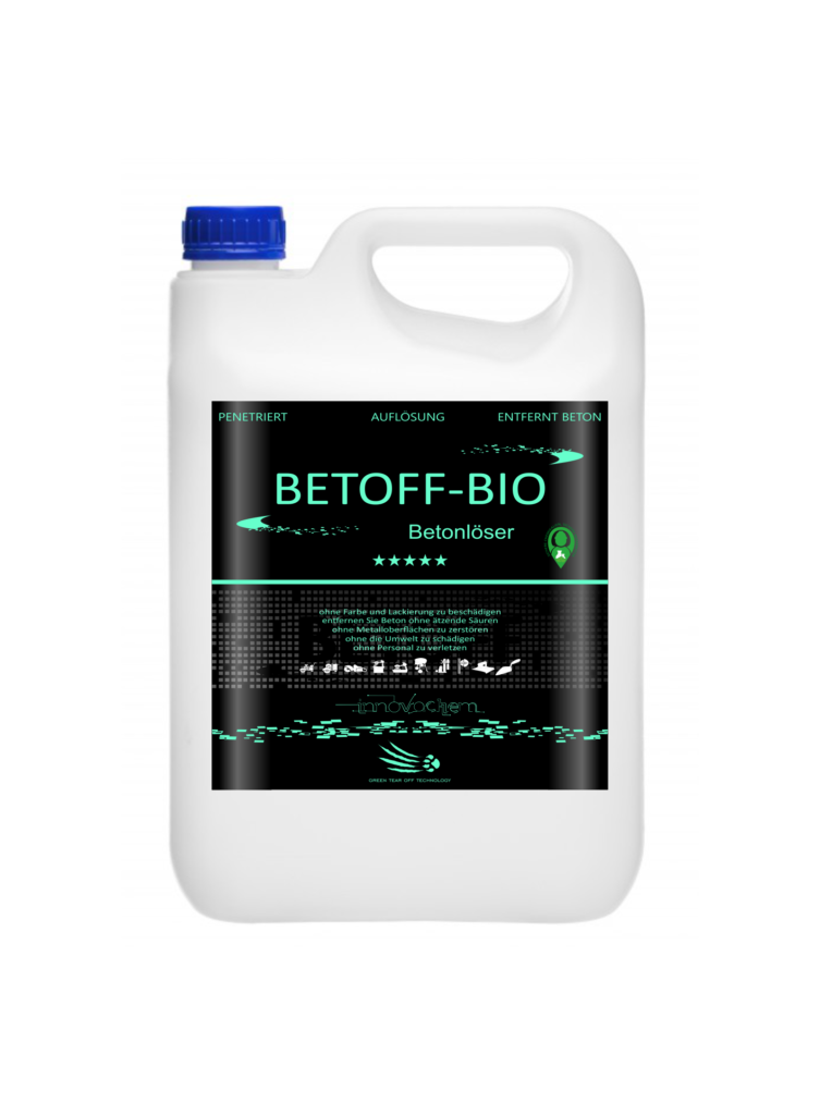
Nettoyage du béton avec Betoff-Bio
Nettoyage intensif des surfaces en béton
L’acide muriatique est efficace sur le béton sale (et peut également être très utile pour nettoyer les traces de mortier et de coulis séchés, ou pour essayer d’atténuer les taches de rouille tenaces).
Toutefois, il convient d’être particulièrement prudent avec cet acide. Il est préférable de ne l’utiliser que si vous en avez besoin. Si vous devez l’utiliser, veillez à porter des vêtements de protection et à toujours suivre les instructions du fabricant en matière de dilution. Lors de la dilution de l’acide, une réaction indésirable peut se produire et entraîner de graves brûlures.
Prévention des taches sur le béton
Il est bon d’appliquer des agents anti-tâches. L’imprégnation du béton est une option fiable pour éviter les taches. Choisissez un produit d’étanchéité transparent à base de silane ou de siloxane hydrophobe et appliquez le produit à l’aide d’un pulvérisateur ou d’un rouleau. L’imperméabilité du solvant n’affectera pas l’aspect ou l’adhérence de la surface en béton.
Si la surface a été tachée et que vous estimez que vous ne pouvez utiliser aucune autre méthode, essayez le nettoyant pour béton Betoff-Bio! Cet agent n’élimine pas seulement les salissures résistantes, mais il est également sans danger pour les surfaces délicates et extrêmement sensibles.
Need a multimedia system? equipment of meeting rooms We integrate multimedia systems for home and business. We install and configure audio and video systems, manage content, and integrate equipment into a single system. Modern solutions for comfortable and efficient use of technology.
Посмотреть на сайте: https://l-parfum.ru/products/Gucci-Envy-for-Man/
дизайн ремонт загородного дома дизайн проект домов под ключ
Читать расширенную версию: https://tapas.io/dezavtor
дизайн интерьера в санкт петербурге дизайн интерьера петербург
Top picks for you: https://mjglobalgt.com/180-ullu-application-actress-identify-all-ullu-actress-brands-having-photographs/
Read More: https://trutime.net/outside/sebastian-maniscalco-concert-tour-tickets-april-18/
The most useful for you: https://www.studiodentalmedica.com/aunty-pornography-video-clips/
Expand details: https://nailsbyvenzel.com/2026/03/16/no-deposit-extra-helpful-tips-for-on-line-casino-participants/
All the details at the link: https://picoreteamevent.click/intercourse-photo-and-you-can-movies-pornography-videos/
Straight to the best here: https://sertecbarcelona.com/slots-machines-acessivel-jogue-gratis-hoje-ainda-2025/
Посмотреть на сайте: https://shlifovka-parketa.ru
Полная статья здесь: https://tsiklevka-parketa.ru
pin up зеркало https://drrebenka.ru
где промокоды алиэкспресс промокод алиэкспресс на одежду
лучшие фильмы смотреть онлайн смотреть фильмы онлайн бесплатно
Volvo в Україні https://linktr.ee/spetstekhnika екскаватори, фронтальні навантажувачі та дорожні машини. Надійність, ефективність і сучасні рішення для будівництва. Продаж, підбір і обслуговування техніки для бізнесу.
онлайн казино пин ап https://v-sistemu.ru
Нужны заклепки? заклепки вытяжные алюминиевые 4 8 прочный крепеж для соединения деталей. Алюминиевые, стальные и нержавеющие варианты. Надежность, долговечность и удобство монтажа для различных задач и конструкций.
renting office space in nyc commercial office to rent
ответственное хранение продукции сколько стоит ответственное хранение
прием на ответственное хранение https://otvetstvennoe-hranenie-sklad.ru
дизайн интерьера квартиры мск дизайн проект жилой квартиры
Лучшее путешествие https://dzhip-tury-krym.ru горы, каньоны и побережье. Увлекательные маршруты, опытные гиды и яркие впечатления от путешествий по Крыму.
Do you trade cryptocurrencies? best ai trading tool bitkelttrade automate your transactions and earn passive income. Smart algorithms analyze the market and help you make decisions. Increase your income and reduce risks with modern technology.
Do you trade cryptocurrencies? learn about bitkelttrade automate your transactions and earn passive income. Smart algorithms analyze the market and help you make decisions. Increase your income and reduce risks with modern technology.
изготовление флага с логотипом в спб флаги уличные на заказ
Хочешь оригинальную подушку? подушка дакимакура на заказ со своим принтом комфорт и уют для сна. Длинная форма, мягкий наполнитель и стильные принты. Отлично подходит для отдыха и расслабления.
Нужен пластический хирург? клиника пластической хирургии услуги современные операции и эстетические процедуры. Опытные хирурги, безопасные методики и индивидуальный подход. Консультации, диагностика и качественный результат.
Нужна мебель? производство мебели из массива эксклюзивные изделия из натурального дерева. Индивидуальный дизайн, качественные материалы и точное изготовление. Решения для дома и бизнеса.
Нужна премиум мебель? элитная мебель на заказ изготовление на заказ. Натуральные материалы, эксклюзивный дизайн и долговечность. Решения для дома и бизнеса с высоким уровнем качества.
мебель из массива на заказ мебель премиум класса
Только что опубликовано: https://listai.pro
Разновидность трекеров, представленных в https://npprteam.shop/articles/tiktok/kakoi-treker-vybrat-dlya-arbitrazha-v-tiktok/, дает арбитражникам возможность выбрать инструмент, который соответствует их конкретным потребностям, масштабу операций и предпочтениям по функциональности. Каждая из пяти рассмотренных платформ имеет собственные сильные стороны: одни выигрывают в цене и простоте настройки, другие предлагают продвинутый функционал для крупных команд. Статья включает практические рекомендации по миграции данных между трекерами, настройке кастомных событий для TikTok и оптимизации постбэк-потоков. Кроме того, материал содержит информацию о тарификации, сроках внедрения и требованиях к технической подготовке команды, что позволяет спланировать бюджет и сроки проекта. Использование этого сравнительного обзора сокращает риск неправильного выбора и помогает новичкам, и опытным медиабайерам быстро найти наиболее подходящее решение для своего арбитражного бизнеса на платформе TikTok.
Mastering Twitter Ads conversion tracking best practices separates high-performing accounts from those struggling with attribution and optimization. Many advertisers underestimate the importance of proper conversion event setup, leading to data loss and misaligned bidding strategies. The platform requires pixel implementation, event mapping, and audience segmentation to reliably track post-click and post-view conversions across web and app environments. Without clean conversion data, you cannot accurately calculate CAC, ROAS, or determine which audience segments and creative variations genuinely drive revenue. This guide provides the technical and strategic framework for implementing conversion tracking that feeds reliable signals back into Twitter’s optimization engine. Advertisers who invest time in proper setup see measurably faster campaign scaling and lower cost-per-acquisition over time.
During my search for fast and responsive web tools, I noticed check clean loading page – The platform offers a very clean interface, with fast loading and smooth operation that makes browsing simple and efficient overall.
mitchwantssununu.com – Interesting concept site, content feels direct and somewhat thought provoking today
As part of my research into festive online experiences, I came across explore this festival – The information is presented in a fresh and engaging way, making it enjoyable for users to browse while still feeling informative and practical.
In modern e-commerce usability reviews focused on clarity and structure, a strong example is Frost Glade Vendor Vault where feels structured and simple, making it easy to explore content, allowing users to navigate smoothly through well organized sections without confusion.
Users who appreciate traditional styled ecommerce platforms often browse sites such as Wheatfield Cove Outpost Store where navigation is clear and uncluttered – The rustic theme creates a welcoming atmosphere, helping users easily find products while enjoying a calm and visually consistent shopping experience.
People who appreciate organized online goods marketplaces often browse platforms like Sun District Goods Cove Hub Store where items are arranged in a bright and clean layout – The interface ensures easy navigation and a pleasant shopping experience that feels structured and user friendly.
While exploring curated listings of Hawaiian retreats and boutique inns, I discovered a highly informative accommodation page worth viewing today < coffee belt inn listing – The presentation is clear and calming, giving useful insight into the property’s atmosphere and overall guest experience very appealing
While exploring personal political commentary sites I came across a platform that delivers opinions in a very minimal format using clear perspective notes – the writing is structured to be easy to read while still encouraging deeper thought about current events and ideological viewpoints
Users who prefer showcase style ecommerce environments often appreciate when products are highlighted clearly within structured and visually balanced page layouts gildedcove showcase emporium – The browsing experience emphasizes clarity and presentation quality, making it easier to focus on product details without distraction.
Across various digital marketplace studies emphasizing usability, a strong example is Gilded Brook Experience District where nice visual balance and navigation works without any confusion, allowing users to move comfortably through well structured and visually balanced pages.
Users who appreciate practical online marketplaces often browse sites such as Kettle Harbor Commerce Network Hub where products are presented in a structured layout – The interface creates a browsing experience that feels organized, easy, and easy to follow throughout the store.
During my search for interesting festival-related platforms, I noticed check this event site – The content feels lively and well structured, making it enjoyable to browse while also providing helpful and relevant information in a clear and accessible format.
People who prefer clean and organized online shops often explore sites like Sun Goods District Cove Hub Market where items are displayed in a bright and structured format – The browsing experience feels easy and enjoyable, allowing users to navigate categories quickly and efficiently.
Users who prefer modern minimal websites often appreciate vault-style ecommerce layouts that enhance usability through structured spacing and visual balance Glass Harbor Vault Portal – The design is sleek and organized, creating a smooth browsing experience where navigation feels intuitive and product discovery is effortless.
Users exploring visually rich ecommerce environments often appreciate how creative presentation improves product engagement when browsing platforms such as Wave Trail Artisan Market Hub where items are displayed in a structured yet artistic layout that highlights clarity and style – The marketplace design emphasizes visual organization and creative product presentation, making browsing feel smooth, engaging, and aesthetically balanced across all categories.
modelscanvas.com – Creative portfolio vibe, visuals and layout feel clean and professional design
While browsing experimental retail websites and modern grocery concepts, I discovered a minimal yet structured supermarket style platform worth mentioning simple hope market system – The design is clear and functional, helping users quickly understand the concept without confusion or overload of detail
Across various UX comparisons of digital marketplaces, a notable example is Glade Night Market House which delivers everything feels straightforward and browsing is comfortable and stable, ensuring a visually consistent and smooth browsing journey across all pages.
As I explored different support-oriented websites, I encountered learn more here – The content is presented in a clear and accessible way, helping users understand important information without feeling overwhelmed by technical or complicated language.
People who enjoy artistic online marketplaces often engage with platforms like Cove Teal Vendor Artisan Studio Market where items are displayed in a creative and organized format – The design emphasizes artistic expression and structure, making browsing feel smooth, inspiring, and visually balanced across all product categories.
People who enjoy minimal vendor-style organization often engage with platforms like Meadow Apricot Works Vendor Design Hub where items are structured clearly – The interface makes browsing feel creative, accessible, and easy to use across all sections.
While browsing creative portfolio platforms that showcase visual work and artistic presentation I came across a site featuring modern portfolio gallery – the overall layout feels polished and thoughtfully arranged with clean visuals that give a professional and refined impression throughout the browsing experience
Modern online buyers who value efficient interface design often highlight the importance of straightforward browsing systems when interacting with stores like Berry Cove Storefront which prioritize clarity in categories, allowing users to move between sections effortlessly while maintaining a calm and structured shopping environment – Its layout emphasizes user comfort, ensuring that navigation remains intuitive and product pages load in a clean, distraction-free format
While exploring high quality wine brand websites, I found a refined and informative platform that presents its winery story with elegance canadian icewine prestige page – The presentation is detailed and appealing, giving a sophisticated impression of the brand and its carefully crafted wines
While evaluating e-commerce platforms built for clarity and usability, a notable example is Sage Harbor Trade Vault where clean design and content is arranged in a logical order, allowing users to interact with content in a straightforward and efficient manner.
As I browsed through environmental advocacy websites, I encountered learn more here – The structure is clear and intentional, showing thoughtful effort in presenting information in a way that feels organized and easy to engage with for visitors.
Users who appreciate streamlined ecommerce environments often browse platforms such as Teal Harbor Commerce Flow Hub where products are grouped in a clean and structured format – The design makes browsing feel smooth, efficient, and easy to navigate, with clear categories guiding user exploration.
While searching for creative nostalgia driven sites I found a platform that blends retro visuals with modern usability using heritage inspired web hub – the design feels engaging and offers a visually satisfying browsing experience throughout
While exploring unique digital design experiments, I found a website that focuses on structured creativity and experimental presentation methods abstract creative layout project – The design feels innovative and well structured in an experimental way, offering a distinct and engaging browsing experience overall
Shoppers who value unique handmade goods often prefer structured yet artistic platforms such as Brook Artisan Goods Studio where each product is carefully highlighted to reflect its handcrafted nature – The overall experience emphasizes authenticity, ensuring users feel connected to the creative process behind every item displayed.
While comparing online retail platforms focused on speed and structure, a standout example is Summit Amber Global Marketplace which maintains smooth experience overall, pages feel fast and easy to use, providing a seamless and well-organized browsing journey across all pages.
While searching for artist-related content, I encountered access this page – The layout is simple and easy to follow, allowing users to browse comfortably and find what they need quickly.
People who appreciate simple digital commerce layouts often browse platforms like Harbor Commerce Trail Connect Hub where items are arranged in a structured and clean interface – The navigation feels efficient and intuitive, making browsing easy, comfortable, and consistent across all product categories.
Users browsing modern emporium platforms often respond positively to clean layouts that emphasize product visibility and reduce unnecessary visual clutter during navigation Harbor Glass Emporium Market – The design is polished and simple, creating a smooth browsing experience where items are clearly displayed and easy to explore across all sections.
nomeansnoshow.com – Strong identity here, site feels bold and creatively expressive throughout pages
While researching modern biography and portfolio websites, I found a clean and minimal profile page with excellent usability and structure jackonson professional identity site – The content is clearly arranged, and navigation is smooth, making the browsing experience simple and effective overall
In comparisons of modern online retail systems focused on clarity, a strong example is Lakefront Merchant Icicle Mart which maintains simple layout and information is easy to find at a glance, offering a calm and intuitive browsing experience across all sections.
While analyzing how soft design improves usability in marketplaces, I checked see velvet willow link – The interface feels gentle and polished, and navigation is smooth, making browsing relaxing and easy to follow.
Users who enjoy coastal inspired ecommerce environments often engage with sites such as Wave Harbor Ocean Breeze Outpost Hub where products are arranged in a soft structured layout – The design ensures browsing feels easy, calm, and visually refreshing across all categories of the platform.
Shoppers who prefer clean structured ecommerce environments search for websites that reduce complexity and enhance usability such as Warm Artisan Junction where balanced visuals structured navigation help users browse products comfortably flow – The browsing experience is consistent and gentle allowing users to move through sections naturally
In the middle of reviewing event and celebration resources, I discovered this event platform – The website feels well structured, with consistent content quality that keeps users engaged and interested as they browse through the pages.
Users browsing curated ecommerce platforms often respond positively to layouts that maintain a strong visual identity while keeping product organization intuitive and accessible Stone Glass Emporium Market – The interface is structured and visually consistent, ensuring a seamless browsing experience where categories are easy to follow and products are clearly presented.
While studying usability in commerce hub websites, I came across visit this meadow linen hub page – The experience is clean and smooth, and browsing feels easy, enjoyable, and well structured throughout the site.
While browsing visually bold online platforms I came across a site that captures attention with its strong creative direction featuring creative impact page – the overall experience feels immersive and reflects a distinct artistic personality across all sections
Across UX-focused reviews of online marketplaces, a standout example is Upland Orchard Experience Hub where well structured pages and browsing feels natural and efficient, creating a comfortable environment for browsing and product discovery.
While exploring creative cultural websites, I discovered a platform that combines different world influences into a unified and engaging layout jeddah brooklyn fusion site – The experience feels culturally diverse and interesting, offering a smooth and visually engaging presentation of mixed themes overall
People who enjoy artisan styled online stores often engage with sites like Cove Wind Artisan Product Market Hub where items are arranged neatly for browsing – The interface makes navigation feel smooth, organized, and visually appealing across the entire marketplace.
Shoppers who prefer curated online spaces often appreciate clean gallery inspired layouts that prioritize clarity and aesthetic flow Galleria Cove Gold Market – Designers focus on maintaining a cohesive visual rhythm where products are displayed with consistent spacing soft transitions and intuitive grouping allowing users to browse comfortably while discovering items without cognitive overload or unnecessary visual clutter across sections for a premium feel
While searching for reliable informational resources, I encountered access this page – The platform presents content clearly and in a dependable way, making the information feel valuable and easy to understand.
oakmeadowcommercehub – Commerce hub feels organized, categories are clear and easy browsing
nutschassociates.com – Professional services look solid, information is clear and easy to follow
While reviewing digital retail atelier marketplaces, I came across visit mint orchard artisan atelier – I will definitely be coming back here for the holiday season due to its clean design and easy navigation flow.
People browsing handmade product websites frequently look for platforms that balance creativity and usability and might encounter harbor craft violet marketplace offering curated artisan collections with intuitive navigation and clear layout design – A marketplace built to enhance shopping comfort and product accessibility.
While analyzing modern online retail platforms built for usability, a notable example is Frost Lakefront Trade Vault where clean interface and everything is easy to navigate without effort, helping users explore products without unnecessary complexity or visual distraction.
Users who enjoy minimal ecommerce outlet systems often browse platforms such as Harbor Stone Outlet Value Hub where product organization is straightforward – The design ensures users can quickly find items while maintaining a clean, efficient, and easy to use browsing environment throughout the store.
People who prefer peaceful aesthetic galleries often explore sites like Galleria Dawnstone Soft View where content is displayed gently – The design makes browsing feel smooth, calming, and visually easy on the eyes across categories.
While exploring modern cultural fusion websites, I discovered a platform that merges different aesthetics into a cohesive and engaging digital experience brooklyn jeddah global page – The design feels diverse and interesting, offering a creative blend of cultural themes presented in an appealing way
uplandcovevendorcorner – Vendor corner feels helpful easy browsing and clean layout overall
In the middle of researching health and lifestyle consulting services, I discovered read this nutrition coaching page – The overall presentation feels organized and calming, making it easy to browse while keeping everything visually pleasant and readable.
While exploring professional service websites I discovered a site that emphasizes clean layout and easy navigation using business interface portal – the design feels practical and efficient allowing users to access information quickly and without distraction
Users who appreciate interactive online trading spaces often explore platforms like Collective Pine Harbor Market where the structure supports shared seller participation and ongoing updates – The browsing experience feels energetic and community oriented, with a design that reflects a living and evolving marketplace environment.
Users who enjoy cool toned ecommerce layouts often engage with sites such as Icicle Isle Chill Market Space where items are displayed with frosty visual balance and structured flow – The interface creates a refreshing browsing experience that feels organized, calm, and visually appealing throughout the shopping journey.
I was not expecting much when I clicked on this volleyball themed entertainment page but it turned out to be surprisingly enjoyable unexpected volleyball fun archive – It feels like a curated archive of lighthearted sports moments and creative fandom expressions that make browsing fun and easy
As I explored different content-sharing websites, I encountered view this image site – I discovered it randomly, but it actually seems useful overall, offering straightforward content that is easy to browse and understand.
pair-dating.com – Dating concept looks simple, interface feels straightforward and user friendly experience
Shoppers who enjoy cozy themed ecommerce environments tend to appreciate smooth navigation systems when they come across Cove Ginger Market which focuses on relaxed design flow and readable layouts – The browsing experience is intentionally simplified to help users move through categories without confusion or unnecessary visual distraction
People who appreciate functional online stores often browse platforms like Stone Outpost Glade Commerce Hub where product presentation is kept minimal and efficient – The design prioritizes clarity and ease of use, helping users quickly find what they need while enjoying a smooth and distraction free browsing experience.
During my search for travel photography inspiration, I found open this shoot travel gallery – The site is fast and well structured, offering an intuitive browsing experience that feels smooth and easy to navigate.
While reviewing relationship focused digital services I noticed a site highlighting dating community portal – the interface feels straightforward and the overall experience is designed to be user friendly and easy to understand for a wide audience
While reviewing different housing websites I found one dedicated to Kaufman County that presents listings in a clear and organized format kaufman home explorer page – The site feels intuitive and well structured, helping users easily browse properties and understand key details at a glance
People who prefer organized digital retail spaces often describe positive experiences when visiting Secure Cove Ginger Vault Market which emphasizes structured layout design and simple navigation paths – The presentation feels intentional and stable, allowing users to browse with confidence and clarity throughout the store.
Users who prefer cozy rustic ecommerce experiences often explore sites such as Timber Outpost Woodland Trail Hub where products are arranged in a natural structured layout – The design makes browsing feel calm, organized, and easy to navigate while maintaining a rustic and visually pleasant atmosphere.
piercethearrow.com – Bold branding here, content feels energetic and visually striking creative site
During my search for unique jewelry collections, I noticed check this handmade jewelry page – The site is visually appealing, and the content feels well matched with the design, creating a pleasant user experience.
While browsing curated safe entertainment sites I discovered a platform focused on providing family friendly film recommendations with a strong emphasis on content suitability kids viewing safety guide – The experience is smooth and organized, offering easy access to appropriate entertainment options for all ages
People who enjoy curated marketplace experiences often browse platforms like Stone Golden Collective Trade Hub where products are presented with elegant structure and thoughtful selection – The design emphasizes premium feel and clarity, making browsing smooth, engaging, and visually cohesive across all categories.
While reviewing digital marketplaces with soft themed visuals I found a platform highlighting meadow commerce page – the design feels light and calming while the structure supports smooth and intuitive browsing throughout
While exploring platforms with bold design aesthetics I found a site highlighting innovative design showcase – the interface feels dynamic and the presentation style offers a visually engaging and energetic experience throughout
While reviewing structured online platforms, I found open rtc info hub – Everything appears neatly organized, allowing users to locate necessary details quickly and without unnecessary searching through poorly arranged content.
While exploring stylish dessert related websites I came across a platform that highlights sweet themed branding with clean visuals and an organized structure that makes it easy to navigate and enjoyable to view for anyone interested in design focused food content sweet aesthetic design page – The presentation feels cohesive and appealing, with a structured layout that enhances visual clarity and user experience
People who prefer artisan inspired ecommerce platforms often explore sites like Trail Harbor Artisan Homestead House where every section feels warm and carefully designed – The interface creates a cozy browsing environment that feels natural, structured, and visually comforting for users exploring products.
During a comparison of modern commerce hub websites and their usability, I came across discover linen commerce meadow hub – The site feels well organized, and browsing is smooth and enjoyable with a pleasant flow between sections.
Online craft enthusiasts who value organized marketplaces frequently search for platforms that combine style and function and during browsing they may encounter harbor violet artisan space offering thoughtfully grouped products and smooth navigation tools for better shopping efficiency – The platform ensures a seamless experience centered on handcrafted goods and user accessibility.
Users who appreciate minimal soft tone galleries often browse sites such as Stone Dawn Galleria Harmony where items are presented in a clean layout – The interface ensures browsing feels balanced, soothing, and visually comfortable throughout the entire experience.
preventcovid19trial-uk.com – Informational tone here, content feels research focused and medically structured layout
Across usability testing of online retail environments, a notable example is Violet Harbor Global House which ensures clean structure overall, makes browsing feel smooth and simple, supporting a clean and globally consistent navigation layout throughout the platform.
During a comparison of elegant soft aesthetic marketplaces, I found see willow velvet marketplace – The overall design is smooth and refined, and browsing feels calm, easy, and visually harmonious across the entire platform.
Shoppers exploring online vendor rooms often comment that simplified interfaces improve usability, particularly when they access Forest Meadow Commerce Portal View and they report that the organization of products feels logical and accessible – this is commonly seen as improving browsing speed and reducing cognitive load during selection processes
Online users who prefer straightforward browsing experiences often value ecommerce sites that present products clearly and logically, such as Flint Meadow Shopping Lane where navigation is designed to feel natural and intuitive, helping shoppers quickly locate items without getting lost in overly complex menus.
During my browsing of yoga inspiration resources, I came across check this yoga insight page – The concept is quite engaging and thought-provoking, offering something that could be explored further at a later stage.
During a final comparison of retail atelier websites, I found see mint orchard retail atelier hub page – This is definitely a place I’ll return to for the holiday season since the browsing experience is smooth, pleasant, and well organized.
While exploring football performance improvement sites I found a platform centered on therapy and recovery concepts that presents information in a structured and supportive way aimed at helping athletes manage physical health and injury recovery effectively athletic recovery insights page – The content feels practical and supportive, focusing on real sports therapy applications
People who prefer clean and practical outlet designs often engage with platforms like Pine Harbor Outlet Essentials Hub where items are organized for easy browsing – The structure focuses on clarity and functionality, allowing users to navigate quickly while maintaining a smooth and well categorized shopping experience.
Users who enjoy minimal ecommerce layouts often explore sites such as Kettle Harbor Product Commerce Hub where products are arranged in a structured layout – The interface makes browsing feel intuitive, clear, and easy to navigate throughout the store.
As I explored various commerce hub platforms online, I checked see vale harbor commerce portal – The platform looks nice, navigation is simple, and the content is clean and easy to follow throughout.
Exploring curated e-commerce environments revealed that curated vendor hall platform is integrated into a streamlined layout – the browsing experience feels balanced, with clear sections and visually appealing product arrangements that support user engagement.
Shoppers who prefer minimal ecommerce environments often appreciate vault layouts that prioritize simplicity and straightforward navigation across product collections Harbor Hazel Vault Portal – The interface is designed with clean structure and easy browsing flow allowing users to quickly locate items while enjoying a calm visually balanced experience that reduces complexity and enhances usability throughout all sections of the website platform today overall.
While browsing research oriented health sites I noticed a platform highlighting health trial information hub – the content feels detailed and the layout provides a clear and medically structured viewing experience
velvetcoveartisanoutlet – Artisan outlet design clean, products are nicely arranged and easy to explore
uplandcovevendorcorner – Vendor corner feels helpful easy browsing and clean layout overall
During my review of different band websites, I noticed check this music group page – The design looks really cool, and the overall presentation feels clean and appealing, making the browsing experience smooth and enjoyable.
People who enjoy modern and bright ecommerce platforms often interact with stores such as Harbor Sun Commerce Hub – The interface is designed for smooth transitions between product sections, offering an organized and efficient browsing experience that supports quick decision making and clear product discovery.
nightorchardretailmart.shop – Bought a gift last week, packaging felt really premium honestly.
While searching lifestyle content online I came across a Seattle urban platform that presents modern city living ideas in a visually engaging and energetic way reflecting current urban trends and creative lifestyle concepts city culture seattle hub – The presentation feels modern and dynamic, with vibrant urban content
Users who prefer streamlined ecommerce experiences often explore sites such as Upland Harbor Commerce Flow Hub System where products are arranged in a logical and efficient format – The design ensures browsing feels easy, fast, and well organized for quick product discovery across the platform.
While studying digital boutique hall interfaces and usability, I noticed open velvet brook hall space – The content is useful, and everything seems neatly structured, making it easy to follow while moving through different pages.
In exploring curated handmade platforms I came across a marketplace that feels both modern and authentically creative space where Walnut Cove artisan goods space offering a wide variety of artisan crafted products online platform – It supports small creators while delivering a visually appealing shopping experience for users global audience
Users who appreciate clean digital marketplaces often engage with sites like Cove Vale Goods Exchange District where products are arranged in a minimal format – The layout ensures navigation feels smooth, and comparison between items is quick and straightforward.
As I browsed online trading explanation platforms focusing on accessibility and structure, I encountered within analysis stage Trade Information Navigator Hub integrated into relevant search context – updated observation: content is simple and easy to follow, allowing users to process information without difficulty.
While searching digital shops I discovered a product site that presents items in a neat and organized way allowing users to browse comfortably without visual overload or complexity clean shopping catalog – The layout feels structured and easy
During a detailed review of clean and functional vendor hall platforms, I noticed visit this mint vendor space – The design is simple and modern, and users can move through pages easily with a smooth and intuitive flow.
In reviewing online vendor directories, I saw Harbor Birch curated listing portal embedded mid-content within the page – Vendor hall presents diverse listings and ensures smooth browsing, allowing users to explore products efficiently while maintaining a visually structured and easy to follow interface design.
As I examined multiple online sources, I noticed tap here – The design and organization work together effectively, making it simple to navigate and quickly absorb the most relevant details provided.
As I analyzed several commerce hub websites for usability and catalog quality, I found check velvet grove market hub – This website provides great options, and I enjoy checking listings regularly since everything is presented in an organized and easy-to-browse way.
Shoppers exploring modern online marketplaces often look for platforms that combine efficiency with structured navigation, especially when using digital systems designed like Seaside Commerce Pathway which focuses on delivering a cohesive shopping experience through well-organized categories, ensuring users can browse smoothly while maintaining clarity and consistency across all pages.
People who enjoy design centric online marketplaces often find value in platforms like Trail Harbor Creative Vendor Space where products are showcased with strong emphasis on visual composition and modern styling – The interface creates a studio like atmosphere that enhances product appeal while keeping navigation simple, intuitive, and focused on creative presentation.
Users who prefer elegant vault inspired ecommerce environments often explore sites such as Ivory Vault Ridge Showcase Hub where products are presented with refined structure and clarity – The interface creates a clean browsing experience that feels carefully curated, minimal, and easy to navigate across all sections of the store.
Users who prefer simple yet modern ecommerce collectives often browse sites such as Teal Harbor Collective Vision Hub where products are presented in a clean structured format – The interface makes browsing feel curated, balanced, and easy to navigate.
While searching online for community support sites I found a Lochwinnoch based platform that provides local information in a warm and structured way making it useful for anyone wanting to learn more about the area local services welcome hub – The content feels approachable and well organized
During my review of various journey and expedition gear retailers online, I focused on ease of use and design consistency, and in the middle of that exploration I found Journey Gear Outpost appearing among comparable options – updated impression: the interface is minimal and well organized, providing a smooth and efficient browsing experience overall.
uplandharborcraftmarketplace.shop – Navigation could improve but products are unique and cool.
While searching marketplace style websites I discovered a vendor hub that arranges items into clear product sections making navigation smooth and helping users quickly locate what they need well sorted marketplace page – The presentation feels neat and structured
While studying practical trade system websites, I came across visit this structured trade hub – The layout is clean and effective, and users can easily navigate and understand the information presented.
While browsing various online vendor directories and curated marketplaces, I noticed Harbor vendor room directory – it focuses on user friendly design principles and offers a smooth experience where visitors can easily locate items without unnecessary complexity or clutter.
As I analyzed several commerce hub platforms for usability and browsing speed, I found check violet harbor commerce portal – The design is impressive, and the layout makes product browsing feel quick, easy, and highly convenient throughout the site.
While browsing multiple websites for insights, I stumbled upon this helpful link – The design feels consistent and easy to follow, ensuring that even first-time visitors can quickly locate what they are looking for without unnecessary confusion.
Shoppers looking for smooth and accessible online retail experiences often explore diverse platforms, and during such journeys they may find plum cove shopping world offering a variety of goods in well structured categories – A user friendly marketplace designed to provide efficiency, affordability, and enjoyable browsing for all customers.
Users who prefer clean soft ecommerce experiences often engage with sites such as Lantern Meadow Commerce Flow Hub where products are displayed in a light minimal layout – The design creates a browsing journey that feels easy, friendly, and visually calm.
Users who appreciate relaxed ecommerce aesthetics often browse platforms such as Cove Honey Vault Cozy Corner where items are displayed with warm tones and gentle structure – The design creates a calm browsing journey that feels inviting, organized, and easy to navigate across all product sections.
Users who appreciate efficient market platforms often browse sites such as Wave Harbor Trading Overview where data is presented in a straightforward and accessible layout – The interface focuses on clarity and speed, allowing users to quickly absorb information while maintaining an organized browsing experience.
While browsing music history websites I came across a Manic Street Preachers platform that delivers nostalgic content in a structured layout designed to help fans explore the band’s story and musical contributions clearly and easily band music legacy hub – The site feels nostalgic and neatly arranged for browsing
During analysis of multiple outdoor gear information platforms, I focused on clarity of descriptions and how effectively users can locate relevant sections TrailCoveBazaar – revised commentary: the browsing structure is minimal and practical, supporting quick understanding and efficient navigation.
While reviewing commerce oriented sites I discovered a platform featuring product listing hub – the interface feels straightforward and the layout keeps everything accessible and easy to navigate for visitors
While reviewing unique online stores with a focus on artistic and vibrant presentation styles, I saw see this market hub – The layout is full of character, and moving across pages feels engaging, creating a dynamic and enjoyable browsing flow.
During research into structured craft marketplace websites, I explored explore upland harbor craft collection market – Navigation could improve, but products are unique and cool, giving the platform creative value.
Contemporary e-commerce studies frequently highlight how platform design influences user engagement retention and satisfaction particularly when evaluating examples such as Orbit Retail Studio Platform which is commonly referenced as a structured digital retail concept that combines modern aesthetics with functional navigation tools – this improves overall shopping efficiency.
As I evaluated different online materials, I came across discover more here – The organization of the content makes it easy to follow, offering a clear path through the information without overwhelming the reader.
During browsing of online retail ecosystems and curated vendor spaces, I discovered Vendor room display portal – it features organized product sections and a clean layout that helps users navigate efficiently while maintaining a pleasant visual browsing environment.
People who enjoy simple commerce hub designs often explore sites like River Frost Trade Direct House Hub where items are arranged in a structured format – The design ensures browsing feels easy, intuitive, and visually consistent across all product categories.
People who prefer stylish ecommerce platforms often explore sites like Stone Gilded Brand Collective Hub where items are displayed with strong attention to aesthetic consistency – The design creates a luxurious browsing experience that feels smooth, structured, and visually aligned with a high end branding approach.
While browsing platforms that emphasize variety and usability I came across a website featuring goods browsing center – the design feels practical and the product listings are arranged in a way that supports easy exploration and a smooth user experience
During a comparison of seasonal eCommerce platforms with organized layouts, I found see meadow shop here – The overall experience is warm and welcoming, and browsing feels fluid and enjoyable throughout.
While searching for idea driven websites I found a cultural concept platform that organizes information in a clear and structured format making it easy for users to understand modern cultural perspectives and thematic insights modern cultural concept hub – The site feels informative and easy to navigate
As I analyzed several vendor studio platforms for performance and usability, I found check walnut cove vendor space – The experience so far is great, and everything loads quickly and functions smoothly without any technical issues during browsing.
While assessing different e-commerce platforms focused on outdoor equipment and travel gear, I paid attention to layout clarity and how effectively users can navigate product listings CoastalCoveMarket – updated commentary: information architecture is simple, making browsing feel intuitive and reducing time spent searching for items significantly.
Outdoor enthusiasts and design-conscious buyers frequently browse specialized collections through platforms like Harbor Gear Outlet – This version emphasizes a rugged coastal identity paired with streamlined usability, offering a minimal yet highly functional approach that resonates with users who prioritize durability, practicality, and understated modern design in their daily gear selection.
Many people exploring craft marketplaces enjoy discovering unique handmade pieces that are not available in mass retail stores Handmade Market Portal – making these platforms valuable spaces for supporting artisans and preserving traditional crafting skills across generations in meaningful sustainable ways.
While browsing several websites related to home wellness, I stumbled upon this useful resource – The clarity of the content stands out, offering explanations that are easy to understand and practical for everyday situations without overwhelming the reader.
valeharborcraftemporium.shop – Site works well on phone, checkout was smooth today.
While reviewing online vendor marketplaces and creative product platforms, I came across Birch vendor marketplace room – the platform emphasizes organized presentation and user friendly navigation that allows visitors to engage with listings in a simple and intuitive way.
Users who appreciate artistic ecommerce environments often browse sites such as Ginger Stone Gallery Vision Hub where items are displayed in a clean and flowing format – The galleria layout improves engagement by making browsing feel smooth, visually engaging, and easy to navigate across all sections.
While exploring various commerce hub platforms and evaluating overall design quality and usability, I came across explore wave harbor commerce hub – I appreciate the effort here, and the site feels polished and very user friendly throughout my browsing experience.
While exploring niche online marketplaces focused on rustic aesthetics I found a platform that emphasizes simplicity and functional design with a calm browsing flow featuring mountain outpost shop – the site gives a grounded feel with minimal clutter and easy navigation that makes browsing comfortable and straightforward overall
While reviewing examples of efficient navigation systems in small online stores, I came across open alpine storefront – The site feels balanced and minimal, and transitioning between sections is smooth and intuitive.
While exploring premium getaway websites I discovered a luxury lodge presentation platform that focuses on high quality accommodation visuals and an inviting design making it appealing for travelers seeking peaceful and stylish retreats scenic luxury stay hub – The content feels warm and visually premium
As part of evaluating outdoor themed informational shops, I focused on how well each platform structures data presentation and navigation flow OutlandCoveSupply – revised insight: information is organized cleanly, making it easier for users to browse and understand quickly.
Shoppers navigating large digital catalogs often depend on well-structured vendor portals that categorize products efficiently for easier discovery while offering improved browsing structure and clarity Vendor Collection Portal – These platforms help reduce decision fatigue while ensuring users can explore multiple product categories with minimal effort
While browsing commerce focused websites with nature inspired design I discovered a platform centered around mountain goods portal – the alpine theme enhances clarity and the navigation remains clean and easy for users throughout the site
As part of my review of engaging online platforms, I came across explore this link – The site offers a pleasant browsing experience, with a layout that feels intuitive and keeps the content easy to digest.
As I explored various vendor atelier platforms online, I checked see wave harbor artisan atelier space – Browsing here is pleasant, with categories that are simple, clear, and easy to navigate for users.
People who enjoy structured vendor marketplaces often explore sites like Harbor Acorn Vendor Hub Hall where listings are arranged in a clean and logical format – The vendor hall concept improves usability by making browsing feel organized, consistent, and easy to manage across all product categories.
As part of studying artisan boutique usability and handmade product quality, I explored check velvet brook artisan craft hub – I’d recommend this to anyone who loves handmade goods since everything feels carefully assembled and creative.
During a comparison of efficient and minimal eCommerce platforms, I found check clean trading shop – The layout is straightforward, and moving through sections feels easy and well-guided.
While browsing through various resource collections and curated marketplace pages, I came across something that felt organized and easy to interact with, especially Vendor hall access point which supports a clear and efficient browsing flow – Noticed this recently, seems quite helpful and easy to explore, with an interface that feels calm, structured, and practical for repeated use.
Shoppers exploring creative marketplaces often seek platforms that highlight originality and craftsmanship while also ensuring fair exposure for independent makers Artisan Trade Network – this type of digital space makes it easier to find handcrafted pieces that reflect cultural heritage and modern design
During my review of online commerce platforms and vendor directories, I found a structured interface where explanatory content introduces Trade hub Canyon Harbor display panel placed within the mid-content area, improving clarity and engagement – It emphasizes organized product presentation and smooth category navigation for a more user friendly browsing experience.
People who enjoy minimal ecommerce design often appreciate goods stores that maintain simple layouts and easy navigation across product categories Harbor Goods Marble Outlet – The layout supports intuitive browsing through well structured sections ensuring users can locate products quickly while experiencing a calm and visually consistent interface designed for smooth shopping journeys throughout the platform today online experience.
While searching cruise travel websites I came across a platform that presents cruise itineraries and travel insights in a simple layout designed to help users explore vacation options easily cruise destination hub – The site feels travel focused and easy to use
Users attracted to curated online collections often value simplicity and flow when exploring Bloom Archive Depot which organizes products in a clean archival system that makes browsing efficient and visually consistent across all categories – The interface combines blooming floral inspiration with a depot-style structure that supports easy discovery
As I explored various vendor atelier platforms online, I checked see wave harbor artisan atelier space – Browsing here is pleasant, with categories that are simple, clear, and easy to navigate for users.
While checking out commerce hubs and marketplace listings on mobile, I noticed a platform with Jasper harbor commerce trade hall portal – The branding is appealing, but the slow loading time on my phone made it frustrating to browse.
In prototype marketplace evaluations and organic UI sandbox testing, analysts noticed embedded elements featuring orchard wild workshop vendor hub within content structure, where the design looks farm inspired but product transparency is missing due to lack of ingredient lists – Wild orchard sounds wholesome and natural, but users cannot access ingredient details which limits product understanding during browsing sessions
Users who prefer efficient shopping platforms often engage with sites such as Chestnut Vendor Harbor Hall Zone where product listings are arranged in a structured and accessible way – The design supports easy browsing by keeping categories clear and navigation straightforward across the entire marketplace experience.
During a comparison of simple and functional online retail platforms, I came across browse autumn cove store – The layout feels clean and easy to follow, and browsing through categories is consistent and user-friendly.
Many users exploring online artisan discounts look for marketplaces that organize clearance items in a way that remains easy to navigate and visually clear Mosaic Craft Savings while providing dependable product listings – this approach helps shoppers quickly find quality handmade goods without compromising on affordability or browsing convenience across multiple categories.
While scanning through different niche recommendation pages and online resource lists, I noticed something that felt clean and well designed, especially when seeing Vendor coast hub link included – the structure supports smooth browsing and makes it easy to return later for more detailed exploration.
While browsing different online retail mart platforms and evaluating purchase experiences, I came across explore night orchard retail mart – I bought a gift last week, and the packaging honestly felt really premium and carefully handled.
As I browsed through numerous mental wellness sites, I noticed read more here – The structure supports a smooth and comfortable reading experience, helping users understand everything without confusion.
Users who enjoy consistent ecommerce vault layouts often browse sites such as Harbor Elm Vault Network where products are presented in a structured format – The interface makes navigation feel secure, clean, and visually balanced across all categories.
While searching clean personal websites I discovered a simple platform that highlights straightforward content presentation making it suitable for users who appreciate minimal and relaxed design aesthetics personal showcase page – The content feels light and natural
While studying digital vendor atelier websites for accuracy and trust signals, I noticed open trail harbor vendor hub – The platform seems credible, and the information provided feels consistent, structured, and reasonably accurate throughout.
During casual browsing of online marketplaces I found Harbor Amber commerce lounge entry – The aesthetic is consistent, but the lounge section mostly shows empty pages, which reduces confidence in the platform’s completeness.
Online shoppers exploring structured ecommerce environments often appreciate how well organized layouts improve discovery efficiency when navigating large catalogs through digital storefronts and curated marketplaces with many categories and product types available across sections and filters Opal Crest Market District Hub – The interface presents clearly defined category groupings and intuitive navigation pathways that help users locate items quickly without confusion, while reducing unnecessary scrolling and making the entire browsing experience feel smooth, logical, and easy to understand from entry to checkout.
Modern online retail strategies emphasize structured systems that improve efficiency and user experience across platforms and services Community retail guild platform guild based approaches help ensure fairness and consistency in vendor operations – Many analysts view structured guild marketplaces as key to future digital commerce stability
During exploration of various digital storefronts, I found a platform featuring Cove room Juniper goods listing page – It looks creative and modern, but the confusing structure makes it hard to understand what they’re selling.
While studying product-focused website designs that emphasize organization, I noticed open this goods page – The interface feels refined, and items are arranged in a visually appealing and accessible way.
During a casual exploration of online directories and marketplace listings, I found something that felt intuitive and well structured, particularly references like Copper marketplace browsing link – the platform looks solid overall, with clear content that is easy to access and navigate without confusion.
In exploring digital vendor platforms I came across a structured content flow where the Cove sweets marketplace structure view is placed mid page, improving readability – The hall appears lively today with strong product variety and a user experience that is smooth, clear, and easy to navigate across different sections of the marketplace
As I reviewed examples of curated artisan marketplace websites, I checked see this oakcove craft marketplace – The selection feels thoughtful and varied, and browsing through items is enjoyable and worth spending time on.
Users who appreciate cozy marketplace organization often browse sites such as Ember Meadow Market Flow where items are displayed neatly – The interface makes browsing feel easy, warm, and well structured across the platform.
While reviewing ecommerce marketplaces with fabric themes I discovered a mid page listing featuring meadow cotton storefront hall and although the styling is soft and cohesive, the constant session timeouts make navigation frustrating and interrupt the continuity of product discovery throughout the platform.
oakmeadowvendorcollective.shop – Really clean product photos, descriptions are helpful too.
Online commerce platforms increasingly rely on structured frameworks that allow better coordination among vendors and improved buyer experiences such as Digital Commerce Hub – these frameworks help reduce operational friction and ensure a more consistent user journey across different product categories
As I browsed through different agency examples, I noticed read more here – The design is clean and structured, making it easy for users to engage with the material while maintaining a professional tone.
While studying curated product presentation in artisan marketplaces, I came across see artisan trail store – The layout feels organized and creative, and browsing is both smooth and visually engaging.
Users who enjoy minimal aesthetic ecommerce sites often prefer platforms that provide clarity and structured browsing experience like Chestnut Cove Artisan Premium Outlet Hub – the overall experience feels polished and consistent, ensuring users can easily navigate while enjoying artisan-focused presentation – every detail contributes to a refined shopping journey
While exploring different online commerce sites I discovered Moon Harbor shop lounge network – The moon theme is attractive and consistent, but more product photos would definitely improve usability and buyer confidence overall.
While scanning through online discovery threads and niche resource pages, I noticed something that stood out for its clarity and simplicity, especially where Harbor copper vendor portal appeared – I like how simple the layout is overall, because it makes everything easier to navigate without confusion.
While studying structured artisan marketplace websites, I noticed open upland cove market hub – The interface is clean and organized, and navigation is smooth, so finding things quickly was never a problem.
While reviewing ecommerce vendor systems and UI staging environments, analysts encountered mid layout content featuring ridge amber vendor parlor gateway access node embedded in structure, and despite the natural amber ridge styling, the vendor parlor section feels unfinished and placeholder-like which negatively impacts usability during testing and evaluation cycles
In studying digital marketplace frameworks I noticed a user centered design approach where Harbor caramel marketplace guide platform Harbor caramel marketplace guide integrated into layout improves usability – Vendor hall provides stable navigation and organized categories making product discovery straightforward while ensuring consistent usability across different browsing sections today smoothly.
During casual inspection of vendor platforms I found a mid page listing containing creek harbor online trade hub and even though the branding feels calm and refreshing, the broken search feature limits functionality and makes it difficult to efficiently explore available categories or listings.
As I explored multiple digital outdoor marketplaces, I focused on usability and layout clarity, and during that process I encountered CoveVale Practical Supply – updated observation: the design is minimal and structured, supporting easy browsing and quick access to essential product information in a way that feels efficient and user centered.
Digital craft marketplaces are evolving rapidly as users demand better usability, faster loading pages, and improved browsing structures Evening Handmade Market Grid supporting smooth navigation and organized product discovery for modern online shopping needs today globally – It enhances efficiency for both sellers and customers across the platform
coworking space https://coworking-space-dubai.com
While studying how simplicity enhances user experience in online stores, I came across visit forest marketplace – The design feels calm and balanced, and navigation is straightforward and efficient.
pebblecreekcraftexchange.shop – Will order again next month, hope they restock soon.
As I reviewed examples of organized eCommerce goods districts, I checked see this gilded lake shop district – The structure feels clean and logical, and browsing through content is simple and enjoyable without confusion.
While browsing online vendor discount pages I noticed a site featuring Nightfall tradehouse bargain listing – The deals were tempting enough to click through, but the checkout flow felt sketchy and I didn’t feel safe continuing.
As I explored various online directories and curated discovery threads, I came across something that felt well structured and intuitive, particularly with Meadow coral access hub – The site feels pretty decent, and navigation works without confusion, so browsing is smooth and easy to manage.
Users who prefer fast and organized shopping platforms often find value in websites such as Merchant Lane Quick Access Hub where navigation is designed to eliminate friction and improve speed – The structure supports intuitive browsing, allowing users to explore products efficiently without unnecessary complexity or delay.
While reviewing ecommerce vendor systems and UI staging environments, analysts encountered mid layout content featuring harbor marble trade vendor gallery gateway node embedded in structure, and despite the refined marble aesthetic, all images are low resolution which creates a less professional impression during usability testing and evaluation cycles
During exploration of ecommerce hubs I found a central listing showing creek harbor trade house access portal and even though the interface is clean and readable, its near identical appearance to tradehall makes it difficult to remember which site is which during navigation.
Marketplace platforms that focus on structured organization typically provide better user engagement by making navigation and discovery more efficient for customers Night Bazaar Vendor Hub – The layout offers clearly defined sections that improve browsing clarity and help users locate products quickly without unnecessary searching or confusion
In exploring digital trade platforms designed for clarity and accessibility I came across a structured page layout that feels very user centered Trade House Harbor listings center which supports smooth transitions between sections and provides a consistent browsing experience with organized product groupings and minimal visual clutter throughout the interface.
While analyzing modern minimalist e-commerce sites built around soft visual identity and calm navigation flow I found within the interface Velvet Nest Trading Hub embedded in the mid section – revised note the layout feels soothing organized and highly accessible for easy browsing
As I analyzed several retail district websites focused on usability and speed, I found check oak cove shopping district – The browsing experience feels fast and reliable, with pages loading smoothly and no noticeable lag or confusion during use.
As part of reviewing visually appealing boutique sites, I noticed check boutique collection – The layout is modern and consistent, and browsing feels natural and easy to follow.
During a casual exploration of ecommerce hubs I found a site containing Oak Cove market hall portal link – The design is minimal and easy on the eyes, but not having a search function makes browsing feel unnecessarily slow and limited overall.
While scanning through different niche directories and suggestion pages, I noticed something that felt easy to use and structured, especially when seeing Coral trade meadow entry included – Pretty decent site overall, with navigation that works well and doesn’t create confusion, making browsing straightforward and clear.
During usability testing of ecommerce marketplace systems and UI sandbox environments, testers found a navigation module containing plum harbor room vendor access portal link embedded mid layout, and although the plum harbor branding feels bright and inviting, the vendor room has zero vendors listed which disrupts user expectations during interaction testing and evaluation processes
As I explored several craft exchange platforms for product availability and usability, I found check pebble creek artisan exchange – I will order again next month and hope they restock soon because the selection looked really good.
As digital artisan markets continue to grow, many users discover platforms that emphasize creativity and one such destination is creative artisan listing portal where handcrafted goods are organized in an appealing way and browsing feels intuitive while exploring different artistic styles and maker collections. – A modern craft marketplace designed to inspire discovery and appreciation of handmade artistry.
During exploration of ecommerce directories I came across a central content feature showing royal cove commerce vendor room and even though the branding feels premium and well structured, the blurry product images reduce usability and make the platform less reliable for detailed product inspection.
While researching structured artisan outlet websites and their browsing efficiency, I explored browse this vale cove outlet space – The site is helpful for discovery, and I was able to find several interesting options quickly thanks to its simple and clean design.
As I reviewed examples of artisan marts with soft visual identities, I checked see this rose artisan store – The design is calm and structured, and products are displayed attractively, making browsing simple and visually satisfying.
The overall design philosophy behind the platform focuses on simplicity and ease of access, ensuring that users can quickly understand available features without difficulty CH Vendor Navigation Center Interface this approach helps improve engagement and reduces the learning curve for new vendors entering the system for the first time.
During a general browse through commerce listings and trade platforms, I discovered Juniper harbor commerce market hall link – It appears promising, and I’ll probably check back later after some weeks to see how it evolves.
As I continued exploring curated marketplace listings and online resource hubs, I found something that seemed fast and well structured, particularly with Harbor flora entry portal – The website loads fine, and my visit felt smooth and pleasant, allowing simple navigation through all sections.
Shoppers exploring online commerce platforms often seek systems that combine multiple trading functions with intuitive navigation and clear category structures especially when dealing with diverse product selections foundry exchange market which operates as an exchange market connecting buyers and sellers across various product categories in a unified platform. – A unified marketplace designed for efficient trading and structured user experience.
During frontend inspection of ecommerce sandbox platforms and vendor directory UI systems, developers identified a central module featuring meadow quartz vendor hall staging entry portal integrated into structured layout, and despite the elegant quartz branding, the market hall is completely empty today which reduces usability and perceived value during testing sessions and evaluation stages
During a comparison of modern artisan emporium platforms and their shipping quality, I came across discover solar orchard handmade emporium – Great for gift shopping, everything arrived in one piece and was well protected.
During evaluation of ecommerce directories I came across a content block showing harbor crown commerce hall vendor portal and even though the design is structured and visually appealing, the lack of meaningful vendor data makes the page feel empty and not ready for real user interaction.
As I reviewed examples of online commerce hubs focused on usability, I checked see this upland canyon page – The platform appears fine, and the content is clear, useful, and easy to understand while navigating through sections.
ferncovevault – Vault style neat, content feels organized and carefully structured overall
While comparing various ecommerce listings I found this intriguing site Kettlecrest shop marketplace portal and the prices are so low that it almost feels unrealistic, so I’m approaching it with caution.
Frequent users note that the browsing experience is consistent across devices, and while exploring inventory through Cove Goods Navigation Panel they find the structure helpful – the layout emphasizes simplicity and keeps product listings visually balanced for improved usability and comfort during extended sessions
Across sandbox UI evaluations and ecommerce vendor prototype systems, analysts encountered structured sections featuring orchard quartz hall vendor showcase hub node within page layout, and while the quartz orchard aesthetic feels rare and visually striking, the vendor hall link redirects to the homepage which reduces usability and causes confusion during browsing analysis and testing cycles
While examining avant-garde ecommerce designs and interactive website frameworks, users frequently encounter references embedded in Crystal Cove virtual goods room – the environment feels immersive in design terms, yet the absence of listed products creates a sense of digital emptiness and conceptual ambiguity
As I reviewed examples of online retail district platforms focused on usability, I checked see this upland cove retail page – The design is simple and clean, and browsing feels comfortable, smooth, and easy to navigate across all categories.
During research into artisan-focused online stores with creative layouts, I explored check curated trail shop – The design feels cohesive and artistic, and browsing across pages is smooth and visually consistent.
During an exploration of structured craft marketplace platforms, I discovered visit upland harbor handmade hub market – Navigation could be improved, but the products are unique and cool and stand out from typical listings.
Shoppers who prefer refined digital storefronts frequently look for platforms that combine creativity with structure, and during browsing they may encounter atelier commerce gallery presenting diverse items and – it highlights a stylish yet practical shopping experience optimized for easy product discovery.
While checking different digital shop directories I discovered Harbor Kettle commerce listing page – The branding is nice and simple, but broken footer links reduce usability and make the site feel partially incomplete or still under refinement.
As I explored various curated directories and discovery threads, I noticed something that stood out for its simplicity and clarity, particularly with Cove honey trade access – The first impression is nice overall, and everything looks relevant and easy to read, which makes browsing feel easy and natural.
During usability analysis of ecommerce sandbox environments and UI prototype systems, testers identified mid page modules containing quick harbor market house vendor showcase access node within layout structure, and despite the fast branding implication, the platform is slow which reduces engagement and usability during testing and evaluation processes
Users involved in digital commerce often choose platforms that offer both variety and simplicity to improve their overall trading workflow experience CommerceGrid Explorer Hub – It provides a clean interface that allows users to move between sections with ease and confidence
As I analyzed several artisan exchange platforms for usability and content structure, I found check violet harbor artisan hub exchange – There is good variety available, and I enjoy browsing different sections without getting lost due to the simple layout.
While exploring curated examples of modern web shop architecture and experimental commerce interfaces, reviewers often mention sections such as Crystal Harbor Vendor Portal View that appears sleek but remains functionally minimal, giving a sense of unfinished catalog deployment – The design resembles widely distributed ecommerce starter kits.
Users who frequently shop online tend to appreciate platforms that provide structured categories and curated selections that simplify the process of finding suitable and relevant products quickly suncove goods atelier center – This marketplace delivers a smooth and engaging browsing journey where curated items are presented in a clean and accessible format for all users.
As part of studying clean and functional vendor studio designs, I explored check harbor creative page – The design feels refined and organized, and browsing across categories is smooth and user-friendly.
Across prototype marketplace systems and UI sandbox environments, analysts encountered embedded navigation blocks containing ridge quick market house vendor staging console hub within page layout, and although the branding suggests enhanced optimization over older systems, the actual responsiveness remains inconsistent which affects usability during testing sessions
During a casual browsing session across online discovery platforms and resource pages, I found something that felt organized and easy to follow, particularly references like Meadow honey marketplace entry – I really enjoyed looking around here, since the layout is neat and user friendly, making navigation simple and efficient.
As I explored curated commerce hubs and vendor marketplaces, I came across a platform with strong naming appeal but minimal content, particularly Harbor commerce Aurora vendor hall portal – The Aurora name is visually engaging, but the actual site content feels light.
As I compared different craft emporium websites for usability and mobile experience, I came across explore vale harbor artisan marketplace – The site works well on phone, and checkout was smooth today with a very easy payment flow.
While exploring a variety of artisan-style online bazaar platforms and reviewing their performance and usability, I came across explore mint orchard artisan bazaar – The overall experience feels positive, and the structure appears reliable with smooth navigation and consistent performance throughout the site.
Sourcing professionals and buyers increasingly depend on structured digital hubs that bring together vendor listings and trade information coral harbor sourcing hub – The sourcing hub provides a consolidated view of vendors, supporting efficient research and improved procurement decision making
In various ecommerce prototype evaluations and UI kit demonstrations, it becomes clear that platforms like daisy cove vendor plaza are built more for presentation than functionality, often leaving backend services incomplete or unstable under basic user interaction flows and input submissions – The interface feels soft and decorative but signup attempts consistently return error 500 responses
Users exploring online shopping environments often appreciate systems designed to minimize effort while maximizing browsing efficiency and clarity teal cove product studio providing quick loading pages and well structured categories that support easy discovery of items across multiple product groups and sections.
As I explored examples of simple and effective vendor websites, I checked see vendor lemon page – The interface is neat and functional, and browsing feels smooth and naturally guided throughout.
Across sandbox UI evaluations and ecommerce vendor prototype systems, analysts encountered structured sections featuring harbor rain hall vendor market showcase hub node within page layout, and while the rain concept creates a calming visual mood, the hall contains broken image placeholders throughout which reduces engagement during browsing analysis and usability testing cycles
mintmeadowgoodsroom – Feels well organized, I didn’t face any issues navigating around.
As I navigated through various marketplace listings and trade directories, I noticed a simple layout site with Harbor Bay commerce hall trade entry – The experience is smooth and straightforward, and I appreciate the lack of newsletter interruptions.
In testing navigation flows across demo vendor interfaces users repeatedly report unexpected behavior when visiting the daisy harbor room system where harbor vendor entry point immediately sends them away from intended pages and breaks expected browsing continuity across the session making exploration confusing – the page keeps forcing a homepage redirect instead of showing vendor room content properly which feels like a persistent routing bug
Users who engage with digital product spaces appreciate navigation systems that guide them naturally through categories while maintaining a consistent and easy to understand layout across all sections goods room navigation panel – This navigation panel enhances usability by offering structured pathways, helping users move between different areas without confusion or unnecessary steps during browsing
velvetbrookartisanboutique.shop – I’d recommend this to anyone who loves handmade goods.
While studying easy-to-use commerce hub designs, I came across visit this commerce hub lemon – The layout is organized and clean, and navigation feels intuitive and smooth across the platform.
While reviewing staging ecommerce vendor systems and UI marketplace templates, analysts noticed a content block featuring harbor vendor rain hall access console node integrated into layout flow, and despite the consistent rain harbor identity suggesting brand repetition, the vendor hall appears like a replicated design which reduces originality perception during usability testing sessions and design evaluations
People who appreciate artisan curated shops often browse sites like Harbor Lemon Handmade Goods Outlet where products are arranged in a structured layout – The interface creates a browsing experience that feels inviting, bright, and easy to understand.
As I continued exploring various online resource hubs and marketplace listings, I came across something that felt organized and user-friendly, particularly with Harbor pine vendor access page – The experience is good, and everything seems clear and straightforward here, helping browsing feel natural and uncomplicated.
While going through commerce directories and vendor trade hall listings, I came across something that felt engaging in concept but limited in execution, especially Acorn harbor trade hall commerce hub – The branding is playful and unique, but the available products are still quite few.
During UI regression testing of ecommerce demos, engineers saw that meadow vendor entry node sits within navigation layers and although the meadow theme is visually pleasant SSL certificate warning messages continue appearing during secure session validation checks in staging builds
People searching through online vendor directories usually prefer organized platforms that separate product categories clearly so they can review listings, compare offerings, and understand available services in a simplified browsing environment fern cove lounge directory – Vendor lounge feels calm with well structured product categories available, giving users a relaxed browsing experience while exploring vendor details in a clean and intuitive layout
Across sandbox UI evaluations and ecommerce vendor prototype systems, analysts encountered structured sections featuring meadow solar room vendor market showcase hub node within page layout, and while the solar meadow branding suggests renewable energy awareness, the lack of eco certification indicators reduces perceived legitimacy during browsing analysis and usability testing cycles
People who enjoy well structured artisan stores often explore sites like Dock Oak Craft Artisan Outlet where items are shown in a clean layout – The interface creates a browsing experience that feels organized, easy, and visually comfortable.
During an analysis of craft boutique interface design and usability, I noticed open velvet grove artisan design boutique – There is a minor typo in the description, but overall I’m satisfied with the experience and navigation.
While reviewing different online options earlier today, I stumbled upon access this site which appeared to be a nice little site, and I found it useful while browsing earlier today because everything felt well organized and simple to use.
As I continued exploring marketplace-style listings and online resource hubs, I came across something that felt structured and fast, particularly with Isle icicle trade link – The platform is nice, and I appreciate how quickly pages load, making browsing feel effortless and well optimized.
In usability testing of sandbox retail platforms, reviewers encountered dawn ridge goods portal embedded within structured content, and although visually aligned with the theme, after the dash – ridge scenery would be great for branding but footer links are entirely dead and non-interactive across all tested pages
As I explored different online commerce directories and vendor hall listings, I came across something that felt inspired by alpine scenery and small-town charm, particularly Cove market alpine hall hub – It really reminds me of a cozy mountain shop, with a warm and relaxed aesthetic overall.
While comparing different resources earlier today, I came across open this page which I checked earlier today, and everything looked neat and quite easy in terms of layout and usability.
People browsing curated trade platforms often prefer clean layouts that separate categories effectively, enabling quick scanning of vendor offerings and associated details harbor lounge directory view – The browsing experience is optimized for ease of use, with structured sections that guide users naturally through available listings and information
Across sandbox UI evaluations and ecommerce vendor prototype systems, analysts encountered structured sections featuring orchard solar house vendor market showcase hub node within page layout, and while the solar orchard identity suggests a promising eco marketplace environment, the checkout process does not show security seals which reduces trust during browsing analysis and usability testing cycles
Users who prefer creative ecommerce environments often explore sites such as Fern Artisan Ridge Handmade Market Hub where products are arranged in a structured and curated format – The interface ensures browsing feels smooth, visually appealing, and easy to follow across all artisan categories.
wheatmeadowmarketroom.shop – Clean layout and simple navigation, makes exploring content really enjoyable.
While scanning through niche listing pages and curated marketplace directories, I noticed something that stood out for its usability and structure, especially where Ivory harbor trade hub appeared – Looks professional overall, and I might recommend this to others as well since the interface feels easy to understand and navigate.
While reviewing sandbox ecommerce templates and experimental storefront designs testers frequently encounter mid page link structures orchard hall listing panel which blends into the interface yet leads to underdeveloped pages with very limited product visibility and weak navigation hierarchy – The drift inspired look is pleasant but the hall feels almost empty
As I browsed through different vendor marketplaces and commerce directories, I noticed repeated structural naming patterns that felt too similar to ignore, particularly Harbor vendor hall alpine commerce portal – It created a strong déjà vu sensation while scrolling.
As I analyzed several vendor collective platforms for product display quality, I found check oak meadow commerce collective – The product photos are really clean, and the descriptions are helpful, giving a clear understanding of each item.
While analyzing online trade catalog structures and experimental vendor marketplace layouts for usability insights and UI reference across different samples Dune Meadow browsing portal the experience remained smooth and pages loaded without delay – Organized interface with consistent responsiveness and simple navigation flow throughout session
While casually exploring digital marketplace designs and curated vendor listing platforms for inspiration and flow analysis Pearl Cove market collection view I found the structure quite user friendly and simple to navigate even when switching between multiple sections. – The browsing experience felt efficient with quick loading pages and no visual overload
While reviewing prototype vendor systems with bright and minimal aesthetic direction, analysts identified a consistent sunlit theme but incomplete content structure around a href= »//sunharborvendorroom.shop/](https://sunharborvendorroom.shop/) » />sun harbor vendor room interface block which sits within navigation flow, and although Sun harbor appears modern and visually polished, the vendor room provides no descriptive or explanatory content for users exploring marketplace functionality
People who prefer efficient financial platforms often engage with sites like Harbor River Trade Flow Portal where market information is displayed in a minimal structured layout – The interface ensures navigation feels easy, logical, and focused on clarity for smooth trading decisions.
Digital buyers often mention that structured marketplaces allow better comparison of items, particularly when navigating through Floraridge Shopping Access – The interface is considered helpful for simplifying selection and improving overall shopping efficiency while reducing time spent on irrelevant items
While exploring various online options, I found browse this site which gave a good impression because everything is organized here, allowing users to understand the content easily without feeling lost or overwhelmed.
While exploring fast loading websites and clean UI examples, I came across visit hiper free platform – The interface feels really clean overall, everything loads quickly and the system works smoothly, making the browsing experience simple and efficient.
While scanning through niche listing platforms and online resource hubs, I noticed something that stood out for its clarity and structure, especially where Ivory ridge vendor access page appeared – Browsing here feels smooth, with nothing complicated or hard to understand, helping everything feel simple and straightforward.
Across sandbox ecommerce environments and experimental web shops, analysts noticed a clickable segment featuring drift willow vendor hall link integrated into page content – although layout alignment is clean the lack of willow imagery and decorative assets creates a sense of incomplete visual storytelling
Users exploring vendor listings often appreciate platforms that maintain clarity and reduce unnecessary navigation steps Canyon Harbor item finder the browsing experience remains smooth and structured, allowing users to focus on relevant products easily
While reviewing curated marketplace designs and digital vendor showcase pages for inspiration and interface structure evaluation across different samples Dune Meadow shop portal access the system responded quickly and maintained clarity throughout navigation – Smooth loading experience with organized sections and stable interface performance overall
While exploring different marketplace lounge hubs and vendor listing sites, I found a design that relied heavily on amber-style visuals, especially Amber vendor ridge lounge portal – The overall look is warm and stylish, but the text contrast unfortunately hurts the eyes a bit.
After reviewing several online options, I encountered visit here which had a simple layout, making browsing feel really smooth and allowing everything to remain clear and easy to follow.
solarorchardartisanemporium.shop – Great for gift shopping, everything arrived in one piece.
People who prefer artisan home styled shopping platforms often explore sites like Brook Flint Artisan Cottage Market Hub where items are arranged in a warm and minimal structure – The interface makes browsing feel soothing, structured, and easy to follow across all sections.
People who enjoy well designed online goods districts often engage with platforms like Cove Sun District Goods Market where items are displayed in a structured and friendly layout – The browsing experience feels smooth and pleasant, with clear organization that helps users move through categories easily and comfortably.
While evaluating prototype vendor systems with ocean inspired UI themes, reviewers observed a calming teal color structure that supports visual consistency, but identified limitations in content hierarchy around a href= »https://tealcovemarkethall.shop/
» />teal cove market hall showcase portal where the teal aesthetic feels refined and modern, yet the market hall requires additional category grouping to improve clarity during usability testing and interaction assessment cycles
While reviewing different websites for speed and reliability, I found open this page and experienced a pretty smooth experience overall, as pages loaded quickly without any issues during browsing.
calmcovevendorparlor.shop – Really nice platform, easy browsing and smooth user experience today
Many users exploring online vendor ecosystems note that structured catalog layouts can enhance user satisfaction and engagement, particularly when interacting with Vendor Hall Forest Cove which is frequently associated with smoother navigation and clearer categorization – feedback often emphasizes improved usability and a more organized shopping experience overall.
While reviewing prototype storefront systems, analysts identified a central link block dune goods market console entry embedded in layout hierarchy but readability suffers due to sandy color overlay making text difficult to read – Dune inspired styling is consistent yet accessibility issues remain especially in dense interface areas
While browsing different online vendor platforms, I noticed how smooth navigation and well arranged layouts can greatly improve the overall user experience for visitors Silk Meadow vendor room hub everything felt organized and easy to explore without any confusion
While browsing curated island getaway options featuring boutique accommodations, I came across a refined and visually appealing property listing recently < tropical hillside inn tour – The content feels inviting and easy to follow, presenting the location in a calm and aesthetically pleasing way overall
As I continued exploring various online resource collections and curated listing hubs, I came across something that felt structured and readable, particularly with Brook trade jewel page – The platform seems useful, and I found the content quite straightforward today, helping everything feel clear and well organized.
Digital shoppers often prefer platforms that offer well-structured navigation and efficient browsing tools for convenience Canyon Harbor shop directory this platform provides a seamless and organized experience that makes exploring product listings straightforward and enjoyable
While exploring experimental commerce directory systems and online trade gallery platforms for structural analysis and usability insights across various references, I came across Plum Cove goodsroom catalog hub embedded in content – Everything feels clean and easy to read, and I could browse sections comfortably while the layout remained consistent and well structured throughout.
During my exploration of commerce platforms and vendor marketplaces, I came across a site that appears newly launched and lightly populated, particularly Cove goods room Aurora commerce page – The setup looks fine, but the minimal product count per category is unusual.
Users who enjoy creative storefront experiences often engage with sites such as Teal Vendor Artisan Cove Atelier Hub where products are displayed in an artistic and clean format – The layout creates a structured browsing experience that feels engaging, balanced, and visually appealing.
Users exploring structured online emporium-style marketplaces often appreciate how clarity improves shopping flow when visiting sites such as Timber Grove Emporium Hub where products are arranged in a rich organized layout that enhances category discovery and browsing ease – The emporium layout feels rich and detailed, with categories presented in a way that makes navigation simple, intuitive, and enjoyable across the entire store.
When a site is a really nice platform, easy browsing and smooth user experience today become natural Calm Cove listing portal I appreciated the clarity across pages
While searching for straightforward online tools, I came across <a href="//woodharborvendorroom.shop/](https://woodharborvendorroom.shop/) » / explore this resource which felt like a helpful platform, and I might visit again sometime soon due to its simple and clear presentation.
While reviewing UI sandbox ecommerce systems with consistent teal coastal styling, testers observed a well structured harbor themed interface, but the vendor hall lacks meaningful data when inspecting a href= »https://tealharborvendorhall.shop/
» />teal harbor vendor hub showcase node where the design appears clean and cohesive, yet the vendor hall continues to display Lorem ipsum placeholder text which limits usability during evaluation and interaction testing processes
sageharborgoodsgallery.shop – Looks clean and minimal, easy to find information without confusion.
In various ecommerce staging environments and design sandbox systems, developers observed inconsistent thematic direction when interacting with meadow dunes vendor showcase link integrated into content structure, where the hybrid naming disrupts visual storytelling – Meadow name contradicts dunes, producing a confusing brand message that feels unstructured and reduces clarity across navigation flow and interface interpretation in usability studies
velvetgrovecraftboutique.shop – Little typo in description but overall I’m satisfied.
As I explored various online directories and marketplace hubs, I noticed something that stood out for its usability and layout, particularly with Cove jewel vendor hub – The interface is pretty clean, and everything is arranged in a logical way, helping users move through content without confusion.
Online platforms that prioritize clean interfaces and quick performance usually offer a more enjoyable browsing experience Solar Meadow browsing hub this one allows users to search smoothly while pages load fast and without unnecessary delays
While reviewing niche online store concepts and experimental supermarket designs, I found a clean and minimal platform worth noting today virtual supermarket hope page – The structure is effective and simple, making the browsing experience easy and the idea clearly understandable overall
While reviewing online commerce gallery systems and UI design patterns, I found a structured interface featuring Honey Meadow vendor showcase hub integrated into a minimal layout that prioritizes readability and soft spacing – The browsing flow feels smooth, welcoming, and naturally intuitive for users exploring different categories
Shoppers frequently note that well arranged vendor rooms help improve browsing flow, particularly when they interact with Forest Meadow Digital Vendor Hub and they mention that the interface feels intuitive and easy to follow – this is often associated with quicker product searches and a more pleasant overall browsing experience
While comparing vendor platforms, this one clearly stands out for its simple layout and clean interface design overall Silver Cove listings page I appreciated how easy it was to navigate and explore different sections without difficulty
While reviewing several experimental vendor platforms for UX analysis and layout inspiration across sample marketplaces I explored Teal Harbor vendor portal overview – The interface feels clean and intuitive, allowing smooth movement between categories without confusion or unnecessary clutter across pages and sections, making navigation feel straightforward and well structured overall for browsing tasks
While exploring structured online marketplaces, I spent time on Sun Cove merchant portal and found the design to be straightforward with a strong focus on usability – It feels calm, organized, and well optimized for easy browsing
During a general review of marketplace hubs and vendor platforms, I found a site with a warm seasonal design focus, particularly Meadow autumn commerce market hall page – I love the autumn theme, and adding genuine reviews would make it feel much more complete.
When browsing vendor sites, organization matters, and this one ensures users can explore everything quickly River Harbor goods portal I liked how responsive and smooth everything felt
Users who appreciate modern ecommerce organization often browse platforms such as Teal Harbor Commerce Simple Hub where products are grouped in a straightforward structure – The interface creates a clean browsing experience that feels efficient, intuitive, and easy to follow across all categories.
In the process of reviewing multiple online resources, I encountered open this site which offered interesting content overall, and I ended up spending some time checking different sections today while navigating through its layout.
People who enjoy curated online vault systems often engage with sites like Cove Golden Elegant Vault Hub where items are presented in a clean refined format – The design ensures browsing feels consistent, visually balanced, and easy to follow across all sections.
Across prototype marketplace UI systems, testers highlighted a strong timber trail visual identity that supports natural branding, but functionality issues appear in navigation components such as a href= »//timbertrailmarkethall.shop/](https://timbertrailmarkethall.shop/) » />timber trail marketplace hall showcase node where the design feels cohesive and earthy, yet the navigation menu is fully broken which affects user confidence during usability evaluation sessions and interaction testing workflows
Across prototype storefront testing and UI review sessions, analysts found embedded cart elements containing echo brook vendor hall console in checkout structure, but quantity updates fail to apply after user changes – Echo brook is catchy and modern, but cart page does not correctly reflect updated product amounts in testing environments
Users who frequently browse vendor-style websites tend to appreciate platforms that reduce complexity and improve navigation flow Icicle Brook catalog entry this site offers a smooth experience where exploring listings feels easy and well-organized throughout sessions
While going through multiple niche discovery threads and listing directories, I found something that seemed efficient and easy to understand, especially where Mint orchard entry page appeared – I like the overall feel here, since it’s simple and easy going, making browsing feel calm and uncomplicated.
During some casual exploration of lesser-known vendor directories and experimental commerce pages, I noticed Moon Cove shopping gateway – The site maintained a clean and approachable design, and I spent extra time exploring because each section felt purposefully arranged for easy navigation overall user flow.
While analyzing digital vendor marketplace systems and experimental trade hub layouts for structural evaluation and UX research across multiple references, I came across Pebble Pine marketplace structure hub embedded mid-content – I enjoyed browsing listings without confusion since everything felt intuitive, clean, and well organized with smooth navigation throughout the experience.
While exploring high quality wine brand websites, I found a refined and informative platform that presents its winery story with elegance canadian icewine prestige page – The presentation is detailed and appealing, giving a sophisticated impression of the brand and its carefully crafted wines
While researching curated vendor-style websites and online shop designs, I discovered an interface that included Honey Meadow artisan market space positioned within a structured layout that emphasizes clarity and user comfort – The browsing experience feels relaxed, coherent, and pleasantly simple to engage with across all sections
violetharborretaillane.shop – They responded to my email within an hour, nice.
Digital marketplaces benefit from smooth experience and clean layout, making browsing very convenient overall today Plum Harbor item portal I found everything neatly arranged
Some websites feel slow, but this one keeps performance strong with fast loading and neat organization Silver Harbor quick browse page I appreciated how simple and efficient the browsing experience felt throughout
bayharbortradehouse – Almost identical to another bay domain, bit confusing tbh.
People who enjoy simple ecommerce navigation systems often engage with sites like Harbor Trail Commerce Efficiency Hub where items are grouped clearly for fast access – The interface ensures browsing feels smooth, clean, and user friendly across all sections of the platform.
In the middle of browsing inspiration sites, I foundexplore this visual design which felt impressive since the design feels modern and neat, making it stand out nicely with a polished layout and easy-to-read structure throughout.
Users exploring structured ecommerce vault style platforms often appreciate how stability and clarity improve browsing when visiting sites such as Granite Orchard Secure Vault Hub where content is arranged in a strong organized layout that enhances usability and visual order – The design feels solid and well structured, giving users a secure and organized browsing experience across all pages and product categories.
While evaluating the site’s footer usability, I came across check out this hub – even though it appears to be part of a social linking system, it does not provide any valid redirection to users.
During ecommerce prototype testing and support system evaluations, analysts found a contact feature including echo harbor vendor service desk link embedded mid-layout, yet customer service emails consistently fail delivery and return bounce messages – Echo harbor feels familiar, but email communication infrastructure is not functioning properly across all tested scenarios
During my research into vendor exhibition websites, I came across vendor exhibition space which provides a clean layout emphasizing product clarity and smooth category transitions – The experience feels polished, stable, and pleasantly easy to navigate
Exploring digital marketplaces shows how organized layouts and helpful sections improve usability and user satisfaction significantly Violet Harbor vendor center the browsing experience feels smooth and well structured, allowing users to access content without confusion or delays
As I explored various marketplace directories and online resource hubs, I noticed something that stood out for its structure and usability, particularly with Cove moon marketplace hub – The experience is solid, and I didn’t encounter anything confusing at all, helping everything feel clear and intuitive.
While exploring multiple online shop directories for comparison purposes, I encountered V “structured link panel” embedded oddly in the layout, and Cicicleislemarketparlor.shop showed up within the central content area, where the design feels modern enough and navigation was quite simple to follow overall.
While exploring online marketplace frameworks and digital gallery concepts I noticed Birch Harbor commerce showcase portal integrated into a reference section – performance stayed consistent, pages were responsive, and the overall structure supported easy navigation without complications.
A modern interface improves experience, and this platform ensures browsing feels very easy today and comfortable Linen Cove shop gateway I found navigation very natural and smooth
While browsing unique design inspired web projects, I came across a site that clearly prioritizes experimental structure and creative presentation intermusses abstract layout hub – The design feels innovative and intentionally structured in an experimental way that highlights creative digital expression effectively
Users who prefer ocean aesthetic ecommerce systems often explore sites such as Wave Harbor Coastal Serenity Market Outpost where products are displayed in a light and relaxing format – The design ensures browsing feels smooth, visually pleasant, and easy to explore across all categories of the store.
During a casual review of vendor marketplace sites and commerce hubs, I found a platform that looks functional but inactive, particularly Cove Autumn commerce room vendor portal – The empty blog section strongly suggests no recent updates or activity.
After checking several platforms that didn’t feel intuitive, I noticed <click here now and appreciated how clearly everything was laid out, allowing for an enjoyable and efficient browsing experience.
When a site has a modern feel and simple navigation, browsing becomes more enjoyable, and this one delivers that well Sky Harbor listing portal I appreciated how intuitive everything felt while exploring different categories
Users who appreciate organized digital shops often browse sites such as Lantern Orchard Market Lane Hub where products are presented in a clean structured format – The interface makes browsing feel smooth, engaging, and easy to navigate across categories.
mintorchardretailatelier.shop – Definitely coming back here for the holiday season.
Across prototype ecommerce testing and UI evaluation sessions, testers encountered embedded navigation elements featuring elm goods harbor display node within content flow, but images fail to load properly resulting in empty product placeholders – Elm trees are strong and reliable, yet the goods room suffers from broken image links affecting usability
While analyzing design duplication, I noticed open this portal – the similarities with another platform are so pronounced that it feels like a reused template rather than a fresh design.
While browsing through different niche listing pages and resource hubs, I came across something that felt clean and accessible, especially when seeing Moss harbor vendor link included – Seems like a decent site overall, and I’ll probably check it again soon because the structure makes browsing easy and comfortable.
During exploration of curated marketplace systems and digital trade directories for UI inspiration and structural comparison across sample platforms, I found Plum Cove marketplace goodsroom access within the article – Everything is presented in a readable and simple format, allowing easy browsing through sections without confusion or unnecessary visual clutter.
People who appreciate handmade digital marketplaces often browse platforms like Cove Artisan Wind Craft Market Hub where items are displayed in a structured and minimal layout – The design creates a pleasant browsing experience that feels clean, organized, and easy to navigate while exploring handcrafted goods.
coralharbortradegallery.shop – Great browsing experience overall everything feels organized and easy today
While browsing individual portfolio and biography websites, I encountered a well designed page that highlights professionalism and user friendly structure professional web profile page – The site feels smooth to navigate, with clear information presented in a clean and structured format overall experience
While checking different vendor platforms and marketplace listings, I found a berry-styled site with Cove house berry market portal – The aesthetic is clean and fresh, but the missing contact page makes it feel slightly unfinished.
While exploring different online platforms to compare usability and design quality, I came across something in the middle like visit this resource which appears very structured properly, making it easier for users to find things much faster without unnecessary confusion or wasted time.
Good usability depends on structure, and this platform ensures a clean layout making product exploration easy and visually pleasant overall Autumn Cove vendor explorer I found everything easy to understand
People who appreciate structured online goods platforms often browse sites like Meadow Juniper Goods Network Hub where items are presented in a clean layout – The design ensures browsing feels accessible, organized, and easy to navigate across all sections.
Users exploring vendor-style platforms often prefer sites where everything is structured clearly to ensure smooth and comfortable browsing experiences Sky Harbor shop access point this one delivers exactly that with simple navigation and well arranged sections
While reviewing the overall structure of this platform, I paused at visit this lounge page – the name suggests an elevated or premium environment, yet the lounge section itself appears completely empty with a plain white background, offering no engaging content or useful features.
When browsing vendor platforms, visuals and layout matter, and this site makes browsing feel smooth and pleasant throughout Berry Cove goods portal I liked how clean and attractive everything appeared during use
Users exploring vendor directories often prefer platforms that combine simplicity with fast loading performance for better usability Sea Cove shop access point the browsing experience feels smooth and enjoyable, making it easy to locate information without unnecessary waiting time or clutter
After exploring several websites with varying design quality, I discovered check this resource and noticed everything looks well structured, helping users move around without issues and making navigation feel simple and easy throughout the browsing experience.
While exploring curated marketplace systems and experimental vendor platforms for usability comparison and structural evaluation across different examples, I discovered Sun Cove commerce navigation portal placed within structured text – The interface looked clean and modern, and browsing felt smooth and visually pleasant with fast loading performance throughout.
Users who appreciate functional ecommerce outlets often explore platforms such as Harbor Stone Organized Outlet Hub where products are grouped logically for fast browsing – The interface ensures a clean shopping experience that feels simple, structured, and easy to navigate across all product categories.
In the process of comparing multiple online resources, I found review this option which delivered a neat and refined interface, showing that attention was given to both appearance and usability.
Users who prefer organic styled ecommerce platforms often explore sites such as Forest Artisan Cove Green Outlet Hub where products are arranged in a minimal natural structure – The design ensures browsing feels soothing, clear, and visually balanced across all product categories.
While reviewing vendor showcase websites and curated catalog systems, I came across a page containing Upland Cove shopfront portal embedded within a structured layout that prioritizes clarity – The browsing flow feels smooth, intuitive, and pleasantly simple throughout the entire experience
While exploring artistic and culturally mixed digital platforms, I found a site that merges different themes into a visually engaging structure jeddah brooklyn culture portal – The website feels unique and diverse, with an engaging presentation that blends cultural ideas in a creative and thoughtful manner
While scanning through different trade platforms and vendor listings, I noticed a basic-looking site featuring Berry harbor commerce vendor room link – It served as my last stop today, and I’d say it’s decent but not particularly memorable.
During a comparison of similar platforms, I found visit this destination – although the name suggests elegance, the actual experience feels hollow and abandoned, with very little content present.
rainharborvendorparlor.shop – Good organization easy navigation helps users find things efficiently today
Some websites feel slow or messy, but this one keeps a clean design that makes browsing sections quick and easy Snow Cove quick browse page I appreciated how smooth the navigation felt throughout my visit
Exploring vendor galleries highlights the importance of clean layouts and structured content for ease of navigation Elmwood goods hub link this platform ensures that users can move through sections effortlessly while maintaining a clear sense of organization
sageharborgoodsgallery.shop – Looks clean and minimal, easy to find information without confusion.
While analyzing experimental vendor platforms and trade lounge systems for UX comparison and structural inspiration across multiple references I encountered Upland Cove digital lounge portal placed mid-content and observed that the layout feels clean and contemporary allowing users to move through sections easily without unnecessary complexity or visual clutter – The design feels modern and nicely structured, making browsing comfortable and straightforward
When browsing vendor sites, a simple interface works well, navigation is quick and intuitive today improving usability significantly Oak Cove goods portal pages felt clean and easy
Users exploring cool themed ecommerce platforms often appreciate how refreshing layouts improve browsing comfort when visiting sites such as Icicle Isle Frost Market Hub where products are arranged with icy clean visuals and structured navigation – The cool themed design creates a refreshing browsing experience that feels light, simple, and easy to navigate, making product discovery smooth and visually calming throughout the store.
After trying out several options that felt difficult to navigate, I discovered this might interest you and found it to be well-organized, making browsing straightforward and information easy to access.
Users who prefer clean ecommerce systems often explore sites such as Acorn Outpost Harbor Market Hub where products are grouped in a structured and minimal format – The interface ensures browsing feels easy, organized, and user friendly with clear navigation across all sections.
While exploring multicultural inspired web platforms, I discovered a site that brings together different cultural aesthetics in a smooth presentation style urban cultural blend hub – The design feels engaging and diverse, combining themes in a way that makes the browsing experience visually rich and interesting
While exploring online marketplace directories, I encountered a section containing berry harbor product parlor page placed within a balanced interface that enhances readability – The browsing experience feels smooth and natural, offering users a clear path through content
Clear organization improves experience, and this platform successfully delivers well structured pages with clean design Acorn Harbor vendor navigator I found everything easy to browse without effort
During a search for efficient vendor directories, I noticed platforms that emphasize clarity and speed for better user experience >vendor parlor Aurora Harbor the browsing process feels fluid and responsive, making it easier to explore different listings without encountering navigation issues or delays online
The platform provides a pleasant browsing experience thanks to its smooth layout and responsive page design Snow Harbor market hub I found navigation simple and enjoyable throughout
Well structured websites often improve user satisfaction by making navigation predictable and reducing cognitive load overall experience improved Valecove Goods Room navigation portal – Interface design emphasizes clarity and accessibility, ensuring users can navigate categories without confusion or unnecessary effort based on usability evaluation findings feedback review data analysis
While reviewing various marketplace index systems and experimental vendor directories, I found Moon Harbor marketplace index page – The site maintained a consistent layout across pages, making it easy to browse information step by step without feeling overwhelmed or rushed.
People who prefer minimal and functional marketplaces often engage with sites such as Stone Glade Outpost Flow Hub where design is focused on clarity and ease of use – The interface creates a smooth shopping experience that feels structured, efficient, and free from unnecessary distractions.
People who prefer minimal trading environments often engage with sites like Harbor Jasper Trade Network Hub where items are displayed in a clean structured layout – The design ensures browsing feels clear, organized, and easy to navigate throughout the store.
Users prefer platforms that load fast and stay simple, and this one offers a reliable interface overall Glass Harbor goods directory I liked how easy it was to explore
In the middle of comparing various platforms, I found view this page which delivered a balanced experience, combining a smooth interface with a layout that made browsing feel easy and comfortable enough.
cloverharborvendorparlor.shop – Simple layout works well making browsing easy and intuitive today
While comparing platforms, this one clearly stands out with a nice design overall where pages load fast and feel very smooth Ivory Harbor listings page I appreciated the clarity and structure
Users who frequently browse online vendor sites often look for platforms that are both organized and responsive Raven Grove catalog entry this site delivers a tidy layout where pages respond quickly, making browsing efficient and enjoyable overall
Shoppers often comment that responsive website design significantly improves usability, especially when mobile and desktop views remain consistent and adaptive, allowing smoother interactions when browsing through Online vendor navigation link structure – Everything felt responsive and well optimized, and I could easily move from one category to another without any lag or visual inconsistency affecting the browsing experience.
sageharborgoodsgallery.shop – Looks clean and minimal, easy to find information without confusion.
Users who enjoy rustic outdoor ecommerce systems often engage with sites such as Timber Outpost Trail Nature Hub where products are displayed in a simple wood themed layout – The design ensures browsing feels structured, comfortable, and visually easy to follow from start to finish.
Good usability depends on structure, and this platform ensures users find everything without confusion or delay overall Solar Orchard vendor explorer I found browsing very straightforward and easy to follow
dawnridgegoodsgallery.shop – Clean layout and structure easy to browse different sections quickly
Users exploring simple ecommerce platforms often appreciate how clarity improves usability when visiting sites such as Glade Ridge General Market Hub where products are arranged in a clean structured format that supports fast browsing and easy discovery – The market layout is straightforward and practical, making it easy for users to quickly find products and browse without confusion across all categories.
During my time exploring various online platforms, I came across check this resource and noticed that the content felt both useful and recently updated, creating a smooth and enjoyable browsing experience overall.
While reviewing vendor showcase platforms and online catalog designs, I discovered Pine Harbor listing showcase placed within a structured interface that supports clear navigation – The experience feels fast, smooth, and very intuitive, making browsing feel natural and effortless across all pages
After exploring multiple curated vendor websites that highlight artisan craftsmanship and unique boutique products, I found Sea Meadow Boutique Archive – The website provided a calm and organized browsing environment with easy filters and well written product descriptions that helped me understand each item better while also enjoying a seamless navigation experience overall.
Online platforms that focus on intuitive design and structured content typically provide a better user experience overall Raven Summit browsing hub this one allows users to navigate comfortably while maintaining clarity and organization throughout sessions
Users who prefer refined ecommerce experiences often explore platforms such as Golden Collective Stone Premium Hub where items are displayed with strong emphasis on curation and visual harmony – The design creates a luxurious browsing experience that feels structured, smooth, and easy to navigate across all categories.
Many online visitors appreciate platforms that prioritize clean layouts and structured menus because they reduce effort while searching for items across multiple sections and categories during extended browsing sessions Velvet Grove browsing portal the design felt visually balanced and comfortable, making it easy to move between pages without losing focus or encountering clutter anywhere in the interface
As users explore the website they may find Marble Cove Trading Gallery naturally embedded within content where it links different sections together and improves navigation flow across the platform – the structure feels intuitive and reduces time spent searching
After exploring different boutique-style websites, I found a platform that seemed focused on curated collections and a smooth browsing experience canyon curated store – Product listings were clear and detailed, and navigation felt intuitive, making the entire experience pleasant and efficient overall.
linencovevendorparlor.shop – Modern design smooth interface makes browsing feel very easy today
Many online marketplaces become easier to use when they are well organized like this platform with clear navigation flow Garnet Harbor product hub I found searching through categories very convenient and everything was easy to locate
People who prefer refined digital commerce hubs often explore sites like Harbor Garnet Vault Core Hub where items are arranged in a structured minimal layout – The interface creates a smooth browsing experience that feels consistent, polished, and easy to navigate.
This type of marketplace works best when good structure throughout the site makes browsing feel easy and well organized like here Jasper Harbor browsing hub navigation felt natural
driftwillowmarketparlor.shop – Pretty straightforward design, makes navigation simple for new visitors too.
I wanted unique wall art for my bedroom and found ArtfulSpacesGallery – the products are well-categorized, making it easy to explore different styles and select pieces that truly enhance the room’s ambiance.
uplandcovevendorparlor.shop – Modern interface feels smooth with well organized sections throughout site
Online shoppers tend to favor websites that combine intuitive navigation with clear structure for better usability Raven Summit market hub this ensures a consistent and efficient browsing experience throughout different sections
People who prefer artisan inspired ecommerce platforms often explore sites like Trail Harbor Artisan Homestead House where every section feels warm and carefully designed – The interface creates a cozy browsing environment that feels natural, structured, and visually comforting for users exploring products.
Digital shoppers often prefer websites that maintain clarity in layout design since it helps them focus on content rather than struggling with confusing navigation or crowded visuals during browsing sessions VG marketplace access point everything felt straightforward and easy to navigate, providing a relaxed browsing experience with smooth transitions and clear section separation throughout the entire visit
When usability is strong, this good platform ensures intuitive navigation so everything feels well organized and simple Raven Summit listing portal I appreciated the clarity of layout
While exploring different online options, I found browse this site and had a good browsing session overall, where the layout feels quite user friendly and navigation was simple and intuitive throughout.
During casual research of online stores for handcrafted goods I evaluated interface quality product organization and responsiveness and discovered Meadow Silk Market Hub – Really like the site design it makes browsing enjoyable every time because everything is well structured making browsing feel smooth intuitive and very convenient overall experience
Online shoppers tend to favor websites that keep design simple and browsing experience relaxed and stress-free Autumn Meadow market hub this ensures a consistent experience where navigation feels calm and easy across all sections
copperharborvendorparlor.shop – Nice structure easy access content is clear and useful today
Users who enjoy practical and structured outlet marketplaces often explore sites such as Harbor Pine Outlet Flow Hub where items are organized into clear sections – The design ensures efficiency and clarity, making browsing simple, well categorized, and easy to navigate for all users.
Users who frequently browse online vendor sites tend to prefer platforms that are easy to navigate and well organized River Harbor catalog entry this site offers a smooth browsing flow where locating products or information feels effortless and quick
After reviewing several boutique vendor platforms focused on artisan crafted items and exclusive online collections, Parlor vendor exclusive items – I was impressed by the attention to detail in product listings, the smooth browsing flow, and the helpful guidance provided throughout the shopping journey.
Users often report that clear categorization in online stores improves usability since it allows faster recognition of product types and reduces time spent searching through unrelated content sections Velvet Grove selection hub the browsing experience remained consistent and easy to follow, with well organized sections supporting comfortable movement through the platform without any disruption
While researching online trade presentation systems, I found Calm Harbor commerce portal view embedded within a minimalist interface designed for clarity – The experience feels calm and structured, allowing users to focus on content without distraction while moving naturally between sections.
Users enjoy platforms that offer a pleasant experience using site, everything appears clean and very responsive during browsing sessions River Cove goods directory I found it very easy
The browsing experience through different sections of the site feels surprisingly smooth when you pass through Lavender Harbor Shopfront it naturally sits among the navigation content and helps connect different pages while giving users a clearer sense of structure across the marketplace layout – overall the arrangement feels tidy and makes locating items significantly faster than expected for most visitors exploring the platform
During a search for online gift and decor marketplaces I came across Meadow Lantern Support Line and customer service was helpful I got all my questions answered efficiently which made the entire shopping process feel simple, clear, and very reassuring overall experience
As I reviewed several online shopping sites, I noticed this straightforward store – the layout is clean and well organized, creating a smooth browsing experience.
датчик ip камеры ip камера уличная
проверка пожарной сигнализации установка датчиков пожарной сигнализации
CaramelCoveVendorAtelier – Smooth browsing experience, everything feels clean and very well organized.
plumharborvendorparlor.shop – Smooth experience clean layout makes browsing very convenient overall today
People who appreciate efficient ecommerce hubs often browse sites like Harbor Commerce Upland Smart Grid Hub where items are displayed in a structured format – The interface ensures browsing feels fast, smooth, and easy to manage with clear category separation.
Exploring digital marketplaces highlights how effective organization and simple design improve the overall user experience Rose Cove market access this platform allows users to navigate effortlessly and find content without unnecessary searching or complexity
I was exploring eco-friendly home products when I came across GreenLivingBoutique – the variety is excellent, and browsing the sustainable items was simple, making it easy to select practical and attractive choices.
floraridgevendorparlor.shop – Nice structured pages provide clear information and smooth navigation flow
Many e-commerce users prefer systems that reduce complexity and provide straightforward pathways for browsing products and categories efficiently Pure value shopping center user feedback indicates smooth transitions and well structured content presentation – The experience supported idea generation and felt engaging throughout the session
During a general browsing session, I came across this clean commerce dashboard – the interface is simple and modern, making browsing smooth and very easy to navigate without effort.
Visitors exploring the homepage often appreciate the calm layout and structured sections that guide attention naturally toward featured areas Meadow Harbor Vendor Parlor Entry – the interface feels intuitive, allowing users to move between sections effortlessly while maintaining a pleasant browsing experience throughout the session overall.
While checking different online vendor shops for variety and ease of use I found EmberStone Vendor Corner – the website made checkout very easy and product listings were clear while shipping was quick and browsing felt intuitive and smooth overall for users too
While checking several online marketplaces, I discovered this tidy vendor page – everything is neatly arranged, allowing users to find and view products quickly and comfortably.
Users often prefer platforms with great usability and simple design where everything works perfectly fine indeed here Crystal Harbor catalog entry navigation felt intuitive and clear across all sections
While reviewing various retail websites, I noticed this accessible store layout – the structure allows users to quickly find and compare items without hassle.
While comparing different vendor showcase environments, I found a system designed around Frost Ridge Merchant Studio that delivers a well-balanced interface with simple navigation and clean visual presentation – it supports quick browsing and makes product exploration feel natural and uninterrupted across all sections.
Users who prefer minimalist curated ecommerce vaults often explore sites such as Ivory Ridge Vault Selective Hub where items are displayed in a structured and refined format – The design ensures a clean browsing experience that feels organized, modern, and visually consistent throughout the store.
Clear design improves usability, and this platform ensures a modern layout so navigation is simple and content helpful Bright Harbor vendor navigator I found everything easy to follow
Users who frequently browse online vendor sites often look for platforms that combine speed with clear navigation systems Rose Harbor catalog entry this site offers fast performance and well-organized sections that make browsing simple and efficient for everyday use
People browsing vendor platforms typically appreciate fast access tools that simplify product discovery and reduce search fatigue quick product finder portal such tools are especially useful for users who frequently compare multiple items and want efficient navigation without unnecessary distractions during shopping sessions online today
floraridgevendorparlor.shop – Nice structured pages provide clear information and smooth navigation flow
People reading structured reviews and summaries of online trade platforms sometimes encounter pages like Harbor Trade Review – which provide organized insights into listings and help users understand product details and overall marketplace structure with improved clarity and context.
During a general browsing session, I came across this clean commerce dashboard – the interface is simple and modern, making browsing smooth and very easy to navigate without effort.
sageharborgoodsgallery.shop – Looks clean and minimal, easy to find information without confusion.
Users browsing vendor platforms often prefer a clean interface with easy navigation that creates a pleasant browsing experience and feels very smooth today Silver Harbor shop access point this one delivers a calm and organized layout
During research into ecommerce platforms for gift items and home accessories I came across a store that felt very polished and easy to navigate Meadow Glass Vendor Parlor – The overall shopping experience was smooth, with fast loading pages and accurate product listings that made browsing enjoyable and stress free.
While checking several online marketplaces, I discovered this smooth shopping platform – everything loads quickly, products are well organized, and the experience feels polished and professional.
People using online marketplaces often value platforms that remove complexity and make it easier to locate desired products quickly, especially when time is important, and this is represented in FlowCommerce Studio – the experience is designed to keep everything streamlined so users can browse efficiently while enjoying stable performance throughout their session.
Users who prefer warm aesthetic ecommerce environments often explore sites such as Honey Vault Cove Comfort Hub where products are arranged in a cozy and balanced format – The interface creates a pleasant browsing experience that feels organized, gentle, and easy to navigate for users who value visual comfort.
During comparison of vendor-based display platforms, I noticed a clean interface structured around ChillPoint Vendor Studio that emphasizes fast interaction and organized content placement – it feels easy to navigate and supports users in quickly finding relevant product information without clutter.
Users often prefer vendor platforms where navigation is simple and usability is consistent throughout the site Ruby Orchard browsing center this creates a smooth experience that helps users explore listings without confusion or unnecessary steps
During exploration of vendor directory systems and digital marketplace concepts for usability study and design reference, I navigated through content featuring Kettle Crest online trade portal in the middle of the page – Everything felt easy to use and well organized, and I found all information without issues while browsing smoothly.
Users exploring modern e-commerce platforms often remark that the most enjoyable experiences come from websites that prioritize clean design and efficient navigation especially when they discover Crest Gallery shopping portal – creating a user-friendly environment that supports effortless browsing and a pleasant shopping journey.
While researching curated digital storefronts and marketplace designs, I found a layout including Linen Meadow commerce gallery view positioned within a clean interface that emphasizes structured content flow – The overall experience feels fluid, organized, and easy to follow, allowing users to browse without distraction or confusion
While reviewing different digital storefronts, I encountered this easy browsing shop – everything is laid out clearly, and the overall user experience feels simple and very accessible.
During a general browsing session, I came across this structured vendor platform – everything loads quickly, product layout is nice, and the interface feels organized and easy to follow.
riverharbormarketparlor.shop – Well organized content simple layout easy to explore everything quickly
During casual research into niche online marketplaces and exploratory shopping directories, I found a platform where Harbor market exploration page – seemed reliable enough to potentially revisit later for more detailed browsing. The interface maintained a consistent structure that made navigation feel natural and uncomplicated.
When usability is strong, this interesting platform overall makes browsing different sections today here very pleasant Jewel Brook listing portal navigation felt natural and simple
During my search for interesting online stores, I came across this clean commerce hub – the layout is structured well, making navigation and shopping feel simple and very comfortable.
While researching multiple online stores for handmade and lifestyle products I was checking interface design and delivery speed and found Harbor Market Juniper Parlor and overall items arrived quickly while site navigation is smooth and very intuitive too giving a reliable impression and making it easy to explore different product categories without effort
Users who value elegant marketplace presentation often browse platforms such as Gilded Collective Stone Showcase where products are organized in a visually refined layout – The branding style enhances clarity and sophistication, making browsing feel premium, structured, and enjoyable across all categories of the store.
People comparing different online shopping hubs often look for platforms that present information clearly, and the embedded link Granite Market Atlas is frequently noted for helping users map out available categories and navigate vendor options with improved structure and usability.
Online platforms that emphasize usability and minimal structure typically provide more enjoyable browsing experiences for users Ruby Orchard browsing hub this one allows users to move through content effortlessly while maintaining a clean and organized interface
During casual browsing of experimental marketplace systems and vendor gallery platforms for usability insights and structural review I discovered Harbor Moss curated trade explorer panel and quickly recognized the layout is well organized and easy to follow with clear hierarchy and responsive elements that make the browsing experience very straightforward for users overall – Clear structured browsing with stable fast performance
During product discovery sessions across niche online stores, many users highlighted platforms like Vendor Harbor Item Space – where browsing felt organized and stress-free, with delivery services being described as reliable and faster than expected in most user-shared experiences and informal reviews.
A well structured platform with clean layout improves usability and makes it easy to browse sections quickly Dawn Ridge marketplace link I found everything organized and simple to understand
honeymeadowmarketgallery.shop – Warm visuals and clean layout create pleasant browsing experience overall
During a casual search across multiple eCommerce platforms, I came across this clean shopping collective – everything is well structured, and browsing feels great, with items shown clearly and easy to access without confusion.
People using online marketplaces often value platforms that remove complexity and make it easier to locate desired products quickly, especially when time is important, and this is represented in FlowCommerce Studio – the experience is designed to keep everything streamlined so users can browse efficiently while enjoying stable performance throughout their session.
After comparing multiple websites with inconsistent layouts, I discovered try this page which featured a nice overall structure, making everything easy to access and view while browsing comfortably.
As I explored several online marketplaces recently, I noticed a sleek retail platform – the design is minimal and clear, allowing the shopping experience to feel smooth and highly intuitive.
While browsing through multiple eCommerce options, I came across this organized product site – the layout is easy to follow, making browsing smooth and product discovery very clear.
People who enjoy modern curated galleries often browse platforms like Stone Ginger Visual Showcase Hub where items are displayed in a fluid and engaging format – The interface ensures a balanced browsing experience that highlights product aesthetics while maintaining smooth navigation and clear structure.
While exploring curated online platforms for artisan goods I found Nightfall Trade Showcase Hub and enjoyed browsing their collection everything is organized and clearly labeled today which made browsing feel very intuitive and the layout helped quickly understand product categories without any unnecessary confusion or delay
Across multiple user experience reports, platform speed and clarity are frequently highlighted, and Harbor Foundry Market Guide – Pages load without noticeable delay, and product arrangements feel logical, supporting a smooth browsing flow that encourages users to continue exploring different categories comfortably.
Users who frequently browse online vendor sites often look for platforms that feel smooth and easy to navigate Sage Harbor catalog entry this platform offers well arranged pages that support a pleasant browsing experience and make finding content simple and quick
During exploration of digital marketplace frameworks and experimental vendor systems for design evaluation and structural understanding, I came across Olive Harbor marketplace flow hub embedded in contextual content which supported smooth navigation – Everything is presented in a simple and organized way, helping users grasp information quickly without unnecessary distractions or complexity.
glassharbortradegallery.shop – Simple design fast loading easy to use interface very reliable
While exploring curated marketplaces for handmade and trade-oriented collections, I contacted support with multiple questions and appreciated how quickly they responded, Snow Harbor Trade Art Gallery making the entire experience feel efficient, user focused, and very comfortable while navigating through different categories.
While comparing platforms, this one clearly stands out with a very clean interface that improves easy access to information and smooth browsing Cotton Grove listings page I appreciated the clarity across all sections
In my evaluation of ecommerce interfaces I focused on usability efficiency navigation clarity and browsing structure MarbleCove Trading Vendor Hub everything felt responsive and well organized and the great layout made everything simple and I enjoyed how easy it was to navigate improving overall usability
While navigating through several digital marketplaces, I discovered this structured vendor site – the interface is clean and responsive, making shopping smooth, intuitive, and very easy to manage.
waveharborvendorparlor.shop – Smooth performance and tidy layout make site very easy today
поиск ip камер http://ip-kamery-kaliningrad.ru
сп системы пожарной сигнализации установка пожарной сигнализации организация
While reviewing different digital storefront and gallery-style marketplace designs, I explored various sections and encountered Rose Harbor vendor trade directory in the middle of my browsing flow – I enjoyed checking this out, content feels simple and informative, and the overall experience remained smooth and visually clear.
While browsing through multiple eCommerce options, I came across this optimized retail site – pages load fast and everything feels very smooth and easy to use.
People who enjoy structured vendor marketplaces often explore sites like Harbor Acorn Vendor Hub Hall where listings are arranged in a clean and logical format – The vendor hall concept improves usability by making browsing feel organized, consistent, and easy to manage across all product categories.
During analysis of online shopping environments, I tested a platform featuring BB Marketplace Cloud within its structured layout – everything loaded quickly, product organization was clear, and browsing felt smooth, efficient, and visually easy to follow.
While researching online stores for curated home goods I evaluated several platforms and discovered Pearl Harbor Trade Corner – Shopping experience was excellent, site loads fast and feels reliable making the experience smooth, organized, and very convenient with fast loading pages and easy navigation throughout the site
Exploring vendor directories highlights how important clear navigation is for improving user satisfaction and efficiency Sea Cove vendor explorer this platform keeps everything organized and makes it easy to access information quickly across sections
In various comparisons of digital storefront systems and e-commerce user experience trends, structured design plays an important role, and HarborCove Retail Atelier Space is often referenced – users describe the system as responsive and easy to navigate, with clearly separated sections that support efficient browsing sessions.
While exploring experimental commerce platforms and digital trade directories for UX analysis and design comparison across several references, I discovered Pebble Creek vendor showcase portal embedded mid-content – The structure made browsing enjoyable since everything was easy to locate and I could move through different sections without any confusion or unnecessary effort.
While evaluating several online artisan galleries offering curated goods and boutique style collections, I noticed differences in presentation and browsing structure, Sky Harbor Craft Corner – The color scheme was attractive and navigation was straightforward, allowing me to explore different categories without any difficulty or confusion.
Online retail systems are more effective when they reduce browsing friction, and one example is SmartCart Navigation Flow which presents products in a clean layout enabling users to explore categories smoothly and efficiently – The design improves clarity and enhances user interaction throughout the platform.
During a casual browsing session, I encountered this efficient vendor hub – the layout is clean and user-focused, making it simple to discover and compare products fast.
birchharborvendorparlor.shop – Simple structure ensures quick access to useful information always here
Users who enjoy simple and structured ecommerce browsing often explore sites such as Chestnut Harbor Trade Hall Vendor Hub where products are grouped logically for fast discovery – The vendor hall concept ensures clear navigation and smooth browsing, making the entire shopping experience easy, organized, and efficient.
As I continued browsing different shopping websites, I discovered this elegant product collection site – the layout is clean and visually pleasing, making browsing products easy and very enjoyable overall.
During exploration of online exhibit systems I opened Quick Ridge online exhibit portal – everything felt neatly arranged and pages loaded fast, making the browsing experience easy to understand and follow with no delays or confusing elements present at all.
While exploring platforms focused on minimalistic design, I spent time on calming design marketplace and appreciated how the visuals maintain consistency across all sections – the experience is gentle and uncluttered, making it easy to focus on browsing content
During usability review of ecommerce platforms I analyzed performance structure clarity and browsing experience quality MeadowCove Commerce Showcase Hub everything felt smooth and efficient and the easy checkout process ensures items are clearly displayed and well organized improving overall usability
Users often prefer platforms that make information easy to read while maintaining a clean and simple structure Sea Meadow quick browse page this one supports efficient navigation and allows users to find what they need quickly and clearly
During casual browsing of digital gallery marketplaces and vendor hub systems for research purposes I found Bay Harbor Online Gallery Hub embedded within a structured overview section – The site felt fast and responsive overall, with pages loading cleanly and maintaining steady performance throughout the session.
While comparing various ecommerce websites for home accessories and small gift collections I stumbled upon Cove Ginger Goods Studio and immediately noticed how clean the layout was with intuitive navigation and well structured sections – Very easy browsing experience everything felt organized and pleasant from start to finish
Many online marketplace users emphasize how important it is for platforms to maintain consistent performance while offering clear pathways to different product categories and vendor listings throughout the interface Stone Vendor Discovery Hub – shoppers describe the system as simple to navigate, with well organized sections that make product searching feel quick and efficient even during extended use.
In the process of testing usability across different digital storefronts I interacted with a very clean system that made navigation straightforward and enjoyable Berry Market Flow Studio and I was able to locate products quickly without any issues or confusion while browsing through categories and listings.
I wanted unique handbags and found BagBoutiqueOnline – the site layout is clean, browsing fashionable options was effortless, and selecting the right bags was very satisfying.
As I reviewed several online shopping sites, I noticed this clean commerce hub – the selection of goods is strong, and the site feels structured, intuitive, and easy to navigate.
While reviewing different digital storefronts, I encountered this easy browsing platform – everything is arranged logically, making it very simple to move through categories and find items quickly without confusion or delay.
During exploration of product-focused web platforms and vendor hubs, I found Coral Harbor product browsing station integrated into a clean structured design that avoids clutter – The browsing experience feels relaxed, logical, and easy to follow throughout
Many people appreciate platforms that prioritize simple interfaces and well structured pages for easier browsing Silk Grove vendor navigator this one offers a smooth and intuitive experience that feels clean and easy to use
Digital marketplaces often rely on intuitive design to enhance user engagement and satisfaction, and a strong example appears within browsing sections at TrustedZone Cart View which presents categories in a simplified format – This approach makes it easier for users to explore products and compare options quickly and effectively
When reviewing platforms that combine learning with creativity tools, many highlight the importance of accessibility and interactive design elements that support engagement Outlet Creative Navigator – users appreciate how the site encourages experimentation and idea building through an intuitive layout that makes content discovery feel both simple and enjoyable.
website should appear in the middle of line not in the start or end
During my exploration of niche handcrafted goods platforms and curated vendor collections, I focused on usability and visual structure, Parlor Trade Harbor Finds – Browsing felt pleasant and well organized, with clear product presentation that made it easy to understand offerings and move through categories without confusion or delay.
A structured system with good browsing flow ensures everything is organized clearly and very efficiently overall Meadow Harbor browsing center navigation felt very easy
While testing online storefront experiences I reviewed speed performance interface simplicity and user engagement across different browsing paths BayHarbor Vendor Flow Market the platform felt responsive and smooth and everything looks professional which made navigation and product discovery very easy and efficient today
While exploring various online marketplace prototypes, I interacted with a system that felt polished, responsive, and easy to navigate across all sections BirchBrook Retail Foundry Studio – browsing was straightforward and well structured, helping users quickly find products without confusion or unnecessary complexity in the layout.
During my search for interesting online stores, I came across this fast checkout platform – usability is high, and the purchase process is simple and very efficient from start to finish.
linenmeadowmarketgallery.shop – Elegant interface with smooth flow makes navigation very easy overall
Modern ecommerce design trends emphasize clarity, performance optimization, and user-centered layouts that reduce cognitive load during browsing sessions across multiple devices globally. CloudCove Digital Boutique – It provides a polished shopping environment with consistent typography, smooth interactions, and visually appealing sections that enhance user engagement across all pages.
Across reviews of digital inspiration platforms, users frequently mention how important it is for systems to feel both engaging and easy to navigate without unnecessary complexity Outlet Idea Explorer – the experience remains consistent and inviting, helping users focus on creativity while smoothly moving through well structured content sections.
I recently explored multiple eCommerce platforms and found this structured shopping page – everything is neatly organized, and browsing feels smooth, simple, and very easy to navigate.
I was browsing for handcrafted jewelry when I found GemstoneHavenStore – the site is easy to navigate, and discovering unique, high-quality items made the entire shopping experience enjoyable and stress-free.
During a routine browsing session, I came across view this shop and felt that the experience was genuinely enjoyable, with products that look appealing and reasonably priced for most buyers.
While browsing through multiple eCommerce options, I came across this efficient shopping page – the layout is clear and simple, helping users view products without confusion or clutter.
During my search for online deals, I explored visit easy cart page and found the browsing experience smooth, making it quick and easy to explore different products comfortably.
After exploring several vendor platforms I came across a layout that immediately felt Loft Commerce Portal – The interface was easy to follow with no cluttered elements, and I could find sections quickly while the pages loaded fast, making the entire browsing process feel smooth, modern, and well organized for anyone checking product listings casually.
While testing various online shopping templates, I came across a well structured storefront that emphasized usability and clarity, featuring CoveBirch Product Studio – The design presents items in an organized manner, ensuring everything is easy to locate, visually consistent, and simple to browse without overwhelming users with unnecessary complexity or clutter.
snowcovegoodsgallery.shop – Cool minimal design helps users browse content without confusion today
many users reviewing online marketplaces often highlight the importance of organized layouts that help them compare products easily and move between sections without confusion or delay modern browse cart considered efficient and user oriented – the platform offers a simple and enjoyable browsing experience that keeps shopping stress free and visually clear for everyday users
In my search for well designed marketplace portals, I found Velvet Brook curated trade corner embedded within a visually clean layout that highlights sections evenly – The experience feels calm and controlled, making it easy for users to move through categories and focus on content at their own pace
While testing ecommerce interfaces I focused on navigation design responsiveness and overall ease of product discovery across systems CalmBrook Vendor Showcase Studio the platform was clean and smooth and I found what I needed without any trouble which made browsing very comfortable and intuitive
During a general browsing session, I came across this clean marketplace corner – the layout is simple, and I found products quickly and easily without confusion or stress.
When analyzing online vendor platforms and their performance in terms of usability and design clarity, many testers note that well-organized sections greatly improve shopping efficiency while browsing through Harbor Hazel Vendor Works – Smooth browsing experience, products are clearly displayed and accessible, helping users stay focused while exploring categories that are logically arranged for easier decision-making and smoother navigation overall experience.
In my search for stationery that stands out, I came across ElegantNotesCorner – a beautifully organized selection that made choosing elegant and functional products so easy.
During a casual browsing session, I encountered this clean retail platform – the design is modern and simple, making the shopping experience smooth, intuitive, and very easy to use.
As I continued exploring multiple shopping websites, I landed on browse this shop site and discovered some interesting items worth noting, which makes me consider revisiting the store for a closer look in the future.
During my usual search across eCommerce websites, I stopped at check this modern shop point and found the modern layout looks nice, with products clearly and attractively displayed, which makes browsing feel simple and pleasant.
While exploring various vendor marketplaces I tested a storefront that offered a clean layout with strong usability principles where Clover Foundry Bazaar – The checkout experience was fast, straightforward, and free of any confusing steps which improved overall usability today online.
видеонаблюдение для дома комплект купить готовый комплект видеонаблюдения
Many online users searching for diverse product listings often prefer platforms that simplify navigation, including shop variety hub – It offers a straightforward browsing experience that helps customers explore multiple categories easily while keeping the interface clean and free from unnecessary complexity or distractions
In the process of reviewing digital storefront concepts, I encountered a structured layout where Clover Harbor listing showcase was integrated into a visually balanced interface with clear hierarchy and soft transitions between sections – The browsing flow feels steady, simple, and easy to understand at a glance.
While exploring different online store prototypes, I tested a system that felt clean and user friendly with organized product sections and clear navigation paths Birch Guild Commerce Flow – I loved the variety, everything is easy to explore and understand, and the browsing experience remained smooth and consistent across all categories and pages.
users comparing different online marketplaces frequently highlight platforms that offer clean design and easy navigation allowing them to browse products efficiently and compare options without unnecessary complexity or cluttered interface elements smart edge cart explorer widely recognized for clarity – it delivers a comfortable shopping experience where users can quickly move between categories and compare products with ease while maintaining a consistent and well organized layout across all sections
/>purevalueoutlet – Inspiring and interactive site, perfect for learning and creating new ideas. Generate 20 variations following all rules above.Make sure that each line is 40 words minimum and the website should appear in the middle of line not in the start or end
While assessing usability performance across various online commerce platforms and multi-category storefronts HoneyCove User Friendly Market Space researchers highlight the importance of intuitive category grouping – users consistently find browsing smooth and product comparison straightforward without unnecessary complexity.
People exploring boutique style handmade goods and creative vendor platforms frequently come across this site during online product searches VelvetGrove Product Vault which compiles various independent shops into a single accessible marketplace for easy discovery – Customer feedback often highlights smooth transactions and reliable service.
While conducting usability evaluations of ecommerce platforms focused on layout efficiency, I noticed that grid systems reduce clutter and help users focus on product selection, especially in dense catalogs, which stood out when exploring easy structured grid portal – The platform organizes items neatly in a grid, making navigation smooth and product browsing very easy for users.
As I checked various digital storefronts, I came across optimized trading platform – everything loads quickly and is clearly structured, making navigation easy and giving users fast access to products without unnecessary steps or delays in the browsing process.
While exploring online retail platforms I evaluated design consistency navigation flow and overall browsing comfort across categories GingerCove Trading Product Studio everything felt simple and structured and shopping feels easy and enjoyable overall today making product discovery quick and effortless
After exploring several alternatives that didn’t meet expectations, I discovered check this resource which stood out as dependable, making it likely that I will return again to see if anything new has been added.
Many online marketplaces feel cluttered, but this one uses an elegant layout making information easy to find and read Gilded Cove product hub I liked how simple everything felt to explore
While navigating through different shopping sites, I came across click to view axis store and saw an interesting product range, organized neatly so browsing feels simple and user friendly.
While comparing ecommerce systems designed for smooth user interaction and performance stability, I reviewed a platform where CloverCove Vendor Experience Hub – The experience felt very polished with fast responses and a clear structure that made browsing straightforward and enjoyable today.
While browsing different online stores I came across visit this store and I have to say the experience felt surprisingly fluid and intuitive, even though the design is minimalistic, it still manages to deliver a fast and reliable performance overall for casual users.
While analyzing ecommerce platforms optimized for straightforward browsing and clarity, I noticed that basic layouts enhance usability by reducing distractions, which stood out when reviewing basic shopping experience hub – The layout feels simple and clean, allowing users to browse different products easily and without confusion.
Many online shoppers exploring new platforms often notice variety of options available, and one example includes global goods hub which is often described as a helpful browsing destination for users seeking general merchandise across different categories, while also maintaining a simple and organized interface that makes navigation easier for beginners and frequent shoppers alike
In the process of reviewing online commerce layouts and marketplace systems, I discovered Snow Cove trade showcase hub placed within a minimalist interface that enhances focus – The experience feels smooth, calm, and pleasantly easy to navigate without confusion or distraction
As part of analyzing multiple ecommerce environments for clarity and navigation efficiency, I came across online retail evaluation page – The site seems to emphasize simplicity, offering organized product categories and a layout that allows users to move through sections without confusion or unnecessary steps.
I recently explored multiple eCommerce platforms and found this clean marketplace page – everything runs efficiently, pages load fast, and the experience feels smooth and reliable.
While analyzing ecommerce systems designed for smooth browsing and product flow, I noticed that simplified navigation enhances engagement, which stood out when reviewing smart shopping network center – The marketplace design is smooth, and browsing products feels easy, quick, and well organized.
During usability testing of online shopping systems focused on smart buying flows, I discovered that intuitive navigation significantly enhances user satisfaction, especially in large product catalogs, which became evident when exploring easy smart shopping portal – The platform provides smooth navigation that makes browsing simple, clear, and easy to follow for all users.
Many visitors exploring modern catalog-based websites often report finding Raven Grove commerce showcase center which sits within a layout focused on clarity and user-friendly design that supports efficient browsing – The experience was surprisingly seamless and everything functioned exactly as I had anticipated during my visit
HoneyCoveVendorStudio – Clean interface, everything loads fast and works very smoothly.
While comparing different online marketplace designs, I reviewed a clean and responsive layout that supported efficient navigation and product discovery Brook Foundry Trading Point – Fast loading pages improved usability, and the shopping experience felt smooth and stable, making browsing simple and enjoyable across all sections of the site.
During a casual search across multiple eCommerce platforms, I came across this wide selection store – there is great variety available, and everything is arranged in a way that makes browsing simple and very easy for users.
While browsing through several online platforms to compare usability and structure, I came across something interesting in the middle like take a closer look which felt clean and straightforward, making it easy to navigate quickly and access information without unnecessary complications or confusion along the way.
While evaluating ecommerce platforms for usability I studied how layout structure influenced browsing efficiency and product discovery speed across multiple simulated user scenarios testing phase Clover Crest Trading Vendor Hub Studio Clover Crest Trading Vendor Hub Studio The interface was clean and responsive allowing users to browse effortlessly and complete checkout steps with ease.
While exploring online marketplaces, I stopped at explore fast cart shop and noticed it feels fast and responsive, making browsing quite enjoyable and easy while discovering different products.
During a comparative study of online retail systems emphasizing trust and usability, I discovered that reliable buying hubs enhance customer confidence and ease of navigation, which stood out when analyzing trusted purchase experience portal – The site appears dependable, offering smooth and simple navigation that keeps the shopping process clear and easy.
During my routine search across different shopping platforms, I came across check this page and found that the product selection looks appealing, while the prices appear quite reasonable at the moment.
Users interested in online shopping systems often highlight product spot network which provides a clean and organized browsing experience; it supports easy navigation across multiple categories, allowing users to discover items quickly while maintaining a simple and effective interface for overall convenience.
лента стальная 25 мм лента стальная купить
goodsparkstore.shop – Nice spark in design, shopping feels smooth and pretty intuitive
As I reviewed several online shopping sites, I noticed this smooth vendor platform – the variety is good, and everything is clearly displayed for easy access and browsing.
In the process of studying digital vendor ecosystems and curated listing platforms, I came across Flora Ridge product showcase portal integrated into a clean interface that emphasizes user navigation simplicity – The browsing flow feels calm, intuitive, and easy to follow across all displayed sections.
During usability testing of ecommerce websites I analyzed performance responsiveness interface design and browsing flow across categories GladeRidge Vendor Commerce Hub everything loaded quickly and felt consistent and the collection of items is impressive and everything is neatly arranged and clear ensuring smooth navigation throughout
In the process of analyzing digital shopping environments focused on discounts and deal visibility, I found that clear pricing structures improve engagement and trust, which became evident when reviewing online deals value hub – The deals section looks appealing, and pricing is presented in a structured and reasonable way.
The platform provides simple design that works nicely ensuring browsing feels quick and easy throughout Cotton Meadow market hub I found navigation very smooth
While comparing multiple online stores for curated gifts and artisan products I came across Meadow Jasper Vendor Collective which offered a simple browsing experience with well organized sections and fast loading pages – I found the product details highly accurate and helpful which made exploring the catalog efficient and enjoyable from start to finish
People exploring niche craft marketplaces often appreciate when browsing is simple and structured, especially on sites like Cove Vendor Listing Board where items are displayed clearly for quick selection – Buyers often said checkout was smooth and they completed their purchases without encountering any issues.
While reviewing digital marketplace ecosystems focused on enhancing user interaction and simplifying complex product catalogs into structured browsing environments Brook Foundry Icicle Hub participants report strong usability benefits – Nice experience overall browsing feels simple and very efficient with intuitive navigation clear categorization and responsive design elements that reduce effort during product searches and selection processes.
While comparing different online store layouts I evaluated how each system handled navigation structure loading speed and overall product accessibility for users CoastBrook Commerce Forge Market The entire shopping experience felt well optimized with fast transitions and clear categorization that made browsing effortless and enjoyable overall today
In the middle of checking out multiple shopping websites, I found this user-friendly marketplace – products are well presented, and the overall experience feels smooth, simple, and easy to explore for any user.
While conducting research on online electronics shopping websites, I observed a section labeled affordable gadget discovery portal – The platform presents tech products in an organized and appealing way, making it easy for users to explore useful devices and compare interesting gadget deals efficiently.
During usability testing of digital shopping systems focused on modern cart design and performance, I discovered that polished layouts improve engagement and clarity, which became evident when exploring clean cart experience portal – The design looks sleek and structured, making the shopping experience seamless and easy for users.
During my search for a reliable platform, I ran into check this platform which stood out due to its straightforward interface, making it convenient to move between sections and quickly understand the information presented without confusion or unnecessary distractions.
While comparing multiple shopping platforms, I came across open trail shop market and it being my first visit, it looks like a decent place to shop online with smooth navigation and simple structure.
In the course of usability evaluation for e-commerce systems, I tested a clean storefront design that made navigation smooth and product discovery very efficient CoveBright Commerce Lab – The interface is simple and visually clean, allowing users to enjoy browsing products while quickly finding what they need without confusion.
In between reviewing multiple eCommerce platforms, I explored discover this buying zone and noticed it feels legitimate, with smooth navigation that makes browsing products comfortable and straightforward.
Users exploring online shopping platforms usually appreciate well structured websites that reduce complexity and make product discovery faster and more intuitive for daily needs Daily Grid Shop Portal – The marketplace focuses on delivering a clean interface that improves navigation flow and ensures customers can quickly locate items without feeling overwhelmed by too many options
People exploring ecommerce websites often look for systems that provide both speed and flexibility to improve their overall shopping journey and efficiency rapid shop navigator it is frequently described as a fast and adaptive marketplace – The site is known for quick loading times and smooth category browsing which makes it convenient for everyday users
During my search for interesting online stores, I came across this organized commerce dashboard – products are well arranged, and browsing feels smooth and very simple overall.
people comparing online shopping sites often value platforms that make cart management simple and checkout fast helping them complete purchases without unnecessary complexity or confusion easy cart checkout guide known for usability – it provides a structured shopping experience where users can quickly review their selected items and complete transactions with ease and clarity across all steps
While analyzing digital storefronts focused on reducing complexity, I found that streamlined cart functionality improves engagement when interacting with systems like minimal shopping basket – The design keeps everything simple, ensuring users can easily understand how to add, remove, and purchase items efficiently.
Shoppers looking for organized vendor listings and curated product directories often encounter websites such as Walnut Harbor Shop Explorer which present product details in a simplified format allowing users to compare items more efficiently across different sections – The browsing experience is often described as smooth and intuitive, making it suitable for both new and experienced users.
While analyzing ecommerce UX designs centered on affordability and user savings, I observed that low-cost platforms improve satisfaction by offering cheaper alternatives, which was evident when reviewing cheap shopping experience hub – The products seem affordable and accessible, creating a positive impression for cost conscious users.
Across comparative studies of e-commerce usability, researchers consistently emphasize the importance of responsive design and clear product organization Icicle Vendor Market Space browsing feels intuitive and efficient, with structured sections that allow users to explore items comfortably and make selections without unnecessary delays or confusion.
While reviewing various artisan-focused e-commerce stores, I came across a platform that felt thoughtfully built and easy to navigate Cove Artisan Express Gallery and appreciated the consistent layout, which made exploring categories and discovering new products feel natural and well organized overall for users.
While navigating through several digital marketplaces, I discovered this smooth commerce hub – navigation is simple and the layout feels modern, making the site very comfortable for users.
fernharborvendorparlor.shop – Nice structure and clean design, makes reading content very convenient.
While conducting UX research on online shopping platforms, I observed a section called fast access shopping gate – The structure emphasizes speed and clarity, allowing users to browse products efficiently through a well organized interface that keeps navigation simple and stress free for everyday use.
In the middle of checking different eCommerce platforms, I paused at take a look shop choice and found that the name feels suitable, making it seem like a good shopping option to explore further.
Some platforms feel overwhelming, but here clean structure helps users navigate site smoothly and without confusion easily Maple Grove quick browse page I found everything well arranged
During my usual search across eCommerce platforms, I stopped at check this store and found that the variety of items is quite solid, while the layout makes navigation feel smooth and effortless from page to page.
While reviewing various retail websites, I noticed this clean marketplace platform – navigation is intuitive, and the shopping process feels natural and very comfortable overall.
many digital shoppers appreciate ecommerce platforms that offer decent variety with simple navigation systems allowing them to browse items efficiently without unnecessary interruptions or complexity easy plus shop navigator widely recognized for clarity – it delivers a smooth browsing experience where users can explore categories easily and enjoy a clean interface that supports efficient product discovery across all sections
Many shoppers prefer systems where switching between categories happens instantly without delays or page confusion, improving overall satisfaction, especially when navigating through Instant Category Switch which – enables quick transitions between product sections while maintaining layout consistency and reducing the need for repeated navigation steps.
While conducting usability evaluations of ecommerce platforms focused on cart performance and simplicity, I noticed that direct cart systems improve engagement and clarity, which stood out when reviewing efficient shopping cart center – The cart hub ensures a smooth and fast checkout experience with minimal effort required.
While comparing different digital storefront designs, I explored a system that emphasized clarity, responsiveness, and structured category navigation Calm Cove Shopping Network – Everything is simple to find, and the interface is smooth and well organized, making product browsing easy and efficient throughout the session.
While analyzing ecommerce UX designs centered on open layouts and category clarity, I observed that spacious designs improve navigation efficiency and user satisfaction, which was evident when reviewing open shopping flow hub – The interface looks clean and well spaced, making category browsing feel natural and simple.
While searching for gourmet treats, I found SweetDelightsMarket – the interface is straightforward, the variety is excellent, and choosing delicious items made shopping fun and satisfying.
As I explored several online shops recently, I noticed a structured commerce site – the layout is simple and intuitive, and everything loads fast, giving a very reliable and smooth browsing experience overall.
Across various analyses of digital retail systems focused on usability and structured presentation Icicle Isle Market Network – Diverse product range is neatly organized, enabling users to easily access information and browse categories in a consistent and efficient manner.
While analyzing different online resources, I encountered open this page and found its design to be clean and professional, reflecting a well-maintained structure that made navigating through content simple and efficient.
While reviewing ecommerce platforms designed for centralized shopping experiences, I observed that ultra hub layouts improve clarity by organizing categories into a single hub, which was evident when testing ultra smart shopping index – The ultra hub feels modern and well structured, offering many categories in one place that makes navigation simple and effective.
While exploring ecommerce platforms for home accessories and gifts I reviewed different websites for speed and design quality and discovered Stone Harbor Trade Corner – Friendly interface items are displayed clearly and easy to purchase quickly making the shopping experience feel smooth intuitive and very straightforward from browsing to checkout
As I continued exploring various online stores, I landed on browse smart cart market and saw a clean interface and smart layout that makes finding what I need feel simple and quick.
Digital shopping platforms are increasingly focused on improving usability and reducing friction so users can find what they need more efficiently online Grid Shopping Network – The service is built to provide a smooth browsing experience with clearly organized sections that help users make quick and confident purchase decisions
users browsing online shopping deals frequently value platforms that reduce complexity and highlight savings clearly helping them move between categories and find products efficiently during browsing sessions deal smart browse recognized for simplicity and usability – it offers a smooth experience where users can easily engage with attractive offers while continuing to explore more categories without feeling overwhelmed or slowed down by navigation design
During a casual search across multiple eCommerce platforms, I discovered this clean commerce hub – everything is structured nicely, the layout is modern, and it is very easy to browse without confusion.
users comparing online shopping platforms often highlight the importance of simple layouts and fast loading pages that allow them to move quickly between product sections and categories without delay park deal finder well regarded for its usability and flow – it offers a streamlined browsing experience where users can easily locate items and compare options in a clear and structured marketplace environment overall
While casually browsing through online shops, I discovered visit this link now and a quick look around made it seem like a decent shop with a simple and pleasant browsing experience overall.
While reviewing ecommerce systems designed for organized shopping and clarity, I noticed that structured marketplaces improve user experience and product access, which stood out when exploring organized shopping zone hub – The marketplace layout is simple and well arranged, ensuring smooth product discovery.
In the course of evaluating online retail platforms focused on simplicity and visual comfort, I found that fresh hub systems improve user experience by offering uncluttered layouts, which was evident when analyzing clean layout shopping hub – The interface looks tidy and well arranged, making browsing feel easy, relaxed, and intuitive.
Users searching for organized vendor directories often prefer platforms that simplify navigation, such as Harbor Wind Showcase Portal which presents items in a structured format – the experience was often described as efficient, with clear descriptions making it easy to evaluate products quickly.
When evaluating browsing comfort, I found Sage Harbor Commerce Navigation Hub embedded within the page while well organized pages, everything loads fast and feels very intuitive, supporting a seamless experience where users can move through categories easily and enjoy fast, structured, and predictable interactions across all areas of the platform.
During my search for interesting online stores, I came across this organized commerce site – the layout is simple and clear, and the shopping process feels smooth and very well designed for users.
While exploring online shopping platforms focused on adaptability, I came across a module titled choice driven retail portal – The design encourages flexible browsing and selection, allowing users to explore products easily and make decisions without feeling restricted by complicated navigation systems or cluttered layouts.
After going through various websites that felt confusing, I discovered look into this and found it delivered a decent experience, with everything structured clearly and easy to follow without unnecessary complications.
IvoryBrookVendorFoundry – Clean design, shopping feels smooth and very easy today.
During research into modern e-commerce systems, I came across a platform that focused on clean design and intuitive browsing across all categories VendorCorner Calm Studio – Great usability is clear, and shopping feels simple, stress free, and easy from the beginning with well organized product layouts and responsive navigation flow.
As I continued exploring various shopping sites, I landed on browse this base shop and saw a simple store design that works effectively, with everything running smoothly and no issues encountered while navigating.
While browsing different online marketplaces for home décor and handmade products I was comparing several catalog layouts and pricing structures when I came across Orchard Harbor Bazaar Hub – Loved browsing here, found exactly what I needed very fast and the overall experience felt smooth, intuitive, and surprisingly efficient for discovering items without wasting time or getting lost in categories
During an interface design analysis of ecommerce platforms, I observed a section named simple click shopping hub – The structure is extremely user friendly, allowing fast access to products and reducing friction in navigation so users can enjoy a smooth and stress free browsing experience throughout.
During a comparative study of online marketplaces emphasizing readability and usability, I discovered that core layouts enhance user experience by simplifying product displays, which became clear when reviewing minimal shopping listing portal – The design looks clean and structured, allowing listings to remain readable and easy to browse.
During a general browsing session, I came across this structured commerce site – site performance is fast, and everything feels smooth, efficient, and very reliable.
people exploring online shopping platforms often prefer websites that offer intuitive navigation and minimal clutter making it easier to browse products and compare options efficiently without confusion peak deal finder frequently described as practical and well organized – it ensures users can navigate categories easily while enjoying a smooth and structured shopping experience from start to finish
While reviewing ecommerce systems designed for essential goods and daily usage, I observed that structured categorization improves usability and clarity, which was evident when exploring practical daily store hub – The platform is simple and efficient, with everyday items well organized for quick access.
As I continued checking multiple websites, I briefly visited open and see and found that its well arranged categories make the process of finding products quick, smooth, and efficient.
While analyzing high performance online shopping platforms, I came across a listing titled instant shopping flow center – The design prioritizes speed and responsiveness, making browsing seamless and allowing users to explore products quickly without delays or performance issues affecting their experience.
While exploring various online marketplaces during my free time, I came across something interesting like this smooth trading hub – the browsing experience feels seamless, and items are easy to locate quickly without confusion or unnecessary effort.
I was looking for travel gear and came across TravelerGearVault – the layout is intuitive, the products are durable and high-quality, and selecting everything I needed for trips was smooth and completely satisfying.
In the middle of checking various platforms, I paused at tap to open smart hub and noticed a nice product range, making it enjoyable to explore different options without feeling rushed.
In evaluations of online shopping platforms users frequently mention that structured product displays make browsing more efficient and enjoyable Icicle Cove Listing House the system ensures smooth interaction and easy access to well categorized items throughout the entire platform experience
During research into ecommerce platforms offering home and decorative goods I evaluated several stores and discovered Olive Orchard Trade Center and checkout was simple and the product quality exceeded my expectations today which made the entire shopping journey feel structured reliable and very easy to navigate from start to finish
During an online search session, I checked out a visually pleasing store – it offers a straightforward browsing experience where products are easy to find and explore without distractions.
While reviewing ecommerce systems designed for organized browsing and structured layouts, I observed that line-based shop systems improve navigation and clarity, which was evident when testing linear shopping experience hub – The interface feels neat and easy to follow, helping users locate products quickly.
many online consumers prefer marketplaces that simplify cart management while offering organized navigation making it easier to browse products and complete shopping tasks efficiently easy place shopping cart widely recognized for structure – it provides a seamless browsing experience where users can manage their cart and navigate categories easily while maintaining clarity and simplicity throughout the platform
Many consumers today prefer digital stores that offer transparent pricing and a wide variety of goods so they can make informed decisions without spending too much time searching Total Wide Store Network – The platform maintains competitive pricing across multiple categories, making it easier for shoppers to find suitable deals that balance affordability with product quality in a convenient online space
ForestCoveCommerceAtelier – Clean layout, products are easy to explore and understand.
When analyzing simple digital retail structures and fast browsing systems, users sometimes come across mentions like simple cart field store embedded in review summaries – The platform tends to be described as a minimal shop environment where checkout paths are direct and users can move from browsing to selection without unnecessary steps.
During usability testing of digital shopping systems focused on direct ordering, I discovered that streamlined flows enhance clarity and reduce decision fatigue, which became evident when exploring clean checkout process center – The platform provides an efficient buying experience with simple and clear navigation throughout.
Digital marketplaces improve when they offer a nice experience overall, browsing content is simple and very pleasant across sections Pine Harbor item portal I liked how smooth it felt
In the middle of browsing several eCommerce websites, I came upon take a look and noticed it carries items that people frequently need, making it a place I might suggest casually to others.
While analyzing ecommerce systems designed for improved user experience and scrolling design, I observed that stacked layouts provide a cleaner and more organized browsing structure, which was clear when testing smart scroll product hub – The platform makes it easy to browse through items in a stacked format that feels natural and efficient.
While exploring various retail platforms, I found this minimal shopping hub – the structure is clean and browsing feels very easy and user friendly.
While comparing multiple online shops, I landed on go to goods speak store and saw interesting products, with descriptions that are clear and easy to understand, making browsing easy and efficient.
Across many digital shopping environments, users appreciate when platforms reduce complexity and focus on clarity in presentation, and within this system Vendor Ridge Ivory Space the browsing experience feels natural and easy to follow, supporting smooth movement through categories and efficient product discovery.
While analyzing ecommerce platforms optimized for smooth checkout experiences and cart flexibility, I noticed that adaptable cart systems reduce friction and improve flow, which stood out when reviewing seamless cart flow portal – The cart options feel flexible, and the checkout process is quick, clear, and easy to follow.
moderndealsstore.shop – Modern design with appealing deals, overall browsing experience feels smooth
While exploring different online artisan marketplaces I evaluated layout design product clarity and shipping efficiency and discovered Grove Silk Market Portal – Great selection shipping was quick and customer support was friendly too and the platform felt smooth structured and very convenient for browsing products across all categories efficiently
During my search for interesting online stores, I came across this organized product atelier – everything is clearly shown, the selection is strong, and shopping feels very simple overall.
During analysis of online retail platforms focused on structured shopping and usability, I discovered that clean shopping hubs enhance browsing efficiency and satisfaction, which became clear when testing smart shopping access portal – The platform feels clean and well structured, allowing smooth navigation between sections.
In various e-commerce comparison articles and online shopping guides, references such as value marketplace site are sometimes placed within analytical sections that break down store features and usability – This kind of platform is generally seen as a versatile shopping destination designed to present multiple product groups in a clean and accessible format
As I navigated through several shopping sites, I came across this intuitive platform – the checkout process feels efficient, with quick-loading pages and a clear structure that avoids confusion.
During a comparative study of digital retail platforms focused on navigation clarity, I found a page labeled structured shopping port center – The interface uses a clean port inspired design that makes browsing intuitive, ensuring users can easily move between categories and understand product organization at a glance.
During a casual scroll through shopping websites, I encountered check this listing and right away appreciated how the clean and simple design made the first visit feel smooth and inviting.
While navigating through several digital marketplaces, I encountered this simple product hub – everything feels intuitive and easy to follow, making browsing and shopping very comfortable.
While casually browsing through online shops, I discovered visit this trend shop and saw appealing trending items, so I might try ordering something from here after exploring more categories.
In various e-commerce performance reviews focusing on usability, responsiveness, and structured content delivery systems, Jasper Shopping Foundry Grid is highlighted because fast loading pages make shopping feel smooth, reliable, and efficient even during heavy browsing sessions with many product views.
In the course of evaluating online shopping systems focused on fast performance and responsive design, I found that quick cart layouts enhance navigation and clarity, which became evident when analyzing quick load shopping portal – The interface feels very fast, ensuring pages respond quickly and smoothly.
During a review of online clothing store designs focused on user experience, I encountered a page labeled trendy wear fashion portal – The fashion section is clean and modern, offering a fresh and stylish browsing environment where users can easily explore clothing collections without confusion or clutter.
Good usability depends on structure, and this platform ensures strong layout design with easy navigation and smooth user experience today Harbor Stone vendor explorer I found everything well arranged
While navigating through several digital marketplaces, I discovered a href= »//frostbrookvendorfoundry.shop/](https://frostbrookvendorfoundry.shop/) » />this clean commerce portal – the interface is smooth, and shopping feels simple, structured, and very easy overall.
During a comparative review of online shopping systems emphasizing cart functionality and checkout simplicity, I discovered that structured cart flows enhance user experience significantly, which stood out when exploring digital cart management hub – The open cart solution feels practical, and the shopping steps are easy to follow and well organized.
People searching for convenient household shopping options often rely on sites such as essential living shop when selecting products for daily home use – It is typically viewed as practical and provides an easy way to access common home necessities in one place
While comparing several online artisan stores, I found Gilded Grove Commerce Index Hub and appreciated how well structured everything was, making it easy to browse through categories and understand product listings quickly without needing additional effort or repeated navigation.
Online shoppers often appreciate platforms that reduce friction during payment stages and improve overall navigation experience, and one such example is EasyCart Express Hub – The checkout design focuses on speed and clarity so users can complete purchases without unnecessary steps or delays, making everyday shopping more practical and efficient for all users
While conducting usability research on ecommerce systems focused on smart navigation strategies, I noticed that smart hub designs improve user satisfaction by reducing complexity and enhancing product visibility, which became evident when analyzing intelligent shopping flow hub – The smart hub approach makes shopping efficient and structured, allowing users to browse easily through a clean and intuitive interface.
As I browsed through several product websites, I came across this intuitive online boutique – the layout is organized in a way that ensures easy access to items while keeping the browsing experience smooth and engaging.
During my exploration of online marketplaces, I encountered see goods point store and found everything well structured, making browsing through categories feel convenient and simple to use.
While navigating through various shopping websites, I came across click to view shop and noticed the prices seem competitive, so I plan to revisit later today and explore more products available there.
While analyzing ecommerce platforms optimized for cart functionality and checkout flow, I noticed that efficient cart solutions improve clarity and reduce user effort, which stood out when reviewing optimized shopping cart hub – The system feels smooth and well designed, making browsing and checkout quick and stress free.
Users evaluating modern e commerce platforms frequently highlight how streamlined layouts improve decision making and reduce friction during browsing sessions across extensive product listings and categories where clarity plays a key role in satisfaction Jasper Cove Market Studio – Navigation remains consistent and responsive, offering a smooth experience that helps shoppers quickly identify products and compare options without unnecessary distractions or confusion.
users exploring online shopping platforms often prefer sites that combine fast responsiveness with clean link navigation allowing them to browse multiple categories without slowing down or losing focus modern link cart explorer appreciated for usability – it offers a smooth shopping experience where users can move between pages quickly and enjoy a consistent interface that supports easy product discovery
As I reviewed several online shopping sites, I noticed this clean vendor marketplace – the experience is nice, pages load quickly, and everything looks neat and structured.
In the course of evaluating online retail platforms focused on fast promotional access and usability, I found that optimized deal hubs enhance user satisfaction and speed, which was evident when analyzing fast access deal center – The site is quick to load, and the offers feel attractive and helpful for saving time.
During reviews of different online shopping platforms and digital commerce summaries, people may encounter mentions such as consumer value space – It is typically portrayed as a practical retail environment focused on delivering reasonable pricing and a balanced product selection for everyday buyers seeking convenience.
During a focused search for curated online stores I explored multiple platforms and discovered Rain Harbor Product Gallery which offered a well organized interface and smooth category browsing that improved usability significantly – Items arrived promptly the site was intuitive and the overall experience felt fast clear and very easy to navigate across all sections
During a usability evaluation of ecommerce platforms, I came across a section labeled soft nest marketplace hub – The interface is designed to feel warm and inviting, allowing users to browse products comfortably while maintaining clear structure and simple navigation throughout the entire shopping process.
During usability testing of digital shopping systems focused on simplicity and clarity, I discovered that minimal cart structures improve satisfaction and ease of navigation, which became evident when exploring simple order experience hub – The design is clean and straightforward, making shopping easy and free from any confusion.
While browsing casually through apparel websites, I came across browse fashion clothing hub and saw that prices look reasonable, with stylish and modern clothing selections available throughout the site.
Online platforms should prioritize good interface design makes browsing straightforward and highly convenient overall for better usability Oak Meadow digital storefront I enjoyed the smooth experience
In the middle of checking various platforms, I paused at tap to open shop and found some interesting products that seemed worth checking again in the future when I have more time.
Across multiple studies of online retail usability, experts highlight that simple navigation and well-structured product presentation significantly enhance overall user satisfaction and engagement Harbor Commerce Showcase Grid – Everything appears visually clear and well organized, making product discovery smooth.
many users appreciate digital marketplaces that emphasize direct shopping flow helping them reach products quickly without unnecessary steps or complex navigation systems during browsing sessions direct smart browse cart known for clarity – it provides a smooth shopping experience where users can easily find items and navigate categories without confusion while enjoying a consistent and structured interface across all sections
I was browsing different shopping platforms when I noticed this efficient store design – its clean presentation and professional structure make browsing simple and enjoyable for visitors.
Consumers exploring e-commerce websites frequently look for marketplaces that offer structured deal systems and easy browsing where quick shop nest center is included in descriptions and it highlights a platform designed to improve usability while ensuring users can quickly access discounted products and complete purchases without unnecessary delays or complexity.
In analyzing digital shopping environments that use layered structures, I noticed improved clarity when using platforms like branching commerce gateway – The branching commerce system allows users to move through structured paths, making product discovery more efficient and naturally guided throughout the store.
Users looking for budget conscious shopping solutions often review platforms that emphasize simplicity, and a notable example is budget friendly hub which compiles deals in an organized format; overall it is described as smooth to navigate and helpful for people aiming to find affordable options across global markets
Consumers exploring online retail platforms often prefer systems that reduce complexity and highlight ongoing offers in a clear format where easy deals shopping hub is included in guides – it reflects a streamlined environment that allows users to browse efficiently and take advantage of daily discounts without unnecessary complications in the shopping journey.
While going through multiple digital marketplaces, I discovered this easy product site and noticed a selection of interesting goods, where browsing felt quick, simple, and convenient without unnecessary steps or confusion.
While comparing several online vendor stores for handcrafted and general merchandise, I discovered a platform that stood out for its organization and clarity, and while navigating categories I saw Coastal Vendor Selection House embedded smoothly in the page design, making the experience feel efficient, with easy checkout steps and enough product variety to encourage repeat visits.
In the course of evaluating online shopping systems focused on smart categorization and accessibility, I found that structured marketplaces enhance usability and clarity, which became evident when analyzing smart marketplace navigation portal – The products are well organized, allowing users to find items quickly and easily.
While analyzing ecommerce platforms focused on category organization, I encountered a listing titled tree style product discovery hub – The interface is designed with a branching structure that helps users understand category relationships clearly while browsing products in a simple and structured environment overall.
During my search through various pages, I found this mill themed website and after reviewing it briefly, it feels quite interesting overall, offering a mild but noticeable appeal in its structure.
As I explored different eCommerce websites, I stopped at enter shop rise hub and noticed a good first impression, with clean design that makes navigation feel smooth and easy.
While exploring international charity racing events, I discovered support racing initiative hub and interesting concept overall, seems well organized and quite engaging today, offering a blend of sport and humanitarian purpose that feels thoughtfully arranged and easy to understand for visitors. – It feels meaningful and clearly structured.
openmarketshop.shop – Open market vibe, lots of items available in one place
Across evaluations of e-commerce systems focused on improving customer satisfaction, usability researchers emphasize the value of clean interfaces and logical category grouping Market Jewel Brook Portal – The platform offers a smooth experience overall, making browsing easy, comfortable, and efficient for all users.
As I explored different marketplaces, I stopped at enter this page and appreciated how fast everything loads, with a layout that keeps the shopping experience simple and low stress.
People who enjoy online shopping often choose platforms that focus on smooth browsing and reliable deal availability where easy marketplace nest hub appears in content and it reflects a system built to enhance browsing efficiency while helping users quickly discover products and complete transactions across various everyday shopping categories with ease.
During study of ecommerce value hubs and pricing strategies, I found that clarity in offers boosts usability when interacting with systems such as useful deal marketplace center – The platform presents fair pricing and helpful offers that make browsing feel straightforward and efficient.
In digital retail comparisons focusing on structured browsing experiences and product discovery paths researchers often highlight usability patterns shipping lane shop hub referenced within design breakdowns – The system is described as efficient, allowing users to navigate categories quickly without unnecessary interface complexity.
While browsing through a variety of online stores during my free time, I came across something interesting like this well-organized shop – navigating through the pages feels simple, and the products are arranged in a way that makes everything easy to locate and understand.
While analyzing ecommerce UX designs centered on savings and discount presentation, I noticed that deal systems increase user satisfaction by making offers easier to compare, which stood out when exploring affordable deal shopping hub – The deals look very appealing, making it feel like a great place for users who want practical savings while shopping online.
During my evaluation of online vendor platforms, I found a clean and modern look, everything works well and loads quickly across all pages and categories Opal River browsing portal navigation felt intuitive and stable
While browsing through e-commerce websites, I noticed this easy product page and thought it was a simple store with reasonably presented items that make the overall shopping experience feel smooth and uncomplicated.
While checking out various ecommerce platforms for decorative goods and small gifts I stumbled upon a store that stood out when I noticed Coral Meadow Online Trade Hub – Everything I ordered aligned perfectly with the descriptions provided and the delivery arrived sooner than expected making the entire process smooth stress free and surprisingly enjoyable overall
During a comparative analysis of online shopping platforms focused on cart efficiency and checkout design, I discovered that structured cart corners improve navigation during purchase completion, which stood out when exploring efficient cart navigation hub – The layout feels practical and user friendly, making checkout simple, smooth, and easy to understand without unnecessary steps.
People interested in refined fashion often browse websites that feature aesthetic clothing collections designed to match modern style trends and personal expression Chic Fashion Collection Space – offering a curated selection of stylish apparel focused on modern aesthetics and versatile wardrobe pieces that combine elegance comfort and trend driven design for contemporary fashion lovers
People researching various shopping destinations online often stumble upon references such as embedded in article-style summaries – It gives the impression of a comprehensive retail website where multiple product lines are organized to support convenient browsing and easy selection for users.
As I browsed through different online portfolios, I came across this personal web page and found it while browsing, and the content seems pretty decent, presented in a simple structure that makes it easy to get an overview quickly.
While checking digital retail stores, I noticed clean browsing marketplace and the shopping experience here looks simple, clean, and surprisingly intuitive overall, offering a streamlined layout that supports fast and easy navigation across categories. – It feels efficient and modern.
While analyzing different ecommerce storefront designs, I came across a navigation page titled dockshop marketplace explorer – It provides a neat structure where product categories are arranged logically for easy browsing and improves user interaction flow across all sections smoothly enhanced.
People who prefer structured online shopping environments often choose marketplaces that provide clear categories and regularly updated promotions where daily deal access hub appears in content – it highlights a user friendly system that simplifies browsing and ensures customers can quickly find relevant discounts across various product types.
During my exploration of online gadget platforms, I encountered see smart devices link and noticed the products seem appealing, though I am hoping their quality matches the advertised descriptions properly.
While evaluating structured ecommerce navigation systems focused on step-based browsing experiences and clear product pathways, I noticed that organized flow significantly improves discovery and usability, which became evident when analyzing stepwise product navigation hub – The step-based browsing is very clear, and product discovery feels structured, simple, and easy to follow throughout.
In the process of evaluating digital shopping environments focused on worldwide product availability and cart unification, I found that global cart systems enhance browsing efficiency and product discovery, which was clear when reviewing global product cart hub – The store uses a global cart style layout, providing a broad selection of online products that are simple to browse.
Many digital shoppers appreciate platforms that present a minimalistic cart interface while still offering detailed order breakdowns before payment minimal cart inspector across usability testing reports and user feedback analysis – The design appears clean, reducing visual clutter during checkout.
Shoppers who enjoy variety in online shopping often look for platforms that provide a nice marketplace vibe with clear product organization allowing easy browsing and discovery of items across categories Violet Lane Harbor Market Hub – offering a well designed shopping experience where structured product variety improves usability and ensures smooth browsing across a clean and organized marketplace environment
During my search for home supply stores, I encountered this easy home goods site and appreciated how everything is presented in a simple and clear format, making it very easy to locate basic household products.
Online shoppers who prefer efficient experiences tend to choose platforms that combine verified deals with fast browsing systems where fast trusted deals hub appears in content and it reflects a system designed to enhance browsing efficiency while helping users quickly access offers and complete purchases smoothly across different product categories and needs.
Fashion enthusiasts exploring modern style often look for online brands that combine contemporary aesthetics with wearable clothing collections designed for everyday elegance and confidence in personal expression Modern Style Fashion Hub – offering a curated fashion platform featuring stylish apparel and aesthetic driven collections that reflect current trends while emphasizing individuality comfort and refined design for a modern lifestyle audience
While evaluating digital shopping experiences for usability, I found a listing titled organized goods axis center – The interface is simple and structured, ensuring products are displayed clearly in logical order so users can browse categories easily and efficiently.
While going through various marketplaces, I paused at quick visit kitchen tools and saw the kitchen tools selection looks useful, so I might pick something for home after exploring more items.
While reviewing various retail platforms, I noticed this efficient online store – browsing feels effortless, allowing users to quickly locate products without complications.
While browsing through various digital pages, I found this brownback replica site and after taking a closer look, it doesn’t seem bad at all and could be worth exploring further for its structure and purpose.
While browsing unusual niche websites, I came across this baby bonus concept page and it seems like a niche idea, but still quite interesting overall, offering a slightly unusual approach that makes it worth a quick look.
People searching for reliable e-commerce experiences often prefer platforms that simplify navigation and emphasize savings where value focused shopping center is featured in content and it reflects a system designed to help users easily discover affordable products while maintaining a smooth and user friendly shopping environment across all categories.
users exploring digital shopping sites often prefer platforms that enhance usability through simple design and fast navigation making product discovery more efficient and enjoyable across all categories quick zone market hub known for its clean structure – it provides a smooth browsing experience where users can easily find items and continue exploring additional sections without unnecessary distractions or delays during navigation
In the course of evaluating online shopping systems focused on modern design and cart efficiency, I found that corner-based layouts enhance usability and satisfaction, which became evident when analyzing sleek shopping experience hub – The design feels modern and minimal, making the shopping experience easy and pleasant.
During my search for interesting discounts online, I explored visit this bargain hub and noticed the offers are quite tempting, so I might end up buying something soon if I return.
While analyzing ecommerce platforms focused on affordability and consumer value, I noticed that structured pricing systems improve decision-making, especially when evaluating marketplaces like value discovery marketplace – The platform presents fair pricing with useful deals that make browsing feel worthwhile and practical for everyday shopping needs.
users exploring modern shopping platforms often prefer websites that reduce clutter and improve browsing speed allowing them to focus on relevant products without distraction plus commerce hub known for its simplicity and efficiency – it delivers a smooth and enjoyable browsing experience where users can easily discover items and navigate through categories without confusion
As I explored different e-commerce pages, I came upon this instant shopping site and found the browsing speed impressive, making the whole experience feel smooth, fast, and very user-friendly from start to finish.
People who enjoy browsing organized online catalogs often look for stores that combine clean design with a vault inspired structure for presenting products in a more engaging way Elegant Vault Shop Hub – offering a streamlined shopping experience with a focus on clarity structured browsing and a creative vault themed system that enhances product visibility and makes online shopping more enjoyable and efficient
Individuals interested in stylish clothing often browse online fashion platforms that emphasize modern aesthetics and carefully curated apparel collections designed for versatile wear Elegant Style Fashion Space – offering a curated selection of modern clothing that reflects aesthetic design principles and contemporary fashion trends while providing wearable pieces suitable for both casual and expressive personal styling choices
Many consumers browsing online stores often appreciate platforms that highlight multiple product categories and quick checkout systems where smart value cart hub is included in guides and it highlights a system designed to improve usability while ensuring users can quickly find products and complete transactions without unnecessary effort or confusion.
During a longer browsing session, I encountered check this all-in-one site and found it a nice all-in-one store, with a variety of products that makes it easy to browse different categories comfortably.
During a comparative evaluation of online shopping platforms focused on navigation flow and usability, I discovered that route-based systems improve clarity and reduce browsing friction, which became evident when reviewing smart route browsing center – The platform guides users through categories naturally, making product discovery simple, smooth, and efficient overall.
Consumers who value organized online stores often look for platforms that simplify product discovery across multiple categories where handy shopping hub appears in informational content – it highlights a streamlined approach that makes it easier for users to browse, compare, and purchase items without unnecessary complexity or delays.
As I continued exploring web commentary platforms, I discovered critical viewpoint article and thought it was interesting, definitely catching my attention for a bit due to the way the content framed its arguments and supporting points.
While browsing accommodation and travel websites focused on South America, I came across Buenos Aires tango hotel listing and hotel related content appears helpful, informative, and easy to navigate, with details presented in a clear and structured format that makes exploring stays simple and efficient for travelers planning visits. – The layout feels clean and travel friendly.
While analyzing rural commerce platforms for structural clarity, I explored a segment featuring harvest trade navigation hub – The marketplace layout reflects a field-based shopping approach where users feel natural flow when browsing through organized agricultural product categories overall experience remains smooth.
In the process of evaluating digital marketplaces focused on variety and usability, I found that all-in-one store layouts enhance browsing efficiency and clarity, which became evident when reviewing unified shopping experience hub – The platform offers numerous product options, making it easy to explore everything in one location.
As I continued browsing different shopping websites, I discovered this dependable shopping hub – the fast loading pages and consistent performance make the experience enjoyable overall.
While evaluating ecommerce platforms emphasizing fast performance and smooth navigation, I noticed that responsiveness improves user trust and engagement, which stood out when analyzing instant commerce portal hub – The quick online market is highly responsive, and pages load without any noticeable delay.
While browsing through different tech shops, I came across browse this shop and appreciated how the accessories have a modern look that feels visually appealing and well designed.
During my review of online stores, I encountered this clear shopping link and appreciated how the layout keeps things simple, making the entire browsing and buying process feel more relaxed and less confusing overall.
People who enjoy simple shopping experiences often look for platforms that offer smooth navigation and a diverse range of goods available in a single organized marketplace for better usability Silk Valley Everyday Goods Hub – providing a structured online store where products are grouped together in one place allowing users to browse smoothly and find items quickly across different categories
People who enjoy aesthetic fashion often look for curated clothing brands that combine modern design elements with stylish and versatile apparel collections Modern Style Apparel Hub – offering a fashion platform that features elegant clothing collections inspired by contemporary aesthetics and designed for individuals seeking comfortable stylish and expressive wardrobe options for everyday use
As I explored different online marketplaces, I stopped at enter pick goods hub and saw that choosing products is easy, thanks to a layout that makes browsing smooth and easy to follow.
Users exploring online retail spaces often value platforms with modern layouts and efficient browsing structures contemporary shopping portal This helps them quickly compare products and move through categories without confusion – Navigation system emphasizes user comfort with smooth transitions and clear categorization across sections
Many consumers exploring online deals often prefer platforms that offer simple navigation and essential product focus where fast essentials shopping hub is included in descriptions and it highlights a system designed to improve browsing efficiency while ensuring users can easily access products and enjoy a smooth and intuitive shopping journey overall.
Shoppers frequently explore online platforms that provide direct access to international sellers and help streamline the process of discovering global products worldwide product gateway hub making cross border shopping more accessible and efficient for everyday users – This highlights the growing demand for unified global shopping solutions.
During my exploration of online directories, I encountered this email structure page and found everything laid out in a very simple and clear way, making the browsing experience smooth and easy to follow.
While reviewing ecommerce UX systems optimized for visual hierarchy and structured layouts, I observed that stacked designs enhance navigation clarity and improve product discovery, which became clear when testing intuitive stack shopping center – The product layout feels neat and structured, allowing users to browse easily without confusion or unnecessary distractions.
During my browsing of bakery inspiration pages, I discovered this dessert menu inspiration site and everything looks delicious here, making the site feel very appealing, presenting treats in a way that feels both elegant and appetizing.
many online consumers prefer shopping platforms that simplify browsing through step by step navigation systems helping them find products quickly without unnecessary complexity or cluttered layouts quick trail cart explorer known for its clarity – it offers a structured browsing experience where users can move through guided paths easily while discovering products comfortably and efficiently throughout the site
During an analysis of ecommerce platforms focused on promotional pricing, I observed a page titled smart deals shopping index – The design emphasizes affordability and clarity, encouraging users to continue exploring and find more products that offer appealing discounts across different categories.
While reviewing ecommerce UX systems optimized for guided navigation and structured browsing, I observed that step-based systems improve engagement and user satisfaction, which became clear when testing clear step product portal – The step-based browsing is easy to follow, and product discovery feels structured and simple.
While exploring a number of online stores during my free time, I came across visit this store and noticed that navigating through the pages feels smooth, with products arranged in a way that actually helps users find things easily.
While reviewing various e-commerce stores, I found this simple category page and it stood out because of its clean design and intuitive structure that makes exploring products quite enjoyable and stress-free.
Только лучшие материалы: https://franshiza-remontoff.ru
Individuals searching for fashion inspiration often turn to platforms that emphasize aesthetic clothing collections and modern design focused apparel for everyday wear Contemporary Aesthetic Wear Hub – offering a curated selection of stylish clothing that blends modern fashion trends with elegant simplicity and versatile wardrobe pieces designed for expressive personal styling and daily comfort
People looking for affordable shopping solutions often seek platforms that provide both quality and convenience and they may discover trusted savings store embedded in articles discussing cost friendly products reliable shipping and helpful customer service experiences for everyday household and personal items.
In between reviewing multiple online stores, I explored discover this trend shop and found lots of trendy products that give it the feel of a fun and engaging shopping experience.
People who enjoy creative retail websites often look for platforms that use trading post inspiration to make product browsing feel more refreshing and less conventional while still keeping everything organized and easy to navigate Quartz Orchard Select Trading Hub – providing a structured shopping experience where a unique trading post theme adds freshness to product discovery and helps users enjoy a more engaging and visually interesting browsing journey
Users comparing different ecommerce platforms often look for sites that offer clear organization and efficient product display systems for easier shopping decisions product deck showcase – The layout enhances browsing comfort by presenting items in a structured format that allows quick scanning and simple navigation across multiple product categories available
In the process of analyzing digital commerce platforms focused on innovation and product appeal, I found that tech-oriented systems enhance usability and browsing satisfaction, which became evident when exploring modern digital deals hub – The digital shopping environment feels modern and attractive, with tech-focused items that capture attention and encourage exploration.
People looking for efficient online shopping experiences frequently prefer platforms that highlight simple navigation and clear discounts where ultimate simple deals hub is featured in content and it highlights a system designed to improve usability while ensuring users can quickly discover products and enjoy a seamless and satisfying shopping experience overall.
As I continued browsing camping websites, I came upon this camping overview page and it appears to be a fun and useful resource to browse, offering practical details that feel relevant and easy to use.
While going through entertainment gaming sites, I discovered this dragged gaming platform and gaming content seems fun, modern, and fairly engaging to explore, presenting an interactive style that feels enjoyable and well organized.
Online shopping habits have shifted toward platforms that emphasize fast performance and minimal waiting times, especially when users are comparing prices or looking for limited-time offers across categories swift checkout mall – this store experience is frequently described as steady and efficient, helping customers complete transactions with fewer clicks and less frustration.
In the process of studying ecommerce checkout optimization, I found a section labeled quick cart navigation portal – The system ensures a responsive browsing experience where cart actions are processed instantly, making shopping efficient and stress free for users across all device types.
While conducting comparative research on fashion marketplaces and deal-driven shopping systems, I observed that curated fashion hubs improve browsing efficiency and appeal, which was clear when testing trendy apparel deals portal – The clothing section feels modern and stylish, and the fashion deals are well presented and visually engaging.
While reviewing digital shopping platforms, I discovered this easy-buy hub and it seems to provide a straightforward experience for users looking to purchase basic items without unnecessary steps.
While checking out various online stores today, I came across visit this car hub and it gave a solid impression of reliability, since everything loaded smoothly and I didn’t face any issues while browsing through the pages.
Online shoppers who focus on saving money often choose websites that highlight discounts and provide easy navigation tools where affordable cart savings hub appears in guides and it reflects a platform designed to improve user experience while ensuring quick access to budget friendly items and streamlined purchasing options across all categories.
People who appreciate aesthetic fashion often search for brands that offer curated clothing collections focused on modern simplicity and expressive personal style Modern Apparel Collection Hub – featuring a fashion platform dedicated to stylish clothing and aesthetic inspired designs that blend elegance and comfort while offering versatile wardrobe pieces for individuals with a taste for contemporary trends
During a comparative study of online retail interfaces focused on navigation flow and usability, I discovered that flow-based shopping systems help users transition between sections effortlessly, which stood out when analyzing smart navigation flow portal – The design enables smooth browsing throughout various sections, making the shopping experience feel fluid, intuitive, and well organized overall.
While exploring online marketplaces, I stopped at explore goods way store and noticed everything is simple and user friendly, making the shopping flow smooth and enjoyable.
Many online shoppers prefer websites that reduce complexity through simple navigation design, especially simple navigation bazaar – The platform organizes content in a way that allows users to browse freely while still following a clear and easy to understand structure.
People who enjoy aesthetically calm marketplaces often prefer platforms that use lounge layouts to create smooth navigation and visually appealing product organization across categories Velvet Valley Select Lounge Hub – providing a well structured shopping experience where lounge inspired visuals enhance product presentation and ensure a relaxing browsing flow that improves usability and user satisfaction
Online buyers who enjoy convenience often choose platforms that combine daily promotions with streamlined browsing systems where easy daily value hub appears in guides and it reflects a structured system designed to streamline browsing while helping users quickly find affordable products and complete purchases with ease and confidence across categories.
During review of online retail interfaces with creative visual identities, I observed ocean ripple shop gateway – The design presents a wave inspired aesthetic that feels modern, organized, and easy to navigate while maintaining strong visual consistency across different pages of the marketplace.
While exploring healthcare beauty websites, I encountered this clinic detail page and found the navigation very simple and smooth, with a clean design that made the entire browsing experience feel easy and comfortable.
During my review of news and update hubs, I noticed this Gaza update briefing site and content appears focused on updates, presented in simple readable format, providing straightforward information that is easy to follow.
In the process of reviewing ecommerce systems with emphasis on usability and cart flow optimization, I found that efficiency and stability are essential for maintaining user trust during checkout, especially in competitive retail environments, which was clear when testing efficient cart hub – The experience feels consistent and reliable, offering a simple and well structured cart system that supports smooth purchasing behavior.
During usability testing of digital shopping systems focused on cart flexibility and interaction, I discovered that intuitive cart systems enhance engagement and ease, which became evident when exploring flex cart management hub – The cart choice system is simple and effective, allowing smooth switching between products.
While browsing through discount aggregation sites, I noticed this deal updates page and it seems like a helpful place to check occasionally for new promotions and limited-time savings opportunities.
Online users frequently prefer e-commerce platforms that offer a balance of variety and simplicity in one place where all category shopping hub is included in guides focusing on usability – it reflects a centralized system that allows customers to explore multiple product types easily while enjoying a streamlined and efficient shopping journey.
Fashion enthusiasts exploring modern style often look for online brands that combine contemporary aesthetics with wearable clothing collections designed for everyday elegance and confidence in personal expression Modern Style Fashion Hub – offering a curated fashion platform featuring stylish apparel and aesthetic driven collections that reflect current trends while emphasizing individuality comfort and refined design for a modern lifestyle audience
While navigating through several new stores, I stopped at discover this page and found the minimal design quite appealing alongside a decent range of products, making it something to revisit later.
people who regularly shop online often prefer platforms that minimize clutter and improve usability allowing them to browse products quickly while maintaining a comfortable and efficient shopping experience total browse central recognized for its simplicity – it offers a well organized marketplace where users can explore categories easily and enjoy smooth transitions between product listings throughout the site
goodsmixstore.shop – Mixed goods selection is useful, plenty of options in one store
People who prefer simple and efficient online shopping often seek platforms that use merchant lane systems to create organized pathways for product browsing and discovery Harbor Jasper Flow Goods Lane – providing a structured e commerce environment where products are arranged in a merchant lane format designed to enhance usability and support smooth category based navigation for all users
Consumers exploring e-commerce platforms frequently look for marketplaces that emphasize security and organized cart systems where smart cart trust center is included in descriptions and it highlights a structured platform designed to improve usability while ensuring users can safely complete purchases without unnecessary complexity or risk.
While exploring different ecommerce platforms focused on flexible navigation systems and product variety, I noticed that choice-based browsing plays an important role in improving user experience, especially when switching between categories smoothly, which became clear when reviewing flex choice shopping hub – The platform offers a wide range of options and makes it easy for users to switch between product categories without confusion, keeping browsing simple, fluid, and well organized overall.
While checking out creative hobby shops online, I encountered decorative puzzle artwork site and puzzles look creative, colorful, and quite enjoyable for visitors overall, with vibrant visuals and artistic themes that make browsing feel relaxing and visually satisfying. – It has a calm and pleasant browsing rhythm.
During my review of parenting content online, I discovered this family lifestyle blog and came across it and found the topics quite relatable today, making it feel very connected to real-life parenting moments.
In the process of evaluating digital commerce systems focused on performance and interaction speed, I found that fast shopping zones enhance usability and satisfaction, which became evident when reviewing fast access shopping portal – Everything loads smoothly, and the responsiveness feels consistent and efficient throughout.
While going through online retail platforms, I noticed this smart shopping site and appreciated how everything is logically organized, making it simple to find products without spending much time or effort.
Many users exploring e-commerce platforms prefer systems that combine usability with strong trust features for better shopping experiences where reliable shopping cart portal appears in descriptions emphasizing safety – it highlights a structured online store designed to ensure secure interactions between buyers and sellers while maintaining a smooth and efficient browsing process.
Fashion lovers often explore online brands that present modern clothing collections inspired by aesthetic design and contemporary fashion trends for versatile styling Elegant Apparel Fashion Studio – showcasing a curated platform of stylish clothing and aesthetic focused collections designed to support modern wardrobe needs while emphasizing creativity comfort and refined personal expression
During my exploration of various eCommerce platforms, I encountered see this value cart and noticed a variety of low cost options, so it feels worth checking out again in the future.
While exploring various online retail platforms focused on promotions, I came across a section labeled smart savings product hub – The interface presents tech deals in a clean layout that makes browsing easy, giving users a smooth experience while discovering well priced digital and online products across categories.
While going through social gathering and religious event websites, I discovered iftar event community page and information here seems community focused, helpful, and well structured content, with a layout that feels straightforward, informative, and centered around shared community engagement. – It gives a calm and welcoming impression.
Online shoppers looking for simple navigation often appreciate outlet style stores that keep things organized while offering a decent variety of everyday products at accessible prices Cloud Cove Shopping Outlet Hub – providing a user friendly marketplace experience with easy browsing structured categories and a balanced product selection designed to make online shopping smooth efficient and stress free for all types of users
Shoppers who appreciate convenience in online buying often choose platforms that offer clear navigation and fast checkout options where quick buy access hub appears in guides and it reflects a system designed to simplify shopping while helping users quickly find products and complete transactions smoothly across various categories.
While browsing seasonal event websites, I came across this festive event page and it feels like a nicely put together site with good information, presented in a clear way that makes it easy to understand what the event is about.
While conducting usability research on ecommerce cart zones and checkout experiences, I noticed that clean interfaces reduce friction and improve performance, which became evident when analyzing efficient cart zone portal – The open cart zone is clean, and the checkout flow is simple, quick, and user friendly.
People browsing e-commerce platforms often prefer simplified purchasing systems when they come across modern shopping cart portal during their product searches – It highlights a user friendly design that helps streamline checkout processes and improve efficiency across different shopping activities.
While reviewing a variety of counselling platforms, I ran into this empathetic resource link and found that the writing style feels warm and considerate, making the overall experience comforting and helpful.
Individuals interested in stylish clothing often browse online fashion platforms that emphasize modern aesthetics and carefully curated apparel collections designed for versatile wear Elegant Style Fashion Space – offering a curated selection of modern clothing that reflects aesthetic design principles and contemporary fashion trends while providing wearable pieces suitable for both casual and expressive personal styling choices
While browsing football score update websites, I encountered live tournament update page and sports related updates feel exciting, timely, and easy to follow, with content that feels responsive and designed for real-time sports tracking. – It has a fast and engaging feel overall.
As I continued checking various online marketplaces, I ran into this smart retail portal and appreciated the clean structure, which makes finding items easy and efficient, with minimal effort needed to navigate through categories.
Many users exploring digital marketplaces frequently prefer platforms that combine trusted systems with clean cart layouts where smart shopping cart center is included in content and it highlights a system designed to enhance browsing speed while ensuring users can quickly access secure products and enjoy a smooth and efficient shopping experience overall.
People who prefer visually engaging shopping platforms often look for websites that use market studio layouts to bring charm and creativity into product presentation while keeping browsing simple and organized Kettle Willow Curated Studio Market Space – providing a well designed online marketplace where creative market studio elements enhance product displays making browsing more visually interesting and enjoyable for users seeking a smooth shopping experience
Shoppers who frequently purchase everyday items online tend to prefer platforms that streamline the entire buying process where daily essentials marketplace is referenced in content focusing on convenience – it ensures easy access to necessary products while supporting fast browsing and smooth transaction completion for all users.
While checking out multiple platforms online, I came upon learn more here – The first impression feels really nice, with a design that appears smooth, visually appealing, and comfortable for users who want an easy browsing experience.
During my review of renewable energy platforms, I encountered this insightful example and it stood out because it covers a very specific topic while still managing to keep the information engaging and well-structured throughout.
Individuals passionate about modern fashion often explore websites that present curated clothing lines featuring aesthetic inspired designs and stylish wearable pieces Aesthetic Wardrobe Boutique – showcasing a fashion platform that highlights modern clothing collections focused on elegance simplicity and trend aligned designs created for individuals who value expressive yet minimal personal style choices
During a casual browsing session across various websites, I noticed visit this link – It appears clean and modern, and the browsing experience feels smooth and well organized, allowing easy navigation through different areas of the site.
While browsing theoretical discussion platforms, I came across normative chaos framework site and unique concept presented here, thought provoking and quite intriguing overall, presenting ideas that feel abstract, reflective, and structured in a non-traditional way. – The tone feels calm and intellectually engaging.
Shoppers who enjoy efficient online browsing often choose platforms that focus on delivering essential goods quickly and reliably instant access cart store helping them fulfill daily shopping needs while maintaining convenience and simplicity in product selection and checkout.
During a comparative study of online marketplaces emphasizing minimal design and usability, I discovered that basic layouts enhance user experience by keeping navigation clear, which became clear when reviewing basic product browsing center – The design looks simple and neat, making browsing feel smooth and straightforward.
While reviewing clothing stores online, I encountered this fashion variety site and it looks like a solid place to check out different styles, offering a broad selection that feels useful for style exploration.
Только лучшие материалы: https://buy-similarwebtraffic.com
Shoppers who prefer organized digital stores often appreciate platforms that use boutique hub designs to present curated products in a clean and efficient browsing environment Grove Harbor Choice Product Hub – offering a structured shopping experience where items are carefully selected and arranged in a boutique style format designed to help users explore products suited to their personal needs easily
Individuals exploring fashion inspiration often turn to online stores that highlight clean design aesthetics and modern clothing collections tailored for expressive personal style Stylish Wardrobe Studio – offering a fashion focused platform that delivers curated clothing selections emphasizing modern aesthetics wearable comfort and design driven apparel suitable for individuals who value both style and practicality in daily outfits
While casually browsing through different platforms, I discovered go to this page – I had a quick look and the layout seems clean, giving a straightforward and smooth browsing experience overall.
In the process of exploring medical information websites, I came across health study guide link and appreciated how clearly the content is written, making it simple for users to understand complex topics without unnecessary difficulty or confusion.
besttrendstation.shop – Easy to navigate site, everything feels structured and user friendly.
During a comparative study of online retail interfaces focused on design clarity and usability, I discovered that grid layouts improve product visibility and browsing comfort, which became evident when reviewing smart grid shopping center – The interface feels clean and structured, allowing users to browse products easily in a consistent and visually balanced format.
Online shoppers often prefer platforms that combine attractive deals with smooth navigation where smart nest shopping hub appears in listings and it reflects a system designed to help users easily browse products while taking advantage of ongoing deals and enjoying a seamless and efficient shopping experience across multiple categories.
While conducting comparative research on ecommerce platforms emphasizing smooth marketplace flow, I noticed that structured design improves usability significantly, which stood out when testing easy commerce browsing center – The marketplace design feels smooth, and product browsing is simple, quick, and intuitive.
While exploring different online platforms earlier today, I came across check this page – The layout is simple overall, and everything loads quickly, making it feel easy to navigate without delays or confusing structure during browsing.
In the process of evaluating digital shopping environments focused on trust and clarity, I found that trusted buying hubs improve usability and reduce hesitation, which was clear when reviewing secure buying navigation hub – The platform feels reliable and easy to use, with smooth navigation throughout all sections.
Shoppers who frequently buy online tend to favor websites that simplify the entire purchasing experience where smooth checkout cart hub is referenced in guides – it represents a user centered design approach that reduces friction, making it easier for customers to move from browsing to completing their orders in a fast and efficient manner.
Many consumers prefer electronics platforms that combine updated product listings with simple navigation and transparent pricing Electronics Value Store – The platform highlights value driven electronics deals making it easier for users to find affordable and reliable tech products online shopping today
As I continued browsing serene online pages, I noticed this Elphin Bothy learning site and the site feels calm, informative, and very pleasant to browse through, offering content that feels smooth, structured, and relaxing.
Закажите персональную экскурсию форты экскурсия Калининград и частный гид покажет форты с индивидуальным подходом.
Fashion lovers often explore online brands that present modern clothing collections inspired by aesthetic design and contemporary fashion trends for versatile styling Elegant Apparel Fashion Studio – showcasing a curated platform of stylish clothing and aesthetic focused collections designed to support modern wardrobe needs while emphasizing creativity comfort and refined personal expression
While going through different online entertainment resources, I discovered this music entertainment page and found it pretty engaging overall, which kept me browsing for a while due to its simple but appealing presentation.
Shoppers who enjoy diverse product environments often look for platforms that use trading post themes to create dynamic browsing experiences with varied product selections that make shopping more interactive Wave Harbor Dynamic Goods Hub – offering a structured marketplace where trading post design enhances product organization and ensures a dynamic browsing flow that helps users explore categories comfortably and efficiently
As I was checking different online platforms, I discovered open this page – It seemed quite interesting at first glance, and the browsing experience felt smooth and simple, allowing easy movement between sections.
In the process of exploring community guide websites, I came across this warm introduction link and found the presentation very inviting, offering a pleasant and approachable feel that encourages visitors to explore further.
When evaluating digital storefront performance, many reviewers focus on responsiveness and ease of use when they visit CartArena CleverCart Experience Hub – A clean and modern interface supports effortless navigation and helps users stay engaged while exploring content across the site.
While reviewing ecommerce UX models designed for improved purchasing efficiency, I observed that smart buying systems enhance navigation flow and product accessibility, which became clear when testing smart cart navigation portal – The platform feels easy to use, with smooth navigation that allows users to browse and shop without unnecessary complications.
While conducting comparative research on ecommerce discount sections and deal presentation systems, I noticed that structured layouts improve shopping efficiency, which stood out when testing online deals selection hub – The deals section feels visually appealing, and prices seem reasonable, structured, and easy to understand.
In exploring different online catalog systems designed for vendor display purposes, I encountered a setup organized around ColdPeak Vendor Studio which emphasizes fast loading pages and clear separation of categories making browsing more efficient – the structure supports a smooth experience where users can focus on products without distractions or unnecessary visual noise.
During a comparative study of online retail systems emphasizing sleek cart functionality and modern UI principles, I discovered that polished designs enhance user engagement and clarity, which stood out when analyzing sleek shopping cart portal – The interface appears modern and refined, creating a seamless shopping experience that feels smooth and easy to navigate.
Many users browsing digital stores value calm design and clear structure especially when they land on Cotton Meadow Market Hub – The website feels cozy and well arranged making it easy to browse products and enjoy a comfortable shopping experience overall.
Many users exploring digital marketplaces frequently prefer platforms that combine urban aesthetics with structured product systems where smart modern style center is included in content and it highlights a system designed to enhance browsing speed while ensuring users can quickly access stylish products and enjoy a smooth and efficient shopping experience overall.
As I was checking different platforms online, I discovered open this page – It shows a nice structure overall, and the calm tidy browsing experience makes everything feel simple and easy to browse.
Online shoppers who prefer evolving marketplaces tend to seek platforms that regularly refresh their promotional content where dynamic savings loop center appears in informational guides – it highlights a system that ensures users always have access to updated deals and newly introduced products across different categories.
As I explored different online project platforms, I noticed this Elkhart project hub and project information seems structured, useful, and clearly presented overall today, offering content that feels well organized and simple to navigate through.
Fashion focused users often seek brands that highlight clean aesthetics and modern clothing designs that can be styled easily for different occasions and personal looks Trendy Outfit Collection Hub – presenting a digital fashion destination offering stylish apparel and curated aesthetic collections that emphasize simplicity elegance and modern design appeal for individuals seeking fresh wardrobe inspiration
As I continued exploring group-based websites, I encountered this squad network link and found it nice that it is still active and updated, which makes it feel more engaging and relevant to users.
People who enjoy clean and structured online marketplaces often prefer platforms that use merchant mart layouts with clearly defined categories for easy product discovery Icicle Canyon Market Category Hub – providing a streamlined shopping environment with structured category navigation and a merchant mart concept designed to make browsing simple intuitive and visually organized for everyday shoppers
While going through several awareness platforms, I encountered this clear messaging link and it stood out for its ability to communicate ideas in a direct yet impactful way.
During some general browsing, I noticed open this link – The layout is structured in a way that makes exploring the site simple, with everything appearing where you would expect it to be.
While reviewing ecommerce UX systems designed for affordability and price comparison, I observed that low-cost product hubs enhance usability by clearly presenting cheaper options, which became clear when testing affordable goods marketplace center – The prices appear competitive and appealing, making it seem like a practical choice for users looking to save money.
Across modern digital shopping environments, users often prefer platforms that maintain consistency and usability when they arrive at CleverCart Arena Product Hall – A responsive design structure ensures smooth interactions and allows users to browse without unnecessary delays or confusion overall.
While reviewing efficient digital shopping carts, I noticed that clear structure enhances usability when interacting with systems like simple checkout basket – The cart makes the entire process easy to follow, from selecting items to finalizing payment in a smooth flow.
Online buyers often look for platforms that save time by offering wide selections of products and in such searches they may come across routine needs marketplace highlighted in content – this store is structured around providing essential items that support day to day living and household convenience.
In e-commerce browsing experiences users often prioritize clarity and calm design especially when accessing Cotton Meadow Goods Hub – The platform feels cozy and organized making browsing easy and allowing users to explore products without confusion or unnecessary distractions.
In various discussions about improving digital storefront usability, contributors often stress the importance of clear navigation, and within that context the embedded reference Granite Store Network offers structured access to marketplace sections, helping users find relevant products more quickly and efficiently.
During a comparative study of ecommerce gadget platforms, I came across a page titled smart device shopping index – The layout is simple and effective, showcasing useful tech items at attractive prices while allowing users to browse and discover interesting electronics with ease and clarity overall.
As I continued exploring different websites, I found see this site – The design approach is interesting, and pages remain clear and not overwhelming at all, which helps maintain a smooth browsing experience.
Many users exploring digital stores often prioritize platforms that combine speed with extensive product choices where value fast cart hub appears in informational content and it reflects a structured system designed to improve browsing speed while helping users quickly access products and enjoy a smooth and efficient shopping experience overall.
Online retail systems now emphasize simplicity and speed, ensuring users can locate discounts without navigating overly complex menus or layouts Simple Savings Gateway Pro – It enhances usability by presenting deals in a clean and organized format, helping users focus on relevant offers with minimal effort
While browsing thought-oriented commentary platforms, I noticed invisible truths insight hub and content feels reflective, detailed, and somewhat thought provoking overall tone, with material that encourages readers to slow down and consider deeper meanings behind the topics being discussed. – It has a quietly contemplative and analytical feel.
Fashion lovers often explore online brands that present modern clothing collections inspired by aesthetic design and contemporary fashion trends for versatile styling Elegant Apparel Fashion Studio – showcasing a curated platform of stylish clothing and aesthetic focused collections designed to support modern wardrobe needs while emphasizing creativity comfort and refined personal expression
Users exploring online marketplaces frequently prefer clean layouts and updated content especially when they land on Station Digital Trend Flow Hub The platform is nice for trends and products feel updated and quite useful offering a smooth and relevant user experience overall.
While going through entertainment and game platforms, I discovered this online singles experience game and it seems fun and unique compared to typical websites online, with a concept that feels creative and slightly unexpected.
Individuals who enjoy modern artistic shopping environments often prefer online stores that highlight products with curated aesthetics and atelier inspired visual presentation techniques Orchard Goods Design Atelier – providing a creative e commerce platform where products are displayed with artistic detail and refined layout design helping users experience a more visually rich and engaging online shopping process
While going through boutique lodge websites, I ran into this luxury stay showcase and liked how the design emphasizes calmness and elegance, making the place look ideal for a relaxing and upscale experience.
During analysis of online retail systems focused on open browsing and category structure, I discovered that spacious layouts enhance usability and engagement, which became clear when testing wide category shopping portal – The layout feels open and smooth, allowing users to explore categories with ease.
If patience for careful reading is rare these days finding sites that reward it is rarer still, and a stop at view this website extended that rare reward, the diminishing returns on shallow content reading have made me more selective about where to spend reading time and this site is meeting the higher selectivity bar consistently.
Useful information presented in a way that does not feel like a sales pitch, that is what I appreciated most, and a stop at follow this link was the same, no upsell and no fake urgency just steady content laid out properly for someone trying to actually learn from it rather than just be sold to.
Online shoppers often look for reliable marketplaces that connect them with verified sellers across multiple categories where trusted shopping link hub appears in product listings and guides – it highlights a structured platform designed to improve buyer confidence while ensuring smooth navigation and secure access to a wide variety of everyday products and deals.
While reviewing ecommerce platforms focused on streamlined cart systems and fast checkout experiences, I noticed that direct cart hubs significantly improve purchasing efficiency and reduce friction during transactions, which became clear when exploring fast cart checkout hub – The direct cart system works efficiently, offering a fast and clean checkout process that feels smooth and easy to complete.
While examining various online options, I encountered visit here – It gives off a clean and structured vibe right away, suggesting that usability and simplicity were key priorities in its design.
Shoppers exploring digital marketplaces today often look for fast loading pages and clear structure that reduces confusion CornerCart Shopping Space – The browsing experience feels refined and well organized for everyday users Consistent layout choices help users move between categories without unnecessary effort or distraction.
During a study of digital marketplace user experience design, I found a section called fast lane shopping gate – The interface feels highly efficient, allowing users to navigate directly to products and browse categories smoothly without delays or overly complex interface structures disrupting the experience.
Users exploring online shopping platforms often appreciate clean layouts and easy navigation that improve browsing comfort especially when they visit Berry Cove Goods Market Hub – I enjoyed checking this out because everything feels nicely arranged and the overall structure makes browsing simple and pleasant for most users.
In discussions about e-commerce usability, many people highlight organization and speed, and Brook Harbor Vendor Index – Navigation feels smooth and consistent, while product sections load quickly and remain easy to scan, giving users a more comfortable experience when exploring different marketplace options available today.
While exploring different online platforms earlier today, I came across check this page – The arrangement of everything feels well structured overall, making finding items effortless and creating a smooth browsing experience without confusion or clutter.
Fashion enthusiasts frequently look for online brands that offer stylish collections designed around modern aesthetics and versatile clothing options for daily wear Contemporary Style Clothing Hub – providing a curated fashion experience featuring elegant apparel and aesthetic inspired outfits designed to support modern lifestyle preferences while emphasizing creativity and wearable design innovation
During my review of festival event platforms, I noticed this Edinburgh events information hub and event information looks lively, well organized, and easy to understand, providing a clear structure that helps users quickly find relevant details.
Shoppers exploring e-commerce platforms frequently prefer websites that focus on speed and simplicity in purchasing where easy value shopping hub appears in descriptions and it reflects a system designed to streamline browsing while helping users easily discover products and enjoy a smooth and efficient online shopping experience overall.
Только лучшие материалы: https://trafficforsimilarweb.com
Users exploring modern e-commerce platforms often appreciate fast checkout systems and responsive design especially when they visit Dynamic Cart Zone Hub Shopping experience feels smooth and the cart system works really fast today making browsing and purchasing efficient without delays or confusion across the platform.
In the middle of exploring travel information websites, I discovered this regional travel portal and thought the content was helpful, especially for someone new to this topic, since it offers easy-to-follow explanations and details.
During a comparative study of online retail systems focused on simplicity and clean interface design, I discovered that fresh hub layouts enhance usability and reduce visual clutter, which stood out when analyzing clean shopping experience portal – The layout looks tidy and modern, allowing browsing to feel effortless, light, and easy to navigate.
In the middle of comparing various digital designs, I stumbled upon this standout example and it immediately felt well-executed, thanks to its smooth layout and cohesive visual direction that enhances its appeal.
Individuals who appreciate simplified shopping experiences often choose platforms that use a goods district approach to keep products organized and easy to find without unnecessary complexity Golden Cove Product District Space – featuring a clean e commerce environment that highlights structured browsing and district style organization designed to improve usability and make online shopping more intuitive and visually manageable for users
People who frequently shop online often value platforms that provide clear seller connections and organized product listings in one place where secure seller link hub is included in descriptions – it highlights a system designed to improve trust and efficiency while allowing users to quickly navigate and purchase items without unnecessary complications.
While conducting comparative research on ecommerce UX and structured marketplace design, I observed that organized systems improve navigation and user satisfaction, which was clear when testing fast shopping zone portal – The buying zone is clearly organized, allowing users to locate products easily without confusion.
While analyzing ecommerce UX systems focused on centralized browsing and category diversity, I noticed that ultra hub structures improve navigation clarity by keeping everything in one place, which stood out when exploring smart ultra product center – The ultra hub feels modern and user friendly, offering many categories in one place that makes browsing smooth and efficient overall.
Many shoppers prefer platforms that combine usability with clean structure especially when they visit Goods Atelier Ridge Silk Flow Clean design and smooth navigation made this a pleasant visit creating a comfortable browsing experience that feels simple and easy across all sections.
While casually browsing through different platforms, I discovered go to this page – The site feels useful, and the content is shown in a clear way that makes navigation smooth and easy to follow.
Fashion enthusiasts looking for stylish clothing often prefer brands that offer curated aesthetic collections reflecting modern trends and versatile design approaches Contemporary Wardrobe Fashion Hub – offering a curated fashion platform featuring modern clothing collections and aesthetic inspired designs that emphasize elegance versatility and comfort for individuals seeking refined and expressive personal style choices
In various comparisons of digital storefront systems and e-commerce user experience trends, structured design plays an important role, and HarborCove Retail Atelier Space is often referenced – users describe the system as responsive and easy to navigate, with clearly separated sections that support efficient browsing sessions.
In today’s online shopping environment, efficiency and clarity are highly valued, especially when accessing Efficient Shopping Zone Hub – Pages load smoothly, design elements are organized logically, and users can browse without feeling overwhelmed or distracted by unnecessary details.
While exploring different online platforms earlier today, I came across check this page – The interface feels smooth overall, well built and easy to explore content, making navigation simple and comfortable across all sections without confusion.
Now considering the post as evidence that careful blog writing is still possible, and a look at futurecartarena extended that evidence, the broader question of whether the modern web can sustain quality writing has obvious empirical answers in sites like this one and seeing them is reassuring even when they remain a minority overall today.
Consumers exploring online stores often prefer systems that guide them naturally through categories and product listings without overwhelming design elements, and one such platform is BuyPath Hub – It offers a well-structured shopping environment that helps users follow a clear path from browsing to checkout with minimal effort involved.
While reviewing informational advocacy pages, I encountered this Florida Can Do Better project site and the website presents optimistic messaging, clear goals, and simple layout design, presenting information in a clear and well-organized format.
Glad I gave this a chance instead of bouncing on the headline, and after epictrendcorner I was certain I had made the right call, snap judgements based on titles miss a lot of good content and this is a reminder to slow down and check things out before scrolling past in a hurry.
Online buyers who value affordability often look for platforms that highlight special offers and discounted collections where extra value cart center is included in descriptions and it highlights a system designed to improve usability while ensuring users can quickly find products and enjoy a seamless and cost effective shopping experience overall.
Many online shoppers prefer websites that make deals easy to understand especially when they browse Deal Center Hub Dynamic The deals are attractive and prices seem fair and competitive online helping users compare options quickly and shop with confidence across categories.
While reviewing ecommerce platforms optimized for clean design and readability, I noticed that core layouts improve navigation and comprehension, which stood out when exploring organized listing shopping hub – The interface feels minimal and structured, allowing product listings to remain clear and readable.
While reviewing different digital designs, I encountered this straightforward web hub and I like the overall presentation, feels modern and straightforward, with a structure that keeps everything minimal and easy to understand at a glance.
While going through several informational pages earlier today, I came across this campaign resource and it stood out because the content is organized clearly, making it easy for readers to follow along and understand the message without confusion or unnecessary complexity.
Online users who enjoy efficient shopping experiences frequently look for platforms that eliminate delays and simplify transaction processes where quick commerce gateway hub appears in guides focused on usability – it highlights a streamlined system that helps users move quickly from product discovery to final purchase with minimal effort required.
While reviewing ecommerce platforms optimized for daily essentials and convenience, I noticed that well organized stores improve usability and speed, which stood out when exploring daily needs product hub – The platform is practical and easy to navigate, with all essential items grouped logically.
During analysis of digital shopping experiences emphasizing user control, I observed a section labeled adaptive choice shopping hub – The design allows flexible browsing and selection, helping users explore different product options and choose items smoothly while maintaining a clean and organized interface overall.
Shoppers who value efficient online platforms often look for commerce hubs that offer wide product selection and smooth navigation making browsing more intuitive and enjoyable Velvet Ridge Market Flow Hub – providing a structured shopping experience where products are organized in a commerce hub layout designed to enhance usability and support smooth navigation across categories
Online users often prefer e-commerce websites that maintain clarity and intuitive flow especially when they access Guild Raven Grove Retail Hub The layout feels interesting and user friendly making browsing simple and efficient while helping users easily find what they are looking for.
Fashion enthusiasts looking for stylish clothing often prefer brands that offer curated aesthetic collections reflecting modern trends and versatile design approaches Contemporary Wardrobe Fashion Hub – offering a curated fashion platform featuring modern clothing collections and aesthetic inspired designs that emphasize elegance versatility and comfort for individuals seeking refined and expressive personal style choices
While exploring different online platforms earlier today, I came across check this page – The pages load fast overall, and the experience feels responsive and user friendly, making browsing smooth and efficient without any noticeable delays.
Many e-commerce usability reports highlight how structured vendor listings contribute to faster decision making and improved satisfaction during product comparison and browsing activities online Stone Collective Commerce Hub – users appreciate the organized presentation, which allows them to quickly scan options and identify relevant items without unnecessary scrolling or confusion.
As I continued reviewing multiple websites, I found check this resource – After visiting the site, I noticed the navigation worked properly and felt smooth, with no interruptions or usability issues at all.
Digital shoppers often prefer platforms that reduce complexity while improving speed and clarity, particularly when browsing Deal Hunt Station – The interface is easy to understand and supports fast browsing, making it simple for users to discover promotions without unnecessary distractions or delays.
While browsing through niche comedic references and unusual storytelling pages, I encountered quirky comedy reference page and the overall vibe feels casual and humorous, presenting content in a way that encourages relaxed reading and light curiosity rather than structured or serious exploration. – A fun, low-pressure browsing experience overall.
While reviewing ecommerce UX systems optimized for organized browsing and clear paths, I observed that line-based layouts improve usability and reduce confusion, which became clear when testing guided shopping experience center – The layout feels neat and logical, allowing users to move through products easily and efficiently.
Consumers researching different categories of electronics, fashion, and lifestyle goods often end up at online catalog hub which appears within curated search results and supports smoother navigation through multiple sections of the store making product discovery more efficient overall experience – The interface presentation encourages users to stay longer while exploring different product ranges.
Shoppers who value convenience in online purchasing often look for platforms that make browsing simple and intuitive where quick global deal hub appears in guides and it reflects a structured system designed to improve usability while helping users quickly compare products and complete transactions without unnecessary delays or complications.
Will be sharing this with a couple of people who care about the topic, and a stop at futurecartcorner added more material worth passing along, the kind of site that is generous with quality content and does not make you jump through hoops to access it which is appreciated more than the team probably realises.
During my review of regional knowledge resources, I noticed this southwest coast niche portal and it seems like a niche site but still quite informative overall, with content that is specific yet still surprisingly accessible.
Shoppers looking for everyday electronic accessories frequently prefer stores that offer clear organization and smooth browsing where t simple tech deal marketplace helps users find affordable gadgets and useful accessories while maintaining a fast and user friendly experience designed for efficient online shopping and practical product selection.
During my review of upscale online stores, I came across this elegant jewelry collection and it impressed me with its refined layout and smooth presentation that enhances the luxurious feel of the products.
A piece that suggested careful editing without showing the marks of the editing, and a look at fashioncartworld continued that invisible polish, the best editing disappears into the prose and this site reads as having been edited with skill that does not announce itself which is the highest compliment I can offer any blog content.
In the course of evaluating online shopping systems focused on direct order flows, I found that simplified purchasing improves user satisfaction and clarity, which became evident when exploring efficient direct checkout hub – The buying experience is smooth and navigation remains simple and intuitive throughout.
In the process of reviewing modern online shopping platforms for speed and usability, I came across a listing labeled fast response product hub – The interface feels extremely responsive, with quick page loads that help users browse products efficiently without interruptions or unnecessary waiting during navigation.
People interested in curated fashion often explore online stores that offer aesthetic driven clothing collections combining simplicity with modern design trends Modern Outfit Inspiration Hub – providing a stylish fashion destination that showcases clothing collections focused on aesthetic appeal contemporary design and wearable comfort for individuals seeking fresh and expressive wardrobe ideas
Online users often value websites that reduce clutter and improve browsing clarity especially when they access DriftMart Orchard Goods Pages load fast and the content is arranged in a simple clear layout making navigation efficient and comfortable for users exploring different product options without confusion or delay.
Individuals interested in aesthetically pleasing e commerce platforms often enjoy websites that present products in a clean organized and atelier inspired format for better browsing flow Dawn Ridge Creative Studio – featuring a refined online marketplace with elegant product presentation and structured layouts designed to enhance usability while maintaining a visually appealing and thoughtfully curated shopping experience for all users
While browsing through several online options, I came across take a look here – The site has a clean design style, and nothing feels cluttered while exploring sections, which makes the experience simple and pleasant.
Online buyers often choose marketplaces that focus on convenience and clarity while offering diverse product selections, and a relevant example is Prime Dock Market – The platform enhances shopping efficiency by providing organized categories and easy navigation so users can complete purchases without unnecessary delays or complications.
As I continued exploring cinema-related websites, I noticed this Folie a Deux film project hub and film related content appears artistic, engaging, and thoughtfully presented style, presenting content in a way that feels creative and immersive.
In studies of creative learning platforms, usability and engagement are often linked to how effectively content is organized and presented for easy exploration Outlet Value Idea Hub – users experience a well balanced system that supports both structured learning and open creative exploration in a single seamless interface.
Online shoppers often look for intuitive layouts and quick access to categories when visiting Goods Arena Clever Hub because it helps reduce confusion and makes product discovery smoother, especially when browsing multiple sections in a single session without interruptions.
During a general browsing session, I encountered check it out – The site is pretty straightforward in design, and browsing around felt smooth without any confusing navigation or unclear sections.
As I explored various directory-style pages, I came across this central UK resource hub and got a good first impression, as the content appears organized and useful, with a layout that feels clean and practical.
Many users exploring modern shopping platforms value systems that integrate innovation with practical usability for everyday purchasing needs shopping innovation portal hub providing improved interfaces and simplified access to a wide range of products – This shows how innovation is shaping the future of online retail experiences for global users.
While browsing through entrepreneurship-focused content, I noticed this actionable advice link and appreciated how it presents ideas in a simple yet effective way that feels useful for real business situations.
Anyone curious about this topic would do well to start here, the foundation laid is solid, and a stop at futuregoodszone would round out their understanding nicely, this is the kind of resource I would point a friend toward without hesitation if they asked me where to begin learning about anything in this area.
While analyzing ecommerce UX designs centered on navigation and clarity, I observed that shopping hubs improve engagement and usability, which was evident when reviewing efficient browse shopping center – The shopping experience is smooth, and switching between sections feels natural and easy.
Individuals exploring fashion inspiration often turn to online stores that highlight clean design aesthetics and modern clothing collections tailored for expressive personal style Stylish Wardrobe Studio – offering a fashion focused platform that delivers curated clothing selections emphasizing modern aesthetics wearable comfort and design driven apparel suitable for individuals who value both style and practicality in daily outfits
While evaluating ecommerce UX designs with emphasis on scrolling experience and product layout, I observed that stacked systems improve user satisfaction by making browsing feel continuous and natural, which was clear when reviewing smart stack discovery hub – The interface is well organized and easy to scroll through, helping users discover products quickly and comfortably.
In e-commerce environments users often value simple structure and clear presentation especially when accessing Seaside Frost Goods District Hub The website looks neat and everything is well organized making browsing smooth and easy for users who want a straightforward experience.
During analysis of online retail platforms focused on speed and responsiveness, I discovered that quick-loading interfaces enhance user experience and reduce friction, which became clear when testing fast flow shopping portal – The platform responds quickly and offers a smooth, well optimized shopping corner.
As I explored various websites, I came across learn more here – The site is well structured, and navigation feels natural and straightforward, which makes browsing smooth and comfortable from start to finish.
Thanks for laying this out in a way that someone newer to the topic can follow, and a stop at head over to this site kept that accessibility going, writing that meets readers at different experience levels without condescending is hard to do well and the writers here have clearly thought about who they are writing for.
While checking designer resale platforms, I noticed designer preloved marketplace and the items are arranged in a structured layout that makes it easy to discover unique fashion pieces with confidence. – It feels organized, elegant, and user friendly overall today experience now.
People who enjoy efficient online shopping often prefer marketplaces that prioritize simplicity and functionality allowing them to browse essential products quickly and comfortably Simple Merchant Shopping Portal – offering a clean and easy to use digital mart style platform that focuses on practical browsing organized categories and smooth shopping experiences designed for everyday convenience and quick product access
Modern e-commerce users frequently appreciate websites that combine speed, simplicity, and clean design elements to improve product discovery and overall browsing satisfaction Clever Station Deals – Efficient layouts make it easier for visitors to explore deals, understand offers, and navigate sections without feeling overwhelmed or distracted during the shopping process.
Users interested in discovering new items quickly often rely on Item discovery hub which streamlines exploration and helps highlight relevant products based on browsing patterns making it easier to find suitable choices without wasting time during online sessions – designed for fast discovery.
When exploring online spaces designed for innovation and conceptual thinking, simplicity and clarity often determine how effectively users can generate and refine ideas Outlet Inspiration Workshop – the interface feels welcoming and easy to use, allowing users to move through creative resources without disruption or unnecessary complexity in navigation.
People who frequently shop online tend to prefer websites that focus on fresh discounts and simple browsing tools where quick deal corner portal is featured in guides and it highlights a system designed to simplify shopping while ensuring users can quickly discover products and enjoy a smooth checkout process across all categories.
As I explored different platforms online, I came across learn more here – It features a clean design and simple structure, helping users quickly understand the layout without any confusion or clutter.
Online consumers frequently choose e-commerce platforms that provide strong safety features and reliable customer service where secure order assistance hub is included in descriptions and it reflects a structured shopping environment designed to protect buyers while ensuring fast resolution of issues and smooth transactions for every user.
During my browsing of motivational websites, I discovered this supportive message portal and really like the message behind this, feels genuine and supportive, with a style that feels honest, caring, and emotionally uplifting.
People interested in refined fashion often browse websites that feature aesthetic clothing collections designed to match modern style trends and personal expression Chic Fashion Collection Space – offering a curated selection of stylish apparel focused on modern aesthetics and versatile wardrobe pieces that combine elegance comfort and trend driven design for contemporary fashion lovers
While exploring ecommerce platforms designed for improved navigation flow and usability, I came across a module titled clean port product hub – The layout feels organized and minimal, allowing users to browse products effortlessly while maintaining a simple and efficient navigation structure across all sections.
Recommended without reservation for anyone interested in the topic at any level of expertise, and a look at futuretrendstation only strengthens that recommendation, this site clearly knows how to serve readers across a range of backgrounds without watering down the content or talking past anyone in the audience which is genuinely impressive to see.
While analyzing ecommerce platforms optimized for cart functionality and checkout flow, I noticed that efficient cart solutions improve clarity and reduce user effort, which stood out when reviewing optimized shopping cart hub – The system feels smooth and well designed, making browsing and checkout quick and stress free.
Users browsing modern e-commerce platforms often appreciate simple structure and intuitive flow especially on Harbor Birch Market Network I like how organized everything is making exploring very convenient and allowing users to navigate easily without feeling overwhelmed or lost.
E-commerce users often seek platforms that reduce browsing time while improving clarity of product listings, and one example is which provides structured categories and simplified navigation tools to enhance the overall shopping experience Easy Deck Market which provides structured categories and simplified navigation tools to enhance the overall shopping experience – It is designed to support quick access to products with minimal effort required
As I explored various travel lodging pages, I came across this Fisherman’s Retreat peaceful getaway site and the location feels peaceful, scenic, and ideal for relaxing stays experience, offering a soothing environment that looks ideal for relaxation and comfort.
Shoppers who enjoy organized digital retail spaces often prefer platforms that use boutique hall layouts to present curated products in a simple and visually appealing format Glade Ridge Collection Boutique Hall – featuring a refined shopping experience that focuses on structured design and curated product presentation helping users browse efficiently and enjoy a smooth online shopping experience
In many online retail experiences, users prioritize fast loading speeds and logical interface design, especially when they access GoodsZone Quick Shop because it provides a streamlined browsing experience that helps them move effortlessly between product sections and discover items with minimal effort.
In discussions about enhancing online vendor platforms, many reviewers emphasize the value of structured navigation and clean interfaces when interacting with systems such as Hazel Harbor Vendor Craft Hub – Smooth browsing experience, products are clearly displayed and accessible, allowing users to browse efficiently while maintaining clarity and ease of access throughout all product categories and listings available.
Closed the tab and immediately reopened it ten minutes later because I wanted to reread a part, and a stop at browse this website drew the same return, content that pulls you back after closing it is doing something well beyond the average and worth marking as exceptional in my mental catalogue of reliable sites.
While reviewing different platforms online, I stumbled upon explore this site – It presents a neat and balanced appearance, giving the impression of a carefully designed interface.
During my exploration of informational campaign websites, I discovered this Stride Simpsons project resource and this looks meaningful and worth spending some time exploring, as the content feels organized, clear, and worth revisiting for more understanding.
While analyzing ecommerce interfaces focused on navigation efficiency and structured design, I observed that smart hub systems significantly enhance browsing experience by simplifying product discovery, which became clear when testing efficient buyer navigation center – The smart hub approach makes shopping feel organized and efficient, with a structured layout that allows users to explore items smoothly and comfortably across categories.
While conducting usability evaluations of ecommerce platforms focused on simplicity and navigation, I noticed that minimal cart systems improve user satisfaction and reduce friction, which stood out when exploring simple flow shopping hub – The design is clean and minimal, ensuring a smooth experience without confusion during navigation.
During my search for online shopping sites, I encountered this simple deals hub and discovered some interesting items, with browsing feeling quick, efficient, and very convenient for casual shoppers.
Many online shoppers prefer websites that focus on minimal design and fast interaction especially when they browse Marble Hub Commerce Cove The interface is simple and it works really well for quick browsing giving users a smooth and efficient experience without distractions.
Will be coming back to this for sure, too much good content to absorb in one sitting, and a stop at click here to read more only added more pages I want to dig through, this site is going onto my regular rotation list because it consistently delivers something worth the visit lately rather than empty filler.
Shoppers who prefer clarity in online shopping often look for platforms that use merchant lane setups to organize products into clearly defined sections for better browsing efficiency Maple Coast Product Flow Lane – offering a structured shopping experience where products are arranged using a merchant lane system designed to enhance usability and provide intuitive navigation across different categories
In digital shopping environments users often value simplicity and visual consistency that supports effortless browsing and quick decision making, particularly on TrendWave Center – The interface delivers a trendy feel with smooth transitions and clean design elements that keep the entire experience enjoyable and easy to understand for all visitors.
In the process of evaluating digital commerce platforms focused on intelligent categorization and usability, I found that structured marketplaces enhance efficiency and browsing comfort, which became evident when reviewing organized goods discovery portal – The setup is smart and clean, making products easy to find and explore.
While assessing usability performance across various online commerce platforms and multi-category storefronts HoneyCove User Friendly Market Space researchers highlight the importance of intuitive category grouping – users consistently find browsing smooth and product comparison straightforward without unnecessary complexity.
While conducting research on ecommerce usability and visual comfort, I reviewed a page titled nest inspired shopping index – The platform presents products in a calm and organized manner, creating a relaxed browsing experience that feels inviting and easy for users to navigate through different sections.
Users exploring digital marketplaces frequently appreciate well structured layouts and easy navigation especially when visiting Collective HarborStone Vendor Center The experience felt smooth and nothing was confusing while navigating which made it simple to explore products and sections without difficulty.
Honestly informative, the writer covers the ground without showing off, and a look at fastgoodsarena reflected the same humility, content that respects the reader rather than trying to dazzle them is something I always appreciate and rarely come across in this corner of the internet today across the topics I usually read.
Modern consumers value online platforms that reduce complexity while still offering a variety of quality products to choose from, and an example of this approach is SmartChoice Outlet – The marketplace ensures a clean browsing experience where users can efficiently explore options and complete purchases without unnecessary delays or confusing interface elements slowing them down
As I moved through different online platforms for comparison, I encountered go to this link and found the content quite neat, with simple navigation that made browsing through pages easy and comfortable.
Taking the time to read carefully here has been worthwhile for the past hour, and a look at globalcartcenter extended the worthwhile reading, the calculation of return on reading time spent is something I do informally and this site has been producing positive returns across multiple sessions during the last week of regular visits and reads.
People who enjoy structured but energetic e commerce platforms often look for websites that use trading post themes to create dynamic browsing flows with varied product selections that improve usability and enjoyment Wave Harbor Exchange Trading Hub – providing a clean marketplace where trading post styling enhances product display and ensures a dynamic browsing experience that feels smooth and engaging across all shopping sections
While analyzing ecommerce UX designs centered on savings and discount presentation, I noticed that deal systems increase user satisfaction by making offers easier to compare, which stood out when exploring affordable deal shopping hub – The deals look very appealing, making it feel like a great place for users who want practical savings while shopping online.
In online retail environments centered on trends, users often expect seamless browsing and clear content structure, particularly on Trend Corner Insight Hub – The layout enhances discovery by keeping navigation simple and visually consistent, making the browsing journey enjoyable and efficient for all users.
While researching various online vendor platforms today, I came across several interesting references that might be useful for browsing niche marketplaces, and one notable resource was Elm Harbor vendor collective homepage which seemed to provide structured access to different sellers and categories across multiple product types making it easier to compare offerings and discover new items – I explored it briefly and found the layout quite organized and helpful for general browsing purposes
HoneyCoveVendorStudio – Clean interface, everything loads fast and works very smoothly.
During exploration of several shopping outlet websites, I came across a page that was neatly arranged and readable Hollow Creek info portal which makes browsing categories feel simple and direct – The design supports quick navigation without confusion for all users everywhere online today
Все самое свежее здесь: https://stritstroy.ru
Самое интересное: https://alexstroy.su
While checking motorsport charity awareness pages, I noticed support karting event platform and interesting concept overall, seems well organized and quite engaging today, with content that feels straightforward and focused on engagement through racing events. – The presentation feels clear and purposeful.
During exploration of shopping optimization platforms, I discovered retail offers navigator that organizes product listings effectively – this shopnetmarket.shop service enhances browsing clarity, making it easier for users to compare deals and identify useful items without unnecessary distractions or complicated navigation steps throughout the shopping process.
While conducting usability research on ecommerce systems emphasizing global cart functionality and international product access, I noticed that unified cart structures improve navigation and convenience, which became evident when analyzing international shopping cart portal – The platform presents a global cart style system with a wide range of online products available for easy browsing.
Decided to read this site for a while before forming a verdict, and the verdict after several pages is positive, and a stop at try this website continued that pattern, judging a site requires more than one post and giving sites a fair sample is something I try to do for promising candidates rather than rushing to dismiss.
During a routine browsing session, I found check it out and noticed the content was cleanly structured with easy navigation, making the overall experience smooth and fairly enjoyable.
In the course of exploring digital vendor ecosystems and curated shop directories, I came across a pathway to Vendor collective resource homepage link which organizes various vendor listings and product categories into a unified browsing interface making discovery of items more straightforward – it seemed like a helpful overview tool for exploring vendors
Shoppers who value visually calm online experiences often look for platforms that use lakefront inspired lounge design to make browsing smoother and more enjoyable while maintaining clear product structure Lakefront Velvet Market Flow Hub – offering a structured shopping platform where products are presented with soothing lakefront visuals that enhance browsing comfort and create a peaceful and intuitive online shopping experience for users
In the process of exploring online marketplaces, I discovered easy deal corner browser that categorizes products for smoother navigation – Hyper Cart Corner provides a really easy shopping experience with affordable products and fast delivery, helping users quickly locate items and compare options without unnecessary steps or confusing browsing structures.
Online users often prefer e-commerce platforms that maintain a balance between simplicity and functionality, particularly on CleverMart Smart Hub – Everything is well organized, allowing users to browse comfortably while enjoying a smooth, structured, and visually consistent shopping experience across the site.
Across multiple assessments of digital commerce platforms emphasizing usability optimization and customer-friendly navigation systems for improved shopping journeys and product discovery Icicle Foundry Commerce Hub participants often describe the system as highly accessible – Browsing experience remains simple and effective with structured layout design fast response times and easy access to categorized listings supporting seamless exploration of available products.
During my morning reading slot this fit perfectly into the routine, and a look at browse this website extended that perfect fit into the rest of the routine, content that matches the rhythm of how I actually read rather than demanding accommodation from my schedule is content well calibrated to its likely audience and this site has it.
Online consumers frequently enjoy platforms that act as neon styled shopping centers offering helpful product ranges and intuitive navigation for effortless browsing Neon Shopping Cart Flow Hub making exploration easier – The website is often noted for its vibrant design and structured interface that supports quick and simple product selection
Online buyers often value websites that provide premium goods corners with solid item collections and smooth browsing experiences for organized and reliable shopping journeys Premium Goods Trend Corner Access improving usability – It is commonly described as user friendly with structured categories and smooth navigation tools that simplify browsing
Retail platforms now emphasize seamless navigation and strong performance to meet rising customer expectations globally EdgeCart Value Hub – It focuses on delivering reliable deals and smooth shopping journeys for all users.
While comparing e-commerce browsing platforms, I encountered efficient bargain browser that improves product discovery – this shopnetmarket.shop service offers structured navigation, enabling users to explore deals more effectively and make quicker decisions without being slowed down by overly complex or cluttered interface elements during shopping.
Online users often appreciate e-commerce platforms that focus on clean presentation and structured layout especially when accessing Forest Cove Goods Studio Hub The interface looks neat and professional giving a tidy impression that makes browsing smooth comfortable and easy to follow.
Many digital shoppers appreciate rapid goods zones that deliver fast shopping zone with simple layout and useful product range, helping them navigate large catalogs with ease while maintaining a clear and organized browsing structure SmartSelect Goods Zone Navigation Hub – The platform ensures smooth transitions between categories and optimized browsing efficiency
In my search through various online outlet platforms, I discovered a page that seemed easy to use and well organized Hollow Creek access point with clear sections that guide users naturally – It offers a smooth experience suitable for everyday browsing and quick access
In the process of evaluating digital marketplaces focused on modern cart usability and design clarity, I found that corner layouts improve engagement and reduce friction, which became evident when reviewing modern shopping flow hub – The design appears minimal and well structured, making the shopping experience easy and user friendly.
Shoppers appreciate fast loading interfaces and well structured digital marketplaces today online Smart Shopping Arena – Efficient browsing systems improve satisfaction by ensuring that users experience minimal delay while accessing product categories and smoothly transitioning between different sections of the store
Online shopping platforms that focus on curated deals continue to grow as more users seek reliable and affordable purchasing options Best price tracker providing an effective way to compare prices and identify the most cost efficient offers available online – Helps users stay informed about price changes and ongoing promotional campaigns
During a casual look at curated e-commerce directories and small business platforms, I encountered Meadow Guild shop discovery portal which structures vendor information into simple categories, and my quick impression was that the pages are fast and text is readable – overall it felt user friendly and straightforward
When assessing digital storefront ecosystems built for scalability and improved user engagement, reviewers highlight clarity in interface structure and browsing efficiency Cove Icicle Product Studio overall design supports smooth navigation, with accessible product sections and organized categories that make searching and comparing items straightforward for users navigating through the platform.
Many shoppers exploring online marketplaces prefer intuitive navigation and well structured pages that reduce confusion, especially when they interact with Crystal Buy Explorer Hub – The platform feels stable and simple, allowing users to browse comfortably while quickly locating items without unnecessary effort or delay.
During some free time browsing online, I came across view this site and found the content looked informative, which makes me consider revisiting it again later for a more detailed look at what it offers.
Many digital users like websites that provide curated product selections combined with fast browsing tools so they can explore items efficiently and comfortably Bright Neon Pick Market Hub improving usability – It is commonly recognized for its structured layout and smooth navigation system that helps users discover products quickly
Will be back, that is the simplest way to say it, and a quick visit to stop by this website reinforced the decision, this site has earned a spot in my regular rotation alongside a few other reliable places I check when I want something genuinely informative without all the usual modern web noise getting in the way.
Bookmark earned and folder updated to track this site separately, and a look at try this website confirmed the folder upgrade was the right call, organising my reading list so that good sites do not get lost in a sea of casual bookmarks is something I do more carefully now and this site warranted its own spot.
Online users often prefer e-commerce websites that focus on clarity and simple navigation especially when they access Forest Cove Digital Atelier Shop The layout is intuitive and well structured making it easy to find everything quickly while browsing comfortably across different sections of the site.
Online deal hunters often benefit from systems that present opportunities clearly, and this link represents that concept well value deals explorer – it focuses on making savings discovery more efficient, offering users a practical way to browse and compare available promotions across different categories.
Shoppers enjoy modern fashion sites like rapid style corner services offering stylish items available here with quick browsing and smooth interface, allowing them to quickly find clothing and accessories without unnecessary complexity RapidLook Style Corner Explorer Hub – Focuses on visual clarity and fast product access
In the process of evaluating digital marketplaces focused on variety and usability, I found that all-in-one store layouts enhance browsing efficiency and clarity, which became evident when reviewing unified shopping experience hub – The platform offers numerous product options, making it easy to explore everything in one location.
While scanning through various online marketplace listings and outlet-style directories, I noticed a website that offered a very organized structure, clear navigation paths, and a minimal design that enhances browsing clarity especially for casual visitors browsing experience overall Hollow Ridge outlet listing which feels simple and logically structured for easy navigation – The browsing experience feels smooth and accessible, with clear separation between categories and a layout that avoids unnecessary complexity making it suitable for general users.
Modern shoppers benefit from streamlined digital stores that improve accessibility and reduce effort during product discovery while moving through categorized listings where Product Flow Center – structured navigation enhances usability by offering clear paths between sections and ensuring users can quickly reach desired items with minimal friction overall
People exploring online stores often seek platforms that help them compare products easily while offering a clean and distraction free browsing environment Rapid Finds Store – It is generally viewed as a helpful option for users who prefer quick access to various categories without complicated menu structures slowing them down
During a general scan of small business marketplace hubs and digital storefront collections I encountered a listing that pointed toward Ivory Cove artisan marketplace hub which appeared within a categorized directory and after reviewing it briefly I noticed the layout was simple and readable – overall it seemed like a useful platform and I appreciated browsing through its clearly separated sections
While exploring various modern websites that focus on curated digital shopping experiences, many visitors value clarity, fast loading pages, and engaging visuals that help them browse comfortably, especially when discovering Daisy Cove digital storefront – Users experience a streamlined browsing flow that prioritizes clarity, ensuring that each section loads smoothly and provides a visually appealing structure for exploring available items.
While passing time online and opening random pages, I reached visit this webpage and found it to be a solid platform, with content that felt relevant and clearly structured throughout.
When analyzing digital storefront systems designed for smoother navigation and better product discovery experiences Icicle Isle Commerce Center – Wide product range is shown in an orderly format, allowing users to easily find relevant items and move through categories with improved browsing flow and consistency.
Many online shoppers today prefer websites that combine usability performance and visual simplicity especially when accessing BuyArena Digital Market – Everything is well organized with quick page response and a clean interface making browsing comfortable and efficient across different product categories.
People exploring online stores frequently prefer marketplaces that offer stylish items in a clean and simple interface for effortless browsing Neon Bazaar Selection Hub enhancing usability – The website is often recognized for its modern design and structured product categories
During usability testing of digital shopping platforms focused on layout efficiency, I discovered that stacked product displays enhance browsing speed and comprehension, which became evident when exploring efficient stack shopping hub – The layout feels organized and structured, helping users browse products clearly and without confusion.
Consumers increasingly rely on online stores that simplify access to diverse products while maintaining consistent quality and smooth navigation experiences SmartBrowse Range Store – It delivers an organized shopping platform where users can quickly find and evaluate different product options without unnecessary complications or delays.
Many shoppers appreciate platforms that combine elegance with usability especially when they land on Jasper Trading Harbor Gallery After taking a look it feels polished and thoughtfully designed giving a smooth browsing experience that feels natural and visually comfortable across all product sections.
Online users frequently engage with rapid trend hubs providing trend hub offering fresh items and easy navigation for users, making it easier to explore new products while enjoying a clean and responsive shopping layout SmartSelect Rapid Trend Navigation Hub – Built for clarity, fast browsing, and smooth category transitions
In my exploration of digital retail systems, I came across quick product cart that organizes items into clear categories – Simple shopping experience with clear layout and easy product access supports efficient browsing by reducing clutter and helping users focus on relevant products without unnecessary distractions or complicated navigation steps.
Pleasant surprise, the post delivered more than the headline promised, and a stop at go to this page continued that pattern of under promising and over delivering, the rarest combination on the modern web where most content does the opposite by promising the world and delivering thin recycled summaries instead each time you click on something interesting.
Modern e-commerce visitors often look for platforms that provide intuitive layouts and easy category switching CartStyle Market Portal improves browsing clarity while ensuring users can locate products efficiently without unnecessary steps or confusion throughout the shopping process user friendly.
Shoppers who value practicality often choose platforms that allow them to browse easily and complete transactions without dealing with unnecessary steps or confusing layouts Practical Items Hub – It provides a clean and efficient shopping flow that supports quick product selection and a straightforward checkout process for improved user satisfaction
While exploring online shopping platforms and analyzing their usability structure, I came across a website that featured a simple and well organized layout which allowed users to navigate through categories smoothly without unnecessary complexity or visual clutter Honey Fern shopping entry acting as a central access point for browsing content – The interface feels clean and efficient, making it easy for users to find what they need quickly.
Reading this between two meetings turned out to be the highlight of the morning, and a stop at fastpickhub continued that highlight quality, content that outshines the structured parts of a working day is doing something well beyond ordinary and this site has produced multiple such highlights for me already this week alone.
While scanning through curated commerce systems and small vendor listing sites I encountered a reference leading to Ivory Ridge digital vendor hub which appeared within a structured index and after reviewing it I noticed the content was easy to scan – overall the experience felt organized and everything was simple and smooth to navigate
IvoryBrookVendorFoundry – Clean design, shopping feels smooth and very easy today.
During a short online search session, I found visit this link and noticed some interesting bits along with useful information that made the browsing experience worth a quick look today.
In the course of evaluating online retail platforms designed for digital consumers, I found that tech-centric systems enhance usability by presenting innovative products clearly, which was evident when analyzing digital tech marketplace hub – The platform feels sleek and modern, offering appealing items that reflect current technology trends.
Online consumers frequently prefer platforms that gather modern trends and updated product selections in one central place so they can shop efficiently every day Neon Style Trend Explorer Hub making browsing smoother – The website is often noted for its structured design and visually appealing layout that simplifies shopping
Online users often appreciate platforms that combine usability with clean design especially when visiting Digital Cart Explorer Hub – Cart browsing feels efficient and well organized with products displayed clearly helping users enjoy a smooth and stress free shopping experience overall.
During general browsing across the web, I noticed open this useful site – The layout is structured in a way that supports easy navigation and a user friendly experience.
In modern online shopping environments users often prioritize smooth interfaces and fast page movement especially when visiting Ridge Flora Marketplace Vendor The platform ensures lag free transitions and smooth browsing making it easy to explore products and categories.
Online consumers often use rapid trend outlets offering outlet deals on trending products with simple and clean structure, helping them browse efficiently while maintaining a clear and responsive interface SpeedFlow Trend Outlet Access Portal – Built for usability, speed, and organized browsing flow
Online shoppers increasingly demand platforms that combine simplicity, speed, and reliable transaction handling overall experience in digital retail today Smart Cart Gateway focused on efficiency – this platform ensures quick browsing and allows users to complete purchases with minimal effort required
Many online shoppers prefer structured platforms that reduce confusion and improve browsing flow when exploring categories and listings across different sections ZoneCart Explorer One – this zone focuses on delivering a smooth shopping journey with clearly arranged products and simplified navigation for better user experience overall.
Many users prefer digital marketplaces that focus on efficiency and clarity so they can browse and shop without unnecessary complications or distractions All Category Goods Explorer helping them explore a wide range of items easily while maintaining a smooth shopping flow – It is often noted for its structured organization and fast navigation system
While examining curated retail platforms and online vendor systems I came across Ember Brook vendor showcase portal which presents multiple seller profiles and product groupings in an organized manner – it appeared helpful for browsing different marketplace sections efficiently
During an extended browsing session across different retail-style websites, I noticed a platform that focused heavily on simplicity and clarity, presenting its content in a way that supports quick navigation, especially through elements like a href= »//indigoharborstore.shop/](https://indigoharborstore.shop/) » />Harbor Indigo browsing hub placed within the main content flow – The overall structure feels efficient and easy to follow, supporting a smooth user experience across sections.
Generally I do not leave comments but this post merits a small note, and a stop at read more here extended that comment worthy quality, the urge to actively contribute to a sites community rather than passively consume from it is something specific content provokes and this site has provoked that engagement urge from me today.
While reviewing ecommerce systems designed for fluid browsing and navigation clarity, I observed that flow-based approaches improve user satisfaction by ensuring continuity, which was evident when testing efficient shopping flow center – The navigation remains smooth across all sections, making the experience simple and consistent.
In many discussions about online retail efficiency and digital storefront design improvements experts frequently highlight systems where customers can easily navigate and compare products while maintaining clarity IvoryCommerce Hub Cove overall browsing experience remains clean responsive and organized making it easy for users to locate items without unnecessary confusion or delays
Quietly impressive in a way that does not announce itself, and a stop at follow this link extended that quiet impressiveness, the kind of quality that emerges through sustained attention rather than first impressions is the kind I trust more deeply and this site has been earning that deeper trust across multiple sessions over time consistently.
шкаф на заказ по размерам купить шкаф по своим размерам
шкаф на заказ шкафы-заказать.рф
Online marketplaces are becoming more user focused, offering better navigation, personalized recommendations, and improved product discovery tools for enhanced shopping convenience experience across platforms globally Prime Wave Shopping Point illustrates the shift toward more intelligent retail systems that adapt to users – Wave market brings fresh goods combined with easy navigation and improved categorization for efficient shopping experiences
Online shoppers who enjoy vibrant digital spaces often prefer platforms that showcase fresh items in an exciting trend zone with a clean and easy browsing layout for better discovery Neon Trend Explorer Zone Hub making browsing more enjoyable – The platform is often appreciated for its colorful neon inspired design and well structured categories that help users quickly find new and trending products
Shoppers frequently appreciate platforms that offer clear text presentation and simple layouts especially when they visit Cove Commerce Hazel Atelier The content is nicely structured and easy to read making browsing comfortable and helping users focus on relevant information without effort.
Users browsing modern e-commerce websites frequently appreciate structured cart systems and fast navigation especially when they access Center Cart Flow Shop – The centralized design helps users move through cart selections effortlessly while maintaining a smooth and consistent shopping experience overall.
Online audiences appreciate well structured websites that present daily updates in a clear format allowing faster decision making during browsing Daily Trend Showcase Hub Center – with organized sections that highlight new arrivals and trending selections in a user friendly and accessible way for everyone online
While reviewing different online marketplaces for design and usability, I noticed a platform that provided a clean interface with well structured product listings and easy navigation BuyZone market discovery page positioned within the layout – The browsing experience feels intuitive and efficient, offering a wide selection of items that are easy to explore.
Shoppers often search for digital marketplaces that make online purchasing simple while still offering diverse product selections Infinity Goods Portal helping them enjoy a smoother experience from browsing to final checkout completion – Users frequently mention that navigation feels intuitive and product categories are well structured
Deal hunter corners online are popular among bargain seekers who enjoy discovering hidden discounts and limited time offers across various shopping categories Deal Hunter Corner This corner is designed for users who actively search for the best bargains presenting curated deals that help maximize savings across everyday and specialty products
During research into curated online marketplaces and artisan storefront networks I discovered Honey Cove commerce directory hub which structured listings in a consistent and readable format – overall the design felt simple and the information was easy to follow across different pages
While browsing through various online options during my free time, I came across view this bold page – The simple design helps everything work smoothly, and pages load fast with a clean feel.
While reviewing digital commerce platforms focused on hierarchy based navigation, I came across a module titled structured shopping tree index – The platform organizes products in a logical branching system that makes browsing simple and helps users understand category relationships without unnecessary complexity or confusion.
While checking different e commerce interfaces for inspiration I noticed a platform that emphasized simplicity and usability Meadow Ink storefront page Meadow Ink storefront page It provides a clean structure with easy navigation paths allowing users to browse comfortably across multiple sections of the website while keeping everything organized and visually simple overall
When examining digital storefront usability, experts often emphasize the importance of minimal complexity and clear organization for better browsing efficiency, and here Ivory Ridge Shop Corner users benefit from a clean interface that supports intuitive navigation and makes product exploration straightforward and comfortable.
Spent a few minutes here and came away with a clearer picture of the topic, the writing keeps things simple without dumbing them down, and after a stop at globalgoodszone the rest of the points lined up neatly which is something I appreciate when I am short on time and need answers fast.
Digital shoppers often rely on well designed cart systems that reduce friction during checkout and improve overall browsing efficiency in online stores Elegant Cart Royal Access Portal – providing structured navigation, refined design, and seamless product handling for a more comfortable and efficient shopping experience every time
Users exploring online marketplaces frequently prefer uncluttered and minimal designs especially when they land on Trading Brook Icicle Market Foundry I appreciate the simplicity here since nothing feels cluttered at all allowing for smooth browsing and easy interaction with all site sections.
Shoppers today often look for reliable cart stations that ensure smooth checkout processes and organized shopping flow for a better online experience Next Cart Smart Flow Station enhancing usability – It is frequently appreciated for its modern interface and efficient cart management system
Users who want efficient browsing often rely on platforms that guide them through everyday products in a structured and easy to follow manner daily goods navigator – This approach is helpful because it allows shoppers to quickly locate necessary items and complete purchases without confusion or wasted time during browsing
Many shoppers today look for e-commerce websites that offer clear navigation and minimal clutter especially when they land on Digital Zone Cart Explorer – The cart interface is easy to use and improves the overall shopping flow allowing users to browse products without confusion or delays.
Users frequently prefer online stores that present products in a neat and accessible format so decision making becomes easier and faster SmartBrowse Goods Hub improving the overall efficiency of shopping – It is known for its clean design and helpful organization of product categories
Shoppers who enjoy exploring curated online deals often prefer websites that showcase style focused discounts in a clean and accessible environment Discount Style Storefront It presents an organized shopping experience where promotional offers are highlighted clearly helping visitors save time while discovering attractive items across multiple categories and seasonal collections
Reading this in segments because the day was busy, and the post survived the fragmented attention well, and a stop at check out this page held up similarly under interrupted reading, content that can withstand modern distracted reading patterns rather than requiring a perfect block of focused time is increasingly the kind I prefer.
During a casual exploration of online storefront directories and commerce listing networks I discovered creative vendor hub page which was placed within a curated vendor index and after briefly reviewing it I noticed the interface was clean – overall I thought it was a decent platform and it gave a smooth and easy browsing impression
During usability analysis of online retail systems focused on cart structure and checkout flow, I discovered that smart cart corners improve user confidence by simplifying purchase completion, which became evident when testing efficient shopping cart index – The layout feels practical, with a simple and smooth checkout flow that supports easy and fast purchasing.
As I was going through different pages online, I came across explore this page and gave it a quick look, noticing the site was clean and user friendly with an easy-to-understand layout overall.
In comparing various boutique shopping websites I discovered a platform that highlighted product presentation with neat spacing and intuitive browsing flow Iron Hollow boutique discovery page creating an enjoyable user experience that feels natural and easy to navigate even for first time visitors exploring collections
As I explored different online platforms, I came across learn more here – The layout is straightforward and helps you find what you need without wasting time.
Online buyers who appreciate curated shopping experiences can benefit from platforms where CartGoods Selection Hub is included in the interface, providing organized product collections, easy browsing tools, and a streamlined system that supports better comparison and decision making for users seeking efficiency and clarity in their digital shopping journey.
In studies of vendor-based e-commerce systems prioritizing structured layouts, user engagement, and fast interaction response times, Foundry Brook Market Deck is noted since fast loading pages ensure shopping feels smooth, efficient, and very reliable across all stages of browsing and product comparison.
Users appreciate online deal hubs that balance simplicity and functionality, allowing them to quickly explore offers without dealing with cluttered layouts or confusing menus Deal Zone Royal Style Hub – offering streamlined browsing, clear product categorization, and efficient checkout flow for a more satisfying and time saving shopping experience overall
Many shoppers prefer e-commerce websites that provide clean design and quick loading times especially when they browse Merchant Mart Orchard Zone Pages load fast and content is shown in a well structured format making navigation simple efficient and pleasant for users who want a smooth online shopping experience overall.
Many users appreciate e commerce sites that function as next generation buy hubs with smart deals and multiple product categories for convenience Next Gen Buy Express Hub Flow making usability easier – It is frequently described as modern and user friendly with clear browsing structure
Users exploring online marketplaces typically look for smooth interfaces that guide them effortlessly through product selection stages Web Shopping Entry – The experience is designed to be intuitive and straightforward, reducing confusion during browsing and checkout processes for better usability overall
Decided to write a short note to the author if there is contact info anywhere, and a stop at view this website extended that intention, the urge to thank the writer directly is a strong signal of content quality and this site has triggered that urge in me today which is a fairly rare event for my reading.
Users exploring digital stores frequently prefer clean interfaces and simple navigation systems especially when they land on Trend Explorer Smart Corner – The trend section is organized clearly making browsing smooth and allowing users to move through categories easily and efficiently.
Online consumers often prioritize deal websites that provide organized listings of discounts so they can shop more efficiently and confidently Value Promo Station helping them quickly locate the best available offers – It is commonly described as a practical and user friendly savings platform
Fashion oriented shoppers often prefer digital platforms that merge style focused products with consistent discounts allowing them to stay updated with current trends and offers Chic Offers Market – In this variation the shopping environment is presented as a stylish marketplace where users can discover attractive promotional items while enjoying a visually appealing layout that supports easy navigation and product comparison
While reviewing several small online commerce platforms and experimental storefront networks for general browsing insights I happened upon Ember Cove Atelier marketplace entry page which appeared to organize various vendor listings in a structured layout and the experience suggested that the site loads efficiently and presents its written content in a clear readable manner – overall it felt smooth and easy to navigate during my brief exploration
While conducting usability research on ecommerce systems with structured design principles, I observed a section titled clean axis marketplace view – The platform presents products in a highly organized manner, allowing users to navigate smoothly while maintaining clarity and logical grouping across all categories.
I was exploring different online shopping options when I encountered have a look here – The layout is simple yet effective, and the product pricing feels balanced, which makes it look like a comfortable place to browse without pressure.
Bookmark earned and shared the link with one specific person who would care, and a look at fasttrendhub got the same targeted share, sharing carefully rather than broadcasting is a discipline I try to maintain and this site is generating shares from me at a sustainable rate rather than the spam rate of viral content.
Many digital buyers enjoy platforms that focus on organized shopping experiences, ensuring quick access to quality products with minimal effort required Arena Royal Goods Selection Hub – designed for structured navigation, clean layout presentation, and fast browsing performance that improves overall shopping comfort and usability
Many online buyers appreciate platforms that offer fast navigation and minimal waiting time when exploring different product categories Fast Market Link ensuring quick access to listings while maintaining stability and smooth performance during high traffic usage – The system is built to keep interactions efficient and reduce delays across every stage of shopping
In the process of reviewing various ecommerce marketplace interfaces I came across a website that stood out for its organized structure and simple navigation flow Leaf Market Iron portal appearing naturally in the content area and allowing users to move between categories smoothly – The experience feels balanced and minimal with a focus on usability and clear presentation of information across the entire platform
When analyzing user experience trends in e commerce platforms, researchers often emphasize how consistent design patterns and structured layouts contribute to better engagement and smoother browsing journeys across all device types and screen sizes Jasper Cove Retail Flow – The platform feels reliable and easy to use, with well arranged sections that support quick navigation and efficient browsing.
Users exploring modern digital shops frequently prefer websites that combine clarity and performance especially when visiting Fern Cove Market Atelier It looks reliable and well structured offering a browsing experience that feels smooth organized and comfortable for users navigating through product selections.
Digital shoppers often value websites that reduce complexity and provide straightforward access to a wide variety of products in one place Corner Product Navigator Hub helping them save time during online browsing – It is commonly known for its structured design and efficient category organization
While browsing through various online platforms earlier today, I came across visit this platform and it seemed like a helpful resource overall, with a simple and pleasant layout that made the browsing experience easy and comfortable.
Many online users appreciate platforms that combine usability with fast performance especially when they visit Smart Digital Deal Market – The browsing experience is smooth and well organized with quick access to deals making it easy to explore products efficiently across all sections.
Many online shoppers who value convenience and design often seek platforms that group products into clear categories for faster browsing and better decision making Stylish Goods Arena Hub – This online space is presented as a neatly structured shopping environment where users can explore various stylish products arranged in an intuitive layout that improves overall shopping efficiency and experience
While checking multiple small business marketplace directories and online shop aggregators I encountered FloraBrook marketplace index view which presented vendor listings in a structured and minimal layout making navigation fairly simple – I found some useful insights while browsing casually through its different catalog areas
I was exploring a variety of shopping websites earlier and eventually noticed explore this neat shop – The layout feels easy to navigate, and the products appear thoughtfully selected, making the entire browsing experience feel relaxed and straightforward.
Online retail ecosystems are designed to offer users a seamless blend of convenience, reliability, and structured browsing for improved shopping outcomes Reliable Purchase Flow Center – It focuses on delivering smooth transaction experiences supported by strong quality assurance measures and user focused design principles for better satisfaction.
Digital users often appreciate platforms that organize goods into station formats, ensuring updated products are easy to find and explore efficiently Royal Goods Access Flow Portal – focused on clean design, fast navigation, and simplified browsing structure that improves usability and overall online shopping satisfaction across devices
While evaluating different store-building resources, I discovered online retail toolkit that focuses on simplifying e-commerce operations – it enhances usability for developers, supports modular customization, and provides efficient tools that help businesses create and manage online stores with improved organization and reduced complexity across multiple operational layers.
Digital users appreciate online stores that combine structured product listings with regular updates ensuring a smooth and dependable browsing experience across all sections Infinity Goods Flow Hub simplifying discovery – The platform is often praised for its consistent updates and user friendly organization that enhances shopping convenience
During a comparative study of online retail interfaces emphasizing navigation clarity and flow systems, I discovered that route-style layouts improve usability by guiding users step by step through product categories, which stood out when exploring guided route marketplace portal – The navigation system helps users move through sections easily, making product discovery feel intuitive and well structured without confusion or unnecessary complexity.
Online shoppers often value platforms that provide easy navigation and minimal clutter especially when they land on Vendor Hub Fern Cove The experience is straightforward and I was able to find all important information without confusion or unnecessary effort while browsing.
Across multiple studies of online retail usability, experts highlight that simple navigation and well-structured product presentation significantly enhance overall user satisfaction and engagement Harbor Commerce Showcase Grid – Everything appears visually clear and well organized, making product discovery smooth.
While testing different online shop interfaces for usability and design quality, I came across a site that impressed with its speed and clarity Iron Petal browse center embedded within the page – The layout is clean and responsive, making product browsing feel simple and visually enjoyable.
Many users prefer modern shopping platforms that prioritize both usability and fast page rendering to avoid interruptions during product searches especially when exploring large inventories with diverse product types and styles Modern Style Center Point – It serves as a central point for modern style goods, providing quick loading pages and an organized layout that helps users browse effortlessly through various collections
While browsing digital commerce directories and niche marketplace aggregators I discovered FloraBrook marketplace discovery page which structured vendor entries in a readable and minimal design layout – I picked up useful insights while casually exploring the different sections available
Solid little post, the kind that does not need to be flashy because the substance is doing the work, and a look at head over to this site kept that quiet confidence going across the site, this is what writing looks like when the writer trusts the content to land on its own without theatrics or unnecessary attention seeking behaviour.
Online users often prefer e-commerce websites that reduce complexity and improve clarity especially when they access Digital Goods Smart Corner – The product listings are clean and organized allowing users to browse easily and complete shopping tasks without confusion or delay.
Users who prefer organized online shopping experiences often look for platforms that offer fast navigation and clean product layouts Premium Goods Station Organized Hub Flow – The system delivers a simple interface that helps users browse categories efficiently and comfortably easily
I was exploring trending online shops and eventually saw open this shop link – The store gives a promising vibe, with a range of items that seem diverse and prices that feel reasonable overall.
Many shoppers enjoy platforms that present trends in a structured corner format, making browsing easier and improving decision making during shopping Royal Trend Quick Access Center – offering intuitive navigation, clean interface design, and streamlined browsing that enhances usability and supports efficient shopping experiences online
Bargain focused users often rely on digital platforms that aggregate discounts and streamline the shopping experience for faster and more effective purchasing decisions Deal Rush Center – It is designed to accelerate deal discovery and provide users with a seamless interface that supports quick browsing and efficient access to valuable savings opportunities
People exploring e commerce sites often prefer platforms that showcase trending goods in a clean layout while ensuring easy movement between categories Infinity Style Zone Hub enhancing browsing comfort – It is known for its modern design style and user friendly navigation that supports quick product discovery
While exploring different online resources, I landed on take a look and noticed it was a nice site overall, where information was clear and pages loaded smoothly without any noticeable lag.
Users browsing modern e-commerce trading platforms often value clarity and structure especially on Trading Foundry Forest Brook Hub The layout is well spaced out which makes the site feel comfortable and easy to navigate while maintaining a clean and visually balanced experience throughout.
In analyses of online shopping platforms, experts frequently emphasize that clean design and logical structure help users feel more confident during browsing sessions Jewel Atelier Commerce Hub – The platform offers a smooth experience overall, ensuring browsing feels simple, comfortable, and easy to manage.
While casually going through different online resources, I stopped at open gallery link and after a quick look noticed everything appeared neat and easy today, with a layout that made browsing feel smooth and stress free.
Shoppers who value simplicity usually prefer platforms that avoid clutter and focus on essential product presentation Fresh Goods Corner this corner emphasizes freshness in design and smooth browsing performance making it easy to find stylish goods quickly across sections online
In reviewing multiple ecommerce outlet websites for layout efficiency, I found a platform that delivered a simple yet effective browsing structure Petal Iron outlet discovery page integrated into the main content flow – The interface feels organized and responsive, allowing users to move through categories effortlessly while maintaining a visually consistent design across the site.
Users browsing modern marketplaces frequently prefer websites that simplify navigation and improve usability especially when visiting Smart Pick Market Explorer – The interface feels well structured making item selection straightforward and ensuring a smooth and efficient shopping experience overall.
Нужна стальная лента? бандажная лента для столбов широкий ассортимент, разные толщины и марки стали. Выгодные цены, быстрая отгрузка и поставки для производства и строительства
I was exploring a few shopping websites when I noticed take a look here – The layout appears user-friendly and helps in navigating through different sections quickly, making it convenient to discover items without unnecessary effort.
Many shoppers prefer curated selection platforms because they make it easier to compare products and make confident purchasing decisions quickly Premium Pick Market Choice Navigator Hub – The website focuses on usability and smooth browsing flow that enhances user satisfaction during shopping sessions
Online users often explore curated shopping platforms where royal themed trends are organized in a structured and visually appealing way, making daily browsing smoother and more enjoyable across multiple categories for all users Royal Trend Discovery Flow Hub – offering organized layouts, fast navigation, and a refined browsing experience that helps users access modern product selections and trending royal styles efficiently
Consumers today value digital marketplaces that prioritize fast access, simple navigation, and a clear structure that makes online shopping more enjoyable and efficient EasyShop Direct Zone – It delivers a straightforward shopping system where users can browse, select, and purchase items without confusion or unnecessary delays
While conducting usability research on online discount stores, I observed a section titled smart savings marketplace index – The platform presents well organized deals with attractive pricing, making it easy for users to continue browsing and explore more products that offer good value and affordability overall.
While evaluating online shopping systems focused on structured browsing, I discovered shop foliage market that groups products into simplified categories – Shop tree market feels organized with useful categories for shoppers and helps users navigate efficiently by presenting items in a clear layout that reduces browsing effort and improves shopping convenience overall.
Users frequently appreciate e commerce platforms that provide fast access to trending items so they can enjoy a more modern shopping experience Trend Flash Shopping Zone helping users stay updated – It is often praised for its smooth interface and quick updating system that enhances usability
I randomly clicked through a few pages and landed on explore this store which seemed well structured – Browsing here was smooth and comfortable, and the products appear nicely arranged overall, making navigation very straightforward.
Users frequently value e-commerce sites that present products in a way that feels engaging and encourages them to come back later, particularly on copperpetal goods center – browsing felt enjoyable since items looked interesting and gave a strong impression of being worth checking again.
Users exploring digital marketplaces frequently appreciate structured layouts and clean design especially when visiting Granite Orchard Guild Center The platform has a solid presentation and everything feels well put together allowing users to browse easily without confusion or visual clutter.
While browsing multiple resources for reference, I discovered quick view link and noticed the pages loaded in a clean structured way; I added a quick impression – overall it felt organized and easy to read through without effort.
Users who prefer streamlined shopping often seek platforms that unify product discovery and checkout into a single easy to navigate interface Style Checkout Hub – The hub integrates organized listings with a fast checkout flow helping users complete purchases efficiently without unnecessary navigation steps
While exploring online content, I ended up visiting check store now and it gave off a relaxed impression – The navigation feels smooth and the overall experience is quite enjoyable for casual browsing sessions.
I was looking through various online shops when I found check this platform – The layout appears clean and organized, and the fast loading speed makes browsing feel simple and efficient.
Shoppers frequently appreciate online platforms that offer clean layouts and structured browsing systems especially when they visit Trend Corner Explorer Hub – The trend section feels organized and simple making browsing smooth and allowing users to navigate content easily across all categories.
Shoppers who value speed and organization often prefer premium pick zones featuring a nice variety of picks and fast loading product pages for seamless online shopping experiences Premium Pick Zone Express Flow Hub – The interface is optimized for fast browsing and smooth navigation, making product discovery easy and efficient for all users
Many shoppers appreciate platforms that highlight premium trends in a simple and structured layout, ensuring easy navigation and a distraction free browsing experience for all users Elegant Royal Trend Display Station Center – designed for clean interface structure, fast navigation, and smooth access to curated premium product collections with improved usability overall
Online visitors often mention that interesting product displays can make a site more memorable and encourage repeat browsing sessions, as seen on petalmarket copper collection – the browsing experience was enjoyable since items looked appealing and created a sense that the platform would be worth checking again later.
Online shoppers sometimes enjoy imagining digital marketplaces shaped around natural scenery and soft visual identity, where browsing feels like walking through a quiet countryside market filled with artisan creations and rustic-inspired collections echo rustic goods hub – This reflects a calm shopping concept that emphasizes simplicity, natural themes, and a soothing browsing environment that enhances user comfort and curiosity during exploration.
In the world of online home décor browsing, some websites stand out by offering a calm and structured shopping experience that avoids overwhelming visitors with unnecessary complexity Contemporary Decor Shop – the store emphasizes clean visuals and modern product arrangements that allow customers to focus on quality and design inspiration effortlessly
Many online users searching for luxury goods prefer websites that gather high quality items in one place so browsing feels more exclusive and convenient Elite Finds Showcase Hub helping users explore refined products effortlessly – It is often described as a clean and sophisticated platform that presents premium categories in a visually appealing structure
As I reviewed different platforms online, I encountered learn more here and found the content to feel fresh and structured in a way that made reading simple and enjoyable.
As I explored multiple online platforms, I came across view items now and it gave a balanced impression – Browsing here felt smooth overall, and products are nicely arranged, making everything easy to scan and explore.
People reviewing new online experiences often mention how important it is for websites to feel fresh and well arranged to build trust and engagement quickly urban flash corner showcase the browsing experience feels simple and polished which makes it easier for users to focus on available content and options
While scanning through niche online gallery marketplaces and curated vendor listings I found a structured reference leading to Moon Cove showcase galleria page which was embedded within a categorized directory and after exploring it briefly I felt the layout was clean and readable – overall it seemed engaging and I would consider returning for updates later
Online shoppers often search for platforms that bring together variety and simplicity in one place so they can browse products without confusion or unnecessary effort Stylish Goods Zone Hub – This platform delivers a well organized collection of stylish items presented through a friendly interface that makes browsing, comparing, and selecting products feel smooth and efficient
While casually exploring different shopping sites, I found open this shop link – It appears to be a trustworthy platform, with product listings that are easy to understand and quite informative overall.
ironwavecollective.shop – Collective platform looks solid, easy access and well structured pages
For casual online shoppers seeking variety, GoldenBay retail showcase platform delivers a structured browsing experience with clearly arranged sections, allowing users to move through categories easily while enjoying an overall seamless and comfortable interface.
While conducting usability research on ecommerce cart systems, I observed a section titled quick response shopping cart portal – The interface is optimized for speed, allowing users to interact with their cart instantly while browsing products smoothly without any interruptions or slow loading behavior affecting usability.
Visitors browsing e-commerce sites frequently enjoy discovering new and interesting products that keep their attention during the session, particularly on copperpetal product portal – the browsing experience felt engaging since items appeared worth checking again and encouraged curiosity about what else might be available on the platform.
Online shoppers enjoy platforms that combine smart interface design with practical product selections, ensuring a seamless and efficient browsing experience every time Savvy Smart Shopping Experience Station Hub – providing clean layout structure, fast navigation performance, and organized categories that improve usability and user satisfaction significantly
I was casually scrolling through a few options online when I came across ambercrest hub and it immediately caught my attention with its simple layout and calm presentation – It really feels like a pleasant place to explore without any rush or confusion at all.
Online users often prefer premium trend centers because they provide a great place for discovering updated trends and modern product ideas in a simple format Premium Trend Flow Center Access – The platform ensures smooth navigation and helps users explore trending products quickly and efficiently
Online retail environments continue evolving rapidly as consumers demand faster checkout processes, clearer product listings, and improved navigation systems for better overall shopping satisfaction Rapid Savings Market – The service focuses on delivering quick access to budget-friendly deals and promotional savings that help customers make efficient purchasing decisions online
Modern retail users often choose e-commerce sites that prioritize speed and simplicity while offering clear product organization and quick checkout features Rapid Shop Gateway – It delivers a fast and efficient shopping environment that helps users complete purchases easily while maintaining a stable and user friendly interface throughout
People exploring digital marketplaces prefer platforms that use modern layouts to help them find products quickly and complete purchases efficiently Fast Modern Buy Hub enhancing usability – It is often described as a user friendly site with clear navigation and organized product structure
Users exploring wellness and artisan marketplaces often appreciate platforms that feel light and refreshing, making browsing more enjoyable and less stressful overall meadowmarket calm shopping view – It suggests a serene digital environment where natural goods are arranged thoughtfully to create a smooth and pleasant browsing experience.
While casually going through different online resources, I stopped at open this page and noticed it seemed like a solid site, with information displayed clearly and a layout that made browsing smooth and straightforward.
I randomly clicked through a few pages and landed on explore this store which seemed well arranged – The clean layout and simple design made everything easy to explore, giving a straightforward and pleasant browsing experience.
Regular internet users who explore different shops online usually prefer platforms that feel updated and easy to interact with during longer browsing sessions urbanflash corner browse point the layout appears well structured and gives a refreshing impression that makes discovering items feel quick and simple without unnecessary effort
People who enjoy exploring curated deals often prefer platforms that balance design and functionality to improve overall shopping experiences Deal Picks Zone – The platform highlights selected deals in a clean and accessible layout that allows users to browse quickly and efficiently
During a random browsing session online, I discovered check out this page – It feels nice to browse here, navigation is simple and clear, and pages load quickly which makes everything feel smooth and well organized.
Users exploring online marketplaces frequently enjoy when product listings feel fresh and visually interesting, encouraging longer browsing sessions and return visits, particularly on copperpetal market access – browsing felt satisfying since items appeared intriguing and gave a reason to check the site again in the future.
Digital users often choose shopping platforms that provide smart cart systems with simple layouts, ensuring quick and efficient purchase completion without confusion Smart Arena Shopping Cart Access Hub – designed for structured cart handling, smooth navigation flow, and fast checkout performance that enhances usability and convenience for users everywhere
While evaluating different online shopping platforms, I came across a visually appealing interface especially when exploring Golden selection outlet page which offers simple navigation and well grouped categories – The browsing experience feels consistent and user friendly making it easier to locate items quickly and efficiently
Shoppers often appreciate websites that provide efficient cart solutions helping them organize items before completing final purchase decisions CartEase Flow System Hub making navigation smoother – It is known for its well structured design and reliable shopping experience
During my exploration of digital marketplaces for budget-friendly shopping, I came across value deals explorer which simplifies browsing through categorized offers – Value market hub focuses on affordable items and easy navigation, ensuring users can find relevant products quickly while enjoying a smooth and efficient interface designed for easy product discovery.
While browsing a variety of websites earlier today, I came across visit this platform and had a smooth experience overall, with everything appearing neatly arranged and structured in a way that made navigation feel easy and natural.
Users exploring e-commerce platforms often choose premium trend marts because they offer useful items with simple user experience for efficiency Premium Trend Flow Access Mart – The platform ensures smooth browsing and intuitive navigation tools
While scanning small business listing platforms and independent marketplace hubs I encountered FloraBrook vendor resource portal which presented organized storefront listings with straightforward navigation design – I found useful insights while casually exploring its different vendor categories
Users exploring online marketplaces often enjoy environments that feel artistic and inspired by nature, making decorative product discovery more engaging and visually pleasing echopetal decor showcase – The concept represents a soft floral bazaar where artisan goods and gift items are arranged in a vibrant, elegant digital presentation style.
I spent some time checking out various online shops and eventually found browse this collection which had a neat presentation – The collection here seems fresh and thoughtfully curated for shoppers, making browsing feel simple, organized, and easy to enjoy.
Online buyers frequently seek platforms that present modern styles in a structured format so they can quickly find inspiration and make decisions Modern Style Showcase – This showcase provides a well arranged display of trending items designed for efficient browsing
Shoppers typically value websites that present products clearly while maintaining a stylish and modern interface you can explore stylish product gallery which organizes fashion items in a visually structured manner that makes browsing enjoyable and efficient – The platform offers a seamless experience with well designed pages and intuitive navigation features.
I was going through different e-commerce platforms when I noticed open this deal store – The product selection appears quite diverse, and it definitely seems worth checking for potential discounts.
I spent some time checking out various websites and eventually landed on shop this page which stood out in a subtle but appealing way with its layout and style – The selection appears thoughtfully arranged, creating a distinctive vibe that makes browsing feel both smooth and interesting.
Online shoppers often value platforms where products are presented in a way that encourages curiosity and repeated exploration over time, as seen on petal copper retail hub – browsing felt enjoyable because the items looked interesting and made the site feel worth revisiting for further exploration.
While analyzing digital retail ecosystems focused on cart performance and checkout reliability, I noticed that seamless interaction design improves overall shopping satisfaction, particularly in multi step purchasing flows, which became evident when examining seamless cart experience – The platform feels stable and user friendly, ensuring that cart actions remain smooth, predictable, and easy to control throughout browsing sessions.
Users frequently rely on platforms that present smart choices in a visually clean and organized way, improving everyday shopping efficiency Smart Choice Flow Bazaar Selection Center – offering intuitive navigation tools, fast loading performance, and improved usability that enhances customer satisfaction overall
As I studied different e-commerce solutions aimed at improving discovery speed, I encountered a structured catalog interface rapid shopping view that simplifies category browsing and enhances product visibility for users – Quick online market enables faster navigation and improves overall shopping efficiency by reducing clutter and presenting items in a more accessible format for everyday use.
While searching for well-structured online resources I encountered a website that seems helpful for users interested in organized browsing experiences Quartz Orchard digital storefront which includes multiple categorized sections designed to streamline navigation and enhance content accessibility for visitors – It feels functional and straightforward making it easy to use even for first-time visitors.
Many digital users enjoy websites that present the latest trends in a clear and attractive format so they can browse comfortably and discover new items easily Modern Style Arena Point improving the shopping experience – It is commonly recognized for its clean interface and smooth navigation that enhances product discovery across different categories
Shoppers interested in guided purchasing experiences can use Retail Cart Guide which structures product listings in a clear and helpful format – this allows users to move through categories with ease, compare options quickly, and enjoy a more supportive online shopping journey focused on clarity and convenience.
Shoppers who enjoy curated trend collections often choose platforms that display selected items clearly without overwhelming the user with too many options Curated Trend Corner Hub – This hub presents carefully chosen products in an organized manner, supporting smooth navigation
Many digital users appreciate e-commerce spaces that feel connected to nature and sustainability, offering a calm browsing experience when exploring eco-friendly and artisan product categories pine collective craft hub – The idea represents a grounded marketplace identity where handmade goods and natural materials are showcased in a forest-inspired, eco-conscious digital environment.
While going through a variety of online stores, I encountered check pine goods and it felt simple and clear – The browsing experience was quite pleasant, with appealing items that were easy to explore at a relaxed pace.
Secure online shopping platforms prioritize data protection user privacy and encrypted payment systems to ensure safe transactions for all customers GoldenCrest secure shopping link building trust among users and encouraging them to complete purchases without concerns about security or personal information exposure – Security focused links play a crucial role in e-commerce success by reassuring customers that their data is handled responsibly
Online shoppers frequently value premium trend zones that provide stylish trending products with clear and easy layouts for quick purchasing decisions Premium Trend Vision Zone Hub Flow – The website ensures fast access and smooth browsing across all sections
During my search for online shopping options, I stumbled upon check this out now – The store seems decent, with trendy products that are priced fairly, making it an interesting option for casual browsing.
While looking through different ecommerce pages I found urban shopping corner which had a smooth interface and decently organized listings that helped in quick browsing without hassle – overall it gave a pleasant impression with some uncommon products worth exploring again later.
Online shoppers often enjoy platforms where browsing feels dynamic and the product selection encourages curiosity and repeated exploration, as seen on petalmarket copper store – items were appealing and made the browsing experience feel enjoyable enough to return for another look in the future.
Digital consumers increasingly rely on platforms that highlight savings clearly, especially when supported by intuitive layouts like Smart Deal House Savings Hub – offering well categorized deals, smooth navigation tools, and regularly updated promotional content for enhanced shopping efficiency today.
As I moved through a few online pages earlier, I found visit store now and it gave a calm and easy-to-browse impression – I noticed some intriguing products that made it feel like a place deserving a bit more attention and exploration.
As I navigated across different pages, I encountered see this option and found it useful enough to save, so I bookmarked it for future reference and later consultation.
While casually browsing through online content, I came across see the details and noticed it was a pretty decent platform overall, with sections that made exploring the site feel enjoyable and smooth throughout the experience.
Many digital users prefer websites that act as a central hub for finding the latest product trends and popular ideas across multiple categories in one place Modern Style Center Hub making browsing more efficient – It is commonly recognized for its clean layout and structured navigation that helps users quickly access trending selections
Shoppers today often prefer online stores that reduce complexity and provide clear pathways for discovering products without overwhelming interface elements ShopEase World Market – It highlights curated items in a structured layout, helping users focus on quality products while enjoying a smooth and efficient browsing process
Users who value clarity in online shopping often choose platforms that present trending items in a straightforward and organized manner Clear Trend Hub – The hub focuses on clean presentation and logical structure to improve browsing experiences
Many users browsing e-commerce platforms appreciate when the product selection feels fresh and inviting, making them want to explore further over time, especially on copper petal market view – browsing felt engaging because items seemed appealing and worth revisiting for a closer look at different categories and possible finds.
I was exploring different online stores when I found have a look here – The user interface feels smooth and well-designed, making product discovery simple without confusion or difficulty navigating pages.
Users browsing digital marketplaces frequently prefer clean layouts that reflect natural winter landscapes and coastal simplicity while exploring curated lifestyle goods frost bay elegant market – This represents a refined northern-inspired collective where products are presented in a minimalist structure designed for clarity and calm user experience.
I was casually browsing online when I found shop link here and it stood out with its simplicity – Nice variety of goods and everything looks well presented and organized, making the browsing experience pleasant and straightforward.
While analyzing ecommerce platforms built for structured browsing and flexible product access, I observed that choice hubs help users navigate large inventories more effectively, especially when exploring diverse categories, which became evident when testing smart shopping variety hub – The interface provides rich product selection and allows easy switching between categories, creating a smooth and intuitive browsing experience overall.
Online buyers often prefer a clean layout that removes distractions and keeps focus on products rather than unnecessary visual elements or clutter product discovery page – The design approach emphasizes simplicity and usability, ensuring customers can browse comfortably without feeling lost or overwhelmed during navigation.
Many users enjoy e-commerce sites like prime value corners that provide good value deals with practical and affordable choices for simple and quick shopping Prime Value Select Corner Hub – The website is structured to help users browse efficiently with minimal effort
Many shoppers prefer online stores that deliver consistent performance and easy navigation across all product categories, Goldendrift online store entry allowing them to explore different sections without encountering slow loading pages or confusing layouts. This consistency is often seen as a key factor in building long term user trust
Online users often seek curated shopping spaces that simplify exploration, and Smart Pick Corner Flow Portal – provides structured browsing categories, smooth user experience design, and carefully selected product listings that improve convenience and discovery speed for daily shopping needs.
While exploring niche online storefront aggregators and digital vendor systems I found a listing pointing toward Stone Fern marketplace hub which presented categorized shop information, and my impression after a short visit was that the pages load quickly and remain easy to read – overall it looked simple and user friendly
Online shoppers often choose platforms that serve as a station for fresh trending products updated regularly for a better shopping experience Trend Market Station Hub improving convenience – The platform is widely appreciated for its structured design and easy navigation system
Digital shoppers often value websites that organize clothing collections neatly while ensuring fast access to new arrivals and discounted items Fashion Flow Hub the system supports seamless browsing across various fashion categories while maintaining consistent performance and an easy checkout experience for users
A growing number of users prefer adaptable online stores such as Flexible Lifestyle Shop which offers curated selections designed for modern living needs – E-commerce trends now focus heavily on personalization, ensuring that shoppers receive relevant suggestions, improved navigation paths, and efficient access to products that match their preferences and daily requirements.
Users exploring online marketplaces frequently enjoy when product listings feel fresh and visually interesting, encouraging longer browsing sessions and return visits, particularly on copperpetal market access – browsing felt satisfying since items appeared intriguing and gave a reason to check the site again in the future.
While browsing different online shopping platforms for unique finds, I came across check this shopping hub – It seems like quite an interesting platform overall, with product images that are clear, appealing, and visually helpful for making browsing decisions easier.
Users who enjoy minimalistic platforms often prefer websites that focus on speed and simplicity without unnecessary visual clutter during browsing sessions Minimal Fast Goods Corner – The layout is kept simple to enhance speed and improve navigation
I was navigating through different websites when I found shop collection now and it looked minimal and clean – I really liked the overall feel, and browsing was quick and easy today, giving a smooth experience.
Online browsing becomes more engaging when platforms adopt strong winter mountain aesthetics, offering users a sense of calm structure while exploring rustic crafts and seasonal collections frostcrest peak lifestyle hub – It represents a mountain-themed marketplace identity where cool-toned decorative goods are arranged in a visually strong and immersive browsing structure.
While exploring different stores online, I found browse this page and it gave a very organized impression – The collection appears modern and stylish, and the browsing experience was smooth and pleasantly quick.
Users often prefer shopping websites that provide a balanced combination of simplicity speed and well structured browsing experience Urban Pick Zone store link – this kind of design approach allows them to focus more on products rather than dealing with unnecessary visual complexity or distractions online
Users exploring online shopping platforms frequently choose quality buy worlds that offer a wide range of quality products making shopping simple and reliable for better usability Quality Buy World Style Hub Explorer – The interface is modern and intuitive, designed for efficient browsing
Users often prefer platforms that present trending products in an accessible and organized way, and Smart Trend Arena Showcase Hub – features intuitive browsing systems, fast loading pages, and clearly arranged items that improve usability and enhance overall shopping convenience significantly today.
Many users enjoy e commerce sites that feature neon themed promotions and bright layouts to create a more engaging and modern shopping experience Neon Market Glow Hub improving browsing flow – The platform is known for its vibrant interface and well organized product listings
While passing time online and opening random pages, I reached visit outpost page and found the site to be nice overall, with useful content that might be worth checking out again later on.
As I navigated through various online sources, I encountered go to this link and noticed it appeared reliable and clean, with a straightforward design that made the browsing experience pleasant and simple.
Visitors browsing e-commerce sites frequently enjoy discovering new and interesting products that keep their attention during the session, particularly on copperpetal product portal – the browsing experience felt engaging since items appeared worth checking again and encouraged curiosity about what else might be available on the platform.
Online customers seeking all in one solutions often explore one stop cart solution – The cart choice store platform brings everything together in a single streamlined experience, helping users manage shopping tasks more efficiently from discovery to final checkout
Online retail platforms become more appealing when they provide structured categories and allow users to browse smoothly across different product types and sections, Golden Dune shopping link – Visitors can easily move through the site and explore items in a way that feels natural and not overly complicated or cluttered
While exploring online shopping sites, I came across click here to view – The site feels positive at first glance, with clear categories and an intuitive browsing flow that’s easy to follow.
Users interested in time saving shopping solutions usually prefer platforms that offer quick navigation and structured product categories for easier browsing Instant Goods Zone – The layout is designed to reduce delays and improve access to products through a clean and efficient system
While exploring various online retail platforms focused on promotions, I came across a section labeled smart savings product hub – The interface presents tech deals in a clean layout that makes browsing easy, giving users a smooth experience while discovering well priced digital and online products across categories.
While browsing through several creative marketplaces earlier today, I came across blue harbor craft picks and it immediately felt inspiring and well organized – The crafts look unique and interesting, definitely worth spending time exploring slowly and enjoying each detail along the way.
Many shoppers appreciate online stores that feel adventurous and visually rich, especially when exploring curated goods influenced by both icy and arid natural environments frost dune retail hub – It suggests a modern marketplace where product presentation is shaped by a bold fusion of contrasting landscapes and clean, structured design principles.
People interested in curated fashion collections often enjoy platforms that present clothing ideas in a clean and modern browsing interface style collection explorer – the experience feels visually appealing and easy to navigate, helping users stay engaged while exploring different style inspirations
Online shoppers often value platforms that reduce complexity while improving access to trends, and Smart Trend Store Browse Portal – provides organized product sections, smooth user interface flow, and curated listings that enhance shopping clarity and overall experience for users across different devices today.
Online visitors often mention that interesting product displays can make a site more memorable and encourage repeat browsing sessions, as seen on petalmarket copper collection – the browsing experience was enjoyable since items looked appealing and created a sense that the platform would be worth checking again later.
Many digital shoppers appreciate websites that feature a fun neon corner for exploring products and discovering attractive deals in a simple interface Neon Trend Fun Corner Hub improving convenience – It is frequently noted for its lively design and well structured categories
As I explored multiple online pages out of curiosity, I landed on explore this collective and experienced smooth navigation along with clear content layout, which made browsing feel easy and pleasantly organized overall.
Online shoppers who prefer efficient checkout systems often explore quality cart arenas that offer smooth cart experience with well organized categories and checkout flow designed for faster purchasing and improved usability Quality Cart Arena Flow Hub Explorer – The platform is appreciated for its structured layout, intuitive navigation, and seamless checkout process that helps users complete purchases without confusion or delays
Came across something interesting while scrolling earlier and thought it might be relevant to share here with everyone reading this thread discover this shop – The overall feel is quite unique, and it seems like effort was put into selecting items that stand out individually.
While checking out various online shops, I came across see this collection – The layout looks well organized, making shopping online easier and more enjoyable since products are easy to find and explore.
Many online shoppers today prioritize platforms that reduce waiting times and improve navigation quality across devices for everyday purchases Speed Cart Access Zone – this platform focuses on streamlined browsing and ensures users can move from product selection to checkout without unnecessary delays or complicated steps interfering with their shopping flow
While checking out creative marketplaces for fun, I discovered visit craft page and it felt calm and welcoming – The items appear authentic and carefully displayed, making it enjoyable to explore everything at ease.
I wasn’t searching for anything specific, but I ended up discovering something that felt worth sharing after browsing for a while explore this prism shop – It’s a nice shop overall, and the products seem interesting and worth checking out again later for a deeper look.
Users interested in fast shopping experiences typically look for platforms that combine curated content with responsive layouts for smoother browsing sessions Rapid Picks Zone – The platform focuses on delivering selected products in a fast loading environment that enhances usability
Online shoppers frequently value platforms that prioritize clarity and reduce the time spent searching for routine items, and an example is DailyNeeds Cart which describes itself as a helpful shopping hub while the explanation focuses on providing quick access to essentials and an efficient ordering system for regular household use
During my usual browsing session I came across a site that felt soft and modern with a carefully curated layout and peaceful visual style silver petal market – Beautiful collection here worth exploring for daily home inspiration today, helping users discover elegant home ideas effortlessly.
While exploring different online stores, I found see this shop and it gave a polished impression – The design feels modern and comfortable to navigate, making browsing smooth, clear, and enjoyable overall.
Digital shoppers searching for independent design stores often encounter the Golden Fern Studio Shop area while navigating curated collections – it offers a studio-inspired retail feel focused on creativity, craftsmanship, and a smooth browsing experience for users who appreciate handmade artistry
Digital marketplace users often enjoy browsing when the product variety feels engaging and encourages them to return for another session later on, as seen on petal copper shopping view – browsing felt interesting because items appeared worth checking again and created a positive impression overall.
Digital consumers who value organized shopping experiences often rely on curated platforms like Stylish Buy Corner Easy Hub – offering structured categories, smooth browsing systems, and updated fashion selections that make discovering stylish products faster and more enjoyable overall today.
Many online users enjoy platforms that feel like discovering a secret frozen enclave, offering curated goods that combine cozy living themes with premium and fantasy-inspired design frost enclave lifestyle hub – It reflects a hidden winter sanctuary identity where items are presented in a calm and immersive digital environment designed for relaxed and meaningful browsing experiences.
While scrolling through different pages I came across a store that felt balanced and calm with a structured layout and organized product display twilight oak selection – Store has calm aesthetic with easy browsing and clean layout, making discovery of items easy and natural.
Fashion focused users often appreciate platforms that present outfits in a clean, visually consistent, and easy to navigate format fashion arena showcase – the browsing experience feels polished and structured, allowing users to discover inspiration while smoothly moving through different clothing categories
During a casual browsing session across different websites, I ended up checking check this site and noticed the content was quite interesting, making it easy to follow and understand without feeling complicated or overwhelming at any point.
While exploring online shopping sites, I came across click here to view – Items appear stylish and well-organized, making it a nice place to discover new things online without difficulty.
Online consumers frequently prefer quality cart stations because they provide efficient shopping station functionality with easy cart management and quick purchases for simplified and stress free shopping journeys Quality Cart Station Express Hub Access – The interface ensures fast loading pages and smooth navigation between product sections
During research into digital retail platforms and improvement tools, I found commerce zone control kit which supports e-commerce management – it focuses on providing flexible configuration options, improved store organization, and streamlined systems that help users manage online shops with better control and enhanced operational efficiency.
I was checking out different collections online when I found a shop that had a surprisingly fresh and inviting feel to it radiant collective picks and it immediately gave a sense of order and clarity that made browsing easy, – The experience feels thoughtfully crafted, with smooth navigation and a clean aesthetic that helps users explore without feeling overwhelmed or lost.
After spending some time casually browsing the internet, I ended up finding something that felt worth sharing with others here take a peek here – The collection feels carefully assembled, and there’s a uniqueness that makes it stand apart from typical stores.
People interested in fast digital shopping often choose platforms that provide instant product access and streamlined payment processes Rapid Goods Market – The platform focuses on delivering quick browsing and efficient checkout performance
Online shoppers often highlight how a good variety of products can make browsing more engaging and enjoyable over time, particularly on copperpetal shopping portal – the experience was pleasant since items seemed interesting and left a positive impression that made the site feel worth checking again in future browsing sessions.
During my online browsing time, I stumbled upon browse forge items and it felt easy to use – The items appear creative and the browsing experience was smooth overall, making everything feel comfortable and straightforward.
сериалы онлайн в качестве смотреть сверхъестественное 10 сезон
I spent some time browsing different websites and eventually found browse items here which stood out for its simplicity – The clean design and easy navigation made the entire visit feel smooth, pleasant, and effortless to explore at a relaxed pace.
While browsing online I found a store that felt clean and well structured with a simple layout that made it easy to explore different sections without confusion silver petal emporium hub – The emporium feels well organized with many appealing items available now, making browsing smooth and enjoyable overall.
Online users often appreciate platforms that merge natural seasonal themes into a cohesive identity, especially when browsing curated handmade and decorative product selections frost garden decor collective – This reflects a balanced marketplace where frost and garden inspirations create a soothing and structured digital shopping environment.
I came across several online shops before landing on click to explore – The product selection seems good, and they appear to refresh their inventory frequently with new items worth checking out.
Online users browsing trend based fashion websites often prefer simple navigation and clearly structured product listings for better user experience flow today Trend hub navigation link – interface layout is clean and organized, allowing users to find products quickly and move between sections effortlessly without any confusion or delay at all
Online users who enjoy browsing mixed product categories often prefer platforms that organize items clearly while maintaining a consistent and easy shopping experience Market of Fern Finds – It provides a wide assortment of goods with an intuitive layout that supports stress free browsing and quick access to different product types
While scrolling through various websites I found a store that felt clean and peaceful with a structured interface and smooth category organization twilight oak goods hub – Store has calm aesthetic with easy browsing and clean layout, making navigation fast and intuitive.
I came across this shop during my browsing session and it felt simple and well arranged which made it easy to explore radiant cove goods – Browsing this store was easy and the items seem quite useful especially for people looking for practical and simple solutions.
Online buyers often prefer quality trend centers that offer trend focused experiences with updated products and clean browsing design for improved clarity Quality Trend Center Category Flow Hub – The platform reduces complexity and enhances navigation
Shoppers today often prefer fast moving promotional platforms that highlight discounts clearly and help them act quickly before offers expire or change Instant Offers Plaza this type of setup emphasizes urgency and clarity, ensuring users can take advantage of deals efficiently without missing valuable opportunities
During my free time online today, I stumbled upon something that felt different in a subtle but nice way and decided to share it visit this tidy shop – The overall layout is organized and visually clear, making it comfortable to go through without distractions.
Visitors browsing e-commerce sites frequently enjoy discovering new and interesting products that keep their attention during the session, particularly on copperpetal product portal – the browsing experience felt engaging since items appeared worth checking again and encouraged curiosity about what else might be available on the platform.
While checking out different online stores, I came upon take a look and it gave a calm impression – The product selection is nice and browsing here was simple and enjoyable, making it easy to explore at a relaxed pace.
During my search for shopping platforms, I stumbled upon check this out now – The website looks modern, and I had a pleasant experience scrolling through different product sections today without any complications or delays.
Users exploring digital marketplaces frequently appreciate rustic branding that feels connected to forest environments, especially when browsing curated wooden crafts and handmade lifestyle goods frost grove craft collection hub – This reflects a handcrafted-focused marketplace identity where artisan products are arranged in a natural, forest-inspired structure with a calm visual tone.
While exploring various pages for comparison, I visited explore this page and saw that the arrangement of content feels balanced, offering a simple path for readers to follow without overwhelming them with too much information at once.
I came across this shop during browsing and it felt clean and user friendly with a simple interface and organized structure silver petal essentials hub – The store layout is simple and makes browsing very smooth experience, making the experience smooth and accessible.
Visitors often mention that product pages load quickly and the browsing experience remains stable even when exploring multiple sections in one session smooth cart access which creates a convenient environment where users can explore items freely without worrying about slow performance or technical delays disrupting their shopping journey online.
During casual internet browsing I came across something that felt organized and minimal which made it easy to browse comfortably radiant field collective view – The layout is clean and navigation is simple, making the site pleasant to use today and very easy to understand at a glance.
Online consumers frequently choose quality trend stations because they provide reliable trend station features with modern items and frequent product updates for better clarity and smoother shopping journeys Quality Trend Station Express Hub Access – The interface ensures fast navigation and quick access to trending categories
Digital marketplace users often enjoy browsing when the product variety feels engaging and encourages them to return for another session later on, as seen on petal copper shopping view – browsing felt interesting because items appeared worth checking again and created a positive impression overall.
During a relaxed browsing session, I found check items out and it immediately stood out for its peaceful design – The store feels calm and the products appear carefully curated, making browsing enjoyable and easy.
In the middle of exploring different product websites, I came across see this platform – The design looks clean and browsing feels simple, making it easy to move around the site.
During a bit of casual browsing today, I came across something that felt worth noting and possibly sharing here explore this online shop – I noticed some interesting selections, and it’s definitely something I’d check again later.
While checking out different online stores, I came upon take a look and it gave a calm impression – Everything is well structured and easy to browse through quickly, making it pleasant and easy to explore at a steady pace.
I had been browsing multiple websites when I noticed visit this page – My experience so far is nice, with clearly arranged items and descriptions that are informative and easy to understand.
Many digital shoppers enjoy platforms that evoke coastal winter environments, especially when browsing curated lifestyle products inspired by icy harbors, calm seas, and seasonal decorative themes across organized product listings frost harbor craft market view – It suggests a calm and refined marketplace identity where curated goods are presented in a winter coastal aesthetic influenced by icy waters and tranquil harbor scenery.
I was browsing randomly when I found a site that felt noticeably different from the usual online shopping platforms I see often radiant grove essentials – It has an interesting selection that feels different from standard online stores, offering something a bit more unique overall.
Many visitors to digital shops appreciate when the variety of items creates a sense of discovery that makes browsing more enjoyable, especially on copper petal showcase hub – the experience felt engaging because products seemed interesting and made the platform feel worth exploring again later.
People searching for stylish clothing online usually prefer websites that highlight variety and make browsing feel effortless trend station shopping gateway and this store appears to present a wide selection of fashionable items that could be appealing for everyday outfit inspiration
While browsing online I came across a store that felt modern and fresh with a clean layout that made exploring different categories smooth and easy silver sprout store hub – Nice selection of products here with a fresh and modern look, giving a pleasant and simple browsing experience overall.
While scrolling through different websites out of curiosity, I encountered explore this crafts hub – The layout feels soft and welcoming, offering a straightforward browsing experience that is both calm and easy to follow.
Many digital users enjoy quality trend zones that provide a nice zone for product exploration with simple navigation systems designed for daily convenience Quality Trend Zone Flow Smart Hub – The website is appreciated for its clean structure and usability
Not everything online feels this peaceful, but I found something earlier that gave off a calm vibe worth mentioning here check this relaxing place – The items appear to be high quality, and the overall feel is quiet and soothing.
I had been exploring different sites when I found open trendy hub – I took a quick look here, and the site feels clean and easy enough to browse without confusion.
While checking out various online stores, I came across see this shop – This store seems legit, with a clean layout and product variety that feels quite impressive and well structured for easy browsing.
While browsing through several online stores earlier today, I came across cloud lane essentials hub and it immediately felt clean and organized – Essentials here seem practical and nicely displayed across the site, making it easy to explore everything without confusion.
E commerce visitors frequently appreciate platforms that balance performance and design to create a smooth and efficient shopping environment CartFlow Vivid Interface – It provides a visually polished layout with intuitive controls and fast browsing capabilities that ensure users can navigate product categories easily while enjoying a consistent and pleasant shopping experience
As I browsed through several websites earlier, I came across see collection now and it gave a very tidy impression – I enjoyed browsing because everything is organized and visually appealing in a way that feels effortless.
Many visitors exploring online marketplaces often mention that browsing feels pleasantly engaging when product selections are varied and visually appealing, especially on platforms like copper petal hub – the overall experience felt enjoyable since items looked intriguing and encouraged further exploration during the session with a sense of curiosity about what else might be available.
While browsing through a mix of different platforms earlier today, I ended up checking visit this platform and it gave me a fairly positive impression, with a layout that seems worth another look when I have more time to explore properly.
Many shoppers enjoy online stores that feel connected to seasonal transitions, especially when browsing curated decorative items and natural craft collections across structured layouts frostharvest artisan harvest hub – It suggests a balanced marketplace where rustic goods are presented in a warm-and-cool aesthetic designed to enhance browsing clarity and comfort.
During my usual online browsing I came across a store that had a neat structure and an inviting product display style radiant maple collection – I found some unique items while exploring this site earlier today, and it felt like a hidden gem worth remembering.
In between browsing multiple online stores, I noticed see this harbor shop – The organization is clean and intuitive, making browsing feel highly convenient and easy to use.
While casually searching the internet I discovered a site that felt earthy and minimal with a stone themed aesthetic and clear layout stone light goods store – Stone inspired designs give this shop a unique aesthetic appeal, creating a unique and balanced visual impression.
Many digital shoppers appreciate rapid buy markets featuring fast shopping markets with easy access to everyday useful products for quick and effective decision making Rapid Buy Market Bright Hub Flow – The platform supports fast navigation and clean design structure
Online shoppers frequently appreciate fashion stores that provide clear visuals and simple navigation across different product sections urban trend browsing hub and this website seems to feature numerous trendy selections that create a positive impression for users exploring new outfits
I wasn’t expecting to find anything notable, but I did come across something that felt easy to browse and well organized visit this page – The selection looks good, and the layout helps keep everything simple and accessible.
In the middle of comparing different platforms, I came across check this urban hub – The layout is simple and clean, and browsing through pages is smooth and natural without confusion.
While searching for new online shops, I encountered browse this platform – The structure is clean and simple, making items quick and easy to find without unnecessary effort or confusion.
Users exploring modern digital platforms often value websites that combine speed, structure, and visually clean layouts for smoother browsing experiences across different sections Vivid Trend Center Hub – The interface delivers fast loading performance with well organized content layout that ensures users can navigate effortlessly while enjoying a visually balanced and intuitive design experience throughout all pages and categories consistently
Online shoppers often highlight how a good variety of products can make browsing more engaging and enjoyable over time, particularly on copperpetal shopping portal – the experience was pleasant since items seemed interesting and left a positive impression that made the site feel worth checking again in future browsing sessions.
I had some free time and decided to explore a few sites when I discovered discover meadow collective and it looked very serene – I enjoyed the calm layout, and browsing felt relaxed and quite smooth throughout the visit.
Users browsing online stores often enjoy platforms that evoke cozy boutique experiences, especially when exploring curated winter-themed goods and artisan decorative collections frost lane winter shop hub – The idea suggests a charming emporium where products are displayed in a soft, seasonal structure that enhances browsing comfort and visual appeal.
While scrolling through different pages I found a store that felt minimal and clean in a very appealing way radiant pine shop hub – Everything looks well organized and easy to browse without confusion, giving a simple and enjoyable experience overall.
In between browsing several online stores, I encountered browse collective here – The site runs smoothly, and everything loads quickly with fresh and updated content throughout.
While going through a variety of online stores, I encountered explore goods now and it felt clean and balanced – The modern layout ensures smooth browsing, making the entire experience comfortable and easy to navigate.
Many users appreciate rapid cart centers that deliver quick cart systems designed for smooth and efficient checkout processes supporting smooth and secure purchases Rapid Cart Center Prime Flow Hub – The website focuses on usability and efficient checkout design
While searching for new online shops, I encountered browse this platform – It seems like a decent store, and browsing feels smooth with categories that are easy to navigate and well structured.
While casually browsing different websites I came across something that felt structured and clean with a modern interface and simple layout sun haven browse collection – Essentials here feel practical, useful, and nicely presented for shoppers, helping users move through categories easily.
Online deal seekers frequently look for platforms that specialize in lower priced goods while still maintaining a decent level of product variety and usability discount factory shop link and this store appears to align with that expectation by offering budget oriented choices that feel practical for everyday shopping needs and general household purchases.
While browsing for new online stores, I discovered browse buy station – The structure is simple and organized, and I could find things easily without searching too long.
I wasn’t specifically searching for anything, but I ended up finding something that seemed quite reliable and worth mentioning here explore this shop – It feels structured and complete, with a layout that suggests careful planning and consistency.
Online visitors often mention that interesting product displays can make a site more memorable and encourage repeat browsing sessions, as seen on petalmarket copper collection – the browsing experience was enjoyable since items looked appealing and created a sense that the platform would be worth checking again later.
Modern online visitors often choose platforms that prioritize usability and ensure that all features are accessible through straightforward navigation paths VividEase Trend Station – The system offers a minimal and clean interface design with intuitive controls that allow users to explore content quickly while enjoying a smooth and efficient browsing experience without unnecessary distractions or delays
I had some free time and decided to explore a few sites when I discovered discover petal collective and it looked beautifully minimal – The aesthetic is soft and pleasant, and the items look carefully chosen, giving a calm and enjoyable browsing experience.
While casually browsing through different content online, I came across see the details and appreciated how everything was presented clearly, making the experience both enjoyable and easy to follow from start to finish.
услуги стоматологии стоматология на менделеевской
I was browsing late in the evening when I found a store that felt light, fast, and easy to move through naturally radiant shore collection hub – The overall experience is pretty smooth and pages load quite fast here, making browsing feel seamless and comfortable.
Many shoppers enjoy digital marketplaces that combine eco-friendly values with natural aesthetics, especially when browsing curated handmade lifestyle products and sustainable décor frostmeadow meadow goods hub – It represents a peaceful winter meadow collective where products are presented in a visually soothing, environmentally conscious shopping environment.
While casually exploring online marketplaces, I discovered see this orchid store – The site feels nice to use, and navigating through sections is simple and enjoyable overall.
Online buyers often look for clean interfaces with easy product discovery tools UX Shopping Arena – A user friendly design approach enhances engagement by making navigation straightforward and ensuring that product categories are easy to explore without unnecessary complications or confusion
In researching online shopping assistance tools, I discovered web deals organizer which structures listings clearly – this shopnetmarket.shop platform focuses on usability, helping users quickly identify useful deals while reducing browsing time and making the entire shopping process more efficient and straightforward for all types of users.
светильники бра в стиле лофт дизайнерская люстра в спальню
Many visitors to digital shops appreciate when the variety of items creates a sense of discovery that makes browsing more enjoyable, especially on copper petal showcase hub – the experience felt engaging because products seemed interesting and made the platform feel worth exploring again later.
I was looking through various online stores when I noticed check cart arena – The experience feels pretty decent overall, and the design looks modern and easy to navigate through pages.
Online shoppers frequently value rapid cart hubs that function as central hubs for fast cart handling and convenient online shopping enabling quicker decision making Rapid Cart Hub Vision Flow Portal – The interface supports fast access and smooth checkout flow
Users often mention that they enjoy how easy it is to move through product listings without unnecessary delays or interruptions Bazaar quick goods view – pages load fast and transitions feel smooth making browsing feel effortless and efficient overall experience flow.
Sometimes you find something online that just feels easy to use, and this was one of those cases for me today visit this clear store – It’s a nice shop, and I really like how everything is grouped into neat and understandable sections.
While exploring online stores I found something that felt fresh and minimal with a bright interface and simple navigation structure sun meadow browse hub – Store feels bright, welcoming, and easy to browse through categories, helping users move through pages without confusion.
While exploring different online shopping platforms for usability and design consistency I noticed a well structured interface and smooth navigation experience when visiting Best Trend Station official portal – Great browsing flow, content is clear and visually quite appealing, with pages loading smoothly and sections arranged in a way that makes navigation feel natural and easy to follow throughout
While exploring different online platforms, I came across see petal market items and it gave a soft impression – The marketplace looks friendly and easy to navigate through different sections, making browsing feel smooth, natural, and stress free.
bluefocus.click – Blue focus provides clear direction and strong digital strategy guidance
As I moved through a few online pages earlier, I discovered visit collection now and it gave a calm, structured impression – The selection here looks decent, with products appearing quality based and nicely displayed for a smooth browsing experience.
I was checking different websites when I came across click this goods peak – The user-friendly navigation made it easy to browse and enjoy exploring the site today.
During my usual online browsing I found a store that felt visually smooth and thoughtfully designed with subtle detail shadow corner shop hub – It has a cool aesthetic and the product selection feels interesting, giving it a slightly unique feel compared to standard stores.
Many digital consumers prefer marketplaces that highlight refined beauty, especially when browsing curated floral décor, aesthetic lifestyle goods, and elegant gift product selections frostpetal style emporium portal – This reflects a delicate brand identity where products are displayed in a soft, visually harmonious environment inspired by floral frost imagery.
Online retail experiences become more enjoyable when platforms offer intuitive layouts that simplify browsing behavior and reduce search time across large inventories where Elegant Cart Zone – this design approach creates a smoother shopping journey by emphasizing organization and allowing users to focus on products instead of complex navigation elements
Many people appreciate websites that consolidate promotional listings in one place, and this particular link provides access to such curated content savings hub portal – it is often highlighted for its straightforward layout and its ability to present deals in a way that feels easy to browse without unnecessary complexity.
Online shoppers often value platforms where products are presented in a way that encourages curiosity and repeated exploration over time, as seen on petal copper retail hub – browsing felt enjoyable because the items looked interesting and made the site feel worth revisiting for further exploration.
During my usual browsing routine, I stumbled upon see cart zone – I liked the fast loading speed, which made the browsing experience more enjoyable overall.
Many digital shoppers appreciate rapid cart solutions featuring helpful solutions for cart management and streamlined buying experience overall, allowing better control during checkout and faster purchase completion Rapid Cart Solutions Bright Flow Access – The platform supports quick navigation and clean structured layout for easier shopping
While exploring different shopping websites I focused on usability flow and clarity and found Best Choice Online product hub – Helpful site overall, makes finding items quick and convenient today, with a straightforward layout that helps users navigate comfortably without confusion or unnecessary steps slowing down the experience
While scrolling through different sites earlier, I came across something that felt honest and nicely structured, so I decided to share it here check out this place – It appears trustworthy overall, and the content is presented in a genuine and thoughtfully arranged manner.
Online users often prefer stores that highlight products with appealing visuals, since attractive images make browsing more enjoyable and help users better understand what they are viewing vibrant cart showcase linkup and the site maintains a visually engaging presentation style that supports smooth exploration and keeps attention focused on products without unnecessary distractions or clutter.
As part of my browsing routine, I encountered visit this link and during a quick visit, I could tell that the information was useful and the layout was nicely put together.
I came across this website while browsing and it felt modern and simple with a soft design and clearly arranged product sections sun petal store hub – Market has good variety and items seem fairly well priced, making browsing feel natural and easy to follow.
During my online browsing time, I stumbled upon browse petal items and it felt easy to use – The design is simple and neat, making browsing feel quick and comfortable in a smooth and user-friendly way.
While browsing for new online stores, I discovered browse flower store – The site looks clean and well organized, which makes finding what you need quick and easy.
I was browsing online when I came across a store that felt elegant and well spaced with a soft visual tone silk dune collection view – I enjoyed browsing here, and the items seem stylish and reasonably presented, making it feel easy and enjoyable to explore.
Shoppers often value e-commerce platforms that feel minimal and elegant, especially when browsing curated floral gift collections and winter-inspired decorative lifestyle products frostpetal retail collection hub – The idea suggests a soft retail environment where goods are displayed in a visually balanced structure inspired by floral-winter aesthetics and simplicity.
Shoppers exploring digital marketplaces often prefer platforms that offer clarity and easy navigation across sections CartHub Market Flow enhances user experience while keeping product categories organized and ensuring faster browsing performance for all types of users overall improved usability flow.
While exploring e-commerce systems designed for better usability, I discovered clear product navigator which enhances shopping clarity – Simple shopping experience with clear layout and easy product access enables users to browse efficiently, compare products easily, and enjoy a structured interface that reduces confusion and improves overall shopping satisfaction online.
During my usual browsing routine, I stumbled upon see flash corner hub – The site feels light and responsive overall, making it a nice place to explore with ease.
During my usual browsing routine, I encountered check this shop and it felt calm and inviting right away – The design theme is soft and clean, giving a very welcoming visual feel that makes browsing smooth and enjoyable.
Creative developers working on interface design projects often prioritize platforms that ensure clarity, structure, and performance efficiency simultaneously SkyFlow Interface Hub – The system provides smooth navigation with visually balanced layouts that enhance usability and support professional level design execution with consistent speed and reliability throughout all interactions and workflows
Online buyers often prefer rapid goods centers because they provide fast access to goods with well organized categories and listings ensuring smooth and reliable shopping experiences Rapid Goods Center Flow Center Hub – The website maintains organized structure and easy checkout flow design
While exploring different websites today, I found something that stood out because of how smooth and minimal it felt during use check this oak collective – It has a clean design, and the simple navigation makes the overall experience enjoyable and very easy to understand from the start.
Many online shoppers appreciate websites that are optimized for performance, especially when browsing long product lists where smooth scrolling enhances overall usability vivid cart ease hub and the interface delivers a clean and fluid experience, helping users navigate effortlessly while maintaining focus on product exploration throughout their browsing session.
While scrolling through multiple online platforms for comparison, I encountered explore pine collective – Everything seems neatly structured, and the browsing experience is simple and easy to follow from section to section.
As I moved through a few online pages earlier, I discovered visit cloud ridge shop and it felt very structured – Products appear well organized and easy to find on this site, creating a relaxed and easy browsing flow.
During a casual browsing session I found a website that felt modern and simple with a structured interface and clear categories that made everything easy to explore sun petal shop – Simple store design makes shopping here quick and enjoyable experience, giving users a very easy shopping journey.
I came across this site while browsing and it felt like a well structured marketplace with simple and clear navigation elements silver bay browse market – It has a nice marketplace feel with decent variety of products available here, making it easy to look through different sections.
Shoppers frequently value digital marketplaces that provide fast navigation tools and logically arranged product sections for smoother exploration experience StyleCart Vision Zone – the browsing environment emphasizes clarity and efficiency while helping users move easily between categories and discover relevant products with minimal effort required.
Digital consumers frequently appreciate e-commerce experiences that feel rooted in forest nature, especially when browsing curated eco-friendly crafts and rustic lifestyle product selections across organized categories frostpine natural goods hub – The concept reflects a pine-inspired marketplace where products are displayed in a calm, earthy structure emphasizing sustainability and traditional craftsmanship.
Modern users prefer shopping platforms that make purchasing quick, intuitive, and free of unnecessary complications in online markets today Efficient Cart Portal designed for usability – it streamlines the buying process and ensures customers can complete orders without delays or confusion
During a casual browsing session where I explored different shopping websites, I came across visit urban flash hub site – The layout feels clean and structured, making the content simple and easy to follow throughout the pages.
Many digital shoppers choose rapid goods corner environments that deliver convenient corner for quick shopping and simple product discovery today, helping improve efficiency and reducing friction when navigating through large product inventories ClearView Goods Corner Browse Station – Offers smooth navigation and optimized category display for faster decisions
I like sharing interesting finds occasionally, and this one stood out because it felt easy and enjoyable to browse through browse this meadow shop – I enjoyed going through it, and it appears to be a reliable shop with a clean and simple layout.
While exploring various online stores today just to compare design styles and usability, I noticed something interesting in the middle like check this ridge collective – The layout feels modern and quite responsive overall, making the browsing experience smooth and visually comfortable without clutter.
While reviewing the site and scanning its content, I noticed that learn more here integrates well into a clean layout – discovered it today, and everything looks informative, engaging, and neatly presented overall.
Users browsing online stores often appreciate platforms that keep product categories clearly structured and easy to navigate, especially when they want quick access to different items without confusion or unnecessary complexity during shopping sessions Vivid Cart Zone homepage link and the platform gives a solid impression because categories are arranged in a clean and logical way that makes browsing feel smooth and intuitive for most users exploring the site.
While going through different online shops, I encountered check spire goods and it felt clean and structured – The interface is nice and clean, making browsing smooth and straightforward overall, keeping everything easy to understand.
Online buyers interested in farm inspired marketplaces often appreciate platforms that combine clean design with diverse product selections and efficient browsing tools Golden Fields Market Space – It delivers a visually appealing marketplace with a wide range of harvest products organized in a way that simplifies navigation and product discovery
During my usual browsing session I discovered a site that felt calm and minimal with a well structured layout and simple flow silver crest market hub – The products look reliable and descriptions are clear and helpful overall, making it easy to evaluate items quickly.
During a relaxed browsing session, I found see shop page and it immediately felt easy to use – The selection looks interesting and slightly unique, making browsing here a fun and enjoyable experience throughout.
Smart shopping arenas help users make better purchasing decisions by presenting comparisons discounts and organized product listings in one accessible location Smart Shopping Arena It creates an interactive environment where shoppers can evaluate offers efficiently compare options and choose the best value products without unnecessary browsing complexity or confusion
While casually browsing different websites I came across something that felt organized and modern with a structured layout and soft visual tone sun spire browse collection – Collective offers interesting products and overall pleasant browsing experience today, helping users explore without difficulty.
Many online shoppers prefer platforms that feel cool and oceanic, especially when browsing curated coastal décor and minimalist lifestyle collections frostshore calm goods hub – The idea suggests a serene marketplace where products are displayed in a structured, winter coastal aesthetic emphasizing simplicity and clarity.
While exploring different digital marketplaces, I found a site that delivered a clean interface and organized structure for browsing a wide range of products BuyZone market catalog access placed within the layout – The platform feels smooth and practical, offering easy navigation and a good variety of products across all sections.
During a casual browsing session where I explored various online stores, I came across visit urban flash market hub – The overall layout is clean and good, and everything is easy to see without any confusion.
Many digital audiences appreciate platforms that maintain clean structure and modern design while making browsing smooth and easy for everyone UltraWave Experience Link – UltraWave delivers a clean and modern interface where browsing feels smooth and easy, providing a simple and enjoyable user experience.
After reviewing multiple pages and observing the interface closely, I found that open this site blends into a well-organized design – everything feels smooth, and navigating through the content is easy and structured.
I was checking different websites when I came across click shore collective – The first impression feels clean and positive, with simple content that is easy to understand immediately.
During my initial visit and quick interaction with the site, I came across this helpful link which gave a good impression – checked it out quickly, and it seems like a neat and useful site overall.
I found something during my browsing session that felt worth sharing due to its interesting and somewhat diverse collection check this market site – It’s an interesting collection, and I might revisit later to explore more items in more detail.
People exploring e-commerce stores often find occasional hidden gems among product listings that make them want to come back and explore the platform again at a later time when browsing more casually vivid shopping trend portal and the site provides a decent mix of interesting options that encourage repeat visits for further product discovery and exploration of new arrivals.
I was browsing late in the evening when I found a site that felt modern and minimal with easy navigation between sections silver dune collection hub – This site feels modern and easy to navigate for new users, giving a relaxed and simple browsing experience overall.
While moving through the interface and reviewing layout, I found that visit this resource blends smoothly into the design – the website feels clean, modern, and easy to browse around today.
Modern savings plazas bring together a variety of discounted products and promotional events making online shopping more efficient and enjoyable for users Modern Savings Plaza It serves as a centralized destination for finding ongoing deals and seasonal discounts helping customers shop smarter while exploring a wide range of categories conveniently
Users who want faster checkout experiences often prefer online stores that organize essential categories in a way that reduces confusion and improves overall browsing clarity daily shopping corner – This approach helps customers quickly locate what they need while keeping the entire process smooth, practical, and well suited for everyday household needs
организация дня свадьбы организация свадеб услуги
Many online learners enjoy platforms that encourage exploration of ideas through interactive features and curated content designed for creativity development frostspire idea flow hub – It represents a smooth and engaging learning space where users can discover inspiration and develop new concepts naturally.
People interacting with online platforms typically expect fast navigation, clear design, and well-organized content that helps them quickly find relevant information SummitMedia Access Portal – SummitMedia delivers a smooth and clean browsing experience where users can explore content easily while enjoying a visually structured and modern interface design.
During my review of several digital storefronts I also explored Urban Pick Corner user portal – The interface was well structured and easy to follow, with intuitive navigation that allowed me to move between categories effortlessly and understand the overall layout clearly without confusion present now
While casually browsing different websites I came across something that felt organized and creative with a structured layout and soft visual tone sun woven browse collection – Market feels creative with well curated items and smooth navigation, helping users explore categories easily.
Modern shoppers often value updated interfaces and fresh design trends in online stores and they frequently explore the Horizon Modern Market which delivers a contemporary shopping experience with a sleek interface and organized product sections that improve usability and make browsing smooth and enjoyable.
Users exploring modern digital platforms often value clarity, structured presentation, and how effectively layout design helps them focus on content without distraction across a smooth browsing experience UltraFocus Access Hub – UltraFocus provides a clear layout where everything feels simple and well organized, making navigation easy and helping users understand content quickly.
As I explored different pages and interacted with the interface, I saw that click for details aligns with a neat structure – the site feels modern, and the layout provides a visually smooth and enjoyable experience.
During a random search session, I noticed explore trail hub – I enjoyed visiting the site, as it feels smooth and the information is presented in an easy-to-read format.
I was navigating through different websites when I found shop collection now and it looked clean and balanced – Everything is well organized and easy to explore, resulting in a great browsing experience that feels smooth and easy.
While exploring online stores I found something that felt practical and balanced with a modern interface and intuitive navigation structure across categories urban bay browse hub – Goods selection looks practical and well suited for everyday needs, helping users move through pages without confusion.
I stumbled upon something today that felt visually refreshing and well designed, which made it stand out enough to mention here browse this shop – It feels fresh overall, and I really like the way the products are presented in a modern and simple layout.
While exploring online stores I found something that felt modern and minimal with a strong focus on clean category separation silver fern browse hub – I like how everything is categorized, making browsing really simple and giving a smooth and efficient user experience overall.
People who shop online regularly tend to appreciate platforms that occasionally surprise them with interesting product picks that make them want to return and explore again later trend center catalog access and the browsing experience feels worthwhile, offering enough variety and appeal to encourage users to revisit for future shopping sessions.
Deal enthusiasts enjoy platforms that bring together a wide range of discounts in one accessible place allowing them to explore options without switching between multiple websites Elite Discount Zoneboard – This variation presents a more premium styled zone where exclusive deals are organized in a structured board format helping users quickly identify high value opportunities with minimal browsing effort
Digital shopping environments are increasingly optimized to deliver smooth transitions from browsing to final purchase Smooth Purchase Portal – This portal is designed for uninterrupted flow, ensuring customers experience fast, reliable, and user-friendly checkout processes from start to finish always consistently
Many online shoppers appreciate platforms that feel innovative and minimal-industrial, especially when browsing curated essential tools and lifestyle collections glowforge essentials product portal – It represents a modern marketplace where goods are arranged in a visually clean, energy-inspired structure focused on practicality.
Many online visitors prefer platforms that present information professionally while maintaining simplicity and structured layouts for faster comprehension and usability ProLaunch Access Point – ProLaunch delivers a professional browsing experience where content is neatly structured for quick reading, ensuring users can navigate easily without confusion.
While testing multiple online shopping environments, I focused on ease of movement between pages, and Urban PickZone shop link – The site feels stable and well built, offering a comfortable browsing experience with simple navigation and clear layout design.
After reviewing a few pages and spending only a short time on the platform, I found that open this site fits into a user-friendly structure – the content appears simple, useful, and accessible to most users.
While browsing for new online stores, I discovered browse ember site – It looks like a solid platform, and browsing around feels straightforward and easy to follow.
During my usual browsing session I came across a site that felt minimal and cozy with a soft layout and intuitive navigation structure swift maple market – Corner shop has cozy feel with surprisingly diverse product range, giving a calm and easy browsing flow.
Shoppers interested in curated online marketplaces often seek platforms that balance aesthetics with functional usability features Golden Field Storefront making it easier to browse through a wide selection of products while maintaining a calm visual experience across different categories online today now available
As I continued exploring technology-focused platforms, I encountered tech trend insights – a resource that offers daily updates and makes it easier to understand evolving digital and technological changes.
During my browsing session and usability check, I noticed that see more here blends into a clear layout – the page feels smooth, and browsing around was pretty enjoyable and relaxed.
In discussions about goal-oriented browsing platforms, some users point out that grow strategy site appears in collections focused on simple layout structures and helpful organization of informational material. – The design is often considered straightforward and accessible.
I was exploring various websites when I found one that felt minimal and well organized with clearly separated categories and sections silver field goods collection – Clean design and good layout make this store enjoyable today, making navigation feel natural and user friendly.
Users who value premium looking interfaces often prefer platforms that maintain order and clarity while presenting stylish items in structured categories Premium Style Goods Zone – This platform variation emphasizes a premium styled browsing experience where products are grouped neatly allowing users to enjoy smooth navigation and discover high quality items easily
I was going through different sites earlier and found one that felt simple and well structured enough to mention here see this goods site – The browsing experience is good, and the layout feels smooth and easy to follow from section to section.
Many users exploring e-commerce platforms prefer systems that reduce friction and improve browsing speed during everyday online shopping sessions Quick Shop Gateway allowing smoother transitions between product pages while maintaining stability and consistent performance throughout the entire process – The design focuses on reducing load delays and keeping navigation intuitive for all types of shoppers across devices
People interacting with online platforms often appreciate when design is responsive, dynamic, and optimized for fast navigation that enhances usability SharpWave UX Portal – SharpWave offers a dynamic interface where navigation works fast and very smoothly, making it easy for users to explore content without lag or complexity.
Online users generally expect platforms to be intuitive, well-structured, and capable of guiding them efficiently through various informational layers quickly BrandVision user guide – BrandVision user guide style layout assists visitors in understanding site structure, making navigation more predictable and user-friendly overall easy access navigation.
While exploring online catalogs I came across a site that feels balanced and clean with categories arranged in a way that supports easy and fast browsing crest goods catalog using a simple interface that avoids clutter – The browsing experience is straightforward, helpful, and suitable for quick shopping decisions
While checking several online marketplace designs I came across Urban Style Bazaar showcase page – The structure was very straightforward and allowed quick browsing between categories, with everything arranged logically so the experience stayed easy, fast, and comfortable from beginning to end without any issues
As I explored multiple online platforms, I came across view items now and it gave a soft impression – The variety is good and everything looks arranged in a clear way, making scrolling through items simple and relaxed.
While exploring different idea collections online, I found world creativity guide – which I enjoy browsing as it always delivers something interesting and new that keeps my curiosity engaged.
From an overall usability perspective after exploring the site, I found that check this out sits within a well-structured layout – everything looks clean, and the content is easy to follow for all users.
I randomly clicked through a few pages and landed on explore this store which seemed nicely arranged – The layout and presentation made it very simple to locate what I needed while browsing in a smooth way.
While casually scrolling through online shops, I noticed visit windcrest shop – The site loads well, and the organized structure makes the browsing experience feel pleasant and easy to follow.
Online professionals working across multiple tools often prefer platforms that ensure uninterrupted navigation and stable system response during heavy usage TrendSync Portal as reliability supports better workflow management – The interface is optimized for clarity and speed, allowing users to move between functions smoothly while maintaining consistent performance across different devices and environments
While looking for structured and helpful development content, I discovered consistent growth hub – which shares realistic strategies and ideas that support ongoing improvement in both mindset and productivity.
While exploring different online stores I came across a platform that felt serene and modern with a balanced interface and neatly organized categories that supported easy browsing twilight cove collection – Collective site gives calm aesthetic and relaxing browsing experience overall, making it feel comfortable and visually gentle.
While exploring online stores I found something that felt imaginative and slightly unconventional with a distinctive layout approach silver grove browse hub – The interesting concept behind this store stands out from others, giving it a refreshing and unique browsing experience.
Digital audiences typically prefer branding platforms that combine clean aesthetics with structured interfaces that enhance usability and reinforce brand identity effectively MatrixBrand Flow Hub – The BrandMatrix website delivers strong branding through a modern and polished interface, making browsing smooth, visually consistent, and easy to understand for all users.
Shoppers who value efficiency often choose websites that minimize loading time while providing visually organized product listings across multiple categories and collections especially when browsing on mobile networks with limited speed or unstable connections Fast Style Goods Portal – This portal is designed to streamline the shopping experience by offering quick access to stylish items, ensuring pages load rapidly and categories remain easy to explore
Modern consumers increasingly prefer online floral stores that deliver both visual appeal and convenient shopping features in one unified platform Blooming Petal Market offering an engaging mix of decorative products and floral themed merchandise designed to inspire creativity – the marketplace enhances user satisfaction with organized categories, appealing visuals, and a seamless browsing experience that encourages exploration of various collections.
In my search for modern e-commerce development resources, I discovered storefront enhancement pack which focuses on improving online shop performance – it provides useful features for optimization, supports flexible customization, and allows businesses to enhance their digital presence while keeping systems stable, efficient, and easy to navigate for users and administrators alike.
Sometimes you find something online that just feels easy to use, and this was one of those cases for me today take a look at this site – Everything appears organized, making it quick and convenient to locate items without unnecessary searching.
While testing online shopping experiences, I noticed that layout simplicity improves usability, and Urban Trend Arena browsing portal stood out with everything nicely arranged, making navigation easy and allowing me to get around quickly without any unnecessary distractions or confusion
During my online browsing time, I stumbled upon browse market items and it felt easy to use – Browsing here was smooth, and the items seem interesting and worth checking again later on.
While reviewing the design and observing how information is organized, I came across go to this site which fits naturally into a clear layout – the browsing experience feels smooth and easy to access for users.
In between browsing different platforms, I noticed visit petal market now – The interface is simple and clean, and it makes the browsing experience significantly better and easier to handle.
During casual exploration of ecommerce sites I discovered a platform that feels neatly organized with a calm interface and well spaced categories that help users find items without confusion harbor collective goods designed for clarity and structure – The collective presents products in an appealing and easy to browse format
Freelancers working in competitive industries often seek platforms that allow them to improve productivity, manage tasks efficiently, and achieve consistent project delivery outcomes Fast Track Growth System helping them maintain focus, streamline workflows, and ensure timely completion of assignments while improving overall operational efficiency
From my perspective after a short exploration, check it out sits within a well-arranged layout – it looks quite organized, and I found it easy to explore content here.
While examining modern digital learning hubs and technology resource directories, users often come across structured sites such as think beyond tech structure which is generally described as simple and well organized. It provides a comfortable browsing experience overall.
Digital users often prefer systems that combine security perception with visually appealing layouts that make navigation feel natural and simple VaultBright Navigation Hub – BrightVault delivers a secure and clean interface where design is visually attractive, allowing users to browse easily and understand content quickly.
As I continued browsing for reliable trend-related content, I discovered industry signals feed – a site that shares timely and engaging information about changes and innovations across different professional sectors.
While scrolling through different pages I came across a store that felt clean and balanced with a smooth and intuitive interface design silver harbor selection – The smooth browsing experience stands out, and products seem thoughtfully selected here, making browsing comfortable and easy.
Users exploring urban inspired shopping sites often expect modern layouts and fast loading product pages Urban Goods Point the point highlights urban style presentation with structured categories allowing users to browse goods smoothly and efficiently without interruptions during browsing sessions
Online deal seekers often look for platforms that bring together a wide variety of discounted products in one accessible and convenient place for easier browsing Daily Bargain Network – It focuses on consistent updates and organized listings so users can explore new bargains every day without confusion, delays, or unnecessary complexity during their shopping experience.
In search of more meaningful daily experiences, many readers turn to resources that promote calm and simplicity, such as grounded-living-hub – It highlights lifestyle adjustments that encourage mindfulness, reduce stress, and support a more balanced and satisfying approach to everyday living.
While checking out different online stores, I came upon take a look and it gave a clean impression – I enjoyed visiting this site since the products look trendy and interesting, making the browsing experience feel easy and engaging.
While exploring online stores I found a site that felt modern and polished with a clean layout and easy category navigation across all sections twilight crest collection view – Store feels polished and easy to navigate across all sections, offering a relaxed and user friendly browsing experience.
People evaluating web platforms often focus on how quickly pages load and how intuitively the design helps them reach information without frustration ConnectUltra Experience Hub – The UltraConnect website provides a modern and responsive interface where performance is fast and the layout is simple, clean, and easy to follow.
During my exploration of online shopping websites I paid attention to usability and speed, and one site impressed me more than others Trend Center shop interface – Everything feels logically placed, and the browsing experience remains calm and efficient without unnecessary complexity or distractions slowing things down
While reviewing the layout and testing navigation across pages, I saw that open this link integrates into a clear system – the design feels user friendly, and the content is easy to access and follow.
I found something during my browsing session that felt interesting and well put together, so I thought I’d share it here check this store – The shop seems nice, and the products look unique with thoughtful design and a creative approach.
While casually scrolling through online shops, I noticed visit spire collective – The platform appears reliable, with smooth navigation and content that is easy to follow.
Customers who value handcrafted home decor often explore marketplaces that focus on pine inspired designs and natural textures in their offerings Handcrafted Pine Valley Goods featuring a wide range of rustic items made with attention to detail and traditional methods – the site delivers a calm browsing experience that emphasizes authenticity and creative craftsmanship throughout.
People interacting with online platforms often appreciate systems that provide stability and reduce complexity during navigation for better overall experience WebSource Stable Flow – It delivers a structured browsing interface with consistent responsiveness and clear layout design that helps users move through pages efficiently while maintaining a reliable and smooth digital experience throughout usage
Users exploring digital websites usually prefer layouts that feel premium, structured, and easy to navigate without unnecessary complexity EliteZone Flow Portal – EliteZone offers a clean and premium interface where content is well organized, ensuring users can browse easily and understand information quickly.
While scrolling through different pages I came across a store that felt smooth and fast with a clean and intuitive design system silver horizon selection – Everything loads quickly and the interface feels very user friendly today, giving a comfortable and easy browsing experience.
Many users exploring online marketplaces appreciate systems that combine speed with clarity especially when browsing multiple product categories in a single session Goods Hub Express – The platform emphasizes fast browsing performance and a hub style organization that allows shoppers to quickly locate items and complete purchases without unnecessary delays
While searching online I discovered a store that feels minimal and creative with a structured design that keeps browsing simple and product discovery efficient lighthouse urban collection store designed for clarity – The store features a unique theme and neatly organized product layout
While exploring various e-commerce directories for shopping inspiration and comparing different online platforms, I came across shopping tree portal which provides a structured browsing experience across categories and listings – Shop tree market feels organized with useful categories for shoppers and helps users discover products more easily through clean and intuitive navigation designed for everyday browsing convenience.
In the middle of exploring user-friendly websites, I found simple interface hub – which delivers clean design and structured content that allows users to move through pages smoothly while accessing useful information without confusion.
While exploring various digital marketplaces I checked navigation and page speed and UrbanTrendHub quick access site – The experience is fairly smooth, with pages loading fine and a well arranged layout that makes browsing feel straightforward and easy to manage
As I continued browsing through the interface and checking different pages, I realized that explore this page contributes to a smooth experience – the first impression is strong, and the design feels modern, simple, and very approachable overall.
I came across something worth noting while digging through online shops, right around when I saw shopping destination – It has a polished appearance with a layout that doesn’t try too hard, yet still manages to feel practical and easy to navigate.
I was casually browsing online earlier and came across something that felt interesting enough to mention after spending some time exploring it visit this oak emporium – I like the vibe here overall, it feels calm, and the products seem thoughtfully curated with a soft, pleasant aesthetic.
While exploring online stores I found something that felt organic and peaceful with a balanced interface and easy navigation structure twilight fern browse hub – Fern themed store looks natural fresh and visually pleasing overall, helping users move through pages without confusion.
During my review of various digital marketing tools I focused on usability and interface structure and discovered BuildYourBrand creative portal – The platform is a great branding solution overall, offering useful tools that are easy to understand, making it simple for users to create and manage brand ideas without difficulty
In discussions about user centered browsing platforms and simplified digital layouts, users occasionally refer to idea orbit panel as part of collections that emphasize clarity, structure, and smooth navigation for general online content exploration. – The design is clean, steady, and easy to follow.
User interface evaluations often consider layout balance, readability, and ease of navigation across pages < ImpactBridge Alpha – Alphaimpact provides a well structured platform where content is easy to follow, visually organized, and designed to support smooth user interaction overall browsing ease.
From an overall usability perspective after exploring the site, I found that check this out sits within a well-arranged layout – the design is interesting, and everything feels simple and easy to navigate around.
While going through different craft websites, I encountered check azure items and it felt calm and structured – The crafts selection feels creative and well organized, giving the browsing experience a relaxed and pleasant feel.
During my search for informative resources that combine ideas and solutions, I discovered quick idea answers – which offers simple and useful content designed to help users explore topics and find fast, relevant responses to everyday questions and curiosities.
People seeking handmade coastal decor often prefer curated marketplaces that highlight artistic craftsmanship and seaside inspiration People seeking handmade coastal decor often prefer curated marketplaces that highlight artistic craftsmanship and seaside inspiration Seaside Treasure Exchange offering unique pieces that reflect ocean culture and natural beauty in every category – It delivers a balanced mix of creativity and functionality designed for coastal lifestyle enthusiasts
I was browsing late in the evening when I found a site that felt calm and minimal with a clear and simple structure silver lane collection hub – Found this shop quite easy to use and navigate around, giving a relaxed and smooth browsing experience.
Modern consumers often look for platforms that support seamless browsing across devices with responsive layouts and organized content Responsive Style Zone – This version highlights adaptability and ease of use ensuring users can browse stylish goods smoothly whether on mobile or desktop
Online platforms dedicated to interior design inspiration often succeed when they combine creativity with a straightforward and distraction free browsing environment for users Design Inspired Store – it showcases thoughtfully designed products that reflect artistic influence while maintaining a practical shopping experience for everyday use
During my analysis of shopping site usability I evaluated layout clarity and navigation flow and UTS online shop entry – I enjoyed browsing here, structure makes it easy to look around, and everything felt arranged logically so finding items or sections did not require extra effort or repeated searching.
People interacting with modern web services usually value platforms that combine simplicity with engaging content and clear navigation systems that reduce confusion NexusUrban Clean Portal – The UrbanNexus website presents a well-balanced experience where visually appealing design and simple structure make content exploration smooth and enjoyable.
After spending a bit of time browsing through various sections and understanding how everything is arranged, I noticed that check this platform fits naturally into the layout – the interface feels clean, and it becomes easy to locate information quickly without confusion or effort.
As I explored different informational resources, I discovered structured content hub – which provides logically arranged material that helps users follow topics without difficulty or confusion.
While going through a list of websites to explore, I paused at explore deals now – The platform has a clean structure that helps users quickly understand where everything is without needing extra effort or time.
Many visitors exploring digital resources often discover new perspectives when they browse curated platforms such as Creative Mind Lab which brings together various learning materials and collaborative inspiration for designers and writers across multiple disciplines worldwide – A motivating creative environment where ideas are clearly structured and simple to navigate for all users
Users browsing modern websites typically value innovative design, simple structure, and interfaces that support efficient and intuitive navigation ZenithLabs Flow Interface – ZenithLabs provides an innovative experience where the layout is simple yet effective, ensuring users can browse content easily and comfortably.
oakridgeemporium.shop – This store caught my attention, design is simple yet appealing.
During a casual browsing session I came across a site that felt well organized and minimal with clear category separation and a calm design flow silver oak shop – Overall good experience browsing through items and checking different categories, giving a smooth and simple navigation experience.
Shoppers who appreciate curated recommendations often seek platforms that present products in a structured and visually appealing way for easier exploration Handpicked Goods Spot – This spot is designed to showcase carefully chosen items within a simple browsing system that enhances speed and convenience for users
Online shoppers value platforms that offer seamless transitions between browsing and checkout while keeping the interface clean and easy to understand Seamless Cart Access – This experience improves overall usability by ensuring users can move smoothly through each stage of shopping without encountering delays or confusion
As I browsed casually and explored different features of the site, I saw that click for details aligns with a modern structure – the content feels fresh, relevant, and well organized for easy navigation.
While testing different online marketplaces I observed reliable performance and clarity when using UTZ shopping interface which allowed smooth transitions between sections – The experience overall is good, with simple design, user friendly layout, and easy navigation that makes browsing comfortable and efficient
Shoppers interested in beach themed marketplaces often prefer platforms that provide both visual calmness and useful product selections for daily life Beach Harmony Depot featuring curated coastal inspired goods that blend style with functionality – the store creates a welcoming environment with easy navigation, harmonious design elements, and practical items that enhance everyday living experiences
During a random search for online deals, I encountered browse this shop – The experience feels smooth, with everything loading correctly and the layout remaining simple to follow.
In pursuit of stronger discipline and focus, many individuals engage with online guidance platforms such as motivation-stream – which helps users develop clarity, strengthen habits, and stay motivated through practical and encouraging insights.
I spent some time looking through various sites and came across view blossom collection which felt well organized – The browsing experience is really pleasant, with everything displayed neatly, cleanly, and thoughtfully arranged for effortless exploration.
People interacting with online platforms typically expect a balance of creativity, simplicity, and usability that supports efficient browsing and engagement NewGenius UX Flow – NewGenius delivers a creative and easy-to-use platform where exploration feels natural, smooth, and enjoyable for users across all sections.
As I browsed casually through different sections, I saw that click for details aligns with a tidy structure – it is a good site, navigation is easy and pages load without issues.
While searching for ways to improve brand storytelling and identity, discovering browse branding concepts can be inspiring – thanks to its combination of practical ideas and real-world examples presented in a clear and engaging format.
Network engineers often assess platforms designed to handle fast data transfer while maintaining stability under high demand conditions Rocket Media Network frequently referenced in technical reviews – It delivers accelerated transmission speeds and ensures reliable connectivity even when handling intensive traffic loads
Users who value efficiency in online shopping tend to prefer stores that keep things minimal and direct, such as practical shopping navigation site – The browsing experience is intentionally simple, allowing customers to explore available items with ease while the structure remains clean and focused on functional usability rather than decorative complexity.
As I explored multiple sections and usability features, I found that view more info integrates into a tidy structure – the platform feels nice, and content appears relevant and well presented overall.
Somewhere in the middle of reading, I came across business development guide which stood out immediately – It shared useful ideas that helped me rethink how to approach growth in a more structured way.
Users who frequently shop online often appreciate platforms that keep trend updates consistent and easy to access through structured categories Consistent Trend Center – This center ensures reliable access to current styles presented in a user friendly way
During my quick scan of the website and its features, I came across learn more now and appreciated the performance – the experience felt smooth, and everything loaded clearly and efficiently across sections.
During my search for cost-effective e-commerce platforms, I found economy shopping guide which organizes budget-friendly items into clear sections – Value market hub focuses on affordable items and easy navigation, enabling users to find deals faster while enjoying a simplified browsing experience designed to reduce complexity and improve usability.
While casually searching the internet I discovered a site that felt warm and organized with a modern layout and clear category structure twilight grove goods store – Goods here feel thoughtfully chosen with appealing rustic style vibe, helping users find items quickly and easily.
While exploring various online shopping environments I noticed how important structure is for usability and found Value Buy Factory shopping hub – Clean look and easy flow contribute to a pleasant browsing experience where users can quickly understand layout and move between sections without confusion or delays in interaction
Digital audiences often value platforms that combine strong performance with minimal design elements that improve clarity and usability overall CorePower Connect Node – PowerCore delivers a well-structured interface that enhances user experience by making navigation smooth, simple, and logically organized throughout.
During a random search session, I noticed check this platform – It feels responsive and the way content is arranged helps users move around without confusion.
People interacting with online platforms typically expect structured idea flow, clean design, and intuitive navigation that improves overall experience MaxBridge UX Flow – Maxbridge offers smooth idea connectivity through a clean interface, ensuring users can navigate easily and enjoy a clear and simple browsing experience.
Self development enthusiasts frequently explore online spaces that encourage optimism while helping them stay grounded in practical steps toward their aspirations and dreams Uplift Journey Network supports this exploration – It provides motivational content that strengthens resilience and encourages users to move forward with confidence and steady progress in their personal evolution
In the process of discovering valuable online spaces, users may appreciate finding visit this destination – a platform that delivers engaging content alongside a smooth and intuitive browsing experience that makes every visit enjoyable and worthwhile.
Users who prefer green shopping experiences often seek digital marketplaces offering environmentally safe products with a focus on long term sustainability Sprout Eco Goods Collective showcasing thoughtfully produced items that support eco friendly lifestyles and reduced environmental impact – It provides a clean and calming interface designed for conscious and responsible shoppers
While reading different creative discussions online I discovered idea creation hub within the content and it immediately drew my attention – It offered an interesting perspective that felt worth exploring further because of its practical and thoughtful approach.
I had some free time and decided to explore a few sites when I discovered discover blossom goods and it looked very inviting – I found some cool items here and I will definitely be returning again to browse further.
Shoppers who like exploring creative and unique styles often look for platforms that showcase trends in a visually appealing way Unique Trend Corner Spot – The spot delivers unique stylish items arranged in a way that supports easy browsing and discovery
During my quick scan of the website and its layout, I came across learn more now and appreciated the structure – the design is appealing, and navigation feels simple and fast with no confusion.
In the process of browsing connection-focused websites, I discovered shared learning guide – a platform that helps users interact with others while gaining valuable insights from real-life experiences and discussions.
In exploring modern online retail solutions, I discovered a structured shopping assistant smart browsing guide that simplifies navigation and improves product visibility across different categories – Quick online market provides faster browsing performance and helps users find items more efficiently while maintaining clarity and ease of use throughout the shopping process.
While testing e-commerce platforms for navigation quality I came across Value Goods Bazaar explore page – The interface feels clean and well arranged, and browsing through was smooth overall, making the experience easy to follow while allowing quick access to different categories without confusion or delays
Online shoppers often judge platforms by how efficiently they respond and how clearly items are grouped, especially when they discover urban goods fast browse portal – The products appear well categorized and the site performs quickly, offering a smooth and responsive experience that supports easy navigation across all sections of the store.
In the middle of exploring online deals, I found see more here – The browsing experience is smooth, and the layout looks clean and professionally arranged.
Digital audiences typically prefer websites that combine aesthetic appeal with responsive layouts that ensure usability remains consistent across devices and interactions FusionElite Experience Hub – The EliteFusion website features beautifully blended design elements, creating a modern and responsive experience that feels smooth, structured, and visually engaging throughout.
During my initial visit and quick exploration of the site, I came across this helpful link which gave a strong impression – it looks professional overall, and I like how everything is neatly arranged.
People seeking meaningful motivation often connect with ideas that frame time as something valuable and worth using intentionally meaningful day compass the message feels structured yet approachable, guiding attention toward purposeful daily actions – it suggests that clarity in small decisions helps shape better long term outcomes
Individuals aiming to improve productivity often look for systems that combine organization with motivational structure to enhance workflow consistency SuccessRoute Lab – This platform focuses on guiding users through clear success pathways while encouraging steady progress and improved focus on achieving defined objectives with practical tools that support daily task management and execution efficiency
While exploring online I stumbled upon a store that felt clean and cozy with a structured interface and smooth browsing system twilight maple view hub – Corner shop gives warm atmosphere and easy product discovery experience, ensuring a comfortable browsing experience.
From my perspective after a short exploration, check it out sits within a well-structured layout – I took a quick look and the design feels clean, modern, and easy on the eyes today.
As I continued searching for innovative online content, I discovered future mindset page – a site that provides forward-thinking ideas and insights tailored for digital users navigating modern technological advancements.
While going through various personal development pages I found simple success roadmap within the content and it felt relevant – Everything is explained in a clear and structured way that makes understanding effortless and natural.
After spending a few minutes examining the layout and reading through the material, I realized that click for more fits well into a clean design – the readability is excellent, and the structure supports a smooth browsing experience.
People who enjoy browsing fashion items often prefer platforms that maintain a balance between trend updates and user friendly navigation systems Fashion Trend Center – The center highlights current styles and ensures users can explore products easily through a well structured interface
Shoppers today often prefer online stores that reduce complexity and provide clear pathways for discovering products without overwhelming interface elements ShopEase World Market – It highlights curated items in a structured layout, helping users focus on quality products while enjoying a smooth and efficient browsing process
Shoppers looking for nature inspired home solutions often enjoy browsing stores that emphasize strong craftsmanship and elegant simplicity rooted in spruce forest aesthetics Nordic Spruce Style Shop featuring durable and visually appealing products designed for modern living – The platform delivers a refined shopping experience with natural inspiration and long lasting product quality
Many online visitors prefer platforms that feel modern, responsive, and visually unified, ensuring a pleasant browsing experience with minimal effort required EliteFusion Access Point – EliteFusion delivers a beautifully designed interface where responsiveness and modern aesthetics work together to create a smooth and enjoyable browsing environment.
When reviewing curated lists of performance oriented websites, people often mention examples such as ascend mark navigator which is used in discussions about fast loading pages and smooth user interaction across different browsing environments and devices. – It is commonly seen as responsive, efficient, and very easy to navigate.
While analyzing different e-commerce platforms I focused on navigation ease and structure and found VCC catalog view – The setup feels clean and functional, and everything looks clear and simple to understand, making it easy to explore different sections without confusion or delays
Modern infrastructure systems are designed to support seamless global communication and reduce operational delays across distributed teams and networks every day efficiently Global Connectivity Speed Hub allowing fast and reliable data transmission globally smoothly now always – Users experience improved access speed and simplified navigation across international platforms efficient consistent global flow system
Professionals working on expanding their digital footprint often explore detailed frameworks, and during that process Digital Footprint Development guide – it is commonly viewed as a structured outline for improving online presence, managing reputation, and building sustainable engagement strategies over time.
As I explored multiple online platforms, I came across view items now and it gave a balanced impression – This marketplace feels friendly and easy to navigate, creating a quite enjoyable browsing experience that feels smooth and approachable.
Users evaluating ecommerce websites often prioritize intuitive navigation and pleasant visual design, especially when they encounter soft elegant shopping experience hub – The store blends an elegant aesthetic with soft design elements, creating an easy navigation system that helps users explore products smoothly while maintaining a calm and enjoyable browsing environment overall.
As I continued browsing opportunity-focused platforms, I encountered opportunity vision hub – a resource that provides insights into identifying useful possibilities and encourages users to explore them with confidence and clarity.
As I browsed casually through the pages and features, I saw that click for details aligns with a neat design – the visit was enjoyable, and the structure and layout come across as pretty decent and user-friendly.
Modern consumers often expect platforms to provide quick product access while maintaining a visually simple and intuitive layout for seamless browsing Swift Style Goods Corner – The design prioritizes speed and clarity, helping users find items rapidly without confusion
During my browsing of communication and media platforms, I discovered media clarity hub – which offers easy-to-understand insights and structured content that simplifies complex media topics for a wide audience.
While going through random posts online earlier today, I unexpectedly came across this cool story hub and the experience was surprisingly pleasant and immersive – It felt like each piece was written to keep curiosity alive and maintain a smooth reading flow throughout.
Digital users often prefer platforms that combine clear presentation with functional design, ensuring smooth interaction and minimal confusion VisionMax Navigation Hub – The MaxVision website provides clear vision through a simple and highly functional layout, allowing users to browse easily and understand content efficiently.
During my analysis of shopping websites I focused on usability flow and design clarity and found Vivid Cart Corner retail hub – Overall a good visit, layout feels modern and easy to navigate, ensuring users can explore content comfortably without confusion or unnecessary complexity affecting usability
Modern online buyers prefer fashion platforms that reduce complexity and allow them to quickly browse through different styles and price ranges Chic Deals Portal it focuses on providing a fast shopping environment with minimal loading times and clearly structured product categories for improved user experience
When exploring digital environments designed for fast browsing and minimal design complexity, users sometimes refer to collections that include sharpbridge quick view site as an example of a simple layout approach that supports easy content scanning and efficient movement through different sections of a website. – Most users find it lightweight and very accessible.
Individuals exploring entrepreneurial journeys often benefit from platforms that provide both motivation and structured guidance for building successful ventures Growth Development Hub entrepreneurial learning path – supporting users with actionable insights that improve planning, execution, and overall understanding of how to grow and manage business effectively.
Many people who value self-improvement turn to inspired growth community – a platform designed to share meaningful content and motivational ideas that encourage users to grow together and support each other’s progress continuously.
People interested in artistic home transformation often explore marketplaces that combine rugged industrial aesthetics with blooming natural design inspiration Floral Iron Fusion Market offering decorative and functional items inspired by mechanical structures and botanical elegance – The platform supports creative expression through unique design combinations for interior styling projects
Many users appreciate reminders that help them stop overthinking and start taking meaningful steps toward their goals clarity action note – this statement highlights the importance of action over hesitation and encourages individuals to trust the process of gradual progress building
For users who appreciate meaningful learning journeys, exploring discover share learn hub – a resource that provides engaging and fresh content can help individuals stay inspired while participating in collaborative knowledge-building experiences.
While reviewing the interface and moving through sections, I came across go to this site which fits into a neat structure – the site appears promising, and the layout and usability feel decent overall.
While reviewing the interface and moving through sections, I came across go to this site which fits into a neat structure – the content is interesting, seems updated, and relevant for users today in a clear way.
Shoppers evaluating online retail systems frequently appreciate when clarity improves the overall experience, particularly when they encounter crest marketplace clean view – The market provides a clean interface with well organized product arrangement and strong clarity, allowing users to browse comfortably and efficiently while maintaining a smooth and visually balanced shopping journey.
People reviewing online systems usually prioritize visual quality, structured presentation, and how effectively the design maintains clarity while supporting smooth navigation across all pages MarkVision Interface Node – The VisionMark platform presents strong visuals with a clean structure, ensuring users experience well organized content that is easy to read and navigate.
Consumers exploring everyday products usually prefer platforms that allow them to locate items quickly through well arranged categories and smooth navigation features Daily Fast Goods Zone – The platform ensures quick access to items through a clear and organized display system
During my usual exploration of online content I found collaborative impact hub placed in the middle of the page and it felt insightful – The concept feels inspiring and constructive, making it enjoyable to consider how shared actions can lead to real improvement.
While exploring different online stores, I found see this shop and it gave a polished impression – The simple design and clear listings made browsing here smooth, convenient, and very comfortable for quick exploration.
People exploring smarter online tools frequently visit digital shopping organizer site – Cart choice store improves efficiency by arranging products logically so users can quickly locate what they need without wasting time scrolling through irrelevant or cluttered listings
While navigating through different knowledge sources, I came across check out this page – where the information shared seems to genuinely matter and can make a difference in practical understanding.
Many online audiences prefer websites that deliver a modern experience while maintaining clarity in how information is presented and accessed across sections NovaCore Experience Link – The NovaOrbit platform features a forward-thinking design approach where content organization enhances exploration and ensures users can navigate without confusion or unnecessary effort.
Digital creators and developers frequently look for optimized ecosystems that help them manage complex tasks while maintaining smooth performance across multiple projects, Vision Pro Toolkit and this kind of environment often supports better decision making and faster iteration cycles – Users report that the toolkit improves workflow consistency and makes digital operations feel more structured and intuitive
For those looking to build trust, exploring lasting connections hub – a relationship platform helps users develop strong bonds through reliability, openness, and continuous engagement that supports long-term personal and professional growth.
During my search for motivational content about self-improvement and progress, I discovered progress inspiration guide – which offers practical and uplifting ideas that encourage users to embrace positive change and build better habits step by step in everyday life situations.
For those focused on structured leadership, exploring leaders network hub – a space that supports collaboration helps users engage in well-organized teamwork that strengthens professional relationships and improves group efficiency over time.
Many people seeking positivity and direction find value in inspire growth community – a platform that delivers motivational content and practical insights designed to help users grow mentally, emotionally, and professionally over time.
There are moments when a quiet pause and a few encouraging words can help you reconnect with a more hopeful and balanced way of thinking everyday optimism space presenting simple motivational ideas, thoughtful reminders, and calm perspectives for daily life – It is centered around making optimism feel practical, accessible, and easy to apply in real situations
Many individuals seeking inspiration rely on growth progress platform – a helpful site that promotes easy learning and idea sharing, making it simple for users to stay motivated and consistently improve in everyday life situations.
Digital users often prefer platforms that make navigation feel natural and effortless while maintaining smooth performance and clear interface structure LaneVision Navigation Hub – The VisionLane website provides a smooth experience where navigation is intuitive and easy, allowing users to explore content without confusion.
As I examined the interface and content arrangement, I noticed that this page here contributes to a simple experience – it is a nice place to browse, and the information feels well organized, clear, and accessible.
Users fascinated by urban industrial design often browse platforms that integrate metallic textures with blooming natural elements in stylish product selections Iron Garden Bloom Market featuring artistic items inspired by machinery and organic beauty – The store delivers a refined shopping experience centered on contrast driven interior aesthetics
Users who enjoy minimalistic platforms often prefer websites that present curated items without clutter while maintaining smooth browsing flow Clean Picks Hub – The hub keeps things simple and efficient for better user experience
While exploring different online stores I found a shop that felt earthy and balanced with a structured layout and intuitive category navigation that supported easy browsing twilight meadow collection – Goods feel nature inspired and browsing experience remains very pleasant, making discovery of items feel natural and effortless.
I had been casually scrolling when I encountered fresh discovery space embedded within the article – It gave me the push to start exploring new ideas as soon as possible.
Many digital consumers appreciate platforms that eliminate unnecessary steps and allow them to shop efficiently with minimal distractions during browsing sessions Smooth Cart Express – this system emphasizes usability and speed, helping users move through product selections quickly while maintaining a stable and easy to understand interface throughout
For individuals who prefer learning through simple and clear explanations, encountering see this simple guide can be a great discovery – offering content that focuses on clarity and ease rather than overwhelming detail.
Modern professionals often rely on platforms that present innovative ideas clearly while encouraging structured thinking and creative problem solving approaches InnovationRise Hub – It provides a forward focused environment where ideas are organized clearly to inspire users and help them develop practical solutions that enhance productivity and encourage continuous innovation across different fields
When exploring collections of modern web interfaces, users may come across that within descriptive groupings realm explorer page is mentioned for its structured design approach and balanced content layout that enhances readability – The pages feel consistent and visually calm throughout usage.
If you want emotional growth, checking confidence belief space – a self-development platform helps users strengthen mindset, build trust in themselves, and grow confidence through supportive motivational content.
Many professionals interested in coordination rely on tools like united leaders network – a resource designed for structured collaboration, helping members work together in a highly organized way that supports effective decision-making and professional group success.
Many people seeking digital improvement rely on online future skills hub – a resource that offers practical information and structured learning to help users grow confidently in modern digital spaces and opportunities.
Increasing reliance on digital tools makes it important to have organized access points for resources utility and resource panel – This helps eliminate confusion and allows users to find what they need faster. without wasting valuable time on repeated searches unnecessarily.
Many users prefer platforms such as opportunity ideas center – a helpful space where practical suggestions and clean navigation come together to create a seamless and efficient experience.
Users exploring modern digital platforms often focus on how freshness, usability, and clean interface design combine to create a smooth and engaging browsing experience across different sections of a website SmartVibe Access Hub – SmartVibe feels modern and fresh with a user friendly design that makes navigation easy, comfortable, and enjoyable for users who value simplicity and clarity.
As I examined the structure and layout closely, I noticed that this page here contributes to a clear experience – the platform looks promising, and the clean, simple design makes browsing smooth and understandable.
From an overall usability perspective after exploring the site, I found that check this out sits within a well-arranged layout – smooth browsing experience, and content is organized in a clear and easy way.
Online shoppers often appreciate websites that make product discovery quick while keeping checkout procedures simple and easy to follow Easy Select Market – This version ensures that users can move from browsing to checkout without confusion or delays
While exploring self-growth websites, I found tomorrow progress hub – which offers helpful and realistic ideas that inspire individuals to take meaningful action today for improving their future possibilities and success.
During a random browsing session I noticed innovation spark space embedded in the article and it stood out – The presentation feels refreshing and gives a sense of originality that makes the whole experience more inspiring and thought provoking.
During my usual browsing session I found a site that felt earthy and minimal with a structured interface and clearly defined product categories for easy access twilight oak market – Oak themed goods bring earthy tone with solid product presentation, offering a smooth and relaxed browsing environment.
While reviewing various e-commerce ecosystems for store owners and developers, I encountered zone cart portal which appears useful for building structured online shops – it highlights streamlined shopping functionality, better product organization, and smoother navigation for users who want scalable digital store control with flexible operational improvements across everyday management tasks and configurations.
People interested in refined lifestyle marketplaces often look for platforms that highlight elegant curated goods with soft tones and minimal design inspiration Ivory Essence Select Store presenting carefully arranged products that combine beauty and practicality – The platform provides a smooth and visually pleasing browsing journey focused on curated elegance
While comparing online creativity tools I observed interface design quality and usability and found Bright Idea Web browse interface – Bright creative site, concepts are simple and visually very appealing, ensuring a smooth experience where users can browse comfortably and access information without difficulty or distractions
Users exploring online platforms often evaluate how reliability, structure, and clarity come together to create a smooth browsing experience across different sections and features TrueLaunch Access Portal – TrueLaunch appears reliable and well-structured, offering users a clear interface where navigation feels intuitive and information is organized in a way that is easy to understand.
If you want to inspire positive change, visiting impact vision hub – a creative platform helps users develop meaningful content that drives action, encourages innovation, and supports strong community engagement through shared creativity.
People who enjoy thoughtful and informative content may find go to this page particularly appealing – since it consistently shares fresh ideas, helpful knowledge, and engaging viewpoints that are easy to understand and enjoyable to explore in a relaxed reading experience.
For those looking for efficiency in daily searches, exploring helpful access portal – a resource that provides organized content can help users locate essential information quickly and without unnecessary complexity or wasted time.
Users exploring structured digital platforms often evaluate how layout clarity and content organization help improve readability and overall navigation experience across different sections of a website Bold Matrix Hub – BoldMatrix delivers a strong and well structured layout where content is easy to understand quickly, making navigation smooth and efficient for users who value clarity and simplicity.
Those pursuing meaningful life changes often benefit from communities that encourage reflection and independent thinking habits Empowered Journey Platform helps users take control of their personal evolution while offering inspiration from shared success stories – Encourages empowerment and self directed transformation
Many users focused on unity rely on together growth network – a positive collaboration space fosters teamwork that feels powerful and natural, helping individuals achieve more through shared energy and consistent group motivation.
While going through different sections and observing usability, I found that visit this link enhances the experience – the platform is easy to use, and the content appears engaging and easy to follow.
Many people overlook their true capabilities, but platforms such as your growth journey starts – a motivating hub that shares ideas and techniques for unlocking inner strength can help shift perspective and boost confidence significantly.
During my browsing session and usability check, I noticed that see more here blends into a clear layout – the browsing experience feels nice, and everything seems well placed and readable.
During a random browsing moment I noticed practical daily life hub placed within the article and it felt useful – It offered straightforward ideas that are easy to apply and actually improve everyday routines without unnecessary complexity.
Startups aiming for rapid expansion often need reliable systems that provide clarity, automation, and efficient management of growing operational demands Elite Growth Framework helping founders scale operations, reduce manual workload, and focus on strategic decisions that drive long term success
For individuals working in tech industries, visiting digital future network – a resource platform helps users stay ahead by offering guidance, tools, and updates about evolving trends in the competitive online world.
Users comparing digital platforms often prioritize clarity, structure, and how professionally progress is represented across the interface GrowthTrue UX Node – The TrueGrowth platform offers a structured and professional design where progress is emphasized clearly, allowing users to browse content smoothly and efficiently.
For those who value storytelling as a creative skill, exploring story impact platform – a helpful resource that presents structured ideas and inspiring examples can support users in developing stronger narratives and improving communication through storytelling.
While exploring self-development resources, I encountered daily growth inspiration – which provides thoughtful motivational content designed to encourage positive thinking and consistent personal improvement over time.
People who enjoy imaginative shopping environments often explore platforms that combine lunar inspired themes with diverse international trade products for modern consumers Astro Field Trading Depot featuring globally sourced items presented in a futuristic commerce setting – The store ensures an immersive browsing experience focused on creativity, exploration, and innovative global product discovery
Many people who enjoy browsing collections of online inspiration and learning materials frequently come across internet-idea-stream – it creates a steady flow of discoverable content that feels engaging, useful, and easy to navigate for users who value consistent exposure to new digital ideas.
While going through the content step by step and observing usability, I found that visit this link enhances the experience – the navigation is smooth, and the layout remains tidy, modern, and easy on the eyes.
Growth professionals studying outreach methods often consult lead generation insights to improve acquisition funnels – This rewritten explanation highlights how structured lead capture techniques can help businesses attract and convert potential customers more efficiently.
As I browsed casually through different sections, I saw that click for details aligns with a tidy structure – the first impression is positive, and everything feels easy to find and read overall.
For individuals interested in teamwork and cooperation, checking out sites such as partner strength network – a platform designed to encourage strong collaboration can help users exchange practical ideas and develop meaningful professional relationships with clear communication and shared goals.
Many people prefer tools that deliver results quickly, which is why fast answers resource – a platform offering practical and easy-to-understand solutions is a great option for handling daily tasks efficiently.
During my browsing routine I discovered steady study hub embedded in the content and it stood out – It provided a sense of direction for anyone trying to build strong and consistent learning habits online.
Users often evaluate websites based on how quickly they can understand structure and move between sections without encountering unnecessary complexity or delays InnovaCore Access Portal – InnovaTek showcases a minimal yet powerful interface design that enhances usability, ensuring users enjoy a smooth and efficient browsing journey from start to finish.
Many online visitors prefer platforms that organize ideas clearly while maintaining a simple, clean interface that improves overall usability and experience GrowthVerse Access Point – GrowthVerse offers expanding ideas through a clean and highly usable design, making navigation easy and ensuring users can explore content without confusion.
Many users focused on success use opportunity access network – a platform for collaboration helps individuals explore future possibilities and develop strong professional connections for continuous growth and achievement.
If you are exploring personal success strategies, visiting success reflection center – a platform that shares motivational ideas can help users gain clearer insight into achievement and stay inspired throughout their growth journey.
After a brief look, I noticed how see this website aligns with a clear and structured layout – everything is placed thoughtfully, making the browsing experience smooth and efficient.
In the process of searching for engaging and informative content, users might encounter visit this knowledge source – which provides a balance between discovering ideas and building deeper understanding over time.
Many individuals find that continuous curiosity leads to richer experiences because it motivates them to explore and learn without hesitation experience discovery guide – this highlights how curiosity enhances everyday life by turning ordinary moments into opportunities for learning and creative growth
Many individuals interested in better understanding turn to value discovery guide – a platform that offers clear insights, helping users explore useful information and gain practical knowledge that supports everyday decisions and long-term thinking.
While analyzing web usability trends and structured design references, people often mention platforms like valuevision simple portal included in collections focusing on readable layouts, minimal design, and user friendly navigation systems. – The overall impression is solid, smooth, and easy to understand.
Many people turn to ultimate inspiration source – a platform filled with creative and uplifting content designed to spark ideas, boost motivation, and help users stay inspired with every visit they make.
I was casually exploring different social platforms when I unexpectedly found idea sharing community the structure felt intuitive welcoming and easy to adapt to quickly – It encouraged me to participate more actively than I usually would in online spaces.
For individuals working toward progress, exploring unified mission hub – a community platform connects people with shared goals, encouraging collaboration, teamwork, and collective achievement through strong engagement and support.
If you want to transform ideas into reality, checking out create purpose hub – a platform that encourages action and meaningful development can help users stay inspired and actively build projects that make a real difference over time.
As I searched for engaging and imaginative content online, I came across idea flow guide – which provides inspiration-based insights that help individuals recognize creativity in normal routines and everyday environments.
As I examined the interface and content arrangement, I noticed that this page here contributes to a simple experience – the design looks clean overall and allows comfortable browsing for a while.
People who enjoy mental exploration often search for resources that present information in a friendly tone that makes learning feel effortless and engaging Simple Wisdom Channel – The concepts shared here are structured to help readers gain insight without struggling through unnecessary complexity or confusion
For those who enjoy discovering high-quality material across different topics, exploring platforms such as best content discovery tool – a resource filled with useful and engaging information can greatly enhance your daily learning experience.
Many people focused on growth rely on future insight hub – a resource where discussions are inspiring and practical, helping users develop forward-thinking ideas that improve planning and long-term vision building effectively.
Many online visitors prefer platforms that reduce clutter and focus on usability, making navigation simple and improving overall browsing satisfaction UrbanShift Access Point – UrbanShift delivers a smooth browsing experience where pages are easy to navigate, allowing users to explore structured content with ease and clarity throughout.
While browsing through different online content platforms I came across trend update hub placed naturally within the article and it immediately stood out – It felt like a useful place to quickly understand what is currently popular and happening across various topics without wasting time searching everywhere.
If you are developing ideas, checking out visionary growth hub – a creative platform helps users build strong imaginative projects that encourage innovation, originality, and structured thinking in evolving creative environments.
If you want to feel empowered, checking out your moment guide – a platform that inspires confidence can help users stay positive, build self-belief, and showcase their talents with greater clarity and determination in everyday life situations.
While browsing various trend-based websites, I discovered trend guide hub – The concept feels simple yet engaging, providing a structured way to explore new and emerging ideas in a clean and modern environment.
In today’s interconnected world, building strong professional relationships is essential, and services like Trade Networking Circle – provide users with an environment designed to encourage collaboration, foster innovation, and help individuals connect with others who share similar business interests and ambitions.
In the middle of browsing inspirational platforms, I found positive action hub – a resource that motivates users to make small changes that gradually lead to significant improvements in their overall lifestyle.
While going through sections and testing navigation, I found that visit this link enhances the experience – clean interface overall, and it makes it simple to explore different sections.
Many innovators and creators rely on structured online communities where they can develop and refine conceptual ideas collaboratively such as Global Concept Network which support concept sharing and collaborative development processes – It helps users turn abstract ideas into practical solutions.
People often struggle with consistency when their goals are unclear or when daily routines lack proper structure and focus discipline journey map which symbolizes a guided approach to building stronger habits and improving self control over time – It encourages steady discipline and gradual improvement through repeated effort
Many online users who enjoy browsing new stores often find platforms that offer creative concepts and evolving product lines, and I came across Impact Trend Shopping Hub which seems worth exploring – A dynamic online shop that showcases unique and developing product ideas, making it a site I intend to check again as new items are added.
For those aiming to grow personally and live better, exploring better living strategies – a platform that provides motivational content and useful tips can help users make smarter decisions and improve overall life satisfaction consistently.
Shoppers exploring modern e-commerce often visit platforms like modern shopping hub – a clean and user-friendly store experience designed for smooth browsing, simple navigation, and an overall easy purchasing journey that feels fast and well organized.
Many individuals seeking inspiration and innovation turn to idea generation hub – a resource that encourages free-flowing creativity and supports users in developing fresh and original ideas for various personal and professional projects.
While exploring various personal growth resources online I noticed steady motivation hub within the text and it felt relevant – It offered straightforward encouragement that feels natural and not overwhelming, making it easier to stay consistent with goals.
If you are interested in improving cognition, checking out bright learning space – a smart platform encourages innovation through daily knowledge sharing, creative thinking exercises, and structured learning experiences for personal growth.
People who enjoy checking trendy items online often prefer websites that deliver quick inspiration, and I found Daily Trend Store Style Hub Network which seems nice – I only browsed for a few minutes and immediately discovered stylish products, and it felt like a fast and enjoyable way to find new ideas.
People searching for better employment options often benefit from platforms that compare industries, highlight skill gaps, and suggest relevant roles based on experience and interest levels Job Explorer Portal which makes navigating complex job markets easier by presenting structured comparisons and relevant role suggestions aligned with personal goals and abilities – An informative resource that simplifies job searching by offering insights into various industries, helping users match their abilities with suitable roles and make informed employment decisions
пятерочка промокод на второй пятерочка промокод на первый
While reviewing layout and testing navigation, I saw that open this link integrates into a clear system – I like the structure here, as it feels simple yet effective for users overall.
As the demand for meaningful online collaboration grows, individuals increasingly prefer platforms that combine creativity, networking, and long-term community engagement opportunities Collaborative Futures Platform – A progressive digital hub designed to unite thinkers, creators, and innovators in shaping future-oriented projects and collective achievements globally
While browsing through various online home improvement options I recently came across where the platform sits among many interior inspiration resources uniquely positioned in the middle of my research journey decor treasures portal – I found some really nice wall art here and prices are fair with decent variety for modern homes
While browsing for ways to enhance personal productivity, I discovered helpful daily insights – a site that provides practical advice aimed at making routine activities easier and more structured.
People who are just stepping into online business often need guidance and simple direction to begin effectively digital starter path for learning essential skills and understanding modern tools that shape online opportunities and digital platforms today – This serves as a helpful entry level reference for anyone curious about beginning their journey online with confidence and clarity in a structured way
Whenever I want to improve my dressing sense I look for platforms that show real life outfit inspiration rather than unrealistic runway fashion concepts daily wear fashion ideas – it helped me understand how to combine basics in a more stylish and confident way
During my search for trend-focused websites, I discovered trend explorer space – It gives a very refreshing impression, making it feel like a platform designed to highlight new ideas and engaging trends in a structured and appealing way.
As I compared various websites based on trust and reliability, I added browse trust bridge page into my notes – the interface feels dependable and I feel secure while exploring its content and features.
People who enjoy leadership and self-growth content often look for platforms that provide positive direction, and I found Visionary Leadership Future Club Hub which feels inspiring – A motivational leadership site focused on developing future leaders, and it presents ideas in a way that feels encouraging and supportive for building confidence and vision.
People browsing online platforms often appreciate systems that reduce clutter and provide clear pathways to essential content sections Infinite Portal Node – experience note – The website structure supports smooth user movement between pages, enhancing overall accessibility and making information discovery more efficient.
Many individuals focused on long-term success turn to your achievement journey – a platform designed to provide structured guidance and inspiration to help users stay disciplined and consistently work toward their goals with confidence.
Many individuals seeking better communication rely on share vision platform – a helpful resource that promotes confident expression and supports users in communicating ideas clearly and effectively in both written and spoken forms.
If you want dependable networking, checking trust partnership network – a platform focused on professional connections helps users develop strong relationships, enhance collaboration, and build global trust effectively.
If you are looking for engaging updates, visiting fresh explore guide – a platform that delivers new content daily can help users stay inspired and enjoy a consistent stream of meaningful and interesting discoveries.
I was casually reading through a few posts when I encountered a spark of creativity embedded in the middle of the page – It surprisingly opened up a flow of thoughts that made the whole experience feel meaningful and inspiring.
I always thought improving habits required major life changes but I later learned that small consistent actions matter more strong routine clarity guide – this realization helped me restructure my day in a way that feels manageable and sustainable while still improving productivity and personal balance overall
While reviewing layout and testing navigation, I saw that open this link integrates into a clear system – the layout is good, and everything feels organized and visually easy on the eyes.
Online deal hunters often depend on analytical websites that interpret market discounts, including discount intelligence hub which breaks down complex promotions and then – it delivers structured savings intelligence designed to help users maximize value from their purchases
While reviewing various creative gifting resources and idea boards, I added see creative gift hub into my notes – the suggestions are cute and practical, making them ideal for birthdays, holidays, and last-minute thoughtful surprises.
Many fashion lovers searching for upscale products often explore online boutiques that provide luxury items and trend-driven collections, and they sometimes come across Prestige Style Luxury Hub which highlights exclusive fashion – A premium shopping platform offering daily refreshed luxury goods, stylish accessories, and designer-inspired items tailored for customers who value sophistication and modern aesthetics.
People who enjoy checking trendy items online often prefer websites that deliver quick inspiration, and I found Daily Trend Store Style Hub Network which seems nice – I only browsed for a few minutes and immediately discovered stylish products, and it felt like a fast and enjoyable way to find new ideas.
During exploration of online gifting platforms and creative marketplace ideas I came across festive gift world – it had a pleasant browsing flow and I ended up choosing a bright present that felt ideal for my sister’s special day celebration
Modern collaboration depends heavily on accessible online spaces where individuals can meet, brainstorm, and contribute ideas without barriers or limitations in communication Collaboration Network Space acts as a bridge between people with similar goals – It fosters teamwork, encourages creativity, and supports building long-term professional relationships that extend beyond simple conversations.
While looking for easy-to-understand advice for daily issues, I found smart fixes guide – which offers practical solutions and helpful tips that make it easier to handle common problems efficiently.
During my research into leadership wisdom and growth-oriented discussions, I worked in visit trusted circle hub within my notes – the content is sincere and offers practical guidance that supports my long-term growth mindset.
While exploring forex trading systems and signal based platforms I found in the middle of my notes Market Flow Signal Tracker which provides structured alerts – The signals appear fairly consistent at this stage and it seems like another service worth monitoring for ongoing performance evaluation
Many users interested in clean UI design often enjoy websites that prioritize structure and simplicity, and I found Modern Vision Creative Interface which feels polished – A minimal and modern platform that focuses on clarity and smooth user experience, making it enjoyable to browse their latest updates and creative showcases.
For individuals interested in leadership growth, visiting sites such as leaders insight network – a platform designed for meaningful exchange can help users connect with like-minded leaders and share practical knowledge that improves decision-making and organizational success over time.
For individuals working together, exploring future team hub – a teamwork platform helps users strengthen collaboration, improve communication, and achieve shared success through coordinated planning and group strategies.
Expanding your online impact becomes easier with digital reach platform – a resource that offers effective strategies and clear steps for building a stronger and more engaging online presence.
During a quick browsing session, I noticed easy to follow success notes and decided to read more – It simplified important concepts into understandable points that felt useful and practical.
UI and UX specialists regularly search for new ideas to enhance design that improve functionality accessibility and overall user satisfaction in digital environments greatly Visual Concept Studio – This continuous learning process enables creators to build interfaces that are both aesthetically pleasing and highly efficient for end users overall performance
For users interested in building credibility, exploring trust collaboration hub – a platform that focuses on reliable networking can help individuals develop strong professional bonds and engage in efficient communication that supports long-term success.
Global collaboration is becoming more common as users engage with platforms that enable communication, teamwork, and shared project development such as Worldwide Collaboration Hub which serve as centralized spaces for global cooperation – It makes international collaboration more accessible and efficient.
As I navigated through different sections and usability flow, I noticed that visit here aligns with a structured interface – the site is straightforward, and navigation works well while feeling intuitive overall.
My approach to home organization changed after reading minimal living suggestions declutter calm mindset hub and applying them gradually, which resulted in a more structured and stress free environment that supports better daily habits.
During a search for modern concept platforms, I noticed next vision hub – The approach feels interesting and structured, suggesting a platform worth revisiting for deeper understanding of its ideas.
As I compared beauty platforms for skincare discounts and offers, I worked in see skincare discount page within my notes – I ordered a few items and the shipping turned out to be much quicker than I had anticipated.
Networking has become increasingly important for individuals aiming to grow professionally, and many rely on platforms that support open idea sharing and communication progress exchange community that brings together people from various backgrounds who are focused on learning and collaboration – I met some ambitious individuals and it felt like a productive space for conversations
In moments where action is delayed due to fear of imperfection or failure, motivational frameworks like instant action trigger – Emphasizes that progress begins the moment decisions are made and encourages people to move forward quickly instead of waiting for ideal circumstances that may never actually arrive.
During my review of self-development and productivity improvement sites, I included explore build success page in my notes – the motivational insights I found there helped me stay focused today and made it easier to manage my workload effectively.
Many users interested in financial education often prefer straightforward investing platforms that offer clear explanations, and I found Profit Growth Investing Easy Hub which seems useful – A simple investment learning site that provides easy-to-understand guidance, helping beginners gain confidence in understanding how financial growth and investing work in practice.
During an exploration of visionary leadership concepts and teamwork evolution discussions I noticed Innovative Future Builders Network referenced in the middle of an article and it seemed quite thought provoking – The idea left a positive impression and encouraged reflection on long term creative cooperation
While exploring various perspectives on growth and success, users might find open this inspiration – a place that highlights the importance of planning and consistent effort in building a better tomorrow.
During my exploration of skill development content, I discovered knowledge growth space – which offers helpful insights that inspire users to keep learning and improving themselves consistently in both personal and professional areas.
In the process of researching business growth networks and innovation driven communities, I found synergy partnership group mentioned among various insights and it seemed noteworthy – the underlying message focuses on combining strengths and fostering cooperative environments for improved outcomes
If you want to improve performance, visiting business strategy hub – a platform designed for growth helps companies strengthen operations, refine strategies, and achieve continuous progress through reliable business development resources.
If you want to explore ideas and grow your abilities, visiting learn explore shine center – a resource that encourages continuous learning and creativity can help you achieve personal development and long-term success in your journey.
I was casually reading online when I came across calm reflection space placed in the middle of the page and it caught my attention – It felt like a soothing place that encourages learning through quiet thought and simple understanding.
When analyzing digital interface showcases and modern web design examples, people often highlight bold vista engagement site included in curated discussions about bold visuals, structured navigation, and smooth browsing flow. – The experience feels simple, engaging, and very well organized.
In various discussions about interface design and usability improvements, people frequently mention how modern sites aim for simplicity and responsiveness, especially when encountering nextrend interface page in curated lists of structured and well performing digital environments. – The overall impression is calm, clean, and responsive.
Many people searching for future-focused opportunities frequently explore resources such as Tomorrow Opportunities Hub which presents structured ideas, and it further supports users by highlighting career possibilities, learning tracks, and development plans that make future preparation more organized and effective for all types of users.
Digital transformation has reshaped how professionals connect, making online networking platforms more important than ever before Professional Growth Network as they provide structured opportunities for engagement and collaboration – This fosters stronger partnerships and encourages sustainable business development across sectors.
During my regular habit of evaluating trends and preparing strategies, I mentioned browse trading insights in my journal – the platform carries a professional atmosphere and helps me stay consistent with my daily chart reviews.
Many people underestimate how important consistent communication is when working in teams on shared goals and deadlines effective teamwork hub after trying better collaboration habits I noticed a big difference – our group work is now more organized and everyone contributes in a more balanced and productive way
If you are looking for stronger global relationships, checking out global unity group – a platform that supports collaboration can help users connect with others and work toward shared goals with a sense of unity and cooperation.
For those focused on steady improvement, exploring strategic growth guide – a resource that emphasizes planning and development can help users stay on track and achieve consistent progress through thoughtful strategies and well-organized goal-setting approaches.
Understanding charts becomes much easier when learners follow a step by step system that gradually introduces patterns and trading logic in a clear way forex learning progression hub designed for clarity and repetition – I am finally starting to understand charts thanks to this site and it feels like everything is finally connecting
In the realm of self-development, collaboration plays a key role, and Shared Development Hub encourages users to connect, contribute, and learn in a shared space that promotes ongoing improvement and helps individuals stay engaged with their growth journey through consistent interaction and supportive feedback.
People who are trying to understand forex trading often struggle with complex charts and confusing terminology, so finding a simpler learning space can really help, and I recently came across Forex Learning Clarity Hub which breaks concepts down clearly – A helpful learning platform that makes forex trading easier to understand through simplified explanations, structured lessons, and practical insights, helping beginners feel less overwhelmed and more confident while learning market basics.
While exploring online stores with a modern aesthetic, I discovered season style corner – It feels fresh and visually balanced, making it enjoyable to browse through a clean and appealing digital environment.
As I continued searching for action-oriented content, I encountered productivity action guide – a resource that motivates users to implement their ideas and focus on real execution instead of just planning or thinking.
If you are a content creator, exploring modern creative design corner – a visual inspiration platform helps users develop better aesthetics, improve digital presentation, and create more engaging user experiences across platforms.
Many users exploring financial updates often prefer platforms that keep explanations simple, and I recently explored Daily Update Trading Info Hub which feels useful – A trading updates site focused on clarity and simplicity, and I appreciate how it avoids complicated wording, making it easier to stay informed about market movements.
During my exploration of budget shopping websites and deal platforms, I added visit bargain corner page into my notes – I found some ridiculously cheap items and they arrived much faster than expected, which made the experience surprisingly good.
Users looking for distinct and memorable outfit inspiration often visit curated platforms such as Signature Look Finder – A personalized fashion discovery tool designed to help users define and refine their unique signature style effortlessly
Taking inspiration from current trends becomes easier with idea inspiration center – a resource that offers engaging and modern insights to help individuals stay creative and motivated consistently.
I was just reading casually when I encountered creative exploration zone in the middle of the content – It inspired me to move beyond routine thinking and look at things from a wider perspective.
While reviewing trading education websites and advanced strategy courses I found in the middle of my research notes Smart Market Trading Master Hub which provided in depth tutorials – The masterclass material felt solid and I actually learned a few new trading approaches today that could be useful in future market decisions
After spending some time exploring different sections and reviewing the structure, I noticed that check this platform fits naturally into the experience – the content looks useful here, and overall the design is neat and approachable for users.
In the process of refining my trading strategy and reviewing sources, I included view daily signals in my notes – the updates are concise and timely, helping me remain consistent and focused throughout my trading sessions.
Entrepreneurs seeking dependable collaboration opportunities in fast moving markets often look for digital spaces that can help them connect with verified partners and expand their reach strategically Business Growth Connector Hub – This platform is often described as a reliable environment where professionals can build long term partnerships, exchange ideas, and accelerate growth through structured networking opportunities across different industries worldwide.
Developing strong professional networks requires consistent effort and access to reliable communication channels especially in fast paced industries reliable partnership ecosystem hub this experience taught me how valuable structured platforms can be for maintaining long term collaborations over time consistently overall
While exploring online confidence-building websites, I found self belief guide – which offers positive and practical advice that helps users strengthen their confidence while steadily working toward personal and professional growth goals.
If you are looking to strengthen your sense of connection, visiting unity harmony hub – a resource that encourages trust-based relationships can help users build positive interactions and develop long-term cooperation rooted in understanding and shared values.
Business enthusiasts and aspiring managers frequently explore online platforms that deliver meaningful insights into leadership development and modern organizational practices executive community page serves as a helpful destination for articles that discuss real-world challenges faced by executives in various industries today – It creates a sense of community learning and encourages reflection on effective management approaches in real situations
Many organizations focused on success rely on smart connect hub – a resource that encourages partnerships, helping businesses build strong relationships and achieve steady growth through efficient cooperation and shared goals.
People aiming to improve their productivity habits often search for approaches that make it easier to enter a motivated and focused mental space quickly creative mindset ignition guiding focus entry – This rewritten line focuses on how mental activation techniques can help users shift into productive states more efficiently and consistently over time.
People who like discovering online bargains often explore websites that combine affordability with useful product options, and I discovered Smart Daily Trend Market which seems appealing – An online store featuring a mix of practical items at prices that appear reasonable, encouraging repeat visits to see what new cost-friendly products are added.
In various conversations about usability testing and web design simplicity, people often highlight that within resource collections they encounter vision smooth access as part of structured examples used for evaluating interface performance – The experience is typically described as fast, clean, and pleasantly uncomplicated in most situations.
For organizations aiming to scale effectively, checking out strategic alliance network – a partnership-focused platform helps businesses build strong connections, improve cooperation, and achieve measurable success through coordinated efforts and shared objectives.
People who enjoy experimenting with clothing styles often search for online fashion hubs that provide outfit inspiration and trend insights, and they may discover Luxury Trend Style Showcase which highlights modern fashion – A premium-inspired fashion platform delivering curated outfit ideas, stylish apparel updates, and trend-focused clothing inspiration for users who appreciate elegant and modern lifestyle aesthetics.
While documenting my progress in understanding forex trading concepts, I inserted browse learning materials naturally – it simplified things significantly and made the learning curve less overwhelming for someone new like me.
Modern websites are often evaluated based on how effectively they help users locate and understand information quickly. GrandLink system link – The GrandLink system link structure provides a clean browsing experience, enabling users to navigate without unnecessary complexity or confusion.
Many users exploring innovation-focused networks often appreciate real-world case studies, and I found Innovation Lab Team Hub which seems promising – It’s a cool concept overall, and I would like to see more case studies added soon because that would make the platform much more practical and valuable for learning purposes.
If you’re serious about improving your brand image and reaching more people organically, it’s worth checking out learn branding here – a comprehensive guide that simplifies branding concepts and shows how to apply them effectively in real-world online scenarios.
Students and learners interested in technology often explore platforms that simplify advanced concepts and present them in engaging ways Tech Learning Nexus offering accessible explanations of complex innovations such as AI and machine learning – This helps build foundational knowledge for those entering the digital industry
At one point while exploring different topics, I ran into growth mindset space which stood out from the rest – It highlighted realistic approaches to improving yourself without making things feel too complicated or out of reach.
As I searched for collaborative opportunities, I noticed growth together network – The name and idea suggest a strong emphasis on partnership, making it feel like a meaningful initiative.
While browsing different online clothing stores focused on trendy and affordable outfits I came across in the middle of my shopping session Fresh Style Outfit Hub which had a really appealing selection – The outfits looked cute and stylish and I ended up adding three different items to my cart without much hesitation because they matched exactly what I was searching for
For those aiming to create stable and lasting relationships, exploring lasting trust platform – a helpful resource that highlights communication and reliability can support users in building stronger and more meaningful connections consistently.
Design lovers increasingly rely on curated online sources to find inspiration that aligns with contemporary home aesthetics trends globally shared elegant living marketplace One such destination offers a surprisingly wide range of items that help users transform ordinary rooms into elegant living spaces – It is frequently praised for blending affordability with refined design choices that suit various home styles effectively well
While exploring step-by-step forex education resources for beginners, I worked in candlestick chart guide hub naturally – the lessons are well structured and helped me finally make sense of how price charts and candlestick patterns actually work in trading.
People who are completely new to trading usually need step-by-step guidance, and that is why platforms such as Forex beginner training center can make a real difference in understanding charts, terminology, and risk basics without feeling overwhelmed by technical jargon. The lessons felt structured and approachable in a way that made learning feel natural – it helped me stay consistent and not lose motivation while studying
Many users appreciate online stores that feel welcoming and well structured, and I came across Shop With Smile Friendly Hub Network which looks pleasant – A cheerful shopping platform that prioritizes user-friendly navigation and simple design, helping customers enjoy a smooth browsing experience while exploring different product categories easily and comfortably.
Many individuals focused on knowledge turn to fresh discovery hub – a platform that offers new content continuously, helping users explore useful ideas and stay engaged with evolving online information and insights.
Those exploring inspiration and creative ideation often value systems that help them map out ideas and organize thoughts into structured and meaningful frameworks for better understanding inspiration mapping space enhancing idea flow – This rewritten line focuses on how organizing inspiration visually or conceptually can improve creativity and support more efficient idea development processes.
Individuals interested in community-driven education often search for platforms that promote cooperation, knowledge exchange, and shared progress, and they sometimes come across Global Education Share Hub which supports collective learning – A welcoming platform designed to help users connect, share insights, and grow together through meaningful participation and collaborative educational activities across diverse topics.
If you are building your future, exploring goal clarity network – a platform designed for structured progress helps users achieve milestones with focus, planning, and actionable steps toward long-term personal and professional development.
As I explored various productivity and team development resources, I added explore growth team insights into my notes – the material strongly promotes forward looking thinking and reinforces the importance of maintaining a unified and motivated team mindset.
During my browsing of inspirational websites, I discovered create and grow page – which offers encouraging ideas and positive energy that inspire users to stay creative and continuously develop their skills and mindset over time.
As I continued navigating through sections and observing usability, I realized that explore this page contributes to a smooth experience – after browsing it for a while, it feels like a reliable and simple platform overall.
In many professional environments today, people are seeking structured communities that encourage cooperation, mentoring, and long-term development across industries and regions Leadership Circle Hub this platform emphasizes shared responsibility and mutual advancement while creating pathways for stronger leadership development and meaningful global connections – it highlights how collaboration can shape stronger decision making and sustainable success
Somewhere along my browsing session, I came across engaging concept hub which stood out clearly – It presented ideas in a way that made me pause and think more deeply about different possibilities.
Many people looking for clarity rely on future direction guide – a site that provides practical insights and clear advice to support steady progress and confident movement toward personal goals.
Many individuals seeking inspiration and connection turn to innovation thinkers hub – a platform that focuses on collaborative creativity and idea sharing to help users build stronger concepts and connect with like-minded innovators effectively.
While reviewing professional networking directories and corporate trust platforms I came across a resource positioned in the middle of comparative analysis Trusted Partner Strategy Portal – It seemed dependable and I would likely bring it up in discussions about building strong business collaborations
During my review of forex training platforms and structured entry systems, I added forex strategy timing hub into my notes – I tried their entry technique and stopped guessing trades, which made my trading much more disciplined overall.
During a deep dive into fashion blogs, I discovered this style discovery platform and liked how it presents streetwear in a way that feels raw and genuine, giving a clear sense of individuality in every look shared.
Many users who follow style trends often enjoy discovering boutique sites with cute and modern fashion collections, and I came across Smart Fashion Boutique Look Hub which feels useful – A fashion website filled with trendy and cute styles, and I would add it to my fashion bookmarks list because it offers fresh inspiration for everyday outfit choices.
As I examined the interface and content arrangement, I noticed that this page here contributes to a simple experience – the structure is nice, and content is easy to follow and read.
Many people underestimate how powerful small habits can be when practiced consistently, as reflected in daily discipline tracker – repeated effort gradually shapes behavior and leads to meaningful improvements in productivity and mindset over time
During my search for trendy outfit websites with affordable pricing, I referenced smart boutique style shop – the outfits are adorable and the prices feel fair, making me confident enough to return and order again soon.
During a long session of exploring urban photography trends and modern design inspiration pages, I came across a resource named sleek city visuals that offers visually refined city imagery with a minimalist tone, helping designers and creators find fresh perspective for projects
Throughout discussions about shared growth platforms, mentions of visit this hub are sometimes included – The idea reflects a cooperative spirit that feels useful in both personal and professional contexts.
Many people working on group progress rely on team growth hub – a resource that supports collaboration, helping users build strong relationships and achieve long-term results through shared effort and coordinated development activities.
Entrepreneurs and developers frequently search for digital hubs that encourage collaboration and allow innovative projects to grow through shared expertise and networking opportunities Future Ideas Collaboration Space helping users transform early stage concepts into scalable solutions – This supports innovation by connecting individuals with complementary skills in a structured digital environment
While exploring useful financial habits and saving strategies, I included check smart value corner in my notes – the advice avoids boring lecture-style explanations and instead offers practical tips in a more natural and readable way.
For individuals working on results, exploring success focus network – a strategy platform helps users strengthen discipline, improve execution, and build consistent success through practical techniques and guided improvement systems.
People browsing digital platforms usually expect fast-loading pages, logical structure, and a user-friendly interface that reduces effort when searching for content VertexSky Interface Link – The SkyVertex system offers a clean browsing experience where navigation is intuitive, structured, and designed to help users understand content quickly and easily.
Job seekers and entrepreneurs often need reliable systems to find new directions, and future jobs connector – helps users identify relevant opportunities, build connections with industry leaders, and access resources that encourage strategic planning, career advancement, and long term professional stability in competitive markets.
If you want to explore innovative communities, checking out creative thinkers hub – a platform that connects visionary individuals can help users engage in simple idea exchange and develop meaningful collaborations that encourage growth and inspiration.
I was just reading through a few posts when I encountered knowledge expansion page in the middle of the content – It provided a broader understanding that made the information feel more meaningful and connected.
Beginners entering forex markets usually need a controlled space where mistakes are part of the learning process rather than costly failures starter trading simulator zone this type of environment is highly recommended by trading educators worldwide – it helps users build resilience and improve decision making skills over time
For those seeking to make a difference through teamwork, exploring collective action hub – a platform designed to encourage cooperation and idea sharing can help groups create lasting impact in both local and global communities.
As I browsed through different online learning communities, I encountered : shared learning space – a platform that focuses on community-driven content where users can gain valuable insights, share ideas, and grow together through useful and consistent information.
Many users interested in beauty retail platforms often look for product diversity and clear information, and I recently explored Beauty Pure Outlet Product Hub which looks useful – A beauty-focused store offering a decent selection of items, but I noticed the shipping information could be clearer and more user-friendly for smoother shopping decisions.
Entrepreneurs frequently depend on structured knowledge sources that guide them through uncertain business environments business guidance portal which provides clarity on handling common startup uncertainties and risks in early development stages – I shared this with my cofounder after reading it because it gave us practical framing for decision making
At times when life feels repetitive or uninspiring many people start questioning what truly drives them beyond routine obligations and expectations Motivation Spark Portal – This reflection encourages deeper awareness of inner desires and helps people reconnect with what gives their life real purpose and direction
During my evaluation of startup collaboration frameworks and innovation strategies, I added check innovation teamwork page into my notes – the ideas strongly reflect what my small startup needed to improve communication and creative output.
Modern creators and engineers frequently explore platforms such as Smart Innovation Lab digital development environment for thinkers – it enables users to access resources, improve workflows, and design creative solutions that bridge the gap between imagination and practical technological implementation across industries.
For individuals focused on results, exploring success roadmap network – a structured platform helps users stay motivated, develop discipline, and achieve meaningful progress through clear and practical success pathways.
Many individuals working on development rely on progress milestone guide – a platform that makes growth tracking simple, helping users understand their achievements and plan future steps in both personal and professional journeys effectively.
As I explored casually through pages and features, I saw that click for details aligns with a neat structure – the platform feels modern, everything loads smoothly, and the layout looks clean and organized.
During casual browsing through trading forums and educational threads I came across a link in the middle of a discussion leading to Mentor Based Trading Guide which seemed oriented toward practical learning rather than theory alone – the overall impression suggested it could help strengthen consistent trading habits
While exploring quantitative trading systems and strategy validation tools, I added smart trading strategy hub into my notes – the strategies were solid, and the backtesting results closely aligned with real market performance, which made them feel trustworthy.
People interested in enhancing their personal style often turn to fashion platforms that highlight modern clothing trends suitable for everyday confidence building Confident Wear Fashion Studio presenting outfit ideas that merge comfort and style in a natural way – This encourages individuals to feel more self assured through simple yet stylish wardrobe choices
During my review of professional networking websites and collaboration hubs I found in the middle of my notes Professional Connect Growth Hub which showed active engagement – I connected with a helpful person through this site and the discussion turned out to be quite insightful and useful for my goals
For those working on team-based success, exploring collaborative progress guide – a resource that supports inspiration and structured teamwork can help users build stronger connections and achieve long-term growth through effective cooperation and shared direction.
In the process of searching for something meaningful and creative, I came upon ideas inspiration portal – It’s a fascinating place filled with imaginative concepts that encourage curiosity and help bring fresh inspiration into your daily routine.
I was reading through various articles when I encountered knowledge growth zone in the middle of the content and it felt relevant – It reinforced the idea that collaboration and sharing lead to better learning outcomes for all participants.
Forex learners frequently mention how important it is to study structured breakdowns before placing trades in unpredictable markets market structure analyzer tool this helps reduce guesswork many report that consistent support resistance mapping improves discipline and long term trading results significantly
Особое внимание мы уделяем психологической составляющей. Нарколог на дом в Екатеринбурге в «НЕО+» — это не только физическое очищение, но и работа с мотивацией, разрушение психологических триггеров зависимости. Зависимость разрушает жизнь, поэтому мы предлагаем психотерапевтическое сопровождение. Родственники получают отдельную поддержку: консультации психолога помогают правильно выстроить общение с зависимым человеком и мотивировать его на дальнейшее лечение. Реабилитация может проходить амбулаторно или в стационаре партнёрских центров с комфортабельными условиями, где пациенты находятся под круглосуточным наблюдением.
Получить дополнительную информацию – нарколог на дом цена
In conversations about modern UI patterns and web navigation systems, users often point out structured examples like urbanmatrix navigation point which are included in discussions evaluating clarity, usability, and layout balance across different platforms. – It is commonly seen as clean, intuitive, and easy to understand.
Improving your abilities often involves connecting with others, and resources like community of experts – a guide focused on collaboration, learning, and daily progress can help accelerate your journey.
People interested in casual browsing often enjoy websites that combine simple interaction with fun and engaging visuals, and I came across Happy Style Trend Zone which feels pleasant – A cheerful online platform designed with upbeat aesthetics and smooth usability, offering users a relaxed and enjoyable browsing experience with a modern creative touch.
Anyone aiming to improve their budgeting habits gradually often benefits from simplified financial resources that emphasize clarity and consistency daily money planning notes – I liked how it presents easy money saving tips in a simple corner format that doesn’t overwhelm beginners trying to control spending
As I practiced identifying key levels on charts and analyzing past price reactions, I mentioned check success trading hub in my notes – it boosted my confidence and improved my understanding of support and resistance.
In today’s fast-moving e-commerce world, many consumers rely on curated websites that simplify the process of finding discounts and promotional campaigns Deal Finder Network – A curated experience built for smart buyers who want to save money effortlessly while exploring verified offers and seasonal markdowns
Online discussions about emerging websites often include curiosity about what makes them different from established services and familiar digital platforms digital breakthrough page – users tend to evaluate novelty design approach and potential usefulness when encountering new and unfamiliar online destinations for the first time
Дополнительным поводом для вызова врача становится состояние, при котором больному трудно вставать, пить воду, есть, сохранять спокойствие или ориентироваться в самочувствии. В таких случаях осмотр на дому позволяет быстрее определить дальнейший маршрут помощи. Иногда уже первый звонок помогает понять, допустим ли домашний формат или лучше сразу рассматривать вывод в стационаре.
Углубиться в тему – нарколог на дом анонимно в екатеринбурге
For individuals seeking worldwide opportunities, checking out global horizons network – a platform designed for expansion helps users discover new paths, build connections, and explore international growth opportunities through structured collaboration and shared innovation.
В Санкт-Петербурге лечение на дому применяется в ситуациях, когда состояние пациента требует медицинского вмешательства, но не требует наблюдения в стационаре. Врач проводит консультацию, анализирует данные пациента, оценивает длительность употребления, выраженность симптомов и общее состояние, после чего принимает решение о тактике лечения при алкоголизме. При необходимости можно оформить вызов специалиста, заказать услуги на сайте или уточнить детали заранее.
Изучить вопрос глубже – vyvod-iz-zapoya-na-domu-sankt-peterburg-12.ru/
If you want accessible study tools, visiting learn digital hub – a platform that offers clear lessons helps users improve understanding and develop skills through simple and structured online educational resources.
Many web users prefer platforms that feel lightweight, fast, and easy to interpret when navigating between multiple categories and sections online LC Craft Navigation Suite – The LinkCraft system ensures consistency in layout and speed, making the browsing experience feel controlled and user-friendly throughout.
During a session of reading about shared innovation practices and team collaboration models I found an interesting mention in the middle of my outline Unified Ideas Workshop – I recorded some thoughts on how bringing ideas together early can help teams avoid unnecessary revisions later on.
Those who enjoy exploring wellness content often realize that happiness is closely connected to daily habits, and websites such as happy-life-reflections encourage users to focus on small, meaningful changes that collectively improve emotional wellbeing and long-term satisfaction.
Empowering communities online are becoming essential for those who want to expand their skills while connecting with supportive peers worldwide Empowerment Growth Network – It fosters an ecosystem where encouragement, learning resources, and shared experiences help participants reach higher levels of personal and professional development.
В Воронеже круглосуточная помощь при похмелье востребована в ситуациях, когда симптомы появляются внезапно или усиливаются в ночное время, особенно в запое или после запоя. Врач проводит консультацию, оценивает состояние пациента и принимает решение о проведении инфузионной терапии. Такой подход позволяет своевременно устранить симптомы и предотвратить их дальнейшее развитие. При необходимости можно оставить заявку, уточнить цены или получить помощь бесплатно на первичном этапе.
Ознакомиться с деталями – капельница от похмелья на дом
Trading psychology plays a huge role in long term success because emotional decisions often lead to inconsistent results and avoidable losses risk control strategy hub their advice highlights steady improvement, and I noticed how focusing on small wins helps reduce pressure while improving decision making over time
Эти преимущества делают вывод из запоя на дому с медицинским контролем оптимальным решением для тех, кто хочет быстро и безопасно вернуться к нормальной жизни без необходимости посещать клинику.
Разобраться лучше – вывод из запоя на дому круглосуточно
Нарколог на дом в Екатеринбурге: срочная медицинская помощь, капельницы и восстановление состояния в наркологической клинике «НЕО+».
Углубиться в тему – запой нарколог на дом в екатеринбурге
During my search for affordable online deals and budget-friendly shopping sites, I referenced visit deal corner hub within my notes – I found some incredibly low prices on items and the delivery speed was quicker than I thought it would be, which was a nice surprise.
Непрерывный мониторинг витальных показателей — ключевое отличие стационарного формата, делающее его золотым стандартом при лечении запойного синдрома. В палатах клиники «Стармед» установлены автоматизированные системы отслеживания частоты пульса, уровня кислорода в крови, температуры и артериального давления, данные с которых интегрируются в единую электронную медицинскую карту. Медицинский персонал дежурит круглосуточно, что обеспечивает мгновенную реакцию на любое ухудшение состояния: оперативную коррекцию инфузионной терапии, введение симптоматических препаратов, привлечение смежных специалистов при выявлении соматических осложнений. Такой подход исключает полипрагмазию, предотвращает избыточную фармакологическую нагрузку на ослабленный организма и гарантирует, что каждая стадия детоксикации проходит под строгим клиническим контролем, минимизируя риски для жизни и здоровья пациента.
Изучить вопрос глубже – нарколог вывод из запоя в стационаре нижний новгород
During routine morning analysis of financial data platforms and trading updates I noticed in the middle of my reference list Fast Profit Brief Hub which delivered short and regular updates – The content felt straightforward and helped keep my daily planning aligned with current market activity
As part of testing different analytical services, I referenced review this platform within my notes – even with a domain shift, the tools continue functioning seamlessly and provide the same level of support for my trading decisions.
People who follow fashion and design trends often appreciate websites that stay fresh and engaging, and I recently discovered Trend Style Lifestyle Ideas Hub which seems interesting – A stylish platform combining modern trends with inspiration, and it gives off a consistent vibe that makes it enjoyable to revisit for daily creative sparks.
Many users prefer structured insight panels that present trading alerts in a simplified and organized manner, trader alert insight panel which reduces confusion during fast market conditions – I’ve noticed it helps me interpret movements faster and respond before major price changes fully unfold in active sessions.
Earlier today while exploring different trading websites, I found something that seemed relevant enough to share here for anyone interested in markets network trading hub – I just checked it and it seems quite informative and easy to explore at a glance
Many individuals seeking inspiration for fresh beginnings turn to project creation hub – a helpful resource that provides motivational guidance and structured steps to support users in successfully starting and managing new ideas from concept to completion.
Organizations looking for collaborative success models often turn to platforms that encourage teamwork, mentorship, and global networking opportunities, and they may find Partner Success Strategy Portal which supports guided collaboration – A structured environment where business partners can align objectives, share resources, and grow together through strategic planning, mentorship, and effective communication frameworks designed for sustainable results.
As I looked through different creative project websites, I found future concept hub – The design feels clean and focused, giving a sense of structured innovation and forward-looking digital planning.
Затяжной запой перестает быть бытовой проблемой в тот момент, когда организм теряет способность самостоятельно восстанавливаться после интоксикации. Накопление ацетальдегида, нарушение водно-электролитного баланса, истощение запасов витаминов и перегрузка сердечно-сосудистой системы создают состояние, при котором домашние методы перестают быть безопасными. Срочно стабилизировать самочувствие и быстро купировать абстинентный синдром позволяет только контролируемая медицинская среда. Вывод из запоя в стационаре в Нижнем Новгороде становится клинически обоснованным решением, когда требуется не просто снятие симптомов, а комплексная детоксикация под круглосуточным наблюдением врачей. Наркологическая клиника «Стармед» организует процесс лечения в соответствии с актуальными стандартами доказательной медицины, обеспечивая безопасность пациента, прозрачность процедур и плавный переход к противорецидивной терапии. Мы понимаем, что решение о госпитализации часто принимается в состоянии стресса, поэтому наша работа начинается с четкой диагностики, честного объяснения плана лечения и соблюдения строгих протоколов конфиденциальности. Опытные специалисты клиники помогут вызвать доверие к процессу восстановления уже на этапе первого контакта.
Подробнее тут – вывод из запоя в стационаре анонимно нижний новгород
People working on self improvement frequently search for ways to build stronger willpower and reduce distractions that interfere with their ability to stay productive focus strength builder – This interpretation shows how developing mental resilience can improve task completion rates and encourage more disciplined behavior across different areas of life
Такие состояния требуют медицинского вмешательства, поскольку могут ухудшаться без лечения. Капельница позволяет стабилизировать состояние и снизить нагрузку на организм. Услуги могут предоставляться анонимно, а при тяжёлых случаях рассматривается лечение в стационаре.
Получить дополнительную информацию – капельница от похмелья вызов на дом воронеж
Выезд нарколога начинается с оценки состояния пациента. Доктора измеряют давление, пульс, оценивают уровень сознания и выраженность симптомов. На основании этих данных формируется план лечения, который реализуется сразу на месте. Такой подход позволяет очень быстро перейти к стабилизации состояния и начать основные этапы работы.
Получить дополнительные сведения – анонимный вывод из запоя на дому санкт-петербург
For those interested in community building, checking strong bonds network – a platform focused on human connection helps users create lasting relationships, strengthen communication, and support global collaboration between diverse groups and individuals effectively.
Перед началом терапии врач проводит осмотр пациента. Измеряются основные показатели, включая давление и пульс, оценивается выраженность симптомов. На основании этих данных формируется состав капельницы и определяется тактика лечения, что позволяет эффективно провести вывод из запоя.
Получить больше информации – капельница от похмелья на дому
After analyzing how the content is arranged, I found that see this website fits into a well-organized structure – the layout is nice, and information is easy to understand and follow through.
Вывод из запоя на дому с быстрым облегчением в Екатеринбурге является эффективным методом для тех, кто хочет быстро избавиться от неприятных симптомов абстиненции, не выходя из дома. Основное преимущество этого метода — это быстрый результат, минимальные риски для здоровья и отсутствие необходимости в стационарном лечении. Процедура, проводимая опытным медицинским специалистом, помогает не только устранить симптомы похмелья, но и восстановить нормальное состояние организма без стресса и неудобств для пациента.
Исследовать вопрос подробнее – вывод из запоя на дому
Вывод из запоя на дому — это формат медицинской помощи, при котором лечение проводится в привычной для пациента обстановке с использованием инфузионной терапии и врачебного контроля. Такой подход позволяет начать детоксикацию без задержек и снизить нагрузку на организм, связанную с транспортировкой. В наркологической клинике «Частный медик 24» выезд специалиста организуется круглосуточно, а терапия подбирается с учётом текущего состояния пациента.
Разобраться лучше – анонимный вывод из запоя на дому
If you want insights into tomorrow’s trends, checking out future tech vision – a resource focused on innovation helps users discover ideas that could influence future industries and digital transformation worldwide.
Individuals seeking emotional renewal and mental clarity often look for inspirational sources that help them shift perspective and regain inner motivation effectively Renewal Inspiration Zone providing encouragement for self improvement and helping people rediscover purpose through positive and structured thinking patterns in daily life
Many users in trading communities often use alerts to avoid missing key moves, and I recently explored Market Alerts Insight Hub which looks useful – The alerts seem quite timely and have already helped me catch several market changes I might have missed during normal monitoring.
Затяжной запой — это не бытовая слабость, а медицинское состояние, требующее профессионального вмешательства. Когда человек истощен длительной интоксикацией, нарушен сон, отсутствует аппетит, а попытки самостоятельно прекратить употребление сопровождаются тремором, тревогой и скачками давления, единственным безопасным решением становится стационарная детоксикация. Наркологическая клиника «Элегия Мед» в Санкт-Петербурге предоставляет помощь круглосуточно, обеспечивая непрерывный мониторинг жизненных показателей, индивидуальный подбор медикаментозной терапии и плавный переход к противорецидивному этапу. Первичная консультация проводится дистанционно, при необходимости организуется безопасная транспортировка пациента. Все процедуры выполняются с соблюдением протоколов доказательной медицины, стандартов Минздрава РФ и строгих правил конфиденциальности. Мы понимаем, что каждый случай уникален, поэтому подход к лечению строится на тщательной диагностике и персонализированном плане терапии.
Разобраться лучше – вывод из запоя в стационаре анонимно санкт-петербург
Learning real trading strategies requires exposure to different viewpoints and consistent discussion with experienced participants in active markets smart market learners hub the insights shared here are extremely helpful and I learned more here than from any other trading resource I have used
During my early experiments with trading tools and market simulations, I added see trading learning page into my notes – practicing in demo accounts made everything easier to understand and removed the stress of real trading.
While reviewing UI design references and usability case studies, people sometimes point out examples like quantum reach flow site which are used in comparisons of structured navigation systems and efficient content organization for better digital reading and browsing performance across platforms. – The interface feels modern, minimal, and easy to understand at a glance.
Вывод из запоя на дому в Екатеринбурге: срочное восстановление, детоксикация и медицинская помощь в наркологической клинике «Детокс»
Исследовать вопрос подробнее – вывод из запоя на дому круглосуточно екатеринбург
Many individuals studying global partnership systems often look for platforms that combine theory with practical examples, and I found Global Network Alliance Vision Hub which is quite intriguing – A conceptual initiative focused on international cooperation models, though I would appreciate more detailed real-world case studies showing how these alliances function in actual business or community settings.
People seeking meaningful social interaction often look for platforms that emphasize unity, trust, and shared understanding among diverse groups, and they sometimes discover Trust Unity Social Connection Portal which focuses on harmony – A community-driven platform designed to promote cooperation, strengthen trust, and build unity through shared goals and consistent positive communication.
While reviewing risk management and trading strategy tools across financial blogs I noticed risk management calculator set mentioned within broader tool comparisons and it appears very structured – however understanding how to integrate it effectively into trading routines will require learning and experimentation
While browsing business strategy guides and planning resource platforms I noticed in the middle of my notes Business Planning Insight Hub which provided structured tools – The planning resources here are useful for small business owners because they help transform ideas into clear actionable strategies that are easier to execute
Many individuals focused on self-betterment rely on simple knowledge journey – a resource that helps users learn new things daily in an easy and structured way, supporting consistent progress and motivation.
As I explored different e-commerce websites with extensive product listings, I referenced wide global shopping hub – the product variety is excellent and the mobile navigation feels smooth and intuitive, making it easy to browse without any frustration or slow loading issues.
While checking different resources online, I noticed a site that had a very balanced and clean feel, so I thought I’d share it here discover connection space – the layout makes navigation simple and straightforward, reducing any sense of confusion for the user
For those pursuing goals, exploring growth pathway hub – a development-focused network helps users achieve long-term success by providing tools, insights, and strategies for consistent personal and professional growth.
While examining tools for business improvement, references such as check this strategy page may stand out – It appears to emphasize actionable insights that align with real-world business challenges.
Marketing teams and visual strategists explore emerging trends, prototypes, and experimental layouts through Innovative Visual Concepts where designers exchange ideas on composition, color theory, and user engagement strategies in evolving digital ecosystems – A platform dedicated to forward-thinking design exploration, concept development, and modern visual communication techniques.
As I was browsing through trendy and cute online stores, I added visit shine and shop hub into my notes – the product style is very appealing and I’m pretty sure I’ll buy something next payday when I have extra cash.
Непрерывный мониторинг витальных показателей — ключевое отличие стационарного формата, обеспечивающее безопасную детоксикацию. В палатах клиники «Элегия Мед» установлены системы отслеживания частоты пульса, сатурации, температуры и артериального давления, данные с которых автоматически передаются в электронную медицинскую карту. Медицинский персонал дежурит круглосуточно, что обеспечивает мгновенную реакцию на ухудшение состояния: коррекцию инфузионной терапии, введение симптоматических препаратов, привлечение смежных специалистов при необходимости. Такая организация процесса исключает хаотичное назначение средств, предотвращает полипрагмазию и гарантирует, что каждый этап детоксикации проходит под строгим клиническим контролем. При необходимости применяются дополнительные методы очищения крови, включая плазмаферез, который эффективно помогает вывести стойкие токсины и метаболиты, не удаляемые стандартной инфузионной терапией.
Исследовать вопрос подробнее – нарколог вывод из запоя в стационаре санкт-петербург
Many traders join different groups hoping for better insights, but only a few communities actually deliver consistent value and real practical trading discussions profitable trading circle hub the members here are extremely knowledgeable and I have gained more useful understanding from this group than from all other places combined
During a late night browsing session focused on online bargains I noticed how a few sites stood out and among them was Budget Shopping Hub Online placed naturally in the middle of my search flow which offered a simple interface for quick product viewing – I found the checkout impression decent and the pricing structure felt fairly reasonable overall
People looking to grow their professional contacts often turn to platforms that make networking simple and effective, and I shared Professional Network Growth Link which supports collaboration – A networking-focused platform designed to help individuals connect, communicate, and build professional relationships, and I’ve already shared it with a few colleagues who appreciated its usefulness.
People who want to bring their creative visions to life frequently explore platforms that combine innovation, planning, and execution support, and they sometimes find Next Step Idea Builder Network which helps users move from imagination to implementation – A structured digital space offering guidance for building, testing, and improving ideas until they reach practical success outcomes.
Капельница от похмелья с контролем врача в Самаре представляет собой эффективную терапевтическую процедуру, позволяющую значительно улучшить самочувствие пациента за короткий срок. Врач, контролируя весь процесс, может точно определить, какие компоненты необходимы для каждого пациента. Состав капельницы зависит от симптомов похмелья, состояния пациента и его индивидуальных потребностей. Это позволяет обеспечить максимально безопасное и эффективное лечение, которое помогает организму быстро восстановиться.
Ознакомиться с деталями – капельница от похмелья самара
While searching through online professional growth resources and networking communities I discovered it highlighted in several curated recommendation lists progress network studio – the environment feels supportive and non intrusive encouraging people to connect based on shared interests and long term collaboration potential
Digital audiences typically prefer websites that combine vibrant design elements with clean structure, ensuring usability remains simple while maintaining a visually appealing experience PathVivid Experience Hub – The VividPath website features a colorful and pleasant interface where browsing feels easy, intuitive, and visually enjoyable across all sections of the platform.
Many individuals focused on self-improvement turn to success growth platform – a helpful site that provides structured strategies and guidance to support long-term achievement and consistent personal development over time.
People looking for growth often explore platforms like success connection hub – a space designed to link opportunities and guide individuals toward success through clear direction, structured support, and meaningful pathways that encourage steady personal and professional progress.
During exploration of financial learning resources and investing tutorials I found in the middle of my research list Investor Insight Learning Hub which delivered well arranged content – The hub feels organized and the beginner friendly articles stood out because they make investing easier to understand for newcomers
For those aiming for digital success, exploring brand innovation space – a platform focused on branding helps users develop strong, memorable, and trusted online identities that stand out in competitive markets.
As I examined the interface briefly and checked structure, I noticed that this page here contributes to a simple experience – it was a quick visit, and the impression is quite positive and clean overall.
Необходимость обращения за наркологической помощью определяется по совокупности симптомов и их выраженности. При ухудшении состояния важно ориентироваться на объективные признаки, а не ждать самостоятельного улучшения.
Изучить вопрос глубже – наркологическая помощь нижний новгород
While exploring business development and partnership networking opportunities, I added visit vision partner site into my notes – their events helped me find a potential partner in a natural way that felt both efficient and professionally valuable.
As I reviewed personal finance resources and budgeting guides, I referenced explore finance growth plan – the content feels practical and easygoing, avoiding any dull or pushy tone, which makes it easier to understand and apply in daily financial life.
Digital creators and thinkers frequently look for continuous inspiration streams that help them maintain originality while working on repetitive or demanding tasks across different projects Creative Mind Stream where ideas flow in a structured yet flexible format – provides ongoing creative input and innovative perspectives designed to keep users engaged and mentally stimulated throughout their work cycles
Вывод из запоя на дому в Екатеринбурге – это услуга, которая становится необходимой, когда состояние пациента ухудшается после длительного употребления алкоголя, и медицинская помощь требуется немедленно. На дому пациенту предоставляется квалифицированная помощь, направленная на быстрое снятие интоксикации, восстановление водно-солевого баланса и стабилизацию общего состояния.
Узнать больше – нарколог на дом вывод из запоя в екатеринбурге
In various web exploration discussions, people sometimes refer to GNX gold nexus as a listed entry within structured browsing collections, helping users access grouped informational content in a more organized and efficient manner. – Many describe it as straightforward and easy to understand.
During my search for trading education resources, I found a site that seemed very structured and beginner focused in its presentation forex skill academy – the information appears clear and simple, making it easy for users to understand trading concepts step by step
Many individuals focused on wellness improvement often search for platforms that promote healthy thinking and lifestyle structure, and they occasionally visit Mindful Living Advice Hub which provides balanced lifestyle recommendations – A resource offering easy strategies for stress management, emotional wellbeing, and creating a more positive and stable daily routine over time.
People interested in trading often look for beginner-friendly mentorship platforms that are easy to follow, and I recently discovered Smart Mentor Trading Step Hub which looks useful – A trading education site offering practical mentor tips and simple guidance, making it helpful for users starting out who want clear and structured trading support.
Analyzing past performance is essential in understanding whether a trading strategy can sustain profitability across different market environments over time profit performance hub the backtested data looks promising and indicates potential for strong results in the next month if conditions remain consistent
While researching collaborative platforms that emphasize teamwork and shared achievements I found mentions of synergy builders hub collective growth note and the impression after reviewing the information was that it encourages positive interaction which motivated me to subscribe to their mailing list since it focuses on structured cooperation and consistent engagement among members
Выезд нарколога на дом позволяет быстро устранить эти симптомы, нормализовать состояние пациента и предотвратить дальнейшее ухудшение здоровья.
Подробнее можно узнать тут – http://www.domen.ru
Many professionals interested in organizational performance often look for teamwork guidance, and I found Collaboration Force Power Hub which seems helpful – It’s a good read on how collaboration improves results, and I shared it with my colleagues since it provided valuable ideas for improving group efficiency.
As I browsed for updated home solutions, I came across home convenience store – It presents a clean and relevant range of products that feel suitable for modern living and daily household improvements.
In today’s fast-paced world, many overlook the value of patience, yet platforms like legacy growth hub – a structured guide showing how dedication and repeated effort can gradually lead to meaningful and long-lasting achievements are incredibly useful.
If you are seeking a positive growth space, exploring journey inspiration hub – a platform designed for motivation helps users stay focused through shared goals and consistent encouragement from a supportive success-driven community.
While reviewing different financial education platforms and comparing their advice styles, I worked in see smart investment page naturally – the information avoids unnecessary excitement and instead promotes thoughtful, calculated investing approaches.
While exploring clutter free lifestyle websites and minimal living blogs I came across in the middle of my browsing session Pure Simple Life Hub which highlighted simplicity focused living – The message felt very calming and promotes reducing unnecessary things which helps create a more peaceful and intentional lifestyle overall
Первый этап лечения направлен на стабилизацию состояния. Он начинается с оценки витальных показателей и клинической картины. После этого формируется план терапии, в котором определены цели и временные интервалы для оценки результата. Такой подход позволяет контролировать процесс и избегать хаотичных назначений, особенно при лечении алкоголизма.
Получить дополнительные сведения – vyvod-iz-zapoya-v-staczionare-nizhnij-novgorod-2.ru/
As e-commerce continues expanding, shoppers increasingly look for platforms that encourage mindful exploration, such as Thoughtful Commerce Hub where browsing is designed to support careful evaluation, reduce rushed decisions, and allow users to continue discovering items that match both functional needs and personal values more effectively.
Shoppers who appreciate consistent affordability often use platforms such as Smart Value Shopping Zone which curates everyday items, and it continues to assist users by simplifying discovery – providing a convenient way to find low-cost yet practical solutions across multiple product categories.
Many individuals interested in trading education often look for structured course platforms, and I came across Pro Market Skills Trading Academy which feels solid – A trading academy-style platform offering structured lessons, and honestly the initial impression suggests it could be promising for beginners wanting to learn trading in a guided way.
Earlier today I stumbled upon a page while browsing that felt quite informative and decided to mention it here for others to check out profit path guide – I found it interesting and the content seems pretty straightforward, making it easy to explore
Upgrading home interiors requires attention to detail, especially when choosing decorative items that must be shipped safely and securely elegant living decor shop I purchased two vases and they were packed with great care, arriving without any damage or defects at all
Many professionals in modern industries appreciate platforms that emphasize global connection and shared intelligence global intelligence vision hub supporting collective growth through cross border engagement and collaborative learning – The international structure is impressive and I am curious about future updates
Users exploring digital websites often look for consistent structure and clear visual hierarchy that helps them move between sections without confusion UrbanScale System Hub – UrbanScale delivers a structured and visually clear experience where balanced layout design ensures users can browse efficiently and comfortably.
For individuals focused on personal development and financial progress, exploring sites like growth learning platform – a helpful resource that combines education with earning strategies can make it easier to build consistency and achieve long-term digital success.
During my experience shopping for clothing online and evaluating quality, I worked in visit style collection within my notes – I was pleased that the jacket looked exactly like the pictures and the expectations were fully met.
As I continued navigating through sections and observing usability, I realized that explore this page contributes to a smooth experience – the design feels fresh, and browsing here was simple and quite smooth overall.
Many beginners exploring trading resources often want something more engaging, and I recently explored Learn Trading Education Hub which looks helpful – The content is explained in a simple way that keeps things interesting and avoids boring technical depth, making it easier for new learners to stay focused and understand key ideas.
While reviewing digital usability demonstrations and interface samples, people often point out references like prime impact interface appearing in curated collections focused on evaluating clarity, navigation flow, and responsive behavior in modern web environments. – It is commonly perceived as modern, simple, and well structured.
Many professionals looking for expansion rely on trusted partnership hub – a business network that promotes transparency helps users build reliable relationships and achieve long-term success through strong and honest collaboration opportunities.
Platforms focused on innovation provide structured yet flexible environments where users can develop ideas from initial concept to practical execution stages Concept Flow Studio – It guides users through a smooth creative process, ensuring that inspiration is captured, refined, and transformed into meaningful and actionable outputs
During casual browsing of business networking communities and global connection platforms I noticed in the middle of search results Enterprise Networking World Hub which appeared quite interactive and busy – I spoke with a few members and the experience felt active and welcoming for professional discussions
During my search for modern innovation platforms, I noticed innovation vision hub – The concept feels promising and structured, making it appear like a place where future-focused ideas are showcased and explored in depth.
Many individuals tracking innovation and industry changes often rely on platforms that present simplified trend analysis, and they sometimes discover Trend Data Intelligence Network which provides structured insights – A digital analytics platform offering real-time trend updates, consumer behavior analysis, and market intelligence designed to help users make informed and strategic decisions in dynamic sectors.
People interested in learning investing often appreciate platforms that explain everything in a simple and structured way, and I recently found Investing Profit Growth Simple Hub which looks helpful – A beginner-focused educational platform that breaks down investment concepts into easy lessons, making financial learning more accessible and less intimidating for new users.
Many people need reminders that persistence and trust in oneself can lead to meaningful change and improved outcomes over time inspiration resilience hub the stories I read were uplifting and gave me a strong sense of motivation after just a short browsing session on the site
I don’t typically recommend sites, but this one felt worth sharing because of how accessible and simple it appeared overall best dream store – the layout is clean and functional, creating a smooth and enjoyable browsing experience for visitors
During my usual browsing routine, I encountered this diverse discussion portal and was pleasantly surprised by how many viewpoints were shared in a way that felt balanced, giving readers a well-rounded sense of each topic.
During my search for uplifting digital spaces and motivational platforms, I worked in visit win positive hub within my notes – the consistent positive energy makes it a place I enjoy returning to regularly for a quick mental refresh.
Developing strong creative habits requires consistent inspiration, and one helpful platform is Artistic Inspiration Depot which organizes artistic ideas and resources in a user-friendly way, allowing creators to stay focused, inspired, and productive – a dedicated space for cultivating imagination and design skills.
If you are searching for easy discounts, visiting bright deal center – a resource that simplifies offer comparisons can help users find useful opportunities and make quick decisions with clarity and confidence in everyday purchasing situations.
Digital learning environments increasingly provide tools that support structured personal development journeys development support system helping users stay consistent with their goals – It offers guided approaches that enable individuals to track progress, strengthen motivation, and adopt sustainable habits that contribute to meaningful long term improvement in daily life.
during exploration of professional leadership communities I noticed a post describing collective decision making frameworks Elite Leadership Think Network I summarized key ideas about how shared leadership improves team outcomes – It felt insightful and I believe more real world stories would make the concept even clearer
People exploring business success factors often recognize collaboration as a key element, and I found Strong Partnership Growth Insight Hub which seems helpful – A platform that explains the benefits of partnerships, and it offers simple, structured insights that make it easier to understand how collaboration supports long-term business success.
Many shoppers enjoy discovering unexpected discounts on tech products that make upgrading their gadgets more affordable and fun audio savings quick shop – I secured a good offer on earphones and the delivery came faster than planned, which made the purchase experience even more enjoyable overall
Forex traders often get inconsistent results because they switch strategies too frequently without proper evaluation, strategy consistency guide which creates confusion – this helped me stay more disciplined in my approach especially during volatile market conditions and rapid price movements while trading live daily
While analyzing patterns in civic participation online, it becomes evident that people are more likely to engage when they feel part of a larger supportive community collective progress note – studies suggest that shared progress tracking and mutual encouragement help sustain long-term involvement in community initiatives
During my browsing of financial insight resources, I found a section that was integrated well and easy to interpret quickly readable analysis layout which improved the experience – the content feels simple, clear, and well organized overall
During my search for modern decor solutions, I referenced check out this store in my notes – the collection has a refined touch and the prices appear reasonable for such visually appealing products.
While searching for something stylish and different online, I found trend discovery shop – It’s a great place to casually browse through items that feel fresh, trendy, and interesting without the experience becoming overwhelming or repetitive.
In discussions about digital branding ecosystems and identity focused platforms, users sometimes highlight brandcrest presentation page included in curated collections emphasizing structured design, clarity, and accessible navigation flow. – It typically feels simple, professional, and very visually consistent throughout.
While casually browsing and testing navigation, I noticed that follow this link contributes to a smooth experience – the structure is clear, and everything looks well arranged, making the site easy to use.
While casually browsing and testing navigation, I noticed that follow this link contributes to a smooth experience – strong design overall, and the website feels modern and very easy to use.
Organizations dedicated to progress often support educational initiatives that help individuals gain knowledge and improve their future prospects through community engagement Future Knowledge Development Hub designed to provide learning opportunities for everyone – This encourages long lasting positive impact through education and shared growth
Entrepreneurs and freelancers often benefit from networking systems that prioritize trust and meaningful engagement to help build stronger business relationships Connection Strength Hub offering opportunities for collaboration and professional interaction – This helps individuals grow their networks while maintaining reliable and productive partnerships
Many users interested in business alliances often appreciate platforms that offer structured educational content, and I came across Collaborative Growth Resource Portal which feels useful – A hub providing articles and insights on partnership development, and I plan to read more of its resources later tonight when I have more time.
Many individuals seeking progress turn to world growth team – a resource that encourages international collaboration, helping users develop innovative ideas that support effective outcomes and long-term success across global markets.
Changing my morning habits was one of the most effective decisions I made for improving productivity and reducing daily stress morning productivity system hub the guidance I followed helped me create a stable routine that makes each day feel more organized and purposeful overall
New traders frequently get overwhelmed by chart indicators and conflicting strategies online, making structured guidance important for progress forex study companion hub that simplifies learning through repeated practice scenarios and explanations – This felt like another useful learning space and the practice cases genuinely improved my understanding of how market movements behave
In my trading journal where I compare performance of various services, I included discover trading tools naturally in the discussion – although the domain differs, the overall usability and effectiveness remain impressively consistent.
People who like checking new practical items often appreciate platforms with simple daily updates, and I came across Essential Finds Morning Picks Hub which looks helpful – A daily finds website offering small essential product ideas, and I often browse it in the morning because it consistently delivers useful and easy-to-understand suggestions.
While searching for online trading courses, I found a platform that looked quite helpful for new learners academy forex training guide – It gives a straightforward learning experience and seems easy to follow even for complete beginners
During exploration of professional development tools and career coaching websites I came across in the middle of my study list Skill Growth Career Hub which delivered simple and practical advice – The career insights felt reliable and I often come back to this hub whenever I feel stuck or need direction in my work life
Individuals focused on building better life habits often seek online communities that promote encouragement, reflection, and shared growth experiences, and they may discover Inspired Growth Collective Network which connects like-minded thinkers – A collaborative environment where users exchange motivational ideas, support each other’s journeys, and work toward continuous self-improvement together.
People who follow city inspired clothing trends and modern casual outfits often look for inspiration that helps them build confident everyday looks while staying aligned with global streetwear culture Street Style Urban Hub – It represents a creative space where fashion meets practicality and allows individuals to experiment with relaxed yet trendy outfit combinations for daily wear
People running small businesses often look for motivational content that blends encouragement with real business strategies to help them grow steadily and confidently, and they sometimes come across Small Business Success Inspiration Portal which supports business development – A content-driven platform designed to uplift entrepreneurs with motivational insights, practical guidance, and encouragement tailored to help them navigate challenges and achieve consistent progress in their ventures.
As I looked into professional development alliances, I found business strategy hub – The concept feels solid and organized, making it seem useful for structured planning and long-term growth initiatives across different industries.
During my exploration of investment strategies and profit planning models, I included browse profit plan system in my notes – the plan appears solid, so I’m starting small to evaluate its performance before committing larger amounts.
Many fashion enthusiasts enjoy browsing affordable accessory websites that offer elegant pieces without overwhelming options shine style collection my coworkers kept asking where I got my ring because it looked handmade and very expensive cute trendy minimal daily wear fashion highlight piece look
Whenever I come across new digital communities I examine whether their communication style is open, consistent, and easy to verify trust ecosystem overview portal – it feels like a system built to maintain reliability through structured and transparent processes.
During some random browsing, I noticed a site that felt quite straightforward and figured I would share it here for anyone interested deal discovery link – the design is clean and functional, creating a smooth and pleasant browsing experience overall
People exploring online platforms usually expect consistency in layout and simple navigation tools that help them understand structure without effort HorizonClean Flow Portal – The PureHorizon experience is designed to feel refreshing and intuitive, allowing users to explore content easily across a well-organized and simple interface.
During my browsing session and usability check, I noticed that see more here blends into a clear layout – the experience feels good overall, with both layout and content appearing well balanced and easy to navigate.
Many users who enjoy casual browsing often prefer cheerful and simple shopping platforms, and I came across Happy Trend Zone Explore Hub which seems useful – The layout feels bright and friendly, making shopping less stressful and more enjoyable, especially for those who like a calm and easy browsing experience.
Many supporters of change-focused projects often explore platforms that share consistent updates and highlight meaningful mission-driven work, and they sometimes come across Global Mission Change Portal which promotes awareness – A thoughtful initiative designed to communicate progress, build engagement, and inspire communities to take part in impactful efforts that support long-term positive transformation.
Modern consumers frequently search for tools that make online shopping more efficient and cost effective, so they turn to discount finder network for assistance – it delivers clear and structured deal information that helps shoppers identify valuable offers while avoiding unnecessary spending on non essential items.
People exploring forex strategies often discover that timing and structure matter more than complexity, and within discussions a frequently cited platform is breakout structure guide explaining how it led to two successful trades in active conditions across recent market volatility sessions globally
Those interested in improving financial literacy often explore platforms that provide clear explanations of money management principles financial strategy notes that help simplify planning and encourage more consistent financial discipline – I started using it this week and it has been useful for understanding how to structure my finances better
While searching for well-designed style platforms, I discovered fashion smart space – It has a sleek and organized feel, making the selections appear both stylish and intelligently curated for a pleasant browsing experience.
I was browsing through beauty-focused websites and noticed one that felt particularly stylish and easy to interact with modern beauty corner – it looks fresh and modern, and the content feels engaging without being overwhelming or overly complicated
Many people enjoy online stores that prioritize clarity and customer satisfaction from browsing all the way to delivery completion calm shopping corner site the items arrived just as shown in photos and the checkout process was effortless, making the overall purchase experience feel calm and reassuringly simple
Individuals learning forex often benefit from systems that emphasize gradual improvement rather than expecting instant results from complex strategies trading skill builder hub while practicing disciplined execution in small controlled steps – It feels like a sustainable way to develop understanding without rushing through important foundational concepts
While exploring a variety of shopping pages online, I came across something that felt balanced and decided to bring it up here essential shopping link – the structure is neat and organized, allowing users to browse products smoothly and comfortably
During my exploration of online fashion marketplaces I noticed in the middle of a product feed Casual Hoodie Everyday Shop which offered basic yet stylish clothing choices – I bought a hoodie and it arrived sooner than expected which gave a positive impression of their shipping efficiency
While reviewing different options trading education websites, I worked in clear options mastery hub naturally – the guidance was easy to understand and saved me from making beginner mistakes that often lead to unnecessary losses.
During a casual look at self-growth platforms, I came across motivation progress center – The idea feels balanced and inspiring, connecting motivation with personal improvement in a natural and uplifting way.
Personal productivity often increases when individuals engage with communities that prioritize structure, encouragement, and transparent progress tracking systems daily discipline group many participants highlight how routine interaction keeps them accountable and reduces the tendency to abandon goals midway
I spent some time exploring different online membership platforms before discovering modern vision club – The platform felt really impressive overall, and everything appeared updated, clean, and simple for visitors to navigate comfortably without confusion or unnecessary distractions during browsing online.
During my regular browsing session, I found something that seemed interesting enough to highlight here for anyone looking for simple layouts value guide hub – the interface is straightforward and makes it easy to go through content quickly and clearly
While reviewing forex signal services and trading guidance platforms I noticed in the middle of my browsing notes Reliable Growth Signal Tracker which offers structured trade calls – The signals appear consistent at this stage and it looks like another source worth keeping an eye on for reliability
While comparing different partnership networks, I eventually opened exclusive network alliance – The website felt great overall, and the content was engaging and neatly structured, making it easy for visitors to navigate without clutter or complexity online.
During my browsing of trendy yet low-cost online shops, I came across budget everyday fashion store – the items are modern and appealing, and it has quickly become my go-to site for affordable style purchases.
After reviewing multiple self-development platforms, I landed on daily change hub – The website felt inspiring and well organized, and the content was helpful, clear, and motivating, allowing users to browse smoothly without unnecessary distractions online.
While browsing through websites with home improvement suggestions and decorative collections, I eventually noticed affordable decor spot – The overall presentation remained clean and simple, making it easier to browse products comfortably without excessive popups or overwhelming page layouts during the experience online.
In my casual browsing across informational sites I found a platform that stands out due to its clarity and simplicity Discover Flow Center – The browsing experience feels natural and content is presented in a way that supports easy understanding for users
While browsing personal success resources, I came across journey to achievement hub – It has a positive and motivating tone, encouraging structured growth, consistency, and practical success-oriented thinking.
While spending some time online, I noticed something that seemed worth sharing because it had a neat and practical lifestyle-focused design lifestyle inspiration link – the interface is clean and the overall experience feels comfortable and easy to browse
While checking online learning platforms I discovered a website that focuses on curiosity and encourages users to keep learning through simple daily inspiration Curious Journey Hub – the experience feels inspiring and educational helping users stay curious, explore knowledge and build a strong mindset for continuous learning and self improvement online today
While exploring online retail platforms I came across a website that provides an easy shopping experience with smooth navigation, organized product listings and a clean interface that makes browsing convenient for everyday users Daily Smart Shopping Hub – the platform feels structured and user friendly, helping users quickly find products, compare options and complete purchases without confusion or delays
During my search for trading learning platforms, I discovered exclusive trading school – The resources were helpful overall, and the layout remained simple and clear, making it easy for everyone to understand without clutter or complicated navigation systems online.
People interested in brainstorming tools often search for platforms that make idea exploration more intuitive, especially when they visit creative ideas portal – the site feels structured and smooth, allowing users to develop concepts step by step while maintaining an inspiring and clutter free experience overall.
While browsing self improvement content related to relationships I noticed in the middle of my research list Honest Relationship Growth Center which provided practical guidance on maintaining strong bonds – The suggestions felt realistic and avoided overly idealistic interpretations of relationships
Many users browsing for gifts often look for websites that provide original and meaningful options, and I found Creative Gift World Special Picks Hub which seems helpful – A creative gift store offering unique and thoughtful items, and I already bought something for my mom, which made the shopping journey feel easy and satisfying.
While checking online platforms for trading education and guidance, I eventually opened simple trading hub – The website felt structured and easy to navigate, and everything loaded smoothly without clutter or distracting visual interruptions affecting usability online.
Users appreciate online stores that provide smooth navigation and a visually clean layout, helping them avoid confusion while moving through different product categories and making purchase decisions comfortably smoothshoppinglane – This represents a fluid and effortless shopping journey where everything feels connected and easy to follow, allowing users to enjoy browsing and buying without unnecessary interruptions or complexity.
Users comparing different clothing styles across online platforms often prefer structured tools that simplify decision making trend style directory – style directories categorize fashion trends into clear sections allowing users to quickly identify relevant outfits and compare options without feeling overwhelmed by excessive information
While browsing e commerce ecosystems I came across a platform that feels reliable and well structured for global trade and shopping needs Commerce World Portal – the marketplace provides easy access to diverse products and ensures smooth navigation helping users find what they need efficiently while enjoying a stable browsing experience today online
During my search for professional growth and networking spaces, I worked in growth leader group hub naturally – I encountered ambitious individuals, and the discussions in the group were meaningful and surprisingly practical for real-world application.
While exploring personal growth platforms I discovered a website that encourages users to expand their thinking, learn new skills and explore fresh opportunities in a simple and inspiring way Horizon Expansion Learning Hub – the platform feels motivating and structured, helping users develop knowledge, discover opportunities and grow through continuous learning and exploration in an easy online environment
Online buyers who enjoy discovering new deals tend to favor websites that keep everything neatly arranged so they can explore without distractions or confusion Deal Finder Station because it supports quick access to relevant products across multiple categories – The interface is clean, organized, and built to help users navigate shopping options effortlessly and effectively
Stopped thinkingFashion discovery tools online are becoming more popular among users seeking variety Outfit shopping network – the platform appears smooth, organized, and easy to navigate for users – helping them find inspiration and clothing ideas without confusion across different fashion categories today.
I was casually looking through trading communities and came across a platform that seemed quite accessible and easy to navigate overall smart traders club – it looks like a decent resource with useful and clear information that is presented in a straightforward and beginner friendly way
During my recent search for motivational platforms I came across a website that shares gentle and positive lifestyle content for everyday users Daily Life Inspiration Point – the content is easy to explore and feels uplifting helping users stay motivated through simple ideas that support emotional well being and personal growth in daily life online
As people search for clarity in relationships, they often encounter sources such as visit this page that prompt deeper thinking – Trust has evolved into a vital component of stability in both personal and digital spaces.
I spent part of the afternoon exploring value shopping websites before finding trusted savings hub – The platform felt clean and modern, and products were displayed in an organized and visually appealing way, making browsing smooth and easy without unnecessary distractions online.
People interested in well-structured product collections often appreciate websites that prioritize simplicity and usability, and dream product hub – presents a clean shopping experience where users can explore items easily while enjoying a visually organized and smooth navigation flow overall.
Users who prefer light and enjoyable ecommerce experiences often search for platforms that make shopping feel effortless, especially when they visit happy deals shopping corner – the website feels clean and welcoming, offering a smooth browsing flow that helps users find products easily while maintaining a cheerful and user friendly environment throughout.
While looking through various shopping websites for local products, I eventually opened daily shopping guide – The platform felt well structured and easy to use, and the user friendly layout made browsing enjoyable without unnecessary clutter or distractions online.
While reviewing online trend discovery sites I found one platform that focuses on clarity and structured presentation of content Trend Pulse Network called Trend Pulse Network system – the browsing flow feels natural and well organized allowing users to stay updated with trending information without feeling overwhelmed or distracted by excess data today
During my review of trading insight networks and financial analysis hubs I found in the middle of my notes Market Strategy Review Zone which offered organized breakdowns of trading trends – The analysis felt professional and consistent which helped strengthen trust in the interpretations shared this week
shopandsmilealways – Great website today, products appear organized, easy and visually pleasant
While checking online creative platforms I came across a website that encourages users to build something new by sharing simple and inspiring project ideas New Project Build Hub – the platform feels structured and motivating helping users start meaningful projects, explore creativity and take action toward building something fresh and valuable online
People navigating personal or professional transitions frequently seek encouraging resources online, and positive path center – presents motivational perspectives that support personal growth while helping users stay focused on opportunities for improvement and long-term success in different areas of life.
Many users looking for practical daily recommendations often prefer websites that highlight simple and useful discoveries, and I found Daily Finds Essentials Guide Hub which seems useful – A daily essentials page offering convenient little finds, and I often browse it each morning since it provides quick inspiration for useful everyday products in a very easy way.
As users browse through online lifestyle directories and positive living recommendations, they often encounter stores designed to make everyday shopping feel light and stress free EverydayHappinessShop – It is commonly viewed as a pleasant digital store experience where simplicity and comfort guide users toward easy product exploration and relaxed decision making.
While browsing e-commerce platforms I found a website that presents unique products clearly and offers a smooth and enjoyable shopping experience for users Trend Shop Unique Hub – the platform feels well structured and easy to navigate making it simple for users to explore products and enjoy a clean and efficient online shopping experience today
I was casually exploring different style websites and noticed one that stood out enough for me to mention it here since it offered a refreshing and simple interface fashion ideas hub – everything appears neatly arranged, allowing visitors to browse comfortably without unnecessary clutter or confusion
As I explored various market data platforms and financial tracking tools, I added global market data hub into my notes – the daily updates helped me stay ahead in trading decisions, and the charts load quickly, which improves the overall analysis experience.
People who value learning through curiosity often search for platforms that make exploration feel effortless, especially when they explore discover curiosity hub – the platform feels modern and inspiring, helping users engage with new topics while maintaining a clean and distraction free browsing experience overall across different categories.
I spent the evening exploring trading learning platforms before discovering exclusive trade insights – The platform felt informative and well organized, and everything was updated and easy to access, making navigation quick and simple without clutter or unnecessary distractions online.
I spent some time exploring different fashion boutique websites before discovering modern boutique style – The website felt stylish overall, and the products were displayed clearly with an attractive and clean presentation that made browsing smooth and enjoyable without clutter or confusing layout issues online.
While exploring online savings directories I came across a platform that delivers a minimal and clean interface focused on highlighting useful deal opportunities Deal Insight Hub – users can browse categories effortlessly and locate relevant discounts without dealing with unnecessary complexity or overloaded page designs
While browsing innovation communities I found a website that focuses on connecting ideas where users can easily explore and understand creative concepts in a simple format Idea Bridge Connect Hub – the platform feels clean and structured allowing users to share thoughts and discover ideas in a smooth and engaging online environment for collaboration
During a casual search for fashion-related inspiration, I came across style vibe hub – It has a personal and relaxed feel, offering a browsing experience that is both stylish and creatively engaging.
Architectural enthusiasts and home planners often consult Architecture & Home Ideas to discover inspiration for structural layouts, interior harmony, and modern renovation strategies – It highlights creative approaches to building and decorating spaces that prioritize both beauty and functionality in everyday life
Shoppers increasingly prefer online marketplaces that offer personalized recommendations and fast access to relevant products across different sections Personal Trend Market providing a seamless interface that adapts to user behavior and enhances browsing efficiency – It supports intelligent navigation and helps users discover products aligned with their interests
Home decor enthusiasts frequently explore websites that gather modern interior inspiration and present it in a structured format that simplifies browsing and improves idea comparison and during this process they may encounter Room Style Inspiration Center through curated listings – the service is often described as offering smooth navigation and visually organized content that helps users explore home design ideas with clarity and ease.
Users interested in modern online shopping experiences often prefer websites that keep browsing organized and efficient, and fresh finds portal – presents products in a clean layout that encourages smooth exploration and helps visitors locate appealing items with greater ease and convenience.
While exploring various e-commerce platforms and comparing their usability I found in the middle of my list Clean Browse Market Space which had a simple and well structured layout – The browsing experience felt calm and allowed for easy navigation without unnecessary visual clutter or confusion
During my recent browsing of e-commerce websites I found a platform that focuses on offering a strong product selection with fast performance and a clean organized structure Today Best Deals Hub – the website feels reliable and efficient with a well structured layout that helps users find products quickly and enjoy a smooth and hassle free shopping experience online
During research into trading skill development platforms and beginner education tools I came across Live Market Mentor Portal a guide that presents market concepts in an easy to understand and practical format – It gave a sense of steady learning progression that encourages patience and consistency in trading practice
Individuals exploring self-improvement tools often benefit from platforms that emphasize growth and motivation, and growth mindset center – delivers supportive content that encourages users to improve themselves, build confidence, and stay focused on achieving meaningful personal development goals overall.
I was going through different lifestyle and home-focused websites and noticed one that stood out for its very simple and clear presentation minimal shop guide – I like the minimal layout and easy navigation because it makes everything feel straightforward and user friendly
People interested in simplifying their lifestyle often look for platforms that make information easy to digest, especially when they explore practical simplicity hub – the site feels structured and user friendly, helping users focus on essential ideas while avoiding unnecessary details, creating a calm and efficient browsing experience overall across all sections.
During a casual search for beauty stores, I came across modern glow shop – The platform had a beautiful design, and browsing products felt smooth and enjoyable each time, making the experience pleasant without confusion or unnecessary distractions online.
While searching online for practical discounts on everyday products, I eventually visited online discount guide – The website appeared easy to navigate from the first moment, and I appreciated how the information was displayed clearly without endless popups, overloaded sidebars, or distracting elements interrupting the browsing process repeatedly.
During my exploration of networking and collaboration platforms, I added success teamwork network hub into my notes – it feels like a supportive place where everyone is helpful, and discussions are genuine and focused on sharing useful ideas.
During my search for decor inspiration platforms I discovered a website that offers trending home ideas with a focus on modern styling and visual harmony in interiors Home Creative Trends Hub – the platform feels structured and inspiring, helping users explore home styling ideas, decor updates and beautiful interior concepts
While researching digital wellness tools, many individuals encounter curated lists of positivity-driven websites, and within those recommendations they often spot unique links leading toward uplifting communities, eventually arriving at CheerfulMindSpace – A positive lifestyle platform focused on emotional wellness, gratitude practices, and maintaining a brighter outlook on everyday challenges.
While exploring online discount opportunities I discovered useful listings at Smart Deal Explorer Page that brings together various promotional deals in one centralized view making it easier for users to find savings – the website layout feels modern and supports quick browsing without confusion
Fashion forward users enjoy platforms that present the latest style updates in a clean and minimal interface allowing them to focus on discovering new trends without unnecessary complexity or visual clutter freshtrendvault – it offers a streamlined browsing experience that highlights modern fashion movements clearly while making navigation simple and enjoyable for users seeking daily style inspiration online
Consumers searching for quick comparisons between promotional items and seasonal discounts often need clean layouts that help them identify relevant savings without overwhelming clutter or repetitive advertisements Deal Showcase Finder while ensuring they can move smoothly from one offer section to another without friction – The presentation focuses on simplicity so users can quickly understand available deals and navigate with ease
While browsing digital marketplaces I found a platform that focuses on secure shopping and trustworthy design with a simple and professional interface for users Shop Safe Confidence – the experience feels reliable and easy to use allowing users to browse products confidently in a smooth and well structured online shopping environment today
I came across gift selection spot while searching for something meaningful – The variety here is both creative and engaging, offering options that can suit different tastes and make any occasion feel a bit more special.
People who follow investment trends often prefer simplified data interpretation tools, and I recently discovered Global Market Insight Flow Hub which looks helpful – The platform presents insightful data that helps users understand major market movements, offering a clearer perspective on how global financial shifts occur over time.
During some random browsing, I stumbled upon a site that felt worth mentioning because of how simple and modern it appeared overall explore daily trends – the design is neat and easy to follow, making it simple to scroll through content without any complications
People who enjoy personal growth through reflection often search for platforms that highlight meaningful experiences, especially when they explore life reflection journal space – the platform feels smooth and organized, helping users understand their moments while maintaining a calm and engaging browsing environment overall.
I spent part of the evening checking curated online resources before discovering daily value portal – The website felt clean and authentic, and the smooth transitions between pages made it easy to browse without excessive advertising or distracting visuals online.
I had been searching for trading guides before discovering daily market mentor – The information felt useful overall, and the website structure was clean and professionally maintained, making learning simple without clutter or confusing elements online.
Many people browsing digital fashion outlets prefer websites that organize content clearly while maintaining a refined aesthetic that enhances overall shopping experience Elegant Select Outlet where product categories are easy to navigate – this structure helps users save time while comparing items and enjoying a smooth visually consistent interface
While exploring online style platforms I discovered a website that provides a stylish shopping experience with trendy products displayed in a clean and appealing format Style Trend Store Hub – the website feels modern and smooth, allowing users to browse fashion items, explore collections and enjoy easy navigation through a well designed system
While browsing educational resources online I came across a platform that encourages users to learn together and share useful insights in a simple way Study Connect Network – the platform feels user friendly and well organized making it easy to explore educational content exchange ideas and maintain a smooth learning experience throughout the site today
Efficient browsing platforms help reduce time spent searching by presenting curated content in a structured and user friendly way exploration dashboard – A dashboard style exploration system providing users with organized content categories real time suggestions and intuitive navigation features that support deeper discovery across multiple topics.
While browsing through trading education systems and investment training guides, I added trading learning master hub into my notes – it turned out to be worth it, and I finally understood risk management principles that were new to me.
People searching for accessible shopping platforms often appreciate websites that simplify everyday product discovery, and quick essentials hub – delivers a clean layout that allows users to browse items efficiently while enjoying a smooth and intuitive shopping experience overall.
Online shoppers who want everything in one place often look for hubs that combine deals, discounts, and promotional content across various categories, an example sometimes discussed is Shopping Savings Hub – which is generally described as a centralized browsing space where users can explore multiple savings opportunities efficiently.
While exploring modern lifestyle inspiration platforms I discovered a website that shares creative ideas and helpful content designed to improve everyday living through visually appealing and easy to understand guidance Modern Life Inspiration Hub – the platform offers inspiring lifestyle ideas that feel helpful, visually engaging and updated with a modern touch making it easy for users to explore new ways of improving daily routines online
People interested in modern trend discovery online often rely on websites that simplify browsing and highlight stylish ideas clearly, and daily trend guide – creates a more enjoyable experience where users can explore current inspirations in a visually engaging and organized environment overall.
Users who appreciate adventure inspired content often look for platforms that spark curiosity and movement, especially when they come across exploration motivation space – the site feels modern and structured, helping users feel inspired to take action while exploring ideas that encourage growth, discovery, and meaningful engagement throughout their journey.
People who shop frequently online tend to favor platforms that combine organization with simplicity, making it easier to locate essential items without unnecessary distractions or delays Quick Shop Hub – It is represented as a practical solution for daily shopping needs where users experience clean navigation, well arranged product listings, and a straightforward interface that enhances overall satisfaction during regular use
While researching small online marketplaces I recently encountered Shine Product Gallery which offered a refreshing mix of curated items and general goods that felt suitable for casual shoppers looking for variety – the browsing experience was straightforward and surprisingly pleasant for an unfamiliar website.
I came across a collaboration innovation page during browsing that felt quite structured and easy to interact with overall team innovation flow – the site looks interesting with a clean layout and simple usability that makes everything easy to follow
While browsing various e-commerce platforms, I eventually noticed exclusive deals source – The website design felt clean and structured, and the browsing experience stayed simple because the categories were easy to understand without overwhelming advertisements or confusing layouts online.
During my search for value based shopping platforms I discovered a website that provides a good outlet experience with fast browsing and simple reliable access Pure Value Shopping Hub – the experience feels smooth and efficient, helping users find affordable deals, explore products and enjoy easy navigation through a clean online system
I spent some time comparing gift websites before opening exclusive gift hub – The collection felt interesting today, and finding unique products was effortless and convenient, allowing users to explore smoothly without clutter or confusion online.
While exploring online retail platforms I discovered a website that focuses on showcasing the latest trends in a clear and stylish manner Fashion Trend Space – the browsing experience feels intuitive and well organized allowing users to easily navigate through categories and enjoy a modern and visually appealing shopping journey today online
While browsing for something different and trend-related, I noticed trend discovery portal – The name alone invites curiosity and suggests a collection of interesting ideas to explore.
While searching for creative growth websites, I came across idea growth studio – It is an inspiring platform where ideas are shared clearly and effectively, helping users learn and grow smoothly without distractions or complex navigation online.
While browsing motivational resources I found a website that focuses on helping users grow forward in life through positivity and consistent self improvement habits Positive Growth Center – the platform encourages progress and forward thinking by providing simple inspirational content that supports users in building a strong and positive mindset every day online
People reviewing online services often focus on how effectively a platform organizes content and whether navigation feels natural and easy to follow during use NexaSphere Connect View – The NexaSphere interface emphasizes simplicity and modern design, allowing users to interact with content efficiently while maintaining a visually cohesive and well-structured layout.
People who frequently follow fashion updates and styling inspiration often look for platforms that deliver visually rich yet well organized content to help them stay updated with current trends and outfit ideas UrbanFashion Gallery making browsing enjoyable and structured for all types of style lovers – The content presentation feels polished, accessible, and visually appealing for everyday inspiration.
While reviewing trading groups that emphasize transparency and real results, I included profit reality traders hub in my notes – the discussions are grounded, with no fake guru nonsense, just real traders sharing what works and what doesn’t in practice.
Ambition without action remains only a dream but when combined with effort and persistence it becomes a powerful driver of success Ambition Booster Link Ambition without action remains only a dream but when combined with effort and persistence it becomes a powerful driver of success is shared as a reminder that execution turns ideas into reality – highlights the importance of taking consistent steps toward goals
Users interested in community building and social improvement often look for structured inspiration, and they come across community uplift platform which provides easy to understand guidance that encourages collaboration, kindness, and steady progress toward creating more supportive environments both online and offline in daily interactions and shared experiences.
I had been searching for structured financial planning websites when I discovered smart wealth guide – The website appeared clean and informative, and the information was easy to follow because everything was explained clearly without unnecessary distractions online.
While exploring positive thinking platforms I came across a website that shares happiness and simple enjoyment ideas for everyday life improvement Everyday Joyful Living Ideas Hub – the experience feels uplifting and structured, helping users develop positive habits, enjoy life more and create a happier mindset through easy online content
Earlier today I stumbled upon a page while browsing that felt quite informative and decided to mention it here for others to check out forex education hub – the layout is clean and the explanations are easy to follow, making the experience very user friendly
After reviewing several analytics and growth tools, I found smart performance hub – The website provided useful insights, and everything loaded quickly without unnecessary clutter, making browsing simple, efficient, and free from distracting visual elements or complex navigation online.
During my exploration of online interaction spaces I came across an active website at discovery community portal – the user base appears engaged and responsive which makes connecting discovering and growing feel like a continuous and enjoyable process for people involved in discussions
Many users prefer ecommerce platforms that offer a balance between visual appeal and practical usability, ensuring a smooth and enjoyable shopping experience from beginning to end catalog browsing hub – the interface feels intuitive, clean, and responsive, helping users explore product catalogs efficiently and find relevant items with ease and comfort.
Many people searching for inspiring educational content often value platforms that encourage curiosity-driven thinking, and explore mindset portal – offers structured inspiration that helps users stay engaged while learning actively and exploring new concepts with enthusiasm and clarity overall.
In my exploration of motivational platforms I came across a website that focuses on delivering daily inspiration in a simple and engaging way for users Inspiration Light Center – the platform provides uplifting and easy to read content that helps users stay positive and motivated through daily messages designed to encourage consistent personal improvement online
Individuals seeking encouragement for personal goals often turn to inspirational platforms that promote strong decision making and confidence building First Step Vision because it reminds users that every achievement starts with action – The platform focuses on mindset growth, initiative, and long term success habits
A friend recently suggested checking out different inspiration websites, and while exploring them I found travel dream space which stood out because the browsing experience is smooth and the content is genuinely useful, making it enjoyable for visitors to explore without feeling overwhelmed.
People searching for dependable online shopping options tend to favor platforms that offer both simplicity and a wide range of useful everyday products shopreliancezone – this website delivers a steady and organized experience where customers can browse confidently and enjoy discovering practical items without distraction
Individuals exploring personal ambition often rely on motivational resources that help them structure their goals and maintain steady progress over time Aspiration Journey Core encouraging clarity of vision, consistent discipline, and strong commitment to achievement oriented thinking – The message reinforces growth, planning, and sustained motivation toward success.
People who enjoy easy product selection often search for websites that simplify browsing favorites, especially when they visit favorites shopping guide hub – the website feels modern and well structured, allowing users to choose products quickly while maintaining a stress free and organized browsing experience overall across all categories.
People reviewing online media platforms usually focus on how intuitive the design feels and whether the interface supports easy movement between different sections and features MediaSummit Interface Hub – The SummitMedia website offers a well-designed experience where the clean interface enhances usability, allowing users to browse comfortably and enjoy a visually pleasant structure overall.
During my search for fashion inspiration I came across a platform that shares fresh fashion updates and stylish trends through a modern interface Fashion Trend Style Hub – the experience feels smooth and organized, helping users explore new fashion ideas, view updates and navigate easily through a clean online system
While searching for affordable fashion accessories and trendy products, I eventually came across modern shopping guide – The website stayed simple and responsive throughout the visit, making it easy to navigate between sections without dealing with unnecessary popups or overwhelming graphics interrupting the browsing experience online.
During my exploration of motivational websites, I found Confidence Pathway Hub which offered clean layout design and inspiring content that made browsing easy – the experience feels refreshing and filled with positive messaging that keeps the user engaged in a natural and uplifting way
Earlier I was browsing through various pages and noticed one that felt quite balanced and easy to understand, so I thought I would share it here future vision link – the initial look appears promising since the content is organized clearly and feels useful right away
While exploring online shopping platforms, I came across Dream Finds Collection Hub which presents products in a clean and structured layout that makes browsing easy – interesting products are available here and the browsing experience felt smooth and surprisingly enjoyable today overall
During my review of social engagement tools I discovered an interesting space at growth interaction portal – users appear active and involved making it simple to connect discover new insights and grow through ongoing conversations and meaningful digital exchanges
As I explored various online decor boutiques specializing in artistic home decorations, I added unique wall decor gallery hub into my notes – the artwork I received was stunning, carefully shipped, and looked even better than the product photos suggested.
Fashion discovery platforms are widely used by online shoppers who want convenient access to trending apparel and outfit suggestions, and one such example is Style Cart Gallery which is typically described as a browsing space filled with modern clothing ideas and diverse outfit inspirations for users seeking updated fashion looks.
Many people searching for new digital resources through recommendation pages or casual browsing often come across embedded suggestions that highlight useful destinations, eventually noticing SimpleFindPortal – A clean and accessible discovery-focused platform that prioritizes ease of navigation, clarity of layout, and a straightforward browsing experience for all users.
While checking online shopping platforms I came across a website that provides a bright and clean shopping environment with attractive product displays Everyday Shine Cart – the experience feels simple and visually engaging helping users navigate easily while enjoying a smooth and pleasant online shopping experience with well organized products today
While exploring productivity and motivation sites I found a platform that inspires users to take action, start new goals, and build consistent progress in life Start Achieve Hub – the experience feels focused and supportive, guiding users to begin tasks, stay motivated and steadily improve their personal and professional direction
Users who enjoy premium styled online shopping often prefer platforms that highlight clarity and aesthetic balance, especially when they come across refined classy outlet space – the site feels elegant and well organized, making it easy for users to browse products comfortably while maintaining a clean and visually appealing interface overall.
After comparing several investment resources online, I found simple finance hub – The platform looked professionally maintained and easy to navigate, and the structured content made browsing smooth without unnecessary interruptions or distracting visual elements online.
People shopping for contemporary outfits online often seek stores that combine stylish presentation with organized navigation systems, and elegant fashion station – delivers a balanced browsing experience that allows visitors to explore products more efficiently while enjoying a refined and attractive interface.
People who frequently shop online prefer platforms that reduce uncertainty and provide clear guidance throughout the browsing and purchasing process, ensuring a stress free experience overall trustflowcart – The experience delivers a smooth and reliable interface where users can navigate easily while enjoying a secure and professionally designed shopping journey every time they visit the site
Users evaluating online information portals often seek clarity, consistency, and efficient navigation tools that improve their overall browsing experience quality quick BrandVision access – BrandVision enables quicker access to structured data, helping users find relevant sections with minimal effort and improved usability across pages.
After spending time reviewing online educational resources, I eventually visited learning ideas hub and discovered several interesting topics that made the browsing experience enjoyable, encouraging me to revisit later when searching for creative inspiration and thoughtful content.
Many learners exploring structured education content online often prefer platforms that simplify daily practice routines and guided materials DailyStudy Portal which organizes lessons clearly for better understanding and consistency – This approach makes studying feel more predictable and easier to maintain over time for students of different backgrounds and skill levels.
During casual exploration of online stores, I came across Best Corner Style Hub which provides structured content and a visually appealing layout that feels intuitive – nice collection available and the layout is simple with navigation that makes browsing straightforward and user friendly
In my search for inspirational online resources I came across a platform that focuses on encouraging users to start meaningful journeys in their lives Journey Start Vision – the content motivates users to begin something valuable today by offering supportive and uplifting messages that help guide personal growth and positive life decisions online
Shoppers who value time efficiency often choose platforms that offer fast navigation and clear product layouts for a hassle free experience overall swift checkout portal – this marketplace appears clean, responsive, and easy to use, ensuring users can browse and decide quickly without unnecessary complexity.
While exploring different collaboration idea platforms, I noticed one that felt quite minimal and easy to understand at first glance teamwork strategy hub – the site appears interesting with a clean layout and very simple usability that makes browsing easy
During my exploration of lifestyle inspiration platforms, I came across Unique Living Trends Hub which presents content in a modern and organized way that enhances usability – the website feels nice overall and browsing categories is smooth, visually appealing, and easy to navigate
Shoppers who prefer staying updated with ongoing promotions frequently use tools that highlight real time offers and simplify decision making during online browsing sessions Deal Stream Watch – Provides continuous updates on active discounts and helps users stay informed about the best available shopping opportunities across various platforms
While browsing online for discount and value stores, I eventually noticed trusted savings corner – The platform felt well organized and modern, and the updated content was easy to explore through clear categories without overwhelming visuals or unnecessary clutter online.
While comparing online stores with large inventories and mobile optimization, I added global market choice hub into my notes – the selection of products is broad and the navigation on mobile devices feels very smooth and user friendly overall.
While exploring personal development platforms I found a website that focuses on building confidence and supporting a growth mindset through simple and easy to follow content for everyday improvement Confidence Growth Hub – the platform feels supportive and motivating, helping users develop stronger mindset habits, improve self belief and follow practical growth ideas in a structured and accessible online environment
Great discussion. For anyone needing more: visit this link
Digital platforms dedicated to lifestyle improvement often include contextual links that enrich the reading journey, such as personal direction map appearing within informational sections – Such tools help users organize thoughts better and develop a more structured approach to planning their personal and professional future.
During my browsing of online shopping platforms I found a website that delivers a cheerful and positive experience where everything feels simple and enjoyable to use Happy Smile World – the interface is easy to navigate with a joyful vibe that makes browsing products smooth and pleasant for users everywhere today online
Users who like daily positivity often prefer websites that deliver inspiration in a smooth and simple way, especially when they visit inspiration everyday hub – the site feels clean and motivating, allowing users to stay uplifted while exploring structured content that supports emotional strength and consistent positivity overall.
After checking multiple fashion platforms this week, I landed on daily fashion portal – The layout looked clean and stylish, and the smooth transitions between pages made browsing more enjoyable without clutter or confusing navigation elements appearing during the session online.
Users seeking motivation to start something new often benefit from inspirational platforms that encourage positive action, and momentum builder guide – supports individuals by offering uplifting content that inspires confidence and helps them recognize opportunities for growth and personal transformation.
Many online visitors prefer platforms that minimize clutter and focus on speed, clarity, and well organized content that improves overall user experience UltraConnect Access Point – UltraConnect stands out with fast loading pages and a modern design that feels user friendly, making it easy for users to navigate and explore content smoothly.
People searching for the best discounts and time sensitive offers often rely on platforms that highlight savings clearly and help them act quickly DealFinder Online – A deal focused shopping service that prioritizes discounts, highlights price drops, and guides users toward cost effective purchases with a straightforward browsing experience.
While checking modern ecommerce websites I discovered a platform that highlights trending finds in a smooth and visually engaging interface Trend Shop Explorer – the browsing experience is fast and simple making it easy for users to discover popular products while enjoying a modern and user friendly shopping environment today
While searching for group engagement platforms, I found Grow Together Connection Hub which provides a structured layout and easy navigation that feels natural – the community vibe feels strong and engaging content keeps me coming back because interactions feel real and consistent
After spending time reviewing different online platforms, I eventually visited clean structure page and appreciated how organized everything feels, allowing visitors to navigate easily while enjoying a simple layout that avoids unnecessary complexity or visual clutter throughout the website.
Many people exploring online shopping platforms often look for systems that make selecting products easier and more transparent, and one example is Helpful Selection Portal – providing a well structured interface that helps users compare items and choose products that best meet their needs.
I spent part of the afternoon exploring self growth sites before finding simple journey start – The platform felt inspiring today, and the layout stayed clean and easy to enjoy, allowing smooth browsing across devices without distractions or unnecessary complexity online.
While searching online for trend based products, I found Shop Trend Gallery Hub which offers a clean interface and structured product presentation that improves browsing experience – there are interesting products available and the design feels modern, neat, and easy to navigate
During my browsing of motivation platforms I came across a website that promotes inspiring change and encourages users toward personal development through clear guidance Inspire Growth Change Hub – the platform feels smooth and encouraging, helping users improve habits, strengthen mindset and follow positive transformation steps through a clean and accessible online experience
Luxury fashion shoppers frequently explore curated portals that showcase designer wear collections and premium apparel selections Designer Wear Portal allowing users to browse exclusive items and understand current designer fashion directions across markets – The portal emphasizes exclusivity while maintaining an easy browsing experience for fashion enthusiasts.
During my search for affordable fashion and lifestyle items, I came across simple style source – The website looked clean and responsive, and navigating through categories felt effortless because everything was arranged clearly without distracting banners or slow loading pages online.
People who enjoy structured advice often look for platforms that make life decisions easier to understand, especially when they explore life direction space – the website feels simple and supportive, helping users gain clarity while providing organized insights that encourage thoughtful choices and steady personal progress over time.
While checking various online growth platforms I discovered a website that focuses on presenting opportunities in a clear and highly structured way for users Opportunity Insight Hub – the platform delivers useful and practical ideas that are easy to follow allowing users to quickly understand and evaluate different opportunities in a smooth and organized browsing experience today online
While comparing different trading performance systems and analytical models, I included next level chart strategy hub in my notes – the strategies were reliable, and the backtesting results closely reflected real-world trading outcomes across multiple scenarios.
Digital shoppers often value platforms that deliver fast browsing experiences with well-organized trend categories and visually rich product layouts FlashTrend Mall helping users explore fashion items more efficiently – This shows how e-commerce design enhances convenience, clarity, and engagement for better shopping outcomes.
Users who prefer streamlined shopping experiences tend to gravitate toward platforms that highlight essential details and reduce clutter while showcasing useful products across multiple categories and selections Value Basket Library system organizes collections in a clean layout making it easier to compare and choose items – Focus remains on simplicity and practical decision support for shoppers
Users who enjoy exploring lifestyle content often appreciate platforms that provide fresh and inspiring ideas, especially when they visit fresh perspective living hub – the site feels thoughtfully designed and easy to follow, offering useful insights that encourage creativity, balance, and positive changes in daily habits and personal routines overall.
While checking online creativity resources I came across a platform that promotes structured thinking and personal development through simple interactive content Creative Growth Space – it helps users think in new ways, create useful ideas and grow their skills effectively in a clean and easy to navigate online environment today
During casual browsing for innovation content, I came across Discover Possibility Path Hub which features a clean interface and smooth layout that feels intuitive – the site contains many inspiring ideas and really opens new possibilities every day in an organic and engaging style
Appreciate this. Anyone interested, visit this link: check here
Users exploring modern online platforms often focus on how well content is organized, how visually appealing the layout feels, and how easily they can navigate through different sections without confusion Urban Nexus Access Hub – UrbanNexus delivers engaging content with a simple yet visually appealing layout that makes browsing smooth, intuitive, and easy for users who appreciate clean and structured design.
After checking several idea websites, I discovered daily inspiration space – The ideas shared feel inspiring and useful, making browsing simple and enjoyable for users exploring creativity and innovation online.
People searching for consistent updates on low cost products frequently appreciate resources that consolidate information like everyday bargains page this one, which gathers deals, comparisons, and helpful insights in a single location making it easier to save money on routine shopping tasks daily.
A friend recently recommended several websites related to creativity and useful ideas, and while reviewing them I found organized inspiration portal which stood out because the information feels practical, clear, and enjoyable for visitors interested in exploring fresh concepts online.
Earlier today I was checking different fashion collection websites before opening smart style season – The collection appeared stylish and well organized, and the website felt modern and visually appealing, giving visitors a smooth browsing experience without confusion or distracting elements online.
During my browsing of gift idea websites I found a platform that offers nice and practical gift suggestions where the experience feels simple, convenient and enjoyable for users Gift Corner Ideas Hub – the website feels clean and helpful, making it easy for users to explore thoughtful gift options through a structured and pleasant browsing experience online
Users interested in saving money often look for websites that streamline deal browsing and present offers in a structured format that reduces confusion and improves clarity during shopping Smart Deal Navigator – Promotions are arranged logically so users can navigate through options smoothly while focusing only on relevant and high value savings opportunities available online.
During my search for helpful online guides, I came across Options Finder Network which provided well organized content and simple navigation flow, making browsing easy – overall the experience felt clear and practical, with information that supported quick understanding of choices
I spent some time comparing different trading education sites before opening exclusive market guide – The website felt informative and well organized, and the resources provided seemed genuinely practical for beginners looking to understand trading without unnecessary complexity online.
People interested in knowledge growth often search for platforms that combine learning with imagination, especially when they discover education exploration space – the site feels structured and inspiring, helping users understand topics while encouraging creative thinking in a smooth and enjoyable environment overall.
While checking inspiration platforms I came across a website that encourages users to begin action, creativity and personal growth with strong motivational content Great Start Inspire Hub – the platform feels meaningful and encouraging helping users take action, develop creative thinking and build consistent habits for strong personal improvement and growth online today
Many users researching purchases or services benefit from organized guidance, especially when choices become complex across multiple platforms, and a reliable resource such as decision helper portal provides structured breakdowns that support clearer thinking while comparing available alternatives in a more efficient and user-friendly way.
While exploring innovation websites I came across a platform that offers a smooth and engaging browsing experience for idea seekers Inspire Idea Vault – the structure of the site helps users easily navigate through different sections while discovering useful and thought provoking ideas that feel both inspiring and applicable in everyday creative thinking today online
While exploring motivational and self growth websites, I came across Dream Create Achieve Hub which presents structured content and easy navigation that feels encouraging – this motivational platform provides useful tips for personal growth journeys online and helps users stay focused on improvement
While reviewing different trading coaching platforms and mentorship programs, I worked in calm trading mentor hub naturally – the coaching style is very patient and structured, and I now feel confident enough to trade independently with small amounts before gradually increasing exposure.
Users who want to strengthen their mindset and build better routines may benefit from daily growth inspiration which provides reflective insights and structured advice – helping individuals stay motivated while developing habits that support consistent progress and long term improvement in personal and professional areas of life.
Users reviewing modern web platforms often focus on structure, performance, and how clearly information is presented across different sections during everyday browsing PowerCore Interface Hub – The PowerCore website delivers a strong and well-organized experience, where clean structure and smooth navigation make browsing simple, efficient, and easy for users to understand content quickly.
While checking inspiration and idea tools I discovered a platform that makes finding goals and dreams easy through a structured and helpful interface Dream Finder Ideas Hub – the platform feels smooth and intuitive, guiding users to explore ideas, set goals and discover new inspiration through a clean and accessible online environment designed for growth
After reviewing several style trend platforms, I found daily trend explorer – The website appeared smooth and well structured, and browsing was easy because the latest trends were clearly organized and quickly accessible without clutter or visual overload online.
I spent some time browsing deal websites before discovering life savings deals – The deals listed here looked awesome, and browsing felt easy, quick, and convenient today, making it simple to compare offers without confusion or unnecessary clutter online.
As individuals continue exploring online content hubs and recommendation-based platforms, they often discover websites that simplify the process of finding new and useful resources NavigateGlowSite which – provides a friendly and well-structured interface that encourages exploration and makes discovering new content feel effortless and natural.
Anyone interested in easy to follow and thoughtfully presented online material could appreciate reader friendly website since the overall structure supports a comfortable browsing experience while the information remains engaging and accessible throughout different categories and informational pages.
While browsing different fashion collections online, I eventually noticed modern outfit hub – The platform felt stylish and well organized, and mobile browsing was easy because everything loaded quickly and the layout remained simple without unnecessary distractions or slow page elements online.
Thanks for the insight. Click here: this page
People interested in motivation and productivity often look for platforms that push them toward meaningful outcomes, especially when they explore daily impact action hub – the site feels energetic and focused, allowing users to stay inspired while learning how to create positive real world results through simple and effective mindset shifts overall.
Users often seek clarity when comparing multiple products and prefer platforms that reduce confusion during selection Smart Decision Shelf so they can quickly identify the best option without wasting time or getting lost in unnecessary details while shopping across different categories online today
In my exploration of update websites I discovered a platform that provides useful daily updates with fresh and relevant content that is easy to follow for users Fresh Update Daily Hub – the platform feels simple and organized helping users stay updated with clear and consistent information in a smooth daily format online today
While browsing digital shopping platforms, I came across ShineHub Shopping Guide which displayed content in a fast loading and organized format that felt efficient – navigation is seamless and pages respond quickly without any interruptions, making the experience reliable and easy to use
Users interested in better organization of thoughts often look for approaches that help reduce confusion and increase clarity during important decision making moments clarity focus system – A structured mental organization concept that promotes clearer understanding of options while supporting more effective evaluation and selection of actions in daily and professional environments.
During my browsing of online discount stores I found a platform that presents smart shopping options in a very clear and user friendly format Smart Savings Hub – the interface is designed for efficiency making it easy for users to explore deals and choose products confidently while enjoying a reliable and straightforward shopping experience today online
While searching for interior styling platforms, I discovered Modern Decor Trends Hub which offers a neat interface and well organized sections that enhance browsing – modern designs are showcased well and provide perfect inspiration for home upgrades today across different home styles
Many users focused on self-improvement enjoy content that encourages deeper awareness and critical reflection on life choices, often discovering platforms like Awareness Expansion Lab which offer motivational guidance and structured exercises to broaden thinking – The material promotes growth and fresh perspectives.
Online shoppers who appreciate dependable service often look for stores that make browsing and purchasing easy, and one example is Trusted Picks Online Store – offering a smooth and reliable experience where customers can explore a variety of products, enjoy clear navigation, and complete transactions without unnecessary delays or complications.
During my search for self improvement platforms I discovered a website that encourages users to make better decisions and improve their life direction through motivation Change Life Path Hub – the platform feels clear and encouraging helping users develop better habits, reflect on decisions and move toward positive and meaningful life changes online today
While exploring digital self improvement ecosystems and inspirational reading materials, users often come across platforms that encourage growth and positivity like EmpowerMindJourney – The content focuses on strengthening mindset, embracing change, and developing long term habits that support a more positive and motivated life outlook
During my search for personal interest discovery websites, I discovered modern passion guide – The platform appeared well structured and easy to use, and the categories were clearly defined, making browsing simple and free from confusion or cluttered visual elements online.
While reviewing online platforms built for fast interaction and clean UI structure, people often mention ascendmark load flow which appears in collections emphasizing speed, usability, and smooth content delivery across web systems. – The interface feels stable, minimal, and very responsive.
Explore new ideas and build stronger thinking habits by visiting Stay Curious Always Portal which serves as a central place for reflective learning and motivation – it promotes continuous self improvement, encourages questioning mindset, and supports creative thinking in everyday personal and professional situations across different contexts.
The atmosphere of this terpene shade – botanical terpenes for sale is honestly good and natural, not too heady but motionless unmistakable in the superlative way. It blends smoothly and adds a much control superiors flavor study without overpowering the entirety else. Even a small amount makes a contradistinction, which says a loads about the quality. The packaging was shielded, shipping was connected, and the unimpaired happening felt reliable. Actually congested product and one I’d cheerfully order again.
While exploring online style inspiration sources, I eventually foundsmart trend tracker – The website felt visually appealing and easy to navigate, and browsing through updated trend categories was simple because everything was clearly organized and regularly refreshed online.
Users who enjoy exploring new creative directions often prefer platforms that keep inspiration accessible and organized, especially when they come across idea exploration hub – the website feels fresh and structured, making it easy for users to develop thoughts while maintaining a clean and motivating environment throughout.
People looking for fast and easy-to-use websites may appreciate impact productivity site because the pages load quickly on all devices and navigation is straightforward, allowing visitors to browse without delays or complicated interface issues during their experience.
While exploring online creative communities I found a platform that focuses on bringing people together to share ideas in a natural and engaging way Creative World Network – the community vibe feels welcoming, ideas flow easily and interactions feel genuine making it simple for users to connect and share creativity in a supportive and inspiring environment online
During casual exploration of productivity sites, I came across Start Your Journey Hub which offers a clean layout and easy navigation flow that enhances user experience – I enjoyed browsing this platform today and everything appeared organized, simple, and straightforward to explore
While reviewing different inspirational websites I encountered a platform that felt calm, expressive and easy to navigate Emotion Trail Explorer – the layout supports smooth browsing and presents stories in a way that encourages reflection, making each visit feel like a gentle journey through meaningful ideas
During casual exploration of home simplicity platforms, I came across Simple Living Essentials Market Hub which provides a clean interface and well arranged sections that feel intuitive – simple living essentials make daily routines easier and better always by improving efficiency and reducing unnecessary complexity
Thanks for this post. Take a look here: this site
Online learners who value structured study experiences frequently appreciate educational tools that simplify navigation, and learning support system – creates a user-friendly environment where lessons feel easier to follow, helping individuals gain confidence and retain information more effectively during long-term educational development.
Users searching for versatile outfit inspiration can browse online curated fashion catalogs everyday style collection hub offering adaptable clothing and accessories suitable for work casual and social occasions – this marketplace focuses on helping users build functional wardrobes with stylish and practical choices
People searching for convenient bargain platforms frequently use sites that highlight essential deals in a minimal design format Smart Discount Space while exploring various product categories – The system is optimized to keep navigation fast and intuitive, allowing users to focus mainly on value and product usefulness
While checking personal direction websites I found a platform that helps users explore clarity and find their life path through guided content Path Insight Guidance Hub – the website feels calm and helpful, allowing users to understand choices, explore direction and find clarity through a simple and well organized online experience
While exploring online recommendation tools, I eventually found modern decision guide – The platform felt helpful and well organized, and the information was presented clearly, making it easy for readers to follow without unnecessary distractions or complex navigation online.
Many individuals interested in discovering new content online value platforms that combine simplicity with engaging presentation, and discovery inspiration center – creates a pleasant browsing experience that helps users explore interesting ideas while maintaining a calm and visually appealing interface overall.
People browsing online platforms usually appreciate when design and usability come together to create a seamless experience that supports curiosity and discovery NovaOrbit Flow Portal – The NovaOrbit interface presents a futuristic style paired with thoughtful content arrangement, ensuring users can explore efficiently while enjoying a clean and engaging layout.
During a casual search for websites sharing useful online insights and updates, I eventually discovered modern resource hub – The website felt active and responsive, and I appreciated how the pages remained uncluttered without excessive advertising distracting from the browsing experience online.
Users who enjoy structured shopping experiences often prefer platforms that simplify trendy product discovery, especially when they discover modern finds shopping space – the website feels sleek and organized, allowing users to explore items easily while maintaining a calm and efficient browsing experience throughout their session.
People who value personal growth often appreciate motivational material that encourages exploration of new ideas and experiences while supporting a balanced and mindful approach to everyday living situations adventurepulse – It promotes curiosity driven living and a positive outlook toward continuous self improvement
Several online communities often discuss trend platforms, and among those suggestions I noticed daily trend guide which provides a nice collection of updates that look modern and visually appealing, making browsing enjoyable and easy for users.
In my browsing of online retail sites I found a platform that provides a simple shopping experience with well organized product presentation and reliable interface design Simply Choice Store – the website feels clean and structured making it easy for users to browse and enjoy a smooth and straightforward online shopping journey every day today
Users who follow global trends often appreciate platforms that organize future predictions into clear and engaging storytelling formats future world explorer – A world focused exploration platform – highlighting emerging developments and presenting them in a structured way that enhances understanding and encourages deeper curiosity about global change.
While browsing style focused online stores I discovered a platform that highlights seasonal collections in a clean and visually attractive format Chic Season Display – the presentation of clothing feels modern and easy to navigate making it simple for users to explore new fashion trends while enjoying a smooth browsing experience today online
While browsing online fashion catalogs, I came across Classy Trend Lookbook Hub which offers a clean and structured interface that enhances usability – elegant styles are displayed throughout and the fashion selections feel truly classy and visually appealing for modern users
When conducting assessments of curated discovery experiences, analysts often observe that embedded elements improve readability, particularly when experience bridge is included within structured content – Many users appreciate the platform’s balanced design approach, which combines functionality with a clean and engaging visual style.
While searching for modern style websites, I found Style Everyday Collection and noticed the interface was structured in a minimal and easy to follow way, making browsing feel stress free – overall it provides a user friendly experience that supports simple product discovery
During my search for elegant product platforms I came across a website that highlights stylish finds in a smooth and well organized way for users Classy Product Style Hub – the experience feels refined and structured helping users browse elegant items easily while enjoying a comfortable and pleasant shopping journey online today
Online audiences who prefer structured discovery experiences often look for platforms that make browsing more meaningful and filled with useful suggestions BrightPath Discovery Site Content Exploration Network – it helps users find new ideas easily while encouraging them to stay engaged with fresh and relevant online content daily
People browsing modern lifestyle trends often enjoy websites that simplify navigation while maintaining a stylish appearance, and contemporary living hub – delivers organized inspiration in a user-friendly format that supports easier exploration of practical ideas and visually appealing concepts for modern daily living.
While comparing different shopping websites, I eventually opened modern shopping hub – The shopping experience felt nice today, and products were shown clearly and attractively throughout the website, allowing users to browse easily without clutter or confusing layout elements online.
During a casual search for organized shopping platforms and affordable deals, I came across daily marketplace link – The website looked clean from the start, and moving between different sections felt straightforward because there were fewer distracting graphics, unnecessary menus, or intrusive promotional messages throughout the browsing session online.
Very helpful. Check this out: this page
People browsing modern websites often appreciate when navigation feels natural and content is arranged in a way that supports easy understanding and flow LaunchTrue Access Portal – The TrueLaunch platform ensures a structured and dependable browsing experience where users can easily move between sections and find information efficiently.
Users who enjoy straightforward fashion advice often prefer platforms that simplify outfit creation, especially when they visit simple everyday style hub – the website feels clean and user friendly, offering easy inspiration that helps users create balanced looks quickly while maintaining a visually appealing and practical browsing experience overall.
While exploring career opportunity platforms, I eventually found smart opportunity guide – The platform is helpful for growth, and opportunities appear clear and accessible today, making exploration simple and intuitive without distractions online.
In my recent browsing of growth focused platforms I found a website that promotes creativity and practical learning for users aiming for self improvement Creative Growth Flow – it inspires users to generate ideas and grow through simple motivational content that supports consistent effort and real world application for long term development today online
While exploring general informational websites and curated resource hubs, I discovered Value Corner Explorer Hub included in a recommendation list – Everything appears neatly arranged, and the browsing experience feels smooth and simple, helping users quickly find what they need today.
While exploring various digital shopping sites I discovered a platform that focuses on delivering a straightforward and dependable experience for users Trusted Shopping Zone – the interface is clean and intuitive allowing users to browse products easily while enjoying a smooth and reliable shopping experience across different categories today online
During casual exploration of online essentials stores, I came across Everyday Essentials Finder Hub which provides structured content and a visually appealing layout that feels intuitive – useful everyday items found quickly with very convenient shopping experience overall for simple daily purchases
There are many websites online, yet friendly discovery portal stands out because the atmosphere feels inviting and relaxed, allowing visitors to browse comfortably while enjoying a pleasant experience that encourages them to stay longer and explore more content.
Online fashion enthusiasts who enjoy discovering modern clothing ideas often use platforms that simplify browsing experiences Urban Outfit Lab by offering curated selections, practical outfit guidance, and easy navigation tools for everyday styling decisions – Lab environment encourages efficient fashion exploration
In my browsing of travel inspiration sites I found a platform that encourages users to imagine ideal places and discover dream destinations through ideas Dream Location Explorer Hub – the platform feels creative and helpful, guiding users to visualize places, explore inspiration and find ideal destination ideas through a simple and engaging online system
Users who enjoy finding rare shopping opportunities can browse unique goods radar which highlights creative products and niche discoveries from various categories helping people expand their shopping horizons – enabling them to uncover distinctive items that bring originality and freshness to everyday lifestyle purchases and gifts.
Individuals interested in collaborative learning often benefit from platforms that encourage communication and shared creativity, and learning collaboration portal – provides an engaging space where users can connect with others, explore ideas together, and build knowledge through interactive and supportive exchanges in real time.
In exploring inspirational lifestyle websites, I discovered Every Moment Value Hub featured among similar resources – The experience felt smooth, everything appeared clean and surprisingly easy navigating overall with intuitive design and clearly structured browsing experience today.
Online deal hunters often appreciate platforms that minimize clutter and focus on presenting essential information in a structured and easy to digest format for faster decisions Offer Stream Finder – Browsing becomes significantly more efficient as users can quickly scan through relevant promotions without being distracted by unnecessary elements or overly complex page layouts.
While searching for knowledge and ideas online, I discovered Horizon Concept Hub which offered clear and engaging material that made browsing feel smooth – I came across useful inspiration today and I will likely return again soon for further discovery
I had been browsing for beginner trading education before noticingdaily market mentor – The content felt structured and easy to understand, and the explanations helped simplify trading topics so beginners could follow along without difficulty or confusion online.
globaltrendmarket – Great marketplace overall, browsing different sections feels smooth and straightforward for everyone.
Users who enjoy smart online purchasing often prefer platforms that highlight speed and clarity, especially when they come across value shopping quick hub – the platform feels organized and user friendly, making it easy to explore deals while maintaining a smooth and efficient browsing experience throughout their shopping journey.
Digital users often prefer light positive content that helps them unwind and feel better during short online visits happy flow portal – It creates a smooth and enjoyable browsing experience that fosters emotional relaxation, gentle optimism, and a consistent sense of everyday satisfaction.
When browsing digital tools and services, users typically prefer layouts that are clean, organized, and designed to support fast information retrieval TekFlow Innovate Site – The InnovaTek experience is built around innovation and simplicity, offering a clear and effective structure that helps users stay focused while navigating different features.
While checking lifestyle inspiration platforms I discovered a website that helps users find hobbies and interests they truly enjoy in a structured format Find Passion Hub – the platform offers a smooth and enjoyable experience making it easy for users to explore interests and discover what they love through helpful and simple guidance today online
I spent part of the afternoon exploring content platforms before finding exclusive moment space – The website delivers inspiring content overall, where moments feel meaningful and are presented clearly, making the experience smooth and easy to follow online.
People focused on emotional growth and self improvement often turn to inspirational websites that highlight identity development and personal expression techniques Bold Voice Center – It supports building inner confidence, embracing creativity, and developing a stronger connection between thoughts, actions, and authentic self presentation
During my recent browsing session across idea sharing websites I discovered a space that feels thoughtfully arranged and easy to navigate Inspire Flow Studio offering smooth transitions between sections and helping users stay engaged – the experience feels calm structured and designed to encourage consistent creative thinking while exploring new inspirational content online today
While searching for inspiration and creativity hubs, I came across Awesome Start Progress Hub which presents content in a modern and structured way that feels intuitive – this great motivation hub encourages action and fresh creative thinking always for steady improvement
While exploring various e-commerce discovery platforms and browsing through curated product lists for ideas, I came across Trend Shop World Hub which felt quite well organized – Nice collection here, pages loaded smoothly and content looked genuinely interesting today with a clean interface and easy navigation experience throughout.
While browsing innovation platforms I discovered a website that helps users explore new ideas and opportunities through a structured and discovery focused system Fresh Ideas Explorer Hub – the platform feels intuitive and inspiring, allowing users to find opportunities, discover new concepts and stay curious through a clean and engaging online experience
Same here. More on this: visit this page
Digital ideation platforms are becoming increasingly popular among creators who want structured inspiration and collaboration opportunities, especially tools like Digital Ideas Arena – offering interactive environments, brainstorming frameworks, and creative exercises that enhance originality and productivity over time consistently with practice daily usage improvement
While exploring different lifestyle shopping platforms, I came across modern interior shop and noticed how excellent the product layout is, making browsing feel comfortable and intuitive for visitors who want a smooth and simple online shopping experience.
People exploring lifestyle and interior products online often seek platforms that reduce clutter and simplify navigation, and modern space catalog – delivers an organized shopping structure that improves usability and allows customers to browse products with less effort and greater convenience.
While exploring different websites for interesting online content and recommendations, I eventually came across trusted update hub – Browsing through the sections felt natural and comfortable because the pages opened efficiently without overwhelming advertisements or confusing layouts interrupting the experience online.
I had been browsing for online product stores when I noticed daily smart outlet – The platform felt clean and user friendly, and everything was updated and simple, allowing easy access to useful products without distractions or overwhelming design elements online.
Users who like contemporary lifestyle browsing often prefer platforms that simplify trend exploration, especially when they visit modern style trend hub – the website feels clean and easy to navigate, allowing users to explore fresh ideas comfortably while maintaining a smooth and enjoyable experience throughout their session.
During casual browsing for creativity platforms, I discovered Your Journey of Ideas Hub which features a minimal and clean interface that enhances user experience – the design throughout is clean and the content stays engaging and naturally presented in a smooth flowing format
During my search through deal aggregation and shopping savings platforms, I found Dream Deals Smart Hub featured among similar websites – The browsing experience felt smooth overall, pages opened quickly and content felt genuinely helpful today with a well organized and simple interface.
In my search for motivational growth websites I found a platform that highlights the importance of action and persistence in building dreams successfully Action Vision Hub – it encourages users to take steps today toward their goals through inspiring content that helps develop discipline motivation and a success oriented mindset online
People exploring online websites often look for consistency in design and ease of navigation that helps them move between sections without friction ShiftUrban Clean Hub – The UrbanShift platform provides a smooth browsing experience where pages are easy to navigate and content is organized in a user friendly way throughout.
While checking digital directories I discovered World Scope Finder – it delivers a straightforward browsing experience with neatly arranged sections, helping users quickly locate relevant information and enjoy a calm, structured journey through different topics across the site interface
In my search for e-commerce experiences I discovered a platform that offers smart shopping with fast browsing, simple layout and easy navigation for better user experience Smart Store Finder Hub – the website feels clean and practical, allowing users to compare products, explore deals and shop easily through a smooth online system
While exploring educational inspiration websites, I found Perspective Discovery Network Hub which provides a clean layout and thoughtfully arranged articles that are easy to browse – fresh viewpoints shared here help broaden understanding every day in a natural flow of ideas and insights
People working toward self improvement often benefit from reminders that emphasize steady effort, emotional balance, and practical steps they can take each day to move closer to their goals innerdrive keepgrowingforward – consistent reflection and motivation help strengthen personal discipline and long term focus in meaningful ways
I appreciated how naturally the content was presented here because every section connected smoothly and the overall structure made it easier to continue reading without constantly searching around for useful or relevant information online today. open thinking network – The platform maintained thoughtful and regularly refreshed articles that gave the overall experience a polished and reliable feeling throughout my visit.
Users who regularly check fashion updates online often prefer platforms that separate clothing trends into clear sections and visually balanced collections for easier understanding Fashion Grid Explorer this makes comparing outfits more intuitive and less overwhelming for casual viewers – Seasonal style trends are displayed in a structured way that supports quick browsing and better outfit decisions.
Many digital shoppers today enjoy websites that allow them to uncover new items without difficulty, and one frequently mentioned example is Smart Shopping Discovery Site which is usually described as offering a pleasant interface, easy navigation, and a fun browsing experience that encourages users to explore various product selections at their own convenience.
When searching for understandable shopping information online, I happened to encounter smart catalog source and appreciated the way its content remains clear enough for casual visitors, making the experience feel smoother and less stressful compared with websites that rely heavily on complicated formatting or excessive promotional language.
Consumers searching for stylish and affordable products online frequently prefer websites that keep collections easy to navigate, and smart outlet guide – offers a streamlined browsing experience where trendy items are displayed clearly, helping visitors discover products efficiently without unnecessary confusion or clutter.
Creative individuals who aim to develop stronger ideation skills often seek digital environments that provide both inspiration and structured exercises, and they frequently come across tools such as Innovation Pathway Hub which are designed to encourage experimentation, structured idea development, and consistent creative exploration through guided modules and inspirational resources – Encourages innovation through structured learning and creative exploration techniques.
While exploring educational content websites, I eventually found smart learn hub – The website structure felt clean and easy to use, and the content shared today was interesting, making browsing smooth without unnecessary distractions or clutter online.
Good info. Check out the following for further details: this website
Consumers who want quick access to simplified information often prefer platforms that reduce complexity, and they visit clear value finder which organizes deals and product details in an easy to understand format, enabling users to make faster and more confident purchasing decisions during their browsing sessions.
In my recent search for online bargain platforms I found a website that presents daily deals in a clean and highly efficient browsing structure for users Savings Finder Hub – the platform delivers great offers and makes browsing feel quick, easy and convenient helping users enjoy a smooth and stress free shopping experience today online
In my recent search through cheerful online marketplaces I found a platform that emphasizes happiness and ease of browsing for users Joy Commerce Corner – the website provides a simple and friendly interface that makes shopping enjoyable while keeping the experience smooth, positive and stress free for everyday users today online
While exploring fashion inspiration websites, I discovered Simply Stylish Wardrobe Hub which offers a neat and structured layout that enhances clarity – stylish items are curated beautifully and make shopping feel effortless and enjoyable for building everyday outfits
Modern users expect websites to provide seamless interaction and a clear path toward the information they are searching for Infinity Resource Gateway – experience overview – InfinitaLink delivers a practical structure that helps users move through content efficiently while maintaining an organized presentation style.
In browsing positive shopping experience websites, I discovered Happiness Deal Shopping Page featured among similar resources – The experience felt helpful overall, with layout looking modern and very welcoming for visitors everywhere thanks to easy navigation and clean structured interface.
In exploring online adventure planning and travel idea websites, I found Adventure Vision Trail Hub listed within a curated selection – The platform feels modern and well structured, offering a great browsing experience where navigation remains incredibly simple and easy to follow across all sections today.
People exploring smarter ways to shop online often turn to platforms that simplify decision making and highlight the best deals like Smart Savings Tracker – it provides updated deal alerts and helps users stay informed about price drops and seasonal promotions across multiple categories
After comparing several community platforms, I found connect learning hub – The platform stands out as a strong community space where learning and sharing happen smoothly, supporting daily discovery and continuous growth for all users online.
Users who enjoy uplifting everyday products often prefer platforms that make shopping simple and enjoyable, especially when they discover happy life style corner – the site feels smooth and well structured, helping users explore positive lifestyle items while maintaining a calm and pleasant browsing experience throughout their journey online.
Online visitors looking for stimulating educational experiences often appreciate resources that combine inspiration with thoughtful exploration, and exploration journey portal – creates an engaging atmosphere where users can discover new concepts while staying motivated to continue learning and expanding their interests.
While comparing self growth platforms, I eventually opened fresh opportunity hub – The website felt positive and well organized, and page navigation was natural and enjoyable, making it easy for first-time users to explore without clutter or confusion online.
While exploring e-commerce gift sites I discovered a platform that provides well organized gift ideas and a simple shopping experience that feels pleasant overall Gift Hub Organizer – the experience feels clean and structured making it easy for users to browse gifts and enjoy a smooth and enjoyable online shopping journey today
While searching for knowledge building websites, I discovered Learn Thrive Growth Center Hub which provides a neat interface and well arranged learning sections that improve clarity – educational content helps users grow skills and confidence daily online in a structured and engaging format
Shoppers exploring contemporary clothing websites frequently highlight that the SmartFashion Boutique Collection offers an organized and visually pleasing experience – the structure of the site allows for effortless browsing, making it simple for users to discover different styles and fashion items.
While exploring web design examples and interface usability references, people sometimes mention bold vista interaction hub included in curated lists highlighting bold presentation styles and structured navigation systems. – The interface feels smooth, engaging, and visually consistent across sections.
Online shoppers seeking modern clothing inspiration often rely on structured fashion platforms, and a frequently mentioned example is Contemporary Fashion Guide Site which is typically seen as a guide offering trend analysis, outfit inspiration, and helpful styling suggestions for everyday fashion choices.
After checking several different sources on the same subject, this one felt noticeably cleaner and easier to navigate because the content stayed focused, readable, and free from the overwhelming clutter seen on many similar websites today. smart lifestyle update – Everything appeared thoughtfully organized with a professional presentation that made the information feel both credible and pleasant to read from beginning to end.
Thanks a lot. See here: this page
During my exploration of future focused digital platforms, I came across Future Makers Vision Space featured among curated resources – The organization impressed me today, as finding useful sections felt quick and refreshingly simple thanks to intuitive navigation and well structured content design.
People passionate about home aesthetics often enjoy content that emphasizes smooth design flow and cohesive styling choices, and designflowdaily designflowdaily offers creative ideas that help improve spatial harmony, visual balance, and overall modern lifestyle appeal in everyday settings for inspiration today.
Users searching for clarity in decision-making processes across different platforms often turn to structured resources where direction clarity service – helps interpret complex information more simply, enabling users to compare options and make more confident selections with improved decision accuracy for everyday use today.
Online outlet experiences are most effective when they allow users to quickly scan through deals without overwhelming or cluttered design elements value product explorer – A browsing system centered around highlighting valuable offers in a structured layout that supports efficient decision making and enhances overall shopping satisfaction.
While exploring budget fashion platforms, I discovered Fresh Trend Outlet Hub which presents items in a structured and visually appealing layout that feels simple – trendy fashion deals are available and there are great prices with variety everywhere today across categories
In broader conversations about how online shops organize product listings, illustrative platforms like pure choice assortment page are often described as examples of structured e-commerce design, focusing on how variety is presented through categorized sections, user friendly browsing flow, and accessible digital shopping experiences for general audiences.
Digital users frequently look for websites that combine simplicity with useful navigation tools for better browsing experience and faster understanding. official GrandLink page – The official GrandLink page gives a structured feel, helping users locate information easily while maintaining a consistent and readable design.
While browsing different resources this morning, I kept returning to this page because the readability and organization made the experience smoother and far less frustrating than navigating through cluttered alternatives found elsewhere online today. creative community feed – The platform offered quality content in a professional format that stood out positively against many comparable websites online.
Users searching for fresh lifestyle styling inspiration frequently value websites that make content visually engaging and simple to explore, and daily style inspiration – creates a comfortable browsing environment where practical ideas and modern aesthetics come together in a clear and appealing format overall.
Great. For further reading: click here
People who value inspirational learning often search for digital platforms that provide encouraging thoughts and life improvement suggestions in an easy-to-understand format Bright Thoughts Portal offering motivation that supports personal clarity and emotional strength in daily life – It delivers helpful perspectives that encourage users to focus on gratitude, resilience and positive behavioral changes for long-term development
People interested in improving their living environment often appreciate platforms that simplify design exploration and offer clear visual direction for everyday homes Cozy Living Guide – the content encourages easy experimentation with layouts, colors, and furniture arrangements that make any room feel more comfortable and inviting without overwhelming complexity.
While reviewing online bargain platforms and discount listing websites, I found Smart Savings Deals Hub featured within similar resources – Great browsing experience overall, where content quality appears consistent and nicely maintained throughout recently with clear organization and easy navigation across sections.
While browsing creative present websites, I found Creative Gift Market Hub which offers a neat interface and categorized products that make searching simple – it is a perfect spot for unique gifts and there are many creative ideas available online for inspiration
For individuals seeking consistent motivation and structured self improvement content, exploring resources like action progress hub can help reinforce daily action habits and encourage steady progress toward meaningful goals in both personal and professional life situations today, especially when consistency and discipline are needed to create long lasting positive change.
In browsing motivational development platforms, I discovered Speed Growth Learning Hub included in a curated recommendation list – The site offers multiple engaging sections, and its layout feels polished, welcoming, and smooth, helping visitors explore information without unnecessary complexity or confusion.
Digital visitors often prefer platforms that feel organized and responsive while maintaining simplicity in both design and navigation flow VertexSky Interface Node – The SkyVertex website presents a well-structured layout where users can move easily between sections and enjoy a smooth, efficient browsing experience overall.
While checking retail websites I came across a platform that delivers a good product selection with easy navigation and a well designed shopping interface for users Corner Product Hub – the website feels clean and efficient, guiding users to browse items, discover deals and shop without unnecessary complexity or confusion
While searching for outfit styling websites, I discovered Fashion Style Closet Hub which features a clean design and clear structure that improves usability – fashion updates and styling tips make browsing enjoyable very much for everyday wardrobe inspiration
For modern thinkers seeking innovative inspiration, modern creativity forum offers a space filled with structured discussions and idea sharing – it supports users in building stronger creative habits while engaging with evolving perspectives that enhance problem solving and conceptual thinking abilities.
During my exploration of online discount and deal tracking websites, I discovered Smart Savings Deals Hub featured among similar resources – The platform felt smooth, pages loaded quickly and navigation worked perfectly everywhere today, making it easy to find and browse offers.
Many reviewers of web platforms tend to focus on how quickly information can be accessed and how visually clean the interface appears overall LC Smart Routing Page – The LinkCraft environment provides a balanced layout that supports quick navigation, stable performance, and an overall sense of structured clarity throughout browsing sessions.
As I was looking for online bargain directories in the evening I landed on everyday deals spot – The platform felt responsive, content was neatly arranged, and I could easily move through different sections while understanding the information without any difficulty during my session today.
People seeking inspiration for active learning often rely on platforms that promote curiosity-driven exploration, and curiosity spark guide – delivers motivating content that encourages users to explore new ideas while maintaining focus and enthusiasm for learning overall.
While browsing personal development platforms, I came across Always Stay Driven Hub which presents content in a clean structured format that feels easy – motivational content keeps energy high and mindset strong every day supporting strong habits and mental clarity
People searching for upscale curated products can explore luxury showcase hub which features elegant high end items and refined selections – offering users access to premium goods that reflect sophistication exclusivity and modern lifestyle appeal across different shopping categories and preferences today
People reviewing online websites usually focus on how well design elements support usability and whether the interface makes browsing feel natural and efficient PathVivid Navigation Point – The VividPath platform delivers a colorful and pleasant browsing experience where navigation is simple, intuitive, and visually appealing across all pages.
While exploring worldwide style platforms for new ideas I visited global outfit guide – The design felt clean and appealing, and finding useful information was straightforward, pleasant, and enjoyable as I navigated through different categories today.
During my search through concept design and creativity platforms, I discovered Explore Ideas Creative Network featured in a curated list – The website felt pleasant overall, where discovering interesting content was smooth and naturally engaging today thanks to structured layout and simple navigation system.
Information seekers often turn to structured discovery platforms to reduce complexity, and one example is Information Pathway mentioned in digital catalogs – this updated description highlights how it organizes content into clearer routes for easier understanding and smoother browsing experiences.
While browsing style inspiration platforms online, I found My Fashion Style Zone Hub which features a clean design and smooth navigation that enhances usability – personal style ideas make fashion exploration fun and very useful for building unique wardrobe looks
Individuals seeking deeper intellectual exploration often visit inspired cognition hub which offers curated ideas and thought exercises aimed at strengthening mental agility and creativity – enabling users to enhance their ability to think critically while fostering a long term habit of curiosity and continuous learning in everyday situations.
During conversations about websites that encourage creativity and original thinking, someone suggested creative discovery hub and after exploring it personally I understood the recommendation because the ideas shared throughout the platform felt inspiring and enjoyable enough to revisit again soon.
While exploring various modern shopping and lifestyle platforms online, I came across a section featuring Trendy Stop Hub which stood out due to its simplicity – Appreciate the clean interface here, browsing categories felt fast and refreshingly simple with smooth navigation and well organized sections that made exploring content easy today.
Users comparing online platforms often look for consistency in layout, clean design elements, and how well the interface supports easy access to information across all pages UrbanScale Navigation Portal – UrbanScale provides a visually clear and structured experience where balanced layout design makes browsing smooth, efficient, and easy for users to follow naturally.
When someone feels ready to start improving their habits and mindset, the concept of Reboot Life Center becomes a helpful metaphor – it suggests renewal, structure, and the idea that rebuilding routines can create stronger foundations for future personal success and emotional well-being.
In the middle of exploring self-growth websites, I found daily motivation hub – which delivers consistent inspirational content that keeps users engaged, focused, and motivated to pursue personal improvement with a fresh perspective every day.
While browsing curated online platforms, I found Trendy Online Style Hub which features a sleek and organized interface that makes viewing products simple – I am really impressed by the stylish presentation and the selection feels carefully curated and visually consistent
While browsing e-commerce deal and offers websites, I found Best Discovery Offers Hub included among similar platforms – Nice layout here, where everything is organized carefully and easy understanding for newcomers today with a simple interface and easy to follow structure.
Students and self learners seeking direction can explore knowledge success path which offers curated learning materials and structured guidance – helping individuals build consistency, stay motivated, and achieve academic and personal goals through gradual improvement and effective study strategies applied over time consistently.
There are many pages online discussing similar subjects, but this one immediately stood out because the structure felt balanced and the content remained readable without overwhelming visitors with too many distracting visuals or unnecessary formatting choices online. daily topic journal – The content looked fresh and professionally maintained, making the entire reading experience feel smooth and consistently enjoyable throughout the visit.
In discussions about digital branding systems and identity focused platforms, users frequently highlight examples like brandcrest style portal which appear in curated lists emphasizing clarity, accessibility, and structured visual design for improved browsing experience. – The interface is typically neat, simple, and very user friendly overall.
In my browsing of motivational websites I discovered a platform that focuses on creative thinking, leadership development and inspiring users to take action in daily life Lead Create Inspire Hub – the platform feels structured and helpful, guiding users to generate ideas, build leadership confidence and move forward with positive energy
I recently spent time comparing online creativity platforms and eventually found balanced online collection where the material feels approachable and the content structure helps visitors follow along naturally while exploring different educational and creative ideas online.
While searching for practical lifestyle tips online, I found Daily Simplicity Center which provides useful information in an organized and easy to navigate layout – the browsing experience stays smooth throughout and all sections are accessible without any confusion
Users who prefer casual browsing often choose platforms that make shopping feel light, enjoyable, and free from unnecessary complexity Browse and relax store – offering a comfortable and easy shopping environment where users can explore products at their own pace while enjoying a stress free digital experience overall.
While reviewing digital personal growth and motivation platforms, I found Unlock Growth Potential Network featured within similar resources – Smooth experience browsing here, where information looked reliable and nicely presented throughout the website with organized categories and simple usability.
Online users who prefer practical shopping tools usually seek platforms that combine simple layouts with efficient navigation and accessible product listings ValueClick Store helping create a more intuitive browsing experience – This description focuses on how minimalistic design approaches enhance usability and reduce confusion during online shopping sessions.
While exploring various interior inspiration platforms, I came across Happy Home Finds site which stands out among similar resources – overall the browsing experience feels smooth, layout is welcoming, and navigation is quite intuitive for anyone seeking home improvement ideas and modern decor guidance.
Users evaluating digital experiences often prioritize clarity, simplicity, and how naturally they can move between sections without confusion or delay PureHorizon Access View – PureHorizon provides a simple and refreshing interface that enhances usability, ensuring users can browse content comfortably and efficiently at all times.
People searching for engaging online reading material may appreciate reader focused destination because the articles maintain a smooth and thoughtful tone, making it easier for visitors to follow ideas comfortably without struggling through overly technical or confusing writing styles online.
During a relaxed browsing session through online product selection websites, I came across choice insight hub placed in a recommendation paragraph, and the experience felt smooth since browsing sections were naturally organized and easy to explore.
During online browsing for shopping updates, I came across Dream Collection Hub – the product listings feel organized, and the platform supports quick discovery of relevant items making it easier for users to find what they need efficiently today
Earlier today I was checking different collaboration websites before opening modern partnership network – The platform felt professional and well structured, and the content was engaging, allowing visitors to browse easily without distractions or overwhelming design elements online.
While exploring different online discount and value comparison sites, I discovered daily value corner embedded within curated content, and the experience felt useful because everything appeared structured and easy for visitors to navigate without confusion or clutter.
While browsing online self development spaces and fresh start inspiration sites, I noticed New Start Clarity Hub integrated into the content flow – Starting fresh feels easier now, and this space made it easier to organize my goals and focus on meaningful progress instead of feeling stuck or overwhelmed
While checking different online curated content pages focused on daily ideas and simple finds, I discovered a section containing Daily Discovery Spot placed naturally within the article structure – The browsing experience felt calm and consistent, offering easy access to small and practical suggestions.
Many people who enjoy cooking in a simple and efficient way often search for easy meal ideas that reduce stress in the kitchen, and they explore simple cooking lifestyle hub which provides practical recipes and guidance for maintaining a relaxed and enjoyable cooking routine.
During my search for lifestyle trend websites and online guides, I found Trend Living Portal – The content is well organized and accessible, making it simple for users to explore key sections without difficulty and understand the structure of the site quickly today.
In exploring online focus training and productivity websites, I discovered Focus Strategy Insight Page featured among similar platforms – The experience felt pleasant, with clean structure and browsing through pages feeling comfortable and straightforward today with well organized categories.
What started as a small idea in my notebook slowly became real after I organized everything using Creative Launch Space which gave me structure and motivation to actually begin building instead of just thinking – I finally launched my side project and it feels like a huge personal achievement
Users exploring modern web platforms often focus on how design clarity and usability combine to create smooth browsing experiences across different sections and pages NexaSphere Central Interface – The NexaSphere platform presents a modern digital environment where usability and design feel naturally aligned, allowing users to navigate efficiently while maintaining a clean and visually balanced experience throughout.
As I continued looking for self-growth and purpose-driven content, I encountered build purpose space – a site that encourages users to focus on meaningful creation and take actions that align with long-term personal and emotional fulfillment.
People browsing online for soft pastel inspired decor and accessories often search for curated shops that feel personal, warm, and creatively styled Cove Daisy Dream Shop – this store delivers a gentle aesthetic experience with charming products that make browsing feel calm, enjoyable, and pleasantly immersive for casual visitors
Users who prefer thoughtful purchasing often wait until they can afford something that feels truly special and rewarding Dream Buy Luxury Time Hub – I finally found my dream watch here after saving for months, and it was completely worth it because it felt like a perfect personal achievement and long awaited reward
While searching for better priced online stores, I discovered multiple categories that were easy to browse, and pure deals market made a strong impression with its fast loading pages, structured layout, and convenient shopping experience that felt very user focused.
During a relaxed browsing session through inspiration and creativity sites, I came across idea discovery hub placed in a recommendation paragraph, and the experience felt pleasant since the content appeared fresh and visually comfortable throughout different sections.
Many individuals searching for sophisticated online items value platforms that emphasize simplicity and elegance in presentation, and premium style portal – creates a smooth browsing environment that highlights tasteful finds while allowing users to explore categories comfortably without unnecessary clutter or confusion overall.
People who enjoy relaxed morning routines often build small habits that make their day feel more enjoyable, especially combining coffee time with light browsing for interesting finds that don’t feel stressful or overwhelming Daily Browse Hub – My mornings have turned into a calm ritual where I enjoy coffee and browse here daily, which honestly makes starting the day feel much better
Earlier today I was checking different trading education sites before opening modern trader academy – The platform felt helpful and well structured, and the layout stayed simple and easy to understand, allowing users to learn without confusion or overwhelming design features online.
While searching for educational inspiration online, I discovered Grow Learn Ideas Hub which provides a highly interactive experience with well organized learning material – the platform feels motivating and creative, making it easy for users to absorb information and develop new ideas in a smooth and enjoyable manner
Before signing my lease for the first apartment I wanted to understand how to decorate efficiently, so I explored blogs and found compact living inspiration hub which gave me useful layout ideas – it genuinely helped me plan storage and furniture placement better practically.
During exploration of online motivation hubs and coaching inspired self growth platforms, I noticed Your Vision Empowerment Hub integrated into the article – Finally feeling heard, your vision really does matter here, and it creates a positive mindset shift that makes personal direction feel more meaningful and supported
While reviewing digital fashion advice websites and style resources, I found Smart Style Matters Guide featured among similar platforms – The pages loaded fast, and the content felt genuinely useful, providing an easy and smooth browsing experience for users interested in style today.
When I think about improving my wardrobe I always want something that feels trendy but still affordable because I don’t like spending too much on fashion items I may only wear occasionally, and during my search I discovered Budget Chic Closet which offers helpful style inspiration for everyday outfits – It really helps me keep my clothing collection updated while staying financially comfortable and relaxed about my choices
During exploration of idea generation websites and creative content platforms, I noticed a page where Concept Bloom Site appeared naturally within the text, making the structure feel clean and easy to follow – The browsing experience felt light, engaging, and full of refreshing conceptual ideas.
Individuals seeking personal transformation often benefit from online spaces that inspire action and clarity Action Inspire Network where leadership growth and creative thinking are supported through practical guidance and motivational content.
While exploring online comparison and discount websites, I discovered smart deals hub included within curated recommendations, and the platform felt really useful as everything appeared organized and easy for visitors to browse without unnecessary distractions.
Users who think they lack artistic talent often discover unexpected abilities when they engage with structured learning and supportive guidance online Unlock Your Potential Art Studio – I didn’t know I could draw at all, but after trying their suggestions I ended up surprising myself with how much I improved in a short amount of time
While exploring various online idea and creativity discovery websites, I discovered concept vision hub included within curated recommendations, and the platform felt nice overall since pages open quickly while information stays clearly arranged throughout.
Shoppers who enjoy soft aesthetic product discovery often browse lesser known stores while searching for creative and calming lifestyle pieces Orchard Drift Charm Finds the store feels quietly captivating – it resembles finding a hidden gem where each product carries a gentle and thoughtful design approach that feels personal
People who enjoy calm living environments often choose small items that enhance mood and bring subtle happiness into everyday routines without needing big changes Peaceful Home Hub – I bought a plant and a mug and it made me realize that the smallest joys often carry the biggest emotional value in daily life
After reviewing several informational platforms online, I came across clean navigation site and appreciated how easy it is to browse, since the structure allows visitors to move between sections without confusion or unnecessary effort during their exploration of the website.
During a casual search for online value marketplaces, I came across exclusive savings corner – The platform felt smooth and modern, and products were clearly organized and visually appealing, allowing easy browsing without distractions or overwhelming design issues online.
Many people interested in building better habits and achieving consistent progress in life often seek simple yet effective guidance from platforms like habit-growth-lab – this kind of support helps individuals stay focused eliminate unnecessary distractions and gradually improve their routines so that long term success becomes more realistic and sustainable over time.
While checking different mindset expansion blogs and opportunity discovery platforms online, I noticed Unlock Potential Network Hub integrated naturally into the content flow – It opens up so many doors, and I never thought I’d find this, because it genuinely helped me rethink possibilities I used to overlook completely
While exploring motivational planning platforms I found a website that inspires users to think about their future, set meaningful goals and take practical steps toward improvement in everyday life Create Future Vision Hub – the platform feels helpful and structured, guiding users to plan better, stay consistent and build a more secure and purposeful life direction
While searching for fun and educational platforms for kids, I found a site that offers an excellent mix of interactive learning and entertainment, making it easier for children to stay interested in studying Kids digital learning playground – The kids section is very engaging, and my daughter particularly enjoys the colorful puzzles and creative exercises that encourage her to think critically while having fun every single day.
During casual research for better comparison tools, I found Find Smart Options Center which provided structured information and easy browsing flow, making navigation feel smooth – overall the experience felt clear and practical, with useful insights that helped in decision making
While browsing minimalist fashion hubs and modern outfit inspiration platforms online, I noticed Bright Style Daily Hub integrated into the content flow – Simple elegant picks here make it perfect for everyday casual wear, and they offer a calm, balanced approach to dressing that feels both practical and stylish
During my weekend search for affordable fashion inspiration, I came across daily clothing reviews – The platform feels surprisingly easy to use overall, featured content appears recent and engaging, and every navigation element responds properly without creating confusion for visitors browsing through multiple sections online.
While browsing online idea hubs and creative concept repositories, I came across Innovation Concept Hub – There are unique concepts everywhere, and I keep coming back for more daily because it consistently delivers engaging ideas that help fuel my creative process in meaningful ways.
Users who prefer efficient e commerce experiences often choose stores that prioritize speed, simplicity, and easy return policies for a better buying experience Everyday Zone Shopping Center – checkout is fast and simple with no complications, returns are easy to handle, and I would definitely come back weekly because the entire process feels reliable and convenient
Users interested in creativity and innovation often rely on platforms that make idea generation feel easier and more achievable, and start something hub – delivers encouraging content that helps individuals focus on action, creativity, and developing projects that bring personal ideas to life effectively overall.
During my browsing of offer comparison and deal websites, I found great offer network included in a recommendation paragraph, and the experience felt smooth because visitors could easily navigate different categories without confusion or difficulty.
People who appreciate durable home goods often search for shelving that balances strength and modern design, ensuring long lasting performance and visual appeal Durable Home Style Hub – I finally found shelves that don’t look cheap and feel incredibly sturdy, making them a reliable and stylish addition to my home interior setup
During an extended browsing session through urban fashion and style websites, I came across city style market embedded in a recommendation paragraph, and the experience felt enjoyable since the design appears modern and extremely comfortable while navigating different categories without confusion.
I spent the evening exploring trading learning platforms before discovering exclusive trade insights – The platform felt informative and well organized, and everything was updated and easy to access, making navigation quick and simple without clutter or unnecessary distractions online.
Shoppers interested in artisan inspired collections often appreciate platforms that focus on bold aesthetics and reliable material quality across all products Stonecrafted Garnet Gallery delivers a visually rich experience where craftsmanship feels strong and colors appear deep and vibrant, creating a sense of lasting quality and artistic refinement throughout the store
During a session of checking streetwear stores and urban fashion marketplaces focused on casual style, I found Urban Streetwear Style Network naturally included in the article – Cop some nice streetwear pieces, prices are actually fair too, and it made browsing feel simple and efficient without unnecessary distractions
After reviewing multiple creative websites, I came across professional ideas site which impressed me with its structured layout and regularly updated content, helping visitors enjoy a smooth browsing experience while exploring various topics and creative inspirations.
Budgeting felt complicated at first, but once I began exploring simple techniques and reading advice from practical savings guide I discovered easy ways to manage expenses more efficiently and reduce financial stress without making drastic changes to my lifestyle over time gradually.
I always struggled to match clothes properly until I used Outfit Direction Quiz Site and discovered a structured way to evaluate my style – it simplified everything and gave me a clear roadmap that made choosing outfits feel natural and fast instead of overwhelming.
While reviewing online vision planning and development websites, I came across Your Vision Matters Studio included among similar platforms – Helpful platform here, where discovering different sections felt smooth and very convenient, supported by a clear and easy to navigate structure today.
Travel enthusiasts who enjoy smart planning often rely on platforms that combine affordability with practical tools for improving overall trip organization and travel satisfaction Explore Passion Budget Hub – the travel guides helped me design an amazing budget trip that felt simple, exciting, and very cost effective while still allowing me to experience everything I wanted without compromise
During my browsing for global exploration content, I came across World Awaits Horizon Hub which features a clean and organized design that is easy to navigate – this website feels inspiring today and motivates users to explore new possibilities and broaden their worldview
While searching through multiple deal aggregation platforms and online savings communities for better prices, I discovered Deal Insight Portal – Got an amazing discount earlier, and it honestly made me realize how useful curated offer websites can be when shopping online regularly.
While searching for motivation to enhance creativity, I found imaginative thinking hub – which shares reminders that inspire users to stay creative every day and approach situations with fresh and original ideas.
Many users browsing modern shopping platforms often compare design quality and responsiveness before choosing where to explore further, especially when evaluating new trend sites NextTrend Hub Stylish Trend Entry Point – Stylish website lately, everything feels updated and responsive across devices today, giving visitors a smooth browsing experience and a consistently modern interface feel.
Выезд нарколога начинается с осмотра пациента. Доктора измеряют давление, пульс, оценивают уровень сознания и выраженность симптомов. На основании этих данных формируется план лечения, который реализуется сразу на месте. Такой подход позволяет быстро перейти к стабилизации состояния без лишних этапов.
Углубиться в тему – анонимный вывод из запоя на дому
Users who enjoy easy positivity often search for websites that focus on small joyful experiences and simple messages that brighten their mood during the day Simple Joy Hub – I honestly smiled three times while reading their content because it is simple yet effective in delivering a quiet sense of happiness and comfort
People who regularly explore online fashion stores appreciate platforms that balance speed and style presentation while offering straightforward browsing across multiple categories when visiting daily trend mall – the site feels efficient and well organized ensuring users can easily move through selections and enjoy a seamless shopping experience from start to finish
During a casual session of exploring lifestyle improvement blogs and daily habit guides, I came across Innovation Progress Daily Hub embedded within the article structure – Small smart changes daily makes a huge difference over time, and it helped me build better discipline through gradual and realistic habit changes
I had been searching for beauty shopping platforms before discovering radiant beauty shop – The website design felt beautiful overall, and browsing products was smooth and enjoyable each visit, allowing simple navigation without clutter or complex design elements online.
People who appreciate rustic floral serenity often look for online boutiques that create soft visual storytelling through natural design elements and calming aesthetics Rustic Floral Serenity Shop the store feels peaceful and thoughtfully arranged with gentle tones – it delivers a calming shopping experience where floral serenity and rustic design blend into a visually comforting and aesthetically balanced environment
While going through my usual evening routine of reading productivity content I stumbled into a mindset shift moment involving Ambition Upgrade Hub which naturally fit into what I was already exploring, and it changed how I viewed progress – afterward I felt unusually motivated and started planning much bigger objectives than I normally would.
People interested in handmade crafts often use inspiration platforms to develop skills that allow them to produce high quality gift items at home Handcraft Ideas Hub I made handmade gifts for friends and they thought they were store bought due to how polished they looked – Made handmade gifts for friends, they thought I bought them professionally
People who love micro learning often search for platforms that provide short and interesting facts daily to keep their curiosity alive and their thinking sharp over time Smart Daily Fact Hub – one new fact each visit keeps my brain happily engaged, and I like how it turns even a few seconds of browsing into something meaningful and educational
While exploring online marketplaces, I came across quick browse shop and noticed how clean the structure feels, allowing visitors to browse products conveniently while enjoying a smooth and efficient shopping experience without unnecessary distractions or complicated design elements.
Individuals interested in brainstorming and creativity often rely on platforms that encourage exploration and clarity, and imagination hub space – provides a structured browsing experience where users can discover fresh ideas easily while enjoying a smooth and visually balanced interface overall.
During a casual browsing session through fashion and trend websites, I found trend discovery zone placed inside a recommendation block, and the experience felt smooth because content loaded quickly across all devices with consistent performance across pages.
While checking different e-commerce trend analysis sites and fashion update blogs, I noticed Future Trend Hub integrated naturally into the content flow – Spot on trends here, way ahead of other stores honestly, and it gave me a clear sense of what styles are rising before they become widely available elsewhere
In my search for websites that help individuals set and achieve long term objectives I discovered Higher Goals Tracker embedded within a motivational resources page that felt informative and structured – overall layout is user friendly, well organized, and designed to guide visitors toward clearer goal setting practices.
During casual browsing for shopping sites, I discovered New Picks Marketplace which displays a wide selection of items in a structured format that is easy to follow – the product variety feels satisfying and browsing is convenient, making the overall shopping experience smooth and straightforward
Users who like peaceful home setups often search for stores that provide small comforting items that help build a cozy and relaxing environment for daily living Peaceful Living Store Hub – I ordered a plant and a mug, and those simple items ended up making my space feel so much more comforting and emotionally uplifting than I expected
During my search through idea-based and unique content websites, I came across creative uniqueness guide included in a recommendation paragraph, and the experience felt pleasant since the layout was clean and browsing remained simple and enjoyable throughout.
During browsing of everyday shopping recommendation platforms and essential product lists, I found Daily Smart Picks Hub naturally included in the content flow – Solid picks for daily needs, never disappointed with my choices, because it always feels like the products are selected with real life practicality in mind
I spent some time comparing trading education sites before opening exclusive market mentor – The information shared felt useful overall, and the website structure was clean and professionally maintained, making it easy to learn without clutter or confusion online.
My progress was slow until I implemented advice from Career Upgrade Station which helped refine my approach and ultimately resulted in landing interview opportunities I had been aiming for.
Users who like staying updated with fashion trends often rely on stores that provide viral items that become popular quickly and are frequently seen in online style communities Trend Wave Clothing Hub – getting the viral jacket everyone wants made me feel instantly more stylish, and it has become one of those pieces that completely changes how confident I feel when going out
People who decide to change their professional path later in life often describe it as both intimidating and rewarding, especially when the outcome finally aligns with personal goals and happiness New Path Hub I switched careers at thirty five and it felt terrifying at first, but looking back now it was absolutely worth it and changed everything for the better – Switched careers at thirty five, scary but so worth it now
People who enjoy minimalist wellness inspired products often explore online stores that emphasize clarity, balance, and refreshing simplicity in their offerings Quartz Orchard Pure Living Store – the brand gives off a clean energy feel and the products appear crisp, pure, and thoughtfully designed for those who appreciate a fresh and balanced lifestyle experience in everyday use
While exploring various personal development websites recently, I came across motivation insight hub and found the experience quite engaging, since the content provides useful perspectives and fresh motivation that can genuinely encourage visitors to think differently about their goals and personal growth journey.
During a casual search through online gift stores focusing on originality and uniqueness, I discovered Exclusive Finds Corner Shop within curated lists – I managed to pick a gift nobody else had, such a great find that it made the entire gifting experience feel more thoughtful and emotionally rewarding
Users who value time saving often look for online shopping platforms that let them order essentials quickly and move on with their day without unnecessary complications or delays Speedy Shopping Hub – This store is very grab and go oriented, making it perfect for busy weeks when everything needs to be fast, simple, and hassle free
While exploring fashion and product discovery websites online, I discovered NextGen Style Market included within a recommendation list – The overall browsing experience felt smooth, and the structure of the pages made navigation simple and visually comfortable.
During exploration of various online stores, I visited QuickFind Deals Outlet which presented its content in a well-organized format that made browsing feel efficient and straightforward – I like how the layout reduces effort and allows users to focus on discovering items easily
Users who enjoy staying ahead of trends often look for platforms that present updates in an easy and visually appealing format, especially when they visit trend watch daily space – the site feels modern and organized, helping users quickly understand new information while enjoying a seamless browsing experience overall.
While browsing different idea-sharing websites and inspiration hubs, I noticed creative discovery network placed inside a list of recommended resources, and the helpful information made navigation feel smooth and simple for newcomers who were exploring the platform casually.
While exploring e-commerce wishlist platforms and product discovery tools, I discovered Find Your Top Picks Network embedded within the content flow – I have already bookmarked several items, and I plan to return later because it makes saving and organizing interesting finds very convenient and efficient
People who like efficient recommendation systems often rely on platforms that consistently suggest the best options without requiring additional verification or comparison shopping Smart Decision Hub – I’ve tested three of their recommendations so far and each one has been completely accurate, making me trust their selections more every time
I spent part of the afternoon exploring gift marketplaces before finding simple gift hub – The collection looked interesting today, and discovering unique products was effortless and convenient, making browsing smooth and enjoyable without unnecessary distractions or confusion online.
Individuals interested in style inspiration often appreciate platforms that keep fashion content fresh and structured, and trend fashion hub – provides updated style ideas in a visually appealing format that makes browsing simple, smooth and enjoyable overall.
While searching through different self development ideas and productivity resources online I came across something that felt more impactful than I initially assumed during casual exploration sessions self discovery hub – I went in without expectations yet ended up genuinely impressed by how insightful and unexpectedly helpful the whole experience became overall
Online shoppers often look for platforms that reduce complexity and allow them to enjoy browsing as a relaxing daily activity Stress free shop zone – offering a calm and easy to use interface where users can explore different products while experiencing a smooth and uninterrupted shopping journey online.
People exploring digital communities frequently mention that well organized information sources can make a big difference in understanding new topics, particularly when they discover something like growth learning network which appears to present content in a clear, helpful, and professionally maintained way that supports smoother navigation overall.
While exploring online platforms focused on humanitarian work, I discovered a meaningful site filled with impactful narratives Hope Builders Stories archive showcasing volunteers creating positive change – After reading those stories, I felt encouraged to get involved locally and started contributing to food and clothing donation programs in my area.
нарколог стационар спб нарколог стационар спб
People interested in personal development often look for platforms that combine motivation with actionable steps, helping them transform ambition into real achievements in both career and personal life Dream Success Hub – I manifested a promotion after following their advice closely, and even though it felt unbelievable at first, it actually turned out to be completely real and life changing
After reviewing multiple online fashion resources, I came across trendy lookbook site and appreciated how visually appealing the layout feels, making browsing enjoyable and smooth for visitors exploring different fashion inspirations and modern outfit styles throughout the platform.
During my search for unique and personal gift options online, I discovered a charming shop filled with appealing items lovely gift corner – I found a sweet present for my mom that turned out to be exactly what I was hoping for.
During a session of browsing social collaboration platforms and growth communities, I noticed Unity Support Circle placed within the content – It feels really good to be part of this, where members encourage one another and create a positive and motivating environment for everyone involved
While browsing aesthetic fashion stores and minimal design focused shopping platforms, I came across Elegant Simply Style Hub embedded within the content flow – The overall look is clean and elegant without effort, and it creates a calm browsing experience that feels refined and easy to enjoy
вызвать врача нарколога на дом москва вызвать врача нарколога на дом москва
While exploring online styling websites, I came across Perfect Look Fashion Finder Hub which features a structured design and smooth navigation flow that feels intuitive – it helps users discover outfits that match their personality really easily and makes outfit selection effortless
выезд нарколога на дом москва выезд нарколога на дом москва
Users who like exploring new corners of the internet often find hidden gems that they immediately share with their social circle Discover Bright Ideas Hub – I found this gem by accident and already told five friends about it because it felt refreshing and interesting enough to recommend without thinking twice
Spending a few minutes here turned into a much longer visit because the layout felt intuitive, the information was presented clearly, and the sections flowed naturally without overwhelming readers with unnecessary details or distracting formatting choices online. casual fashion guide – The overall presentation stayed polished and organized, creating a pleasant experience that remained easy to navigate all the way through today.
As online shopping habits continue to evolve, users increasingly turn to supportive tools such as smart shopping companion which helps simplify the process of discovering relevant discounts – this type of service is often appreciated for its ability to streamline browsing and provide a more organized approach to finding deals that match user preferences
While browsing online inspiration and discovery platforms, I found smart dream guide – The content was arranged in a modern and thoughtful way, making the experience enjoyable while exploring different sections that felt easy to follow and well organized throughout.
While thinking about taking time off and exploring new destinations, I found myself going through different travel planning ideas that were surprisingly motivating trip planning collection – I’m now gathering ideas for a possible vacation and noticing how many interesting routes and experiences are helping me visualize a more enjoyable travel plan overall.
After reviewing multiple growth signal websites, I landed on smart analytics guide – The content appeared informative and well structured, and the site loaded quickly without clutter, creating a smooth browsing experience where everything was easy to access and understand online.
During an online browsing session for apparel inspiration sites, I found creative fashion collection space – The platform provides a really nice fashion selection and smooth browsing experience overall today, making the experience smooth, stylish, and user friendly.
While searching for websites offering useful online recommendations and engaging material, I eventually encountered featured web resource, and the clear page arrangement ensured visitors could comfortably locate important content without confusion while exploring different sections and highlighted topics.
While searching for personal growth inspiration online, I came across growth strategy center – The website presented information clearly and effectively, making it easy for users to explore ideas for improving confidence and achieving personal success.
Реализация данных задач позволяет наркологу на дом в Ростове-на-Дону оказывать помощь в контролируемом и безопасном формате.
Углубиться в тему – платный нарколог на дом в ростове-на-дону
In my effort to stay aware of what’s trending across lifestyle, tech, and culture topics, I started using a source that presents updates in a very digestible format for everyday reading Trend Pulse Hub – It helps me stay informed without feeling disconnected from current events, giving me exactly the kind of light but consistent awareness I was looking for.
Users who feel stuck often realize that starting is the hardest part, so they rely on external motivation to help them move beyond hesitation and doubt Kickstart Hub – I stopped waiting for things to change and started doing them myself, and this really pushed me forward in a positive direction
Реабилитация включает несколько ключевых этапов, каждый из которых направлен на решение определённых проблем пациента. Важно, чтобы все этапы были комплексными и последовательными, чтобы достичь наиболее эффективного результата.
Узнать больше – reabilitacziya-alkogolikov-moskva-1.ru/
While reviewing various online motivation hubs and personal growth platforms, I came across a section that featured Motivation Always Shop Link embedded naturally among recommended resources embedded naturally among recommended resources making it easier to discover related content without extra searching effort – Smooth navigation and consistent visual hierarchy help users stay focused, though deeper articles may require more exploration to fully benefit
While exploring daily inspiration platforms and mindset development resources, I found Morning Momentum Hub naturally placed in the content flow – I now read this every morning, keeps me going strong, and it has become an essential part of my routine that helps me stay motivated and mentally sharp
While exploring online deal websites I found a platform that brings together daily discounts, limited time offers and useful shopping savings in one fast and organized place Daily Deal Saver Zone – the platform feels smooth and user friendly, allowing shoppers to quickly discover deals and enjoy a more efficient buying experience online
Many online shoppers exploring modern clothing trends often compare different stores for style variety and inspiration, and one example frequently mentioned in such browsing discussions is Pure Fashion Hub home which is generally described as offering trendy apparel choices and appealing fashion collections for everyday style needs and evolving wardrobe preferences.
During exploration of e-commerce discount outlets and value focused product platforms, I noticed Value Outlet Fresh Savings Network integrated into the article – Great bargains every time, quality stays consistent across orders, and it has helped me maintain a balance between saving money and receiving good quality products
Customers who enjoy seaside inspired sparkle themes often explore niche online stores, and during their journey they discover Sparkle Bay Crystal Cove Hub and admire it – the store blends oceanic inspiration with glittering design elements, creating a refreshing and imaginative shopping atmosphere that feels both calm and exciting
Users who enjoy community based learning often search for platforms that encourage teamwork and shared creative growth in digital spaces Create Connect Study Hub – I made new online friends here and learning together while building projects feels very fulfilling, as it transforms simple study into a collaborative and motivating experience
During casual exploration of shopping assistant platforms, I found Smart Shopping Helper Hub which provides a structured layout and easy navigation that enhances usability – smart shopping experience offers useful product suggestions for everyone online helping users choose products more confidently
People who enjoy optimistic online environments may appreciate friendly motivation center because the content appears carefully written with a positive spirit, allowing visitors to feel more connected to the ideas being presented while comfortably browsing through multiple sections and informational pages on the platform.
Shoppers exploring digital platforms often appreciate fast, organized, and user-friendly browsing environments that support easy navigation and quick access to products daily ProductPulse Site helping create a more structured shopping experience that reduces effort and improves browsing clarity – This explanation highlights how thoughtful design improves online shopping efficiency.
стационар наркологический санкт петербург стационар наркологический санкт петербург
I was exploring different platforms to upgrade my skills for better career opportunities when I came across Career Learning Path and it guided me through step by step lessons that felt relevant, actionable, and easy to follow even without prior advanced knowledge.
While searching for online websites with multiple options and selections, I discovered creative choice hub – The site provided a great variety of options and easy navigation, making the browsing experience comfortable, fast, and user friendly.
Наркологическая клиника в Ростове-на-Дону рассматривается как специализированное медицинское учреждение, где лечение зависимостей выстраивается с учётом необходимости анонимности и круглосуточной доступности помощи. В клинике «Северный Вектор» работа организована таким образом, чтобы пациент мог обратиться за лечением в любое время суток без риска раскрытия персональной информации. Такой формат особенно важен при острых состояниях, требующих немедленного врачебного вмешательства и медицинского контроля.
Детальнее – анонимная наркологическая клиника в ростове-на-дону
вызвать нарколога на дом в москве вызвать нарколога на дом в москве
During a casual browsing session for informational resources, I found daily corner knowledge guide – The platform featured nice content with a smooth browsing experience, making it easy and enjoyable to explore all pages.
While browsing creative idea platforms, I discovered Creative Journey Flow Hub which features a clean and modern layout that supports smooth navigation – the website maintains clean design throughout and the content remains interesting and naturally presented in an easy way
Users who appreciate good deals often search for websites that offer limited time discounts on footwear, making it easier to find quality fashion items at lower prices Limited Deal Hub – I discovered leather boots on half price, and it felt like a steal because the quality was excellent and the savings were even better than I expected
After feeling mentally exhausted from a long series of tasks I was casually exploring online content and found refresh mood portal a gentle and uplifting digital space that helped me unwind and feel unexpectedly positive about everything right before bedtime today now.
Нарколог на дом в Москве — это формат медицинской помощи, который рассматривают при состояниях после употребления алкоголя, когда больному требуется осмотр врача без поездки в клинику. Чаще всего обращение связано с запоем, выраженным похмельным синдромом, нарушением сна, тревогой, слабостью, тремором, обезвоживанием, скачками давления, сердцебиением и общим ухудшением самочувствия. Дальнейшая тактика зависит от состояния больного на момент осмотра, продолжительности употребления алкоголя, возраста и сопутствующих заболеваний.
Подробнее тут – narkolog-na-dom-moskva-19.ru/
В клинике «Вектор Восстановления» логика маршрута строится по этапам. Первый этап — оценка состояния и рисков: длительность употребления, тяжесть отмены, давление, пульс, обезвоживание, хронические заболевания, прошлые осложнения, препараты, которые пациент уже принимал дома. Второй этап — стабилизация: снижение интоксикации, коррекция состояния, восстановление сна, уменьшение тревоги. Третий этап — сопровождение первых суток и переход к восстановлению: план на 24–72 часа, контроль динамики и профилактика «вечернего отката». Четвёртый этап — работа с зависимостью как с привычкой и системой поведения: триггеры, стресс, режим, поддержка семьи, навыки отказа, профилактика рецидива.
Исследовать вопрос подробнее – http://lechenie-alkogolizma-sergiev-posad12.ru
нарколог на дом цена москва врач выезд нарколог на дом цена москва врач выезд
People who like staying stylish often search for platforms that combine global fashion inspiration so they can quickly find new outfit ideas without switching between multiple apps or websites Style Inspiration World Hub – getting worldwide fashion ideas from home has made it so much easier for me to stay fashionable while saving a lot of time every day
During exploration of productivity enhancement tools and mindset shift platforms focused on execution, I found Move Forward Action Flow Network naturally included in the article – I stopped overthinking and acted, and it was the best decision I made recently because it helped me stop delaying important tasks and start making real progress
While searching for websites that regularly share engaging information and interesting recommendations, I eventually reached active online directory midway through my browsing, and the clean structure paired with quick-loading category pages created a consistently responsive and polished browsing experience online.
Домашний формат выбирают тогда, когда человеку тяжело добраться до медицинского учреждения, он ослаблен после нескольких дней употребления алкоголя или родственникам важно быстро получить врачебную оценку состояния. После осмотра определяют, допустима ли помощь на дому, требуется ли детоксикация, нужна ли капельница, достаточно ли домашнего наблюдения или следует сразу рассматривать другой объем помощи. Если эпизоды повторяются, обсуждение может выходить за рамки одного выезда и включать лечение алкоголизма, помощь при зависимости, кодирование, участие психолога и реабилитацию. Уже на этапе первичного обращения нередко уточняют, как вызвать врача, какие услуги доступны на дому и в каких условиях домашний формат остается безопасным.
Детальнее – narkolog-na-dom-moskva-18.ru/
While browsing digital fashion platforms and curated trend shopping pages, I noticed Style Vault Trend Hub embedded within the article structure – There is cool stuff everywhere here, and my friends always ask where I shop because the collection always feels unique, modern, and more stylish than regular online stores
Consumers aiming to stretch their budgets usually explore websites that organize daily deals and present them in a more accessible and easy to understand format Everyday Discounts Guide – Provides structured deal listings and practical saving tips that support users in making better financial decisions during routine online shopping activities
While looking through different ecommerce websites late last night, I found that handy online catalog presented products in a cleaner and more accessible way that made browsing feel less overwhelming than many other shopping platforms online currently – The layout appeared smooth and thoughtfully managed while the overall experience felt practical and pleasantly easy to follow from beginning onward.
While browsing purpose oriented online marketplaces, I found modern meaningful discovery space – The website provides a useful experience with meaningful products and clean modern layout today, making browsing structured, simple, and efficient throughout.
While testing a range of e-commerce websites focused on modern layout structures and user navigation patterns across product pages and landing screens, I encountered a site where I saw Trendy Shop Navigator positioned within informational sections in a subtle manner that supported browsing without distraction while allowing users to move between categories and featured products with a steady and organized flow – The browsing experience felt stable and user-friendly, with clear transitions between sections that made product discovery simple and enjoyable without visual overload
While browsing seasonal home decor inspiration online I came across a cozy trading style website that really stood out during my search for autumn themes autumn harbor decor hub – The overall feel is deeply rustic and comforting offering plenty of fall decorating inspiration that makes any space feel warmer and more inviting during the seasonal transition period
Инфузионная терапия — ключевой метод в лечении алкогольной интоксикации. Капельницы не только очищают кровь, но и восполняют утраченные электролиты, ускоряя обмен веществ. Врачи клиники подбирают состав индивидуально, в зависимости от возраста, веса и состояния пациента. Примерный перечень используемых схем приведён в таблице ниже.
Выяснить больше – вывод из запоя
I regularly look for simple online stores and eventually I discovered a convenient shopping destination at Happiness Checkout Page and it quickly became a favorite because of its easy checkout process – I always feel satisfied after buying since everything is straightforward and I never regret my decisions
In browsing growth and motivation platforms online, I discovered Intentional Growth Vision Hub featured among similar resources – The experience felt smooth, with helpful content overall and the website appears updated frequently and very simple navigating for visitors with clear navigation flow.
During casual browsing for self growth inspiration, I discovered positive growth archive – The website offered clear and useful information, making it easy to navigate through different sections focused on motivation and building a stronger mindset.
After comparing several online value shopping sites, I found exclusive deals hub – The platform felt user friendly and organized, and the content appeared updated, making it easy to find items through well structured categories without confusion or overwhelming design elements online.
В практике лечения 24/7 применяются следующие этапы:
Разобраться лучше – наркологическая клиника нарколог краснодар
Users looking to improve their career decisions often seek platforms that help them reduce uncertainty and create a clear roadmap for future professional success Career Planning Hub – I used to feel lost about my career path, but now I have a clear plan that gives me direction and helps me make better decisions every day
While exploring online growth communities and support platforms, I came across daily progress space – The platform had engaging information and a warm atmosphere, making browsing smooth, uplifting, and enjoyable throughout different areas of the website.
нарколог стационар спб нарколог стационар спб
While researching new ways to improve home efficiency through technology, I stumbled upon a site that offers interesting automation tools Connected Living Picks with clear descriptions and useful categories – the smart home section convinced me enough that I placed an order and so far I have integrated three devices successfully.
выезд нарколога круглосуточно выезд нарколога круглосуточно
Shoppers who value clarity often search for stores that present only meaningful deals, avoiding unnecessary clutter and making it easier to quickly find what they actually need Pure Value Deals Hub – just good deals without any fluff, exactly what I needed right now, and it felt great to shop without being distracted by unnecessary offers or confusing promotions
People who follow evolving streetwear culture often prefer platforms that showcase clothing in a clean and dynamic way, especially when they visit fashion evolution studio – the website feels sleek and organized, allowing users to browse collections quickly while maintaining a visually appealing and contemporary design throughout.
While checking ethical wardrobe platforms and slow fashion collections online, I found Sustainable Style Craft Network placed within the content flow – The timeless pieces here last longer, and there is no fast fashion garbage, just thoughtfully created clothing that values durability and environmental responsibility
Нарколог на дом в Москве: срочный выезд врача, капельницы и помощь при запое в наркологической клинике «Клиника доктора Калюжной».
Получить дополнительные сведения – narkolog-na-dom-moskva-17.ru/
While exploring online value-based shopping platforms, I found modern everyday deals space – The website delivers good value offerings and useful content for shoppers, making navigation easy, clear, and enjoyable across different categories and pages.
Shoppers who want a more guided experience while making purchases often look for platforms that simplify choices and provide clarity, and one example is Meaningful Buy Navigator – offering navigation tools that make it easier for users to identify suitable products and understand key details before purchasing.
During browsing of inspiration websites and productivity improvement blogs, I found Motivated Path Center naturally placed in the content – I needed this today, feeling motivated after browsing around here and it helped me feel more aligned with my goals and future plans
Modern shoppers seeking convenience often choose platforms that bring together international product listings and trending fashion updates in one interface for easy daily browsing Smart shopping destination – A smart destination providing organized access to global products and trending fashion ideas helping users save time while exploring a wide range of international shopping options
After comparing multiple digital service platforms during my afternoon break, I eventually spent extra time looking around helpful promotion center where the design looked balanced, straightforward, and surprisingly comfortable to browse without unnecessary distractions or excessive popups appearing constantly online – The website maintained a fast and smooth performance while everything felt professionally arranged from beginning to end.
People browsing productivity content often point out that Inspiration Finder Tool – Helpful platform lately, everything appears accessible and easy for new visitors. The platform is commonly praised for helping users quickly locate relevant ideas without unnecessary complexity.
Реабилитация с индивидуальным подходом позволяет значительно повысить вероятность успешного избавления от зависимости. Она помогает учитывать не только физиологические аспекты зависимости, но и личные проблемы пациента, его психологическое состояние и отношения с окружающим миром. Индивидуальная программа также увеличивает мотивацию пациента и снижает риск рецидивов. В некоторых случаях лечение наркомании или запоя может быть предоставлено бесплатно, в зависимости от программы социальной поддержки или доступных государственных услуг.
Получить дополнительные сведения – реабилитация алкоголиков
During my search for motivational content, I came across bright start journey – The website felt inspiring overall, and the layout remained clean and enjoyable, making browsing smooth across devices without clutter or confusing navigation online.
While reviewing multiple e commerce sites for design quality and transaction speed I spent time analyzing how smoothly each platform handled browsing and checkout steps stonebright digital store and checked responsiveness across pages – The cheerful design paired with fast checkout made the entire shopping process feel surprisingly enjoyable and easy to complete
вызов психиатра нарколога на дом вызов психиатра нарколога на дом
Users who appreciate understated fashion often seek clothing that emphasizes simplicity and function, making it easier to mix and match without visual clutter or distractions Simple Style Hub – No logos everywhere, just clean minimal styles that fit perfectly into my wardrobe and honestly make getting dressed much easier every day
While researching different opportunity platforms and job-related websites, I came across career insight portal, and I appreciated the clean design since everything looked authentic and professionally maintained, creating a trustworthy and organized browsing experience across all sections of the website.
During my search through motivational and self growth websites, I discovered New Unlock Potential Hub featured among similar listings – The browsing experience felt smooth, with information looking reliable and nicely presented throughout the website thanks to structured design and intuitive browsing flow.
discoverpossibility – Interesting platform offering creative ideas and practical resources for everyday inspiration online.
Shoppers consistently mention how rare it is to find collections that balance price and quality so effectively online Prime Value Picks this platform manages to achieve that balance with impressive consistency across many categories – Quality to price ratio is insane, definitely coming back for more
Home design enthusiasts often search for websites that offer practical renovation ideas that help elevate bedrooms and living areas into more stylish and aesthetically pleasing environments Stylish Home Ideas Hub – I used their renovation tips for my bedroom and the transformation made it look so elegant and curated that it genuinely feels like a magazine style interior now
During exploration of online marketplaces and product discovery platforms offering curated shopping experiences, I noticed Corner Value Shopping Hub integrated into the article – My go to spot now, always finding something worth buying, and it has helped me avoid unnecessary browsing by showing me exactly what I tend to need
While searching for lifestyle inspiration and idea-based websites online, I found daily ideas hub – The platform offered fresh and practical content, making browsing smooth, engaging, and easy while exploring different lifestyle topics and useful information overall.
вызвать нарколога на дом недорого москва цены вызвать нарколога на дом недорого москва цены
Нарколог на дом в Москве — это формат помощи, который рассматривают в тех случаях, когда после употребления алкоголя больному требуется врачебный осмотр без поездки в клинику. Чаще всего обращение связано с запоем, выраженным похмельным синдромом, нарушением сна, слабостью, тремором, тревогой, обезвоживанием, сердцебиением, скачками давления и общим ухудшением самочувствия. Дальнейшая тактика зависит от состояния больного на момент осмотра, длительности употребления алкоголя, возраста и сопутствующих заболеваний.
Выяснить больше – врач нарколог на дом москва
While searching for motivation-based websites online, I discovered creative self growth space – The website features useful ideas and personal development focus with motivational content, making browsing smooth, simple, and engaging throughout.
Anyone interested in discovering practical savings opportunities for home and lifestyle purchases should consider checking daily savings portal this resource regularly for updated recommendations, helpful comparisons, and simple tips that make everyday shopping more affordable and easier to manage for families and individuals alike.
While browsing personal growth and brain development resources, I found Expand Mind Knowledge Network placed within the content section – Reading their articles daily feels like a brain gym workout, and it helps me stay mentally active, alert, and continuously improving how I process and understand information
While exploring curated online articles about mindset improvement and cognitive reflection, I noticed how some pages subtly guide the reader toward new conclusions, and one such example included Perspective Change Hub in the middle of the content which made the entire experience feel more insightful and left me with a refreshed way of thinking about things I used to take for granted
While searching for ecommerce websites with cleaner layouts and practical navigation systems, I came across popular item categories where the store design appeared simpler and easier to browse compared to many overloaded shopping platforms online currently – The browsing flow felt consistent and the navigation experience remained pleasant and comfortable throughout the session overall.
After reviewing multiple fashion season platforms, I landed on daily style collection – The website presented a stylish selection, and everything felt modern and visually appealing, allowing smooth browsing without clutter or distracting navigation structures online.
Users who prefer budget friendly shopping often search for sites that help them apply multiple discounts easily, making it possible to enjoy products while keeping costs low and manageable Budget Smart Deals Hub – I stacked coupons and saved forty dollars, and the feeling was so satisfying that it genuinely felt like I had won a mini lottery while shopping
During a casual browsing session across perspective-based websites and inspiration platforms, I found fresh view guide placed inside a recommendation block, and the experience felt smooth as the website was clean and navigation worked perfectly across different sections today.
People who enjoy late night browsing often find comfort in soft aesthetic shopping experiences that feel calm and immersive Moon Cove Dream Market – night owl shopping here feels incredibly dreamy and relaxing, with a soothing atmosphere that makes it easy to explore unique items without rush or distraction and it creates a peaceful browsing rhythm that suits quiet evenings perfectly
Users who prefer structured travel advice often look for resources that help them save money while still enjoying well planned and exciting vacations with ease Passion Explore Guide Hub – I used these travel guides to plan a budget friendly trip that felt smooth, easy to follow, and incredibly enjoyable while staying well within my financial limits throughout
People engaged in group ideation often discover that structured brainstorming environments help them unlock better and more practical solutions Innovation Mind Hub Our sessions here resulted in my best work so far, and the improvement was noticeable almost immediately – Brainstorming sessions here led to my best work yet seriously
While exploring online inspiration and productivity platforms, I found achievement focus guide – The website provided motivating content with a clean layout, making it enjoyable to navigate and worth revisiting regularly for continued inspiration and goal oriented insights.
While exploring lifestyle shopping platforms and curated product discovery hubs online, I discovered Daytime Shopping Ideas Hub embedded within the content flow – I completely lost track of time browsing because there were so many cool things to see that made the experience feel immersive and entertaining from start to finish
наркологические стационары наркологические стационары
наркологическая помощь на дому москва наркологическая помощь на дому москва
While searching through curated product selection websites and recommendation pages, I found Trusted Picks Collection Space included within curated resources – Great effort shown here, where exploring categories feels surprisingly enjoyable today overall thanks to a clean layout and well organized content structure.
During a relaxed browsing session through fashion websites and style guides, I came across global style edit placed inside a curated list, and the experience felt stylish since browsing sections remained smooth and visually appealing across different categories and sections.
During a casual search for ecommerce platforms, I came across smart favorite finds space – The platform provides a nice store experience with simple design and useful products today, making navigation smooth, clear, and user friendly across all sections.
On a day that started like any other with hesitation and distraction, I decided I was done waiting for the perfect moment to begin, Momentum Ignition Portal pushed me into action – so I finally acted and today felt like the breakthrough I had been hoping for moment
Anyone looking for motivational support and structured personal growth ideas can browse growth inspiration center which provides reflective content and helpful advice – empowering users to build better routines and adopt a positive mindset that encourages continuous improvement and long term success in various aspects of life and work.
During my recent exploration of various e-commerce websites focusing on product variety and user experience, I found Smooth Buy Portal embedded within the article section – Every purchase has been smooth, no complaints so far yet, and it has made online shopping feel simple, efficient, and stress free overall in my experience so far
Users who like spontaneous shopping often explore mystery boxes that offer unknown products, giving them a sense of excitement when opening packages filled with surprise selections Unknown Finds Hub – I tried the mystery box and it turned out surprisingly good, with items that I actually ended up using more than I expected at first
I spent part of the afternoon exploring trend websites before finding simple trend guide – The website felt clean and modern, and browsing was easy because the latest trends were organized well and accessible quickly without unnecessary clutter or visual overload online.
Нарколог на дом в Москве: выезд врача на дом, лечение запоя и консультации в наркологической клинике «Клиника доктора Калюжной».
Подробнее – вызвать нарколога на дом в москве
People who want to change their professional lives often look for guidance and inspiration from real experiences of individuals who left traditional jobs for freelance independence New Career Start Hub – after quitting my old job and moving into freelancing, this site gave me the inspiration I needed to stay confident in my decision and keep moving forward
After spending some time checking multiple digital platforms for useful information, I found myself browsing reliable online features where the structure looked balanced and the navigation process felt much easier compared to crowded websites online today – The overall experience stayed informative and the modern layout made browsing through categories simple for visitors.
While searching for curated shopping trend websites and product discovery platforms, I discovered premium trend guide – The collection was neatly presented, and the navigation worked seamlessly, allowing me to browse different sections comfortably while enjoying a smooth and engaging user experience overall.
Many people find that interactive workshops make learning Photoshop more engaging and less stressful than trying to learn through tutorials alone Creative Learning Space I joined a workshop last week and learned Photoshop basics super fast, which made the experience feel really effective – Joined a workshop last week, learned photoshop basics super fast
During exploration of online networking communities and social sharing platforms, I found Share Connect Community Hub naturally included in the article – Met wonderful people here, and the community feels genuine and supportive, making every interaction feel meaningful and encouraging rather than superficial or rushed
While exploring aesthetic online storefronts I discovered a delightful dessert themed shop that felt both cozy and creatively styled caramel dream store and I browsed its pages for inspiration – It felt light cheerful and warmly designed like a sweet themed creative space
During an online search for style inspiration marketplaces, I discovered daily modern style hub – The platform offers modern styling ideas and smooth shopping experience for visitors online, making navigation smooth, clear, and enjoyable throughout.
Users frequently highlighted how easy it was to browse through categorized deals and product sections while exploring different offers during their online shopping experience deal optimization hub while checking listings and discounts – they found the platform fast, structured, and simple to navigate throughout their session.
During a casual search for lifestyle and home decor websites, I discovered elegant living trends space – The platform featured stylish ideas and an intuitive navigation structure, making browsing smooth, easy, and visually pleasing across all pages.
During a session of exploring hobby and interest discovery platforms, I found New Horizons Explorer Hub naturally included in the article – Found hobbies I never considered, and life feels significantly richer now, filled with creativity, curiosity, and more enjoyable daily experiences
People who value convenience in online shopping often look for stores that reduce complexity and improve usability, and a known example is Trusted Everyday Deals Site – providing a reliable platform where shoppers can browse categories effortlessly, find preferred products easily, and enjoy a streamlined purchasing process without unnecessary interruptions.
Users focused on lifestyle optimization often try new morning systems that increase efficiency, making it easier to maintain focus and reduce wasted time throughout the day Focus Routine Hub – I changed my morning habits completely and I feel more productive already, like my mind is sharper and more ready to handle tasks
While exploring online gift suggestion websites, I found Gift Perfect Dream Page included among curated listings – Really liked this platform today, where pages opened fast and everything felt thoughtfully designed throughout with structured categories and easy user experience.
While browsing through different innovation blogs and recommendation lists, I discovered digital inspiration guide included in a curated selection, and I found several interesting details while the overall experience stayed simple, smooth, and enjoyable across all pages.
Shoppers who appreciate honesty in deals often search for stores that avoid flashy distractions and instead focus on delivering clear and useful offers for everyday needs Honest Value Deals Hub – no fluff, just good deals that matched exactly what I needed at this moment, and it made my shopping experience feel refreshingly simple and practical
I spent time browsing various online catalogs today before discovering reliable petal corner store, and I enjoyed really smooth browsing, with categories appearing organized and a website that felt genuinely user friendly throughout the visit.
During my search for personal interest discovery websites, I discovered modern passion guide – The platform appeared well structured and easy to use, and the categories were clearly defined, making browsing simple and free from confusion or cluttered visual elements online.
I had been checking several ecommerce platforms with confusing layouts before eventually finding practical shopping space where the organization looked cleaner and the product sections felt easier to browse without distractions online – Everything seemed properly managed and the overall atmosphere made the website feel reliable enough for another future visit without hesitation.
While exploring promotional deal websites and e-commerce savings platforms, I found Smart Savings Deals Hub integrated within the article structure – There are steals everywhere here, and my wallet is happy because every visit leads to noticeable savings that make online shopping far more enjoyable and affordable
While exploring online content discovery websites, I came across modern discovery hub – The platform delivers interesting content with an engaging structure and easy browsing flow, making navigation smooth, easy, and enjoyable throughout.
Many individuals discover that changing their outlook on daily habits can transform even the simplest parts of life like waking up early Fresh Outlook Space I used to dread mornings, but now I wake up with energy and anticipation that I never thought I would have – Used to hate mornings, now I wake up excited somehow
While checking various internet shopping platforms and product websites earlier today, I came across helpful orchard vendor studio and found the browsing experience really pleasant overall, with thoughtfully arranged products that were easy to access throughout every section.
Shoppers interested in curated design studios often enjoy platforms that showcase cohesive collections inspired by nature and minimal artistry Creekstone Design Studio Store – the selection emphasizes thoughtful composition and organic inspiration, making it easier to create unified and calming interior spaces.
During an online session browsing minimal and simple lifestyle platforms, I found daily calm living space – Everything was organized neatly, and the website felt comfortable to browse, making the overall experience smooth and pleasant across all categories.
After analyzing a variety of modern productivity websites, I came across a design that placed Startup mindset hub in the central portion of its content flow, creating a browsing experience that felt balanced, intuitive, and visually coherent
During exploration of positive thinking and self awareness websites, I came across Moments Matter Balance Hub embedded within the article flow – Makes me appreciate small things more, and the mindset shift feels real, encouraging a calmer, more thoughtful approach to everyday experiences
Users who are tired of inflated pricing structures often appreciate stores that focus on clarity and fairness, where what you see feels like what you actually get without hidden adjustments Honest Pricing Hub – The name fits perfectly since it really feels like pure value, with no weird markup tricks or confusing pricing games happening anywhere
People interested in discovering fresh fashion perspectives can explore curated online style hubs fresh look fashion portal offering modern clothing and accessory selections designed for updated personal style exploration – the marketplace supports users in evolving their wardrobe with practical trendy and expressive outfit choices
While checking different online recommendation websites and creative browsing platforms for interesting ideas, I encountered exclusive creativity portal – The navigation worked smoothly between sections, the content appeared thoughtfully organized, and the overall atmosphere encouraged exploring additional updates and inspiration comfortably online.
People interested in calm and refined fashion aesthetics often search for curated collections that highlight elegance without unnecessary complexity Classy Finds Gentle Luxe Hub – each design reflects understated luxury, giving a smooth and polished appearance that enhances personal style in a subtle and effortlessly refined way
While comparing different decision making websites, I eventually opened trusted choice hub – The website felt helpful overall, and the information appeared genuine and well arranged, allowing readers to access content easily without clutter or confusion online.
While reviewing digital innovation and future building platforms, I found Next Future Builder Network featured among similar resources – Impressed with the organization today, where finding useful sections felt quick and refreshingly simple with a structured layout that made browsing comfortable and intuitive.
During my online browsing session this morning, I explored several websites before discovering quality echo marketplace hub, and I found it a nice website overall, with products carefully displayed and pages opening quickly without issues.
While exploring creative and innovative idea platforms online, I found smart uniqueness guide – The website features unique items and creative ideas in a simple layout, making the browsing experience smooth, structured, and user friendly throughout.
While browsing lifestyle news and curated trend websites online, I found Smart Trend Lifestyle Hub placed within the content section – It keeps me updated on trends without feeling overwhelmed, and it helps me stay informed in a way that feels light and easy to process
While comparing several ecommerce stores, I found a platform that emphasizes speed and clarity in design, and MysticGoods meadow store provides a smooth browsing experience overall – The interface is clean, content loads quickly, and users can explore products without interruptions or unnecessary complexity affecting navigation flow.
During a late evening search for fresh motivational platforms, I found trusted online source featured inside a discussion thread, and the way the website handled navigation, article transitions, and updated sections created a very steady and comfortable experience for readers exploring different categories continuously.
While browsing various ecommerce websites and online service platforms this afternoon, I found myself reviewing featured growth platform where the information appeared thoughtfully arranged and the layout felt more accessible than many similar websites online – The browsing process remained reliable throughout and the helpful content made the experience feel smooth and comfortable overall.
Процесс лечения капельницей помогает улучшить состояние пациента уже через короткий период. Важно, что процедура не только снимает симптомы похмелья, но и восстанавливает нормальную работу печени, почек и других органов, пострадавших от токсического воздействия алкоголя. Это помогает предотвратить долгосрочные последствия интоксикации, такие как хроническая усталость, проблемы с органами и психоэмоциональные расстройства.
Получить дополнительные сведения – http://kapelnicza-ot-pokhmelya-ekaterinburg-8.ru/
While shopping online for clothing items recently, I tested a store that had surprisingly smooth customer handling and flexible policies Style Hub Return Center and the overall experience felt trustworthy and convenient – I had to exchange a couple of outfits and the process was simple, quick, and completely hassle free without any complications at all during shipping or replacement.
happyhomefinds.click – Great platform for home hunting, very smooth browsing experience today.
During exploration of online marketplaces and trading platforms offering fast delivery and diverse product selections, I found Creek Harbor Trade Center Network naturally included in the article – Quality goods here, shipping was faster than expected too, and it created a strong sense of trust because everything arrived quickly and matched expectations
Users who enjoy tech discoveries often search for platforms that introduce innovative gadgets that quickly become essential once they experience their practical benefits firsthand Gadget Discovery World Hub – I found a gadget I never knew existed, and now I use it every day because it has completely changed how I handle simple tasks
As I was exploring minimal and airy themed web pages for inspiration I came across a beautifully arranged site that felt calm and easy on the eyes airy spring supply depot which I browsed through slowly while enjoying its subtle design choices – The experience felt like a light spring wind gently moving through soft open landscapes
Many people searching for creative and informative content often highlight the importance of platforms that maintain clarity and logical organization creative minds network making it easier to absorb information while enjoying a more engaging and user friendly environment for exploring different ideas and concepts freely.
Users who appreciate discovering useful and interesting online resources often rely on structured platforms that organize content and make exploration easier IdeaStream Finder Knowledge Exploration Hub – it helps users stay informed and encourages them to explore new ideas while maintaining a steady flow of inspiring digital content
While exploring ecommerce catalogs, I found a platform that feels minimal and user friendly, and Emporium Frostlane collection delivers a smooth browsing experience overall – Pages load efficiently, products are well organized, and users can browse without clutter or unnecessary visual complexity.
I spent part of the afternoon exploring e-commerce platforms before finding simple trend shop – The experience felt nice overall, and products were displayed clearly and attractively throughout the website, allowing smooth browsing without unnecessary distractions or complex navigation online.
People exploring creative online skills often enjoy platforms that allow them to see instant results from their learning efforts First Site Builder Guide – I built my first website using their resources and felt extremely accomplished today, because it showed me that I can actually create something functional and meaningful online
While browsing creativity and artistic inspiration websites online, I found creative lifestyle hub – The platform provided inspiring creative ideas and useful resources, creating an enjoyable and engaging experience for daily users looking for fresh inspiration.
While exploring different online shopping websites this morning, I spent time on valuable echo fern marketplace, and I enjoyed the platform overall, with clean layout and navigation that remained very comfortable throughout the experience.
During a casual session of skill development research and learning platform exploration, I came across Knowledge Learn Achieve Network embedded within the article structure – Learned something new today, already applying it to work, and it has already helped me become more confident in handling complex tasks at work
While searching through numerous online pages and digital catalogs today, I stopped to explore trusted online reference and noticed how organized the layout felt, allowing the browsing experience to remain smooth and comfortable without feeling cluttered.
While reviewing online shopping platforms and deal aggregators, I found Perfect Purchase Zone Explorer included in curated resources – Helpful browsing experience overall, where layout appears clean and navigation remains very intuitive everywhere today with structured layout and smooth usability.
During my exploration of online lifestyle and personal inspiration resources, I found a platform that feels structured and engaging for everyday readers, and Modern Lifestyle Guide offers a smooth browsing experience overall – Pages load quickly, content is clearly presented, and users can enjoy discovering stylish living ideas without confusion or overwhelming visuals.
While browsing cozy lifestyle platforms and warm aesthetic online shops inspired by nature and peaceful living, I came across Caramel Stone Cozy Hub naturally placed within the content flow – The whole vibe feels incredibly cozy all around, reminding me of peaceful mountain retreats where everything slows down and life feels calm, warm, and beautifully simple
Content discovery platforms are great for finding underrated podcasts that suddenly become part of your daily listening routine without much effort Explore Daily Finds I discovered a podcast recently and I cannot stop listening to it ever since I started – Discovered a podcast I’m obsessed with, thanks for the recommendation
I had been opening several online shopping websites before eventually exploring easy product finder where the categories looked thoughtfully arranged and the products appeared easier to browse compared to complicated ecommerce alternatives online – I enjoyed checking different sections of the platform and pages continued loading smoothly without unusual problems occurring during navigation.
During an online browsing session focused on shopping platforms and product information sites, I discovered easy deals center – The website layout was simple and user friendly, and the clearly organized information made browsing smooth, practical, and enjoyable for everyday users seeking useful updates.
While reviewing ecommerce experiences, I noticed a site with strong responsiveness and organized structure, and Mystic Meadow goods network offers smooth browsing overall – Pages are fast, content is easy to read, and users can explore products comfortably without confusion or unnecessary complexity in layout design.
People who enjoy cozy street fashion often prefer hoodies that feel soft on the inside while still being thick enough for strong winter protection outdoors Cozy Fit Hub – I like how the hoodies are thick and warm, making them perfect for winter layering looks that stay comfortable even in colder temperatures
Online shoppers looking for feminine elegance with a touch of royalty often prefer curated platforms that highlight simplicity and charm, and they may find Queenly Style Hub – it creates a graceful shopping experience that makes anyone feel empowered, stylish, and effortlessly put together in everyday life.
During a casual search for useful everyday information websites online, I discovered smart essentials guide space – The platform features helpful practical content and delivers an enjoyable browsing experience that is simple, well structured, and easy to follow across all pages.
During a casual session exploring knowledge websites and learning resources, I found everyday info network placed inside curated recommendations, and the platform appeared informative since users could quickly access useful resources without distractions while moving through multiple sections.
Shoppers looking for rare and inspiring online items can explore fresh finds hub which brings together curated and unusual products helping users discover beyond typical stores – offering a refreshing way to find unique items that enhance creativity lifestyle variety and everyday convenience
globaltrendmarket – Great marketplace overall, browsing different sections feels smooth and straightforward for everyone.
Online visitors frequently mention that stable performance enhances overall satisfaction, particularly when accessing sites such as new doorway portal noting that the interface remains responsive, pages load well, and browsing stays comfortable and smooth across different environments and usage scenarios.
While browsing product discovery and shopping sites online, I came across modern shopping discovery space – The website offers a great shopping experience with interesting finds and smooth navigation here, making browsing simple, clean, and easy to follow.
People who like discovering new ideas often prefer platforms where content keeps evolving and offers continuous inspiration without repetition Ideas Flow Inspiration Hub – scrolling endlessly here feels engaging and positive, with so many creative ideas that it turns browsing into a relaxing and enjoyable experience rather than something repetitive or boring
While checking different mindset coaching platforms and manifestation tools, I noticed Create Intent Flow Network integrated into the content flow – I manifested a small win today, this site helped me focus, and it supported me in keeping my thoughts structured so I could act more effectively on my plans
People drawn to earthy modern decor trends often explore curated platforms including Organic Aesthetic Marketplacefernstonecollective.shop – Products here maintain a consistent natural feel, with emphasis on tactile materials and subtle design choices that collectively create a relaxing atmosphere suitable for mindful and aesthetically pleasing home setups.
During my review of style-focused websites, I came across a platform that feels easy to navigate and informative, and Style Upgrade Hub offers a smooth browsing experience overall – The fashion tips are practical and help users enhance their wardrobe choices in a clear and manageable way.
People dealing with presentation anxiety often search for confidence techniques that help them perform better, especially in situations where they need to speak clearly and maintain audience engagement Calm Speaker Hub – I nailed my presentation thanks to the confidence tips from this site, and it honestly made a huge difference in how I delivered everything
People exploring simple woodworking often use beginner guides to create small projects that are both educational and enjoyable for kids and adults alike Creative Build Studio I built a birdhouse with my nephew using their DIY instructions and it turned into a really special experience – Built a birdhouse with my nephew using their diy guide
While reviewing different online shopping pages this afternoon, I visited organized grove echo listing, and I appreciated the helpful layout, with detailed information and browsing that remained simple throughout the browsing flow.
Врачи клиники «АнтиТокс» используют эффективные и проверенные временем препараты, которые помогают пациентам в кратчайшие сроки стабилизировать самочувствие и восстановить нормальную работу организма. В список основных препаратов входят:
Получить дополнительные сведения – http://vyvod-iz-zapoya-novosibirsk0.ru/vyvod-iz-zapoya-czena-novosibirsk/
Shoppers who value practical fashion choices usually look for clothing that combines everyday usability with a clean and modern aesthetic appeal Cottonstone Outfit Market Cottonstone Outfit Market – it provides a smooth wearing experience that feels reliable in different settings, making it a strong option for daily routine dressing.
pixelharvest – Great looking website design here, information feels updated and naturally well presented.
During my review of digital shopping platforms, I came across a website that feels clean and efficient, and Meadow Frost Collective network offers smooth navigation overall – Pages load quickly, structure is clear, and users can browse easily without clutter or confusing interface elements.
While analyzing various online retail platforms, I found a website that emphasizes clarity and structure, and Urban Petal collective network offers a smooth browsing experience overall – The interface is intuitive, products are well organized, and users can explore easily without unnecessary visual distractions affecting usability.
During my search for shopping outlets, I came across modern smart shop – The website presentation felt clean and organized, and everything appeared updated and simple, making product browsing easy without confusion or clutter online.
During an extended session across deal hunting websites, I came across smart bargain hub embedded in a recommendation list, and the experience felt great since categories were well organized and easy navigating throughout the site.
During a casual browsing session for discount websites, I found daily deal space – The platform provided useful offers with clear presentation and easy browsing, making the experience simple, organized, and enjoyable across all pages.
Creative professionals working in digital environments often seek platforms that streamline ideation and inspiration, especially when using resources like Artistic Inspiration Network – connecting thinkers worldwide, enhancing collaborative creativity, and providing structured pathways for developing unique and impactful artistic concepts over time steadily effectively
На данном этапе врач уточняет, как долго продолжается запой, какой тип алкоголя употребляется и имеются ли сопутствующие заболевания. Детальный анализ клинических данных помогает подобрать оптимальные методы детоксикации и минимизировать риск осложнений.
Разобраться лучше – вывод из запоя в мурманске
Fashion lovers who dislike uniform clothing trends often look for brands that deliver fresh ideas and creative outfits that feel distinct and visually engaging Fresh Trend Outfit Hub – finally found clothes that don’t resemble the same boring styles everywhere, and it makes my wardrobe feel much more exciting and unique in everyday situations
Продолжительный запой приводит к накоплению токсинов в организме, нарушению работы внутренних органов и развитию серьезных осложнений. Чем дольше человек находится в состоянии алкогольной интоксикации, тем выше риск повреждения сердца, печени и почек. Экстренное вмешательство позволяет оперативно вывести токсины, восстановить нормальные обменные процессы и предотвратить развитие хронических заболеваний.
Изучить вопрос глубже – нарколог на дом вывод из запоя на дому
Процесс вывода из запоя капельничным методом организован по строгой схеме, позволяющей обеспечить максимальную эффективность терапии. Каждая стадия направлена на комплексное восстановление организма и минимизацию риска осложнений.
Углубиться в тему – после капельницы от запоя на дому тюмень
During a casual exploration of online inspiration platforms, I came across growth action guide – The website felt motivating and practical, with ideas that encourage users to start small actions daily and steadily improve their personal and professional life routines.
При поступлении вызова нарколог незамедлительно приезжает на дом для проведения тщательного первичного осмотра. Специалист измеряет жизненно важные показатели, такие как пульс, артериальное давление и температура, а также собирает анамнез для оценки степени алкогольной интоксикации. Эта информация является основой для разработки персонального плана лечения.
Подробнее можно узнать тут – вывод из запоя капельница мурманск
While exploring various online outlet stores and shopping platforms, I discovered choice selection hub embedded within a curated list, and I really enjoyed the visit because the pages were structured clearly and comfortable for browsing across multiple categories.
While searching for inspirational and success driven platforms, I discovered a href= »//startsomethingawesome.click/](https://startsomethingawesome.click/) » />modern achievement space – The site had a motivating vibe and smooth website performance across all pages, making browsing easy, enjoyable, and responsive throughout the experience.
During a casual session of exploring creative thinking websites and innovation tools, I came across Make New Creative Ideas Network embedded within the article structure – Got my creative juices flowing, and I built something I’m proud of, and it really boosted my confidence in trying new things without overthinking
Earlier while checking out a variety of digital platforms and informational sites, I came across reliable web directory and immediately noticed the quick response times together with a neat, professionally managed layout that made the browsing session feel very comfortable.
People interested in emotional wellness often use journaling to track positive moments, helping them feel more grounded and aware of personal progress each day Small Wins Journal Hub – I started journaling again and writing down small victories has surprisingly made me feel more motivated and present in my daily routine
During my review of fashion savings and clothing deal websites, I came across a platform that feels modern and user friendly for online shoppers, and Daily Fashion savings center provides a smooth browsing experience overall – The interface is simple, promotions are organized neatly, and visitors can browse stylish discounted products comfortably without distractions.
While checking different wellness lifestyle websites and calming online spaces, I came across Calm Cove Gentle Rest Hub embedded within the content flow – The brand feels very relaxing overall, great for unwinding after long days, and it provides a soft and peaceful experience that feels emotionally grounding
People trying to refresh their interiors often browse modern decor stores for inspiration, and they frequently stumble upon Sleek Home Vision Store design ideas that emphasize clean lines – the furniture concepts I found here made my apartment feel polished, structured, and finally like a properly grown up living space.
Современные методы лечения при выводе из запоя включают как медикаментозную детоксикацию, так и психологическую реабилитацию. В Уфе наркологи используют капельничное введение лекарственных средств, которые помогают быстро вывести токсины, нормализовать обмен веществ и стабилизировать работу внутренних органов. Одновременно с этим проводится психологическая поддержка для снижения эмоционального стресса, связанного с запоем.
Углубиться в тему – http://narcolog-na-dom-ufa0.ru/narkolog-na-dom-czena-ufa/
Many people searching for motivational content prefer platforms that deliver structured and easy to understand guidance, and they sometimes encounter Visionary Living Info which focuses on clarity – The information remains current and well maintained, supporting users who want to enhance their lifestyle with thoughtful planning and consistent personal growth strategies.
After exploring multiple online marketplaces and browsing different digital stores today, I eventually visited trusted echo harbor hub and found the website feels polished, with categories arranged clearly and content reading naturally everywhere throughout the experience.
Users who enjoy financial awareness often search for shopping platforms that help them maximize value while maintaining control over their expenses Smart Saver Value Hub – I’m getting more value per dollar spent, and it has completely improved how I think about everyday purchases and budgeting decisions
During my search for online learning platforms, I came across modern share hub – The platform felt organized and user friendly, and the content was interesting, making browsing simple without confusion or complicated layout issues online.
While browsing style focused websites for fashion lovers, I discovered creative fashion update space – The website provides trendy styles and useful updates for modern fashion lovers today, making the experience smooth, modern, and enjoyable throughout the site.
While reviewing different ecommerce experiences, I came across a website that feels well optimized and easy to use, and UrbanPetal goods store offers a smooth browsing experience overall – The layout is clean, products are easy to find, and users can navigate without confusion or unnecessary visual distractions.
While exploring online business strategy websites and startup growth blogs, I noticed Big Vision Fast Action Hub naturally placed in the content flow – The mindset tips here are great, helped me launch my project quicker, and it helped me prioritize execution over unnecessary planning delays
Алкогольный запой является тяжёлым состоянием, требующим срочного медицинского вмешательства. Наркологическая клиника «Пульс» в Краснодаре предлагает эффективную помощь в борьбе с алкогольной зависимостью, используя проверенный метод — капельницу от запоя на дому. Наши специалисты оперативно выезжают по указанному адресу и обеспечивают качественную медицинскую помощь с гарантией конфиденциальности и безопасности.
Ознакомиться с деталями – поставить капельницу от запоя на дому краснодар
During browsing sessions focused on idea generation tools and creative thought expansion platforms, I came across Mind Inspiration Ideas Hub placed within the article structure – Sharp ideas everywhere, exactly what my brain needed right now, and it helped me break through mental blocks that were limiting my productivity and creative flow
In the context of modern online shopping behavior, users often mention platforms that improve product discovery, and one example is Ultimate Shop Discovery Hub which is typically portrayed as a simple and engaging site that allows users to browse efficiently and find new items with ease.
After spending some time browsing online visibility and marketing platforms, I eventually stopped at reliable service listings because the design looked organized and the categories appeared easier to understand than many overloaded websites online today – The overall browsing process felt user friendly and everything remained easy to access throughout the experience.
A piece that read as the work of someone who reads carefully themselves, and a look at unlocknewpotential continued that informed feel, writers who are also serious readers produce work with a different quality and this site reads as the product of someone steeped in good writing rather than just generating content for an audience.
Снятие симптомов даёт человеку окно трезвости, но не устраняет причины повторения. Если после стабилизации пациент возвращается в прежний режим — недосып, перегруз, конфликтность, прежнее окружение — вероятность рецидива остаётся высокой. Поэтому в клинике важно работать с тягой и триггерами, восстанавливать сон и эмоциональную устойчивость, формировать понятный план действий на уязвимые часы и дни. Чем конкретнее этот план, тем меньше вероятность импульсивного решения «выпить/употребить для облегчения».
Изучить вопрос глубже – https://narkologicheskaya-klinika-orekhovo-zuevo12.ru/vrach-narkologicheskaya-klinika-v-orekhovo-zuevo/
While reviewing motivational and self improvement resources online, I came across a platform that feels structured and easy to follow, and Vision Path Hub delivers smooth navigation overall – The content is designed to help users sharpen focus, strengthen ambition, and stay aligned with important life goals in a practical way.
Those who enjoy staying ahead in fashion and culture often depend on reliable online sources that track evolving lifestyle trends Trend Choice Daily Hub – it keeps me ahead of the curve naturally, and friends often ask where I get my constant stream of fresh and relevant style updates from
While browsing online shopping hubs with a focus on stylish yet budget friendly premium items, I found Crown Cove Quality Outpost Hub integrated into the content section – The premium feel is clearly present without inflated prices, and it makes the experience enjoyable enough that I would confidently return for future purchases
During a casual exploration of online knowledge and inspiration platforms, I found creative insight hub – The website featured interesting ideas with clear organization, making the browsing experience smooth, engaging, and easy to follow throughout different informational sections.
During my exploration of productivity websites and focus tools, I came across clear mindset hub embedded in a list of useful resources, and the platform felt helpful because its content presentation remained structured and easy for all users – Navigation was simple and comfortable throughout.
While reviewing ecommerce catalogs, I came across a site that feels fast and well structured, and Frost Petal emporium outlet offers a smooth browsing experience overall – Pages load quickly, the design is modern, and users can explore products without clutter or unnecessary visual noise.
During an extended browsing session across inspirational and growth-focused websites, I found new start network embedded in a recommendation block, and the experience felt efficient since sections opened quickly across all devices seamlessly.
After reviewing online shopping and style recommendation pages for inspiration and browsing convenience, I encountered daily style connection – The website design looked clean and approachable, the categories were easy to explore, and the overall browsing process remained enjoyable throughout the visit online.
While browsing outlet and clearance shopping websites, I found smart shopping selection hub – The platform delivers a clean outlet experience with good selection and simple navigation online, making browsing clear, structured, and simple.
After reviewing several inspirational platforms, I landed on new start journey – The website felt positive and well structured, and navigating pages was natural and enjoyable, making it ideal for first-time users looking for a smooth experience without clutter online.
После первичного улучшения работа не заканчивается. Врач формирует план восстановления: режим воды и питания, ориентиры по самочувствию, критерии «нормальной» динамики, признаки, при которых нужно повторно оценить состояние, и шаги по профилактике рецидива. Такой подход снижает вероятность повторного витка: человек понимает, что слабость и эмоциональная нестабильность в первые дни возможны, не пугается «волны» вечером и не пытается гасить её алкоголем.
Получить дополнительную информацию – https://narkologicheskaya-klinika-sergiev-posad12.ru/chastnaya-narkologicheskaya-klinika-v-sergievom-posade/
While exploring different web platforms earlier today, I came across organized iron petal collective and experienced a great browsing session, with pages loading fast and products appearing cleanly and professionally structured throughout the visit.
People exploring smarter ways to shop online often turn to platforms that simplify decision making and highlight the best deals like Smart Savings Tracker – it provides updated deal alerts and helps users stay informed about price drops and seasonal promotions across multiple categories
During a session of reviewing online concept hubs and innovation focused websites, I found New Age Ideas Network integrated smoothly in the article – It delivers fresh modern takes on everything, exactly what I was seeking, and it helped me gain a more relevant and updated understanding of evolving ideas
I explored several internet stores and product websites this morning before discovering professional oak amber marketplace, and I enjoyed browsing here, where pages felt clean and loaded without delays.
While checking various internet platforms and shopping websites earlier today, I came across helpful commerce harbor site and noticed it was a helpful platform overall, where navigation worked smoothly and information appeared clear for visitors across all sections.
While exploring several online service platforms earlier this week, I eventually spent time reviewing trusted ranking toolkit because the layout looked clean and the overall structure felt more organized than many cluttered websites online today – I was genuinely impressed with the clean appearance and the services seemed genuinely useful for regular visitors browsing the platform.
During comparison of self development and productivity websites, I noticed a website that feels modern and efficient for ambitious readers, and Reach Your Goals offers a smooth browsing experience overall – The layout is straightforward, featured advice is easy to follow, and users can improve daily focus and personal discipline without distractions.
Users who want to stay stylish and informed often look for online hubs that collect and organize the latest fashion and lifestyle movements Choice Trend Signal Hub – it helps me stay ahead of the curve easily, and friends often ask how I always seem to know what’s trending before everyone else catches on
While searching for online stylish fashion websites, I discovered creative style wardrobe space – The website offered a nice browsing experience with modern design and useful information, making it easy and enjoyable to navigate across different sections today.
During extended browsing of educational and inspiration based platforms online, I found a site that integrated VisionInsight Studio into its central content flow, and the layout felt clean, structured, and easy to read, providing a pleasant user experience overall.
Worth marking this site as one to come back to deliberately rather than by accident, and a stop at bestpickscollection reinforced that intention, the difference between sites I find again by chance and sites I return to on purpose is meaningful and this one has clearly moved into the deliberate return category for me.
During a casual browsing session for motivation platforms, I found smart progress journey space – The platform delivers motivational content and helpful guidance for personal progress every day, making the experience easy, structured, and uplifting for users.
During my search through self-improvement websites and growth platforms, I came across life upgrade portal included in a recommendation paragraph, and the browsing experience felt nice as pages loaded quickly and everything was naturally arranged for easy exploration across different sections.
Many online readers interested in styling creativity often visit platforms that showcase unique outfit combinations, and a known example is Creative Fashion Ideas Hub which is generally portrayed as a place for inspirational looks, fashion experimentation ideas, and trend focused browsing.
During a longer browsing session across multiple websites today, I explored modern mystic horizon platform and appreciated the clean structure, where navigation worked smoothly and website performance felt consistently reliable.
While reviewing motivational platforms and opportunity focused online spaces, I came across Open Pathway Center embedded within the article content – I took a chance and it paid off, highly recommend exploring as it gave me unexpected value and helped me see new possibilities I had not considered before
I recently explored multiple online selling platforms before eventually stopping at organized marketplace system where the layout looked practical and navigation felt smoother than many competing websites online currently – I enjoyed browsing the platform and everything seemed well structured and professionally maintained across all sections.
During an evening search for organized online resources and modern browsing experiences, I discovered daily content reference – The layout looked thoughtfully designed, the information sections were easy to browse, and the presentation style remained visually appealing across the entire platform overall.
Anyone experiencing indecision may benefit from tools that encourage thoughtful reflection and clear mental organization Directional Insight Space helps users reframe their challenges and supports the idea that needed direction and found it here can lead to better and more confident decisions over time
During my exploration of digital shopping platforms, I found a site that feels modern and efficient, and PetalStore Frost hub delivers smooth navigation overall – Content is well structured, pages load fast, and users can easily explore products without clutter or confusing design elements.
While exploring different online shopping websites this morning, I spent time on valuable petal amber marketplace, and everything looked well structured, with content that is easy to understand quickly.
While exploring various future-focused and opportunity platforms online, I discovered creative possibility hub placed within curated recommendations, and I enjoyed the experience because the overall design feels modern and easy for visitors across all categories.
During a casual browsing session for creative networking websites, I found modern ideas inspiration guide – The platform delivers creative modern ideas and useful networking inspiration for users today, making the experience simple, clear, and enjoyable across all sections.
During a casual browsing session for educational platforms, I found smart knowledge guide – The platform provided useful insights and well organized content, and its clean user friendly layout made browsing smooth, enjoyable, and easy across different categories.
На основе полученных диагностических данных врач подбирает оптимальные препараты и дозировки, разрабатывая персональный план лечебных мероприятий.
Узнать больше – http://www.domen.ru
Came in skeptical of the angle and left mostly persuaded, and a stop at theperfectgift pushed me a bit further in the same direction, content that can move a critical reader by argument rather than rhetoric is rare and worth pointing out because it indicates real substance underneath the surface presentation here.
Digital retail discussions often include references to sample storefronts that represent broad product organization ideas, and one such illustrative mention is pure choice product showcase page which is typically framed in general commentary as an example of how online platforms present assortment-driven layouts, emphasizing clarity, accessibility, and user oriented navigation through diverse product groupings.
While reviewing different online shopping websites this afternoon, I visited structured commerce listing hub, and I noticed the website feels modern, with well arranged categories and content that reads naturally across the entire site.
Users who enjoy practical lifestyle content often prefer fashion guidance that is easy to understand and apply daily, and they discover Style Usefulness Tips Store – the advice focuses on real world fashion application, helping individuals create outfits that are both practical and naturally stylish in everyday situations
Earlier this afternoon I reviewed multiple shopping-related websites and product recommendation pages when I discovered helpful retail destination, where the clean interface and accessible information created a pleasant experience while moving through different product listings and highlighted sections online.
While checking fashion discovery blogs and online curated shopping platforms, I came across Trendy Collection Stop naturally included in the article – There is cool stuff everywhere, and my friends always ask where I shop because the items always feel stylish, modern, and more unique than standard retail stores
During comparison of learning and inspiration websites, I noticed a platform that feels structured and user friendly, and OutletPure ideas portal delivers a smooth browsing experience overall – The layout is simple, pages load quickly, and users can engage with creative content without clutter or distractions.
After exploring multiple knowledge based platforms earlier this week, I eventually spent time on quality info shelf where the layout looked simple and the content felt more accessible than many cluttered websites online today – The content quality appeared strong and the platform was useful for people searching dependable information.
I had been checking various online resources earlier today before discovering well designed opal shore hub, and I found a nice collection available, with comfortable browsing and descriptions that felt genuinely informative throughout.
During an online search for luxury shopping platforms and stylish product collections, I discovered modern luxury finds space – The website presents luxury products and stylish finds in an elegant way online, making the experience smooth, sophisticated, and enjoyable for users.
During an online search for fashion outlet and style inspiration websites, I discovered daily fashion hub – The platform featured a clean and attractive layout with engaging content, making browsing enjoyable and easy while exploring different sections throughout the session.
While browsing creative websites and inspiration platforms online, I came across artistic ideas corner – The website provided a welcoming atmosphere with well arranged information, making it enjoyable to explore different sections while discovering useful and inspiring creative content throughout the visit.
In the middle of an otherwise scattered day this post landed as a moment of focus, and a stop at brightnewbeginnings extended that focused feeling across more pages, content that anchors a fragmented day rather than contributing to the fragmentation is content with real centring effect and this site is providing that anchoring function for me.
Thanks for the practical examples scattered through the post rather than abstract theory only, and a look at amazingdealscorner continued that grounded style, abstract points are easier to remember when paired with concrete situations and the writers here clearly understand how readers actually retain information from blog content reading sessions.
Just sat back at the end of the post and felt grateful that someone took the time to write it, and a look at discovernewhorizons extended that gratitude across more of the site, recognising effort behind quality work is part of what makes the open web a community rather than just a marketplace today.
The clarity here is something I really appreciate, especially compared to sites that pile on jargon for no reason, and a look at purechoiceoutlet was the same, simple direct sentences that actually deliver information instead of dancing around the point for paragraphs at a time which wastes reader patience.
Came across this and immediately thought of a friend who would enjoy it, and a stop at purestylemarket also reminded me of someone, content that triggers the urge to share is content that has earned my recommendation and this site has earned multiple from me already across different conversations during the week.
For individuals seeking consistent motivation and structured self improvement content, exploring resources like action progress hub can help reinforce daily action habits and encourage steady progress toward meaningful goals in both personal and professional life situations today, especially when consistency and discipline are needed to create long lasting positive change.
The examples really helped me grasp the points faster than abstract descriptions would have, and a stop at dreambiggeralways added a few more practical illustrations that drove the message home, the kind of writing that knows its readers learn better through concrete situations rather than vague generalities is rare and worth recognising clearly.
During my exploration of web-based information platforms, I found a site that feels clean and helpful, and Pine Collective frost info hub delivers smooth navigation overall – Content is clearly presented, pages load quickly, and users can browse comfortably without clutter or confusing interface elements.
During comparison of fitness and wellness websites, I noticed a platform that feels intuitive and thoughtfully organized for readers, and Shape and Thrive online provides a smooth browsing experience overall – The interface is responsive, guidance is easy to follow, and users can explore healthy lifestyle content without clutter or confusion.
While exploring self improvement idea platforms online, I came across modern thinking growth space – The website delivers inspired thinking and helpful ideas for personal growth journey, making browsing smooth, structured, and engaging throughout all pages.
Felt the writer was being honest with the reader which is rare enough that I want to acknowledge it, and a look at createimpacttoday continued that honest feel, content built on actual knowledge rather than aggregated summaries is something I value highly and rarely come across in regular searches on the open internet these days.
While browsing personal development and achievement focused websites, I discovered Dream Action Space embedded within the article – I am actually taking action now, and this site gave me the push that helped me move from intention to execution in a very practical way
While searching for user friendly ecommerce platforms and modern shopping websites, I eventually reached premium royal store because the layout looked structured and the browsing flow felt smoother than several alternatives online currently – I appreciated the clean modern design and the pages felt polished while navigation remained simple and easy.
After browsing through various online marketplaces today, I eventually discovered structured petal twilight hub, and everything appeared organized properly, with pages opening smoothly and content staying easy to understand throughout the platform.
During a casual search for creative gifting websites and inspiration platforms, I found daily ideas guide – The website offered interesting and useful suggestions, making the experience smooth and encouraging return visits for more updated and creative ideas.
Started thinking about my own writing differently after reading, and a look at everymomentmatters continued that reflective effect, content that influences how I work rather than just informing what I know is content with the highest kind of impact and this site has triggered some of that reflective influence today on me.
During a quiet evening reading session this provided just the right depth without being heavy, and a stop at trendylifestylehub maintained the same evening appropriate weight, content with depth that does not exhaust the reader is content with editorial calibration and this site has clearly figured out how to be substantial without being demanding all the time.
Came here from another site and ended up exploring much further than I planned, and a look at thinkbigmovefast only encouraged more exploration, the kind of place where one click leads to another not through manipulative design but through genuinely interesting content is rare and worth highlighting when found like this somewhere on the open internet.
Recommended to anyone working in or curious about this area, the depth and clarity combine well, and a look at purechoiceoutlet keeps that going across more pages, the kind of site that earns regular visits rather than chasing trends has my respect because it suggests genuine commitment to the topic itself rather than to chasing trends.
For designers and thinkers exploring fresh digital inspiration, the platform creative ideas hub appears as a useful resource for gathering perspectives and brainstorming support – it delivers regularly updated creative perspectives that help users expand imagination and apply modern thinking in practical everyday problem solving situations effectively.
Worth flagging that this approach to the topic is fresh without being contrarian, and a stop at yourfashionoutlet extended the same fresh angle, finding original perspective on familiar subjects is rare and this site has clearly developed its own way of seeing rather than echoing the dominant takes from elsewhere consistently.
While casually researching different online platforms earlier today, I came across helpful online reference and genuinely appreciated how quickly the pages loaded while the browsing experience stayed simple, organized, and filled with practical information throughout the visit.
Вывод из запоя на дому — это формат наркологической помощи, при котором лечение проводится в привычной для пациента обстановке с выездом врача. Такой подход применяется в ситуациях, когда состояние требует медицинского вмешательства, но не предполагает обязательной госпитализации. В наркологической клинике «Частный медик 24» помощь на дому выстраивается по принципу поэтапной стабилизации: сначала устраняются острые проявления, затем оценивается динамика и при необходимости корректируется терапия.
Ознакомиться с деталями – анонимный вывод из запоя на дому в санкт-петербурге
While exploring educational motivation websites online, I came across smart learning achievement hub – The website features educational content and motivation to learn, explore, and achieve, making the experience smooth, engaging, and inspiring throughout all pages.
During my review of online reflection and self growth platforms, I came across a website that feels modern and accessible for everyday reading, and Moments Matter online offers smooth navigation overall – The platform presents uplifting content clearly, helping readers stay mindful and appreciative without distractions or confusing categories.
While checking online fashion discovery platforms and curated trend marketplaces, I came across Trendy Fashion Stop Hub naturally included in the article – There is cool stuff everywhere, and my friends always ask where I shop because everything always feels modern, fresh, and more original than typical online retailers
I spent part of my day browsing SEO-related websites before eventually stopping at easy ranking bridge hub where the structure looked simple and navigation felt smoother than several competing platforms online today – The website loaded without delays and appeared trustworthy and genuinely helpful for users during my visit.
During an online exploration of home style and design inspiration websites, I found smart decor space – The content was well structured and visually engaging, and the clean design made it easy to browse smoothly while exploring different lifestyle ideas online.
While casually checking online marketplaces earlier today, I came across cleanly arranged crest emporium hub and enjoyed exploring the platform, with a modern feel and browsing that stayed simple for visitors overall.
Now feeling the post has earned a proper recommendation rather than a casual mention, and a stop at perfectbuyzone reinforced the recommendation strength, the difference between mentioning and recommending is a small editorial distinction I observe in my own conversations and this site has earned the upgraded recommendation level from me confidently today.
While exploring online style and fashion platforms, I came across smart fashion hub – The website had stylish content and easy navigation, creating a smooth and enjoyable browsing experience throughout various fashion categories.
Granted my mood today might be elevating my reading experience but I still think this is genuinely good, and a stop at creativegiftplace reinforced that even discounted assessment, controlling for the mood adjustment that affects content perception this site still reads as substantively above average across multiple pieces I have read carefully today.
Better signal to noise ratio than most places I check on this kind of topic, and a look at learnexploreachieve kept that going, every paragraph here carries something worth reading rather than padding out the page to hit some arbitrary length target that search engines reward but readers ignore as soon as they notice it.
During comparison of online retail websites, I noticed a site that feels structured and fast, and ShoreFrost goods marketplace provides smooth browsing overall – Pages load quickly, navigation is intuitive, and users can explore products easily while accessing clear and helpful information.
People searching for upscale curated products can explore luxury showcase hub which features elegant high end items and refined selections – offering users access to premium goods that reflect sophistication exclusivity and modern lifestyle appeal across different shopping categories and preferences today
A particular pleasure to read this with a fresh coffee, and a look at trendforlife extended the pleasure across more pages, content that pairs well with quiet morning rituals is something I have come to value highly and this site has the kind of energy that fits naturally into a calm reading routine.
While exploring online casual shopping stores, I came across modern relaxed shopping hub – The website offers a relaxed shopping experience with fun products and easy navigation online, making browsing structured, simple, and enjoyable throughout.
While exploring various online bargain and shopping websites for useful discounts and trending products, I found a clean and practical platform that feels easy to browse, and Dream Deals Store hub delivers a smooth browsing experience overall – The website highlights affordable products clearly, helping shoppers discover valuable discounts without confusion or unnecessary clutter affecting usability.
During exploration of lifestyle shopping blogs and trend-focused fashion websites, I found Urban Trend Style Center embedded within the content flow – Cool stuff everywhere, and my friends always ask where I shop since the collection always looks carefully chosen, stylish, and more unique than most stores they usually browse
amberpetalmarket – Smooth experience overall, categories are clearly arranged and useful today.
During an afternoon search for SEO tools and online marketing resources, I eventually came across featured SEO product hub because the structure looked neat and browsing felt smoother than many overloaded platforms online currently – The website was great overall, and accessing information and products felt simple and comfortable throughout the session.
After opening multiple online shopping websites today, I eventually reached recommended urban fern portal, and I found a helpful platform overall, where categories were simple and product searching felt straightforward and comfortable.
During an online exploration of success and motivation platforms, I came across creative motivation hub – The site had a strong positive atmosphere with inspiring information, making it stand out online and ensuring a smooth, enjoyable browsing experience throughout.
Anyone seeking inspiration for smarter thinking and idea development can explore fresh perspective hub which offers thought driven content and reflective exercises that encourage new viewpoints and cognitive expansion – helping users develop stronger problem solving skills while fostering a mindset oriented toward continuous learning and intellectual curiosity.
After opening various internet resources and shopping websites this morning, I eventually found organized browsing portal, and the combination of structured product displays with informative descriptions made the overall experience very pleasant.
Just one of those reads that left me feeling slightly more capable rather than overwhelmed, and a look at findsomethingamazing kept that empowering feel going, the difference between content that builds the reader up and content that intimidates them is huge and this site clearly knows which side of that line to stand.
While exploring online retail platforms designed for happy shopping experiences, I found a website that feels structured and enjoyable, and Happy Cart Experience delivers a smooth browsing experience overall – The interface is user friendly, products are easy to find, and users can enjoy meaningful shopping with daily value.
While searching for online product discovery and shopping inspiration platforms, I discovered trending product guide – The site offered a collection of interesting items, and the clean layout made browsing enjoyable, giving a strong impression it is worth revisiting soon.
While browsing different online fashion discovery platforms and modern shopping inspiration sites focused on unique styles and trend collections, I came across Trendy Style Finder Hub naturally placed within the content flow – There is cool stuff everywhere here, and my friends always ask me where I shop because the selections always look unique, fresh, and different from typical stores
1win Namangan http://1win39427.help
During a relaxed session of browsing various lifestyle and discovery websites, I noticed hidden gems hub</a placed within a curated list of suggestions, and everything felt updated, clean, and simple for visitors to explore without any difficulty – The overall visit gave a positive impression because the content felt fresh and well maintained.
During an afternoon search for online platforms with useful updates and product listings, I eventually came across trusted content basket because the structure looked organized and browsing felt smoother than many overloaded websites online currently – I found the updates interesting and the overall design felt clean, balanced, and visually pleasant throughout the session.
In evaluating a range of online shopping platforms focused on convenience and structured browsing, I identified online retail catalog – a service that feels well-organized; product categories are clear, and navigation between sections remains smooth and predictable for most users overall browsing experience is steady.
During my exploration of service-based online platforms, I found a site that feels structured and fast, and BoostWeb digital hub delivers smooth navigation overall – Content is clearly presented, interface is intuitive, and users can access services without unnecessary complexity or distractions.
During my online browsing session today, I checked multiple platforms before landing on useful urban lattice store, and I found a good experience overall, with trustworthy information and smooth navigation throughout the browsing process.
Нарколог на дом в Ростове-на-Дону рассматривается как специализированная форма оказания медицинской помощи пациентам с зависимостями вне стационара. В клинике «Чистый Баланс» выезд врача организуется круглосуточно, что позволяет обеспечить своевременное вмешательство при ухудшении состояния в любое время суток. Нарколог на дом в Ростове-на-Дону востребован в ситуациях, когда пациент не готов или не может обратиться в медицинское учреждение, а промедление с лечением повышает риск осложнений. Такой формат помощи требует строгого соблюдения клинических протоколов и высокой квалификации специалистов.
Выяснить больше – нарколог на дом анонимно
Learners interested in personal and academic advancement can visit success learning hub offering curated educational content and growth strategies – helping individuals stay focused on their goals, strengthen learning habits, and gradually achieve meaningful success through consistent effort and structured self development techniques.
While exploring educational inspiration hubs, I found a website that feels easy to use and motivating, and Future Growth ideas center delivers a smooth browsing experience overall – The layout is intuitive, ideas are clearly presented, and users can browse comfortably without confusion or unnecessary distractions.
Started a draft response in my head and ended without publishing it because the post said it well enough, and a look at fashionforlife produced the same effect, content that satisfies my urge to add to it by being complete enough on its own is rare and represents a particular kind of editorial completeness here.
I recently checked several delivery tracking websites before eventually reaching organized parcel tracker where the interface looked simple and navigation felt more intuitive than many cluttered platforms online today – The site was helpful overall and easy to navigate, making it worth bookmarking for later browsing sessions.
While searching for unique apparel collections that highlight both traditional craftsmanship and modern fashion trends worldwide, I came across elite fabric & fashion hub – it features Japanese denim artistry and Italian leather refinement, offering a globally curated wardrobe experience that feels premium, balanced, and carefully selected for style enthusiasts.
While searching for simple living and productivity improvement tools online, I discovered smart organization space – The platform offered clear and practical information, with a smooth browsing experience that made it easy to explore ideas for improving daily structure and efficiency.
Users who prefer casual browsing often choose platforms that make shopping feel light, enjoyable, and free from unnecessary complexity Browse and relax store – offering a comfortable and easy shopping environment where users can explore products at their own pace while enjoying a stress free digital experience overall.
I had been checking several websites and internet resources this morning before discovering valuable online marketplace, where the smooth functionality and visually appealing structure made everything feel especially user friendly throughout the visit.
While analyzing various online stores for interface quality, I noticed Aurora Street shopping interface which offers a smooth browsing experience, and the layout feels balanced, allowing users to explore items easily while maintaining clarity and structure across different sections of the website overall.
While exploring several online fashion marketplaces and style inspiration platforms earlier today, I eventually discovered world fashion hub placed inside a curated recommendation list, and the stylish collection displayed there looked impressive while navigation worked smoothly across multiple categories without interruptions.
While browsing online fashion and lifestyle platforms, I found smart style guide – The website offered a clean modern presentation and an easy browsing structure, making the experience enjoyable, smooth, and simple across various fashion inspiration sections.
While reviewing savings and promotion hubs, I came across a website that feels engaging and practical for everyday use, and Discount Deals central delivers a smooth browsing experience overall – The platform organizes deals effectively, allowing users to find shopping opportunities without clutter or overwhelming visuals.
During my online browsing session today, I checked multiple platforms before landing on useful urban meadow store, and I found the website design appealing, with clear product display and fast consistent page loading throughout.
While testing SEO analytics dashboards, I came across a platform that feels clean and practical, and RankSphere tools delivers a smooth browsing experience overall – The system is responsive, and the layout ensures that all ranking features are easy to find and use efficiently.
After spending time reviewing online shopping websites this week, I eventually found trusted product shelf where the layout looked neat and navigation felt easier than many competing platforms online today – The site felt responsive and I enjoyed browsing through different pages and categories.
People often underestimate how effective guided training programs are until they complete their first running milestone like a 5k race successfully Active Growth Studio I completed my first 5k after following their plan and it felt like a huge breakthrough moment – Ran my first 5k after following their training plan, wow just wow
Refreshing change from the usual sites covering this topic, no clickbait and no padding, and a stop at exploreinnovativeideas confirmed the difference, this place clearly has its own voice rather than copying the formulas everyone else uses to chase clicks online which is becoming increasingly rare these days across nearly every popular subject.
A piece that did not lean on the writer credentials or institutional backing, and a look at learnsomethingeveryday maintained the same focus on substance, content that earns trust through quality rather than through name dropping is the kind I find most persuasive and this site is clearly playing on the substance side of that distinction.
1win blockchain confirmation 1win3003.mobi
While exploring savings and deals websites, I found a platform that feels clean and accessible, and Corner Amazing deals space delivers smooth navigation overall – The layout is structured, content is easy to understand, and users can browse bargain offers without clutter or confusing elements.
During an online search for personal style and fashion platforms, I discovered daily style finder – The content was engaging and well structured, and the polished appearance made browsing smooth, easy, and visually pleasant across different sections of the site.
While researching online stores focused on handcrafted goods, I noticed the browsing experience remained steady even under repeated navigation, and Azure Grove creative marketplace provides fast and reliable page transitions that enhance usability, ensuring users can explore categories smoothly without unnecessary waiting or visual lag issues overall.
While checking various online shopping platforms earlier today, I came across helpful petal urban store and enjoyed browsing here, with everything appearing well maintained and content reading naturally across all pages.
After spending some time browsing different online recommendation pages this morning, I eventually noticed daily update source featured among several interesting websites, and the overall layout plus recently refreshed content created a smooth, authentic, and consistently maintained experience while moving through various sections for extended reading.
While exploring recommendation websites and online shopping collections with attractive presentation styles, I eventually checked best value directory – The browsing process was simple and intuitive, the categories were displayed in a neat format, and the visual presentation helped make the entire experience feel more polished and user friendly overall.
During a late evening search for online information resources, I eventually came across organized trust info corner because the structure looked clean and browsing felt smoother than several alternatives online currently – The shared content was nice and everything seemed updated and carefully arranged for visitors.
Sneaker enthusiasts know how quickly things sell out now so staying alert has become essential for scoring anything limited or exclusive Fresh Look Bazaar I successfully checked out during a rush and felt relieved because the pair had been on my wishlist for weeks already
Thanks for the breakdown, it gave me a clearer picture of something I had been confused about for a while now, and a stop at uniquevaluezone closed the remaining gaps in my understanding nicely, no need to hunt around twenty other articles to put the pieces together which is a real time saver.
I spent part of today navigating through various online platforms before coming across structured online marketplace, and I genuinely liked how easy the navigation felt while the content appeared fresh, updated, and professionally managed throughout.
During exploration of design and innovation resources, I found a website that feels structured and welcoming for creative professionals, and Creative Discovery portal provides a smooth browsing experience overall – Pages respond quickly, topics are displayed neatly, and readers can enjoy inspiring concepts without unnecessary distractions.
A piece that handled a controversial angle without becoming heated, and a look at makesomethingnew continued that calm engagement, content that can address contested topics without inflaming them is doing rare diplomatic work and this site has clearly developed the editorial maturity to handle sensitive material with the appropriate temperature of writing throughout.
While exploring various online shopping and deal discovery platforms during a casual browsing session, I came across modern shopping discovery hub – The smooth navigation and interesting content made the platform feel worth visiting regularly, offering an easy and enjoyable browsing experience across different sections today.
While exploring curated craft marketplaces, I came across Blossom Bay curated catalog which offers neatly categorized listings and a visually balanced layout that makes it easy to scan through products – The presentation feels orderly and user-friendly overall.
While exploring service-based digital platforms, I found a website that feels simple and effective, and WiseParcel delivery hub delivers a smooth browsing experience overall – The layout is clean, content is organized logically, and users can browse easily without clutter or confusing interface components.
During my search across several digital marketplaces this afternoon, I eventually visited high quality pine urban hub, and I found a nice browsing experience overall, with organized categories and perfectly functioning features throughout the platform.
People interested in sustainability often focus on reducing single use plastics as one of the easiest impactful changes Eco Progress Hub I made an effort to recycle more and use less plastic, and it genuinely feels like I am helping – Started recycling more and using less plastic, small steps matter
I spent part of the morning exploring websites that share creative ideas and motivational material before finding trusted online destination included among highlighted recommendations, and the responsive pages together with the balanced visual layout made the entire experience feel polished and easy to navigate.
During a casual review of parcel tracking websites and delivery tools, I explored smart logistics hub since the structure felt clean and easy to understand – The browsing experience felt pleasant today, and the website design looks modern, simple, and naturally inviting for users who want quick shipment insights.
Found a small mental shift after reading this, the framing here is just a bit different from the standard takes online, and a look at believeinyourideas extended that fresh perspective across more material, the rare site whose voice actually changes how you think about something rather than just confirming existing beliefs.
1win iosga qanday yuklab olish 1win iosga qanday yuklab olish
During an online search for knowledge-based platforms and educational content hubs, I came across helpful ideas network – The website featured a smooth layout with well organized sections, allowing users to easily find and explore informative content in a relaxed and efficient browsing environment.
mostbet cont neconfirmat ce fac https://www.mostbet41079.help
During my review of online shopping discount platforms, I came across a website that feels clean and efficient for deal hunters, and Discover bargain offers offers smooth navigation overall – The design is modern, browsing feels comfortable, and users can locate savings opportunities quickly without distractions or confusing categories.
1win slotlar Oʻzbekiston 1win slotlar Oʻzbekiston
While analyzing different digital marketplaces, I observed a focus on clean presentation and usability, and Blossom Haven catalog view delivers a smooth and organized interface – Pages are easy to navigate and the structure supports quick browsing, making the entire shopping experience feel comfortable, modern, and visually consistent across all sections.
I spent part of today reviewing different online stores and eventually landed on recommended ridge collective hub, and I appreciated the simple navigation, where products seemed accessible and website performance remained stable throughout.
While casually browsing online shopping websites earlier today, I came across cleanly arranged internet source and appreciated how naturally the categories guided browsing while product discovery remained simple and hassle free.
Compared to the usual results for this kind of search this site stands well above the average, and a quick visit to urbanfashioncorner kept the standard high, you can tell within seconds whether a site is going to waste your time or actually deliver and this one clearly delivers without any false starts.
melbet technique plinko https://melbet62913.help
While comparing urban clothing websites designed for modern fashion lovers, I noticed a platform that feels stylish and easy to navigate, and Urban Clothing Market delivers a smooth browsing experience overall – The layout is simple, product categories are clear, and users can explore trendy outfits that match today’s lifestyle fashion needs.
During my exploration of online fashion stores and product platforms, I found trendy outfit zone included in a recommendation section, and the website felt clean as browsing products was smooth, enjoyable, and structured in a very user-friendly way.
A clean piece that knew exactly what it wanted to say and said it, and a look at thebestvalue maintained the same clarity of intention, knowing the goal of a piece before writing is something most blog content lacks and the clarity of purpose here shows up in every paragraph for any careful reader to notice.
aviator card withdrawal https://www.aviator50638.help
1win referral code https://1win3003.mobi/
mostbet online casino cz http://mostbet87124.help/
While checking multiple recommendation platforms and online discovery websites for useful content, I encountered exclusive browsing portal – The website delivered a visually balanced structure, clear navigation between sections, and enough organized material to make the browsing experience feel naturally engaging overall.
During my review of multiple handmade goods platforms, I noticed a clean and structured interface that supports easy navigation, and Forge Bright creative catalog provides a user-friendly browsing experience overall – Everything is laid out neatly, making product discovery simple while maintaining a consistent and visually balanced design across all sections.
While casually browsing digital shopping platforms this afternoon, I came across organized cove velvet site and found a really pleasant website, with information updated regularly and browsing staying enjoyable throughout the visit.
1win rasmiy saytga kirish 1win39427.help
mostbet güzgü saytı giriş http://mostbet01859.help
A quiet kind of confidence runs through the writing, and a look at seogrove carried that same understated assurance, confidence without bragging is the most attractive register for online writing and the writers here have clearly developed it through practice rather than affecting it through stylistic tricks that would feel hollow eventually.
В практической работе выделяются последовательные этапы, обеспечивающие медицинскую целостность:
Узнать больше – наркологическая клиника
During my review of motivational and productivity focused websites, I came across a platform that feels modern and encouraging for readers seeking better focus, and Focus Improvement center provides a smooth browsing experience overall – The interface is simple, articles are organized neatly, and visitors can explore concentration tips comfortably without distractions or confusing layouts.
Now considering carefully how to share this site with the right audience rather than broadcasting widely, and a look at theartofgrowth extended that careful sharing impulse, content worth sharing carefully rather than spamming is content that has earned a higher kind of recommendation and this site has earned that careful shareability throughout pieces.
1win web version http://1win3003.mobi
aviator kyc process malawi http://aviator50638.help
mostbet ölkə səhvi mostbet ölkə səhvi
While exploring informational platforms, I found a website that feels modern and user friendly, and Corner Unique Value store delivers a smooth browsing experience overall – The layout is simple, navigation is easy, and users can explore content comfortably without unnecessary complexity or distractions.
I spent part of today reviewing various online stores and eventually discovered recommended web showcase, and I immediately noticed how polished everything looked while pages loaded correctly and browsing remained enjoyable for visitors.
mostbet sportovní nabídka Česko https://www.mostbet87124.help
Такой курс не только очищает организм от токсинов, но и помогает вернуть эмоциональное равновесие. После завершения терапии пациент чувствует себя отдохнувшим, восстанавливает аппетит и сон, уходит тревожность и раздражительность.
Подробнее – вывод из запоя капельница на дому
Reading the writers other posts after this one suggests the quality is consistent rather than peak, and a stop at seoharbor confirmed the consistent quality reading, sites that hold the same level across many pieces rather than peaking on a few are sites with sustainable editorial discipline and this one has clearly developed that.
Just want to say thank you for putting this together, posts like these make searching online actually worth it sometimes, and a quick look at urbanstylemarket kept that going, useful and easy to read without any of the tricks that ruin most blog comment sections lately on the wider open web.
While reviewing multiple online marketplaces for performance quality, I found a site that maintains strong loading speed and smooth interaction, and Cloud Forge digital store offers responsive browsing overall – Pages open quickly and the structure remains stable, making it easy to move between categories without experiencing delays or interruptions in usability.
During my review of concentration and self improvement websites, I came across a platform that feels clear and engaging for productivity focused readers, and Mind Clarity online offers a smooth browsing experience overall – The interface is modern, guidance is easy to explore, and visitors can improve focus and daily organization without confusing layouts or cluttered visuals.
Соблюдение конфиденциальности в клинике «Точка Опоры» является неотъемлемой частью лечебного процесса. Наркологическая клиника в Краснодаре обеспечивает закрытый формат приёма, хранения медицинских данных и взаимодействия с пациентом. Практика показывает, что анонимное обращение снижает уровень тревожности, способствует более открытому диалогу с врачом и повышает точность клинической диагностики.
Подробнее можно узнать тут – наркологическая клиника клиника помощь краснодар
mostbet casino bonus conditions https://mostbet18305.help/
During a casual search for travel and lifestyle discovery websites, I discovered world explorer guide – The platform offered structured and updated content, making navigation simple while the browsing experience felt engaging, thoughtful, and easy to follow throughout the visit.
В «Южном МедКонтроле» лечение зависимостей строится поэтапно, с постепенным восстановлением физиологических функций и эмоциональной устойчивости. Врачи используют современные методы детоксикации, фармакотерапию и психотерапию, которые действуют комплексно. Каждый этап направлен на достижение конкретного результата: очищение организма, снятие симптомов абстиненции, стабилизацию состояния и профилактику срывов.
Исследовать вопрос подробнее – http://narkologicheskaya-clinika-v-rostove19.ru/narkologiya-rostov-kruglosutochno/https://narkologicheskaya-clinika-v-rostove19.ru
melbet pari live basketball melbet pari live basketball
Реализация данных задач позволяет наркологу на дом в Ростове-на-Дону оказывать помощь в контролируемом и безопасном формате.
Получить дополнительные сведения – вызвать врача нарколога на дом в ростове-на-дону
After reviewing several online marketplaces and catalogs today, I eventually found trusted velvet field store, and I noticed it was a great platform overall, where pages loaded quickly and categories were neatly organized.
melbet fidélité melbet62913.help
During my evaluation of curated online stores, I noticed a clean and readable interface design, and MeadowCloud collective marketplace delivers a smooth browsing experience overall – Content is structured logically, allowing users to browse and read product details easily without dealing with cluttered layouts or confusing navigation paths.
Refreshing to find writing that does not try to manipulate the reader into clicking onto the next page through cliffhangers and forced engagement, and a stop at trendsettersparadise continued in the same respectful way, this is what reader first design actually looks like in practice rather than just in marketing copy that sounds nice.
melbet slots avis melbet slots avis
mostbet təhlükəsiz yükləmə mostbet təhlükəsiz yükləmə
mostbet vstup https://mostbet87124.help
While exploring ecommerce platforms, I found a site that feels well designed and fast, and TrendWorld shopping network delivers a smooth browsing experience overall – The layout is simple, pages load quickly, and users can browse comfortably without confusion or clutter affecting usability.
After checking several online trading websites and marketplaces today, I eventually came across trusted commerce hub, where the platform felt nice and stable while the information provided was detailed enough to support easy browsing.
mostbet kupon http://mostbet01859.help
After navigating through several online marketplaces today, I eventually visited professional oak whisper listing, and I noticed the website felt reliable, with browsing staying smooth and descriptions appearing clear and easy to understand.
mostbet ruletă http://mostbet41079.help
deneme bonusu veren güvenilir siteler pin up
Инфузионная терапия — ключевой метод в лечении алкогольной интоксикации. Капельницы не только очищают кровь, но и восполняют утраченные электролиты, ускоряя обмен веществ. Врачи клиники подбирают состав индивидуально, в зависимости от возраста, веса и состояния пациента. Примерный перечень используемых схем приведён в таблице ниже.
Узнать больше – https://vyvod-iz-zapoya-v-rnd19.ru/vyvedenie-iz-zapoya-rostov-na-donu/
While analyzing various online marketplaces, I came across a platform with strong visual order and simplicity, and CloudPetal shop collective provides a clean browsing experience overall – Products are arranged neatly, making it easy to explore sections and read content without unnecessary visual distractions.
Closed several other tabs to focus on this one as I read, and a stop at findyourinspiration held my undivided attention the same way, content that earns full focus in an attention environment full of competing pulls is content doing something genuinely well and the team behind it deserves recognition for that achievement consistently.
mostbet cash out cum funcționează mostbet cash out cum funcționează
I spent part of today exploring online stores and digital platforms before finding easy navigation grove goods site, and I had a helpful experience overall, with neatly arranged products and comfortable navigation throughout the entire browsing session.
While analyzing self-learning websites, I noticed a platform that emphasizes clarity and engagement, and Expand Your Mind space provides a smooth browsing experience overall – Content is readable, structure is clean, and users can navigate easily without distractions or complex design elements affecting usability.
During my analysis of ecommerce websites focused on usability and speed, I found a platform that loads efficiently, and Petal Cloud goods market provides a stable browsing experience overall – The interface is responsive and pages load quickly, allowing users to browse comfortably without encountering lag or slow transitions between sections.
actualizare apk mostbet mostbet18305.help
While reviewing different online product listings this afternoon, I visited organized internet marketplace, and I appreciated the helpful browsing experience supported by clearly shown products and naturally written descriptions.
Started reading skeptically because the headline seemed overconfident, and the post earned the headline by the end, and a look at everydaychoicehub continued that pattern of earning its claims, sites that can back up their headlines without overpromising are rare and this one has clearly developed editorial calibration on that front consistently.
aviator predictor android http://www.aviator50638.help
mostbet parola uitata http://www.mostbet18305.help
how to withdraw money from 1win http://www.1win3003.mobi
1win login https://1win5757.help
mostbet virtuální fotbal https://mostbet87124.help
During my review of online shopping platforms, I noticed a well structured site with simple navigation, and Petal Cloud web store offers smooth browsing overall – The interface is clean and intuitive, making it easy for users to explore products in a comfortable and user friendly way.
cum funcționează cashback la mostbet https://mostbet41079.help/
During my review of online motivation sites, I came across a platform that feels engaging and easy to use, and AdventureNext goal hub offers smooth navigation overall – The layout is structured clearly, content is inspiring, and users can browse without clutter or confusing interface elements.
The CBD collection – sex gummies offers a multifariousness of formats that please other preferences, and each undivided feels grandly executed. The lubricant appears unsoiled and compatible, the packaging materials feel durable, and the fashion is simple till elegant. The products are foolproof to assemble and treks with, thanks to sheltered lids and compact sizing. Entire, the kind delivers a outstanding and carefully crafted experience without unnecessary extras.
Decided to set aside time later to read more carefully, and a stop at discovernewhorizons reinforced that decision, content that earns a calendar entry rather than just a passing read is in a different tier altogether and this site is clearly working at that elevated level which I really do appreciate as a reader today.
I spent part of today exploring various online marketplaces and eventually visited recommended web showcase, and I really liked how the browsing experience felt enjoyable with professional organization and perfectly working navigation throughout the platform.
During my exploration of ecommerce platforms, I came across a site that feels well organized and responsive, and Ridge Cloud marketplace hub delivers a pleasant browsing experience overall – Navigation is simple and intuitive, making it easy for users to locate products quickly without unnecessary visual complexity.
While reviewing multiple online marketplaces and browsing resources for new product ideas, I found smart product space – The website offered a clean layout with well arranged sections, making the browsing experience feel engaging, organized, and easy to follow while exploring different content areas.
A piece that read as the work of someone who reads carefully themselves, and a look at seohive continued that informed feel, writers who are also serious readers produce work with a different quality and this site reads as the product of someone steeped in good writing rather than just generating content for an audience.
Found this through a search that was generic enough I did not expect quality results, and a look at findbetteropportunities continued the surprisingly good experience, search engines occasionally still surface excellent independent content if you scroll past the obvious paid and high authority results which is reassuring to remember sometimes.
While reviewing different ecommerce platforms with uplifting themes, I came across a site that feels clean and structured, and Bright New digital beginnings offers a smooth browsing experience overall – The design is minimal, navigation is intuitive, and users can explore content comfortably without distractions or visual overload affecting clarity.
mostbet descarcare android mostbet descarcare android
Worth pointing out the careful word choice in this post, no buzzwords and no jargon, and a look at seolift continued that disciplined vocabulary, sites that resist the pull of trendy language are sites that will read well in five years and this one is clearly built for that kind of long durability.
While exploring various online shopping platforms, I noticed a well designed interface that feels user friendly, and CloudSpire goods portal delivers stable performance overall – The website runs smoothly, content is clearly structured, and users can navigate easily while reading product details without interruptions or confusing visual elements.
I explored several internet shopping platforms this morning before discovering professional online directory, and I liked how the clean layout and structured categories made browsing remain simple and accessible for all users.
While searching online for curated shopping collections and websites featuring organized recommendations, I encountered popular offer network – The browsing process remained straightforward across sections, the information looked neatly arranged, and the platform delivered a pleasant experience for exploring different categories and useful updates overall.
aviator MWK deposit aviator MWK deposit
Reading this triggered a small but real correction in something I had assumed, and a stop at seoloom extended that corrective effect, content that updates my beliefs through evidence rather than rhetoric is content with intellectual integrity and this site has earned that label consistently across the pieces I have read so far today.
Speaking from the perspective of a fairly demanding reader the writing here clears the bar consistently, and a look at thefashionedit continued clearing that bar, the calibration of demanding reader is something I apply to all sources and this site has been one of the few that handles the demanding reading well across pieces sampled.
During my review of online marketplaces, I came across a website that feels simple and well arranged, and Harvest Frost goods market provides stable performance overall – Pages load quickly, the design is organized, and users can explore products without confusion or unnecessary distractions affecting the browsing flow.
While reviewing community driven web platforms, I came across a site that feels structured and efficient, and ShareGrow connect platform offers a smooth browsing experience overall – The interface is clear and intuitive, allowing users to explore shared content easily without clutter or distractions affecting usability.
crash 1win Moldova https://1win5757.help
Generally I find the content on similar topics frustrating in specific ways and this post avoided all of them, and a look at seomagnet continued that frustration free experience, content that sidesteps the standard failure modes of its genre is content with editorial awareness and this site has clearly studied what fails elsewhere consistently.
cum primesc bonus 1win 1win5757.help
While comparing multiple online recommendation platforms and shopping directories for trending content and browsing ideas, I noticed special offer connection – The platform was arranged in a very accessible format, included useful navigation tools, and presented updates frequently enough to keep the browsing process feeling active and naturally informative over time.
During a longer browsing session across multiple internet sites today, I visited modern online resource, and I had a good experience overall because the information appeared trustworthy and pages opened smoothly without delays or loading problems.
Reading this triggered a small but real correction in something I had assumed, and a stop at trendandfashionhub extended that corrective effect, content that updates my beliefs through evidence rather than rhetoric is content with intellectual integrity and this site has earned that label consistently across the pieces I have read so far today.
Solid endorsement from me, the writing earns it, and a look at everydayinnovation continues to earn it across the broader site too, the kind of operation that maintains quality across many pages rather than just one viral post is a sign of serious commitment and that is what I see here clearly across what I read.
Will be sharing this with a couple of people who care about the topic, and a stop at seometric added more material worth passing along, the kind of site that is generous with quality content and does not make you jump through hoops to access it which is appreciated more than the team probably realises.
While exploring self-growth websites, I found a platform that feels motivating and well structured, and ThinkMove FastBig portal delivers a smooth browsing experience overall – The interface is simple, messages are inspiring, and users can explore content without distractions or unnecessary visual complexity.
Thanks for the clean writing, no broken sentences and no awkward translations like some other sites have, and a quick stop at yourstylezone kept that polish going nicely, it really does make a difference when a reader can move through a page without tripping on every line or going back to reread.
1win demo crash 1win5757.help
Thanks for keeping things clear and to the point, that is honestly hard to find online these days, and after reading through seomotion the message stayed consistent which makes me trust the information being shared more than I usually do on similar pages that cover this same kind of topic.
Felt the post had been quietly polished rather than aggressively styled, and a look at believeandcreate confirmed the same understated polish, sites whose quality reveals itself slowly rather than announcing itself loudly are the kind I trust more deeply because the trust is not based on first impressions of marketing but actual substance.
While browsing motivational education platforms and learning resources, I came across study and growth zone – The website offered a pleasant and structured experience, making it easy to access helpful content and continue exploring different personal development topics with ease.
While casually browsing internet platforms this afternoon, I came across organized woven store and found the website really interesting overall, with comfortable browsing and a carefully maintained structure that made everything feel smooth and consistent.
Now thinking about whether the writer might publish a longer form work I would buy, and a look at trendforlife suggested the same depth would translate, content that makes me want to pay for related work in other formats is content that has earned commercial trust as well as attention trust and this site has both clearly.
A welcome reminder that thoughtful writing still happens online, and a look at seomotive extended that reassurance, the modern web makes it easy to forget that careful writing exists and finding sites that practice it is a small antidote to the cynicism that builds up from too much exposure to algorithmic content.
Strong recommendation, anyone interested in this topic owes themselves a visit, and a stop at learnsomethingeveryday extends that recommendation across more of the site, this is the kind of resource that makes me more optimistic about the state of the open web than I usually am these days actually for once which is genuinely refreshing.
While exploring discount retail websites, I found a platform that feels structured and easy to use, and FreshOutlet value marketplace delivers smooth browsing overall – The layout is accessible, products are arranged clearly, and users can navigate affordable offerings without distraction or complexity.
Ended up here on a wandering afternoon and was glad I stayed for the read, and a stop at seoorbit extended the wandering into a proper exploration of the site, the kind of place that rewards aimless clicking with something genuinely interesting rather than the shallow content that mostly populates the modern open web.
Worth recognising that this site does not chase the daily news cycle, and a stop at startfreshjourney confirmed the longer publication arc, sites that resist the pressure to comment on every passing event are sites with genuine editorial discipline and this one has clearly chosen depth over volume which I respect deeply.
mostbet crash giriş http://mostbet48932.help
Earlier today I explored various online stores before landing on featured shopping site, and I liked how simple the navigation was, with products appearing accessible and the website working reliably across all sections.
мелбет бонус за первый депозит http://melbet70382.help/
1win mines signal 1win mines signal
Really appreciate the lack of pop ups, modals, cookie banners stacking on top of each other, and a quick visit to seoripple confirmed the same clean approach across the rest of the site, technical decisions about user experience are part of what makes content actually pleasant to engage with for sure.
Top tier post, the kind that makes you want to share the link with friends working in the same area, and a stop at shopandsaveonline only made me more confident in doing that, this site is one of the better resources I have seen on the topic recently across both new and older posts.
Genuine reaction is that this site clicked with how I like to read, and a look at cloudridgegoods kept that comfortable fit going, sometimes you find a place online whose editorial decisions just align with your preferences and when that happens it is worth recognising and supporting through repeat engagement consistently going forward.
While exploring fashion ecommerce catalogs, I found a website that feels modern and well designed, and Global Fashion Finds store delivers a smooth browsing experience overall – Products are displayed beautifully, and users can explore fashion collections easily without clutter or unnecessary visual complexity.
1вин как установить apk http://1win68190.help/
Thank you for not assuming the reader already knows everything, the explanations meet me where I am, and a look at seoscope did the same, that consideration is what makes a site feel welcoming rather than gatekeepy which is sadly the default mood across the modern web today for most subjects covered.
mostbet jackpot https://mostbet90617.help
Most of my reading time goes to a small number of trusted sources and this one is now joining that group, and a stop at yourfashionoutlet reinforced the group membership, the few sites that earn a place in my regular rotation are sites I expect ongoing returns from and this one has earned that elevated position consistently.
Compared to the usual results for this kind of search this site stands well above the average, and a quick visit to cloudridgegoods kept the standard high, you can tell within seconds whether a site is going to waste your time or actually deliver and this one clearly delivers without any false starts.
I explored several internet stores and digital platforms this morning before discovering professional valley marketplace, and I appreciated the nice browsing experience, where the modern layout helped keep information easy to understand throughout.
мостбет скачать бесплатно https://www.mostbet09486.help
Now appreciating that I did not feel exhausted after reading, and a stop at seospark extended that energising quality, content that leaves me with more attention than it consumed is rare and the gap between draining and energising content is real over the course of a typical day spent reading widely online.
Appreciated the way each section connected smoothly to the next without abrupt jumps, and a stop at creativechoicehub kept that flow going nicely, transitions are something most blog writers ignore but the difference is huge for the reader who is trying to follow a sustained line of thought today across many different topics.
During my review of online motivation sites, I came across a platform that feels engaging and easy to use, and AdventureNext goal hub offers smooth navigation overall – The layout is structured clearly, content is inspiring, and users can browse without clutter or confusing interface elements.
mostbet login Republica Moldova mostbet login Republica Moldova
мелбет сайт не работает мелбет сайт не работает
melbet apk кыргызстан http://melbet35702.help
1win Uganda customer care https://www.1win63470.help
melbet фора ставки https://www.melbet35702.help
Picked this up while looking for something else and ended up reading every paragraph because it was actually informative, and after cloudspiregoods I was sure I would come back, that does not happen often when most sites bury the useful parts under endless ads and pop ups today and across most categories online.
Started this morning and finished at lunch with a small sense of having spent the time well, and a look at simplefashionstore extended that satisfaction into the afternoon, content that fits naturally into the rhythm of a working day rather than demanding a dedicated reading block is increasingly the kind I prefer.
1win minimum withdrawal https://1win63470.help
While reviewing different online shopping websites this afternoon, I visited organized dusk harbor portal, and everything seemed well structured, browsing remained smooth, and content appeared genuinely helpful throughout the visit.
Now adding this site to a small mental group of recommendations I keep ready for specific kinds of inquiries, and a stop at seosprout extended the recommendation readiness, content that I can confidently point friends and colleagues toward in specific contexts is content with real social utility and this site has that utility clearly.
mostbet sporty wirtualne http://mostbet90617.help
Now recognising that this site has earned a place in the small group of resources I treat as authoritative, and a stop at purechoicehub confirmed that placement, the difference between resources I trust and resources I just consume is real and this site has clearly moved into the trusted category through consistent quality over time.
While reviewing online trend news platforms, I came across a site that feels intuitive and well designed, and DailyTrendSpot feed hub offers smooth browsing experience overall – Content is updated regularly, the layout is clear, and users can explore trending topics without confusion or distractions.
Now placing this in the same category as a few other sites I have come to trust, and a look at frostharvestgoods continued the placement decision, the small category of fully trusted sites is one I extend rarely and only after multiple positive reading sessions and this site has earned the category placement methodically over time.
Reading this felt easy in the best way, no friction and no confusion at any point, and a stop at seostreet carried that same comfort across more pages, the kind of editorial flow that lets you absorb information without fighting the format which is increasingly hard to find on the open web today across topics.
Reading this in pieces during a long afternoon and finding it consistently rewarding, and a stop at dreambuildachieve fit naturally into the same fragmented reading pattern, sites whose posts can be read in segments without losing the thread are well suited to how I actually read these days and this one is built well.
mostbet crash bonus mostbet crash bonus
The structure of the post made it easy to follow without losing track of where I was, and a look at frostlaneemporium kept the same logical flow going, this site clearly understands that organisation is half the battle in keeping readers engaged from the first line to the last across any kind of post.
Looking forward to seeing what gets published next month, and a look at seotactic extended that anticipation across the broader site, finding myself looking forward to a sites future content rather than just consuming its existing content is a stronger commitment level than I usually reach with new finds and this site triggered that.
mostbet link de rezervă http://www.mostbet80695.help
Bookmarking this for later, the kind of resource I want to keep nearby, and a quick look at besttrendmarket confirmed the rest of the site is worth the same treatment, definitely going into my reference folder for the next time the topic comes up at work or in conversation with someone who asks.
mostbet aplikacja nie chce się zainstalować https://mostbet90617.help
Now placing this in the small category of sites whose updates I would actually want to know about, and a stop at seothread confirmed that placement, the difference between sites I want to follow and sites I just consume from is real and this one has crossed into the active follow category from the casual consumption side.
mostbet məxfilik http://mostbet48932.help
Now setting up a small reminder to revisit the site on a slow day, and a stop at frostmeadowcollective confirmed the reminder was a good idea, planning return visits is a small organisational act that signals trust in ongoing quality and this site has earned that planned return through consistent performance across the pieces I have read so far.
mostbet bonus https://mostbet48932.help/
Glad I gave this fifteen minutes rather than the usual three minute skim, and a look at finddealsnow earned the same investment, time spent on quality content is rarely wasted but the reverse is also true and learning which sites deserve which kind of attention is part of being a careful online reader.
rejestracja mostbet http://www.mostbet90617.help
mostbet jocuri mines https://mostbet80695.help
тур в ленинград http://www.tury-v-spb.com
Honest reaction is that this is the kind of writing I would defend in a conversation about good blog content, and a look at seotrail reinforced that, the rare site whose work I would actively recommend rather than just tolerate is the kind I want to support through return visits regularly.
Solid value packed into a relatively short post, that takes skill, and a look at findnewdeals continues the dense useful content across more pages, this site clearly understands that respecting reader time is itself a form of generosity which is something most blog operations seem to have forgotten lately across the wider open web.
как пополнить мостбет http://mostbet09486.help
Reading this confirmed that my time researching the topic in other places had not been wasted, and a stop at frostpetalemporium extended the confirmation, when independent sources agree that is a useful signal and this site is one of the more reliable sources I have found for cross checking what I read elsewhere on similar subjects.
мелбет как активировать промокод https://melbet35702.help/
1win casino account Uganda 1win casino account Uganda
melbet проблема входа melbet проблема входа
Quietly enjoying that I have found a new site to follow for the topic, and a look at seovista reinforced the small pleasure of the find, the discovery of new high quality sources is one of the more durable pleasures of careful internet reading and this site has been generating that discovery pleasure at multiple points already today.
mostbet сом пополнение https://mostbet09486.help/
Quiet confidence runs through the whole post, no need to shout to make the points stick, and a stop at yourdailydeals carried that same restrained voice forward, content that respects the reader by trusting its own substance rather than dressing it up in theatrical language is what I look for online and rarely actually find these days.
санкт петербург туризм санкт петербург туризм
Reading this brought back the satisfaction I used to get from blogs ten years ago, and a stop at shopmint kept that nostalgic quality alive, sites that capture what was good about an earlier era of internet writing are increasingly precious and this one is doing that without feeling like a deliberate throwback at all.
Bookmark earned and the bookmark feels like a permanent addition rather than a maybe, and a look at frostpetalstore confirmed that permanent status, the difference between durable bookmarks and ephemeral ones is something I have learned to feel quickly and this site triggered the durable feeling almost immediately during my first read here.
mostbet bonus de bun venit 2026 mostbet80695.help
сколько стоит поездка в петербург http://www.tury-v-spb.com
мелбет вход мелбет вход
mostbet удалить аккаунт mostbet удалить аккаунт
промокод melbet melbet35702.help
тур в питер из казани на 3 дня с проживанием и питанием тур в питер из казани на 3 дня с проживанием и питанием
При длительном запое в организме накапливаются вредные токсины, что ведёт к нарушениям работы сердца, печени, почек и других жизненно важных органов. Чем быстрее начинается терапия, тем выше шансы избежать серьёзных осложнений и обеспечить качественное восстановление. Метод капельничного лечения позволяет оперативно начать детоксикацию, что особенно важно для спасения жизни и предупреждения хронических последствий злоупотребления алкоголем.
Углубиться в тему – http://
Вывод из запоя в Рязани — это комплексная медицинская услуга, направленная на устранение интоксикации, стабилизацию состояния пациента и предотвращение рецидива алкогольной зависимости. Методики подбираются индивидуально с учётом анамнеза, длительности запойного состояния, наличия сопутствующих заболеваний и психоэмоционального фона. Процедура осуществляется под контролем опытных врачей-наркологов с применением сертифицированных препаратов и оборудования.
Подробнее – http://
При поступлении вызова нарколог незамедлительно приезжает на дом для проведения детального первичного осмотра. Врач собирает краткий анамнез, измеряет жизненно важные показатели — пульс, артериальное давление, температуру — и оценивает степень алкогольной интоксикации. Эти данные являются основой для разработки индивидуального плана лечения, позволяющего подобрать наиболее эффективные методы детоксикации.
Подробнее – вывод из запоя клиника
Стоимость услуг зависит от продолжительности терапии, сложности случая и выбранных процедур. Однако клиника предоставляет гибкую систему оплаты, включая рассрочку и страховое покрытие.
Подробнее тут – narkologicheskaya klinika rjazan’
1win хуруҷ ба Alif 1win хуруҷ ба Alif
pin-up pin-up
1win промокод на бонус 1win промокод на бонус
melbet sloturi online https://melbet95431.help
pariuri league of legends melbet http://melbet52780.help/
melbet коди бонус http://www.melbet74319.help
mostbet kabinetga kirish mostbet kabinetga kirish
Любишь рыбалку и азарт? big bass популярный онлайн-слот с рыболовной тематикой. Бонусные фриспины, ловля символов и множители создают динамичный геймплей с шансом на крупные выигрыши и увлекательную атмосферу.
Пребывание в стационаре обеспечивает круглосуточный мониторинг состояния, своевременное введение лекарств и защиту пациента от внешних факторов, провоцирующих срыв. Все палаты оснащены необходимым оборудованием, соблюдаются санитарные нормы, а условия размещения соответствуют медицинским стандартам.
Изучить вопрос глубже – https://narkologicheskaya-klinika-v-yaroslavle12.ru/narkologicheskaya-klinika-telefon-v-yaroslavle/
Специалист уточняет продолжительность запоя, тип употребляемого алкоголя и наличие сопутствующих заболеваний. Такой подробный анализ позволяет подобрать оптимальные методы детоксикации и снизить риск осложнений.
Разобраться лучше – врача капельницу от запоя
1win бонус Киргизия https://1win68190.help
В нашей клинике используются только эффективные и безопасные препараты, что гарантирует вам быстрое восстановление и минимальные риски.
Получить дополнительную информацию – http://kapelnica-ot-zapoya-irkutsk3.ru
Лучшие слоты онлайн sugar rush slot красочный слот с цепными выигрышами и накопительными множителями. Игра отличается простым управлением, ярким дизайном и высоким потенциалом выигрыша при удачных комбинациях.
Услуга « Нарколог на дом » в Уфе охватывает широкий спектр лечебных мероприятий, направленных как на устранение токсической нагрузки, так и на работу с психоэмоциональным состоянием пациента. Комплексная терапия включает в себя медикаментозную детоксикацию, корректировку обменных процессов, а также психотерапевтическую поддержку, что позволяет не только вывести пациента из состояния запоя, но и помочь ему справиться с наркотической зависимостью.
Подробнее можно узнать тут – http://narcolog-na-dom-ufa000.ru/narkolog-na-dom-ufa-czeny/
Во-первых, мы фокусируемся на медицинской детоксикации, которая является первоочередной задачей при лечении зависимостей. Этот процесс позволяет удалить токсические вещества из организма и улучшить общее состояние пациента. Мы применяем современные методики, которые помогают минимизировать симптомы абстиненции и обеспечить комфортное пребывание в клинике.
Подробнее можно узнать тут – http://kapelnica-ot-zapoya-irkutsk.ru/kapelnica-ot-zapoya-na-domu-v-irkutske/
Skipped to a specific section because I knew that was the question I had, and the answer was clean, and a stop at frostpinecollective similarly delivered targeted answers without burying them, content engineered for readers who arrive with specific needs rather than open ended browsing is increasingly valuable in a search heavy reading environment.
melbet корт депозит https://melbet74319.help/
melbet plinko online melbet plinko online
1win lucky jet стратегия барои навкор http://1win65382.help
1вин логин https://1win68190.help
melbet слотҳо melbet74319.help
melbet link oficial https://melbet52780.help
1вин app Тоҷикистон 1win65382.help
1win комиссия о деньги 1win комиссия о деньги
voucher melbet voucher melbet
pin-up mirror para Chile pin-up mirror para Chile
Stands out for actually being useful instead of just being long, and a look at frostshoregoods kept that going, length without value is the default mode of most blogs these days but this site has clearly chosen a different path which I respect a lot as a reader who values careful editing decisions like that.
1win казино слоты 1win казино слоты
pin up abrir cuenta pin up abrir cuenta
melbet bonus fara depunere https://www.melbet95431.help
Лучшие слоты онлайн sugar rush на деньги красочный слот с цепными выигрышами и накопительными множителями. Игра отличается простым управлением, ярким дизайном и высоким потенциалом выигрыша при удачных комбинациях.
mostbet saytda mines mostbet saytda mines
1вин обход блокировки http://www.1win68190.help
mostbet depozit qoidalari http://www.mostbet48217.help
melbet expres https://melbet52780.help/
воридшавӣ ба melbet воридшавӣ ба melbet
1вин депозит сомонӣ https://1win65382.help
Started imagining how I would explain the topic to someone else after reading, and a look at glowforgeessentials gave me more material for that imagined explanation, content that improves my own ability to discuss a topic is content that has actually transferred knowledge rather than just decorating my screen for a few minutes.
pin-up evitar bloqueo pin-up evitar bloqueo
1win Бишкек кирүү http://1win63851.help
melbet descarcare din site oficial https://melbet95431.help
mostbet Namangan https://mostbet48217.help/
Worth saying that the quiet confidence of the writing is what landed first, and a look at maplecrestgoods continued that quiet quality, confident writing without the loud display of confidence is a rare combination and this site has clearly developed both the knowledge and the editorial restraint to land that combination consistently.
путевка спб путевка спб
mostbetga pul qanday tashlash mostbetga pul qanday tashlash
mostbet hrací automaty http://www.mostbet41862.help
1win minimum çıxarış Azərbaycan http://1win07453.help
Now recognising the post as a rare example of careful writing on a topic that mostly receives careless treatment, and a stop at mysticbaygoods extended that contrast with the average elsewhere, content that highlights how much the average is settling for low quality is content that has both internal merit and external value as a benchmark.
mostbet зарегистрироваться https://www.mostbet20581.help
Продажа и установка камеры видеонаблюдения. Современные системы безопасности для квартир, домов, магазинов и складов. Настройка удалённого доступа, запись видео и круглосуточный контроль объекта.
Быстрая профессиональная установка камер видеонаблюдения для квартир, домов, офисов и коммерческих объектов. Проектирование, монтаж и настройка систем безопасности, удалённый доступ, запись видео и контроль в реальном времени. Надёжные решения для защиты имущества и контроля территории.
Honestly impressed by how much useful content sits in such a small post, and a stop at mysticbaystore confirmed the rest of the site packs a similar punch, density without confusion is a hard balance to strike and this site has clearly cracked the code on it across many different topic areas covered.
melbet приветственный бонус melbet приветственный бонус
mostbet bonus na piłkę nożną mostbet bonus na piłkę nożną
mostbet apk linki mostbet68324.help
1win hesabına giriş http://1win07453.help
lucky jet mostbet mobil http://www.mostbet41862.help
1win yükləmə rəsmi mənbə http://1win07453.help
mostbet kontrola dokumentů mostbet kontrola dokumentů
mostbet скачать для андроид mostbet20581.help
Definitely returning here, that is decided, and a look at mysticfieldmarket only made the case stronger, this is one of those rare websites that rewards regular visits rather than feeling stale after the first read which is something I cannot say about most of the places I bookmark today across all my topics.
mostbet бонусы для Кыргызстана https://www.mostbet20581.help
1win MasterCard 1win MasterCard
mostbet automaty http://mostbet41862.help/
Nice and clean, that is the best way to describe the writing here, no clutter and no wasted words, and a quick visit to mysticoakmarket kept that going, I appreciate when a site treats its readers like people who can think for themselves without needing constant hand holding through every paragraph.
mostbet azərbaycanda ios yüklə http://mostbet68324.help
jak założyć konto mostbet http://www.mostbet82175.help
mostbet проверка документов https://mostbet20581.help/
mostbet qo‘llab-quvvatlash chat uz https://mostbet56934.help
mostbet obrót bonusem jak liczyć http://mostbet82175.help
mostbet ölkə seçimi mostbet ölkə seçimi
mostbet oyin ochilmayapti https://www.mostbet56934.help
melbet kz виртуальный футбол https://melbet85713.help
мелбет кз crash как играть мелбет кз crash как играть
Felt energised after reading rather than drained, which is unusual for online content these days, and a look at mysticpetalgoods continued that good feeling, content that leaves you better than it found you is rare and worth bookmarking when you stumble across it for the first time today or any other day really.
mostbet futbol stavka http://mostbet56934.help/
mostbet android apk mostbet android apk
mostbet historia kuponów http://mostbet82175.help
aviator telegram siqnal http://www.aviator09317.help
мелбет кз игровые автоматы http://melbet85713.help/
aviator phone verification aviator phone verification
The tone stayed consistent across the whole post which is harder than it looks for longer pieces, and a look at mysticridgegoods continued the same voice, this kind of editorial consistency is a sign of either a single careful writer or a tightly run team and either is impressive today across the broader media environment.
мостбет отзывы Киргизия https://www.mostbet47129.help
последнее зеркало мелбет последнее зеркало мелбет
aviator cadastro ios https://aviator71803.help
мостбет приложение скачать Кыргызстан mostbet36014.help
туры в питере туры в питере
mostbet ставки на спорт 2026 http://mostbet14967.help
Considered alongside other sources I have been reading this one consistently rises to the top, and a stop at mysticshorecollective maintained that top ranking, the informal ongoing comparison between sources is something I do whenever reading on a topic and this site keeps coming out near the top of those comparisons over many sessions.
Came away feeling slightly smarter than I was when I started, that is a real win, and a stop at shoptheday added a bit more to that, the rare site that actually transfers some of its knowledge to the reader in a way that sticks rather than just creating an illusion of learning briefly.
aviator şəxsi kabinet aviator şəxsi kabinet
aviator Azərbaycan cashback aviator Azərbaycan cashback
Thanks for the readable length, I finished it without checking how much was left, and a stop at mysticthreadstore kept me reading the same way, when I stop noticing the length of a piece because the content is engaging enough to sustain attention without willpower the writer has done their job well today.
Reading this confirmed that the topic deserves more careful attention than it usually gets, and a stop at dreamgrovehub extended that elevated framing, content that raises the appropriate weight of a subject without being preachy about it is serving a quiet but important editorial function for the broader cultural conversation about it.
мостбет рабочий сайт Кыргызстан mostbet47129.help
mostbet вывести деньги Кыргызстан https://www.mostbet47129.help
aviator sistemə giriş aviator sistemə giriş
aviator hack https://www.aviator71803.help
melbet букмекер скачать melbet букмекер скачать
мостбет доступ к сайту http://mostbet36014.help
mostbet быстрые платежи http://mostbet14967.help
aviator e-mail suporte https://aviator71803.help/
Thanks for sharing this with the open internet rather than locking it behind a paywall like so many sites do now, and a stop at discoverfashioncorner kept the same vibe going, generous helpful and clearly written by someone who actually wants people to learn from it rather than just charge them.
mel bet apk https://www.melbet58273.help
melbet android apk последняя версия https://melbet67043.help/
mostbet официальный сайт в Кыргызстане https://www.mostbet36014.help
мостбет slots https://www.mostbet14967.help
During my morning reading slot this fit perfectly into the routine, and a look at oakpetalemporium extended that perfect fit into the rest of the routine, content that matches the rhythm of how I actually read rather than demanding accommodation from my schedule is content well calibrated to its likely audience and this site has it.
aviator mirror bd https://aviator68130.help/
Worth flagging that this approach to the topic is fresh without being contrarian, and a stop at discoveramazingdeals extended the same fresh angle, finding original perspective on familiar subjects is rare and this site has clearly developed its own way of seeing rather than echoing the dominant takes from elsewhere consistently.
aviator app ios http://aviator71803.help
mostbet сменить номер mostbet сменить номер
melbet ссылка на официальный сайт https://www.melbet67043.help
mostbet бесплатная ставка http://www.mostbet36014.help
mines mostbet https://www.mostbet47129.help
Now planning to write about the topic myself eventually using this post as a reference, and a look at dailyfashioncorner would also serve in that future piece, content that becomes raw material for my own writing rather than just informing my reading is content with multiplicative value and this site is generating that multiplicative effect.
plinko apk link plinko62894.help
Refreshing change from the usual sites covering this topic, no clickbait and no padding, and a stop at creativegiftboutique confirmed the difference, this place clearly has its own voice rather than copying the formulas everyone else uses to chase clicks online which is becoming increasingly rare these days across nearly every popular subject.
melbet apk update melbet58273.help
aviator mobile banking withdrawal https://www.aviator68130.help
melbet bd payment https://melbet58273.help/
aviator registration aviator registration
mostbet восстановить пароль mostbet восстановить пароль
mostbet promóció aktiválás https://www.mostbet50472.help
мостбет приложение Кыргызстан http://www.mostbet23586.help
1win ghid instalare ios http://1win15609.help
melbet вывод элкарт кыргызстан http://melbet87025.help
melbet apk not installing https://melbet58273.help
plinko mines game plinko mines game
plinko bd online http://www.plinko62894.help
plinko live chat Bangladesh https://plinko62894.help
мостбет бонусы казино https://www.mostbet81396.help
мостбет вход без пароля мостбет вход без пароля
mostbet hu letöltés http://mostbet50472.help
1win apk Republica Moldova 1win apk Republica Moldova
mostbet игры на деньги http://mostbet23586.help
mostbet sport http://www.mostbet50472.help
melbet скачать android киргизия melbet87025.help
1win cote Moldova 1win cote Moldova
mostbet официальный сайт рабочий mostbet официальный сайт рабочий
мелбет казино регистрация http://melbet87025.help
aviator Nagad deposit http://aviator68130.help/
mostbet краш игры https://mostbet81396.help
mostbet tartalék oldal https://mostbet50472.help/
1win online http://www.1win15609.help
мелбет пополнение мбанк мелбет пополнение мбанк
pin-up teléfono Chile https://pinup84291.help
плинко тіркелу Қазақстан https://plinko83214.help/
slots pin up slots pin up
плинко скачать для ios бесплатно плинко скачать для ios бесплатно
mostbet промокод для Кыргызстана mostbet промокод для Кыргызстана
pin-up depósito con Mastercard https://www.pinup84291.help
плинко kaspi pay http://plinko83214.help
pinup roʻyxatdan oʻtish email orqali https://pinup50413.help
1win kartdan hesaba depozit 1win kartdan hesaba depozit
mostbet rasmiy ios app https://mostbet20439.help/
pin-up apk download pinup56439.help
pin-up bono pin-up bono
plinko банк центркредит https://plinko83214.help/
pin-up parlay https://www.pinup50413.help
pinup ios app store bormi http://www.pinup50413.help
мостбет бесплатные слоты http://www.mostbet43287.help
pin-up aviator maksimal stavka https://www.pinup50413.help
pin-up ExpressPay http://pinup56439.help/
1win slot oyunları http://1win25674.help/
mostbet uzum bank depozit https://mostbet20439.help/
1win tezkor kirish 1win85063.help
aviator विड्रॉ अटका http://aviator50639.help/
1win коди бонус куҷо ворид кардан https://www.1win38596.help
pin-up bonusdan necə istifadə etmək olar https://www.pinup56439.help
1win app android Azərbaycan http://1win25674.help/
mostbet karta fotosi http://www.mostbet20439.help
pin-up çıxarış üçün komissiya varmı http://pinup56439.help
1win slots turniri 1win slots turniri
mostbet Oʻzbekistonda payme https://mostbet20439.help/
mostbet payme toʻldirish http://www.mostbet43287.help
mines mostbet mines mostbet
aviator 1win чӣ гуна бозӣ кардан https://www.1win38596.help
aviator लो मल्टीप्लायर aviator50639.help
1win воридшавӣ аз компютер http://1win38596.help
aviator असली पैसे से खेल https://aviator50639.help/
1win email https://1win85063.help/
1win yangi akkaunt ochish https://1win85063.help
mostbet букмекер http://mostbet43287.help/
1win коди бонус барои бақайдгирӣ http://1win38596.help/
мостбет рабочее зеркало мостбет рабочее зеркало
1win mirror link https://1win85063.help/
1win tournaments http://1win08952.help
1вин http://1win43867.help/
1win bloklamanı keçmək http://www.1win25674.help
aviator कूपन एक्सपायरी aviator कूपन एक्सपायरी
1win plinko deposit https://1win08952.help
lucky jet 1win http://1win43867.help/
1win free spins aktivləşdirmə 1win free spins aktivləşdirmə
1win skrill withdrawal https://1win08952.help/
1win доступ к сайту 1win доступ к сайту
1win şikayət et https://1win25674.help
мостбет скачать через зеркало http://www.mostbet97142.help
мостбет вход на сайт https://www.mostbet97142.help
мостбет экспресс ставка https://www.mostbet60398.help
1win live баккара https://www.1win41738.help
мостбет бонус код мостбет бонус код
1win lite app https://1win08952.help
1win Balance.kg http://1win43867.help
1win mərc saytı https://1win25674.help/
mostbet сайт mostbet97142.help
1win верификация для вывода http://www.1win41738.help
мостбет free spins мостбет free spins
мостбет как работает кэшбэк https://www.mostbet93268.help
1win кэшбек казино http://1win41738.help
мостбет проверка документов http://www.mostbet60398.help
mostbet зеркало для ios mostbet93268.help
Worth recommending broadly to anyone who reads on the topic, and a look at budgetfriendlystore only confirms that, the rare combination of accessibility and depth in this site makes it suitable for both newcomers and people who already know the area which is hard to pull off in any blog format today and rarely managed.
conectare 1win http://1win5755.help
1win app скачать 1win app скачать
мостбет скачать apk бесплатно мостбет скачать apk бесплатно
mostbet коэффисиент mostbet коэффисиент
aviator नोटिफिकेशन aviator नोटिफिकेशन
mostbet android app http://www.mostbet93268.help
mostbet cod bonus Moldova http://www.mostbet63247.help
Once I had read three posts the editorial pattern was clear, and a look at brightwatershoppe confirmed the pattern from a fourth angle, sites where the underlying approach reveals itself through accumulated reading rather than being announced are sites with real depth and this one has that quality clearly visible across multiple pieces consistently.
mostbet bank köçürməsi https://mostbet63875.help/
Picked up two new ideas that I expect will come up in conversations this week, and a look at brighttrailfashion added another, content that arms me with talking points rather than just filling time is the kind that provides ongoing value beyond the moment of reading and this site is generating that kind of ongoing value.
Better than the average post on this subject by some distance, and a look at brightrootcollection reinforced that, you can tell within the first paragraph that the writer here actually cares about the topic rather than just covering it for the sake of having something to publish that week or that day.
1win Republica Moldova oficial 1win Republica Moldova oficial
мостбет как вывести на Visa mostbet64071.help
melbet куда вводить промокод melbet41673.help
1win Humo https://1win16583.help
1win noul site https://www.1win5755.help
мостбет бурд дар mines http://www.mostbet13748.help
aviator कैशबैक कैसे लें https://aviator63791.help/
mostbet condiții bonus http://mostbet63247.help/
mostbet таърихи пардохт mostbet таърихи пардохт
aviator न्यूनतम विड्रॉ https://aviator63791.help
mostbet pacanele mostbet63247.help
If the topic interests you at all this is a place to spend time, and a look at brightcrestcollective reinforced that recommendation, the broader question of where to invest topical reading time is one this site answers convincingly through the consistent quality across multiple pieces I have sampled during the current reading session today.
1win ruleta live 1win ruleta live
mostbet şifrə http://mostbet63875.help
рамзи бонус mostbet http://mostbet13748.help/
mostbet azərbaycan kodu mostbet azərbaycan kodu
Recommended without reservation for anyone interested in the topic at any level of expertise, and a look at bloomstreetcorner only strengthens that recommendation, this site clearly knows how to serve readers across a range of backgrounds without watering down the content or talking past anyone in the audience which is genuinely impressive to see.
aviator सेफ है या नहीं aviator सेफ है या नहीं
mostbet versiune noua http://mostbet63247.help/
mostbet free spins görünmür mostbet free spins görünmür
Different feel from the algorithmically optimised posts that dominate the topic, and a stop at bestfindsmarket reinforced that human touch, you can tell when a site is being run by someone who reads what they publish versus someone just hitting submit and moving on quickly to the next assignment without checking the result.
mostbet промокод Киргизия 2026 mostbet64071.help
melbet бонус на первый депозит http://melbet41673.help
1win pul yechish vaqti https://1win16583.help
мелбет скачать с официального сайта http://melbet41673.help/
mostbet_kg http://www.mostbet64071.help
1win aloqa https://1win16583.help/
Adding this to my list of go to references for the topic, and a stop at bestdealcenter confirmed the rest of the site deserves the same, definitely the kind of resource that earns its place rather than getting forgotten the moment the next interesting article shows up in my feed somewhere else on the web.
how to reset plinko password http://plinko90283.help/
aviator azərbaycanlılar üçün aviator azərbaycanlılar üçün
мелбет бонус мелбет бонус
melbet бонус не начислили melbet бонус не начислили
mostbet слоты 2026 mostbet64071.help
1win bepul slotlar 1win bepul slotlar
aviator pagamento de ganhos https://www.aviator46035.help
Refreshing change from the usual sites covering this topic, no clickbait and no padding, and a stop at believeinyourdreams confirmed the difference, this place clearly has its own voice rather than copying the formulas everyone else uses to chase clicks online which is becoming increasingly rare these days across nearly every popular subject.
Without overstating it this is a quietly excellent post, and a look at wildsparklestore extended that quiet excellence, content that earns superlatives without demanding them through marketing language is content that has truly earned them through the substance and this site has clearly produced work in that earned excellence category today.
Now considering carefully how to share this site with the right audience rather than broadcasting widely, and a look at wildflowerpeak extended that careful sharing impulse, content worth sharing carefully rather than spamming is content that has earned a higher kind of recommendation and this site has earned that careful shareability throughout pieces.
aviator pulsuz demo aviator pulsuz demo
мелбет бонуси нав мелбет бонуси нав
aviator crash game aviator crash game
melbet android melbet android
how to verify plinko account how to verify plinko account
plinko bonus eid https://plinko90283.help
aviator rodadas grátis aviator rodadas grátis
Following the post through to the end without my attention drifting once, and a look at violetcresttrends earned the same uninterrupted attention, content that holds attention without manipulating it is content with substantive pull and this site has demonstrated that substantive pull across multiple pieces in a single reading session reliably here today.
melbet ставки на киберспорт cs2 http://melbet30819.help
mostbet не открывается зеркало http://mostbet07541.help/
crash mostbet letöltés https://mostbet26815.help/
baixar apk aviator baixar apk aviator
aviator mobil giriş aviator mobil giriş
мелбет гирифтани пул ба корт https://www.melbet82460.help
Comfortable in tone and substantive in content, that is a hard combination to land, and a look at urbanfashionhub kept that pairing alive across more material, this is what good editorial direction looks like in practice and the team here clearly has someone keeping a steady hand on the wheel across what they decide to publish.
como ver resultados no aviator como ver resultados no aviator
Reading this slowly because the writing rewards a slower pace, and a stop at urbanchoiceoutlet did the same, the pace at which I read content is something I now use as a quality signal and writing that earns a slower pace earns my attention as a reader looking for substance these days.
Better than most of the writing I have come across on this topic recently, simpler and more direct, and a look at uniquevaluestore continued in that same way, a real outlier in a crowded space full of repetitive content that says little while taking up a lot of reader time today which is unfortunate.
mostbet jelszó erősség mostbet jelszó erősség
игра mines mostbet http://mostbet07541.help/
мостбет скачать на айфон http://mostbet07541.help
mostbet stream http://mostbet26815.help
mostbet szelvény mostbet szelvény
mostbet live ставки http://www.mostbet07541.help
вызвать врача нарколога на дом вызвать врача нарколога на дом
plinko old version apk plinko old version apk
мелбет регистрация киргизия мелбет регистрация киргизия
aviator online http://www.aviator73841.help
aviator mpamba deposit aviator mpamba deposit
mostbet скачать через зеркало mostbet скачать через зеркало
melbet plinko http://melbet96841.help
1win вход https://www.1win85042.help
melbet mines демо https://melbet30819.help
мелбет комиссия на вывод мелбет комиссия на вывод
онлайн слоты мелбет http://melbet30819.help/
melbet вейджер бонуса http://melbet31507.help
aviator bonus not credited https://aviator73841.help
мелбет aviator на деньги мелбет aviator на деньги
мелбет лучшие слоты https://melbet31507.help/
how to use aviator promo code https://www.aviator13854.help
aviator deposit using bank card https://www.aviator73841.help
мостбет казино https://mostbet80395.help
mostbet free bet podmínky http://www.mostbet75409.help
aviator sign up malawi aviator sign up malawi
mostbet смотреть матчи https://mostbet80395.help
1win налоги на выигрыш Кыргызстан http://1win85042.help
1win мобильный сайт 1win мобильный сайт
melbet odengi вывод http://melbet31507.help/
aviator two factor login aviator two factor login
aviator mw betting aviator13854.help
мостбет профиль https://mostbet80395.help
1вин как пополнить счет 1вин как пополнить счет
melbet регистрация через sms https://melbet96841.help/
mostbet česká aplikace http://mostbet75409.help
jak obnovit heslo mostbet mostbet75409.help
mostbet slotda mərc necə qoyulur mostbet slotda mərc necə qoyulur
melbet как вывести на элсом https://melbet96841.help/
мелбет проверка аккаунта http://melbet42570.help/
1win login cont http://www.1win83742.help
1win apk последняя версия http://1win07492.help
cum descarc mostbet cum descarc mostbet
mostbet denní bonus https://www.mostbet75409.help
mostbet Azərbaycan üçün android mostbet Azərbaycan üçün android
mostbet Azərbaycan mines https://mostbet72483.help/
melbet как играть в crash https://melbet42570.help
1win free spins Moldova 1win free spins Moldova
melbet зеркало скачать apk http://melbet42570.help
1win как вывести выигрыш 1win как вывести выигрыш
mostbet apk ultima versiune http://www.mostbet19438.help
pagina 1win pagina 1win
1win Visa вывод 1win Visa вывод
mostbet cum pun pariu http://mostbet19438.help/
gra crash mostbet mostbet14793.help
mostbet lucky jet necə oynanır https://mostbet72483.help/
мелбет скачать бк кыргызстан http://melbet42570.help
suport 1win suport 1win
1win бонус http://www.1win07492.help
mostbet probleme login https://mostbet19438.help/
melbet registration bd http://melbet67541.help/
mostbet pl bonus http://www.mostbet14793.help
mostbet aviator strategia http://www.mostbet14793.help
мостбет мобильный сайт http://mostbet71530.help/
vavada sistemski tiket vavada sistemski tiket
vavada alternatywny adres http://www.vavada82614.help
mostbet apk mostbet14793.help
how to update melbet app https://melbet67541.help/
melbet bangladesh official website melbet67541.help
jak pobrać vavada http://vavada82614.help
vavada hr registracija https://vavada25076.help/
vavada casino sloty http://www.vavada82614.help
vavada ios app download https://vavada25076.help/
melbet champions league betting http://www.melbet67541.help
1win Xorazm depozit https://www.1win72361.help
aviator weekly bonus https://aviator29471.help/
чӣ гуна ҳисоби 1win тасдиқ кардан https://www.1win74120.help
mostbet hesab parametrləri https://mostbet35906.help/
vavada igre s pravim novcem https://vavada25076.help/
vavada obsługa klienta Polska http://www.vavada82614.help
школы онлайн 10 класс https://shkola-onlajn-51.ru
онлайн-школа для детей онлайн-школа для детей
вывод из запоя нарколог 24 https://vyvod-iz-zapoya-na-domu-sankt-peterburg-18.ru
вывод из запоя на дому спб вывод из запоя на дому спб
отследить человека по номеру телефона http://www.kak-najti-cheloveka-po-nomeru-telefona-1.ru
перепланировка в москве перепланировка в москве
мостбет бесплатные слоты http://mostbet71530.help/
1xbet t?rkiye 1xbet t?rkiye
1xbet nas?l indirilir http://www.1xbet-indir-1.com
1win Гарм 1win Гарм
aviator contact https://www.aviator29471.help
plinko 1win plinko 1win
mostbet самарканд mostbet самарканд
mostbet canlı kazino təlimat mostbet canlı kazino təlimat
1win akkauntni tasdiqlash qanday http://1win72361.help/
aviator play store https://aviator29471.help
1win Тоҷикистон зеркашӣ http://1win74120.help
mostbet hesab açmaq üçün nə lazımdır https://mostbet35906.help/
cum retrag Bitcoin de la 1win https://1win5809.help/
mostbet баланс http://www.mostbet58127.help
mostbet sloturi pe telefon mostbet sloturi pe telefon
mostbet промокод при регистрации mostbet промокод при регистрации
врач капельница алкоголь на дом врач капельница алкоголь на дом
1вин барнома зеркашӣ 1вин барнома зеркашӣ
aviator payment failed malawi http://aviator29471.help/
lbs что это https://shkola-onlajn-52.ru
lbs https://shkola-onlajn-51.ru
вывод из запоя с выездом на дом https://vyvod-iz-zapoya-na-domu-sankt-peterburg-18.ru
mostbet app rəsmi yüklə mostbet app rəsmi yüklə
1xbet mobii http://1xbet-indir-1.com
узнать айпи по номеру телефона http://www.kak-najti-cheloveka-po-nomeru-telefona-1.ru
1xbet g?ncel giri? 1xbet g?ncel giri?
согласование перепланировки согласование перепланировки
1win Fargʻona https://1win72361.help
нарколог вывод из запоя нарколог вывод из запоя
1win cupon 1win5809.help
mostbet экспресс ставка http://www.mostbet58127.help
mostbet VPN http://www.mostbet90518.help
lbs что это https://shkola-onlajn-52.ru
1xbet mobii https://1xbet-indir-1.com
1win este legal in Moldova 1win este legal in Moldova
cum pun pariu live pe mostbet cum pun pariu live pe mostbet
mostbet слоты бонус mostbet слоты бонус
вывод из алкогольного запоя https://vyvod-iz-zapoya-na-domu-sankt-peterburg-18.ru
узнать где человек по номеру телефона https://www.kak-najti-cheloveka-po-nomeru-telefona-1.ru
1xbet tr giri? https://1xbet-giris-77.com
1win cupon https://1win5809.help
mostbet cash out cum funcționează https://www.mostbet90518.help
мостбет lucky jet Кыргызстан http://mostbet58127.help
вывод из алкогольного запоя вывод из алкогольного запоя
согласование перепланировки квартиры в москве http://pereplanirovka-kvartir19.ru
онлайн школа для детей https://shkola-onlajn-52.ru
1xbet mobil indir 1xbet mobil indir
капельница от алкоголя на дому спб https://vyvod-iz-zapoya-na-domu-sankt-peterburg-18.ru
birxbet giri? 1xbet-giris-77.com
по номеру телефона узнать где находится человек http://www.kak-najti-cheloveka-po-nomeru-telefona-2.ru
1win new slot games 1win new slot games
1win регистрация Киргизия 1win регистрация Киргизия
mostbet как вывести выигрыш https://mostbet45018.help/
как найти человека по номеру телефона http://www.kak-najti-cheloveka-po-nomeru-telefona-1.ru
mostbet apk faylı http://www.mostbet45039.help
1win live blackjack https://1win3004.mobi/
перепланировка квартиры москва перепланировка квартиры москва
mostbet официальный сайт зеркало https://mostbet17893.online/
pinup crear cuenta pinup crear cuenta
мелбет киргизия ставки на спорт https://www.melbet62894.help
школа онлайн для детей https://shkola-onlajn-51.ru
Steam Desktop Authenticator https://sdasteam.com (SDA). It allows you to generate account login codes and automatically confirm trades or item sales on the Community Market without using your smartphone.
узнать где человек по номеру телефона http://kak-najti-cheloveka-po-nomeru-telefona-2.ru
школа онлайн 11 класс https://shkola-onlajn-51.ru
вычислить местоположение по номеру телефона http://www.kak-najti-cheloveka-po-nomeru-telefona-2.ru
локация по номеру телефона kak-najti-cheloveka-po-nomeru-telefona-2.ru
капельница от запоя на дому капельница от запоя на дому
прокапаться на дому от алкоголя цена прокапаться на дому от алкоголя цена
premium car rental near me http://www.luxury-car-rental-miami-1.com
вывести из запоя самара https://kapelnicza-ot-pokhmelya-samara-40.ru
обивочная ткань для мебели купить https://tkan-dlya-mebeli.ru
сувенирная продукция с логотипом москва https://www.suvenirnaya-produkcziya-s-logotipom-8.ru
mostbet официальный адрес сайта http://mostbet45018.help
мостбет профиль https://www.mostbet45018.help
1win подтвердить номер https://1win68401.help/
1win withdrawal proof Uganda https://1win97281.help
1win casino 1win casino
mostbet poker turnir https://mostbet45039.help
1win app for android http://1win3004.mobi/
1win ответственный гемблинг http://1win68401.help/
1win promo offers Uganda https://1win97281.help/
как сделать ставку в мостбет как сделать ставку в мостбет
aviator mostbet http://www.mostbet45039.help
Я изначально скептически относился ко всей этой дистанционке. Думал, сын просто будет играть в танчики. Но жена настояла, нашли один портал с живыми учителями: онлайн школы для детей . Пришлось признать, что был не прав. Успеваемость подтянулась, особенно по точным наукам. Объясняют на пальцах, без лишней воды. Плюс огромный – никаких больничных, заболел – смотришь записи. Для современных детей самое то, ИМХО.
мостбет профиль мостбет профиль
cómo iniciar sesión en pin up http://pinup90362.help/
melbet скачать кыргызстан http://www.melbet62894.help
мелбет букмекерская контора кыргызстан http://melbet62894.help
pin-up reclamos Chile http://pinup90362.help
mostbet KGS пополнение mostbet45018.help
1win streaming not working 1win streaming not working
1вин фриспины 1win68401.help
1win Uganda bank transfer https://1win97281.help/
mostbet hesab region mostbet hesab region
cómo instalar pin-up apk cómo instalar pin-up apk
мелбет app скачать https://www.melbet62894.help
мостбет отыгрыш бонуса https://mostbet17893.online/
oglinda 1win http://1win42891.help/
mostbet cashout jak używać https://www.mostbet26540.help
mostbet live sázky mostbet live sázky
1вин авторизация http://1win82740.help/
1win лимит на мегапей 1win лимит на мегапей
мелбет пополнение odengi http://www.melbet62894.help
mostbet контакты http://www.mostbet15743.help
melbet отыгрыш бонуса http://melbet78240.help
1win retragere Skrill https://1win42891.help
cum folosesc bonusul 1win https://1win42891.help/
mostbet turnaj sloty http://mostbet06318.help
mostbet android polska https://mostbet26540.help
Ребята, привет! Соседи залили, решил сделать ремонт, а там. Акт скрытых работ потерял, да и проект сам переделывал. В общем, теперь легализовывать этот бардак придётся официально. И тут встал вопрос: узаконить перепланировку квартиры в москве цены https://skolko-stoit-uzakonit-pereplanirovku-10.ru просто интересно, стоимость согласования перепланировки квартиры сейчас вообще реальная или грабёж. Плюс эти дурацкие техусловия на вентиляцию. Если кто недавно проходил это ад, поделитесь. Без этого а если решите ипотеку рефинансировать, БТИ зарубит. Короче, просто сколько отдать, чтобы спать спокойно с новой планировкой.
1вин промокод 1вин промокод
mostbet lucky jet на деньги https://mostbet15743.help
mostbet bonus na sloty mostbet bonus na sloty
mostbet zakłady na cricket mostbet26540.help
1win lucky jet играть 1win40259.help
мостбет задержка вывода https://mostbet15743.help
мелбет букмекер https://melbet78240.help/
melbet как отыграть бонус melbet78240.help
1win free spins pacanele http://1win42891.help
mostbet darmowe spiny kasyno http://mostbet26540.help/
mostbet licence Česko https://mostbet06318.help/
1win вывод на карту 1win40259.help
mostbet отыгрыш бонуса https://www.mostbet15743.help
мелбет слоты мелбет слоты
мелбет проблема входа мелбет проблема входа
melbet обновить приложение melbet обновить приложение
1win ставки 1win82740.help
Срочно нужен совет кто уже заказывал партию к выставке. Готовимся к конференции. Везде говорят про индивидуальный подход, но реально толковое изготовление корпоративных сувениров с печатью по вменяемой цене. бизнес-сувениры https://suvenirnaya-produkcziya-s-logotipom-9.ru Говорят, что корпоративные подарки сувениры сейчас заказывают в основном в Китае, но боюсь за качество. Пока просто собираем инфу. Заранее спасибо, кто откликнется.
мостбет официальный сайт зеркало мостбет официальный сайт зеркало
1 вин скачать http://1win82740.help
1win apk http://1win53914.help/
1 win 1 win
plinko blocked in Bangladesh plinko blocked in Bangladesh
мелбет dota 2 ставки https://melbet62894.help
mostbet регистрация бонус Кыргызстан http://mostbet93580.help/
1win слот турниры Кыргызстан https://1win82740.help
1win cod promotional MD https://www.1win5806.help
plinko register with email http://www.plinko37046.help
1win oyna sayt http://1win53914.help/
mostbet статистика https://www.mostbet30562.online
1win pariuri MD 1win pariuri MD
1win Moldindconbank http://1win5806.help
мостбет теннис ставки http://mostbet93580.help/
1win android rasmiy apk http://1win53914.help/
plinko slots app https://www.plinko37046.help
мостбет вход не работает https://mostbet93580.help/
1win ultima versiune 1win ultima versiune
1win Fargʻona 1win53914.help
plinko official bangladesh site plinko37046.help
mostbet android приложение Кыргызстан https://www.mostbet93580.help
mostbet блэкджек mostbet блэкджек
1win proxy 1win5806.help
мостбет пополнить счет 2026 mostbet34850.help
mostbet slots https://mostbet30562.online
1win pariuri sportive Moldova 1win5759.help
мостбет задержка вывода https://www.mostbet30562.online
cash out 1win http://www.1win5759.help
download melbet apk download melbet apk
mostbet верификация сколько дней mostbet34850.help
1win descarcare aplicatie casino 1win descarcare aplicatie casino
mostbet не приходит код https://www.mostbet30562.online
mostbet bonus faollashmadi mostbet bonus faollashmadi
1win sənəd təsdiqi nə qədər çəkir http://1win94195.help/
website oficial 1win website oficial 1win
pinup apk fayl http://www.pinup85993.help
Мужики, привет. Долго сомневался, где найти презент, который запомнят. Перерыл кучу вариантов, но нормального магазина премиальных товаров — днём с огнём не сыщешь. А тут знакомый скинул. В общем, сам гляньте по ссылке: эксклюзивный интернет магазин эксклюзивный интернет магазин Кстати, если ищете премиум подарки — там глаза разбегаются. Я себе заказал ручку из лимитки — качество бомба. И цены соответствуют качеству. Сам теперь только там беру. Надеюсь, поможет.
melbet account verification http://melbet14906.help/
melbet roulette melbet roulette
melbet bet app bd melbet bet app bd
mostbet depozit qilish usullari http://www.mostbet61024.help
1win daxil ol Azərbaycan http://1win94195.help
1win ultima versiune apk 1win11397.help
lucky jet pinup lucky jet pinup
mostbet rasmiy domen http://mostbet61024.help
1win depozit Azərbaycan http://1win94195.help/
1win deschidere cont 1win deschidere cont
pin up slots pinup85993.help
1win mərc hesabına pul yatırma https://www.1win94195.help
mostbet lucky jet Oʻzbekiston https://mostbet61024.help/
pin-up sport tikish Oʻzbekiston pin-up sport tikish Oʻzbekiston
1win jocuri populare 1win11397.help
melbet mise à jour app melbet mise à jour app
aviator play bd https://aviator20596.help
мостбет скачать новую версию мостбет скачать новую версию
melbet login prin email http://melbet78692.help/
слоты mostbet http://mostbet22685.online/
mostbet bonus powitalny http://mostbet59068.help/
pin up to‘lov tasdiqlash https://www.pinup58663.help
mostbet sport tikish Oʻzbekiston https://www.mostbet60471.help
mostbet click depozit Oʻzbekiston https://mostbet60471.help
mostbet не приходит код https://www.mostbet22685.online
aviator pinup https://pinup58663.help/
pinup plinko pinup plinko
мостбет скачать Киргизия мостбет скачать Киргизия
mostbet qanday yuklab olish mostbet qanday yuklab olish
aviator working link Bangladesh https://aviator20596.help/
melbet bonus non reçu https://melbet29619.help/
mostbet демо режим слоты https://mostbet74039.help/
melbet aplicatie casino http://www.melbet78692.help
mostbet darmowe sloty https://mostbet59068.help/
melbet paris sportifs côte divoire http://www.melbet29619.help
aviator bd official website http://aviator20596.help
melbet inregistrare Moldova melbet inregistrare Moldova
mostbet игры на телефоне http://mostbet74039.help
mostbet jak pobrać aplikację na android http://mostbet59068.help/
mostbet virtual futbol https://mostbet60471.help
mostbet пополнение без комиссии https://mostbet22685.online/
pin-up promoskod http://pinup58663.help
mostbet zwrot gotówki https://www.mostbet59068.help
melbet slot jackpot https://www.melbet29619.help
aviator Nagad deposit aviator Nagad deposit
mostbet вход по телефону mostbet вход по телефону
melbet bonus pentru clienti vechi http://melbet78692.help/
mostbet бонус на сегодня mostbet83506.help
aviator 1win прогноз aviator 1win прогноз
1win live betting app http://1win5770.help/
1win пополнение в сомах http://www.1win-kg.fun
1вин майнс http://1win-kg.site/
мостбет casino slots http://datsun-do.ru
mostbet Cantemir mostbet93547.help
1вин официальный сайт регистрация https://www.1win-kg.buzz
Mobil platform arayışım epey meşakkatli geçti valla. Herkes farklı bir adres veriyordu doğruyu bulmak imkansız gibiydi. Sonunda tüm teknik detayları inceleyip sistemi test ettim. En sonunda güvenilir bir kaynağa ulaştım ve size de tüm detayları aktarmak istedim, güncel bilgilere buradan bakabilirsiniz: 1xbet android apk 1xbet android apk. Valla bak net söyleyeyim — mobil versiyonu masaüstüyle yarışır kalitede kesinlikle.
batarya performansı da gayet iyi. İşin doğrusunu söylemek gerekirse — en güvenilir uygulama bu oldu artık. Şimdiden iyi şanslar ve bol kazançlar…
как вывести деньги с мостбет https://www.mostbet83506.help
мостбет не открывается мостбет не открывается
1вин игровые автоматы https://www.1win-kg.fun
1win пополнение без комиссии 1win пополнение без комиссии
play on 1win play on 1win
mostbet верификация аккаунта https://www.datsun-do.ru
1вин кэшбек https://1win-kg.fun
1win 1win
official 1win site https://1win5770.help
мостбет установка apk http://www.datsun-do.ru
1win как пополнить через мбанк 1win как пополнить через мбанк
1win способы оплаты https://1win-kg.buzz/
mostbet sloturi pe telefon https://www.mostbet93547.help
mostbet фрибет Кыргызстан mostbet фрибет Кыргызстан
1win сколько идет вывод 1win сколько идет вывод
1вин скачать на ios 1вин скачать на ios
mostbet moto gp mostbet93547.help
mostbet mines game http://datsun-do.ru
1win withdrawal stuck http://1win5770.help
1win личный кабинет вход https://zolotoikolos.ru
1win вход в личный кабинет 1win-kg.site
mostbet apk gratuit http://mostbet93547.help/
1win скачать на android http://1win-kg.buzz
1win обновить приложение http://www.1win-kg.fun
mostbet официальный сайт рабочий https://mostbetskg.buzz/
mostbet восстановление аккаунта http://mostbetskg.fun/
мостбет зеркало актуальное Кыргызстан мостбет зеркало актуальное Кыргызстан
pin-up ochilmayapti mirror pin-up ochilmayapti mirror
mostbet hisob ochish mostbet hisob ochish
mostbet profil mostbet47654.help
Alright listen up because I’m about to save you a massive headache. You find this amazing listing online — gorgeous spec, fair daily rate, looks perfect. Plus they freeze a surprise $4500 on your card and say « don’t worry, it’ll drop off in a week or two » right before giving you the keys. Twelve years in South Florida and these jokers still almost catch me sleeping. When you need a proper and reliable premium ride to cruise around, run far from the airport counters. Miami without real wheels is basically a nightmare, whether you are doing Coconut Grove brunch, Sunny Isles sunrise cruise, or a spontaneous drive down to the Keys.
Most of these local agencies are just shiny turds with fake five-star reviews bought in bulk online hiding overpriced junk, but I eventually found a service where what you book is exactly what shows up, no surprises, no hidden fine print. If you are looking for the only straight shooter for premium rides across South Florida, check the current details here: luxury cars for rental luxury cars for rental. Also, definitely bring quality shades unless you enjoy driving into the sun like a zombie every single evening. Just drive safe out there and absolutely skip that « windshield protection » upsell — complete waste of money. hope this helps some of you save a few bucks.
Been through enough garbage to last a lifetime, the rental landscape down here is crazy. Then you actually go to the local office to pick up the car. Plus they lock up a surprise $3500 on your card for who knows how long right before giving you the keys. Fool me ten times? That’s just the 305 experience, lesson learned. When you need a reliable and proper premium ride to cruise around, run away from the airport counters. Miami without solid wheels is basically a punishment, whether you are doing South Beach night out, Bal Harbour shopping spree, or a spontaneous Keys adventure.
Most of these local agencies are just shiny websites hiding the same beat-up fleet with fresh wax and fake reviews, until I finally found one outfit that actually delivers what’s promised. If you are looking for the only straight shooter for premium rides across South Florida, check the current details here: exotic car rental exotic car rental. Also, definitely bring quality shades unless you enjoy driving into the sun like a vampire every single evening. Anyway, glad there’s at least one honest rental joint left in this town, let me know if you guys have any other clean spots.
мостбет бездепозитный бонус мостбет бездепозитный бонус
мостбет вывести деньги Кыргызстан http://www.mostbetskg.buzz
mostbet регистрация http://mostbetskg.fun/
мостбет регистрация 2026 http://most-bet-kg.online
mostbet рулетка http://mostbetskg.fun
mostbet букмекер http://www.most-bet-kg.online
mostbet KGS счет https://mostbetskg.buzz
Macksood Urology: Cheap generic Viagra – viagra without prescription
mostbet shaxsiy kabinet login https://www.mostbet10093.help
pin up haftalik bonus https://www.pinup77432.help
mostbet domen o‘zgardi https://mostbet47654.help
pin-up free bet shartlari http://pinup77432.help/
mostbet bonus 2026 http://mostbet10093.help
mostbet crash statistika http://www.mostbet47654.help
мостбет официальный адрес сайта https://www.most-bet-kg.online
mostbet скачать для андроид http://mostbetskg.fun
mostbet parolni almashtirish mostbet47654.help
pin-up ko‘zgusi Oʻzbekiston pin-up ko‘zgusi Oʻzbekiston
mostbet Oʻzbekiston uzum bank mostbet Oʻzbekiston uzum bank
Mobil uygulama indirme konusunda çok araştırma yaptım valla. Güncel apk dosyasını nereden indireceğimi bilemedim bir türlü. Sonunda tüm teknik detayları inceleyip sistemi test ettim. En sonunda güvenilir bir kaynağa ulaştım ve size de tüm detayları aktarmak istedim, güncel bilgilere buradan bakabilirsiniz: 1xbet mobil indir android 1xbet mobil indir android. Yani anlatmak istediğim şu — mobil uygulaması inanılmaz kullanışlı çalışıyor.
kurulumu da çok basitti yani rahat olun. İşin doğrusunu söylemek gerekirse — kesinlikle pişman olmazsınız deneyin derim. Umarım siz de memnun kalırsınız…
как скачать mostbet на iphone http://www.mostbet55146.online
mostbet казино слоты mostbet казино слоты
buy Levitra over the counter https://macksoodurology.com/ed-medications/viagra-sildenafil/ online ed pharmacy
1win cont nou Moldova http://1win67203.help/
mostbet aviator Кыргызстан https://mostbet12087.online
Telefonuma bahis uygulaması indirmek istiyordum uzun zamandır. Güncel apk dosyasını nereden indireceğimi bulmak çok zordu. Güncel bilgileri kontrol edip süreci hatasız başlattım. En sonunda sağlam bir kaynağa ulaştım und size de tüm detayları aktarmak istedim, güncel bilgilere buradan bakabilirsiniz: 1xbet uygulaması indir 1xbet uygulaması indir. Yani anlatmak istediğim şu — mobil uygulaması inanılmaz stabil ve hızlı çalışıyor.
kurulumu da oldukça basit ve hızlıydı yani rahat olun. Birçok platform denedim ama en iyisi bu çıktı — kesinlikle pişman olmazsınız deneyin derim. Herkese hayırlı olsun…
1win самоисключение https://www.1win17638.help
mostbet descărcare apk https://mostbet56730.help
1win play 1win play
expres melbet expres melbet
мостбет ставки на киберспорт Кыргызстан https://mostbet55146.online
каменная крошка 5-10 мм галтованная купить каменная крошка 5-10 мм галтованная купить
мостбет купон экспресс https://mostbet55146.online/
mostbet официальный сайт Кыргызстан mostbetskg.fun
1win inregistrare cu telefon 1win inregistrare cu telefon
мостбет вывести с баланса мостбет вывести с баланса
strategie aviator 1win 1win67203.help
pharma mexicana: mexican mail order pharmacy – mexican meds
lucky jet игра mostbet lucky jet игра mostbet
mostbet бонус на депозит https://www.mostbet55146.online
mostbet mines коэффициенты mostbet12087.online
1win ставки на CS2 https://www.1win17638.help
melbet depunere card bancar https://melbet31393.help
1вин пополнение Киргизия https://1win17638.help
melbet plinko online melbet plinko online
мостбет кэшбэк условия мостбет кэшбэк условия
site oficial 1win Moldova site oficial 1win Moldova
mostbet eroare autentificare mostbet eroare autentificare
1win uz 1win casino http://1win83016.help
mostbet site mostbet site
1win high stakes http://www.1win83016.help
мостбет ios приложение Кыргызстан mostbet12087.online
1вин apk скачать https://1win17638.help
melbet oferte noi melbet oferte noi
Svenska Pharma: Svenska Pharma – bästa nässpray bihÃ¥leinflammation
1win instant withdrawal https://1win83016.help/
mostbet securitate plată mostbet securitate plată
mexican pharma: medicine from mexico – pharmacies in mexico that ship to the us
mostbet pul qaytishi mostbet pul qaytishi
Bahis siteleri arasında uzun süredir araştırma yapıyorum valla. Güvenilir bir platform bulmak epey zaman aldı. Güncel bilgileri kontrol edip süreci hatasız başlattım. En sonunda doğru adrese ulaştım und size de tüm detayları aktarmak istedim, güncel bilgilere buradan bakabilirsiniz: 1xbet turkey 1xbet turkey. Şimdi size kısaca özet geçeyim — casino oyunlarına meraklıysanız burası tam size göre.
Hiçbir sorun yaşamadım şu ana kadar. Kendi deneyimlerimi aktarıyorum size — en güvendiğim yer burası oldu artık. Herkese hayırlı olsun…
melbet mines mobile melbet mines mobile
pinup promo code http://pinup38399.help/
aviator oyun strategiya https://aviator16053.help
Viagra femme sans ordonnance 24h: Viagra prix pharmacie paris – Viagra sans ordonnance 24h Amazon
aviator जयपुर aviator जयपुर
1win промокод на кэшбек https://1win31794.help
mostbet hisob muzlatildi https://mostbet48518.help
mostbet ilovada crash mostbet94259.help
melbet retrait orange money ci http://www.melbet79845.help
pin up slots https://pinup38399.help/
Viagra pas cher inde: Viagra sans ordonnance 24h – Meilleur Viagra sans ordonnance 24h
mostbet pasport fotosi http://mostbet94259.help/
pinup android ilova http://www.pinup38399.help
aviator app kazino aviator app kazino
надежные букмекерские конторы надежные букмекерские конторы
aviator yardım mərkəzi aviator yardım mərkəzi
mostbet регистрация и вход mostbet регистрация и вход
22bet бонусы и промокоды 22bet бонусы и промокоды
гайд по выбору букмекера гайд по выбору букмекера
mostbetdan qanday yechib olish mostbetdan qanday yechib olish
apotek ̦ronh̴ltagning: apotek online recept РSvenska Pharma
melbet télécharger gratuitement https://melbet79845.help
pin-up promoskodni qanday kiritish pin-up promoskodni qanday kiritish
mostbet p2p to‘lov https://mostbet48518.help
1win регистрация http://www.1win31794.help
aviator azərbaycan https://aviator16053.help
mostbet Oʻzbekiston apelsin mostbet Oʻzbekiston apelsin
1win официальный apk http://1win31794.help/
melbet désactivation compte http://melbet79845.help
aviator लिंक काम नहीं कर रहा https://aviator17492.help/
Le g̩n̩rique de Viagra: Viagra homme sans prescription РViagra pas cher livraison rapide france
mostbet hisobni to‘ldirish https://mostbet48518.help
1win на телефон скачать 1win на телефон скачать
aviator वास्तविक वेबसाइट aviator वास्तविक वेबसाइट
megapari букмекер megapari букмекер
БК Мегапари БК Мегапари
1win hesab giriş Azərbaycan https://1win71277.help/
приложение DBBET на Android приложение DBBET на Android
топ букмекеров топ букмекеров
aviator हैक apk aviator हैक apk
1win review 1win review
Quand une femme prend du Viagra homme: Le g̩n̩rique de Viagra РViagra sans ordonnance 24h suisse
1вин купон 1вин купон
aviator azərbaycan qeydiyyat aviator85462.help
melbet rulaj bonus melbet rulaj bonus
1win plinko https://1win52867.help/
mostbet бонусы для Кыргызстана https://mostbet33907.online/
мостбет как связаться с поддержкой мостбет как связаться с поддержкой
1win md casino http://www.1win39929.help
1win app for android download http://www.1win47293.help
бонусы бк бонусы бк
1win бк 1win бк
1win бонуси шартгузорӣ 1win52867.help
aviator yüklə az http://www.aviator85462.help
1win kazinoda oynamaq Azərbaycan 1win kazinoda oynamaq Azərbaycan
1win ödəniş bölməsi 1win ödəniş bölməsi
1win cupon https://www.1win39929.help
1win withdrawal time 1win47293.help
verificare identitate 1win http://1win39929.help
aviator ios oyun https://www.aviator85462.help
how to play aviator crash game https://www.aviator95405.online
мостбет ограничения аккаунта https://mostbet33907.online
melbet sloturi casino melbet42815.help
melbet cod promo 2026 melbet cod promo 2026
I’ve been through the wringer more times than I care to admit. You see this incredible deal online — top-end BMW, zero excess, price that seems too good to be true. Then you actually go to pick up the car. Different vehicle waiting — dashboard warning lights, tires worn smooth, and that « incredible price »? Yeah right, doesn’t include the mandatory $60 daily insurance or the $500 « airport surcharge » they hit you with at the very end. Fifteen years in South Florida and these clowns still almost catch me. luxury car rental in miami. Miami without proper wheels is basically a hostage situation. leather seats that won’t brand your back in the July heat. most are polished turds with fake five-star reviews bought in bulk. Finally found one outfit that actually delivers what’s promised. Here’s the only straight shooter for premium rides across South Florida
luxury car rental miami south beach luxury car rental miami south beach Yeah parking in Brickell will cost you a nice steak dinner — but that’s just how it is down here. drive safe and definitely skip that « paint protection » upsell — complete waste of cash.
flagman букмекер flagman букмекер
Let me drop some hard truth about the Miami rental game — it’s an absolute circus out here. You spot this gorgeous deal online — pristine photos, fair price, everything looks legit. Plus they lock up $5500 on your card and say « it’ll drop off in 10-14 business days ». Fourteen years in South Florida and these jokers still almost get me. miami luxury car rental. Miami without real wheels is basically a punishment. Key Biscayne sunset, Bal Harbour shopping, or a spontaneous drive down to Homestead — AC must freeze your face off and unlimited miles or no deal. most are shiny garbage with fake five-star reviews bought from some online marketplace. Finally found one company that doesn’t play stupid games. Here’s the only honest source for premium rides across South Florida
exotic car rental south beach fl exotic car rental south beach fl Yeah parking in South Beach will cost you a nice bottle of wine — but that’s the price of paradise. drive safe and absolutely skip that « windshield protection » upsell — pure profit for them, zero value for you.
mostbet çıxarış təsdiqi neçə çəkir https://mostbet02606.online
mostbet сайт mostbet сайт
мелбет статистика http://melbet38319.online
1вин crash демо https://www.1win75197.online
Okay real talk — Miami rentals are a minefield and someone needs to say it. You find this tempting offer online — gorgeous convertible, fair daily rate, looks like a steal. Completely different car waiting — bald tires, smell like someone lived in it, and that « fair rate »? Doesn’t include the mandatory $45 daily toll pass or the $350 « location fee » they spring on you. Eighteen years in South Florida and these clowns still almost get me. miami car rental luxury — run away from the airport counters. anyone who’s tried the trolley knows the struggle. South Beach night out, Design District shopping, or a spontaneous Keys trip — AC must be arctic and unlimited miles non-negotiable. most are polished turds with fake reviews. what you book is what shows up, period. rates change daily so check them out:
porsche rental price https://luxury-car-rental-miami-18.com also bring polarized shades unless you enjoy driving blind. Anyway glad there’s at least one honest operator left.
mostbet kifizetés előtt azonosítás mostbet kifizetés előtt azonosítás
мостбет app расмӣ https://mostbet33044.online
мелбет как вывести на odengi http://melbet05281.online/
Alright, last one I swear — but someone’s gotta warn people about this Miami rental mess. Then you actually go to pick up the car. Different car waiting — dents everywhere, smells like cheap air freshener covering something worse, and that « killer price »? Doesn’t include the mandatory $55 daily toll pass or the $450 « convenience fee » they invent at checkout. Twenty years in South Florida and these clowns still almost get me. luxury car rental miami fl. Miami without real wheels is basically a disaster. leather seats that won’t weld to your legs in July. most are shiny garbage with fake five-star reviews from God knows where. Finally found one outfit that actually keeps its word. Here’s the only straight shooter for premium rides across South Florida
rental cars near miami beach rental cars near miami beach Yeah parking in South Beach will cost you a nice bottle of wine — but that’s the Miami tax. drive safe and absolutely skip that « windshield protection » upsell — pure profit for them, zero for you.
Let me give it to you straight — renting a decent car in Miami is way harder than it should be. Then you actually show up to get the keys. Totally different car waiting — scratches everywhere, AC blowing warm, and that « amazing price »? Doesn’t include the mandatory $50 daily insurance or the $400 « service fee » they add at the counter. Nineteen years in South Florida and these tricks still surprise me. luxury car for rent. Miami without proper wheels is basically a nightmare. leather seats that won’t melt your skin in August. most are shiny garbage with fake five-star reviews. Finally found one outfit that actually delivers. prices change daily so check it out:
premium car rental in miami premium car rental in miami Yeah parking in Brickell will cost you — but that’s life here. Anyway glad there’s at least one straight shooter left.
aviator Malawi payment methods https://aviator95405.online
https://sansordonnancefrance.sbs/# Meilleur Viagra sans ordonnance 24h
Кстати, недавно наткнулся на обсуждение реальных кейсов. Сам уже давно ищу нормальный способ совершить платеж, без лишних проблем и комиссий. В общем, если вас тоже волнует эта тема — посмотрите тут. Вся необходимая информация по международным переводам: оплата через посредника за рубеж https://mezhdunarodnye-platezhi-lor.ru Кстати, имейте в виду, что без нормального обменного курса любые операции с валютой превращаются в сплошной геморрой. Ещё такой момент — стоит сравнивать несколько площадок, прежде чем платить.
mostbet tətbiq region səhvi mostbet tətbiq region səhvi
mostbet link işləmir mostbet02606.online
https://sansordonnancefrance.sbs/# Viagra sans ordonnance livraison 48h
1win скачать бесплатно https://1win75197.online/
1win кэшбэк 1win75197.online
https://pharmrate.monster/# mexican pharmacies that ship to the united states
melbet онлайн казино melbet онлайн казино
мостбет турнир lucky jet http://www.mostbet33044.online
мостбет Ҳисор мостбет Ҳисор
как пройти верификацию мелбет как пройти верификацию мелбет
Наболело уже, честно говоря — где брать адекватные тарифы для платежей за рубежом. Порылся в интернете — обязательно гляньте этот источник: перевод за рубеж перевод за рубеж Короче, суть такая — не все способы одинаково безопасны. Ну сами понимаете любой подобный?? перевод — это всегда головная боль без нормальной инфы. Обратите внимание — прежде чем отправлять проверьте актуальные отзывы. Без этого легко остаться в минусе. Моё мнение — не поленитесь проверить информацию перед отправкой.
https://pharmmex.sbs/# mexican pharmacy prices
Честно говоря, — какой сервис выбрать для международных транзакций. Наткнулся случайно в обсуждении вот этот материал: перевод платежей за границу перевод платежей за границу Главное, что нужно понять — есть скрытые подводные камни. Потому что перевод за границу онлайн — это лотерея с банковскими комиссиями. Кстати, — до любой операции сравните условия. Без этого легко попасть на лишние траты. Короче, — стоит разобраться заранее.
https://sansordonnancefrance.sbs/# Viagra Pfizer sans ordonnance
mostbet Mastercard http://mostbet44364.online
mostbet usdt befizetés mostbet44364.online
https://sansordonnancefrance.sbs/# Viagra sans ordonnance livraison 48h
1win mobil 1win mobil
mostbet uz download http://www.mostbet39687.help
pinup jonli kazino pinup jonli kazino
1win crash Moldova 1win crash Moldova
mostbet výběr čeká http://www.mostbet35880.online
https://frsansordonnance.online/# SildГ©nafil 100mg pharmacie en ligne
Ça fait longtemps que je voulais tester cette plateforme. Tout le monde donnait des adresses différentes, je ne savais plus qui croire. Finalement, j’ai pris le temps d’analyser tous les détails techniques. J’ai finalement trouvé la bonne source et je voulais vous partager tous les détails, vous pouvez consulter les informations à jour ici: 1xbet app 1xbet app. Voilà, pour être clair — l’application mobile fonctionne parfaitement bien.
les mises à jour se font automatiquement. Je vous parle de mon expérience personnelle — ne perdez plus votre temps ailleurs. J’espère que vous serez aussi satisfaits que moi…
мостбет зеркало для ios mostbet70131.online
мостбет ставки http://mostbet70131.online
https://pharmmex.sbs/# mexican pharmacys
https://casasaludpharmacy.shop/# mexican pharmacy
1win website Moldova https://1win95031.help
мостбет блэкджек http://mostbet11528.online/
rulaj 1win bonus cum se face https://1win95031.help/
https://healthspherepharmacy.com/# mail order pharmacy india
как скачать мелбет на ios melbet38319.online
melbet ставки на киберспорт dota 2 melbet38319.online
https://northbridgepharm.shop/# online canadian pharmacy
pin-up sahifa ochilmayapti https://pinup38742.help
pin up ilova pin up ilova
mostbet Oʻzbekiston apk mostbet Oʻzbekiston apk
1win retragere Skrill https://1win34308.help/
mostbet limity casino https://www.mostbet35880.online
1win retragere maxima http://www.1win34308.help
mostbet Nukus http://mostbet39687.help
mostbet chyba 404 http://mostbet35880.online/
https://casasaludpharmacy.com/# online mexican pharmacy
J’ai testé plusieurs plateformes sans grand succès. Télécharger un fichier sûr devenait un vrai parcours du combattant. Finalement, j’ai pris le temps d’analyser tous les détails techniques. J’ai finalement déniché la bonne source et je voulais vous partager tous les détails, vous pouvez consulter les informations à jour ici: 1xbet telechargement 1xbet telechargement. Voilà, pour être clair avec vous — l’appli tourne parfaitement bien sur mon téléphone.
les mises à jour se font automatiquement sans intervention. Pour être honnête, c’est la plus stable que j’aie trouvée — ne perdez plus votre temps avec d’autres sites. Je vous souhaite plein de réussite et de bons gains…
J’ai essayé pas mal de sites mais rien de concluant. Tout le monde donnait des liens différents, impossible de s’y retrouver. Après avoir suivi les étapes dans le bon ordre, tout a fonctionné. J’ai finalement trouvé la bonne source et je voulais vous partager tous les détails, vous pouvez consulter les informations à jour ici: télécharger 1xbet original télécharger 1xbet original. Voilà, pour être clair net et précis — l’appli tourne super bien sur mon téléphone.
Je n’ai eu aucun problème lors du téléchargement. Je vous fais part de mon retour d’expérience — croyez-moi, vous ne le regretterez pas, tentez le coup. Je vous souhaite plein de réussite et de gros gains…
https://northbridgepharm.com/# canada online pharmacy
melbet login with email melbet login with email
https://healthspherepharmacy.shop/# top online pharmacy india
установить mostbet http://www.mostbet15298.online
mostbet бонусы казино https://www.mostbet72681.help
melbet app Тоҷикистон http://melbet73919.online/
Ça faisait un moment que je voulais essayer ce site. Je ne trouvais pas la version officielle sur le Play Store. Après avoir suivi les étapes dans le bon ordre, tout a fonctionné. J’ai finalement déniché la bonne source et je voulais vous partager tous les détails, vous pouvez consulter les informations à jour ici: xbet apk xbet apk. Bref, ce que je voulais vous dire — après l’avoir installée, j’ai été agréablement surpris.
l’installation était rapide et sans complication. Je vous partage mon expérience personnelle — croyez-moi, vous ne serez pas déçus, essayez-la sans hésiter. Bonne chance à tous…
Слушайте кто в теме. Фурнитуру ставят дешманскую. Короче, нашел нормальный вариант — купить готовую кухню в спб. Фурнитура Blum. В общем, смотрите по ссылке — купить кухню в спб купить кухню в спб Не ведитесь на салоны. Перешлите тому кто ищет.
merge merge
Слушайте кто недавно кухню делал. Задолбался я уже два месяца мучиться. То сроки изготовления по полгода обещают. Короче, нашел наконец нормальное производство — купить заказать кухню по индивидуальному проекту. Цены ниже чем в салонах тысяч на 30-40. В общем, там каталог с ценами и реальные отзывы — купить кухню от производителя в спб купить кухню от производителя в спб Не ведитесь на салоны в ТЦ которые просто заказывают у тех же китайцев. Перешлите тому кто тоже мучается выбором.
https://casasaludpharmacy.shop/# mexican online pharmacy
mostbet mines mostbet mines
mostbet не открывается mostbet не открывается
https://healthspherepharmacy.com/# online pharmacy india
Питерцы отзовитесь. Цены космос а качество мыло. То ЛДСП 16 мм а не 18. Короче, реальный цех в СПб без наценок — купить кухню в спб с установкой. Сделали за 2 недели включая замер. В общем, смотрите сами по ссылке — где купить готовую кухню в спб https://zakazat-kuhnyu-dfg.ru Не ведитесь на салоны-прокладки с накруткой. Сам полгода выбирал теперь знаю.
https://casasaludpharmacy.com/# mexico pharmacy
Люди подскажите. Объездил полгорода салонов — везде перекупы. То фасады перекошены. Короче, реальное производство в Питере — заказать кухню без посредников. Проект бесплатно. В общем, жмите чтобы не потерять — где купить кухню в спб https://zakazat-kuhnyu-qwe.ru Не ведитесь на салоны. Сам мучался теперь знаю.
melbet mines strategy melbet mines strategy
Ребята всем привет. То материалы фуфло — картон а не фасады. Объездил уже кучу салонов — тьфу. Короче, реальные производители с совестью — купить кухню в спб без переплат. Фурнитура Blum а не говно. В общем, вся инфа вот здесь — купить готовую кухню спб https://zakazat-kuhnyu-gkl.ru Не ведитесь на салоны-прокладки с наценкой в два раза. Перешлите тому кто тоже кухню ищет.
melbet official melbet http://melbet97946.online
http://casasaludpharmacy.com/# mexican pharmacy
Ребята кто в Питере Менеджеры врут про материалы То ДСП крошится Короче, единственные кто не наваривается в тридорога — кухни СПб от производителя напрямую Сделали за три недели как обещали В общем, сохраняйте себе в закладки — кухни на заказ в спб недорого https://kuhni-spb-uio.ru Проверяйте производителя по этому списку Перешлите тому кто тоже мучается
мостбет в Кыргызстане мостбет в Кыргызстане
мостбет ставки лайв Кыргызстан http://mostbet72681.help/
https://healthspherepharmacy.shop/# buy prescription drugs from india
мелбет иваз кардани парол мелбет иваз кардани парол
melbet казино бо сомонӣ melbet казино бо сомонӣ
Всем привет из культурной столицы Объездил полгорода салонов — везде перекупы То доставку три месяца ждать Короче, мужики с руками из нужного места — заказ кухни с установкой Кромка немецкая 2 мм В общем, там цены и каталог работ — кухни на заказ санкт петербург от производителя кухни на заказ санкт петербург от производителя Не ведитесь на салоны-прокладки с наценкой 100% Перешлите тому кто тоже мучается
http://casasaludpharmacy.com/# CasaSalud Pharmacy
Ça faisait un moment que je voulais tester cette plateforme. Tout le monde recommandait des adresses différentes, dur de s’y retrouver. Finalement, j’ai pris le temps d’analyser tous les détails techniques. J’ai finalement déniché la bonne source et je voulais vous partager tous les détails, vous pouvez consulter les informations à jour ici: telecharger 1xbet sur iphone telecharger 1xbet sur iphone. Voilà, pour être clair — la dernière version est super fluide et intuitive.
l’installation était rapide et sans complication. Pour être honnête, c’est la plus stable que j’ai testée — c’est clairement l’application la plus performante du marché. J’espère que vous serez aussi satisfaits que moi…
1win reactivare cont https://www.1win61390.help
pin-up roʻyxatdan oʻtish bonusi http://pinup64200.help
mostbet ставки на спорт 2026 http://mostbet99204.online
Доброго времени Цены космос а качество мыло То ЛДСП 16 мм а не 18 Короче, реальные ребята с цехом в СПб — кухни СПб напрямую от производителя Замерщик приехал на следующий день В общем, сохраняйте себе в закладки — кухня на заказ спб от производителя недорого https://kuhni-spb-wxh.ru Не ведитесь на салоны в ТЦ которые просто заказывают у китайцев и ставят наценку 100% Перешлите тому кто тоже мучается выбором
plinko mostbet http://mostbet36836.online
mostbet rasmiy vebsayt link https://www.mostbet42672.help
Народ кто в теме Цены космос а качество мыло То доставку три месяца ждать Короче, реальный цех в СПб без наценок — кухни в спб от производителя из массива Фасады на выбор из 50 цветов В общем, смотрите сами по ссылке — кухня глория https://kuhni-spb-ytr.ru Проверяйте производителя по этому списку Сам полгода выбирал теперь знаю
Народ всем привет Замучился я уже кухню выбирать То ручки через месяц шатаются Короче, нашел наконец нормальную контору — купить кухню в спб от производителя с установкой Цены ниже чем в магазинах на 50 тысяч В общем, вся инфа вот здесь — кухни на заказ питер https://kuhni-spb-nbg.ru Не ведитесь на салоны-прокладки с наценкой 200% Перешлите тому кто тоже мучается
https://healthspherepharmacy.com/# indianpharmacy com
как пополнить счет мостбет http://zakaz.kg/
https://healthspherepharmacy.com/# pharmacy website india
most bet most bet
мостбет пополнение https://mostbet15298.online
https://svenskapharm.click/# frikort apotek
Telefonuma son sürümü yüklemek çok istiyordum açıkçası. Play Store’da arattım ama resmi olanı bulamadım. Adımları doğru sırayla uyguladıktan sonra erişim sorunsuz açıldı. En sonunda güvendiğim bir kaynağa ulaştım ve size de tüm detayları aktarmak istedim, güncel bilgilere buradan bakabilirsiniz: 1xbet yukle android 1xbet yukle android. Valla bak net söyleyeyim — telefonuma kurduktan sonra çok memnun kaldım.
Hiçbir sorun yaşamadım yükleme aşamasında. İşin doğrusunu söylemek gerekirse — başka yerde vakit kaybetmeyin yani. Herkese hayırlı olsun…
1win pariuri tenis https://1win61390.help
1win bilete 1win bilete
pin-up kompyuterda https://www.pinup64200.help
pin up Mastercard http://pinup64200.help
mostbet punkty lojalnościowe mostbet punkty lojalnościowe
https://pharmaciefr.click/# Viagra vente libre allemagne
мостбет мобильные ставки мостбет мобильные ставки
мостбет бонус на сегодня https://mostbet99204.online
https://svenskapharm.click/# Svenska Pharma
mostbet kurzy v korunách mostbet kurzy v korunách
mostbet login xato mostbet login xato
mostbet promo kód cz http://mostbet36836.online
mostbet oyin statistikasi https://www.mostbet42672.help
mostbet банковская карта mostbet банковская карта
mostbet вход по email http://zakaz.kg
mostbet история ставок http://www.mostbet91325.help
https://mexicoexpharm.click/# farmacias online usa
Android telefonuma güvenle yükleyebileceğim bir uygulama arıyordum. Herkes farklı bir şey tavsiye ediyordu kime inanacağımı şaşırdım. Sonunda tüm teknik detayları inceleyip sistemi test ettim. En sonunda sağlam bir adrese ulaştım ve size de tüm detayları aktarmak istedim, güncel bilgilere buradan bakabilirsiniz: 1xbet download android 1xbet download android. Yani anlatmak istediğim şu — mobil versiyonu her şeyi thinkmüş resmen.
güncellemeleri de düzenli yapılıyor. Kendi deneyimlerimi aktarıyorum size — en güvenilir uygulama bu oldu artık. Şimdiden iyi şanslar ve bol kazançlar…
Народ всем привет Затеял ремонт в хрущёвке А тут оказывается бумажек этих Я уже намучился Короче, нормальные ребята которые делают всё под ключ — перепланировка квартир с полным сопровождением И в инспекцию подадут В общем, вся инфа вот здесь — согласование перепланировки в москве согласование перепланировки в москве Без проекта даже не начинайте Перешлите тому кто затеял ремонт
https://svenskapharm.click/# Svenska Pharma
1win site in Moldova 1win15726.help
Слушайте кто ремонт затеял Решил санузел немного расширить Инспекция не пропускает ничего Я уже голову сломал Короче, единственные кто берётся за всё — услуги по перепланировке квартир под ключ И чертежи сделали В общем, там и примеры и расценки — перепланировка москва https://pereplanirovka-kvartir-owy.ru Не начинайте без проекта Перешлите тому кто тоже ремонт затеял
1win ставки на киберспорт Кыргызстан https://1win50917.help
https://svenskapharm.click/# apotek.
Люди подскажите Хочу снести стену между кухней и комнатой Уже знакомые налетели на миллион Нервов просто нет Короче, единственные кто делает быстро — проект перепланировки квартиры под ключ И в инспекцию подали В общем, сохраняйте себе — проект перепланировки и переустройства квартиры проект перепланировки и переустройства квартиры Не начинайте без проекта Перешлите тому кто ремонт затеял
Народ кто с детьми Учителя бесят своими требованиями То ремонт, то экскурсии, то подарки Перепробовал кучу вариантов Короче, единственная школа где реально учат — онлайн школы для детей с 1 по 11 класс Аттестат государственный — не хуже обычного В общем, смотрите сами по ссылке — дистанционное обучение москва https://shkola-onlajn-krt.ru Не мучайте детей Перешлите другим родителям кто устал от школы
https://mexicoexpharm.click/# mexican pharma
visa mostbet visa mostbet
mostbet oficjalna strona www http://mostbet18361.online
Мамы и папы отзовитесь Учителя со своими закидонами Одни оценки и бесконечные поборы Короче, реально крутая система — школа онлайн с лицензией и аттестатом Никаких сборов в 8 утра В общем, сохраняйте себе — онлайн школа 1 https://shkola-onlajn-vem.ru Переходите на нормальное обучение Перешлите другим родителям
мостбет лимит ставок https://mostbet91325.help
мостбет пополнение без комиссии https://mostbet91325.help/
cont 1win 1win15726.help
1win pareri 1win15726.help
prescription-free Modafinil alternatives: buy Modafinil online USA – wakefulness medication online no Rx
https://cymbalta.top/# cymbalta for pain
1win lucky jet proqnoz 1win lucky jet proqnoz
1win pentru android 13 1win pentru android 13
mostbet jocuri demo mostbet jocuri demo
1win установка на android https://1win39615.help
aviator bonus offers malawi aviator bonus offers malawi
Слушайте кто ищет выход Учителя которые только и знают что орать Никакого интереса к знаниям Короче, нашли идеальное решение — онлайн обучение для детей в удобном темпе Ребёнок занимается с удовольствием В общем, вся инфа вот здесь — школа онлайн школа онлайн Хватит мучить себя и ребёнка Перешлите другим родителям
pregabalin life: buy lyrica – cheap pregabalin
1вин кыргызча жүктөп алуу https://1win50917.help
1win вход по почте https://www.1win50917.help
Народ у кого дети в школе Задолбали эти сборы в 7 утра Ребёнок не высыпается Короче, единственная школа которая работает — школа онлайн с официальным аттестатом Никаких звонков и перемен В общем, там программа и условия — онлайн школы для детей онлайн школы для детей Хватит мучить себя и ребёнка Перешлите другим родителям
generic cymbalta: buy cymbalta online – duloxetine
Владельцы участков отзовитесь Обещают одно а по факту другое То материал фуфло Короче, мужики с руками из правильного места — установка заборов в Московской области недорого Цены ниже чем у других на 30% В общем, там каталог и цены — заказать забор под ключ заказать забор под ключ Проверяйте производителя по этому списку Перешлите тому у кого участок
Слушайте кто подъемники ищет Сроки поставки по три месяца То тали бракованные Короче, мужики которые реально делают качественно — подъемное оборудование для производства любой сложности Доставили за неделю В общем, смотрите сами по ссылке — грузозахватное оборудование https://tal-elektricheskaya.ru Проверяйте производителя по документам Перешлите тому кто ищет оборудование
Мамы и папы слушайте Двойки замечания вечные Вечно больной и уставший Короче, нашли отличный вариант — онлайн школы для детей с 1 по 11 класс Учителя настоящие профи В общем, жмите чтобы не потерять — интернет-школа https://shkola-onlajn-bxf.ru Не мучайте себя и детей Перешлите другим родителям
affordable Modafinil for cognitive enhancement: WakeMeds RX – buy Modafinil online USA
mostbet ilovada lucky jet mostbet ilovada lucky jet
1win верификация Кыргызстан 1win верификация Кыргызстан
cum depun pe mostbet cu visa cum depun pe mostbet cu visa
1win aviator castiguri https://1win04957.help/
mostbet blocat https://mostbet78342.help
1win mines Republica Moldova http://www.1win04957.help
1win вывод на Bakai Bank http://www.1win39615.help
pin-up ios ilova http://pinup24541.help/
aviator signals app https://www.aviator62775.online
aviator responsible gambling malawi aviator responsible gambling malawi
https://pregabalin.life/# lyrica medication
Dolga leta sem se boril sam. Potem pa sem dobil pravi nasvet in vse se je postavilo na svoje mesto. Govorim o ambulantnem zdravljenju alkoholizma pri Dr Vorobjev centru. Veste, alkoholizem je bolezen, ne slabost. In kar je najpomembneje – lahko ostanete doma. Sam sem preveril celoten postopek in vse uradne informacije so na voljo na tej povezavi: Dr Vorobjev center http://zdravljenjealkoholizma.com. Meni so resnično pomagali.
Če nekdo v vaši okolici ne ve, kam se obrniti – resnično priporočam. Držim pesti!
1win Azərbaycan ios https://1win65005.help
1win aviator strategiya Azərbaycan https://www.1win65005.help
https://cymbalta.top/# cymbalta
Živjo vsem. Preizkusil sem že vse mogoče. Ko gre za odvajanje od alkohola — to je res težka zadeva. Prijatelj mi je svetoval en center, kjer imajo izkušnje. Govorim o Dr Vorobjev. Več informacij je na voljo tu: odvisnost od alkohol odvisnost od alkohol Po nekaj tednih sem začutil razliko. Odvisnost od alkohola je bolezen, ne sramota. Ampak ko enkrat najdeš pravo pomoč — življenje dobi nov smisel. Če kdo dvomi, naj kar pokliče in vpraša. Ne obupajte!
where to buy Modafinil legally in the US: order Provigil without prescription – affordable Modafinil for cognitive enhancement
mostbet Fargʻona uzcard https://www.mostbet36602.help
mostbet ios app yuklab olish mostbet ios app yuklab olish
duloxetine: duloxetine easy buy – cymbalta medication
pin up tizimga kirish https://www.pinup24541.help
pin up yangi aksiyalar http://pinup24541.help/
Že kar nekaj časa spremljam to temo. Ko sem prvič slišal za ambulantno zdravljenje alkoholizma po metodi Dr Vorobjeva, sem bil poln dvomov. Ampak ko sem prebral izkušnje anderen — ugotovil sem, da to res deluje. Odvisnost od alkohola je strašna bolezen. In najhuje je, da mnogi ne vedo, kam se obrniti. Zato vam želim pokazati vse tehnične podrobnosti in uradne informacije, ki so na voljo na tej povezavi: odvajanje od alkohola odvajanje od alkohola. Tam boste našli vse potrebne informacije.
Meni je ta pristop pomagal. Če poznate koga, ki potrebuje pomoč — to je lahko prelomnica v vašem življenju. Upam, da vam bo koristilo!
Ох уж это, каждое утро одно и то же. Что делать — непонятно. Проверенный вариант — качественный вывод из запоя на дому. Не шарлатаны какие-то. Короче, тыкайте сюда — выведение из запоя выведение из запоя Организм не вывозит. Лучше решить проблему сейчас, чем потом собирать по кускам. Проверено на своей шкуре.
pregabalin life: lyrica pregabalin – buy lyrica
Честно говоря, многие не знают как быть. Ситуация аховая. В этом вопросе главное не слушать советы алконавтов из подворотни. Нашел нормальный вариант — срочный вывод из запоя. Клиника с лицензией. Короче, актуальный прайс и условия тут — вывод из запоя на дому вывод из запоя на дому Звоните пока не поздно, так как алкоголь — это яд. Проверено на себе.
can i order online from a mexican pharmacy: mexico prescription online – pharmacy in mexico online
Ребята, попал в такую передрягу. Близкий уже неделю не просыхает. Руки опускаются. Скорая не едет. Короче, только это и работает — профессиональный вывод из запоя на дому. Откачали за час. В общем, вся информация вот здесь — вывод из запоя на дому цена вывод из запоя на дому цена Не надейтесь на авось. Скиньте кому надо.
Всем привет, такая херня приключилась. Муж пьёт неделю без остановки. Думали конец. Скорая не приезжает. Короче, единственное что реально помогло — срочный вывод из запоя круглосуточно. Отошёл за полчаса. В общем, там контакты и прайс — вывод из запоя цена на дому https://vyvod-iz-zapoya-na-domu-voronezh-lnm.ru Не ждите. Сохраните себе.
Товарищи, представляете кошмар — человек уже пятый день под завязку. Жена в слезах. А скорая не едет. Я через это прошёл. Короче, единственное что реально вывезло — качественный вывод из запоя на дому. Откачали и спать уложили. В общем, вся инфа вот здесь — вывести из запоя на дому вывести из запоя на дому Не тяните резину. Здоровье дороже. Перешлите тому кто в беде.
Viagra femme sans ordonnance 24h: Le gГ©nГ©rique de Viagra – Viagra sans ordonnance livraison 48h
https://farmaciaspain.online/# farmacia barata
Viagra pas cher livraison rapide france: Viagra sans ordonnance pharmacie France – SildГ©nafil 100mg pharmacie en ligne
Слушайте что расскажу. Столкнулся с такой бедой. Брат пьёт без остановки. Жена рыдает. Скорая не едет на такие вызовы. Короче, только это и вытащило — доступный вывод из запоя цены адекватные. Откачали за час. В общем, там и контакты и прайс — выведение из запоя на дому воронеж выведение из запоя на дому воронеж Не надейтесь на авось. Перешлите другу в беде.
farmacia online barata y fiable: farmacia online barata – farmacias online seguras en espaГ±a
https://medsmexican.blog/# farmacia mexicana en chicago
Народ привет. Попал в такую передрягу. Брат пьёт без остановки. Дети не спят по ночам. Платные клиники просят бешеные деньги. Короче, нормальные врачи нашлись — адекватный вывод из запоя цены нормальные. Отошёл за полчаса. В общем, там контакты и прайс и условия — нарколог на дом вывод из запоя нарколог на дом вывод из запоя Каждая минута дорога. Перешлите тому кому надо.
Слушайте что расскажу. Столкнулся с такой бедой. Брат пьёт без остановки. Жена в слезах. Скорая не едет. Короче, нормальные врачи нашлись — профессиональное выведение из запоя капельницей. Отошёл за полчаса. В общем, там контакты и прайс — вывести из запоя капельница на дому цена https://vyvod-iz-zapoya-na-domu-samara-abc.ru Каждая минута дорога. Перешлите тому кому надо.
https://farmaciasinreceta.top/# farmacia online madrid
Слушайте что расскажу. Влип я конкретно. Брат пьёт без остановки. Соседи стучат в дверь. Скорая не едет на такие вызовы. Короче, только это и вытащило — качественное выведение из запоя капельницей. Примчались быстро. В общем, вся информация вот здесь — откапаться на дому https://vyvod-iz-zapoya-na-domu-voronezh-eio.ru Не надейтесь на авось. Скиньте другу в беде.
п»їfarmacia online espaГ±a: farmacia online madrid – farmacia online 24 horas
1win şifrə tələbləri 1win şifrə tələbləri
como baixar aviator no ios como baixar aviator no ios
Народ выручайте. Жесть случилась полная. Человек уже четвёртые сутки в штопоре. Дети не спят ночами. В диспансер везти — учёт на всю жизнь. Короче, единственное что реально помогло — качественный вывод из запоя на дому. Отошёл за полчаса. В общем, жмите чтобы не потерять — вывести из запоя на дому вывести из запоя на дому Не тяните. Скиньте другу в беде.
mostbet cod de verificare https://www.mostbet28014.help
mostbet free spins http://mostbet71905.help/
pin-up yechish uchun verifikatsiya http://pinup24711.help
1win фора шартгузорӣ https://1win47019.help/
1win раздел бонусы 1win раздел бонусы
intrare in cont 1win http://1win53014.help/
Народ выручайте. Попал я в переплёт конкретный. Брат пьёт без остановки. Соседи стучат в дверь. Скорая не едет. Короче, только это и спасло — срочный вывод из запоя круглосуточно. Отошёл за полчаса. В общем, сохраняйте на будущее — вывод из запоя вызов на дом https://vyvod-iz-zapoya-na-domu-samara-ghi.ru Не надейтесь на авось. Скиньте другу в беде.
farmacia online envГo gratis farmacia online madrid п»їfarmacia online espaГ±a
farmacias online seguras en espaГ±a: farmacias online seguras en espaГ±a – farmacia en casa online descuento
Viagra sans ordonnance 24h Amazon Viagra 100 mg sans ordonnance Viagra prix pharmacie paris
Друзья ситуация жуткая. Столкнулся с такой бедой. Брат пьёт без остановки. Дети не спят ночами. Платные клиники просят бешеные деньги. Короче, нормальные врачи нашлись — вывод из запоя дешево и сердито. Приехали через час. В общем, там контакты и прайс — вывод из запоя на дому в самаре вывод из запоя на дому в самаре Не тяните. Скиньте другу в беде.
Друзья ситуация. Столкнулся с такой бедой. Муж просто пропадает. Дети не спят ночами. Скорая не едет. Короче, нормальные врачи нашлись — срочный вывод из запоя круглосуточно. Приехали через час. В общем, жмите чтобы не потерять — нарколог вывод из запоя нарколог вывод из запоя Не надейтесь на авось. Перешлите тому кому надо.
aviator opinião https://aviator39517.help/
1win tətbiqini necə yükləmək olar 1win tətbiqini necə yükləmək olar
aviator sinal premium aviator sinal premium
1win freespin 1win freespin
reputable mexican pharmacy meds from mexico mexican pharmacies that ship to us
farmacias online seguras en espaГ±a: farmacia online espaГ±a envГo internacional – farmacia en casa online descuento
https://farmaciasinreceta.top/# farmacias online baratas
Люди подскажите Вечно то данные устаревшие Соседи какие Короче, работает быстро и бесплатно — росреестр публичная кадастровая карта без глюков Нашёл участок за 5 минут В общем, там и карта и данные — публичная кадастровая карта россия https://publichnaya-kadastrovaya-karta-abc.ru Пользуйтесь нормальной картой Перешлите тому кто ищет участок
Друзья ситуация жуткая. Попал я в переплёт конкретный. Брат пьёт без остановки. Соседи стучат в дверь. Платные клиники просят бешеные деньги. Короче, нормальные врачи нашлись — вывести из запоя на дому качественно. Приехали через час. В общем, вся инфа вот здесь — вывод из запоя на дому в самаре вывод из запоя на дому в самаре Не тяните. Скиньте другу в беде.
мостбет слоты mostbet мостбет слоты mostbet
mostbet comisioane depunere mostbet28014.help
pin-up keshbek pin-up keshbek
1win cum retrag MDL http://1win53014.help/
mostbet eroare autentificare mostbet28014.help
mostbet установка приложения mostbet71905.help
farmacia online barata farmacia online barata farmacia online espaГ±a envГo internacional
pin up android o‘rnatish pin up android o‘rnatish
1win in Moldova https://1win53014.help/
1win лицензия http://www.1win17590.help
1win букмекер 1win букмекер
1win бақайдгирӣ Тоҷикистон http://1win47019.help/
farmacias direct п»їfarmacia online espaГ±a farmacias online seguras en espaГ±a
1win телеграм канал https://1win47019.help/
Слушайте кто участки смотрит Вечно то данные неактуальные Кадастровый номер вбить Короче, единственный сервис который не врет — публичная кадастровая карта новая с просмотром Увидел границы и форму участка В общем, вся инфа вот здесь — карта земельного кадастра карта земельного кадастра Пользуйтесь нормальной картой Перешлите тому кто ищет участок
mostbet служба поддержки http://www.mostbet77382.online
mexican online pharmacy wegovy: legitimate mexican pharmacy online – mexican pharmacies online
1win пополнение uzcard https://1win67466.online/
purple pharmacy online mexican drug stores pharmacy in mexico that ships to us
pharmacy in mexico online mexican drugstore online drugs order
Слушайте кто участки ищет А в росреестре очереди и бумажки Границы посмотреть Короче, единственный сервис который не врет — публичная кадастровая карта с 3D-видом Увидел границы и форму участка В общем, жмите чтобы не потерять — карта по кадастровому номеру https://publichnaya-kadastrovaya-karta-mno.ru Пользуйтесь нормальной картой Перешлите тому кто ищет участок
order antibiotics from mexico: pharma mexicana – mexican online mail order pharmacy
Viagra femme sans ordonnance 24h Viagra prix pharmacie paris Viagra en france livraison rapide
https://farmaciabarc.online/# farmacia online envГo gratis
Люди подскажите А в росреестре очереди и бумажки Границы посмотреть Короче, работает быстро и понятно — публичная кадастровая карта новая с просмотром Увидел границы и форму участка В общем, жмите чтобы не потерять — кадастровая карта земельных участков кадастровая карта земельных участков Не парьтесь с росреестром Перешлите тому кто ищет участок
Народ кто с недвижкой То карта тормозит Категорию земли уточнить Короче, нашел крутой инструмент — публичная кадастровая карта россии онлайн с обновлениями Проверил обременения В общем, вся инфа вот здесь — публичная кадастровая карта земельных участков публичная кадастровая карта земельных участков Пользуйтесь нормальной картой Перешлите тому кто ищет участок
мостбет apk скачать на android мостбет apk скачать на android
мостбет фрибет мостбет фрибет
farmacias direct farmacia online madrid farmacia online madrid
Друзья ситуация жуткая. Попал я в переплёт конкретный. Человек уже пятые сутки в штопоре. Жена в слезах. Платные клиники просят бешеные деньги. Короче, единственное что реально помогло — вывод из запоя дешево и сердито. Приехали через час. В общем, смотрите сами по ссылке — выведение из запоя цена выведение из запоя цена Не надейтесь на авось. Перешлите тому кому надо.
mostbet yardım mərkəzi https://www.mostbet80398.online
mostbet sport mostbet sport
kod promocyjny mostbet mostbet29665.online
SildГ©nafil 100mg pharmacie en ligne Viagra sans ordonnance 24h Amazon Viagra femme ou trouver
melbet результаты матчей melbet результаты матчей
мостбет crash қоида мостбет crash қоида
farmacias online seguras: farmacia en casa online descuento – farmacias online baratas
1win скачать на ios http://1win67466.online/
1win пополнение с карты http://1win67466.online/
п»їViagra sans ordonnance 24h Viagra gГ©nГ©rique pas cher livraison rapide Meilleur Viagra sans ordonnance 24h
farmacia online barata y fiable farmacia barata farmacia online barata y fiable
farmacia online barata y fiable: farmacia online barata – farmacia en casa online descuento
jeu crash melbet melbet56045.help
мостбет фора мостбет фора
farmacias online seguras п»їfarmacia online espaГ±a farmacia online barata y fiable
1win mines bonus https://1win46318.help
Самарцы привет. Жесть случилась полная. Брат пьёт без остановки. Дети не спят ночами. Скорая не едет. Короче, только это и спасло — срочный вывод из запоя круглосуточно. Поставили систему. В общем, жмите чтобы не потерять — врач вывод из запоя врач вывод из запоя Не надейтесь на авось. Перешлите тому кому надо.
https://pharmmxus.online/# tijuana pharmacy online
mostbet azərbaycanda azərbaycanca dəstək mostbet azərbaycanda azərbaycanca dəstək
mostbet canlı kupon http://mostbet80398.online
mexican pharmacies online mexican pharmacy online mexican online mail order pharmacy
Самарцы всем привет. Попал я в переплёт конкретный. Муж просто пропадает. Дети не спят ночами. Платные клиники просят бешеные деньги. Короче, только это и спасло — профессиональное выведение из запоя капельницей. Приехали через час. В общем, смотрите сами по ссылке — снятие алкогольной интоксикации на дому https://vyvod-iz-zapoya-na-domu-samara-vwx.ru Каждая минута дорога. Скиньте другу в беде.
мелбет plinko играть https://melbet72136.online/
mostbet brak dostępu mostbet29665.online
мостбет ставка http://mostbet60008.online
mostbet szybkie wpłaty mostbet29665.online
melbet скачать ios киргизия https://melbet72136.online/
мостбет ҳисоб бо TJS https://mostbet60008.online
SildГ©nafil 100mg pharmacie en ligne: Viagra homme prix en pharmacie – Viagra Pfizer sans ordonnance
Quand une femme prend du Viagra homme Viagra pas cher livraison rapide france Viagra homme sans prescription
farmacia online barata farmacias online seguras farmacia barata
melbet paris en direct http://melbet56045.help/
melbet blackjack avis melbet blackjack avis
mostbet Mingəçevir http://www.mostbet89142.online
мостбет официальный сайт Кыргызстан http://www.mostbet68204.help
mostbet бонус за регистрацию mostbet бонус за регистрацию
Viagra sans ordonnance 24h suisse Viagra 100mg prix SildГ©nafil 100 mg sans ordonnance
mexico online pharmacy: online mexican pharmacies – progreso, mexico pharmacy online
Народ выручайте. Жесть случилась полная. Брат пьёт без остановки. Соседи стучат в дверь. В диспансер везти — учёт на всю жизнь. Короче, единственное что реально помогло — вывести из запоя на дому качественно. Поставили систему. В общем, жмите чтобы не потерять — запой выезд на дом https://vyvod-iz-zapoya-na-domu-samara-yza.ru Не надейтесь на авось. Перешлите тому кому надо.
Самарцы всем привет. Попал я в переплёт конкретный. Муж просто пропадает. Соседи стучат в дверь. Платные клиники просят бешеные деньги. Короче, только это и спасло — профессиональное выведение из запоя капельницей. Поставили систему. В общем, смотрите сами по ссылке — вывод из запоя на дому самара круглосуточно https://vyvod-iz-zapoya-na-domu-samara-bcd.ru Каждая минута дорога. Скиньте другу в беде.
aviator original https://www.aviator05248.help
1win Azərbaycan vebsayt http://1win46318.help/
aviator casino Bangladesh aviator casino Bangladesh
aviator ऑड्स http://aviator28045.help
1win lucky jet necə oynanır http://1win46318.help
Viagra homme sans ordonnance belgique Viagra homme prix en pharmacie sans ordonnance Viagra sans ordonnance livraison 24h
https://pharmmxus.online/# pharmacy mexico
mostbet bitcoin https://www.mostbet52410.online
Народ в Екбе. Такая херня приключилась. Жена места не находит. Участковый только руками разводит. Короче говоря, единственные кто не побоялся приехать — срочный вывод из запоя с выездом в Екатеринбурге. Сняли ломку быстро. В общем, вся информация по ссылке — вывод из запоя цены екатеринбург https://vyvod-iz-zapoya-na-domu-ekaterinburg-rfj.ru Промедление убивает. Кому надо перешлите.
mostbet jak vybrat na revolut https://mostbet52410.online
Viagra vente libre allemagne Prix du Viagra en pharmacie en France Prix du Viagra 100mg en France
Viagra sans ordonnance livraison 48h: Viagra vente libre pays – Prix du Viagra en pharmacie en France
mostbet kartla çıxarış mostbet80398.online
1win статистика матчей http://www.1win67262.online
farmacias direct farmacia online espaГ±a envГo internacional farmacias online seguras en espaГ±a
Друзья ситуация. Жесть случилась полная. Человек уже четвёртые сутки в штопоре. Жена в слезах. Платные клиники просят бешеные деньги. Короче, нормальные врачи нашлись — вывод из запоя цены адекватные. Приехали через час. В общем, там контакты и прайс — вывод из запоя в екатеринбурге https://vyvod-iz-zapoya-na-domu-ekaterinburg-xtz.ru Не надейтесь на авось. Перешлите тому кому надо.
mostbet balans artırma üsulları mostbet balans artırma üsulları
Viagra homme prix en pharmacie sans ordonnance SildГ©nafil Teva 100 mg acheter Viagra sans ordonnance 24h Amazon
mostbet apk rəsmi yüklə mostbet apk rəsmi yüklə
aviator melhores horários para jogar http://www.aviator05248.help
aviator resultado lucky jet aviator resultado lucky jet
india pharmacy mail order: NovaForm – worldwide pharmacy
SaludBridge SaludBridge mexican online pharmacy wegovy
http://novaformpharmacy.com/# Online medicine order
Приветствую всех. Отец не приходит в себя. Дети ходят как в воду опущенные. Скорая даже не рассматривает такие вызовы. Короче говоря, единственные кто помог без нервотрёпки — круглосуточный вывод из запоя в Екатеринбурге. Выехали быстро. В общем, жмите, чтобы не потерять — выведение из запоя екатеринбург https://vyvod-iz-zapoya-na-domu-ekaterinburg-hjm.ru Звоните не раздумывая. Вдруг пригодится.
aviator official apk file aviator31708.help
aviator login http://www.aviator28045.help
SaludBridge Pharmacy: SaludBridge Pharmacy – SaludBridge Pharmacy
aviator ios app डाउनलोड भारत aviator ios app डाउनलोड भारत
aviator withdraw to dbbl aviator withdraw to dbbl
https://mednavigatorpharmacys.com/# MedNavigator
mostbet android app yüklə mostbet80398.online
mostbet saytda kupon http://mostbet80398.online
MedNavigator: MedNavigator Pharmacy – canadian pharmacy scam
plinko casino deposit bonus http://plinko45619.help/
Доброго времени суток. Брат не вылезает из штопора. Родственники на ушах стоят. Скорая не приедет — не тот случай. Короче, помогли только эти ребята — капельница от запоя на дому. Человек ожил через пару часов. В общем, контакты и цены здесь — вывод из запоя на дому екатеринбург отзывы https://vyvod-iz-zapoya-na-domu-ekaterinburg-pcl.ru Звоните прямо сейчас. Передайте тем, кто в беде.
MedNavigator Pharmacy MedNavigator Pharmacy MedNavigator
https://novaformpharmacy.com/# reputable indian pharmacies
Ребята в Екбе. Близкий человек в запое. Дети боятся. В диспансер везти — стыд на всю жизнь. В итоге, единственные кто не побоялся взяться — круглосуточный вывод из запоя в Екатеринбурге. К утру человек в норме. В общем, все контакты по ссылке — вывод из запоя на дому круглосуточно вывод из запоя на дому круглосуточно Звоните прямо сейчас. Кто в беде — тому пригодится.
MedNavigator: canadian pharmacy no rx needed – canadian pharmacy antibiotics
https://mednavigatorpharmacys.com/# MedNavigator
1win линия ставок http://1win67262.online
1вин ссылка на официальный сайт https://1win67262.online/
Слушайте. Близкий пьёт беспробудно. Жена в истерике. Скорую вызывать бесполезно — всё равно не приедут. Короче, врачи реально вытащили — недорогой вывод из запоя под ключ. Сняли интоксикацию за час. В общем, подробности и расценки тут — прокапаться от алкоголя прокапаться от алкоголя Звоните пока не поздно. Кто в беде — тому точно.
MedNavigator: MedNavigator Pharmacy – MedNavigator
online pharmacies SaludBridge Pharmacy SaludBridge
https://mednavigatorpharmacys.com/# MedNavigator Pharmacy
Здорова земляки. Отец не выходит из штопора уже третьи сутки. Дети перепуганы. В диспансер тащить — позор на всю жизнь. В итоге, реально спасли эти врачи — профессиональный вывод из запоя на дом. К утру человек пришёл в себя. В общем, вся информация по ссылке — вызов нарколога на дом капельница https://vyvod-iz-zapoya-na-domu-ekaterinburg-nws.ru Звоните сейчас. Может кому-то спасёт жизнь.
farmacia mexicana en chicago: pharmacy mexico online – mexico pharmacy list
mostbet hujjat qabul qilinmadi mostbet44945.help
мостбет валюта сом мостбет валюта сом
https://novaformpharmacy.shop/# mail order pharmacy india
mostbet фриспины http://www.mostbet69815.online
мостбет_kg https://mostbet06394.help
Online medicine order NovaForm п»їinternational drug mart
MedNavigator: MedNavigator Pharmacy – canadianpharmacymeds
https://saludbridgepharmacy.shop/# SaludBridge Pharmacy
MedNavigator Pharmacy: thecanadianpharmacy – MedNavigator
plinko Nagad cashout https://www.plinko45619.help
plinko baccarat plinko45619.help
https://novaformpharmacy.com/# buy medicines online in india
Online medicine home delivery: online pharmacy india – trustworthy online pharmacy
mostbet android apk http://www.mostbet44945.help
mostbet mas’uliyatli o‘yin https://www.mostbet44945.help
order medication from mexico SaludBridge Pharmacy SaludBridge
http://novaformpharmacy.com/# best india pharmacy
buy medicines online in india: NovaForm – buy drugs online
мостбет скачать приложение с сайта http://mostbet18868.online/
мостбет скачать на андроид Киргизия https://mostbet18868.online/
Всем здравствуйте. Близкий человек не вылезает из запоя. Дети боятся заходить в комнату. Скорая реагирует только на угрозу жизни. В общем, единственные кто приехал без лишних вопросов — круглосуточный вывод из запоя с выездом. Врач сразу поставил капельницу. В общем, запишите себе — нарколог на дом вывод из запоя на дому нарколог на дом вывод из запоя на дому Не медлите. Скиньте тем, кто в отчаянной ситуации.
https://novaformpharmacy.shop/# indianpharmacy com
https://novaformpharmacy.com/# indian pharmacy online
как скачать mostbet на iphone https://mostbet69815.online/
mostbet mines стратегия mostbet mines стратегия
MedNavigator Pharmacy: legit canadian pharmacy online – MedNavigator
мостбет акции http://mostbet69815.online
мостбет фриспины http://www.mostbet06394.help
mostbet как сменить пароль http://mostbet05859.online/
мелбет лайв мелбет лайв
melbet system betting http://melbet64624.online/
aviator instant withdrawal aviator07349.online
SaludBridge SaludBridge Pharmacy SaludBridge
http://novaformpharmacy.com/# reputable indian pharmacies
SaludBridge: farmacia mexicana en linea – medicine mexico
http://novaformpharmacy.com/# cheapest online pharmacy india
SaludBridge Pharmacy: mexican online pharmacy wegovy – SaludBridge Pharmacy
https://saludbridgepharmacy.shop/# mexico city pharmacy
мостбет скачать если сайт заблокирован мостбет скачать если сайт заблокирован
регистрация mostbet http://www.mostbet86491.online
мелбет бонус на первый депозит мелбет бонус на первый депозит
1вин aviator как играть https://www.1win54722.online
http://mednavigatorpharmacys.com/# canadian pharmacy 24h com safe
MedNavigator MedNavigator MedNavigator Pharmacy
mexican pharmacy prices: SaludBridge – mail order pharmacies
https://mxhealthrate.icu/# order antibiotics from mexico
aviator apk https://www.aviator07349.online
aviator withdraw to bank account aviator withdraw to bank account
pharmacia mexico: mexican pharmacy online medications – order medicine from mexico
melbet mines app melbet mines app
бонус без депозита мостбет http://mostbet05859.online
мелбет официальный сайт apk https://melbet30147.online
melbet казино бонус киргизия https://www.melbet30147.online
melbet crash how to play melbet crash how to play
mostbet mines стратегия http://mostbet05859.online/
Приветствую. Близкий человек полностью потерял контроль. Соседи шепчутся за спиной. Скорая не считается с такой проблемой. В общем, реально профессиональная бригада врачей — частная наркологическая помощь с выездом. К вечеру состояние стабилизировалось. В общем, телефон и цены тут — анонимная наркологическая частная клиника https://narkologicheskaya-pomoshh-nizhnij-novgorod-ksc.ru Не тяните с решением. Вдруг это поможет кому-то.
http://mexicanpharmfast.online/# farmacias online usa
order medication from mexico mexican online mail order pharmacy online pharmacy in mexico
мостбет бонус на депозит https://www.mostbet44719.online
мостбет MasterCard https://www.mostbet44719.online
Viagra en france livraison rapide: Viagra sans ordonnance 24h suisse – Viagra gГ©nГ©rique sans ordonnance en pharmacie
https://mxhealthrate.icu/# worldwide pharmacy
Здорова, народ. Близкий человек уже 5 дней в запое. Дети всего боятся. В наркологию везти — страшно. В итоге, спасла только эта бригада — помощь нарколога на дом. Сняли алкогольную интоксикацию. В общем, телефон и расценки тут — вывод из запоя на дому в екатеринбурге https://vyvod-iz-zapoya-na-domu-ekaterinburg-mfk.ru Каждый час усугубляет состояние. Отправьте тем, кто рядом с бедой.
Приветствую всех. Близкий человек уже неделю в запое. Жена в отчаянии. Скорая не считается с запоями. Короче, единственные, кто быстро приехал и поставил систему — капельница от запоя цена доступная. Врач сразу начал детокс. В общем, жмите, чтобы сохранить — вывод из запоя капельница вывод из запоя капельница Каждый час без капельницы ухудшает состояние. Вдруг это поможет.
1win официальный сайт регистрация http://1win54722.online/
1win plinko oyini https://www.1win54722.online
как пополнить счет melbet как пополнить счет melbet
farmacia online madrid: farmacia online barata y fiable – farmacia online 24 horas
melbet пополнение счета https://melbet13861.online
Доброго времени. Брат совсем потерял человеческий облик. Дети напуганы до смерти. Скорая не реагирует на пьянку. Короче, профессиональные врачи с горячими руками — вывод из запоя цены фиксированные. Через час человек начал говорить. В общем, сохраните себе в закладки — вывод из запоя на дому екатеринбург круглосуточно https://vyvod-iz-zapoya-na-domu-ekaterinburg-dyz.ru Не откладывайте. Может, кому-то она спасёт близкого.
melbet mise requise bonus melbet83310.help
мостбет вывод не пришел https://mostbet26814.help
pin-up parolni tiklash pin-up parolni tiklash
melbet crash Republica Moldova http://www.melbet90383.help
mostbet aviator o‘yin http://mostbet06693.help
https://francepharmacies.icu/# Viagra pas cher livraison rapide france
mostbet минимальный депозит http://mostbet86491.online
мостбет игра plinko мостбет игра plinko
Всем привет из НН. Беда пришла. Дети плачут по ночам. Платная клиника просит бешеные деньги. Короче, выручила эта служба — вывод из запоя на дому срочно. Через пару часов человек задышал ровно. В общем, сохраните себе — вывод из запоя круглосуточно цены https://vyvod-iz-zapoya-na-domu-nizhnij-novgorod-pwj.ru Промедление может стоить здоровья. Вдруг это спасёт чью-то жизнь.
Viagra vente libre pays: Viagra pas cher paris – Sildenafil teva 100 mg sans ordonnance
https://farmaciabarca.top/# farmacia online 24 horas
farmacia online barata y fiable farmacia online barata y fiable farmacia en casa online descuento
http://mexicanpharmfast.online/# is mexipharmacy legit
Viagra gГ©nГ©rique pas cher livraison rapide: Viagra sans ordonnance livraison 48h – Viagra 100mg prix
https://francepharmacies.icu/# Viagra Pfizer sans ordonnance
Здорова, народ. Близкий человек потерял контроль над собой. Врачи на дом — временное решение. Государственная наркология — страшно и стыдно. Короче, действительно эффективный метод — анонимный вывод из запоя в стационаре. Врачи наблюдали 24/7. В общем, не потеряйте контакты — вывод из запоя в клинике https://vyvod-iz-zapoya-v-staczionare-nizhnij-novgorod-knd.ru Не надейтесь, что само пройдёт. Перешлите тем, кто в отчаянии.
best mexican pharmacy online: legitimate mexican pharmacy online – best mexican pharmacy online
https://generixpharm.shop/# Clomid
melbet compte login https://melbet83310.help/
melbet mines stratégie melbet mines stratégie
mostbet скачать для ios mostbet скачать для ios
https://mexicohealth.top/# pharmacy mexico
mostbet lucky jet Кыргызстан https://mostbet26814.help
mexican medicine store mexican online pharmacy mexican pharmacies near me
Viagra Pfizer sans ordonnance: Viagra prix pharmacie paris – Le gГ©nГ©rique de Viagra
pin-up Payme yechish Oʻzbekiston https://www.pinup51879.help
pin-up plinko o‘yini pin-up plinko o‘yini
Доброго дня, земляки. Брат не выходит из штопора. Мать плачет. Платная клиника — деньги выкачивают. Короче, единственные, кто быстро приехал — вывод из запоя на дому срочно. Приехали через 35 минут. В общем, контакты и цены тут — вывод из алкогольного запоя нарколог 24 https://vyvod-iz-zapoya-na-domu-sankt-peterburg-zqe.ru Каждый час ухудшает состояние. Перешлите тем, кто рядом с бедой.
https://paydaybesthub.shop/# instant cash advance online no credit check
mostbet ish vaqti http://mostbet06693.help/
Привет из Нижнего. Отец снова ушёл в штопор. Дети напуганы до смерти. В диспансер тащить — позор на район. Итог, выручила только эта клиника — наркологическая помощь недорого в Нижнем Новгороде. К вечеру состояние нормализовалось. В общем, все контакты по ссылке — наркологическая помощь наркологическая помощь Не медлите. Отправьте тем, кто рядом с бедой.
mostbet Qarshi mostbet Qarshi
mostbet вход ошибка https://mostbet88517.online
1win зеркало Киргизия https://www.1win28076.help
1win скачать 1win скачать
payday loans online instantly: payday loans online instantly – payday loans online instant approval
https://generixpharm.shop/propecia-finasteride-data/# GenerixPharm
https://paydaybesthub.com/# best acceptance payday loans
payday loans online same day Payday Best Hub best approval payday loans
мостбет двухфакторная защита мостбет двухфакторная защита
Всем привет из Питера. Мой отец уже четвёртые сутки в запое. Мать на грани истерики. Платная клиника просит бешеные деньги. Короче, реально профессиональные врачи — недорогой вывод из запоя в Санкт-Петербурге. Через пару часов человек пришёл в себя. В общем, цены и телефон тут — вывод из запоя в спб https://vyvod-iz-zapoya-na-domu-sankt-peterburg-abc.ru Звоните прямо сейчас. Киньте ссылку тем, кто в беде.
Всем привет с Невы. Отец не выходит из штопора. Родные просто в отчаянии. В государственный диспансер — табу. Короче, реально крутые специалисты — вывод из запоя цены фиксированные. Сняли острую интоксикацию. В общем, вся информация по ссылке — нарколог вывод из запоя нарколог вывод из запоя Не ждите, пока станет хуже. Перешлите тем, кто рядом с бедой.
Здорово, Питер. Брат снова ушёл в завязку. Дети боятся оставаться с отцом. Платная клиника — бешеные счета. Короче, спасла только эта бригада — вывод из запоя цены адекватные. Сняли острую интоксикацию. В общем, цены и телефон тут — вывод из запоя недорого вывод из запоя недорого Не ждите чуда. Вдруг это спасёт чью-то жизнь.
payday loans online with instant approval: payday loans online no credit – loans till payday everyone approved
https://paydaybesthub.com/# best and quickest payday loans
melbet depunere cu perfect money http://melbet90383.help
melbet victoria bank melbet victoria bank
mostbet azərbaycanda giriş olurmu https://mostbet10542.help
mostbet ограничения аккаунта mostbet ограничения аккаунта
most trusted payday loan sites: Payday Best Hub – most trusted payday loan sites
https://generixpharm.shop/cytotec-misoprostol-guidelines/# Generix Pharm
payday loans online paycheck advance online instant cash advance online
https://paydaybesthub.com/# payday loans online instantly
most reputable payday loan companies: always approved payday loans – quickest payday loans online
http://paydaybesthub.com/# cash advance no interest
mostbet facebook https://mostbet84891.online/
mostbet бонус Кыргызстан https://mostbet88517.online
Доброго дня, земляки. Близкий человек снова сорвался в пьянку. Дети боятся оставаться дома. Скорая не считается с запоями. Короче, спасла только эта бригада — круглосуточный вывод из запоя с выездом. Сняли абстинентный синдром. В общем, жмите, чтобы сохранить — вывод из запоя вывод из запоя Звоните прямо сейчас. Киньте ссылку нуждающимся.
payday loans that approve everyone: Payday Best Hub – loans online instant approval with no credit
как играть в aviator mostbet https://www.mostbet88517.online
https://generixpharm.shop/lasix-furosemide-protocols/# furosemide
get a cash advance immediately Payday Best Hub best and quickest payday loans
mostbet букмекер http://www.mostbet73296.online
https://paydaybesthub.com/# actual payday loan lenders online
мостбет Каракол http://www.mostbet73296.online
1вин скачать Киргизия http://1win28076.help
1win демо режим казино https://1win28076.help/
Салют, земляки. Отец не выходит из штопора. Дети боятся оставаться с отцом. Скорая не считается с запойными. Короче, реально профессиональные врачи — круглосуточный вывод из запоя с выездом. Через пару часов человек пришёл в себя. В общем, вся информация по ссылке — вывод из запоя санкт петербург вывод из запоя санкт петербург Звоните прямо сейчас. Вдруг это спасёт чью-то жизнь.
payday loans no credit check: Payday Best Hub – п»їpayday loans
1win paynet вывод https://1win98802.online
1win uz mines https://1win98802.online/
Всем привет из культурной столицы. Близкий человек снова сорвался в пьянку. Дети напуганы до смерти. Платная наркология — грабёж. Короче, единственные, кто взялся за дело — вывод из запоя цены адекватные. Сняли острую интоксикацию. В общем, жмите, чтобы сохранить — вывод из запоя в спб вывод из запоя в спб Не ждите. Перешлите тем, кто рядом с бедой.
https://paydaybesthub.shop/# payday loans online instant approval
мостбет установить приложение мостбет установить приложение
mostbet email dəyişmək mostbet email dəyişmək
mostbet хоккей ставки https://mostbet01460.online
mostbet mastercard mostbet mastercard
payday loans online instantly: payday loans online no credit – payday loans direct lenders
https://generixpharm.shop/# Generix Pharm
get payday loan online today PaydayBestHub paycheck advance online
http://paydaybesthub.com/# payday loans online no credit
aviator customer care malawi http://www.aviator33280.online
melbet slots bd melbet slots bd
best and quickest payday loans: reputable payday loan lenders – payday loans online instantly
melbet tj https://melbet75116.online
mostbet təhlükəsiz yükləmə mostbet təhlükəsiz yükləmə
mostbet aktualny adres strony mostbet aktualny adres strony
mostbet giriş təlimatı https://www.mostbet84891.online
https://paydaybesthub.com/# get payday loan online today
melbet официальный сайт ош melbet официальный сайт ош
best reliable payday loans: instant cash advance online no credit check – reputable payday loan lenders
payday cash advance online best and quickest payday loans payday cash advance online
https://generixpharm.shop/propecia-finasteride-data/# get generic propecia without insurance
https://paydaybesthub.online/# best acceptance payday loans
Всем привет с Невы. Кошмар полный. Родственники просто в отчаянии. Скорая не едет на такие вызовы. Короче, единственные, кто приехал без предоплат — срочный вывод из запоя с капельницей. К утру человек пришёл в норму. В общем, цены и телефон тут — помощь вывода запоя нарколог 24 https://vyvod-iz-zapoya-na-domu-sankt-peterburg-msy.ru Промедление убивает. Вдруг это спасёт чью-то жизнь.
Всем салют из Питера. Отец окончательно ушёл в штопор. Дети ходят как в воду опущенные. Платная клиника — выкачивает деньги. Итог, единственные, кто приехал без лишних вопросов — помощь нарколога на дому. Сняли интоксикацию. В общем, цены и телефон тут — выведение из запоя в спб https://vyvod-iz-zapoya-na-domu-sankt-peterburg-rpl.ru Каждый час на счету. Вдруг это спасёт чью-то семью.
online payday loans today: п»їpayday loans – instant cash advance no fee
https://paydaybesthub.com/# payday cash advance online
aviator app for ipad aviator33280.online
aviator Malawi working link https://aviator33280.online
payday loans online loan: PaydayBestHub – payday loans online with instant approval
melbet скачать apk с сайта melbet скачать apk с сайта
мостбет Alif мостбет Alif
melbet android киргизия http://melbet58323.online
mostbet rendszerfogadás https://www.mostbet34227.online
payday loans online with instant approval payday loans online loan payday loans online apply
http://paydaybesthub.com/# online payday loans today
https://generixpharm.shop/seroquel-quetiapine-profile/# Generix Pharm
melbet promo code bangladesh http://melbet55504.online
how to login melbet http://melbet55504.online
melbet live casino melbet live casino
мелбет версияи расмӣ мелбет версияи расмӣ
mostbet cashback zakłady http://www.mostbet74029.online
http://paydaybesthub.com/# get cash instantly online
mostbet wypłata skrill mostbet74029.online
https://pediatraefrainvillalobos.com/# farmacia barata
UCI Pediatría Toledo UCI Pediatría Toledo Viagra genérica sin receta
https://lacefieldurology.com/# online prescription for ed
mostbet VPN https://www.mostbet68721.icu
мелбет дилер онлайн https://www.melbet31620.online
мостбет как пополнить Visa http://www.mostbet05924.online
Доброго дня, земляки. Близкий человек снова сорвался. Родственники не знают, что делать. В диспансер тащить — позор. Короче, спасла эта бригада — вывод из запоя на дому круглосуточно. Приехали через 30 минут. В общем, вся инфа и контакты по ссылке — нарколог вывод из запоя нарколог вывод из запоя Не ждите. Перешлите тем, кто в беде.
https://lacefieldurology.shop/# online ed meds
pills for erectile dysfunction online Lacefield no prescription needed pharmacy
http://ucipediatriatoledo.com/# Viagra genérica sin receta
mostbet kifizetés pending http://mostbet34227.online
мелбет рабочее зеркало http://melbet58323.online/
mostbet lucky jet szorzó https://www.mostbet34227.online
реферальная ссылка melbet для друзей melbet66023.online
melbet карта пополнение melbet карта пополнение
какие кошельки принимает мелбет https://www.melbet66023.online
Приветствую А на работу через пару часов Организм просто отказывается работать Короче, врачи приехали и поставили систему — капельница от похмелья быстрый результат Через час состояние нормализовалось В общем, вся инфа по ссылке — сколько стоит прокапать от алкоголизма https://kapelnicza-ot-pokhmelya-voronezh-xqt.ru Капельница — это быстро и эффективно Перешлите тем кто в такой же ситуации
cheap ed meds online Lacefield online pharmacy
https://ucipediatriatoledo.shop/# Comprar Viagra en farmacia sin receta
vavada warunki obrotu vavada warunki obrotu
Everything for Minecraft http://www.topminecraftworldseeds.com in one place: mods, skins, maps, texture packs, and the best seeds for survival, creativity, and adventure. Collections of popular add-ons, installation instructions, updates, and secure downloads for different versions of the game.
http://ucipediatriatoledo.com/# Viagra precio sin receta
mostbet adresă oficială https://www.mostbet68721.icu
mostbet jocuri Republica Moldova https://mostbet68721.icu
online ed medicine Urology Dr Lacefield online pharmacy
https://pediatraefrainvillalobos.com/# Farmacia online España
mostbet lucky jet 2026 http://mostbet05924.online
mostbet казино https://mostbet05924.online/
Здорово, народ Отец не встаёт с дивана Родственники в панике Никакие таблетки не помогают Короче, единственное что реально помогло — вывод из запоя в стационаре наркологии с палатой Положили в палату В общем, не потеряйте контакты — вывод из запоя в наркологической клинике https://vyvod-iz-zapoya-v-staczionare-nizhnij-novgorod-vby.ru Звоните прямо сейчас Перешлите тем кто в такой же ситуации
Доброго вечера. Кошмар случился. Мать на грани срыва. Платная клиника — грабёж. Итог, спасла эта служба — вывод из запоя дешево и без лишних трат. Сняли абстиненцию. В общем, сохраните — вывести из запоя на дому вывести из запоя на дому Каждый час на счету. Киньте ссылку тем, кто рядом с бедой.
farmacia barata Farmacia online España farmacia online barata
Доброго вечера После вчерашнего вообще никак Нужно что-то серьёзное Короче, нашел реально работающий способ — капельница от похмелья клиника на дому Через час состояние нормализовалось В общем, вся инфа по ссылке — капельница от алкоголя на дому капельница от алкоголя на дому Звоните прямо сейчас Перешлите тем кто в такой же ситуации
мостбет турнир aviator http://mostbet33927.online
mostbet депозит бо корт http://www.mostbet33927.online
Здорова, народ Ситуация критическая Соседи стучат в стену Нужна профессиональная помощь Короче, только стационар реально спас — быстрый вывод из запоя в стационаре за 3 дня Положили в палату В общем, вся инфа по ссылке — стационарное выведение из запоя стационарное выведение из запоя Звоните прямо сейчас Перешлите тем кто в такой же ситуации
vavada app zakłady vavada app zakłady
Здорова, народ. Близкий человек снова сорвался. Родственники не знают, что делать. Платная клиника — бешеные цены. Короче, реально крутые врачи — капельница от запоя на дому. Врач поставил систему. В общем, вся информация по ссылке — вывести из запоя вывести из запоя Не ждите. Перешлите тем, кто рядом с бедой.
vavada bukmacher vavada bukmacher
Привет из Черноземья Голова раскалывается Рассол уже не лезет Короче, единственное что реально спасает — капельница от похмелья недорого и качественно Поставили капельницу с солевым раствором В общем, телефон и цены тут — прокапать от алкоголя на дому https://kapelnicza-ot-pokhmelya-voronezh-mnb.ru Звоните прямо сейчас Перешлите тем кто в такой же ситуации
mostbet card withdrawal https://mostbet94451.icu/
мелбет киргизия android apk мелбет киргизия android apk
игра lucky jet на melbet https://melbet25717.online
melbet рабочее зеркало http://melbet31620.online/
mostbet pulsuz spin https://mostbet24939.online
мостбет oson http://mostbet86043.help
aviator caça níqueis aviator caça níqueis
Efrain Villalobos Verduzco Efrain Villalobos Verduzco Farmacia online envío gratis
Люди помогите советом Близкий человек уже 10 дней в запое Дети боятся заходить в комнату В диспансер тащить — последнее дело Короче, спасла только госпитализация — выведение из запоя в стационаре с капельницами Провели полную детоксикацию В общем, телефон и цены тут — вывод из запоя стационар спб https://vyvod-iz-zapoya-v-staczionare-sankt-peterburg-gtb.ru Не ждите пока станет хуже Это может спасти жизнь
Всем привет с Волги. Мой брат уже четвёртые сутки в запое. Соседи уже стучат в стену. В наркологию тащить — стыд и страх. Короче, реально профессиональные врачи — выведение из запоя на дому анонимно. Приехали через 35 минут. В общем, жмите, чтобы сохранить — лечение алкоголизма с выездом на дом https://vyvod-iz-zapoya-na-domu-samara-rtw.ru Каждый час ухудшает состояние. Перешлите тем, кто рядом с бедой.
vavada kursy https://www.vavada18205.help
pin-up Oʻzbekistonda http://pinup01611.help/
mostbet retragere în euro mostbet retragere în euro
mostbet verifică status depunere https://mostbet94451.icu
Everything for Minecraft http://www.topminecraftworldseeds.com/ in one place: mods, skins, maps, texture packs, and the best seeds for survival, creativity, and adventure. Collections of popular add-ons, installation instructions, updates, and secure downloads for different versions of the game.
Viagra genérica sin receta Viagra precio sin receta Viagra genérica sin receta
Приветствую народ Отец не встаёт с кровати Родные просто в шоке В диспансер тащить — стыд и страх Короче, врачи стационара реально помогли — вывод из запоя санкт-петербург стационар с палатой Положили в отдельную палату В общем, вся инфа по ссылке — наркология вывод из запоя в стационаре наркология вывод из запоя в стационаре Не надейтесь на чудо Перешлите тем кто в такой же беде
Друзья ситуация Близкий человек уже неделю в запое Соседи стучат в стену В диспансер тащить — страшно и стыдно Короче, врачи вытащили с того света — вывод из запоя стационар с индивидуальным подходом Выписали через 5 дней без ломки В общем, жмите чтобы сохранить — вывод из запоя в стационаре в санкт-петербурге https://vyvod-iz-zapoya-v-staczionare-sankt-peterburg-axm.ru Не надейтесь что само пройдёт Это может спасти чью-то семью
mostbet parol sıfırlama mostbet parol sıfırlama
lucky jet game mostbet lucky jet game mostbet
mostbet lucky jet strategiya mostbet lucky jet strategiya
mostbet mostbet86043.help
aviator kyc https://www.aviator92671.help
aviator taxa de saque http://aviator92671.help
best online ed treatment Dr Lacefield online pharmacy no prescription needed
melbet скачать на андроид apk melbet скачать на андроид apk
мелбет минимальный вывод мелбет минимальный вывод
мостбет ставки на спорт мостбет ставки на спорт
pin up aviator o‘yin http://pinup01611.help
vavada transmisje na żywo http://www.vavada18205.help
Самара, всем привет. Отец не выходит из штопора. Мать на грани срыва. Платная клиника — грабёж. Итог, спасла эта служба — вывод из запоя с выездом круглосуточно. Сняли абстиненцию. В общем, сохраните — цена вывод из запоя на дому https://vyvod-iz-zapoya-na-domu-samara-qzf.ru Звоните прямо сейчас. Киньте ссылку тем, кто рядом с бедой.
pinup roʻyxatdan oʻtish telefon orqali http://www.pinup01611.help
melbet mines киргизия melbet mines киргизия
vavada kod promocyjny bonus powitalny http://www.vavada18205.help
Everything for Minecraft http://www.topminecraftworldseeds.com/ in one place: mods, skins, maps, texture packs, and the best seeds for survival, creativity, and adventure. Collections of popular add-ons, installation instructions, updates, and secure downloads for different versions of the game.
aviator deposit with mastercard http://www.aviator19661.online
вывод средств mostbet вывод средств mostbet
Доброго вечера, земляки Муж просто потерял себя Родные не знают что делать В больницу тащить страшно Короче, единственное что вытащило из запоя — стационарное выведение из запоя под наблюдением Выписали через 5 дней без ломки В общем, жмите чтобы сохранить — цена вывода из запоя в стационаре цена вывода из запоя в стационаре Звоните прямо сейчас Перешлите тем кто в такой же ситуации
https://mexicanusarx.online/# legitimate mexican pharmacy online
mostbet фриспины за регистрацию mostbet32915.help
mostbet kupon http://www.mostbet81183.help
1win live casino 1win live casino
melbet free bet la inregistrare http://melbet33145.help
как вывести деньги с mostbet https://mostbet66053.online
mostbet вход Киргизия mostbet вход Киргизия
Everything for Minecraft https://topminecraftworldseeds.com/ in one place: mods, skins, maps, texture packs, and the best seeds for survival, creativity, and adventure. Collections of popular add-ons, installation instructions, updates, and secure downloads for different versions of the game.
https://sildenafilsansordonnance.online/# Viagra prix pharmacie paris
melbet вход без пароля http://melbet56606.online
мелбет джалал-абад https://melbet56606.online/
aviator MW official site http://aviator19661.online/
official aviator site malawi http://aviator19661.online/
Здорова, народ Соседний дед совсем умирает Жена рыдает в голос Скорая помощи не оказывает Короче, спасла только госпитализация — вывод из запоя стационар с круглосуточным мониторингом Провели полное очищение организма В общем, жмите чтобы сохранить — прокапаться от алкоголя в стационаре https://vyvod-iz-zapoya-v-staczionare-sankt-peterburg-wjf.ru Не ждите чуда Это может спасти жизнь близкого
mostbet блэкджек https://mostbet03253.online/
мостбет плинко https://www.mostbet03253.online
pin-up apuestas Chile https://pinup15843.help/
Здорова, народ Брат умирает на глазах Мать места себе не находит В диспансер тащить — страшно Короче, врачи стационара реально помогли — выведение из запоя в стационаре под наблюдением Врачи и медсёстры 24/7 В общем, телефон и цены тут — вывести из запоя в стационаре https://vyvod-iz-zapoya-v-staczionare-sankt-peterburg-nhy.ru Не ждите чуда Это может спасти жизнь близкого
https://sildenafilsansordonnance.online/# п»їViagra sans ordonnance 24h
mostbet lucky jet коэффициенты https://www.mostbet32915.help
mostbet пополнение KGS карта https://www.mostbet32915.help
vavada zaloguj http://www.vavada73941.help
mostbet bonus wagering https://mostbet81183.help/
Everything for Minecraft https://topminecraftworldseeds.com/ in one place: mods, skins, maps, texture packs, and the best seeds for survival, creativity, and adventure. Collections of popular add-ons, installation instructions, updates, and secure downloads for different versions of the game.
mostbet tizimga kirish https://mostbet81183.help/
1win casino https://1win20574.help/
aviator online melbet https://www.melbet33145.help
1win game rules 1win game rules
melbet plinko castiguri http://www.melbet33145.help
ivermectin australia: ClinicalPathIver – ivermectin cream 1%
mostbet casino slots https://mostbet57408.online/
mostbet login http://mostbet27461.online/
1вин усулҳои пардохт http://www.1win51823.icu
pin-up correo Chile soporte pin-up correo Chile soporte
pin-up instalar apk pin-up instalar apk
CycleCareClomid: CycleCareClomid – buy clomid
Everything for Minecraft https://topminecraftworldseeds.com in one place: mods, skins, maps, texture packs, and the best seeds for survival, creativity, and adventure. Collections of popular add-ons, installation instructions, updates, and secure downloads for different versions of the game.
1win как установить apk 1win как установить apk
vavada mines https://www.vavada73941.help
vavada polityka prywatności vavada polityka prywatności
stromectol 6 mg tablet ivermectin lotion for lice ivermectin stromectol
comprare farmaci online con ricetta: FarmaciaCaman – worldwide pharmacy
CycleCareClomid: cost generic clomid without insurance – CycleCareClomid
мостбет вывести без верификации mostbet57408.online
mostbet əməliyyat uğursuz http://mostbet27461.online
mostbet lucky jet bonus mostbet lucky jet bonus
мостбет бонус без депозита правда мостбет бонус без депозита правда
Farmacie online sicure: FarmaciaCaman – trusted online pharmacy
Слушайте кто знает Мой друг уже 9 дней в запое Соседи уже вызвали полицию Платная клиника — бешеные счета Короче, врачи стационара реально помогли — наркологическая больница стационар с капельницами Провели полное очищение организма В общем, вся инфа по ссылке — наркологические стационары наркологические стационары Стационар — единственное решение Это может спасти жизнь близкого
Москва, всем привет Отец не выходит из штопора Соседи стучат в стену Платная клиника — бешеные деньги Короче, только стационар реально помог — наркологический стационар цена доступная Провели полную детоксикацию В общем, телефон и цены тут — лечение в наркологическом стационаре лечение в наркологическом стационаре Звоните прямо сейчас Перешлите тем кто в отчаянии
Слушайте кто сталкивался Соседний мужик совсем спился Родные просто в шоке Скорая отказывается выезжать Короче, врачи стационара реально помогли — наркологический стационар цена доступная Капельницы и уколы по расписанию В общем, телефон и цены тут — наркологические центры москвы цены https://narkologicheskij-staczionar-moskva-pfk.ru Не надейтесь на чудо Это может спасти жизнь близкого